


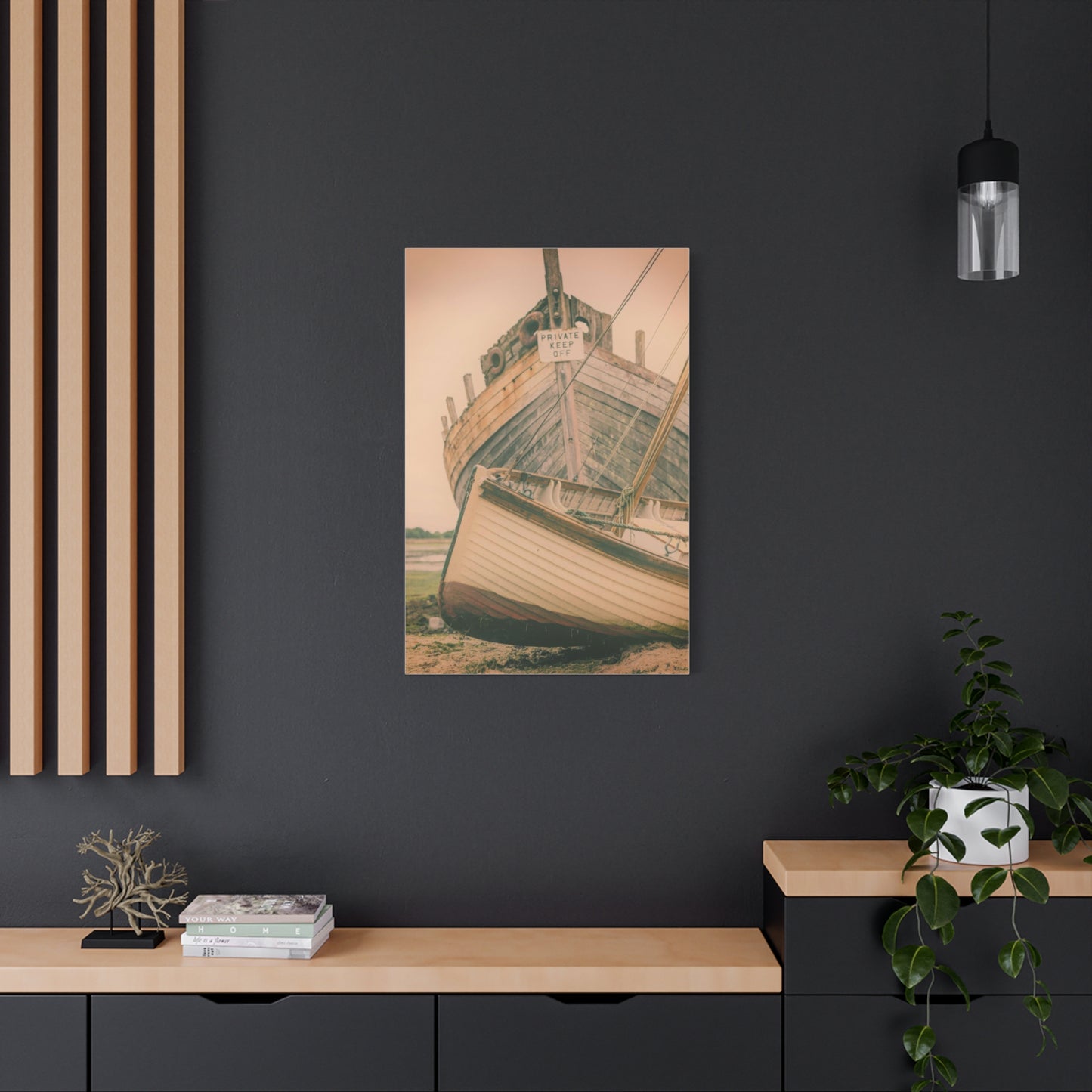
Reliving the Coastline: How Beached Memories Wall Art Adds Warmth and Charm to Your Home
The timeless allure of coastal landscapes has captivated humanity for centuries, drawing us toward the rhythmic dance of waves, the golden embrace of sandy shores, and the endless horizon where sky meets sea. This profound connection to oceanic environments transcends mere aesthetic appreciation, touching something fundamental within our collective consciousness. When we bring these elements into our homes through carefully selected wall decorations and canvas artwork, we create more than just visual interest. We establish sanctuaries that reflect our deepest yearnings for tranquility, freedom, and connection to the natural world.
Interior design has evolved significantly over recent decades, moving beyond simple functionality to embrace psychological wellbeing and emotional resonance. Among the various themes and styles that have emerged, coastal-inspired artwork stands as a perennial favorite, offering versatility that spans traditional, contemporary, and eclectic design philosophies. These pieces serve as windows to another world, transporting viewers from urban apartments to windswept beaches, from cluttered schedules to moments of pure, uninterrupted peace.
The market for ocean-themed canvas prints has expanded exponentially, reflecting our increasing desire to maintain connections with natural environments despite increasingly urbanized lifestyles. Whether you live miles from any coastline or wake each morning to the sound of crashing waves, these artistic representations offer daily reminders of nature's magnificence. They capture fleeting moments that might otherwise disappear with the tide, preserving sunsets, seascapes, and shoreline vignettes for perpetual enjoyment.
This comprehensive exploration delves into every aspect of incorporating coastal wall art into your living spaces. From understanding the psychological impact of marine imagery to mastering placement techniques, from selecting appropriate color palettes to maintaining your investment, this guide provides the knowledge necessary to make informed decisions. We examine how different artistic styles convey distinct moods, explore the technical considerations of canvas quality and printing methods, and discover how these pieces can anchor entire design schemes or provide subtle accents that complete a room's ambiance.
The Psychological Connection Between Ocean Imagery and Human Wellbeing
Scientific research has consistently demonstrated that exposure to natural environments, particularly coastal landscapes, produces measurable improvements in mental health and emotional stability. This phenomenon extends beyond physical presence at beaches or oceanfronts, encompassing visual representations through photography and artwork. The human brain processes these images in ways that trigger relaxation responses, reduce cortisol levels associated with stress, and promote feelings of calm and contentment.
The color blue, dominant in most marine-themed artwork, carries specific psychological associations that contribute to this effect. Studies in color psychology reveal that blue hues lower blood pressure, slow heart rates, and create sensations of spaciousness and freedom. Unlike warmer colors that stimulate and energize, blue tones encourage introspection and peaceful contemplation. When combined with the organic patterns found in waves, sand textures, and cloud formations, these elements create visual compositions that our minds find inherently soothing.
Beyond color theory, the concept of biophilic design explains our attraction to coastal imagery. This design philosophy recognizes humanity's innate need to connect with natural environments, even within built spaces. Incorporating elements that reference the outdoors satisfies this fundamental requirement, improving cognitive function, creativity, and overall satisfaction with our surroundings. Ocean-themed canvas prints serve as accessible, low-maintenance methods of introducing biophilic elements into homes and workspaces.
The specific memories and associations individuals hold regarding coastal experiences further amplify these effects. For many, beaches represent vacation, leisure, and cherished moments with loved ones. Viewing artwork that evokes these memories can trigger positive emotional responses, temporarily transporting viewers back to significant life experiences. This nostalgic dimension adds personal meaning beyond the artwork's inherent aesthetic qualities, making each piece uniquely significant to its owner.
Additionally, the vastness conveyed by ocean imagery addresses psychological needs for perspective and escape. In moments of stress or overwhelm, gazing at representations of infinite horizons can provide mental breathing room, reminding viewers of the broader context beyond immediate concerns. This quality makes coastal wall art particularly valuable in high-stress environments or compact living spaces where physical escape proves impossible.
The meditative quality of repeating wave patterns mirrors techniques used in mindfulness practices. The rhythmic nature of ocean movements, captured and frozen in canvas prints, provides focal points for visual meditation. Viewers can trace the curves of waves, follow the gradient of sunset skies, or explore the intricate details of shoreline compositions, engaging in contemplative practices that quiet mental chatter and promote present-moment awareness.
Exploring Various Artistic Styles in Coastal Canvas Artwork
The diversity within coastal-themed canvas art reflects the multitude of ways artists interpret and represent marine environments. Understanding these stylistic variations enables more intentional selection, ensuring chosen pieces align with both personal preferences and existing design schemes. Each approach offers distinct advantages, conveying different moods and serving different functional purposes within interior spaces.
Photorealistic representations capture coastal scenes with meticulous detail and accuracy, preserving the authentic appearance of specific locations and moments. These pieces appeal to viewers who appreciate technical precision and desire artwork that functions almost as windows to actual places. High-resolution photography printed on canvas delivers this style most effectively, showcasing everything from the individual grains of sand to the subtle color variations in sunset skies. This approach works exceptionally well in contemporary and minimalist settings where clean lines and understated elegance prevail.
Impressionistic interpretations prioritize mood and atmosphere over literal accuracy, using loose brushstrokes, blended colors, and suggested forms to evoke emotional responses. This style captures the essence of coastal experiences rather than documenting them precisely. The resulting artwork carries a dreamlike quality that invites prolonged contemplation and personal interpretation. Impressionistic pieces integrate beautifully into eclectic and transitional design schemes, bridging traditional and modern elements while maintaining visual interest without overwhelming spaces.
Abstract coastal art pushes representation further toward conceptual territory, using colors, shapes, and textures associated with marine environments to create compositions that reference rather than depict. These pieces might incorporate blues, whites, and sandy tones in geometric arrangements, or use flowing forms that suggest wave movements without explicitly illustrating them. Abstract approaches offer maximum versatility in placement and coordination, as their non-literal nature allows them to complement diverse color schemes and design philosophies.
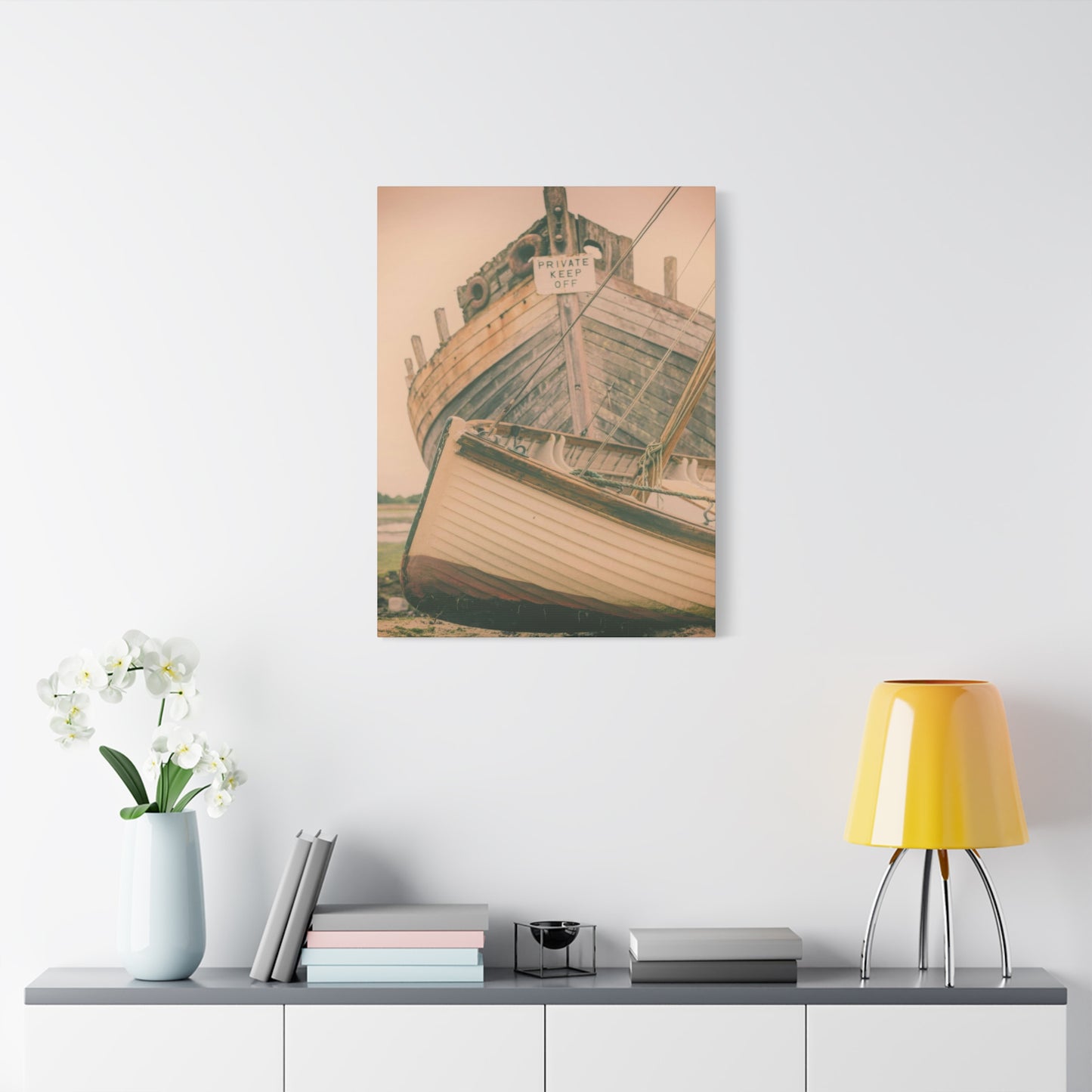
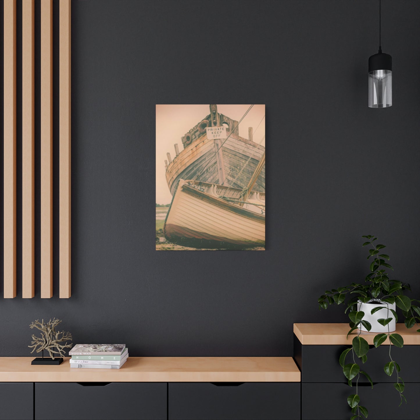
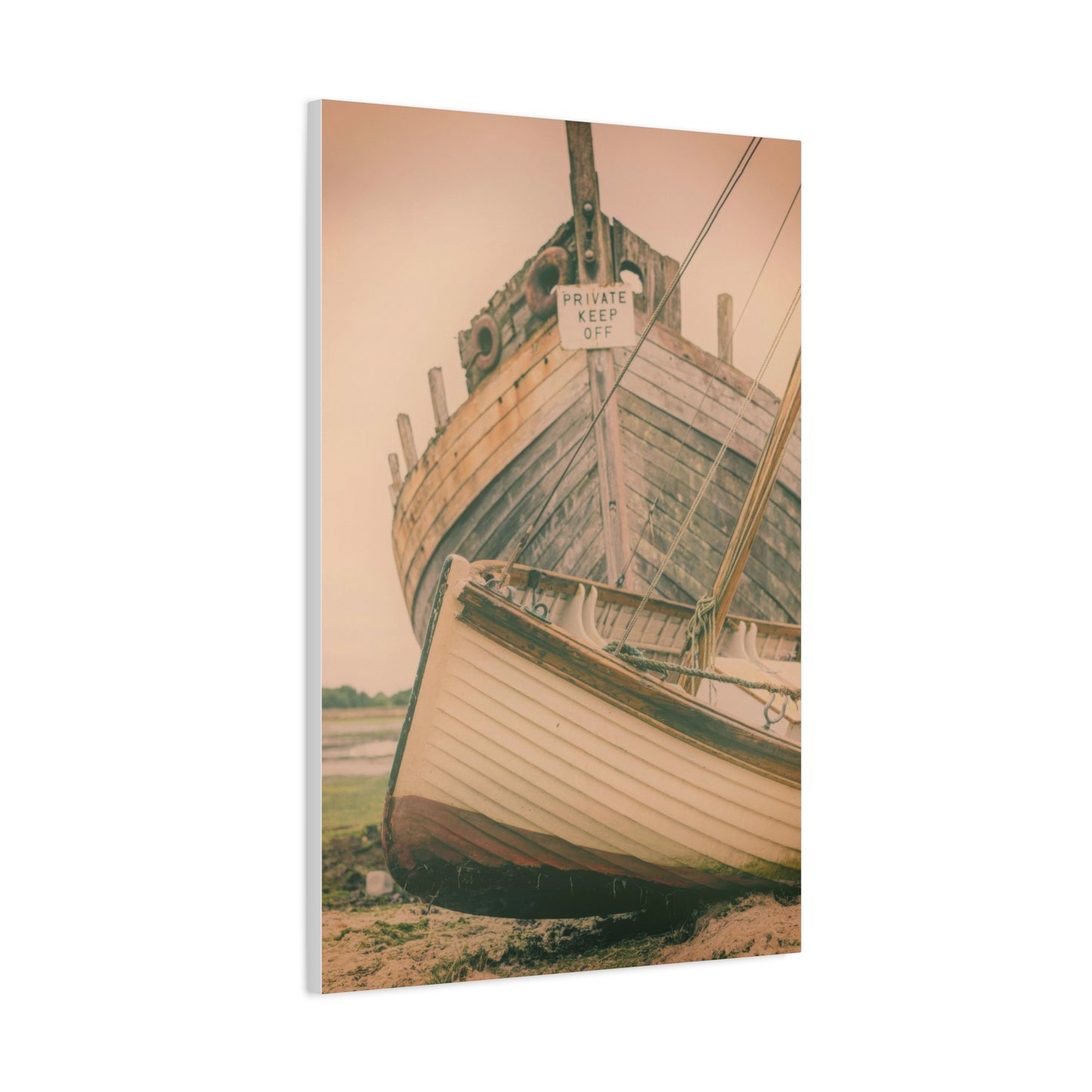
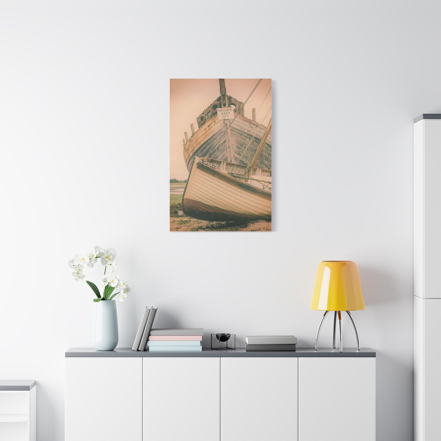
Vintage and retro styles reimagine coastal themes through the aesthetic lenses of past eras, incorporating muted color palettes, weathered textures, and nostalgic compositional choices. These pieces often feature faded appearances, distressed effects, or typography elements reminiscent of antique travel posters. This approach particularly suits coastal cottage, shabby chic, and farmhouse design schemes, adding character and historical depth to spaces while maintaining thematic consistency with marine inspirations.
Minimalist coastal artwork strips scenes to their essential elements, using limited color palettes, clean compositions, and significant negative space to convey coastal themes with maximum simplicity. A single line representing the horizon, subtle gradations of blue suggesting sky meeting water, or the silhouette of a lone sailboat might comprise the entire composition. This reductionist approach aligns perfectly with Scandinavian, Japanese-inspired, and modern minimalist interiors, providing visual interest without cluttering or overwhelming refined spaces.
Mixed media approaches combine photography, painting, digital manipulation, and textural elements to create layered, complex compositions. These pieces might integrate actual sand, incorporate three-dimensional elements, or blend photographic backgrounds with painted foregrounds. The resulting depth and complexity reward close examination while maintaining coherent overall impressions from distance. Mixed media works particularly suit maximalist and bohemian design schemes that celebrate abundance and eclectic combinations.
Selecting Optimal Dimensions and Configurations for Maximum Impact
The physical size of canvas artwork dramatically influences its impact within a room, affecting both visual weight and emotional resonance. Selecting appropriate dimensions requires consideration of wall space, viewing distance, furniture scale, and desired prominence within the overall design scheme. Miscalculations in this area result in pieces that either disappear into backgrounds or dominate spaces uncomfortably, disrupting rather than enhancing room balance.
Large-scale statement pieces, typically measuring forty-eight inches or greater in either dimension, command attention and anchor entire walls. These substantial works function as focal points, drawing the eye immediately upon entering a room and establishing thematic direction for surrounding elements. Oversized coastal scenes work particularly well above sofas, beds, or fireplaces, filling vertical expanses with cohesive imagery that creates dramatic impact. When selecting pieces of this magnitude, ensure adequate viewing distance exists, generally calculated as one and a half to two times the artwork's width, allowing viewers to appreciate the entire composition without requiring excessive neck movement.
Medium-sized pieces, ranging from twenty-four to forty-eight inches, offer versatility and accessibility. These dimensions suit most standard wall spaces without requiring extensive room or specialized hanging considerations. Medium canvases work effectively as standalone pieces in smaller rooms or as components within gallery walls in larger spaces. Their manageable scale facilitates experimentation with placement and periodic rearrangement, accommodating evolving tastes and seasonal design refreshes without significant investment or commitment.
Small accent pieces, under twenty-four inches in either dimension, provide opportunities for detail and intimacy. These works reward close examination, revealing textures, subtle color variations, and intricate compositions that larger formats might gloss over. Smaller canvases excel in creating gallery wall arrangements, filling awkward spaces, or adding visual interest to areas like hallways, powder rooms, and reading nooks where full attention to artwork proves impractical. Collections of coordinated small pieces can create impact rivaling single large works while offering greater compositional flexibility.
Multi-panel configurations, where single images span multiple separate canvases, introduce dynamic visual rhythm while maintaining cohesive narratives. Diptychs split images across two panels, triptychs across three, and polyptychs across four or more. These arrangements allow for creative spacing and alignment, with panels hung in perfect rows for traditional symmetry or staggered at varying heights for contemporary edge. Multi-panel pieces also solve practical challenges, making large-scale imagery manageable in terms of weight, shipping, and installation while creating visual interest through the deliberate breaks between sections.
When determining appropriate sizing, apply the two-thirds rule as a general guideline: artwork should cover approximately two-thirds of the furniture width beneath it. A sofa measuring ninety inches wide, for instance, pairs well with a single piece approximately sixty inches wide or a grouping with similar total width. This proportion creates visual connection between furniture and artwork without either element overwhelming the other, establishing harmonious relationships that feel intentional rather than accidental.
Vertical versus horizontal orientation carries psychological implications beyond mere space utilization. Horizontal compositions emphasize breadth, openness, and expansive horizons, naturally complementing coastal themes while making rooms feel wider. Vertical orientations draw the eye upward, creating impressions of height and grandeur while working particularly well in rooms with tall ceilings or narrow wall sections. Square formats split the difference, offering balanced, stable compositions that work universally while sometimes feeling safer and less dynamic than rectangular alternatives.
Understanding Canvas Quality and Production Techniques
The longevity, appearance, and value of coastal wall art depend significantly on production quality, encompassing everything from canvas material to printing methods, stretching techniques, and finishing treatments. Educating yourself about these technical aspects enables informed purchasing decisions, ensuring investments deliver satisfaction for years while avoiding disappointing experiences with substandard products.
Canvas material itself varies considerably in quality and characteristics. Traditional cotton canvas offers excellent durability, accepts ink beautifully, and ages gracefully when properly cared for. The natural fiber provides subtle texture that enhances visual depth, particularly in pieces featuring organic subjects like coastal landscapes. However, cotton's responsiveness to humidity fluctuations requires climate consideration in installation locations. Polyester canvas, increasingly popular in modern production, resists moisture, sagging, and stretching more effectively than natural fibers. This synthetic alternative maintains dimensional stability across varying environmental conditions while delivering smooth, consistent surfaces ideal for photographic reproductions. Blended canvases attempt to capture advantages from both material types, balancing natural aesthetic appeal with synthetic durability.
Printing technology dramatically influences final appearance quality and longevity. Giclée printing represents the premium standard, utilizing specialized inkjet printers capable of microscopic droplet precision and extensive color gamut. The term, derived from French meaning "to spray," describes the process of depositing archival pigment-based inks onto canvas in layers so fine that individual dots remain invisible to unaided eyes. Authentic giclée prints exhibit extraordinary color accuracy, tonal range, and detail resolution, closely approximating original artwork or photography. These prints, when produced with archival inks and properly displayed, resist fading for decades, making them genuine investment pieces.
Standard digital printing, while more affordable, sacrifices some quality for cost efficiency. These prints utilize dye-based inks that produce vibrant initial colors but fade more rapidly with light exposure and time. For budget-conscious buyers or those planning frequent décor changes, standard prints offer acceptable quality at accessible prices. However, understanding the lifespan limitations prevents disappointment and enables appropriate placement in areas with minimal direct sunlight exposure.
Canvas stretching and mounting profoundly impact both appearance and durability. Gallery wrap construction, where canvas extends around frame edges with imagery continuing onto sides, creates finished appearances from all angles, eliminating the need for additional framing. This contemporary approach suits modern aesthetics while simplifying installation and reducing overall costs. Museum wrap, alternatively, pulls canvas tautly across stretcher bars without imagery appearing on edges, intended for traditional framing behind glass. This method prioritizes protection and formal presentation over cost efficiency or contemporary style.
Frame material and construction quality deserve equal attention to canvas itself. Kiln-dried solid wood stretcher bars resist warping and provide stable support superior to composite materials or low-quality lumber. Corner joints should feature sturdy construction, typically achieved through interlocking designs or substantial stapling, ensuring frames maintain squareness under tension. Cross bracing on larger pieces prevents sagging and warping, essential for maintaining proper canvas tension across substantial spans.
Coating and finishing treatments extend artwork lifespan while influencing appearance. UV-resistant spray treatments, applied as final production steps, filter harmful ultraviolet radiation that causes premature fading. These coatings prove particularly valuable for pieces displayed in sunny rooms or near windows. Gloss, satin, and matte finishes alter surface reflectivity, affecting how artwork appears under various lighting conditions. Gloss finishes enhance color saturation and create dramatic depth but may produce unwanted glare in brightly lit spaces. Matte finishes eliminate glare entirely while producing subtle, sophisticated appearances that complement many design schemes. Satin finishes compromise between these extremes, offering slight sheen without problematic reflections.
Harmonizing Color Palettes Between Artwork and Living Spaces
Successful integration of coastal canvas prints within existing décor requires thoughtful color coordination, ensuring new additions enhance rather than clash with established palettes. This process involves understanding color theory fundamentals, recognizing undertones, and developing strategies for either complementing current schemes or intentionally introducing contrasting elements that refresh and energize spaces.
Monochromatic approaches utilize variations of single hues, creating cohesive, sophisticated appearances through differences in saturation and value rather than color family. In coastal contexts, monochromatic schemes might explore the full range from pale sky blue through navy depths, incorporating whites, grays, and near-blacks to provide contrast without introducing competing colors. This strategy works exceptionally well in minimalist and contemporary settings, delivering visual interest through texture, pattern, and tonal variation rather than chromatic diversity.
Analogous color schemes combine hues adjacent on the color wheel, producing harmonious, naturally pleasing combinations. Coastal palettes frequently employ analogous relationships between blues, greens, and blue-greens, mirroring the actual color transitions observable in ocean waters from shallow to deep, shore to horizon. Adding neutral tones like sand, driftwood gray, and shell white grounds these combinations while preventing overwhelming saturation. Analogous schemes feel cohesive and intentional without appearing overly matched or contrived, suitable for both traditional and contemporary applications.
Complementary strategies pair opposite color wheel positions, creating dynamic tension and maximum contrast. In coastal contexts, this might involve juxtaposing ocean blues against sunset oranges, aqua against coral, or teal against rust. These bold combinations energize spaces, attracting attention and making strong design statements. However, complementary schemes require careful balance to avoid visual overwhelm. Employing one color dominantly while using its complement as accent prevents competition while maintaining dramatic impact.
Triadic relationships select three evenly spaced color wheel positions, producing vibrant, balanced schemes with built-in variety. A coastal triadic palette might include blue, yellow, and coral, or aqua, violet, and peach. These combinations feel lively and optimistic, well-suited to family spaces, children's rooms, and areas dedicated to creativity and social interaction. Managing saturation levels prevents triadic schemes from appearing juvenile or chaotic, with muted or grayed versions of each color producing sophisticated results while maintaining fundamental relationships.
Neutral foundations provide versatile backdrops that accommodate diverse artwork selections. Spaces dominated by whites, grays, beiges, and taupes allow coastal canvas prints to provide color punch without competing against busy backgrounds. This approach offers maximum flexibility for seasonal changes and evolving tastes, as neutral environments adapt easily to different accent colors and themes. Coastal artwork introduces vitality and personality into neutral spaces while maintaining overall calm and sophistication.
Understanding undertones proves crucial when coordinating colors. Blues vary from warm, purple-tinged varieties to cool, green-inflected versions. Similarly, whites range from creamy warm tones to stark cool alternatives, and grays span from warm greiges to cool slate variations. Artwork undertones should harmonize with room undertones to prevent subtle clashes that create discomfort without obvious causes. Examining colors in actual room lighting conditions, rather than relying on digital representations or showroom appearances, ensures accurate coordination.
Accent color strategy involves selecting artwork featuring prominent accent colors that repeat in smaller doses throughout the room. If your coastal canvas includes pops of coral or warm sand tones, echoing these in throw pillows, vases, or other accessories creates cohesive visual flow. This technique, sometimes called color bridging, helps artwork feel integrated rather than randomly placed, establishing clear relationships between elements that guide the eye naturally around spaces.
Strategic Placement Techniques for Various Room Types
The effectiveness of coastal wall art depends not only on the pieces themselves but on thoughtful placement within specific rooms and contexts. Each space presents unique considerations regarding function, traffic patterns, existing focal points, and emotional atmosphere, requiring tailored approaches that maximize both aesthetic and psychological impact.
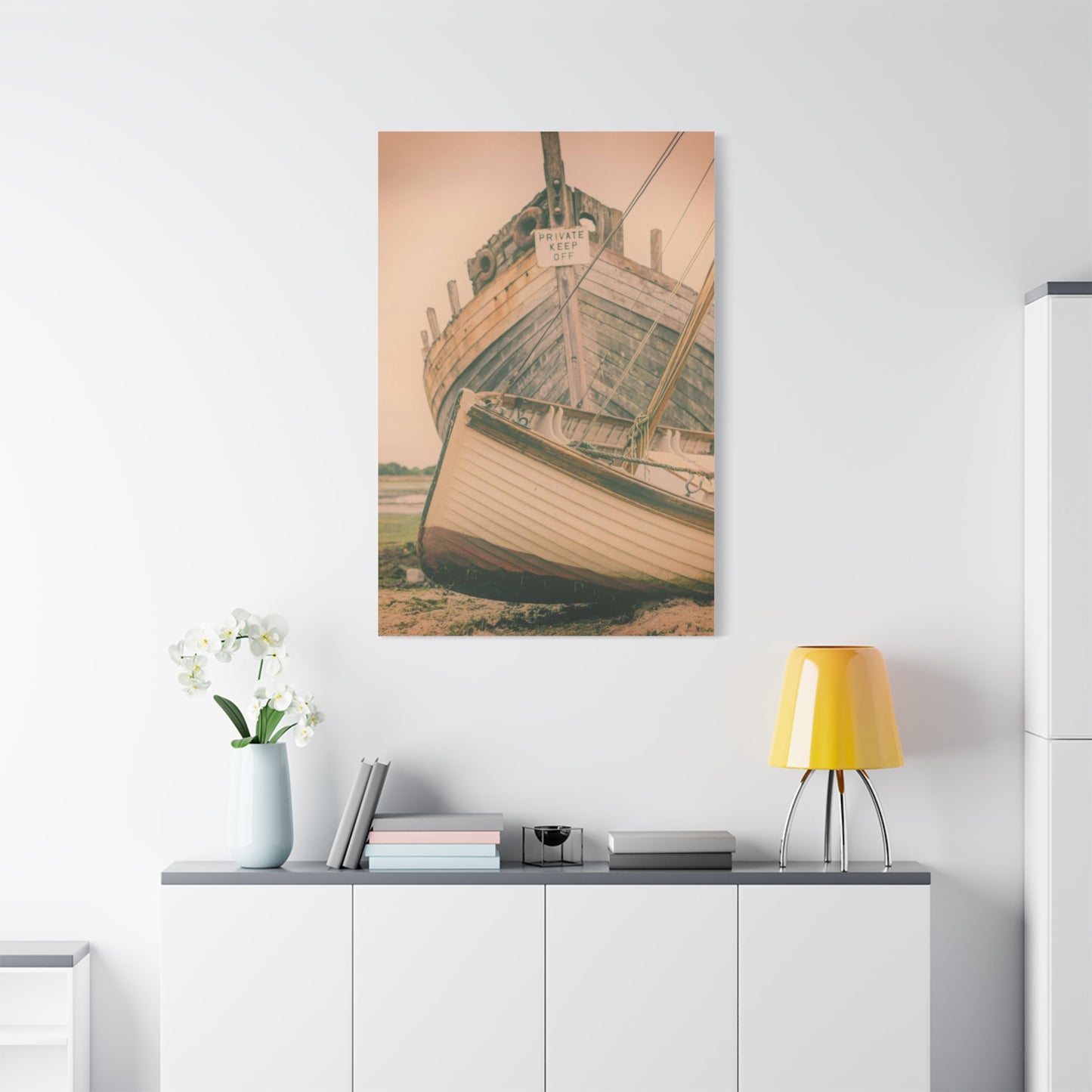
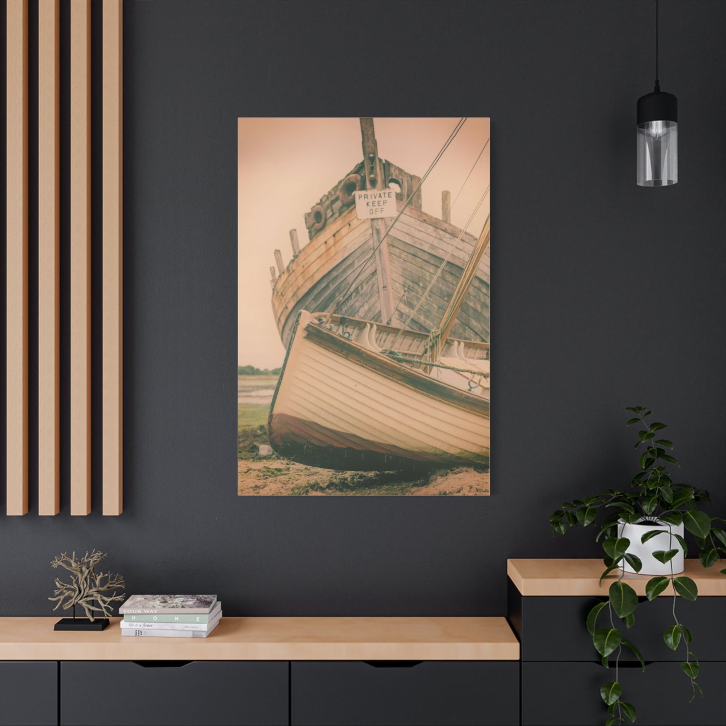
Living rooms, serving as primary gathering and relaxation spaces, benefit from substantial coastal pieces that establish mood and anchor conversational areas. Positioning large-scale ocean artwork above main seating, typically sofas, creates natural focal points that ground furniture arrangements while providing visually interesting backgrounds for social interaction. When working with sectional seating, consider multi-panel pieces that span the broader expanse, maintaining proportional relationships. Alternative placement above fireplaces leverages existing architectural focal points, though ensure the artwork scale doesn't create competition but rather complements the mantelpiece. In open-concept living areas, coastal art can define zones, with ocean-themed pieces marking relaxation areas distinct from dining or kitchen spaces.
Bedrooms demand particular attention to mood and psychological impact, as artwork here influences pre-sleep and waking experiences. Calm, soothing coastal scenes promote relaxation and restful sleep, making them ideal for placement opposite or above beds where they receive attention during evening wind-down and morning awakening. Avoid overly stimulating colors or turbulent wave imagery that might subconsciously energize rather than relax. Gentle sunset beaches, tranquil tide pool studies, or minimalist horizon lines serve bedroom purposes effectively. Consider symmetrical placement of matching pieces flanking beds as alternatives to single large works, creating balanced, intentional appearances that satisfy traditional design sensibilities.
Dining areas benefit from coastal artwork that encourages conversation and creates pleasant atmospheric backdrops for meals. Placement here typically centers on the main wall visible from the table, often opposite the entry point, ensuring visibility throughout dining experiences without requiring awkward head-turning. Artwork should neither dominate nor disappear, instead providing conversation pieces that enhance without distracting. Lighter, brighter coastal scenes work well in dining contexts, promoting positive associations and appetite stimulation through warm color temperatures and inviting compositions.
Bathrooms, natural candidates for coastal themes given water-related functions, require special consideration regarding humidity and space constraints. Select artwork with moisture-resistant coatings and avoid direct splash zone placement to prevent water damage. Small to medium-sized pieces work best in typical bathroom dimensions, positioned above toilets, on walls opposite vanities, or in any available vertical space. Coastal bathroom art reinforces thematic consistency while transforming purely functional spaces into spa-like retreats. Consider groupings of smaller coordinated pieces rather than single large works, adding visual interest to compact spaces without overwhelming.
Home offices and workspaces benefit from coastal art's stress-reducing properties and mental clarity promotion. Strategic placement within sight lines from desks provides quick visual breaks during intensive work periods, with ocean imagery offering brief mental escapes that refresh focus. Avoid positioning artwork directly behind computer monitors where glare becomes problematic or placement requiring significant body rotation to view. Side walls within comfortable sight lines or walls facing desk positions work optimally. Select pieces with horizons and expansive skies that convey openness, counteracting the psychological confinement often associated with task-focused work environments.
Hallways and transitional spaces, frequently neglected in design schemes, provide excellent opportunities for gallery wall arrangements featuring multiple coordinated coastal pieces. These narrow, vertical spaces suit stacked or staggered arrangements that guide movement while adding visual interest to otherwise purely functional areas. Hallway art creates anticipation and flow, with coastal themes suggesting journey and discovery appropriate to spaces that connect distinct areas. Lighting consideration proves particularly important in hallways, which often lack natural light sources, requiring strategic artificial lighting to properly illuminate artwork.
Entryways and foyers set initial impressions, making artwork selection and placement particularly significant. Coastal pieces in these locations establish thematic direction for entire homes while welcoming visitors with immediate visual interest. Scale and impact matter here, as entryway art competes with arriving guests, coat storage, and circulation traffic for attention. Bold, confident pieces with strong compositions and clear subjects work better than subtle, detail-dependent works that require prolonged examination. Consider sightlines from outside entries, ensuring artwork provides attractive previews through windows or glass doors without revealing excessive interior detail to passersby.
Creating Cohesive Gallery Wall Arrangements
Gallery walls, featuring multiple pieces arranged intentionally on single surfaces, offer dynamic alternatives to lone statement pieces while providing opportunities for creative expression and personalized collections. Successfully executing these arrangements requires planning, patience, and understanding of compositional principles that transform random groupings into cohesive, professional-appearing installations.
Thematic unity provides foundation for successful gallery walls, with all pieces sharing common elements that create visual conversation and clear relationships. In coastal contexts, this might mean assembling various beach perspectives, different times of day at the shore, diverse marine life studies, or abstract pieces all drawing from oceanic color palettes. Some variation within unity prevents monotony while too much diversity creates confusion, so aim for pieces that clearly belong together while contributing individual character.
Scale variation adds visual interest and prevents static, repetitive appearances. Combining large anchor pieces with medium supporting works and small accent items creates rhythm and hierarchy that guide viewer attention purposefully. Typically, one or two larger pieces serve as focal points, positioned according to desired emphasis, with remaining pieces supporting and enhancing rather than competing. Avoid sizing extremes where tiny pieces disappear next to large neighbors or oversized works crowd out companions, instead maintaining proportional relationships that feel balanced even when asymmetrical.
Frame consistency simplifies gallery wall execution and enhances cohesion, with matching frames unifying diverse imagery through common borders. This approach works particularly well when mixing photography, paintings, and prints that might otherwise clash. Conversely, varied frames add eclectic personality when unified through color family or style category, such as all natural woods or all white finishes. Canvas pieces without frames integrate easily, their gallery-wrapped edges providing clean, contemporary appearances that complement both framed and unframed neighbors.
Spacing standards ensure professional results, with typical gaps between pieces ranging from two to four inches. Consistent spacing throughout creates orderly, intentional appearances, while varied gaps produce more casual, collected-over-time effects. Tighter spacing emphasizes grouping unity and creates stronger visual impact, particularly effective with smaller pieces that might otherwise scatter visually. Wider spacing allows each piece breathing room, reducing visual competition while requiring more wall space overall.
Arrangement styles range from grid perfection to organic asymmetry. Grid layouts, with pieces aligned in neat rows and columns, deliver clean, contemporary results that suit modern and minimalist aesthetics. These arrangements require careful measurement and identical spacing but reward effort with polished, gallery-quality appearances. Salon-style hangs embrace organic asymmetry, varying sizes and spacing while maintaining overall balance through careful composition. These eclectic arrangements suit traditional, bohemian, and maximalist spaces, conveying personality and collected character. Horizontal lines maintain at least some pieces aligned along common baselines, creating underlying structure within apparent randomness. This hybrid approach offers accessibility for those intimidated by completely free-form arrangements while allowing more creativity than rigid grids.
Template creation prevents wall damage from experimental hanging and ensures satisfactory arrangements before committing to hardware installation. Cut paper templates matching each piece's exact dimensions, then arrange these on walls using removable tape, allowing unlimited experimentation without consequences. Photograph successful arrangements for reference during actual installation, noting measurements from fixed reference points like room corners or furniture edges. This preparatory work proves invaluable, particularly with complex salon arrangements involving numerous pieces.
Central axis establishment provides organizational framework even in asymmetrical arrangements. Identifying a central vertical or horizontal line, then balancing visual weight equally on both sides, creates equilibrium that feels comfortable even when not obviously symmetrical. This principle applies to both grid and salon arrangements, ensuring finished installations feel anchored rather than randomly scattered. The central axis might align with room features like fireplace centers, doorway midpoints, or furniture centerlines, creating architectural relationships that integrate gallery walls into broader room compositions.
Seasonal Rotation and Thematic Variation Strategies
The flexibility of canvas wall art enables periodic refreshing of living spaces through seasonal rotations and thematic variations, maintaining visual interest while accommodating changing moods and preferences. Developing strategies for these transitions maximizes artwork investments while keeping interiors feeling current and personally relevant.
Seasonal approaches adapt coastal themes to reflect changing times of year, subtly shifting color temperatures, lighting qualities, and compositional emphases. Summer selections might feature brilliant sunny skies, vibrant turquoise waters, and bright golden sands, embodying warmth and vitality. Winter alternatives could emphasize moody storm clouds, gray-scale palettes, and dramatic wave action, reflecting seasonal introspection and nature's power. Spring and fall variations fall between these extremes, incorporating softer pastels or rich jewel tones respectively. Rotating artwork seasonally prevents staleness while allowing engagement with fuller ranges of coastal imagery than single permanent selections permit.
Color temperature adjustments provide subtle methods of acknowledging seasonal shifts without completely replacing artwork. Warmer coastal scenes, featuring sunrise and sunset imagery with orange, pink, and golden highlights, add psychological warmth during cold months. Cooler pieces emphasizing blues, greens, and purples create refreshing visual effects during summer heat. These temperature shifts influence perceived room comfort independently of actual thermostat settings, leveraging psychological associations between color and physical sensation.
Storage solutions for seasonal artwork protect investments while facilitating easy transitions. Climate-controlled storage prevents humidity damage and temperature fluctuations that warp canvases or fade inks. Proper protective wrapping using acid-free materials prevents surface scratches and dust accumulation. Vertical storage positions prevent warping better than horizontal stacking, particularly for larger pieces. Label stored artwork clearly, including content descriptions and ideal seasonal timing, streamlining rotation decisions and preventing forgotten pieces from languishing unused.
Thematic variation extends beyond seasons, encompassing life events, personal growth, and evolving interests. New parents might transition from dramatic wave photography to gentler beach scenes reflecting changed priorities. Empty nesters could embrace bolder, more adventurous coastal imagery reflecting newfound freedom. Career changes, relocations, or simply developing tastes justify artwork evolution, with coastal themes providing consistent threads through diverse life chapters.
Budget considerations influence rotation frequency and extent, but creative strategies enable regular refreshing without excessive spending. Building collections gradually, purchasing new pieces periodically rather than complete sets simultaneously, distributes costs while providing rotation options. Shopping during seasonal sales, particularly post-holiday clearances, yields quality pieces at reduced prices. Digital printing services enable custom creation of personal coastal photography, producing meaningful artwork at modest costs. Swapping pieces between rooms creates fresh perspectives without additional investment, as artwork appears new when moved to different contexts and lighting conditions.
Documentary photography of current arrangements before rotations preserves successful configurations for future reference. These records prove invaluable when recreating favorite looks after intervening changes or when uncertain about returning artwork to previous positions. Digital files consume no physical storage space while providing unlimited consultation opportunities, supporting better decision-making during future rotations.
Incorporating Personal Coastal Photography into Canvas Prints
Transforming personal coastal photographs into canvas wall art adds profound meaning and individuality to décor, celebrating cherished memories while creating conversation pieces that connect deeply with personal histories. This approach combines the aesthetic benefits of coastal imagery with emotional resonance that commercial artwork rarely achieves.
Photograph selection requires critical evaluation beyond sentimental attachment, assessing technical quality, compositional strength, and thematic appropriateness. High-resolution images translate best to canvas, particularly for larger prints where low-resolution files produce pixelation and blurriness. Examine technical elements like focus sharpness, exposure accuracy, and color balance, as printing magnifies flaws invisible on small screens. Compositionally strong photographs feature clear subjects, balanced elements, and interesting visual flow that rewards extended viewing. While personal meaning matters, successful wall art balances emotional significance with objective aesthetic merit.
Image resolution requirements depend on intended print sizes, with larger dimensions demanding higher resolution source files. As general guidance, aim for at least one hundred pixels per inch at the intended print size, though three hundred pixels per inch represents optimal quality. A forty-by-sixty-inch print, for instance, requires minimum dimensions of four thousand by six thousand pixels, though twelve thousand by eighteen thousand pixels ensures exceptional clarity. Many smartphone cameras capture adequate resolution for moderate print sizes, but images cropped significantly or enlarged substantially from original capture dimensions may fall short of quality standards.
Color correction and editing enhance raw photographs, optimizing them for printing processes that differ from screen display. Professional editing services or quality software applications enable adjustments to exposure, contrast, color saturation, and white balance, transforming good photographs into excellent ones. Pay particular attention to highlight and shadow detail, ensuring neither blown-out whites nor blocked blacks lose information. Slight saturation increases often prove necessary, as printing typically produces less vibrant colors than backlit screens suggest. Request test prints or proofs before committing to large, expensive productions, allowing color and quality verification under actual viewing conditions.
Service selection impacts final quality significantly, with options ranging from local print shops to specialized online canvas producers and professional fine art printers. Research providers carefully, examining sample works when possible and reading customer reviews regarding color accuracy, canvas quality, and customer service responsiveness. Premium services cost more but deliver superior results through better materials, advanced printing technologies, and quality control processes. Budget providers serve adequately for less critical applications or experimental purposes, though expect compromises in longevity and precision.
Cropping decisions fundamentally alter compositions, emphasizing certain elements while eliminating others. Standard canvas proportions may not match original photograph ratios, requiring decisions about which content to exclude or how to add borders. Experiment with different cropping options, sometimes discovering stronger compositions by eliminating extraneous elements and tightening focus on compelling subjects. Panoramic formats work beautifully for sweeping coastal vistas, while square formats suit certain subjects like tide pools or beach detail studies. Most printing services provide digital preview tools showing exactly how cropped images appear in various dimensions and ratios.
Grouping strategies create powerful narratives when printing multiple related personal photographs. Chronological arrangements might document single beach visits from arrival through sunset, telling visual stories that individual images cannot convey alone. Geographic groupings could assemble favorite beaches from different locations, creating personal travel retrospectives. Thematic approaches might isolate particular elements across photographs, such as collecting various sunset moments, different wave patterns, or diverse seabird encounters, finding unity in focused subject matter rather than temporal or spatial relationships.
Lighting Considerations for Optimal Artwork Display
Proper lighting dramatically influences artwork appearance, affecting color accuracy, detail visibility, and overall impact while protecting against premature fading and damage. Understanding lighting principles and implementing appropriate solutions ensures coastal canvas prints display optimally while maximizing longevity.
Natural light considerations begin with sun exposure assessment and management. Direct sunlight streaming through windows delivers beautiful illumination but carries significant risks, including rapid fading, color shifts, and canvas degradation. Ultraviolet radiation proves particularly damaging, breaking down inks and canvas fibers over time. Protect vulnerable artwork through several strategies: position pieces on walls perpendicular to windows rather than directly opposite them, avoiding the harshest direct exposure; install UV-filtering window films that block harmful radiation while maintaining visible light transmission; use curtains, blinds, or shades during peak sun hours when exposure intensity peaks. East and west-facing windows present greater challenges than north-facing alternatives, receiving more intense direct sun during sunrise and sunset hours. South-facing exposures in northern hemisphere locations sustain consistent, strong light throughout days, requiring maximum protection.
Artificial lighting offers controllable, consistent illumination without natural light's variable intensity and damaging wavelengths. Several approaches suit residential applications, each carrying distinct advantages and considerations. Picture lights, mounted directly above artwork or integrated into frames, provide dedicated illumination that highlights pieces while allowing independent control. These fixtures work particularly well for statement pieces deserving special emphasis, though installation requires careful attention to avoid glare on canvas surfaces or distracting shadows. Adjustable beam angles and dimming capabilities enhance versatility, accommodating different artwork characteristics and viewing conditions.
Track lighting systems deliver flexible solutions for gallery walls or multiple pieces requiring individual attention. Adjustable fixtures mount on ceiling-mounted tracks, allowing precise aiming and easy repositioning as artwork changes. LED track lights offer energy efficiency, minimal heat generation, and excellent color rendering properties that display artwork accurately. Position track lights at thirty-degree angles from walls to minimize glare while providing even illumination across canvas surfaces. Dimming controls enable atmosphere adjustment, creating brighter task-oriented settings or softer ambient lighting depending on occasions.
Recessed ceiling lights provide clean, architectural illumination that integrates seamlessly into contemporary designs. When positioned appropriately, typically between twenty-four and thirty-six inches from walls, recessed fixtures create effective artwork lighting without visible hardware. However, standard recessed lights may produce hot spots or uneven coverage, necessitating careful selection of beam angles and light output levels. Adjustable trim options allow some aiming flexibility, though less than track systems provide.
Ambient room lighting establishes foundational illumination levels that affect artwork visibility even when dedicated accent lighting exists. Overall brightness influences perceived color saturation and contrast, with dimmer environments muting colors while brighter spaces enhance them. Balance ambient and accent lighting to prevent excessive contrast between illuminated artwork and surrounding darkness, which causes eye strain and reduces viewing comfort. Layered lighting approaches combining ambient, task, and accent sources create flexible, functional environments that support diverse activities while properly displaying artwork.
Color temperature selection impacts perceived artwork colors and overall room atmosphere. Measured in Kelvin, color temperature ranges from warm yellowish tones around twenty-seven hundred Kelvin through neutral white near forty-five hundred Kelvin to cool bluish hues above fifty-five hundred Kelvin. For accurate color rendering, neutral to slightly warm temperatures between three thousand and four thousand Kelvin work best, avoiding both the yellowing effect of very warm sources and the cold harshness of daylight-temperature lamps. However, personal preference and room function influence optimal choices, with warmer lighting creating cozier atmospheres in living and sleeping spaces while cooler temperatures suit task-oriented areas.
Color Rendering Index quantifies light sources' ability to accurately reveal colors compared to natural daylight reference, measured on zero to one hundred scales. Higher CRI values indicate better color accuracy, with values above ninety considered excellent for artwork illumination. Budget lighting often achieves only seventy to eighty CRI, creating color distortions that misrepresent artwork appearance. Investing in high-CRI lighting ensures coastal canvas prints display as intended, with accurate blues, subtle sand tone variations, and faithful sunset color reproduction.
Conclusion
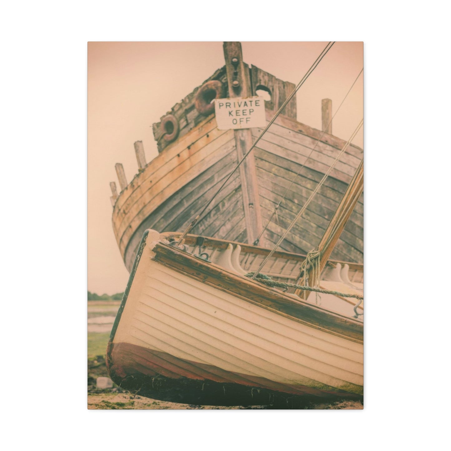
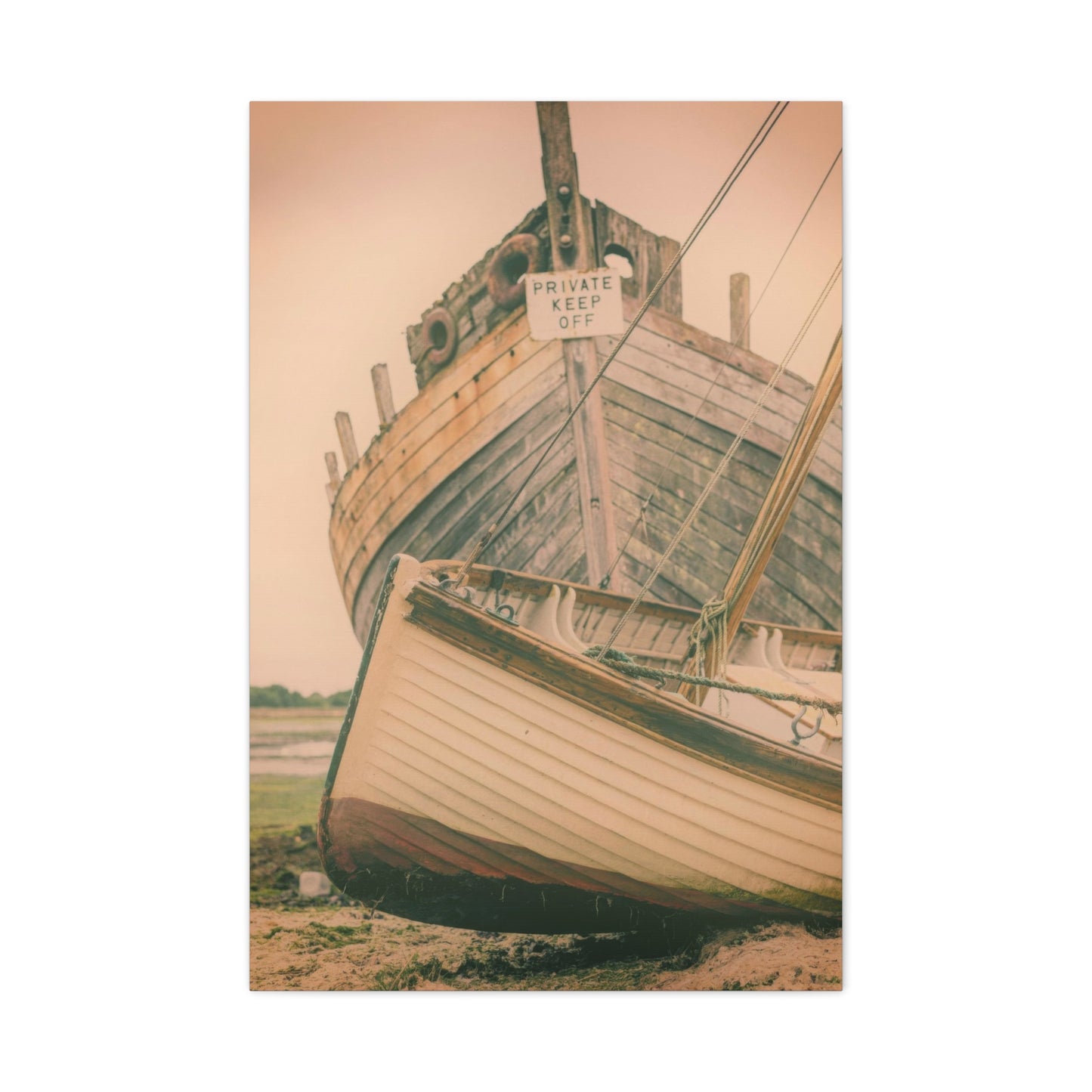
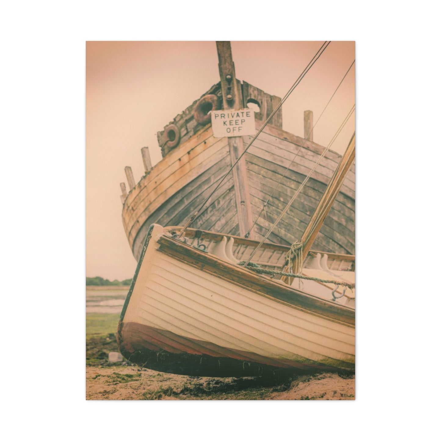
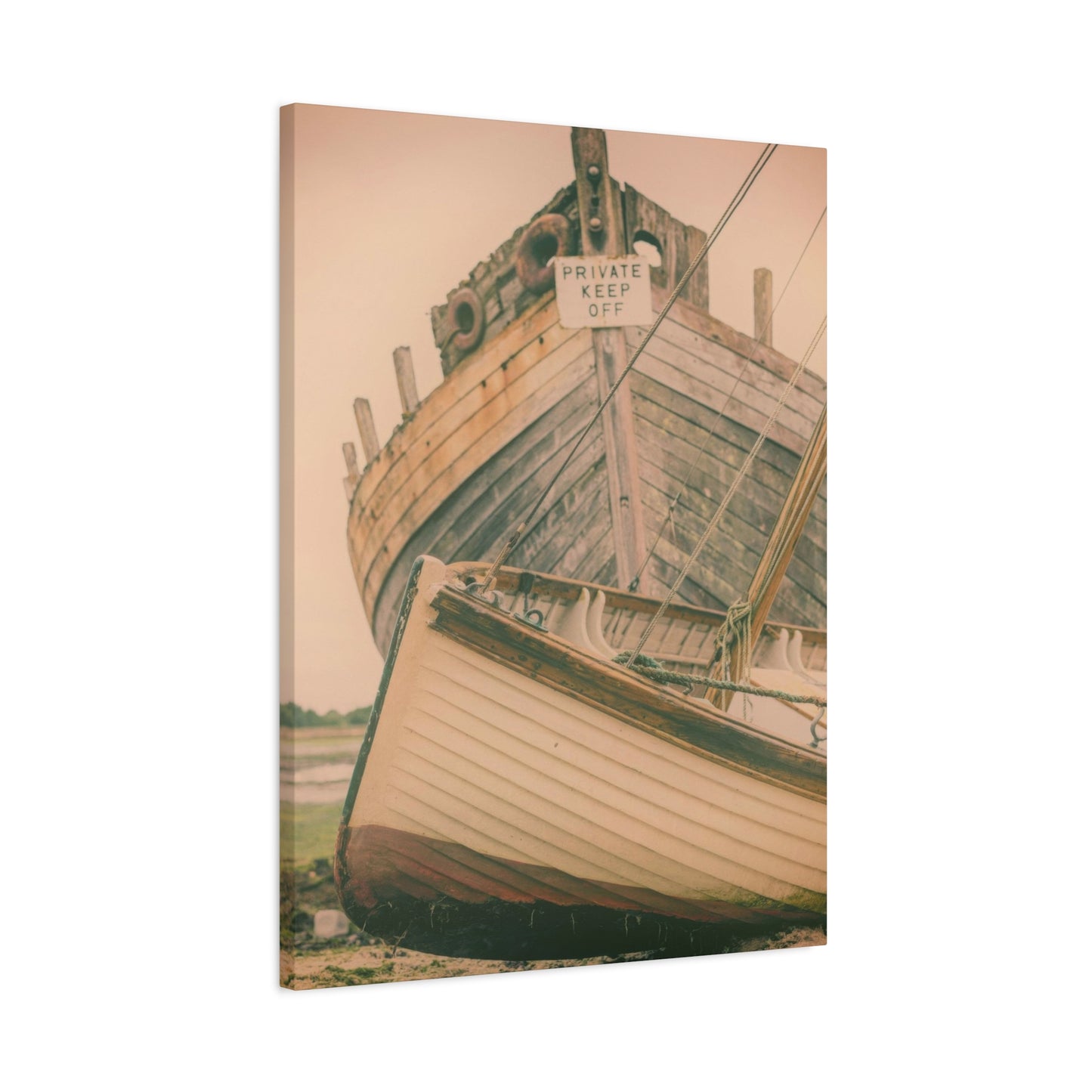
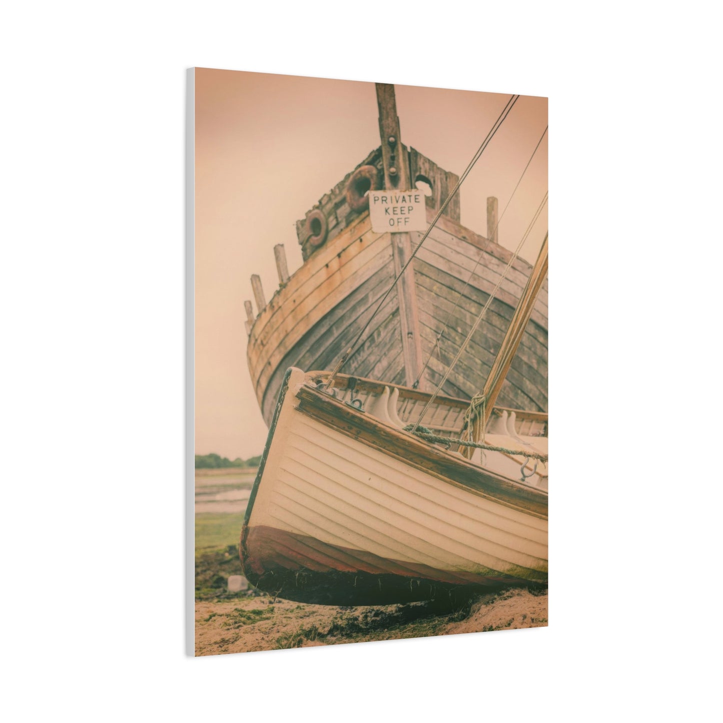
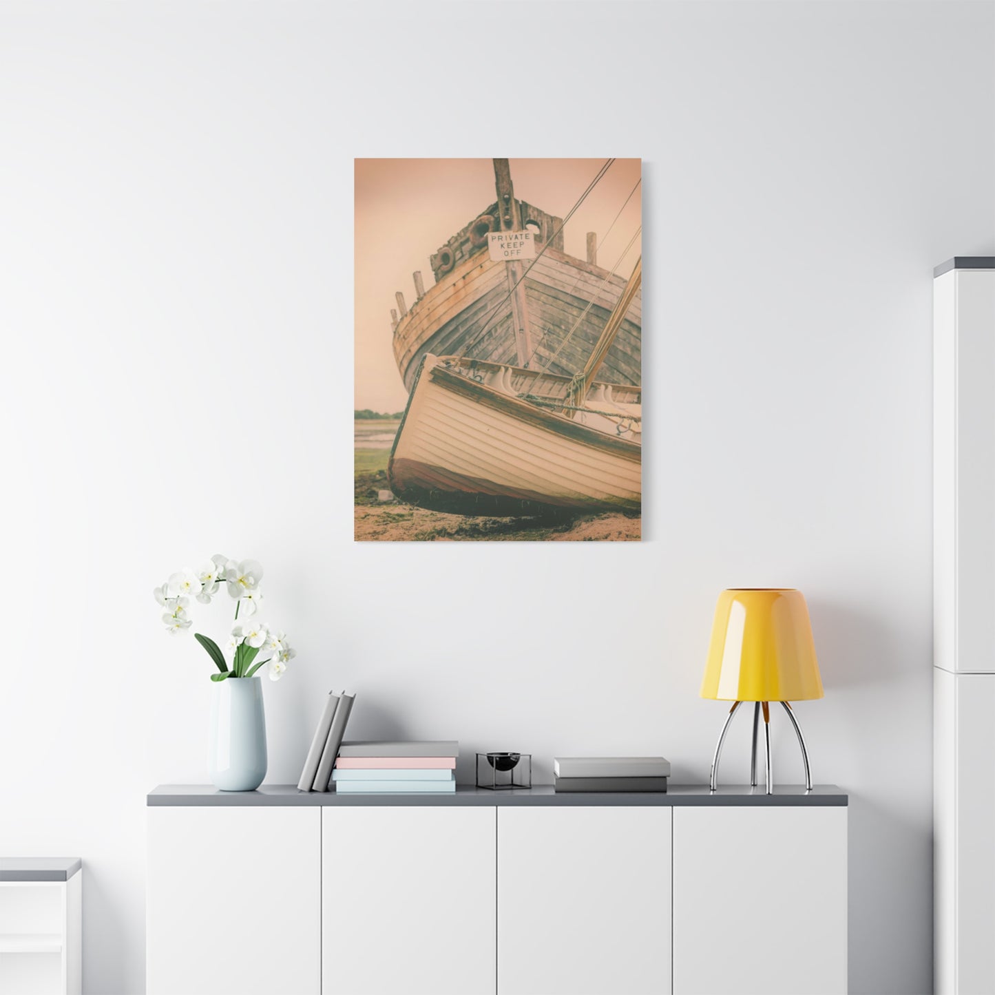
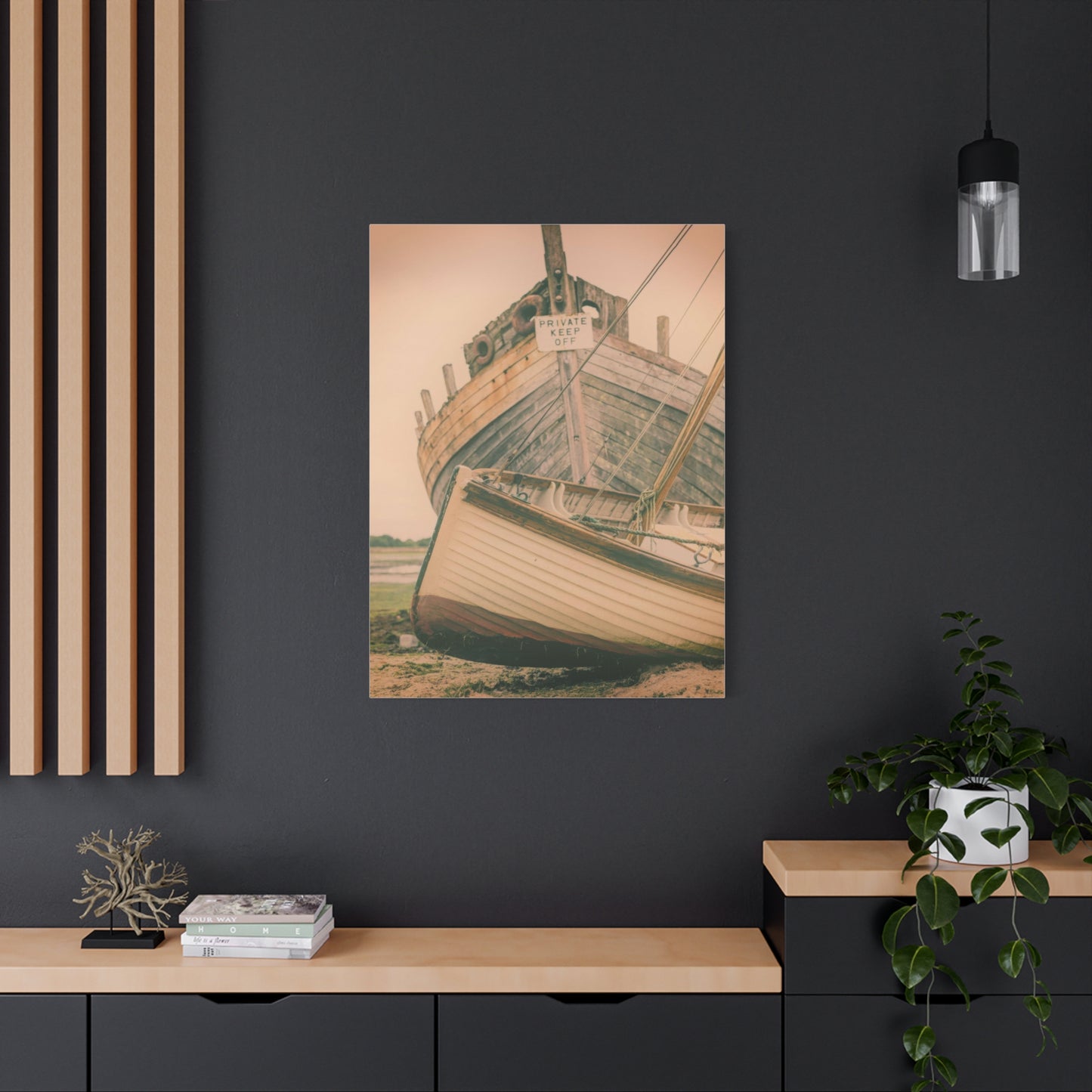
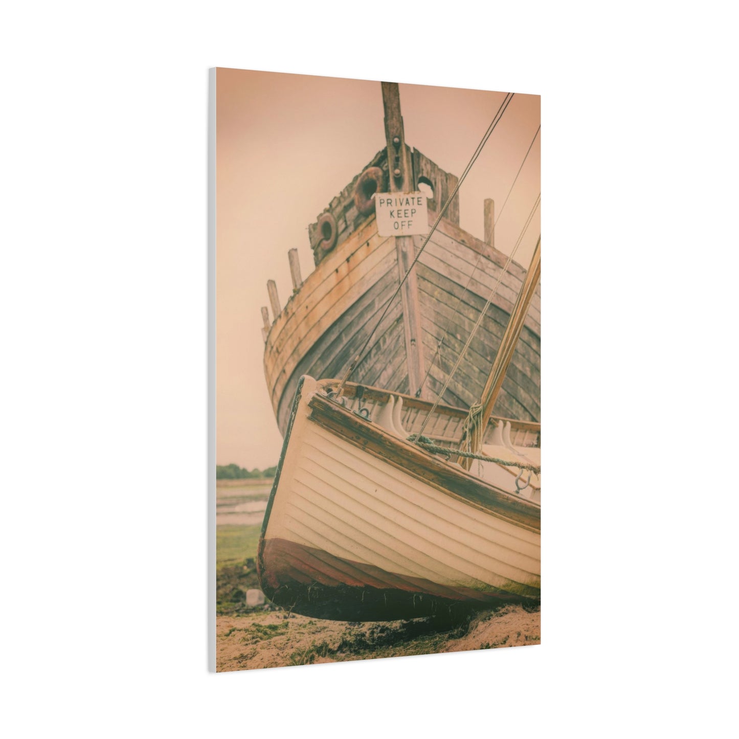
When it comes to transforming your living space into a warm, inviting sanctuary, few pieces of art can capture the essence of tranquility and nostalgia quite like Beached Memories Wall Art. This genre of coastal-inspired artwork takes the serene beauty of the beach—its soft sands, rolling waves, and peaceful horizons—and turns them into stunning visual representations of nature’s most calming landscapes. Whether you’ve spent your life by the sea or simply dream of the coast, Beached Memories offers a way to relive those cherished moments and bring the soothing energy of the shoreline into your home.
Throughout this guide, we’ve explored how Beached Memories Wall Art encapsulates the serene beauty of coastal environments, allowing viewers to reconnect with the natural world and their own personal experiences by the beach. From abstract depictions of crashing waves to more realistic representations of sandy shores, this style of artwork carries a profound sense of peace and nostalgia. It transports us to moments of reflection by the ocean, where time seems to slow, and the world’s worries fade into the rhythmic sound of waves.
One of the defining characteristics of Beached Memories Wall Art is its ability to evoke a sense of calm and relaxation. The colors commonly used in these pieces—soft blues, sandy neutrals, gentle whites, and muted greens—create an atmosphere that is both restful and refreshing. These colors are reminiscent of a beach at dawn or dusk, when the sky and water meet in a peaceful union. By incorporating these serene hues into your home, Beached Memories art creates a visual connection to the soothing qualities of the sea, making it the perfect addition for spaces meant to promote relaxation and serenity, such as bedrooms, living rooms, and even bathrooms.
More than just a reflection of the beach, Beached Memories brings a sense of nostalgia, reminding us of vacations, childhood summers, or the quiet moments spent walking along the shore. These works often capture the essence of fleeting, personal memories—whether it’s the imprint of footprints in the sand, a distant lighthouse on the horizon, or the texture of weathered driftwood. The subtle details in the artwork draw us in, creating a feeling of intimacy with the coast. For many, these memories are not just visual—they are deeply emotional, tied to moments of joy, relaxation, and peace. By bringing these memories into your home, you create a space that invites both reflection and comfort.
From a design perspective, Beached Memories Wall Art is an incredibly versatile style that can fit seamlessly into a variety of interior design themes. Whether you prefer a laid-back, coastal cottage aesthetic or a more polished, modern beach house look, this artwork has the power to enhance any environment. The neutral tones and soft textures lend themselves well to both contemporary and traditional settings, and the imagery can evoke a sense of coastal charm without overwhelming the space. The key is its subtle elegance—a reminder of the beach that doesn’t shout for attention but rather invites you to pause and take it in.
In terms of functionality, Beached Memories Wall Art doesn’t just add visual interest to your home; it helps create an atmosphere. It’s about bringing a sense of the outside world indoors, creating a peaceful retreat where you can unwind and let go of the stress of everyday life. This type of art works especially well in rooms where you want to promote relaxation and mindfulness. Its serene nature is perfect for creating a peaceful bedroom retreat, a calming reading nook, or a tranquil bathroom where you can escape the bustle of the outside world.
Additionally, these coastal artworks also have a universal appeal, making them an excellent gift choice. Whether for someone who has a deep connection to the sea, a newlywed couple setting up their first home, or a friend looking to add a sense of calm to their living room, Beached Memories Wall Art offers a thoughtful and meaningful present. It’s not just about giving someone a piece of art—it’s about giving them a reminder of the beauty and calmness that nature provides, making it a sentimental and cherished gift.
Beyond its visual beauty, Beached Memories Wall Art can also serve as a source of inspiration. The beach, as a subject, has long been associated with freedom, exploration, and a sense of adventure. It speaks to those who find peace in nature’s vastness and joy in the simplicity of the coast. For people who love the ocean, this type of artwork acts as a visual affirmation of their connection to the water and its timeless beauty. It’s also a great way to spark memories of travels to faraway places, beach vacations, or favorite coastal escapes.
Another beautiful aspect of Beached Memories Wall Art is its connection to sustainability and the natural world. Many of these artworks incorporate elements that pay homage to nature’s resilience, such as weathered shells, driftwood, or sea foam. This connection to the earth—its textures, colors, and elements—can serve as a subtle reminder of the importance of preserving our natural environments. For environmentally conscious individuals, having art that celebrates the beauty of the natural world adds another layer of meaning to the piece.
