


Serene Hues: Mastering Cool Green Gradient Wall Art for Contemporary Interiors
Green gradient wall art has emerged as one of the most captivating trends in contemporary interior design, offering a perfect blend of natural inspiration and modern aesthetics. This comprehensive guide explores every aspect of incorporating cool green gradient artwork into your living spaces, from understanding the psychological impact of color transitions to practical styling tips that transform ordinary rooms into extraordinary sanctuaries of calm and sophistication.
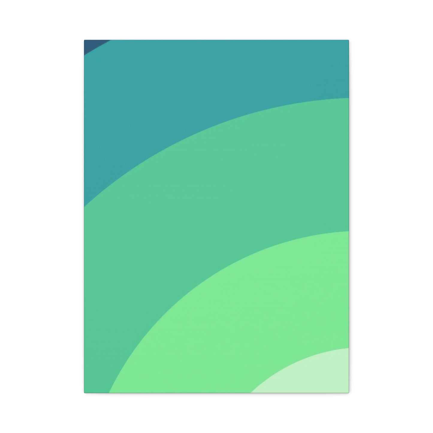
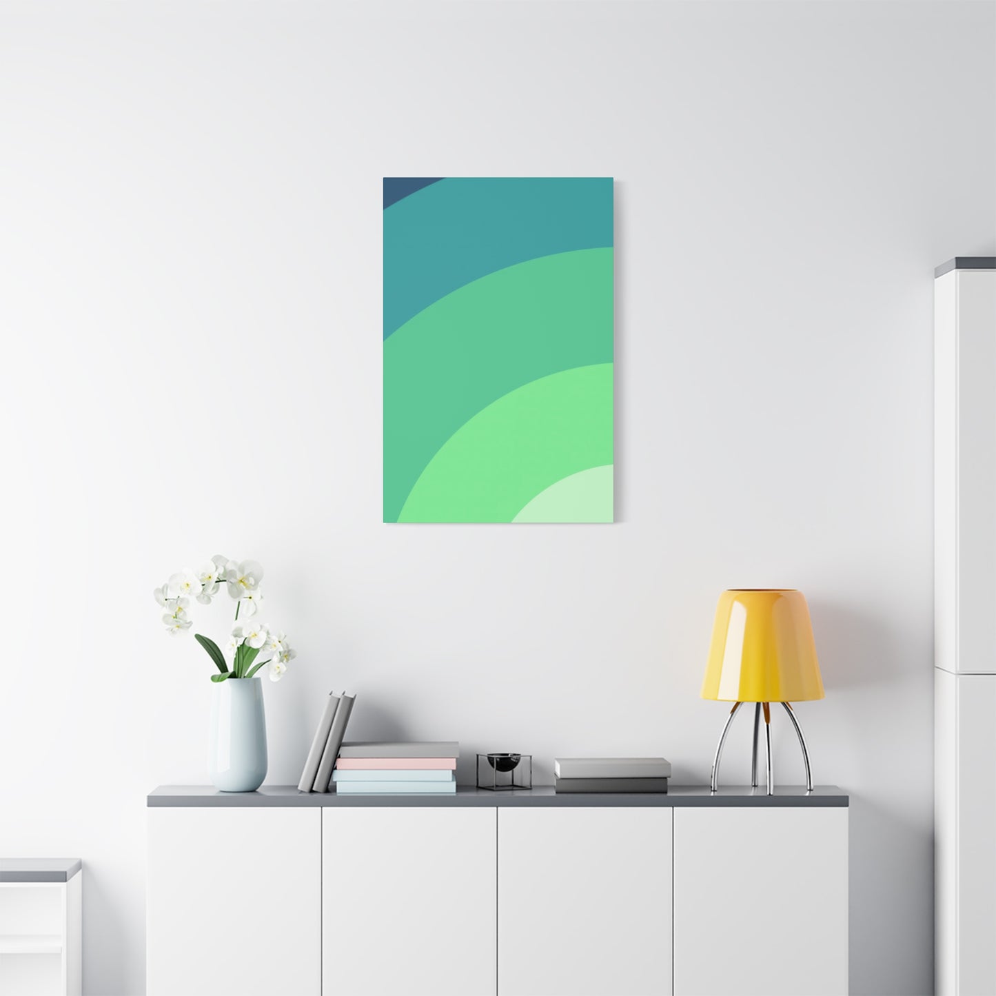
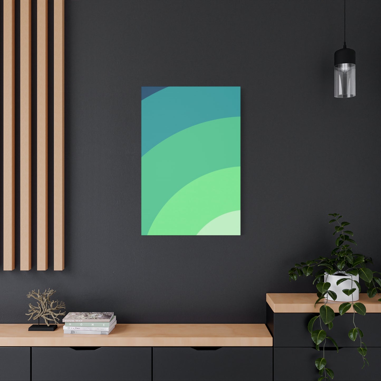
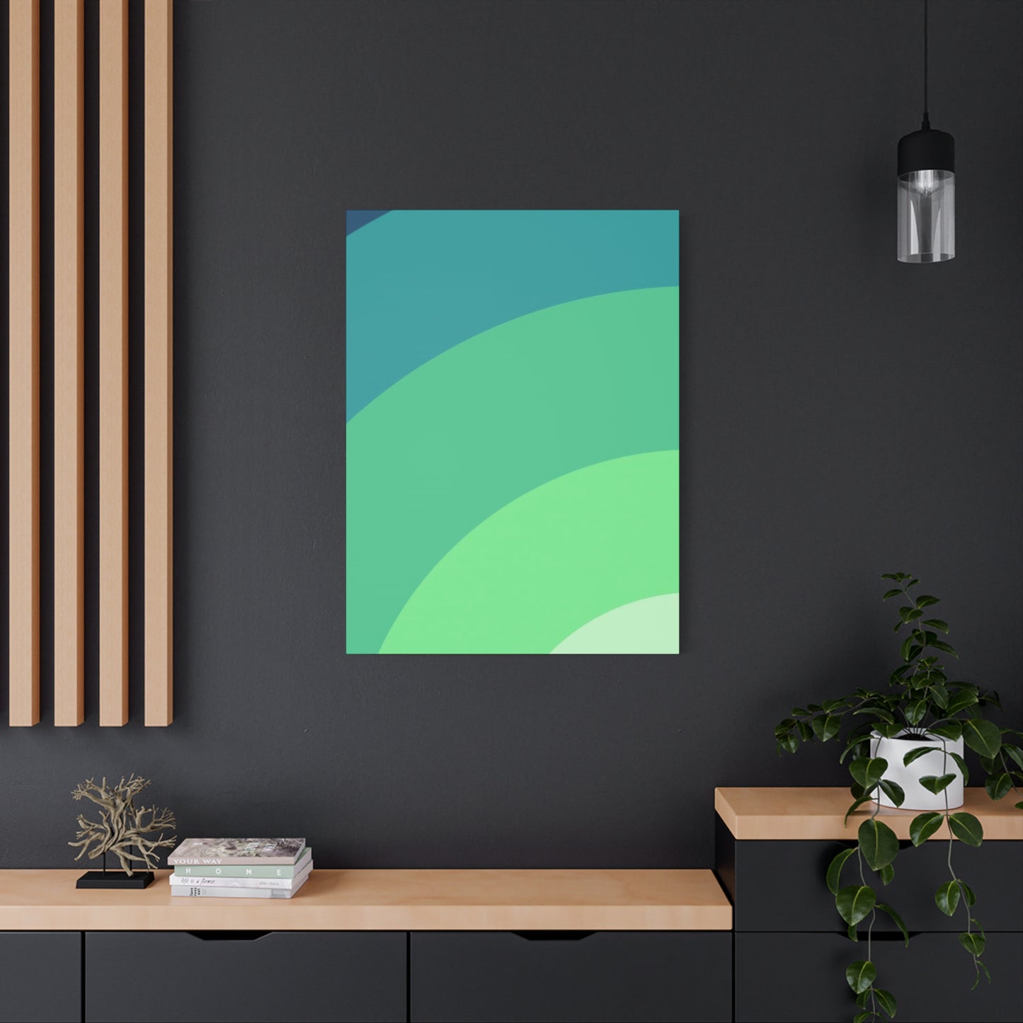
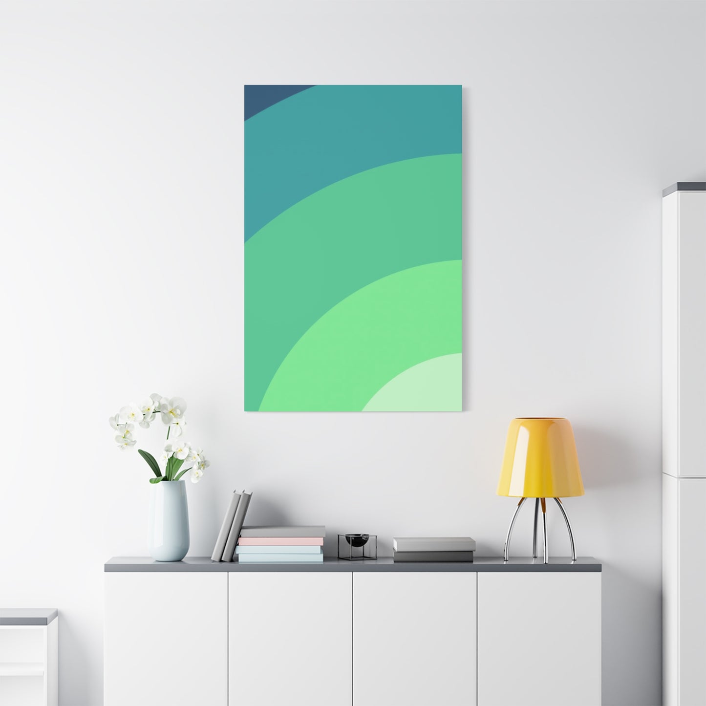
Modern Calm: Cool Green Gradient Wall Art
The concept of modern calm finds its visual expression through the gentle transitions of cool green gradient wall art. This artistic approach combines the psychological benefits of green hues with the dynamic visual interest created by gradual color shifts. Unlike traditional static artworks, gradient pieces introduce movement and depth without overwhelming the senses, making them ideal for contemporary living spaces that prioritize both aesthetic appeal and emotional wellbeing.
Cool green gradients evoke the natural progression of light through a forest canopy, the gentle fade of morning mist over meadows, or the subtle shift in ocean depths. These associations with nature provide an immediate sense of tranquility that busy modern lifestyles desperately need. The beauty of gradient art lies in its ability to be simultaneously simple and complex, offering visual interest that reveals itself gradually rather than demanding immediate attention.
When selecting gradient wall art for modern spaces, consider how the color transitions align with your existing design elements. Cooler greens with blue undertones work exceptionally well in minimalist settings, complementing neutral palettes of white, gray, and natural wood tones. The gradient effect creates a focal point that draws the eye without disrupting the clean lines and uncluttered aesthetic that define modern design.
The versatility of cool green gradient art allows it to function across various room types and purposes. In living areas, larger gradient pieces can anchor seating arrangements and establish the overall mood of the space. Bedrooms benefit from the calming influence of green transitions, particularly when placed opposite the bed to provide a peaceful view upon waking. Home offices gain focus and reduced eye strain from the presence of green tones, which studies have shown can enhance concentration and reduce mental fatigue.
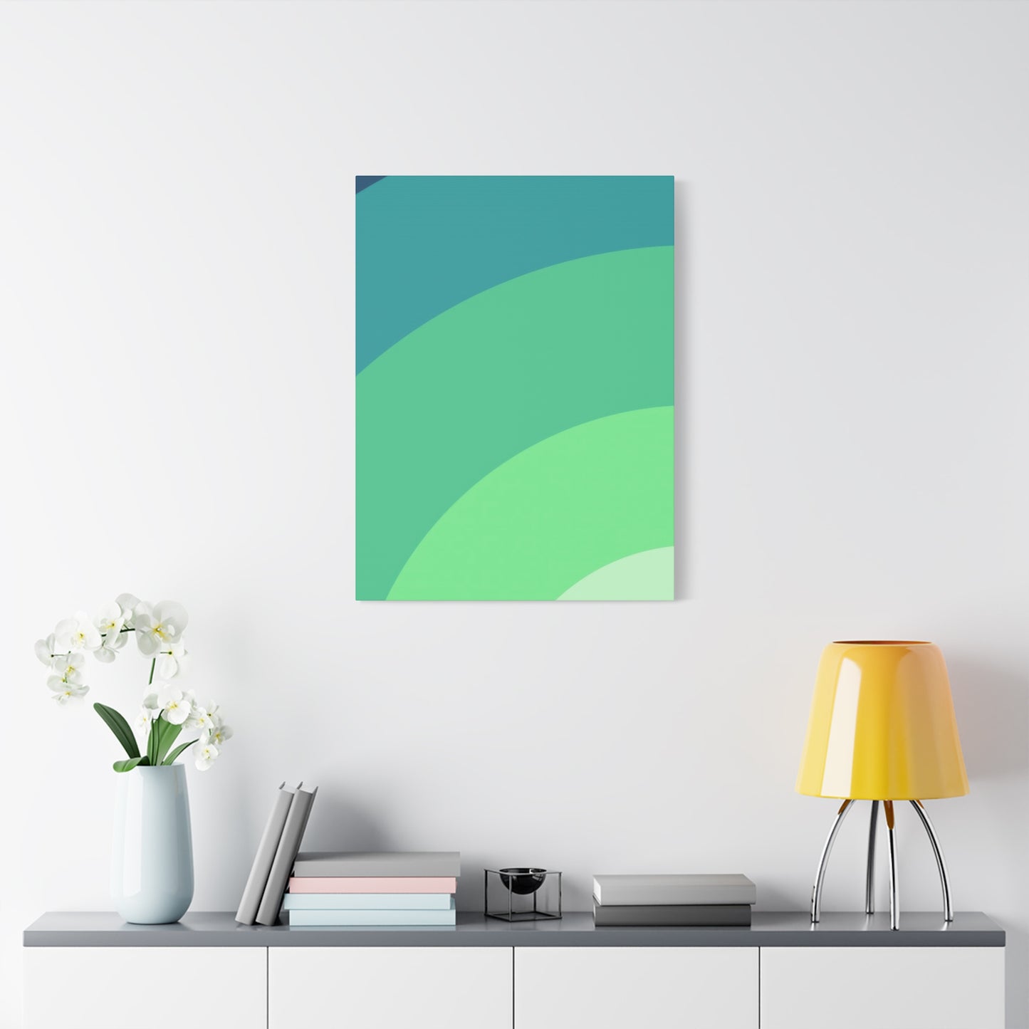
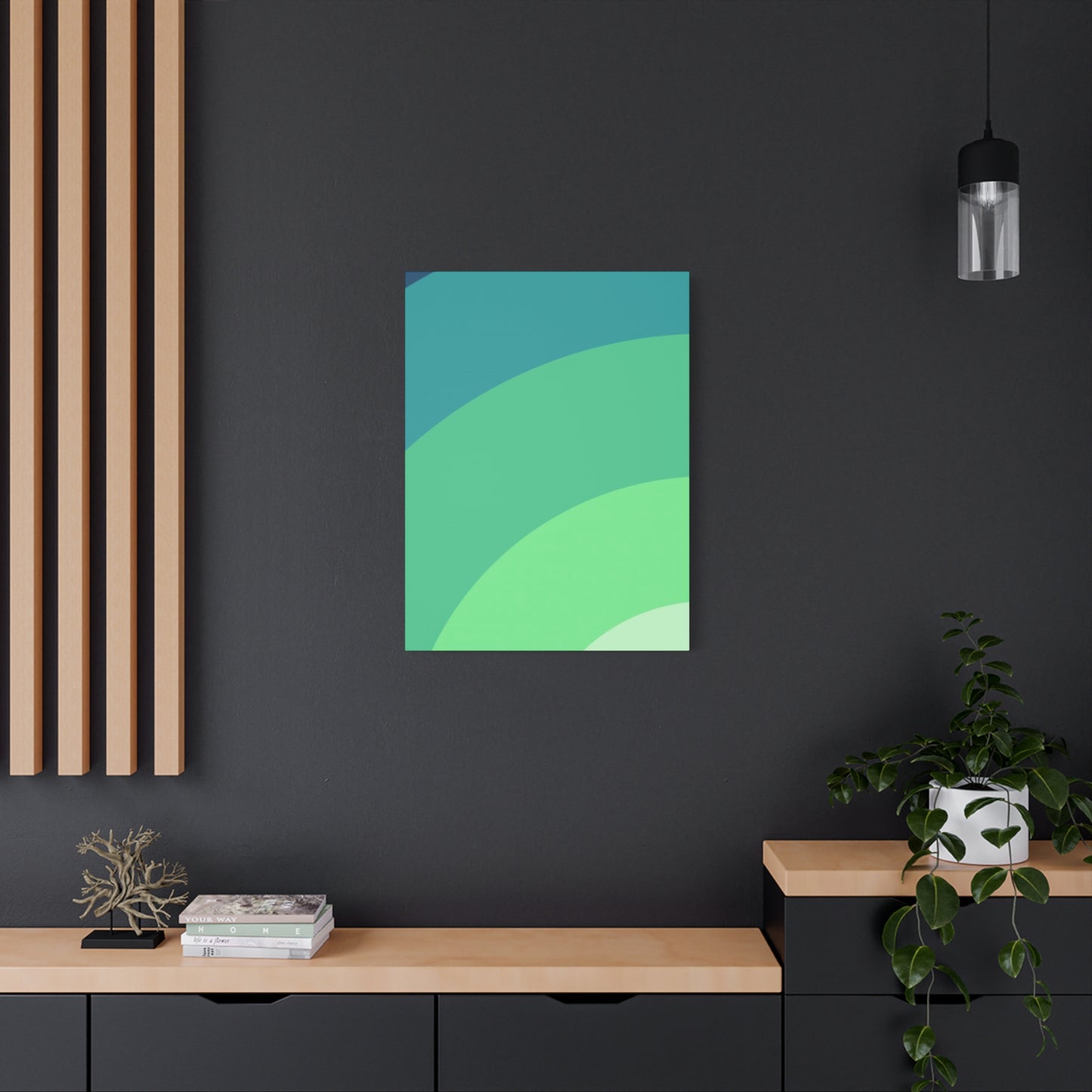
Installation considerations play a crucial role in maximizing the impact of gradient wall art. Proper lighting reveals the full spectrum of color transitions, with natural light sources creating dynamic interactions throughout the day. Artificial lighting should be positioned to avoid glare while highlighting the subtle shifts in tone that make gradient art so compelling. The size and placement of the artwork should respect the architectural features of the room, with larger pieces working best on prominent walls and smaller gradient prints creating cohesive gallery arrangements.
Serenity in Shades: The Beauty of Green Gradients
The beauty of green gradients lies in their remarkable ability to create serenity through the artful arrangement of related hues. Each shade of green carries its own psychological weight and aesthetic character, and when these shades blend seamlessly into one another, they produce a visual experience that soothes the mind while engaging the eye. This section explores how different green tones work together to create harmonious gradients that bring peace and beauty to interior spaces.
Understanding the spectrum of green shades available in gradient art helps in making informed selection decisions. Light sage greens at one end of the spectrum provide an airy, ethereal quality that opens up smaller spaces and reflects natural light beautifully. As the gradient progresses through mid-tone greens, associations with living foliage and thriving nature become more pronounced, bringing vitality without aggression into the environment. Deeper forest greens anchor the gradient, providing visual weight and grounding that prevents the artwork from feeling too ethereal or disconnected from the space.
The technical execution of smooth shade transitions distinguishes exceptional gradient art from mediocre attempts. Professional artists and designers understand color theory deeply enough to create transitions that feel natural rather than forced. The human eye perceives these smooth progressions as pleasing and harmonious, triggering positive emotional responses that contribute to the overall sense of serenity in the space.
Green gradients offer unique advantages over single-tone green artworks or other color schemes. The variation within the piece means it can pick up and complement multiple colors present in the room, creating visual connections that unify the design scheme. A gradient that moves from mint to emerald might echo both the pale green throw pillows on a sofa and the darker green plants placed around the room, tying these elements together in a cohesive visual narrative.
The direction of gradient flow influences the energy and feel of the artwork significantly. Vertical gradients with lighter tones at the top and darker shades at the bottom mimic natural light conditions, feeling stable and grounding. Horizontal gradients can suggest landscapes or horizons, bringing associations with expansive natural vistas into interior spaces. Radial gradients that emanate from a central point create focus and can serve as dynamic focal points in otherwise neutral rooms.
Combining multiple gradient pieces requires careful consideration of how the color progressions interact. Matching gradient directions creates rhythm and movement that guides the eye around the space, while contrasting directions can create interesting tension that energizes a room without sacrificing the calming influence of green tones. The spacing between multiple pieces also matters, with closer arrangements feeling more connected and cohesive while separated pieces maintain their individual integrity.
The cultural and historical associations of green colors enrich the experience of gradient art. Green has symbolized growth, renewal, hope, and prosperity across various cultures and time periods. These positive associations operate at a subconscious level, contributing to the sense of wellbeing that green gradient art provides. Modern interpretations through gradient techniques honor these traditional meanings while presenting them in fresh, contemporary formats.
Minimalist Style with Cool Green Wall Art
Minimalist design philosophy finds a perfect partner in cool green wall art, where the essential principles of simplicity, functionality, and purposeful aesthetics align beautifully. The minimalist approach strips away unnecessary elements to reveal the essence of beauty and purpose, and when combined with the organic appeal of green tones, creates spaces that feel both refined and inviting, sophisticated yet approachable.
The relationship between minimalism and green wall art operates on multiple levels. Visually, the clean lines and uncluttered surfaces characteristic of minimalist spaces provide the perfect backdrop for green artwork to make its full impact. Without competing elements demanding attention, a well-chosen green piece becomes a focal point that commands appreciation without overwhelming the senses. The natural associations of green colors soften the sometimes austere quality of strict minimalism, introducing warmth and life into spaces that might otherwise feel cold or impersonal.
Selecting cool green wall art for minimalist interiors requires careful consideration of both the artwork itself and its relationship to the surrounding space. Single large-scale pieces often work better than multiple smaller artworks, maintaining the uncluttered aesthetic while providing adequate visual weight. The artwork should contain enough interest to reward contemplation without being so complex that it contradicts minimalist principles of simplicity and clarity.
The color palette of minimalist spaces typically centers on neutrals, making cool green wall art an excellent choice for introducing controlled color without disrupting the overall scheme. Greens with gray or blue undertones integrate seamlessly with the whites, grays, and blacks common in minimalist design. The organic quality of green prevents it from feeling harsh or artificial, even when presented in very modern or abstract forms.
Frame selection for minimalist green wall art follows the same principles of simplicity and purpose that govern the overall design approach. Thin frames in matte black or natural wood maintain focus on the artwork itself without adding visual clutter. Frameless canvas wraps offer an alternative that feels even more streamlined, with the artwork extending around the edges for a floating effect that enhances the minimalist aesthetic.
The placement of green wall art in minimalist spaces follows strict principles of balance and proportion. Centering artwork on walls or positioning it according to mathematical proportions creates the sense of order that minimalism prizes. The negative space surrounding the artwork becomes as important as the piece itself, with generous margins preventing any feeling of crowding or clutter.
Lighting design in minimalist spaces must account for the presence of green wall art without compromising the clean lines and hidden infrastructure that characterize the style. Recessed lighting provides illumination without visible fixtures, while track lighting can be positioned to highlight artwork when concealment proves impractical. Natural light sources should be maximized and controlled with simple window treatments that maintain the uncluttered aesthetic.
The Art of Transition: Gradient Green Canvas Prints
The art of creating seamless color transitions defines the technical and aesthetic success of gradient green canvas prints. This specialized form of wall art requires both artistic vision and technical precision to produce results that appear effortless while actually demanding considerable skill and attention to detail. Understanding the artistry behind gradient creation enhances appreciation for these pieces and guides better selection decisions.
Color theory forms the foundation of successful gradient art. Artists working with green gradients must understand how different green pigments interact, how light affects perceived color, and how human vision processes transitions between related hues. The most effective gradients move through colors that share underlying pigments, creating harmony that the eye recognizes as natural and pleasing. Transitions that skip too many steps on the color wheel or combine incompatible undertones can feel jarring or artificial despite technically being gradients.
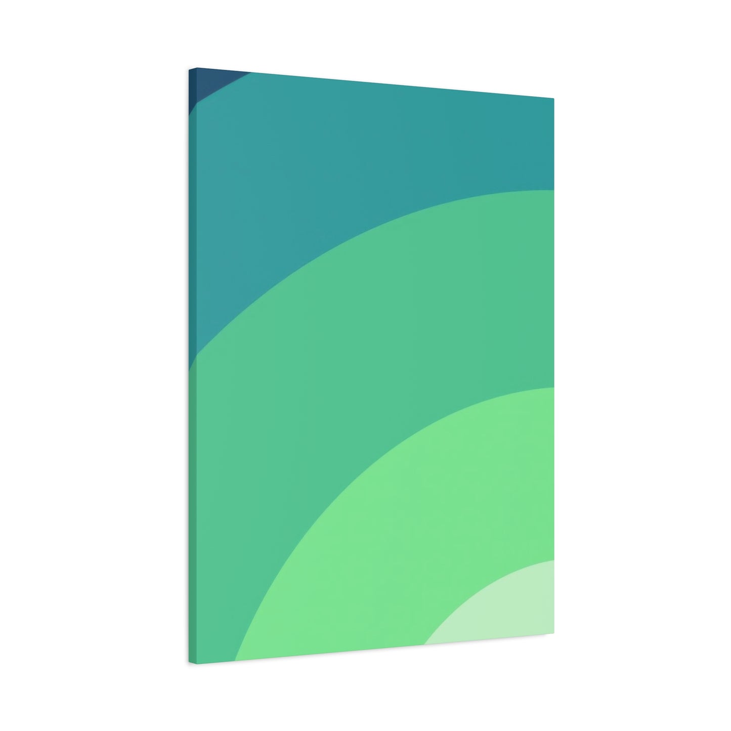
The technical process of creating gradient canvas prints has evolved significantly with digital technologies. High-resolution digital files allow for thousands of subtle color variations that produce incredibly smooth transitions impossible with traditional painting techniques. Multiple layers of ink or pigment build up gradually to create depth and richness that single-pass printing cannot achieve. The canvas material itself contributes to the final appearance, with texture and weave affecting how colors appear and how light interacts with the surface.
Print quality standards separate exceptional gradient canvas prints from inferior products. Resolution measured in dots per inch determines whether color transitions appear smooth or show visible banding. Color accuracy ensures that the greens in the final print match the artist's intention and promotional images. Consistency across multiple prints allows for matched sets or replacements if needed. These technical specifications may seem mundane but they fundamentally determine whether a gradient print succeeds or fails as artwork.
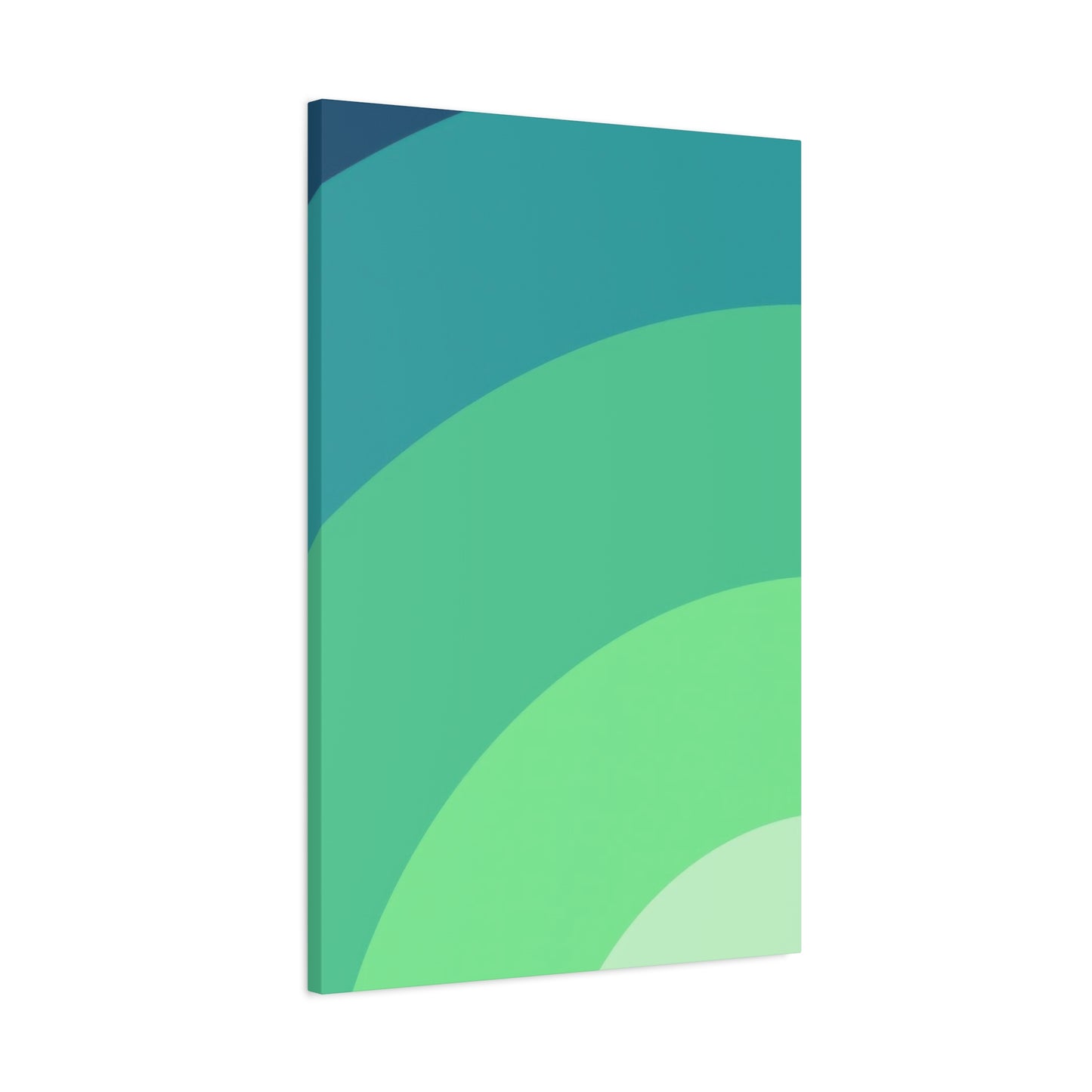
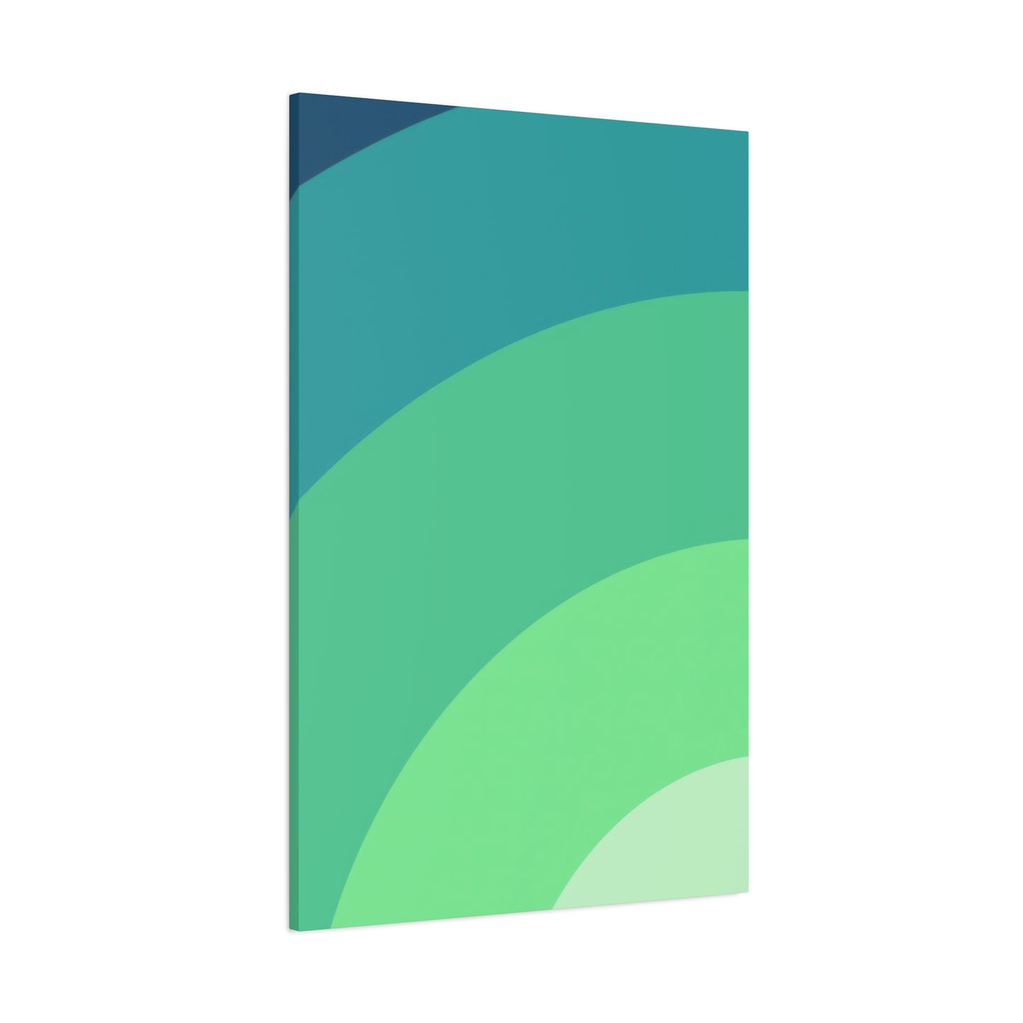
The canvas material selection influences both appearance and longevity of gradient prints. Cotton canvas provides a traditional art feel with visible texture that adds character, while polyester canvas offers superior durability and color retention for pieces exposed to ambient light. Blended materials attempt to capture advantages of both, though with varying success depending on the quality of manufacturing. The weight and tightness of the canvas weave also matter, with heavier, tighter weaves providing better print surfaces and longer lifespans.
Stretching and mounting techniques affect how gradient canvas prints present on walls. Gallery wrap construction extends the image around the sides of the frame for a modern, frameless look that works well with gradient art by eliminating visual breaks at the edges. Traditional mounting with visible sides requires either neutral edges or continuation of the gradient pattern, each choice creating different visual effects. The depth of the stretcher bars contributes to the three-dimensional presence of the artwork, with deeper profiles creating more dramatic shadow lines and greater visual weight.
The size considerations for gradient canvas prints go beyond simple measurements to encompass viewing distance and impact. Larger gradients can show more subtle color variations and create immersive experiences, particularly when the transition moves across several feet of canvas. Smaller prints must compress the gradient transition, which can actually enhance the dramatic quality of bold gradients but may lose the subtlety of delicate transitions. The viewing distance from typical positions in the room should inform size selection.
Soothing Interiors with Green Gradient Tones
The application of green gradient tones specifically for their soothing psychological effects represents a deliberate design strategy that goes beyond simple decoration. Understanding how these color progressions affect mood, perception, and behavior allows for intentional creation of interior environments that support wellbeing and emotional balance. This approach treats wall art not merely as visual enhancement but as a functional element of interior design that serves psychological and physiological purposes.
The science behind color psychology explains why green gradient tones produce soothing effects. Green occupies the center of the visible light spectrum, requiring no adjustment by the human eye and therefore causing no strain during prolonged viewing. This makes green the most restful color for human vision. The gradual transitions in gradient art prevent the eye from having to make sharp adjustments, further reducing visual stress and promoting relaxation. These physiological factors combine with cultural associations of green with nature, growth, and safety to create powerful calming effects.
Different spaces within a home or workplace benefit from green gradient tones in specific ways. Bedrooms become sanctuaries of rest when green gradients create peaceful atmospheres conducive to sleep and relaxation. The absence of stimulating warm colors or harsh contrasts allows the mind to settle, while the subtle visual interest of gradients prevents the space from feeling bland or boring. Living rooms gain versatility from green gradients that feel both welcoming for social interaction and calming for quiet evening relaxation.
Home offices and study spaces benefit particularly from the focusing properties of green tones. Research has demonstrated that green environments improve concentration and reduce mental fatigue, making green gradient art a functional choice for workspaces rather than merely decorative. The gradient quality adds visual interest that provides momentary rest for eyes strained from screen work, while the overall green presence maintains a productive atmosphere free from the drowsiness that some blue tones can induce or the agitation that warmer colors might trigger.
Healthcare and wellness environments increasingly incorporate green gradient tones based on evidence of their therapeutic effects. Waiting rooms become less stressful when decorated with calming green progressions. Treatment rooms gain a sense of peace that helps patients relax. Recovery areas benefit from the hopeful, growth-oriented associations of green colors. These applications extend beyond residential interiors to demonstrate the universal human response to well-executed green gradient designs.
Nature-Inspired Hues: Cool Green Gradient Décor
Drawing inspiration from the natural world, cool green gradient décor captures the essence of forests, meadows, and waterways while translating these organic experiences into forms suitable for interior spaces. This approach to decorating recognizes that human wellbeing depends partly on maintaining connections to nature, even in urban or indoor environments where direct natural contact may be limited. Green gradient artwork serves as a bridge between the built environment and the natural world.
The specific natural phenomena that inspire cool green gradients offer rich variety in aesthetic character and emotional tone. Morning mist rising from forest floors creates inspiration for gradients that move from deep earthy greens upward into pale, almost white-green tones. This vertical progression evokes the freshness of new days and the mysterious beauty of fog-wrapped woodlands. Ocean depths provide another gradient source, with surface greens gradually darkening into the blue-greens of deeper water, suggesting vastness, calm, and the allure of the unknown.
Plant life offers endless gradient inspiration, from the new pale green of spring growth through the rich mid-tones of summer foliage to the deeper, dustier greens of late season vegetation. Capturing these seasonal progressions in gradient art brings the cycles of nature indoors, providing visual connections to growth and renewal throughout the year. Some gradient pieces attempt to capture the dappled light effect of sun through leaves, creating complex layered gradients that mimic the interplay of light and shadow in forest canopies.
The geological sources of green tones add an earthy, mineral quality to some gradient designs. Green marble with its veined transitions, jade with its variations in translucency and color depth, and even oxidized copper all provide inspiration for gradients that feel substantial and permanent rather than ephemeral. These stone-inspired gradients suit interiors that emphasize natural materials and earthy palettes.
Climate and weather patterns inspire gradients that capture atmospheric effects. The green-gray of storm skies, the fresh green clarity following rain, and the hazy green-gold of humid summer afternoons all translate into specific gradient color progressions. These weather-inspired pieces can evoke particular moods and memories, creating personal connections that enhance their decorative value.
Regional vegetation influences gradient color selection and progression. The silvery greens of Mediterranean olive groves create different gradients than the rich emeralds of tropical rainforests or the blue-tinged greens of northern coniferous forests. Choosing gradients that echo the local natural environment creates harmony between interior and exterior spaces, while selecting gradients from distant ecosystems can bring exotic touches and travel memories into home décor.
Abstract Simplicity: Gradient Art for Modern Spaces
Abstract gradient art distills visual experience down to essential elements of color, transition, and form, creating sophisticated pieces perfect for modern spaces that value conceptual depth alongside aesthetic appeal. This artistic approach abandons representational content in favor of pure visual relationships, allowing viewers to project their own interpretations and emotional responses onto works that resist fixed meanings. The simplicity of form belies the complexity of effect that well-executed abstract gradients achieve.
The philosophical foundations of abstract art inform understanding and appreciation of gradient pieces. Abstract art privileges the visual experience itself over any narrative or representational content, asking viewers to engage with color, form, and composition as subjects in themselves rather than as means to depict other subjects. Gradient art embraces this philosophy by making the transition between colors the entire content of the work, elevating what might be a background element in representational art to the status of subject.
The formal qualities that make abstract gradient art successful include balance, proportion, color harmony, and visual rhythm. Balance in gradient art often manifests as symmetrical transitions or carefully calibrated asymmetry that creates dynamic tension. Proportion refers to the relationships between different sections of the gradient and the overall dimensions of the piece. Color harmony determines whether transitions feel natural or jarring, unified or disjointed. Visual rhythm emerges from the pace of color transitions, with rapid shifts creating energy and slow progressions fostering calm.
The versatility of abstract gradient art allows it to function in diverse modern interiors from residential to commercial. In homes, abstract gradients provide sophisticated focal points that don't impose specific themes or narratives on rooms, maintaining decorating flexibility as other elements change over time. In commercial spaces like offices, hotels, or restaurants, abstract gradient art offers visual interest that appeals broadly without alienating subsets of viewers who might react negatively to specific representational content.
The scale of abstract gradient art affects its impact and appropriate applications significantly. Monumental gradient pieces create immersive experiences that can anchor entire rooms or lobbies, functioning almost as architectural elements rather than mere decoration. Medium-scale works provide substantial visual weight without overwhelming spaces, suitable for living rooms or conference rooms. Smaller gradient pieces work in intimate spaces or as parts of larger gallery wall arrangements.
Refreshing Walls with Subtle Green Transitions
The refreshing quality of subtle green transitions lies in their ability to enliven spaces without overwhelming them, providing visual interest and color without dominating rooms or demanding constant attention. This section explores how carefully calibrated green gradients create freshness and vitality in interior environments, examining both the aesthetic principles and practical applications that make subtle transitions particularly effective.
Subtlety in gradient design requires restraint and refinement, characteristics that separate sophisticated artwork from obvious or crude attempts. Subtle green transitions limit the range between lightest and darkest tones, creating gentle progressions that reveal themselves gradually rather than announcing themselves immediately. This understated approach suits spaces where art should contribute to overall ambiance rather than serve as a dramatic focal point.
The psychological effects of subtle green transitions differ from those of bold, high-contrast gradients. While dramatic gradients energize and stimulate, subtle versions soothe and refresh without agitation. The barely perceptible shifts in tone engage attention at a subconscious level, creating interest without distraction. This makes subtle gradient art particularly valuable in spaces requiring concentration, such as offices or studies, or in relaxation areas like bedrooms where stimulation proves counterproductive.
The technical challenges of creating truly subtle gradients exceed those of more dramatic versions. Small variations in color must be precisely controlled to maintain consistency and smoothness. Print quality becomes even more critical when subtle tonal shifts can be lost to inferior resolution or color accuracy. The canvas or print surface itself affects how subtle transitions appear, with texture either enhancing or obscuring delicate color progressions.
The lighting requirements for subtle green gradient art demand careful consideration. Insufficient light renders subtle transitions invisible, reducing the artwork to flat single-tone appearance. Excessive or harsh lighting can wash out delicate variations, similarly defeating the purpose of gradient design. Optimal lighting conditions involve moderate, diffused illumination that reveals the full range of tonal variations without creating glare or harsh shadows.
The placement of subtle gradient art influences how effectively it refreshes spaces. Positioning pieces where natural light strikes them throughout the day creates changing appearances as light quality and intensity vary. Morning light might emphasize certain tones while afternoon sun highlights others, keeping the artwork dynamic and interesting. Placement at eye level or slightly above ensures the gradient remains visible and engaging rather than overlooked.
The Modern Appeal of Gradient Wall Art
Gradient wall art has captured modern design imagination through its unique combination of visual impact, emotional resonance, and contemporary aesthetic character. Understanding the specific qualities that make gradient art particularly appealing to modern sensibilities helps explain its proliferation in residential, commercial, and institutional settings worldwide. This section examines the intersection of gradient art and modern design principles, exploring why these forms resonate so strongly with contemporary audiences.
The clean geometric structure of gradient art aligns perfectly with modern design's emphasis on clear forms and purposeful composition. Unlike busy patterns or complex imagery, gradients present simple vertical, horizontal, or radial organizations that read clearly from any distance. This clarity satisfies modern preferences for uncluttered visual environments while still providing interest and beauty that prevents spaces from feeling sterile or cold.
The technological origins of contemporary gradient art reflect modern comfort with digital tools and processes. High-quality gradient prints would be impossible without digital design software and precision printing technology, making them products of the same technological sophistication that characterizes modern life generally. This technological provenance gives gradient art a contemporary identity that traditional painting techniques cannot match.
The color consciousness of modern design finds perfect expression in gradient art, where color relationships become the entire subject matter. Modern interiors often build around carefully curated color palettes, and gradient art either anchors these schemes or provides carefully considered accents. The ability to specify exact gradient colors and transitions allows for unprecedented control in coordinating artwork with overall design concepts.
The flexibility of gradient art across various scales and applications appeals to modern design's multifunctional approach to spaces. Large gradient pieces function as architectural elements that define zones within open floor plans. Medium pieces provide focal points in more traditional room configurations. Small gradients can be grouped in grid arrangements for customizable gallery walls. This scalability makes gradient art suitable for everything from compact urban apartments to sprawling suburban homes.
The emotional accessibility of gradient art resonates with modern desires for beauty that feels inclusive rather than exclusive. Unlike some contemporary art that requires theoretical knowledge to appreciate, gradients offer immediate visual pleasure to anyone with functioning color vision. This democratic appeal makes gradient art appropriate for diverse populations and public spaces where accessibility matters.
Cool Green Canvas Prints for Peaceful Homes
Creating peaceful home environments through thoughtful design choices has become increasingly important as daily life grows more hectic and demanding. Cool green canvas prints serve this goal exceptionally well, bringing specific qualities that foster tranquility, reduce stress, and enhance the sense of home as sanctuary. This section examines how green canvas art contributes to peaceful atmospheres and provides guidance for selecting and displaying pieces that maximize calming effects.
The canvas medium itself contributes to peaceful aesthetics through its traditional art associations and textured surface quality. Unlike glossy prints or smooth acrylic that can feel contemporary or even clinical, canvas provides warmth and approachability that helps spaces feel like homes rather than showrooms. The slight texture catches and diffuses light gently, adding visual interest without the harshness that reflective surfaces can create.
The color psychology of cool greens specifically supports peaceful environments through multiple mechanisms. Green's position in the middle of the visible spectrum means the human eye processes it without strain, preventing the fatigue that prolonged exposure to more extreme colors can cause. Cool greens specifically, those with blue or gray undertones, lack the stimulating qualities of warm yellows or reds, keeping energy levels moderate rather than elevating them.
The size selection of canvas prints for peaceful homes should prioritize appropriate scale rather than maximum impact. Pieces that fit comfortably within their allotted walls without crowding create serene proportions that support peacefulness. Oversized art can feel dominating or overwhelming in smaller rooms, while undersized pieces can feel tentative or lost. Achieving the right balance ensures artwork contributes to rather than detracts from peaceful atmospheres.
Gradient Harmony: The Flow of Color and Calm
The concept of gradient harmony examines how smooth color transitions create both visual unity and psychological calm through the careful orchestration of related hues. Understanding the principles that govern harmonious gradients enables better selection and appreciation of artwork that achieves these effects successfully. This section explores the relationship between color flow and emotional response, examining why certain gradient combinations feel particularly harmonious while others create tension or discord.
The technical definition of harmony in gradient art involves transitions through colors that share underlying pigments or occupy adjacent positions on the color wheel. Harmonious green gradients might progress from yellow-green through pure green to blue-green, each step sharing components with its neighbors. This creates smooth visual flow that the eye follows comfortably without jarring jumps or unexpected shifts. The brain processes these smooth transitions as orderly and therefore safe, triggering calm responses rather than alertness or anxiety.
The pace of color transitions within gradients significantly affects their harmonious quality. Gradual transitions that allow substantial space for each color stage create leisurely visual journeys that feel meditative and calm. Rapid transitions that compress many color changes into limited space create energy and movement that can be exciting but may sacrifice some harmonious quality. Matching transition pace to intended effect ensures gradients achieve their design goals.
The contrast range within harmonious gradients requires careful calibration. Excessive contrast between gradient endpoints creates tension that can overwhelm the harmonious flow of intermediate transitions. Insufficient contrast results in gradients that appear flat or dull, lacking the visual interest that makes them worth displaying. Finding the optimal contrast level that maintains harmony while providing adequate interest distinguishes exceptional gradient art from mediocre attempts.
Tranquil Energy: Green Gradients in Contemporary Design
The concept of tranquil energy might seem paradoxical, but it perfectly describes what well-executed green gradients bring to contemporary design. These pieces provide visual interest and dynamic qualities that prevent spaces from feeling static or lifeless while maintaining the calm atmospheres that modern living demands. This section examines how green gradient art achieves this balance and explores its role in contemporary design across various applications and contexts.
Contemporary design's embrace of green gradients reflects broader cultural movements toward wellness, sustainability, and biophilic principles. Modern spaces increasingly prioritize occupant wellbeing alongside aesthetic concerns, recognizing that beautiful environments should also support health and happiness. Green gradients serve these multiple goals simultaneously, providing beauty, nature connection, and psychological benefits within single design elements.
The energy component of tranquil energy comes from the visual movement created by color transitions. Unlike static single-color fields that can feel inert, gradients guide the eye through progressive changes that create subtle dynamism. This movement engages attention without demanding it, providing interest that rewards contemplation without creating restlessness or agitation. The result is spaces that feel alive and engaging yet remain fundamentally calm.
The contemporary aesthetic character of green gradients aligns with current design movements including modern organic, Japandi, and new minimalism. These styles blend clean contemporary lines with natural elements, creating sophisticated spaces that feel both current and timeless. Green gradients fit perfectly within this aesthetic territory, offering contemporary execution of nature-inspired content that satisfies both modern and organic design imperatives.
The commercial applications of green gradient art in contemporary design span hospitality, healthcare, corporate, and retail environments. Hotels use green gradients to create memorable, calming atmospheres that enhance guest experiences and encourage positive reviews. Medical facilities employ them to reduce anxiety and promote healing environments supported by research into therapeutic design. Offices incorporate green gradients to balance productivity demands with employee wellbeing concerns. Retail spaces use them to create distinctive brand environments that feel current and appealing.
The residential applications of green gradients in contemporary homes reflect similar priorities around creating environments that support modern lifestyles. Open floor plans benefit from green gradient art that helps define zones without physical barriers. Multipurpose spaces gain flexibility from artwork that suits various functions from work to relaxation. Small urban dwellings maximize their connection to nature through green gradient art when outdoor space is limited or nonexistent.
Create Depth with Cool Green Gradient Wall Art
Creating visual depth through cool green gradient wall art transforms flat surfaces into dynamic features that add architectural interest and spatial complexity to interiors. Understanding the mechanisms through which gradients create depth effects enables strategic selection and placement of artwork that maximizes this quality. This section explores both the perceptual principles underlying depth creation and the practical applications that make gradient art particularly effective for adding dimension to spaces.
The perceptual basis for depth creation through gradients relies on atmospheric perspective, a phenomenon where distant objects appear lighter and less saturated than near objects due to atmospheric interference. Green gradients that move from darker, more saturated tones to lighter, grayer tones mimic this natural effect, triggering depth perception even though the artwork surface remains physically flat. The brain interprets the color progression as spatial recession, creating the illusion of three-dimensional space.
The direction of gradient progression affects the type of depth created. Vertical gradients with darker tones at the bottom and lighter tones at the top suggest infinite upward extension, making rooms feel taller. Horizontal gradients with darker edges and lighter centers can make walls feel like they recede or contain windows into distant landscapes. Radial gradients create depth that appears to recede into or emanate from central points, offering yet another spatial effect.
The contrast intensity within gradients determines the strength of depth effects they create. High-contrast gradients with dramatic shifts from very dark to very light greens create powerful depth illusions that can significantly alter perceptions of room dimensions. Low-contrast gradients produce subtle depth effects that add interest without dramatically changing spatial perceptions. Matching contrast levels to room size and desired effects ensures optimal results.
The interaction between gradient art and room lighting amplifies depth effects when coordinated properly. Lighting that emphasizes the lighter portions of gradients while allowing darker sections to recede enhances the depth illusion. Multiple light sources at various positions create complex interactions with gradient art that reveal different depth aspects throughout the day. Considering lighting design alongside art selection maximizes the three-dimensional effects gradients can provide.
The placement of gradient art relative to other room elements influences depth creation significantly. Positioning gradient pieces on walls opposite major seating areas ensures occupants benefit from depth effects during typical room use. Installing gradients behind furniture groupings creates background depth that makes foreground elements appear more defined and substantial. Using gradients in alcoves or recesses can make these architectural features appear deeper or more prominent.
Modern Elegance: Soft Green Blends for Stylish Spaces
Modern elegance finds perfect expression in soft green blends that combine sophistication with approachability, creating stylish spaces that feel both current and comfortable. This aesthetic achieves the delicate balance between impressive design and livable comfort that characterizes the most successful contemporary interiors. This section examines how soft green gradient art contributes to elegantly styled spaces and provides guidance for achieving this refined look.
The definition of modern elegance in interior design encompasses clean lines, quality materials, restrained ornamentation, and confident use of color and form. Unlike traditional elegance that might emphasize ornate details and formal symmetry, modern elegance achieves sophistication through simplicity and careful editing. Soft green blends serve this aesthetic perfectly, providing visual interest through color relationships rather than busy patterns or complex imagery.
The color characteristics of soft green blends distinguish them from bolder green presentations. Softness in color refers to reduced saturation, suggesting greens that have been mellowed with gray or white rather than presenting as pure intense hues. These softened tones feel refined and subtle rather than bold or aggressive, creating the understated sophistication that modern elegance prizes. The blending quality suggests smooth transitions rather than hard edges, maintaining the fluid grace that elegant spaces require.
The material selections that complement soft green blends include natural fibers, quality woods, marble, and metals with brushed or matte finishes. These materials share the refined, subtle quality of soft green artwork, creating coherent design statements where every element supports overall elegance. Avoiding cheap materials or overly shiny finishes maintains the sophisticated character that soft green blends establish and deserve.
The furniture styles that pair best with soft green gradient art in elegant spaces feature clean profiles, quality construction, and thoughtful proportions. Mid-century modern pieces bring sculptural quality and design heritage that complements artistic green gradients. Contemporary designs with architectural form provide visual interest that harmonizes with gradient art without competing for attention. Traditional pieces with simplified lines can work when their quality and craftsmanship match the refinement of soft green artwork.
The lighting design in elegantly styled spaces with soft green art should emphasize quality over quantity, with carefully positioned fixtures that provide beautiful illumination without visible clutter. Recessed lighting maintains clean ceilings while highlighting artwork effectively. Sculptural floor or table lamps serve as design objects in their own right while providing task lighting. Natural light should be maximized and controlled with simple, high-quality window treatments that maintain elegant simplicity.
The accessory selections in spaces featuring soft green blends require careful curation to maintain elegant restraint. Each accessory should justify its presence through beauty, function, or personal meaning rather than filling space or following decorating formulas. Quality over quantity guides selection, with fewer excellent pieces creating more elegance than numerous mediocre items. Accessories that echo green tones or complement them through color theory maintain coherence with gradient artwork.
The textile choices in elegant spaces with soft green art should emphasize natural fibers, subtle textures, and sophisticated colors that harmonize with artwork. Linen provides casual elegance appropriate for relaxed modern spaces. Wool offers refined texture and warmth for cooler environments. Cotton in high thread counts delivers smoothness and luxury for bedding. Silk brings sheen and drape for window treatments or accent pillows. These natural textiles share the organic quality of green colors while providing tactile richness that elevates overall elegance.
Abstract Greens: A Study in Calm Transitions
Abstract green artwork that focuses on calm transitions represents a refined subset of gradient art where the emphasis falls primarily on creating tranquil effects through carefully orchestrated color relationships. This approach treats gradient design as a serious artistic pursuit rather than mere decoration, with attention to subtle effects that reward careful viewing and contemplation. This section examines abstract green gradient art from an aesthetic and conceptual perspective, exploring what distinguishes exceptional examples and how they function within interior environments.
The artistic philosophy underlying abstract green studies emphasizes process, perception, and the essential qualities of color itself rather than any representational content. Artists working in this mode view color transitions as worthy subjects for serious exploration, investigating how different greens interact, how transitions affect emotional response, and how subtle variations create visual interest. This conceptual framework elevates gradient art beyond decoration into the realm of fine art worthy of critical attention and appreciation.
The formal analysis of calm transitions examines specific elements including hue progression, value shifts, saturation variations, and edge treatments. Hue progression refers to the path through the color wheel that the gradient follows, with analogous progressions feeling more harmonious than complementary ones. Value shifts describe changes in lightness and darkness, with dramatic value ranges creating more dynamic effects than subtle shifts. Saturation variations affect color intensity, with shifts from muted to bright greens creating different effects than consistent saturation throughout. Edge treatments determine whether transitions feel hard or soft, precise or diffuse.
The viewing experience of abstract green transition studies differs from more dramatic or representational art. These pieces reward sustained attention, revealing subtleties that quick glances might miss. The meditative quality of studying color transitions creates contemplative experiences that provide respite from the rapid pace of modern life. This slow-art quality makes abstract green studies particularly valuable in spaces dedicated to relaxation, meditation, or focused work requiring concentration.
Earthy Modernism: Gradient Wall Art for Balanced Interiors
Earthy modernism represents a design approach that balances the clean sophistication of contemporary style with the organic warmth of natural elements and earth-inspired colors. Gradient wall art fits perfectly within this aesthetic, particularly when featuring greens that reference natural landscapes while presenting them through modern gradient techniques. This section explores how gradient art contributes to earthy modern interiors and provides guidance for creating balanced spaces that feel both current and grounded.
The philosophical foundations of earthy modernism recognize that successful contemporary spaces must satisfy not just aesthetic preferences but also deep human needs for nature connection and sensory comfort. Pure minimalism can feel cold or alienating despite its visual appeal, while overly rustic or traditional approaches may feel dated or cluttered. Earthy modernism navigates between these extremes, incorporating natural elements and organic colors within clean contemporary frameworks that feel both sophisticated and humane.
The color strategies for earthy modern spaces typically center on neutral bases of white, gray, beige, or warm wood tones, with accent colors drawn from nature including various greens, earth browns, stone grays, and clay terracottas. Gradient wall art featuring greens serves as a primary accent element that brings nature-inspired color into spaces while maintaining the clean visual lines that modernism requires. The gradient quality provides visual interest without the business of patterns or representational imagery that might disrupt modern simplicity.
The material palette in earthy modern interiors emphasizes natural substances presented in refined contemporary forms. Hardwood flooring or furniture brings organic warmth while clean lines maintain modern character. Stone countertops or tile provides earthy texture and color variation. Natural fiber textiles add softness and tactile interest. Gradient wall art featuring natural green tones complements these materials while introducing color and visual focus that ties various natural elements together.
The architectural features that support earthy modernism include exposed natural materials like wood beams or stone walls, large windows that connect interiors with outdoor environments, and open floor plans that create flowing spaces rather than boxed rooms. Gradient wall art enhances these features by providing natural color that harmonizes with structural materials while adding artistic refinement that prevents spaces from feeling too rustic or unfinished.
The furniture selections for earthy modern spaces featuring gradient art should balance contemporary form with natural materials and comfortable scale. Pieces constructed from solid wood with visible grain bring organic beauty, while upholstered items in natural fabrics provide comfort and softness. Proportions should feel human-scaled rather than oversized or diminutive, creating inviting spaces that encourage relaxation and use. The green gradient artwork provides color accents that furniture can pick up through textiles or accessories.
The lighting approach in earthy modern interiors seeks to maximize natural light while providing layered artificial illumination for evening hours. Large windows often feature minimal treatments that maintain views and light penetration. Artificial lighting includes ambient, task, and accent layers that create flexibility for various activities and moods. Gradient wall art benefits from both natural illumination that changes throughout the day and artificial lighting that maintains visibility during evening hours.
Refresh Your Room with Gradient Wall Prints
Refreshing room aesthetics through gradient wall prints offers an accessible, impactful approach to interior updates that transforms spaces without major renovation or expense. This section provides practical guidance for using gradient artwork to revitalize tired rooms, covering selection, installation, and integration strategies that maximize refreshing effects while maintaining cohesion with existing design elements.
The assessment phase before adding gradient prints involves evaluating current room conditions to identify what needs refreshing and what should be preserved. Dated color schemes, worn furnishings, lack of focal points, or simply boredom with existing aesthetics all signal readiness for refresh. Understanding specific problems guides selection of gradient prints that address issues effectively rather than adding elements that don't resolve underlying concerns.
The color selection for refreshing gradient prints should either complement existing schemes while adding newness, or deliberately contrast to shift overall palettes in desired directions. Complementary gradients that pick up existing colors in new ways feel harmonious while providing fresh perspective. Contrasting gradients introduce entirely new color families that can dramatically alter spatial character, appropriate when more substantial change is desired. Testing potential selections virtually or through samples prevents costly mistakes.
The size determination for refreshing gradient prints follows rules of proportion where artwork scales appropriately to wall dimensions and surrounding furniture. Undersized pieces fail to make sufficient impact for true refresh, while oversized pieces overwhelm spaces designed around different scales. Measuring walls and existing furniture guides appropriate sizing, with general guidelines suggesting artwork width should approximate two-thirds to three-quarters of furniture width when hung above pieces.
The placement strategies for gradient prints affect how successfully they refresh spaces. Focal wall locations where eyes naturally land upon entering rooms maximize impact and establish new visual hierarchies. Positions opposite primary seating ensure artwork remains visible during typical room use rather than being placed where occupants rarely look. Multiple smaller gradient prints can be grouped for cumulative refresh impact, particularly in larger spaces where single pieces might feel insufficient.
The installation techniques for gradient prints include various hanging methods depending on artwork type and wall conditions. Traditional wire hanging works for framed prints with standard hardware. French cleats provide secure mounting for heavy or valuable pieces. Adhesive strips offer damage-free solutions for rentals or temporary installations. Professional installation services ensure perfect placement for those uncomfortable with DIY approaches or working with particularly large or expensive pieces.
Contemporary Zen: Gradient Green Wall Art Ideas
Contemporary Zen aesthetics blend minimalist modern design with traditional Eastern philosophical principles, creating spaces that support meditation, mindfulness, and inner peace while maintaining current sophistication. Gradient green wall art serves this hybrid aesthetic exceptionally well, providing visual calm and nature connection within clean contemporary frameworks. This section explores specific approaches to incorporating gradient green artwork in contemporary Zen interiors.
The philosophical foundations of Zen aesthetics emphasize simplicity, natural beauty, subtlety, and profound tranquility achieved through careful elimination of excess. Contemporary interpretations maintain these principles while adapting to modern life and current design vocabularies. Gradient green artwork fulfills Zen requirements for nature-inspired beauty presented simply, creating focal points for contemplation without busy complexity that disrupts meditative atmospheres.
The color restrictions in Zen-influenced spaces typically limit palettes to natural materials and subtle colors avoiding bright stimulation. Muted greens, warm grays, natural woods, and off-whites dominate, creating cohesive calm that supports rather than disrupts mental peace. Gradient artwork featuring these restricted greens integrates seamlessly while providing enough interest to prevent spaces from feeling barren or cold. The gradual color transitions mirror gradual spiritual development that Zen philosophy emphasizes.
The furniture selections for contemporary Zen spaces emphasize low profiles, clean lines, and natural materials that maintain connection to earth and traditional aesthetics while accepting modern comfort and function. Platform beds, low seating, and minimal storage solutions prevent clutter while providing practical utility. Natural wood showing grain and texture provides visual interest within neutral palettes. Gradient green artwork complements these furniture choices through similar restraint and nature connection.
The spatial organization in Zen-influenced design emphasizes clear flow, defined zones for specific activities, and generous negative space allowing qi or energy to circulate freely. Rooms avoid crowded layouts, instead providing clear pathways and adequate space around each element. Gradient green art occupies prominent positions where it can be viewed during meditation or contemplation, becoming integrated into spiritual practice rather than mere decoration.
The lighting approach in contemporary Zen spaces values natural illumination supplemented by soft artificial sources that never harsh or glaring. Shoji screens, paper lanterns, or rice paper shades diffuse light gently throughout rooms. Candles provide living flame that adds natural element. Gradient green artwork shows differently under various lighting conditions, revealing new subtleties throughout day and encouraging repeated contemplation that deepens appreciation.
Conclusion:
The refined allure of cool green gradient wall art lies in its remarkable ability to transform contemporary interiors into spaces of calm, balance, and understated elegance. By embracing a spectrum of green tones—ranging from soft sage and mint to deep forest and emerald—these artworks capture the tranquility of nature while simultaneously offering a modern, sophisticated aesthetic. Gradients, with their smooth transitions from one hue to another, evoke a sense of flow and movement that resonates with the human eye, creating visual depth, harmony, and an emotional sense of serenity. This combination of color psychology, natural inspiration, and contemporary design principles positions cool green gradient art as an essential tool for interior transformation.
At its core, gradient wall art embodies the balance between subtlety and impact. Unlike rigid, blocky color applications, a gradient invites the viewer’s gaze to move fluidly across the composition, fostering contemplation and relaxation. Cool green tones, associated with growth, renewal, and equilibrium, further enhance this effect, promoting mental clarity and emotional calm. When integrated into contemporary interiors, gradient pieces act as both focal points and atmospheric enhancers. They are versatile enough to complement minimalist spaces, anchor eclectic arrangements, or balance bold furnishings, providing an unobtrusive yet profound influence on the overall mood and perception of a room.
From an interior design perspective, cool green gradient art offers exceptional adaptability. Large-scale canvases can dominate feature walls in living rooms, offices, or bedrooms, creating immersive environments that invite relaxation and focus. Smaller pieces or series of panels can be used to enhance corridors, nooks, or gallery walls, introducing visual continuity and subtle vibrancy without overwhelming the space. The gradient effect enables the artwork to blend seamlessly with neutral palettes while also providing contrast in rooms featuring warmer tones or darker accents. By offering a range of intensity—from soft, ethereal blends to bold, saturated transitions—these artworks cater to diverse aesthetic sensibilities and design intentions.
Beyond its aesthetic appeal, cool green gradient wall art carries profound emotional and psychological significance. Green is widely recognized for its calming and restorative qualities, evoking images of forests, meadows, and natural landscapes. Gradients amplify this effect by creating a visual journey, encouraging viewers to pause, breathe, and immerse themselves in the gentle flow of color. This calming influence makes gradient art ideal for spaces designed for mindfulness, creativity, and rejuvenation, such as home offices, meditation areas, or bedrooms. The combination of natural inspiration and abstract expression fosters a sense of connection to the broader environment, reinforcing both comfort and sophistication.
