


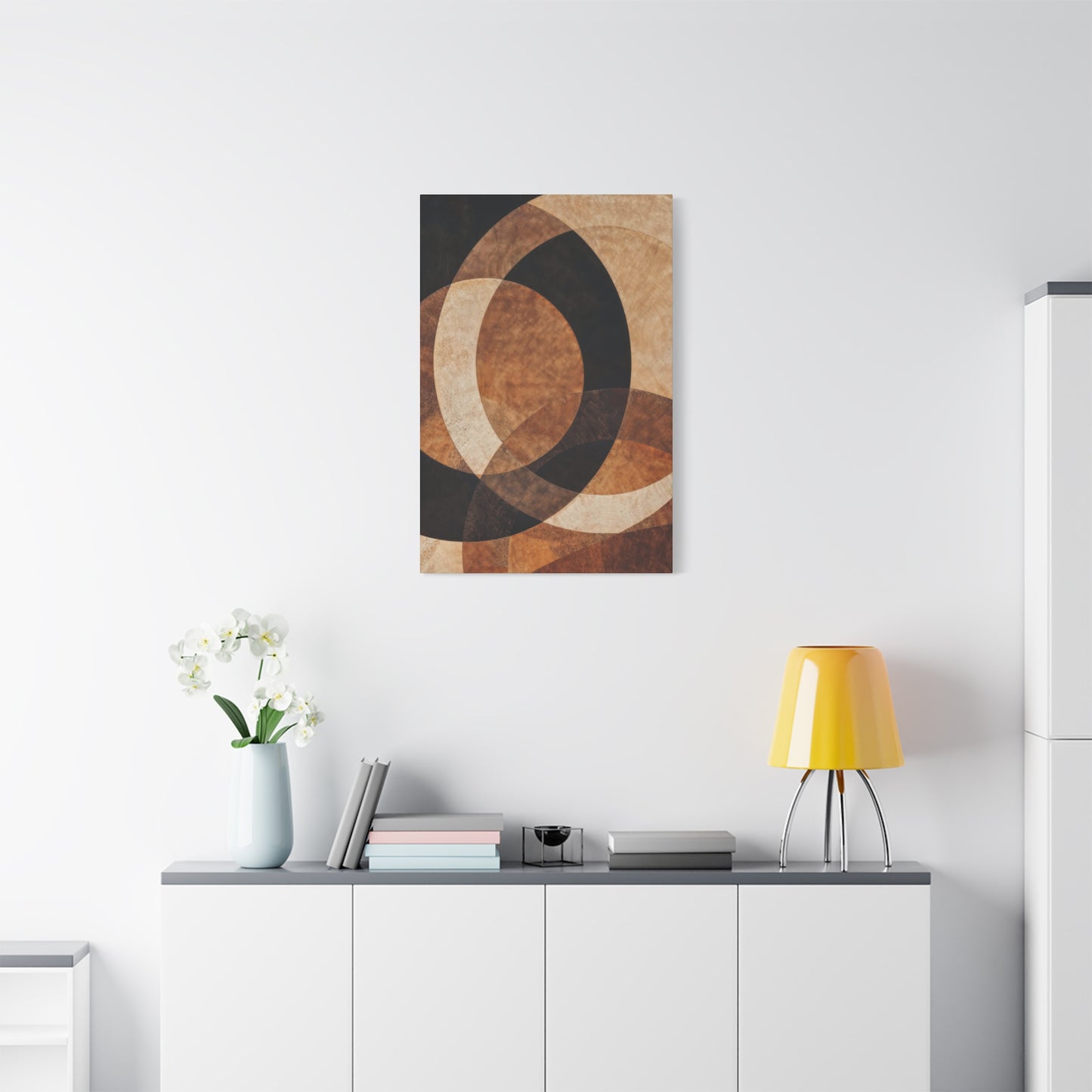
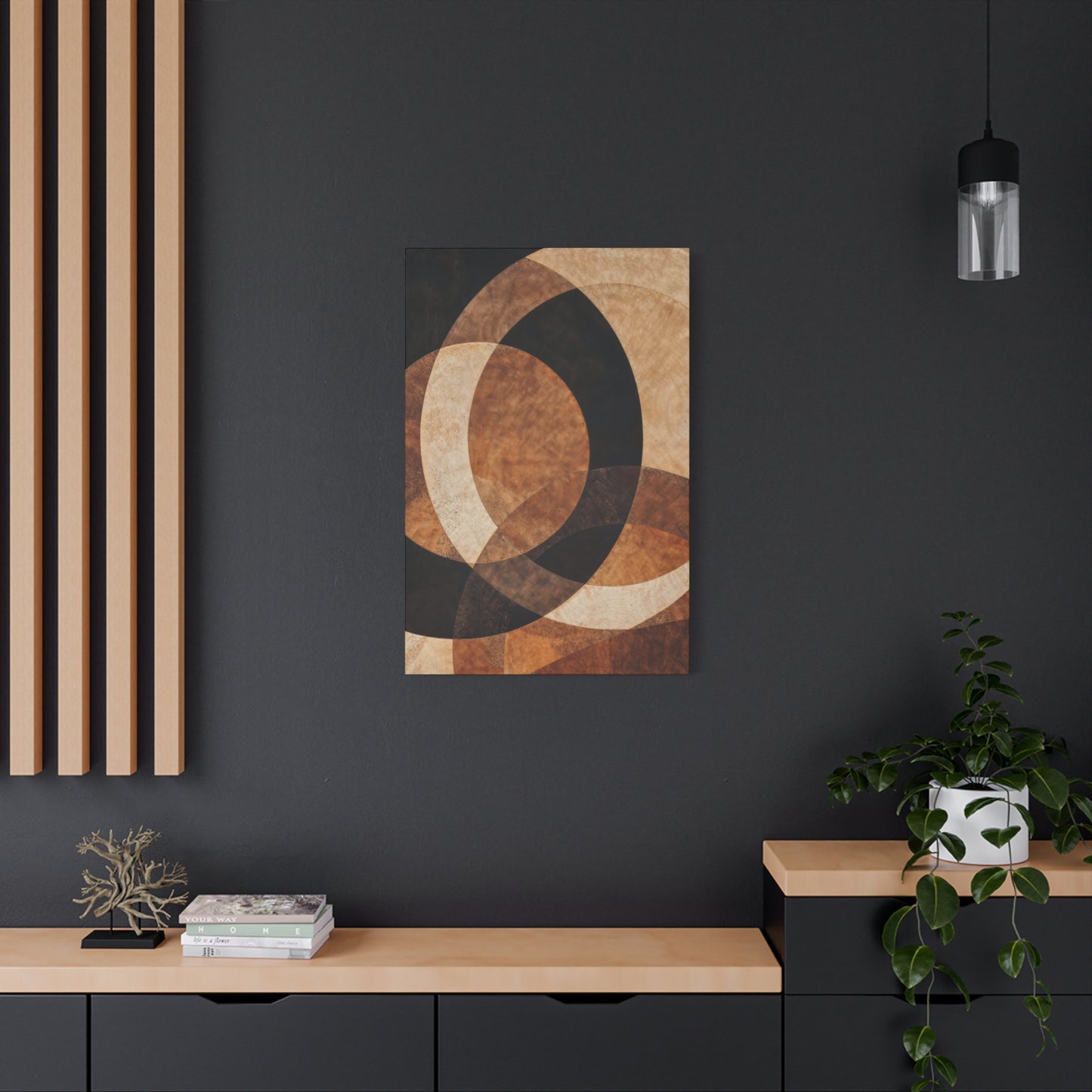

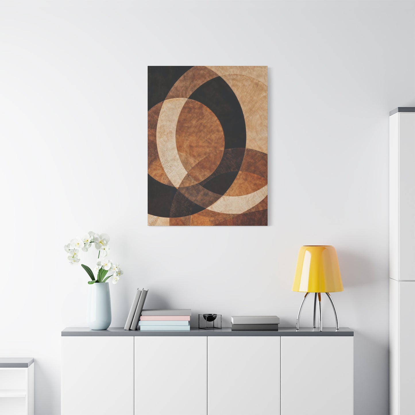
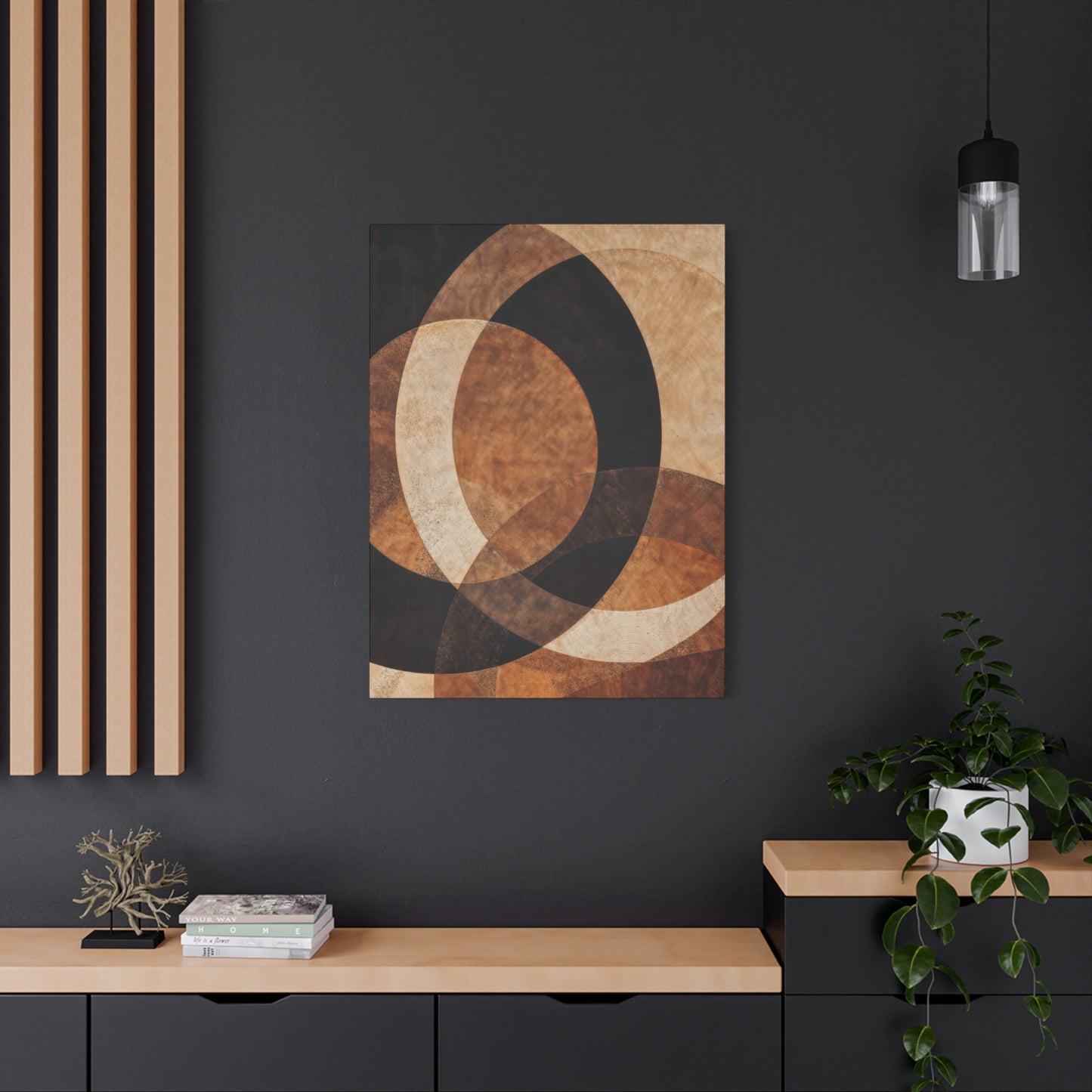
The Allure of Curves: How Earthen Crescent Opulence Wall Art Redefines Organic Interior Design
The intersection of celestial beauty and earthly richness creates a captivating aesthetic that has taken the interior design world by storm. This comprehensive exploration delves into the mesmerizing realm of crescent-inspired canvas art that combines the warmth of earth tones with the opulence of metallic accents. Whether you're redesigning your living space, seeking the perfect statement piece for your office, or simply drawn to the mystical allure of lunar imagery, this guide illuminates every aspect of incorporating these stunning artworks into your environment.
The fusion of natural earth pigments with luxurious golden elements on canvas creates a visual symphony that speaks to both our primal connection to nature and our appreciation for refined elegance. These artistic creations transcend mere decoration, becoming portals to tranquility and sophistication that elevate any interior space. From minimalist interpretations to richly textured masterpieces, crescent-themed canvas art offers endless possibilities for personal expression and environmental transformation.
Radiant Brilliance: Golden Luminosity in Earthern Crescent Canvas Creations
The marriage of golden tones with earthen crescent designs represents a pinnacle of contemporary wall art aesthetics. This artistic approach captures the magical moment when moonlight kisses the earth, creating a warm glow that infuses spaces with both energy and serenity. The golden elements in these compositions are not merely decorative flourishes but essential components that bring depth, dimension, and a sense of luxurious warmth to the overall design.
When artists incorporate golden hues into crescent compositions, they tap into centuries of symbolic meaning associated with both gold and lunar imagery. Gold has historically represented prosperity, divine light, and achievement across cultures, while the crescent moon symbolizes growth, transition, and the cyclical nature of existence. Together, these elements create artwork that resonates on multiple levels, offering visual pleasure while subtly communicating deeper themes of abundance and natural rhythm.
The technical execution of golden crescent designs requires careful consideration of light interaction. Metallic paints and leaf applications catch and reflect ambient light differently throughout the day, causing the artwork to transform subtly as natural illumination shifts. Morning light might emphasize warm amber tones, while evening illumination could bring out deeper bronze and copper undertones. This dynamic quality makes each viewing experience unique, ensuring the artwork never becomes static or predictable.
Contemporary artists working in this style often employ layering techniques that build dimensional depth. Base layers of rich earth tones provide grounding, while successive applications of golden pigments create luminous crescents that appear to float above the canvas surface. Some creators incorporate actual metallic materials, from gold leaf to brass filings, which add tactile interest alongside visual impact. The interplay between matte earthen backgrounds and reflective golden crescents generates a compelling contrast that draws viewers into closer examination.
The psychological impact of golden crescent artwork extends beyond aesthetic appreciation. Color psychology research indicates that gold stimulates feelings of optimism, success, and warmth, while earth tones promote stability, comfort, and connection to nature. When combined with the crescent shape, which inherently suggests movement and progression, these pieces can subtly influence mood and mindset within a space. Placing such artwork in areas where you seek inspiration or relaxation can enhance the intended atmosphere of those environments.
Scale considerations prove crucial when selecting golden crescent canvas art. Larger pieces make bold statements, commanding attention and serving as focal points that organize surrounding décor elements. Smaller works offer opportunities for creating gallery arrangements where multiple crescents at different phases suggest the moon's journey across the sky. Medium-sized pieces provide versatility, working equally well as standalone features or as components within larger decorative schemes.
The color temperature of golden elements significantly affects overall ambiance. Warmer golds with orange undertones create cozy, inviting atmospheres ideal for living spaces and bedrooms. Cooler golds leaning toward champagne or silver-gold hybrids contribute to more contemporary, sophisticated environments suitable for offices or formal areas. Understanding these subtle distinctions helps in selecting pieces that harmonize with existing color schemes while achieving desired emotional effects.
Lunar Sophistication: Crescent Moon Elements in Contemporary Wall Decor
Moonlit elegance manifests through carefully crafted crescent shapes that capture the moon's mystical beauty in permanent form. This design approach emphasizes the graceful curve of the crescent, often presenting it against backgrounds that suggest the night sky, cosmic space, or abstract atmospheric conditions. The resulting compositions balance recognizable celestial imagery with artistic interpretation, creating works that feel both familiar and freshly imaginative.
The crescent moon has captivated human imagination since prehistoric times, appearing in cave paintings, ancient religious iconography, and cultural symbols worldwide. Modern artists working with this motif draw upon this rich heritage while infusing contemporary sensibilities and techniques. The result bridges traditional symbolism with current aesthetic preferences, producing artwork that resonates across generational and cultural boundaries.
Lighting considerations become particularly important with moon-inspired designs. These pieces often feature subtle gradations that mimic the way moonlight transitions from bright illumination to shadowy darkness. Artists achieve these effects through various techniques including airbrushing, wet-blending, and careful glazing. The most successful pieces capture that ethereal quality of lunar light where illumination seems to glow from within rather than simply reflecting external light sources.
Crescent positioning within the canvas frame carries compositional significance. Centrally placed crescents create symmetry and balance, conveying stability and harmony. Off-center placements introduce dynamic tension and visual movement, suggesting the moon's celestial journey. Crescents that extend beyond frame boundaries imply vastness and continuity, reminding viewers that they're glimpsing a small portion of something infinitely larger.
The incorporation of surrounding elements enhances crescent-focused compositions. Some artists include star fields, wispy clouds, or atmospheric effects that contextualize the moon within broader cosmic settings. Others strip away all extraneous detail, presenting the crescent in austere isolation against minimal backgrounds. Both approaches have merit, the former offering rich visual complexity while the latter provides meditative simplicity.
Textural treatments distinguish exceptional crescent artwork from ordinary representations. Smooth, luminous crescents contrast beautifully against heavily textured backgrounds, while rough, craggy lunar surfaces offer geological realism that appeals to astronomy enthusiasts. Some artists incorporate actual lunar topography data into their work, creating scientifically informed pieces that function as both art and education.
Cultural variations in crescent interpretation provide fascinating diversity within this artistic category. Islamic art traditions feature crescent shapes prominently, often paired with geometric patterns and calligraphic elements. Asian artistic traditions may combine crescent moons with cherry blossoms, bamboo, or other culturally significant imagery. Western contemporary approaches tend toward abstraction, using the crescent as a jumping-off point for experimental color and form explorations.
Sumptuous Earth Pigments: Richly Hued Crescent Compositions
Luxurious earth tones form the foundation of truly remarkable crescent artwork, providing warmth, depth, and organic connection that synthetic colors cannot replicate. These hues, derived from the natural world, include the burnt siennas of sun-baked clay, the umber richness of fertile soil, the ochre warmth of desert sands, and the varied tans and browns found throughout natural landscapes. When employed in crescent compositions, these colors ground celestial imagery in earthly substance.
The psychological comfort provided by earth-toned artwork stems from evolutionary biology. Humans evolved in natural environments dominated by these colors, and our brains remain wired to find them inherently soothing and appropriate. Incorporating earth-toned crescent art into living spaces taps into this deep-seated response, creating environments that feel instinctively comfortable and welcoming. This makes such pieces particularly suitable for spaces intended for relaxation, reflection, or intimate gathering.
Pigment quality dramatically affects the final impact of earth-toned artwork. Professional-grade pigments offer superior color saturation, longevity, and mixing capabilities compared to student-grade alternatives. Natural earth pigments, while sometimes more expensive, provide unmatched depth and subtle complexity. A single earth tone pigment might contain dozens of underlying hues that reveal themselves under different lighting conditions, creating visual richness that synthetic pigments struggle to match.
Layering earth tones builds dimensional complexity that elevates artwork from simple to sophisticated. Base layers establish overall warmth and value structure, middle layers introduce color variation and interest, while final layers add highlights and refined details. This building process creates optical depth where colors seem to recede and advance, generating the illusion of three-dimensional form on a two-dimensional surface.
The combination of earth tones with crescent shapes creates interesting symbolic resonance. Earth colors obviously reference our planet, while crescents commonly represent the moon. Together, they visualize the cosmic relationship between Earth and its satellite, the gravitational dance that governs tides, seasons, and countless natural rhythms. Even viewers unaware of this symbolic dimension intuitively respond to the harmony suggested by this earth-moon pairing.
Opulence in earth-toned work comes not from garishness but from richness, subtlety, and refinement. The opulent approach employs multiple shades within the earth-tone spectrum, creating sophisticated color harmonies rather than relying on single flat hues. Subtle shifts from warm to cool browns, variations in saturation and value, and careful attention to color relationships produce results that feel luxurious despite relatively subdued palettes.
Contemporary designers increasingly recognize that luxury doesn't require bright, attention-demanding colors. Earth-toned crescent artwork fits perfectly within this evolved understanding, offering quiet elegance that speaks of confidence and refined taste. Such pieces work exceptionally well in upscale residential settings, boutique commercial spaces, and anywhere sophistication takes precedence over flashy visual impact.
Modern Simplicity: Minimalist Interpretations of Earthern Crescents
Modern minimalism finds perfect expression in streamlined crescent designs that strip away decorative excess to reveal essential forms. This aesthetic approach values negative space, clean lines, and restrained color palettes, allowing the fundamental beauty of the crescent shape to speak without distraction. Minimalist earthern crescent artwork embodies the principle that less is more, demonstrating how limitation can paradoxically expand artistic impact.
The minimalist philosophy originated in mid-twentieth-century art movements but has experienced renewed popularity in contemporary interior design. In our visually cluttered world, minimalist artwork offers visual rest and mental clarity. A single, perfectly rendered crescent against a neutral background provides a focal point that organizes visual attention without overwhelming the senses. This quality makes minimalist crescent art particularly valuable in spaces where calm and focus are priorities.
Color restraint characterizes minimalist earthern crescent compositions. Rather than employing full earth-tone spectrums, these pieces might feature just one or two carefully selected hues. A single ochre crescent on a cream background, for instance, communicates earthen warmth while maintaining austere simplicity. The limited palette forces viewers to appreciate subtle variations in tone and texture that might go unnoticed in more colorfully complex works.
Compositional precision becomes crucial in minimalist work where every element carries amplified significance. The exact placement of the crescent within the canvas, the specific curve of its form, the precise width of its illuminated edge—each decision profoundly affects overall impact. Minimalist artists often create dozens of studies before committing to final compositions, ensuring every aspect contributes meaningfully to the whole.
Negative space functions as an active design element in minimalist crescent artwork rather than simply empty background. The areas surrounding the crescent shape the viewer's experience as much as the crescent itself, creating breathing room that allows eyes and minds to rest. This careful balance between form and emptiness reflects broader minimalist principles about the importance of both presence and absence.
Texture provides one avenue for introducing interest within minimalist constraints. A smoothly painted crescent against a subtly textured background creates gentle contrast that adds depth without compromising overall simplicity. Some minimalist artists work with mixed media, incorporating plaster, sand, or fabric into their canvases to generate tactile variation within restrained visual frameworks.
The appeal of minimalist earthern crescent prints extends to various demographic groups. Younger buyers often appreciate the contemporary aesthetic that aligns with current design trends. Mature collectors value the sophistication and timelessness that transcends passing fads. Business environments benefit from the professional, uncluttered appearance that complements rather than competes with functional workspace requirements.
Stellar Embellishments: Integrating Celestial Themes in Interior Artworks
Celestial décor encompasses a broad category of astronomical and cosmic imagery in residential and commercial design. Crescent shapes naturally fit within this larger aesthetic movement, serving as recognizable astronomical elements that anchor broader celestial themes. The growing popularity of celestial décor reflects renewed public interest in space exploration, astronomy, and humanity's place within the cosmic order.
Stars, planets, constellations, and galaxies provide complementary elements that can enhance crescent-focused artwork. Some compositions present crescents within realistic star fields, situating the moon among the stellar backdrop viewers might observe on clear nights. Others take more interpretive approaches, surrounding crescents with abstract stellar suggestions or geometric patterns that evoke cosmic order without literal representation.
The color palettes associated with celestial themes tend toward cool tones—deep blues, purples, and blacks that represent the night sky. However, earthern crescent artwork introduces warmer counterpoints that prevent compositions from feeling cold or distant. This temperature contrast creates visual interest while maintaining thematic cohesion, the warm earth-toned crescent glowing against cool cosmic backgrounds like a beacon in darkness.
Scientific accuracy varies widely in celestial artwork. Some artists prioritize astronomical correctness, consulting star charts and lunar photography to ensure their representations match observable reality. Others embrace artistic license, creating fantastical cosmic environments that prioritize aesthetic impact over factual accuracy. Both approaches have audiences, with accuracy appealing to science enthusiasts while imaginative interpretation attracts those seeking purely decorative solutions.
The symbolic dimensions of celestial imagery add meaningful depth to these decorative choices. Throughout history, humans have looked to the heavens for guidance, inspiration, and connection to something larger than individual existence. Celestial artwork in contemporary spaces maintains this tradition, providing daily reminders of cosmic wonder and our participation in universal processes. A crescent moon on the wall becomes more than decoration—it's a window to infinity.
Seasonal considerations affect how celestial décor is perceived and appreciated. During winter months when nights lengthen and stars shine brightest, celestial themes feel particularly appropriate and resonant. Summer might emphasize sun imagery, but crescents maintain year-round relevance due to the moon's constant presence in our skies. This temporal flexibility makes crescent artwork a sound investment that remains seasonally appropriate regardless of calendar date.
Children and adults respond differently to celestial imagery, creating opportunities for age-appropriate design applications. Nurseries and children's rooms benefit from playful, colorful interpretations of moons and stars that stimulate young imaginations. Adult spaces call for more sophisticated treatments that maintain celestial themes while reflecting mature aesthetic sensibilities. Earthern crescent artwork often occupies a middle ground, possessing enough visual interest for younger viewers while maintaining refinement appreciated by adults.
Expressionist Luxury: Non-Representational Earthern Crescent Compositions
Abstract luxury takes crescent imagery beyond literal representation into expressive territories where shapes, colors, and textures communicate through purely visual means. These compositions use the crescent as a starting point for artistic exploration rather than attempting accurate lunar depiction. The resulting works prioritize emotional impact, aesthetic beauty, and conceptual depth over recognizable subject matter.
Abstract approaches liberate artists from representational constraints, allowing complete creative freedom in color selection, composition, and technique. A crescent might be rendered in colors never seen in nature—perhaps deep crimson or vibrant turquoise—because the goal is expressive communication rather than realistic depiction. This freedom produces distinctive, memorable works that stand apart from conventional celestial imagery.
The opulent quality in abstract crescent art often comes from material richness and technical complexity rather than subject matter. Artists might incorporate gold leaf, crushed gemstones, or specialty pigments that add literal preciousness to their work. Thick impasto applications create three-dimensional textures that cast shadows and catch light, transforming flat canvases into sculptural objects. Multiple transparent glazes build luminous depth where colors seem to float in ambiguous spatial relationships.
Viewer interpretation plays a larger role with abstract work compared to representational art. Without clear subject matter to guide understanding, each viewer brings personal experiences, emotions, and associations to their encounter with abstract crescent compositions. This openness creates opportunities for deep personal connection, as individuals discover meanings and responses unique to their own perspectives.
The challenge in creating successful abstract crescent art lies in maintaining enough recognizable crescent character to justify the categorization while pushing far enough into abstraction to achieve genuine expressive freedom. The most accomplished pieces strike this balance, presenting forms that unmistakably suggest crescents while clearly existing as abstract explorations rather than realistic depictions.
Color relationships become paramount in abstract compositions where representational subject matter doesn't provide ready-made organizational structures. Artists must carefully consider how colors interact, which combinations create harmony versus tension, and how color choices affect emotional tone. Earthern colors in abstract settings might be paired with unexpected partners—cool grays, bright whites, or even controlled accents of saturated hues that create dynamic contrasts.
The market for abstract crescent artwork includes collectors seeking distinctive pieces that make strong personal statements. Unlike representational work where beauty standards are relatively universal, abstract art's value often depends on individual resonance with specific works. This subjectivity means finding the right piece requires exposure to many examples, making collections and galleries essential resources for serious buyers.
Metallic Enhancement: Gold and Earth-Tone Combination Techniques
Metallic accents transform earthern crescent prints from beautiful to extraordinary, introducing elements of light play and luxury that elevate overall impact. The combination of matte earth tones with reflective metallic surfaces creates dynamic visual interest as viewing angles and lighting conditions change throughout the day. This technical approach adds literal and figurative dimensions to two-dimensional artwork.
Gold remains the most popular metallic choice for crescent artwork due to its warm tone that harmonizes naturally with earth colors. However, contemporary artists increasingly explore alternatives including copper, bronze, rose gold, and even platinum or silver for cooler compositions. Each metal brings distinct character—copper offers rustic warmth, bronze suggests ancient patinas, while silver provides modern sophistication.
Application techniques for metallic elements vary widely based on desired effects. Traditional gold leaf application creates mirror-smooth reflective surfaces with unmistakable luxury. Metallic paints offer easier application with controllable coverage ranging from translucent washes to opaque coverage. Metallic powders and flakes can be mixed into mediums or adhered to surfaces, creating unique textural and reflective qualities. Some artists even incorporate actual metal sheets, cutting and shaping them as collage elements.
The placement of metallic accents requires thoughtful consideration. Metallic crescents against matte backgrounds create clear focal points that immediately draw attention. Alternatively, earth-toned crescents on metallic backgrounds generate subtler, more sophisticated effects. Scattered metallic details throughout compositions create sparkle and visual movement without dominating overall design. Each approach serves different aesthetic goals and suits different environments.
Light interaction with metallic elements produces the dynamic quality that makes these pieces living artworks. Morning sunlight streaming through windows might ignite golden crescents into brilliant focal points. Evening lamplight creates warmer, more intimate glows. Even overcast days reveal the subtle shimmer and depth that metallic elements contribute. This responsive quality ensures the artwork provides fresh visual experiences across times and seasons.
Conservation considerations become important with metallic artwork. Some metallic materials oxidize or tarnish over time, developing patinas that some collectors appreciate while others consider damage. Quality materials and proper sealing techniques protect against unwanted aging while allowing controlled patina development if desired. Understanding these material behaviors helps collectors make informed decisions about purchase and care.
The symbolic weight of gold and other precious metals adds conceptual depth to crescent artwork. Beyond aesthetic considerations, these materials carry associations with wealth, achievement, and spiritual enlightenment across cultures. A golden crescent isn't merely decorative—it suggests value, aspiration, and the preciousness of natural celestial phenomena. These symbolic dimensions resonate even with viewers unaware of consciously processing such meanings.
Declarative Presence: Creating Focal Points with Opulent Crescent Canvases
Wall art statement pieces serve as organizational centers around which entire room designs coalesce. Opulent crescent canvases excel in this role, offering bold visual impact while maintaining enough sophistication to avoid overwhelming spaces. The key to successful statement artwork lies in balancing commanding presence with aesthetic refinement, ensuring pieces attract attention without becoming garish or difficult to live with.
Size considerations prove fundamental when selecting statement pieces. In spacious rooms with high ceilings, only substantial artworks register appropriate impact. Pieces measuring four feet or larger in at least one dimension create the visual weight necessary to anchor expansive walls. Conversely, smaller intimate spaces require more modest dimensions where a two or three foot canvas can function as a statement piece without crowding the environment.
The concept of statement artwork extends beyond mere size to encompass visual impact through color, contrast, and compositional drama. A relatively small piece featuring intense color contrasts or unusual compositions might command more attention than a larger but visually quieter work. Crescent artwork achieves statement status through various routes—perhaps dramatic scale, striking color combinations, exceptional textural richness, or innovative artistic interpretations.
Placement within rooms dramatically affects how statement pieces are perceived and how they influence overall space. Central positioning above sofas or beds creates symmetrical, balanced arrangements that feel formal and organized. Off-center placements introduce asymmetry and dynamic visual tension that energizes spaces. The height at which artwork hangs also matters, with eye-level positioning creating intimate engagement while higher placement emphasizes architectural presence.
Supporting décor elements should complement rather than compete with statement crescent artwork. Color palettes throughout the room might echo hues found within the canvas, creating visual harmony and flow. Furniture arrangements can direct sight lines toward the statement piece, reinforcing its focal status. Lighting, whether ambient or dedicated gallery-style illumination, should highlight the artwork without creating glare or washing out subtle details.
The investment in quality statement pieces pays dividends in lasting satisfaction and potential value appreciation. Mass-produced prints lack the presence and character of original artwork or limited-edition reproductions created with museum-quality materials and techniques. Collectors should consider provenance, artist reputation, materials quality, and personal resonance when selecting statement pieces intended to serve as long-term focal points.
Rotating statement pieces allows fresh perspectives and prevents visual stagnation. Some collectors maintain several statement-quality works, rotating them seasonally or as mood dictates. This approach requires adequate storage facilities and careful handling but provides ongoing variety that keeps living spaces feeling fresh and responsive to changing preferences. For those with extensive collections, rotation transforms homes into personal galleries with ever-evolving exhibitions.
Cosmic Creativity: Lunar and Earthern Color Schemes Combined
Cosmic inspiration manifests when artists thoughtfully combine lunar silvery whites and grays with earthern warm browns and ochres. This marriage of moon and earth colorations creates visually rich palettes that reference the astronomical relationship between our planet and its satellite. The resulting artwork communicates cosmic connection through color language that operates on intuitive rather than intellectual levels.
The moon's actual colors, as captured in high-resolution photography, reveal subtle variations beyond simple gray. Shadows contain hints of brown and tan, while sunlit areas show warm creams and off-whites. These complex neutrals harmonize beautifully with earth tones, allowing seamless color integration that feels natural rather than forced. Artists studying lunar photographs gain palettes that combine scientific accuracy with aesthetic appeal.
Earth-toned backgrounds provide grounding for lunar crescent elements, creating figure-ground relationships that guide visual perception. A silvery crescent against rich sienna background immediately reads as moon against earth or sky, even in highly abstracted compositions. This intuitive recognition allows artists to communicate complex ideas about planetary relationships through simple color and form combinations.
Temperature contrast between cool lunar grays and warm earth tones generates visual vitality that prevents compositions from feeling flat or monotonous. The interplay of temperature creates spatial illusions where cool colors recede and warm colors advance, producing depth on flat surfaces. This dimensional quality adds sophistication to artwork, rewarding close examination with subtle spatial relationships.
Contemporary color theory regarding analogous and complementary relationships informs successful cosmic color combinations. Earth tones and neutrals exist adjacent on color wheels, creating harmonious relationships that feel comfortable and balanced. Strategic accent colors—perhaps deep space blues or burnt orange highlights—can be introduced to energize these neutral-dominant palettes without disrupting overall harmony.
Cultural associations with moon and earth colors carry symbolic weight that enriches artwork meaning. Earth colors suggest stability, nurturing, fertility, and groundedness—qualities associated with our planet across cultures. Lunar colors evoke mystery, reflection, femininity, and cyclical change—attributes traditionally linked with moon symbolism. Artwork combining these palettes subtly communicates these associations, adding conceptual depth to visual beauty.
Practical considerations affect how moon and earth color combinations function in real spaces. These relatively neutral palettes integrate easily with existing décor schemes, rarely clashing with furnishings or wall colors. This versatility makes cosmic-inspired crescent artwork safe choices for those uncertain about introducing strong colors into their environments. Yet within their neutral frameworks, these pieces offer enough visual interest and sophistication to avoid blandness.
Refined Living Spaces: Earthern Crescent Art for Residential Interiors
Elegant interiors benefit immeasurably from carefully selected earthern crescent canvas artwork that enhances rather than dominates living rooms. These social and relaxation spaces require artwork that facilitates conversation, provides visual interest, and contributes to overall atmospheric quality. Crescent pieces with their balance of natural earthern warmth and celestial intrigue serve these functions admirably while adding sophistication.
Living room artwork must work harmoniously with furniture arrangements, architectural features, and traffic patterns. Above sofas, crescent canvases create focal points that anchor seating arrangements while providing visual interest for conversational gatherings. On large empty walls, they fill space without creating cluttered feelings. In gallery arrangements with other artworks, crescents contribute distinctive shapes that contrast with rectangular or square pieces.
Scale appropriateness proves essential in living room applications. Rooms with standard eight-foot ceilings generally accommodate artwork up to four feet in maximum dimension without overwhelming proportions. Higher ceilings permit larger pieces, with some grand living spaces showcasing statement crescents measuring six feet or more. Multiple smaller pieces arranged in clusters or grids offer alternatives to single large works, creating dynamic installations that add visual rhythm.
Color coordination between artwork and living room palettes requires attention but allows flexibility. Earth-toned crescent pieces integrate naturally with neutral décor schemes popular in contemporary design. They also complement jewel-toned or richly colored interiors by providing grounding neutral elements that balance bolder color choices. The warm nature of earth tones makes them particularly suitable for living spaces where comfort and welcome are priorities.
Lighting significantly affects how crescent artwork appears and functions in living rooms. Natural daylight streaming through windows reveals true colors and details, making daytime viewing rich and accurate. Evening illumination from lamps and overhead fixtures creates different moods, often emphasizing golden metallic elements that glow warmly under artificial light. Installing picture lights or track lighting dedicated to artwork ensures optimal visibility during all hours.
The psychological impact of crescent imagery in living spaces shouldn't be underestimated. These rooms serve as gathering places where families and friends connect, relax, and share experiences. Crescent symbolism regarding cycles, growth, and natural rhythms subtly influences the atmosphere, encouraging reflection and appreciation of life's rhythms. Earth tones contribute grounding, stabilizing energy that helps living rooms fulfill their function as comfortable retreats from busy external worlds.
Durability and maintenance considerations affect artwork selection for high-traffic living areas. Canvas prints properly sealed and framed withstand the dust, temperature variations, and occasional bumps inevitable in actively used spaces. Quality materials resist fading from sunlight exposure that would degrade inferior reproductions. Easy cleaning methods—typically just light dusting—help maintain appearance over years of display.
Warm Color Palettes: Earth Tones Paired with Golden Crescent Elements
Warm hues dominate some of the most inviting and comfortable interior spaces, and earth and gold crescent wall art contributes beautifully to these color schemes. The inherent warmth of ochres, siennas, and burnt umbers combined with golden metallic elements creates visual temperature that makes rooms feel cozy, welcoming, and emotionally warm. This thermal quality affects not just aesthetics but actual perceived comfort levels.
The science behind color temperature and psychological response reveals why warm earth and gold combinations feel so appealing. Research indicates that warm colors trigger associations with fire, sunlight, and other heat sources, producing emotional responses of comfort and security. In cold climates or during winter months, warm-colored artwork helps counterbalance external chill, creating psychologically warmer interior environments even when physical temperatures remain constant.
Layering multiple warm tones within single compositions prevents monotony while maintaining overall warmth. A palette might range from pale cream crescents through golden ochres to deep chocolate browns, all within the warm color family. This variation creates visual interest and depth while preserving cohesive warmth. Strategic placement of lightest and darkest values guides eye movement through compositions, creating visual paths that add dynamic quality.
Golden crescent elements serve as natural highlights within warm earth-toned compositions, their metallic brilliance representing the warmest, most luminous notes in the color symphony. These golden accents catch light throughout the day, creating sparkle and movement that enliven static compositions. The reflective quality of gold introduces an interactive element where artwork changes subtly as viewers and light sources move, maintaining ongoing visual interest.
Warm color harmonies in crescent artwork pair beautifully with popular interior design trends favoring natural materials like wood, leather, and stone. The colors in the artwork echo the hues found in these materials, creating unified design schemes where art and environment feel organically connected. This harmony produces spaces that feel thoughtfully designed rather than merely decorated, where every element contributes to overall aesthetic coherence.
Seasonal appropriateness gives warm earth and gold crescent art particular value. These pieces feel especially relevant during autumn when earth tones dominate natural landscapes, during winter when warmth is precious, and during harvest seasons when golden hues celebrate abundance. Yet unlike overtly seasonal décor that must be stored most of the year, these pieces maintain year-round appropriateness due to their timeless subject matter and sophisticated execution.
Cultural variations in warm color preferences affect how earth and gold crescent artwork is received across different populations. Mediterranean and Middle Eastern cultures with strong traditions of warm color use embrace these palettes enthusiastically. Scandinavian design traditions favoring cooler, lighter palettes might find earth tones too heavy, though contemporary Nordic design increasingly incorporates warmer elements. Understanding cultural color preferences helps in selecting artwork appropriate for diverse audiences.
Contemporary Glamour: Earthern Crescents in Modern Decorating Schemes
Contemporary glam style merges clean modern lines with luxurious materials and metallic accents, creating spaces that feel current yet opulent. Earthern crescent canvas décor fits perfectly within this aesthetic, offering sophisticated celestial imagery rendered with the metallic touches and refined color palettes that define contemporary glamour. These pieces bridge minimalist sensibilities with decorative richness, achieving balance between restraint and indulgence.
The contemporary glam aesthetic emerged as a reaction against both stark minimalism and fussy traditional styles, seeking a middle path that honors simplicity while embracing beauty and luxury. In this context, crescent artwork functions as both sculptural element and decorative accent. The clean lines and simple shapes align with modern preferences while earth tones and metallic elements inject warmth and glamour that prevent spaces from feeling cold or sterile.
Material quality becomes paramount in contemporary glam applications where fewer decorative elements mean each piece receives greater scrutiny. Canvas selection, print quality, framing choices, and finishing details all contribute to overall luxury impression. Museum-quality stretched canvases, archival inks that resist fading, and professional finishing create pieces worthy of prominent placement in sophisticated contemporary interiors.
Color editing in contemporary glam spaces tends toward refined neutrals accented with metallics, making earth-toned crescent artwork ideal selections. These pieces provide neutral base colors that integrate seamlessly with popular gray, beige, and cream schemes while offering metallic accents that echo hardware, fixtures, and decorative accessories throughout the space. This color harmony creates cohesive environments where artwork feels integral rather than merely added after the fact.
Geometric precision characterizes contemporary design, and crescent shapes offer interesting organic counterpoints to the straight lines and right angles dominating modern furniture and architecture. This shape contrast creates visual interest while maintaining overall design unity. The curves of crescents soften hard-edged environments without introducing visual chaos, contributing graceful feminine energy to balanced masculine-feminine design schemes.
Contemporary glam spaces often feature mixed metallics—gold, silver, copper, and brass appearing together in finishes and accents. Crescent artwork incorporating multiple metallic elements supports this design approach, tying together varied metallics through unified compositions. A piece featuring gold, bronze, and copper crescents against neutral backgrounds becomes a connecting element that helps disparate metallic finishes feel intentionally coordinated rather than haphazardly mismatched.
The aspirational quality of contemporary glam design appeals to upwardly mobile demographics seeking spaces that reflect success and sophisticated taste. Earthern crescent artwork within this context communicates cultural capital—knowledge of current design trends, appreciation for quality materials, and aesthetic discernment. These pieces function as status symbols while maintaining enough artistic merit and beauty to justify their presence on purely aesthetic grounds.
Creative Boundaries: Multilayered Crescent Compositions with Surface Interest
Artistic horizons expand when creators explore crescent shapes through textured layers that add dimensional depth to canvas surfaces. These innovative approaches transform painting from purely visual art into tactile experiences where surface variations catch light, cast shadows, and invite touch. Layered techniques produce unique pieces where no two are exactly alike, offering collectors truly original works even within print-based reproduction models.
Building textured surfaces requires technical knowledge and artistic vision working in concert. Artists might begin with dimensional paste applications that create raised areas, follow with multiple paint layers that build color complexity, then finish with glazes that unify disparate elements into cohesive wholes. Each layer contributes to final effect, with earlier layers influencing and showing through subsequent applications in ways that create optical depth and richness.
The materials used for creating texture range from traditional to innovative. Modeling paste and gesso provide classic dimensional mediums that accept paint readily and dry to durable finishes. Natural materials like sand, sawdust, or crushed stone add organic texture with authentic earthen character. Contemporary options include acrylic gels, fiber paste, and specialty mediums that create everything from smooth glossy surfaces to rough matte textures. Material choice dramatically affects final aesthetic, making selection crucial to achieving intended results.
Crescent shapes lend themselves beautifully to textural experimentation. The curved form can be rendered in smooth relief against rough backgrounds, creating tactile contrast that emphasizes shape through touch as well as sight. Alternatively, heavily textured crescents against smooth grounds create different but equally effective focal points. Some artists build texture primarily within crescent areas while keeping backgrounds relatively flat, directing attention through dimensional variation rather than just color and value.
Light plays crucial roles in textured artwork, with raking illumination emphasizing surface variations while flat frontal light minimizes them. Strategically placed lighting can dramatically enhance textured pieces, transforming them from interesting to spectacular. Collectors should consider lighting when displaying textured crescent art, potentially installing adjustable fixtures that allow experimentation with various angles and intensities.
The creation process for heavily textured work often involves extended timelines as individual layers must dry before subsequent applications. This extended creation period contributes to the special quality and value of textured pieces. Rush production compromises results, making these works unsuitable for fast-turnaround commercial reproduction. Collectors seeking textured crescent art should expect higher prices reflecting the time investment and technical skill required.
Preservation considerations differ for textured versus smooth artwork. Three-dimensional surfaces collect dust more readily and prove more challenging to clean without risking damage. Proper framing becomes essential, with adequate depth between glass and surface preventing contact that could compress or damage raised textures. Despite these maintenance considerations, many collectors prize textured pieces precisely because their dimensional quality and unique surfaces distinguish them from standard flat reproductions.
Conclusion:
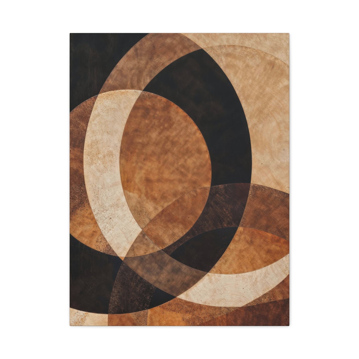
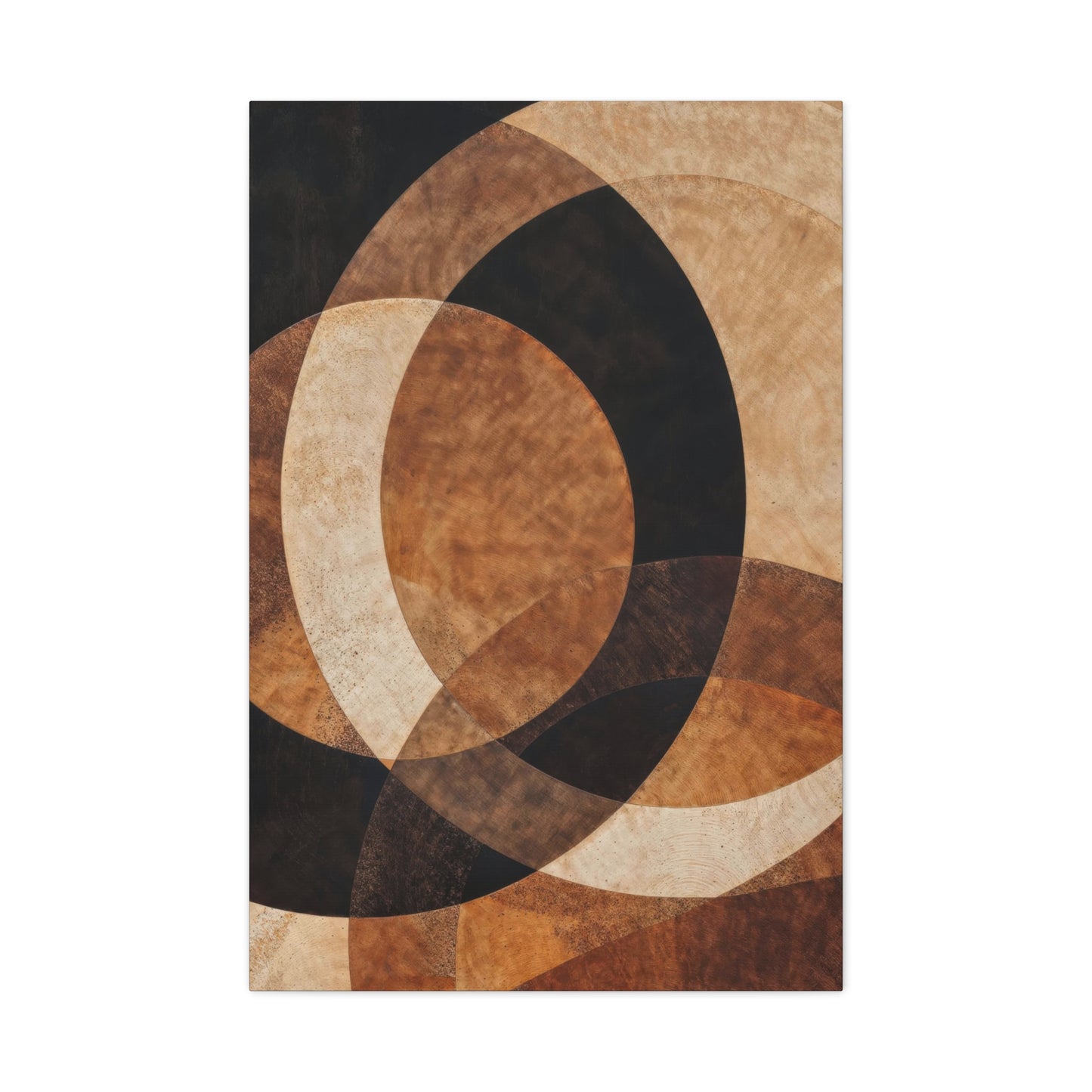
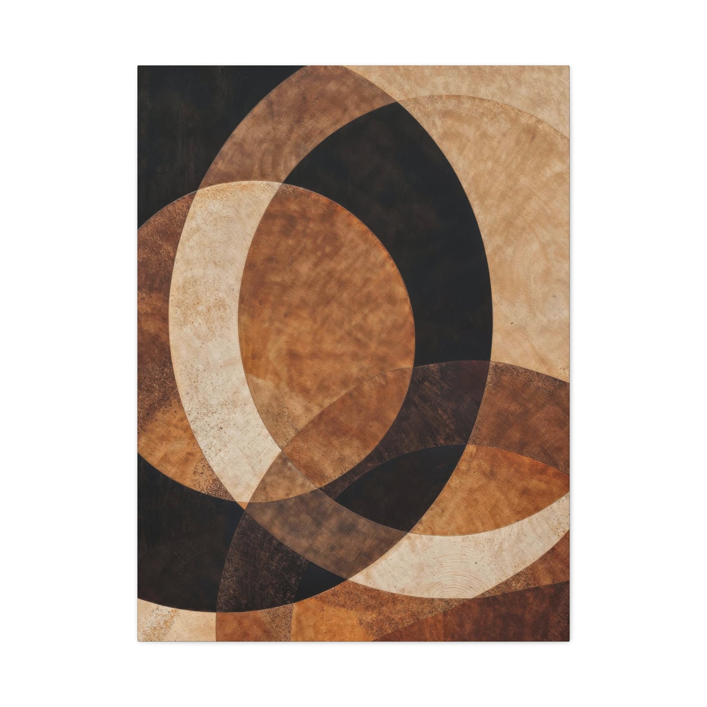
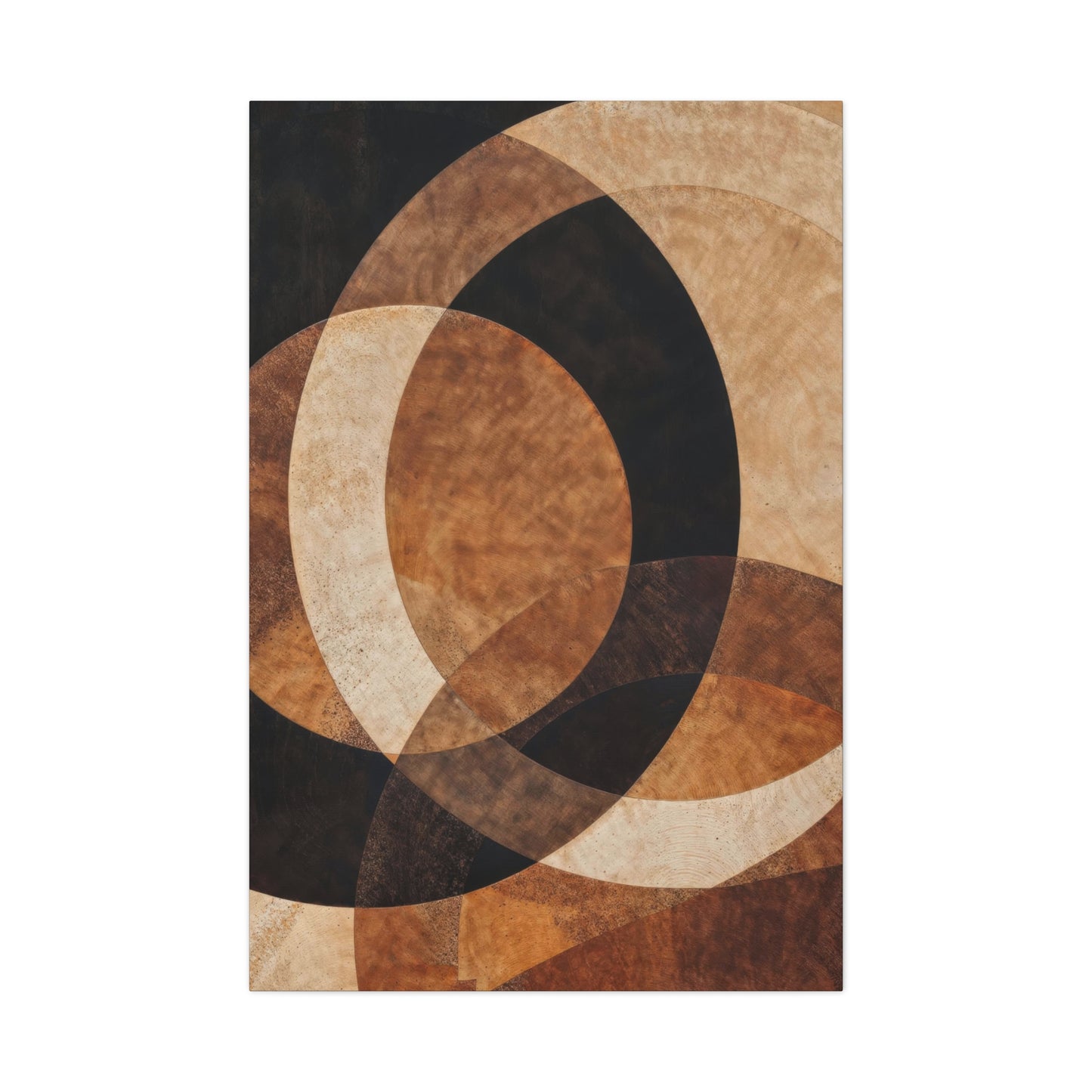
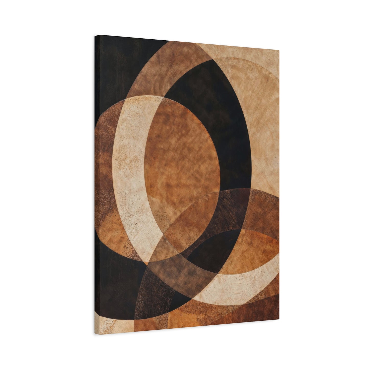
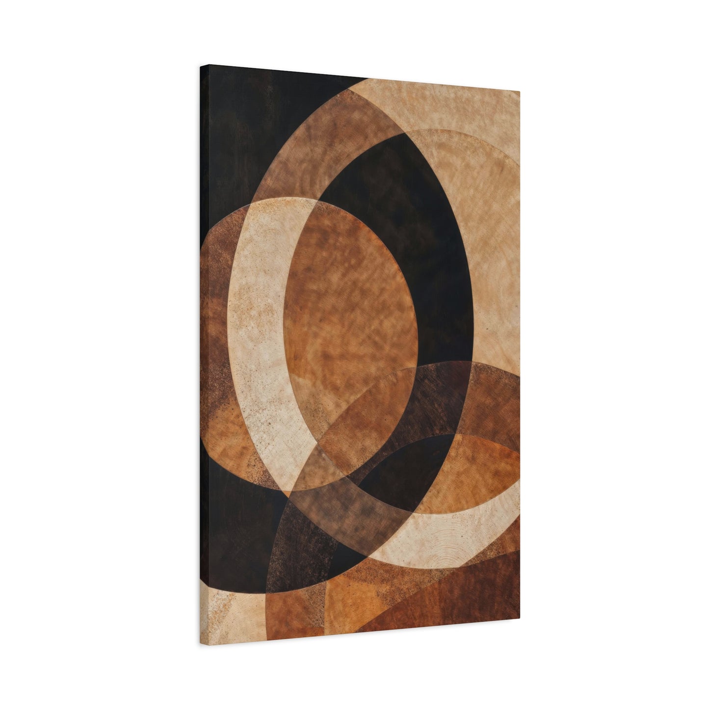
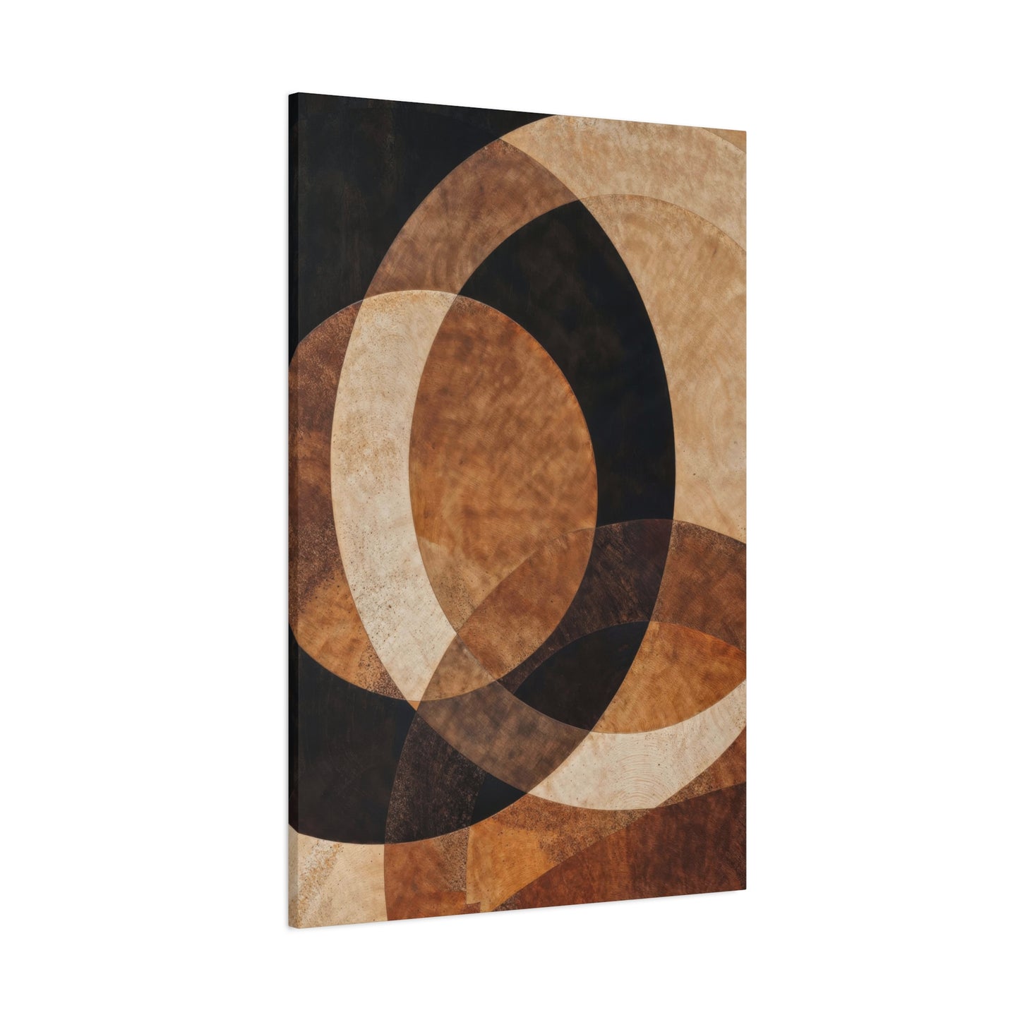
The Allure of Curves: How Earthen Crescent Opulence Wall Art Redefines Organic Interior Design encapsulates the growing movement toward spaces that celebrate natural flow, material authenticity, and quiet luxury. In a design world often dominated by straight lines, symmetry, and minimalism, this art form reintroduces the softness of the curve—an elemental shape found throughout nature, from the arc of a dune to the gentle bend of a river. The fusion of earthen tones with crescent silhouettes creates a visual poetry that invites calm, balance, and sensuality into interior environments. More than mere decoration, Earthen Crescent Opulence represents an aesthetic philosophy: that harmony is found in curvature, imperfection, and the timeless language of the earth.
At its essence, this style draws inspiration from the organic geometry of the natural world. The crescent motif—subtle yet commanding—evokes the phases of the moon, the horizon’s curvature, or the layered arcs of wind-sculpted terrain. When translated into wall art, these forms suggest continuity and renewal, infusing rooms with a meditative rhythm that feels both grounded and transcendent. The earthen palette—soft ochres, clay browns, muted golds, and sandy taupes—adds to this grounding effect, forming a palette that feels ancient yet contemporary. Together, these elements bridge the tactile and the spiritual, reflecting an interior philosophy rooted in nature’s quiet sophistication.
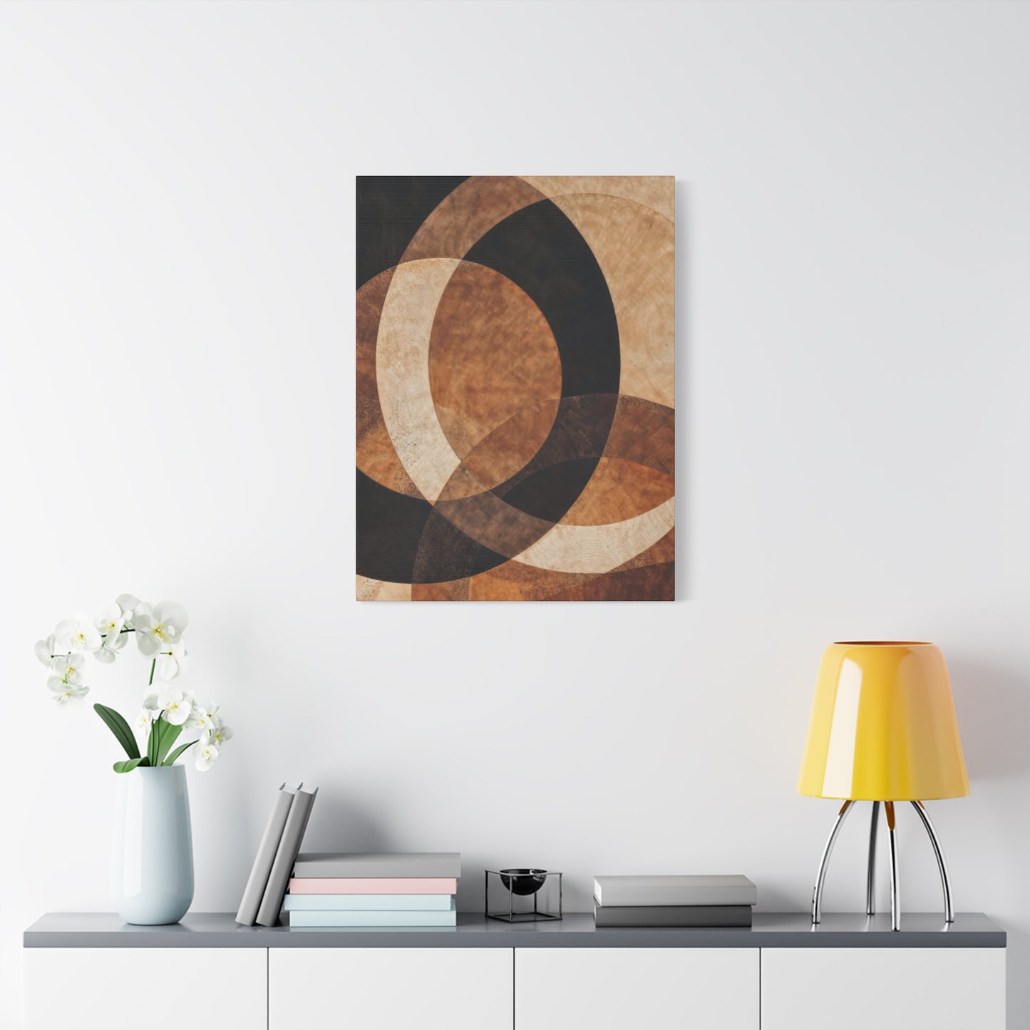
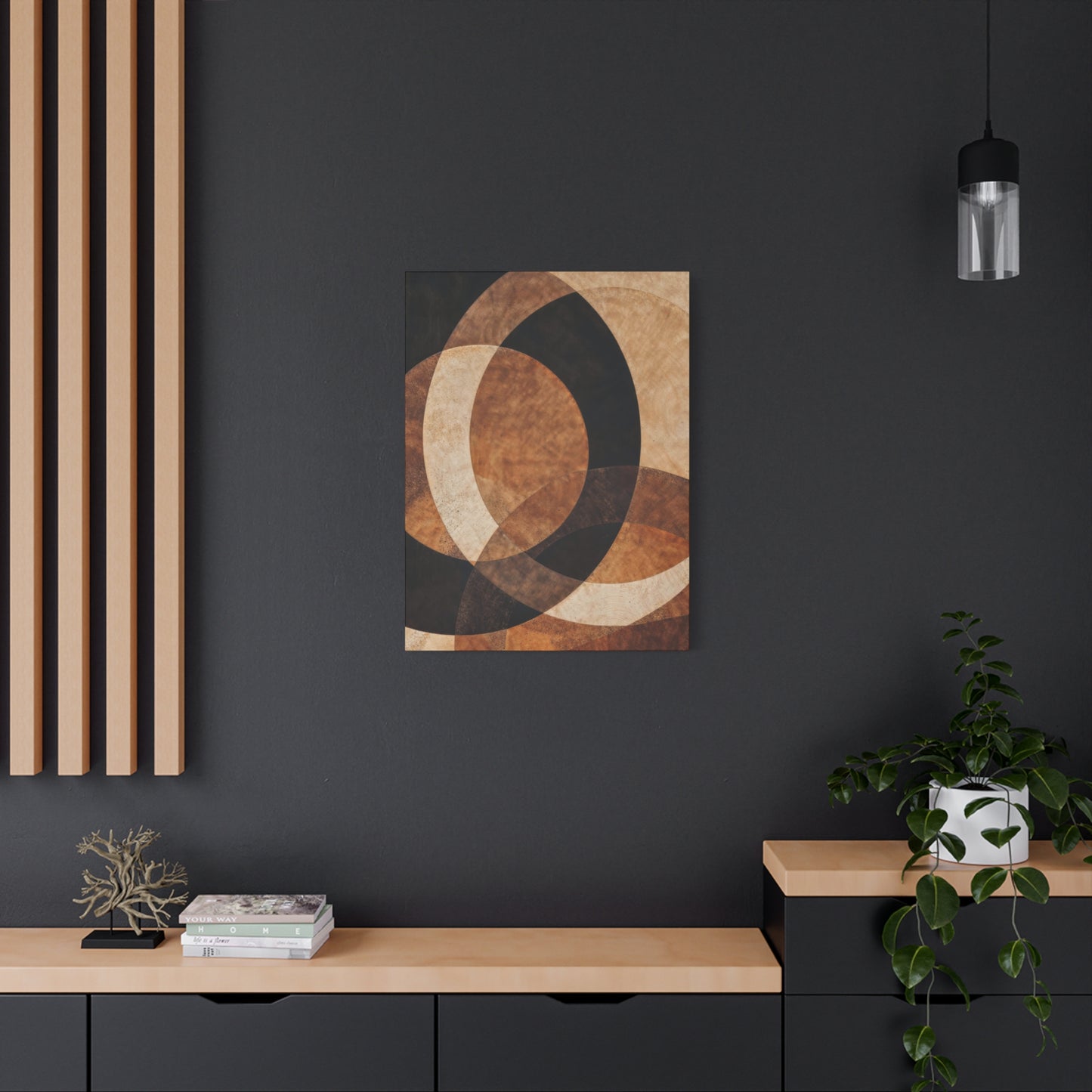
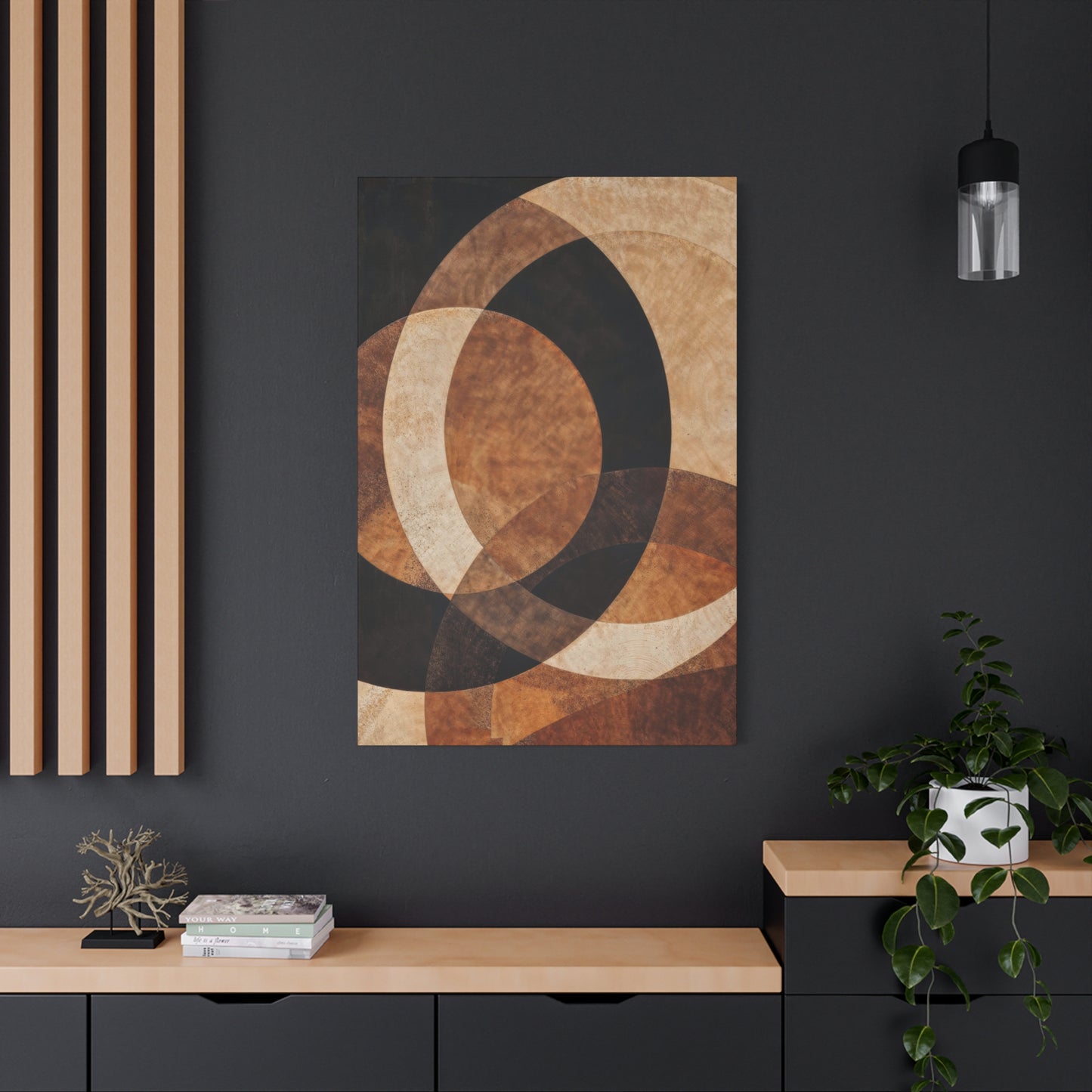
One of the most compelling attributes of Earthen Crescent Opulence Wall Art is its ability to transform spatial energy. Curved compositions soften architectural rigidity, creating visual movement that guides the eye with ease. In modern or minimalist interiors, such art tempers stark lines and industrial materials with warmth and sensuality. In bohemian or organic spaces, it deepens the sense of cohesion with nature-inspired furnishings and textures—linen, jute, clay, and rattan. The crescent’s subtle repetition and balance invite harmony into any setting, making it ideal for living rooms, meditation areas, or bedrooms seeking serene emotional resonance.
From a symbolic standpoint, the crescent form carries layers of meaning that enrich its artistic allure. It embodies duality—the waxing and waning of time, the interplay of shadow and light, the balance between beginnings and transformations. These symbolic undertones give the artwork depth beyond its aesthetic beauty, making it a conversation piece that reflects life’s cyclical grace. The inclusion of metallic or patina-like accents within earthen compositions further enhances this concept, suggesting the blending of ancient and modern, permanence and evolution.
The craftsmanship of this genre also plays a pivotal role in its emotional impact. Artists often employ textured layering, plaster reliefs, or mineral pigments to replicate the tactile essence of natural terrain. Each curve appears to have been shaped by unseen forces—wind, erosion, time—mirroring nature’s patient artistry. This handmade quality elevates each piece beyond printed or digital art, transforming it into an artifact of human touch and environmental reverence. In this way, Earthen Crescent Opulence embodies the intersection between craftsmanship and mindfulness, where each contour tells a story of creation and continuity.
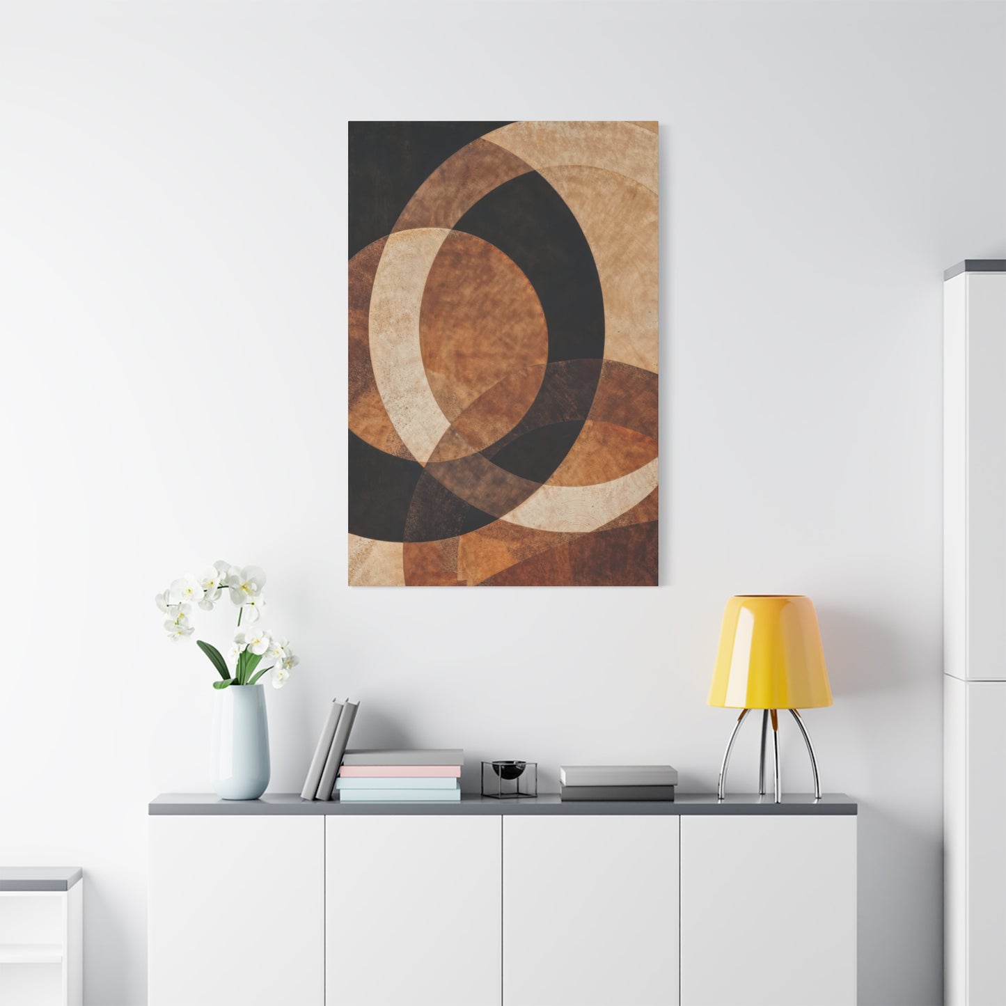
When integrated thoughtfully, this art can redefine how interiors feel and function. Hanging a large crescent-inspired canvas above a neutral-toned sofa creates a focal point that commands yet soothes. Pairing smaller works in varied curvatures along a hallway can evoke the progression of natural movement. Complementing such art with sculptural lighting or reflective surfaces allows the curves to interact dynamically with ambient illumination, producing subtle plays of shadow that evolve throughout the day—just as natural light animates the landscape.
Beyond its visual elegance, the psychological influence of Earthen Crescent Opulence is profound. The repetition of curved forms subconsciously evokes feelings of safety, comfort, and inclusivity. Unlike sharp angles, which convey assertiveness, curves embody flow and acceptance. Combined with the earth-inspired palette, they create spaces that nurture calm introspection and creative thought. This quality makes such art not only a decorative element but a form of environmental therapy—inviting both rest and renewal within the modern home.
Ultimately, The Allure of Curves reveals that design need not shout to be powerful. The quiet eloquence of curved lines, rendered in the humble hues of the earth, demonstrates how simplicity can achieve profound sophistication. Earthen Crescent Opulence Wall Art is a celebration of organic form, a dialogue between movement and stillness, chaos and order. It transforms interiors into reflections of natural equilibrium—spaces where art and architecture merge to honor the timeless language of the world itself.
In embracing the fluidity of the crescent and the warmth of earthen tones, we rediscover the artistry inherent in imperfection and asymmetry. Such works remind us that beauty lies in curvature—the subtle arcs that shape both landscapes and emotions. Through Earthen Crescent Opulence, modern interiors move beyond trend toward timeless serenity, proving that the true allure of design rests not in rigidity, but in the elegant, ever-flowing rhythm of nature’s eternal curve.
