


Enchanting Lavender Wall Art: Creating Serene Botanical Sanctuaries in Your Home
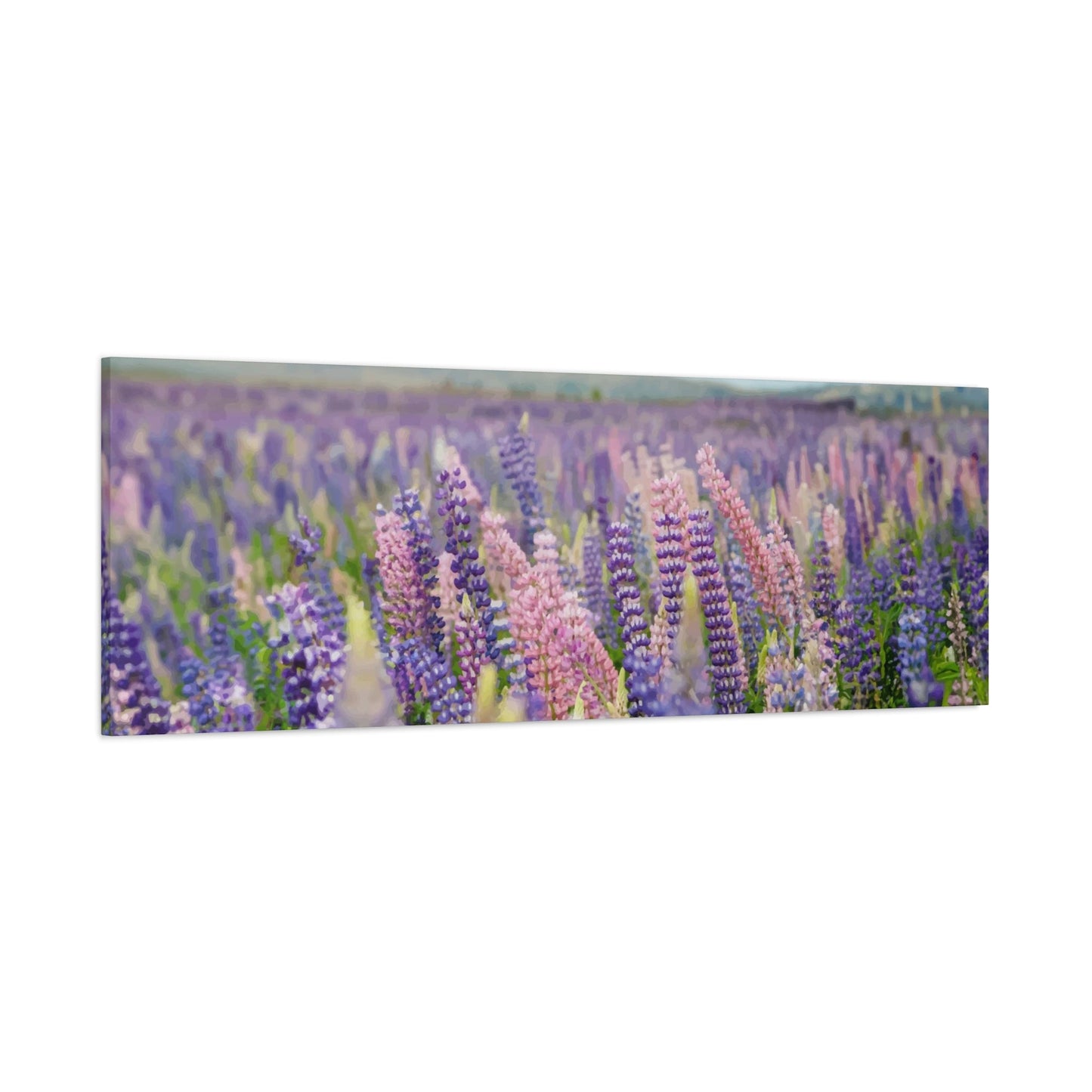
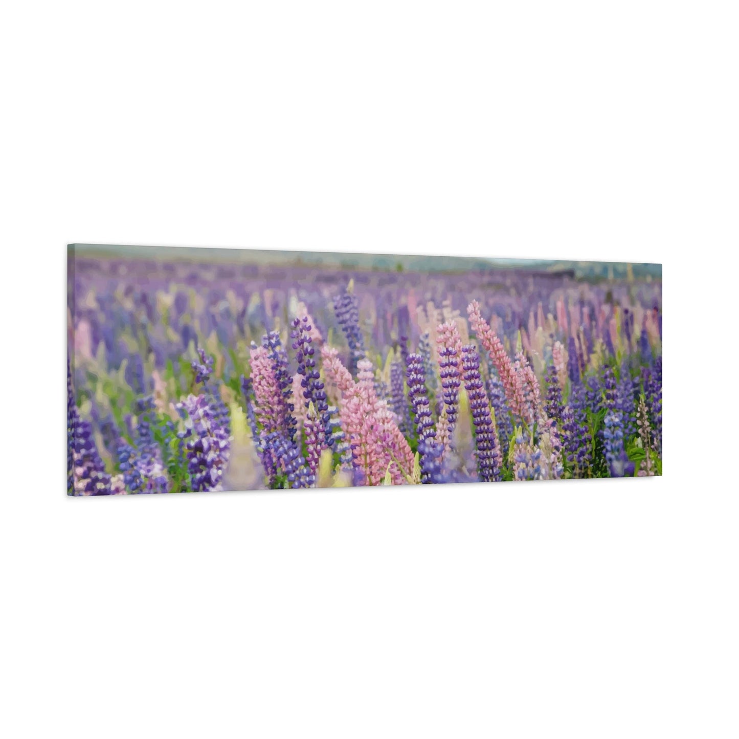
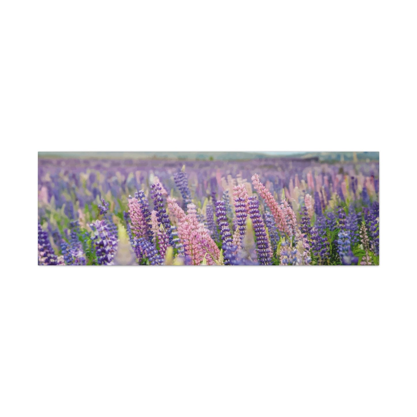
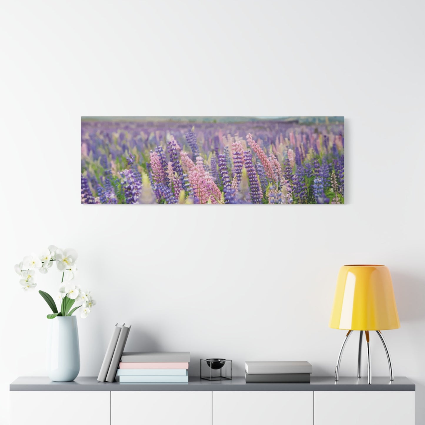
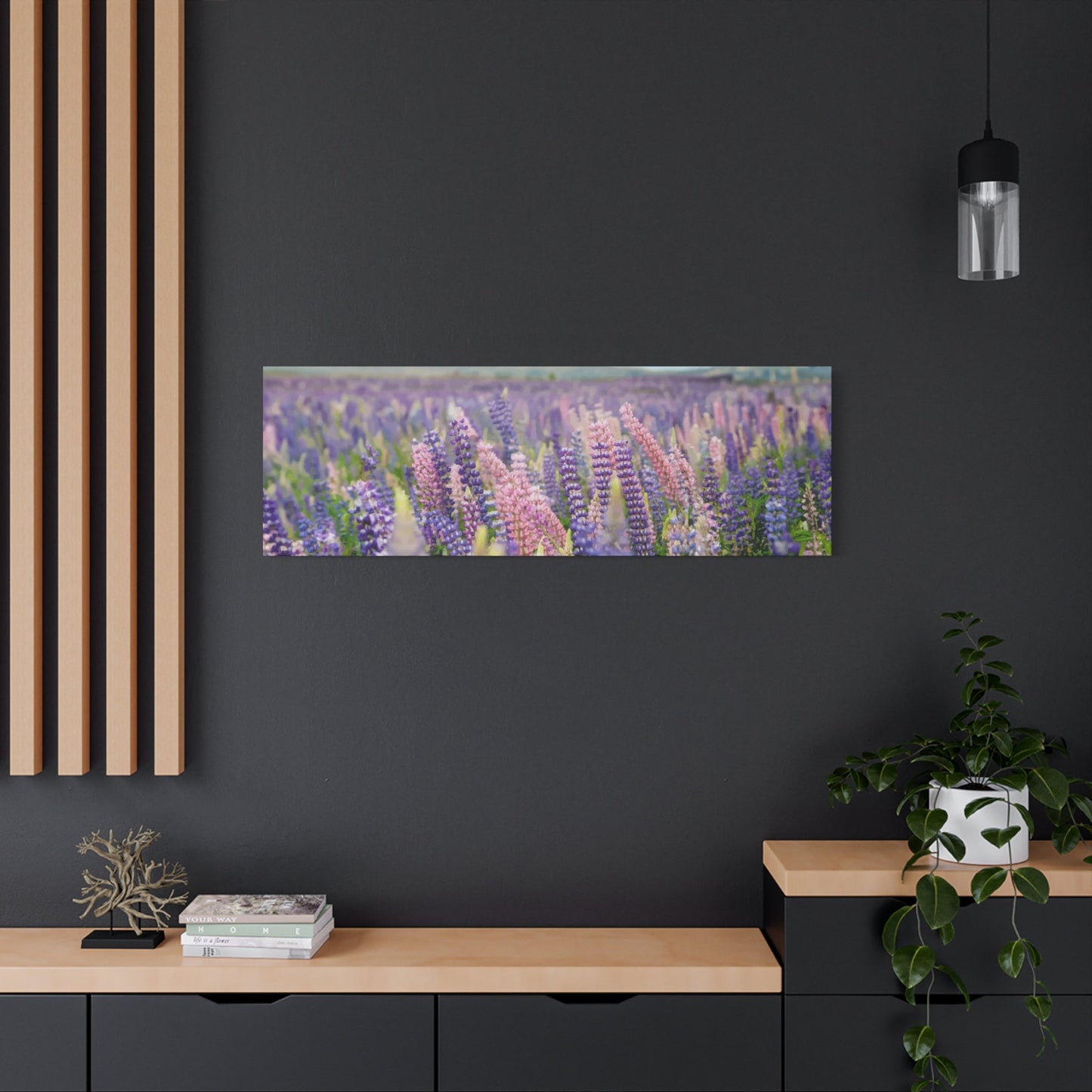
The mesmerizing beauty of endless lavender fields stretches across canvases and prints, bringing the tranquil essence of Provence directly into your living environment. These captivating artworks showcase vast purple landscapes that seem to whisper stories of gentle summer breezes and aromatic blossoms dancing in golden sunlight. The therapeutic qualities inherent in lavender field imagery make these prints exceptionally powerful tools for creating atmospheres of peace and relaxation within any room.
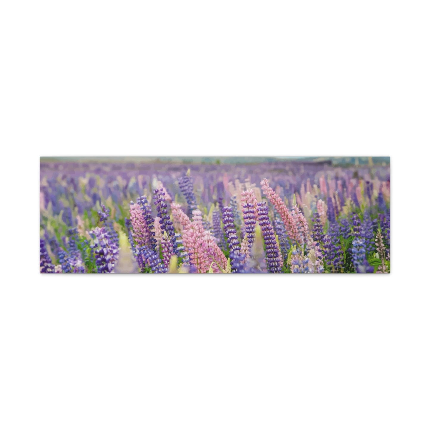
Lavender field prints possess an almost magical ability to transform mundane walls into windows overlooking serene countryside vistas. The rolling hills covered in purple blooms create visual depth and movement that draws the eye naturally across the composition, encouraging contemplation and mental rest. Each brushstroke or photographic detail captures the delicate texture of lavender stems swaying in gentle winds, creating a sense of motion that brings life to static wall surfaces.
The psychological benefits of incorporating lavender field prints into your decor extend far beyond mere aesthetic appeal. Research has consistently shown that viewing natural landscapes, particularly those featuring calming colors like purple and green, can significantly reduce stress levels and promote feelings of well-being. The repetitive patterns found in lavender fields create a meditative quality that helps quiet busy minds and restore emotional balance after challenging days.
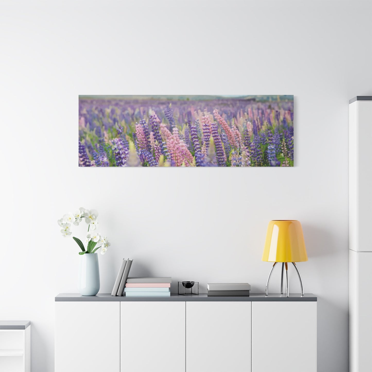
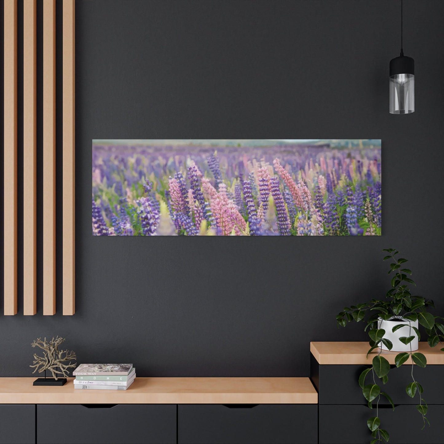
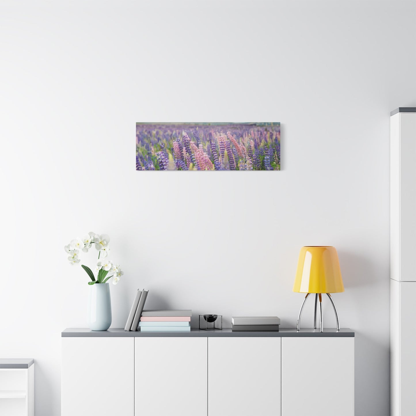
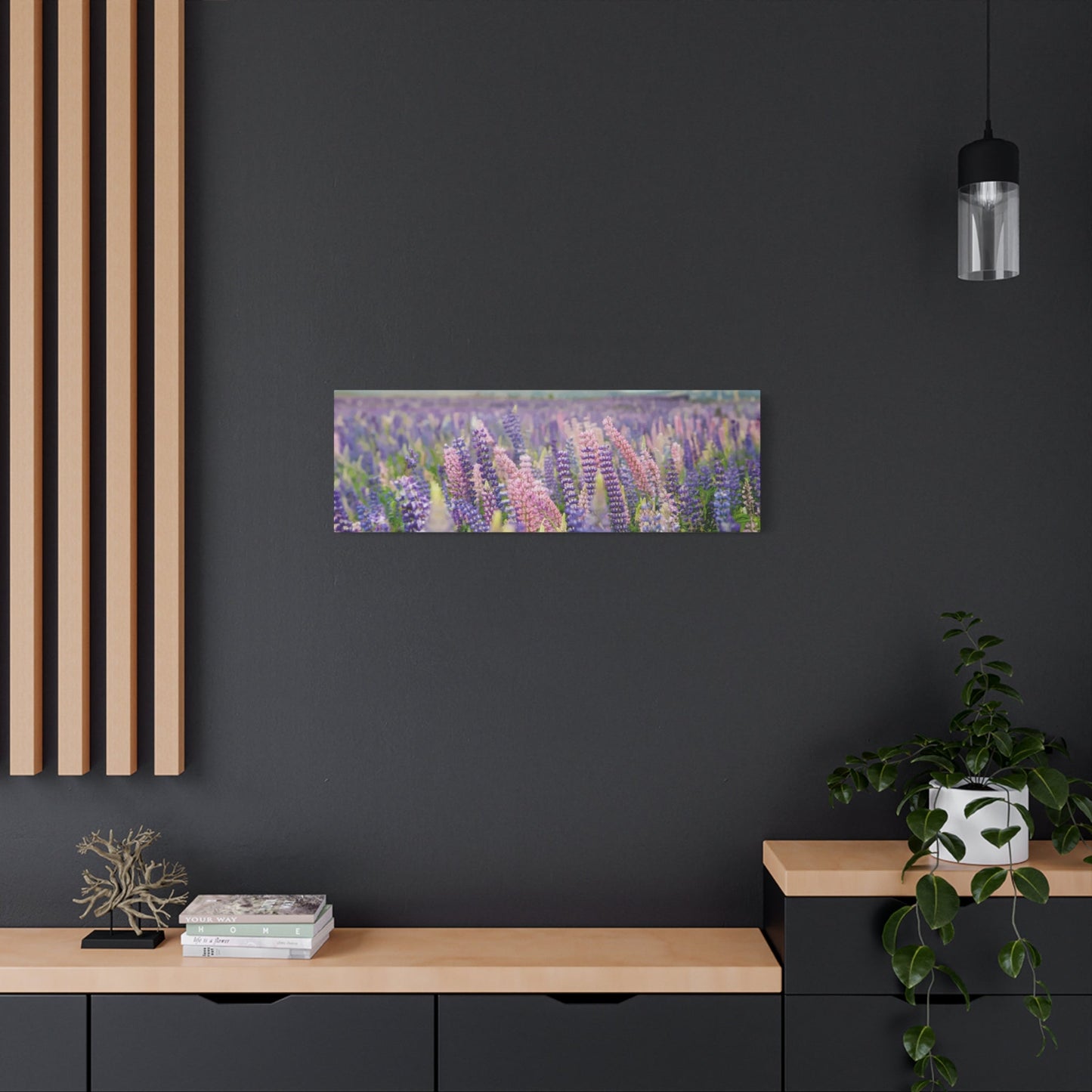
When selecting lavender field prints, consider the size and scale that will best complement your room's proportions. Large panoramic prints work exceptionally well in spacious rooms where they can serve as dramatic focal points, while smaller intimate prints create cozy corners perfect for reading or meditation. The horizontal format of most field landscapes naturally suits bedroom installations above headboards or living room arrangements above sofas and seating areas.
Color saturation plays a crucial role in determining the overall impact of lavender field artwork. Highly saturated prints with vibrant purples and deep greens create bold statements that energize rooms and spark conversation, while softer, more muted tones promote tranquility and blend seamlessly with existing neutral palettes. The interplay between the purple lavender blooms and the surrounding green foliage creates a natural color harmony that works beautifully with both warm and cool decorating schemes.
The versatility of lavender field prints allows them to complement various decorating styles, from rustic farmhouse aesthetics to contemporary minimalist approaches. In traditional settings, ornate frames with gold or bronze finishes enhance the classical beauty of the lavender landscapes, while modern presentations benefit from sleek black or white frames that emphasize clean lines and geometric precision.
Lighting considerations become particularly important when displaying lavender field prints, as proper illumination can dramatically enhance the artwork's visual impact. Natural light brings out the subtle color variations within the lavender blooms and highlights the textural details that give these prints their lifelike quality. However, direct sunlight should be avoided to prevent fading and preserve the artwork's longevity.
Lavender Wall Art for Bedrooms
Bedrooms transformed with carefully selected lavender artwork become personal sanctuaries where rest and rejuvenation flourish naturally. The gentle purple hues associated with lavender create an environment conducive to relaxation and peaceful sleep, making these artistic choices particularly beneficial for those seeking to improve their nightly rest quality. The aromatic associations connected with lavender imagery can trigger positive sensory memories that further enhance the calming atmosphere essential for restful sleep.
The placement of lavender artwork within bedroom settings requires thoughtful consideration of both aesthetic balance and functional lighting needs. Above the headboard represents the most traditional and visually impactful location, creating a focal point that draws attention while maintaining harmony with other bedroom elements. This positioning allows the lavender imagery to be the last thing seen before sleep and the first upon waking, bookending each day with peaceful botanical beauty.
Alternative placement options include creating gallery walls along prominent bedroom walls or positioning single statement pieces on walls facing the bed. These arrangements provide opportunities to incorporate multiple lavender artworks of varying sizes and styles, creating visual interest while maintaining thematic cohesion throughout the room. The key lies in balancing the visual weight of the artwork with other bedroom furnishings to avoid overwhelming the restful atmosphere essential for quality sleep.
Color coordination becomes particularly crucial when incorporating lavender artwork into existing bedroom color schemes. Purple tones naturally complement neutral palettes featuring whites, creams, and soft grays, creating sophisticated combinations that feel both elegant and calming. For bedrooms with warmer color schemes, lavender artwork provides beautiful contrast while maintaining overall harmony through shared undertones and complementary relationships.
The style and medium of lavender bedroom artwork should align with personal preferences while supporting the room's overall aesthetic goals. Soft watercolor prints create dreamy, ethereal qualities perfect for romantic or feminine bedroom designs, while bold photographic prints of lavender fields add contemporary sophistication to modern bedroom schemes. Mixed media approaches combining various artistic techniques can create unique focal points that reflect individual personality and artistic preferences.
Framing choices significantly impact how lavender artwork integrates within bedroom environments. Light-colored frames in white, cream, or natural wood tones maintain the soft, peaceful atmosphere essential for restful bedrooms, while darker frames can add dramatic contrast when used strategically. The frame style should complement existing bedroom furniture finishes to create cohesive design relationships throughout the room.
Lighting considerations become even more critical in bedroom applications where artwork must look beautiful under various conditions, from bright morning sunlight to soft evening lamplight. Adjustable lighting options, such as picture lights or strategically placed lamps, can highlight lavender artwork during evening hours while maintaining the subdued atmosphere necessary for pre-sleep relaxation.
Purple Tones in Floral Decor
The rich spectrum of purple tones found within lavender-inspired floral decor offers endless possibilities for creating sophisticated and emotionally resonant living environments. From deep violet shades that command attention to soft lilac hues that whisper tranquility, purple tones provide versatile options for expressing personal style while maintaining connection to nature's calming influences. These varied purple expressions allow for layered decorating approaches that build visual complexity while maintaining thematic unity throughout any room.
Understanding the psychological impact of different purple tones enables more strategic decorating decisions that support desired emotional outcomes. Deeper purple shades, such as royal purple or eggplant, create dramatic focal points that energize rooms and stimulate creativity, making them excellent choices for offices, studios, or entertainment areas where mental engagement is desired. Conversely, lighter purple tones like lavender, lilac, and mauve promote relaxation and contemplation, making them ideal for bedrooms, meditation rooms, or reading nooks where peaceful atmosphere is paramount.
The interaction between purple floral artwork and existing room colors creates opportunities for sophisticated color relationships that enhance overall design cohesion. Purple's position on the color wheel allows it to create beautiful complementary relationships with yellow tones, analogous harmonies with blues and reds, and elegant monochromatic schemes when combined with various purple shades. These color relationships can be leveraged to create specific moods and visual effects that support the room's intended function and atmosphere.
Seasonal considerations play important roles in selecting appropriate purple tones for floral decor. Spring and summer installations might feature brighter, more vibrant purple shades that reflect the energy and growth associated with these seasons, while autumn and winter arrangements often benefit from deeper, richer purple tones that create warmth and intimacy during colder months. This seasonal approach allows for rotating artwork collections that keep rooms feeling fresh and appropriately attuned to natural cycles.
The medium and technique used to create purple floral artwork significantly influences how the colors appear and interact within room environments. Oil paintings typically offer rich, saturated purple tones with subtle variations and depth, while watercolors provide translucent, ethereal purple effects that seem to glow with internal light. Digital prints can reproduce either effect while offering consistent color reproduction and affordability for larger installations or multiple room applications.
Texture considerations become particularly important when working with purple floral decor, as different textures can dramatically alter how purple tones are perceived and experienced. Smooth, glossy surfaces reflect light and intensify purple colors, creating vibrant, energetic effects, while matte or textured surfaces absorb light and soften purple tones, promoting more peaceful and contemplative atmospheres. The choice between these effects should align with the desired emotional impact and functional requirements of each room.
Layering different purple tones within floral arrangements creates visual depth and sophisticated color relationships that prevent monotonous single-tone presentations. Combining light and dark purple shades, warm and cool purple variations, and saturated and muted purple tones within single compositions or room arrangements creates dynamic visual interest while maintaining thematic coherence through shared color families.
Provence-Inspired Lavender Canvas
The romantic allure of Provence countryside captured on canvas brings timeless European elegance into contemporary living environments. These artistic interpretations of French lavender fields evoke memories of sun-drenched afternoons, ancient stone farmhouses, and the gentle rhythm of rural life that has captivated visitors to this enchanting region for generations. Provence-inspired lavender canvas artwork serves as more than decoration; it becomes a portal to a world where time moves slowly and natural beauty reigns supreme.
Authentic Provence-inspired artwork typically incorporates distinctive visual elements that immediately evoke the region's unique character and atmosphere. Rolling hills covered in precise rows of lavender plants create geometric patterns that contrast beautifully with the organic curves of distant mountains and cloudy skies. Ancient cypress trees punctuate the landscape, adding vertical elements that break the horizontal flow of lavender fields while providing scale reference that emphasizes the vastness of these purple expanses.
The architectural elements commonly featured in Provence-inspired lavender canvas artwork contribute significantly to the overall authentic atmosphere. Stone farmhouses with weathered shutters, terracotta roof tiles, and climbing vines create focal points that anchor compositions while providing cultural context that distinguishes these works from generic floral landscapes. These structural elements add narrative depth that invites viewers to imagine the lives and stories connected to these picturesque settings.
Color palettes characteristic of Provence-inspired artwork extend beyond simple purple and green combinations to include the warm earth tones that define Mediterranean landscapes. Ochre, sienna, and burnt orange tones appear in building walls and distant hillsides, while soft blues and grays represent the characteristic light that makes Provence such a beloved destination for artists. These expanded color palettes create richer, more complex compositions that support various decorating schemes and color preferences.
The painting techniques employed in authentic Provence-inspired lavender canvas artwork often reflect traditional European artistic approaches that emphasize craftsmanship and attention to detail. Impasto techniques create textural interest that makes lavender fields appear to ripple in gentle breezes, while glazing methods build luminous color layers that capture the unique quality of Mediterranean light. These technical approaches result in artworks that reward close examination while maintaining visual impact from viewing distances.
Contemporary interpretations of Provence-inspired themes offer opportunities to incorporate traditional European aesthetic elements within modern decorating contexts. Abstract approaches might emphasize color relationships and compositional elements while reducing representational details, creating artwork that suggests Provence landscapes without literal reproduction. These modern interpretations allow for greater flexibility in matching existing decor while maintaining connection to the romantic ideals associated with French countryside imagery.
The emotional resonance of Provence-inspired lavender canvas artwork stems from its ability to evoke aspirational lifestyle concepts that many people find deeply appealing. The slower pace, connection to nature, and emphasis on simple pleasures represented in these artworks provide psychological escape from contemporary stress and complexity. This emotional connection makes Provence-inspired artwork particularly effective in creating relaxing environments where peace and tranquility are priorities.
Minimalist Lavender Flower Art
The refined elegance of minimalist approaches to lavender flower art demonstrates how powerful visual impact can emerge from simplified compositions and restrained color palettes. By reducing complex lavender field landscapes to essential elements, minimalist artwork creates contemplative focal points that promote mental clarity and emotional balance. These artistic approaches align perfectly with contemporary preferences for uncluttered living environments where every decorative element serves both aesthetic and functional purposes.
Minimalist lavender flower art typically features clean, geometric compositions that emphasize form, line, and negative space relationships. Single lavender stems positioned against neutral backgrounds create striking silhouettes that capture the essential beauty of these aromatic flowers without unnecessary decorative complexity. The resulting artwork possesses a timeless quality that transcends trends while providing versatile decorating options for various room styles and color schemes.
The strategic use of negative space within minimalist lavender compositions creates breathing room that allows viewers' eyes to rest and minds to process visual information without overwhelming stimulation. This approach proves particularly beneficial in contemporary living environments where visual calm becomes increasingly valuable amidst busy lifestyles. The simplicity inherent in minimalist approaches allows the natural beauty of lavender forms to speak for themselves without competing decorative elements.
Color reduction represents another key characteristic of minimalist lavender flower art, often limiting palettes to two or three carefully selected hues that create maximum impact through strategic relationships. Monochromatic approaches using various shades of purple create sophisticated depth while maintaining visual unity, while limited color combinations featuring purple and single accent colors create dynamic tension that energizes compositions without overwhelming peaceful atmospheres.
The scale considerations in minimalist lavender artwork often favor larger formats that allow simplified compositions to command attention and create significant visual presence. Oversized single stems or geometric lavender arrangements can transform entire walls into focal points that anchor room designs while maintaining the understated elegance characteristic of minimalist aesthetics. These scale relationships ensure that simplified compositions maintain adequate visual weight to function effectively within contemporary room proportions.
Medium selection plays crucial roles in successful minimalist lavender flower art, with choices significantly impacting final aesthetic outcomes. Clean digital prints offer precise lines and consistent color reproduction ideal for contemporary presentations, while hand-painted watercolors introduce subtle variations that soften geometric severity without compromising minimalist principles. The medium choice should align with overall room aesthetics and desired emotional impacts.
Framing approaches for minimalist lavender artwork typically emphasize clean lines and neutral colors that support rather than compete with the artwork's simplified beauty. Sleek metal frames, natural wood finishes, or even frameless presentations mounted directly on walls maintain focus on the lavender imagery while providing necessary structural support. The framing choice becomes part of the overall minimalist aesthetic rather than a separate decorative element.
Lighting considerations become particularly important for minimalist lavender artwork, where subtle details and color relationships require proper illumination to achieve intended visual effects. Even, diffused lighting prevents harsh shadows that might disrupt carefully balanced compositions while ensuring accurate color reproduction that maintains the artwork's intended emotional impact throughout various viewing conditions.
Lavender Bouquet Wall Prints
The intimate beauty of lavender bouquet imagery brings the tactile pleasure of gathered flowers into homes through carefully crafted wall prints that capture every delicate detail of these aromatic arrangements. Unlike expansive field landscapes, bouquet presentations focus attention on individual flower characteristics, stem textures, and the gentle relationships between clustered blooms. These close-up perspectives create opportunities for viewers to appreciate the intricate natural architecture that makes lavender such a beloved botanical subject.
Traditional lavender bouquet compositions often feature carefully arranged stems bound with ribbons or twine, creating formal presentations that emphasize the ceremonial and gift-giving associations connected with these fragrant flowers. The addition of complementary elements such as eucalyptus branches, baby's breath, or rustic wrapping materials creates visual complexity while maintaining focus on the lavender's natural beauty. These traditional approaches work particularly well in rooms decorated with vintage or farmhouse aesthetics where nostalgic elements enhance overall atmospheric goals.
Contemporary interpretations of lavender bouquet imagery might emphasize more casual, natural arrangements that appear recently gathered from garden plots. These informal presentations create different emotional connections, suggesting spontaneous enjoyment of natural beauty rather than formal ceremony. Loose, organic arrangements appeal to viewers seeking artwork that reflects relaxed lifestyle approaches and appreciation for unstudied natural beauty.
The photographic techniques employed in creating lavender bouquet wall prints significantly influence final aesthetic outcomes and emotional impacts. Soft focus approaches create dreamy, romantic qualities that emphasize mood over precise detail, while sharp macro photography reveals intricate textures and structural details that celebrate the complex beauty found within individual flowers. The technical approach should align with desired decorating outcomes and personal aesthetic preferences.
Composition choices within lavender bouquet prints offer opportunities to create various visual effects and emotional responses. Centrally positioned bouquets create formal, balanced presentations suitable for traditional decorating approaches, while off-center compositions introduce dynamic tension that energizes contemporary room designs. The compositional approach influences how viewers interact with the artwork and should support overall room functionality and aesthetic goals.
Background selections in lavender bouquet prints play crucial roles in determining overall visual impact and integration potential within existing decor. Neutral backgrounds in white, cream, or soft gray allow lavender colors to dominate while providing flexibility for matching various color schemes. Alternatively, textured backgrounds featuring wood, linen, or aged paper surfaces add character and support specific decorating themes while maintaining focus on the floral subject matter.
Color treatment approaches in lavender bouquet prints range from naturalistic reproduction to artistic interpretation that emphasizes specific emotional or aesthetic outcomes. Saturated color approaches create vibrant, energetic presentations that command attention, while desaturated or sepia treatments produce vintage aesthetics that blend seamlessly with traditional decorating schemes. The color treatment choice should consider both artistic preferences and practical integration requirements.
Size considerations for lavender bouquet prints depend on intended placement and desired visual impact within room contexts. Smaller prints work beautifully in intimate groupings or as part of gallery wall arrangements, while larger formats create standalone focal points suitable for prominent wall locations. The scale relationship between artwork and surrounding elements influences overall room balance and should be planned carefully during selection processes.
Rustic Lavender Farmhouse Decor
The warmth and authenticity of rustic farmhouse aesthetics find perfect expression through lavender-themed artwork that celebrates rural life and agricultural traditions. These decorative approaches emphasize natural materials, weathered textures, and honest craftsmanship that reflects the simple beauty found in country living. Lavender imagery naturally aligns with farmhouse values of self-sufficiency, connection to land, and appreciation for nature's practical and aesthetic gifts.
Traditional farmhouse lavender decor often incorporates functional elements that reflect historical rural practices, such as drying bundles hanging from wooden beams or lavender sachets arranged in woven baskets. These practical references create narrative depth that connects contemporary living environments with agricultural heritage while providing educational opportunities for family members to learn about traditional lavender uses and processing methods.
The material choices characteristic of rustic farmhouse lavender decor emphasize natural textures and authentic finishes that support the honest aesthetic values central to this decorating approach. Reclaimed wood frames with visible grain patterns and weathered surfaces complement lavender imagery while providing structural elements that reinforce the rustic theme. Metal accents featuring aged or patinated finishes add industrial touches that reflect the practical tools and equipment essential to agricultural life.
Color palettes appropriate for rustic farmhouse lavender decor typically feature muted, earthy tones that reflect the natural aging and weathering processes that give authentic farmhouse environments their characteristic appearance. Soft purples paired with sage greens, warm creams, and weathered grays create harmonious combinations that feel both sophisticated and unpretentious. These natural color relationships support the farmhouse emphasis on materials and finishes that improve with age and use.
The handcrafted quality essential to authentic farmhouse aesthetics influences both the selection and presentation of lavender artwork within these decorating schemes. Hand-painted signs featuring lavender motifs and rustic typography create focal points that celebrate traditional signmaking crafts while providing functional information or inspirational messages. These personalized elements add character that mass-produced decorations cannot replicate.
Vintage and antique accessories complement lavender farmhouse decor by providing historical context and authentic period details that enhance overall atmospheric believability. Antique watering cans planted with fresh lavender create functional decorations that bridge the gap between artwork and living botanical displays. Vintage botanical prints featuring lavender specimens add educational elements that reflect the traditional farmhouse emphasis on practical plant knowledge.
The seasonal adaptability of rustic farmhouse lavender decor allows for rotating displays that maintain fresh interest throughout the year while celebrating natural cycles important to agricultural communities. Summer arrangements might emphasize fresh lavender bundles and bright purple accents, while winter presentations could feature dried lavender displays and warmer color combinations that create cozy indoor atmospheres during harsh weather periods.
Lighting approaches for rustic farmhouse lavender decor should emphasize warm, intimate qualities that support the cozy atmosphere central to successful farmhouse aesthetics. Warm LED bulbs, candles, and lantern-style fixtures create golden light that enhances the natural textures and muted colors characteristic of farmhouse decorating while providing practical illumination for daily activities.
Watercolor Lavender Artwork
The ethereal beauty of watercolor techniques applied to lavender subjects creates artwork that captures both the physical appearance and emotional essence of these beloved aromatic flowers. The transparent nature of watercolor pigments allows colors to blend and flow naturally, mimicking the gentle way lavender blooms seem to fade into surrounding landscapes. This artistic medium proves particularly suited to lavender subjects because both the flowers and the technique share qualities of delicacy, transparency, and subtle beauty.
Watercolor lavender artwork often exhibits characteristic flowing effects where colors blend seamlessly into one another, creating soft transitions that mirror the natural gradations found in actual lavender fields. These flowing qualities make watercolor lavender particularly effective in creating peaceful, meditative atmospheres where harsh lines and abrupt color changes would feel jarring or inappropriate. The medium's inherent softness promotes relaxation and contemplation.
The unpredictable nature of watercolor techniques introduces organic variations that prevent sterile, mechanical appearance often associated with digital reproductions. Each brushstroke carries unique characteristics influenced by paper texture, paint consistency, and artist technique, resulting in artwork that possesses individual personality and handcrafted authenticity. These variations create subtle visual interest that rewards close examination while maintaining overall compositional harmony.
Color saturation control in watercolor lavender artwork allows artists to create various mood effects ranging from vibrant, energetic presentations to subtle, contemplative studies. Highly pigmented approaches create bold statements suitable for contemporary decorating schemes, while diluted, translucent applications produce gentle effects that blend seamlessly with traditional or minimalist aesthetics. The saturation choice significantly influences emotional impact and integration potential.
Paper selection plays crucial roles in determining final aesthetic outcomes in watercolor lavender artwork. Rough-textured watercolor papers create granular effects that add visual interest and support rustic or natural decorating themes, while smooth, hot-pressed papers allow for precise detail work and clean color applications suited to contemporary presentations. The paper choice becomes part of the overall artistic expression rather than simply a technical consideration.
Layering techniques in watercolor lavender artwork build depth and complexity through successive transparent applications that create rich color relationships and atmospheric effects. Initial light washes establish overall color temperature and mood, while subsequent layers add detail, contrast, and focal emphasis. This building process creates luminous color qualities that seem to glow with internal light, particularly effective when properly illuminated.
The preservation requirements for watercolor lavender artwork necessitate careful consideration of framing and display conditions to maintain color integrity over time. UV-protective glazing prevents fading while allowing natural light to illuminate the artwork's delicate color relationships. Acid-free matting and backing materials prevent chemical deterioration that could damage the paper and pigments over extended display periods.
Contemporary approaches to watercolor lavender artwork might incorporate mixed media elements that expand expressive possibilities while maintaining the medium's characteristic transparency and flow. Combining watercolor with pencil drawing, ink work, or collage elements creates layered compositions that offer additional visual complexity while preserving the gentle qualities that make watercolor lavender so appealing for residential decorating applications.
Botanical Lavender Illustrations
The scientific precision and artistic beauty combined in botanical lavender illustrations create educational artwork that celebrates both accurate natural observation and aesthetic appreciation. These detailed studies typically feature careful documentation of plant structures, growth patterns, and anatomical details that provide valuable botanical information while maintaining visual appeal suitable for residential decorating applications. The tradition of botanical illustration stretches back centuries, connecting contemporary viewers with historical scientific practices and artistic traditions.
Traditional botanical illustration techniques emphasize accuracy and detail that allows for species identification and study of plant characteristics. These precise approaches often include multiple views showing different growth stages, flower details, root systems, and seed structures that provide comprehensive plant documentation. For lavender subjects, botanical illustrations might feature detailed depictions of flower spike architecture, individual bloom structures, leaf patterns, and essential oil gland locations.
The educational value of botanical lavender illustrations extends beyond simple decoration to provide learning opportunities for family members interested in plant science, gardening, or natural history. Children particularly benefit from exposure to accurate plant representations that help develop observation skills and botanical vocabulary. These educational aspects make botanical illustrations valuable additions to home offices, libraries, or study areas where learning and curiosity are encouraged.
Color accuracy in botanical lavender illustrations requires careful attention to natural color relationships and seasonal variations that occur in living plants. Fresh spring growth might appear in bright green tones, while mature summer flowers display the characteristic purple shades associated with peak blooming periods. Autumn presentations could show seed development and color changes that occur as plants prepare for dormancy periods.
The artistic techniques employed in botanical lavender illustrations often combine precise line work with subtle color applications that create both accuracy and aesthetic appeal. Pen and ink drawings provide structural frameworks that define plant forms clearly, while watercolor or colored pencil applications add natural color relationships without overwhelming linear precision. These combined techniques result in artwork that satisfies both scientific and artistic viewing purposes.
Contemporary interpretations of botanical illustration principles might incorporate digital techniques that allow for enhanced detail reproduction and consistent color printing. Digital approaches enable the creation of multiple size options and format variations that provide flexibility for various decorating applications. However, the best contemporary botanical illustrations maintain the careful observation and accurate representation that define authentic botanical art traditions.
The historical context of botanical illustration adds narrative depth that enriches the viewing experience beyond simple aesthetic appreciation. Understanding that similar illustrations were created by scientific expeditions, monastery scholars, and curious naturalists throughout history creates connections between contemporary viewers and traditional knowledge-seeking practices. This historical awareness enhances the sense of participating in ongoing human efforts to understand and appreciate natural world complexity.
Framing and presentation approaches for botanical lavender illustrations should emphasize the scientific heritage while supporting residential decorating goals. Traditional approaches might feature museum-quality matting with specimen labels and scientific nomenclature that reinforce educational aspects. Contemporary presentations might emphasize clean, minimalist framing that allows the illustration quality to dominate while providing necessary protection and structural support.
Soft Pastels in Lavender Wall Art
The delicate charm of soft pastel interpretations transforms lavender subjects into gentle, dreamlike compositions that promote tranquility and emotional well-being. Pastel mediums naturally complement lavender's inherent softness, creating artwork that feels whisper-quiet and infinitely soothing. These pale, muted color approaches prove particularly effective in bedrooms, nurseries, and meditation areas where peaceful atmospheres support rest, reflection, and emotional restoration.
Pastel color palettes for lavender artwork typically feature reduced saturation levels that create harmonious relationships between purple flower tones and surrounding compositional elements. Soft lavender purples paired with pale greens, creamy whites, and gentle grays establish color schemes that feel cohesive and calming rather than demanding or energetic. These subtle relationships support decorating approaches where visual rest and mental calm take precedence over dramatic impact or attention-grabbing effects.
The psychological benefits of soft pastel lavender artwork stem from color psychology research demonstrating that muted tones promote relaxation and reduce stress responses. Unlike bold, saturated colors that stimulate mental activity and emotional arousal, pastel tones encourage slower breathing, reduced heart rate, and general physical relaxation. These physiological responses make pastel lavender artwork particularly valuable for creating therapeutic environments within homes.
Technical approaches to creating soft pastel effects in lavender artwork vary depending on chosen mediums and desired final appearances. Traditional pastel chalks create characteristic soft, powdery effects with gentle color transitions that feel organic and handcrafted. Digital techniques might employ soft brush effects and reduced opacity settings that mimic traditional pastel qualities while providing consistent reproduction and multiple format options.
The textural qualities characteristic of soft pastel artwork add tactile appeal that invites closer examination and emotional connection. The slightly rough, matte surfaces typical of pastel applications create subtle light absorption that prevents harsh reflections while maintaining gentle luminosity. These surface qualities contribute to the overall soothing effect by eliminating visual harshness that might disturb peaceful atmospheres.
Compositional approaches for soft pastel lavender artwork often emphasize gentle, flowing arrangements that avoid sharp angles or abrupt transitions that might feel jarring within peaceful color schemes. Organic curves, soft focus effects, and gradual color transitions create visual movement that feels natural and unforced. These compositional choices support the overall calming intent while maintaining adequate visual interest to prevent boring or monotonous presentations.
The versatility of soft pastel lavender artwork allows for effective integration within various decorating styles that emphasize comfort, relaxation, and emotional well-being. Shabby chic aesthetics benefit from the vintage, weathered qualities that pastel colors naturally suggest, while contemporary minimalist approaches appreciate the understated elegance that soft pastels provide without overwhelming clean, uncluttered environments.
Lighting considerations for soft pastel lavender artwork require careful attention to prevent color washing or detail loss that might occur under inappropriate illumination conditions. Warm, diffused lighting enhances the gentle color relationships while maintaining adequate contrast for comfortable viewing. Harsh or cool lighting can drain pastel colors of their subtle beauty and should be avoided in areas where soft pastel artwork is displayed.
Lavender Art for Spa-like Environments
The therapeutic associations connected with lavender make these botanical artworks natural choices for creating spa-like environments within residential settings. The aromatherapy connections, color psychology benefits, and peaceful imagery combine to establish atmospheres that promote relaxation, stress relief, and personal rejuvenation. These qualities make lavender artwork particularly valuable in bathrooms, master bedrooms, and dedicated wellness areas where self-care and restoration take priority.
Professional spa environments consistently incorporate lavender imagery and purple color schemes because of proven psychological and physiological benefits that support relaxation and healing responses. Research demonstrates that viewing lavender imagery can trigger positive associations with calm, peace, and well-being that enhance the effectiveness of relaxation practices such as meditation, yoga, or simple rest periods. These evidence-based benefits make lavender artwork valuable investments in personal health and wellness.
The specific visual characteristics that make lavender artwork effective in spa-like environments include soft color palettes, organic forms, and peaceful compositions that avoid jarring or stimulating elements. Gentle purple tones paired with calming greens and neutral backgrounds create color relationships that support rather than compete with relaxation goals. The natural, organic forms found in lavender plants provide visual connections to nature that many people find inherently soothing and restorative.
Moisture considerations become particularly important when incorporating lavender artwork into bathroom environments where spa-like atmospheres are often desired. Proper framing with moisture-resistant materials protects artwork while maintaining visual appeal under humid conditions. Alternative approaches might include ceramic tiles featuring lavender imagery or specially treated prints designed for bathroom installations that combine aesthetic appeal with practical durability.
The scale and placement of lavender artwork within spa-like environments should support relaxation practices rather than creating visual distraction or overwhelming stimulation. Larger, simplified compositions work effectively as meditation focal points, while smaller, detailed pieces reward closer examination during personal care routines. The placement height should accommodate both standing and seated viewing positions to maximize accessibility during various wellness activities.
Integrated lighting approaches enhance the spa-like qualities of lavender artwork by creating atmospheric effects that support relaxation goals. Dimmable lighting systems allow for adjustment according to specific activities and time-of-day preferences, while warm color temperatures promote evening relaxation and cool temperatures support morning awakening routines. Specialized picture lighting can highlight artwork while contributing to overall ambient lighting schemes.
Complementary elements that enhance spa-like lavender artwork installations might include fresh lavender plants, essential oil diffusers, or natural material accents that reinforce the connection between visual art and sensory wellness experiences. These multi-sensory approaches create more immersive spa-like environments that engage multiple senses simultaneously for enhanced relaxation benefits.
The seasonal adaptability of spa-like lavender artwork allows for rotating displays that maintain fresh interest while supporting ongoing wellness practices throughout the year. Summer installations might emphasize fresh, vibrant lavender imagery that celebrates peak growing season, while winter presentations could feature more muted, contemplative approaches that support indoor reflection during colder months.
Framed Lavender Photography
The crisp precision and natural beauty captured in framed lavender photography creates stunning focal points that celebrate the authentic appearance of these beloved aromatic plants. Professional photography techniques reveal details and color relationships that casual observation might miss, creating artwork that educates viewers about lavender's complex beauty while providing sophisticated decorating elements suitable for contemporary home environments. The realistic representation offered by photography appeals to viewers who prefer authentic natural imagery over artistic interpretation.
High-quality lavender photography typically employs macro techniques that reveal intricate structural details within individual flowers and plant arrangements. These close-up perspectives showcase the delicate architecture of lavender spikes, the subtle color variations within individual blooms, and the geometric patterns created by precise flower arrangements along stem structures. Such detailed documentation creates educational opportunities while maintaining strong aesthetic appeal for residential decorating applications.
The technical considerations involved in professional lavender photography influence final artistic outcomes and determine suitability for various decorating applications. Sharp focus techniques create crisp, detailed images that work effectively in contemporary environments where precision and clarity are valued. Alternatively, selective focus approaches that blur backgrounds while maintaining foreground clarity create more artistic effects that emphasize specific compositional elements while maintaining photographic authenticity.
Color reproduction accuracy in lavender photography requires careful attention to lighting conditions and post-processing techniques that preserve natural color relationships. The subtle purple variations found within lavender flowers can be difficult to capture accurately, particularly under artificial lighting conditions. Professional photographers often use specialized equipment and techniques to ensure color fidelity that allows viewers to experience authentic lavender beauty through photographic representation.
The compositional approaches employed in lavender photography range from traditional formal arrangements to contemporary artistic interpretations that emphasize unusual perspectives or creative cropping techniques. Traditional compositions might feature centered subjects with balanced backgrounds that create harmonious, peaceful presentations. Contemporary approaches might employ asymmetrical compositions, unusual angles, or creative lighting effects that add visual interest while maintaining focus on natural lavender beauty.
Environmental context in lavender photography can significantly influence emotional impact and decorating suitability. Images featuring lavender plants within natural field environments create different associations than studio photographs with controlled backgrounds and lighting. Field photography connects viewers with agricultural and rural themes, while studio work emphasizes pure aesthetic appreciation without environmental distractions.
Print quality considerations become particularly important for framed lavender photography, as technical deficiencies in reproduction can significantly diminish visual impact and longevity. Archival printing techniques using fade-resistant inks and acid-free papers ensure color stability over extended display periods. Professional printing services often provide color management expertise that optimizes reproduction quality for specific viewing conditions and frame types.
Framing choices for lavender photography should enhance rather than compete with the photographic content while providing necessary protection and structural support. Clean, contemporary frames work effectively with sharp, detailed photography, while more ornate options might complement softer, artistic photographic approaches. The frame selection should consider both the photographic style and the intended decorating context to achieve optimal integration results.
Vintage Lavender Botanical Prints
The timeless appeal of vintage botanical prints featuring lavender subjects connects contemporary homes with historical scientific traditions while providing sophisticated decorating elements that age gracefully. These historical documents often feature precise hand-colored illustrations created for scientific study and documentation purposes, offering viewers opportunities to appreciate both artistic craftsmanship and botanical accuracy from earlier eras. The patinated appearance and traditional presentation styles characteristic of vintage prints create instant character and depth within modern decorating schemes.
Authentic vintage lavender botanical prints typically feature scientific nomenclature, detailed anatomical studies, and multiple viewing perspectives that provide comprehensive plant documentation according to historical scientific standards. These educational elements add intellectual depth that distinguishes vintage botanical prints from purely decorative artwork while maintaining visual appeal suitable for residential applications. The combination of scientific purpose and artistic execution creates unique decorating elements that serve multiple aesthetic and educational functions.
The historical context surrounding vintage botanical prints adds narrative richness that enhances viewing experiences beyond simple aesthetic appreciation. Understanding that these prints were created for scientific expeditions, university studies, or private botanical collections connects contemporary viewers with historical knowledge-seeking traditions and scientific curiosity. This historical awareness creates deeper appreciation for the careful observation and artistic skill required to produce accurate botanical documentation without modern photographic assistance.
Conclusion
Incorporating enchanting lavender wall art into your home is more than just a design choice—it’s a transformative experience that fosters tranquility, beauty, and a deeper connection with nature. Lavender, with its soft hues and timeless botanical symbolism, creates a serene sanctuary in any space it graces. Whether you choose minimalist prints, vintage botanical illustrations, or textured canvas paintings, lavender wall art invites calmness and elegance into your interior design.
The serene purple tones of lavender are widely associated with relaxation, clarity, and peace, making them ideal for bedrooms, meditation areas, reading nooks, or even busy living spaces that need a soothing touch. By bringing these gentle elements into your home, you establish an atmosphere that promotes mental wellness, encourages mindfulness, and reflects a subtle appreciation for natural beauty.
Lavender-themed art also offers remarkable versatility in terms of style. It seamlessly fits into a variety of interior aesthetics—from rustic farmhouse charm to modern minimalism, French country romance to coastal chic. Its organic textures and delicate floral motifs allow it to complement both bold statement pieces and soft, understated palettes, making it a go-to choice for decorators seeking balance and harmony.
Beyond aesthetics, lavender carries a rich cultural and historical significance, often symbolizing purity, grace, and calmness. By embracing lavender wall art, you bring these associations into your everyday life, reinforcing a sense of serenity and positivity. When combined with natural elements like wooden frames, linen textiles, or dried lavender arrangements, the effect is both grounding and elevating.
Moreover, lavender wall art serves as a gentle reminder of the beauty in simplicity and the healing power of nature. In today’s fast-paced, technology-driven world, creating small botanical sanctuaries in your home can help counterbalance stress and restore emotional equilibrium. These visual cues of nature provide comfort, stimulate creative thinking, and foster a more mindful living environment.
Whether you’re curating a cozy cottage bedroom, a spa-inspired bathroom, or a peaceful corner for reflection, lavender art offers an enchanting solution. It’s a simple yet powerful way to refresh your space, uplift your mood, and express your personal style through the lens of nature’s elegance.
In essence, enchanting lavender wall art doesn’t just decorate—it transforms. It invites peace, inspires stillness, and reminds us of the calming presence of nature. By thoughtfully selecting and placing lavender-themed artwork in your home, you create a serene botanical sanctuary where beauty and tranquility coexist in perfect harmony.
