


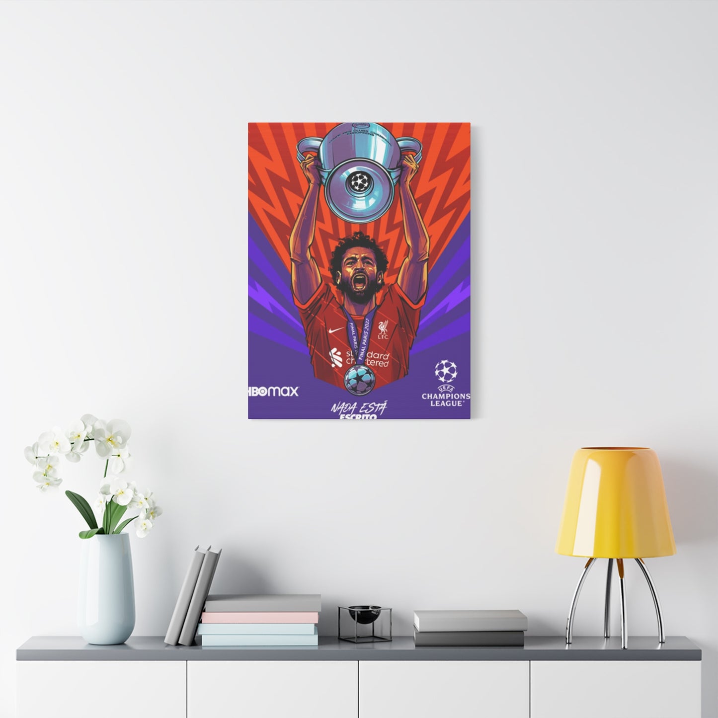

Creating a Mindful Space: How Nada Está Wall Art Brings Calm Energy to Your Home
The world of interior design has witnessed a profound shift toward minimalism and meaningful expression, where less truly becomes more. Within this evolving landscape, Spanish-language wall art has emerged as a powerful tool for personal expression, and among these pieces, those featuring the evocative phrase have captured the imagination of homeowners, designers, and art enthusiasts alike. This exploration into the aesthetic and philosophical dimensions of this particular Spanish expression reveals how simple words can transform living spaces into sanctuaries of contemplation, creating environments that speak to both the eye and the soul. The phrase itself carries layers of meaning that resonate across cultures, inviting viewers to pause, reflect, and consider the profound implications of absence, potential, and the spaces between what is and what could be.
Styling Your Space with Spanish Minimalist Wall Art
The integration of minimalist Spanish-language artwork into residential and commercial spaces represents more than a decorative choice; it embodies a lifestyle philosophy that values intentionality over excess. When selecting pieces for your environment, consider how the stark simplicity of these works creates breathing room within your walls, allowing each element in the space to stand on its own merit without competing for attention. The beauty of incorporating such artwork lies in its versatility across various design schemes, from ultra-modern lofts with industrial elements to cozy apartments seeking a touch of continental sophistication.
Begin by assessing the natural light in your space, as this will dramatically affect how the artwork interacts with its surroundings throughout the day. Morning light may cast gentle shadows that add depth to the lettering, while afternoon sun might create bold contrasts that emphasize the starkness of the design. The placement height matters significantly; hanging the piece at eye level ensures optimal engagement, but in spaces designed for relaxation or meditation, slightly lower placement can create a more intimate connection with the viewer.
Consider the surrounding color palette when positioning these works. Against white or light-colored walls, the typography becomes a focal point that draws the eye immediately upon entering the room. However, when placed against darker backgrounds, the piece can create a subtle, sophisticated statement that reveals itself gradually as one moves through the space. The scale of the artwork should correspond to the wall space available; a large canvas can anchor an entire room, while smaller pieces work beautifully in more confined areas or as part of larger arrangements.
The material quality of the canvas itself contributes significantly to the overall aesthetic impact. High-quality canvas with proper stretching over substantial wooden frames ensures the piece maintains its integrity over time, preventing sagging or warping that could diminish its visual appeal. The texture of the canvas adds dimension to the work, creating subtle variations in how light interacts with the surface throughout the day. Some prefer gallery-wrapped canvases where the image continues around the sides, eliminating the need for traditional framing, while others appreciate the finished look that a complementary frame provides.
Furniture arrangement should complement rather than compete with the artwork. In living rooms, positioning seating to face the piece creates opportunities for contemplation and conversation about its meaning. In bedrooms, placing such artwork opposite the bed offers a meaningful visual to greet you each morning and contemplate before sleep. The negative space surrounding the artwork is equally important; overcrowding the area diminishes the piece's impact, while thoughtful spacing allows it to breathe and command attention appropriately.
Lighting design plays a crucial role in showcasing these pieces effectively. While natural light offers beautiful, changing illumination, strategic artificial lighting ensures the artwork remains a focal point after dark. Picture lights mounted above the canvas provide direct illumination, while wall washers create a more subtle effect. Avoid harsh spotlights that might create glare on the canvas surface, opting instead for softer, diffused lighting that enhances rather than overwhelms the piece.
The psychological impact of such minimalist artwork in living spaces cannot be overstated. These pieces serve as daily reminders to pause, breathe, and consider the deeper aspects of existence beyond the material world. They create anchor points within busy homes, offering visual rest stops where the eye and mind can settle amidst the chaos of modern life. The simplicity of the design prevents visual fatigue, making these pieces suitable for spaces where people spend extended periods.
Resonance of Emptiness and Infinite Potential
The profound philosophical implications contained within these two simple words open doorways to contemplation about existence, potential, and the nature of reality itself. This phrase operates on multiple levels simultaneously, suggesting both absence and infinite possibility, creating a paradox that has fascinated philosophers, artists, and thinkers throughout history. The concept challenges viewers to consider what happens in the space where something is not yet present, where form has not yet taken shape, and where potential remains unrealized but limitless.
Eastern philosophical traditions have long celebrated the concept of emptiness as a foundation for understanding reality. In Buddhist thought, the notion of emptiness does not suggest nihilism or meaninglessness but rather points to the fundamental nature of all phenomena as interdependent and lacking inherent, independent existence. This philosophical framework provides rich context for understanding how such artwork functions not merely as decoration but as a gateway to deeper contemplation about the nature of being and non-being.
Western existentialist philosophy offers another lens through which to interpret these works. Thinkers like Sartre explored the concept of nothingness as fundamental to human freedom, arguing that we exist in a state of radical freedom precisely because we are not predetermined or complete. The anxiety and liberation that comes from confronting this void forms a central theme in existentialist thought, making artwork featuring such language a visual representation of these profound philosophical concepts.
The phrase invites consideration of potential and becoming rather than fixed states of being. In a world obsessed with certainty, achievement, and completion, these words offer refreshing permission to exist in states of transition, incompleteness, and openness. This perspective can be particularly valuable in contemporary society, where pressure to constantly achieve, acquire, and accomplish can become overwhelming. The artwork serves as a visual reminder that emptiness itself holds value, that not everything needs to be filled, completed, or resolved.
From a creative standpoint, the concept resonates deeply with the artistic process itself. Every blank canvas, empty page, or silent space represents the same principle in action—the pregnant void from which all creation emerges. Artists understand intimately the power and potential contained within emptiness, making such artwork particularly meaningful in creative spaces. The tension between what is absent and what might emerge creates a dynamic energy that can inspire and motivate without overwhelming.
Psychologically, these works can serve therapeutic functions by normalizing feelings of incompleteness or uncertainty that many people experience but rarely acknowledge. In a culture that often demands constant productivity and presence, permission to embrace states of emptiness or not-yet-ness can provide profound relief. The artwork becomes a companion in moments of transition, uncertainty, or personal transformation, offering silent validation that such states are not only acceptable but potentially generative.
The linguistic simplicity of the phrase belies its conceptual complexity. By stating what is not rather than what is, the language itself performs the concept it describes. This meta-quality adds layers of meaning for viewers who engage deeply with the piece, creating opportunities for ongoing discovery and interpretation. Unlike more literal or descriptive artwork, these pieces remain open to personal interpretation, allowing each viewer to project their own understanding and experience onto the work.
The temporal dimension of the concept also merits consideration. The phrase exists in the present tense, suggesting not a permanent state of absence but rather a current condition subject to change. This temporal specificity introduces hope and possibility while acknowledging present reality. The implicit suggestion that what is not now might be later creates a forward-looking orientation that can be particularly valuable in spaces dedicated to planning, dreaming, or envisioning future possibilities.
The Compelling Force of Refined Aesthetic Reduction
Simplicity in visual art represents one of the most challenging aesthetic goals to achieve effectively. Removing elements until only the essential remains requires tremendous discipline, discernment, and understanding of visual communication. Wall art featuring minimal typography exemplifies this principle, demonstrating how maximum impact can emerge from minimal elements. The power of such pieces lies not in what they include but in what they deliberately exclude, creating space for viewer interpretation and emotional response.
The history of minimalism in visual arts provides important context for understanding contemporary minimalist wall decor. Emerging as a movement in the late 1950s and gaining prominence through the 1960s and 1970s, minimalism rejected the emotional intensity and gestural expression of abstract expressionism in favor of simplified forms, industrial materials, and objective presentation. While those early minimalist sculptures and paintings differed significantly from contemporary wall art, they established principles that continue to influence design today.
Typography-based art occupies a unique position within minimalist aesthetics because it inherently contains meaning through language while potentially functioning as pure form through letterforms. This dual nature creates tension and interest that purely abstract work might lack. The choice of typeface, spacing, alignment, and proportion all contribute to the overall impact of the piece, demonstrating that simplicity does not mean simplistic or easy. Each decision in creating such work carries significant weight precisely because there are so few elements to consider.
The psychological impact of simplified visual environments has been extensively studied, with research consistently showing that reduced visual complexity can lower stress, improve focus, and create feelings of calm and order. In environments saturated with visual information, advertisements, screens, and stimulation, minimalist artwork provides vital visual rest. The absence of complex imagery or multiple elements allows the mind to settle and process without becoming overwhelmed or overstimulated.
Color choices in minimalist pieces contribute significantly to their emotional impact. Black text on white canvas creates maximum contrast and clarity, producing a bold, definitive statement that commands attention. White text on black canvas reverses this relationship, creating a more intimate, introspective feeling that draws viewers in rather than projecting outward. Subtle variations like off-white backgrounds or charcoal lettering introduce warmth and sophistication while maintaining minimalist principles.
The concept of negative space becomes paramount in these works. In visual design, negative space refers to the area surrounding the main elements—in this case, the space around the letters and words. Skilled designers understand that this space is not merely empty but actively shapes how we perceive and interpret the central elements. Generous negative space allows the words to breathe, preventing the composition from feeling cramped or claustrophobic while emphasizing the importance of what is present.
Scale relationships within minimalist compositions require careful consideration. Oversized typography can create dramatic impact and ensure readability from a distance, while smaller, more delicate letterforms might create intimacy and require closer engagement. The relationship between letter size, canvas size, and viewing distance all factor into determining appropriate scale. In larger rooms, bolder presentation ensures the piece maintains presence, while in smaller, more intimate spaces, subtler approaches may prove more effective.
The materiality of minimalist artwork affects how viewers experience it. Canvas texture adds dimension and warmth that printed paper cannot match, while the weight and presence of properly stretched canvas conveys quality and permanence. The edges of gallery-wrapped canvas become part of the composition, and decisions about whether to continue the design around the sides or leave them neutral impacts the overall aesthetic. Framing choices, when frames are used, should enhance rather than compete with the minimalist aesthetic of the piece itself.
Durability and longevity factor importantly into the appeal of quality minimalist wall art. Unlike trendy pieces that may feel dated after a few years, well-executed minimalist work possesses timeless qualities that allow it to remain relevant and appealing across changing design trends. This longevity makes such pieces worthwhile investments for those building collections or designing spaces intended to remain cohesive over extended periods.
Creating Sanctuaries for Contemplation and Inner Peace
The intentional design of spaces dedicated to meditation, mindfulness, and relaxation has gained significant attention as more people recognize the importance of having designated areas for mental and spiritual practice. Visual elements within these spaces play crucial roles in facilitating the transition from everyday consciousness to meditative states. Artwork featuring contemplative language serves multiple functions in such environments, providing focal points for attention, symbolic representations of practice goals, and aesthetic elements that support the overall atmosphere.
The relationship between visual environment and meditative practice has been recognized across spiritual traditions worldwide. Zen gardens, prayer rooms, and meditation halls all demonstrate understanding that external environment influences internal states. While some traditions favor completely bare spaces, others recognize that carefully chosen visual elements can support rather than distract from practice. The key lies in selecting pieces that enhance rather than overwhelm, that invite inward attention rather than demanding outward focus.
In designing meditation corners or dedicated practice rooms, the placement of contemplative artwork requires thoughtful consideration. Positioning pieces at or slightly below eye level when seated ensures comfortable viewing during practice without requiring neck strain or unusual positioning. The artwork should be visible from the primary meditation position but not demand constant attention. The goal is creating a supportive presence rather than a dominating focal point that pulls attention away from internal awareness.
Lighting in meditation spaces must balance practical needs with atmospheric goals. Natural light offers ideal illumination for daytime practice, connecting practitioners with circadian rhythms and seasonal changes. However, meditation often occurs during early morning or evening hours when artificial lighting becomes necessary. Dimmable lighting allows adjustment to match practice needs, with softer illumination during seated meditation and brighter light for reading or preparation. The artwork should remain gently visible across various lighting conditions without becoming lost in darkness or washed out by excessive brightness.
The color palette of meditation spaces typically emphasizes neutrals, earth tones, and muted shades that promote calm without stimulating strong emotional responses. Within this context, minimalist artwork provides visual interest without disrupting the overall serenity. Black and white pieces complement virtually any color scheme while maintaining the simplified aesthetic appropriate for contemplative environments. The absence of bright colors prevents visual distraction while the contrast ensures the piece remains readable and meaningful.
Furniture and props in meditation spaces should support practice without cluttering the environment. Meditation cushions, benches, or chairs provide comfort during extended sitting, while perhaps a small table or shelf might hold candles, incense, or meaningful objects. The minimalist artwork becomes part of this carefully curated environment, contributing to the overall sense of intentionality and purpose that distinguishes a dedicated practice space from casual seating areas.
The acoustic environment of meditation spaces deserves attention alongside visual considerations. While artwork cannot directly affect sound, the overall design philosophy that guides minimalist visual choices often extends to acoustic design. Soft surfaces like curtains, cushions, and textile wall hangings can absorb sound and create quieter environments conducive to meditation. The integration of visual and acoustic considerations creates multi-sensory environments that support deep practice.
Personal meaning enhances the value of artwork in meditation spaces beyond pure aesthetics. Practitioners might choose pieces whose language resonates with specific aspects of their practice, philosophical orientations, or personal journeys. The Spanish phrase under discussion, with its evocation of emptiness and potential, aligns naturally with Buddhist and mindfulness practices that emphasize non-attachment, impermanence, and the spacious awareness underlying all experience. This alignment between visual element and practice philosophy creates coherence that supports consistent practice.
The flexibility of meditation spaces often requires consideration as well. Many people, particularly those in urban environments or smaller homes, cannot dedicate entire rooms to meditation. Instead, they create flexible spaces that serve multiple functions. In such situations, the artwork becomes increasingly important as a marker that signals the space's contemplative function. When practice time arrives, the presence of the artwork helps shift mental gears from everyday activities to meditative awareness, serving as a visual cue that facilitates the transition.
Harmonizing Minimalist Language with Abstract Visual Elements
The combination of typography-based artwork and abstract visual art creates dynamic tension that can enliven interior spaces while maintaining aesthetic coherence. Abstract art, with its emphasis on form, color, and composition independent of representational content, shares philosophical ground with minimalist text-based pieces despite their apparent differences. Both approaches prioritize essential elements while eliminating the superfluous, creating space for viewer interpretation and emotional response.
When pairing text-based minimalist pieces with abstract artwork, color relationships become primary considerations. If the abstract pieces feature bold, saturated colors, the black and white simplicity of minimalist text art provides visual rest and balance. Conversely, if the abstract works employ subtle, muted tones, the high contrast of black text on white canvas introduces definition and punctuation to the arrangement. The goal is creating conversation between pieces rather than competition, allowing each work to maintain its individual character while contributing to a cohesive whole.
Scale and proportion play vital roles in successful pairings. Large abstract canvases with expansive fields of color might pair beautifully with smaller text pieces that provide intimacy and human scale. Alternatively, oversized typography art can anchor a wall featuring multiple smaller abstract works, creating a focal point around which the other pieces orbit. The relationship between sizes should feel intentional rather than haphazard, with clear visual hierarchy that guides the eye through the arrangement.
The rhythm and spacing of multi-piece arrangements require careful planning. Too much density creates visual chaos that undermines the calm simplicity of minimalist pieces, while excessive spacing can make arrangements feel disconnected and random. Traditional gallery-style spacing typically leaves several inches between frames, but contemporary approaches sometimes tighten spacing for more unified installations or dramatically increase spacing for editorial effect. The specific space being designed, its proportions, and its function should guide these decisions.
Compositional balance between abstract and text pieces can follow symmetric or asymmetric principles depending on the desired effect and the architecture of the space. Symmetric arrangements create formality and calm, with pieces balanced evenly on either side of a central point. Asymmetric arrangements feel more dynamic and contemporary, with visual weight distributed unevenly but in ways that still achieve overall balance. The text piece might anchor one side of an arrangement with its clarity and definition, while abstract works of similar visual weight balance the opposite side.
Thematic connections between pieces, while not required, can add layers of meaning to arrangements. Abstract works that evoke landscapes, horizons, or vast spaces naturally complement text about emptiness and possibility. Similarly, abstract pieces with strong geometric elements share the clarity and decisiveness of well-executed typography. These connections need not be obvious or literal; subtle resonances often prove more interesting than heavy-handed matching.
The frame choices or lack thereof contribute significantly to how pieces relate to each other. Consistent framing creates unity, suggesting the pieces belong together as a deliberate collection. Varied framing can work when other elements like color palette or composition create coherence, but requires more skill to execute successfully. Gallery-wrapped canvases without frames create contemporary, streamlined looks that emphasize the artwork itself rather than its presentation, an approach that often suits minimalist aesthetics particularly well.
Artists and designers should consider the wall color and texture as active elements in multi-piece arrangements. White walls provide neutral backgrounds that allow artwork to stand forward, while colored or textured walls become part of the composition itself. The negative space between pieces functions as part of the overall design, and on colored walls, this space takes on the wall color, potentially creating harmonious or contrasting relationships with the artworks.
Practical considerations like lighting must address multiple pieces rather than a single focal point. Track lighting offers flexibility to illuminate each piece individually, while wall washing creates more even illumination across the entire arrangement. The goal is ensuring each piece receives adequate light without creating harsh shadows or glare, while maintaining the overall atmospheric goals of the space.
Evolution Within Contemporary Hispanic Artistic Expression
The incorporation of Spanish language into visual art reflects broader movements within contemporary art that embrace linguistic diversity and cultural specificity. Hispanic and Latin American art movements have long explored the intersection of language, identity, and visual expression, creating works that speak simultaneously to Spanish-speaking communities and broader international audiences. Text-based artwork in Spanish carries particular resonance, connecting to rich literary traditions while addressing contemporary concerns and aesthetics.
Contemporary Spanish and Latin American artists have pioneered approaches to text-based art that influence design and decorative art worldwide. Artists have explored how language functions visually, how words carry cultural weight beyond their literal meanings, and how bilingual or multilingual viewers might experience the same text differently. These explorations have opened possibilities for designers creating accessible yet meaningful wall art for diverse populations.
The global interest in Spanish-language art reflects demographic shifts and cultural exchange. As Spanish-speaking populations have grown in traditionally English-speaking countries, and as cultural products flow increasingly across borders, Spanish language has gained prominence in visual culture. This visibility extends beyond communities where Spanish is the primary language to broader audiences who appreciate the aesthetic qualities of Spanish typography and the accessible exoticism of romantic language.
Within art markets, Spanish-language pieces occupy interesting positions. For Spanish speakers, they offer opportunities to see their language reflected in high-quality design objects, validating cultural identity within home environments. For non-Spanish speakers, these pieces introduce linguistic beauty and intellectual engagement, as viewers might research meanings and contemplate how understanding shifts with translation. This dual appeal creates market opportunities while raising questions about cultural appreciation versus appropriation.
The specific phrase under discussion resonates with particular strength within Hispanic philosophical and literary traditions. Spanish and Latin American literature have long engaged with existential questions, magical realism, and the nature of reality and illusion. Writers have explored themes of absence, presence, and the liminal spaces between being and non-being. Visual art featuring such language connects to these literary traditions, creating cultural continuity across media.
Modern Spanish design movements emphasize clean lines, quality materials, and the integration of contemporary aesthetics with traditional craftsmanship. These principles align naturally with minimalist approaches to wall art, where execution quality and design clarity determine success. Spanish designers have contributed significantly to contemporary minimalism, bringing Mediterranean sensibilities about light, space, and material to international design conversations.
The role of text in visual art continues evolving as artists experiment with new technologies and presentation methods. Digital printing allows unprecedented control over typography, color, and scale, democratizing access to high-quality text-based art. This technological accessibility has spawned countless small studios and independent artists creating Spanish-language pieces for growing markets. The proliferation of options has raised overall quality standards as consumers become more discerning and educated about design principles.
Street art and graffiti movements, particularly strong in Spanish-speaking urban centers, have influenced how contemporary artists approach text in visual art. The bold, declarative style of street typography, the layering of language and image, and the use of public space as canvas all inform contemporary text-based art. While wall art for homes differs fundamentally from street interventions, the influence is apparent in the confidence and directness with which text addresses viewers.
Investigating Profound Questions Through Visual Design
Existential themes exploring meaning, purpose, freedom, and the human condition have preoccupied philosophers, writers, and artists throughout history. Visual art offers unique opportunities to engage these themes through immediate, visceral means that complement philosophical writing without requiring extensive reading or study. Wall art featuring language related to existence, absence, or being creates daily encounters with these profound questions, integrating philosophical contemplation into everyday life.
The existentialist movement, particularly as developed by European philosophers in the mid-twentieth century, emphasized individual existence, freedom, and responsibility. Key thinkers explored anxiety, alienness, and the challenge of creating meaning in an absurd universe. While these heavy themes might seem incompatible with home decor, thoughtfully designed artwork can introduce these concepts in accessible, aesthetically pleasing ways that invite rather than overwhelm.
The concept of nothingness or absence plays central roles in existentialist thought. Far from indicating nihilism, philosophical engagement with nothingness often reveals the ground from which meaning and value emerge. When we confront what is not, we become more aware of what is, and we recognize our freedom and responsibility to create meaning rather than simply discovering pre-existing purposes. Wall art engaging these themes serves as daily invitation to live authentically and purposefully.
Modern anxiety often stems from abundance rather than scarcity—too many choices, too much information, too many demands on attention and energy. In this context, artwork celebrating emptiness and simplicity offers counterbalance to contemporary overwhelm. The visual representation of concepts like absence or not-yet-ness provides permission to pause, to not fill every moment with activity or every space with objects, to embrace stillness and uncertainty as valuable rather than problematic.
The relationship between language and existence has fascinated philosophers across traditions. Words shape how we understand reality, creating categories and distinctions that structure experience. Yet reality exceeds language, existing beyond our capacity to fully describe or capture it. Artwork that uses minimal language to point toward ineffable concepts enacts this relationship, using words to gesture beyond themselves toward what cannot be fully expressed linguistically.
Contemporary society often avoids contemplating mortality, limit, and finitude, preferring narratives of endless growth, progress, and possibility. Yet existentialist philosophers argue that authentic existence requires confronting these realities honestly. Artwork can facilitate such contemplation in gentle ways, creating space for reflection without demanding immediate resolution or providing false comfort. The daily presence of such pieces normalizes philosophical questioning as part of ordinary life.
The therapeutic potential of existential contemplation has been recognized in existential psychotherapy and related approaches. These methods help clients confront anxiety, find meaning amid suffering, and take responsibility for their choices and lives. While artwork cannot replace therapy, it can support similar processes by keeping fundamental questions visible and valued. The piece becomes a companion in ongoing processes of self-examination and growth.
Different viewers will engage existential artwork from vastly different starting points. Some approach from religious or spiritual frameworks that provide ready answers to existential questions, while others grapple with these questions without predetermined conclusions. The openness of thoughtfully designed artwork allows diverse viewers to engage according to their own needs and orientations, finding personal meaning without requiring ideological agreement.
The placement of existential artwork influences how it functions in viewers' lives. In private spaces like bedrooms or personal studies, such pieces support intimate reflection and personal growth work. In shared spaces like living rooms, they might spark conversations about meaning, purpose, and the questions that occupy inhabitants' minds. In professional environments, they can introduce depth and humanity, suggesting that work occurs within larger contexts of meaning and purpose.
Maximizing Visual Effect Through Thoughtful Presentation
The presentation of canvas artwork dramatically affects its impact and how viewers experience it. While the image itself provides primary content, decisions about framing, mounting, and hanging determine how successfully the piece integrates into its environment and captures attention. For minimalist works where every element carries significance, presentation choices become especially important as they constitute the only elements beyond the central design itself.
Traditional framing involves surrounding the canvas with a protective and decorative border, typically wood or metal, often with mat board creating additional space between the frame and image. For minimalist artwork, frame choices should enhance rather than compete with the piece's simplicity. Thin, simple frames in black, white, or natural wood complement minimal aesthetics without adding visual weight. Wide, ornate frames generally conflict with minimalist principles unless ironic contrast is specifically intended.
Gallery wrapping, where canvas continues around the stretcher bar edges, creates contemporary looks that eliminate framing needs. This approach showcases canvas texture and creates clean, modern presentations. For text-based pieces, gallery wrapping works particularly well when the design is centered and surrounded by adequate negative space, as the continuing edges feel natural rather than chopped. Some artists paint edges solid colors or continue backgrounds around sides while keeping text centered on front.
The decision between framing and gallery wrapping often comes down to personal preference and existing decor. Framed pieces offer protection against dust and minor damage while creating more traditional presentations. Gallery-wrapped pieces emphasize the canvas as object rather than image as window, feeling more sculptural and contemporary. Both approaches can work beautifully when executed with quality materials and attention to detail.
Hanging hardware and methods affect both appearance and safety. Professional installation uses appropriate hardware rated for the artwork's weight, properly anchored to wall studs or using appropriate anchors for drywall or plaster. The hanging mechanism should be secure and ideally hidden, creating the impression that the artwork floats on the wall rather than obviously hanging from visible wires or hooks. Level, properly centered installation ensures the piece looks intentional and professionally presented.
Height conventions suggest hanging artwork so its center sits at average eye level, typically around 57 to 60 inches from the floor. However, this guideline requires adjustment based on ceiling height, furniture arrangement, and viewer habits. In dining rooms where people sit, lower placement ensures comfortable viewing from seated positions. In hallways where people pass by standing, standard heights work well. The architecture and function of each space should inform specific decisions.
Creating visual relationships between the artwork and surrounding architectural features strengthens the overall design. Centering a piece on a wall creates formal, balanced compositions, while off-center placement can feel more dynamic and contemporary. Alignment with windows, doors, furniture edges, or other architectural elements creates visual connections that make the piece feel integrated rather than arbitrarily placed.
The relationship between artwork and furniture requires consideration in living spaces. Pieces hung above sofas or beds should be proportionate to the furniture beneath them, generally spanning half to three-quarters the furniture's width. Too small creates awkward relationships where neither element adequately supports the other, while oversized pieces can overwhelm furniture and feel unbalanced. The vertical distance between furniture and artwork typically ranges from six to twelve inches, close enough to create relationship but far enough to prevent damage.
Lighting installation specifically for artwork elevates presentation significantly. Picture lights mounted above the frame or canvas provide focused illumination, while track lighting offers flexibility to light multiple pieces from single installation points. LED technology has revolutionized art lighting by providing excellent color rendering without ultraviolet damage or excessive heat. Proper lighting ensures the artwork remains visible and impactful during evening hours when many spaces receive primary use.
Protection from environmental damage ensures artwork maintains its appearance over time. Direct sunlight causes fading and degradation, so pieces should be positioned away from windows receiving strong sun or protected with UV-filtering glass or film. Extreme temperature and humidity fluctuations can damage canvas and cause colors to shift, so artwork should not be placed near heating vents, air conditioning units, or in spaces without climate control. Regular dusting with soft, dry cloths maintains cleanliness without risking damage from moisture or chemicals.
Cultivating Tranquility Through Intentional Design
The concept of creating peaceful environments through design principles draws from various cultural traditions and contemporary research into environmental psychology. Zen aesthetics, emerging from Japanese Buddhist traditions, emphasize simplicity, naturalness, and the subtle beauty found in imperfection and impermanence. While Western interpretations sometimes simplify or misunderstand these complex traditions, core principles offer valuable guidance for designing contemporary spaces that support calm and clarity.
Central to Zen-inspired design is the concept of emptiness as positive rather than negative quality. Western cultures often treat empty space as problem requiring solution, filling every corner and surface with objects and decoration. Zen perspectives recognize emptiness as valuable in itself, providing visual and mental rest, allowing appreciation of few carefully chosen elements, and creating spaciousness that supports contemplation. Minimalist artwork naturally complements this approach by occupying space without cluttering it.
Natural materials connect interior spaces to natural world, creating continuity between built and organic environments. Wood, stone, bamboo, paper, and natural fibers all feature prominently in Zen-inspired spaces. When combined with minimalist artwork, these materials create warmth that prevents spaces from feeling cold or sterile. The texture and subtle variation in natural materials adds visual interest without complexity, maintaining calm while preventing monotony.
Color palettes in Zen-influenced spaces typically emphasize neutrals, earth tones, and muted shades. White, beige, gray, and soft browns create backdrops that feel calm without being stark. Occasional accent colors might be introduced through natural elements like plants or through artwork, but these remain subtle rather than demanding attention. Within this context, black and white artwork provides contrast and definition without disrupting overall serenity.
The principle of asymmetric balance draws from natural forms that rarely display perfect symmetry. While symmetric arrangements create formal beauty, asymmetric balance feels more organic and dynamic. In arranging furniture and artwork, Zen-influenced design often employs asymmetry thoughtfully, creating balance through careful distribution of visual weight rather than mirror-image matching. This approach prevents spaces from feeling rigid or overly controlled.
Connections to nature enhance spaces' ability to support calm and restoration. Views of greenery, natural light, indoor plants, water features, or natural materials all strengthen this connection. Artwork can support these efforts through subject matter or more subtly through color, composition, or thematic content. Text referencing natural elements or philosophical concepts related to nature and impermanence reinforces these connections.
Multifunctional flexibility characterizes many Zen-influenced spaces, reflecting traditional Japanese architecture's adaptable rooms. While Western homes typically designate rooms for specific functions, flexible spaces can transform to meet varying needs. Within this context, carefully chosen artwork helps define space without limiting its potential uses. A piece that supports meditation also enhances reading, conversation, or quiet work, proving valuable across activities.
The concept of mindful living extends from meditation practice into all aspects of daily life, encouraging full presence and attention to current experience. Environmental design supporting mindful living minimizes distractions, creates clear purposes for spaces, and incorporates elements that gently remind inhabitants to return to present awareness. Artwork featuring contemplative language functions beautifully in this capacity, offering visual anchors that support intentional living.
Maintenance simplicity factors into Zen-inspired design philosophy. Elaborate decorative schemes requiring constant upkeep create burden rather than peace. Simple, durable elements maintain their beauty with minimal intervention, freeing time and attention for more meaningful pursuits. Quality canvas prints require only occasional dusting, making them ideal for this design philosophy.
Appreciating the Power of Unfilled Visual Territory
Negative space, also called white space or blank space, refers to areas in compositions not occupied by primary elements. Far from being merely empty, negative space actively shapes how we perceive and interact with positive elements. In minimalist artwork featuring typography, negative space becomes as important as the letters themselves, creating breathing room, directing attention, and contributing significantly to overall aesthetic impact.
The relationship between positive and negative space creates visual tension that engages viewers' attention. When generous negative space surrounds text, our eyes travel easily to the words, which stand out clearly against uncluttered backgrounds. This clarity ensures immediate comprehension while creating elegant, sophisticated appearances. Insufficient negative space creates cramped compositions that feel cluttered regardless of how few actual elements appear.
Psychological research demonstrates that negative space affects cognitive processing and emotional response. Compositions with ample white space feel more open, accessible, and high-quality than dense arrangements, even when actual content is identical. This perception affects how viewers value artwork and whether they find it pleasant to observe over time. The generous use of negative space in minimalist design contributes to these pieces' enduring appeal.
Cultural factors influence how different audiences perceive and value negative space. Some design traditions favor fullness and complexity, filling available space with pattern, color, and form. Others prioritize restraint and simplicity, valuing empty space as deliberate choice rather than oversight. Contemporary minimalism draws from both Eastern and Western traditions that value simplicity, creating aesthetics accessible across diverse cultural backgrounds.
The ratio of positive to negative space dramatically affects composition's overall feel. Highly asymmetric ratios where negative space vastly exceeds positive creates delicate, refined effects. More balanced ratios feel bolder and more commanding. Designers manipulate these ratios intentionally to achieve specific effects, recognizing that no universal ideal exists but rather appropriate relationships for particular contexts and purposes.
Negative space can create implied shapes and meanings through careful arrangement of positive elements. In typography, the spaces between letters, between words, and around entire text blocks all contribute to readability and aesthetic effect. Kerning, the space between individual letters, requires attention to prevent awkward gaps or uncomfortable crowding. Leading, the space between lines of text, affects how easily viewers can read and track multiple lines.
Edge relationships between positive elements and composition borders merit consideration. Elements placed very near edges create tension and energy, while generous margins create calm and control. For minimalist text art, centered compositions with equal negative space on all sides create formal, balanced effects. Off-center arrangements with asymmetric negative space feel more dynamic and contemporary.
Negative space influences how viewers' eyes move through compositions. Large areas of negative space create visual paths that guide attention toward positive elements. Designers can manipulate eye movement by strategically varying negative space amounts and distribution, creating visual journeys through artworks. In simple compositions with minimal elements, these considerations become even more critical since fewer elements bear responsibility for engaging attention.
The concept of visual weight, where some design elements feel heavier or lighter than others, relates closely to negative space. Dark colors, large sizes, and complex shapes feel heavier than light colors, small sizes, and simple shapes. Negative space itself carries visual weight—large expanses of white space can balance bold dark elements, creating equilibrium in compositions. Understanding these relationships enables creation of balanced yet dynamic arrangements.
Integrating Spanish Typography into Pared-Down Design Schemes
Minimalist interior design emphasizes simplicity, functionality, and careful curation of elements. Every item must justify its presence through usefulness, beauty, or meaning, with preference given to pieces satisfying multiple criteria. Within this demanding context, thoughtfully selected artwork becomes especially important as one of few decorative elements permitted by minimalist principles. Text-based pieces in Spanish offer particular advantages for these carefully considered spaces.The aesthetic philosophy underlying minimalism rejects excessive consumption and accumulation in favor of intentional possession of meaningful, quality items. This perspective aligns with growing awareness of environmental impact and desire for sustainable living.
Conclusion:
In a world that often feels rushed, noisy, and overwhelming, the spaces we inhabit become vital sanctuaries where we can reconnect with our inner calm. Nada Está wall art serves as more than just a decorative element; it is a mindful expression that brings peace, balance, and quiet strength into any room. The phrase “Nada Está”—meaning “nothing is” or “all is in being”—reminds us to release control, accept the present moment, and allow life to unfold naturally. By embracing this philosophy through art, your home transforms into a living reflection of mindfulness and serenity.
The subtle elegance of Nada Está wall art encourages stillness without demanding attention. Its minimalist designs, neutral tones, and balanced compositions inspire visual rest—something that is often missing in today’s overstimulated environments. Whether displayed in a bedroom, living area, or workspace, the artwork acts as a visual anchor, gently guiding the mind toward calm awareness. The absence of excess detail mirrors the essence of mindfulness itself: simplicity, clarity, and focus on what truly matters.
Incorporating Nada Está art also reflects an intentional lifestyle choice. It is an acknowledgment that beauty need not be loud to be powerful. Each piece tells a silent story of presence and acceptance, resonating with individuals who value inner peace over outward noise. When paired with natural textures, soft lighting, and organic materials, the art helps craft an atmosphere that nurtures reflection and emotional wellbeing. It invites you to pause—to breathe—to simply be.
Psychologically, mindful spaces have a profound impact on mood, focus, and emotional regulation. By integrating Nada Está wall art into your home, you are creating visual cues that remind your mind and body to slow down. The calming energy of these pieces helps reduce stress and fosters mindfulness practices, whether that’s meditation, journaling, or simply enjoying a quiet cup of tea. The art becomes a companion on your journey toward balance—a daily reminder that peace is not found in doing more, but in being more present.
Ultimately, creating a mindful space is about intentional design with emotional purpose. Nada Está wall art bridges the gap between aesthetics and awareness, offering a gentle reminder that tranquility begins within. It transforms ordinary walls into meaningful statements of calm, helping you cultivate an environment that supports inner peace and mindful living.
In every brushstroke, line, and shade, Nada Está art carries the philosophy of stillness—an invitation to dwell in the now and find beauty in simplicity. By surrounding yourself with art that echoes peace, your home becomes a reflection of your values and a sanctuary for your spirit. In embracing Nada Está, you are not merely decorating a space—you are nurturing a state of being that welcomes balance, gratitude, and serenity into everyday life.
