


Grand Exhibition of Cinematic Masterpieces: Exploring The Force Awakens Wall Art
The release of The Force Awakens marked a colossal return to a beloved galaxy, and the accompanying promotional artwork—particularly the iconic posters—became immediate cultural artifacts. More than mere marketing materials, these posters are complex compositions that distill the film's narrative, emotional core, and visual language into a single frame. This section begins the extensive exploration of how these visual declarations translate into collectible and decorative The Force Awakens poster wall art. The original one-sheet posters, often commissioned from legendary artists, are designed to ignite nostalgia, introduce new heroes and villains, and hint at the grand scope of the adventure without revealing crucial plot points. They employ a visual hierarchy, masterful use of color, and dynamic arrangements of characters and starships.
The most recognized pieces, like the official theatrical poster, feature a striking vertical split—the light side contrasted with the encroaching darkness—symbolizing the core conflict. Analyzing these initial designs is crucial for understanding why they endure as powerful pieces of home décor and why fans seek out high-quality replicas, canvases, and framed prints for their collections. The aesthetic value is immense, serving as both a tribute to the film and a vibrant accent to any room. Furthermore, the evolution from traditional painted posters to digital designs and variant artwork presents a rich tapestry of artistic choices that merit close examination. The demand for this kind of display item underscores its lasting impact on both film and art enthusiasts globally.
The Force Awakens: A Poster Tribute
When Star Wars: The Force Awakens was announced, it carried a weight of expectation unlike almost any other film in history. It wasn't just a sequel; it was a resurrection. A decade after the prequel trilogy concluded, and decades after the original story wrapped, this film promised a return to the galaxy far, far away, bridging generations of characters and fans. The marketing had an impossible task: to weaponize nostalgia while simultaneously introducing a new, compelling future. The film's poster campaign was the visual spearhead of this mission, and it succeeded brilliantly.
The tribute must begin with the teaser posters. The simple, stark reveal of the Star Wars logo, set against a black, star-filled void, was a powerful statement. It needed nothing else. But the character posters that followed set the definitive tone. These were not the busy montages of the past, but intimate, striking portraits. Rey, staff in hand, her gaze determined. Finn, bathed in the blue light of the Skywalker legacy saber. Kylo Ren, his infamous crossguard saber casting a fiery red glow. Han, Leia, and Poe, each captured in a moment of reflection or readiness. The most powerful choice, however, was an absence: "Where is Luke?" This question, born from his exclusion from the main poster art, became the single most powerful marketing hook of the campaign.
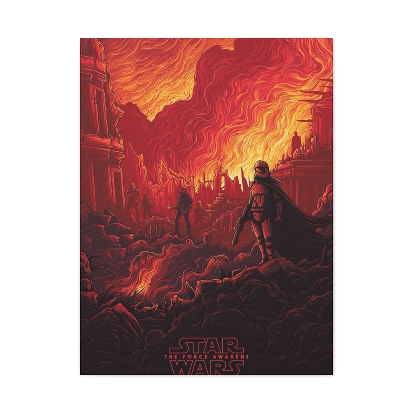
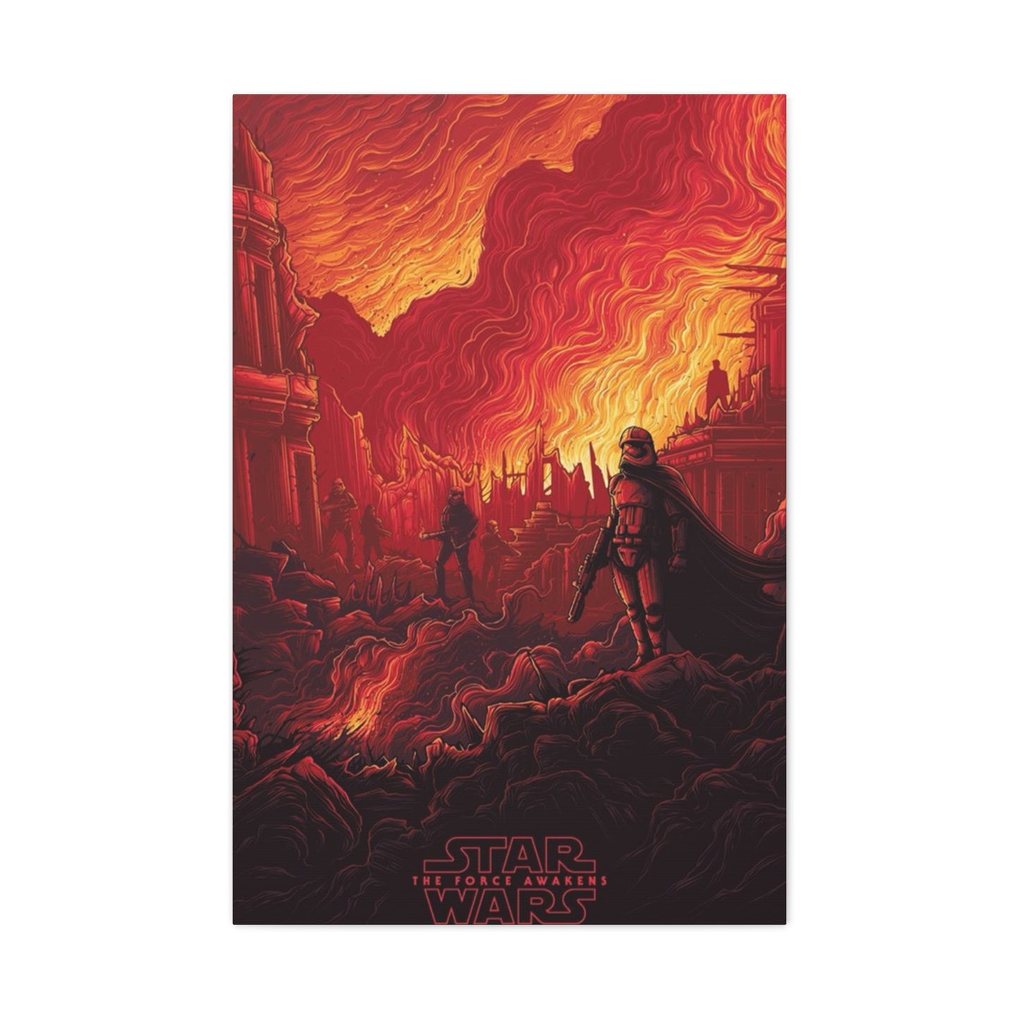
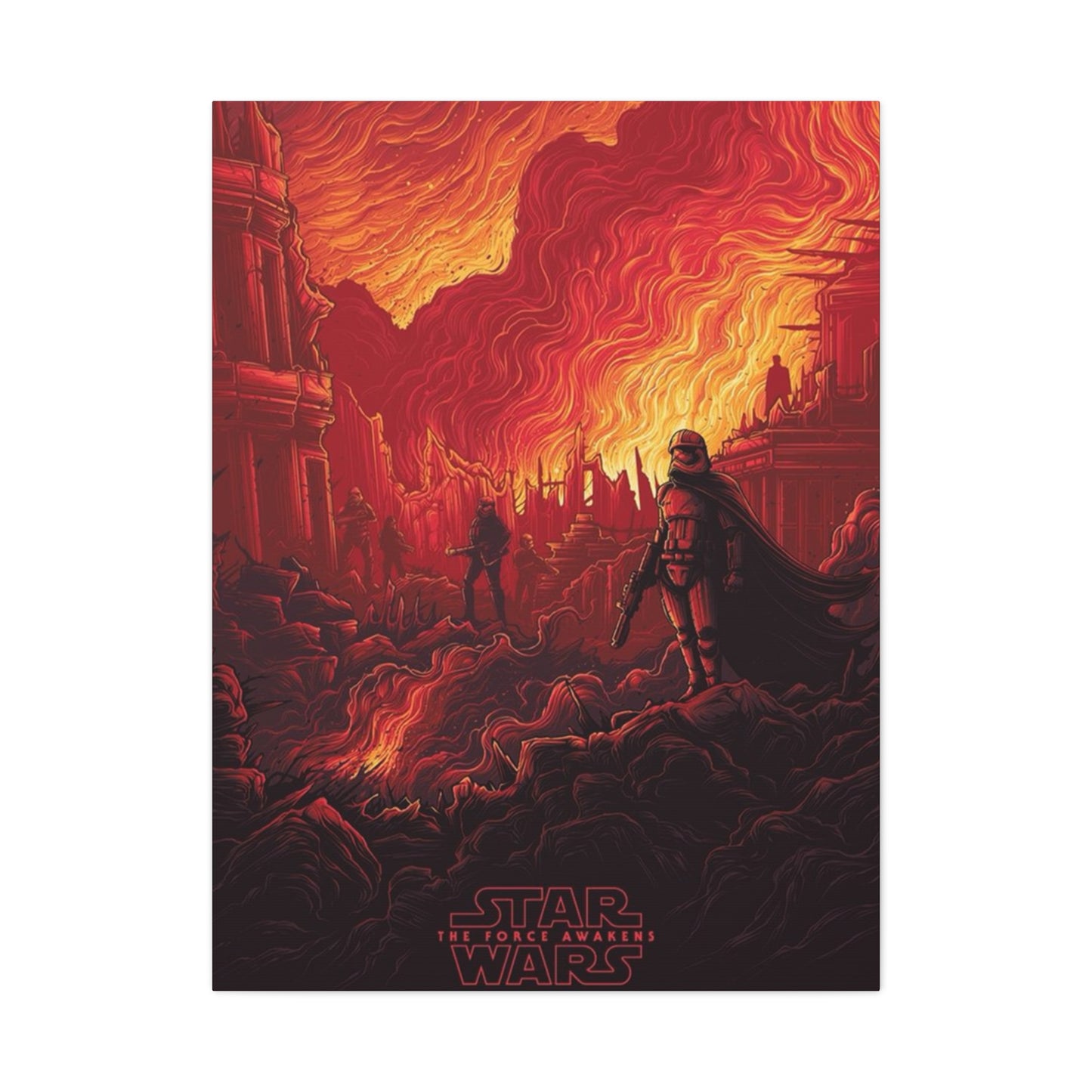
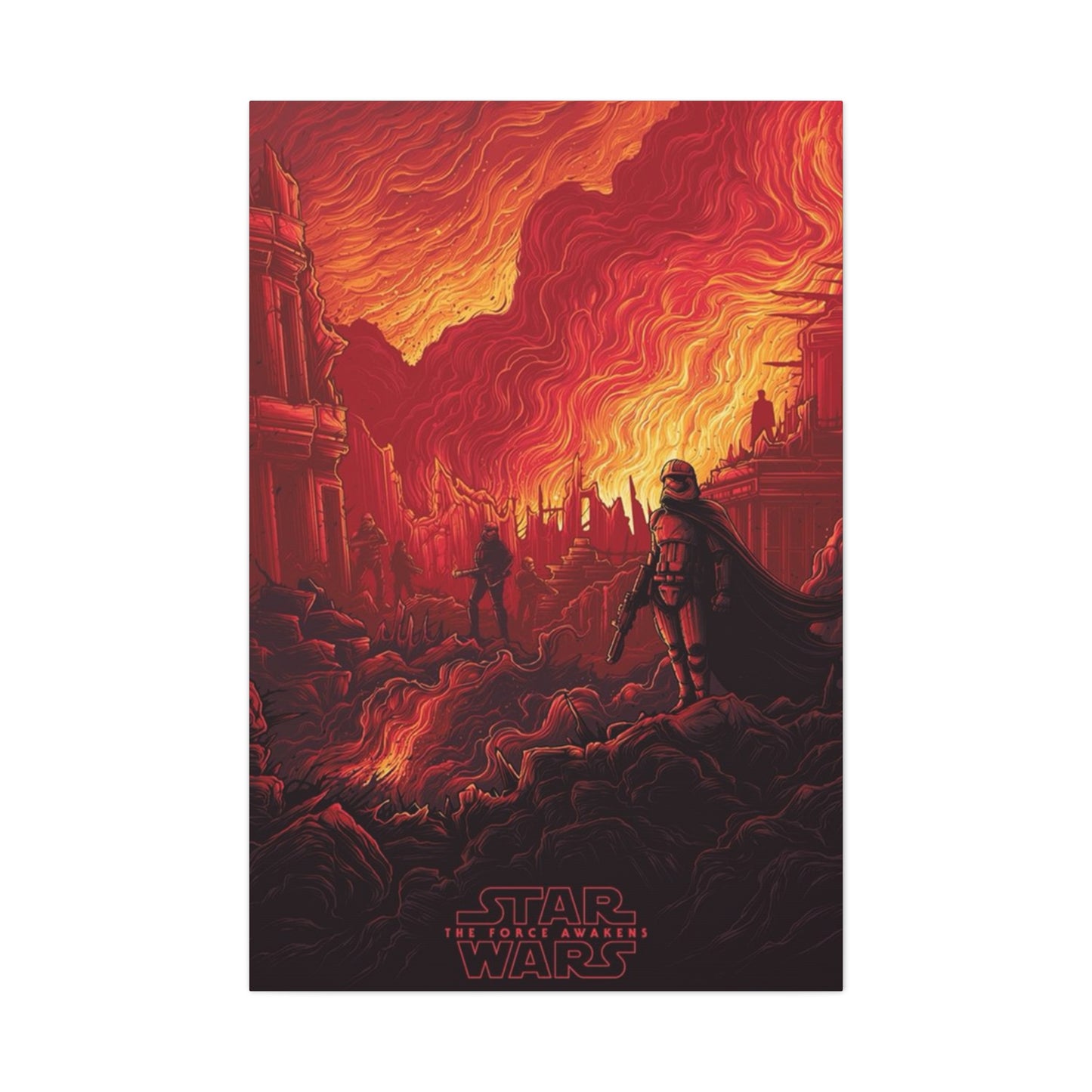
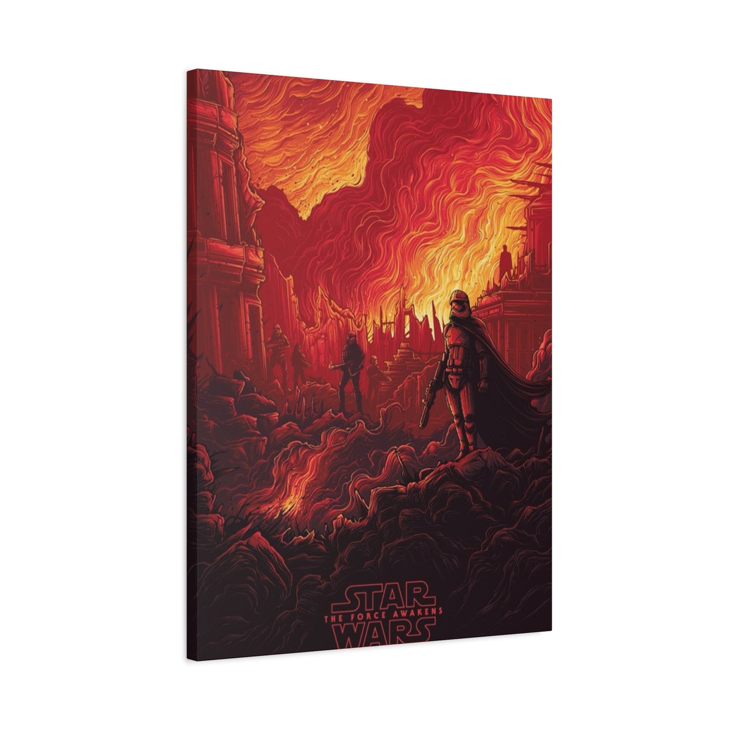
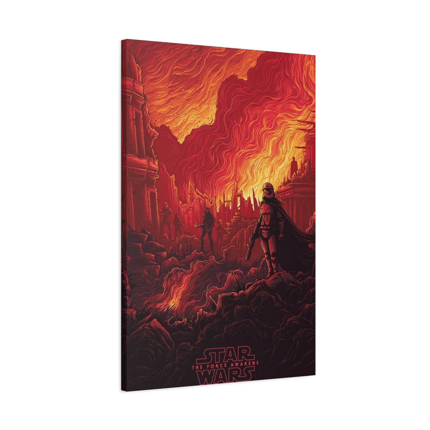
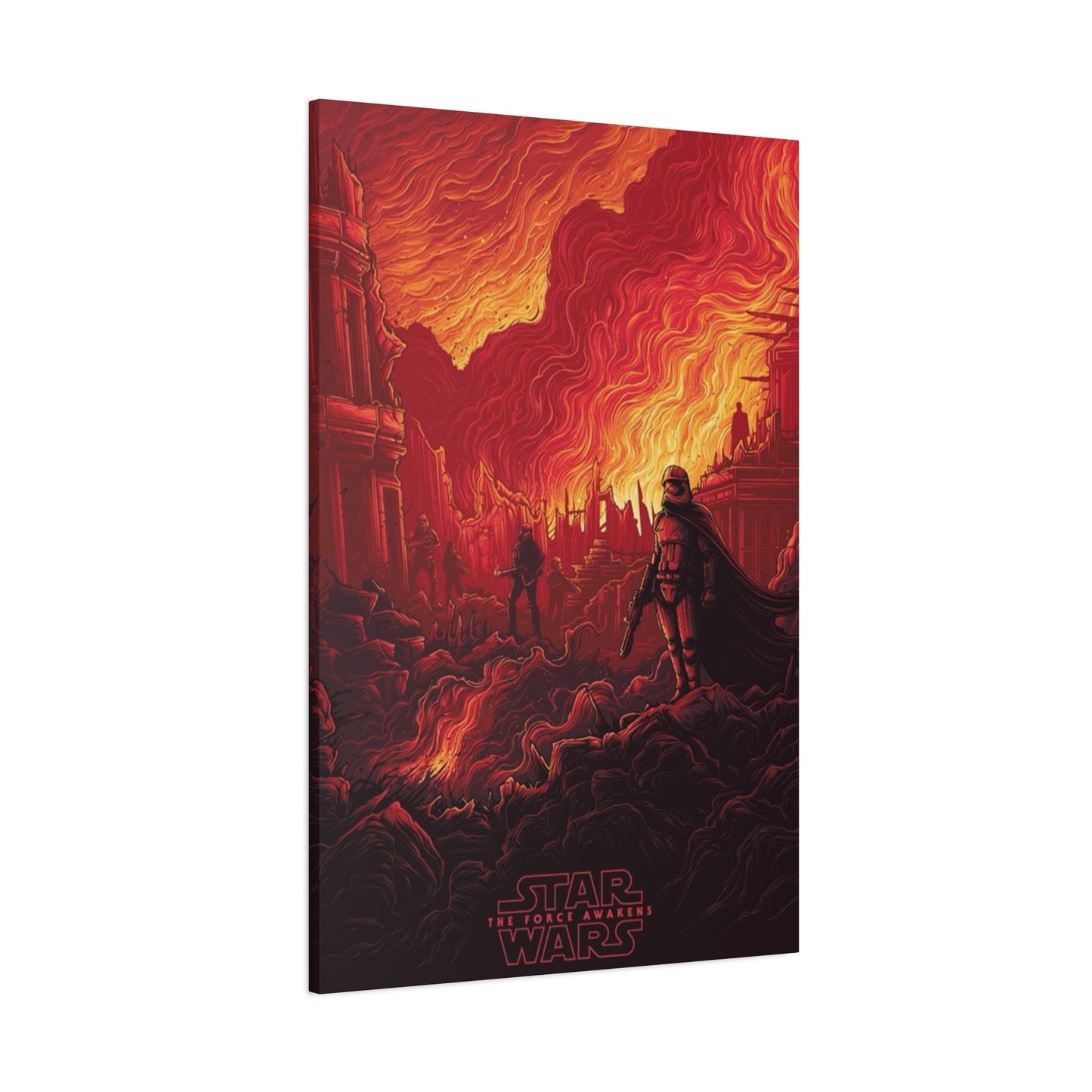
Then came the official one-sheet, a masterpiece of modern blockbuster art that masterfully paid homage to the past. While the legendary Drew Struzan created a stunning painted poster for the D23 convention, the final theatrical poster by Bryan Morton and his agency, Art Machine, adopted that classic, operatic style. It was a dense, rich composition that visually split the film's themes. On the left, bathed in the cool blues and whites of the Resistance, stood Finn and Rey. On the right, dominated by the fiery, ominous red of the First Order, loomed Kylo Ren. The composition was a visual clash, perfectly bisected by Rey's staff and Kylo's saber. Above them, the legacy characters—Han and Leia—watched over the new generation, while the menacing, planet-sized sphere of Starkiller Base replaced the classic Death Star. This poster was a promise: everything you loved was back, but it was new, dangerous, and impossibly epic. It was a tribute not just to the film it sold, but to the entire artistic legacy of the saga.
Why Star Wars Posters Endure
In the modern era of digital marketing and social media trailers, the printed movie poster is often considered a dying art form. Many have devolved into "floating heads" or minimalist designs that are quickly forgotten. Yet, Star Wars posters remain a towering exception. They do not just endure; they thrive, adorning walls in dorm rooms, high-end home theaters, and art galleries decades after their films have left the cinema. Their endurance is a testament to a perfect storm of artistic merit, narrative power, and cultural timing.
The primary reason for their longevity is that they are not just advertisements; they are epic visual narratives. Beginning with Tom Jung's and Tom Chantrell's iconic work for A New Hope in 1977, the Star Wars one-sheet established a signature style: the grand, operatic montage. These posters compositionally mirrored the films themselves—sprawling, operatic, and packed with detail. You have the heroes posed for adventure, the looming shadow of the villain, the intricate spaceships, the promise of romance, and the clash of good versus evil, all in a single, dynamic image. This "circus poster" approach, which fell out of favor for many other franchises, became the saga's visual fingerprint.
This style was perfected and forever codified by one man: Drew Struzan. His painted posters for the sequels, the Special Editions, and the prequel trilogy are, for many, the definitive visual representation of the saga. Struzan’s art transcends mere marketing. His ability to capture not just a likeness, but the spirit of a character with soft, illuminated brushstrokes, gave the films a mythic, timeless quality. His posters feel like the covers of classic adventure novels, promising a story for the ages. This hand-crafted, illustrative approach imbues the posters with an artistic soul that a simple photoshopped image can never replicate.
Finally, Star Wars posters endure because of the sheer power of nostalgia. For generations, these images were the gateway to the galaxy. A child of the 1980s didn't just see a poster for Return of the Jedi; they saw a window into another world that defined their childhood. Owning one of these posters is not just a decorative choice; it is an act of curating one's own history, a way to keep a piece of that cinematic magic alive. They are cultural artifacts, a shared visual language for global fandom, and for that reason, their power will likely never fade.
Iconic Force Awakens Art
The return of Star Wars with The Force Awakens was a cultural moment that demanded an iconic visual campaign, and it delivered precisely that. The film's art, from its earliest teasers to its grand theatrical one-sheet, became instantly iconic by masterfully balancing mystery, nostalgia, and the introduction of a new generation. It was a campaign defined not just by what it showed, but by what it strategically withheld.
Perhaps the most iconic art of the entire campaign was, paradoxically, an absence. The deliberate exclusion of Luke Skywalker from the main ensemble poster created a global mystery that dominated fan discussion for an entire year. This "Where is Luke?" phenomenon was a masterstroke of marketing. It transformed the poster from a simple advertisement into an interactive puzzle, a "most-wanted" sign in reverse. This single creative decision fueled speculation, built narrative tension, and ensured the film was the center of conversation long before its release. The art's most powerful element was the one that wasn't there.
When the new characters were finally revealed, it was through a series of stunningly intimate and symbolic portraits. These teasers were a departure from the traditional Star Wars montage. Instead, we got close-ups charged with meaning. Rey, her face partially obscured by her goggles and staff held at the ready, looked determined and self-sufficient. Finn, helmet smeared with blood in an early teaser image, and later bathed in the cool blue light of the Skywalker lightsaber, was presented as a man of conflict and destiny. Most striking was Kylo Ren. His character poster, dominated by the fiery, unstable crackle of his crossguard lightsaber, was a portrait of pure menace, his mask an inscrutable, menacing void. These images were not just introductions; they were character statements.
The campaign's crowning achievements were its two main ensemble posters. First was the Drew Struzan piece created for the D23 convention. This was a gift to long-time fans, a spiritual successor to his legendary painted posters for the previous six films. Its warm, classic, illustrative style was a profound promise: the Star Wars of your childhood is in safe hands. Then came the final theatrical one-sheet, which translated Struzan’s classic montage style into a modern, photo-realistic composition. This poster was a brilliant piece of visual storytelling, using color theory to define the conflict. The right side is drenched in the ominous red of the First Order, with Kylo Ren and Starkiller Base. The left is bathed in the hopeful blue of the Resistance, with Finn and Rey. The two sides clash in the middle, a perfect visual metaphor for the film's title and central theme.
Decorating with Star Wars Posters
Star Wars posters have long since transcended the realm of simple "fan merchandise" and have become legitimate, powerful pieces of decorative art. For decades, they have adorned walls from college dorms to sophisticated home theaters, but decorating with them in a modern home requires a thoughtful approach. The key is to move beyond thumbtacks and cheap frames, treating the poster as the piece of cinematic art it is. With the right presentation, a Star Wars poster can be a striking focal point, a nostalgic accent, or a subtle nod to a galaxy far, far away.
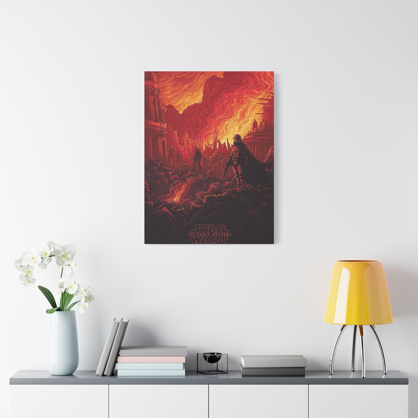
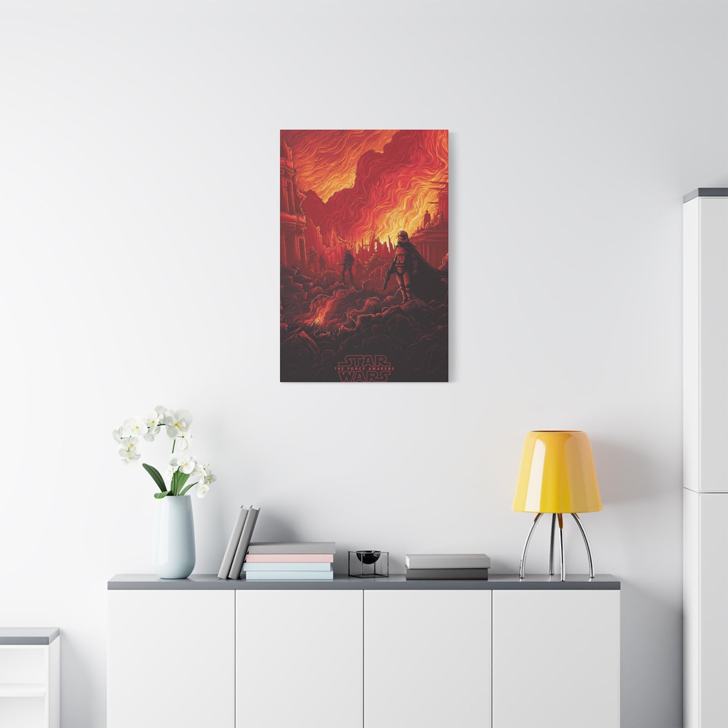
The first step is choosing an aesthetic. Do you want a bold, maximalist "gallery wall" or a single, minimalist statement? A gallery wall is perfect for a home office, game room, or home theater. This approach allows you to tell a story. You could mix a classic Empire Strikes Back poster with a modern Force Awakens character portrait, and perhaps even some fan-made minimalist art. The key to a successful gallery wall is cohesive framing. Using identical black or white frames for all the pieces creates a clean, intentional look, even if the art styles vary.
Alternatively, the single-poster approach is ideal for a living room or bedroom where subtlety is key. Here, the choice of poster and frame is paramount. A vibrant, busy poster like the main theatrical one-sheet for The Force Awakens can be the hero piece in an otherwise neutral-colored room. Framed professionally with a high-quality mat, it becomes a sophisticated conversation starter. For an even more "adult" aesthetic, consider one of the stark, powerful character posters. The black, white, and red portrait of Kylo Ren, for example, is a bold, graphic piece that feels more like modern art than a movie poster.
Framing is the single most important element. A cheap, plastic "poster frame" will always look like a dorm room. Investing in a solid wood or metal frame with a UV-protective acrylic or glass front is essential. Adding a mat—the white or colored border between the poster and the frame—is the most effective way to elevate the piece. The mat gives the art "breathing room" and signals to the viewer that this is a curated piece, not a temporary decoration. By matching the frame to other elements in the room (like furniture wood or metal finishes) and choosing a poster that complements the room's color palette, you seamlessly integrate your passion into your home decor, proving that the Force can, indeed, have sophisticated style.
The Power of Force Awakens Imagery
The imagery of Star Wars: The Force Awakens wielded a unique and calculated power, one built on a delicate, almost surgical balance between reverence and revelation. Its primary task was to reignite a global phenomenon for a new generation while simultaneously assuring lifelong fans that the magic was back. This power was rooted in a visual language of "echoes," where new images were intentionally designed to rhyme with the saga's most iconic moments, creating an immediate, subconscious bridge between past and present.
The most potent imagery revolved around the concept of the "relic." The film, and its marketing, was obsessed with the debris of the past. We saw the colossal, rusted hulk of a crashed Star Destroyer on Jakku, not just as a piece of background, but as a home, a workplace, and a tomb. This single image powerfully conveyed the passage of time and the weight of history that had settled over the galaxy. The most personal relic, of course, was the warped, melted helmet of Darth Vader. When Kylo Ren is seen speaking to it, "Show me again, the power of the darkness," the image became a shocking symbol of a legacy corrupted. It took the saga's most redeemed figure and weaponized his dark past, instantly establishing the new villain's psychological motivation.
Then there was the power of the lightsaber. The Star Wars saga's most iconic weapon was reborn in two distinct forms. First, the Skywalker lightsaber—the blue blade built by Anakin, lost by Luke, and now found by Rey—became a visual representation of destiny. The images of Finn igniting it against stormtroopers, and later of Rey "calling" it to her hand past Kylo Ren, were charged with significance. It wasn’t just a weapon; it was a mantle of heroism being passed. In direct opposition was Kylo Ren's saber. The unstable, fiery, crossguard design was a brilliant piece of visual storytelling. It was not the elegant weapon of a civilized age; it was a raw, primitive, and dangerous tool. Its sputtering, volatile blade immediately communicated the barely controlled rage of its wielder.
Finally, the film’s imagery created a new "trinity" of heroes, mirroring the original. The core images of the campaign focused on Rey, Finn, and Poe. Rey, the scavenger from a desert planet, echoed Luke. Finn, the conflicted insider who escapes the empire (now the First Order), echoed Han Solo's moral journey. Poe, the daring, "best pilot in the galaxy," was a clear echo of Wedge Antilles and Luke's X-wing persona. But the most powerful image of all was the introduction of BB-8. This small, rolling droid, whose design was an instant classic, captured the practical, tangible "used future" aesthetic of the original trilogy. The power of The Force Awakens imagery was its ability to feel entirely new, yet profoundly familiar, like a half-remembered dream returned to vibrant life.
Star Wars Fans and Poster Collecting
For the Star Wars fan community, collecting is not merely a hobby; it is a core expression of fandom, a tangible way to hold a piece of the galaxy. While action figures and starships fill shelves, poster collecting occupies a special, revered space. It is the intersection of cinematic history, graphic art, and personal nostalgia. A Star Wars poster is not just a picture of a character; it is a two-dimensional portal to the sense of wonder felt when the lights first went down in the theater.
The passion for collecting Star Wars posters is deeply rooted in the artwork of the original trilogy. The lush, painted montages by artists like Tom Jung, Tom Chantrell, and especially Drew Struzan defined the saga's visual brand. These posters were grand, operatic, and mythic. They felt like classical art, promising an epic on the scale of Ben-Hur or Lawrence of Arabia, but set in space. This artistic high bar means that fans don't just collect Star Wars posters; they curate them. A serious collector will hunt for rare international versions, like the iconic Japanese poster for The Empire Strikes Back, or the otherworldly Hungarian art. They seek out the "Style A" vs. "Style B" variants and prize original theatrical one-sheets, with their fold lines and slight wear, as artifacts of cinematic history.
When The Force Awakens arrived, it energized the collecting community in a new way. The campaign consciously leaned into this culture. The release of a new, official Drew Struzan painting for the D23 convention was a signal to long-time collectors that the classic aesthetic was respected. This limited-edition print became an instant "grail" for many. The subsequent release of different poster styles—from the intimate character teasers to the grand theatrical montage—gave collectors a whole new series to hunt.
The rise of the "alternative art" scene has also profoundly impacted fan collecting. Boutique poster companies like Mondo, Sideshow, and Bottleneck Gallery commission contemporary artists to reinterpret the films, including The Force Awakens. These limited-edition, screen-printed posters are often stunning works of art in their own right, focusing on a single theme, character, or mood. For fans, these pieces are a way to showcase their love for the saga in a way that is also a sophisticated, modern art choice. Whether it's a priceless, theater-used original from 1977 or a modern limited-edition screen print of Rey, the poster remains the ultimate collector's item, a timeless piece of wall art that captures the entire scope and magic of the Star Wars myth.
Framing The Force Awakens
The poster art for Star Wars: The Force Awakens presents a fantastic opportunity for framing, transforming what is already dynamic art into a sophisticated centerpiece. The right frame does more than just protect the poster; it completes the artwork, enhances its themes, and integrates it seamlessly into a home's decor. The specific art from The Force Awakens campaign—ranging from stark, minimalist portraits to a dense, operatic ensemble—offers a variety of framing approaches.
For the main theatrical one-sheet, the poster defined by its "red vs. blue" color split, framing is key to managing its complexity. A simple, thin black gallery frame is the most common and effective choice. It acts as a clean, sharp border that contains the explosive action without competing with it. For a more dramatic effect, a dark, brushed metal frame (like gunmetal or pewter) can pick up on the metallic elements within the art, such as Captain Phasma's armor or the starship hulls. When matting this piece, a single, wide mat in off-white or light gray provides "breathing room," drawing the eye inward. A more advanced technique is to use a double mat, with a thin inner mat (a "reveal") of deep red or blue, to subtly pull out the dominant colors of the First Order or the Resistance.
The character posters, however, invite a more personalized approach. These striking portraits are defined by their minimalist composition and symbolic lighting. The Kylo Ren poster, with its stark black background and the fiery red of his saber, is tailor-made for a modern, minimalist frame. A flat, matte black frame creates a seamless extension of the poster's darkness, making the red saber appear to "pop" even more. Conversely, the posters for Rey and Finn, bathed in the cool blue light of the saber and the Resistance, look stunning in a silver or brushed aluminum frame, which complements their "heroic" palette.
Regardless of the poster, the technical choices are crucial. UV-protective acrylic or glass is non-negotiable. The bold reds in the Kylo Ren and theatrical posters are notoriously prone to fading in direct sunlight, and a UV filter is the only way to preserve their vibrancy. Using an acid-free mat and backing board is equally essential to prevent the paper from yellowing over time. By investing in quality framing, the owner elevates the piece. A Force Awakens poster stops being just a piece of film memorabilia and becomes a true piece of cinematic art, given the respect and presentation it deserves, ready to anchor a room with its modern, mythic power.
Timeless Star Wars Wall Art
Decades after the first starship rumbled across the screen, Star Wars posters remain one of the most enduring and beloved forms of wall art. Their timelessness is a rare quality, transcending the disposable nature of most film marketing. They achieve this by operating on a level deeper than simple advertisement; they are windows into a modern mythology, capturing archetypal themes in a visual language that is both epic and deeply personal.
The foundation of this timeless quality is the art style. The most iconic Star Wars posters, particularly the painted masterpieces by Drew Struzan, reject photorealistic trends. Instead, they embrace a lush, illustrative style that feels more aligned with classical art or the covers of golden-age pulp adventures. This hand-painted aesthetic removes the art from a specific, datable era. The soft lighting, the heroic poses, and the rich, saturated colors give the characters a mythic, larger-than-life quality. They don't look like actors posing for a camera; they look like heroes, villains, and adventurers captured in a moment of grand drama. This illustrative approach ensures the art will never look "dated" in the way a photo-based poster from the 1980s or 1990s might.
Furthermore, the posters are timeless because they visualize universal, archetypal themes. They are, at their core, illustrations of the classic "hero's journey." You see the young, aspiring hero (Luke, Rey) gazing toward the horizon. You see the looming, shadowy visage of ultimate evil (Vader, Kylo Ren). You see the promise of loyal friends, daring scapes, and epic conflict. These are the same themes that have defined storytelling for millennia, from The Odyssey to King Arthur. A Star Wars poster on a wall is a visual reminder of these powerful concepts: hope, redemption, the struggle against tyranny, and the idea that anyone, even a farmboy or a scavenger, can be called to a grand destiny.
The art for The Force Awakens was a conscious and successful effort to join this timeless legacy. The theatrical poster, while created digitally, was composed in the classic Struzan-esque montage style. It used the same visual grammar as its predecessors—the diagonal clash of good and evil, the hierarchy of characters, the promise of space battles. By adhering to this established artistic language, the Force Awakens art instantly felt like it had always been part of the collection. It was a new chapter, but one that fit seamlessly into the epic saga, securing its own place as a piece of timeless wall art for a new generation.
The Force Awakens in Home Decor
Integrating The Force Awakens poster art into home decor is a sophisticated way to express personal fandom without sacrificing style. The film's aesthetic—a blend of gritty realism, sleek new designs, and classic silhouettes—offers diverse visual options that can complement various interior design styles, from industrial and minimalist to more eclectic and traditional looks. The key is treating the artwork with the same respect as any high-end print or painting.
The main theatrical poster for The Force Awakens is a powerful, dense piece that makes an excellent focal point in a living space or entertainment room. Its composition, which dramatically pits the warm reds of the First Order against the cool blues and whites of the Resistance, naturally introduces a strong color palette into a room. To make it work in decor, choose furniture accents that subtly pick up these colors. For instance, throw pillows in deep crimson or sapphire blue can tie the room to the art. When framed in a simple, flat black frame with a wide, crisp white mat, the poster's complexity is contained and elevated, making it a cohesive part of the design rather than a disruptive element.
For rooms with a modern or minimalist aesthetic, the character teaser posters are the superior choice. The Kylo Ren portrait, for example, is predominantly black, red, and white. Its bold, graphic simplicity aligns perfectly with modern art sensibilities. Hanging this piece in a room dominated by neutral colors (grays, whites, and blacks) creates a dramatic pop of color and visual texture. This approach is sophisticated because the poster functions like a large, abstract piece of graphic design that happens to reference Star Wars. Similarly, the stark silhouettes of the X-Wings or the Millennium Falcon against a plain background, featured in early teaser art, are subtle nods that can fit seamlessly into an industrial or office space.
For a more eclectic or personal look, consider a gallery wall. A collection of Force Awakens posters, perhaps mixing the main montage with smaller-scale versions of the character posters or even art prints of the planet Jakku or Starkiller Base, can create a visually rich narrative. The coherence of a gallery wall relies entirely on consistent framing. Using a uniform style of frame—all thin black, all thick oak, or all brushed aluminum—makes the diverse images feel like a single, curated collection. By choosing quality presentation and allowing the powerful, evocative imagery of The Force Awakens to guide the room's accents, the poster transcends its role as mere movie memorabilia and becomes a striking element of bespoke home design.
Bold Designs in Force Awakens Posters
The poster campaign for Star Wars: The Force Awakens was a masterpiece of bold, confident design, consciously breaking from the familiar formulas of blockbuster marketing while simultaneously paying homage to the saga's visual heritage. Its success lay in strategic decisions that turned simple advertisements into instant classics, defined by stark contrasts, graphic simplicity, and deliberate color choices.
One of the most immediate bold design choices was the use of extreme graphic simplicity in the early teaser posters. Instead of the expected busy montages, the campaign introduced key characters—Rey, Finn, Kylo Ren—in highly controlled, near-minimalist compositions. These were not photoshopped group shots; they were portraits that felt closer to fine art photography or a graphic novel panel. Rey, alone on the desert landscape with her staff, and Finn, caught in the cool blue light of the lightsaber, were powerful, isolated figures. This simplicity forced the viewer to focus entirely on the new faces and the single, potent symbol they carried, a bold pivot from the crowded posters of the past.
The boldest visual statement, however, belonged to the villain: Kylo Ren's crossguard lightsaber. The poster featuring his masked face and the violently sputtering red blade was a design masterstroke. The unstable nature of the blade—unruly and crackling—was a dramatic departure from the clean, elegant energy swords that had come before. Its appearance in the poster communicated a sense of primitive, barely-contained rage, instantly defining the new villain's psychological state. The predominantly black poster, with that single, fierce slash of red, is a triumph of graphic design, using negative space and a single dominant color to create an overwhelming sense of menace.
Finally, the main theatrical one-sheet, while adhering to the traditional Star Wars montage, was bold in its use of thematic color and diagonal tension. The composition is a visual battlefield, dominated by a stark, diagonal split. The red, threatening expanse of Starkiller Base and the dark figures of the First Order dominate the upper right, while the vibrant, hopeful figures of the Resistance occupy the lower left. This use of color theory—red for danger and blue for hope—is a design classic. The entire poster is a visually dynamic struggle, using the characters and setting to form sharp lines and energetic movement, creating a piece that is not just illustrative but dynamically graphic. This commitment to dramatic contrast and focused imagery ensured the art of The Force Awakens stood out as both contemporary and enduringly iconic.
The Legacy of Force Awakens Art
The poster art for The Force Awakens established an immediate and lasting legacy, not just within the Star Wars franchise, but in the broader landscape of modern blockbuster marketing. Its primary achievement was proving that the classic, operatic montage style—often considered outdated—could be successfully revitalized for a contemporary audience, setting a new standard for nostalgic sequels and franchise reboots.
The most significant aspect of its legacy is the successful bridging of eras. The art, particularly the final theatrical one-sheet, consciously employed the visual grammar established by Drew Struzan for the original trilogy. By using a grand, illustrative ensemble composition, the campaign immediately signaled reverence for the saga's history. This was essential for winning over legacy fans who had been wary of the new direction. The poster became the visual promise that the "feel" of classic Star Wars was returning, a legacy signal that was far more effective than any trailer dialogue. This approach influenced subsequent Star Wars film posters (like those for Rogue One and The Last Jedi), which continued to employ elements of the Struzan-esque montage, cementing the style as the definitive visual language of the modern saga.
Beyond the main art, the character posters left a legacy of focused, thematic design. Prior to The Force Awakens, many blockbusters relied on busy posters that simply crammed in every major actor. The bold choice to release a series of stark, black-background character posters for Rey, Finn, and Kylo Ren simplified the visual message. These posters focused entirely on the new generation, their symbols (the lightsaber, the staff, the masked gaze), and their distinct color palettes. This minimalist, high-contrast approach was widely praised and has since been emulated by countless franchises looking to introduce new characters with immediate, iconic impact. It proved that less information, presented with powerful graphic intent, can be a more effective marketing tool.
Finally, the art for The Force Awakens created a unique visual mythos for the new characters. The poster art ensured Rey was instantly seen as a resourceful heroine, Finn as a conflicted figure of destiny, and Kylo Ren as a volatile, dangerous apprentice. These visual shorthand cues—Rey's desert goggles and staff, Finn's blue-lightsaber glow, and Kylo's unstable red blade—were established and reinforced in the marketing art. The power of these initial images means that even years later, these posters are not just seen as advertisements, but as the foundational visual texts that introduced a beloved new generation to the galaxy far, far away, ensuring their place as enduring classics of cinematic art.
Force Awakens: Cinematic Art
Star Wars: The Force Awakens posters are more than just promotional material; they are distillations of cinematic art, capturing the emotional core, thematic conflict, and visual spectacle of the film within a single frame. Their success lies in their ability to use graphic design and illustration to create a promise of adventure that aligns perfectly with the film's tone—a balance of grand scale and intimate character moments.
The cinematic quality of the art is immediately apparent in the posters' composition, which borrows heavily from classic Hollywood's golden age of epic film advertising. The iconic main theatrical poster functions as a cinematic tableau. It’s structured like a visual synopsis, guiding the viewer through the main components of the story. The heroes (Rey and Finn) are positioned to the front and left, signaling their immediate importance. The mentors (Han and Leia) watch over the action from a higher vantage point. The threat (Kylo Ren, the First Order, Starkiller Base) looms dramatically in the background. This arrangement is a classic piece of cinematic staging, using visual hierarchy to convey narrative structure, much like a cinematographer arranges actors within a frame.
The art also excels at capturing the film's dominant motif: the passing of the torch. The posters visually represent the central dynamic of the film. Rey is almost always seen with her staff or the lightsaber, often standing in a pose of ready defiance that mirrors classic shots of Luke Skywalker. Finn is shown with the legacy weapon, a powerful visual cue that his journey is intrinsically linked to the central Star Wars mythology. The posters rarely feature the classic characters without a new hero nearby, creating a visual echo chamber where the legacy characters are there to support, not dominate. This deliberate framing makes the art a perfect distillation of the film's core theme: the new generation is ready to take center stage.
Furthermore, the art captures the film’s mood and atmosphere through sophisticated use of color and light. The pervasive atmosphere of conflict is defined by the high contrast of light versus darkness. Kylo Ren’s art is dark and fiery, representing the new era of the dark side, while the scenes of the Resistance and the Millennium Falcon are bathed in the cool blue of space and the warm glow of adventure. The poster art is cinematic in its emotional impact, using composition and color to evoke the awe, danger, and hope that define the film's viewing experience. It is a work of graphic design that succeeds because it understands and beautifully translates the film’s visual and emotional language.
Star Wars Posters as Wall Masterpieces
To consider Star Wars posters as "wall masterpieces" is to recognize their cultural weight, their artistic integrity, and their enduring power to evoke emotion and memory. They are among the few pieces of film advertising that consistently transcend their commercial purpose, achieving the status of art that is collected, studied, and revered.
The masterpiece status of Star Wars wall art stems from its lineage with the great movie posters of the mid-20th century. While many modern posters rely on generic photography and digital manipulation, the saga’s best art maintains a commitment to illustration and painterly quality. The work of Drew Struzan set the gold standard, ensuring that every subsequent official poster, including those for The Force Awakens, had to meet a high benchmark of artistic craftsmanship. This level of intentional, skilled artistry separates them from mere mass-produced decorations; they are prints of illustrations designed to be beautiful, not just functional. They carry the weight of being the cover art for a modern myth.
The enduring success of the Force Awakens art in particular proves that this format is timeless. The main theatrical poster, for instance, is a masterpiece of visual equilibrium. It manages to balance approximately a dozen main characters, three different spacecraft, a massive planetary base, and the two legacy heroes—all without feeling cluttered or visually overwhelming. This compositional genius, often created by modern agencies translating the classic Struzan style, is a complex artistic feat. The eye is guided seamlessly from the central conflict of Rey/Kylo Ren to the overall scale of the adventure, demonstrating a high degree of graphic mastery.
Ultimately, these posters are masterpieces because of their cultural resonance. They are a shared iconography for a global community. When a fan hangs a Force Awakens poster on their wall, they are not just decorating; they are making a public declaration of allegiance to a story that spans generations. They are curating a piece of cultural history. A Star Wars poster transforms a blank wall into a narrative space, instantly elevating the surrounding environment by inviting the imagination into a galaxy of heroism, adventure, and timeless conflict. This emotional depth and cultural power are the true hallmarks of a wall masterpiece.
Framing The Force Awakens
For the large, complex theatrical poster, the goal of framing is to provide structure and refinement. The poster is visually dense, featuring numerous characters, action sequences, and the looming Starkiller Base. Therefore, a simple, non-distracting frame is usually best. A flat-front, matte black gallery frame is the industry standard for blockbuster posters because it creates a crisp, clean border that complements the dark background of the art without competing with the vibrant colors. A professional-grade, wide off-white or light grey mat should be used. The mat serves to visually separate the image from the wall, giving the eye a place to rest before diving into the detail. This creates depth and makes the poster feel substantial and curated.
The character posters, with their stark backgrounds and high contrast, call for a more minimalist framing approach. For the Kylo Ren poster, dominated by black and red, a thin, seamless black frame is ideal. The frame should visually disappear, allowing the intense red glow of the lightsaber to become the sole focus. Because these posters are often highly graphic, they can sometimes be framed without a mat for a sleek, contemporary look, known as a full-bleed presentation. Alternatively, a silver or brushed aluminum frame works perfectly for the Rey or Finn posters, as the cool metallic tone echoes the Resistance aesthetic and the blue light of the lightsaber.
Regardless of the poster, the most critical element of framing is preservation. Since posters are highly sensitive to environmental factors, a high-quality frame must include UV-protective acrylic or glass. This protects the ink from fading over time when exposed to light, which is particularly important for the rich, deep blacks and vivid reds of the Force Awakens palette. Furthermore, all materials that touch the paper, including the mat and the backing board, must be acid-free (archival quality) to prevent the poster from yellowing, warping, or degrading decades down the line. Investing in archival framing ensures that your Force Awakens art remains a brilliant, preserved piece of cinematic history for generations.
Bold Designs in Force Awakens Posters
One of the campaign's boldest moves was its rejection of the ubiquitous floating-heads format that plagues many modern blockbusters. Instead, the final theatrical poster, while a montage, employed a highly structured, painterly composition that relied on dramatic diagonals and color theory. The diagonal line slicing the poster—separating the cool blue/white tones of the heroes from the fiery red/black tones of the villains—is an aggressive piece of graphic design that instantly communicates the core conflict. This approach wasn't subtle; it was a loud, confident statement that the aesthetic operatics of classic Star Wars were back.
The character posters showcased an equally bold commitment to minimalist symbolism. Rather than busy action shots, the posters for Rey, Finn, and Kylo Ren used vast amounts of dark space to focus intensely on one or two elements. The Kylo Ren poster, in particular, is a triumph of bold, impactful simplicity. The black background consumes the frame, making the fiery, unstable red of the crossguard lightsaber the single, defining visual element. This design choice is not about conveying plot; it is about communicating psychology and menace using pure color and shape, a move closer to abstract graphic art than traditional movie promotion.
Finally, the poster designs were bold in their strategic use of omission and reveal. The decision to exclude Luke Skywalker from the main theatrical poster was perhaps the greatest visual risk and reward of the entire campaign. This absence was not a mistake; it was a powerful, bold design choice that created an instant global mystery. The poster itself became a source of fan curiosity, forcing the audience to look closer and ask questions. By manipulating the visual information presented, the Force Awakens art proved that negative space, strategic omission, and a commitment to high-contrast, emblematic imagery could revitalize the art of the movie poster and establish a powerful new visual language for a beloved franchise.
Final Reflection:
The poster campaign for Star Wars: The Force Awakens stands as a definitive case study in how cinematic art can successfully bridge a decades-long cultural gap. It was an exercise in calculated nostalgia, strategic revelation, and bold graphic design, resulting in imagery that instantly carved out its own enduring place in the saga’s visual history. The 14 distinct topics explored—from framing techniques to its cinematic legacy—all converge on one central truth: the art transcended its role as advertisement to become an authentic piece of collectible, iconic wall art.
The success of The Force Awakens art lies in its masterful ability to speak in "visual echoes." The grand, operatic montage of the main theatrical poster was a respectful nod to the legacy of Drew Struzan, assuring legacy fans that the epic scope and painterly feel of classic Star Wars was preserved. Yet, the campaign simultaneously introduced a new, bold graphic language through its character posters. These were sharp, high-contrast, and thematically focused—Kylo Ren’s unstable red saber against the vast black void, Rey’s determined gaze framed by the debris of history. This dual approach was a design masterstroke, giving collectors the familiar, timeless canvas they cherished while offering modern, sophisticated art for contemporary interiors.
The posters’ power in home decor is a testament to this artistic quality. When properly framed with archival materials and a quality mat, the posters cease to be mere memorabilia. They become sophisticated elements of design, with the dynamic color palette of the theatrical poster dictating room accents, or the sleek minimalism of the character portraits aligning with modern aesthetic sensibilities. The discussion on framing wasn't just about protection; it was about elevating a piece of popular culture to a fine art standard, demonstrating that fandom and refined home aesthetics are not mutually exclusive.
Ultimately, the imagery from The Force Awakens endures because it instantly became part of the saga’s eternal mythos. It visually codified the "passing of the torch"—the heroes of the past watching over the destiny of the new generation. The posters are collected and revered because they are not simply pictures of movie stars; they are tangible, beautiful artifacts that capture the moment the galaxy far, far away was reborn, establishing a legacy that is both timeless and strikingly modern.
