The Psychology of Colours in Home Office Design
Designing a home office today is no longer simply about choosing a desk, a chair, and a quiet corner; it is about creating an environment that actively supports productivity, creativity, concentration, and emotional balance. One of the most overlooked yet most influential aspects of this environment is colour. The psychology of colour, a field that studies how different hues influence human thoughts, emotions, and behaviours, has long been applied in branding and marketing, but it is equally powerful when translated into our personal workspaces. The walls of a home office are not just boundaries that define the space; they are visual canvases that can energise, calm, focus, or inspire depending on the colours we choose. Understanding how colours interact with psychology, lighting, spatial dynamics, and even cultural traditions such as Vastu Shastra can transform a home office from a functional nook into a personalised hub of excellence.
Research shows that humans are highly responsive to visual stimuli, and colour occupies a central role in this sensory experience. A bold, bright colour can elevate mood, stimulate action, and even boost metabolism, while muted, neutral tones can lower heart rate, quiet the mind, and invite introspection. In the context of a home office, these effects translate into very practical outcomes. For example, someone in sales or marketing may thrive surrounded by shades that encourage confidence and extroversion, while a writer, coder, or researcher may feel most at home in an environment painted in colours that reduce distraction and nurture calm concentration. There is no universal “best colour,” because every profession and every personality resonates differently with the spectrum. What exists instead is a palette of possibilities, each linked with psychological triggers that can be harnessed to align the environment with the individual’s goals.
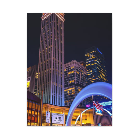
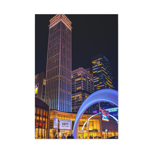
One of the first considerations in selecting a paint colour for home office walls is the size and natural light availability of the space. Small rooms tend to feel cramped if painted in dark shades, while lighter tones visually expand the area, reflecting light to create an airy illusion of spaciousness. A pale blue or off-white wall can instantly open up a narrow room, while a dark forest green might shrink it further but create a cocoon-like environment that some find comforting. Conversely, if the home office is a large, well-lit room with wide windows, bold choices such as navy, terracotta, or mustard can be used without overwhelming the space. Colour is not chosen in isolation—it must be considered in relation to architecture, lighting, furniture, and personal preference. Ceiling colour plays a significant role here too; keeping it white or at least two shades lighter than the wall ensures that the room does not feel oppressive, especially in prolonged work sessions.
Lighting is another crucial element that modifies the perception and impact of paint colours. Natural light enhances warm hues during the day and gives cool colours a crisp vibrancy, while artificial lighting can dramatically alter how a colour is perceived. Under warm incandescent or LED lights, white walls may appear yellowish, greys may look beige, and blues may soften into teal. Cooler fluorescent lights may make warm colours appear harsher and amplify the serenity of cooler shades. To achieve the ideal balance, most designers recommend a combination of natural daylight, ambient lighting such as overhead fixtures, and task lighting such as desk lamps. The relationship between paint colour and lighting is symbiotic: light determines how colour is experienced, and colour influences how bright or dim the light feels. For instance, a deep burgundy accent wall under warm lighting feels cosy and intimate, while the same wall under cold light might feel heavy and somber. Understanding these nuances ensures that the chosen colours work consistently across different times of day.
Work style also influences the ideal colour palette for a home office. Professionals engaged in analytical, detail-oriented work often benefit from minimalist tones such as whites, greys, or pale blues, which provide a clean backdrop free from unnecessary distractions. These colours promote order and structure, allowing the mind to focus without being overstimulated. In contrast, creative individuals in fields such as design, advertising, or writing may prefer vibrant colours that ignite imagination. Bright yellows stimulate creativity and optimism, oranges boost energy, and greens inspire growth and fresh thinking. However, there is a balance to be struck. Too much of a bright colour can overwhelm and lead to restlessness, while too much neutrality can feel monotonous. The most effective designs often combine a dominant neutral base with carefully chosen pops of stimulating accent colours, creating a space that is both calming and energising.
Another dimension to colour selection in home offices, particularly in Indian households, is Vastu Shastra. This traditional system of design aligns spatial arrangements and colours with natural energies to optimise well-being and success. According to Vastu, different directions of the home correspond with specific colours that amplify desired outcomes. For example, light green is recommended for offices in the north as it symbolises calmness, grounding, and growth. Light blue in the northeast supports imagination, innovation, and intellectual clarity. Red and pink in the south channel energy, sophistication, and dynamism, which are beneficial for those in competitive or fast-paced careers. Silver in the northwest enhances visibility and marketing success, while tan, gold, and yellow in the southeast stimulate prosperity, creativity, and happiness. White and off-white, especially in the north and east, symbolise purity, clarity, and financial stability. Even if one is not a strict follower of Vastu, these recommendations reflect universal psychological associations of colours with moods and outcomes. Integrating such principles adds cultural resonance and a sense of intentionality to design choices.
Colour psychology also intersects with personal identity and emotional needs. Some people associate specific colours with memories or aspirations, and this personal symbolism can be a powerful motivator. A professional who associates deep blue with reliability and trust may find comfort in surrounding themselves with that hue, while another who links green with nature and freedom may feel invigorated by it. The home office is, after all, a deeply personal space. Unlike corporate offices, which often use generic neutral colours to appeal to many, the home office can be customised to reflect one’s personality, values, and emotional triggers. Choosing colours that resonate personally ensures that the office does not just function as a workspace but feels like an extension of the self.
Beyond walls, the application of colour through accent areas and furniture can refine the overall impact. A single accent wall painted in a stimulating shade such as orange or teal can create a focal point, while the remaining walls maintain neutrality. Similarly, if painting all walls feels excessive, adding colour through furniture, shelving, rugs, or artwork can create balance. The interplay of colour across walls and objects ensures that the room has layers of interest without being overwhelming. For example, a grey wall combined with a mustard chair and green plants creates a balanced palette of calm, energy, and freshness. A beige wall paired with dark brown wood furniture conveys warmth and reliability. These combinations remind us that colour is not just about walls but about harmony across the entire visual field of the room.
Scientific studies further reinforce how colours affect performance in workspaces. Research has shown that red enhances attention to detail but may increase stress if overused, while blue boosts creative thinking and problem-solving. Green has been linked to reduced anxiety and improved reading ability, while yellow promotes memory retention and optimism. Grey, when balanced well, reduces overstimulation and encourages focus, but excessive grey can lead to feelings of isolation or dullness. These findings suggest that the most productive home office colour schemes often blend different hues to balance their strengths and offset their weaknesses. For instance, a predominantly blue office with green accents may encourage both creativity and calm, while a neutral white base with splashes of yellow may balance clarity with positivity.
Cultural factors also play a role in how colours are perceived and experienced. In Western contexts, white is often associated with purity and simplicity, but in some Eastern traditions, it can symbolise mourning. Similarly, red may be seen as a colour of danger in one culture but as auspicious and celebratory in another. In India, for instance, red is strongly linked to prosperity, vitality, and auspiciousness, making it a common choice for energising spaces. Incorporating cultural meanings into colour selection for home offices ensures that the space resonates not only psychologically but also emotionally, reinforcing deeper connections.
Ultimately, choosing the right paint colour for home office walls is a process of harmonising multiple factors: psychological impact, spatial dynamics, lighting, work style, cultural beliefs, and personal resonance. It is not enough to pick a colour simply because it looks attractive in a catalogue; it must serve a functional purpose that aligns with the role of the office in one’s life. A home office designed with colour psychology in mind becomes more than a workspace; it becomes a partner in productivity, creativity, and success. Every glance at the walls subtly reinforces focus, every shade inspires the right mood, and every tone contributes to the overall energy of the environment.
As we continue to adapt to an era where working from home is increasingly common, the importance of intentional home office design will only grow. The walls, often underestimated, carry immense potential to shape our daily experience. Whether through calming blues, invigorating oranges, grounding greens, or versatile neutrals, the colours we choose for our home office walls are silent yet powerful allies in our journey toward professional growth and personal well-being. Understanding and applying the psychology of colours ensures that this vital space becomes not just a room where work is done, but a sanctuary where focus thrives, ideas flow, and ambitions are realised.
Energising Paint Colours for Business Vitality and Productivity
When it comes to designing a home office that sparks energy and maintains momentum, the power of energising colours cannot be overstated. Unlike calming neutrals or serene pastels, energising paint colours for home office walls are meant to stimulate the brain, fire up motivation, and keep lethargy at bay. They are particularly useful for professionals in fast-paced industries—sales, marketing, entrepreneurship, teaching, or any role where quick thinking, active communication, and sustained enthusiasm are essential. The right hues not only transform the physical appearance of the space but also interact with our psychological responses, elevating performance levels and inspiring resilience during long work hours. Choosing energising colours for business vitality is not about simply painting walls in bright tones; it is about understanding how specific shades influence mood, pairing them effectively with complementary neutrals, and tailoring them to suit the unique character of the workspace.
The most prominent energising colour is red, a hue universally associated with vitality, strength, and stimulation. In a home office, a red accent wall can increase adrenaline levels, boost heart rate, and sharpen focus, making it easier to tackle demanding tasks or deadlines. It conveys authority, confidence, and dynamism—qualities essential for professionals who need to stay persuasive or competitive. Red is particularly effective when used sparingly; an entire room painted in a dark crimson may feel overwhelming or aggressive, but a single wall in deep burgundy behind a desk or a muted terracotta in a creative workspace can create a striking focal point that energises without overpowering. Red also works beautifully in spaces where frequent communication is required, as it encourages assertiveness and enhances verbal expression. To balance its intensity, designers often pair red with neutrals like beige, soft grey, or off-white, ensuring the energy is focused but not chaotic.
Orange is another colour that radiates energy and vitality, but unlike red, it carries an added element of friendliness and warmth. Orange symbolises enthusiasm, sociability, and optimism, making it ideal for home offices where brainstorming, creative collaborations, or coaching sessions take place. It is a colour that naturally sparks conversation and can keep group dynamics lively, even in virtual meetings. From bright tangerine to warm pumpkin, shades of orange stimulate positivity and creativity while reducing feelings of isolation. In smaller spaces, a lighter apricot or peach can provide the same energetic lift without overwhelming the senses, while in larger offices, bold orange can be used on accent walls to inject a burst of vibrancy. For professionals in creative fields—writers, artists, marketers—orange walls can act like a visual stimulant, nudging the mind toward new connections and innovative solutions. It pairs well with whites, creams, and even wooden furniture, creating a harmonious yet invigorating palette.
Yellow, the colour of sunshine, is widely regarded as the ultimate mood booster. Known for evoking happiness, positivity, and mental clarity, yellow is an excellent choice for those who want to brighten up their home office and bring optimism into daily work routines. It is especially effective in rooms with limited natural light, as it naturally mimics daylight and adds brightness. Yellow is believed to stimulate the logical side of the brain, improving concentration, decision-making, and memory retention, which makes it perfect for students, analysts, and teachers who need a sharp mental edge. A pastel buttery yellow can gently uplift the atmosphere, while bold lemon or mustard tones can add drama and flair. Care, however, must be taken not to overuse bright yellow, as too much can lead to restlessness or irritability. The best approach is often to combine yellow walls with calming neutrals like white, pale grey, or soft beige, striking a balance between cheerfulness and professionalism.
For those who crave intensity but with a modern, sophisticated edge, shades like coral and magenta offer an energising alternative. Coral, which sits between orange and pink, combines the vitality of red with the friendliness of orange, making it both stimulating and welcoming. It is an excellent choice for home offices used by people in client-facing roles, as it creates a sense of warmth and accessibility. Coral walls bring vibrancy without the harshness of pure red, and when combined with white or cream, they exude elegance alongside energy. Magenta, on the other hand, is bold and unconventional, perfect for professionals who thrive on standing out and thinking outside the box. It infuses a space with creative dynamism and passion, encouraging risk-taking and bold ideas. These hues may not suit everyone, but for those in artistic or entrepreneurial fields, they can turn a home office into a vibrant creative studio.
The beauty of energising colours lies not only in their psychological effects but also in how they can be adapted to different design schemes. For example, a predominantly neutral office can be given an energy boost by painting just one wall in a bold red, orange, or yellow, while the remaining walls stay in calm whites or greys. This creates an accent wall that becomes the centrepiece of the room, drawing attention to the workspace while keeping the rest of the room balanced. Similarly, energising colours can be introduced in stripes, geometric patterns, or textured finishes that add both visual interest and psychological stimulation. For those hesitant about committing to bold wall colours, accessories such as shelving, artwork, rugs, or furniture in energising hues can deliver the same impact in smaller doses.
Lighting again plays a crucial role in determining how energising colours perform in a home office. Red under warm incandescent light feels rich and inviting, while under bright white light it can feel sharper and more stimulating. Orange glows warmly under both natural and artificial lighting, but can lean toward a more rustic vibe in dim settings. Yellow tends to look best in bright, well-lit spaces where its brightness enhances the airy atmosphere. Understanding these interactions allows homeowners to choose the right lighting fixtures that complement their chosen paint colours. Adjustable task lights or dimmable overhead lighting provide flexibility, enabling one to modify the intensity of colour depending on mood and time of day.
From a Vastu perspective, energising colours also carry directional significance that enhances their impact. Red and pink, for example, are recommended for the south-facing areas of a home office to channel energy, sophistication, and high productivity. Yellow and gold are associated with the southeast, symbolising prosperity, creativity, and optimism. These alignments suggest that energising colours not only work psychologically but also resonate with cosmic energies, reinforcing their positive influence. Even for those not deeply invested in Vastu, aligning colours with natural light directions can add harmony to the overall design.
The effectiveness of energising colours extends to how they influence work behaviours. Studies suggest that exposure to red enhances detail-oriented tasks and performance under time pressure, while yellow improves mood and memory, and orange increases creativity and sociability. In practice, this means that a professional handling negotiations might benefit from a red accent wall that sharpens their assertiveness, while a teacher preparing lessons could thrive in a yellow-toned office that uplifts and inspires clarity. A designer might find orange walls ideal for fuelling creativity during brainstorming sessions, while a marketer might prefer coral or magenta for their blend of energy and originality. Tailoring colours to one’s role ensures that the office actively supports the unique demands of the job.
Cultural associations of energising colours also shape their impact. In India, red is not just a colour of passion but also of prosperity and auspicious beginnings, making it an especially powerful choice for those embarking on new ventures. Yellow is associated with knowledge and learning, aligning perfectly with offices dedicated to study or teaching. Orange carries spiritual undertones in Indian tradition, symbolising purity, strength, and vitality. When these cultural layers are woven into home office design, the workspace becomes more than functional; it becomes a space that resonates deeply with personal values and cultural identity.
Energising paint colours can also be paired with natural elements to soften their intensity and create balance. A red or orange wall paired with wooden furniture introduces earthiness, grounding the vibrancy. A yellow wall combined with indoor plants not only adds freshness but also connects the room with the outdoors, reducing stress while retaining positivity. These combinations highlight the fact that while energising colours stimulate, they must also coexist with calming elements to avoid overstimulation. The result is a workspace that feels vibrant yet sustainable for long-term use.
Ultimately, energising paint colours for home office walls are not about creating a loud or chaotic environment but about designing a space that actively supports energy, vitality, and productivity. They are about igniting motivation on sluggish mornings, keeping focus alive through long afternoons, and ending the day with a sense of accomplishment. By carefully selecting the right shades of red, orange, yellow, coral, or magenta, and by balancing them with neutrals, textures, and lighting, homeowners can create offices that inspire them to bring their best selves to work every day. The home office then becomes not just a place of duty but a space of passion, momentum, and growth—an environment where energy flows freely and productivity flourishes.
Calm and Balanced Paint Colours for Focus and Stability
In the realm of home office design, calm and balanced paint colours play an equally significant role as their energising counterparts, though their impact is markedly different. While energising hues like red, orange, and yellow are known to stimulate activity and enthusiasm, calm shades such as whites, greys, blues, and greens cultivate an environment of serenity, balance, and sustained concentration. For professionals whose work involves long hours of focused tasks—writing, accounting, coding, research, or even client management—these tones serve as the visual backdrop that supports endurance, reduces anxiety, and minimises distractions. A calm home office does not only look soothing but actively nurtures mental clarity and emotional equilibrium, allowing its occupant to function at peak capacity without succumbing to stress or fatigue. Choosing the right colours in this category is not about making the space look plain or dull; rather, it is about strategically using subtle shades and undertones to create a palette that sustains productivity while feeling restful.
White is one of the most widely used colours in home offices for its unparalleled ability to create a sense of space, cleanliness, and neutrality. When applied to walls, white reflects light, making even small offices feel larger and airier. Its crisp, fresh look eliminates visual clutter, creating a blank canvas that allows the mind to focus without being overstimulated by bold hues. For individuals who work with a lot of visual information—graphic designers, architects, or analysts—white provides a neutral backdrop that does not interfere with perception. Psychologically, white represents clarity, order, and new beginnings, which aligns perfectly with the goal of maintaining focus and organisation in a professional setting. However, pure stark white can sometimes feel sterile or cold if left unbalanced. That is why it is often paired with wood tones, textured rugs, or colourful accents that introduce warmth and prevent monotony. Off-white, ivory, or warm white shades are excellent alternatives that retain all the benefits of white while adding a subtle sense of comfort and softness.
Grey has become a favourite in modern interiors, especially in home offices, due to its sophistication, versatility, and calming effect. It occupies a middle ground between black and white, exuding neutrality while still having depth and character. Light grey walls can make a space feel open and soothing, while darker greys lend gravitas and formality to professional environments. Grey is particularly effective for tasks requiring analytical thinking and precision, as it promotes a calm and composed state of mind. Unlike brighter hues that may distract, grey allows concentration to deepen and minimises unnecessary stimulation. Designers often recommend pairing grey with white trim or metallic finishes to elevate its elegance, while adding pops of colour through furniture or artwork to avoid a monotonous feel. In the context of Vastu, shades of light grey or silver in the north and northeast directions are associated with stability, focus, and financial discipline, making them ideal for those seeking long-term growth in their careers or businesses.
Blue is universally acknowledged as one of the most calming and productive colours, frequently cited as the top choice for home offices. Associated with the vastness of the sky and the depth of the ocean, blue has an inherently tranquil effect on the human psyche, reducing stress levels and lowering blood pressure. In a workspace, medium to dark shades of blue are particularly beneficial, as they encourage clear communication, logical thinking, and intellectual depth. Lighter blues evoke freshness and relaxation, ideal for those in creative or consulting professions, while navy or indigo blues communicate reliability and authority, beneficial for managers or client-facing roles. Blue walls not only enhance productivity but also create an atmosphere of trust and dependability, which is essential for building relationships in professional contexts. Combined with natural light, blue can transform a home office into a meditative sanctuary where ideas flow easily and focus is sustained throughout the day. Pairing blue with white, grey, or wooden finishes ensures a balanced aesthetic, while accents in gold or brass can add a luxurious touch to prevent the room from feeling overly cold.
Green is another colour that has a profound calming effect, rooted in its association with nature and growth. It is one of the most balanced colours on the spectrum, combining the stability of blue with the vitality of yellow. In home office design, green is particularly powerful for reducing stress and mental fatigue, making it perfect for individuals who work under pressure or deal with complex problem-solving tasks. Soft sage greens or mint tones bring freshness and harmony, while deeper emerald or olive greens exude richness and stability. Research suggests that exposure to green enhances creativity and innovation, making it a versatile choice for both analytical and artistic professions. Beyond its psychological benefits, green walls also pair beautifully with indoor plants, reinforcing the connection to nature and creating a biophilic workspace that rejuvenates the senses. From a Vastu perspective, light green in the north direction is believed to bring relaxation, earthiness, and calmness, aligning perfectly with the goals of mental balance and stability in professional life.
Beige and taupe, often overlooked as “boring” colours, are in fact invaluable when designing a calm and stable home office. These neutral shades bridge the gap between whites and browns, providing warmth without being overpowering. Beige walls create a cosy, grounded atmosphere that reduces distraction and allows the mind to focus. They blend seamlessly into the background, making them ideal for pairing with colourful décor or functional furniture. For those who prefer a minimalist design, beige and taupe offer subtle sophistication, ensuring that the workspace feels inviting yet professional. They also adapt well to different lighting conditions, maintaining their warmth under natural daylight and artificial lighting alike. When combined with wooden elements, beige creates an earthy, organic vibe that promotes long-term comfort and concentration.
Brown, though darker and more intense than beige, can also be a grounding colour in home offices. Symbolising hard work, reliability, and stability, brown provides a sense of permanence and strength. Wooden brown walls, either through paint or textured laminates, evoke warmth and tradition while maintaining a professional air. Brown is particularly effective in larger offices, where its richness creates a cocooning effect that enhances focus. Lighter shades of brown can be used to soften the room, while darker mahogany or walnut tones can create a more formal, executive feel. Brown pairs beautifully with beige, cream, or muted greens, ensuring the office remains grounded without feeling heavy.
The effectiveness of calm colours is amplified when combined with thoughtful design strategies. For example, a room painted in light grey or white can be enhanced with natural wood shelves, ergonomic furniture, and soft lighting, creating a workspace that balances clarity with comfort. A navy-blue accent wall behind a desk can serve as a focal point, reinforcing authority while the surrounding walls remain a calming white or grey. Similarly, a sage green office paired with natural rattan or bamboo furniture can evoke a serene, nature-inspired environment that reduces stress and boosts creativity. The goal is always to maintain balance: calm colours should not feel dull or lifeless but should instead create a backdrop that encourages productivity while offering emotional support.
Lighting plays a crucial role in how calm colours manifest in a space. White and light grey benefit greatly from natural daylight, reflecting brightness and enhancing openness. Blues shift in tone depending on the light source, appearing cooler under artificial lighting and warmer under natural light. Greens tend to remain stable but can be accentuated with warm lighting for a more inviting feel. Beige and browns glow warmly under yellow-toned lights, adding cosiness to the workspace. By carefully aligning wall colours with lighting conditions, homeowners can maximise the calming effect of their chosen palette. Adjustable task lighting, in particular, ensures that workspaces remain functional without disrupting the colour’s intended psychological impact.
Culturally, calm colours also carry rich significance. In Indian traditions, white is associated with purity and clarity, often seen as a symbol of fresh beginnings. Blue, revered as the colour of Lord Krishna, embodies wisdom, calmness, and trust, making it an auspicious choice for spaces requiring intellectual work. Green is tied to fertility, growth, and balance, aligning with the idea of nurturing prosperity through professional pursuits. Brown and beige resonate with earthiness and stability, reflecting the grounded values of tradition. By aligning these cultural associations with modern design principles, homeowners can create offices that resonate deeply with their personal identities and values.
The beauty of calm and balanced colours lies in their adaptability. They are not bound to one design style but fit seamlessly into minimalistic, traditional, rustic, or modern home offices. A Scandinavian-inspired workspace might use white and light grey with wooden finishes, while a more traditional office could rely on beige, brown, and muted greens. A coastal-inspired office might incorporate blue and white to mimic the sea and sky, while a contemporary urban design might lean heavily on greys with metallic accents. This versatility ensures that calm colours remain timeless, adjusting to evolving tastes while consistently supporting focus and stability.
Ultimately, calm and balanced paint colours for home office walls are about creating an environment where focus thrives and distractions fade into the background. They establish a foundation of stability that allows energy and creativity to flow without turbulence. By choosing whites, greys, blues, greens, beige, or browns thoughtfully, and pairing them with complementary lighting, textures, and furnishings, homeowners can craft workspaces that sustain productivity and promote well-being. In contrast to the bold intensity of energising hues, calm colours whisper reassurance and quiet strength, reminding us that stability is as crucial to success as energy. A well-balanced office, bathed in these tranquil tones, becomes more than just a place to work—it transforms into a sanctuary of focus, discipline, and enduring calm.
Personalised Paint Palettes for Creativity and Comfort
While energising shades spark motivation and calm tones enhance stability, there is a third category of wall colours for home offices that deserves equal attention: personalised palettes that combine creativity and comfort. Unlike generalised recommendations of reds for energy or blues for focus, personalised palettes are designed to reflect an individual’s personality, working style, and emotional needs. These paint choices go beyond mere productivity—they shape how a person feels in their workspace, how inspired they are to create, and how comfortable they remain during long working hours. Whether achieved through softer hues such as peach and blush pink, earthy neutrals like beige and taupe, or experimental mixes that integrate multiple colours, personalised palettes infuse a sense of intimacy and originality into the home office. They ensure the space feels less like a rigid workplace and more like a balanced environment where innovation and ease coexist harmoniously.
Peach and blush pink are among the most effective colours for creating a warm yet creative atmosphere in the home office. Unlike bright reds, which can sometimes feel aggressive or overstimulating, these softer variations retain energy while exuding calmness. Psychologically, peach evokes friendliness and optimism, creating an inviting mood that is perfect for brainstorming sessions, artistic pursuits, or client calls where a sense of positivity is essential. Blush pink, on the other hand, conveys compassion, creativity, and subtle charm. When used on the walls, these colours make the workspace feel approachable and fresh without overwhelming the senses. They are particularly suited for professionals in artistic, literary, or therapeutic fields, where emotional resonance and openness are valuable. To balance their warmth, peach or pink can be paired with muted greys or whites, ensuring that the palette remains professional while still personal and uplifting.
Beige and brown tones form another powerful personalised palette for those who prefer a grounded, comforting workspace. While they may not appear as dramatic as other shades, their enduring charm lies in their ability to make a room feel secure and welcoming. Beige walls act as neutral canvases, allowing professionals to experiment with colourful furniture, rugs, or wall art. This makes them ideal for those who like changing their décor often but want a stable background. Brown, particularly in wood-inspired tones, symbolises strength, reliability, and tradition. It brings a cocooning effect to the office, perfect for long work hours where physical and emotional comfort is crucial. Lighter taupes, sandy beiges, or warm caramels can make the office feel intimate, while deeper chocolate browns exude sophistication. Combined with indoor plants or soft fabrics, beige and brown tones create a timeless palette that nurtures both creativity and comfort.
A particularly creative approach to personalisation lies in combining two or more colours to build a custom palette that caters to different moods and needs. For instance, pairing soft green with lemon yellow introduces balance and brightness in equal measure—green reduces stress while yellow stimulates imagination and energy. Similarly, blending navy blue with pastel peach creates an intriguing combination of authority and playfulness, making the office both professional and approachable. Professionals who work in multidisciplinary roles can benefit greatly from such dual-colour strategies, as they allow for different emotional zones within the same room. For example, a deep blue wall behind the desk can serve as the “focus wall,” while a softer pastel-coloured wall in the reading corner can encourage relaxation and creativity. Personalised palettes thus offer flexibility and nuance, acknowledging that one colour alone may not serve all of an individual’s needs in a dynamic work environment.
Earthy tones are another rising trend in personalised palettes. Inspired by nature, these include shades like terracotta, clay, olive green, mustard, and sandstone. They are deeply comforting, grounding the workspace in a sense of familiarity while still leaving room for inspiration. Terracotta walls, for instance, bring warmth and a Mediterranean charm to the office, stimulating creativity without being overwhelming. Olive greens blend focus with earthiness, providing stability and freshness at once. Mustard yellow adds a retro flair that sparks innovation while maintaining depth and seriousness. These earthy tones also pair beautifully with natural materials such as wood, cane, or jute, creating a biophilic design that connects the office with the calming influence of nature. For professionals who find inspiration outdoors but spend long hours indoors, earthy personalised palettes provide the perfect compromise, bringing the outside in and sustaining creativity in a comfortable setting.
Comfort in a home office is not just about the walls being calm; it is also about how the chosen colours resonate emotionally with the occupant. That is why many personalised palettes are rooted in nostalgia, cultural associations, or personal preferences. For some, a soft lavender wall may evoke childhood memories of gardens, while for others, a pale teal may remind them of the ocean and holidays that inspire relaxation. Colour choices are deeply personal, and acknowledging this is essential when creating a workspace that feels authentic. Cultural traditions also influence personalised palettes. In Indian contexts, for instance, saffron hues may inspire spirituality and vitality, while auspicious shades of gold or maroon can invoke prosperity and strength. By aligning colour palettes with personal stories and cultural roots, homeowners not only design a productive office but also infuse it with meaning, making workdays feel more purposeful.
Lighting plays a transformative role in how personalised palettes are experienced. Softer colours like peach, blush, and beige look radiant under warm yellow lighting, while cooler shades like teal, lavender, or grey-pink come alive under natural daylight. Earthy tones like terracotta or mustard thrive under both, shifting their character from cosy in the evening to stimulating during the day. By adjusting lighting fixtures—pendant lamps, task lights, or recessed LEDs—homeowners can further personalise how their wall colours behave at different times of the day. This dynamic interaction between light and paint ensures that the home office feels comfortable throughout long working hours, whether early morning, afternoon, or late night. Personalised palettes therefore extend beyond paint swatches to include the entire sensory experience of the room.
Another advantage of personalised palettes is their versatility in blending aesthetics with function. Unlike purely energising or purely calming colours, personalised combinations allow for multi-dimensional environments. For example, an office that uses a blush pink feature wall alongside beige neutrals not only looks stylish but also inspires creativity while remaining professional enough for virtual meetings. A pastel green wall with white trims feels both refreshing and organised, balancing stress reduction with visual appeal. Meanwhile, earthy palettes like olive and terracotta add character, ensuring that the office feels distinct from generic corporate settings. This blending of beauty and practicality makes personalised palettes the perfect choice for professionals who want their workspace to reflect both their personality and their career aspirations.
The psychological impact of personalised palettes cannot be overstated. Colours like peach and pink reduce stress hormones, promoting calm creativity. Beige and taupe reduce overstimulation, making concentration easier during monotonous tasks. Green and yellow combinations fire up both hemispheres of the brain, encouraging logical analysis alongside imaginative problem-solving. Earthy hues like terracotta and brown foster a sense of safety, grounding individuals during high-pressure situations. By integrating such insights into colour psychology, homeowners can intentionally craft a workspace that supports their mental and emotional states. Personalisation thus becomes not just an aesthetic choice but a functional strategy for success.
Furthermore, personalised palettes allow for experimentation with accent walls, textures, and finishes. A matte peach wall paired with glossy white shelving creates depth and visual interest. Textured beige walls with stone or wood laminates evoke rustic comfort, while pastel teal combined with metallic gold accents introduces elegance. Such layered approaches ensure the office feels dynamic rather than flat, sustaining inspiration over time. Professionals who thrive on variety may even choose to repaint or refresh their palettes every few years, using their office walls as a canvas for evolving tastes and goals. The adaptability of personalised palettes ensures they remain relevant long-term, unlike trend-based colour schemes that may quickly feel outdated.
Importantly, comfort in personalised palettes also comes from balance. A room painted entirely in blush pink may feel overwhelming, just as an office drenched in terracotta might feel heavy. The key is moderation—using these tones selectively, often in combination with neutrals like white, grey, or beige, to ensure harmony. Accent furniture, curtains, rugs, and art pieces can then amplify the personality of the palette without making the space visually chaotic. This layering allows professionals to inject creativity while maintaining order, ensuring the workspace remains conducive to both innovation and productivity.
In the modern era of remote work, where the boundary between personal and professional spaces often blurs, personalised paint palettes offer a way to reconcile the two. They allow individuals to design offices that are not sterile replicas of corporate cubicles but authentic extensions of their home and identity. A writer may find inspiration in soft lavender walls, an architect in grey-beige minimalism, and a designer in playful peach-and-green contrasts. By reflecting personal identity, these palettes ensure that the office feels like a sanctuary, motivating individuals to spend time there willingly rather than out of obligation. Creativity flows more freely in spaces that feel personally resonant, while comfort ensures longevity and satisfaction.
Ultimately, personalised paint palettes for home offices represent the convergence of self-expression, emotional well-being, and practical design. They highlight the truth that productivity is not a one-size-fits-all equation but a deeply personal journey shaped by environment. Whether through soft pastels that encourage artistic imagination, earthy neutrals that provide grounded stability, or bold custom combinations that capture multiple moods, these palettes offer endless possibilities. By carefully curating colours that resonate with one’s personality, cultural values, and professional needs, homeowners can transform their offices into spaces that are not only efficient but also inspiring and comfortable. In doing so, they ensure that work is no longer confined to mechanical tasks but becomes a holistic experience—one where creativity flourishes, comfort abounds, and personal identity finds full expression on the very walls that surround them.
Conclusion
Choosing the right paint colours for a home office is not simply about decorating walls; it is about designing an environment that nurtures focus, enhances productivity, and reflects personal identity. From energising tones like reds and oranges that ignite passion, to calming hues of blue, green, and grey that create balance, and finally to personalised palettes of peach, pink, beige, or earthy neutrals that blend creativity with comfort, each choice carries the power to shape mood and performance. By considering factors such as space, lighting, working style, and even cultural or psychological connections, homeowners can transform their office walls into more than backdrops—they become active partners in professional success and personal well-being, making the home office not just a place to work, but a place to thrive.