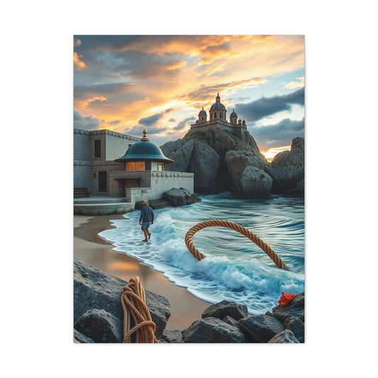
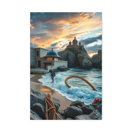
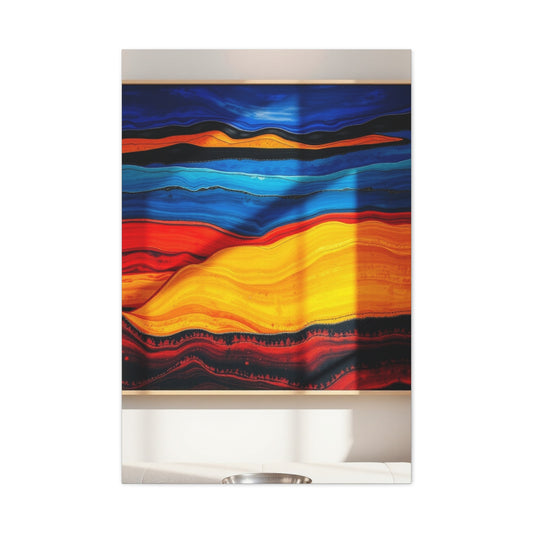
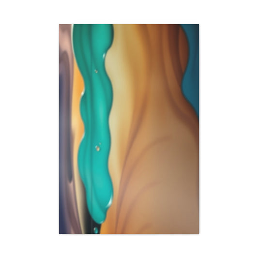
Blood orange has emerged as one of the most commanding color stories of fall, bringing warmth, drama, and an unexpected sense of sophistication to seasonal style. Unlike traditional autumn shades that lean heavily on browns and muted neutrals, blood orange pulses with life. It reflects harvest abundance, shifting leaves, and the glowing twilight skies that define the season’s emotional palette. This color is not timid. It invites confidence and signals creative intent, whether it appears in fashion, interiors, or visual storytelling.
The resurgence of expressive hues has coincided with a broader desire for individuality. Blood orange fits perfectly within this cultural moment because it refuses to blend in. Designers are increasingly using it as a central tone rather than a supporting accent, allowing it to shape the entire visual narrative of a space or wardrobe. This shift mirrors how people want their environments to feel in fall: layered, expressive, and deeply personal.
In creative homes, blood orange appears alongside curated visual pieces that balance intensity with restraint. Many homeowners are pairing the color with timeless visual foundations such as curated modern wall art displays that anchor the space while allowing bolder tones to shine. The result is a harmonious tension between classic structure and seasonal experimentation, proving that blood orange is not a fleeting trend but a versatile color with lasting appeal.
Emotional Warmth And Psychological Impact Of Blood Orange
Color psychology plays a powerful role in why blood orange feels so compelling during fall. This hue sits at the intersection of red’s passion and orange’s optimism, creating an emotional resonance that feels energizing yet comforting. As daylight shortens and temperatures cool, people instinctively gravitate toward colors that evoke warmth and vitality. Blood orange fulfills that emotional need without overwhelming the senses.
In living environments, this color has been shown to stimulate conversation and creativity. It invites engagement rather than passivity, making it ideal for shared spaces where connection matters most. When layered thoughtfully with softer textures and complementary tones, blood orange transforms rooms into places that feel alive even as the outside world slows down.
The psychological balance becomes even more striking when blood orange is paired with neutral visual contrasts. Spaces that incorporate subtle monochrome elements such as refined black white gold decor pieces benefit from blood orange’s warmth without sacrificing elegance. This interplay highlights how bold color can coexist with restraint, creating an environment that feels emotionally rich rather than visually chaotic.
Blood Orange In Contemporary Fashion Narratives
Fashion has always been a mirror of cultural mood, and blood orange’s prominence reflects a collective desire for expressive confidence. Designers are moving away from predictable fall palettes and embracing colors that feel intentional and bold. Blood orange garments command attention while remaining wearable, offering a sense of drama that feels grounded rather than theatrical.
This color thrives in transitional pieces that blur the line between nostalgia and modernity. It resonates with younger audiences who are rediscovering vintage influences while reinterpreting them through a contemporary lens. The return of cropped silhouettes, fitted tees, and expressive colorways has given blood orange a platform to shine.
Cultural references to retro fashion cycles can be seen in explorations of nostalgic style movements such as those discussed in reflections on 90s inspired fashion revival. Blood orange fits seamlessly into this revival, echoing the bold experimentation of past decades while feeling fresh and current. Its adaptability across casual and elevated looks makes it one of the most versatile hues of the season.
Interior Styling With Bold Yet Balanced Color
Using blood orange in interiors requires intention, but when done correctly, it becomes transformative. Rather than saturating entire spaces, designers often introduce the color through focal elements that guide the eye and set the tone. This approach allows blood orange to energize a room without overwhelming it.
The key to successful integration lies in balance. Natural materials such as wood, stone, and woven textiles temper the intensity of blood orange, grounding it in warmth rather than excess. This philosophy aligns with a growing appreciation for authenticity and organic design principles, themes often explored in discussions around returning to creative roots. Blood orange feels most powerful when it complements natural textures instead of competing with them.
Visual cohesion also matters. When blood orange is paired with thoughtfully chosen imagery and artwork, it elevates the entire environment. The color becomes part of a narrative rather than an isolated statement, encouraging a more immersive and emotionally resonant space.
The Art Of Visual Contrast And Color Harmony
Contrast is essential when working with a color as assertive as blood orange. Without thoughtful counterpoints, the hue can feel overpowering. Designers often rely on visual rhythm, alternating bold elements with calm spaces to create a sense of movement and harmony.
This balancing act is not just aesthetic but emotional. Spaces that successfully integrate blood orange feel dynamic yet restful, stimulating yet inviting. The process mirrors broader creative principles discussed in reflections on achieving equilibrium in design such as those found in explorations of creative balance in interiors. Blood orange thrives when it has room to breathe, allowing its richness to unfold gradually rather than all at once.
By pairing blood orange with cooler undertones or neutral backdrops, designers create visual tension that keeps the eye engaged. This approach transforms the color from a mere accent into a storytelling device that guides perception and mood throughout a space.
Nature Inspired Expressions Of Blood Orange
Blood orange draws much of its power from nature. The color evokes autumn sunsets, ripening fruit, and the shifting tones of falling leaves. This natural association makes it particularly effective in spaces that aim to feel grounded and organic.
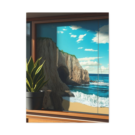
Nature-inspired design often emphasizes subtle variation and texture, allowing bold colors to emerge organically rather than artificially. When blood orange appears alongside botanical motifs or earthy palettes, it feels intuitive and comforting. Visual pieces such as serene landscape imagery, including works like the verdant elegance series found through lush botanical inspired prints, amplify this connection by reinforcing the dialogue between color and environment.
This approach encourages a deeper emotional response. Rather than simply decorating, blood orange becomes part of a sensory experience that reflects seasonal change and personal connection to the natural world.
Personal Expression Through Curated Visual Stories
Fall is often a season of reflection, and blood orange supports this introspective mood by encouraging self-expression. Whether through clothing choices or interior design, this color invites people to tell their own stories boldly and unapologetically.
Visual storytelling plays a crucial role in this process. Curated imagery that captures moments of grace and authenticity can deepen the emotional impact of a space. Pieces that echo themes of growth and refinement, similar to those found in collections like refined artistic wall imagery, complement blood orange’s expressive energy without overpowering it.
When personal narratives are woven into design choices, blood orange becomes more than a trend. It transforms into a medium for memory, identity, and seasonal ritual, enriching everyday experiences with meaning and intention.
Modern Color Pairings That Elevate Blood Orange
Blood orange reaches new heights when paired with unexpected color companions. While neutrals provide stability, cooler hues introduce contrast that enhances vibrancy. Blue, in particular, creates a striking yet harmonious relationship with blood orange, offering visual depth and sophistication.
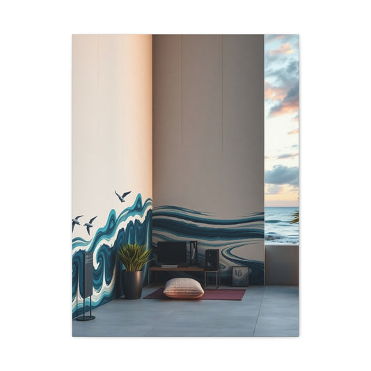
This pairing has become increasingly popular in contemporary design because it balances warmth with calm. Collections featuring layered palettes, such as those explored through black white blue accents, demonstrate how blood orange can coexist with cooler tones without losing its impact.
The result is a space or wardrobe that feels thoughtfully composed rather than impulsive. Blood orange remains the focal point, but its surrounding colors elevate its presence, creating a cohesive and memorable aesthetic.Blood orange is a color that commands attention. Bold, warm, and unexpectedly versatile, it sits at the intersection of red and orange, carrying the intensity of both while maintaining a unique vibrancy.
On its own, it is powerful, but when paired thoughtfully with complementary or contrasting colors, blood orange transforms from a statement into a fully realized aesthetic experience. Modern color pairings allow this striking hue to shine, elevating everything from fashion to interior design.
One of the most effective ways to enhance blood orange is through neutrals. Soft beige, cream, or warm taupe create a grounding backdrop that allows the vividness of blood orange to take center stage. These subtle pairings prevent the color from overwhelming the eye while adding a sense of sophistication and balance. In fashion, a blood orange dress against a neutral coat or accessories feels polished yet daring. In interiors, pairing the hue with soft neutrals can bring warmth and energy to living spaces without appearing chaotic.
Authentic Imagery And Human Connection
Blood orange resonates strongly with authenticity. Its warmth mirrors human emotion, making it an ideal backdrop for visual narratives that celebrate real moments and genuine connection. In photography and personal imagery, this color enhances skin tones and adds depth without distraction.
Authentic visual storytelling often prioritizes candid expression over perfection. Resources that explore this approach, such as insights on natural portrait photography ideas, highlight how expressive color can support honesty and emotional resonance.
Incorporating blood orange into these narratives reinforces a sense of warmth and humanity. It becomes a subtle yet powerful tool for amplifying emotion and connection, aligning visual expression with lived experience.For those willing to explore bolder combinations, deep, moody shades such as charcoal, navy, or forest green provide striking contrast.
These darker tones anchor the vibrancy of blood orange, creating a visually dynamic effect that feels contemporary and intentional. In modern design, this type of pairing emphasizes depth and dimension, whether through layered textiles, accent walls, or statement furniture pieces. The interplay of rich darks with the bright, fiery hue of blood orange creates a dramatic yet harmonious energy that feels both daring and refined.
Another exciting approach is pairing blood orange with unexpected pastels or muted colors. Soft blush, powder blue, or muted lavender might seem counterintuitive at first, but these lighter tones soften the intensity of blood orange while adding a fresh, contemporary twist. This combination works particularly well in fashion editorials and modern home décor, where it injects personality without clashing. It demonstrates that blood orange can adapt to playful, inventive palettes while maintaining its bold identity.
Seasonal Memory Making Through Color
Fall is a season deeply tied to memory, and blood orange plays a unique role in shaping how moments are remembered. Colors have the power to anchor experiences, turning ordinary days into lasting impressions. When blood orange is woven into seasonal traditions, it becomes part of a personal archive of emotion and atmosphere.
Families and individuals often use visual storytelling to preserve these moments, crafting narratives that reflect growth and change. Creative projects centered on memory preservation, similar to those discussed in approaches to personalized family yearbooks, show how color choices influence emotional recall.
By embracing blood orange during fall, people create a visual signature for the season. It becomes a recurring motif that evokes warmth, reflection, and bold self-expression year after year, cementing its place as the color you truly need this fall.Metallics offer yet another dimension for elevating blood orange.
Gold, bronze, and even brushed copper enhance the warmth and richness of the hue, making it feel luxurious and sophisticated. In interiors, metallic accents paired with blood orange furnishings or décor create a refined, modern look. In fashion, jewelry, belts, or shoes in metallic tones can accentuate blood orange pieces, adding subtle shine and depth without overpowering the outfit.
Expressive Art As A Seasonal Color Language
Blood orange finds a powerful ally in expressive art forms where color is used not merely for decoration but for emotional storytelling. In mixed media landscapes, this shade often appears as a transitional force, bridging warmth and intensity with texture and movement.
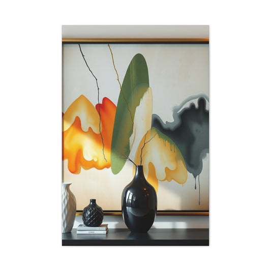
Such works demonstrate how bold seasonal colors can exist within layered compositions without overpowering the viewer, instead drawing them deeper into the narrative of the piece. Explorations of artistic depth and chromatic emotion, such as those highlighted in expressive mixed media landscapes, reveal how colors like blood orange can be embedded into visual stories that feel raw, thoughtful, and immersive.
This approach reinforces the idea that fall color trends gain longevity when they are treated as expressive tools rather than surface-level statements, allowing blood orange to resonate as both an aesthetic and emotional anchor within seasonal design.Ultimately, the key to modern color pairings with blood orange is balance and intention.
Whether using neutrals for elegance, darks for contrast, pastels for freshness, or metallics for sophistication, the goal is to highlight the color’s vibrancy while maintaining harmony. Blood orange is not just a seasonal trend; it is a bold expression of confidence and creativity. The right combinations transform it from a striking statement into a cohesive, modern aesthetic that feels both timeless and forward-thinking.
Blood Orange As A Visual Counterpoint In Modern Aesthetics
Blood orange in fall continues its narrative in Part 2 as a counterpoint rather than a centerpiece, proving that bold color can coexist with restraint. When surrounded by cooler palettes and structured visuals, blood orange acts as an emotional spark that brings depth to otherwise calm environments. This role is especially powerful in contemporary spaces where minimalism and expression are constantly negotiating balance. Instead of dominating, blood orange punctuates moments, guiding attention and anchoring feeling.
This approach mirrors how horizon-inspired visuals often work, where color gradients subtly shift the viewer’s perception. Pieces inspired by expansive scenery, similar to those explored through verdant horizon elegance, demonstrate how a restrained palette allows warmer tones to feel intentional and atmospheric. Blood orange thrives in this context, becoming a quiet but memorable presence.
Cool Tones That Amplify Warmth
One of the most effective ways to elevate blood orange is through contrast with cool tones. Blues, deep greens, and muted teals provide a visual temperature shift that makes warm hues feel richer rather than louder. This contrast reflects natural environments where autumn foliage meets crisp skies, creating visual harmony through opposition.
Artistic compositions that explore cooler spectrums, such as those evoked by deep sapphire inspired visuals, show how warmth gains sophistication when placed against depth and calm. Blood orange, when introduced into such settings, becomes refined and emotionally resonant rather than purely energetic.
Urban Narratives And Seasonal Color
Cityscapes offer a unique backdrop for blood orange because they already contain layers of contrast, movement, and texture. Against monochrome urban imagery, a warm accent feels intentional and symbolic, echoing streetlights, signage, and fleeting moments of warmth in concrete environments.
Visual storytelling rooted in urban minimalism, like those found in curated black white city scenes, allows blood orange to act as a narrative highlight. It becomes a metaphor for life and energy within structured surroundings, reinforcing its role as a color of presence and momentum during fall.
The Cultural Legacy Of Iconic Color
Understanding blood orange’s impact also means understanding the cultural weight of color itself. Throughout history, certain hues have defined eras, emotions, and artistic movements. Blood orange joins this lineage by blending intensity with accessibility, making it both striking and relatable.
Stories behind iconic pigments, such as reflections on the story of iconic yellow, reveal how colors gain meaning through context and repetition. Blood orange is building its own narrative, shaped by seasonal rhythms, creative expression, and emotional resonance rather than shock value alone.
Memory, Emotion, And Layered Visuals
Color becomes most powerful when tied to memory. Blood orange excels in this space because it is emotionally charged yet warm, making it ideal for visual compositions that tell layered stories. When used within intricate imagery, it encourages viewers to linger and explore rather than simply observe.
The concept of multiple moments forming a single narrative, similar to ideas explored in photo mosaic storytelling, aligns naturally with blood orange’s role. It binds fragments together, creating cohesion through warmth and emotional continuity.
Family Spaces And Personal Color Language
In personal environments, blood orange becomes part of a shared visual language that reflects identity and connection. Family-focused spaces benefit from colors that feel welcoming yet expressive, and blood orange offers that balance effortlessly. It supports intimacy without feeling subdued.
Ideas centered on personalization and authenticity, such as those discussed in authentic family portrait ideas, highlight how thoughtful color choices enhance emotional truth. Blood orange in these contexts becomes a backdrop for real moments rather than staged perfection.
Portraiture And Emotional Depth
Portrait-focused visuals gain new depth when paired with warm seasonal tones. Blood orange enhances natural expression by adding subtle vibrancy to skin tones and surrounding elements. It does not distract from the subject but enriches the emotional atmosphere around them.
Visuals that emphasize calm presence and introspection, similar to those found in serene portrait compositions, demonstrate how warmth can be conveyed quietly. Blood orange supports this serenity, proving that bold color does not always need bold execution.
Creating Calm With Warm Undertones
While blood orange is often associated with energy, it can also evoke calm when softened and layered correctly. Muted applications of the color introduce warmth without agitation, making it suitable even for reflective or restorative environments.
Designs that explore tranquility through gentle composition, like those reflected in soft serenity inspired visuals, show how warmth and stillness can coexist. Blood orange, when diffused, becomes a comforting presence rather than a focal demand.
Minimalism Enhanced By Intentional Color
Minimalist environments rely heavily on precision, making every color choice matter. Blood orange works within minimalism when used sparingly and purposefully, acting as an emotional anchor in otherwise restrained spaces.
Collections focused on reduction and clarity, such as curated black white minimal interiors, provide the perfect stage for a warm accent. Blood orange punctuates simplicity, ensuring minimalism feels human rather than sterile.Ultimately, timeless contrast in monochrome settings lies in balance. It is the interplay of light and dark, texture and smoothness, simplicity and complexity, that creates an enduring aesthetic.
Monochrome is not the absence of creativity; it is a framework that challenges designers, artists, and stylists to extract maximum expression from minimal elements. When executed thoughtfully, monochrome transforms any environment or outfit into an elegant statement, proving that true style does not depend on color alone—it depends on contrast, composition, and the subtle art of restraint.
Technical Awareness And Visual Integrity
The impact of color is ultimately shaped by how it is captured and displayed. Understanding technical elements like resolution ensures that blood orange retains its richness and nuance across mediums. Without this awareness, even the most thoughtful color choices can lose their intended effect.
Insights into visual clarity and detail, such as those explained in camera resolution basics, remind creators that color integrity depends on both artistic vision and technical execution. Blood orange deserves precision, allowing its depth and warmth to translate fully into the viewer’s experience.
Monochrome also carries an inherent sense of clarity. By stripping away the distraction of multiple hues, it emphasizes essence over excess. Each component, whether in design, décor, or wardrobe, is allowed to reveal its full character. This intentionality produces an effect that feels deliberate and thoughtful, reinforcing the impression of sophistication. Monochrome’s timelessness comes from its ability to combine restraint with visual impact—a paradox that few color schemes can achieve as consistently.
Blood Orange As The Signature Of Modern Living
As the series concludes, blood orange emerges not just as a seasonal preference but as a defining signature of modern living. This color has proven its ability to adapt, evolve, and embed itself into contemporary environments that value intention over excess. In modern homes, blood orange is less about spectacle and more about clarity of voice. It signals confidence in choice and a willingness to let color communicate emotion without explanation.
Contemporary spaces thrive on thoughtful curation, where every visual element contributes to a cohesive atmosphere. Reflections on refined modern environments, such as those explored through sophisticated contemporary interiors, demonstrate how bold color works best when guided by restraint. Blood orange fits seamlessly into this philosophy, offering warmth that feels deliberate rather than decorative.Another reason monochrome remains perpetually relevant is its adaptability. Its simplicity provides a versatile backdrop that accommodates bold statements without overwhelming the viewer.
Accessories, accent pieces, or even a single bright element can transform a monochrome scene into something striking while preserving harmony. This flexibility ensures that monochrome settings are not only aesthetically enduring but also highly functional, capable of evolving with trends while retaining their foundational elegance.
Cosmic Influence And Emotional Color
Blood orange carries a celestial quality that feels especially relevant as design increasingly draws inspiration from the cosmos. Its depth mirrors planetary tones, distant sunsets, and the quiet drama of night skies. This connection to the universe adds a layer of symbolism, positioning blood orange as a color that transcends the everyday.
Design narratives influenced by celestial themes, similar to those discussed in explorations of astrology inspired interiors, reveal how color can reflect both personal identity and universal rhythm. Blood orange becomes a bridge between the intimate and the infinite, grounding cosmic inspiration in human warmth.Monochrome settings have a quiet power. At first glance, they may seem simple, even restrained, but within their apparent uniformity lies a world of dynamic contrast and timeless appeal.
Black and white, shades of gray, or even a single color in varying intensities—monochrome schemes transform minimalism into a canvas for depth, texture, and nuanced expression. Far from being limiting, these settings embrace contrast as their defining strength, proving that sophistication often resides in subtlety.
The beauty of monochrome lies in its ability to highlight differences that might otherwise go unnoticed. When color is minimized, every shape, line, and shadow gains significance. A single dark accent against a lighter background can draw attention to architectural details, furniture, or artwork in a way that vibrant palettes sometimes overpower. In fashion, monochrome outfits rely on layers, texture, and proportion rather than color combinations, allowing each element to make a statement on its own. The result is elegance without effort—a form of refinement that never feels dated.
Harmony Through Layered Composition
Harmony is essential when working with a color as expressive as blood orange. Rather than existing alone, it thrives within layered compositions where texture, tone, and movement interact. This layered approach mirrors musical structure, where individual notes gain meaning through relationship rather than isolation.
Visual compositions that suggest rhythm and flow, such as those evoked by symphonic nature inspired visuals, demonstrate how warmth can be orchestrated rather than imposed. Blood orange acts like a recurring motif, weaving continuity through complex visual narratives.
Expansive Perspectives And Depth
Blood orange also excels in spaces that emphasize perspective and openness. When paired with visuals that suggest distance or horizon, the color anchors the viewer emotionally while allowing the eye to wander. This balance between grounding and expansion creates environments that feel both secure and inspiring.
Scenes that explore openness and layered distance, similar to those found in elegant panoramic vistas, enhance blood orange’s ability to create depth. The color becomes a reference point within expansive compositions, guiding emotional orientation.
Contrast in monochrome settings extends beyond visual boundaries; it creates a sensory rhythm that guides perception. A smooth, glossy surface next to rough, matte textures, or a soft fabric against a structured silhouette, introduces tension and balance simultaneously.
These contrasts invite the eye to explore the composition, creating interest while maintaining cohesion. Light and shadow play an equally crucial role, emphasizing dimensionality and enhancing the perception of space. In photography, interior design, or fashion, monochrome contrasts rely on these subtleties to evoke emotion, drama, and timeless appeal.
Timeless Contrast In Monochrome Settings
Monochrome environments have long relied on contrast to avoid sterility. Blood orange offers an ideal counterbalance, injecting warmth into spaces defined by restraint. Its presence transforms stark compositions into emotionally resonant experiences without disrupting visual clarity.
Collections centered on tonal purity, such as curated classic black white photography, reveal how a single warm element can redefine an entire setting. Blood orange in these contexts becomes a focal whisper rather than a shout.
Figurative Expression And Emotional Resonance
The emotional strength of blood orange is amplified when paired with figurative imagery. Human form and gesture already carry narrative weight, and warm color deepens that impact by reinforcing empathy and connection. This pairing invites viewers to engage emotionally rather than intellectually.
Insights into emotional visual storytelling, like those explored in discussions on psychological impact of figurative art, highlight how color influences perception. Blood orange supports emotional readability, making visual experiences feel immediate and human.Ultimately, completing the seasonal narrative is about alignment—between the external environment and internal state.
As days grow shorter and air turns crisp, there is a quiet invitation to slow down, to be deliberate, and to find beauty in richness rather than excess. When style and atmosphere reflect this mindset, the season feels complete, cohesive, and deeply satisfying.
Reflection, Symmetry, And Visual Dialogue
Reflection introduces dialogue within a composition, allowing colors to interact with themselves. Blood orange gains complexity when mirrored, creating symmetry that feels intentional and contemplative. This technique transforms color into conversation rather than statement.
Creative approaches to reflection, such as techniques explained in creating reflected images, show how warmth can be multiplied without becoming overwhelming. Blood orange reflected becomes softer, more introspective, and layered with meaning. Another key element is intention. Thoughtful curation—choosing pieces, colors, and textures that speak to one another—elevates the seasonal experience. Rather than overwhelming the senses, intentional choices create harmony.
They allow each element to stand out while contributing to a larger whole. This approach transforms everyday decisions into moments of expression, reinforcing the narrative with subtlety and depth.
Preserving Color Integrity Through Technique
No matter how intentional the color choice, its impact depends on faithful representation. Blood orange’s richness requires careful attention to technique to ensure it translates accurately across mediums. Without technical care, its depth can flatten or distort.
Guidance on capturing visual fidelity, including insights found in photographing artwork correctly, underscores the importance of precision. Blood orange deserves clarity, allowing its nuanced warmth to remain intact from creation to display.Completing the narrative also means honoring continuity.
While trends may change, the essence of the season remains rooted in familiarity. This is why autumn feels nostalgic yet forward-looking at the same time. It draws from timeless influences while making space for new interpretations. The most compelling seasonal stories acknowledge the past while confidently stepping into the present, creating a bridge between comfort and creativity.
Travel, Place, And Chromatic Memory
Blood orange often evokes memories of place, particularly locations rich in history and atmosphere. Its warmth aligns with stone streets, fading sunlight, and the romance of travel. When used thoughtfully, it becomes a vessel for nostalgia and imagination.
City narratives filled with texture and light, like those suggested through romantic Venice city scenes, reinforce how color anchors memory. Blood orange captures the emotional residue of experience, turning spaces into reminders of movement and discovery.Every season has a rhythm, and autumn’s rhythm is slower, richer, and more grounded. It encourages layering—not only in clothing and décor, but in emotion and expression.
The colors we gravitate toward during this time reflect a collective shift inward. Deep hues, earthy undertones, and saturated shades create a sense of comfort while still allowing for individuality. These elements work together to complete the narrative of the season, transforming isolated choices into a unified aesthetic experience.
What makes a seasonal narrative feel complete is balance. Boldness must be tempered with restraint, and tradition should coexist with experimentation. When these contrasts are harmonized, the result feels authentic rather than forced. Fall thrives on this duality—where softness meets structure and warmth meets intensity. Whether expressed through fashion, design, or lifestyle, the season rewards those who embrace its complexity rather than simplifying it.
Completing The Seasonal Narrative
As the final note in this series, blood orange stands as a complete seasonal narrative rather than a passing accent. It has proven its versatility across modern living, emotional storytelling, technical execution, and personal memory. Its strength lies not in dominance but in presence.
Even subtle visual elements, including refined pieces like those suggested through verdant elegance inspired visuals, show how warmth can conclude a space with quiet confidence. Blood orange ultimately defines fall not by trend cycles, but by its ability to hold emotion, memory, and modern identity in a single, resonant hue.
Completing the seasonal narrative is about more than following trends—it is about understanding how color, texture, and mood come together to tell a cohesive story. As the year transitions into its cooler months, there is a natural desire for depth, warmth, and meaning in the choices we make. Fall, in particular, invites reflection and reinvention, offering a chance to express identity through thoughtful details that feel intentional rather than incidental.
Conclusion
In a season defined by transformation, depth, and warmth, blood orange emerges as more than just a trend—it becomes a statement. As fall invites us to shed the lightness of summer and embrace richer tones, this bold, vibrant hue perfectly captures the energy of change. Sitting at the intersection of fiery red and grounded orange, blood orange offers a dynamic balance of warmth, confidence, and sophistication that feels both daring and timeless.
What makes blood orange particularly compelling is its versatility. While bold at first glance, it adapts effortlessly across styles, settings, and personalities. In fashion, it can be the centerpiece of a standout coat, dress, or knit, instantly elevating even the simplest outfit. In accessories, it adds a controlled pop of color—through bags, shoes, or scarves—that refreshes neutral fall palettes without overwhelming them. Even in beauty and home décor, blood orange brings a sense of vibrancy that feels cozy rather than overpowering, energizing spaces and looks alike.
Beyond aesthetics, blood orange carries emotional resonance. Fall is often associated with introspection and renewal, and this color mirrors that duality. Its warmth evokes comfort and familiarity, while its intensity signals confidence and forward momentum. Wearing or incorporating blood orange is an act of self-expression—it suggests creativity, courage, and a willingness to stand out while remaining grounded. In a world where neutral tones often dominate cooler seasons, choosing blood orange is a refreshing departure that still feels seasonally appropriate.
Another reason blood orange shines this fall is its ability to complement a wide range of colors. It pairs beautifully with classic autumn shades like camel, chocolate brown, olive, and burgundy, while also working surprisingly well with unexpected tones such as blush, teal, or even lavender. This adaptability ensures that blood orange is not a fleeting trend but a color with lasting potential in any wardrobe or design palette.
Ultimately, blood orange represents the spirit of fall itself—bold yet comforting, rich yet lively. It encourages experimentation without sacrificing elegance and invites individuals to embrace color as a form of confidence. Whether you choose to go all in with a statement piece or subtly incorporate it through small accents, blood orange offers endless possibilities to refresh your seasonal style.


