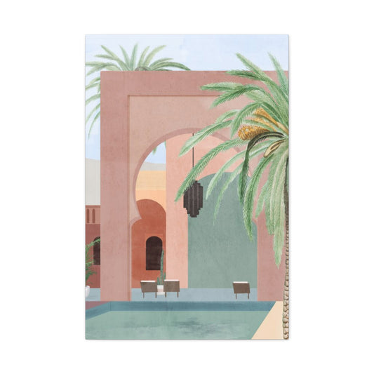
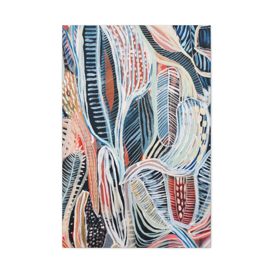
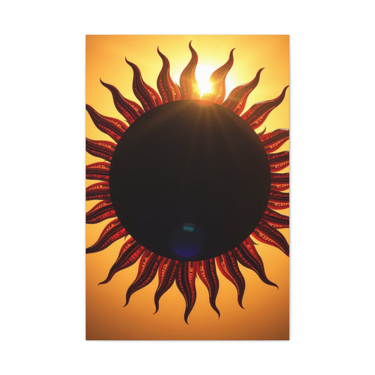
In the chromatic hierarchy of design, red, yellow, and blue hold an unassailable position. These three primary colors are the genesis of every other shade in the visible spectrum. And yet, despite their power, they’re often bypassed in favor of understated neutrals or whisper-soft pastels. But 2025 heralds a triumphant return for these audacious tones, especially in interiors where personality is paramount.
The reemergence of primary colors isn’t accidental—it’s an intentional rebellion against the sterile and over-curated aesthetics of recent years. As design circles pivot back to expressive, joy-infused environments, this powerful triad offers both nostalgia and novelty. From punchy accent walls to bold Wall art that harnesses red’s passion, yellow’s optimism, and blue’s tranquility, primary colors offer a vivid way to infuse your home with character and vibrancy.
The Psychology of Primary Colors: Emotionally Charged Design
Before diving into styling tips, it's essential to understand why these colors evoke such strong emotional responses. Red symbolizes vitality, courage, and intensity. Yellow radiates happiness, clarity, and warmth. Blue soothes the mind, invoking peace and reliability. These hues, though powerful alone, become truly magnetic when harmoniously combined.
Incorporating them into your space can do more than elevate the décor—it can transform the atmosphere. Whether you’re designing a creative workspace, a cheerful kitchen, or a grounded living room, these colors act as emotional anchors in your visual story.
Red: The Bold Pulse of Energy
When used thoughtfully, red can transform a bland room into a haven of passion and movement. While a crimson wall may seem daunting, even subtle inclusions of this hue can make a profound impact. Think burnt red accent chairs, terracotta-toned vases, or a scarlet-framed Wall art piece that draws the eye in.
Balance is key—pair red with neutral materials like light wood, matte black, or concrete for a grounded yet dynamic effect. In open-concept spaces, red functions as a visual connector between zones, guiding the gaze while adding an avant-garde flair.
Yellow: Sunshine for Your Walls
Yellow is the epitome of optimism. From buttery tones to bright ochre, it injects any space with instant warmth. Incorporating yellow into your home is like inviting perpetual daylight—uplifting and invigorating.
Try incorporating mustard yellow throw pillows on a charcoal sofa, or use daffodil-toned curtains to brighten a space with limited natural light. And don’t underestimate the power of yellow Wall art—it can transform a hallway or reading nook into a cheerful vignette that exudes character and charm. Pair yellow with cool shades like gray or navy to avoid overpowering the room.
Blue: Tranquility in a Saturated Spectrum
As the most universally favored color, blue brings a sense of calm and stability. In its deeper forms—such as sapphire or ultramarine—it conveys a sense of sophistication. In lighter shades like sky or cornflower, it can create a breezy, beach-house vibe.
Blue serves as a perfect foil to the high energy of red and yellow. Use it as a grounding element in rugs, sofas, or statement lighting. A cobalt accent wall adorned with abstract Wall art can bring depth and contemplative elegance to a modern interior, especially when surrounded by minimalist furnishings.
The Triadic Approach: Curating Balance
When using all three primary colors together, restraint is paramount. The goal is harmony, not chaos. Begin by selecting one dominant shade, another as a secondary accent, and the third in small doses to punctuate.
For example, a living room might feature blue as the main wall color, yellow in the form of upholstery or lighting fixtures, and red as a statement in an oversized piece of Wall art or a patterned area rug. This layering approach creates a curated, gallery-like vibe rather than a clashing cacophony of hues.
Mid-Century Modern and Primary Colors: A Match Made in Design Heaven
Mid-century design principles—clean lines, organic shapes, and honest materials—create the perfect canvas for primary color integration. Think Eames chairs in fire-engine red, vintage credenzas painted cornflower blue, or mustard yellow poufs resting on walnut floors.
Wall art inspired by Bauhaus or abstract expressionism ties the look together effortlessly, capturing the spirit of the era while maintaining a modern sensibility. The interplay of vivid color and iconic furniture shapes creates a visual rhythm that’s impossible to ignore.
Contemporary Twists: Minimalism Meets Chromatic Boldness
For those who favor a more modern aesthetic, primary colors can be woven into minimalist interiors with strategic precision. Consider an all-white room punctuated by a modular red sofa, a geometric yellow light fixture, or a navy accent table. These chromatic interruptions function like visual exclamation points, energizing the room without overwhelming its serene structure.
Gallery walls are especially effective here. A monochrome blue canvas juxtaposed with a line drawing in red and a modernist yellow print can create an artful narrative in any space. The clean backdrop allows each color to breathe and shine.
Children’s Spaces Reinvented
While primary colors have long been a staple in children’s design, today’s interpretations are more elevated and enduring. Instead of garish cartoon palettes, think of curated elements: a canary-yellow reading nook, a crimson toy chest, or a robin’s-egg blue ceiling.
Even in nurseries, Wall art featuring abstract interpretations of red, yellow, and blue encourages visual stimulation and developmental interest—without sacrificing style. Soft furnishings in coordinating hues add cohesion and comfort, striking the ideal balance between playful and polished.
Bringing It Home: A Legacy of Color
Decorating with primary colors is not about following a fleeting trend—it’s about embracing a timeless palette with infinite possibility. In 2025, designers are celebrating bold individuality, and there’s no better way to make your interiors unforgettable than through these iconic hues.
Whether you opt for a saturated feature wall, sculptural furniture, or curated Wall art that dances between red, yellow, and blue, you’ll be infusing your home with history, creativity, and an unapologetic zest for life.
Let your space become a living canvas. Let it speak in chromatic tones. And let it reflect your boldest, brightest self.
Primary Color Power: Elevating Interiors with Expressive Simplicity
Injecting personality into your living space doesn’t require dramatic makeovers or extensive renovations. One of the most impactful yet uncomplicated methods to transform a room lies in embracing expressive art—particularly through the strategic use of primary colors. Red, yellow, and blue, the foundational hues of the color spectrum, carry a symbolic weight and aesthetic power that can shift a room’s mood instantaneously. When harnessed through abstract or modern artwork, these pure tones offer a dynamic interplay that enlivens even the most neutral of spaces.
Integrating primary colors through Wall art allows for a bold expression of style without demanding a full redesign. It is the art of minimal intervention with maximal effect. A single, well-placed piece featuring these high-impact hues can act as the visual heartbeat of a room. Whether you favor mid-century aesthetics or lean into minimalist design, these vibrant tones can inject spirited energy while maintaining a clean, curated appearance.
Consider a blank wall—perhaps painted in taupe, soft white, or dove grey. While these colors provide a timeless and versatile backdrop, they can often lean toward sterility without some visual contrast. Hanging an abstract canvas that pulsates with fiery crimson, sunflower yellow, and cerulean blue instantly catalyzes the room. The vibrancy of primary colors is not just visual—it’s emotional. Red stirs excitement and passion, yellow radiates joy and optimism, while blue evokes calm and clarity. Together, they create a chromatic conversation that’s both balanced and bold.
Primary-toned Wall art doesn’t just stand alone; it becomes the anchor point that ties together other elements in your space. For instance, a cobalt throw pillow, a scarlet ceramic vase, or a golden floor lamp can find cohesion through the artwork’s palette. Suddenly, disparate decorative items no longer feel like accidents—they feel intentional, harmonized by a central artistic expression. This is the silent orchestration that great design achieves: visual cohesion born from expressive nuance.
In spaces with more subdued palettes—think Scandinavian or Japandi interiors—primary-colored artwork becomes an electrifying focal point. These color-rich pieces infuse rooms with vitality, keeping the minimalism from veering into monotony. The brilliance lies in contrast. Abstract compositions with jagged strokes or fluid geometries disrupt the soft order of neutral spaces, making the artwork an exciting moment of design rebellion.
When choosing Wall art imbued with primary tones, consider the emotional narrative you want your room to tell. Do you crave vivacity in a sleepy corner? A pop-art-inspired piece rich in graphic reds and yellows might be your muse. Is your reading nook too muted? A canvas with large cobalt brushstrokes could offer tranquility while maintaining visual intrigue. Abstract pieces, with their lack of defined subjects, invite interpretation—each glance may evoke something different depending on the day, the light, or your mood.
Another advantage of using expressive art to introduce color is its flexibility. Unlike painted walls or colored furniture, a piece of Wall art can easily be rotated, repositioned, or replaced, allowing your interior to evolve with your tastes and the seasons. This adaptability makes it perfect for renters, frequent redecorators, or anyone craving a low-commitment, high-impact upgrade to their home.
For those with eclectic tastes, don’t shy away from combining styles. A vibrant abstract painting can exist harmoniously alongside vintage furniture, industrial accents, or even coastal-inspired elements. The key is balance. The boldness of primary colors can be tempered with organic textures like raw wood, natural linens, or woven textiles. This synthesis of intense color and tactile materials crafts a living space that is as emotionally resonant as it is visually cohesive.
Lighting also plays a critical role in showcasing color-infused artwork. Sunlight will enhance the warmth of reds and yellows during the day, while cool-toned artificial lighting can intensify the depth of blues at night. Spotlights or directional wall lamps can accentuate the textures and pigments within the artwork, giving it a dimensional quality that flat lighting may suppress. Consider installing track lighting or sconces to frame your art and amplify its impact.
In children’s rooms or creative workspaces, primary-colored Wall art can also encourage imagination and cognitive stimulation. These hues are inherently engaging and often associated with educational settings for a reason. They inspire creativity, reinforce visual learning, and foster emotional engagement—making them ideal for environments where inspiration is key.
Don’t forget the frame. The style and color of your frame can alter the tone of the entire piece. A sleek black frame can give a contemporary edge, while a natural wood border might soften the intensity and connect the work to more organic interiors. Floating frames, which add a shadow between the canvas and the frame edge, offer a modern museum-like presentation that elevates the perceived value of your art.
Ultimately, expressive Wall art is a celebration of individuality. It offers a curated yet free-spirited way to inject soul into your living space without overwhelming it. By leaning into the vibrancy of primary colors, you bring emotional clarity and visual stimulation to any room. It is a design philosophy rooted in bold simplicity—where a single canvas can echo loudly, making the walls of your home feel more alive, more personal, and infinitely more dynamic.
Incorporating primary colors doesn’t have to mean a complete overhaul. With the right artwork, even the simplest gesture can speak volumes. Let color do the talking, and let your walls become a gallery of bold expression, unified by purpose and radiating joy.
Metropolitan Harmony: Pairing Greyscale Foundations with Bold Color Bursts
In the realm of modern interior design, the interplay between neutrality and vivid color is a celebrated aesthetic. Nowhere is this more artfully realized than in the marriage of urban grey with vibrant contrasts. This design philosophy takes the clean minimalism of city-inspired palettes—think concrete tones, steel hues, and smoky undertones—and enlivens them with the unexpected energy of primary shades. The result? A space that feels grounded yet spirited, effortlessly blending sophistication with creative verve.
Urban grey tones form the cornerstone of contemporary design, reflecting the architectural gravitas of city skylines, cobblestone alleyways, and modern loft interiors. These tones speak to a refined, lived-in elegance, a kind of quiet confidence that serves as a perfect canvas for artistic expression. Rather than dominate, these greys recede, allowing brighter elements to step into the spotlight without overwhelming the senses.
Introducing vibrant color into this subdued scheme is like striking a match in the dark—it illuminates, excites, and transforms. Bright reds, sunlit yellows, cobalt blues, and verdant greens serve as arresting accents that breathe vitality into muted surroundings. Imagine a slate-gray sofa softened by poppy-red throw cushions, or a concrete-finish accent wall punctuated by a striking Wall art piece featuring bold, geometric forms in cerulean and ochre. These juxtapositions command attention while maintaining harmony—a hallmark of high-level design.
When thoughtfully curated, this balance creates what many urban designers refer to as visual rhythm. This rhythm occurs when the eye dances between calm and energy, resting momentarily on the grey elements before being awakened by bursts of color. Grey functions almost like a visual reset, allowing each vibrant addition to make a statement without feeling chaotic or misplaced.
Wall art plays an integral role in executing this style successfully. Grayscale backgrounds adorned with bold, abstract expressions of color create a sense of dynamic stability. A print featuring vivid brushstrokes over a soft monochrome wash can serve as the room’s centerpiece, marrying depth with dimension. Opt for works that juxtapose angularity with fluidity, or those that layer textures—such as splashes of pigment over muted gradients—to reinforce the contrast.
To enhance the modernity of this look, the choice of furniture and finishes should reflect clean lines and sleek surfaces. Concrete countertops, matte black fixtures, and industrial metal detailing complement the coolness of grey while highlighting the warmth of surrounding hues. Upholstered chairs in vivid velvets—royal blue, crimson, or chartreuse—can punctuate a room like exclamation points, transforming functional pieces into aesthetic declarations.
Color placement is key when designing with contrast. Rather than scattering brights indiscriminately, designate focal areas for maximum impact. A pair of sunflower-yellow lamps on either side of a graphite-toned bed, or an electric blue accent wall against dove-grey cabinetry, offer cohesion and clarity. The goal is not to overwhelm the space with saturation but to orchestrate balance through purposeful design.
In open-concept spaces, use area rugs, partitions, and lighting to demarcate zones of contrast. A grey-toned kitchen might flow seamlessly into a sitting area with fire-engine red bar stools or teal dining chairs. Layering greyscale textures—like ash wood, galvanized steel, and wool—with bold accessories anchors the space while infusing it with character.
Accent pieces in primary hues aren’t limited to textiles or furniture. Sculptural objects, vases, planters, or even light fixtures can become sculptural statements that liven up a grey backdrop. Don’t shy away from including metallics in this mix; brushed brass, chrome, and oxidized copper all interact beautifully with both grey and color, acting as elegant intermediaries.
Another sophisticated technique involves color blocking through art. Seek out large Wall art canvases that feature oversized segments of bold color set against grey. These graphic prints introduce a Bauhaus flair, where functionality and aesthetics converge. Alternatively, photographic prints in black and white with selective color—such as a single red umbrella in a monochrome cityscape—can offer a cinematic edge that feels both nostalgic and fresh.
This urban grey and vibrant contrast theme works remarkably well in various living spaces. In living rooms, it creates a hub of energy and conversation. In bedrooms, when used sparingly, it introduces vitality without disrupting relaxation. Even bathrooms benefit from this aesthetic when paired with slate tiles and ruby or teal towels. The versatility of this palette ensures it adapts across environments while maintaining its core appeal.
Lighting also enhances the depth and dimension of this style. Cool-toned LEDs emphasize grey’s sleekness, while warm filament bulbs can soften its severity. Colored LED strips behind floating shelves or under cabinetry introduce an unexpected glow that feels futuristic yet cozy.
Psychologically, the juxtaposition of grey and color mirrors the human need for stability and stimulation. Grey represents calm, logic, and clarity. Color, meanwhile, invokes passion, joy, and curiosity. When combined, they create an environment that feels balanced, nurturing both serenity and inspiration. This emotional duality is particularly valuable in urban homes, where space may be limited but the desire for expression is boundless.
In a world where design often leans toward extremes—either monochrome minimalism or rainbow maximalism—the fusion of urban grey with vibrant accents offers a refined middle path. It allows for creative latitude without sacrificing coherence. With a few strategic choices, you can reinvent even the most mundane room into a gallery-worthy sanctuary of style.
By incorporating grey as your foundational hue and infusing it with vibrant Wall art and accessories, you craft a space that’s contemporary, expressive, and innately livable. It’s the modern urban home reimagined—not just polished, but pulsing with personality.
A Subtle Embrace of Color: Welcoming Navy as a Sophisticated Gateway Shade
For those who admire color but find pure primary palettes overwhelming, there’s a refined alternative that retains vibrancy without being overpowering. Navy—deep, serene, and elegantly versatile—offers the perfect entry point into the world of bold color. While rooted in the classic family of blues, navy feels more grounded, more contemplative. It provides a bridge between the daring tones of true primaries and the safety of neutrals, inviting depth and richness into a space without demanding the spotlight.
Unlike the vivacious punch of cobalt or royal blue, navy carries a dignified charisma that can adapt to a multitude of aesthetics. Whether you lean toward maximalist opulence or minimalist restraint, navy delivers timeless appeal. The true magic lies in how you choose to layer it within your interiors. Start by incorporating a few anchoring pieces—perhaps a plush velvet sofa, a linen armchair, or a low-sheen navy ottoman. These foundational elements create a sense of continuity, allowing for subtle accents and curated expressions to flourish.
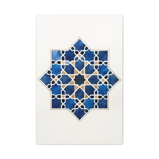
One of the most visually arresting ways to integrate navy is through a bold yet balanced Wall art installation. Imagine a large-scale canvas bathed in a stormy navy wash, interrupted by wisps of scarlet or flickers of antique gold. The visual interplay of these hues nods to the vibrancy of primary color design but filters it through a more mature lens. The contrast between navy’s brooding intensity and gold’s luminous warmth results in an ambiance that feels both artistic and intimate. When mounted on a softly hued wall—think alabaster, dove gray, or muted taupe—this piece becomes a magnetic focal point.
The elegance of navy lies in its versatility. It thrives in natural materials like wool, suede, and heavy cotton, adding weight and gravitas to your design without the visual heaviness of black. Pairing navy with rich textures allows the tone to resonate across the room—try cable-knit blankets, boucle throw pillows, or even a raw-edge indigo linen curtain. Each of these elements contributes to a layered effect that draws the eye and invites tactile exploration.
To accent navy with complementary shades, look to muted iterations of its chromatic companions. Dusky reds—such as merlot, rust, or oxblood—lend warmth and contrast, adding drama without the brashness of fire-engine red. Antique gold, with its patinated finish and timeworn shimmer, brings a regal edge that softens the austerity of navy. Incorporate these hues sparingly through metallic fixtures, embroidery, or delicate décor—perhaps a vintage gilded mirror or a side table with brass inlay. These flourishes create pockets of luminosity that punctuate the visual calm of a navy-dominated scheme.
In shared living spaces, navy serves as a grounding influence. In a dining area, consider navy velvet dining chairs around a natural wood table, topped with taper candles in brass holders and a centerpiece of crimson florals. In the bedroom, a navy tufted headboard against cream walls, flanked by antique gold sconces, evokes quiet grandeur. Add a Wall art composition above the bed that echoes these tones, with abstract lines or celestial imagery rendered in your chosen palette.
Lighting is key when working with darker tones like navy. To avoid creating a somber atmosphere, opt for soft, ambient lighting. Layer light sources by combining overhead fixtures with floor lamps and sconces. Choose shades in ivory or bone to diffuse light gently, allowing the room’s features to glow rather than glare. If natural light is limited, consider integrating reflective surfaces—a lacquered tray, a mirrored sideboard, or metallic photo frames can amplify light and add visual interest.
Flooring and underfoot textures matter just as much. A navy-centric space can feel cold without the right foundation. Opt for rugs in oatmeal, sand, or camel tones with subtle navy patterns. These earthy hues ground the space and provide a cozy base, inviting barefoot comfort. Alternatively, a distressed Persian rug with navy detailing and warm undertones can serve as both art and utility underfoot.
Incorporating greenery also enhances navy interiors. The verdant vibrancy of plants—whether cascading ferns or upright fiddle leaf figs—offers a natural foil to navy’s depth. Use planters in ceramic, aged terracotta, or matte black for contrast. Green adds an organic touch that breathes life into the structure navy provides.
If you’re drawn to an artistic, curated home atmosphere, consider creating a vignette centered on navy. Layer objects of varying heights and textures: a navy vase with dried florals, a stack of indigo-bound books, and a small Wall art piece featuring nautical or celestial motifs. This not only showcases your personal style but creates a moment of intentional beauty in even the smallest corner of your home.
In the entryway—a space often overlooked—navy can make a dramatic first impression without overwhelming the senses. Paint a console table in a satin navy finish and top it with sculptural objects in brushed gold or scarlet glass. Above, hang a Wall art mirror with navy and gold detailing. It’s a sophisticated nod to primary colors that welcomes guests with warmth and creativity.
Ultimately, navy offers the allure of primary color without the intensity. It tempers boldness with sophistication and creativity with restraint. Whether used as a central motif or a subtle accent, navy lends your home an aura of depth, thoughtfulness, and timeless charm. With the right blend of textures, colors, and Wall art, this gateway hue transforms your space into one of quiet confidence and lasting impact.
Sunlit Sophistication: Embracing the Radiance of Yellow Interior Accents
In a world often dominated by grayscale minimalism and muted palettes, the resurgence of yellow in interior design is both refreshing and transformative. With hues inspired by sunlight, golden marigold, and ripe citrus, yellow has emerged as a powerful chromatic force in modern interiors. This isn’t the pale, timid yellow of bygone trends—it’s a bold, unapologetic tribute to optimism. From accent walls to radiant décor, yellow is no longer a peripheral color but a leading character in today’s most effervescent living spaces.
Yellow’s recent rise in popularity stems from its undeniable ability to transform moods and lift spirits. In uncertain times, the human psyche craves light—both literal and metaphorical. Infusing your interiors with golden tones offers more than visual warmth; it introduces emotional equilibrium, vitality, and a deep-rooted sense of cheerfulness.
Why Yellow Reigns Supreme in Modern Interior Design
The allure of yellow lies in its versatility. It can oscillate between being a dynamic statement and a soft whisper depending on how it's used. When painted on a feature wall, a saturated sunflower yellow or tangy turmeric hue can animate a space like few other colors can. In more restrained applications—such as cushions, lamp bases, or a vivid Wall art canvas—it brings just enough chromatic spice to elevate a subdued palette.
Moreover, yellow is known for its psychological effect. It’s a color that stimulates creativity, inspires positivity, and encourages social interaction. Incorporating yellow into living rooms, kitchens, and home offices invites a lively, invigorating atmosphere. It’s not merely decorative—it’s experiential.
Harmonizing Boldness: Accent Pairings That Pop
Although yellow shines brilliantly on its own, it becomes truly enchanting when harmonized with complementary tones. Pairing it with deep cobalt blues introduces a regal contrast that feels both grounded and spirited. Crimson or rust-red accents add fiery warmth and lend a painterly, almost Mediterranean feel to the space. Even touches of charcoal or forest green can serve as grounding agents, allowing yellow to sparkle without becoming overpowering.
To bring this symphony of color into balance, consider curating your space with intentional layering. A bright yellow throw blanket atop a slate-grey couch, a crimson velvet ottoman beside a pale golden wall, or a piece of Wall art featuring abstract patterns in bold primaries—all of these elements coalesce to craft a room that’s cohesive yet daringly expressive.
The Golden Wall: A Daring Yet Delightful Backdrop
Choosing to paint a statement wall in yellow is not a decision for the faint-hearted, but when executed with precision, the payoff is remarkable. A sunflower-hued wall can serve as an invigorating canvas that sets the emotional tone of the room. Use it in dining areas to spark conversation and appetite, or in entryways to offer guests an instant dose of warmth and welcome.
For those hesitant to commit to such a bold move, a mural-style Wall art installation offers a brilliant alternative. A canvas print bursting with saffron strokes, lemony gradients, or golden florals achieves the same zestful effect without the permanence of paint. Wall art in these tones doubles as a statement and a mood-setter, turning even the most modest corner into an inspired nook.
Beyond Paint: Yellow in Décor Details
Yellow’s brilliance isn’t confined to walls alone. Decorative accents allow you to experiment with this radiant hue on a smaller, more flexible scale. Incorporate ochre-patterned rugs, golden-tinted glass vases, or throw pillows in honeycomb prints. These small injections of sunshine can punctuate neutral interiors, offering a sense of dynamism without disrupting the existing aesthetic harmony.
Wall art again proves to be a vital player in this arena. Whether abstract or botanical, impressionistic or graphic, yellow-centric artwork infuses interiors with an inherent sense of light. The visual luminosity it creates mimics natural sunlight, a highly coveted effect especially in rooms lacking abundant windows or natural light.
Yellow for Every Room: Versatile Vignettes
Contrary to popular belief, yellow can work in nearly every space within the home. In kitchens, it adds a zesty flair that mirrors the energy of food preparation and convivial gatherings. In bedrooms, muted mustard or antique gold tones exude warmth and intimacy. Bathrooms benefit from pastel yellows, which offer a clean yet cozy ambiance.
Entryways and hallways—often overlooked in design planning—become luminous pathways when adorned with golden lighting fixtures or Wall art that radiates light and life. These transitional zones suddenly take on new purpose as mood-lifting interludes between rooms.
Curating an Eclectic Look with Yellow Wall Art
Yellow Wall art doesn’t need to be traditional or expected. This is where the color really stretches its creative legs. Consider pieces that blend modernist abstraction with Bauhaus color theory or those that channel retro sunshine motifs from mid-century design. Textured canvases featuring mixed media or tactile finishes like metallic sheen or glossy overlays can add even more depth to your yellow aesthetic.
If you're cultivating a bohemian or maximalist environment, combine yellow with burnt sienna, sage green, and navy blue to create a layered, immersive palette. If you lean more minimalist, even a singular, striking piece of yellow Wall art on an all-white wall can be the room’s heartbeat.
Enigmatic Elegance: Elevating Interior Spaces with Moody Primary Colors
Primary colors are often confined to playful, juvenile, or ultra-modern design schemes—but that’s a limitation of perception, not possibility. When channeled through a lens of depth, texture, and sophistication, red, blue, and yellow can transcend their elementary roots and blossom into a palette of pure opulence. Welcome to the age of dramatic chromatics, where primary colors are reimagined with grandeur, lending your interiors an unexpected allure.
The Unexpected Sophistication of Rich Hues
Traditionally, primaries are seen as bold, cheerful, and elementary—ideal for classrooms or quirky accent pieces. However, when deepened and refined, they unlock an entirely different narrative. Imagine a lavish living room cloaked in velvet cobalt, warmed by the glow of antique gold finishes, and grounded with ruby-toned accents. This isn't your average primary color story. It’s a masterclass in elegant contrast, where hues steeped in pigment bring out layers of personality, depth, and visual intrigue.
Let cobalt take center stage in the form of a statement armchair or velvet sectional, paired with soft lighting to accentuate its almost celestial depth. Incorporate crimson or ruby red walls with subtle gloss to reflect ambient light, creating a sultry and intimate environment. Swap traditional yellow for brass and aged gold, embracing metallic undertones that add refinement rather than stark contrast. These luxurious interpretations offer an invitation to escape the mundane and embrace an atmosphere of high-art design.
Textural Alchemy: Why Fabric and Finish Matter
The richness of color is only as impactful as the material that carries it. When decorating with moody primary tones, it’s essential to choose textiles and finishes that amplify their inherent drama. Velvet, moiré silk, brushed metal, and high-gloss lacquer are the conduits through which these colors speak in whispers rather than shouts.
For example, a navy blue velvet chaise lounge not only adds comfort but anchors the space with its dense chromatic weight. A ruby glass chandelier can provide jewel-like shimmer overhead, refracting light into hidden corners and evoking vintage elegance. Meanwhile, gold doesn’t need to shout—let it whisper through bronze hardware, weathered candle holders, or hand-gilded frames around striking Wall art.
Wall Art: The Crown Jewel of Moody Design
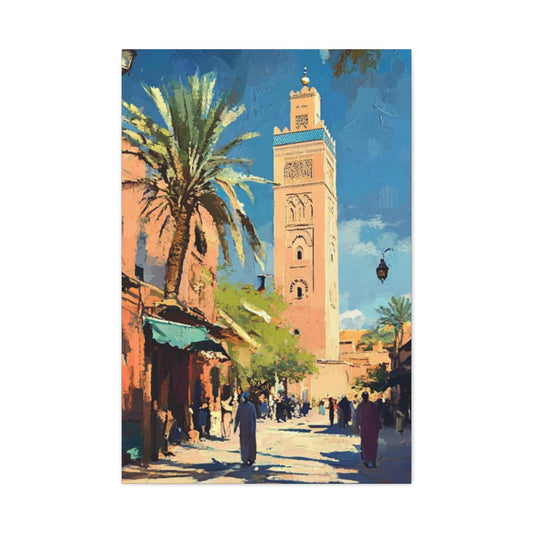
There’s no better vehicle to incorporate dramatic primaries than through Wall art. Opt for canvas prints that blend deep reds, regal blues, and muted golds into expressive abstract compositions or modern impressionistic landscapes. Art not only allows you to experiment with these rich tones without overwhelming your space, but it also adds an irreplaceable emotional undercurrent. Choose pieces with texture—oil-inspired finishes or brushstroke effects—that carry the same intensity as the palette itself.
Consider a multi-panel canvas featuring a moody skyline bathed in sunset hues—where ruby red clouds fade into ultramarine, pierced by slivers of gilded light. These curated selections of Wall art can help pull your entire palette together, serving as both focal points and narrative devices.
Moody Spaces: Not Just for Living Rooms
While most might default to the living room as the epicenter of bold décor, moody primary colors can work wonders in any space. In bedrooms, deep blue walls can create a cocoon of serenity, enhanced by crimson bedding and soft brass bedside lamps. The subtle interplay between the colors enhances the tranquil, opulent feel.
In dining rooms, lean into maximalist elegance with dark cherry-red paint, blue velvet dining chairs, and antique gold candlesticks. This aesthetic evokes an old-world charm with a fresh, contemporary twist. Kitchens, too, can benefit from moody primaries. Imagine navy cabinetry paired with brushed gold handles and crimson accent tiles—a bold, bespoke look that defies tradition.
Lighting: The Key to Unleashing Depth
Lighting plays an integral role in the success of any moody color scheme. Moody primary interiors should be layered with soft, warm lighting to prevent them from feeling oppressive. Think dimmable sconces with golden undertones, vintage-inspired pendant lights with ruby glass, or even soft LED backlighting behind a large-scale piece of Wall art to enhance its visual gravity.
Avoid cool-toned lighting at all costs—it will flatten the depth of your colors and strip them of their richness. Instead, create a lighting plan that accentuates the velvety nuance of cobalt or the regal warmth of crimson.
Accessories and Details: Quiet Luxury
Accessories are where the narrative of your space truly sings. For instance, gold-framed mirrors, silk pillows in dusky primary hues, or ceramic vases glazed in deep indigo all carry the color story without overwhelming it. In this aesthetic, more is not necessarily more. Choose curated, high-impact accessories that speak volumes through craftsmanship and rarity.
Wall art again becomes instrumental here. Look for pieces where texture is just as important as color—heavy impasto techniques, metallic foil overlays, or layered geometric patterns rendered in brooding primaries. These pieces transcend trendiness and enter the realm of timeless artistry.
Designing with Intention: The Essence of Elegant Moodiness
Designing with moody primary colors requires a distinct mindset—one of restraint, intention, and artistic sensibility. It’s about achieving balance and elevation, not saturation. Use each hue purposefully. Let crimson draw the eye in, navy deepen the walls around you, and aged gold glisten subtly across surfaces.
Keep in mind the importance of proportion. If one color dominates, let the others play supporting roles. Allow Wall art to guide your composition and color harmony. Interior design becomes storytelling when executed with clarity, and these colors—when treated with respect—create a compelling narrative filled with emotion and elegance.
Retro Redux: Nostalgia in Technicolor
Travel back in time by borrowing from the golden age of primary design. Channel the 1960s and 70s with mid-century modern furniture in saturated colors and geometric forms. Hang vintage-style posters framed in royal blue or cherry red, and integrate mustard yellow textiles into your layout. Keep the walls neutral—perhaps in eggshell white or soft beige—to allow these vibrant hues to pop like they did in retro interiors. Complement the look with Wall art that captures the flair of old-school graphic design.
Refined Radiance: Muted Primaries for a Sophisticated Twist
Dismiss the idea that primary colors are strictly for kids’ rooms or playful spaces. By choosing toned-down variants—think ruby instead of fire engine red, ochre over lemon yellow, and slate-infused blues—you can achieve a palette that’s both refined and rooted in classic color theory. This sophisticated approach can work in a variety of settings, from minimalist to boho-chic. Try pairing muted yellow walls with dark cherry armchairs and blue-gray linens. Accent the space with curated Wall art that subtly references all three tones.
Primary Colors Reimagined: Where Art Leads the Way
At the core of this bold revival is a renewed appreciation for expressive artwork. From graphic prints to large-scale abstract canvases, art is the most accessible way to experiment with the power of primary colors. These iconic hues don’t just draw the eye—they create a sense of structure and movement within your space. Whether you're drawn to Bauhaus-inspired grids or fluid brushstrokes that blend red, yellow, and blue in an elegant dance, you’ll find a wealth of options with Wall art.
Primary shades are more than just design fundamentals—they are cultural symbols, emotional triggers, and tools of creative storytelling. When brought into your home intentionally, they possess the ability to transform the mundane into the magnificent.
Final Brushstroke: Let Primary Colors Lead Your Style Evolution
There’s a certain purity to primary colors that makes them eternally relevant. In a world of ever-changing palettes and fleeting trends, these foundational hues offer consistency and familiarity. But don’t mistake them for boring—when used with imagination, they’re nothing short of revolutionary. So whether you're giving your space a complete revamp or looking for small changes with big results, let red, yellow, and blue guide your interior journey. Explore the dynamic collection of Wall art to bring this vivid vision to life—because when you decorate with primaries, you're not just adding color; you're making a statement.


