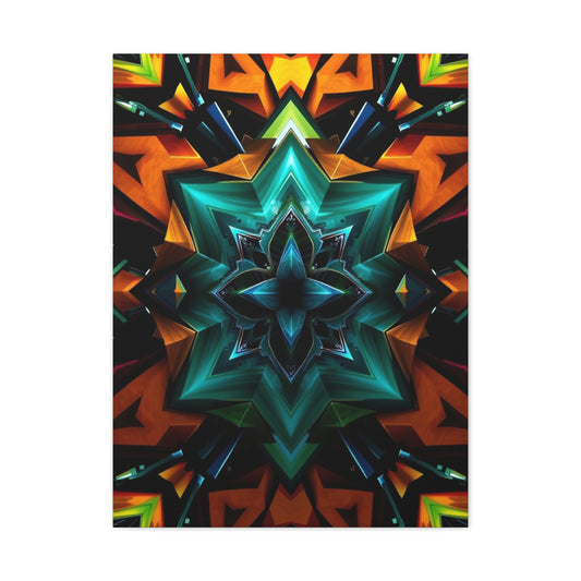
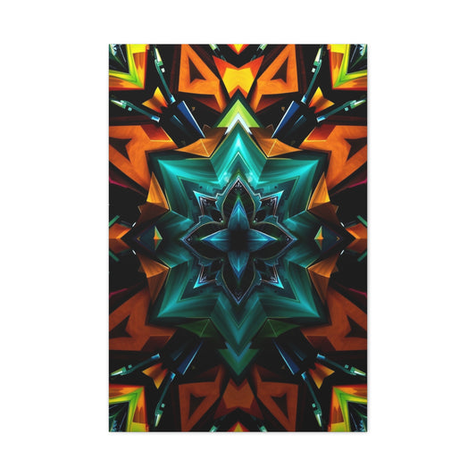
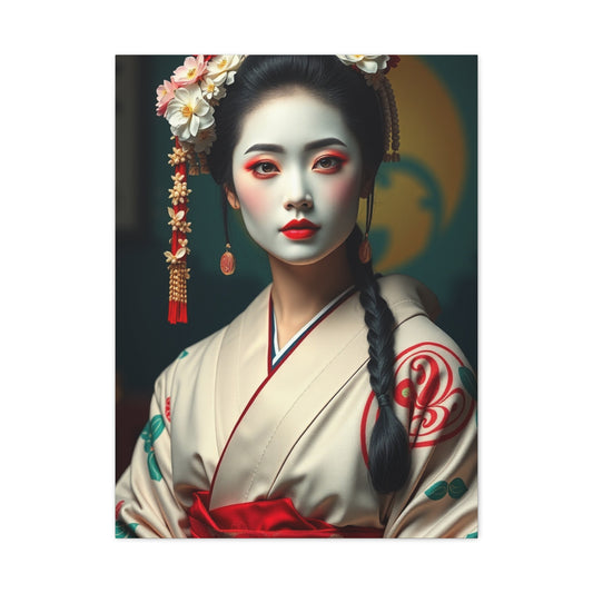
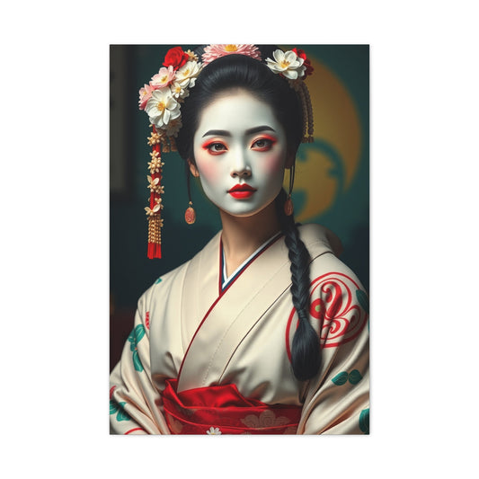
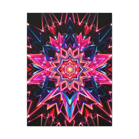
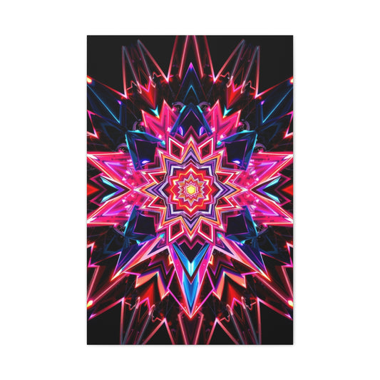
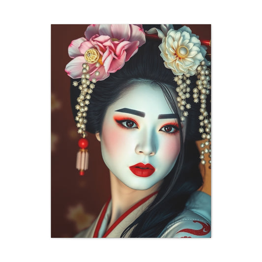
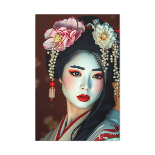
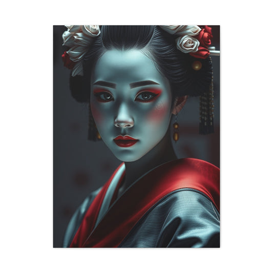
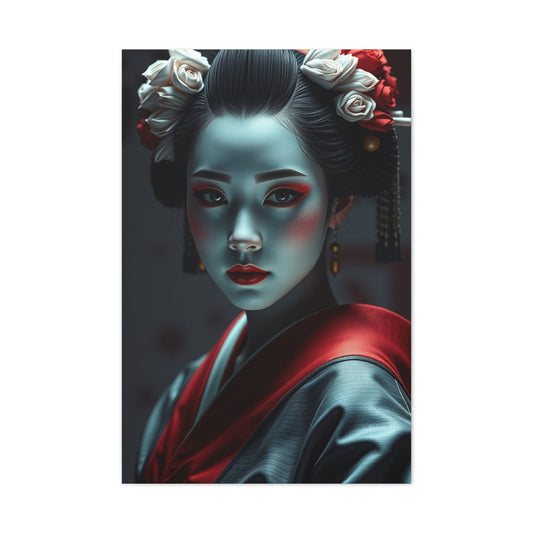
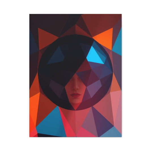
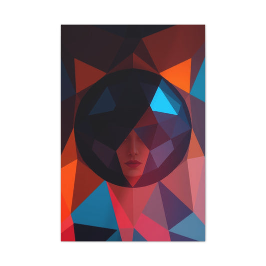
A home with attitude announces itself the moment someone steps inside, and this is where confidence should be unmistakable. The entry space should feel intentional, expressive, and slightly provocative, using scale, contrast, and storytelling rather than restraint to immediately set expectations for what lies beyond. Strong décor decisions here communicate individuality without a single word spoken.
Visual balance matters, but symmetry is not mandatory. Unexpected pairings, oversized elements, and controlled negative space create intrigue while avoiding clutter or confusion. Much like ideas showcased in discussions around square compositions found through square photo display ideas, deliberate structure can elevate visual storytelling and make the first impression feel bold yet refined.
Texture plays a defining role in reinforcing attitude. Smooth finishes meeting raw materials give depth and presence, making the entry feel curated instead of cautious. When every element feels chosen with purpose, the home instantly conveys fearless design confidence.
Florals With Edge And Unexpected Energy
Florals no longer belong only to soft or traditional environments. When used boldly, botanical elements can introduce drama, attitude, and modern edge to interiors that refuse to play it safe. Scale and contrast are critical, especially when florals are amplified against minimal backdrops or industrial materials.
Layering florals with sleek furniture and strong lighting creates an energetic tension that feels contemporary rather than delicate. Deep hues and confident arrangements allow botanical elements to dominate space without appearing ornamental, an approach inspired by concepts associated with dramatic botanical styling such as those explored in dramatic floral décor styles within modern interior conversations.
Florals with attitude thrive when allowed to command attention. Instead of blending into surroundings, they become focal elements that challenge expectations while adding organic intensity.
Faces, Forms, And Botanical Drama
Zooming into natural forms transforms familiar subjects into striking visual statements. Botanical close-ups introduce abstraction, encouraging viewers to see nature through a more daring and intimate lens. This technique adds depth and emotional weight to living spaces designed for expression rather than neutrality.
Large-scale botanical forms inject drama and curiosity, especially when paired with minimalist furniture or open layouts. This magnified perspective shifts attention to texture, structure, and organic detail, echoing the philosophy behind bold floral focus found in floral portrait inspirations where natural subjects feel powerful and commanding.
These elements suit homes that celebrate artistic exploration. The result is an atmosphere that feels thoughtful, expressive, and unapologetically bold.
Lighting That Plays By Its Own Rules
Lighting choices define mood more powerfully than almost any other element. Instead of evenly lighting every surface, homes with attitude embrace shadows, highlights, and layered illumination to create drama and depth. Lighting becomes an active design feature rather than a background utility.
Accent lights draw attention to statement features while ambient lighting sets emotional tone. Controlled contrast helps define spaces without physical barriers, a principle often explored through visual experimentation similar to techniques discussed in slow sync lighting techniques that show how timing and illumination shift perception.
When lighting is treated creatively, rooms gain personality and flexibility. The environment adapts throughout the day, always maintaining its confident presence.
Color Accents That Refuse To Whisper
Bold interiors understand the power of color restraint combined with strategic intensity. Instead of saturating entire rooms, confident homes use color as punctuation, drawing attention and anchoring spaces through focused application.
A single striking accent can energize an entire environment when placed thoughtfully. Against neutral surroundings, vibrant hues become intentional statements rather than distractions, echoing concepts explored through intentional color accent tips that emphasize balance over excess.
Color used with purpose reflects personality. It guides the eye, defines zones, and reinforces the emotional narrative of a room without overwhelming its occupants.
Photography-Inspired Interiors With Grit
Photography offers endless inspiration for interiors that value perspective and storytelling. Homes influenced by photographic principles emphasize composition, contrast, and frozen moments, allowing spaces to feel visually compelling and intentional.
Motion-inspired concepts encourage designers to think beyond static arrangements. Elements appear suspended in visual rhythm, mirroring ideas rooted in dynamic imagery such as those discussed in dynamic water imagery concepts where timing and precision elevate visual impact.
This approach creates rooms that feel alive and expressive. Every angle feels considered, every placement deliberate, reinforcing a strong aesthetic voice.
Urban Influence And Architectural Confidence
Urban-inspired spaces bring ambition and scale into residential environments. Architectural lines, strong geometry, and metropolitan references infuse rooms with energy and global character. These elements shine especially well in open layouts where structure and flow are visible.
Rather than direct imitation, urban décor thrives on interpretation. Subtle nods to cityscapes and industrial design offer strength without sacrificing comfort, aligning with the visual confidence reflected in city skyline design ideas that celebrate structure and vertical presence.
This influence introduces rhythm and boldness, grounding interiors in a sense of purpose and momentum.
Precision Details And Edited Expression
Bold spaces rely on precision to avoid chaos. Editing becomes essential, ensuring that every element contributes meaningfully to the overall story. Confidence comes not from excess but from intentional selection and refinement.
Clean lines and thoughtful spacing allow strong design elements to breathe. Visual clarity enhances impact, a philosophy mirrored in refinement discussions such as those around seamless editing techniques where precision elevates the final result.
When details are controlled, bold décor feels sophisticated rather than overwhelming. The space reflects mastery, not impulse.
Statement Florals With Contemporary Confidence
Florals become powerful when treated as anchors rather than accents. A single dominant botanical presence can define the entire mood of a room, allowing surrounding elements to support rather than compete.
This contemporary approach values simplicity and impact. Clean backdrops enhance expressive floral visuals, creating confidence through contrast, much like the effect seen in modern botanical statements such as modern magnolia décor ideas within bold interior concepts.
The result is a space that feels curated and fearless. Florals no longer soften the room; they empower it.
Soft Tones With Strong Personality
Attitude does not always require intensity. Soft tones can convey strength when paired with deliberate scale and placement. Muted palettes gain authority through contrast and structural clarity rather than volume.
Large elements, open layouts, and confident composition transform subtle colors into powerful statements. This balance is reflected in approaches similar to those highlighted through elegant magnolia interior accents, where gentler hues still command attention.
These interiors feel calm yet assertive, proving that confidence is defined by intention, not loudness.
Technical Inspiration For Bold Visuals
Technical understanding enhances bold design execution. Awareness of clarity, balance, and exposure helps ensure every element performs visually across lighting conditions and angles.
Homes that embrace precision often reflect technical influence, ensuring strong visuals remain consistent and controlled. Concepts related to visual calibration and balance echo ideas discussed in exposure control strategies where accuracy supports confident expression.
When technical insight meets creative ambition, interiors achieve lasting impact. The result is a home that doesn’t hold back, yet always feels intentional.
Textures That Challenge Comfort Zones
Texture is one of the most underestimated tools in bold interior design, yet it plays a critical role in shaping how a space feels and performs emotionally. Homes with attitude often reject uniform surfaces in favor of tactile contrast, combining materials that provoke curiosity and engagement. Rough finishes next to polished ones create tension that feels intentional rather than accidental, encouraging movement and interaction within the space.
Layering textures adds complexity without relying on excess color or ornamentation. Natural elements such as stone-inspired finishes, structured fabrics, and grain-rich surfaces introduce depth, while smoother components balance the experience and prevent visual fatigue. This contrast keeps rooms dynamic, ensuring that no single surface fades into the background. The goal is not harmony but controlled friction, where each texture contributes to the overall character of the environment.
When textures are selected with purpose, they communicate confidence. Instead of catering to comfort alone, they invite exploration and emotional response. These spaces feel lived-in yet daring, reflecting personalities that value expression over predictability.
Spaces Designed To Provoke Conversation
A truly bold home does more than look striking; it sparks dialogue. Conversation-driven spaces are designed to surprise, challenge, and invite interpretation. This begins with layout choices that encourage gathering, eye contact, and shared experiences rather than passive observation. Furniture placement becomes a tool for connection rather than mere functionality.
Provocative spaces often include unexpected focal points or unconventional compositions that draw attention and invite questions. These elements are not meant to explain themselves but to inspire curiosity and personal interpretation. The lack of obvious explanation becomes part of the allure, allowing guests to engage with the space on their own terms.
Designing for conversation requires confidence in restraint. Instead of overwhelming the senses, these rooms rely on a few strong ideas executed well. The result is an atmosphere that feels intentional, expressive, and memorable. Such spaces leave an impression not because they try too hard, but because they dare to be different.
Athletic Energy As Interior Identity
Sport-inspired interiors channel momentum, pride, and raw energy into living spaces by translating competition and movement into design language. These environments feel charged with purpose, using contrast-heavy palettes, assertive layouts, and decisive forms to reflect intensity rather than decoration. The atmosphere speaks to discipline, focus, and forward motion.
Athletic influence works best when it shapes the mood instead of overwhelming the room. Materials, proportions, and flow subtly echo strength and agility, much like the visual confidence expressed in collections centered on competitive passion such as football inspired décor, which align energy with interior identity in a refined way.
When executed thoughtfully, this style creates interiors that feel bold yet grounded. It reflects a mindset driven by drive and resilience, making the space feel alive and intentional.
Wild Motifs And Untamed Personality
Animal symbolism introduces instinct and freedom into interiors that reject predictability. These motifs suggest individuality and confidence, allowing spaces to tell a story rooted in natural strength and awareness. The presence of wildlife-inspired visuals adds depth without needing explanation.
The key is stylization rather than literal representation. Abstracted or modern interpretations paired with clean architecture maintain sophistication, similar to expressive themes found in nature-driven styling like fox themed décor where intelligence and alertness shape visual tone.
This approach balances control and spontaneity. The result feels refined yet instinctual, reinforcing a home’s fearless character.
Landscapes That Expand The Room
Landscape influence introduces scale and openness into residential interiors, creating a sense of calm confidence. Wide perspectives and horizontal emphasis encourage visual breathing room, making spaces feel expansive regardless of size.
These ideas also influence layout and flow, guiding how rooms connect and how sightlines are maintained. Principles that mirror expansive visual thinking, similar to those discussed in landscape composition techniques, show how horizons and balance reshape spatial perception.
When applied with intention, landscape inspiration creates interiors that feel immersive and stable. The home gains presence without excess.
Urban Focal Points With Purpose
Urban references bring ambition and structure into home environments, acting as anchors rather than distractions. A single strong city-inspired focal element establishes rhythm and reinforces the design narrative with confidence and clarity.
This influence works best alongside clean furniture and controlled lighting, allowing architectural character to stand out naturally. A strong example of this mindset aligns with visual impact found in urban skyline décor, where city energy translates into interior strength. The result is a space that feels modern and decisive, grounded in structure and vision.
Small Spaces With Big Attitude
Compact interiors demand bold clarity. Limited space benefits from confident decisions that eliminate hesitation and maximize presence. Strong focal points and intentional layouts help small environments project authority instead of compromise.
Designing this way requires discipline, focusing on what adds value and removing what doesn’t. Strategies that reflect confident compact living appear in discussions similar to small apartment design ideas, where intention outweighs square footage. These spaces feel expressive and efficient, proving attitude is not dependent on size.
Clever Layouts Without Hesitation
Layout defines how confidence is felt in a home. Clever planning prioritizes flow, clarity, and purpose, ensuring every zone serves both function and personality. This decisiveness eliminates visual confusion and strengthens presence.
Clear pathways and defined areas allow bold elements to exist without conflict. Approaches rooted in strategic planning, similar to insights found in small apartment layout hacks, demonstrate how efficiency supports expressive living. The outcome is a space that feels controlled, bold, and welcoming all at once.
Modern Materials With Assertive Tone
Material selection shapes the emotional tone of an interior. Contemporary surfaces with clean finishes project authority and calm strength, especially when ornamentation is minimal and deliberate.
Neutral palettes gain power through texture and proportion rather than decoration. This refined strength reflects modern design thinking aligned with ideas discussed in modern grey surface ideas, where subtle materials still make strong statements. The space feels confident because it avoids distraction, letting form and structure speak clearly.
Social Spaces With Confident Flair
Homes with attitude prioritize connection. Social zones should encourage interaction through openness, balance, and expressive simplicity. Confidence in these spaces shows through lighting, proportion, and layout rather than excess features.
An intentional gathering area feels energizing without being overwhelming. Concepts that elevate these spaces mirror inspiration found in modern bar counter ideas, where function and sophistication align effortlessly. These rooms invite conversation and presence, reinforcing the home’s bold personality.
Sculptural Elements As Silent Statements
Sculptural forms introduce artistry through shape and proportion. Their impact comes from restraint, allowing negative space to amplify presence without competition.
When thoughtfully placed, sculptural elements ground a room visually. This philosophy aligns with minimal yet expressive design cues similar to plateau form design, where form carries meaning without excess. Such elements encourage reflection and elevate the intellectual depth of a space.
Myth And Fantasy In Modern Homes
Fantasy-inspired details add narrative power when framed through modern design language. Instead of whimsy, these references feel symbolic and intentional, adding intrigue without clutter.
Clean lines and controlled placement ensure these elements enhance rather than distract. This balance is evident in imaginative concepts akin to mythical form décor, where storytelling meets contemporary restraint. The result is a home that feels expressive, layered, and confident in its identity.
Confidence Through Curated Restraint
True boldness in interior design is far more than simply filling a room with striking elements or eye-catching décor—it is the confidence to know exactly what to leave out. A home with attitude does not rely on clutter or overwhelming visual noise to assert its personality; instead, it leverages curated restraint, allowing every object, color, and texture to earn its place. This intentional minimalism is a hallmark of sophisticated design, where the absence of unnecessary elements amplifies the impact of the choices that remain. By removing what does not serve the story, the remaining pieces gain power, presence, and meaning, transforming a room into a deliberate and commanding statement of style.
Every decision within such a space reinforces the overall narrative of the home. From the selection of a single bold artwork to the placement of a sculptural lighting fixture, each choice contributes to a cohesive, layered story that feels thoughtful rather than random. This approach requires not only taste but also discipline—the ability to resist fleeting trends or impulsive additions that could dilute the integrity of the space. A home that embodies curated restraint communicates confidence because it demonstrates mastery over both aesthetic and spatial choices. The visual clarity achieved through this process gives each element room to breathe, ensuring that the eye naturally gravitates to focal points without distraction, creating harmony and rhythm throughout the interior.
Homes designed with this philosophy do not seek external validation. Their strength lies in certainty: every hue, texture, and object is selected with intention, creating balance through proportion, scale, and placement. Attitude in this context is defined not by excess but by deliberate control, where restraint becomes a tool to elevate expression. The result is a space that is simultaneously bold and refined, commanding attention while remaining purposeful, proving that true design confidence is measured not by what is added, but by what is thoughtfully omitted.
Playful Contrasts That Defy Expectations
A home with attitude often thrives on contrasts that surprise and challenge traditional design norms. Playful juxtapositions—such as pairing smooth and rough textures, warm and cool tones, or modern and vintage elements—create tension that energizes a room and invites exploration. Rather than feeling chaotic, these contrasts signal intentionality and confidence, showing that the space belongs to someone unafraid to bend the rules.
Contrasts also influence perception of space and scale. Light against dark, matte against glossy, or minimalist furnishings paired with intricate décor can make a room feel more dynamic and layered. These interactions provide visual interest at every glance, ensuring that the environment never feels static. The interplay of opposing elements encourages the viewer to slow down and appreciate the deliberate design choices, reinforcing a sense of curated audacity.
When implemented with care, playful contrasts allow a home to express individuality without overwhelming the senses. They introduce personality, depth, and vitality, making each room feel interactive and alive. Bold interiors embrace this tension, leveraging it as a tool to challenge expectations and create a memorable living experience.
Personal Collections As Bold Statements
Incorporating personal collections into interiors is a way to project individuality while reinforcing a home’s unique attitude. Objects collected over time—whether art, curiosities, or memorabilia—can become conversation starters and focal points, lending narrative and depth to the space. These collections reflect personality, interests, and history, making the home an authentic reflection of its owner rather than a generic showcase.
The key to integrating collections successfully is curatorial discipline. Arranging items thoughtfully—by theme, color, or scale—ensures they enhance rather than overwhelm the environment. Groupings can be displayed in unconventional ways, such as on floating shelves, within glass cabinets, or as part of sculptural arrangements. These presentations highlight individuality while maintaining visual cohesion and flow.
When executed with intention, personal collections transform rooms into dynamic environments that tell a story. They act as silent statements, demonstrating confidence and taste without the need for overt explanation. In homes with attitude, these curated displays blend seamlessly with architectural features and décor, enhancing the space’s overall impact while allowing personal expression to shine.
Heroic Inspiration In Living Spaces
Homes with attitude often draw from bold, heroic themes to inspire energy and narrative within interiors. Dramatic visuals, commanding figures, and intense color palettes evoke power and confidence, transforming ordinary rooms into spaces that feel alive and purposeful. This type of décor encourages self-expression and audacious creativity.
When incorporated thoughtfully, heroic imagery can define the mood of an entire space. Large-scale visuals, carefully framed placements, and attention to contrast ensure these bold statements are impactful without overpowering the room. Collections that celebrate dynamic, iconic art are perfect for adding cinematic flair, such as Frank Frazetta inspired pieces that showcase intensity, movement, and heroic presence within interiors.
The result is a living environment that energizes inhabitants and visitors alike. By referencing power, action, and narrative in visual elements, homes become immersive arenas of attitude and personality.
Kitchens With Bold Design Statements
Kitchens in homes with attitude no longer function as purely practical spaces—they act as showpieces reflecting personality and design daring. Modern layouts, unexpected materials, and playful contrasts turn culinary areas into arenas of visual interest and engagement.
Open shelving, innovative storage solutions, and dramatic lighting emphasize both style and functionality. The combination of aesthetics and practicality creates a kitchen that feels deliberate, expressive, and unapologetically modern. Insights on elevating contemporary cooking spaces can be found in modern Indian kitchen designs, which balance innovation with cultural richness.
Bold kitchen designs encourage interaction and experimentation. Color, texture, and layout all work together to ensure that this high-traffic area mirrors the overall attitude of the home while remaining fully functional.
Nostalgic Landscapes For Dramatic Flair
Introducing landscapes with nostalgic or dramatic qualities adds both scale and emotional resonance to interiors. These elements evoke memories, moods, and timeless storytelling, infusing spaces with depth and personality. Careful curation ensures that these visuals complement rather than compete with other design choices.
Vintage-inspired imagery or classic natural vistas provide rhythm and grounding to rooms, making them feel intentional and layered. Homes that embrace a sense of history and narrative through design can look to references like nostalgic American landscapes for inspiration, merging emotional resonance with bold stylistic choices.
Landscapes act as anchors for color and spatial planning. They invite contemplation and give interiors a sense of context and sophistication, reinforcing the home's confident personality.
Pop Culture And Graphic Statements
Pop culture-inspired elements create immediate visual impact and communicate personality. Vibrant colors, iconic imagery, and playful references energize spaces and demonstrate the inhabitant’s unique point of view.
When integrated carefully, these bold visuals coexist with more neutral elements, creating balance between intensity and refinement. Strategic placement ensures the décor feels curated rather than chaotic. Collections that celebrate cultural icons, such as pop art inspired designs, provide both fun and visual authority, transforming interiors into expressive environments.
Pop culture statements act as conversation starters. They provide rhythm, energy, and identity, allowing interiors to feel dynamic and unapologetically expressive.
Transforming Interiors With Pantone Colors
Color choice defines mood, emotion, and the overall tone of any home. Bold homes leverage color deliberately to create personality, set ambiance, and highlight key design elements. Using trend-forward hues adds freshness while ensuring spaces feel current and daring.
Warm neutrals, rich browns, and deep tones can anchor rooms with sophistication, offering versatility and impact. Current design inspiration emphasizes incorporating shades such as the Pantone color of the year to refresh interiors while maintaining bold appeal.
Intentional color application amplifies statement pieces, architectural features, and focal areas, ensuring homes feel both confident and harmonious.
Kitchen Storage With Style
Storage in stylish homes blends functionality with visual flair. Clever solutions such as open shelving, modular cabinetry, and integrated systems allow spaces to remain organized while reflecting the homeowner’s personality.
The combination of utility and aesthetic consideration ensures kitchens stay clean, uncluttered, and visually confident. Contemporary storage innovations can be explored through trendy kitchen storage, demonstrating that practicality does not preclude bold design.
Strategically designed storage encourages efficiency while reinforcing the room’s character, making it both inviting and inspiring.
Perfect Color Pairings For Bold Spaces
Color combinations define mood, contrast, and rhythm. Homes that embrace attitude often experiment with unconventional pairings to create tension, excitement, and layered visual interest. The key lies in balance, proportion, and strategic accenting rather than indiscriminate application.
Neutral tones paired with rich, saturated hues establish focal points and highlight statement features, giving rooms personality without excess. Practical guidance on pairing strong browns with complementary shades can be found in resources exploring perfect brown color pairings, ensuring interiors feel intentional and bold.
Effective color strategy elevates a room, transforms perception, and amplifies attitude, turning even familiar spaces into memorable experiences.
Portraits With Personality
Portraiture in interiors adds intimacy and depth, transforming walls into narrative-rich focal points. Carefully chosen images communicate identity, emotion, and story while enhancing the home’s character.
Large-format or stylized portraits command attention without overwhelming the room, allowing them to coexist with other bold design elements. Exceptional examples that combine artistry and personality are visible in works like portrait visual inspiration, which create immediate presence while reinforcing aesthetic cohesion.
These pieces offer visual dialogue, making interiors feel expressive, personal, and courageous.
Animal Imagery That Inspires Presence
Animal-inspired designs embody strength, cunning, and instinct, infusing spaces with symbolic confidence. Strategically chosen pieces reflect the traits the homeowner admires while creating impactful focal points.
Using modern interpretation and contemporary framing, wildlife imagery becomes an empowering accent rather than a thematic cliché. Works such as cute fox design showcase personality, precision, and energy, transforming interiors into expressive, narrative-driven environments.
These motifs communicate subtle strength and individuality, contributing to the bold attitude of the home.
Power And Majesty Through Iconic Imagery
Strong visuals that depict leadership, dominance, or grandeur establish authority within a space. These elements serve as psychological anchors, reinforcing the confidence and presence of the environment.
Iconic and regal representations, like pride of lion design, deliver immediacy and gravitas. Such pieces naturally draw attention and serve as enduring statement points within bold interiors.
Strategically positioned, these works provide structure, emotion, and narrative depth, making the home both memorable and commanding.
Layered Textures For Maximum Impact
Texture is one of the most powerful tools in a home with attitude. Layering multiple textures creates visual depth, tactile interest, and a sense of intentional complexity. Mixing soft textiles with rougher materials, glossy surfaces with matte finishes, or natural fibers with industrial elements introduces contrast and intrigue that engages the senses. Each layer contributes to the narrative of the room, signaling that every choice was deliberate.
Successful layering relies on balance and proportion. Too many competing textures can overwhelm, but thoughtfully paired materials allow each element to shine. For instance, pairing a plush rug with a rugged wooden table and sleek metallic accents can create a dynamic dialogue within a space, drawing attention to both the tactile and visual qualities. Light and shadow play across these surfaces, adding even more dimension and drama, which strengthens the bold personality of the home.
Layered textures also encourage interaction. Visitors instinctively touch, lean, or explore different surfaces, creating a living experience within the home. This approach transforms interiors from static displays into immersive, engaging environments. A home with varied textures feels alive, intentional, and unforgettable—an authentic reflection of the homeowner’s audacious style.
Statement Lighting As A Design Element
Lighting in homes with attitude is never purely functional; it is a key design element that shapes mood, perception, and identity. Statement fixtures, dramatic contrasts, and layered illumination convey personality and authority while guiding the eye through the space. Lighting becomes part of the narrative, emphasizing architectural features, art, and focal points while adding drama to everyday life.
Bold lighting choices include oversized pendants, sculptural chandeliers, or unexpected arrangements of LED strips and spotlights. The scale, placement, and intensity of lighting define the atmosphere, creating zones of focus and areas of calm. For example, a bold chandelier over a dining area establishes grandeur and confidence, while subtle under-cabinet or accent lighting in adjacent spaces introduces warmth and intimacy. This interplay of light and shadow reinforces the overall attitude of the home.
Strategic lighting also transforms perception of space. Well-placed fixtures can make rooms feel larger, highlight textures, and accentuate color schemes. By layering different light sources and experimenting with intensity, homeowners can control mood dynamically throughout the day and evening. In homes that refuse to hold back, lighting is not merely an afterthought—it is a tool for storytelling, energy, and immersive experience.
Conclusion
Creating a home with attitude is a deliberate act of self-expression. It requires rejecting the safe and predictable in favor of bold, curated choices that communicate personality, taste, and confidence. Every decision—from color selection and texture layering to lighting and spatial layout—serves a purpose. A home with attitude is not a collection of random trends or decorative whims; it is a cohesive statement that reflects the inhabitant’s individuality, values, and vision.
At its core, attitude in design is about narrative. Each room tells a story, whether through dramatic visual focal points, striking furniture arrangements, or unexpected contrasts. This narrative approach transforms interiors into immersive environments that engage all the senses. Visitors don’t just see the space; they feel it, experience it, and remember it. Bold homes are conversational, emotional, and dynamic because they refuse to be passive backdrops. They are active participants in the lives of those who inhabit them.
Color plays a central role in establishing attitude. Strategic use of saturated hues, striking contrasts, and intentional accenting communicates energy and personality. The balance between bold colors and neutral foundations ensures the space feels intentional rather than chaotic. Similarly, the careful integration of textures enhances sensory engagement, introducing depth and dimension. From soft textiles to rugged materials, layered surfaces create tactile experiences that elevate the emotional resonance of a room.
Lighting is equally pivotal in homes that don’t hold back. Beyond functionality, lighting defines mood, directs focus, and amplifies design elements. Dramatic shadows, layered illumination, and statement fixtures transform interiors into theatrical, visually compelling environments. Properly designed lighting elevates both aesthetic and functional aspects of a home, making spaces feel alive and purposeful.
Another hallmark of interiors with attitude is spatial intentionality. Whether in expansive lofts or compact apartments, thoughtful layout and flow ensure that every element serves a purpose. Bold homes maximize every corner, employing clever storage, multifunctional furniture, and dynamic arrangements that support both form and function. Small spaces, in particular, benefit from decisive planning, showing that confidence in design is not dependent on square footage but on clarity of vision.
Art and personal collections are crucial for cultivating identity in such homes. Statement pieces, from portraits and landscapes to abstract or narrative-driven works, create focal points that define the character of a room. Curated collections reflect the inhabitant’s story, passions, and taste while enhancing the overall atmosphere. These personal touches make the space feel authentic, layered, and expressive, ensuring that attitude is embedded not just in aesthetics but in lived experience.
Animal motifs, heroic imagery, and symbolic representations contribute to the psychological and emotional impact of a space. They convey strength, courage, and individuality, reinforcing the home’s narrative without needing words. Similarly, urban references, pop culture elements, and contemporary materials add personality, grounding the home in a specific identity and sensibility. Each choice amplifies the overall message: that this is a space shaped by intentionality, confidence, and creativity.
Bold homes also embrace playful contrasts and unexpected combinations. Mixing textures, patterns, and forms creates visual tension that excites the eye and invites exploration. These contrasts do not introduce disorder; instead, they signal sophistication and discernment, showing a willingness to experiment while maintaining coherence. A home with attitude surprises, delights, and engages, drawing attention to the owner’s ingenuity and boldness.
Ultimately, attitude in interior design is about confidence. It is about making choices that resonate with personal taste and vision, and standing by those choices regardless of convention. A home that exudes attitude does not seek validation; it commands it through coherence, intentionality, and expressive design. Every element—color, texture, lighting, furniture, art—works in concert to create spaces that are memorable, vibrant, and alive.
To embrace this approach, homeowners must prioritize authenticity, clarity, and courage. They must be willing to experiment with scale, contrast, and materiality, understanding that restraint and decisiveness are not opposites but complementary tools. By thoughtfully integrating personal narrative, bold visual statements, and immersive sensory experiences, a home becomes more than just a place to live—it becomes an environment that celebrates individuality, creativity, and unapologetic confidence.
Décor with attitude is not about extravagance or chaos; it is about deliberate expression. It is a design philosophy that values narrative, emotion, and personality over conformity. Such homes captivate, inspire, and challenge, creating spaces that are not only functional but truly alive. By embracing bold color, layered textures, dynamic lighting, thoughtful layout, and meaningful personal touches, interiors can achieve a level of sophistication and audacity that reflects the people who inhabit them. A home with attitude leaves a lasting impression, proving that the strongest statement any space can make is one that is unapologetically, authentically itself.


