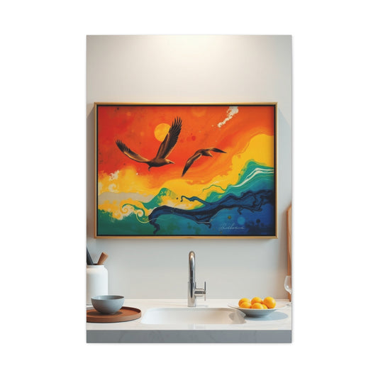
Watercolor enthusiasts have long hailed Daniel Smith Watercolors as one of the finest brands in the world. Known for their vibrant pigments and superior quality, Daniel Smith paints have been a trusted choice for artists seeking to achieve extraordinary effects in their watercolor compositions. With a commitment to innovation, the brand continues to enrich the artistic community with new additions to its already extensive range. These recently launched colors not only add richness to an artist's palette but also deepen the possibilities for expression through the medium of watercolor. Let’s take a closer look at the latest additions from Daniel Smith: Cobalt Green Deep, Jaune Brilliant No. 1, Jaune Brilliant No. 2, Coral Reef, Manganese Violet, and Earthy Red Light. This article delves into the distinct characteristics of each color and how they can enhance your watercolor journey.
Cobalt Green Deep: A Fresh Shade Inspired by Nature’s Calm
Cobalt Green Deep stands as one of the most striking new additions to the Daniel Smith palette. This semi-transparent color immediately captures attention with its remarkable ability to blend both warmth and coolness. It embodies the serene essence of lush, untouched forests, making it a perfect color for artists aiming to replicate the calming effect of nature in their work. Whether creating detailed landscapes or abstract pieces, Cobalt Green Deep offers the ideal tone for enhancing the natural elements in a scene. Its delicate yet profound granulation is one of the standout features of this pigment. When mixed with water, the green hue reveals its true depth, with subtle hints of texture emerging. The color maintains its strength, allowing it to work harmoniously in both shadowed areas and highlights within a landscape. Its moderate opacity makes it an exceptional choice for layering, providing depth while maintaining its rich vibrancy.
Beyond its aesthetic qualities, Cobalt Green Deep offers a versatile approach to color mixing. Artists will find that it pairs well with other natural hues like browns and ochres, as well as more vivid colors like cerulean blues and purples. The ability of this color to provide a gentle touch while still standing out in a composition makes it a must-have for anyone working with watercolors, particularly when exploring botanical themes, woodland scenes, or even abstract interpretations of nature. Its neutral tone gives artists a broad canvas to work with, allowing for both subtle and bold creative choices.
Jaune Brilliant No. 1: A Luminous Yellow That Evokes Spring's Freshness
Jaune Brilliant No. 1 brings a soft, luminous quality to the watercolor palette that evokes the gentle radiance of springtime. This color blends Arylide Yellow with Titanium White, resulting in a yellow that feels both light and vibrant. It is a semi-opaque pigment, providing just the right amount of opacity to create the warm glow of early morning light or the subtle radiance of a blooming flower. Jaune Brilliant No. 1 might appear understated at first glance, but it possesses remarkable versatility when applied to paper. The transparency of the pigment allows it to shine through layers of other colors, creating an ethereal glow that can illuminate your watercolor compositions.
This gentle yellow is perfect for light washes and highlighting key areas in your artwork. It can be used to simulate sunlight filtering through windows or the soft glow of a landscape at dawn. Artists will find that Jaune Brilliant No. 1 is ideal for capturing the feeling of fresh beginnings, making it an excellent choice for painting spring scenes, morning skies, or delicate floral arrangements. Despite its lightness, this color performs beautifully with other pigments, offering a perfect balance when paired with greens, blues, or even deeper shades for a more sophisticated effect. Its ability to add subtle vibrance without overpowering the overall composition makes it a valuable addition to any palette.
Moreover, Jaune Brilliant No. 1 works particularly well in combination with other colors to achieve a range of effects. It can enhance warmer tones, bring balance to cooler pigments, and even bring life to more neutral palettes. Artists can experiment with this color to create glowing transitions from soft highlights to deeper tones, all while maintaining a luminous and airy quality to their work. This flexibility makes it an indispensable pigment for those looking to add a soft touch to their watercolor compositions.
Jaune Brilliant No. 2: A Warm and Inviting Orange for Autumn's Rich Palette
Building upon the success of Jaune Brilliant No. 1, Daniel Smith introduced Jaune Brilliant No. 2, a more intense and richly hued variation that brings warmth and vitality to any composition. This pigment, composed of Benzimidazolone Orange and Titanium White, offers a stunning orange hue with an inviting peach-like quality that instantly warms up a palette. While Jaune Brilliant No. 1 evokes the light, crisp essence of spring, Jaune Brilliant No. 2 captures the golden glow of a late afternoon or the fiery tones of a harvest sunset. It is a semi-opaque pigment that maintains an easy balance between transparency and vibrancy, making it perfect for creating atmospheric effects in watercolor.
Jaune Brilliant No. 2's vibrant yet soft opacity allows artists to use it in a variety of ways. It can serve as the dominant tone in compositions, such as those inspired by autumn landscapes or sun-drenched portraits, or it can be used subtly as a secondary color to add warmth to cooler tones. The soft glow of this orange makes it an ideal choice for scenes of autumnal harvests, warm evenings, or landscapes bathed in the golden light of the sun. In addition, its layered applications offer richness and depth, making it a great color for adding dimension to your work.
This pigment's ability to integrate seamlessly with other colors is one of its most appealing qualities. Whether mixed with yellows for a golden hue or with reds for more depth, Jaune Brilliant No. 2 can contribute a full spectrum of warm tones. Artists will appreciate how the color can introduce an element of softness to otherwise vibrant compositions, offering a harmonious transition between hues. For anyone looking to infuse their artwork with a touch of warmth, Jaune Brilliant No. 2 is the perfect pigment to consider.
Coral Reef, Manganese Violet, and Earthy Red Light: A New Range of Textures and Tones
In addition to the previously discussed shades, Daniel Smith also introduced a trio of colorsCoral Reef, Manganese Violet, and Earthy Red Lightthat bring new textures and tones to the watercolor palette. Coral Reef captures the essence of tropical beauty, offering a rich pinkish hue that adds a touch of elegance and serenity to any composition. The color has a unique mix of granulation and transparency that allows it to bring life to soft, vibrant coral hues, which can be ideal for creating delicate florals or the warm tones of a sunlit sea.
Manganese Violet, another new addition, offers a cool violet shade that combines both transparency and a subtle granulating texture. This color is perfect for creating soft transitions, whether you're painting ethereal skies or mysterious shadowed areas. Its ability to evoke a calm, otherworldly quality in a painting makes it a must-have for artists who want to capture the essence of twilight or reflective moods.
Lastly, Earthy Red Light brings a grounded, earthy tone to the palette. This pigment delivers a warm red shade that can serve as a beautiful backdrop for landscapes, portraits, or still lifes. It’s a versatile color that can be used to add a touch of depth or contrast, creating an interplay between warm and cool hues in a composition.
Together, these three colors complement the existing palette, offering even more opportunities for creative exploration. They allow artists to experiment with unique textures, blend striking hues, and achieve both subtle and bold results in their artwork.
Daniel Smith’s commitment to expanding the watercolor palette with these new colors reflects its dedication to providing artists with the tools needed for artistic growth and exploration. The new additions are a testament to the brand’s ongoing innovation and the artist's ever-expanding possibilities within the medium of watercolor.
Earthy Red Light: A Rich, Granulating Red with Depth
Earthy Red Light is a striking pigment that immediately captivates with its deep, earthy tones and its ability to bring texture and dimension to any watercolor composition. Derived from Red Iron Oxide, this pigment is semi-opaque and has an almost rustic, grounded feel, reminiscent of sun-baked landscapes or the rich palette of desert terrains. At first glance, Earthy Red Light might appear to be a dense, almost heavy red, but its real magic lies in its granulating properties. When diluted, this color transforms into a stunning textural experience, offering layers of granulation that create an illusion of depth and tactile richness. For artists, this makes Earthy Red Light a perfect choice for adding organic texture to their work, whether they are creating lush landscapes or abstract compositions.
The granulation effect of Earthy Red Light is one of its most intriguing features. It creates subtle variations in tone and texture as the pigment settles into the paper, allowing for a painterly, almost tactile feel that many other reds simply cannot achieve. This characteristic makes it particularly well-suited for artists who enjoy working with layering techniques. The color flows effortlessly into the paper, building up layers of complexity that lend a beautiful sense of motion to a painting. Unlike many red pigments that maintain a smooth, uniform finish, Earthy Red Light holds onto its individuality, producing washes that feel alive and dynamic. Whether you are aiming for a vibrant, intense layer or a softer, more subdued undertone, this pigment can easily adapt to your needs.
Earthy Red Light isn’t just visually captivating but also remarkably versatile. It can serve as the focal point of a composition, dominating a scene with its bold, earthy intensity. Alternatively, it can be used more subtly, blending beautifully with a wide range of colors to create depth and contrast. When mixed with muted greens and blues, Earthy Red Light enhances the grounding, natural feel of a landscape, giving it an earthy, tranquil undertone. This versatile red pigment also works well with other vibrant hues, adding complexity to floral compositions or infusing abstract work with warmth and life. Its ability to pair harmoniously with both vibrant and muted tones ensures that it has a place in virtually every artist’s palette.
What truly sets Earthy Red Light apart from other red pigments is its ability to strike a balance between vibrancy and subtlety. It is bold without being overpowering, deep without being too heavy, and versatile enough to suit a wide range of artistic styles. Whether used in thin, transparent washes or in thick, textured layers, this pigment offers a visual experience that is rich and engaging. It allows artists to explore the boundaries of color, texture, and form, making it a worthy addition to any watercolorist’s collection.
Coral Reef: Vibrant, Peachy Pink with Tropical Energy
True to its name, Coral Reef is a vibrant and lively pigment that brings the essence of tropical beauty to any watercolor composition. This striking hue, a blend of Pyrrole Orange and Titanium White, embodies the warmth and vibrancy of sun-soaked beaches and tropical paradises. With its semi-opaque nature, Coral Reef captures the glow of a summer sunset or the bright pop of coral reefs beneath clear blue waters. Whether you are painting a tropical landscape or capturing the delicate hues of a floral arrangement, this color adds a cheerful burst of energy and life to the scene. Its soft peachy pink tone has a dynamic presence, infusing your painting with warmth and inviting the viewer to experience the energy of summer in full swing.
Unlike some other pigments that are known for their granulating qualities, Coral Reef is relatively smooth and consistent, making it a reliable color for artists who want to achieve bold, uniform effects. Its opacity and saturation ensure that it performs beautifully in both subtle and dramatic layers, offering a fantastic range of possibilities for artists. Whether you are using it to create a sweeping wash or building up layers for added intensity, Coral Reef delivers striking color without losing its clarity or brightness. Its soft yet saturated tone is perfect for creating gradients that capture the fluidity and movement of a sunset or the gentle ebb of the tide on a beach.
What makes Coral Reef such a captivating pigment is its versatility and ease of use. It lends itself well to a variety of applications, whether you are using it for delicate washes in a floral composition or for bold, intense contrasts in a landscape painting. Its vibrant hue works beautifully on its own, but it can also be mixed with other pigments to create stunning blends. When paired with deep greens or rich blues, Coral Reef takes on a new dimension, offering a beautiful contrast to cooler tones while adding a touch of warmth and brightness to the overall palette. Its ability to mix seamlessly with other colors makes it an essential tool for artists who enjoy exploring new combinations and experimenting with different moods and atmospheres.
For watercolorists who specialize in capturing the energy of nature, Coral Reef is an invaluable addition to their palette. Its ability to bring a sense of liveliness and warmth to any scene makes it ideal for depicting everything from vibrant sunsets to tropical flora. Whether painting the soft blush of a coral reef at sunset or the vibrant hues of a summer flower garden, Coral Reef gives your artwork a fresh, sunlit energy that radiates warmth and beauty. Its playful, tropical vibe brings joy to any composition, ensuring that your work will stand out with its bold and lively character.
Earthy Red Light and Coral Reef: A Dynamic Duo in Watercolor Art
When combined, Earthy Red Light and Coral Reef offer an exciting contrast that can transform a watercolor painting into a visually dynamic composition. While each color brings its own unique qualities to the table, together they create a harmonious blend of warmth, texture, and vibrancy that opens up new creative possibilities for artists. The earthy, grounded tone of Earthy Red Light pairs beautifully with the bright, cheerful vibrancy of Coral Reef, creating a dynamic interplay of warmth and energy. This pairing allows for the exploration of both subtle and dramatic effects in a painting, offering artists the opportunity to experiment with layering techniques and textures.
Earthy Red Light’s granulating properties work well to build depth and texture in a composition, while Coral Reef provides a smooth, opaque finish that contrasts beautifully against the more granular texture of Earthy Red Light. The result is a harmonious balance between vibrancy and subtlety, with the two pigments complementing each other in a way that enhances the overall visual impact of the painting. Whether you are using the colors together in a bold, dramatic composition or layering them gently for a softer, more nuanced effect, this duo allows for a rich range of artistic expression.
Additionally, Earthy Red Light and Coral Reef open up new possibilities for texture exploration. As Earthy Red Light granulates and settles into the paper, Coral Reef can be layered over it to create smooth, bold areas that contrast beautifully with the textured, granular background. This layering technique not only adds depth to the artwork but also introduces an interesting interplay between different surface qualities. The contrast between the earthy, grounded red tones of Earthy Red Light and the warm, energetic coral of Coral Reef brings an exciting sense of balance and rhythm to the painting.
For watercolorists seeking to push their creative boundaries, combining these two pigments offers the chance to explore new ways of interacting with both color and texture. Earthy Red Light and Coral Reef together create a diverse and dynamic palette, one that invites experimentation and fosters the development of unique artistic styles. Whether creating landscapes, florals, or abstract compositions, these two colors offer an exciting and versatile addition to any watercolor artist’s toolkit.
Manganese Violet: The Regal Purple with Unmatched Granulation
Manganese Violet is one of the standout pigments in Daniel Smith’s watercolor range, bringing an extraordinary richness and depth to your palette. Its striking, deep purple hue stands out for its semi-transparency, which allows the color to maintain vibrancy even when diluted with water. This makes it an exceptional choice for artists who want to explore soft yet powerful contrasts in their watercolor compositions. What truly sets Manganese Violet apart from other purple tones is its granulating nature, which gives it an unparalleled ability to add texture and dimension to artwork.
Granulation occurs when pigment particles settle into the texture of the paper, leaving behind a mottled, uneven finish that can create depth and intrigue within the painting. In the case of Manganese Violet, this granulation is pronounced, which makes it perfect for achieving a more atmospheric or moody look. Its ability to form textured washes means that it’s ideal for creating complex and expressive skies, deep, shadowy elements, or even for adding a mysterious, dreamlike quality to your work. This natural settling of pigment makes Manganese Violet not just a color but a tool for creating visual interest and movement on the page.
For artists working with washes, Manganese Violet is an absolute dream. The granulation brings a sense of life and organic motion to the wash, something that cannot be replicated with more uniform pigments. Whether using it in isolation or blending it with other colors, the outcome is always a harmonious dance of tones. The vibrancy of Manganese Violet is captivating and can be utilized to create dramatic contrasts, especially when paired with warmer hues like golden yellows or fiery oranges. The result is an eye-catching contrast that is both sophisticated and visually dynamic, adding new layers of complexity and depth to your watercolor works.
What makes Manganese Violet so versatile is that it opens up new possibilities for artistic exploration. It’s not just a color that sits in the background; it’s one that actively contributes to the emotion and texture of the piece. Its richness allows it to stand out on its own, but it can also be softened or enhanced depending on the artist’s needs. As you experiment with different techniques, you’ll discover the multitude of ways this regal purple can transform your compositions. Whether painting a grand, atmospheric sky or an intimate moment in shadow, Manganese Violet has the power to elevate any watercolor painting.
Cobalt Green Deep: The Essence of Serene Forest Landscapes
Cobalt Green Deep, another standout in Daniel Smith’s watercolor collection, brings the tranquility of nature to life through its calming, mossy tones. This pigment is a perfect choice for artists looking to capture the peaceful serenity of forested landscapes, the cool embrace of shaded woodlands, or the richness of the natural world. Cobalt Green Deep is known for its ability to granulate, a characteristic that adds textural depth to the color, making it ideal for evoking the gentle roughness of forest floors, the soft layering of moss, or the cool, shaded canopies of trees.
This pigment’s versatility lies in how it shifts and changes depending on the amount of water you use. When applied generously, Cobalt Green Deep produces a dense, rich green reminiscent of a thick forest canopy. This deep, earthy hue can bring to life the weight and richness of a lush, shaded environment, providing a perfect foundation for creating a variety of natural landscapes. The beauty of Cobalt Green Deep is that it also works beautifully in more delicate, diluted applications, where it transforms into a lighter, more translucent shade of green, resembling the soft, dewy moss that carpets the forest floor. The granulation effect is especially noticeable when the pigment is used with less water, allowing the natural texture of the paper to interact with the color and create a stunning effect that mirrors the randomness and beauty of nature itself.
One of the most intriguing features of Cobalt Green Deep is its ability to create both depth and contrast, offering a rich backdrop that makes lighter, brighter colors pop. When used in combination with brighter pigments, such as yellows or oranges, Cobalt Green Deep can create striking shadows and visual layers, adding a sense of dimension and complexity to your landscape paintings. The subtle variations in tone and texture that arise from the granulation give Cobalt Green Deep a unique quality, as it doesn’t simply sit flat on the page but creates a depth that mimics the natural world itself.
This pigment is particularly effective for capturing the feeling of being immersed in nature, as its hues range from deep, shadowy greens to softer, almost translucent shades of green that are seen when sunlight filters through leaves or reflects off damp earth. It’s the ideal choice for artists looking to evoke the complexity and beauty of forests, woodlands, or even quieter moments in the natural world. By embracing the natural granulation of Cobalt Green Deep, artists can explore new textures and layers that bring their landscape paintings to life in a way that feels both grounded and organic.
The Power of Granulation: Why It Matters for Artists
Granulation is a characteristic that some pigments possess, and it plays a vital role in how a watercolor painting ultimately feels and looks. This natural settling of pigment particles into the paper’s surface allows the artist to explore a completely different dimension of texture and depth within their work. Both Manganese Violet and Cobalt Green Deep possess this remarkable ability, offering artists new ways to engage with their medium.
The beauty of granulation is that it’s unpredictable, allowing each stroke and wash to take on its own unique texture. The uneven distribution of pigment particles creates a sense of movement, making the artwork appear alive and dynamic. For Manganese Violet, this quality lends itself particularly well to creating dramatic, atmospheric skies or the shadows of a twilight scene. The granulation provides a softness that enhances the depth and emotion of the painting, giving it a more ethereal quality.
On the other hand, Cobalt Green Deep offers a more serene take on granulation. Its natural texture evokes the feeling of moss underfoot or the soft folds of shaded leaves, making it a perfect tool for artists working in the landscape genre. The granulation of this color adds an element of organic randomness, mimicking the unpredictable nature of the forest floor and the variation found in natural settings.
The power of granulation lies in how it allows artists to experiment with texture in ways that would be difficult to achieve with smoother, more uniform pigments. It invites spontaneity and creative exploration, making it easier to depict the natural world with all its complexity. Whether you’re aiming to capture the moody atmosphere of a sunset sky with Manganese Violet or the depth of a shadowy forest scene with Cobalt Green Deep, the granulation inherent in these pigments provides the necessary texture to make your vision come to life in ways that feel true to nature.
Both Manganese Violet and Cobalt Green Deep offer artists exciting opportunities to push the boundaries of watercolor painting. Through their unique granulating properties, they add a rich sense of depth and texture that is perfect for bringing new dimensions to your work. Whether you are drawn to the regal elegance of Manganese Violet or the natural serenity of Cobalt Green Deep, these colors will allow you to create stunning compositions that are full of life, movement, and visual interest. Embrace the power of granulation and explore the endless possibilities these colors bring to your artistic journey.
The Alchemy of New Pigments: Creating Unique Hues
The true brilliance of modern watercolor pigments lies in their remarkable ability to blend and interact with one another, producing stunning and unexpected results. The new range of pigments offers a wide spectrum of creative possibilities, allowing artists to experiment with combinations that generate complex and rich hues. This unique ability to mix and match colors opens the door to endless opportunities for artistic expression, giving every painting an added layer of depth and intrigue.
These new pigments are more than just vibrant and striking; they carry individual characteristics that bring something special to the palette. Whether it’s the granulation of a particular pigment or the transparency it offers, each color contributes a distinctive element to the final artwork. When combined, these colors react in fascinating ways, enhancing one another’s qualities and creating new shades that weren’t previously possible. For example, mixing Earthy Red Light with Cobalt Green Deep results in beautifully muted, earthy tones that are ideal for landscape work, offering a natural, grounded feeling to the painting.
The unique properties of each pigment can bring out different textures, lighting effects, and atmospheric qualities in a painting. When you experiment with the interactions of new colors, you may be surprised by how seamlessly they blend into each other. The pigments create gradients of color that seem to shift and evolve over time, capturing the subtle nuances of natural light or deep, textured shadows in a way that traditional pigments often can’t. These blending opportunities also allow artists to explore new ways of highlighting certain aspects of their work, whether it's through soft, glowing transitions or bold, deep contrasts.
Furthermore, the palette of colors available today gives artists the ability to play with both harmony and contrast, resulting in visually dynamic and compelling compositions. The interactivity of the pigments invites artists to embrace a sense of exploration. Whether you're painting a vibrant, glowing sunset or a quiet, shadowy forest scene, the potential for innovation is at your fingertips, allowing for endless discovery with each new mix and application of pigment.
The Harmony of Contrasting Pigments: Exploring Complementary Combinations
One of the most exciting features of these new watercolor pigments is the way they interact when placed alongside one another. The possibilities are endless, and the interplay of complementary colors offers a unique way to bring energy and balance into your artwork. Some combinations are naturally harmonious, creating subtle transitions, while others are more dramatic, offering striking contrasts that command attention. Both approaches allow the artist to explore color in new and exciting ways.
For example, the pairing of Manganese Violet and Jaune Brilliant No. 2 creates a delightful contrast, where the richness of the violet is beautifully offset by the brightness of the yellow. This combination brings vibrancy and dynamism to any composition, creating a striking color balance that works wonderfully for elements such as flowers, sunsets, or abstract compositions that need a touch of dramatic contrast. The warmth of Jaune Brilliant No. 2 against the cooler tones of Manganese Violet gives your artwork a fresh, energetic feel, highlighting the vibrancy of both pigments.
In contrast, the mixing of muted pigments such as Earthy Red Light with Cobalt Green Deep offers a more restrained, yet equally powerful effect. These two colors combine to form earthy tones that carry a sense of grounded elegance, perfect for capturing the essence of natural landscapes or atmospheric skies. The depth of the pigments complements each other in a way that brings an added sense of realism to your work, without overpowering the composition with too much intensity. The subdued, neutral quality of these colors allows artists to create peaceful, tranquil scenes while still showcasing the richness that modern pigments bring to the table.
By experimenting with these different combinations, artists can achieve a wide range of effects, from subtle and soft transitions to bold, high-contrast areas that demand attention. The interplay of complementary colors not only adds beauty to the composition but also enhances the emotional impact of the piece. This is the power of color theory in action using both harmony and contrast to tell a visual story that draws the viewer in and holds their attention.
Pushing Boundaries with Watercolor: The Future of Artistic Expression
As watercolor painting continues to evolve, the introduction of new pigments allows artists to push the boundaries of their craft and explore uncharted territories in their artistic expression. These modern pigments not only broaden the color spectrum but also provide new ways to achieve effects that were previously difficult or impossible with older, more traditional hues. The depth, transparency, and granulation of these new colors present artists with endless potential for exploring light, texture, and atmosphere.
One of the greatest advantages of these new colors is the balance between tradition and innovation. While watercolor remains a timeless medium that has been beloved by artists for centuries, these new pigments introduce a sense of progress and evolution. The combination of new colors and techniques makes it possible for artists to refine their craft, experiment with new styles, and add layers of complexity to their work.
For instance, using these new pigments, artists can create soft, glowing highlights that seem to radiate from the paper, capturing the delicate light that defines natural scenes. On the other hand, deep, textured shadows can be achieved with the same pigments, adding depth and dimension to the artwork. The unique qualities of these pigments also allow for fine details and smooth transitions that can transform a painting into something truly breathtaking. Whether you are looking to paint a delicate portrait, a stormy ocean scene, or a bold, abstract composition, these new colors offer a wealth of possibilities to explore and refine your artistic technique.
Moreover, the ability to mix these pigments together allows for more personalized color palettes, tailored to the artist's unique style and vision. Whether an artist is aiming for a soft, pastel composition or a more intense, saturated effect, these pigments provide the tools needed to achieve the desired results. The flexibility of the pigments also means that artists can move beyond traditional techniques and embrace new, innovative ways of working with watercolor.
The possibilities for creative growth with these new colors are endless, and as the medium continues to evolve, the tools available to artists will only improve. The modern watercolor palette allows for a deeper understanding of the nature of color and light, encouraging artists to experiment, explore, and push their creative boundaries. The introduction of these pigments represents not just a technical advancement in the medium, but also a celebration of the ever-expanding potential for artistic expression in watercolor.
In conclusion, these new watercolor pigments offer an exciting opportunity for artists to dive deeper into the magic of color blending, contrast, and innovation. Whether you are capturing the natural world or exploring abstract concepts, these pigments open up new avenues for discovery and mastery. As artists continue to experiment and mix these vibrant colors, they will find that their work evolves in ways they may not have previously imagined, offering a more expansive, dynamic, and personalized approach to watercolor painting.


