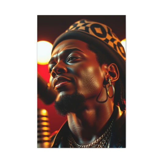
CoColors one of the most powerful tools in photography. It communicates emotion, sets a mood, and can dramatically influence how viewers interpret an image. Every photographer, whether shooting portraits, landscapes, or still life, benefits from understanding how colors affect perception and how they can use this knowledge to create more compelling and emotionally resonant images. At its core, color psychology is about the relationship between colors and human feelings, perceptions, and behaviors. This understanding allows photographers to deliberately choose and manipulate cocolorso evoke specific reactions in their audience.
Color Psychology Means
Color psychology is the study of how colors influence human emotion and decision-making. While some aspects of color perception are biological, many associations are cultural and learned over centuries. For instance, red can be perceived as exciting or dangerous depending on context, while blue often conveys calmness or trust. In photography, this knowledge helps guide choices about lighting, wardrobe, backgrounds, and even post-processing. When you understand the psychological impact of color, you can ensure that your images communicate the intended message effectively.
Color is a visual language, and like any language, it has rules, nuances, and exceptions. Using the wrong color or combination can confuse the viewer, dilute the intended emotion, or even create unintended reactions. For example, a vibrant, neon background might overpower a serene portrait, shifting focus from the subject and creating visual tension. On the other hand, thoughtful use of complementary colors can enhance harmony and make an image feel balanced.
The Emotional Impact of Primary Colors
Secondary and tertiary colors—green, purple, orange, and variations—also play important roles in creating mood. Green is often associated with nature, freshness, and tranquility, making it ideal for environmental or lifestyle photography. Purple conveys creativity, luxury, or serenity depending on its saturation and brightness. Orange is warm, inviting, and energetic, often used to make scenes feel cozy or playful. By combining primary and secondary colors thoughtfully, photographers can create layered emotional experiences that resonate deeply with viewers.
Warm and Cool Colors
One of the simplest ways to apply color psychology is by distinguishing between warm and cool tones. Warm colors—reds, oranges, and yellows—tend to evoke feelings of warmth, excitement, energy, and intimacy. They can make scenes feel inviting, lively, or passionate. Cool colors—blues, greens, and purples—convey calmness, serenity, professionalism, or melancholy. They can make an image feel peaceful, distant, or reflective. Understanding this distinction helps photographers craft images that support the intended mood, whether they are shooting a cozy indoor portrait or a serene landscape.
Color temperature also interacts with lighting. Warm lighting in sunset or golden hour photography enhances reds and oranges, making scenes feel inviting and magical. Cool lighting, such as overcast skies or shade, enhances blues and greens, creating calm or moody atmospheres. Recognizing how natural and artificial light affects color perception is essential for applying color psychology effectively in photography.
Color Combinations and Harmony
Choosing colors in isolation is useful, but understanding combinations is even more powerful. Complementary colors, opposite each other on the color wheel, create contrast and visual interest. For example, pairing blue with orange can make both colors, creating a dynamic, engaging image. Analogous colors—those next to each other on the color wheel—produce harmony and cohesion. For instance, a gradient of yellow to orange to red evokes warmth and continuity. Triadic color schemes, using three evenly spaced colors, balance contrast and harmony, often resulting in visually striking compositions.
Color combinations also affect emotional perception. A photograph of a forest with complementary green and red elements may feel energetic and vibrant, while a scene with analogous green, blue, and teal tones feels peaceful and unified. Learning how to combine colors effectively allows photographers to guide the viewer’s emotional response intentionally, rather than leaving it to chance.
Color Saturation and Brightness
Saturation and brightness are critical aspects of color psychology. Highly saturated colors are bold, attention-grabbing, and energetic. Desaturated colors feel muted, subtle, and sometimes melancholic. Bright colors can feel cheerful and inviting, while dark or low-brightness tones can evoke seriousness, intimacy, or mystery. Adjusting saturation and brightness gives photographers an additional layer of control over mood. For instance, a newborn portrait with soft, pastel colors communicates innocence and calm, while a darker, desaturated portrait of the same subject could feel dramatic or somber.
Post-processing tools, such as HSL sliders in Lightroom or Photoshop, allow photographers to refine these aspects after the shoot. Subtle adjustments can transform the emotional impact of an image, enhancing narrative intent without altering the core composition. Understanding the psychological effects of saturation and brightness ensures that editing choices support the desired feeling rather than contradict it.
Cultural and Personal Associations
While many color associations are universal, some are cultural or personal. For example, white is commonly associated with purity in Western cultures but can signify mourning in others. Red can symbolize luck in some cultures and danger in others. Personal experiences also shape color perception. A viewer who associates yellow with childhood memories may respond differently from someone who finds it overwhelming. Photographers must consider the target audience and context when using color intentionally. Awareness of cultural and personal associations adds depth to color psychology, allowing images to resonate more effectively with diverse viewers.
Color and Subject Interaction
Color psychology also depends on the interaction between the subject and background. Colors surrounding the main subject can enhance or detract from the intended emotion. For example, placing a joyful subject in a scene dominated by cold, dark tones may create visual dissonance, whereas surrounding the subject with warm, complementary colors reinforces positive emotions. Similarly, in product photography, careful color choices influence perceived value, mood, and desirability. Considering the relationship between subject, background, and supporting elements ensures that color supports the overall narrative.
Using Color in Storytelling
Every photograph tells a story, and color is a key narrative tool. By selecting colors deliberately, photographers can guide the viewer’s attention, convey time of day, highlight emotion, or signal thematic elements. For instance, warm tones can suggest intimacy, nostalgia, or romance, while cool tones can imply isolation, tranquility, or melancholy. Color can also create symbolic meaning—green for growth, red for urgency, blue for loyalty. When used thoughtfully, color becomes part of the visual language, adding layers of storytelling that deepen the viewer’s connection to the image.
Understanding the fundamentals of color psychology provides photographers with a powerful tool to influence perception and emotion. By considering emotional associations, warm versus cool tones, color combinations, saturation, brightness, cultural context, and the interaction between subject and background, photographers gain control over the way their images are experienced. Rather than leaving the impact of color to chance, this knowledge allows for intentional, emotionally resonant photography.
Color is not just decoration—it is a communicative element that conveys energy, mood, and meaning. Mastering ccolorpsychology empowers photographers to create images that are compelling, memorable, and emotionally powerful. As a beginner, focusing on these foundational principles sets the stage for more advanced applications in composition, lighting, and post-processing, ensuring that every photograph carries the intended message clearly and effectively.
Mastering Color Psychology Across Photographic Genres
In portrait photography, color plays a central role in conveying personality, emotion, and atmosphere. Warm tones such as reds, oranges, and yellows evoke intimacy, joy, and energy, making them ideal for lifestyle, family, or newborn portraits. These hues naturally complement skin tones, enhancing warmth and vitality in your subjects. Cooler tones like blues, greens, and purples can evoke calmness, sophistication, or introspection. These are often used in editorial or professional portraits to communicate elegance, professionalism, or subtle emotional depth.
The interaction between clothing, background, and props also contributes to the overall color story. Thoughtful choices ensure the colors support the subject and enhance the intended emotional tone. Saturation and contrast further refine mood; highly saturated colors feel vibrant and lively, while muted tones can create nostalgia, intimacy, or seriousness. By combining these elements deliberately, photographers can craft portraits that resonate deeply with viewers.
Landscape Photography
Landscape photography relies heavily on color to establish mood, convey atmosphere, and capture the natural beauty of a scene. Warm tones, particularly during sunrise and sunset, generate feelings of serenity, comfort, and warmth. Golden hour photography, with its soft, warm light, naturally enhances these colors, adding magic and inviting viewers into the scene.
Cool tones dominate overcast skies, lakes, rivers, and shaded forests, evoking calm, contemplation, and solitude. Greens suggest growth, freshness, and harmony with nature, while blues convey tranquility or distance. Combining warm and cool tones strategically within a single composition can create contrast, depth, and dynamic storytelling. CoColoring in post-processing further amplifies these effects, allowing photographers to fine-tune the emotional impact of each landscape.
Still Life and Product Photography
In still life and product photography, color psychology directly influences perception and appeal. Bright, bold colors draw attention, stimulate energy, and convey vibrancy. For example, saturated reds or yellows in food photography can evoke appetite, excitement, and immediacy. Subtle, muted palettes suggest sophistication, elegance, or minimalism, which is particularly effective in luxury product shoots.
Color harmony plays a crucial role in these genres. Complementary color schemes create striking visual contrast, while analogous colors produce cohesion and balance. The goal is to ensure that the color choices align with the intended mood, reinforce the product’s message, and guide the viewer’s emotional response. Thoughtful selection of backgrounds, props, and lighting contributes to creating a cohesive and intentional color narrative.
Street Photography
Street photography often captures candid moments and dynamic environments, where color can emphasize mood, focus, and storytelling. Bold primary colors, like red or yellow, can instantly draw attention to a subject, signal action, or heighten energy within a scene. Conversely, muted or monochromatic palettes can evoke a sense of melancholy, reflection, or historical nostalgia.
Natural and artificial light sources, such as neon signs, streetlights, and reflections, further shape color perception in urban environments. By understanding color psychology, street photographers can make subtle decisions to enhance the story or emotion conveyed without over-directing the scene. The choice of when to embrace or subdue directly affects the viewer’s perception and emotional engagement.
Event and Wedding Photography
Event photography relies on color to communicate atmosphere, emotion, and celebration. Warm tones—golden, soft, or pastel—enhance feelings of intimacy, joy, and togetherness, ideal for weddings and family gatherings. The colors of decor, clothing, and natural light all contribute to a cohesive visual experience that reinforces the intended mood.
Cooler tones, such as blues and muted purples, can provide contrast, highlight quiet or reflective moments, and convey elegance. Balancing warm and cool tones across a series of event images ensures consistency while capturing a range of emotions. Color psychology allows photographers to maintain visual harmony and emotional resonance across an entire event, ensuring that viewers connect with both the mood and the narrative.
Fine Art and Conceptual Photography
In fine art and conceptual photography, color is often the primary vehicle for storytelling. Photographers use specific color schemes to evoke emotions, create symbolism, and guide interpretation. Warm, saturated reds might suggest passion, urgency, or aggression, while muted blues and greens convey tranquility, contemplation, or melancholy.
Color contrast, harmony, and placement within the frame are tools to reinforce the conceptual narrative. Adjustments in post-processing, such as selective desaturation, hue shifts, or saturation enhancement, allow photographers to refine the intended psychological impact. Every color choice is deliberate, ensuring that viewers experience the emotion or story the photographer intends to communicate.
Editorial and Fashion Photography
Editorial and fashion photography frequently uses color to define style, establish mood, and convey branding messages. Bold, high-contrast colors generate drama, excitement, and visual impact, ideal for high-fashion spreads or advertising campaigns. Pastel or muted tones evoke delicacy, romance, or sophistication, often used in beauty, lifestyle, or lifestyle-inspired editorial work.
Collaboration with stylists, makeup artists, and designers ensures the chosen colors align with the overall vision and audience expectations. Color psychology allows photographers to anticipate reactions, evoke desire, and create memorable imagery. Understanding which colors trigger specific emotional responses helps maintain consistency while maximizing visual and emotional appeal.
Color in Post-Processing
Across all photographic genres, post-processing is where color psychology can be fully leveraged. Adjustments to temperature, saturation, luminance, and contrast allow photographers to enhance mood, highlight subjects, or subtly shift emotional cues. Localized adjustments refine specific areas of an image, guiding viewer perception and reinforcing narrative intent.
Filters, color grading, and selective desaturation provide creative flexibility while maintaining visual cohesion. For instance, warming the overall tone of a family portrait enhances feelings of comfort and intimacy, whereas cooling a cityscape can accentuate mood and drama. Understanding how post-processing interacts with color psychology ensures that every edit supports the intended emotional experience.
Mastering color psychology across different photographic genres allows photographers to create images that are visually striking, emotionally resonant, and narratively compelling. Thoughtful application of color principles—considering emotional associations, warm versus cool tones, color harmony, saturation, and post-processing—enables photographers to guide viewer perception intentionally. Whether capturing a portrait, landscape, still life, or conceptual art, color becomes a language that communicates emotion, sets the tone, and enhances storytelling, transforming ordinary images into works that resonate deeply and linger in the viewer’s mind.
Creating Emotional Impact Through Color in Photography
Color is more than a visual element; it is a powerful emotional tool that shapes how viewers perceive and respond to an image. By understanding the psychological associations of colors and how to manipulate them, photographers can craft images that evoke precise feelings and create lasting impressions. Emotional impact through color is achieved by careful consideration of hue, saturation, contrast, combinations, and context.
Understanding Emotional Associations
Each color carries inherent emotional associations, which have developed through biological, cultural, and historical influences. Red is linked to energy, passion, and urgency, while blue conveys calmness, trust, and stability. Yellow is stimulating, cheerful, and bold. Green evokes nature, freshness, and balance. Purple communicates creativity, luxury, and harmony, while orange radiates warmth, enthusiasm, and friendliness. White symbolizes purity, innocence, and clarity, and black often represents mystery, depth, and elegance.
Understanding these associations allows photographers to guide the viewer’s emotional response intentionally. For example, in a landscape shot, warm reds and oranges of a sunset can evoke tranquility and awe, whereas a desaturated, cool-toned urban scene may evoke solitude or introspection. Being mindful of these associations ensures that the colors in an image align with the intended mood and narrative.
Using Color to Emphasize Narrative
Color can act as a storytelling device, subtly reinforcing the narrative of an image. In portraiture, background colors can complement the subject’s expression or pose to strengthen emotional resonance. A joyful expression paired with warm, vibrant colors amplifies feelings of happiness and vitality, whereas a reflective or somber pose combined with muted blues or grays enhances introspection.
In landscape photography, color guides the viewer’s interpretation of time, weather, and atmosphere. Golden hour light with rich yellows and oranges conveys warmth and nostalgia, while cool, desaturated tones suggest calm, solitude, or even melancholy. By carefully selecting color palettes that align with the story being told, photographers create images that communicate beyond literal visual content.
Color Contrast and Emotional Tension
Contrast is a powerful tool in evoking emotion. Complementary colors—those opposite each other on the color wheel—create visual tension and dynamic energy. For instance, a red subject against a green background immediately draws the viewer’s attention, evoking intensity and excitement. Analogous colors, on the other hand, promote harmony and cohesiveness, evoking calm and stability.
Using contrast intentionally can enhance the emotional impact of a photograph. A high-contrast street scene with bold, clashing colors may convey chaos, energy, or urban vibrancy, whereas a softly graded portrait using analogous tones can evoke peace, intimacy, and subtlety. Recognizing when to use tension versus harmony allows photographers to control the emotional journey of the viewer.
Color Saturation and Mood
Saturation directly influences how an image feels emotionally. Highly saturated colors feel vibrant, energetic, and bold, often conveying excitement or urgency. Desaturated colors, muted tones, and pastel shades evoke subtlety, calm, or nostalgia. Adjusting saturation strategically can amplify the intended mood without altering the core composition.
For example, a lively festival scene can benefit from bright, saturated colors to convey energy and movement, while a quiet, introspective portrait might be more impactful with desaturated tones, softening distractions and emphasizing emotional subtleties. Mastering saturation allows photographers to guide emotional response through visual intensity.
Light and Color Interactions
Lighting significantly affects color perception and emotional impact. Warm light enhances reds, oranges, and yellows, intensifying feelings of warmth, comfort, and intimacy. Cool light emphasizes blues and greens, creating calm, distance, or melancholy. Shadows, highlights, and reflections further manipulate color interactions, allowing photographers to shape mood and focus within an image.
Understanding the relationship between light and color helps photographers anticipate emotional impact. Golden hour light naturally enhances warmth, making scenes feel inviting and magical. Overcast or shaded conditions enhance cool tones, fostering tranquility or somber atmospheres. Using natural and artificial light effectively ensures that color choices convey the intended feeling.
Cultural and Contextual Considerations
Cultural context shapes how viewers interpret color. While many associations are universal, some colors carry specific meanings in different cultures. For example, white often symbolizes purity in Western cultures but can represent mourning in others. Red may symbolize luck and celebration in some regions, while suggesting danger or urgency in others.
Understanding your audience is crucial for applying color psychology effectively. Personal experiences also affect perception; a viewer’s emotional history with certain colors may influence their response. By considering cultural and contextual factors, photographers ensure their color choices communicate the intended emotion across diverse audiences.
Color Palettes for Emotional Cohesion
A well-chosen color palette can unify an image and strengthen emotional impact. Complementary palettes create contrast and excitement, while analogous palettes promote harmony and calm. Triadic palettes balance contrast and cohesion, producing visually striking and emotionally balanced compositions.
When constructing palettes, photographers should consider primary and secondary colors as well as tonal variations. The interplay between light and dark, saturated and muted, warm and cool tones creates layered emotional experiences. For example, a landscape with a gradient of blues and greens may feel peaceful and immersive, while the addition of a single contrasting warm element adds focal interest and narrative tension.
Using Color to Guide Viewer Focus
Color can direct attention within an image, highlighting key elements or reinforcing narrative importance. Bold, saturated colors naturally draw the eye, making them ideal for focal points or subjects. Muted or monochromatic backgrounds allow the main subject to stand out, ensuring clarity of message and emotional focus.
In portrait photography, dressing a subject in complementary colors to the background enhances prominence and reinforces emotional tone. In still life or product photography, contrasting colors guide the viewer’s gaze, emphasizing important details and enhancing perceived value. CColormanipulation guides perception subtly yet effectively, making it an essential tool for storytelling.
Color in Post-Processing for Emotional Effect
Post-processing allows photographers to refine color and emotional impact further. Adjusting hue, saturation, luminance, and contrast can enhance mood, emphasize subjects, and maintain cohesion across an image series. Localized adjustments provide control over specific areas, ensuring that color aligns with narrative intent.
Techniques such as selective desaturation, color grading, and split toning allow photographers to transform the emotional tone of an image without altering the composition. Subtle tweaks can make a warm portrait feel more inviting, a cityscape more dramatic, or a landscape more serene. Mastering post-processing in the context of color psychology ensures that the final image communicates the intended emotion consistently and effectively.
Creating emotional impact through color is a cornerstone of photographic storytelling. By understanding psychological associations, leveraging contrast, saturation, and lighting, and considering cultural and contextual factors, photographers can guide viewer perception and evoke desired feelings. Color palettes, focus management, and post-processing tools all contribute to controlling mood, narrative, and emotional resonance. Mastery of color psychology allows photographers to produce images that do more than capture moments—they move viewers, tell stories, and leave lasting impressions.
Advanced Techniques in Color for Photography
Once a photographer understands the basics of color psychology, the next step is to explore advanced techniques that allow for more intentional, creative, and impactful use of color. These techniques go beyond simple associations of warm and cool tones or primary and secondary colors and focus on mastering palette construction, complementary and contrasting color use, emotional layering, and practical exercises to refine skills.
Understanding Complex Color Palettes
A complex color palette involves more than one or two colors; it integrates multiple hues, tones, and shades to create depth, harmony, and visual interest. By carefully constructing a palette, photographers can evoke nuanced emotions and guide the viewer through the image. For example, combining muted blues with soft purples and subtle touches of gold can create a serene, luxurious atmosphere.
Advanced palette construction considers relationships between colors. Analogous colors create cohesion and calm, complementary colors create tension and focus, and triadic schemes balance harmony and contrast. Incorporating subtle variations in saturation and brightness within these schemes adds complexity and richness, making images feel more polished and emotionally engaging.
Using Complementary Colors to Create Impact
Complementary colors—those directly opposite each other on the color wheel—are highly effective for creating visual tension, contrast, and emphasis. In practice, this technique can make subjects pop against their background or add energy to a composition. For instance, a model in a vibrant red dress against a green natural backdrop immediately draws attention, while a yellow subject against a purple-toned environment feels bold and dynamic.
The key to using complementary colors effectively is balance. Overuse can feel chaotic or overwhelming, while subtle application can produce striking emphasis without distraction. Skilled photographers often use one dominant color and a complementary accent to direct the viewer’s eye and evoke a precise emotional response.
Layering Colors for Emotional Complexity
Advanced color use involves layering multiple hues to create nuanced emotional effects. Single-color schemes may communicate basic emotions, but layering allows for subtler storytelling. For example, a photograph of a city at dusk might combine deep blues with warm streetlights and muted greens from foliage to evoke nostalgia, calm, and vibrancy simultaneously.
Layering also involves considering the psychological interaction of colors. A combination of red and blue, for instance, can evoke both energy and calm, producing tension or intrigue depending on the dominance and placement of each color. Mastery of this technique allows photographers to convey multi-dimensional emotions and craft images with greater depth.
Color Blocking and Visual Focus
Color blocking is the deliberate use of large areas of contrasting or complementary colors to define focus and structure within an image. This technique is particularly effective in minimalist photography, fashion, and abstract work. By isolating colors in distinct blocks, photographers can guide the viewer’s eye, emphasize key subjects, and create a strong visual impact.
For example, a portrait with a subject wearing a bold outfit against a monochromatic background uses color blocking to create instant focus. Similarly, architectural photography can use large color panels in buildings to direct attention and enhance compositional balance. Color blocking allows for intentional visual hierarchy, ensuring that viewers engage with the image as intended.
Color Gradients and Emotional Flow
Gradients, the smooth transition from one color to another, are a powerful tool for creating emotional flow and guiding perception. Gradients can mimic natural light shifts, suggest movement, or evoke subtle mood changes. For instance, a sunrise landscape transitioning from deep purple to orange conveys calm awakening and warmth, while a gradient from cool blue to soft teal in a seascape evokes tranquility and continuity.
Photographers can create gradients through natural light, reflective surfaces, or post-processing adjustments. Using gradients strategically ensures that color transitions enhance the narrative rather than creating visual dissonance. Gradients are particularly useful for evoking atmosphere and guiding the emotional journey of the viewer.
Color and Composition Integration
Advanced color techniques must integrate seamlessly with composition. Color should reinforce the visual balance, leading lines, and focal points rather than compete with them. For instance, complementary colors placed at the intersections of the rule of thirds create natural emphasis, while analogous color gradients along leading lines guide the viewer’s gaze through the scene.
By considering color as a compositional element, photographers ensure that every hue contributes to storytelling, focus, and emotional resonance. Composition and color work together to create images that are both aesthetically pleasing and psychologically impactful.
Practical Exercises for Skill Development
Developing mastery over advanced color techniques requires deliberate practice. One exercise is palette isolation: photographing scenes using only a limited palette to understand how hues interact and affect mood. Another is complementary experimentation: placing opposing colors in various dominance ratios and observing their impact on viewer perception.
Photographers can also experiment with layering and saturation adjustments in post-processing to explore emotional subtleties. Creating a series of images using a specific gradient or colorblock approach helps internalize techniques and understand how color can be manipulated intentionally to guide perception. These exercises build intuition and skill, ensuring that advanced color techniques become second nature.
Emotional Storytelling with Advanced Color
Advanced color techniques are most effective when tied to narrative intent. For example, a fashion editorial using bold complementary colors conveys confidence and energy, while a fine art portrait using layered muted tones evokes subtlety and introspection. Emotional storytelling through color requires photographers to anticipate viewer response, consider cultural and personal associations, and apply techniques with intentionality.
By combining palette complexity, layering, complementary use, gradients, and color blocking, photographers can craft images that communicate sophisticated emotional messages. The viewer experiences more than visual appeal; they connect with the scene, the subject, and the intended mood on a psychological level.
Post-Processing for Advanced Color Manipulation
Post-processing is essential for refining advanced color techniques. Tools such as HSL sliders, selective color adjustments, curves, and gradient mapping allow photographers to fine-tune hues, saturation, and brightness with precision. Localized adjustments emphasize specific areas of interest, while global changes harmonize the overall palette.
For instance, adjusting blue hues in a cityscape while keeping warm highlights intact can balance tension and harmony. Selective desaturation can draw attention to the subject or emphasize a particular emotional tone. Mastery of post-processing ensures that the final image communicates the intended message with clarity and sophistication.
Advanced color techniques elevate photography from aesthetically pleasing to emotionally and psychologically compelling. By mastering palette construction, complementary and contrasting colors layering, color locking, gradients, composition integration, and post-processing, photographers can craft images that resonate deeply with viewers. These tools allow for precise emotional storytelling, guiding perception, and creating impactful, memorable visuals. Color becomes not just an element of design but a language that communicates, evokes, and connects, transforming photographs into experiences rather than mere representations of reality.
Using Color Set Mood and Influence Perception in Photography
Colors are one of the most powerful tools photographers have to shape mood, influence perception, and control the emotional resonance of an image. Beyond basic associations, an advanced understanding of how color interacts with the environment, light, and composition allows photographers to create images that communicate on both conscious and subconscious levels. This part explores how to use color to set mood, leverage environmental cues, and apply psychological principles to real-world photography.
The Role of Color in Establishing Mood
Mood is the emotional atmosphere of an image, and color is a primary driver. Warm colors—reds, oranges, and yellows—evoke feelings of energy, passion, intimacy, and comfort. They are particularly effective in lifestyle, family, and portrait photography, where emotional connection is key. Cool colors—blues, greens, and purples—suggest calmness, introspection, melancholy, or sophistication. By selecting colors deliberately, photographers can immediately set the tone of a scene before the viewer even interprets subject matter or composition.
Saturation, brightness, and contrast amplify mood. Highly saturated colors are lively and intense, while muted tones create subtlety and reflection. Brightness conveys optimism and energy, whereas darker tones evoke mystery or seriousness. Recognizing how these variables interact allows photographers to manipulate mood with precision.
Environmental Colorord Context
The environment plays a significant role in influencing mood. Urban settings with neon lights, graffiti, or reflective surfaces create bold, energetic palettes that communicate excitement, movement, or tension. Natural landscapes with lush greens, warm golden sunsets, or icy blues evoke serenity, freshness, or tranquility.
Photographers must observe the colors in their environment and decide whether to enhance, balance, or contrast them. For instance, a vibrant subject placed in a muted natural landscape creates focal emphasis and visual interest, while complementary colors between subject and environment can harmonize the scene for emotional cohesion. Environmental color awareness ensures that the mood is consistent with both subject and context.
Psychological Effects of Color Combinations
Colors do not exist in isolation; combinations can dramatically alter perception. Complementary colors create tension and energy, perfect for dynamic scenes, high-impact portraits, or dramatic storytelling. Analogous colors provide harmony and subtlety, ideal for tranquil landscapes or cohesive still life compositions. Triadic schemes balance contrast and harmony, producing visually engaging images without overwhelming the viewer.
The psychological effects of combinations can be subtle yet powerful. A landscape dominated by green and blue suggests calm and growth, but adding a small touch of warm yellow can draw attention and add emotional nuance. Photographers can manipulate these combinations to create layered moods that guide the viewer's perception intentionally.
Color Temperature and Emotional Influence
Color temperature, measured as warm versus cool, profoundly affects emotional interpretation. Warm light enhances reds, oranges, and yellows, creating intimacy, nostalgia, and optimism. Cool light emphasizes blues and greens, evoking calm, reflection, or melancholy. Photographers can leverage this by choosing specific times of day, lighting setups, or filters to achieve the desired emotional effect.
For example, sunrise and sunset naturally provide warm tones that enhance feelings of comfort or joy. Overcast conditions or shaded areas emphasize cool tones, creating serenity or a sense of solitude. Understanding how natural and artificial light interacts with color temperature ensures that the mood is consistent and intentional.
Color Saturation and Emotional Weight
Adjusting saturation allows photographers to control emotional intensity. Highly saturated colors are bold, urgent, and energetic, suitable for lively events, fashion photography, or action scenes. Desaturated colors create calmness, introspection, or a timeless feel, often used in fine art, conceptual, or documentary photography.
Local adjustments in post-processing allow selective control, emphasizing certain elements while subduing others. For instance, a desaturated background with a saturated subject highlights focal importance while maintaining subtlety in surrounding elements. Saturation management ensures that emotional weight aligns with the story being told.
Color as a Storytelling Tool
Color serves as a narrative device in addition to setting the mood. By considering how hues interact with subject, environment, and composition, photographers can create images that tell more than a literal story—they evoke emotion, suggest themes, and guide interpretation. For instance, a solitary figure in cool, muted tones conveys isolation or reflection, whereas the same figure in a vibrant, warm environment communicates energy or joy.
Layering color psychologically allows multiple emotional cues to coexist, enriching the narrative. Subtle gradients, complementary contrasts, and intentional desaturation can all contribute to complex storytelling, ensuring that viewers engage with both the visual and emotional layers of an image.
Practical Application in Real-World Photography
Applying color psychology in real-world scenarios requires observation, planning, and experimentation. Photographers should:
-
Assess the natural environment and identify dominant colors
-
Decide whether to enhance or contrast these colors to achieve the intended mood.
-
Choose clothing, props, or background elements that align with emotional goals.
-
Consider light temperature and direction to influence color perception.
-
Experiment with post-processing adjustments to refine hue, saturation, and brightness.
For example, a wedding photographer can use warm tones in decorations and lighting to evoke intimacy and joy, while a landscape photographer might emphasize cool tones in an early morning mist to convey calm and reflection. By consciously applying these principles, photographers create images that communicate intentional emotion and narrative.
Color and Viewer Perception
The ultimate goal of using color to set mood is to influence the viewer's perception. Viewers react instinctively to color, often before consciously processing subject or composition. A photograph that aligns color with emotional intent establishes an immediate connection, guides interpretation, and enhances memorability. Misalignment, conversely, can confuse or diminish impact.
For instance, portraying a joyous subject with cold, desaturated tones may create cognitive dissonance for the viewer, reducing emotional engagement. Thoughtful application of color ensures that perception and intended emotion are aligned, producing powerful, resonant imagery.
Combining Techniques for Maximum Impact
Advanced photographers combine multiple techniques—temperature, saturation, complementary or analogous palettes, environmental color awareness, and post-processing adjustments—to create cohesive and emotionally compelling images. This layered approach ensures that every element, from subject to background to light, contributes to the mood and narrative.
By practicing these combinations, photographers develop intuition for color use, learning how subtle shifts can dramatically alter perception. The ability to craft mood through color transforms photography from mere documentation into an expressive art form.
Using color to set mood and influence perception is essential for creating impactful, emotionally resonant photography. By understanding the psychological effects of hue, saturation, temperature, and combinations, and by considering environmental and compositional context, photographers can control emotional response and enhance storytelling. Applying these principles in real-world scenarios ensures that every image communicates intentional feeling and engages viewers on a deeper psychological level. Color becomes a tool not just for aesthetics but for emotional expression and narrative control, turning every photograph into a meaningful visual experience.
Mastering Color Consistency and Integration in Photography
The final step in applying color psychology effectively is learning to maintain consistency, integrate color into your photographic style, and use it as a long-term creative tool. Mastery involves not only understanding color theory and emotional associations but also refining technical skills, post-processing techniques, and compositional strategies. This ensures that color enhances storytelling, reinforces mood, and supports a cohesive visual identity across a photographer’s body of work.
Maintaining Color Consistency Across Images
Consistency in color is essential for building a cohesive portfolio or series of images. Viewers subconsciously associate certain moods and themes with repeated color palettes, and inconsistency can dilute impact. Maintaining color consistency involves careful planning during shooting and disciplined post-processing.
Photographers should consider lighting conditions, camera settings, and white balance to ensure colors remain stable across different environments. For instance, shooting the same subject at various times of day or in different locations requires adjustments to compensate for natural light shifts. This proactive approach minimizes discrepancies and preserves the intended emotional tone.
Developing a Personal Color Style
Every photographer can develop a distinctive color style by consistently applying specific palettes, tones, and treatments. Some photographers favor warm, earthy tones for an organic, nostalgic feel, while others lean into vibrant, saturated colors for high-energy storytelling. Defining a personal color style enhances recognition and strengthens the emotional identity of your work.
Experimentation is key. By testing different palettes, gradients, and color combinations over multiple shoots, photographers learn which approaches best communicate their artistic vision. Documenting these preferences allows for reproducibility and refinement over time. A consistent color style ensures that individual images contribute to a larger narrative or portfolio identity.
Color Harmony in Long-Term Projects
When working on large-scale photography projects that span weeks, months, or even years, maintaining color harmony is essential for creating a cohesive and professional body of work. Unlike single images, where color decisions can be made independently, a long-term project requires the photographer to consider how each image relates to the others. Whether documenting travel experiences, producing a documentary series, or assembling an editorial spread, consistent attention to palette, tonal balance, and color relationships ensures that the collection communicates a unified mood and narrative.
Color harmony is the practice of combining hues in a way that is aesthetically pleasing and emotionally consistent. In large projects, this goes beyond simple beauty—it reinforces the story, strengthens viewer engagement, and gives the work a recognizable style. Common approaches to achieving harmony include the use of complementary, analogous, or triadic color schemes. Complementary colors, positioned opposite each other on the color wheel, create visual tension and draw attention to key elements. Analogous colors, which sit next to each other on the wheel, foster a sense of cohesion and subtlety. Triadic schemes, composed of three evenly spaced colors, offer balance and visual interest without overwhelming the viewer. Strategic use of these combinations across a series of images allows the photographer to maintain emotional continuity and reinforce the intended tone.
Anticipating how individual images interact within a series is a critical part of long-term color management. Each photograph should not only succeed independently but also contribute to the overall aesthetic and emotional arc of the project. This requires careful planning during shoots, considering lighting, environmental colors, and subject matter to ensure compatibility across multiple images. For instance, a travel series may feature landscapes from diverse locations, each with distinct colors. By adjusting shooting times, angles, or incorporating post-processing techniques, the photographer can create a consistent visual signature that ties the series together.
Post-processing plays a significant role in aligning the color palette and tonal balance across images. Adjusting white balance, saturation, contrast, and hue allows the photographer to harmonize shots taken in different conditions or at varying times of day. Subtle corrections can make images feel cohesive without appearing artificially manipulated, ensuring that the emotional and narrative flow remains uninterrupted. Over time, these adjustments become part of a consistent workflow that defines the project’s visual identity.
Ultimately, maintaining color harmony in long-term projects enhances both storytelling and professional presentation. A cohesive palette creates a sense of continuity, guiding viewers through the series in a deliberate and emotionally resonant way. The audience experiences the project as a unified narrative rather than a collection of disconnected images, increasing engagement and impact. By combining careful planning, strategic use of color schemes, and consistent post-processing, photographers can ensure that every image contributes meaningfully to the overarching story, producing work that is both visually and emotionally compelling.
Advanced Post-Processing Techniques
Post-processing is where photographers solidify color consistency and emotional impact. Advanced techniques include:
-
Selective color adjustment: Enhances specific areas without affecting the entire image.
-
Split toning: Adds complementary color to shadows and highlights for emotional depth.
-
Gradient mapping: Creates smooth color transitions to evoke mood.
-
Curves and levels adjustments: Refines luminance and contrast for tonal consistency.
These tools allow for subtle corrections, stylistic enhancement, and the creation of signature color aesthetics. Mastery of post-processing ensures that every image communicates intended emotions while maintaining a cohesive visual identity.
Color Integration with Composition
Color is one of the most powerful visual elements in photography, but its effectiveness is greatly amplified when it is deliberately integrated with composition. Composition refers to how visual elements are arranged within a frame to create balance, focus, rhythm, and narrative flow. When color is considered as part of this structural framework rather than treated as a secondary concern, it becomes a tool for guiding viewer perception, enhancing storytelling, and reinforcing the intended emotional impact of an image. By thoughtfully combining color and composition, photographers can create images that are not only visually appealing but also emotionally engaging and narratively coherent.
Leading lines are a fundamental compositional technique that benefits immensely from the careful use of color. Leading lines are visual pathways—such as roads, fences, rivers, or architectural elements—that direct the viewer’s gaze toward a specific subject or area of the frame. When these lines are accompanied or emphasized by cocolorthey become even more effective in guiding attention. For instance, a brightly coloured pathway or a series of complementary coloured objects along a leading line naturally draws the eye along the intended visual trajectory. The viewer’s attention is subtly controlled, ensuring that the focal point of the image is emphasized while still allowing the surrounding elements to contribute to the overall aesthetic. Color enhances the clarity and impact of leading lines, transforming them from structural guides into emotional and narrative conduits.
Framing is another compositional tool that interacts effectively with color. Framing involves using elements within the scene—such as windows, archways, tree branches, or other objects—to encircle or highlight a subject. When the colors of the framing elements contrast with or complement the subject, the effect is magnified. For example, a warm-toned subject framed by cooler tones in the background will stand out prominently, immediately capturing the viewer's attention. Conversely, complementary color framing can create harmony, making the subject feel integrated with its environment while still being distinct. Thoughtful use of color in framing can establish context, evoke emotion, and reinforce the story behind the image.
Symmetry and spatial arrangement also benefit from the integration of color. Symmetry creates a sense of balance, order, and stability, while deliberate asymmetry can evoke tension, movement, or dynamic energy. Color can enhance these effects by emphasizing key areas, drawing attention to symmetrical or asymmetrical patterns, and reinforcing visual hierarchy. For instance, symmetrical architectural photography can be accentuated with contrasting colors along the axis of symmetry, making the repetition and order more striking. In asymmetrical compositions, strategically placed complementary or contrasting colors can balance the visual weight of elements, ensuring that the composition feels cohesive despite intentional imbalance. Color in this context becomes both a structural and expressive tool, guiding the viewer’s eye while shaping emotional response.
Gradients and tonal shifts are subtle but powerful ways to integrate color composition. Gradients involve the gradual transition of color from one hue, saturation, or brightness level to another. These shifts can be used to guide the viewer’s gaze through the scene, highlight areas of importance, and create depth. For example, a landscape photograph with a gradient from deep blues in the foreground to warmer, lighter tones in the background can create a sense of distance and atmospheric perspective. Similarly, a subject positioned at a tonal high point naturally draws attention due to contrast against surrounding shades. By combining gradients with compositional techniques such as leading lines or framing, photographers can craft images where the eye moves fluidly through the frame, absorbing both narrative and emotional cues.
Considering color as a structural element of composition also involves understanding its interaction with form, texture, and perspective. Color should complement these elements rather than compete with them. For instance, in a portrait, a subject’s clothing color can enhance the visual lines of their pose, the textures of the environment, and the depth created by perspective. In landscape photography, the hues of natural elements can emphasize topography, patterns in vegetation, or the play of light and shadow across terrain. By treating color as an integral part of the structural design, photographers ensure that each hue reinforces rather than distracts from the image’s overall composition.
Moreover, integrating color with composition enhances the emotional resonance of an image.CoColors carry psychological weight, influencing mood, tone, and viewer perception. When used intentionally within a structured composition, these psychological effects are amplified. A bold, warm color at a focal point can evoke energy and excitement, while a muted, cool palette in peripheral areas can create calm and balance. Thoughtful integration ensures that the emotional impact of color aligns with the compositional flow, resulting in images that are both aesthetically compelling and emotionally engaging.
In practice, achieving successful integration of color and composition requires observation, planning, and experimentation. Photographers should analyze scenes to identify natural color relationships and assess how they interact with compositional elements. They should consider lighting, contrast, and saturation, as these factors influence how colors are perceived and how they guide attention. Experimenting with different color placements, contrasts, and harmonies allows photographers to refine their ability to use color as a compositional tool, building intuition over time.
Colourorks best when it is treated as an essential structural component of composition. Leading lines, framing, symmetry, gradients, and spatial arrangement all benefit from deliberate color choices that guide the viewer’s eye, reinforce narrative intent, and enhance emotional impact. By considering color alongside form, texture, and perspective, photographers can create balanced, engaging, and visually compelling images. Thoughtful integration transforms color from a decorative element into a powerful tool for storytelling, ensuring that every hue contributes meaningfully to the overall composition and viewer experience.
Psychological Consistency Across Series
Beyond aesthetic consistency, psychological consistency is crucial for long-term projects. Colors should reinforce the intended emotional narrative across multiple images. For instance, a travel series documenting serene landscapes might consistently favor cool blues and muted greens, while a vibrant street photography series could rely on bold primary colors.
Consistency allows viewers to recognize thematic and emotional patterns, deepening engagement and creating a coherent story. When color choices align with narrative intent across a series, the overall impact is far greater than the sum of individual images.
Practical Strategies for Long-Term Color Management
To maintain consistency and mastery in color psychology:
-
Pre-visualize shoots: Plan palettes and lighting to align with the desired mood.
-
Create reference swatches: Document preferred color combinations for recurring use.
-
Use consistent editing presets: Maintain uniform adjustments across multiple images.
-
Monitor color temperature and white balance: Ensure environmental lighting does not distort intended tones.
-
Review images as a series: Evaluate how colors interact across multiple compositions.
These strategies streamline workflow, enhance control over outcomes, and ensure emotional and visual cohesion in long-term projects.
Integrating CColorPsychology into Creative Practice
Color psychology is not simply a technical tool; it is a creative framework that shapes how photographers conceptualize, execute, and refine their work. Beyond knowing which colors evoke which emotions, integrating color into the creative process allows photographers to communicate deeper meaning, craft cohesive narratives, and establish a unique visual style. To achieve this, color must be considered at every stage of the photographic workflow—from pre-shoot planning to post-processing—so that it becomes a natural, intuitive part of decision-making rather than an afterthought.
At the pre-shoot stage, color psychology informs the choices a photographer makes about location, props, wardrobe, and overall visual direction. Selecting a backdrop that complements the intended mood of an image, for example, ensures that the colors in the frame reinforce the emotional tone. For a warm, joyful portrait, a background infused with soft yellows or muted oranges can amplify feelings of happiness and intimacy. Conversely, for a contemplative or melancholic portrait, cooler tones such as blues, greens, or desaturated purples may enhance a sense of calm or introspection. The pre-shoot phase allows the photographer to conceptualize color relationships deliberately, aligning environmental hues with the desired narrative and emotional resonance.
Once on location, continues to guide decisions in real-time. Natural light, shadows, reflections, and surrounding elements all influence how colors are perceived and interact with one another. A photographer who understands color psychology can anticipate these interactions and adjust positioning, framing, or camera settings to maximize the desired effect. For instance, shooting during the golden hour introduces warm, soft light that enhances reds, oranges, and yellows, naturally creating a sense of warmth and intimacy. Conversely, an overcast day or shaded environment accentuates cooler tones, which can convey solitude, calmness, or subtle tension. By considering color in conjunction with lighting and environmental cues, photographers can create images where emotional impact is woven seamlessly into every element of the scene.
Composition, too, benefits from a conscious approach to color. Leading lines, balance, and spatial arrangement are strengthened when colors are used intentionally to guide the viewer’s eye. A brightly coloured subject against a muted background draws attention naturally, creating emphasis and focus. Complementary colors can create tension and energy, while analogous color schemes foster harmony and cohesion. Photographers who integrate color into compositional thinking understand that hues are not merely decorative; they function as visual signals that influence perception, highlight narrative points, and reinforce the intended mood.
Post-processing is another critical stage where color psychology plays a central role. Adjustments to saturation, hue, temperature, and luminance allow photographers to refine and enhance emotional impact. Subtle manipulations, such as selectively enhancing a warm tone in a subject’s clothing or cooling the shadows in a background, can dramatically shift how an image is perceived. Over time, photographers who consistently apply these adjustments develop an intuitive understanding of how color adjustments shape mood and narrative, allowing them to make decisions quickly and effectively without second-guessing.
A key aspect of integrating color psychology into creative thinking is ongoing experimentation. Trying new color palettes, unusual combinations, or deliberate contrasts expands the photographer’s visual vocabulary. Experimentation allows the photographer to explore emotional nuances, test unconventional approaches, and discover innovative ways to communicate with color. For example, pairing unexpected complementary colors may produce striking emotional effects or add subtle narrative complexity. Through repeated exploration, photographers build a repository of intuitive responses to color interactions, enabling them to evoke precise emotional responses in future projects.
Internalizing color psychology also strengthens the photographer’s creative intuition. Over time, the knowledge of which colors evoke certain feelings, combined with practical experience in manipulating hues in real-world settings, becomes second nature. Photographers no longer rely solely on conscious decision-making; they can instinctively select colors, adjust lighting, and frame compositions to achieve a desired emotional effect. This intuitive application of cocolors ensures consistency across projects while allowing for spontaneous creativity and responsiveness to changing conditions.
Ultimately, integrating color psychology into creative thinking transforms photography from a technical practice into a form of emotional storytelling. CoColor comes as a deliberate and expressive tool that communicates tone, guides perception, and enhances narrative depth. By considering color at every stage—planning, location, lighting, composition, and post-processing—and embracing ongoing experimentation, photographers cultivate a refined understanding of how color enhances the viewer’s experience. This intuitive mastery allows them to create images that consistently resonate on both a visual and emotional level, producing work that is compelling, cohesive, and uniquely their own.
Color psychology should not be seen merely as a set of rules about warm and cool tones or complementary palettes. Instead, it is a lens through which photographers interpret and shape the world they capture. By making color an integral part of creative thinking, internalizing its emotional impact, and experimenting with new combinations, photographers develop an intuitive skill set that allows them to convey complex moods and narratives effortlessly. Over time, this approach transforms colour into a color, an instinctive element of their artistry, empowering them to craft images that are both visually stunning and emotionally resonant.
Color as a Storytelling Framework
Ultimately, color becomes a storytelling framework rather than a decorative element. It reinforces subject, context, and emotion, providing viewers with cues about narrative, tone, and intention. Advanced photographers use color to:
-
Convey time of day or season through hue and temperature.
-
Enhance emotional subtext with saturation, contrast, and tonal manipulation.
-
Establish continuity across a series or body of work.
-
Guide viewer focus using complementary, contrasting, or analogous colors.
Through these methods, color transforms photography into a multi-layered experience, connecting the viewer emotionally and intellectually with the subject.
Mastering color consistency and integration is the pinnacle of advanced photography practice. By combining technical skill, post-processing expertise, compositional awareness, and psychological insight, photographers can create cohesive, emotionally compelling images that communicate their artistic vision clearly. Maintaining consistent palettes, developing a personal color style, and applying advanced techniques ensures that every photograph not only looks aesthetically pleasing but also resonates emotionally and narratively. Color becomes a language, a tool for storytelling, and a unifying thread across long-term projects, elevating photography from simple documentation to expressive, intentional art.
Conclusion
Color is far more than a visual element; it is a language, a mood setter, and a psychological tool that allows photographers to communicate emotion, narrative, and meaning. Throughout this guide, we have explored the depth and breadth of color psychology and its applications in photography, from the basic understanding of emotional associations to advanced techniques, real-world applications, and long-term integration into a personal style. Mastering color is not just about aesthetics—it is about guiding perception, influencing emotions, and creating images that resonate with viewers on multiple levels.
At its core, color psychology teaches that every hue carries emotional weight. Reds evoke passion, energy, and urgency, while blues convey calmness, trust, or introspection. Greens represent balance, nature, and renewal, whereas yellows generate excitement and optimism. Understanding these associations allows photographers to make deliberate choices that enhance storytelling and strengthen emotional connection. Color is not random decoration; it is a powerful visual cue that can alter how an image is perceived and felt.
Applying cocolorsychology across photographic genres shows its versatility. In portraits, warm tones can enhance intimacy and joy, while cooler tones convey sophistication or reflection. Landscapes rely on natural colors to communicate time, season, and mood, with gradients, saturation, and lighting shaping the viewer’s emotional experience. Street photography benefits from bold, contrasting colors to emphasize energy and movement, while still life and product photography use palette, harmony, and complementary tones to direct attention and highlight emotional qualities. Conceptual, editorial, and fine art photography extend these principles further, using color as a deliberate narrative tool to evoke layered emotional responses.
Advanced color techniques, including palette construction, complementary and analogous combinations, layering, color blocking, and gradient use, allow photographers to go beyond simple associations and create complex, emotionally rich compositions. These methods ensure that color not only enhances aesthetics but also serves the narrative, guiding the viewer’s eye, reinforcing mood, and adding depth to the visual story. By mastering these techniques, photographers can control how images are perceived and experienced, achieving subtlety and sophistication in every shot.
Post-processing plays a critical role in refining color. Tools like selective adjustments, split toning, curves, and gradient mapping allow photographers to manipulate color precisely, emphasizing mood, focus, and emotional resonance. Combined with compositional awareness, these adjustments ensure that color structures work together harmoniously, producing images that are visually and emotionally compelling. For long-term projects or portfolios, maintaining color consistency builds cohesion, strengthens style, and enhances the psychological impact of a body of work.
Beyond technical skill, mastering color psychology requires integration into a photographer’s creative practice. It is about observing the environment, anticipating emotional responses, experimenting with new combinations, and internalizing principles so that color becomes an intuitive part of the creative process. When consistently applied, color becomes a unifying thread across images, connecting subjects, settings, and narratives in a coherent and emotionally engaging manner.
Ultimately, color is a bridge between the photographer and the viewer. It conveys emotion before words or context can, shaping perception and storytelling in subtle yet powerful ways. By understanding the psychological effects of hue, saturation, contrast, temperature, and combinations, photographers gain a tool that transcends technical limitations and allows for expressive, intentional art. Whether shooting portraits, landscapes, street scenes, events, or conceptual projects, color provides the means to evoke joy, tension, serenity, nostalgia, or excitement, enriching the viewer’s experience and deepening engagement.
Mastering color psychology is an ongoing journey. It requires observation, experimentation, technical skill, and creative intuition. The photographer who invests in understanding color not only enhances the aesthetic quality of their work but also creates emotionally resonant, meaningful images that communicate across cultural and personal boundaries. Color transforms photography from simple documentation into expressive storytelling, enabling images to leave a lasting impression and resonate deeply with audiences.
By embracing color as a fundamental element of visual communication, photographers can elevate their work, connect with viewers on a psychological level, and create imagery that is not only seen but felt. Color is the invisible thread that links emotion, narrative, and artistry, making it one of the most essential tools in the photographer’s creative toolkit.


