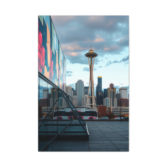
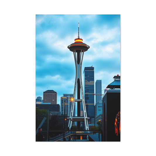
Photography is a visual language, and color is one of its most expressive dialects. While sharpness, subject matter, and composition matter, color often determines whether a photo feels balanced, jarring, soothing, or intense. Of all the color relationships available, complementary colors hold a special place. These opposing hues create dynamic contrast and aesthetic harmony, making images naturally more striking and memorable.
In this comprehensive guide, we’ll explore how complementary color theory works, how to apply it practically in your shoots, and how subtle adjustments in saturation and context can impact the emotional tone of your photography.
Color Interaction in Photography: Beyond the Surface
To create images that resonate emotionally and visually, photographers must learn to see beyond the obvious. Colors aren’t just hues—they're psychological triggers, emotional cues, and compositional tools. A photo with excellent lighting and subject matter can fall flat if the colors are poorly managed. Conversely, even the simplest scene can become captivating with the right color pairing.
Understanding color relationships gives you control over how viewers perceive your work. That’s where color theory comes in. It’s not just a designer’s tool; it's a powerful foundation for photographers as well.
Understanding the Color Wheel and Its Importance
At the heart of color theory is the color wheel—a circular diagram that organizes primary, secondary, and tertiary hues in a way that helps you understand their relationships. It serves as a map for combining and contrasting colors effectively.
There are several models of the color wheel. The most common for visual artists is the traditional RYB (red, yellow, blue) system. Digital creatives often refer to the RGB (red, green, blue) model, while printers rely on the CMY (cyan, magenta, yellow) system. Each model defines its own complementary pairs, but the principle remains the same—complementary colors sit directly opposite each other and deliver maximum contrast.
Defining Complementary Colors in Photography: The Art of Harmonized Contrast
In photography, the interplay of color is one of the most potent tools available to a visual storyteller. Among the many techniques used to enhance image composition and impact, the deliberate use of complementary colors stands out as one of the most visually compelling. These color pairs, located directly opposite each other on the color wheel, provide striking contrast and vibrant energy while maintaining a sense of visual balance. Understanding how complementary colors work—and how to apply them effectively—can dramatically improve your creative output, whether you’re capturing portraits, landscapes, or still life scenes.
What Are Complementary Colors?
Complementary colors are pairs of hues that contrast with and intensify one another when placed in close proximity. Their interaction is rooted in both optical science and psychological response. When viewed side by side, complementary colors enhance each other's brightness and clarity. When blended in pigment or digital light, they neutralize each other, producing achromatic results like gray, white, or black.
This visual phenomenon makes complementary colors exceptionally useful in photography. By employing oppositional hues strategically, photographers can create images that draw the viewer's eye naturally toward focal points, while also fostering an aesthetic equilibrium within the composition.
|
Related Catagories: |
The Science Behind Complementary Contrast
Color perception is governed by how light reflects and refracts off surfaces and how the human eye processes these wavelengths. Complementary colors, by virtue of being opposites on the color spectrum, activate different photoreceptors in the retina. This dual stimulation increases color intensity and makes adjacent colors appear more vivid.
In additive color systems like RGB (used in digital cameras, monitors, and other screens), colors are created by blending light. Here, complementary pairings include:
Red and cyan
Blue and orange
Green and magenta
Yellow and purple (in extended RGB-HSL hybrids)
These combinations produce the highest visual contrast and are frequently used in commercial photography, film grading, and digital post-processing to evoke emotional intensity or direct attention.
In subtractive color models such as RYB (red, yellow, blue), traditionally used in painting and print media, classic complementary pairings are:
Red and green
Yellow and violet
Orange and blue
These relationships are foundational in classical color theory and remain widely relevant in practical photography, especially when styling shoots with physical objects, garments, or environmental elements.
How Complementary Colors Enhance Photography
When used skillfully, complementary color schemes can bring out the best in a composition. These pairs not only provide visual tension but also create a natural balance that feels both energizing and harmonious. Some of the key benefits include:
Increased Subject Isolation
Using a complementary background color can help a subject stand out dramatically without the need for excessive lighting or digital manipulation. For instance, a red subject set against a cyan backdrop will immediately pop, making the color separation intuitive and compelling.
Mood Amplification
Complementary colors often bridge the divide between warm and cool tones, which helps evoke mood. Blue and orange, for example, can simultaneously convey calm and energy, a balance that is ideal for storytelling through environmental portraiture or travel photography.
Enhanced Emotional Resonance
Each color triggers emotional responses on its own. When combined with its complement, this psychological effect is magnified. Yellow evokes optimism, and purple suggests luxury and depth. Together, they create a palette that is rich, expressive, and memorable.
Compositional Balance
When a photographer uses complementary colors evenly in a frame, the viewer's eye moves comfortably between visual elements. This creates rhythm and flow in the image, helping guide the viewer through the story being told.
Practical Applications Across Genres
Complementary colors are versatile tools that can be adapted to nearly every genre of photography. Here’s how they can be used effectively across different styles:
Portrait Photography
Using complementary backdrops, wardrobe, or lighting gels can instantly elevate the mood and focus in portraits. A magenta dress on a green sofa, or a cyan light hitting a subject in red clothing, adds vibrancy and emotional tension without feeling forced.
Landscape and Nature Photography
Nature provides countless examples of complementary colors—think of the orange hues of a desert contrasted against a clear blue sky, or a red barn nestled in green fields. Recognizing and framing these relationships can enhance the natural beauty of outdoor scenes.
Fashion and Editorial Work
In high-fashion or conceptual photography, bold complementary contrasts are often used to add drama and style. Pairing a yellow outfit against a rich purple set design or styling blue-toned lighting with orange accessories can produce magazine-worthy visuals with high impact.
Food Photography
Color psychology plays a major role in food presentation. Complementary color schemes, like green garnish on red pasta sauce or a blue napkin under a slice of orange cake, can make dishes appear more appetizing and professionally styled.
Tips for Using Complementary Colors Intentionally
While complementary color schemes are naturally powerful, using them effectively requires thought and finesse. Here are several techniques to keep your compositions elegant and not overwhelming:
Use One Dominant Color: Allow one of the complementary colors to dominate the frame while the other acts as an accent. This prevents the image from feeling too chaotic or visually cluttered.
Adjust Saturation Levels: Playing with the intensity of hues allows you to control mood. Muted tones create sophistication, while high-saturation combinations lend themselves to playful or energetic aesthetics.
Balance with Neutrals: Introducing neutral colors like gray, beige, or white can soften the interaction between two strong complements, making the photo feel more refined.
Leverage Lighting: Colored lighting or gels can simulate complementary contrast even when wardrobe or environment lacks color variation. For example, a cyan key light paired with a red background instantly delivers compelling contrast.
Post-Processing Enhancements: Use color grading tools in editing software to subtly enhance or introduce complementary tones. Split toning and selective color adjustments allow you to reinforce natural contrasts without overprocessing.
Exercises to Practice Complementary Color Use
To develop a natural eye for these color relationships, try incorporating them in personal photography exercises:
Still Life Studies: Arrange objects in one dominant hue against backgrounds or props in the complementary color. Document how lighting affects the perceived contrast.
Street Photography Scavenger Hunt: Challenge yourself to find real-world examples of complementary colors in urban environments—such as signage, clothing, graffiti, or storefronts.
Split Tone Experimentation: Convert an image to black and white, then reintroduce color using complementary pairs in the highlights and shadows. Observe the difference in visual tone and emotional impact.
Why Complementary Colors Create Visual Impact in Photography
In the realm of photography, the use of color is more than a stylistic choice—it is a sophisticated language that communicates mood, emotion, and meaning. Among the most powerful combinations within that language are complementary colors. These pairings, positioned directly opposite each other on the color wheel, create a natural visual contrast that captures attention, evokes emotion, and delivers harmony and drama in a single frame.
Understanding why complementary colors have such profound visual impact goes beyond simple aesthetic preference. It involves biology, color theory, perception, and design principles. Once you grasp how and why these colors resonate so deeply, you can begin to apply them deliberately in your compositions for maximum artistic effect.
The Science Behind Visual Attraction
Complementary colors—such as red and green, blue and orange, or yellow and purple—are rooted in the fundamental mechanics of light and vision. Our perception of color stems from the way our eyes process different wavelengths of light through photoreceptor cells known as cones.
There are three types of cones in the human eye, each sensitive to either red, green, or blue wavelengths. When we look at complementary colors, opposing wavelengths are simultaneously activated, creating a vibrant neurological stimulation. This heightened activity results in a sensation of visual tension, which the brain perceives as dynamic and captivating.
For example, when viewing a red object placed next to cyan, both the red-sensitive and green/blue-sensitive cones in the eye are engaged. The intense interplay between these opposing signals demands attention, holding the viewer's gaze longer than analogous or monochromatic combinations would.
The Harmony in Contrast
Though they are visual opposites, complementary colors work together because they offer both contrast and balance. This duality—opposition and harmony—mimics natural visual phenomena, making it particularly pleasing to the human eye.
Our visual system is hardwired to seek equilibrium. When two complementary hues are placed side by side, they reinforce one another’s intensity without overwhelming the viewer. One color acts as a visual anchor while the other introduces energy and dynamism.
This equilibrium allows photographers to create compositions that feel complete and deliberate. A model in a violet gown posed against a sunflower field, or a turquoise plate holding slices of orange fruit—these scenes are compelling because they satisfy the viewer’s innate craving for chromatic balance.
The Psychological Power of Opposing Colors
Complementary colors do more than stimulate our eyes—they evoke emotions and psychological reactions. Each hue carries its own connotations, and when paired with its opposite, those associations are often magnified.
Red and green: Red suggests passion and urgency, while green conveys calm and nature. Together, they create tension and resolution.
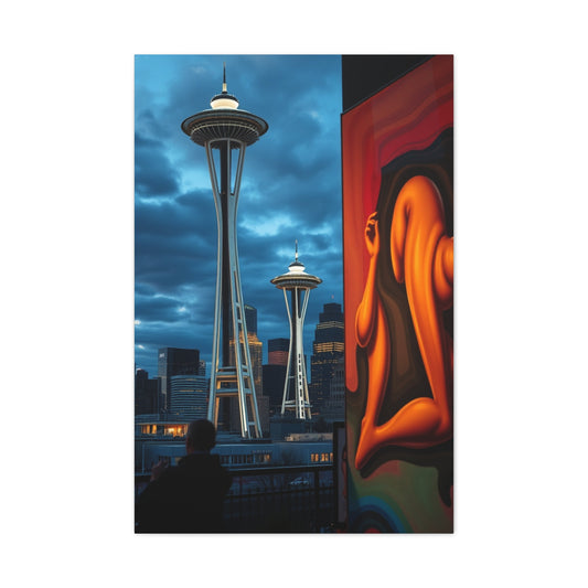
Blue and orange: Blue is associated with serenity, while orange represents energy and excitement. This combination evokes both cool contemplation and vibrant action.
Yellow and purple: Yellow exudes optimism and warmth; purple suggests depth and luxury. Their pairing symbolizes creativity and regal contrast.
These psychological interactions are why complementary colors are frequently used in visual storytelling across film, advertising, fashion, and photography. They help establish atmosphere, define characters or products, and elicit emotional responses—often without the viewer consciously realizing it.
Enhancing Composition and Focus
From a compositional standpoint, complementary colors are highly effective at guiding the viewer’s eye through an image. They naturally draw attention to focal points and create strong separation between subject and background.
In portraiture, for example, using a complementary-colored backdrop can make the subject’s clothing, skin tone, or accessories stand out more clearly. A subject wearing magenta posed against lush greenery will not only pop from the frame but also feel more anchored within the scene.
Similarly, in product photography, placing an object against a complementary background color enhances its form and increases perceived contrast. This method is often used in branding and e-commerce to make products more desirable and visually distinctive.
Creating Movement in Static Frames
Still photography, by nature, captures a single moment in time. One of the challenges in this medium is generating a sense of dynamism or flow within a static composition. Complementary colors can solve this by introducing visual rhythm and kinetic energy.
Because the eye is so responsive to complementary contrasts, it moves back and forth between opposing colors within the frame. This movement creates the illusion of motion or progression, even though the subject remains still. It keeps the viewer engaged, scanning and re-scanning the image in a loop.
In this way, color contrast becomes a compositional tool just as powerful as leading lines or rule-of-thirds placement. It adds dimensionality and narrative energy without relying on overt action or special effects.
Minimal Editing, Maximum Effect
One of the greatest advantages of using complementary colors is that their impact requires very little digital enhancement. When properly captured in-camera—through intentional styling, lighting, or background selection—the colors speak for themselves.
This not only reduces the need for excessive retouching but also preserves the authenticity of the image. Complementary color contrast appears natural and organic, making it ideal for editorial photography, lifestyle shoots, and artistic work where authenticity is key.
Photographers can harness these combinations through wardrobe styling, location selection, or even post-processing adjustments in hue and saturation. However, the best results often come from anticipating the effect and building it into the shoot from the start.
Subtlety in Saturation
While high-saturation complementary colors are immediately eye-catching, subtle variations can be equally powerful. Desaturated complementary tones produce elegant, sophisticated visuals that retain the balance and tension without overwhelming the viewer.
For instance, a dusty blue paired with a muted terracotta still offers a complementary relationship, but with a softer and more nuanced impact. These kinds of palettes are ideal for wedding photography, lifestyle branding, and fine art, where subtle emotion and tonal harmony are often preferred over visual intensity.
Understanding how to manipulate saturation levels allows photographers to adapt the principle of complementary contrast to a wide variety of styles and genres.
Working with Color Models in Photography: Understanding Color Systems for Creative Control
Color is a fundamental tool in photography, but the way we interpret and apply it is influenced by the color model being used. Color models are systems that define how colors are formed and interact with each other, whether through light, pigment, or ink. For photographers, understanding these models is critical for composing scenes, adjusting tones during post-processing, and preparing files for print or digital platforms.
Each model has its own logic, its own set of primary and secondary hues, and importantly, its own complementary color pairings. By working within the framework of these systems, photographers can make deliberate creative decisions that enhance contrast, direct attention, and evoke mood. The three most relevant color models in photography are RYB (Red, Yellow, Blue), RGB (Red, Green, Blue), and CMY (Cyan, Magenta, Yellow).
The RYB Model: A Painter’s Approach to Color Composition
The RYB model is one of the earliest color systems, primarily rooted in traditional art and design. It is often taught in art schools and used when dealing with physical media like paint or fabric. In this model, red, yellow, and blue are considered the primary colors. When mixed, they form the following secondaries:
Red mixed with yellow produces orange
Blue mixed with red creates purple
Yellow and blue combine to form green
From this wheel of primary and secondary colors, the complementary pairings emerge:
Red and green
Blue and orange
Yellow and purple
These combinations are frequently used in styling photo shoots with physical elements such as clothing, props, or painted surfaces. The RYB model is especially useful in still life photography, fine art portraiture, and any scene where tangible objects and real-world lighting are used to build compositions. While not as precise as digital models, RYB remains a powerful conceptual framework for understanding color relationships in physical environments.
The RGB Model: The Foundation of Digital Imaging
In digital photography, the RGB color model is the standard. It is based on the way electronic screens emit light, using red, green, and blue as its primary colors. Through combinations of light at various intensities, every color you see on a screen is created. When red, green, and blue light overlap at full strength, they produce white.
In this model, the complementary pairs are:
Red and cyan
Green and magenta
Blue and yellow
These combinations are essential for anyone working with digital images, whether editing photos, color grading videos, or designing for online platforms. The RGB model is central to understanding how cameras capture light and how images appear on displays.
For photographers using editing software like Lightroom or Photoshop, knowledge of RGB complements is invaluable. When adjusting shadows and highlights or using split toning, understanding which hues oppose each other in this model helps maintain balance and natural contrast in the image. For example, when correcting green color casts in portraits, subtle magenta shifts can restore skin tone realism.
RGB complementary colors are also prominent in visual storytelling, marketing visuals, and social media content, where attention-grabbing contrast and emotional tone are critical.
The CMY Model: Critical for Printing and Physical Output
The CMY model, often extended to CMYK with the addition of black, is the subtractive color model used in printing. It functions differently from RGB because it deals with how light is absorbed and reflected from surfaces rather than emitted. Cyan, magenta, and yellow are the primary colors in this model. When combined, they ideally absorb all light and produce black, although black ink is added to enhance depth and clarity.
In the CMY model, the complementary pairs are:
Cyan and red
Magenta and green
Yellow and blue
These relationships are especially relevant when preparing images for print. What looks vibrant and well-balanced on a screen in RGB may shift dramatically in CMY if color conversion is not handled properly. This is why photographers who regularly produce prints, photo books, or gallery work need to understand how these complements interact.
For instance, when printing a landscape with a blue sky and golden tones, maintaining the yellow-blue balance in CMY ensures the final output reflects the same contrast and emotion seen in the digital version. Many photographers rely on soft proofing techniques to simulate CMY output before sending files to a printer.
|
Related Catagories: |
Applying Color Models in Real-World Photography Workflows
Each color model serves a different purpose, and understanding when and how to use each can dramatically improve consistency across creative and technical workflows.
RYB is best used when styling or concept planning with physical media. It is especially helpful in art direction for fashion shoots, portrait setups, and environments where tangible color interactions are part of the scene design.
RGB dominates the digital space. It is the default model for cameras, editing software, monitors, and online publishing. Most color corrections, enhancements, and creative grading decisions are made within this model.
CMY, or CMYK in full printing contexts, is essential for output and color accuracy in printed materials. Whether preparing an exhibition print or a commercial brochure, understanding this model prevents color shifts and maintains visual integrity.
Using Complementary Colors Within Each Model
To maximize visual impact, photographers can apply complementary pairings directly within each model. Some practical examples include:
Using red and green in an RYB-styled shoot with Christmas-themed props or a warm-toned portrait against a garden backdrop
Applying blue and orange lighting in an RGB-based cinematic edit to create emotional duality in a moody portrait session
Balancing cyan and red in CMYK proofing when finalizing an editorial spread that includes skin tones and colored backgrounds
Each model allows for precise and intentional use of complementary hues. Depending on whether you're creating content for a screen or a printed format, switching between models and their respective complements ensures the best visual results.
Applying Complementary Colors in Real Photography: Crafting Powerful Visuals with Color Contrast
Color is more than just a visual element in photography—it’s an emotional and compositional powerhouse that can elevate a photograph from ordinary to captivating. Among the many techniques available to photographers, using complementary colors is one of the most effective and visually compelling. These color pairings, found on opposite sides of the color wheel, offer a natural way to enhance contrast, create balance, and draw the viewer’s eye exactly where you want it.
Complementary colors are as different as hues can be, yet their pairing results in a harmonious contrast that adds visual depth and storytelling potential to an image. When applied with intention, these combinations infuse a photograph with energy and character, often requiring minimal post-production.
How Complementary Colors Work in Real Scenes
Complementary color schemes are not just theoretical—they appear frequently in real-life situations, both naturally and through creative styling. Photographers who train their eyes to spot these relationships will find endless opportunities to craft striking compositions across various genres.
Here are a few vivid examples of complementary colors at work in photography:
A turquoise ocean behind an orange surfboard highlights the refreshing serenity of the sea while drawing attention to the subject’s movement and vibrancy.
A model wearing a magenta jacket posed against a green wall creates dynamic contrast that is fashionable and editorial, ideal for lookbooks or portrait portfolios.
Yellow sunflowers framed against a violet twilight sky not only emphasize nature’s color palette but also establish mood, emotion, and the fleeting beauty of dusk.
Red berries scattered across a cyan dish deliver contrast in both color and texture, making food photography feel more artistic and appetizing.
In each case, the complementary pairing isn’t merely pleasing—it guides visual flow and anchors the subject within the scene. This balance between contrast and harmony enhances the photo’s impact and makes the composition more engaging.
Using Complementary Colors in Different Photography Genres
Complementary color theory is highly versatile and can be tailored to fit virtually any type of photography. Let’s explore how it can be used in various shooting contexts to create compelling visuals.
Portrait Photography
In portraiture, complementary colors can help isolate the subject from the background and create emotional tone. A red dress worn by a subject standing against a green field doesn’t just create pop—it tells a story of confidence and balance. Similarly, warm skin tones can be complemented with cooler-toned backdrops like teal or cyan, providing soft visual tension that flatters without overwhelming.
Wardrobe stylists and makeup artists often coordinate complementary colors to create cohesiveness in themed shoots, particularly for fashion photography. Combining a tangerine lip color with a blue-toned background, for example, will make facial features stand out with clarity and style.
Landscape Photography
Nature is a masterful colorist, offering photographers ample opportunities to apply complementary hues. The interplay between orange sandstone and blue desert skies, or the golden glow of autumn leaves against deep violet shadows during sunset, presents a rich palette for creative expression.
Landscape photographers can enhance these color contrasts through strategic framing, timing, and light control. Capturing a field of purple lavender at golden hour adds a dreamy yellow tone to the light, naturally introducing the complementary counterpart.
Still Life and Product Photography
Product photography greatly benefits from the use of color contrast, especially when the goal is to highlight form, texture, or brand identity. A skincare product with a green label can be placed on a magenta surface to enhance its visibility without appearing too staged. In food photography, complementary pairings not only catch the eye but can also influence perceived flavor and freshness. A blue ceramic plate makes orange curry pop, while a background of leafy green enhances the ripeness of strawberries or cherries.
Using this technique in flat lays, tabletop arrangements, and e-commerce photography can increase viewer engagement and boost conversion by creating images that linger in memory.
Street and Travel Photography
In more candid or spontaneous photography, such as travel or street shoots, being able to recognize and quickly capture complementary color moments adds life and vibrancy to your portfolio. Think of a person in a yellow raincoat walking past a wall painted in rich purple, or traditional market stalls filled with red spices beneath green awnings.
Training your eye to spot these opportunities in everyday surroundings enables you to create balanced compositions that convey the energy of real-world settings. Travel images often benefit from this natural vibrancy, helping tell cultural stories through color symbolism as well.
Color Pairing Tips for Photographers
Whether you’re setting up a stylized shot or working with available light and real-world scenes, these tips can help you use complementary colors more effectively:
Let one color dominate. If both hues are highly saturated, the image can become visually overwhelming. Make one the primary color and use the complementary as an accent.
Adjust tone and saturation. Muted or pastel complementary colors can be just as effective and more subtle, which is useful for fine art, documentary, or lifestyle photography.
Balance with neutrals. Introduce gray, white, or black elements to soften the intensity and keep the color pairing from feeling too stark.
Use light to guide color balance. Colored gels, time of day, and natural lighting conditions can all enhance or mute complementary tones.
Consider emotional impact. Complementary colors do more than look good; they also convey emotional opposites. Use this psychological effect to support the story your image is telling.
Real-World Exercise to Practice Complementary Colors
A simple way to sharpen your skill in identifying and using complementary colors is to build a personal photography challenge. Here’s how you can start:
Choose one complementary pair to focus on for a full day of shooting, such as orange and blue.
Look for environments, objects, or clothing that match either hue and then seek out its counterpart.
Compose your shots around the tension and harmony between those colors, playing with positioning, framing, and exposure.
At the end of the day, review your images to study which compositions feel most balanced or dramatic.
This hands-on practice will gradually train your eye and enable you to incorporate complementary contrast into your work intuitively.
Controlling Contrast Through Saturation
Using complementary colors doesn't always mean pushing your image into vibrant extremes. While high saturation does create stronger visual impact, sometimes a softer approach is more suitable. Many successful compositions use muted complementary tones to maintain harmony and mood.
For example:
A dusty rose paired with sage green offers a gentle contrast perfect for lifestyle branding
Burnt orange and steel blue provide a rustic and editorial feel
Soft lavender against buttery yellow creates a pastel dreamscape for food or children’s photography
Photographers can adjust the vibrancy of one or both colors to control the intensity of the visual message. Lower saturation leads to a more sophisticated and subtle aesthetic, making this technique useful in weddings, boudoir, and documentary work.
Color Pairing Challenge for Photographers
To train your eye for complementary pairings, you can try a hands-on color-blocking exercise. This is a powerful visual experiment that enhances your understanding of color tension, balance, and saturation in composition.
Step 1: Set the Scene with a Background
Choose a flat background in a bold, singular color. Large pieces of craft paper, foam boards, or vinyl backdrops work well. Avoid textures or gradients so that the focus remains on color interaction.
For instance, pick a deep royal blue background.
Step 2: Choose a Subject with a Complementary Hue
Next, select an object or subject with the color that sits opposite on the wheel. If you’re using blue, reach for something in the orange family. A ripe tangerine, copper sculpture, or a pumpkin could work beautifully.
Natural colors are ideal, but don’t hesitate to use fabric, props, or paint if needed. This is your visual lab—experimentation is encouraged.
Step 3: Build the Composition
Arrange your elements with simplicity. Use a familiar angle—overhead, side-lit, or front-facing. Focus on isolating the two dominant colors. Let them play off each other. Watch how shadow and light influence the pairing.
Now repeat the process with another color duo. Try magenta and green, then red and cyan. Observe how each combination changes the mood and rhythm of the image.
Over time, your ability to perceive and manipulate color relationships will become second nature.
Integrating Complementary Color Theory in Various Genres
The beauty of complementary colors is that they are universal across genres. Here’s how different photographers can apply them:
Portrait photographers can use makeup, clothing, or background contrast to make subjects pop.
Landscape photographers might capture sunsets behind blue mountains or green fields with red barns.
Food photographers often use blue plates for orange dishes or green herbs against pink backgrounds.
Product photographers can highlight a product using a background in its complementary hue to draw attention naturally.
In every scenario, the use of complementary tones enhances visual storytelling by reinforcing focal points and creating cohesion in color structure.
Creating Emotional Impact with Color Choices
Beyond contrast, colors evoke emotions. Warm tones like red, orange, and yellow energize, while cool tones like blue, green, and purple calm and relax. When complementary colors are used strategically, they can reinforce the mood of the image.
Blue and orange can represent both peace and energy—a calm beach with a lively sunset
Red and green often represent passion versus balance—think of a red dress in a lush forest
Purple and yellow combine royalty and joy—great for high-end fashion or expressive portraits
Learning to interpret the emotional resonance of each pairing enables you to communicate more deeply through your imagery.
Final Reflections on Color Harmony in Photography
In a world saturated with visuals, understanding color gives you an edge. Complementary colors offer one of the most accessible yet powerful ways to improve your compositions without additional gear or post-processing tricks.
Using them intentionally can:
Direct attention to key elements
Enhance subject separation
Add emotional weight
Make your images more memorable
As you continue your photographic journey, pay closer attention to the colors in your environment. Study how nature balances hues and how design leverages contrast. The more you observe, the more effortlessly you’ll begin to use color as a storytelling tool.
So next time you reach for your camera, think beyond exposure and framing. Ask yourself: how are the colors working together—or against each other—and how can you use that tension to tell a better visual story?
Master the color wheel, experiment with complementary hues, and watch your images evolve from visually pleasing to genuinely captivating.


