Cool-toned wall art transforms homes by infusing calm, sophistication, and visual harmony. From tranquil bedrooms to dynamic kitchens, serene bathrooms, focused offices, and flowing hallways, these shades of blue, green, grey, and muted purple enhance every space. This guide explores creative ways to incorporate cool hues in wall art, balancing elegance, personal expression, and cohesion across all room styles.
The Allure of Cool Colors in Interior Spaces
The moment one steps into a home defined by shades of blue, green, grey, and subtle purples, there is an immediate shift in perception. These colors, often described as cool tones, carry a remarkable ability to alter not only the atmosphere of a room but also the state of mind of its occupants. Cool-toned wall art extends far beyond decorative appeal; it speaks to an emotional register rooted in calm, poise, and understated elegance.
|
Related Catagories: |
Every hue within this spectrum possesses its own subtle character. A deep navy canvas resonates with authority and refinement, while a misty sage green photograph communicates freshness and tranquility. Pale lavender paintings whisper of delicacy, whereas strong graphite-inspired art offers structure and stability. By embracing wall art with cool tones, homeowners create a layered language that influences the rhythm of everyday life.
The Psychological Impact of Cool-Toned Artwork
Psychologists have long studied the influence of color on human emotions, and the findings are both fascinating and applicable to interior design. Cool tones consistently rank as colors that encourage serenity, introspection, and clarity. A canvas awash in ocean blue can subconsciously slow heart rates and invite deeper breathing, while greens reminiscent of forest foliage often promote feelings of rejuvenation and renewal.
Grey, though sometimes underestimated, provides grounding. When incorporated through photography, abstract textures, or minimal compositions, grey artwork cultivates balance, tempering both vibrant and muted surroundings. Purple, often tied to creativity and contemplation, introduces an enigmatic quality that sparks imagination. Collectively, cool-toned wall art crafts an ambiance that nurtures reflection, productivity, and comfort.
The brilliance of these shades lies in their adaptability. Unlike certain bold colors that dominate a space, cool hues integrate seamlessly, creating harmony rather than competition. This quality makes them invaluable when selecting artwork to enhance interiors across diverse design styles.
The Evolution of Cool Tones in Art and Décor
The preference for cool tones in decorative art has historical roots. Ancient civilizations used lapis lazuli pigments in frescoes to symbolize wisdom and eternity. The Renaissance period embraced verdant backdrops and muted violets to lend depth and sophistication to portraiture. In more contemporary movements, abstract expressionists explored the emotional intensity of cobalt and turquoise, while modern minimalists turned to silvery greys and icy blues to emphasize clarity and restraint.
This continuum demonstrates that cool tones are not bound by time or trend. They have proven resilient across centuries of shifting aesthetics. By incorporating wall art steeped in these shades, a homeowner taps into a visual lineage that honors both tradition and innovation.
Integrating Scale and Proportion
Selecting wall art is never solely about color; scale and proportion are equally important. Cool-toned artwork offers unique flexibility when it comes to size. Large panels drenched in soft aquamarine can dominate a wall without overwhelming the eye, while smaller framed pieces in lilac or slate grey add whispers of refinement in compact areas.
When arranging art in a gallery wall composition, alternating tones of cool blues and greens creates a natural rhythm. The eye moves gently from one piece to the next, avoiding the sense of clutter that often arises with warmer palettes. Cool hues allow negative space to remain a design element, granting breathing room and coherence.
Textural Interplay with Cool Colors
The relationship between texture and tone plays a pivotal role in how artwork is perceived. Cool colors respond differently depending on whether they are presented on glossy finishes, matte canvases, or layered mixed-media surfaces.
A glossy teal print exudes vibrancy, catching the light and energizing the room, while a matte charcoal piece conveys quiet dignity. Embossed or textured paintings in pale grey add dimensional depth, making a wall feel tactile and dynamic. Pairing such artwork with textiles—linen curtains, wool throws, or velvet cushions—amplifies the sensory dialogue between sight and touch.
Cool-toned art also harmonizes beautifully with natural textures. A moss-green abstract beside stone detailing, or a soft periwinkle photograph against reclaimed wood, produces a balanced aesthetic that feels organic yet curated.
Architectural Styles and Cool Wall Art
The adaptability of cool-toned artwork shines when considered against varying architectural backdrops.
In modernist homes with sharp lines and open spaces, expansive blue and grey canvases echo the architecture’s clean geometry. Minimalist interiors benefit from singular, oversized pieces in muted greens that uphold the principle of simplicity while adding vitality.
Traditional spaces thrive with framed paintings in deep purples and forest greens, enhancing their timeless quality. Industrial lofts gain contrast from steel-inspired grey artwork, which resonates with exposed metal beams and concrete textures. Coastal homes, naturally inclined toward cool hues, are enriched by oceanic art that blurs the line between inside and outside.
No matter the architectural context, cool-toned wall art adapts without losing its character, proving its universality.
Mood Zones Through Color Placement
An overlooked dimension of cool-toned art is how strategic placement can create mood zones within a home. In a workspace, a tranquil blue landscape fosters focus and reduces stress. A hallway with gradient green prints subtly energizes movement through transitional areas.
Bedrooms become sanctuaries with soft lilac or pale grey art that promotes rest, while living rooms benefit from bold teal abstracts that spark conversation without causing overstimulation. The idea is not merely decoration but orchestrating emotional flow through color-coded zones.
The Subtle Power of Grey in Artwork
Among cool hues, grey deserves particular attention. It is often misjudged as bland, yet its power lies in versatility. Grey artwork functions as a stabilizing force, grounding both colorful and neutral interiors. It can appear sleek in a contemporary setting, timeless in a classic space, or edgy in an industrial loft.
Artists often employ grey as a mediator within a piece, balancing brighter shades or providing contrast against white. In wall art, this neutrality transforms into a canvas for harmony, enabling surrounding furniture and accessories to shine. A smoky charcoal print over a fireplace or an ash-toned geometric canvas in a study elevates the sophistication of a room.
Incorporating Purple for Creative Expression
Purple, though less common than blue or green, is a valuable component of cool-toned wall art. Soft lavenders convey grace and tranquility, while deeper shades like amethyst introduce intrigue and artistic flair. When integrated thoughtfully, purple pieces encourage creativity and contemplation.
A violet-hued abstract in a studio inspires innovation, while a lilac floral painting in a guest room communicates charm and comfort. Pairing purple with greys or greens creates an unconventional yet striking combination, enriching the visual tapestry of a home.
Cool-Toned Art as Seasonal Adaptation
Cool-toned wall art also offers flexibility across seasons. In summer, light aqua and mint accents mirror refreshing outdoor energy, keeping interiors airy. During winter, deep navy or forest green pieces reflect introspection and coziness. Unlike trend-driven décor, cool colors maintain relevance year-round, adapting their resonance to shifting climates and moods.
This adaptability ensures that investment in cool-toned art remains worthwhile, offering perennial style rather than fleeting appeal.
Large Statement Pieces Versus Curated Collections
Homeowners often debate between investing in a singular large artwork or curating a series of smaller pieces. Cool tones excel in both formats. A massive indigo seascape above a sofa commands attention and sets the emotional tone for the entire space. Conversely, a collection of smaller teal, sage, and silver prints arranged thoughtfully along a corridor produces rhythm and narrative.
Both approaches carry weight depending on the intent. Statement pieces function as anchors, while collections create dialogue and continuity. Cool tones make either path visually coherent, ensuring balance regardless of arrangement.
Blending Art with Functional Elements
Beyond pure decoration, cool-toned wall art can be woven into functional elements of a home. For example, custom panels in sea-glass hues can act as room dividers, while grey-toned murals enhance acoustic panels or sliding doors. Kitchen backsplashes and bathroom tiles inspired by abstract artwork demonstrate how practical surfaces can double as artistic expressions.
By integrating art into utility, the cool palette transcends the role of ornamentation, embedding itself into the very structure of daily living.
Curatorial Strategies for a Cohesive Look
To curate a home that feels intentional, consider consistency across tones while allowing variation in form and subject matter. A living room dominated by blue should include different shades, from soft powder tones to rich midnight, for layered depth. Green pieces in various textures—photography, prints, textiles—prevent monotony while upholding unity.
Balance cool hues with metallic accents like silver or chrome for modern sharpness, or with natural wood tones for warmth. The curatorial process transforms disparate pieces into a visual narrative, where each artwork contributes to an overarching story.
The Harmony of Light and Cool Colors
Lighting profoundly influences how cool-toned wall art is experienced. Natural light enhances blues and greens, making them feel airy and expansive. Soft evening lighting draws out the richness of purples and greys, adding drama and intimacy.
Strategic placement of lamps or directional spotlights can emphasize texture and color gradation within artwork, ensuring it remains a focal point regardless of time of day. By harmonizing light with art, homeowners amplify the emotional and aesthetic qualities of cool tones.
The Bedroom as a Sanctuary
The bedroom is a deeply personal space, reserved not only for rest but also for moments of retreat, contemplation, and emotional recharge. Wall art within this environment carries immense power, influencing mood and shaping the sensory experience of the room. Cool tones—spanning tranquil blues, grounding greys, soothing greens, and enigmatic purples—offer the perfect palette for bedrooms. They provide a balance between relaxation and character, ensuring that the space feels serene without slipping into monotony.
Bedrooms demand a careful calibration of atmosphere. Unlike communal rooms where bold expression thrives, this domain benefits from hues that whisper rather than shout. Cool-toned wall art achieves this equilibrium, becoming a central element in designing restful yet visually intriguing environments.
The Psychology of Restful Hues
Color psychology plays a pivotal role in sleep quality and emotional regulation. Shades of blue, particularly sky and ocean tones, have been linked to reduced blood pressure and slower heart rates, making them ideal for bedrooms. A large canvas in cerulean or turquoise becomes more than decoration; it becomes an agent of calm.
Greens, especially soft sage or muted moss, evoke natural landscapes and promote renewal. They create a connection to the outdoors, aligning the body’s rhythm with cycles of growth and restoration. Grey acts as a stabilizer, neutralizing overstimulation and anchoring the visual palette. Purples, especially lighter lavender shades, add a subtle undertone of luxury and creativity, nurturing an environment where both sleep and inspiration can coexist.
When curated thoughtfully, these tones envelop the room in a cocoon of serenity, enhancing not only its aesthetic quality but also its restorative potential.
Minimalist Bedrooms and the Elegance of Simplicity
Minimalism in bedroom design is characterized by restraint and intentionality. In this aesthetic, clutter is stripped away, allowing each detail to carry significance. Cool-toned wall art naturally complements this philosophy, embodying calm precision while preventing the space from appearing stark.
A single oversized canvas in navy or steel grey above the bed acts as an anchor, echoing the clean lines of minimalist furniture. Abstract geometric pieces in teal or ice-blue provide structure without excess. Even photography with muted tones—misty landscapes or architectural silhouettes—can integrate seamlessly into pared-down interiors.
The absence of embellishment in minimalist bedrooms requires that every object serves a purpose. Cool-toned art fulfills that role by offering visual depth and emotional resonance without disturbing the purity of the design.
Modern Bedrooms and Bold Cool Statements
Modern bedrooms thrive on a balance between sleek sophistication and playful creativity. Cool-toned wall art enhances this by introducing vibrant contrasts and eye-catching details. Unlike minimalism’s restraint, modern design embraces statement-making elements while maintaining order.
Deep emerald prints paired with chrome frames create a sharp, futuristic effect. Indigo abstracts with metallic accents lend drama without overwhelming the space. Multi-panel canvases in teal gradients stretch across wide walls, adding movement and rhythm.
Modern interiors also embrace technology-driven innovation, making LED-lit wall art in icy blues or digital prints in layered purples exciting choices. The interplay between bold cool colors and modern materials—glass, steel, acrylic—produces an environment that is both calming and cutting-edge.
The Charm of Eclectic Bedrooms
Eclectic bedrooms celebrate individuality, layering diverse styles into a cohesive narrative. Here, cool-toned wall art becomes the thread that unites an otherwise varied collection of objects, textures, and colors.
A gallery wall featuring prints in turquoise, lavender, and slate grey can tie together mismatched furniture and textiles. Vintage botanical illustrations in sage tones harmonize with bohemian textiles, while abstract blue works balance more ornate or global-inspired details.
The versatility of cool tones allows eclectic bedrooms to maintain cohesion without restricting creative freedom. Each piece of wall art contributes to a symphony of influences, guiding the eye through the room while retaining a sense of harmony.
Intimate Corners and Niche Displays
Bedrooms often include overlooked areas—reading nooks, dressing spaces, or alcoves—that can benefit from carefully chosen wall art. Smaller cool-toned works bring intimacy to these corners, transforming them into purposeful retreats.
A lavender sketch above a vanity adds softness, while a moss-green watercolor in a reading nook fosters grounding. Grey-toned photography hung beside a wardrobe creates cohesion with neutral textiles. These subtle interventions emphasize that wall art is not confined to the main focal wall but can enrich even the smallest corners with mood and meaning.
Layering Art with Textiles
The success of bedroom design often lies in the interplay between wall art and textiles. Cool tones thrive when mirrored in bedding, throws, or rugs, creating visual echoes that connect different elements.
A navy abstract above the bed feels more intentional when paired with indigo cushions. A teal seascape resonates with a woven rug in complementary shades. Grey photography finds companionship in linen bedding, while lavender florals harmonize with delicate curtains.
This dialogue between surfaces ensures continuity and prevents artwork from feeling isolated. It weaves wall art into the fabric of the room—literally and figuratively—achieving unity across sensory experiences.
Nature-Inspired Themes for Bedrooms
Bedrooms often benefit from nature-inspired wall art, as organic imagery aligns with the body’s need for rest and reconnection. Cool tones, inherently linked to water, sky, and foliage, provide endless opportunities for natural motifs.
Watercolor paintings of forest paths, photographic prints of ocean waves, or abstract renderings of night skies bring the tranquility of nature indoors. By choosing wall art that mimics outdoor settings, the bedroom becomes an extension of the natural world, gently coaxing the mind toward relaxation and restorative sleep.
Symbolism in Cool-Toned Bedroom Art
Beyond aesthetics, wall art can carry symbolic resonance. Blue has long been associated with trust and stability, making it a reassuring presence in a private sanctuary. Green symbolizes growth and healing, nurturing the body’s restorative cycles. Grey reflects neutrality and balance, tempering fluctuations in mood. Purple, especially in subdued shades, embodies introspection and spirituality, ideal for quiet moments before rest.
The symbolic qualities of these colors, when embedded in wall art, reinforce the bedroom’s role as a space of renewal. They extend beyond visual beauty, embedding layers of meaning into the environment.
Scale Considerations for Bedroom Spaces
Bedrooms vary widely in size, from compact urban studios to expansive master suites. Cool-toned wall art can adapt to either extreme when scale is considered thoughtfully.
In smaller bedrooms, light-colored art in pale blue or soft grey opens up visual space, preventing the room from feeling confined. Medium-sized canvases are often preferable to avoid crowding. In larger bedrooms, bold navy or emerald statement pieces above the bed create proportion and prevent vast walls from feeling barren.
Triptychs or multi-panel designs work well in master suites, stretching across walls to mirror the breadth of the space. In contrast, single framed photographs or subtle sketches may better serve more intimate settings.
The Role of Light in Bedroom Art
Lighting profoundly shapes the way wall art is perceived, particularly in bedrooms where natural and artificial light interact in layered ways. Morning sunlight can enliven aqua or turquoise prints, while evening lamplight enhances the softness of lavender or muted green.
Directional lighting, such as bedside sconces angled toward artwork, highlights textures and brushwork, making each piece feel more dimensional. Dimmable fixtures allow homeowners to control how intense or subdued the tones appear, shifting from energizing morning vibrancy to soothing evening ambiance.
Understanding how light interacts with color ensures that wall art in bedrooms remains versatile and effective throughout the day.
Personalized Bedroom Art Choices
Bedrooms often reflect individual taste more than any other room in the home. Personalization is key, and cool-toned wall art offers a wide range of expressive possibilities.
For some, this may mean selecting abstract canvases that reflect internal states of mind. For others, it may involve framed photography from meaningful travels, particularly images featuring blue seas or green landscapes. Customized prints in grey or lavender tones can be tailored to include personal motifs, initials, or quotes, further enhancing intimacy.
Personalized art ensures the bedroom remains not only restful but also deeply connected to the identity of its occupant.
Transitioning Between Traditional and Contemporary Bedrooms
Cool-toned wall art bridges the gap between traditional and contemporary bedroom designs. In traditional bedrooms, framed oil reproductions in forest greens or muted violets integrate seamlessly with ornate headboards and antique furnishings. In contemporary spaces, minimalist blue abstracts or sharp geometric greys suit streamlined furniture and sleek finishes.
This dual adaptability ensures that regardless of style preference, cool-toned wall art finds its place. It acts as a unifying element, allowing homeowners to shift stylistic directions without needing to replace their artwork.
Subtle Luxury Through Cool Tones
Luxury in bedrooms is often communicated through restraint rather than extravagance. Cool-toned wall art provides this subtle luxury, evoking sophistication without ostentation. A large framed indigo print with gold accents introduces understated opulence. Lavender canvases paired with silver frames whisper refinement.
The understated elegance of these tones ensures the bedroom feels indulgent yet serene, capturing a balance between comfort and grandeur.
Bathrooms as Spaces of Renewal
A bathroom is often seen as purely functional, yet its potential as a sanctuary for renewal should not be underestimated. The right wall art transforms this space from utilitarian to uplifting. Cool-toned pieces—dominated by hues of blue, green, grey, and subtle purples—are particularly effective in bathrooms because they resonate with the elements of water, air, and stone. They create continuity with the natural associations of cleansing and restoration.
When curated thoughtfully, bathroom art transcends decoration. It becomes part of the ritual of daily life, shaping how one begins and ends each day. Cool tones elevate this environment into a setting that reflects both tranquility and sophistication.
Abstract Art as a Natural Fit
Bathrooms often have limited wall space, making them ideal settings for abstraction. Abstract art in cool tones thrives in this context because it introduces depth and visual intrigue without overwhelming.
A teal canvas with sweeping brushstrokes mirrors the fluidity of water. Grey and white textures evoke stone and mineral formations, echoing bathroom materials like marble and tile. Pale lavender geometric compositions lend subtle energy to small alcoves or narrow walls.
Abstract art suits modern bathrooms but adapts easily to transitional or eclectic styles. Its ability to suggest movement without literal imagery harmonizes with the bathroom’s core themes of flow and transformation.
The Connection Between Cool Tones and Water
No palette is more aligned with the bathroom environment than cool colors. Blues resemble oceans, lakes, and skies, while greens suggest riversides and lush plant life. Greys connect to rocks, pebbles, and natural minerals, and purples hint at twilight reflections over water.
When these tones appear in wall art, they amplify the room’s natural associations. A photographic print of rolling waves brings vitality, while a misty mountain lake painting introduces calm reflection. By tying directly into water symbolism, cool-toned wall art underscores the bathroom’s role as a restorative sanctuary.
Small Spaces and the Illusion of Depth
Bathrooms are often compact, requiring design choices that maximize perceived space. Cool-toned wall art has an innate ability to expand visual depth. Lighter shades—powder blue, seafoam, pearl grey—reflect light and create airiness, preventing the room from feeling confined.
Strategically placed vertical pieces elongate walls, while horizontal works widen the sense of scale. Multi-panel art in aqua or sage tones distributes imagery across a wall, encouraging the eye to travel and enlarging the visual field. These techniques turn modest bathrooms into spaces that feel open and welcoming.
Textural Interplay with Bathroom Surfaces
Bathrooms typically feature materials such as tile, glass, stone, and metal. Cool-toned wall art interacts elegantly with these surfaces, creating layered contrasts or seamless integration.
A glossy navy print mirrors polished ceramic finishes, while matte grey artwork softens the sheen of chrome fixtures. Green watercolors balance the hardness of stone floors, and lavender abstract prints bring warmth to cold marble.
This interplay between surface and art fosters cohesion. It allows the artwork to feel embedded in the architecture rather than an afterthought.
Lighting and the Role of Reflection
Lighting in bathrooms is unique because it often involves a mix of natural light, overhead illumination, and reflective surfaces. Cool-toned wall art responds dynamically to these conditions.
Morning sunlight can make aqua and turquoise prints glow with vitality, energizing the start of the day. Evening lighting emphasizes the moody depth of indigo or graphite artwork, ideal for winding down. Reflections in mirrors and glass further extend the visual presence of artwork, doubling its impact.
Adjustable lighting or dimmable fixtures enhance this versatility, allowing cool-toned pieces to shift their character with the rhythm of daily rituals.
Spa-Like Atmospheres Through Art
Bathrooms are increasingly designed as personal spas, offering relaxation and rejuvenation. Wall art plays a central role in cultivating this spa-like atmosphere, with cool tones as the natural choice.
Soft grey photography of stones, minimal aqua abstracts, or botanical sketches in sage tones contribute to a holistic wellness aesthetic. Combined with elements like scented candles, greenery, and textured towels, the art completes the sensory experience.
Such spaces become immersive environments where sight, scent, and touch converge, turning daily hygiene into a ritual of renewal.
The Balance of Bold and Subtle Choices
Bathrooms invite experimentation with scale. A single bold piece in cobalt blue above a freestanding tub commands attention and sets a luxurious tone. Alternatively, a series of subtle prints in soft lavender along a narrow wall introduces understated charm.
The decision between bold and subtle depends on the function and mood of the bathroom. Guest bathrooms benefit from striking, memorable statements, while private en suites often flourish with gentle, calming works that enhance relaxation.
Cool-toned art accommodates both approaches, offering a spectrum from dramatic impact to quiet elegance.
Integrating Nature Motifs
Nature-inspired motifs resonate strongly in bathroom spaces. Cool-toned wall art depicting seascapes, foliage, or celestial skies creates a thematic alignment with water and cleansing rituals.
A panoramic photograph of a misty shoreline above a vanity evokes freshness. Botanical prints in sage or emerald reinforce biophilic design principles. Abstract works resembling raindrops or waves subtly suggest natural cycles without literal representation.
By weaving in nature motifs, bathrooms gain vitality and prevent sterility, balancing functionality with organic warmth.
Harmony Between Function and Aesthetic
Bathrooms must remain practical, yet functionality does not preclude artistry. Choosing durable materials for wall art—sealed prints, acrylics, or moisture-resistant frames—ensures longevity in humid conditions.
Within these practical boundaries, cool-toned pieces still flourish. Grey-toned stone photography resists fading, aqua resin-coated abstracts withstand moisture, and sage green prints in acrylic frames offer both beauty and resilience.
Function and aesthetic can merge seamlessly, ensuring that the bathroom feels polished without sacrificing practicality.
Multi-Sensory Design Through Art
Bathrooms often rely heavily on tactile and olfactory experiences. Wall art contributes a visual dimension to this multi-sensory environment. Cool-toned works integrate with elements such as eucalyptus sprigs, textured bath mats, or the scent of lavender oils, creating layered sensory harmony.
For example, a teal watercolor beside a basket of rolled towels in complementary shades strengthens both visual and tactile impressions. A grey abstract near a diffuser emitting calming aromas completes a sensory triad. This interplay transforms the bathroom into a complete environment rather than a purely functional zone.
The Elegance of Monochromatic Bathrooms
Monochromatic bathroom designs in cool tones achieve timeless elegance. A series of indigo prints on crisp white walls highlights simplicity. Grey tonal variations—charcoal, dove, ash—produce a sophisticated gradient effect. Lavender works against pale lilac tiles introduce subtle depth without breaking the palette.
Monochromatic schemes create calm continuity. Wall art becomes both accent and extension, reinforcing the unity of tone and texture throughout the space.
Personalized Bathroom Art
Though bathrooms are often shared spaces, personalization adds intimacy. Cool-toned wall art featuring coastal photography from personal travels or botanical sketches with sentimental meaning connects daily rituals with cherished memories.
Custom abstract prints in aqua or mint reflect individuality while still aligning with the bathroom’s overall aesthetic. Personalized choices elevate the art from generic décor to pieces with emotional resonance, ensuring the space feels uniquely one’s own.
Transitioning Between Styles
Bathrooms can reflect a variety of stylistic influences—contemporary, rustic, industrial, or eclectic. Cool-toned wall art adapts seamlessly to each.
In contemporary bathrooms, sleek blue abstracts pair with glass and chrome finishes. Rustic spaces benefit from green botanical sketches that echo wood or stone textures. Industrial bathrooms, with their raw metal details, gain sophistication from graphite and steel-grey prints. Eclectic designs thrive on mixed sets of aqua, lavender, and sage works that bring coherence to diverse elements.
This stylistic versatility ensures cool-toned art remains relevant regardless of the design framework.
Seasonal Shifts in Bathroom Art
Bathrooms, though smaller in scale, can reflect seasonal moods. In summer, aqua and mint prints mirror refreshing outdoor energy, while in winter, navy and deep green works introduce coziness. Spring benefits from lavender florals, while autumn can be expressed through muted teal abstracts with earthy undertones.
Swapping smaller framed pieces seasonally allows homeowners to refresh the atmosphere without major redesigns. Cool tones adapt effortlessly to these shifts, offering continuity alongside variation.
Creating Focal Points in Bathrooms
Every bathroom benefits from a focal point, and wall art often serves this purpose. Above the tub, behind the vanity, or along a feature wall, cool-toned pieces draw the eye and establish hierarchy.
A large sapphire-toned abstract behind a bathtub creates drama, while a row of emerald sketches above towel hooks adds charm. Grey diptychs beside a mirror bring symmetry, enhancing balance. By defining focal points, art contributes to both structure and storytelling within the room.
The Kitchen as a Canvas for Atmosphere
The kitchen has long been considered the heart of the home, a place where nourishment and gathering intersect. Wall art in this space should complement both function and atmosphere, infusing the room with visual energy without disrupting its rhythm. Cool-toned artwork—featuring shades of blue, green, grey, and muted purple—plays a pivotal role in enhancing kitchens. These tones harmonize with natural materials, echo culinary freshness, and create a mood that is simultaneously invigorating and serene.
Unlike decorative additions in living rooms or bedrooms, kitchen wall art must balance utility with artistry. Cool colors accomplish this by supporting an ambiance of clarity, cleanliness, and understated elegance, all while leaving space for culinary creativity to flourish.
Freshness and the Psychology of Cool Tones
Cool tones resonate with the essence of freshness. Aqua suggests clarity of water, emerald evokes herbs and garden foliage, while grey recalls the sleek neutrality of stone countertops. Lavender, though less common in kitchens, adds an element of gentle refinement.
In wall art, these tones amplify the kitchen’s connection to food and nature. A still-life painting of sage leaves in muted greens can emphasize herbal freshness. A photographic print of icy blue glassware might underscore clarity and purity. By subtly reminding one of natural elements, cool-toned art enriches both the visual and sensory experiences of preparing and sharing meals.
Vintage Charm and Culinary Nostalgia
Kitchens are often infused with nostalgia, recalling family recipes, traditions, and memories of communal cooking. Cool-toned wall art with vintage themes taps into this sentiment.
Retro prints featuring teal enamel kettles, muted green scales, or cobalt dishware can spark a sense of warmth and familiarity. Antique illustrations of fruits, vegetables, or kitchen tools in grey-blue inks evoke the timeless charm of cookbooks and apothecaries.
Pairing vintage art with distressed wood shelves or ceramic jars creates continuity, transforming the kitchen into a place where history and daily rituals intertwine. Cool hues prevent this nostalgia from becoming overly sentimental, offering balance through restraint and refinement.
Art as a Bridge Between Warm and Cool Elements
Most kitchens naturally incorporate warm elements: wooden cabinetry, copper cookware, terracotta tiles. Cool-toned wall art acts as a balancing counterpoint, preventing the room from feeling too heavy or rustic.
A pale blue abstract above a wooden sideboard tempers earthy tones. A grey-toned botanical sketch near copper pans highlights their metallic glow. A green watercolor near a terracotta backsplash draws connections to nature while cooling the palette.
This interplay allows both warm and cool materials to coexist harmoniously, enhancing the sensory richness of the kitchen without visual clutter.
Culinary Themes in Cool Palettes
Thematic artwork featuring food, ingredients, or dining scenes becomes particularly compelling when expressed in cool tones. A painting of figs in dusky purples, a minimalist sketch of olives in sage hues, or a photographic print of oysters in steel greys blends art with culinary symbolism.
These works highlight the relationship between cooking and aesthetics. They serve as reminders that food itself is art, and that the kitchen is both studio and stage. Cool colors enhance these motifs by grounding them in refinement, avoiding overly literal or garish representations.
Minimalist Approaches for Contemporary Kitchens
In sleek modern kitchens with glossy surfaces and clean lines, minimalist cool-toned art is especially effective. A large, single-hued indigo canvas can establish drama without excess. Grey geometric prints mirror tile patterns, while aqua line drawings echo glass and steel textures.
Minimalist works maintain visual spaciousness, essential in open-plan layouts where kitchens flow into dining or living areas. Cool tones support this continuity, introducing subtle elegance that does not compete with the architecture or furnishings.
The Role of Scale in Kitchen Art
Scale is crucial when selecting wall art for kitchens, where space is often segmented by cabinetry and appliances. Large artworks may dominate breakfast nooks or dining alcoves, while smaller pieces thrive above countertops or between shelving units.
Cool tones assist in adjusting scale. Bold sapphire works anchor expansive walls, while petite mint sketches enliven compact spaces without overwhelming them. Groupings of small grey prints arranged in a gallery style can animate narrow corridors leading to pantries or utility areas.
By tailoring scale to the rhythm of the kitchen, cool-toned art becomes integral rather than intrusive.
Textures and Surfaces in Kitchen Art
Textures play a significant role in kitchen wall art, as they interact with tactile surfaces of countertops, tiles, and utensils. Cool-toned pieces with layered textures amplify this interplay.
A rough canvas in slate grey echoes stone counters, while smooth prints in aqua mimic glazed ceramics. Watercolor washes in soft lavender reflect the translucence of glassware. Mixed-media works incorporating hints of metallic sheen can complement stainless steel appliances while remaining grounded in cool palettes.
This dialogue between art and surfaces enriches the tactile character of kitchens, creating subtle harmony between what is seen and what is touched.
Seasonal Inspiration in Kitchen Decor
Kitchens shift in mood with the seasons, and wall art can echo these transitions. In spring, light aqua florals or mint sketches resonate with renewal. Summer thrives with bold cobalt still lifes of fruits or seafood. Autumn finds balance in muted olive and slate depictions of harvest produce, while winter suits indigo abstracts or lavender-toned kitchen scenes.
Rotating smaller works seasonally allows the kitchen to feel alive, responding to cycles of nature without requiring large-scale redesign. Cool tones provide continuity across these shifts, offering coherence throughout the year.
Eclectic Kitchens and the Play of Styles
Eclectic kitchens, often marked by a mix of eras and influences, benefit greatly from cool-toned wall art. A teal Art Deco poster beside rustic shelving, a sage botanical alongside industrial fixtures, or a lavender abstract against Mediterranean tiles all demonstrate how varied elements can unite.
Cool hues serve as mediators, creating a sense of flow across contrasts. They prevent eclecticism from feeling chaotic, offering an undercurrent of calmness that holds divergent aesthetics together.
Personal Narratives in Kitchen Art
The kitchen often carries deep personal meaning, tied to family traditions and daily rituals. Wall art can reflect these narratives through personalized or curated selections in cool tones.
A photograph of family gatherings in soft grey filters, a watercolor of herbs grown in one’s own garden, or a commissioned abstract in aqua inspired by culinary memories introduces intimacy into the space. These pieces enrich the kitchen with both aesthetic and emotional depth, ensuring it feels not just functional but profoundly personal.
The Impact of Light on Kitchen Wall Art
Lighting in kitchens can range from bright task lighting to gentle ambient glows in dining corners. Cool-toned wall art interacts dynamically with these variations.
Under strong daylight, aquas and mints radiate freshness, echoing vitality and activity. In softer evening light, indigos and greys gain depth, creating an atmosphere suited to slow meals and lingering conversation. Pendant lights above artwork add focal drama, while under-cabinet lighting allows smaller prints to shimmer subtly.
The relationship between light and art transforms kitchens into versatile environments, responsive to both practical and social rhythms.
The Subtlety of Monochromatic Kitchens
Monochromatic kitchens built around cool tones achieve timeless poise. Grey gradients across cabinetry, walls, and artwork create seamless sophistication. Aqua details layered with pale blues form refreshing continuity. Lavender accents in both tile and art lend understated softness.
In these schemes, wall art becomes both anchor and accent. It contributes to the monochromatic story without breaking the visual spell, ensuring cohesion that is both restful and elegant.
Kitchen Corners as Galleries
Not every kitchen has expansive wall space, but corners, alcoves, and transitional areas offer opportunities for art. Cool-toned pieces in these niches create delightful moments of discovery.
A narrow vertical print in sage above a spice rack becomes a quiet focal point. A lavender abstract tucked near a breakfast bar adds charm. Even small grey sketches placed above doorways lend subtle sophistication. These gallery-like corners transform overlooked areas into points of visual intrigue.
Functional Art in Kitchens
Kitchens thrive on utility, and wall art can embrace functionality while maintaining cool elegance. Magnetic boards in slate grey, chalkboard panels framed with aqua accents, or wall calendars in muted lavender designs become both practical and aesthetic.
Such functional art ensures the kitchen remains efficient while still carrying artistic depth. Cool tones integrate practicality with calm, avoiding the harshness often associated with organizational tools.
Cool Tones and Social Energy
The kitchen is not only for preparing food but also for gathering. Wall art influences this social energy by setting the tone for conversation and interaction.
Bold teal abstracts spark vibrancy in group meals, while softer sage prints foster intimacy during quiet breakfasts. Grey urban photography can add cosmopolitan flair to entertaining spaces, while lavender sketches bring gentle comfort to family dinners.
Through these tonal influences, cool-toned wall art becomes part of the atmosphere of connection, making kitchens not only functional but inviting.
The Workspace as a Visual Ecosystem
A home office is not merely a place for tasks; it is an ecosystem that shapes focus, imagination, and motivation. Every detail in this environment influences how one works, from furniture placement to lighting, and especially the art adorning the walls. Cool-toned wall art carries a distinctive ability to transform a workspace into an environment that balances serenity with intellectual stimulation.
These shades invite clarity without austerity. They calm the senses while opening mental space for innovation. In home offices, where long hours often require sustained concentration, cool-toned artworks act as visual anchors—reminders that structure and creativity can coexist.
The Psychology of Cool Tones in Workspaces
Colors profoundly affect cognitive performance and emotional states. Blue, long associated with trust and wisdom, encourages clear thought and reduces stress. Green represents balance and growth, fostering calm while maintaining vitality. Grey adds neutrality, minimizing distractions and promoting order. Purple, particularly in muted forms, inspires originality and reflective depth.
Wall art in these shades creates a cognitive environment conducive to sustained effort. A grey geometric abstract can establish structure, while a soft aqua watercolor introduces clarity. A forest-green botanical print offers a sense of renewal, and a pale lavender composition sparks gentle imagination. Together, these tones form an atmosphere that nurtures both productivity and creativity.
Minimalism as a Guide for Focus
Minimalist cool-toned wall art resonates deeply in home offices where focus is paramount. Sparse compositions in slate grey, or linear designs in cobalt blue, reduce visual clutter while offering subtle stimulation.
Minimalism ensures that the mind is not overstimulated by decorative excess, which can fragment attention. Instead, each piece of art serves as a quiet companion, reinforcing calm and concentration. Even a single indigo canvas on an otherwise bare wall can instill a sense of order that sharpens mental clarity.
Abstract Art and Cognitive Stimulation
Abstract cool-toned wall art brings a different dimension: intellectual stimulation. Abstract forms encourage the mind to wander, find patterns, and engage in interpretive thinking. This process enhances creativity, problem-solving, and innovation—qualities essential in any workspace.
A teal composition of swirling lines may spark new perspectives, while a grey fractal-inspired design stimulates analytical thought. Lavender color fields can evoke meditative states, while aquamarine patterns mimic the flow of water, suggesting adaptability and resilience. Abstract art in cool tones thus becomes more than decoration; it is a catalyst for mental exploration.
Botanical and Natural Imagery for Renewal
The home office often lacks direct access to nature, yet natural motifs can bridge this gap. Cool-toned wall art depicting plants, landscapes, or aquatic imagery reintroduces organic vitality into the workspace.
A sage-green botanical print can remind one of growth and renewal during moments of fatigue. A photograph of icy mountains in shades of grey and blue can inspire resilience and perseverance. A watercolor of ocean waves in turquoise tones can provide a refreshing break for the eyes during intense work.
These natural images mitigate the sterility of office furniture, grounding the space in a rhythm that feels alive and restorative.
Personal Identity and Self-Expression in Office Art
Wall art in a home office is more than background—it reflects personal identity and values. Selecting cool-toned pieces that align with professional goals or individual philosophies adds authenticity to the workspace.
A grey architectural sketch may resonate with someone in design or engineering. A lavender-toned abstract portrait could align with a writer’s search for voice. A teal world map might inspire an entrepreneur with global ambitions.
By integrating personal narratives into the visual environment, cool-toned wall art transforms a workspace into a mirror of self-expression, reinforcing motivation and purpose.
Scale and Placement for Functional Harmony
Scale matters profoundly in home offices. Oversized canvases can dominate a small workspace, while tiny prints may fade into insignificance on expansive walls. Cool-toned wall art adapts to these conditions with finesse.
A large cobalt abstract positioned behind a desk can establish authority and presence. Smaller sage sketches above bookshelves add subtle charm without distraction. A triptych of indigo forms along a side wall can introduce rhythm while maintaining balance.
Strategic placement ensures that artwork enriches rather than overwhelms, aligning aesthetic choices with functional requirements.
|
Related Catagories: |
Light and Its Influence on Cool Colors
Lighting in home offices varies between task-oriented brightness and ambient warmth. Cool-toned wall art shifts character depending on illumination.
Under bright daylight, aquas and mints radiate freshness, invigorating the workspace. In the softer glow of evening lamps, indigos and lavenders create introspection. Adjustable lighting allows one to alter the mood of the room, enabling art to respond to different working states—energetic mornings, reflective afternoons, or contemplative evenings.
This dynamic interaction between light and art transforms the office into a versatile environment adaptable to changing tasks and moods.
Geometric Precision and Structural Integrity
For individuals whose work demands logic and structure, geometric wall art in cool tones proves invaluable. Triangles in slate grey, circles in navy blue, or grids in teal echo patterns of order and precision.
Such art reinforces mental clarity, supporting tasks that require organization, calculation, or systematic reasoning. Geometric designs also provide visual rhythm, reducing monotony without creating distraction. The regularity of form reassures the mind, enabling sharper focus and steadier output.
Fluidity and Imagination in Artistic Forms
Conversely, work that relies on innovation benefits from wall art that emphasizes fluidity. Swirls of turquoise, flowing lavender brushstrokes, or misty grey watercolor washes encourage flexibility of thought. These forms suggest movement, adaptability, and openness—qualities that inspire invention and originality.
The balance between structured geometric art and fluid organic art allows one to curate a workspace that caters to multiple modes of thinking. Cool tones, adaptable in both realms, provide a cohesive link between logic and creativity.
Functional Art in Workspaces
In home offices, functionality is paramount, and wall art can embrace this role while maintaining aesthetic quality. Calendars designed with sage hues, magnetic boards framed in slate, or chalkboard panels accented with aquamarine lines merge organization with elegance.
Functional art avoids the sterile feeling of purely utilitarian tools. Cool tones soften these features, making them not only practical but visually integrated into the overall design of the office. The workspace thus becomes efficient without sacrificing refinement.
Symbolism and Subtle Inspiration
Cool-toned wall art often carries symbolic meanings that resonate deeply in professional contexts. Blue skies signify limitless potential, green leaves suggest progress, grey stones represent stability, and lavender fields evoke balance.
Artworks that incorporate these motifs serve as quiet reminders of ambition, resilience, or renewal. Unlike motivational posters with overt messages, symbolic art in cool tones communicates encouragement subtly, maintaining sophistication while still inspiring perseverance.
The Role of Texture in Office Art
Texture introduces a tactile dimension that enriches visual experience. In a workspace where many surfaces are smooth—desks, screens, and shelves—textured wall art provides contrast.
Canvas paintings with raised brushstrokes in indigo, layered collages in sage, or prints on matte paper in steel grey add depth. Texture prevents the office from feeling sterile, making the space both visually and emotionally engaging.
The interplay between texture and cool tones creates balance, enhancing the room’s sense of dimension and inviting closer contemplation.
Seasonal Shifts in the Home Office
Work routines shift across seasons, and wall art can echo these transitions. Pale aqua landscapes bring freshness to spring mornings, bold cobalt abstractions inject energy into summer productivity, muted olive sketches align with autumn reflection, and indigo compositions offer comfort during winter evenings.
Rotating artwork according to the season keeps the workspace dynamic. Cool tones provide continuity across these cycles, ensuring that change feels natural rather than disruptive.
Integrating Technology and Art
Modern home offices often include screens, devices, and technological tools. Cool-toned wall art harmonizes with these elements, reducing the harshness of digital glow.
Grey abstracts pair elegantly with metallic laptops, teal accents complement illuminated monitors, and lavender pieces balance the coldness of LED lighting. Art becomes a counterbalance to the sterility of technology, humanizing the workspace while maintaining cohesion with its digital components.
Eclectic Offices and Personal Freedom
Some home offices resist rigid definitions, blending creative, professional, and personal elements. Cool-toned wall art excels in these eclectic spaces, tying diverse aesthetics together.
A turquoise abstract alongside rustic shelving, a sage botanical near a modern desk lamp, or a lavender print above a collection of books exemplifies how cool hues unify contrasts. They prevent eclecticism from devolving into disorder, weaving coherence through subtle elegance.
Art as a Ritual of Transition
The act of entering a home office can itself be ritualized through wall art. A framed piece in soft blue placed near the doorway signals the transition from domestic space to professional mode. Similarly, a calming grey abstract near the desk can mark the shift back to focus after breaks.
These visual cues subtly train the mind, helping establish rhythms that distinguish work from leisure, and enabling smoother transitions between roles.
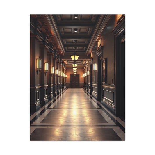
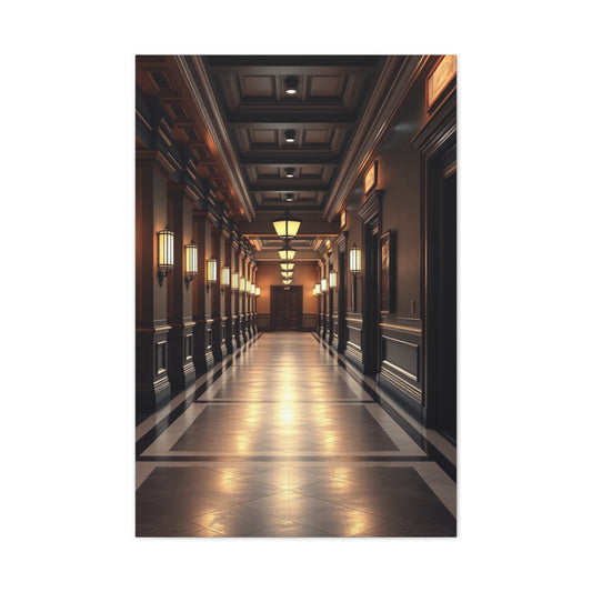
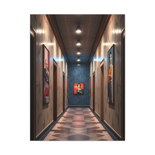
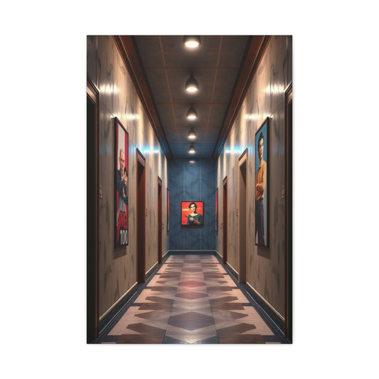
The Subtle Power of Transitional Spaces
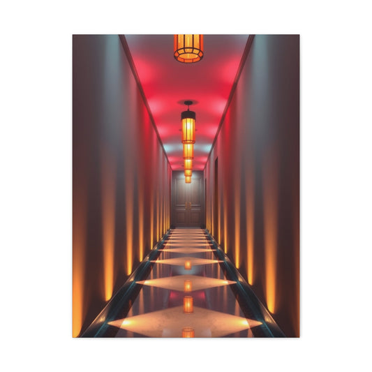
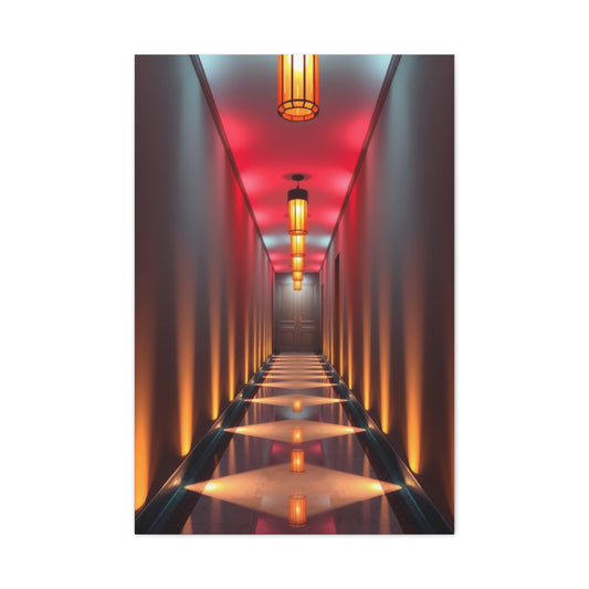
Hallways and transitional spaces often exist in the background of a home, overlooked in design planning. Yet these areas act as arteries that connect rooms, guiding movement and influencing the flow of energy. Wall art in such spaces carries immense potential: it can transform passageways into visual narratives, enrich overlooked corners, and establish cohesion between disparate interiors.
Cool-toned wall art, with its calming blues, tranquil greens, refined greys, and gentle purples, thrives in these environments. These shades balance serenity with intrigue, providing visual interest without overwhelming areas that serve primarily for movement.
Continuity Through Color and Mood
A hallway often links rooms that differ in aesthetic identity. Cool-toned wall art provides a bridge between these variations, ensuring continuity throughout the home.
A series of aquamarine prints can connect a minimalist living room with a vintage-inspired dining space. A row of grey-toned sketches may carry the mood from a classic study into a contemporary bedroom. Sage or lavender accents soften transitions, harmonizing contrasts between styles and palettes.
By repeating or echoing cool shades across transitional areas, the entire home feels unified, even when each room carries its own personality.
Hallways as Galleries
Hallways offer an ideal opportunity to create gallery-like experiences. Narrow walls, when adorned with carefully curated art, can transform daily passage into moments of discovery.
Cool-toned pieces excel in these settings, as their calming presence prevents corridors from feeling crowded or chaotic. A sequence of teal abstract panels can establish rhythm, while indigo photographic prints of landscapes evoke depth. Small lavender sketches arranged in grids can create gentle repetition, while large grey compositions anchor key stretches of wall.
This gallery-like approach transforms hallways into places where art becomes part of daily routine, enriching even the most functional walks through the home.
Light and Atmosphere in Passageways
Lighting in transitional spaces is often inconsistent—sometimes dim, sometimes brightly artificial. Cool-toned wall art interacts dynamically with these conditions.
Under natural light from a side window, aqua prints shimmer with freshness. In softly lit corridors, slate grey paintings acquire contemplative depth. Lavender artworks glow subtly under pendant lamps, while teal photographs gain vibrancy with directional spotlights.
By considering the interplay of light and color, hallways can shift atmosphere throughout the day, moving from crisp clarity to gentle ambiance.
Narrow Spaces and the Illusion of Depth
Hallways are often narrow, yet cool-toned wall art can counteract this limitation. Blues and greens are known to recede visually, creating an illusion of depth and spaciousness.
A large indigo abstract on one wall elongates perception, while a turquoise seascape expands lateral boundaries. Grey geometrical prints emphasize linearity, guiding the eye forward. A lavender horizon painting creates the impression of openness at the end of a corridor.
Through thoughtful selection, cool hues visually enlarge constrained spaces, making transitions feel more expansive and inviting.
Movement and Rhythm in Art
Hallways inherently suggest movement, and wall art can echo this rhythm. Cool-toned artworks with flowing forms—waves, swirling patterns, or fluid brushstrokes—amplify the sense of motion. Geometric repetitions in slate or teal add structured cadence, guiding the pace of walking.
A sequence of artworks that subtly shift in tone, from pale aqua to deep navy, mirrors progression, creating a narrative of movement. This visual rhythm makes the act of passing through hallways more engaging, transforming function into experience.
Transitional Niches as Focal Points
Beyond walls, transitional spaces often contain niches or small alcoves perfect for focal artworks. Cool-toned wall art in these corners introduces charm and intimacy.
A soft sage botanical sketch above a small console table creates a moment of pause. A lavender abstract placed near a staircase landing adds elegance. A cobalt canvas positioned under a skylight becomes a luminous centerpiece.
These placements demonstrate that transitional areas are not mere conduits but destinations in themselves, enriched by art’s presence.
Personal Narratives in Passageways
Hallways often lead to private rooms, and wall art can serve as a visual prologue to the stories within. Cool-toned artworks with personal resonance add depth to these transitional narratives.
A grey photographic print of a cherished cityscape may precede a study filled with books. A watercolor of mint foliage could lead into a garden-view room. A lavender portrait sketch might signal the entrance to a personal sanctuary.
By using cool-toned art as storytelling devices, transitional spaces gain emotional significance, turning corridors into reflective journeys.
Scale and Proportion in Transitional Design
The proportions of hallways demand careful attention to scale. Oversized canvases risk overwhelming narrow walls, while overly small works can feel lost. Cool-toned wall art adapts gracefully to these proportions.
Triptychs of medium-sized teal prints can line a corridor evenly. Long horizontal indigo pieces fit above wainscoting. Small clusters of grey sketches arranged vertically add height to compressed walls. Lavender abstracts framed in multiples offer playful rhythm in longer stretches.
By calibrating scale, wall art integrates seamlessly with spatial rhythm, ensuring balance and coherence.
Texture and Materiality in Transitional Art
Texture plays a profound role in transitional areas where tactile details often stand out. Cool-toned wall art with varied textures amplifies sensory richness.
A canvas with raised slate brushstrokes complements stone flooring. Smooth aqua prints harmonize with glossy wooden railings. Matte lavender drawings contrast gently with polished metallic fixtures. Mixed-media artworks with layered greens echo foliage glimpsed through windows.
These textural correspondences enrich passageways, ensuring that art interacts not only visually but materially with its surroundings.
Transitional Spaces as Emotional Resets
Hallways provide moments of transition not only physically but emotionally. Cool-toned wall art enhances this reset, calming the mind between experiences of different rooms.
A deep blue abstract can soothe after leaving a lively living room, preparing one for a quiet study. A mint botanical may reenergize before entering a dining room. A lavender wash at the end of a hall can signal comfort before reaching a bedroom.
These emotional recalibrations, subtle yet profound, make transitional spaces integral to the harmony of the home.
Seasonal Adaptability of Hallway Art
As seasons shift, hallways can mirror these changes through art. Aqua prints echo spring’s renewal, teal ocean photography resonates with summer’s vitality, olive sketches align with autumn’s harvest mood, and indigo abstracts reflect winter’s introspection.
Because hallways are less burdened with functional furniture, swapping art seasonally is relatively easy. Cool tones provide continuity across the year, ensuring that changes feel seamless rather than disjointed.
Eclectic Transitions and Artistic Freedom
Some hallways connect rooms with vastly different aesthetics—a rustic kitchen and a modern living room, for example. Cool-toned wall art acts as mediator, softening contrasts and weaving coherence.
A grey abstract with industrial textures might ease the shift from rustic wood to modern steel. A teal botanical bridges natural and contemporary themes. A lavender watercolor tempers bold transitions with subtle grace.
These artistic bridges prevent dissonance, ensuring that each passage feels intentional and cohesive.
Functional Enhancements in Transitional Areas
Hallways often host functional elements like mirrors, hooks, or shelving. Cool-toned wall art can integrate with these functions, preventing utilitarian items from dominating.
A sage print above a coat rack balances practicality with elegance. Indigo frames around a mirror create cohesion while enhancing depth. Grey geometric pieces near shelves organize visual rhythm. Lavender accents near hooks soften utility with charm.
This balance ensures that functionality remains efficient without sacrificing refinement.
The Role of Perspective in Hallway Art
Perspective is especially influential in transitional spaces. Cool-toned artworks can manipulate perception of direction, distance, and openness.
A turquoise landscape with a distant horizon draws the eye forward, elongating the corridor. A grey abstract with converging lines reinforces linear motion. A lavender spiral creates centripetal focus, pulling attention inward near a landing.
These visual manipulations enhance spatial character, turning transitional areas into dynamic environments rather than neutral voids.
The Poetics of Silence in Transitional Art
Unlike living rooms or dining areas, hallways often carry quieter atmospheres. Cool-toned wall art embodies this silence, amplifying subtlety and stillness.
A pale blue watercolor wash across a wall can evoke breath-like softness. A slate monochrome drawing may whisper stability. A lavender minimal piece suggests introspection, offering pause amidst movement.
This poetic restraint highlights the meditative role of hallways, elevating their understated beauty.
Conclusion
Cool-toned wall art offers versatility, beauty, and a sense of tranquility throughout the home. Each room benefits from carefully curated pieces, whether it’s the minimalist serenity of a bedroom, the fluid energy of a bathroom, the nostalgic charm of a vintage kitchen, or the focused atmosphere of a home office. Even hallways and transitional spaces gain purpose and style when adorned with blues, greens, greys, and subtle purples, creating a seamless visual narrative from room to room. By selecting artwork that balances scale, texture, light, and thematic resonance, homeowners can craft interiors that feel cohesive yet personalized. Cool tones enhance natural elements, complement architectural features, and allow both contemporary and traditional designs to flourish. The thoughtful integration of these shades ensures that every area, from lively gathering spaces to quiet retreats, embodies sophistication, harmony, and aesthetic clarity, resulting in a home that is both stylish and restorative.