Exploring the Excellence of Michael Harding Professional Watercolours: An Artist’s Perspective
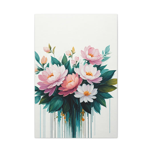
Upon first encountering the Michael Harding Professional Watercolours collection, it is impossible not to be drawn to the striking vibrancy and impressive quality that the brand promises. Known globally for its superior oil paints, Michael Harding has extended the same level of dedication, precision, and artistry to its watercolour paints, producing a range that is quickly becoming a favorite among discerning artists. The extensive selection includes 136 stunning shades, and what stands out immediately is the fact that 92 of these colours are crafted using single pigments. This commitment to using pure pigments not only guarantees exceptional colour purity but also ensures that artists can enjoy cleaner, more accurate mixing. For those who value transparency and control over their palette, this is a significant feature that elevates the brand’s status in the competitive world of watercolours.
As an artist who is always eager to explore new mediums and paint formulations, I was keen to see if Michael Harding’s watercolours would meet the high standards set by their oil paint counterparts. The results were nothing short of impressive. Each of the eight shades I tested had its own distinct personality, with vibrant, rich hues that stood out from the moment they were swatched. The range encompasses both bold, saturated colours and more delicate, understated tones, offering the flexibility needed to create an array of expressive works. The texture of the paint, as I squeezed it from the 15 ml tubes, was thick yet smooth, promising excellent coverage and an effortless flow once applied to paper.
A Deep Dive into Quality and Texture
One of the first things I noticed upon applying Michael Harding watercolours was the consistency and richness of the pigment. These artist-quality paints are a joy to work with, providing a lush, creamy consistency that glides smoothly across the page. The thick texture, combined with the strong pigment load, ensures that the colour remains vibrant and intense throughout the painting process. This level of saturation makes it easier to build up washes and layers while maintaining the integrity of the colour. Each brushstroke is an opportunity to express depth and emotion, with the colours standing out with exceptional clarity and lightfastness.
The creamy texture of the watercolours is partly thanks to the high-quality ingredients used in their production. The inclusion of natural gum arabic and honey gives the paints a distinct viscosity that feels luxurious on the paper. These ingredients not only enhance the texture but also help the colours retain their vibrancy over time. For artists who are particular about the quality of the materials they use, this attention to detail is a major selling point. The smooth flow of the paint and its ability to mix effortlessly with water makes the painting process enjoyable and productive, with little to no effort required to achieve the desired results. There is an undeniable richness in the way these paints behave, both when used straight from the tube or when diluted with water to create delicate washes. The smooth application and beautiful, even coverage make it easy to see why Michael Harding’s watercolours are highly regarded by professional artists.
Packaging and Presentation: Form Meets Function
While the quality of the paint itself is the most important consideration for any artist, the packaging of Michael Harding watercolours also deserves a mention. Each of the 15 ml tubes is sturdily crafted and designed with the artist in mind. The tubes are equipped with clear, legible labels that display essential information such as the paint name, pigment number, and a colour band that provides a quick visual reference. This thoughtful design is invaluable, especially for artists who may not always have the most organized studio setup or those who frequently use a variety of colours. Being able to quickly identify and select the correct tube of paint is a small but important feature that enhances the overall user experience.
However, I did encounter a minor issue with one of the colours in the range. The Indanthrone Blue, despite its rich and complex pigment, had a label that seemed to lean more toward a violet hue rather than the expected blue. While this is a minor discrepancy, it did lead to some confusion in my initial stages of testing, as I reached for the wrong tube a few times. It’s worth noting that this was a very small issue and did not affect my overall satisfaction with the product. In fact, the high quality of the paint more than made up for this small labeling inconsistency.
Across the range of colours I tested, I found the consistency of the paint to be remarkably even. Each tube delivered the same creamy texture and smooth consistency, making it easy to create a variety of effects, from soft gradients to intense, bold strokes. The pigments themselves were rich and complex, with some historical colours like Lapis Lazuli standing out as particularly stunning. The combination of traditional and modern pigments ensures that the Michael Harding watercolour collection offers something for every artist, whether you are working on fine art, illustration, or landscape painting.
Pigments That Inspire: A Vast Range for Creative Freedom
Michael Harding’s commitment to purity and quality is further reflected in the carefully selected range of pigments. With 136 different shades, the watercolour collection covers a wide spectrum of colours, allowing artists to experiment and find exactly what they need for their creative projects. Of the 136 shades, a remarkable 92 are made using single pigments, which speaks volumes about the brand’s dedication to colour integrity. For any artist, working with single-pigment colours means fewer complications when it comes to mixing. The result is cleaner, brighter colours that retain their vibrancy, even in subtle gradations.
Single-pigment watercolours are highly prized for the ability to achieve smooth, unblemished blends, which is why their use in the Michael Harding range is a standout feature. It enables artists to have greater control over their colour mixing, creating harmonious tones that don’t result in muddy or unpredictable outcomes. For example, using a single pigment for a warm yellow or a deep red means that the colour remains true to its original hue, regardless of the amounts of water or other colours mixed into it. This is especially beneficial for artists working in delicate washes or for those who want to retain full control over their palette.
In addition to single-pigment options, Michael Harding also offers a selection of mixed-pigment colours that combine the best of both worlds. Some of these blends are based on historical pigments that have been used for centuries, while others feature more modern synthetic hues. Each pigment brings its own unique qualities to the table, allowing artists to explore an even broader range of tonalities. The historical colours, such as the rich, translucent Lapis Lazuli, are perfect for creating luminous, ethereal washes, while the synthetic pigments offer bold, intense shades that can be used to create striking contrasts or powerful focal points in a composition.
For an artist who enjoys working with a wide variety of hues, the Michael Harding watercolour collection provides endless opportunities for creative exploration. The range is thoughtfully designed to accommodate both traditional and contemporary artistic practices, making it suitable for a wide range of techniques, including glazing, wet-on-wet, and dry brushwork. Whether you are painting landscapes, portraits, or abstract works, the versatility of these watercolours ensures that they will meet your artistic needs.
Exploring the Range of Michael Harding Professional Watercolours
To truly grasp the exceptional quality of Michael Harding Professional Watercolours, I decided to dive deep into a selection of pigments that would allow me to experiment with a variety of effects, from vibrant, striking hues to more subtle, muted tones. My chosen palette consisted of six single-pigment colours and two carefully crafted blends, with the aim of testing their performance both in isolation and when mixed. This approach provided me with invaluable insights into the range’s overall capabilities and performance, allowing me to explore how the colours behave under different applications and techniques.
The diversity in Michael Harding’s watercolour selection is immediately evident. From the first brushstroke, it’s clear that these paints are designed for artists who demand the highest level of vibrancy, clarity, and versatility. The intense richness of the pigments, combined with the smooth consistency, offers an entirely new experience for both seasoned and emerging artists. In the following sections, I will share my exploration of some of the most captivating colours from the line, shedding light on their unique properties and how they stood out in my work.
One of the most notable features of these watercolours is their exceptional pigment load. The vibrancy of the colours is almost otherworldly, giving each hue a distinct, radiant quality that is difficult to replicate with other brands. As I applied the colours to my paper, I noticed how the pigments settled beautifully into the texture of the surface, blending seamlessly with minimal effort. This ease of use became apparent in the way the paint adhered to the page, creating washes with remarkable smoothness, while still maintaining that sought-after transparency that watercolour is so renowned for.
The single-pigment colours, in particular, revealed a depth of tone that was not only visually arresting but also highly adaptable. When mixed with one another, they produced rich, complex mixtures that were nuanced without being muddy. This balance between purity and complexity in the colour mixes speaks to the quality of the raw materials used in these paints. I found myself experimenting with various combinations, creating a range of effectsfrom soft, ethereal gradients to intense, jewel-like depths. Each layer of paint allowed me to push the boundaries of what I could achieve, which is a testament to the integrity of Michael Harding’s formulation.
In addition to their impressive vibrancy, the two specially designed blends in my palette offered an entirely different kind of magic. These pre-mixed colours were carefully crafted to offer both a specific tone and a level of complexity that would be challenging to achieve through conventional mixing. What struck me the most about these blends was their remarkable consistency. They behaved like single-pigment colours in terms of control and flow, yet their depth and layered characteristics were immediately apparent as soon as they touched the paper. This is where Michael Harding’s meticulous craftsmanship truly shines: these blends manage to offer both convenience and complexity in one stroke.
As I worked with the colours, I found that they offered an unexpected level of control, even in situations where I was working wet-on-wet or layering multiple washes. The colours didn’t overtake one another, which can sometimes be a challenge when mixing multiple pigments in traditional watercolour. Instead, each hue retained its distinct identity, allowing for a range of tonal possibilities. This precision in mixing, combined with the ability to layer without losing clarity, made for an incredibly rewarding painting experience.
The finish of these watercolours was another aspect that left a lasting impression. While many watercolours can appear somewhat flat once dry, Michael Harding’s pigments dried with a luminous, almost three-dimensional quality. There was an unmistakable depth to the colours, as though each brushstroke had been imbued with light. It was a characteristic that elevated my work, providing not only vibrant colour but also an enhanced sense of volume and dimension within the painting itself.
What also stood out during my exploration was the incredible versatility of the paints when used with different techniques. Whether I was experimenting with wet-on-dry, creating delicate glazes, or building rich, textured layers, the colours responded beautifully, offering a range of possibilities for detailed, intricate work or bold, expressive strokes. The smooth consistency of the paints made them perfect for fine line work, while their vibrant nature gave me the freedom to experiment with broader, more fluid applications.
The ability to rework areas of my painting, whether through lifting or glazing, was another revelation. Some watercolours can be unforgiving once dry, but I found that Michael Harding’s colours remained responsive even after they had set, allowing for more refinement and subtlety in the process. This is especially important for artists who rely on the ability to fine-tune their work over multiple sessions, and it demonstrated just how much thought had gone into the creation of these paints.
The Power of Orange Sunset: A Vibrant and Versatile Hue
One of the first colours I eagerly tested was the stunning Orange Sunset. Upon initial observation, it became clear that this colour is a powerhouse in terms of vibrancy and application. Unlike many deep orange pigments that tend to lose their clarity when mixed with other hues, Orange Sunset remains strikingly luminous and vibrant, even when blended. This quality sets it apart from many other similar shades in the market. The magic lies in the use of the single pigment PO34, which grants the orange its unique luminosity and staying power.
What I found particularly impressive about Orange Sunset is its versatility. Whether used in intense, concentrated applications or diluted to create soft, glowing undertones, this orange pigment adapts seamlessly to different techniques and effects. The richness of the colour is maintained even when diluted with water, creating an elegant, light wash that feels delicate yet bold. This flexibility makes Orange Sunset an excellent choice for a variety of artistic endeavors. Whether you’re capturing the vibrancy of botanical studies, working on intricate floral compositions, or exploring bold sunset landscapes, this colour will undoubtedly elevate the overall feel of your work.
Moreover, the balance of warmth and brightness in Orange Sunset ensures that it doesn’t overpower other colours in your palette. Its radiant glow can be used strategically to accentuate certain elements in your painting, adding depth and warmth to your composition without overwhelming the viewer. The quality of this pigment makes it a must-have for any artist looking to infuse their work with rich, radiant hues while maintaining a level of subtlety and refinement.
Imperial Purple: A Bold and Dynamic Blend
The next colour that immediately caught my attention was Imperial Purple, a rich and bold hue that offers a striking balance between cool and warm tones. This colour is a blend of two pigments, PV19 (a violet) and PB29 (Ultramarine Blue), which results in a deep, intense purple with complex undertones. When mixed with water, the pigments in Imperial Purple naturally split, revealing the underlying blue tones that add a surprising layer of depth to the wash. This unique characteristic makes it an ideal pigment for artists looking to create dynamic, layered effects in their work.
What’s truly remarkable about Imperial Purple is its transparency. The ability of this colour to be layered without losing its vibrancy makes it an excellent choice for a variety of watercolour techniques, from glazes to washes. The transparency ensures that each layer can build upon the previous one without muddying the colours beneath. The high pigment load in this paint also ensures that only a small amount is required to achieve rich, vibrant results, making it incredibly efficient for large or detailed pieces alike.
The versatility of Imperial Purple extends beyond its striking visual appeal. Its intense hue makes it a powerful tool for a range of artistic genres, from botanical art to dramatic landscape compositions. In particular, its ability to reveal blue undertones when mixed with water or salt gives it a fluid, dynamic quality that is perfect for capturing the shifting nature of light and shadow. For artists seeking a bold, yet nuanced colour that will bring depth and complexity to their work, Imperial Purple is a must-try.
Indian Yellow: A Warm and Inviting Hue with Endless Possibilities
Another standout colour in the Michael Harding Professional Watercolours range is Indian Yellow, a warm and buttery shade that provides a unique intensity while maintaining transparency. This colour, made from the pigment PY83, stands out for its vibrant and inviting nature, offering a beautiful balance between warmth and depth. What sets Indian Yellow apart is its ability to retain its brilliance even when heavily diluted with water, making it an incredibly versatile addition to any palette.
Indian Yellow is a non-granulating pigment, which means that it maintains a smooth, even application on paper. This quality makes it especially ideal for artists who work with large washes or require a consistent, uniform tone throughout their compositions. Despite its intensity, it doesn’t overpower other pigments when mixed, making it a fantastic companion for other warm hues like reds, oranges, and pinks. Whether used in a single layer to create a glowing, sun-kissed effect or mixed with other colours to enhance their vibrancy, Indian Yellow proves to be a reliable and highly flexible choice.
Its tendency to lean towards the red side of the colour spectrum adds to its warm, inviting nature. This makes it an excellent choice for capturing the golden light of sunrises and sunsets or adding a rich, glowing undertone to floral or landscape scenes. The ability to pair Indian Yellow with cooler hues also allows for exciting contrasts, making it an essential tool for artists working in both natural and abstract forms. From creating the softness of a golden hour sky to the warmth of a radiant flower petal, Indian Yellow offers endless possibilities for artistic exploration.
The stunning warmth and brilliance of Indian Yellow also make it a favourite among artists who specialize in botanical or floral work. The colour’s capacity to evoke a sense of sunlight and warmth makes it ideal for capturing the delicate nuances of flowers, fruits, and foliage. Whether used alone or as part of a larger palette, Indian Yellow has the ability to infuse any piece with a sense of light and life.
Uncovering the Full Potential of Michael Harding Watercolours
By experimenting with these three coloursOrange Sunset, Imperial Purple, and Indian YellowI gained a deeper understanding of the true potential of Michael Harding Professional Watercolours. Each pigment demonstrated exceptional vibrancy, clarity, and versatility, whether used on its own or in combination with others. These watercolours are formulated with high-quality pigments that ensure that the vibrancy of each colour remains consistent throughout the painting process, regardless of the application technique. Whether you’re creating intricate botanical works, atmospheric landscapes, or experimental abstract pieces, these watercolours offer endless possibilities for exploration.
Moreover, the performance of these pigments under different conditions, whether diluted with water for a soft wash or applied in concentrated layers for bold effects demonstrates their adaptability to a wide range of artistic styles and techniques. The rich, transparent nature of each paint ensures that artists can achieve depth and luminosity in their work, while the high pigment concentration means that the colours go a long way, offering great value for money.
Ultimately, Michael Harding Professional Watercolours provide the perfect blend of intensity, transparency, and versatility, making them an ideal choice for both professional artists and passionate hobbyists alike. With a palette that supports a wide array of creative possibilities, these watercolours will continue to inspire and elevate your artistic journey, no matter what direction you choose to take.
The Vibrant Allure of Opera Rose: A Splash of Joy in Every Stroke
Michael Harding Professional Watercolours has continually impressed me with their selection of high-quality, richly pigmented paints. Among the numerous shades I've had the pleasure of testing, Opera Rose stands out as an especially captivating color. This vivid, radiant pink is a versatile addition to any artist’s palette, offering both energy and warmth to compositions. I have long relied on Opera Rose in my own artwork, and my expectations were high when I introduced the Michael Harding version into my practice. I am happy to report that it exceeded my expectations, providing a beautiful and pure rendition of this stunning hue.
Opera Rose is a color that exudes a joyful energy, perfect for infusing life into a variety of subjects. Whether you are creating soft, ethereal washes or diving into the depths of more intense, saturated pinks, this pigment proves itself invaluable. When applied with a light hand, it offers a delicate, dream-like quality, ideal for creating ethereal backgrounds or subtle transitions. On the other hand, when used straight from the tube, it delivers a bright, rich pink that radiates intensity, making it perfect for areas of the painting that require attention and vibrancy.
While the lightfastness of Opera Rose may not rival other colors in the Michael Harding range, it is still rated as ‘Good,’ which ensures its suitability for most projects where long-term durability isn’t a critical concern. Artists who prioritize longevity will likely lean towards other pigments in the range, but for those working on projects where freshness and vibrancy are more important than ultimate permanence, Opera Rose remains an excellent choice. One of the most exciting applications of this paint is in floral compositions, where the lively pink hue truly shines. Whether it's the central bloom of a bouquet or the delicate accent flowers scattered throughout the piece, Opera Rose adds a touch of brilliance that elevates the overall work.
In terms of versatility, Opera Rose pairs beautifully with other pigments. A particular combination I’ve enjoyed experimenting with is the mixture of Opera Rose and Indian Yellow. The result is a stunning array of colors that mimic the rich warmth of a sunset, with the deep pink merging seamlessly into the golden hues, creating depth and a sense of atmosphere. Even though Opera Rose may not be the most permanent pigment in the line, its exceptional vibrancy and ability to work harmoniously with a variety of colors make it a must-have in my collection. It brings a unique sense of freshness and playfulness to the palette that no other pigment quite matches.
Perylene Green: The Rich, Forest-Like Depth of a Versatile Hue
Another standout in the Michael Harding Professional Watercolors range is Perylene Green, a rich, dark green pigment that has long been one of my favorites. This deep, forest-like hue is a perfect example of how the range delivers quality, as it offers a complexity of tone that is truly captivating. Interestingly, Perylene Green, despite its name, is technically a black pigment (PBk31), which imparts a deep, almost opaque quality to the paint. The result is a dark, muted color that can easily be used to create dramatic shadows and intricate details in your artwork.
What I find most fascinating about Perylene Green is its remarkable versatility. When applied in thick, undiluted layers, it provides a rich, deep color that can anchor compositions with its bold presence. This makes it an excellent choice for creating dramatic contrasts in landscape paintings or for adding depth to shadowed areas. However, when diluted with water, Perylene Green reveals a softer, more verdant tone that retains its richness while appearing more transparent and fluid. This unique quality makes it an excellent choice for artists working with subtle transitions between light and dark or who need to create the illusion of depth through the delicate layering of color.
The broad range of light and dark values that Perylene Green offers allows it to be used in a variety of different techniques. Its versatility shines through whether you are looking to build up layers of dense color or prefer to work with more transparent washes. The pigment is equally at home in detailed, intricate work, such as botanical illustrations or still life paintings, as it is in large-scale compositions that require strong contrasts and bold, sweeping strokes. For landscape artists in particular, Perylene Green is invaluable as it effortlessly mimics the rich tones found in nature, from dense foliage to shaded forest floors, offering a sophisticated palette that speaks to the natural world.
Moreover, Perylene Green’s exceptional mixing properties enhance its appeal. The pigment can be combined with various other hues to create dynamic color harmonies. I particularly enjoy pairing it with Perylene Violet for creating deep, atmospheric effects, or mixing it with warmer tones like Indian Yellow for a more muted, earthy palette. This ability to harmonize with a wide range of colors makes Perylene Green a truly indispensable pigment, capable of taking any piece from flat to full of life.
The Subdued Beauty of Perylene Violet: A Perfect Shade for Depth and Atmosphere
Perylene Violet is yet another gem in the Michael Harding Professional Watercolors collection, offering a beautifully rich and deep purple hue that has become an essential part of my palette. This muted, atmospheric color is perfect for creating subtle depth and tonal complexity, particularly when working on botanical or portrait paintings. Its soft yet intense appearance makes it an ideal choice for artists looking to explore the quieter, more subdued side of color.
What sets Perylene Violet apart is its ability to both stand alone as a powerful, sophisticated color and work as a subtle neutralizer when combined with more intense hues. This makes it an incredibly versatile pigment, as it can either serve as the dominant color in a composition or be used as a counterbalance to bright, bold pigments. Whether you are looking to create delicate shadows or bring a sense of moody atmosphere to a piece, Perylene Violet excels in adding depth and complexity.
One of the standout qualities of Perylene Violet is how well it mixes with other pigments. I’ve found it to be particularly effective in neutralizing overly bright or garish colors, such as Cadmium Red or Hansa Yellow, creating a more balanced and harmonious palette. It’s a wonderful tool for controlling the overall tone of a piece, ensuring that no single color overwhelms the others. When used strategically, Perylene Violet helps to create a beautiful interplay of light and dark, which is particularly valuable in portraiture, where capturing subtle shadows and nuanced skin tones is essential.
Perylene Violet’s versatility extends beyond its neutralizing properties. The color works beautifully for creating atmospheric effects, particularly in compositions where you want to evoke a sense of depth or distance. In landscape paintings, for instance, Perylene Violet can be used to suggest the distant haze of a mountain range or the shadows beneath a dense forest canopy. Its muted tones lend themselves perfectly to these kinds of compositions, where a sense of space and mood is more important than sharp detail.
Unveiling the Excellence of Michael Harding Professional Watercolours
Testing the Michael Harding Professional Watercolours has been an incredibly revealing experience that showcases the brand’s commitment to providing some of the finest watercolours available today. With a selection of pigments that range from vibrant, eye-catching hues to deep, intense shades, it is clear that these watercolours are designed with the serious artist in mind. Each colour is carefully crafted with an exceptionally high pigment load, which translates to rich, full-bodied tones that stand out beautifully on paper.
The overall quality of the paints was immediately apparent with every stroke, offering a smooth, buttery consistency that made the application process both effortless and rewarding. The richness of the colours is something that immediately captivates the eye, from the delicate pastel shades to the more dramatic, darker tones. Artists who appreciate the importance of high pigmentation will find that these watercolours are not only consistent but offer a level of versatility that allows for fine adjustments to depth and vibrancy during painting. Whether blending shades or layering for depth, the quality of Michael Harding watercolours ensures that every application results in a dynamic and impactful effect.
What sets these watercolours apart from others is not only the sheer vibrancy and clarity of each colour but also the sophisticated formulation that allows these paints to work with a range of techniques and artistic styles. Whether used for precise detailing, expressive washes, or intense colour layering, the Michael Harding paints deliver impeccable results. For artists looking for a reliable, high-performance medium, this range stands out as a powerful tool that can elevate any work of art to a new level of excellence.
Versatility in Application: Staining, Lifting, and Creating Effects
As I explored the various colours in the Michael Harding range, I noticed the remarkable balance between staining and lifting properties, a feature that offers artists immense creative flexibility. Some colours, such as the striking Orange Sunset and the deep, rich Indanthrone Blue, exhibit a high staining power that resists lifting from the paper, even when water is applied generously. This characteristic is particularly useful for creating layers of colour that remain bold and saturated, without the risk of losing intensity during subsequent washes. The high staining pigments provide a lasting impression on the paper, which is ideal for artists who want to maintain strong colour presence, even through multiple layers.
On the other hand, there are colours like Moonlight, which lifts effortlessly from the paper, leaving behind pristine, bright areas of untouched white. The ability of Moonlight and similar colours to lift cleanly allows artists to create stunning highlights and soft transitions without the need for masking fluid or other techniques. For those who work in styles that involve delicate light effects or soft gradients, the lifting properties of these paints provide a natural and convenient way to achieve those effects.
This duality in the pigments' behavioursome staining deeply, others lifting cleanly adds a layer of versatility that many artists will appreciate. It’s a characteristic that not only opens up possibilities for various techniques but also allows artists to select specific colours based on their desired effects. For example, botanical artists might gravitate towards the staining colours to capture the intricate details of foliage, while landscape painters may prefer the lifting properties for capturing light and atmosphere in their compositions. The balance between these two properties is an essential consideration, and the Michael Harding watercolours excel in offering the best of both worlds.
A Perfect Fit for Every Artist: Final Thoughts on Michael Harding Professional Watercolours
In conclusion, the Michael Harding Professional Watercolours offer exceptional quality and a range of pigments that cater to a wide variety of artistic needs. Whether you’re a botanical illustrator seeking the sharpest detail and vibrant colours, a landscape artist in need of subtlety and luminosity, or someone who simply enjoys experimenting with different artistic techniques, these watercolours provide the perfect medium to bring your visions to life.
What makes this range stand out is the perfect balance between colour strength, vibrancy, and versatility. The high pigment concentration allows for the creation of paintings with intense saturation, while the unique properties of each individual colour, whether staining or lifting allows for creative flexibility that will inspire artists at all levels. The rich textures and clarity of each colour ensure that no matter how you choose to use them, the final result will be a captivating and high-quality piece of art.
Beyond just the paints themselves, the Michael Harding range offers an exceptional experience in terms of artistic possibilities. The paints are formulated to work seamlessly with various watercolour techniques, whether it’s wet-on-wet, glazing, or drybrush. They blend effortlessly, giving artists complete control over their work, while still allowing for spontaneous and organic effects to emerge as the paint reacts with the paper and water. This responsiveness to different techniques ensures that no two paintings will be the same, making each artistic journey with these paints uniquely fulfilling.
For artists who prioritize excellence and consistency, the Michael Harding Professional Watercolours provide an investment that will enhance their creative process. The stunning pigmentation, flexibility, and range of effects achievable with these paints make them a perfect addition to any artist's palette. Whether you're looking to create intricate details or sweeping washes, these watercolours will meet and exceed your expectations.
Ultimately, the Michael Harding Professional Watercolours are not just a tool for paintingthey are a means of expression that allow the artist to push the boundaries of their creativity. With their ability to deliver both bold, saturated colours and delicate, light-filled highlights, these paints offer unparalleled versatility. This range stands as a powerful choice for those serious about their art, delivering not only quality but also the tools needed to bring any artistic vision to life.