Breathing Venice into Paper: A Journey Beyond Traditional Watercolour
In the tranquil rhythm of a painter's day, there comes a moment when inspiration doesn’t need to be summoned simply arrives. For me, Venice appeared not with fanfare, but as a whisper carried on a salt-sweet breeze. It’s a city of constant transformation, where light skips across canals like notes of music and every weathered stone tells a story layered in time. Capturing such a place demands not just observation, but immersion. My method was to marry three unique, yet harmoniously aligned watercolour forms: Watercolour Markers, Watercolour Sticks, and traditional Professional Watercolours.
Each medium possesses its own voice, its own way of meeting the paper. Yet they all share the elemental spirit of watercolourfluid, expressive, and responsive. What fascinated me was not simply using them individually, but weaving them together to achieve an orchestration of effect that mirrored the complexity of Venice itself. This wasn’t just about rendering the visualit was about invoking mood, history, and the city’s emotional undertone.
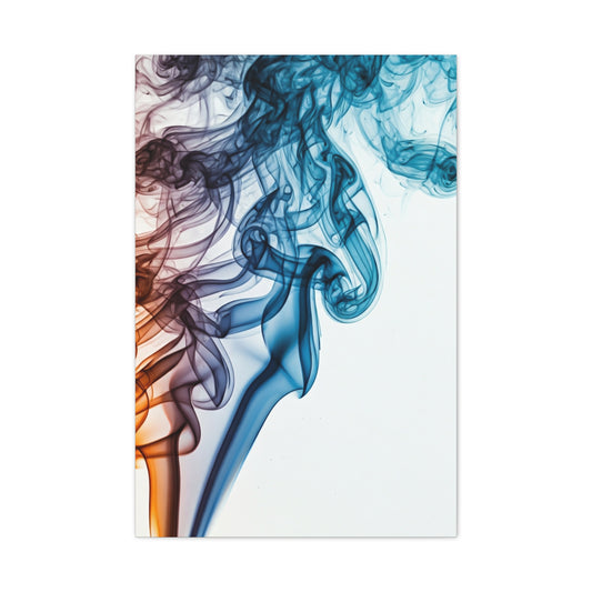
The markers served as the foundation. They offered immediate precision, their dual tips giving me both control and freedom. With a steady hand, I sketched the essential bones of the cityarches and domes, winding bridges and stoic facades. Then came the magic: a damp brush meeting those lines, coaxing pigment into life. The lines softened, the edges breathed. They became less architectural blueprints and more atmospheric cueslike memories forming from fog.
At times, I moistened the marker tip itself before applying it, letting the pigment flood the paper in a dreamy, velvety spread. This approach was ideal for rendering rooftops blurred by morning mist, or reflections that seemed to pulse beneath a gondola’s slow passage. With every stroke, I began to understand that Venice isn’t made of stillness’s made of movement and echo, and the marker captured that duality beautifully.
Texture, Gesture, and Depth: The Role of Watercolour Sticks
With the understructure of the scene taking form, it was time to infuse it with texture and boldness qualities that Watercolour Sticks deliver in abundance. These robust, tactile tools remind me more of pastel or crayon than of paint. Their solid form invites confident gestures and physical interaction with the paper. They allowed me to go beyond the delicate etching of lines and instead focus on masses and shapes, broader forms that carry weight and presence in the composition.
I remember using a sienna-toned stick to rough in the base of a façadeits horizontal marks echoing the weathered surfaces of Venetian architecture. I pressed the pigment into the grain of the paper, and with a wet brush, allowed it to dissolve and cascade downward, transforming into the ghost of a reflection in the water below. There was something immensely satisfying in that process, something elemental. The pigment didn’t merely sit on the paper; it became part of it.
When I sought even more texture, I scraped the side of a dry stick along the paper’s rough surface, carving color into the valleys of the grain. These marks defied refinementand that was precisely the point. They spoke of time, erosion, the natural wear of beauty. Venetian walls have absorbed centuries of light, shadow, and salt. The watercolour sticks translated that history better than any brush ever could.
And yet, despite their boldness, these marks did not dominate the painting. They became living parts of the story, meeting and merging with other media. The sticks offered power and spontaneity kind of unfiltered expression. Where markers provided precision, the sticks delivered immediacy. They weren’t so much applied as they were etched, scratched, and smeared into existence. These gestures gave the piece its energy.
Washes, Whispers, and the Dance of Integration
With the scene’s skeleton and muscle in place, I turned to traditional watercolours to offer nuance to tie it all together in a cohesive, resonant whole. There’s a timeless elegance to the process of dipping a brush into a porcelain palette, loading it with pigment, and then watching that colour unfurl across the surface like breath on glass. These paints didn’t shoutthey whispered. They sang in harmonies. They acted as the emotional glue between the assertiveness of marker and the rawness of stick.
I used the watercolours to glaze over areas, veiling certain parts and revealing others. A diluted ultramarine brought an atmospheric depth to the sky, adding dimension where previously there was only form. A soft wash of burnt umber toned down the vividness of a stick-applied wall, blending it back into the mood of the overall scene. The beauty of traditional watercolour lies in its ability to be both gentle and profound. It doesn’t compete with other markets complements and completes.
This interplay between all three mediums became the most rewarding aspect of the process. There were moments when a marker’s line would bleed into a stick’s grainy texture, and both would vanish beneath a translucent wash. These moments couldn’t be planned. They just happenedand they were magical. The painting began to speak for itself, not in a single voice, but in a layered chorus.
Venice, after all, isn’t a city of clarity. It’s a city of implication. Of things half-seen and fully felt. Its reflections are never still, its silhouettes are always shifting. This ambiguity demands an artistic language that can suggest rather than dictate. And in the blend of these three mediums, I found just that a vocabulary of illusion, mood, and gentle distortion.
One of the more surprising discoveries was the effect of watercolour sticks on rough paper when left untouched by water. They created a visual vibration, a shimmering echo that mimicked sunlight scattered on canal water. With just a hint of water, those marks softened into dreamlike pools. With more, they dissolved completely degree of moisture revealing a different aspect of their character.
Markers, too, surprised me. Their precision could be deceptive. A well-placed line might hold a structure together, but a single touch of water could transform it into something far more evocative. I crafted gondolas this waysharp prow lines that softened at the edges, making them hover beneath bridges like apparitions. They became not just objects, but memories.
Throughout the painting process, I returned again and again to my traditional watercolour pans. Their consistency grounded the composition. Even when experimenting with bolder tools, I always found myself drawn back to the rituals of classical techniquethe quiet mixing of hues, the gentle laying of washes. These colours brought a subtle musicality to the piece. They filled the spaces between louder gestures, just as a melody fills the silence between notes.
Ultimately, this journey was never just about rendering Venice. It was about reimagining what watercolour can be when it steps beyond its usual borders. When sticks, markers, and washes come together, they create not just images, but experiences. They open the door to experimentation, to spontaneity, to those fortuitous moments that turn a composition into a conversation between artist and paper.
Art, I’ve found, is not about control’s about presence. It’s about knowing when to lead and when to follow, when to make a mark and when to let one dissolve. With this triad of media, I didn’t just depict Venice rediscovered it. Through every layered stroke, I learned to trust the process, to embrace imperfection, and to let the medium carry its own wisdom.
Light as Language: Translating Venice Through Watercolour Expression
In a place like Venice, light becomes more than a visual element, it’s a living, breathing character. It dances across canals, ricochets off golden domes, and filters through layers of history embedded in crumbling walls and baroque stonework. Painting such a city is not about copying its contours but about interpreting its atmosphere, the way light permeates every surface and shadow. When approaching this task, traditional watercolours alone offer a palette of possibilities, but it is in the convergence of multiple water-soluble mediums, markers, sticks, and pans that the true symphony of tone and texture unfolds.
Working with watercolour is to engage in a dialogue between control and spontaneity. It’s a medium that invites surprise, one where intention and accident often become indistinguishable. In the initial phase of the project, I had already established the foundational forms of Venice using Watercolour Markers for their linear clarity and Watercolour Sticks for grounding texture. The Professional Watercolours from the pan set anchored both, tying the elements together with washes of luminous colour.
As the work evolved, layering and blending became key strategies in revealing Venice’s elusive textures. Each material, used both independently and in tandem, brought forward different tonal qualities. The markers, for instance, provided precise detail and sharp definition. I often began with them on a smooth, hot-pressed surface to capture architectural features like the ornate windows of Venetian palazzos or the repetitive elegance of a colonnade. When softened slightly with a wet brush, these lines transformed from structural outlines into gradients of shadow and time, offering a dynamic sense of dimensionality.
On the other hand, the Watercolour Sticks were like raw pigment encapsulated in a form expressive and inherently textural. Used on cold-pressed or rough paper, they became tools of surface storytelling. Dragging the edge of a stick across a dry sheet mimicked the irregular sheen of algae along a waterline or the gritty stone of an eroded canal wall. A damp brush applied afterward brought those marks to life, blurring edges and invoking movement as if the pigment itself was receding or emerging with the tide.
These techniques allowed me to move beyond merely depicting a place. I was able to suggest shifts in time and atmosphere: the slow arc of the sun across cobblestones, or the way mist blurs the boundary between architecture and reflection. Watercolour, with its inherent fluidity, becomes a vehicle for visual memory for impressions rather than replications. In this way, Venice was not just painted, it was interpreted emotionally, moment by moment.
Layering Atmosphere: Technique Meets Intuition in Watercolour Media
One of the most remarkable attributes of integrating markers, sticks, and traditional watercolour pans is the balance between planning and improvisation. Each tool responds differently to moisture, paper texture, and brushwork. Mastery isn’t about rigid technique but about responsiveness, the ability to shift gears mid-painting, to adapt to what the medium offers in that moment.
Hot-pressed paper, with its silky surface, enabled clean lines from markers that evoked the sharpness of wrought iron balconies or the crisp shadows beneath window ledges. Yet even here, subtle shifts could be made. A line might be softened slightly with a brush to suggest light decay or used at full strength to articulate a silhouette in early evening light. These decisions, seemingly small, built up a visual rhythm, a cadence of clarity and softness that mimicked the natural ebb and flow of a day in Venice.
With Watercolour Sticks, the story changed. These tools revealed their full potential on rougher surfaces. Using them like charcoal across toothy paper resulted in textures that echoed crumbling plaster or the splintered surface of an old boat hull. When touched with a damp brush, the granulated pigments would explode outward or drift softly, echoing ripples or rain-slick stone. The beauty of the Sticks is in their refusal to remain static. Even dry, they insinuate movement texture that feels alive and part of the landscape rather than an artificial addition.
In one particularly memorable moment, while painting a view into a side canal just off the Grand Canal, I reached for a deep graphite shade from the Sticks. I used it to sketch the subtle recesses beneath ledges and around mooring rings. Then, dipping into a wash of viridian, I glazed delicately over the area. The pigment spread organically, feathering into the graphite like moss creeping over stone. The result was a depth that felt natural, an interplay of old and new, of pigment and light, of permanence and transience.
Water remained the unifying force. Each medium responded to it uniquely, the Markers melting gracefully when brushed after application, while also allowing vibrant wet-into-wet effects if pre-dampened. At one point, I began using the flat side of the marker tip to block in large areas of colour on damp paper, allowing the pigment to diffuse outward in unexpected blooms. These areas are often suggested by cloud or fog, elements difficult to define but crucial in setting a Venetian mood.
I also became increasingly fascinated with how each medium could be used not only directly on the paper but also through indirect methods. I frequently loaded a brush from a Watercolour Stick, then held it momentarily, letting the pigment absorb. With a flick of the wrist against the palette edge, I sent droplets into the sky portion of my scene. These specks dried as translucent halos, perhaps moisture in the air, perhaps salt residue, perhaps the morning mist refracting the rising sun. The ambiguity made them more powerful.
Evoking Memory Through Media: A Tactile Symphony of Tone and Time
As I progressed into the second half of the Venice composition, I found myself painting less with individual tools and more with their combined essence. The brush became a translator, not just a means of applying colour from a pan, but of lifting, blending, and distributing pigment from multiple sources. It wasn’t unusual to load colour from a Stick, modulate it on the palette, and then blend it with pigment from a Marker all before touching paper. This tactile experimentation pushed the boundaries of how watercolour media could be used in concert.
One of the greatest revelations came when I painted a morning scene bathed in pale blues and greys. The subject was simple a quiet canal, dappled with reflections from mooring poles and early lamplight. Using a reduced palette of indigo, Payne’s grey, and cobalt turquoise, I created soft washes that defined the structure of the space. Then, over this subdued base, I etched reflections with the Watercolour Markers. The pigment fractured as it met the damp paper, mirroring the way light fractures across rippled water.
Still, the composition lacked a tactile counterpoint. To create that last layer of textural contrast, I turned again to the Watercolour Sticks. With the paper nearly dry, I scraped a cool-toned stick horizontally across the surface. The pigment clung to the texture like dust on stone, providing a shimmer that caught the light even after glazing with lavender. It wasn’t a loud effect, n fact, its power was in its restraint. The result was a subtle texture that made the image feel lived-in, as though the paper itself had absorbed the humid Venetian air.
Another advantage of this multi-medium approach was the reworkability. Watercolour is often seen as unforgiving, but this hybrid method allowed for surprising flexibility. Even after drying, areas created with markers and sticks could be lifted or altered. I could introduce highlights using just a clean, damp brush carving out negative spaces or adjusting tonal weight without relying on opaque layers. This became especially useful when fine-tuning elements like reflections, architectural contrasts, or subtle light effects.
In this phase, I found a deeper intimacy with the scene. The materials stopped feeling like separate tools and instead became voices in a choir. The Markers brought precision and structure; the Sticks added texture, grit, and poetic irregularity; and the traditional pans provided atmosphere, transparency, and harmony. Each gesture, whether a mark, a wash, or a glaze, felt part of a larger orchestration, a way to not just paint Venice, but to speak its language.
What emerged was not a postcard-perfect rendering, but something richer: a layered memory, painted in time and texture. The smallest elements, rust stains on iron, a window glinting with sun, and stone glossed with tide, gained emotional weight. These weren’t just details; they were moments of presence. The layered approach gave each corner of the painting its voice, its own story, and its subtle glow.
In embracing the unique characteristics of each medium and allowing them to converse freely, I discovered more than a technique; I found a philosophy. Painting with watercolour in this way isn’t about getting it right. It’s about staying attuned to the conversation between water, pigment, paper, and light. In a city like Venice, where every wall holds memory and every reflection hints at something deeper, this method becomes not just appropriate, it becomes essential.
The Soul of Venice: Capturing Light, Texture, and Time in Watercolour
Painting a city like Venice is more than capturing architecture; it's about translating an experience. The city pulses with a rhythm shaped by water, stone, and ever-shifting light. Every reflection, every softened edge of a column, every violet-hued dusk turns the cityscape into a living, breathing entity. As an artist, you're not just recording buildings, you're designing with light and atmosphere, layering emotion into your composition. This vision guided my approach as I turned to a trio of versatile tools: Watercolour Markers, Watercolour Sticks, and Professional Watercolours.
This stage of the process wasn't about rendering precise details. Instead, it was about finding the harmony between control and freedom, between structure and spontaneity. I focused on the interplay of positive and negative space, discovering that each tool carried its rhythm and voice within the composition. Together, they allowed me to create a painting that didn't just depict Venice, but reflected its poetic instability its constant motion and delicate transience.
The Watercolour Markers served as my architectural compass. Their precision brought clarity when I needed to define outlines and establish focal points. The fine tip was ideal for capturing the slender grace of lamp posts, the clean edge of a cornice, or the sharp profile of a distant bell tower. These marks were never rigid. A single touch of water could either cement them into permanence or coax them into a misty suggestion. It was a dance of decisions where to hold form, where to let go.
Reflections in Venice play just as central a role as the structures themselves. Managing edges became critical. I often applied the broader side of the marker to dampened paper, allowing pigment to flow and settle organically. This technique created transitions that were evocative of domes mirrored in rippling water or the subtle fade of distance between overlapping facades. Markers, in this way, did more than draw lines; they orchestrated the boundaries of light and space.
Expressive Layers: From Gesture to Atmosphere
Where the markers grounded the composition, the Watercolour Sticks breathed life into it. These tools invited a physical, gestural approach that was essential for capturing the patina of the city, its age, its textures, and the subtle chaos that time imposes on its surfaces. With a rhythm that felt closer to drawing than painting, I used the sides of the sticks like charcoal. The grain of cold-pressed paper met the pigment with resistance, allowing me to sculpt midtones into the scene rather than merely lay them on top.
This tactile process was key for building character in the image. Stucco walls cracked by salt air, mossy bridge undersides darkened by dampness, rooftops fractured by centuries of weather all of these came to life through the direct, expressive application of Watercolour Sticks. And when softened with water, the strokes retained their movement. The memory of the gesture remained embedded in the pigment, lending the painting a kind of vibration, a suggestion that the surface itself was breathing.
The traditional Professional Watercolours provided the connective tissue of the composition. They filled the sky with quiet washes and linked disparate elements with subtle gradations of hue. Their transparency made them ideal for layering, I could glaze over marker work without obscuring it or soften the robust textures from the sticks while maintaining depth. These washes brought a sense of atmosphere, of open air, to the architecture. They suggested sunlight dissolving through haze, or cool shadows stretching gently across uneven flagstones.
A major challenge during this stage was resisting the temptation to overuse any one medium. The layering of three distinct materials created a rich vocabulary, but it also required restraint. I began to listen more closely to the painting itself to recognize where it needed to speak boldly, and where it needed silence. Negative space, I realized, was not absence but a kind of visual exhale. Blank areas allowed the eye to rest, offering emotional contrast to the denser zones of line and color.
To achieve these quiet moments, I leaned into delicate glazes created from diluted mixes of cobalt and buff titanium. These soft tones acted as a breath between phrases. In places, I lifted pigment with a water-soaked brush, pulling light back into the surface on the high curves of a dome, on the water-lapped stone of a canal’s edge, or on a single illuminated flagstone that caught the last gold of day. These acts of subtraction were just as important as any addition of pigment.
Composition as Emotion: Following the Medium’s Lead
The true artistry of painting Venice lies not in accuracy, but in orchestration. A successful composition does not rely on one heroic focal point but on the relationship between elements how they move, balance, and breathe together. With Watercolour Markers, Sticks, and Professional Watercolours working in tandem, I found a new kind of musicality in the way mediums overlapped and responded to each other.
One method became particularly powerful in conveying the fragile beauty of decay: layering dry stick marks beneath wet watercolour washes. This reversal of the traditional process, typically wet first, then dry, created subtle resist effects. The watercolour skipped over the texture left by the sticks, producing spontaneous highlights and tonal shifts. These effects felt tailor-made for rendering aged walls, chipped balustrades, and water-stained plaster surfaces that hold the city’s memory like skin holds the sun.
This way of working is as much about surrender as it is about control. The paper becomes a collaborator, influencing the final result. Washes pool unexpectedly, stick strokes deflect or catch in surprising ways, and water trails across the page with a mind of its own. These moments, far from being mistakes, are doors into possibility. They challenge the painter to respond, not to correct. And in that conversation, the image begins to breathe with authenticity.
Nowhere was this more evident than in my treatment of the Basilica di Santa Maria della Salute, the emotional and architectural anchor of the piece. I approached it with a sense of reverence. Using the fine tip of a neutral-toned marker, I mapped its contours lightly, ot to lock it in, but to suggest its grace. Water softened those lines just enough to keep them grounded yet ethereal. Over that foundation, I poured a glowing wash of warm gold and softened rose, hinting at the sun's slow descent behind the domes.
To convey the building’s depth, I introduced Watercolour Sticks once again. Their textures deepened the shadowed crevices and gave substance to its curves. Finally, a gentle glaze of nearly transparent lemon yellow caught the upper edges like sunlight trembling on marble. Every gesture was made with care, resisting the urge to overstate, honoring instead the quiet majesty of the structure.
As I stepped back from the finished painting, what struck me most wasn’t the accuracy of any one line or tone. It was the way each medium played a part in guiding the eye. Sharp lines drew attention, rough textures invited lingering, soft washes offered calm. This interplay created a rhythm a movement not only across the composition but within the viewer’s experience. It reflected, in many ways, the very essence of Venice itself: layered, elusive, textured, and infinitely alive.
In choosing to work with these three watercolour tools in unison, I wasn’t just combining materials. I was echoing the layered reality of the subject. Venice is never singular. It shifts constantly in light, in water, in history. To capture it faithfully, one must work with tools that can both define and dissolve, assert and suggest. The result is not just a painting of a place, but a painting with a soul.
Knowing When to Stop: The Art of Restraint in Watercolour
In the journey of painting, there comes a subtle yet crucial moment when the artist must make a choice, not about what to add, but when to stop. This pause, this final whisper before overworking a piece, is where intuition takes precedence over technique. It is here, on the cusp of completion, that mastery begins to show not in excess, but in control. Especially with watercolor medium known for its spontaneity and sensitivity act of restraint becomes even more essential.
While working on a detailed watercolour piece inspired by Venice, I found myself face-to-face with that moment. The city’s architectural poetry had already emerged through layers of paint. The atmospheric light danced over the canal, and the story had begun to speak for itself. What the painting needed next wasn’t more color, needed clarity. It needed intention.
The final phase of a watercolour painting isn’t about covering the canvas but refining what’s already there. It becomes a matter of deciding which marks are vital and which should be left unsaid. Using a combination of Winsor & Newton’s Watercolour Markers, Watercolour Sticks, and their range of Professional Watercolours, I was able to navigate this delicate process with a sensitivity tailored to the needs of the composition.
Each medium offered a distinct voice. The Markers provided control and refinement. The Sticks injected vitality and texture. The Professional Watercolours brought in harmony and cohesion. But the magic wasn’t just in the toolsit was in listening to the painting itself. Each stroke, each gesture, was not about dominance, but dialogue. It became clear that the final step wasn't about imposing more on the paintingit was about letting it speak for itself.
As the details of Venice settled into their places, I found the courage to stop, not because the painting was perfect, but because it was whole.
The Tools of Expression: Layering Markers, Sticks, and Paint with Purpose
Watercolour is often misunderstood as a medium that must be treated delicately, almost timidly. But in truth, it thrives on confident handling. It’s in the bold juxtaposition of sharp lines and soft washes, of textured strokes and fluid glazes, that a watercolour painting finds its rhythm. In finishing my Venetian scene, I leaned deeply into this interplay, allowing each material to fulfill its purpose in concert with the others.
The Watercolour Markers were my first stop in the final pass. After numerous washes and textures, some edges had become too soft, too vague. To reintroduce the definition without losing the painting’s dreamlike quality, I used the fine tip of a sepia-toned marker. Just a touch along the edge of a window, the bow of a gondola, the shadow beneath a balcony. These weren’t reinforcements were reminders. Subtle lines that guided the viewer’s eye with quiet precision.
The strength of the markers lies in their ability to deliver contrast without overwhelming delicacy. Even in their deepest tones, there’s an inherent softness that blends naturally when coaxed with a damp brush. This made them ideal for adding definition while preserving atmosphere. They didn’t screamthey whispered.
After setting the edges, I reached for the Watercolour Sticks. These tools are the soul of spontaneity. Their texture, grit, and malleability offer a rawness that contrasts beautifully with the more structured effects of the Markers. I used the Sticks to introduce movement and energy in unexpected ways. Dry scumbles across the water hinted at sunlight flickering off ripples. A sideways drag over aging stone added the weight of time. My favorite part was suggesting ivy climbing along a stucco wall with a nearly dry Stickfaint, suggestive, almost imagined, yet undeniably real.
What the Sticks gave me was a gesture without obligation. I wasn’t painting ivy per seI was painting the feeling of ivy. In certain areas where horizontal strokes dominated, I brought in vertical touches using the Stick to break the monotony and draw the viewer’s attention upward. These verticals, faint and suggestive, led the eye toward the ornate domes and towersreminding the viewer that Venice is not just a city of water, but of ascension.
The Watercolour Sticks functioned as controlled chaos. They allowed me to be playful without being careless, expressive without becoming unhinged. In the final stages of a painting, when most marks risk feeling heavy-handed, the Sticks offered lightness, ambiguity, and a kind of poetic truth.
To bring everything together, I turned back to the most classic of the three tools: Professional Watercolours. These were not just background playersthey were the harmony that wove the voices together. I used them not to add new details, but to adjust tone and mood. A glaze of diluted indigo and burnt sienna cooled the lower third of the composition, pulling warmth from the canal and enhancing the evening feel. It was a finishing touch that didn’t replace what came before, embraced it, filtered it, and elevated it.
These subtle glazes were less about colour and more about emotion. They mellowed the highs, deepened the lows, and turned contrast into cohesion. Only traditional watercolour could manage this kind of orchestrationfluid enough to blend, yet transparent enough to reveal every decision that came before.
Finishing with Intention: Space, Silence, and the Final Signature
One of the most powerful techniques in watercolour is not application, but subtraction. In the final hour, as I stood back from the work, I reached not for a brush laden with pigment, but a clean, damp one. This was the tool I used to lift pigment and carve out impromptu highlights, glint on brass, the lip of a cloud, the curve of a marble stair. These lifted areas functioned like breaths in a musical phrase, creating space for the eye to rest and the mind to imagine.
It’s easy to fall into the trap of over-defining, especially in a city like Venice, where every stone and canal begs to be painted. But not everything needs explanation. Sometimes, the most powerful areas of a painting are those left untouched. Negative space became one of my strongest allies. A patch of bare paper beneath an overhanging archway. A blank portion of sky, softly fading into white. These weren’t voidsthey were voices.
Allowing areas to remain untouched didn’t mean neglect meant trust. Trust in the medium. Trust in the viewer. Trust in the painting itself to carry the weight of the story without needing every brick described. These silent spaces gave the artwork a chance to exhale.
By this point, the entire composition had become a symphony of edges. Crisp and blurred. Assertive and elusive. I had used the Watercolour Markers to direct and define, the Sticks to energize and surprise, and the Watercolours to unify and elevate. Every mark had become a question of necessity. Not "Can I do more?" but "Should I?"
And then came the final act: signing the piece. I returned to the sepia Watercolour Marker I had used in the initial linework. This circular gesture felt symbolicclosing the loop with the same tool that had started the journey. It wasn’t flashy or loud. Just a quiet affirmation that the piece was finished.
Reflecting on the entire process, I am reminded of the power of collaborationnot between artists, but between mediums. The Watercolour Markers brought sharpness and clarity, the Sticks gave me freedom and vitality, and the traditional Watercolours grounded everything in light and tone. Each one contributed without overshadowing the others. They worked not in isolation, but in harmony.
What this project reinforced for me is that watercolour is not just a techniqueit’s a language. And within that language, there are dialects. By embracing the full spectrumfrom line to wash, from whisper to depthwe enrich the voice of the work. Venice didn’t emerge from control alone; it emerged from trust. Trust in the tools. Trust in the process. Trust in knowing when to let go.
In the end, I didn’t paint VeniceI conversed with it. The city, the medium, and I reached an understanding. Not through replication, but through reverence. And in that silent agreement, the painting found its final whisper.