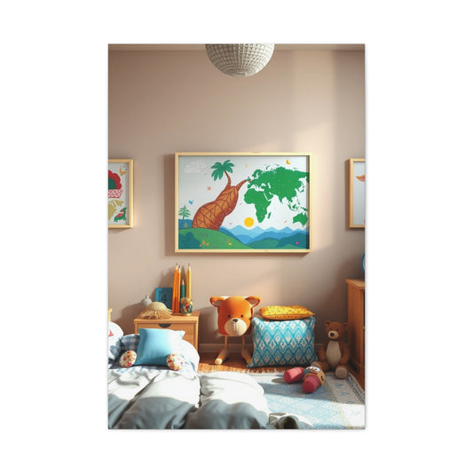
Traditionally, black has stood as the cornerstone of dramatic and sophisticated interior aesthetics. However, deep navy blue is now making a powerful and stylish statement in home décor. With its rich, velvety tone and a warmth that contrasts beautifully with the cold austerity of black, navy has emerged as a dynamic alternative that suits both modern and timeless design sensibilities. It delivers bold impact without overwhelming a space and adds an air of tranquility that makes rooms feel not only chic but also comforting and livable.
Whether you're updating your living space, curating a cozy reading nook, or creating an intimate bedroom sanctuary, navy blue has the versatility and elegance to anchor your vision. It works seamlessly in various design themes—from coastal minimalism to luxurious maximalism—and blends well with metallic accents, natural materials, and layered textiles.
Calming Spaces Reimagined: The Elegance of Blue-Grey Interiors
Creating a home that inspires tranquility and mindfulness requires thoughtful attention to color. Among the most refined and contemporary choices is blue-grey—a quiet hue that captures the atmospheric tones of overcast skies and coastal mists. This versatile shade subtly marries the profound richness of navy with the soft restraint of classic grey, forming a color that soothes the eye while exuding quiet sophistication.
When incorporated into interior spaces, blue-grey establishes a setting that is both expansive and cocoon-like. The color opens up visual space without overwhelming it, making even compact rooms feel airy and serene. It’s an ideal base for areas designed for respite, such as bedrooms, meditation corners, guest rooms, or intimate reading nooks.
For wall treatments, blue-grey can serve as either a matte backdrop or a statement surface when used with textured finishes such as plaster or limewash. These subtle applications allow the color’s depth to shine, catching natural light and creating visual movement throughout the day. Pairing this color with ivory-toned baseboards, off-white upholstery, or pale stone flooring creates gentle contrast that feels weightless and refreshing.
Natural elements further enhance the calming qualities of blue-grey. Use furniture crafted from driftwood, rattan, or reclaimed oak to introduce textural variance. Add tactile textiles such as linen throw blankets, jute rugs, and boucle cushions to bring the palette to life. For accessories, opt for matte ceramic vases in soft terracotta or stone grey to anchor the color story with understated elegance.
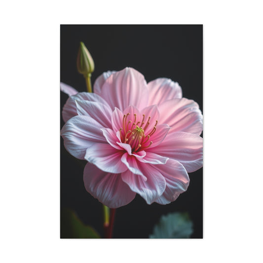
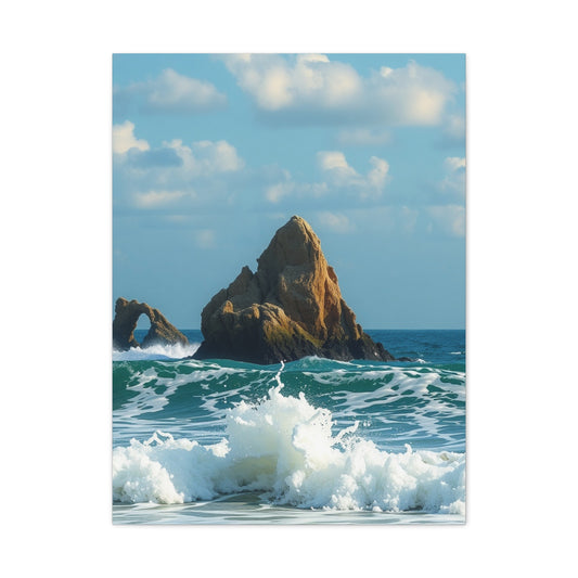
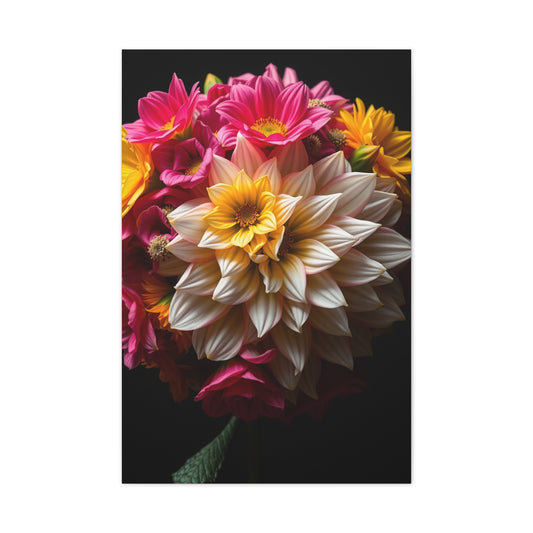
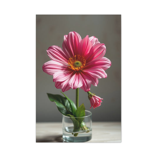
Introducing organic greenery infuses energy into these cool spaces. Large-leaf plants like monstera or rubber trees offer sculptural intrigue, while cascading pothos or delicate ferns provide movement and softness. Botanical wall art, abstract seascapes, or photography prints with oceanic hues can elevate the emotional tone of the room, making it feel curated and deeply personal.
In open-concept homes, blue-grey also works as a cohesive thread between spaces. When used strategically in color-blocking or accent walls, it creates visual continuity without imposing a singular design note. Even in contemporary apartments or compact studios, it brings a grounded sense of clarity, especially when framed with muted metallics like brushed pewter or antiqued brass.
Blending Heritage and Modernity: Navy Meets Earthy Brown
Combining navy with earthy brown tones is a masterstroke of contrast—unexpected, sophisticated, and entirely on-trend. Historically, this pairing was often avoided in interior design circles due to the belief that the hues clashed. Today, designers have rediscovered the beauty of juxtaposing deep, contemplative navy with the organic richness of warm brown shades, resulting in interiors that are both layered and inviting.
Navy, a color that symbolizes intellect and stability, gains warmth when set against brown’s natural palette—think camel, mocha, clay, and cinnamon. This combination evokes the harmony of ocean and earth, creating a timeless and grounded aesthetic that appeals across design genres, from transitional homes to rustic-industrial lofts.
Begin your design journey with a statement piece in navy—perhaps a velvet sofa, a painted sideboard, or bespoke cabinetry. These elements serve as anchors that command attention while allowing for complementary layering. Introduce brown through leather upholstery, wooden coffee tables, or hand-woven baskets. Opt for materials like walnut, chestnut, or distressed pine to infuse visual warmth and natural depth.
Layering finishes and textures is key to enhancing this color narrative. A matte navy bookshelf can be paired with a high-gloss mahogany desk, while a navy linen armchair pairs beautifully with a cowhide rug or suede accent pillows. Light is also critical in these spaces. Use warm-toned bulbs and light sources with soft gold or aged brass finishes to create ambiance and amplify the visual richness.
Wall décor plays a critical role in enhancing the dynamic between navy and brown. Opt for large-scale artwork with a tonal blend of blue, ochre, and sienna. Try abstract prints, moody landscapes, or mixed-media installations that echo the natural hues within the room. Neutral-toned or wooden frames can unify the aesthetic while allowing the artwork to stand out.
This color story excels in living rooms, libraries, home offices, and dining rooms. The combination of navy and brown suggests comfort without compromise, making it ideal for spaces where guests gather and stories unfold. It’s a palette that whispers elegance while remaining grounded in its connection to natural elements.
Balancing Palettes: The Art of Harmonious Color Design
Color harmony is not simply about pairing complementary shades; it’s about creating a space where the mind feels at ease and the eye can wander without disruption. Achieving this visual and emotional resonance requires a nuanced understanding of how colors interact—and how they reflect the mood and purpose of a room.
The interplay between cool and warm tones is essential in creating dynamic yet peaceful environments. Blue-greys introduce calm and composure, perfect for spaces that serve as havens. Earthy navies and browns, by contrast, offer comfort, depth, and gravitas—making them ideal for high-use areas that demand both style and substance.
Start by identifying the emotional intent behind the room: should it restore and quiet the spirit, or inspire warmth and dialogue? This purpose-driven approach will help you map out your dominant and supporting hues. Stick to a base of two or three core colors, then layer in subtle gradients or textural variations for dimension.
Wall art is an excellent tool for weaving your palette together. Look for pieces that mirror your chosen colors in nuanced ways—perhaps a watercolor in navy, taupe, and blush, or a minimalist ink drawing set against a parchment background. These subtle additions unify the space without drawing too much attention away from the broader composition.
Furniture placement and styling also play an important role in maintaining balance. Position dark elements opposite light ones to create visual equilibrium. Use texture to transition between contrasting shades—a velvet navy armchair next to a white boucle ottoman or a weathered wood console topped with glazed ceramic lamps in soft grey.
Color harmony ultimately reflects thoughtfulness. It’s a visual language that communicates the mood of your space, speaks to your personal style, and allows your home to feel fully cohesive without being rigid or over-stylized.
Textural Sophistication: The Lasting Allure of Velvet
Velvet is one of the most sensual and dramatic materials in interior design. Its plush texture, luminous surface, and depth of tone make it a perennial favorite for those who wish to blend comfort with glamour. When velvet is rendered in rich, pigmented navy, it becomes even more captivating—striking the perfect chord between luxury and subtlety.
Navy velvet furniture instantly elevates any room. Consider a tufted chaise lounge in a sunroom, a curved velvet sofa in a formal living area, or navy velvet dining chairs that transform every meal into an occasion. The material's texture invites touch and interaction, while its color anchors the space with understated power.
Complement navy velvet with a diverse mix of textures and finishes. Think burnished bronze pendant lights, travertine coffee tables, boucle throws, and silk accent cushions. These elements break up the visual density of velvet while amplifying its tactile appeal.
Use color strategically. Emerald green, dusty rose, soft cream, and deep garnet are excellent companions to navy velvet. They create balance and contrast without compromising the elegance of the core palette. Incorporate these hues through art, florals, or decor accessories.
To fully showcase velvet’s potential, consider lighting. Natural daylight enhances its sheen, while soft ambient lighting in the evening deepens its tone. Install layered lighting—recessed ceiling lights, adjustable sconces, and accent lamps—to allow for mood flexibility.
Incorporating navy velvet isn't limited to furniture. Use it in drapery, wall panels, or even upholstered headboards. These applications wrap the room in softness, offering a sensory experience that merges visual beauty with physical comfort.
Mood and Meaning: Designing with Intention and Emotion
Interior design is about more than aesthetics—it’s a practice rooted in how we want to feel and function within our spaces. By thoughtfully curating colors like blue-grey and navy brown, you can create interiors that express character, support well-being, and reflect your personal story.
Blue-grey interiors radiate clarity and stillness. They help reduce mental clutter, making them ideal for bedrooms, studies, and places of introspection. Earthy navy palettes, on the other hand, create connection and intimacy—perfect for gathering spaces, libraries, and work-from-home sanctuaries.
The success of these palettes lies in their versatility and their ability to respond to context. In smaller rooms, lighter tones help expand space, while darker hues add gravity. In open floor plans, consistent use of navy or grey across zones fosters flow and unity.
Don’t overlook the emotional impact of small details—hand-thrown ceramics, vintage books, heirloom textiles, or nature-inspired sculptures. These objects provide nuance and personality, ensuring that even the most polished space feels lived-in and soulful.
Ultimately, the art of designing with color is about shaping emotion. It’s about crafting spaces that feel as good as they look, where every hue, texture, and material serves a purpose beyond style. Whether you're embracing blue-grey’s serene subtlety or the rich harmony of navy and earth tones, your home becomes a narrative—an ever-evolving story of beauty, meaning, and intention.
Velvet Interiors: Redefining Sophistication Through Texture
Few materials in the world of interior design embody luxury quite like velvet. Renowned for its soft luster, depth of color, and indulgent tactile quality, velvet has been a staple of refined interiors for centuries. When used in navy tones, this textile reaches an apex of sophistication that’s both timeless and contemporary. It exudes a richness that feels stately without being overbearing, and a softness that invites touch and comfort without compromising visual drama.
Velvet’s distinctive weave gives it a sheen and dimensionality that changes subtly depending on lighting and perspective. This chameleon-like nature makes it an ideal fabric for creating focal points or for layering depth within a room. It captures the light differently throughout the day, adding natural movement and life to still spaces. Whether used sparingly as a touch of luxury or liberally for dramatic effect, navy velvet brings warmth, elegance, and a sense of curated style that transcends trend cycles.
The true power of navy velvet lies in its versatility. It is equally at home in a stately Victorian-inspired room as it is in a minimalistic Nordic design. From sumptuous lounge chairs to flowing drapery, this luxurious textile can be tailored to nearly any aesthetic. When styled thoughtfully and paired with complementary textures and hues, navy velvet interiors achieve a rare balance of sophistication and coziness.
Key Statement Pieces That Transform Your Space
When considering navy velvet as part of your interior design vision, selecting the right furniture and accents is crucial. This opulent material naturally commands attention, and when applied to strategic focal points, it can elevate the ambiance of a room with remarkable ease. The most effective way to incorporate navy velvet is through statement pieces that marry function with artistry.
A navy velvet sofa, for example, can serve as the anchor of a living room. Its rich hue adds gravitas, while the velvety surface exudes comfort and indulgence. Opt for styles with sculptural details—such as curved silhouettes, channel tufting, or brass legs—to enhance its visual impact. Similarly, a tufted velvet headboard in the bedroom can turn a sleeping space into a regal retreat. When extended high or framed with ornate woodwork, it creates a sense of grandeur while still feeling intimate and cocooned.
Accent chairs, ottomans, and velvet benches also offer opportunities to weave in this luxurious texture. These smaller pieces are excellent for layering the material without overwhelming the space. Consider an upholstered bench at the foot of the bed, a slipper chair in a reading nook, or a pair of velvet stools flanking a fireplace.
For an elegant, elongated effect, floor-to-ceiling velvet curtains in navy not only provide insulation and light control but also introduce softness and movement. Their gentle folds enhance vertical lines in a room and create a rhythmic interplay of shadow and light that subtly dramatizes the overall aesthetic.
Mastering the Art of Texture and Contrast
Velvet’s rich texture demands careful consideration when pairing with other materials. To avoid a flat or overly plush look, it’s essential to introduce contrasting elements that offer tactile and visual diversity. A successful velvet interior hinges on a thoughtful blend of hard and soft surfaces, light and dark tones, and matte and lustrous finishes.
Start by juxtaposing velvet against raw, organic materials. Wood, particularly in natural or weathered finishes, creates a beautiful counterbalance to the sleek, reflective surface of velvet. A navy velvet chair beside a live-edge wood table, or a velvet throw atop a cane bench, strikes a harmonious contrast that feels grounded and timeless. Similarly, stone and concrete accents—such as marble side tables, travertine tiles, or terrazzo planters—add a sculptural edge that complements velvet’s softness.
Metallic finishes also work wonders in navy velvet rooms. Brushed gold, burnished copper, and antique brass offer warmth and depth without competing for attention. These metals reflect light and amplify the richness of velvet, especially in the form of table legs, lighting fixtures, or decorative hardware.
Layering textures is key to creating visual interest. A velvet sofa adorned with boucle or mohair pillows introduces dimension without disrupting the monochromatic elegance. Pair with woven throws or leather accessories to break the uniformity and enhance the room’s tactile appeal. Rugs in natural fibers like jute, sisal, or wool provide the final layer, anchoring the space while adding an earthy, textural foundation.
Curated Color Pairings for Velvet-Focused Rooms
The color palette you choose to accompany navy velvet can define the mood of the space. Because navy is inherently rich and adaptable, it pairs beautifully with a variety of hues—from understated neutrals to vibrant jewel tones. The goal is to create a palette that supports the velvet’s intensity while introducing balance and fluidity.
For a refined and serene atmosphere, pair navy velvet with warm neutrals like parchment, ivory, and mushroom. These hues soften the formality of navy and lend the space a tranquil, composed elegance. Consider ivory-toned walls, linen curtains, or alabaster ceramics to temper the richness of the velvet and create a harmonious interplay of light and shadow.
If you’re drawn to dramatic interiors, explore the synergy between navy and bolder shades like emerald green, plum, ochre, or deep burgundy. These saturated tones echo the velvet’s depth and create a jewel-box aesthetic that’s opulent yet modern. A velvet navy chaise beside a malachite accent wall, or paired with chartreuse throw pillows, yields a room that feels both artful and expressive.
Subtle pastels also offer an unexpected but effective contrast. Muted blush, powder blue, and pale sage add a whisper of color that complements navy without diluting its character. Use these shades in accent pieces, abstract artwork, or layered textiles for a nuanced, layered look.
When designing with navy velvet, avoid overly cool or sterile colors that can diminish its warmth. Steer clear of bright whites or icy greys unless balanced with ample texture and natural materials. Instead, embrace tonal depth and subtle variation to build an atmosphere that feels cohesive and elevated.
Lighting and Finishing Touches for a Polished Look
Lighting plays a pivotal role in showcasing the beauty of velvet. Its reflective pile captures and transforms light throughout the day, so it’s essential to plan lighting with intention. Natural light brings out the fabric’s tonal variations, while artificial lighting can emphasize its texture and add drama.
Layer lighting sources to provide flexibility and ambiance. Start with a central fixture—like a chandelier or sculptural pendant in brass or smoked glass—to make a design statement. Add wall sconces or picture lights for focused illumination, particularly in areas featuring velvet furniture or art. Finally, incorporate table lamps and floor lamps with warm-toned bulbs to soften shadows and highlight the plushness of the fabric.
Accent lighting can be used to spotlight navy velvet curtains or to create a vignette around a velvet armchair and side table. Dimmer switches are particularly helpful in controlling intensity and adapting the mood for different times of day or activity levels.
Final styling touches bring cohesion and character to your velvet-centered space. Include curated decor items like ceramic vases, textured books, sculptural objects, and layered textiles. Wall art should echo the room’s palette—consider mixed-media canvases, minimalist ink drawings, or atmospheric photography.
Greenery also enhances the ambiance of velvet interiors. Lush plants such as fiddle-leaf figs, birds of paradise, or trailing philodendrons offer organic contrast and help refresh the visual weight of navy velvet. Use artisanal pots in tonal glazes to further elevate the display.
Whether your design leans modern, traditional, or eclectic, navy velvet serves as both muse and medium. Its ability to adapt, anchor, and enhance makes it a beloved tool in the arsenal of refined interior designers who understand that luxury lies in the layers, not just the labels.
Designing with Depth: The Elegance of a Monochrome Navy Palette
In the ever-evolving world of interior design, the monochromatic approach has gained widespread acclaim for its ability to deliver visual unity without compromising on character. Among the most alluring executions of this technique is the use of navy and its surrounding shades. A monochromatic navy scheme creates not just a room—it crafts an experience. It invites immersion, gently guiding the eye through varying depths of blue, from midnight to mist, evoking the sensation of floating within an ocean of calm and refinement.
At the core of this design philosophy is tonal layering. The idea is simple, but the execution requires care: to take a single color family—navy in this case—and unfold it into its many subtle variations. The result is a space that is both harmonious and complex, offering intrigue without chaos. The dark richness of navy acts as the foundational anchor, while softer shades like slate, periwinkle, steel, and sky add levity and rhythm to the space.
Painting your walls in a classic navy hue creates an enveloping backdrop that sets the tone for the entire room. From there, you can begin building layers using textiles, furniture, decorative accessories, and even architectural elements in complementary shades. Each layer deepens the narrative, making the space feel cohesive yet richly detailed.
A monochromatic navy scheme can be tailored to suit different environments. In bedrooms, it fosters tranquility and restfulness. In dining areas, it introduces drama and intimacy. In living spaces, it creates a timeless sophistication that feels both grounded and elevated.
Building Layers Through Material Diversity
While working within a single color family might seem limiting at first, the use of varied materials opens up a world of creative potential. In fact, when done thoughtfully, a monochromatic room can feel more visually compelling than a multi-hued one. The key lies in material interplay—blending textures and finishes to draw out the depth and subtlety of each tone.
Start by introducing a mix of soft and hard surfaces. Pair plush velvet seating with structured wool upholstery or textured boucle throws. Use silk cushions alongside matte linen drapery. Incorporate brushed metal light fixtures with high-gloss navy lacquered tables or smoked glass accents. The interplay of smooth and tactile, reflective and matte, soft and sturdy introduces nuanced visual contrast that makes each blue surface feel distinct yet related.
Architectural features offer additional opportunities for layered design. A navy paneled accent wall, built-in shelves in steel blue, or baseboards painted in a desaturated denim tone can create structural variation without stepping outside the color family. Even crown moldings or fireplace surrounds painted in complementary blues add dimension to a room without disrupting its flow.
Navy cabinetry or built-ins in kitchens and home libraries also work beautifully within this palette, especially when paired with pale blue tiles, marble counters with indigo veining, or powder blue hardware. Consider mixing in navy-stained woods or tinted concretes to maintain a natural, earthy contrast while staying true to the monochrome concept.
Lighting the Spectrum: Creating Mood and Movement
Light is the most important element in revealing the subtle complexity of a monochrome room. Without proper lighting, even the most beautifully layered navy space can fall flat. Lighting introduces not only brightness but also mood and rhythm, transforming flat surfaces into dynamic planes of color and shadow.
In navy-dominant rooms, warm lighting is essential to prevent the space from becoming too cool or austere. Use amber-toned or Edison-style bulbs in table and floor lamps to bathe the room in a gentle glow. Overhead fixtures with soft gold or antique brass finishes contribute to this warmth while reflecting light in a way that enhances the velvet richness of navy hues.
Avoid stark, cool-white lighting, which can drain the subtle undertones from blue shades and make them appear washed out. Instead, opt for layered lighting schemes that include ceiling lights, sconces, floor lamps, and accent lighting. This diversity allows the room to adapt throughout the day and into the evening, ensuring that each material and tone is shown in its best light.
Spotlight art, architectural details, or textural finishes using directed lighting. Picture lights over monochrome artwork, uplighting on paneled walls, or under-cabinet lighting in kitchens can enhance depth and focus. These touches create a fluid interplay between light and material that reinforces the layered effect intrinsic to monochromatic design.
Natural light should also be maximized wherever possible. Use sheer navy-tinted curtains or roman blinds in smoky shades to filter daylight while maintaining tonal integrity. The way light passes through translucent fabrics introduces movement and an ephemeral quality to the color scheme, subtly changing its appearance throughout the day.
Art, Accessories, and the Final Layer of Curation
In a room where color is restrained to a single spectrum, accessories and decorative objects take on an elevated role. They serve as punctuation marks in the story of the room, adding emphasis and variation while maintaining the cohesive visual language.
Wall art is a particularly powerful tool. Choose abstract compositions in layered shades of blue, or minimalist pieces that echo the room’s architectural geometry. Consider mixed-media art that includes texture—such as thick brush strokes, collaged textiles, or raised materials—to complement the tactile richness of the room.
Sculptural ceramics, vases, and glassware in varying opacities of blue can be scattered throughout the space to add sculptural interest. A glazed navy ceramic bowl, an indigo glass vase, or a cobalt stone sculpture serves as both function and focal point. Mirrors, especially those with soft-edged frames or smoked tints, reflect both light and color, amplifying the tonal palette without introducing a foreign hue.
Fabrics are a critical part of the accessory story. Layer throw pillows in slightly varied textures—cotton, velvet, jacquard—while keeping their hues within one or two steps of each other. Rugs in tonal blues—ranging from traditional Persian styles to contemporary hand-knotted designs—help ground the space and define zones within open layouts.
Books with navy covers, indigo-dyed baskets, and navy-bound journals or albums can be strategically placed on shelves and consoles to further enforce the color theme. By keeping each object within the palette but varying the finish, material, and shape, the result is a curated environment that feels deliberate yet dynamic.
Function Meets Aesthetic: Why Monochrome Navy Works
Beyond its aesthetic impact, a monochrome navy interior offers practical benefits that make it a smart choice for a variety of homes and lifestyles. For starters, it simplifies the design process. Limiting the palette to one dominant hue and its variations reduces the stress of choosing between countless colors, allowing more energy to be devoted to form, material, and placement.
Monochromatic spaces also create emotional clarity. By removing color-based distractions, they allow occupants to focus on the atmosphere, the function, and the tactile experience of a space. Navy in particular has psychological qualities that promote calm, contemplation, and stability—qualities that are increasingly desirable in today’s fast-paced world.
This color scheme is inherently timeless. Navy does not fall in and out of fashion the way bolder, trend-based hues can. It offers both formality and flexibility, making it ideal for homes that want to remain stylish through changing seasons and shifting tastes. Whether you’re designing a serene bedroom, a dramatic dining room, or a sophisticated workspace, navy provides a foundation that supports both innovation and tradition.
Importantly, monochromatic rooms are also highly adaptable. You can start small, with navy accents in an otherwise neutral space, and gradually deepen the palette. Conversely, you can lean fully into the concept, painting every surface, furnishing every corner, and layering every textile in blue—each element contributing to a story of immersion, intention, and visual harmony.
Navy as a Symbol of Contemporary Refinement
Navy blue has transitioned from nautical staple to modern-day symbol of refinement. It embodies authority, sophistication, and adaptability, fitting effortlessly into both classical and contemporary contexts. In traditional rooms, it pairs beautifully with heavy drapes, ornate millwork, and antique brass. In modern settings, it highlights clean lines and minimalist furnishings.
Use navy as the base from which you explore contrasts. For dynamic energy, add large-scale artwork with sweeping lines and expressive brushwork. Opt for marble countertops, stone finishes, or concrete accents to inject raw, textural interest that complements navy’s formality.
Large indoor plants like fiddle-leaf figs or rubber trees can provide height and organic softness. Integrating greenery with navy-rich rooms enhances airiness while preventing the design from veering too dark or dense.
Velvet Sophistication: A Timeless Investment
Velvet’s timeless allure becomes especially pronounced when wrapped in navy hues. This combination encapsulates a duality of richness and approachability, making it ideal for elegant interiors that still feel inviting. A velvet navy sectional, paired with a minimalist metal coffee table, offers a compelling juxtaposition of indulgence and restraint.
Curate surrounding elements with intention. Choose textiles that echo the velvet’s plush quality, such as mohair or faux fur. Use geometric wall art in subtle metallics or tonal contrasts to avoid clashing with the opulence of the fabric. A navy velvet bedroom bench, when paired with a hand-knotted rug and soft ambient lighting, completes a design scheme that's both luxurious and livable.
Creating a Navy Haven: Your Ideal Restful Bedroom
When designing a bedroom, color has a profound impact on your ability to unwind and feel at peace. Navy blue excels in this regard, offering both tranquility and sophistication. It’s bold enough to make a visual statement, yet subdued enough to support restfulness.
Apply navy as a dominant wall color or through key furnishings like an upholstered bed frame. Offset the intensity with airy neutrals—white bedding, taupe drapes, or greige side tables. Add gold accents through bedside lighting or drawer hardware for a refined touch that doesn’t overwhelm the space.
Wood elements also pair beautifully with navy. A weathered oak dresser or walnut nightstand introduces texture and a natural finish that breaks up the density of the color. Finish the space with soothing artwork inspired by nature—think minimalist seascapes, abstract floral prints, or monochrome photography—to complete a setting that feels both grounded and ethereal.
Smart Styling with Navy: A Blueprint for Elevated Décor
Navy is remarkably adaptable and can be introduced in subtle ways or as a central motif. For those hesitant to commit, start small. Throw pillows, area rugs, framed art, and tabletop accessories offer low-risk ways to experiment with the hue. As confidence grows, integrate navy more prominently with painted walls, cabinetry, or large-scale upholstery.
This shade pairs well with a range of complementary colors—emerald green, pale blush, ochre, and alabaster are all exceptional choices. Navy also accommodates diverse materials, from glass and lacquer to wood and textile. By layering finishes and being intentional with proportions, you can craft a cohesive yet visually engaging design.
Final Thoughts: Creating Harmony with Thoughtful Color Design
Color selection is more than a visual decision—it’s an emotional one. Misty blues and earthy navy palettes bring a sense of calm and character that transforms a house into a home. Whether you favor minimalist tranquility or rustic warmth, navy can support and amplify your aesthetic vision.
Blend it with organic materials, juxtapose it with textured surfaces, and tie everything together with curated wall art. The result is a harmonious, stylish, and meaningful interior that reflects who you are—and welcomes you every time you walk through the door.
Navy blue is more than a design trend. It’s an enduring statement of taste, balance, and intentional living—proving that the most powerful colors are not always the loudest, but the ones that speak with quiet confidence and timeless grace.


