
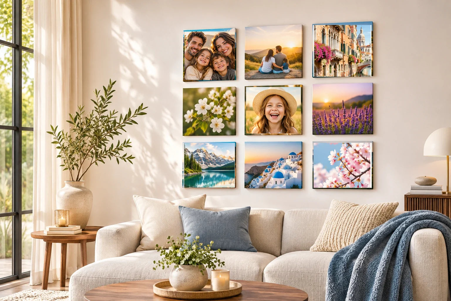
Two photographs can carry equal emotional importance even when their subjects, lighting or composition differ. One might show a grandparent on a birthday and the other a child at graduation, with neither intended as the main image. To balance them as separate square picture tiles, consider how much attention each attracts through subject scale, brightness, contrast and surrounding space. The aim is a visual conversation, not a forced hierarchy in which one photograph becomes the hero and the other merely provides decoration.
A pair does not need to be identical. Balanced compositions can be symmetrical or asymmetrical, with different visual elements carrying comparable weight. Adobe's composition guidance distinguishes visual balance from perfect mirroring, which is useful for interpreting two very different family pictures. Start by reviewing the source photographs as independent stories, then place their square previews side by side. Rework only the aspects that cause one to overwhelm the other, preserving recognizable faces and the integrity of each memory.
Identify what each image contributes
Write one sentence about the meaning of each photograph. Perhaps one shows the parent who encouraged a new career, while the second captures the person celebrating its beginning. If both moments matter equally, the pairing should make those meanings available without a caption explaining which is most important. Look for recognizability and comparable emotional clarity. A photograph with a powerful expression may need no additional contrast, while a wide group image may require a considered crop so its people remain identifiable.
Do not choose the visually loudest image as the default starting point. Begin with the less obvious photograph and determine what makes it special, then review whether the other image offers enough space for it. The pair should not require duplicating colors or applying a uniform filter that changes someone's appearance. Each source can retain its own lighting and time of day. Equality concerns the viewer's ability to appreciate both, not making their pixels match.
Compare subject scale without making faces identical
A close portrait attracts attention immediately because a face occupies much of the square, while a photograph of several people against a landscape may read more slowly. Consider whether the pairing needs similar subject prominence or whether the contrast is part of its story. One approach is to loosen the portrait crop enough to include setting, rather than enlarging a group until someone is cut out. Compare at the same intended tile scale and judge which details remain readable.
Avoid artificially enlarging a small face with aggressive upscaling. The source may lack enough detail, and creating sharper-looking features can introduce a false appearance. A different photograph from the same moment might supply a more natural composition. If both images use very different scales deliberately, give them a reason to belong together through a shared gesture, direction or visual rhythm. Their individuality should remain apparent without one becoming visually incidental.
Balance brightness, contrast and color
Bright white sky, vivid clothing and high-contrast lettering all pull attention. A subdued indoor portrait may appear secondary beside a strongly saturated vacation image even when its emotional importance is equal. Compare the two under consistent viewing conditions, identifying which area attracts the eye first. A restrained exposure adjustment or a different crop can sometimes distribute visual weight more fairly. Avoid forcing all skin tones or shadows to look identical across photographs taken under different light.
A close portrait of one grandparent and a wider photograph of another at a favorite garden may carry equal emotional importance without occupying equal amounts of each square. Place them at the same represented size and ask whether both are recognizable. If the garden scene feels distant, choose a stronger source rather than forcing the second image into an extreme crop. Two equal roles are established by how clearly their memories read, not by making every face the same size.
Color harmony can come from a small shared element rather than blanket recoloring. A blue doorway in one picture and a blue shirt in the other may create a connection, while different warm and cool scenes can convey a passage of time. Use the actual subjects as a guide. Strong creative filters may flatten the character of one image, turning balance into sameness. Keep the originals and review each edit independently before judging the pair.
Use negative space to give both pictures room
A close subject placed against a simple background may feel quiet and clear, while a busy event photograph offers many competing points of attention. Cropping the busy image to emphasize one interaction can bring balance without reducing its importance. Conversely, retaining a little more negative space around the close portrait can soften its dominance. Adobe describes negative space and visual weight as tools for creating balance even without geometric symmetry; they apply to each individual square as well as the relationship between them.
Inspect whether one person's face sits hard against an edge while the other picture has comfortable space around its subject. That imbalance can make one tile feel cramped. Try reversible crops with equal attention to meaningful hands, clothing and context. Do not stretch a rectangular image into a square or invent seller-specific borders and trim margins. The eventual physical arrangement should respect verified product options, but the editing decision can be evaluated independently.
Test how viewers move between the two images
Place the candidate square images beside one another on a screen or printed reference sheet of equal represented size. Observe which is noticed first, then whether the second offers a clear reason to continue looking. The goal is not perfect simultaneous attention, which is unrealistic, but a satisfying movement between two complete memories. A face looking toward the center of the pairing may invite a natural connection, while a figure looking outward can make the pair feel less cohesive.
Ask another family member which moment they notice and whether the second receives equal consideration. Their response can reveal a problem with crop, visual clutter or meaning that the editor overlooked. Avoid treating one reviewer's preference as objective science; the photographs may carry different personal associations. A balanced pair should remain intelligible to someone without the full family history, while preserving each image's own value.
Approve equality without erasing difference
Compare a short list of reversible crop and tonal variations, noting which details changed. Save a final working version for each photograph and preserve its unmodified original. If the pair uses professional photographs, verify reproduction permissions independently. The absence of a designated hero does not authorize altering either photographer's creative treatment. Keep the project focused on family memories rather than unverified assumptions about mounting, size or the physical print surface.
A successful two-tile pairing allows both moments to be remembered on their own and appreciated together. Equal visual weight does not require identical subject sizes, matched colors or perfectly mirrored compositions. It requires thoughtful crops, readable subjects and a clear relationship between the images. Preserve the two stories, test them at the same approximate scale and let the final arrangement express their shared importance without inventing a hierarchy.