
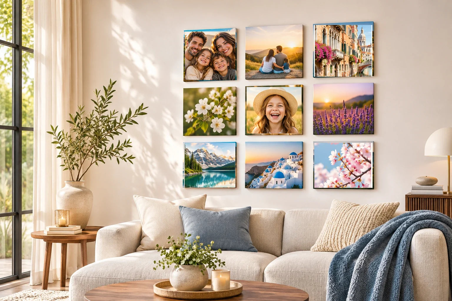
Travel photographs often jump between brilliant daylight and dark evening scenes, and that contrast can make a tile gallery feel fragmented. The solution is not to force all the images toward the same brightness. Day and night reveal different qualities of a place: architecture and landscape in one, signs, windows and reflected light in the other. A cohesive display acknowledges the difference while finding a visual rhythm that allows the viewer to move comfortably between them.
Before editing, arrange the selected photographs as small squares and identify what each lighting condition contributes. A daytime market photograph may show spatial detail; a nighttime picture of the same street may emphasize atmosphere. These can make a compelling pair if they are genuinely different perspectives. Avoid selecting five neon-lit photographs and a single bright beach image with no transition. Think about composition and color relationships before assuming that a uniform filter will make the collection work.
Preserve the character of each light condition
Daylight photographs usually contain a broad range of visible objects and surfaces. Night scenes may rely on isolated pools of light, silhouettes or strong reflections. Editing a night image to look as bright as afternoon can create unnatural noise and destroy its mood. Instead, decide which illuminated subject should remain legible. A shop window, a ferry deck or a distant skyline can provide a clear focal point even if much of the surrounding scene stays dark.
A daylight portrait might include clear faces and warm walls, while an authentic night street scene contains bright lamps and deep shadows. Trying to match both with one exposure preset could wash out the night scene and dim the portrait. Compare them at their native character first, then look for a modest bridge such as a recurring architectural line or a familiar companion. If the dark image loses genuine detail in a conceptual small square, choose another authentic night frame rather than generating sharp faces or fictitious street features.
Likewise, do not darken a sunlit image until it looks artificially dramatic. A bright landscape can offer welcome breathing space beside a concentrated night scene. Preserve the actual weather and time-of-day character where possible. If a photograph was taken in heavy rain or dense shade, its atmosphere may be part of the memory. Cohesion depends more on relative visual weight and clear subjects than on forcing unrelated moments into an invented shared exposure.
Find bridges through recurring colors and shapes
A blue twilight photograph can connect a daytime sea view with a darker urban scene, offering a natural transition. Another link might be repeated warm light: late-afternoon stone, a café interior and a row of illuminated windows. Look for colors already present in the photographs rather than painting all their backgrounds a matching hue. A bridge image is most effective when it belongs to the travel story independently of its palette.
Shape can be just as useful as color. A curving road photographed in daylight may relate to a trail of evening lights; a dark archway can echo a bright doorway. Place those images close enough for the relationship to register but give each enough space to remain distinct. View the tiles at their intended size. A subtle reflection that seems obvious on a large monitor may disappear in a compact printed square and should not be the only visual connection.
Balance the darkest and lightest photographs
Arrange the photographs so the heaviest dark blocks do not all accumulate on one edge. A night image with a small bright subject may still read as predominantly dark from across the room. Distribute such images among lighter photographs while considering the subject's direction of movement. Try a short sequence moving from day through dusk into night, or alternate lighting conditions if the photographs form paired observations. Either approach can work when the visual logic is obvious.
Check the group against the intended wall color. A very dark wall may swallow night scenes if their edges become indistinct, while a bright wall can make high-contrast night squares feel especially dramatic. Paper mockups and accurate-size image previews help reveal these effects. Do not assume all photo-tile products have identical finishes or reflection behavior. Final decisions about physical appearance require an actual print sample or verified product specifications, not a screen-only simulation.
Edit night photographs without inventing detail
Low-light photographs may contain visible grain, color noise or motion blur. Some of that texture is part of the scene; excessive smoothing can make people and architecture look unnatural. Begin with the original file and make small, reversible exposure or noise adjustments. Examine faces, signs and high-contrast edges for artifacts. If the important subject is not visible in the source, enlargement or aggressive software correction cannot guarantee faithful recovery of missing information.
Nighttime colors also vary widely under artificial lighting. A street may be lit by warm lamps, cool LEDs or mixed sources, giving nearby surfaces an unusual cast. Correct only when the color distracts from the memory or makes a familiar subject misleading. Avoid turning every evening photograph neutral gray. Distinct lighting is part of how the traveler experienced the place. The objective is to keep the collection readable while respecting the atmosphere captured by each camera.
Let the journey influence the order
A trip can move naturally from morning exploration to sunset and an evening gathering. If the photographs tell that story, a chronological sequence may strengthen the lighting transitions. But a gallery combining several destinations might be clearer when organized by complementary views instead. Decide which relationship matters most: the passing of a day, a repeated place at different times or the contrast between types of travel experience. The wall needs one readable organizing idea, not several competing systems.
A simple grid helps disparate light conditions feel related through the repeated square format. Do not overcrowd the display simply to include every interesting night photograph. A few carefully chosen images may show more variety than a large group with repeated skyline scenes. Before physical installation, confirm the actual mounting guidance and room clearances. The design can be tested with temporary paper outlines without assuming any tile can be safely moved on the finished wall.
Review the collection at ordinary viewing distance
After preparing the images, reduce them to the approximate final tile size and look at the arrangement from across the room. Check whether the night photographs still have a recognizable focal point and whether the daylight images overwhelm their neighbors. If one image appears muddy, consider a different crop or photograph instead of forcing major correction. Keep editable source files so any adjustments can be reconsidered before production.
The strongest day-and-night travel gallery makes the difference in light part of its story. Its dark scenes feel intentional, its daylight photographs offer space and its transitional images help the viewer travel between them. Do not sacrifice the integrity of a memorable place for technical uniformity. A well-balanced arrangement allows morning, twilight and evening to remain themselves while sharing one coherent visual journey across the wall.