
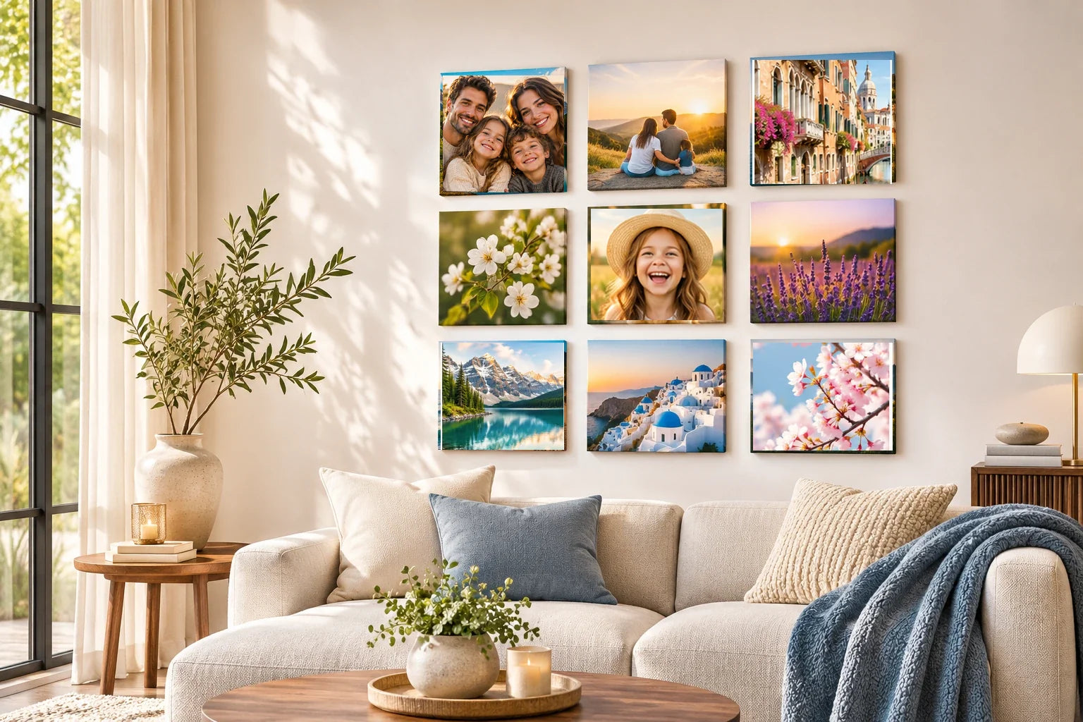
Portraits and architectural photographs can coexist beautifully in a black-and-white photo-tile gallery, even though one shows people and the other shows places. Their shared language need not be identical subject matter. It can come from tonal range, the direction of the light, the size of important shapes, or the order in which the viewer encounters them. A face and a building façade may feel connected because both use a strong curve or shadow, not because they belong to the same album or were taken with the same camera.
Begin by placing the photographs together without arranging them into rows. Separate the face-centered images from the building-centered images and look for repeating visual qualities. One portrait may have a pale background and dark jacket; one architecture image may contain a dark doorway in a bright wall. Such relationships can bridge the subjects. Keep the emphasis on how the pictures look together, rather than converting every image to a harsh high-contrast style merely to force a uniform aesthetic.
Find a common tonal foundation
Black and white removes the direct distraction of competing colors, but it does not automatically make photographs coherent. One image can be mostly pale gray with soft shadows, while another is dominated by almost-black shapes and brilliant white highlights. If placed next to each other without thought, the second may overwhelm the first. Notice the range and distribution of tones before choosing an order. Similar midtone weight can create continuity even when the subjects are different.
Compare two arrangements: one that groups the darkest pictures together, and another that distributes them across the gallery. Concentrating dark images may create a clear visual anchor; distributing them can keep the entire wall balanced. Neither is always right. If a portrait's expression should lead the story, give it a position where a nearby photograph does not compete through extreme contrast. The gallery is successful when tonal coordination supports the meaning of the individual pictures.
Pair human gestures with architectural shapes
A portrait can contain distinctive lines: the angle of shoulders, the curve of a face, the direction of a person's gaze. Architecture offers arches, stairs, windows, and strong vertical or diagonal edges. These shapes can speak to each other across two tiles. A side-profile portrait may sit naturally beside a staircase image because both move upward; a centered face may echo the symmetry of a doorway or building entrance.
A black-and-white family portrait beside a photograph of a grandparent's former home can create a meaningful visual relationship. Repeating a window grid or doorway shape may tie the sources together, yet the portrait does not automatically prove the person lived in the pictured building. Keep each photograph's real subject, creator, and date traceable. A digital mockup can use matching vertical lines to establish rhythm without merging the two images into one invented occasion. The human relationship can come through family testimony rather than assumptions drawn from architectural similarity.
Use these connections carefully. It is not necessary to manufacture a one-to-one visual match for every picture. A sequence of three might use a portrait, an architectural detail, and another portrait, letting the middle image create a pause between people. Alternatively, group two building images around a central face to establish a setting. The aim is to make viewers notice a relationship, not to turn the gallery into an exercise where every line must align exactly.
Balance intimate and distant viewpoints
Portraits often bring the viewer close to a person, while architecture may pull attention outward toward a street or building. That change in implied distance can create a pleasing rhythm. A close face followed by a broad façade gives the eye room to breathe, especially when both photos are square and arranged near each other. A series of close-ups without wider views may feel emotionally intense; a series of distant buildings without a human moment may feel impersonal.
Think of a gallery as alternating scales. A close portrait with visible expression can be followed by a quiet window detail, then a wider city scene. The viewer moves between individual lives and the spaces that surround them. If the photographs are from different places or decades, this visual structure can still work without falsely implying they document one event. Captions or personal context should remain truthful; the arrangement itself need not invent a common history.
Make the monochrome treatment consistent but not identical
Some black-and-white photographs have soft grain and gentle transitions; others use crisp edges and high local contrast. A gallery can include both, provided their differences feel purposeful. Do not remove all character by forcing every file into the same filter. Instead, compare whether whites are radically brighter in one tile, whether dark areas lose essential facial detail, and whether grain distracts from the most important feature.
Editing should preserve the dignity and identity of the people shown. Excessively deepening shadows around a face or erasing background details may change the photograph's meaning. Work from authorized original images when available, retain an unedited copy, and verify that any changes suit the intended use. A visual plan cannot establish permission to reproduce portraits of other people or resolve privacy and publicity rights; those need their own consideration.
Give the gallery a readable beginning and ending
A mixed portrait-and-architecture group can feel like a story when the images are ordered deliberately. You might begin with a clear human portrait, continue through a building entrance, then end with a wider scene. Another sequence may start with a place and introduce the people connected to it. Select the path according to what the photographs genuinely represent, not a stock narrative about travel or family history.
Square tile boundaries offer regularity while leaving room for different types of content. If the viewer will approach the wall from one side, consider placing the first meaningful image along that route. Where a gallery has no obvious left-to-right reading direction, use one strong center and a supporting rhythm around it. The layout should help someone move among photographs without needing labels for every relationship, although accurate captions may still be valuable for archival purposes.
Rehearse the set before making it permanent
Build a simple mockup with the exact selected images, then reduce it to the apparent size at which the gallery will normally be seen. Check whether faces remain recognizable and whether building details turn into confusing dark patches. Try swapping two tiles rather than changing the entire arrangement. Often one better tonal or directional relationship makes the set feel more coherent without altering any file or committing to a different display pattern.
The goal is not to make portraits look like architecture or buildings feel like portraits. It is to let the photographs share contrast, scale, and a clear viewing sequence while retaining their different subjects. Keep the gallery personal and truthful; verify image consent and specific mounting requirements separately. A careful black-and-white treatment can make people and places feel part of one collection without suggesting that they were created at the same time or for the same reason.