
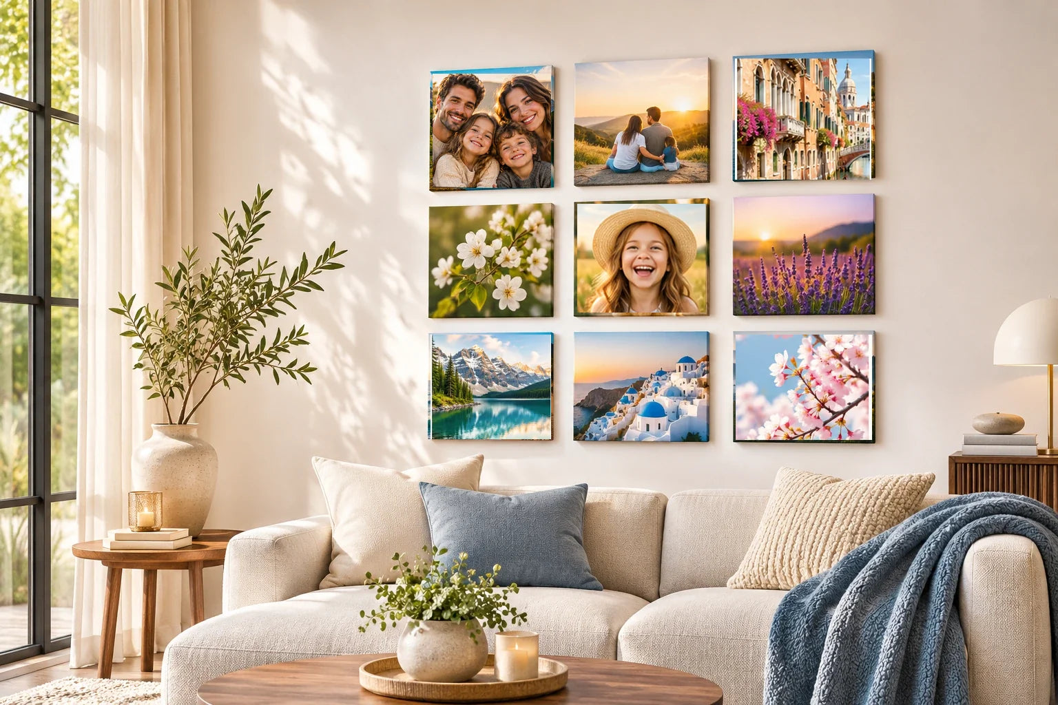
A photograph can communicate a different mood depending on what surrounds it. In a conventional framed picture, the frame becomes a visible boundary with its own width, material impression, and relationship to nearby furniture. A square picture tile offers a different visual logic: the repeated square form and the intervals between pieces can become the gallery's primary structure. These are design distinctions, not statements about which particular product formats Wallpics currently sells or how any tile attaches to the wall.
The comparison matters most when several pictures are displayed together. A framed photograph often feels like an individual object, with a border that can separate it from the wall and from neighboring images. Repeated square pieces can emphasize the photographs as components of one larger arrangement. Neither approach is automatically cleaner or more contemporary. The effect depends on the chosen images, whether a visible border is present, and how the entire group fits the room's architecture and furnishings.
Understand what the boundary contributes
The visible frame around a picture can act as a pause between image and wall. A dark border may create definition around a pale photograph, while a lighter frame may soften the transition to a pale room. Width, shape, and texture also influence how formal or casual the presentation appears. A border is not merely decoration; it can change where the image seems to begin and end. That effect can be useful for photographs with busy backgrounds or highly varied color treatments.
A square tile grouping may rely less on individually expressive frames and more on repeated outer geometry. The shape creates a visual beat, and the gaps become part of the composition. If the actual tile product includes an edge or border, inspect its real appearance rather than assuming it is entirely frameless. The general principle still holds: multiple regular squares tend to encourage viewers to notice pattern and relationship, whereas varied framed pictures can emphasize the individuality of each selected image.
Compare a single centerpiece with a modular gallery
One framed picture can establish a focused center above a piece of furniture. A family portrait, wedding photograph, or favorite landscape may need no supporting images. Its outline is easy to read from a distance. A set of square tiles usually invites another kind of attention because several pictures compete or cooperate within one overall arrangement. The viewer may look first at the complete pattern, then move closer to explore the separate photographs and their relationships.
This modular quality can be an advantage when a memory is distributed across moments. A child's first year, a long trip, or generations of family portraits may gain meaning from being viewed together. The square format can create continuity even when source images differ. But a modular arrangement is not always the best solution. If the original photograph has a strong panoramic composition or substantial fine detail, a larger framed presentation may preserve more of the image's intended visual field.
Explore rhythm, alignment, and negative space
Repeated square edges can establish an orderly rhythm. A regular grid emphasizes stability, while a stepped or asymmetric grouping can suggest movement. The open wall between squares acts as visual punctuation. Consistent gaps help the eye interpret separate pictures as one set, yet the image selection remains crucial. A perfectly aligned wall of nearly identical photographs may feel more repetitive than a smaller, less rigid arrangement with varied subject scale and stronger emotional connections.
Imagine the same six portraits first as a single large composition with one enclosing frame and then as six separate squares. The framed version makes a unified field; the separate pieces allow the gaps to give each person a little independence. Look at the result from the typical viewing distance and ask which format better supports the intended relationship among the people. This is a compositional comparison, not evidence that one construction is more durable or easier to install.
Framed galleries can also create rhythm, but the visible frames introduce another variable. Matching frame widths may unify diverse photographs; mixed frames can create a collected feeling when their colors and proportions are thoughtfully related. Compare both systems with a simple room mockup. Draw the outer outlines first and fill in the photographs afterward. This reveals whether the composition's geometry suits the wall before visual detail distracts from the overall spacing and balance.
Think about the room's existing lines and materials
Square picture pieces can echo the geometry of tiled surfaces, shelving, or a rectangular sofa, but too much repetition may make a room feel rigid. A framed photograph can introduce a different proportion or a stronger boundary that cuts through existing patterns. Look at the direction of furniture, the height of doors, and the size of uninterrupted wall sections. The best display usually participates in those relationships without reproducing every shape in the room.
Material impressions deserve caution. A photograph of a product does not verify its backing, thickness, surface sheen, adhesive, or long-term performance. Likewise, a traditional frame may be made from many different materials with different care requirements. Treat design descriptions and product specifications separately. It is reasonable to discuss the visual effect of a narrow border or strong edge; it is not reasonable to invent engineering or finish claims to make a comparison sound more definitive.
Select photographs for the presentation they need
A formal portrait with a dark background may benefit from a quiet border and generous breathing room. A series of candid moments might feel more lively as a coordinated group of squares. These are possibilities rather than fixed rules. Compare how each proposed image reads at the intended size. A square crop may remove important context from a wide shot, while a visible frame may help separate a complicated photograph from patterned wallpaper. Let the content influence the format instead of forcing every memory into one presentation style.
Try a gallery of three different subject scales: a close portrait, a medium activity scene, and a contextual photograph. In a tile arrangement, their equal outer shapes can make the variations feel coordinated. In framed form, matching or complementary borders can perform a similar task. Notice where your eye goes first in each mockup. If one version feels busy, simplify the images or reduce the number of pieces rather than assuming the entire display category is unsuitable.
Decide without relying on unverified product promises
Choose the visual approach that supports the photographs and the wall. A single framed picture may suit a decisive image; a square tile collection may make relationships between moments easier to see. Neither choice should be justified by unverified claims about effortless installation, removability, printing materials, or product availability. Those questions require exact current business and manufacturer evidence, along with wall-specific guidance where a physical installation is planned.
The strongest design comparison is made with honest mockups. Photograph the room, test the outer shapes, insert the actual image crops, and review the result from realistic viewing positions. A square tile display is not simply a frame with its border removed, and a framed photograph is not merely a slower version of a modular gallery. Each uses boundaries, proportion, and spacing differently. Understanding those differences allows the memory—not a marketing label—to determine how the photograph deserves to be seen.