
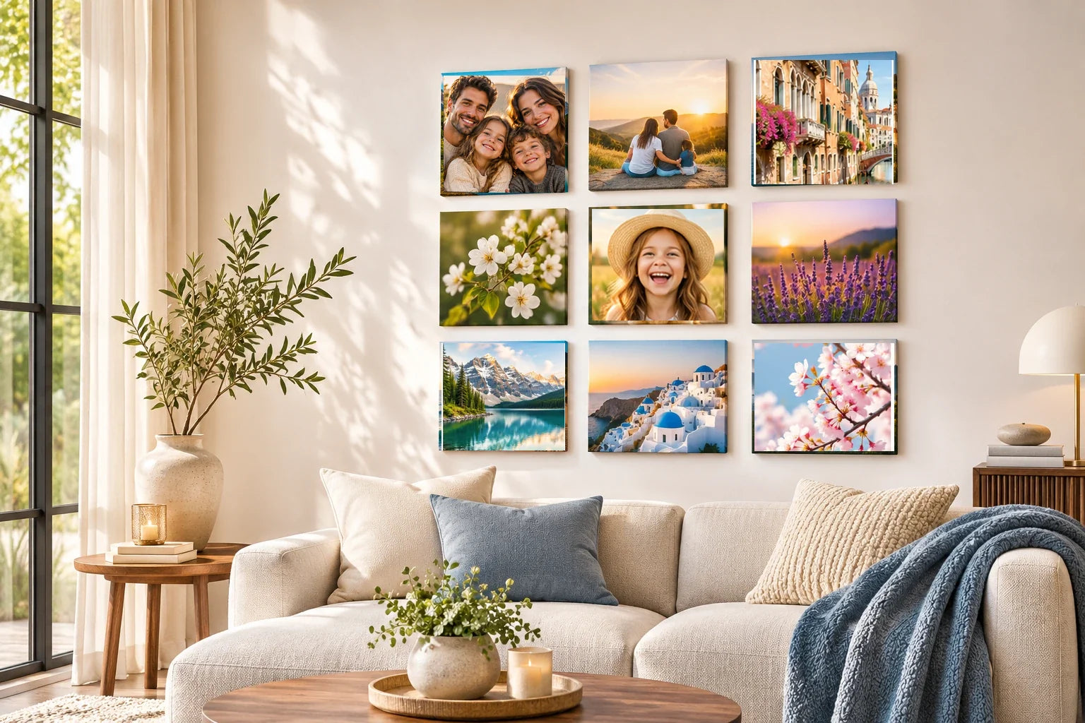
Black-and-white conversion can clarify shapes and expressions, but some personal photographs lose essential meaning when their colors disappear. A child's distinctive jacket, a wedding bouquet, the light of a familiar sunset or the painted walls of a neighborhood may be central to why the memory matters. Converting such images to monochrome for the sake of a matching tile gallery can erase useful context. A thoughtful editor should decide what color communicates before deciding whether to remove it.
Start by comparing the original and a temporary grayscale version at the proposed square crop. Ask what a viewer can still recognize. A photograph may look elegant in black and white while becoming less specific as a memory. If color identifies the place, person, season or event, preserving it may be the stronger choice. The collection can accommodate one or two color photographs without abandoning a restrained overall design, provided the arrangement gives them a clear role.
Keep color when it identifies the occasion
Some events are closely associated with distinctive colors: team uniforms, ceremonial clothing, handmade decorations or a carefully chosen object. Those hues may help family members recognize a particular moment instantly. Removing them can turn a recognizable event into a generic gathering. Before converting a milestone photograph, ask whether color is part of the memory itself or only an incidental element. A quiet, natural color version can be more truthful than a dramatic monochrome treatment that strips the occasion of its visual identity.
A family photo may show a flag whose colors identify the occasion, a child's handmade costume with bright details, or two flowers that are meaningful precisely because their hues differ. Converting all three to grayscale could make the display tidy while erasing useful information. Compare the real color originals with restrained monochrome versions and ask which facts a viewer would lose. If the color holds the memory's identity, preserve it, or place that source in a distinct color chapter rather than inventing a black-and-white history.
Avoid assuming that meaningful color must be intensely saturated. A faded blue dress or a muted autumn sky may carry subtle associations that survive best with restrained editing. If the original file has an awkward color cast, correct it carefully rather than using grayscale as an automatic escape. Preserve realistic skin tones and the surrounding context. The goal is not to make every photograph colorful; it is to avoid losing information that the viewer needs to understand what happened.
Preserve colors that distinguish people or places
A child's favorite sweater, a brightly painted front door or a landscape's unusual vegetation can anchor a personal story. In monochrome, these details may become ordinary gray shapes, especially if their brightness is similar to nearby objects. Try viewing the picture without color and identifying what has become less clear. If the answer includes the central subject, keep color or choose a different photograph for the monochrome set. Style should not make the memory harder to recognize.
Travel photographs are particularly vulnerable to overgeneralization. A blue coastal view, a red market awning and a warm evening street may each depend on local light and materials. Turning them all gray can reduce the sense of place. This does not mean every travel image must remain in color. An architectural silhouette or strong pattern may communicate beautifully in monochrome. Evaluate each subject's visual information rather than converting an entire trip with one preset for convenience.
Choose monochrome when form matters more than hue
A photograph may benefit from black and white when its interest lies primarily in gesture, light, texture or structure. An intimate family portrait with competing colored backgrounds can sometimes become easier to read once the hues are removed. A strong shadow across a doorway may gain clarity as a tonal composition. The conversion is useful when it directs attention toward the meaning already present, rather than creating a new mood unrelated to the memory.
Test whether important faces and objects remain distinct after conversion. Different colors with similar brightness can merge in grayscale, and dark hair or clothing may lose separation from the background. Adjust middle tones conservatively instead of increasing global contrast until the picture looks harsh. If the result needs extensive manipulation to keep its subject recognizable, retaining color may be the more honest and effective choice. The original image should remain available for comparison.
Introduce selected color without breaking the gallery
A mostly black-and-white display can contain a purposeful color photograph as a focal point. Position it where the extra visual energy feels balanced rather than leaving it isolated at an edge. Another option is to include two color images with a shared, understated hue that ties them together across the group. Avoid selective-color tricks that leave one object bright while everything else turns gray unless that effect genuinely serves the story; it can quickly feel artificial.
Consider the wall color and nearby furniture too. A warm room may absorb a muted color photograph comfortably, while the same picture could appear unusually bright against a cool white wall. Test at the real intended size. A color accent should be meaningful enough to justify its stronger pull on attention. If it dominates simply because its saturation is extreme, reduce the edit or consider another image rather than sacrificing the coherence of the entire collection.
Account for the photographic source and print conditions
Digital previews can hide differences that become visible when the image is cropped and reproduced physically. A low-quality screenshot may contain compressed colors and lost tonal detail, while an original camera file may allow more controlled editing. Work from the strongest source and retain an untouched master. A grayscale version is not necessarily higher quality because it contains fewer colors. Its focus, pixel dimensions and tonal range still determine whether the picture is technically suitable for the proposed print size.
Do not assume a specific print finish, color gamut or photo-tile material without verified product details. The best preview is the one approved by the actual production process. Check the intended physical dimensions, and inspect the image at that scale. A particular shade may shift between phone screens and printing, so avoid claiming exact color matches from an uncalibrated display. Make a design decision based on the memory's role and real evidence rather than hypothetical product promises.
Let meaning decide the final edit
When the photo set is arranged together, ask what each color image adds. Does it identify a special occasion, place or person more clearly, or merely stand out because it is vivid? If it is essential, give it room within the grouping. If a photograph communicates its value more directly through line and expression, black and white may be appropriate. Keep the originals and reversible versions so the decision can be revisited if the gallery changes.
A coherent personal wall does not require every memory to surrender the same visual information. Some photographs speak through light and shape; others depend on the exact colors that family members remember. Treat monochrome as a useful editorial option, not an obligation. The strongest set retains what is meaningful in each image while balancing the whole display. Color should remain whenever removing it would make the story less specific, less recognizable or less honest.