Displacement maps in Photoshop offer a powerful and creative way to integrate text, graphics, and other elements into your images in a more dynamic and realistic way. Instead of simply overlaying text or graphics onto a photo, the displacement map allows you to warp these elements according to the underlying textures and patterns, making them appear as though they are naturally part of the image. This technique can elevate the realism of your compositions and create a cohesive, visually striking effect.
The concept of displacement mapping might seem complex, but with the right approach, it can become an essential tool in your Photoshop arsenal. Whether you’re adding text to a textured surface or integrating a graphic into a photograph, displacement maps can help you make those elements appear as though they belong seamlessly with the background. In this guide, we’ll walk you through a step-by-step process to create and apply displacement maps in Photoshop, as well as explore some creative uses for this technique.
Choosing the Right Background Image for Displacement Mapping
The first and perhaps most crucial step in applying a displacement map is selecting the background image that will serve as the foundation for your text or graphic. The background image is essential because it sets the tone and establishes the visual context in which your added elements—such as text, logos, or illustrations—will interact. When it comes to displacement mapping, the image you choose plays a significant role in how effective and striking the final result will be.
For displacement mapping to be noticeable and impactful, the background image must have texture and contrast. The reason texture is important is that it provides the visual foundation upon which the displacement effect can create warping and movement in the added text or graphic. The more pronounced and dynamic the texture in the background, the more dramatic the displacement effect will appear.
The Importance of Texture and Contrast in Displacement Mapping
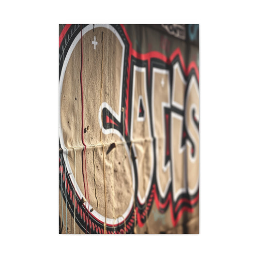
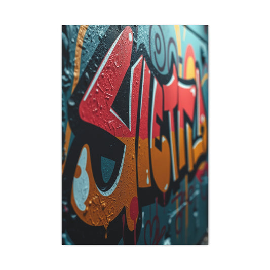
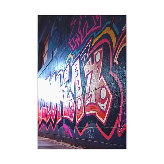
When working with displacement maps in Photoshop, it’s beneficial to start by selecting an image that has strong contrast and texture. Backgrounds that include textures, such as rough surfaces like a weathered wall, a fabric with intricate patterns, or even a crumpled piece of paper, are ideal. These types of images will ensure that the displacement map’s effect is easily visible and creates a dynamic look. Text and graphics will appear to interact with these textures, enhancing the realism and integration of the layers.
For example, using an image of a wall with peeling paint or a surface that has deep wrinkles will allow the displacement map to follow these contours, making your text or graphic appear as though it is physically interacting with the surface. This can create a more immersive, believable effect, where the added elements seem to be part of the scene rather than sitting on top of it.
|
Related Catagories: |
On the other hand, images that have little contrast or minimal texture may produce a more subtle displacement effect. While this can still be beautiful, it might be harder to see at first glance. If your aim is to create a more subtle effect, a background with less pronounced texture may be more fitting. However, it’s essential to understand that the displacement effect will not be as noticeable as it would be on a high-contrast, textured surface. This subtlety could work for certain designs or visual effects, but if you want a more noticeable and dramatic result, choose an image with more visual depth.
Step 1. Selecting the Right Image for Your Project
The subject matter of your background image is equally important as its texture and contrast. When selecting an image for your displacement map, consider how the background image will interact with the text or graphic you plan to add. Ideally, the background and the added elements should complement each other in both composition and color. The goal is for the text or graphic to blend naturally with the background, not stand out awkwardly or appear disconnected from the scene.
If you are adding text, you should ensure that the background image doesn't compete with the readability of the text. For instance, a busy or overly textured background might make the text hard to read or detract from its clarity. In this case, you may want to choose a background that is more subdued in terms of color or texture. Conversely, if you want the text to stand out, you can choose a background with subtle textures and colors that allow the text to become the focal point of the design.
When choosing a background, you should also take the colors into account. The color palette of the background image should work well with the colors of the text or graphic you plan to add. For example, if your background has warm tones like reds and oranges, consider using text or graphics that complement or contrast those tones to create a balanced and harmonious composition. If you have a background with cold colors like blues or greens, a text or graphic in a contrasting color (such as warm oranges or yellows) can create a striking effect.
How to Achieve a Balanced Displacement Effect
After you’ve selected a background image, it’s important to focus on achieving a balanced displacement effect. The goal is for the text or graphic to look as though it naturally integrates with the background. Displacement maps can add depth, texture, and realism, but they also need to be applied carefully to ensure that the added elements don’t appear out of place.
To do this, it's essential to consider the direction of the texture and how the displacement map will influence the appearance of your text or graphic. The texture of the background can determine how much distortion or warping the text will experience. For example, if the background has a strong horizontal texture (like wood grain or fabric weave), applying a displacement map will cause the text to appear as if it is moving with the natural flow of that texture. By choosing a background with strong linear textures, you can give the illusion that the text is carved into or painted onto the surface.
For backgrounds with more organic or irregular textures, such as a wrinkled piece of paper or a crumpled metal surface, the displacement effect will make the text appear to be pressed into the surface or following the contours of the image. In these cases, the text might seem as though it is physically warped by the texture, adding depth and realism to the final composition.
One important consideration is how much of the texture you want to show through. If you want the text to have a slight interaction with the background, a lower displacement map intensity can be used. On the other hand, if you want the text or graphic to be deeply embedded within the surface, a higher intensity of displacement will make it appear as if it is more significantly shaped by the texture. Finding the right balance of displacement intensity is key to achieving a natural-looking effect.
Step 2: Converting the Image to Black and White for Displacement Mapping
Now that you have selected your background image, the next step in preparing it for displacement mapping is converting it into a black-and-white image. The reason for this conversion is that displacement maps function based on grayscale values, which are used to determine how elements such as text, logos, or graphics will be warped according to the texture and structure of the background. By using a black-and-white version of your image, you are creating a high-contrast map that will effectively guide the interaction between your added elements and the underlying texture.
The grayscale conversion is an essential step because it strips away the color data and focuses solely on the lightness or darkness of each pixel. In displacement mapping, lighter areas of the map cause more displacement, while darker areas cause less. This contrast determines how your added text or graphic will move and shift in relation to the background texture, creating the warped, three-dimensional effect that makes the displacement map so powerful.
Understanding the Role of Color Channels in Displacement Mapping
To start preparing your image for displacement mapping, open the Channels panel in Photoshop. This panel will display the three color channels of your image: Red, Green, and Blue. Each of these channels represents a different part of the color spectrum, and the tonal values of each channel can vary depending on your image. By examining these channels, you can select the one that offers the most contrast, as contrast is key to getting a pronounced and noticeable displacement effect.
For most images, the Blue channel often provides the most contrast and works best for displacement mapping, especially if the image has a lot of texture. The Blue channel tends to accentuate details, making it easier to create the kind of dynamic and noticeable warping effect you're aiming for. However, this isn’t always the case, and you may find that the Red or Green channel works better for your specific image. For instance, if your image has a lot of light tones in the blue areas, the Blue channel might not offer enough contrast. In such cases, the Red or Green channel might provide a better result for enhancing the texture and achieving the displacement effect you desire.
Once you’ve selected the channel with the most contrast, the next step is to adjust its contrast further to ensure the displacement map is as effective as possible. Increasing contrast sharpens the texture, making the areas of displacement more defined and pronounced.
Enhancing Contrast for a More Defined Displacement Effect
The key to getting a powerful displacement effect is creating a high-contrast image that emphasizes the texture. To achieve this, you’ll need to adjust the contrast of your chosen channel. To do this, go to Image > Adjustments > Levels (or press Ctrl+L on Windows or Command+L on Mac). The Levels dialog box will allow you to adjust the tonal range of your image, specifically the shadows, midtones, and highlights.
In the Levels window, you’ll see three input sliders beneath the histogram. These sliders allow you to fine-tune the black, gray, and white points of your image. The left slider controls the shadows, the middle slider adjusts the midtones, and the right slider affects the highlights. By moving these sliders, you can either darken or lighten the image, which increases or decreases the contrast, respectively.
Start by adjusting the left (shadows) and right (highlights) sliders to enhance the contrast. Move the left slider toward the center to deepen the dark areas of the image. Similarly, move the right slider inward to brighten the light areas. The goal here is to make the dark areas darker and the light areas lighter, which will help to define the textures in the displacement map.
The midtones slider can also be adjusted to make finer tweaks to the overall brightness of the image. You can move this slider left to darken the midtones or right to lighten them. However, this adjustment should be used carefully as it can affect the overall look of the texture. By sharpening the contrast in this step, you are making sure that the texture in your image is pronounced enough to affect the displacement map when applied to text or graphics.
It’s important to keep in mind that the level of contrast you choose depends on the effect you want to achieve. For a more subtle displacement effect, a lower contrast will provide a smoother look, while a higher contrast will create a more dramatic and pronounced displacement effect.
Saving the Image for Future Use
Once you’ve created a high-contrast version of your background image, you need to save it as a separate Photoshop file. This saved file will be used specifically as your displacement map, so it’s important to keep it accessible for the next steps in the process.
To ensure the image is properly set up for displacement mapping, go to Image > Mode > Grayscale to convert it to grayscale. After that, change the mode to 8 Bits/Channel by going to Image > Mode > 8 Bits/Channel. This step is necessary because Photoshop displacement maps work best with an 8-bit depth, which limits the color information to grayscale values.
Now that your image is in the correct format, you need to duplicate the channel you’ve selected for the displacement effect. In the Channels panel, right-click on the chosen channel (such as the Blue channel, if that provided the most contrast) and select Duplicate Channel. In the dialog box that appears, choose New for the destination document and give the file a meaningful name. This will ensure that you have a separate file containing your displacement map.
Save this file as a .PSD file and store it somewhere easy to find, as you will need to reference it later when applying the displacement map to your text or graphics.
Step 3: Saving Your Image for Displacement Mapping
Once you’ve successfully converted your image to black and white and adjusted the contrast for optimal displacement mapping, the next step is to save it in the appropriate format. This is crucial because displacement maps need to be in a specific format and color depth to work correctly in Photoshop. The process ensures that the grayscale image will be used efficiently for the displacement effect and allows you to seamlessly integrate it with your text or graphic later on.
Converting the Image to Grayscale and Correct Color Depth
The first thing you need to do is convert the image into grayscale. This removes all color information from the image, which is important because displacement maps function based on the intensity of light and dark values—grayscale images are ideal for this purpose. To convert the image to grayscale, go to the Image menu at the top of the screen and select Mode > Grayscale. This ensures that your image no longer has any color data and is purely composed of shades of gray.
|
Related Catagories: |
Next, you need to adjust the color depth of the image. Displacement maps should be in 8-bit color depth for optimal functionality in Photoshop. To switch the image to 8 Bits/Channel, go to Image > Mode > 8 Bits/Channel. This step is vital because displacement mapping relies on 8-bit depth to effectively map grayscale values, which in turn control the displacement amount applied to the text or graphic. Working with a higher bit depth can result in more detailed color data, but for displacement mapping, 8-bit is typically sufficient and ideal for most projects.
Duplicating the Channel for the Displacement Map
Once your image is converted to grayscale and set to 8 Bits/Channel, the next task is to duplicate the channel that will be used for the displacement map. As you have already selected the channel that provides the most contrast—either the Red, Green, or Blue channel—you now need to make a copy of that specific channel. This duplicate will serve as the base for your displacement map.
To duplicate the channel, go to the Channels panel and right-click on the channel you’ve chosen. Select Duplicate Channel from the context menu. A dialog box will appear asking you to select a destination for the new channel. You’ll need to choose New as the destination document. This will ensure that the duplicate channel is saved as a separate file from your original image, making it easy to use as a displacement map later.
Give the new file a descriptive name that makes it clear this is your displacement map, such as "Displacement Map" or "Texture Map." After naming the file, click OK to confirm and create the new document. Photoshop will now create a new file with only the duplicated channel, preserving the high-contrast grayscale values that are essential for the displacement map. This new file will be used in the later steps to apply the displacement effect to your text or graphic.
Saving the Displacement Map File
After creating the duplicate channel and confirming it in a new document, the next step is to save this new file. It’s essential to store the displacement map file in a location that is easy to find, as you will need to open it later in Step 6 when you apply the displacement map to your text or graphic.
To save the file, go to File > Save As and choose PSD (Photoshop Document) as the file format. This will preserve all of your layer information and channel adjustments, ensuring the file remains editable in the future. Saving the file as a PSD ensures that the map retains its full quality and can be reopened at any time for further modifications if necessary.
Choose a location on your computer where the file is easily accessible, such as a specific project folder. Organizing your files in this manner will save you time later when you need to return to the displacement map for adjustments. Once saved, close the file, as you won’t need it again until Step 6, where you will load it to apply the displacement effect to your text or graphic.
Why It's Important to Save a Separate PSD File
Saving the displacement map as a separate PSD file is crucial because it allows you to keep all your work organized and ensures you can reuse the map for other design elements in the future. PSD files retain all the information you’ve edited—such as grayscale adjustments, channel duplications, and contrast levels—without losing quality. This is particularly useful when you need to make changes later on.
If you save the file in any other format, such as JPEG or PNG, you may lose the detail or quality that is critical for the displacement map to function properly. These formats tend to compress the image and lose important pixel information, which would result in a less effective displacement effect. By saving as a PSD, you’re preserving all the fine details that the displacement effect will rely on to produce the desired results.
Organizing Your Workflow for Efficiency
As with any complex Photoshop task, organization is key. By saving the displacement map as a separate file and keeping it in an easily accessible location, you’ll make your workflow much smoother. You can also create a dedicated folder for your project files, including both the original image and the displacement map, to keep everything organized in one place. This practice not only keeps your files in order but also allows you to come back to the project in the future and make adjustments or try new effects with ease.
When you’re working on multiple layers and effects, especially for complex designs, keeping your files organized helps ensure you don’t lose track of any necessary assets. Plus, having the displacement map saved as a separate file allows you to experiment with different textures or background images in the future while using the same displacement map for consistency across projects.
Step 4: Apply Gaussian Blur to Enhance the Displacement Map Effect
Once you’ve prepared your grayscale displacement map, the next step in creating a seamless and realistic effect is to apply a subtle Gaussian blur. This step may seem simple, but it plays a significant role in ensuring that the displacement effect blends smoothly with the underlying textures of your background image. By adding a slight blur, you’re softening any sharp, abrupt edges of the displacement effect, which can otherwise make the added text or graphic appear overly distorted and unrealistic.
The Gaussian blur helps create a more organic transition between the text or graphic and the background, leading to a more natural appearance. Without this blur, the displacement effect could end up looking too harsh or jagged, taking away from the authenticity of the final composition. The goal is to integrate your added elements seamlessly into the background, making them appear as though they naturally belong to the texture.
The Role of Gaussian Blur in Displacement Mapping
The primary purpose of applying a Gaussian blur to the displacement map is to smooth out the displacement's interaction with the added text or graphic. Displacement maps work by altering the position of each pixel based on the grayscale value—light areas cause more displacement, and darker areas cause less. However, if the transition between these light and dark values is too sharp, the effect can look unnatural and overly exaggerated.
By applying a blur, you create a gentler transition between these values, resulting in a softer displacement effect. The blur effectively rounds off harsh pixel edges, making the displacement look more fluid and in tune with the surrounding texture of the image. For example, if you are working with an image that has a textured surface like a stone wall, a harsh displacement effect would make the text appear unnaturally warped, whereas a smoother, softer blur will allow the text to appear as though it is genuinely pressed into the surface.
How to Apply the Gaussian Blur Effect
To apply the Gaussian blur in Photoshop, go to the Filter menu at the top of the screen and select Blur > Gaussian Blur. This will open the Gaussian Blur dialog box, where you can control the radius of the blur. The radius controls how much of a blur is applied and how smooth the transitions in the displacement map will be.
When working with displacement maps, the general starting point for the radius is usually 1 pixel. A radius of 1 pixel creates a minimal blur effect, ensuring that the transition between light and dark areas in the grayscale displacement map is subtle, without losing too much of the texture’s definition. A small blur radius helps preserve the fine details of the texture, which is particularly important if you’re working with intricate backgrounds that rely on fine texture for the displacement effect to be effective.
That being said, depending on the resolution of your image and the intensity of the effect you want to achieve, you can adjust the radius of the Gaussian blur. If your image is highly detailed and you want a more pronounced effect, you can experiment with a slightly larger radius. For example, using a blur radius of around 2–3 pixels will create a more noticeable transition, but anything above this can begin to soften the texture too much and result in a loss of detail. Therefore, it's crucial to find the right balance that matches your design and the overall look you're going for.
Once you have set the appropriate radius for your blur, click OK to apply the effect. The blur will smooth the edges of the grayscale map, and you will notice the displacement effect becoming more natural when you apply it later to your text or graphic.
Why Gaussian Blur Is Essential for Realistic Displacement Effects
While displacement maps allow for powerful visual manipulation of text and graphics, they can also create unnaturally harsh effects if not applied with careful consideration. The blurred displacement map ensures that the added elements interact more organically with the background, allowing them to seem as though they are part of the texture rather than floating above it.
For example, imagine trying to add text to a photograph of a textured stone wall. Without a blur, the text could appear as though it is sharply carved into the wall, which may not align with the soft, natural curves and inconsistencies of the wall texture. By applying a Gaussian blur, the text will appear as though it naturally conforms to the surface of the stone, taking on the subtle indentations and imperfections of the material. The blur mimics the way light and shadow interact with physical surfaces, lending an air of realism to your design.
The importance of this effect becomes especially clear when working with photographs that contain soft lighting or smooth textures. If the texture of the background is delicate, a sharp displacement effect without blur could create a jarring, unrealistic result. The Gaussian blur ensures that your text or graphic doesn’t appear too harshly imposed, but instead flows naturally with the image's overall aesthetic. This results in a design that feels more harmonious and visually cohesive, helping to establish a stronger visual impact.
Adjusting the Radius Based on Image Resolution and Design Needs
One of the factors that can influence the intensity of the Gaussian blur is the resolution of your image. Higher-resolution images contain more detail and can accommodate larger blur radii without losing texture or quality. Conversely, lower-resolution images might require a smaller blur radius to prevent the effect from becoming too soft or muddy.
If you're working with a high-resolution image and want a more dramatic displacement effect, feel free to experiment with higher blur radii, such as 2–5 pixels. These settings will allow the displacement to have more movement, while still maintaining a level of realism. On the other hand, for lower-resolution images, you may want to stick with a blur radius of 1–2 pixels to preserve as much texture as possible.
Another important aspect to consider is the overall design aesthetic you’re aiming for. For designs where the text or graphic is supposed to be subtly integrated into the background, using a lower blur radius will allow the texture to show through more clearly. For more stylized effects, where the displacement is the focal point of the design, you may want to increase the blur radius for a softer, more flowing result.
Saving the Image After Applying Gaussian Blur
After applying the Gaussian blur, it’s essential to save your image before moving on to the next steps in your displacement mapping process. Saving the image at this stage ensures that the blurred displacement map is preserved, and you won’t lose any of the adjustments you’ve made so far. To do this, simply go to File > Save As and save your image in a location where it can be easily accessed later. Ensure that it’s saved as a PSD file to preserve all layers and adjustments.
Step 5: Add Your Text or Graphic
Now that the displacement map is ready, it’s time to add the text or graphic that will be affected by the map. Return to your original image and ensure all channels are enabled (RGB). Next, add your text or graphic to the image. You can type in text using the Text tool or place a graphic or logo by dragging and dropping it into the workspace. Position the text or graphic exactly where you want it.
At this point, you can adjust the color of your text or graphic. For text, you might want to use a contrasting color to make it stand out against the background. For graphics or logos, you can either leave the color as is or change it to complement the background image. If you're using a graphic, ensure it’s placed on a new layer, as this will allow you to manipulate it independently from the background.
Step 6: Apply the Displacement Map
To apply the displacement map to your text or graphic, you first need to convert it into a Smart Object. Right-click on the text or graphic layer in the Layers panel and choose "Convert to Smart Object." This step is essential because it allows you to apply the displacement effect non-destructively, so you can always modify the effect later if needed.
Next, go to Filter > Distort > Displace. A dialog box will open, where you can adjust the displacement settings. You can use the default settings or tweak the settings based on how much displacement you want. Click OK, and Photoshop will prompt you to select the displacement map file you saved earlier. Locate the file, select it, and click Open.
Once the displacement map is applied, you can zoom in to 100% view to inspect the effect. The text or graphic will now warp according to the grayscale values in your displacement map, creating the effect of it naturally blending into the texture of the background.
Step 7: Refine the Displacement Map Effect
After applying the displacement map, the effect may not be perfect right away. To refine the look, you can adjust the layer’s blend mode to make the text or graphic blend more naturally with the background. The default blend mode of Normal might not produce the best result, so experiment with different blend modes such as Overlay, Soft Light, or Multiply. These blend modes often help the text or graphic integrate more seamlessly with the background.
You can also duplicate the layer and experiment with the opacity and blend mode settings to further fine-tune the effect. If the displacement effect is too subtle, duplicating the layer and adjusting the opacity can strengthen the effect. For additional control, you can adjust the color of the text or graphic by creating a new Solid Color fill layer. Choose a color that complements your image, and apply it only to the text or graphic by creating a Clipping Mask.
Alternative Uses for Photoshop Displacement Maps
Displacement maps are most commonly used with text and graphics, but their applications extend far beyond that. One interesting use of displacement maps is to create realistic reflections. By applying a displacement map to a reflection, you can make the reflected object appear as though it’s influenced by the texture of the surface it’s reflecting on, creating a more convincing result.
Displacement maps can also be used for creative design projects such as adding tattoos to portraits. When adding a tattoo or any graphic to a person’s skin, a displacement map can help the design follow the natural contours of the body, making the tattoo appear more realistic and integrated. Without displacement mapping, the tattoo might look flat and unnatural, but with this technique, it seamlessly conforms to the curves of the skin.
Conclusion: Mastering the Displacement Map Effect in Photoshop
Mastering the displacement map effect in Photoshop is a valuable skill for any designer or photographer. By following the seven steps outlined in this guide, you can apply displacement maps to integrate text, graphics, and other elements naturally into your images. Experiment with different textures, blend modes, and opacity settings to achieve the perfect result. Whether you're creating realistic reflections, adding tattoos, or simply enhancing text, displacement maps allow you to create more dynamic and professional compositions in Photoshop.
As you become more comfortable with this technique, don’t be afraid to experiment with more complex designs. The versatility of displacement maps opens up countless possibilities for creative expression, so use this powerful tool to push the boundaries of your Photoshop projects.


