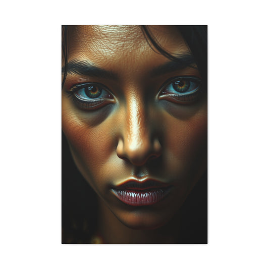
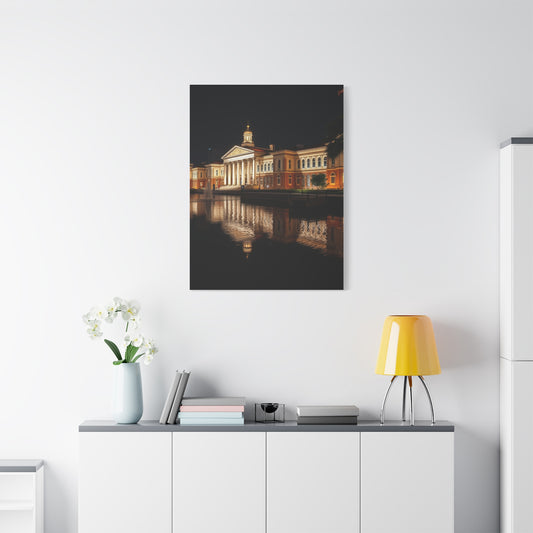
Selecting black watercolour paper begins with understanding its inherent properties. Unlike traditional white or cream papers, black paper absorbs light differently, affecting the vibrancy and contrast of your pigments. Artists often find that metallic or opaque watercolours perform exceptionally well on this surface. The deep tones of black paper create a natural backdrop for highlights, allowing reflective or iridescent paints to pop dramatically. If you are looking to create serene and spiritually uplifting spaces through your art, you can draw inspiration from pooja room designs for peace and positivity, which demonstrate the use of contrast and ambient lighting to enhance artistic expression. Understanding these qualities is crucial for artists seeking to achieve mood and atmosphere in their compositions, whether in abstract or realistic works.
Black paper also allows for unique experiments with negative space. Artists can emphasize the absence of color as much as the presence, creating compositions that feel dynamic and visually compelling. When combined with reflective mediums like metallic watercolour or gel pens, black paper can turn even simple sketches into striking visual statements.
Evaluating Paper Weight and Thickness
The weight of black watercolour paper significantly impacts its usability and overall performance. Heavier papers, typically above 300 gsm, resist warping even when applying multiple layers of water, ink, or gouache. These papers are ideal for professional artwork or for techniques involving repeated washes. Lighter sheets, in contrast, are better suited for practice sketches, studies, or small-scale projects.When experimenting with shadows and highlights, consider techniques similar to those in solar eclipse photography tips for beginners, where attention to detail and contrast plays a crucial role in achieving depth. The interplay of light and shadow on black paper can mimic photographic effects, allowing artists to create dimensionality and visual tension. For larger works, heavier paper ensures that layering techniques do not buckle the surface, providing a stable canvas for complex compositions.
Choosing the right weight also depends on the intended medium. For instance, acrylics tend to be heavier and may require sturdier sheets, while fine-detail gouache can thrive on lighter textures. Understanding these nuances allows artists to plan projects more effectively and avoid frustrations during execution.
Surface Texture: Smooth vs. Rough
Black watercolour paper comes in a variety of textures: hot-pressed (smooth), cold-pressed (medium texture), and rough. Smooth papers are ideal for fine lines, detailed illustrations, and calligraphy-style techniques, whereas rough textures lend themselves to expressive strokes, washes, and layered effects. The surface choice directly affects how paint interacts with the paper, influencing blending, absorption, and final presentation.For artists seeking a cozy, natural aesthetic, ideas from rustic home decor for warm ambiance can translate into choosing textures that feel warm and inviting in your compositions. Rough textures, for example, mimic the tactile feel of natural materials like wood or stone, enhancing the organic quality of your art. Exploring different textures also encourages experimentation with brush techniques, splattering, or layering to achieve depth and variation.
Additionally, the choice of texture can influence the perception of light. Smooth papers reflect light subtly, allowing metallic pigments to shimmer, while rough papers absorb light unevenly, producing dramatic contrast. Understanding these effects is crucial for creating intentional highlights and shadows on black backgrounds.
Durability and Acid-Free Composition
Long-lasting black watercolour paper must be durable and acid-free to prevent yellowing and deterioration over time. Acid-free papers are particularly important when producing artwork intended for framing, exhibitions, or sale, as they maintain color integrity and structural stability. High-quality sheets ensure your artwork maintains its original intensity and brilliance, even after years of display.Just as unique decorative elements like the snake plant decor for man cave provide character to a room, selecting archival-grade paper adds longevity and aesthetic value to your creations. Durability is also critical when experimenting with water-heavy techniques or mixed media projects that combine multiple layers and materials. Investing in high-grade paper ultimately saves time, preserves artistic effort, and ensures that your work withstands both handling and environmental stressors.
Testing Color Vibrancy on Black Paper
Color vibrancy is essential when working on dark surfaces. Metallic paints, gouache, and opaque acrylics appear more vivid on black paper than on lighter sheets, making the medium perfect for dramatic illustrations, fantasy scenes, or abstract compositions. Properly testing your pigments ensures that they maintain brightness and clarity against the dark background. Techniques for highlighting and layering can dramatically change the perception of depth, adding a three-dimensional feel to your work.Observing the bold statement of skull photography with high contrast can inspire similar contrasts in your compositions, showing how careful attention to light and dark transforms simple elements into eye-catching visuals. Layering light colors over black also allows for subtle tonal variations, enabling artists to create shading effects that would be difficult to achieve on white or cream paper.
Experimenting with complementary and analogous color schemes on black paper can further enhance vibrancy. For instance, warm metallics against cool dark backgrounds create dramatic tension, while soft pastel hues appear delicate yet striking.
Comparing Brands and Paper Sources
Not all black watercolour papers are created equal. Some brands focus on smooth textures for precise illustration, while others prioritize absorbency or archival quality. Testing a variety of brands is essential to discover which combination of texture, weight, and surface treatment aligns with your preferred techniques. Exploring curated collections like premium textured art prints can provide insight into refined textures and surface finishes that artists often aim to replicate in their own material choices. Reviews, sample packs, and trial sheets are effective ways to evaluate different brands without committing to full-sized pads. Assessing papers based on your specific medium—whether gouache, metallic watercolour, or ink—ensures that your final selection supports both technical performance and artistic intent.
Integrating Black Paper into Mixed Media Projects
Black watercolour paper is versatile and can be used beyond traditional watercolours. Mixed media projects often involve inks, pastels, metallics, or even digital transfer techniques to enhance visual impact. Combining multiple mediums on black paper allows for layered compositions that are dramatic, expressive, and highly unique.Artists can draw inspiration from high-contrast collections like dark background gun weapons art, which demonstrate how dark backgrounds amplify intensity, making details stand out sharply. Understanding how different materials behave on black paper enables artists to integrate textures, reflective highlights, and bold pigment contrasts effectively. Mixed media experimentation also encourages innovation, pushing traditional boundaries of black paper usage.
Enhancing Your Workspace for Black Paper Techniques
The environment in which you create your artwork is as important as the materials themselves. Adequate lighting, a well-organized workspace, and ergonomic setup improve both comfort and the precision of your work. For black paper, lighting is particularly critical, as shadows and reflections influence how pigments appear and blend.Elements from home decor, such as divine false ceiling ideas pooja room, can inspire creative arrangements of your studio space. Strategic lighting setups can simulate daylight, enhance metallic pigments, and reduce glare on dark surfaces. A thoughtfully organized workspace fosters creativity, minimizes errors, and allows for extended, comfortable practice sessions.
Special Techniques for Black Paper Art
Unique techniques such as wet-on-wet, metallic layering, and white ink highlights unlock the full potential of black paper. These methods emphasize contrast, creating depth, texture, and eye-catching luminosity. Learning to manipulate light and shadow effectively transforms black paper into a versatile and dramatic medium.Dynamic references like star wars sequels artwork inspiration illustrate how layering and contrast can tell a story visually. Studying these compositions allows artists to understand color interactions, tonal hierarchy, and the importance of negative space in black paper projects.
Maximizing Contrast with Background Colors
The interplay between dark paper and luminous pigments creates striking visual contrast. Artists can simulate lighting techniques similar to those in styling light colored kitchen cabinets to balance shadows and highlights, adding dimension to their work. Using complementary colors and reflective media enhances the perception of vibrancy, creating works that command attention.Additionally, experimenting with layered washes, glazing, or metallic accents can produce dynamic visual effects. Mastering these techniques allows artists to exploit the black paper surface fully, achieving bold compositions with depth and intensity.
Landscape and Nature Inspirations
Black watercolour paper is particularly effective for landscapes and nature studies. Dark skies, mountain silhouettes, and reflective water surfaces gain extra drama when rendered against a deep black background. Compositions that capture subtle lighting transitions resemble the aesthetics in sunrise mountain modernism art print, where tonal contrasts elevate the overall visual experience.By layering highlights, shadows, and midtones carefully, artists can achieve photorealistic or impressionistic effects. Techniques such as glazing and metallic detailing further enhance reflections, moonlit scenes, and mist effects, making black paper ideal for expressive and immersive landscapes.
Choosing the Right Black Watercolour Paper for Cityscape Art
Creating cityscape artwork on black watercolour paper allows artists to play with contrasts, shadows, and highlights to mimic urban lighting. Dark surfaces provide a dramatic backdrop for reflective elements like glass windows, streetlights, and metallic structures. For inspiration, artists can study the streets skyline of New York City inspiration, which showcases how layered lighting and bold contrasts create dynamic urban compositions. By carefully observing architectural forms and perspective, black paper becomes a tool for amplifying depth and vibrancy in cityscapes.When working on black paper, subtle tonal differences between buildings or street elements become more pronounced. Using metallic watercolours or white ink over dark backgrounds adds a glowing effect reminiscent of city lights at night. Practicing layering and highlighting on smaller sketches helps artists gain confidence before larger compositions.
Maximizing Budget-Friendly Techniques for Black Paper
High-quality black watercolour paper can be expensive, so learning budget-friendly techniques is important. One effective method is using sample sheets to test paint reactions, transparency, and layering effects. Artists can also mix opaque pigments with more transparent ones to extend their supply. For deals on art supplies and inspiration, explore best photography deals on Amazon Prime, which highlights ways to optimize resources without compromising quality.In addition, experimenting with recycled papers or combining smaller sheets can produce creative layouts without waste. Keeping an inventory of high-pigment paints ensures that every application is maximized, especially when working on black backgrounds where pigment opacity is crucial. Using affordable alternatives strategically allows artists to maintain consistency and achieve high-impact results.
Selecting Paper Texture for Detailed Illustrations
Texture plays a pivotal role in black paper artwork, especially for detailed illustrations. Smooth papers provide the perfect surface for precise line work and ink detailing, while rough textures enhance depth and create organic brush effects. Artists can explore collections like Gustave Caillebotte inspiration for painting to understand how texture affects tonal transitions and layering techniques. Black watercolour paper amplifies texture, giving every brushstroke extra visual weight and sophistication.Choosing the right texture depends on the project type. For urban architectural sketches, smoother papers allow crisp lines and clean edges. For expressive or abstract pieces, rough textures encourage dynamic movement and layered effects. Understanding the interaction between paint and paper texture is crucial for achieving the intended artistic outcome.
Preserving Memories with Archival-Quality Black Paper
Black watercolour paper should be archival-quality to maintain the vibrancy of colors and prevent yellowing over time. High-quality sheets allow artists to preserve family or landscape-themed artwork for generations. Techniques for capturing detail and contrast are similar to those in timeless family photo guide with any camera, emphasizing the importance of quality materials for long-lasting results.Archival paper also withstands repeated layering of metallics, gouache, and inks, making it ideal for experimental techniques. Ensuring durability allows artists to revisit and enhance previous works without risk of damaging the paper. Proper storage in acid-free folders or boards further preserves both texture and pigment integrity.
Celebrating Feminine Aesthetics on Black Paper
Black watercolour paper can also be used to create soft, expressive, and feminine-inspired compositions. The dark background allows pastel hues, metallics, and white ink to stand out dramatically. For inspiration in curating subtle yet strong thematic pieces, study remarkable women reflecting on home, which demonstrates the power of highlighting details against dark contexts.Techniques for layering subtle gradients over black paper include glazing, wet-on-dry applications, and light washes of diluted paint. By combining soft color palettes with dark backgrounds, artists can evoke emotion and contrast that resonates with viewers. Integrating personal or thematic symbolism enhances depth and narrative within the artwork.
Incorporating Movement and Action in Artwork
Black watercolour paper is ideal for depicting dynamic scenes, including movement, waves, or action sequences. Using opaque or metallic pigments can simulate energy, reflections, and motion. Artists can find examples in surfing photo dynamic motion guide, which illustrates how foreground and background contrasts create a sense of speed and movement.When illustrating motion, layering techniques are critical. Start with lighter underlayers for reflections, then build up darker shadows to enhance depth. Adding metallic highlights emphasizes highlights in water or objects in motion. Practicing with small action studies before committing to a full composition ensures accuracy and fluidity.
Sunset and Twilight Effects on Black Paper
Creating sunset or twilight scenes on black watercolour paper allows artists to exaggerate contrast between light and shadow. Vibrant oranges, pinks, and golds emerge vividly over a dark surface, producing an immersive experience. For reference, explore sunset of Philadelphia inspiration guide to understand tonal blending, color harmony, and layering techniques suitable for black paper.Key techniques include wet-on-wet washes for smooth gradient transitions, followed by selective highlights to depict reflection or glow. Understanding how light interacts with dark backgrounds helps artists control the intensity of each color, ensuring that the composition appears balanced and luminous.
Learning from Classical and Modern Art Styles
Studying both classical and modern art movements provides valuable insight into composition, color, and texture. Black paper allows artists to emulate detailed brushwork, layered textures, and tonal depth seen in classic works. Artists can take cues from Gustav Klimt painting inspiration collection, where intricate patterns and high-contrast elements demonstrate effective use of dark backgrounds.Techniques such as layering gold or metallic pigments, emphasizing negative space, and using opaque watercolours over black surfaces help create luxurious textures and visual richness. Incorporating stylistic elements from renowned artists helps refine personal techniques and expand creative possibilities.
Collage and Mixed Media Integration
Mixed media projects on black paper, including collage, ink, and pastel overlays, enhance dimensionality and richness. Artists can create vibrant compositions by combining textures, reflective surfaces, and layered materials. For guidance on design layout and balance, check picture perfect collage guide for beginners. Using black paper as a base unifies diverse materials, making contrasts appear sharper and more striking.Collage techniques include layering paper cutouts, metallic foils, or even semi-transparent elements. Combining multiple media types encourages experimentation while maintaining cohesion through the unifying black background. The result is visually compelling and texturally engaging.
Functional Studio Integration and Storage Tips
Black watercolour paper requires careful handling, storage, and preparation for ongoing projects. Proper shelving, weight management, and humidity control prevent warping or pigment degradation. For inspiration in designing functional spaces with aesthetic appeal, explore contemporary book racks blending style functionality. A well-organized studio fosters creativity and efficiency, allowing for long sessions of focused work without interference from environmental factors.Storage also includes protecting sheets individually with interleaving tissue to prevent scratching or smudging, particularly when working with metallic or white pigments. Maintaining a clean workspace ensures precision, enhances pigment vibrancy, and preserves the quality of finished artwork.
Exploring Celestial Inspirations on Black Paper
Black watercolour paper offers artists the opportunity to explore cosmic and celestial themes with striking contrast. Deep, dark backgrounds make stars, planets, and abstract cosmic forms appear vibrant and luminous. For visual inspiration, examine the celestial azure gallery artwork inspiration, which demonstrates how layering metallic pigments and subtle color gradients over black surfaces can produce ethereal effects. Artists can experiment with splattering white ink for star fields, glazing techniques for nebulae, and metallic highlights for planetary reflections.
Creating celestial art on black paper also requires understanding how to manipulate opacity and transparency. Using diluted washes and layering semi-opaque pigments can simulate depth in space, giving artwork a three-dimensional feel. Combining fine liners with watercolour helps add precise stars or planetary rings, enhancing realism. By practicing these techniques, even abstract cosmic compositions can evoke awe-inspiring, professional-quality results.
Additionally, artists can explore surreal interpretations of celestial objects, blending fantasy elements with realistic lighting. Gradients, soft blending, and metallic washes mimic the shimmer of the universe. Black paper naturally intensifies contrast, giving stars and galaxies a luminous glow that cannot be replicated on lighter surfaces. This makes black watercolour paper an ideal choice for cosmic-themed portfolios and experimental night-sky projects.
Artists can also incorporate mixed media techniques, such as adding metallic powders or gel pens, to create sparkling highlights. Using soft brushes for smooth gradient transitions and hard brushes for star bursts allows control over detail and impact. Experimenting with larger sheets helps practice complex constellations or panoramic night skies, offering opportunities for both decorative and professional celestial compositions.
Matte vs Glossy Finishes for Black Paper
The finish of black watercolour paper plays a critical role in how paints appear. Matte surfaces absorb light, creating a muted, elegant effect, while glossy or semi-glossy finishes enhance reflective qualities, making metallic or bright pigments shine. Learning the impact of finishes is crucial for artists to achieve their intended visual outcomes. A helpful guide is choosing between matte and glossy finishes guide, which outlines practical tips for selecting the right surface finish depending on lighting, pigment type, and artistic style.When working on black paper, reflective finishes can make metallics pop but may create glare under certain lighting conditions. Matte surfaces, on the other hand, offer smooth blending and are less prone to smudging when layering white or opaque pigments. Artists can test both types using small sheets to identify which finish best suits their medium and preferred techniques.
Furthermore, the choice of finish affects drying time and absorption. Matte paper tends to hold water slightly longer, which can influence blending, while glossy finishes may cause paints to sit on the surface temporarily, allowing for bold layering techniques. Considering these properties helps artists plan their workflow more efficiently and achieve consistent results.
Artists can also combine finishes creatively by painting over matte areas with glossy highlights to simulate reflections, wet surfaces, or metallic shine. This technique is particularly effective in nightscapes, water features, or reflective architectural studies on black paper, enhancing realism and visual appeal.
Fitness and Action-Themed Projects
Black watercolour paper is ideal for high-contrast, energetic compositions depicting movement, strength, and fitness. Artists can explore action sequences, gym scenes, or athletic figures using opaque and metallic paints to highlight muscle definition and motion. For inspiration, consider gym inspiration for dynamic artwork, which illustrates how dark backgrounds intensify visual impact in movement-based compositions.To emphasize motion on black paper, layering techniques are key. Begin with a base layer to establish silhouette and form, then apply highlights strategically to capture muscular contours or light reflections. Combining white ink for fine details and metallic paints for accents ensures the figures appear vivid and lifelike, even against a dark surface.
Additionally, artists can experiment with motion blur effects, using quick brush strokes or wet-on-wet techniques to simulate movement. Highlighting specific areas of tension, such as flexed muscles or reflected light on equipment, adds realism. Black paper naturally amplifies these effects, making action scenes more dramatic and immersive.
Incorporating background elements like gym equipment, shadows, and reflective surfaces helps establish context and scale. Artists may use muted tones or metallic highlights to suggest movement trails, energy, and intensity, creating compositions that feel alive and dynamic.
Elegant Home Decor Inspirations
Black watercolour paper can also be a medium for creating art inspired by interior design, architecture, and lifestyle themes. Artists may render furniture, interiors, or decorative elements with bold contrast and subtle detailing. For example, chic sleek cupboard designs for dressing room showcases elegant interior lines and materials that can inspire color palettes, contrast, and texture techniques on black paper.Using black paper for interior-themed illustrations allows metallic paints or white inks to highlight edges, reflections, and surface details. The dark background provides a natural shadow effect, creating a realistic sense of depth. Artists can also experiment with perspective drawing to enhance spatial realism, giving their pieces a professional, polished look.
By observing contemporary interiors, artists learn how to balance colors, light sources, and material textures. Subtle metallic accents or highlights on furniture, mirrors, or decorative objects can mimic natural reflections, adding sophistication to compositions. Black paper enhances this effect by providing a backdrop that strengthens contrast without overwhelming subtle details.
Artists may also create mood boards or conceptual sketches for interior design projects using black paper. The dark surface helps plan lighting schemes, metallic highlights, and shadowed areas effectively, giving clients and viewers a clear impression of depth, tone, and color relationships.
Florals and Botanical Studies
Floral and botanical illustrations gain extra vibrancy when rendered on black paper. The deep surface enhances contrast, making petals, leaves, and stems stand out dramatically. White or light-toned watercolours, combined with metallic highlights, create luminous, delicate effects. Artists can draw inspiration from white flower on black background to study how minimal colors over dark surfaces can create striking botanical compositions.Experimenting with layering techniques and fine brushwork is essential for botanical studies on black paper. Artists may start with base colors for the main structures, gradually adding highlights and details to emphasize veins, textures, and subtle color shifts. Incorporating complementary colors in small accents can enhance vibrancy while keeping the composition balanced and harmonious.
Additionally, black paper encourages creative exploration of shadows and lighting. By emphasizing negative space, artists can create unique compositions where the absence of color is as visually impactful as the painted elements. This technique is particularly effective in minimalist or modern floral artworks.Botanical illustrations on black paper can also integrate metallic pigments to highlight water droplets, dewdrops, or reflective surfaces, giving plants a glistening, three-dimensional appearance. This approach adds realism and dramatic effect, making compositions more visually engaging.
Urban Landscapes and City Studies
Urban landscapes, skylines, and street scenes are particularly effective on black paper due to the dramatic contrasts they create. Dark surfaces allow lights, windows, and reflective elements to pop, producing dynamic compositions. For practical guidance, reference capturing urban beauty beginner cityscapes, which demonstrates how depth, layering, and lighting can elevate urban-themed artwork on dark backgrounds.Techniques for cityscapes include blocking out building shapes in dark tones, layering highlights for light sources, and using metallic accents for reflective surfaces. Artists may also experiment with perspective lines, vanishing points, and atmospheric effects like fog or light glare to increase realism and visual impact.
Urban compositions benefit from careful attention to ambient light, reflections, and shadow contrast. Black paper naturally amplifies nighttime scenes, neon lights, and reflective pavements. Layering opaque pigments over dark surfaces ensures that even subtle details are visible, allowing artists to achieve a professional finish.
Adding elements such as traffic lights, windows reflections, and illuminated street signs enhances realism. Artists may also combine pen and ink for crisp architectural lines, while retaining watercolour or metallic highlights for dynamic lighting effects.
Abstract and Animal-Inspired Designs
Black watercolour paper is highly suitable for abstract compositions and animal-themed studies. The contrast allows bold colors to stand out and creates dramatic, eye-catching visual effects. Artists can explore reference materials such as red abstract fox inspiration to understand how dark backgrounds enhance the perception of depth, movement, and energy in abstract animal forms.Layering techniques, metallic highlights, and fine detailing help bring abstract animal designs to life. Experimenting with complementary colors, negative space, and dynamic brushwork can produce striking compositions that evoke emotion and narrative. Black paper provides a perfect stage for emphasizing shape, motion, and contrast, enhancing visual storytelling.
Abstract projects also allow exploration of unconventional mediums like pastel, ink, or mixed media. Artists can combine techniques for unique textures and tonal variations. Black paper strengthens bold choices, giving abstract forms a dramatic presence that is difficult to achieve on lighter backgrounds.
Enhancing Interior Spaces with Art
Art created on black paper can also be tailored to interior decor applications. Artists may create pieces designed to complement color schemes, lighting, and furniture within homes or studios. For creative inspiration, refer to warmth and style with hallway wallpapers, which demonstrates how artwork interacts with spatial design and enhances ambiance.When designing for interiors, artists should consider complementary tones, lighting conditions, and focal points. Black paper artwork can serve as a strong contrast piece, drawing attention without overwhelming surrounding decor. Careful planning of composition, color intensity, and reflective accents ensures artwork harmonizes with the environment.
Lighting and Studio Considerations
Proper lighting is crucial when working on black watercolour paper. Reflective surfaces, metallic pigments, and opaque paints respond differently depending on ambient light. Artists can find guidance from kitchen ceiling lights transform cooking area for inspiration on how lighting influences perception and highlights in artwork.Studio setup should include adjustable light sources, preferably diffused, to reduce glare and enhance visibility of subtle tones. Experimenting with both natural and artificial lighting helps artists understand how their pigments and layers appear under different conditions, ensuring the finished work maintains its intended impact.
Artists may also use angled or soft-box lighting to evaluate metallic pigments, transparency layers, and wet-on-wet washes. Adequate studio lighting ensures precision and helps in capturing fine details when photographing or displaying black paper artworks.
Seasonal and Thematic Artwork
Black watercolour paper is perfect for creating seasonal, thematic, or event-specific compositions. Halloween and dark-themed artwork benefit particularly from the stark contrast that black backgrounds provide. For inspiration, explore Halloween-inspired spooky art collection to study how artists emphasize mood, tone, and dynamic elements against dark surfaces.Techniques include layering semi-opaque pigments, metallic highlights, and stark white detailing to convey textures, shadows, and atmosphere. Artists can combine thematic motifs with abstract patterns or realistic elements to create engaging compositions suitable for exhibitions, seasonal decoration, or portfolio pieces.
Halloween-themed and seasonal projects allow for experimentation with eerie lighting, glowing effects, and dramatic contrasts. Using black paper emphasizes shadows, silhouettes, and highlights, making designs more visually striking. Artists can mix natural pigments, metallic accents, and ink for layered depth that enhances thematic storytelling.
Conclusion
Black watercolour paper stands apart as a powerful and expressive medium that challenges traditional approaches while offering exceptional creative rewards. Its deep, absorbent surface transforms the way light, pigment, and texture interact, encouraging artists to rethink contrast, layering, and color application. Throughout this exploration, it becomes evident that black paper is not merely an alternative to white sheets, but a distinct artistic foundation that supports dramatic, refined, and visually striking compositions across a wide range of themes and artistic disciplines.
One of the most significant advantages of black watercolour paper lies in its ability to amplify contrast. Light pigments, metallic paints, and opaque mediums achieve a level of vibrancy and clarity that is difficult to replicate on lighter surfaces. This quality makes black paper particularly effective for subjects that rely on luminosity, such as celestial scenes, urban nightscapes, abstract compositions, and botanical studies. By working from darkness toward light, artists gain greater control over highlights, allowing each brushstroke to carry intention, direction, and visual weight. This reversed workflow often leads to more thoughtful compositions, where highlights are deliberately placed rather than broadly applied.
Equally important is the role of paper finish and texture in determining artistic outcomes. Matte surfaces offer subtlety, smooth blending, and reduced glare, making them ideal for layered washes and controlled detailing. Glossy or semi-gloss finishes, by contrast, enhance reflectivity and intensify metallic effects, creating bold visual statements when used thoughtfully and selectively. Understanding these characteristics enables artists to select paper that aligns with both their technical approach and their creative vision, ensuring consistency and precision in the final work. Texture also influences emotional tone, with smoother papers lending themselves to refined detail and rougher surfaces encouraging expressive, organic effects.
Black watercolour paper further encourages experimentation across genres and disciplines. From fitness-inspired action scenes and expressive animal forms to elegant interior sketches and seasonal artwork, the dark surface adapts seamlessly to both realism and abstraction. It supports mixed media applications, allowing inks, pastels, gel pens, acrylics, and watercolour to coexist harmoniously. This versatility makes black paper an excellent choice for artists seeking to expand their portfolio, explore new visual narratives, or establish a distinctive personal style that stands apart from conventional approaches.
Another critical consideration is the impact of lighting and workspace setup when working on dark surfaces. Proper illumination is essential for accurately judging tonal values, metallic reflections, and subtle color shifts. Adjustable, diffused lighting minimizes glare while revealing fine details that might otherwise be overlooked. Thoughtful studio organization, including neutral work surfaces and test swatches, allows artists to maintain consistency and control. Evaluating artwork under different lighting conditions further ensures that finished pieces retain their intended impact when displayed, photographed, or reproduced.
Durability and archival quality further elevate the value of black watercolour paper. Acid-free, heavyweight sheets provide structural stability, resist warping, and preserve color integrity over time. These qualities are especially important for artists creating exhibition-ready work, commissions, or pieces intended for long-term display. Investing in high-quality materials not only enhances immediate results but also safeguards the longevity, professionalism, and market value of completed artwork.
Perhaps most importantly, black watercolour paper fosters a meaningful shift in artistic mindset. It invites patience, precision, and strategic planning, as each highlight must be earned rather than assumed. This disciplined approach often leads to stronger compositions, clearer focal points, and a heightened awareness of negative space. Artists learn to embrace restraint, using fewer strokes with greater intention, which ultimately strengthens visual storytelling and emotional resonance. The process encourages mindfulness, slowing the creative pace and deepening engagement with each stage of the work.
In conclusion, black watercolour paper is a sophisticated and rewarding medium that offers depth, drama, and creative flexibility. Its unique properties support a wide range of artistic themes while encouraging technical growth, experimentation, and conceptual clarity. By understanding paper weight, surface finish, lighting requirements, and suitable techniques, artists can unlock its full potential and produce work that feels both refined and expressive. Whether used for bold contemporary designs, atmospheric studies, or delicate minimal compositions, black watercolour paper provides a compelling foundation for artists seeking to push boundaries, refine their craft, and elevate their creative practice with confidence and intention.


