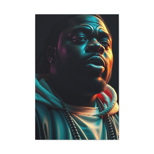
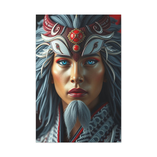
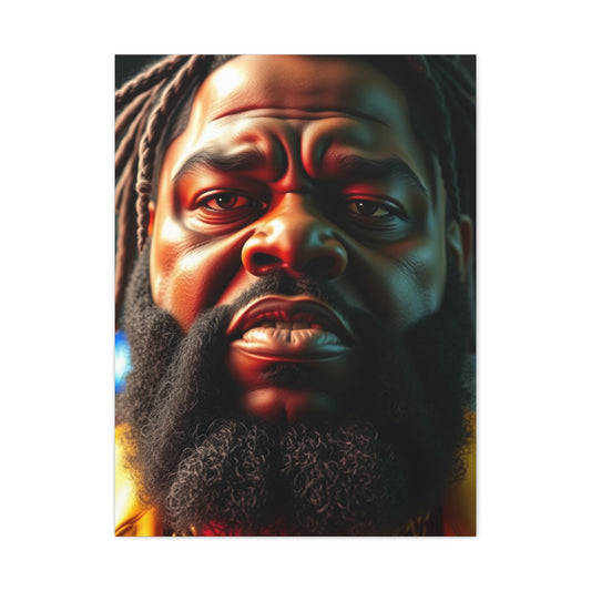
Incorporating color thoughtfully into your photography can greatly amplify the impact of your images. While vivid colors naturally attract attention, a deeper understanding of color theory can elevate your photos from visually appealing to truly captivating. This guide introduces essential concepts of color in photography, guiding you through various techniques and ideas to master the use of color and create striking images.
The Role of Color in Visual Composition
Color plays an often overlooked yet indispensable role in the art of photographic composition. While many photographers may focus primarily on light, shadow, framing, and subject matter, the thoughtful use of color can significantly elevate an image's emotional impact and narrative power. Beyond just making a photograph visually appealing, color serves as a compelling language of its own — capable of evoking feelings, directing the viewer’s gaze, and enriching the story conveyed by the image.
To truly harness the power of color in photography, it is essential to understand how it functions within visual composition and how it interacts with other compositional elements. Color is not simply a decorative feature; it is a foundational tool that, when used intentionally, can transform the mundane into the extraordinary.
At its core, color influences mood. Different colors carry distinct psychological associations that can sway a viewer’s emotional response. For example, warm hues like reds, oranges, and yellows often evoke feelings of warmth, passion, and energy, while cooler shades such as blues and greens tend to induce calmness, tranquility, or even melancholy. Understanding this emotional language allows photographers to choose color schemes that complement the narrative they wish to tell or the atmosphere they aim to create.
Moreover, color serves as a powerful guide for the viewer’s eye. A striking splash of a vibrant color against a muted background naturally becomes a focal point, drawing attention immediately. Through contrast and harmony, photographers can manipulate how the viewer explores an image. Strategic placement of color elements can lead the eye along a deliberate path, highlighting specific details or creating a sense of movement within the frame.
Depth and spatial perception are also enhanced by color. Lighter and warmer colors generally appear closer to the observer, while darker and cooler colors recede into the background. This optical illusion can be used creatively to emphasize the subject or create layers in a photograph, enriching the viewer’s experience and engagement.
A fundamental understanding of color theory — including the relationships between primary, secondary, and tertiary colors — equips photographers with the tools to create balanced and aesthetically pleasing compositions. Familiarity with concepts such as complementary colors, analogous colors, and triadic color schemes provides a framework to either harmonize or deliberately contrast hues to evoke desired effects. For instance, complementary colors, which sit opposite each other on the color wheel, produce vibrant and eye-catching contrasts when placed side by side, perfect for energizing an image. On the other hand, analogous colors, which lie next to each other, offer harmony and subtlety, making them ideal for serene and cohesive visuals.
Color’s significance extends beyond aesthetics; it is deeply intertwined with cultural symbolism and context. Colors can carry different meanings depending on cultural backgrounds and historical connotations. Red might symbolize love and celebration in one culture but danger or warning in another. Photographers who are aware of these nuances can use color more thoughtfully, making their work resonate with diverse audiences or communicate layered messages.
The influence of color is not restricted to photography alone. Its principles find wide application across creative domains such as graphic design, painting, fashion, and marketing. Mastering color theory and its emotional resonance allows photographers to not only create more compelling images but also to collaborate effectively in multidisciplinary projects, ensuring visual consistency and communicative clarity.
|
Related Catagories: |
In practical terms, photographers can apply these insights by paying close attention to the color palette in their scenes before pressing the shutter. This may involve scouting locations with complementary or harmonious colors, using colored props or backgrounds, or adjusting white balance and color settings in-camera or during post-processing to enhance the desired mood and effect. Using color thoughtfully also means sometimes breaking the rules — introducing jarring color contrasts or unexpected hues to provoke or challenge viewers, adding layers of complexity and intrigue to the image.
Finally, embracing color as a dynamic and interactive element invites experimentation. Photography is both a technical craft and an expressive art. When photographers develop an intuitive feel for color, they open themselves up to endless creative possibilities — from subtle tonal shifts that enhance emotion to bold color combinations that transform ordinary scenes into visual masterpieces.
Understanding Color Theory Basics
Color theory is a fundamental cornerstone for anyone looking to master the art of photography. At its essence, color theory provides a framework that helps photographers understand the relationships between different hues and how to use them effectively in visual compositions. A deep grasp of color theory can empower you to craft images that are not only aesthetically pleasing but also emotionally compelling and narratively strong.
At the heart of color theory lies the color wheel, a visual representation of colors arranged according to their chromatic relationships. The color wheel is typically divided into 12 hues, starting with the three primary colors: red, yellow, and blue. These primary colors are unique in that they cannot be created by mixing other colors; instead, they serve as the building blocks for all other colors.
By mixing two primary colors in equal measure, you create secondary colors. These include green (a mix of blue and yellow), purple (a mix of blue and red), and orange (a mix of red and yellow). These secondary hues occupy the spaces between the primary colors on the wheel, representing transitional tones that bridge the gap between the foundational colors.
Beyond primary and secondary colors, there are tertiary colors—hues formed by mixing a primary color with an adjacent secondary color. Examples include red-orange, yellow-green, and blue-purple. These tertiary colors enrich the palette and offer more nuanced choices for artists and photographers alike.
Understanding how these colors relate on the wheel forms the basis for various color schemes, which guide how colors can be combined harmoniously or contrasted dynamically within a composition.
One of the most common color schemes is the complementary scheme, which pairs colors directly opposite each other on the wheel, such as red and green or blue and orange. Complementary colors provide striking contrast and visual energy, making subjects pop and capturing viewer attention instantly. Using complementary colors effectively requires a delicate balance to avoid overwhelming the viewer, but when done correctly, this approach infuses images with vibrancy and impact.
Analogous color schemes, which involve colors adjacent to each other on the color wheel, such as blue, blue-green, and green, offer a more harmonious and soothing aesthetic. These colors naturally blend well because they share underlying tones, creating a unified and cohesive look. Analogous palettes are often found in nature—think of the gradual shift of greens in a forest or the delicate hues of a sunset sky—and are especially useful for creating mood and atmosphere in photography.
Triadic color schemes use three colors evenly spaced around the wheel, such as red, yellow, and blue. This approach balances the vibrancy of complementary contrasts with the harmony of analogous colors, resulting in compositions that are both lively and visually pleasing. Triadic schemes can inject a playful or dynamic feel into an image and are often favored in street photography and urban scenes where multiple colors interact naturally.
Monochromatic schemes focus on variations in lightness and saturation of a single hue. Though seemingly simple, monochromatic compositions can be incredibly powerful, emphasizing texture, shape, and light without the distraction of multiple colors. This approach is widely used for artistic and minimalist photography to evoke emotion through subtlety and restraint.
Color theory also touches upon the psychological and cultural connotations of color, which play a crucial role in how an image is perceived. Different cultures and contexts attribute varied meanings to colors—red may signify love and passion in some cultures while representing danger or warning in others. A photographer's awareness of these associations allows for more intentional storytelling through color choices, adding depth and resonance to their work.
Furthermore, color temperature—the warmth or coolness of a color—adds another layer to the theory. Warm colors like reds, oranges, and yellows tend to advance toward the viewer and convey feelings of warmth, excitement, or urgency. Cool colors such as blues, greens, and purples recede into the background, evoking calm, serenity, or melancholy. Mastery of these temperature dynamics enables photographers to manipulate spatial perception and emotional tone effectively.
In the practical world of photography, the principles of color theory influence many decisions. When scouting locations or setting up shots, photographers can use the color wheel to predict how various hues in the scene will interact. Choosing subjects or backdrops with complementary or analogous colors can dramatically enhance the composition. Likewise, color balance can be adjusted in post-processing to refine or completely alter the mood of an image.
Additionally, the impact of color extends to technical settings such as white balance, saturation, and contrast, all of which are essential tools for translating the color theory concepts into compelling final images. Adjusting these parameters thoughtfully ensures the colors captured or rendered align with the photographer's creative vision.
Color theory is a living, evolving discipline that invites experimentation. While traditional rules provide a helpful guide, many memorable images emerge from deliberate rule-breaking—combining unexpected color pairings or emphasizing discordant tones to provoke and intrigue. The best photographers develop an intuitive sense of color that transcends rigid theory and embraces creative freedom.
Analogous Color Schemes in Photography: Creating Harmonious and Captivating Images
Analogous color schemes are a powerful and versatile tool in the photographer’s arsenal, offering a natural, soothing aesthetic that enhances the visual appeal and emotional depth of an image. Defined by the use of three or more hues that lie adjacent to each other on the color wheel, analogous colors share similar undertones and tonal qualities, allowing them to blend seamlessly in photographic compositions. This harmonious relationship creates images that feel balanced, cohesive, and pleasing to the eye without overwhelming the viewer with jarring contrasts.
The Nature of Analogous Colors
In the natural world, analogous colors are abundant, often appearing in gradual tonal shifts found in landscapes, floral scenes, and wildlife photography. For example, a forest canopy showcases a rich tapestry of greens blending into yellows and soft browns, while a field of blooming flowers might display a gentle transition from violet to blue and teal. Such examples demonstrate how analogous colors create a visual rhythm and unity that is both calming and aesthetically satisfying.
Unlike complementary colors, which stand opposite each other on the color wheel and create high contrast and tension, analogous colors work by proximity and subtlety. This proximity means that the colors share one or more components (like red, orange, and yellow sharing warmth), lending a visual cohesiveness that invites the eye to move fluidly across the image. This quality makes analogous color schemes especially effective in storytelling photography, where emotional tone and atmosphere are key.
Compositional Strategies for Using Analogous Colors
While analogous color schemes naturally produce harmony, achieving a compelling photograph requires more than just placing similar hues together. Photographers must engage in deliberate compositional choices and understand how light interacts with color to maintain interest and avoid monotony.
One key strategy is to pay close attention to the balance of colors within the frame. Although analogous colors share undertones, they can vary in brightness, saturation, and hue intensity. Utilizing a dominant color alongside secondary and tertiary hues creates depth and visual layering. For instance, a landscape dominated by lush greens can be enlivened by accents of yellow-green or muted olive, which prevent the image from appearing flat or uniform.
Deliberately skipping a color within the analogous range can introduce dynamic tension without breaking the overall harmony. This technique involves omitting a hue adjacent on the color wheel, creating a subtle contrast that guides the viewer’s eye or emphasizes a focal point. For example, in a sequence of blue, blue-green, and green, leaving out blue-green can produce an unexpected shift that enhances the composition’s visual interest.
Texture and form also play critical roles when working with analogous colors. Because the hues themselves do not provide strong contrast, variations in texture and shape become essential for defining subjects and creating separation within the image. In macro photography, close-up shots of plants or insects with analogous colors benefit from detailed textures that highlight the subject against a similarly toned background.
Lighting Considerations with Analogous Palettes
Lighting dramatically influences how analogous colors interact within a photograph. Soft, diffused light often enhances the gentle transitions typical of analogous schemes, emphasizing their harmonious qualities. For example, shooting a misty morning landscape with its subtle green and yellow hues under soft light results in an ethereal, dreamlike mood that complements the color harmony.
Conversely, directional or hard lighting can add contrast through shadows and highlights, helping to distinguish elements within a predominantly analogous composition. The interplay between light and shadow introduces dimension, which compensates for the limited color contrast and prevents the image from becoming visually dull.
Photographers should also consider the time of day and atmospheric conditions, as these factors affect the color temperature and saturation. Warm golden hour light intensifies yellows and oranges, while cooler blue hour lighting accentuates blues and violets, altering the analogous color relationships and the image’s emotional tone.
Analogous Colors in Different Genres of Photography
Analogous color schemes are not confined to any single genre and can be effectively utilized across various photographic styles.
Landscape Photography: Natural scenes are inherently rich in analogous color schemes. Photographers can highlight these subtle gradients in forests, mountains, and coastal environments to evoke tranquility and natural beauty. For example, a mountain scene with layered greens, yellows, and browns can create a harmonious panorama that draws viewers into the serenity of the location.
Macro Photography: Flower petals, insects, and other small-scale subjects often exhibit analogous hues. Capturing these details with a focus on color harmony emphasizes nature’s delicate complexity. Photographers use shallow depth of field and soft lighting to isolate the subject while blending the background colors smoothly.
|
Related Catagories: |
Urban and Street Photography: Though cities are colorful mosaics, intentional use of analogous color schemes can unify seemingly chaotic scenes. Photographers might focus on architectural details, murals, or clothing colors that naturally cluster within a segment of the color wheel, producing compelling yet cohesive urban narratives.
Portraiture: Using analogous colors in clothing, backgrounds, and props can create flattering, harmonious portraits that feel calm and inviting. For instance, dressing a subject in varying shades of blue and green, coupled with a background that complements these hues, can enhance skin tones and mood.
Challenges and Solutions in Analogous Color Photography
While analogous color schemes offer many benefits, photographers must be mindful of potential pitfalls.
One challenge is avoiding a lack of contrast, which can cause images to appear flat or monotonous. To counteract this, photographers can incorporate elements of texture, pattern, and tonal variation. Adjusting lighting to create highlights and shadows also helps in defining the subject and maintaining viewer engagement.
Another challenge is maintaining clarity in compositions with complex or busy backgrounds where similar colors blend excessively. Using selective focus, vignette effects, or post-processing adjustments like localized contrast enhancement can help isolate the main subject without disrupting the harmonious color palette.
Practical Tips for Mastering Analogous Color Schemes
-
Study Your Environment: Observe natural or urban scenes to identify existing analogous color clusters. This awareness helps in framing shots that naturally embody color harmony.
-
Use a Color Wheel App or Tool: Digital tools can assist in planning shoots and post-processing by providing accurate color relationships and suggesting analogous hues for editing or styling.
-
Experiment with Saturation and Contrast: Fine-tuning these parameters allows you to emphasize or subdue certain hues within the analogous range, shaping the mood and focus of your image.
-
Compose with Layers: Arrange foreground, middle ground, and background elements with varying analogous colors to create depth and dimension.
-
Play with Negative Space: Incorporate neutral or monochromatic areas to offset the color harmony, giving the eyes places to rest and making the colors stand out more effectively.
-
Leverage Editing Software: Tools like Adobe Lightroom and Photoshop provide powerful means to enhance or modify analogous colors. Adjustments in hue, saturation, and luminance can refine the overall balance.
Analogous Colors and Emotional Impact
Colors evoke emotions, and analogous palettes are particularly effective for creating specific moods. Cool analogous colors like blues and greens often suggest calmness, peace, and contemplation, making them ideal for serene landscapes or reflective portraits. Warm analogous colors such as reds, oranges, and yellows convey warmth, comfort, and energy, which can be utilized in lively street scenes or vibrant still life.
By consciously selecting analogous colors that align with the intended emotional tone, photographers can elevate their images from mere documentation to evocative art.
Employing Color Blocking Techniques: Creating Bold and Striking Photographic Compositions
Color blocking is a dynamic and powerful technique in photography that revolves around using large, solid sections of contrasting colors to craft images that are immediately captivating and visually impactful. By strategically placing two or three distinct hues—often complementary colors from opposite sides of the color wheel—photographers transform color from a mere decorative element into a commanding compositional force. This technique emphasizes the role of color as a central design element, creating photographs that are both bold and thoughtfully balanced.
Color blocking has roots in modern art and design, where it emerged as a way to simplify visual elements and create strong contrasts that grab attention. Translating this into photography, the approach encourages photographers to think graphically, breaking down their scenes into areas of uniform color that interact in deliberate ways to enhance the overall visual narrative.
The versatility of color blocking spans many photographic genres. In street photography, it can highlight urban architecture by isolating walls, doors, or signage painted in vivid contrasting colors, transforming everyday scenes into striking visual stories. In product and food photography, color blocking serves to accentuate the subject by placing it against backgrounds that both complement and contrast, elevating the object’s appeal and guiding the viewer’s eye precisely where the photographer intends. Fashion photography often employs color blocking by pairing wardrobe colors with backdrop hues to heighten drama or playfulness, while minimalist photography leans heavily on this technique to emphasize form and color purity, distilling an image down to its essential elements.
A key aspect of color blocking is the use of complementary colors—pairs like blue and orange, red and green, or purple and yellow—which inherently provide the highest contrast and vibrancy. When these colors are used in blocks, their juxtaposition creates a visual tension that energizes the image and draws immediate attention. However, successful color blocking requires more than just selecting contrasting colors; it involves careful placement and sizing of color areas, balancing color proportions to maintain harmony, and thoughtful composition to ensure the interaction between colors serves the story or mood of the photograph.
The graphic nature of color blocking makes it an excellent technique for photographers seeking to create images with a strong visual identity. It simplifies complex scenes by focusing on color as the primary organizing principle, making the photographs memorable and aesthetically bold. The approach also encourages exploration of architectural elements, fashion details, and natural forms through a color-centric lens, challenging photographers to see and capture the world differently.
Lighting plays a significant role in the effectiveness of color blocking. Evenly lit blocks of color maintain their intensity and uniformity, ensuring that the visual impact of the color contrast remains strong. Soft, diffused light can prevent harsh shadows that might break up the color fields, while directional light can be used creatively to add depth or texture without detracting from the block effect. Photographers should also consider the time of day, reflective surfaces, and weather conditions, as these factors influence the saturation and perceived warmth or coolness of colors, subtly altering the mood and effectiveness of the block.
Mastering color blocking demands attention to detail in both pre-visualization and execution stages. Photographers benefit from scouting locations for ideal color combinations, whether it be a mural with complementary painted sections, a fashion shoot with carefully chosen garments, or a product shoot utilizing colored backgrounds and props. The choice of colors can also be manipulated in post-processing, allowing for enhancement or selective desaturation to sharpen the impact of color blocks.
Beyond its aesthetic appeal, color blocking carries psychological and emotional weight. Colors convey meaning and mood—reds can evoke passion and urgency, blues calm and stability, yellows happiness and energy—and when these colors are blocked against one another, the emotional resonance of the photograph is intensified. Understanding the psychological impact of colors enables photographers to craft images that not only please the eye but also evoke desired feelings in the viewer.
Compositionally, color blocking aligns well with principles such as balance, symmetry, and negative space. Photographers often use geometric shapes and lines—walls, windows, clothing edges—to delineate color boundaries, creating clean, defined blocks. The interaction between positive and negative space within the frame further enhances the perception of the blocks, making compositions more engaging and structured.
For photographers new to color blocking, starting with two contrasting colors can be an accessible introduction. Experimentation with subjects and backgrounds that feature these colors in solid or near-solid forms allows practice in controlling the balance and harmony of the composition. As proficiency grows, incorporating a third color or exploring variations in tone and saturation adds complexity and depth, pushing creative boundaries.
Color blocking also extends to editorial and commercial photography, where brand colors can be utilized as dominant blocks to reinforce visual identity and create strong brand associations. This technique is especially powerful in advertising and social media content, where striking visuals are essential for capturing audience attention in crowded digital spaces.
The impact of color blocking is further amplified when combined with minimalism. By removing unnecessary details and distractions, the bold colors take center stage, and the image’s message becomes clear and direct. Minimalist compositions with color blocking emphasize form, texture, and color purity, resulting in photographs that are not only visually compelling but also intellectually stimulating.
Technological advancements in cameras and post-processing software have made color blocking more accessible than ever. High-resolution sensors capture rich, vibrant colors with precision, while editing tools enable photographers to refine color balance, contrast, and saturation to perfection. This fusion of technique and technology empowers photographers to push the limits of color blocking and explore new creative horizons.
Mastering Color Saturation: Elevate Your Photography Through Vibrant and Subtle Tones
Color saturation is one of the most powerful tools in a photographer’s arsenal. It defines the intensity and purity of colors in an image, playing a crucial role in shaping the overall mood, storytelling, and visual impact. Understanding how to effectively manipulate saturation can transform an ordinary photo into a breathtaking masterpiece or imbue a serene image with quiet sophistication. This comprehensive guide explores the nuances of saturation, techniques for control, and creative strategies to harness this vital element in photography.
Techniques and Tools for Controlling Saturation
Color saturation describes the vividness or dullness of colors within an image. When colors are highly saturated, they appear bold, rich, and eye-catching. Conversely, desaturated colors are muted, soft, and often convey calmness or nostalgia. Saturation influences how viewers emotionally respond to photographs, affecting everything from the sense of realism to abstract artistic impressions.
In simple terms, saturation measures how much gray is mixed with the pure color. A fully saturated color has no gray, appearing as a pure, intense hue. Lower saturation means more gray, resulting in washed-out or pastel tones. The ability to modify saturation gives photographers control over how colors are perceived and how much they dominate the composition.
The emotional resonance of color saturation is profound. Highly saturated colors tend to evoke excitement, energy, and passion. These colors stimulate the senses and can draw immediate attention to specific areas or subjects in the frame. For example, bright reds can symbolize love or urgency, while vivid yellows suggest happiness and optimism. Vibrant images are often associated with vitality and celebration.
On the other hand, low saturation or desaturation is associated with tranquility, melancholy, or elegance. Photos with muted tones can feel timeless and sophisticated, emphasizing form, texture, and composition over color itself. Black and white photography is an extreme example of desaturation that focuses on contrast and structure rather than color vibrancy.
By consciously adjusting saturation, photographers can shape the narrative and mood of their images, guiding viewers through a carefully curated emotional journey.
Many modern cameras include settings or picture profiles that allow direct control of color saturation. These can be adjusted through menus or custom modes. Shooting in RAW format is advisable as it preserves the most color information, providing greater flexibility to adjust saturation later without loss of quality.
Some cameras also offer built-in creative filters that enhance or reduce saturation for quick effects, ideal for photographers who want in-camera edits with minimal post-processing.
Lens filters like polarizers are invaluable for increasing color saturation, especially outdoors. Polarizing filters reduce reflections and glare from non-metallic surfaces such as water, glass, and leaves. This removal of scattered light deepens the colors and enhances contrast, producing richer skies, more vibrant foliage, and clearer water.
Other filters such as graduated neutral density or warming filters can indirectly influence perceived saturation by balancing exposure or shifting color temperatures. These tools enable photographers to manage saturation while capturing the image, optimizing for the final desired effect.
The most precise and flexible method to adjust saturation is through post-processing software like Adobe Lightroom, Photoshop, Capture One, or similar platforms. These programs offer advanced controls to fine-tune saturation globally or selectively.
The simplest approach is to adjust the overall saturation slider, which affects all colors equally. Increasing this slider enhances every color's intensity, making the image pop. Decreasing it moves the photo towards grayscale, muting colors evenly.
While this global control is effective for general enhancement or creating monochrome effects, it can sometimes lead to over-saturation, where certain colors become unnaturally intense or colors clash.
Hue, Saturation, and Luminance (HSL) panels allow for precise adjustments of individual colors. For example, a photographer can increase the saturation of blues and greens in a landscape without affecting skin tones or other colors in the scene.
Selective saturation control prevents colors from becoming oversaturated or unnatural while highlighting the most important hues. This level of detail is essential for maintaining color harmony and enhancing specific visual elements.
Many editing tools distinguish between “vibrance” and “saturation.” Vibrance increases the intensity of muted colors while protecting already saturated tones and skin tones from becoming overexposed. This intelligent adjustment maintains natural skin appearance and overall balance.
Using vibrance adjustments often results in more pleasing, subtle enhancements compared to the sometimes aggressive effect of global saturation boosts.
The art of saturation lies in balance. Over-saturation can lead to images that look artificial, cartoonish, or overwhelming, reducing their artistic and emotional effectiveness. Under-saturation, meanwhile, may cause images to appear dull, lifeless, or uninspired.
Finding the right level depends on the subject, lighting, and intended mood:
-
For landscapes and nature photography, moderate to high saturation enhances the lushness of greenery, the depth of blue skies, and the warmth of sunsets.
-
Portraits benefit from controlled saturation to preserve realistic skin tones while making clothing and background elements pop.
-
Urban and street photography can embrace bold saturation to reflect the vibrancy of city life or reduce it to create moodier, grittier scenes.
-
Fine art photography often explores extremes, using saturation or desaturation creatively to convey abstract emotions or conceptual themes.
Practical Applications and Creative Strategies for Saturation
Evaluate your subject carefully and consider how color intensity serves your story or message. Does the scene benefit from vivid hues or subtle tones?
Use calibrated monitors to ensure accurate saturation adjustments that translate well across devices.
Avoid pushing saturation so far that colors clip or lose detail, which can appear as unnatural flat patches or color bleeding.
Preview your images across multiple displays—phones, tablets, and prints—to maintain consistent saturation and color fidelity.
Combine saturation adjustments with contrast, exposure, and sharpness edits for a well-rounded final image.
Experiment with masks or brush tools in editing software to apply local saturation changes. Highlight focal points or create visual pathways by selectively increasing or reducing saturation in specific areas.
In portraits, preserve natural skin tones by carefully balancing saturation. Over-saturating skin colors can produce unnatural or distracting results.
Use creative techniques such as:
-
Color pop effects by desaturating the entire image except one or two colors for striking contrast.
-
Mood creation by using high saturation for energy and excitement, or low saturation for nostalgia and calm.
-
Seasonal emphasis by enhancing autumnal hues or spring blossoms selectively.
-
Abstract and fine art photography by pushing saturation to extremes for surreal or impressionistic effects.
Exploring Complementary Colors
Complementary colors sit opposite each other on the color wheel and create powerful contrast, making your images visually striking. Pairs like red and green, blue and orange, or yellow and purple naturally draw attention due to their high contrast. While vibrant complementary colors energize an image, softer tones can be used for a more balanced and subtle effect. This principle is valuable for enhancing subject-background separation and increasing image depth.
Color Contrast for Impact
Utilizing color contrast effectively enhances focal points and injects energy into your photos. The strongest contrasts arise from complementary colors, but experimenting with less obvious pairings can also yield interesting results. Combining contrasting hues alongside strong shapes and lines can result in dynamic compositions that showcase your unique style and creative vision.
Triadic Color Harmonies
Triadic color schemes involve three colors evenly spaced around the color wheel, such as red, yellow, and blue. This approach balances vibrancy and harmony, allowing for uplifting and visually engaging photos. While these schemes are more commonly found in man-made environments, especially in street scenes, practicing their use sharpens your compositional skills by balancing dominant and supporting colors.
The Art of Monochrome Photography
Monochromatic photography employs varying shades of a single color, creating simplified yet emotionally rich images. Whether focusing on natural elements or urban scenes, this approach leverages color psychology to evoke specific moods—red for passion, green for tranquility, and so forth. Monochrome differs from black and white photography, which uses only shades of grey; instead, monochrome embraces all tonal variations within a chosen hue.
Distinguishing Monochrome and Black & White
Though often confused, monochrome and black & white photography are distinct. Monochrome images include all tints and shades of a single color, such as sepia or cyanotype, while black & white strictly uses grayscale. Capturing in color and converting to monochrome during editing is recommended to retain the richest image data and editing flexibility.
Utilizing Red in Photography
Red is a striking color known for evoking passion, energy, and attention. It’s a powerful tool in portraiture, landscape, and abstract photography to convey emotion and draw focus. Red’s complementary green adds vibrancy and natural balance, making it an essential color for photographers looking to create dynamic compositions.
The Versatility of Blue
Blue’s emotional range spans serenity to melancholy. Lighter blues induce calmness, ideal for peaceful landscapes and minimalist compositions, while saturated or dark blues intensify drama and mood. Photographers often use blue tones during the “blue hour” to capture tranquil yet captivating scenes. Its complementary contrast with orange also offers compelling visual opportunities.
Combining Orange and Blue for Dynamic Contrast
Orange and blue form one of the most effective complementary color pairs, offering strong contrast that energizes an image. This combination frequently occurs in nature, such as sunsets and seascapes, and can be enhanced through composition techniques like color blocking or selective highlighting in food and product photography.
Conclusion
Mastering the use of color in photography unlocks a vast spectrum of creative possibilities. Whether you are drawn to harmonious analogous colors or the energetic contrasts of complementary hues, understanding how to manipulate color intensity, balance, and relationships allows you to craft compelling, visually vibrant images. Embracing these techniques will not only improve your technical skills but also deepen the emotional impact of your photographs, making your work stand out in a crowded visual world.


