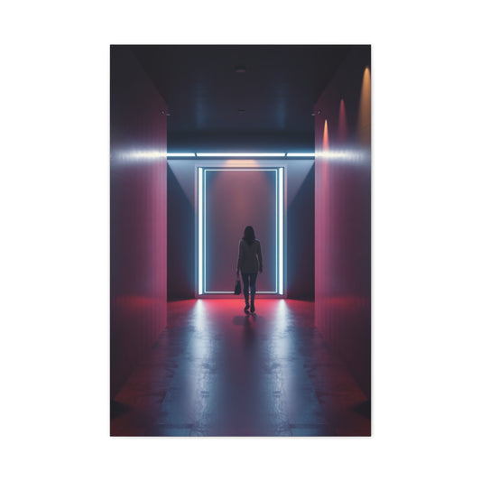
Neon colors, once emblematic of the bold and eclectic style of the 1980s, are experiencing a remarkable resurgence. What was once considered loud or daring has evolved into a versatile and contemporary design choice, capable of elevating a space without overwhelming it. Modern interpretations of neon balance vibrancy with sophistication, offering a playful yet controlled aesthetic that can harmonize with both traditional and contemporary interiors. This revival has found its footing not only in fashion but also in home design, art, and decor, demonstrating neon's enduring ability to captivate and inspire.
The appeal of neon lies in its ability to inject energy and personality into a space. These luminous colors have a unique capacity to draw attention, create focal points, and transform ordinary rooms into visually stimulating environments. From neon accents in furniture and lighting to statement art pieces, the possibilities for integrating these colors into your home are virtually limitless. The resurgence of neon today is not about replicating the past; it’s about reimagining it. Modern designers are exploring new palettes, softer neon tones, and strategic placement to ensure these vibrant colors complement a space rather than dominate it.
One of the most exciting developments in the neon trend is the reinterpretation of Pantone’s Color of the Year, Very Peri, through a neon lens. Very Peri is a periwinkle hue that combines blue’s calmness with subtle purple undertones, offering a playful yet sophisticated feel. By applying a neon twist to Very Peri, designers create a luminous bluish-purple that feels both fresh and contemporary. This color bridges the gap between boldness and subtlety, making it suitable for spaces that aim to be modern, lively, and harmonious. Its versatility allows it to blend seamlessly with earthy tones such as leafy greens and beige, providing balance while maintaining a vibrant presence.
Using Very Peri in interior design can take multiple forms. For instance, a monochromatic approach—employing variations of periwinkle across walls, furnishings, and decorative elements—creates a cohesive and visually engaging environment. By keeping a neutral foundation in other aspects of the room, the neon-infused periwinkle becomes the star of the space, drawing attention without overwhelming. This approach can be particularly effective in contemporary living rooms, bedrooms, or home offices, where balance between vibrancy and calm is key. Additionally, Very Peri works exceptionally well in wall art, allowing the color to serve as a dynamic visual focal point. Abstract pieces, geometric patterns, and neon-infused prints all offer ways to incorporate this hue creatively.
Beyond Very Peri, hot pink has also returned as a prominent neon option, redefining the perception of what it means to design boldly. Traditionally, hot pink was associated with playful or whimsical interiors, but today’s approach is more refined, emphasizing the color’s ability to energize a space while maintaining elegance. Hot pink introduces vibrancy, youthfulness, and a sense of passion to interiors, making it ideal for rooms that benefit from dynamic energy, such as lounges, bedrooms, or creative workspaces.
Integrating hot pink into a home doesn’t necessitate full-room saturation. Instead, it can be used strategically as an accent color. Neon pink artwork, throw pillows, or small decorative objects can make a subtle yet impactful statement. When paired with neutral shades like soft grays, whites, or muted taupes, hot pink gains prominence without feeling excessive. Additionally, blending neon pink with complementary colors, such as purples or deep blues, can produce harmonious contrasts, enhancing visual interest while maintaining sophistication.
Neon hot pink also resonates with cultural and artistic movements that celebrate boldness and individuality. Its vibrant energy mirrors the expressive and unapologetic aesthetic found in contemporary art, fashion, and design trends. For creative spaces, hot pink can stimulate inspiration and imagination, offering an emotional lift to anyone inhabiting the room. Moreover, its adaptability across both modern and traditional design schemes ensures that neon pink remains relevant, versatile, and exciting.
From a psychological perspective, neon colors, including Very Peri and hot pink, exert a tangible effect on mood and atmosphere. Bright, saturated hues are naturally energizing, encouraging alertness, optimism, and creativity. In contrast to muted tones that may evoke calmness or neutrality, neon shades actively engage the senses, making a space feel lively and dynamic. This psychological impact is particularly useful in areas designed for social interaction, creative endeavors, or personal expression. Integrating neon thoughtfully allows designers to balance stimulation with comfort, ensuring that bold colors enhance the space rather than overwhelm it.
When planning neon accents, scale and placement are crucial considerations. Large neon walls or furniture pieces can dominate a room, potentially creating visual tension if not balanced with complementary tones. Conversely, small-scale applications, such as neon artwork, accessories, or textiles, provide opportunities for experimentation without committing to an entire color scheme. Neon colors are versatile enough to serve as primary design elements or supporting accents, depending on the desired effect.
Another essential aspect of modern neon design is lighting. Proper illumination enhances neon’s vibrancy, while natural light can soften the intensity of fluorescent hues. Using indirect lighting, LED strips, or strategically placed lamps can elevate neon elements, highlighting their luminosity without creating glare. Light-reflecting surfaces such as mirrors or glass can further amplify the neon effect, contributing to a space that feels bright, dynamic, and contemporary.
Incorporating neon into wall art remains one of the most popular and effective strategies. Artistic expressions in neon shades allow for experimentation with abstract forms, geometric designs, and contemporary motifs. Neon art can serve as a centerpiece, guiding the eye and defining the room’s atmosphere. This approach is particularly impactful in living areas, offices, or creative studios, where visual stimulation is both functional and aesthetically pleasing. By choosing neon colors thoughtfully, art can harmonize with furniture, decor, and architectural elements to create a cohesive, engaging environment.
The revival of neon is not limited to specific rooms or styles. From minimalist modern spaces to eclectic interiors, neon colors offer a flexible tool for designers to introduce energy, personality, and depth. Even in traditionally neutral settings, small neon accents can act as conversation starters, adding unexpected flair. Whether through artwork, decorative objects, furniture, or textiles, neon allows homeowners to explore creativity and individuality while embracing a vibrant, contemporary aesthetic.
Hot pink, alongside Very Peri, illustrates the spectrum of neon possibilities. While Very Peri offers a balance of cool sophistication and playful energy, hot pink injects warmth, intensity, and vitality. Together, these colors exemplify the adaptability of neon, showing that it can evoke diverse emotional responses depending on application, pairing, and intensity. Interior designers increasingly recognize the power of neon not only as a visual element but as a tool to shape mood, perception, and overall spatial experience.
The resurgence of neon in modern interiors has opened the door to a spectrum of bold, lively hues that can transform any space. Beyond the subtle elegance of Very Peri and the energetic flair of hot pink, neon tones like Atomic Tangerine, Lime Green, and Neon Yellow are making waves in contemporary design. These colors are no longer confined to kitschy retro décor—they are now celebrated for their ability to energize rooms, add personality, and create visually compelling environments.
Atomic Tangerine is a striking neon orange that exudes warmth, energy, and optimism. This hue carries a unique vibrancy that can redefine a space without overwhelming it when used thoughtfully. Unlike softer or muted shades of orange, Atomic Tangerine immediately draws attention, making it an ideal choice for accent walls, statement furniture, or bold decorative pieces. Its historical roots in post-modern design and mid-20th-century aesthetics give it a timeless quality, allowing it to be integrated seamlessly into both contemporary and classic interiors.
The key to using Atomic Tangerine effectively is pairing it with complementary or neutral tones that enhance its vibrancy without competing for attention. Warm shades such as burnt orange, terracotta, or rust create depth and cohesion when used alongside this neon orange. For instance, a living room featuring Atomic Tangerine accents could incorporate soft burnt-orange cushions or muted terracotta vases, providing a layered visual experience. In addition, pairing this neon hue with cooler tones like slate gray, navy blue, or teal creates dynamic contrasts, emphasizing the boldness of the color while maintaining balance.
One of the most effective ways to integrate Atomic Tangerine is through art. Neon-infused wall art can act as a focal point, instantly energizing a room while maintaining an artistic, contemporary feel. Abstract pieces, multi-panel canvases, and geometric designs are particularly suited for this color, allowing its vibrancy to shine while offering opportunities for interplay with other elements in the space. Even small decorative objects, such as neon lamps, vases, or throw blankets, can add touches of Atomic Tangerine without dominating the room.
Moving to the cooler end of the spectrum, Lime Green offers a neon option that is fresh, invigorating, and surprisingly versatile. Unlike the intense saturation of traditional neon, lime green retains a natural quality, echoing the vibrancy found in spring foliage. This hue injects life into interiors, creating a sense of renewal and energy. Its versatility allows it to complement both neutral palettes and other neon shades, making it a powerful tool for modern interior design.
Lime Green’s appeal lies in its ability to balance vibrancy with subtlety. While bold in appearance, it can harmonize with muted tones such as soft beige, ivory, or gray, creating an energetic yet calming environment. Scandinavian-inspired interiors, known for their clean lines and neutral palettes, have embraced lime green as an accent color, demonstrating its ability to enhance minimalist spaces. For example, lime-green accent walls, furniture, or decorative pieces can transform a neutral room into a dynamic, visually engaging space without overpowering the design.
The psychological effect of Lime Green is also worth noting. Green is inherently associated with growth, nature, and renewal. When brightened to neon levels, it retains these associations while adding a playful, energetic edge. This makes Lime Green an excellent choice for spaces where creativity and focus are essential, such as home offices, art studios, or even children’s rooms. Additionally, pairing Lime Green with other bright hues, such as Electric Blue or Neon Yellow, can create vibrant color schemes that are cohesive yet visually striking.
Neon Yellow, on the other hand, represents some of the boldest expressions of contemporary neon design. Often likened to the intensity of highlighter ink, Neon Yellow is a color that demands attention. Its luminous quality can dramatically enhance a space, infusing it with optimism, warmth, and vitality. When incorporated strategically, Neon Yellow can be one of the most impactful tools in modern interior design, functioning both as an accent and as a primary visual element.
The key to using Neon Yellow successfully is moderation and context. Because of its inherent brightness, overuse can easily overwhelm a room. Instead, consider using this hue for accent walls, statement art, furniture details, or decorative accessories. For instance, a muted living room with soft gray or navy-blue walls can benefit from Neon Yellow cushions, lamps, or abstract wall art, creating a bold yet balanced visual effect. Its high visibility also makes Neon Yellow a natural choice for focal points, drawing the eye and energizing the surrounding space.
Neon Yellow also pairs exceptionally well with neutral tones, providing a cheerful contrast that maintains harmony in design. Taupe, beige, gray, and muted whites act as stabilizers, allowing the neon intensity to shine without overpowering the senses. Moreover, combining Neon Yellow with other neon hues such as Electric Blue, Lime Green, or Hot Pink can result in dynamic, playful interiors that celebrate color and energy. This approach works particularly well in creative studios, youth-focused spaces, or modern living areas where vibrancy and expression are desired.
Beyond color theory and pairing strategies, the practical application of Atomic Tangerine, Lime Green, and Neon Yellow is enhanced by the selection of materials and textures. High-gloss finishes, lacquered furniture, and reflective surfaces can intensify the brightness of neon colors, while matte textures offer a softer, more diffused effect. For example, a neon-yellow matte wall paired with lime-green velvet cushions can create an interplay of vibrancy and tactility, enriching the sensory experience of the space. Similarly, Atomic Tangerine in neon acrylic art or high-gloss ceramics can enhance the color’s luminosity while contributing a modern edge to the room.
Lighting also plays a critical role in showcasing neon colors. Natural light can soften and balance neon hues, preventing them from appearing harsh or overly saturated. Artificial lighting, such as strategically placed LEDs or lamps, can enhance neon colors at night, creating dramatic effects and mood variations. For instance, neon Lime Green furniture under soft, warm lighting can appear inviting and energizing, while the same piece under cool, bright light can create a more contemporary, vivid aesthetic. By understanding the interaction between color and light, designers can maximize the visual impact of these neon hues without compromising comfort or cohesion.
One of the most compelling aspects of neon design is its adaptability across design styles. Atomic Tangerine, Lime Green, and Neon Yellow can be incorporated into traditional interiors, modern minimalist spaces, eclectic designs, or even industrial aesthetics. In traditional rooms, neon accents provide a surprising pop of energy that balances classic elements without feeling out of place. In minimalist or modern interiors, these neon hues serve as bold focal points, breaking up neutral palettes and adding personality to clean, structured spaces. The flexibility of neon ensures that it can enhance any design vision while maintaining a contemporary edge.
In addition to individual applications, combining neon colors can create immersive, visually stimulating environments. Coordinating Atomic Tangerine with Lime Green and Neon Yellow, for instance, can produce a lively, balanced color palette that feels energetic yet intentional. Thoughtful distribution of these colors across walls, furniture, and decorative elements ensures that the space feels cohesive rather than chaotic. Even in smaller areas, selective placement of neon hues can enhance depth, contrast, and visual interest, transforming an ordinary room into a dynamic and engaging environment.
Neon’s resurgence is not merely about aesthetics—it reflects a broader cultural and psychological trend toward embracing boldness, self-expression, and creativity in living spaces. Modern interiors increasingly prioritize personality and individuality, encouraging homeowners to explore vibrant colors and unconventional combinations. Neon, in its many forms, allows for such exploration, offering a spectrum of possibilities from subtle highlights to full-scale, immersive designs. Atomic Tangerine, Lime Green, and Neon Yellow exemplify this potential, providing both visual excitement and emotional impact.
As neon colors continue to gain traction in contemporary design, Electric Blue has emerged as one of the most compelling and versatile hues. This vivid shade of blue combines the calm, serene qualities of traditional blue with the intensity and energy characteristic of neon. Unlike softer blues that tend to recede into the background, Electric Blue commands attention and establishes itself as a focal point within a space. Its ability to be both invigorating and calming makes it ideal for a variety of interior applications, from wall art and furniture to textiles and accent details.
Electric Blue’s adaptability is one of its defining strengths. It can be paired with neutral tones such as whites, grays, and beige to create a balanced, modern aesthetic while still allowing the color to shine. Alternatively, Electric Blue can be combined with other neon hues, such as Hot Pink or Neon Yellow, for dynamic, high-energy interiors that celebrate vibrancy and playfulness. This flexibility enables homeowners and designers to use Electric Blue across different rooms and design styles, including minimalist, contemporary, industrial, and eclectic spaces.
One of the most popular ways to incorporate Electric Blue is through wall art. Neon-infused art pieces, whether abstract or geometric, can anchor a room and provide visual interest without overwhelming the space. Large-scale Electric Blue paintings or multi-panel canvases allow the color to serve as a statement element, drawing the eye while complementing surrounding décor. Even smaller-scale art, such as neon-accented prints or sculptural pieces, can introduce this striking hue in subtle yet impactful ways. The key is to consider scale, placement, and context, ensuring that the vibrancy of Electric Blue enhances rather than dominates the overall design.
Electric Blue also works exceptionally well in textiles. From throw pillows and blankets to area rugs and upholstered furniture, the color can bring a refreshing pop of energy to interiors. For instance, a muted living room featuring gray or cream furniture can benefit from Electric Blue accent pillows or a statement rug, creating contrast and visual interest. Similarly, Electric Blue bedding in a bedroom can establish a focal point while evoking calmness and sophistication. By varying textures and materials, designers can amplify the color’s effect and create multidimensional, engaging interiors.
Lighting plays a critical role in highlighting Electric Blue, especially in the context of neon design. Natural light can soften the intensity of this color, allowing it to blend seamlessly with other elements, while artificial lighting can enhance its vibrancy. LED strips, recessed lighting, and strategically placed lamps can illuminate Electric Blue elements, emphasizing their luminosity and creating dynamic visual effects. Reflective surfaces such as mirrors or glossy finishes can further amplify the color’s impact, contributing to a sense of brightness and energy in a room.
Beyond Electric Blue, neon colors as a whole provide vast opportunities for creative expression through painting and artistic décor. Neon wall art has become increasingly popular as homeowners seek ways to integrate bold colors into their spaces without committing to permanent alterations like painting entire walls. Neon paintings and art installations can range from abstract compositions to stylized figurative pieces, offering something for every aesthetic preference. These works of art allow designers to explore form, color, and texture in ways that complement both minimalist and maximalist interiors.
One effective approach to using neon in paintings is through color blocking and geometric patterns. By juxtaposing contrasting neon colors or varying shades of the same hue, artists and designers can create depth, movement, and visual intrigue. Electric Blue paired with Neon Yellow, for example, produces a striking contrast that energizes the viewer and enhances the spatial dynamics of a room. Similarly, combining Lime Green with Atomic Tangerine in geometric compositions can provide a sense of balance while celebrating vibrancy. Such arrangements can be scaled to fit entire walls, creating immersive environments that transform ordinary spaces into bold, expressive interiors.
Abstract neon art also allows for experimentation with texture and layering. Thick, expressive brushstrokes, splattered paint effects, or layered panels can introduce tactile and visual complexity, adding dimension to the bold color palette. When executed thoughtfully, these techniques prevent neon colors from feeling flat or overly intense, instead producing a sophisticated interplay of form, texture, and hue. Even small-scale abstract pieces can contribute significant visual interest when strategically placed in a room, particularly in spaces that rely on neutral foundations to balance the overall design.
Neon art also thrives in mixed-media applications. Combining neon paint with metallics, glass, or acrylic elements allows designers to play with reflection, luminosity, and depth. For instance, layering Electric Blue neon with silver or gold accents can create a contemporary, luxurious feel, while pairing Lime Green or Atomic Tangerine with transparent acrylic panels can produce a sense of vibrancy and movement. These approaches demonstrate the flexibility of neon as both a color and a medium, showcasing its potential beyond traditional wall coverings or textiles.
Placement and scale remain crucial factors when incorporating neon art into interiors. Oversized neon pieces can act as dramatic focal points in large rooms, whereas smaller works may serve as complementary accents in more intimate spaces. The goal is to achieve balance, ensuring that neon colors enhance the overall aesthetic rather than overpower it. Consideration of the surrounding décor, lighting, and color palette is essential to achieve harmony, particularly when multiple neon hues are combined within a single space.
Neon colors are not only visually stimulating—they also impact the psychological atmosphere of a room. Electric Blue, for instance, has a calming effect due to its association with serenity, stability, and clarity, yet its neon intensity introduces energy and dynamism. Similarly, neon shades like Hot Pink, Neon Yellow, and Lime Green can inspire creativity, optimism, and engagement. By understanding the psychological influence of color, designers can harness neon to create environments that are both aesthetically pleasing and emotionally resonant, tailoring each space to its intended mood and function.
Beyond walls and art, neon can be incorporated into furniture, accessories, and decorative objects. Chairs, side tables, lamps, and vases in neon hues provide opportunities for subtle yet effective pops of color. For example, an Electric Blue chair against a neutral background can serve as both a functional and visual highlight. Neon lamps or light fixtures can contribute to ambiance, creating soft glows that enhance the perceived intensity of other neon elements in the room. Even everyday objects, such as picture frames, clocks, or storage containers, can become unexpected sources of vibrancy when rendered in neon colors.
The versatility of neon extends to different interior styles. In minimalist or modern spaces, neon acts as a counterbalance to clean lines and neutral palettes, introducing energy and personality without compromising simplicity. In eclectic or maximalist interiors, neon colors can coexist with other bold patterns, textures, and colors, enhancing a sense of creativity and expression. Industrial spaces, with their raw materials and open layouts, can also benefit from neon accents, softening the starkness of metal and concrete while adding a contemporary, playful twist.
One of the most significant advantages of neon in interior design is its timeless appeal. Although these colors gained prominence in the 1980s, their ongoing revival demonstrates their capacity for adaptation and reinvention. Today’s neon trends emphasize thoughtful application, sophisticated combinations, and innovative mediums, ensuring that neon remains relevant, stylish, and desirable across decades and design movements. From Electric Blue paintings to multi-colored abstract installations, neon offers endless opportunities for experimentation and personal expression.
Another aspect to consider is the integration of neon with natural elements. Combining neon art or décor with organic materials like wood, stone, or textiles can create a balanced aesthetic, softening the intensity of the colors while maintaining vibrancy. For example, Electric Blue wall art above a wooden console or Lime Green accessories on a natural linen sofa can establish harmony between artificial luminosity and organic warmth. These combinations showcase neon’s adaptability and its ability to coexist with diverse textures, materials, and design philosophies.
Finally, neon painting ideas extend beyond visual impact—they encourage a sense of creativity and experimentation in interior design. By embracing neon colors, homeowners can personalize their spaces, make bold statements, and reflect individual tastes and moods. Neon allows for flexibility, from small-scale accents to immersive, large-scale installations, providing endless possibilities for artistic expression. Whether through Electric Blue, Lime Green, Atomic Tangerine, or Neon Yellow, these colors empower designers to explore new ways of thinking about space, light, and color interaction.
Neon colors, once considered the hallmark of retro and playful design, have firmly reestablished themselves as a contemporary force in modern interiors. After exploring specific hues such as Very Peri, Hot Pink, Atomic Tangerine, Lime Green, Neon Yellow, and Electric Blue, the next step in designing with neon involves harmonizing multiple colors and understanding the dynamics of intensity, placement, and balance. Successfully integrating neon into interiors requires careful consideration of how each color interacts with others, how it responds to lighting, and how it contributes to the overall atmosphere of a space.
Combining Neon Hues
The interplay between multiple neon colors is a critical aspect of contemporary design. Unlike muted palettes where subtle contrasts suffice, neon demands attention, and multiple neon hues must be curated carefully to avoid visual chaos. A well-executed neon scheme leverages contrast, complementary colors, and tonal variation to create a cohesive yet energetic space. For instance, pairing Electric Blue with Neon Yellow creates a vivid complementary contrast that feels playful yet balanced. Similarly, Atomic Tangerine and Lime Green together produce a vibrant, lively palette reminiscent of nature’s citrus-inspired tones. The key is to maintain a sense of proportion—allowing some colors to dominate while others serve as supporting accents.
Layering neon shades within a single room can also introduce depth and dimension. For example, a living room could feature a Neon Yellow accent wall, Electric Blue throw pillows, and Lime Green decorative accessories. Each element contributes to the room’s energy without competing for dominance because of strategic placement and varying intensities. By distributing neon colors across walls, furniture, textiles, and décor items, designers can create visually stimulating environments that feel deliberate and harmonious rather than chaotic.
Balancing Vibrancy with Neutral Elements
While neon colors are inherently bold, the most sophisticated interiors balance vibrancy with neutral elements. Whites, grays, creams, and natural wood tones act as stabilizing forces, allowing neon hues to stand out without overwhelming the senses. For example, pairing Very Peri with beige or muted greens creates a sense of calm while letting the neon shade command attention. Similarly, Electric Blue or Hot Pink can be offset with light gray walls, soft cream upholstery, or neutral flooring to maintain equilibrium within the space.
Another method to balance neon is through textural contrast. Glossy surfaces, reflective metals, or high-shine furniture amplify the intensity of neon, while matte finishes, soft fabrics, and natural textures can soften its visual impact. A neon-accented velvet sofa, for instance, may feel vivid yet inviting due to the tactile quality of the fabric, whereas a glossy neon lamp adds a sharp, modern edge. By combining various textures, designers create multidimensional interiors where neon feels both bold and harmonious.
Neon Accent Walls and Focal Points
Accent walls remain one of the most effective ways to incorporate neon into interiors. A single wall painted in a neon hue immediately establishes a focal point while allowing the rest of the space to remain neutral or subdued. Electric Blue, Neon Yellow, and Atomic Tangerine are particularly effective for accent walls because of their high visual impact. When designing a neon accent wall, consider complementary décor elements such as wall art, lighting, or furniture in coordinating or contrasting colors. This ensures the wall feels integrated within the overall design rather than isolated.
Focal points are not limited to walls. Neon furniture, lighting, or art installations can serve as central elements that anchor a room. For example, an Electric Blue armchair positioned in a reading nook can become a dynamic centerpiece, drawing the eye and infusing the space with personality. Similarly, Neon Yellow or Hot Pink lamps, side tables, or sculptural pieces can act as subtle yet powerful accents that energize a room. The effectiveness of these focal points lies in their ability to command attention while complementing surrounding design elements.
Neon in Functional Spaces
While neon is often associated with living rooms or creative spaces, its application extends to functional areas such as kitchens, bathrooms, and home offices. In kitchens, Neon Yellow or Lime Green cabinetry, backsplash tiles, or countertop accents can inject vibrancy into what might otherwise be a purely utilitarian space. In bathrooms, Electric Blue or Hot Pink towels, bath mats, or wall art can create a lively, playful environment without requiring permanent changes. Home offices benefit from the psychological effects of neon as well; colors like Very Peri or Electric Blue can stimulate creativity, focus, and energy, helping to transform workspaces into inspiring areas.
Lighting Considerations
Lighting is crucial in determining how neon colors appear within a space. Natural light can soften neon hues, allowing them to harmonize with neutral backgrounds and reduce visual fatigue. Conversely, artificial lighting can either enhance or overwhelm neon depending on its intensity and placement. LED lighting, in particular, is well-suited to neon designs because it allows precise control over brightness and direction. For instance, an Electric Blue painting illuminated by focused LED lights will appear vibrant and luminous, enhancing its impact without creating glare. Additionally, reflective surfaces such as mirrors, glass tables, or metallic accents can amplify neon colors, creating a sense of brightness and depth that enhances the spatial experience.
Psychological Effects of Neon
Neon colors influence mood and perception in unique ways. Bright hues such as Neon Yellow and Hot Pink evoke energy, excitement, and positivity, while Electric Blue and Very Peri promote focus, creativity, and emotional balance. Lime Green, with its natural, lively associations, fosters renewal and freshness. By thoughtfully applying these colors, designers can manipulate the emotional ambiance of a space, tailoring interiors to encourage desired moods and activities. This psychological dimension of neon makes it a valuable tool in both residential and commercial design, where mood, productivity, and atmosphere are critical considerations.
Neon and Artistic Expression
Neon’s resurgence has also sparked a renaissance in artistic expression. Beyond furniture and walls, neon can be explored through paintings, sculptures, and mixed-media installations. Artists and designers are experimenting with abstract compositions, geometric patterns, and multi-panel canvases to create immersive environments that celebrate color and creativity. Neon art is particularly effective in spaces that require dynamic focal points or expressive statements, such as living rooms, studios, or gallery-style interiors.
Mixed-media neon art adds an additional layer of sophistication. By combining neon paint with metallics, glass, or acrylics, designers can create reflective, luminous compositions that play with light, shadow, and perspective. Such works highlight neon’s adaptability, demonstrating that it can coexist with other materials while maintaining its visual intensity. Even small-scale pieces contribute significantly to a room’s character, offering subtle pops of vibrancy in otherwise neutral or understated interiors.
Neon in Eclectic and Minimalist Interiors
One of the most exciting aspects of neon is its versatility across design styles. In eclectic interiors, neon complements an array of patterns, textures, and materials, creating a playful, visually engaging environment. A combination of Neon Yellow, Lime Green, and Electric Blue within an eclectic setting can produce a lively, creative space that encourages self-expression. Conversely, in minimalist interiors, neon serves as a strategic counterpoint to clean lines and neutral palettes. Here, a single Neon Yellow accent chair or Electric Blue wall art can transform a subdued environment into a bold, contemporary space without undermining the minimalist aesthetic.
Neon can also be incorporated into industrial-style spaces, where its brightness contrasts with raw materials like concrete, metal, and exposed brick. Neon accents in these interiors provide warmth, energy, and modernity, creating a balance between stark industrial elements and lively, vibrant color. Similarly, Scandinavian-style spaces, traditionally characterized by muted tones and natural materials, can benefit from subtle neon accents, such as Lime Green or Very Peri, to introduce personality while maintaining visual harmony.
Long-Term Appeal and Timelessness
A common concern with neon colors is their longevity within a design scheme. However, modern neon trends emphasize versatility, thoughtful placement, and sophisticated pairings, ensuring these hues remain relevant across decades. Unlike past associations with kitsch or excess, contemporary neon embraces refinement, adaptability, and creativity. By integrating neon thoughtfully, designers create interiors that feel both current and enduring, allowing homeowners to enjoy bold colors without fear of rapid obsolescence.
Neon colors also encourage experimentation and personalization. Their intensity and vibrancy make them ideal for homeowners who wish to express individuality, creativity, and energy through their interiors. Whether used sparingly as accents or boldly across walls, furniture, and art, neon empowers self-expression while contributing to visually stimulating environments. By embracing neon, spaces can reflect personality, mood, and style preferences in ways that muted palettes simply cannot achieve.
Tips for Successful Neon Integration
Successful incorporation of neon hinges on a few key principles. First, consider scale and proportion. Neon is most effective when strategically placed to create focal points or balance within a room. Second, balance vibrancy with neutral or natural elements to prevent sensory overload. Third, pay attention to lighting and reflective surfaces, which can enhance or diminish neon’s impact. Fourth, experiment with textures and materials to create dimensionality and sophistication. Finally, think of neon as a tool for mood creation, using colors deliberately to evoke desired emotions and atmospheres within different spaces.
The return of neon represents a shift in interior design philosophy, where boldness, energy, and individuality are celebrated. From Very Peri and Hot Pink to Atomic Tangerine, Lime Green, Neon Yellow, and Electric Blue, each hue offers unique qualities that can transform a room, elevate mood, and inspire creativity. Thoughtful integration of neon across walls, art, furniture, and accessories allows designers and homeowners to embrace color in ways that are sophisticated, harmonious, and visually captivating.
Neon colors are no longer a relic of past decades—they are an evolving, dynamic element of contemporary interiors. By combining multiple neon hues, balancing intensity with neutral foundations, and experimenting with textures, lighting, and artistic applications, spaces can achieve vibrancy without sacrificing elegance. Neon invites creativity, self-expression, and exploration, offering endless opportunities for designers to craft interiors that are not only visually stimulating but also emotionally resonant.
Ultimately, neon’s power lies in its dual nature: it is both playful and sophisticated, bold yet versatile. When approached thoughtfully, neon can redefine interiors, offering a fresh, modern take on color, energy, and artistic expression. Its enduring appeal ensures that it will remain a central force in design trends for years to come, proving that bright, luminous colors have a permanent place in contemporary living.
The resurgence of neon in modern interiors has evolved beyond simple color accents. Designers today are exploring advanced strategies to incorporate neon hues in ways that enhance mood, spatial perception, and artistic expression. While Part 4 discussed balancing multiple neon colors and integrating them into various interior styles, this section delves deeper into practical applications, spatial psychology, and immersive neon environments. These approaches highlight the transformative potential of neon, showing how it can elevate both aesthetics and experience in contemporary spaces.
Creating Cohesive Neon Color Palettes
An essential strategy in advanced neon design involves curating cohesive color palettes. Neon is inherently vibrant, so combining multiple neon hues requires careful consideration of contrast, harmony, and visual weight. A successful neon palette typically includes a dominant color, a secondary supporting hue, and a neutral foundation. For example, Electric Blue might serve as the primary focus, accented by Neon Yellow elements, while whites, grays, or natural wood tones provide balance. This approach prevents the space from appearing chaotic while maintaining the excitement and energy neon provides.
Another method is gradient layering, where neon shades transition subtly from one to another across walls, furniture, or décor items. Gradient transitions, such as moving from Lime Green to Neon Yellow or Hot Pink to Electric Blue, create depth and dimension, transforming flat surfaces into immersive, dynamic environments. This technique is particularly effective for feature walls or large-scale artworks, where smooth color transitions emphasize movement, energy, and contemporary sophistication.
Psychological Impacts of Neon in Interiors
Neon colors influence not only aesthetics but also emotional response and behavior. Bright neon hues are known to stimulate alertness, creativity, and energy, making them ideal for spaces where engagement and activity are desired. For instance, Hot Pink and Neon Yellow are highly stimulating, evoking optimism, enthusiasm, and playfulness. Electric Blue and Very Peri, while vibrant, maintain a calming influence due to their blue undertones, making them suitable for focused areas like home offices or reading nooks. Lime Green connects to nature, promoting freshness and renewal, while Atomic Tangerine evokes warmth and sociability.
Understanding these psychological effects allows designers to strategically allocate neon colors within different areas of a home. Highly energetic spaces, such as living rooms or creative studios, can benefit from bold neon combinations, whereas areas intended for relaxation or concentration, such as bedrooms or workspaces, may incorporate neon more subtly or in cooler shades. By considering the emotional influence of color, neon becomes more than a visual tool—it becomes a medium for shaping experience and mood.
Neon and Spatial Perception
Neon colors also affect spatial perception, altering how a room is experienced visually. Bright, luminous hues can make smaller spaces feel larger by drawing attention to vertical or horizontal planes, while strategic placement of neon accents can guide the eye and highlight architectural features. For example, a Neon Yellow wall at the far end of a hallway can create the illusion of depth, while Electric Blue accents along shelving or furniture edges can add definition and structure.
In open-plan interiors, neon can be used to delineate zones without physical barriers. A Lime Green seating area adjacent to a neutral-toned kitchen, for instance, establishes a distinct living zone while maintaining visual openness. Similarly, Neon Yellow or Hot Pink rugs, cushions, or lighting fixtures can signal transitions between functional spaces, allowing neon to act as both decorative and spatial organizing elements.
Neon in Furniture and Functional Elements
Beyond walls and art, neon is increasingly applied to furniture and functional objects, expanding its practical and aesthetic reach. Neon-accented chairs, tables, or shelving units provide both utility and bold visual impact. For example, an Electric Blue armchair can serve as a statement piece in a muted living room, while Neon Yellow or Lime Green side tables offer vibrancy in secondary spaces. Even lighting fixtures, such as lamps or pendant lights, can incorporate neon tubing or finishes to introduce illumination with added personality.
The material of neon furniture and accessories plays a key role in perception. Glossy or metallic finishes amplify brightness, creating reflective, high-impact focal points, while textured or matte surfaces soften intensity, producing a more subtle, elegant effect. Combining these material approaches enables designers to modulate the visual impact of neon according to room scale, function, and desired atmosphere.
Layering Neon Through Textiles and Accessories
Textiles are another highly effective avenue for neon integration. Rugs, cushions, curtains, and throws in neon colors can anchor color schemes and add tactile depth. For instance, Electric Blue velvet cushions on a neutral sofa create visual contrast, while a Neon Yellow rug can energize a muted floor plan. Layering multiple neon textiles adds dimension, allowing color to interact dynamically across surfaces, reflecting light and creating interest without overwhelming the space.
Accessories, such as vases, picture frames, clocks, or sculptures, can further introduce neon in a subtle, controlled manner. Placing neon accents in unexpected areas enhances the element of surprise and delight, adding personality without dominating the room. For example, a Hot Pink lamp on a side table or Atomic Tangerine bookshelves against a neutral wall can provide playful focal points, encouraging visual exploration and engagement.
Neon Lighting Techniques
Lighting amplifies the transformative potential of neon. Modern LED technology allows precise control of brightness, direction, and color temperature, enabling designers to highlight neon hues while minimizing visual strain. Indirect lighting or concealed LED strips can make neon elements appear luminous yet integrated, softening intensity without diminishing vibrancy.
Layering natural and artificial light also impacts perception. Neon shades illuminated by sunlight may appear softer and more approachable, while the same colors under artificial lighting can seem vivid and dramatic. Designers often experiment with contrasting warm and cool light sources to manipulate mood, emphasizing certain neon colors or creating dynamic, multi-layered effects throughout the day.
Immersive Neon Environments
One of the most exciting applications of neon is creating immersive environments. By combining multiple neon colors across walls, floors, ceilings, and furniture, designers can craft spaces that feel vibrant, energizing, and enveloping. For example, a studio or creative space could feature Neon Yellow accent walls, Electric Blue furniture, Lime Green decorative objects, and Hot Pink textiles, resulting in an environment that stimulates creativity and interaction.
Immersive neon environments are particularly effective in commercial settings, such as boutiques, cafes, or art galleries, where sensory engagement is paramount. However, residential interiors can also embrace immersive neon when balanced with neutral anchors, textured surfaces, and controlled lighting. The goal is to create a sense of energy and presence without overwhelming the senses, achieving vibrancy that is both playful and sophisticated.
Neon in Art Installations and Feature Pieces
Beyond functional application, neon is increasingly used in art installations and feature pieces, reflecting the crossover between interior design and contemporary art. Multi-panel canvases, neon-infused sculptures, and abstract compositions allow homeowners and designers to explore form, texture, and color interaction in unique ways. Mixed-media approaches, such as combining neon with metallics, glass, or acrylic, introduce reflective surfaces and luminosity, enhancing depth and dynamism.
Neon art also functions as a conversation starter. A single Electric Blue or Neon Yellow piece can define a room’s character and elevate its perceived sophistication, while multi-color installations can create immersive visual narratives. These artistic applications highlight neon’s versatility, demonstrating that it is not merely decorative but a medium for personal expression, experimentation, and storytelling within interior spaces.
Integrating Neon Across Design Styles
Neon’s adaptability allows it to complement virtually any design style. In minimalist interiors, neon serves as a counterpoint to neutral palettes, providing focal points and personality. In eclectic spaces, neon can coexist with other bold patterns, textures, and colors, enhancing visual interest and creativity. Industrial spaces benefit from neon’s ability to soften stark materials such as concrete and metal, while Scandinavian-style interiors use neon as subtle accents to add warmth and liveliness to predominantly neutral schemes.
The ability to integrate neon across styles makes it a timeless and versatile design tool. Its applications can range from subtle accents to full-scale immersive experiences, demonstrating its capacity to evolve with changing design trends while maintaining relevance.
Neon as a Medium for Personal Expression
Ultimately, neon embodies creativity, personality, and self-expression. Its boldness encourages experimentation, empowering homeowners to define spaces according to their tastes, moods, and lifestyles. Neon allows for individuality in ways muted palettes cannot, offering both immediate visual impact and lasting emotional resonance. Whether through walls, art, furniture, or accessories, neon creates spaces that are not only visually compelling but emotionally engaging, reflecting both aesthetic sensibilities and personality.
Neon has firmly returned to the forefront of interior design, evolving from its 1980s retro roots into a sophisticated, versatile element in modern spaces. After exploring individual hues, artistic applications, immersive environments, and psychological effects in the previous sections, it’s time to focus on practical strategies, emerging trends, and forward-looking insights. This final part emphasizes actionable tips for incorporating neon into interiors while maintaining balance, timeless appeal, and originality.
Strategic Placement of Neon
Successful neon design begins with strategic placement. Because neon colors are inherently intense, selecting where and how to introduce them determines both aesthetic success and functional harmony. A neon wall, for instance, can act as a statement piece without overwhelming the room if the surrounding elements are neutral or subdued. Similarly, neon furniture or accessories—such as Electric Blue chairs, Neon Yellow lamps, or Lime Green cushions—should be positioned to draw the eye and enhance key areas, rather than appearing scattered or accidental.
Focal points are particularly effective for neon application. In living rooms, a single neon wall, a large painting, or a statement piece of furniture can establish the room’s character. Bedrooms benefit from neon accents through bedding, lighting, or small decorative items, creating energy and personality without disrupting the tranquil environment. In workspaces or studios, Electric Blue or Very Peri can enhance focus and creativity, particularly when paired with neutral surroundings and adequate lighting.
Balancing Neon with Neutral Foundations
One of the most important principles of modern neon design is balance. Neutral foundations, including whites, grays, beige, and natural wood tones, anchor the intensity of neon while providing visual relief. For example, a living room featuring a Neon Yellow accent wall might pair with soft gray sofas, white rugs, and wood flooring to prevent visual overstimulation. Similarly, an Electric Blue feature chair in a predominantly neutral room creates contrast and focal interest without overpowering the space.
Texture also contributes to balance. Soft textiles, matte finishes, and natural materials can soften neon’s brightness, creating a harmonious interplay between energy and subtlety. A Neon Yellow velvet pillow, for example, can energize a neutral sofa, while a matte Lime Green wall finish reduces glare and harshness. By layering textures alongside color, designers achieve interiors that are dynamic, visually engaging, and comfortable.
Mixing Multiple Neon Hues
Combining multiple neon colors requires careful attention to contrast, complementarity, and visual weight. A successful palette usually includes a dominant color, a supporting secondary hue, and neutral stabilizers. For instance, Electric Blue may dominate a living space, while Neon Yellow and Lime Green serve as accenting colors, creating harmony and vibrancy. Gradient transitions and overlapping color zones can also add depth and sophistication, avoiding a chaotic or jarring appearance.
Pairing complementary neon colors—like Hot Pink with Lime Green or Neon Yellow with Electric Blue—introduces dynamic energy. The key is to distribute colors strategically across walls, furniture, accessories, and lighting, ensuring each hue enhances the others rather than competing for attention. By curating combinations thoughtfully, multiple neon colors can coexist to create immersive, visually stimulating interiors.
Incorporating Neon Through Art and Decorative Elements
Neon is especially effective as a medium for art and decorative elements, allowing homeowners to experiment with bold color without committing to permanent installations. Multi-panel canvases, abstract paintings, sculptures, and mixed-media pieces offer opportunities to explore form, texture, and luminosity. These elements can serve as focal points, defining the space’s character and guiding visual flow.
Mixed-media art amplifies neon’s impact. Combining neon paints with reflective metals, glass, or acrylics introduces dimension and light interaction, transforming walls or surfaces into vibrant, dynamic statements. Even smaller pieces, such as neon-accented frames or sculptural décor, contribute depth and interest, demonstrating that neon’s influence extends beyond walls and furniture.
Lighting Techniques to Enhance Neon
Lighting is fundamental to neon design. Natural light softens neon’s intensity and integrates it into the overall environment, while artificial lighting can amplify its vibrancy and create dramatic effects. LED strips, recessed lighting, or spotlights can be used to highlight specific neon elements, adding depth, texture, and visual focus.
Layering warm and cool light sources also affects perception. Warm lighting can tone down the intensity of Neon Yellow or Hot Pink, making them appear approachable, while cool lighting enhances the sharpness and clarity of Electric Blue or Very Peri. Thoughtful lighting ensures neon elements enhance the space without creating eye strain or imbalance.
Functional Neon Applications
Neon is not limited to aesthetic use; it can also serve functional purposes. In kitchens, bathrooms, and home offices, neon can delineate spaces, signal transitions, and provide visual cues. A Lime Green or Neon Yellow accent wall in a kitchen may designate a cooking zone, while Neon Blue or Very Peri in a home office can define work areas and promote focus. Even neon lighting can guide pathways, illuminate features, or highlight key elements, adding both form and function.
Furniture and accessories further extend neon’s functional possibilities. Neon-colored tables, chairs, or shelves serve as both utility objects and visual statements. The strategic placement of these pieces can enhance circulation, guide attention, and create zones without physical barriers, particularly in open-plan layouts.
Psychological Considerations and Mood Curation
Neon colors carry psychological weight, influencing mood, energy, and behavior. Hot Pink and Neon Yellow evoke excitement, optimism, and sociability, making them ideal for social areas or creative studios. Electric Blue and Very Peri provide energy without overwhelming, fostering focus, calm, and mental clarity. Lime Green promotes freshness and renewal, connecting indoor spaces to natural and organic associations.
Designers can leverage these effects to curate the mood of a room intentionally. For example, a vibrant living room may combine Hot Pink and Neon Yellow for social energy, while an Electric Blue and Very Peri home office promotes productivity. Bedrooms can use subtle Neon Yellow or Lime Green accents to create a cheerful yet restful ambiance. By considering emotional impacts, neon becomes a tool for more than decoration—it becomes a medium for crafting meaningful experiences within spaces.
Future Trends in Neon Design
Neon design continues to evolve, with emerging trends highlighting refinement, adaptability, and technology integration. Some notable trends include:
-
Gradient and Ombré Walls: Smooth neon transitions across walls are gaining popularity, creating depth and fluidity. Gradients between Electric Blue and Neon Yellow, for instance, can produce a visually striking effect while maintaining harmony.
-
Interactive Neon Lighting: Smart neon lights and LED-based neon installations allow homeowners to adjust brightness, hue, and color temperature, enabling spaces to shift moods dynamically throughout the day.
-
Neon in Minimalist Interiors: Minimalist spaces are increasingly incorporating single neon elements as bold focal points, offering energy and personality without clutter.
-
Mixed-Media Neon Art: Combining neon colors with metallics, glass, or acrylic continues to expand the artistic potential of interiors, blurring the line between décor and art installation.
-
Nature-Inspired Neon Palettes: Neon shades inspired by natural phenomena—such as neon greens reminiscent of foliage or vibrant blues mimicking tropical waters—are being used to create immersive, mood-enhancing environments.
These trends emphasize neon’s adaptability and ongoing relevance in modern design, proving that neon is not a passing fad but a lasting element of contemporary interiors.
Neon and Sustainability
An additional consideration in modern design is sustainability. Many neon materials, especially LED-based lighting and water-based paints, are energy-efficient and environmentally conscious. By selecting eco-friendly neon options, designers can achieve bold, luminous effects without compromising on sustainability. Neon furniture and décor crafted from recycled or renewable materials further contribute to environmentally responsible design practices.
Tips for Long-Term Neon Integration
To ensure longevity and continued appeal, consider these practical tips when designing with neon:
-
Start Small: Begin with accent pieces or small areas before committing to large-scale neon installations. This allows experimentation and adaptation over time.
-
Balance with Neutrals: Always anchor neon elements with neutral colors or natural materials to prevent sensory overload.
-
Experiment with Texture: Use a mix of matte, glossy, and reflective surfaces to create depth and visual interest.
-
Layer Colors Strategically: Introduce multiple neon hues gradually, balancing dominant and secondary shades with neutral foundations.
-
Prioritize Lighting: Consider how natural and artificial light affect neon, and adjust placement and intensity accordingly.
-
Focus on Function: Use neon not only for aesthetics but also to define zones, guide movement, or highlight key features.
-
Plan for Mood: Align neon colors with the intended emotional atmosphere of each room, from energetic social spaces to calming retreats.
Final Thoughts
Neon has transcended its retro origins to become a dynamic, versatile, and sophisticated element in modern interior design. From the playful vibrancy of Hot Pink and Neon Yellow to the calming energy of Electric Blue and Very Peri, each neon hue offers unique opportunities to elevate space, mood, and style.
Throughout this series, we’ve explored how neon can be applied thoughtfully—through walls, furniture, textiles, lighting, and art—while balancing its intensity with neutral tones, natural textures, and strategic placement. Whether used as a bold focal point or subtle accent, neon has the power to transform ordinary spaces into immersive, expressive, and memorable environments.
The enduring appeal of neon lies in its adaptability. It complements a wide range of design styles, from minimalist to eclectic, industrial to Scandinavian, and its impact extends beyond aesthetics to influence mood, creativity, and emotional experience. By curating cohesive color palettes, layering textures, and experimenting with lighting, neon can be both visually striking and harmoniously integrated.
As interior design continues to evolve, neon remains a timeless tool for self-expression, innovation, and playful sophistication. Its combination of boldness, energy, and versatility ensures that it will continue to inspire designers and homeowners alike, offering endless possibilities to create interiors that are vibrant, engaging, and uniquely personal.
In essence, neon is more than a color—it is a statement, a mood enhancer, and a vehicle for creativity. Embracing neon thoughtfully allows you to bring life, personality, and lasting impact to any space, proving that bright, luminous colors are here to stay in contemporary interior design.