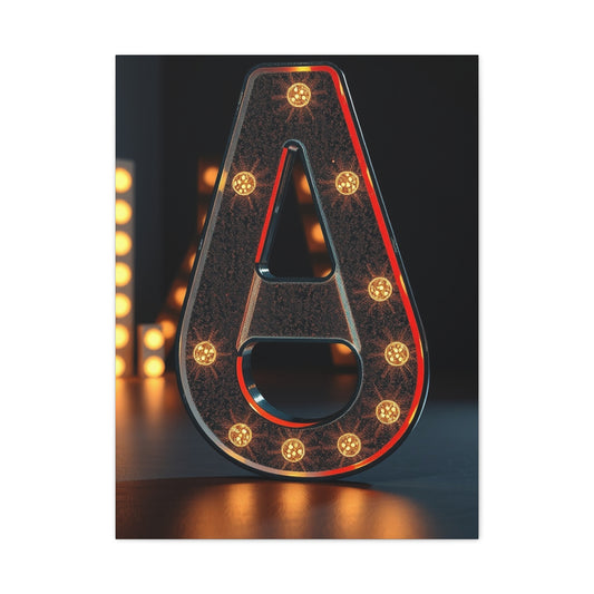
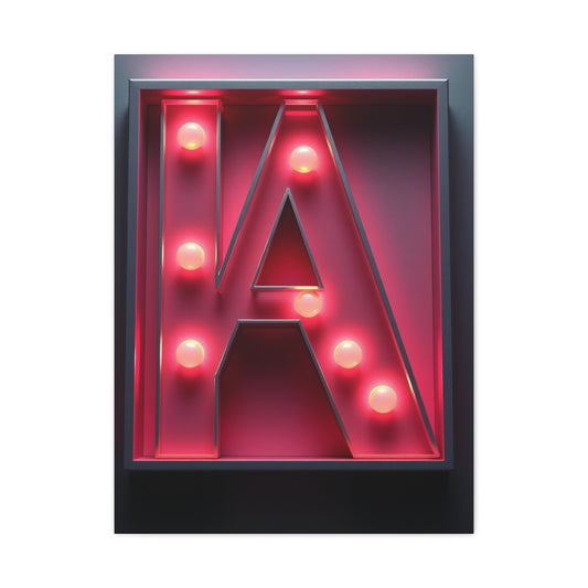
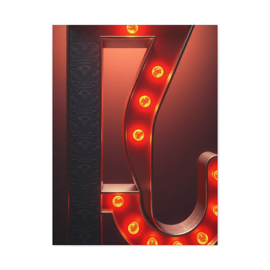
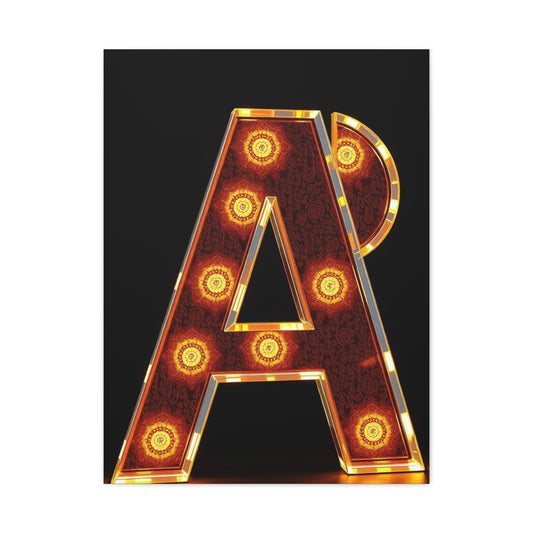
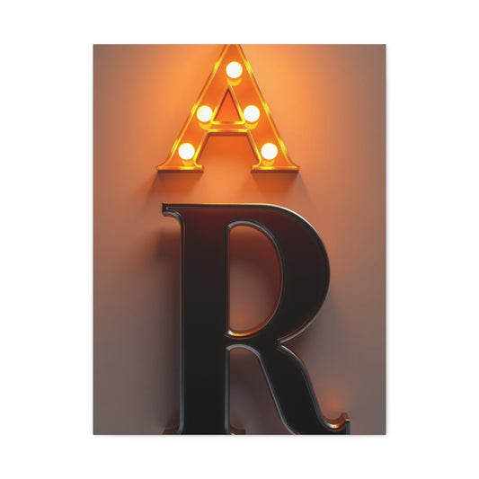
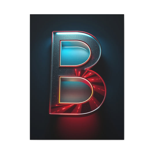
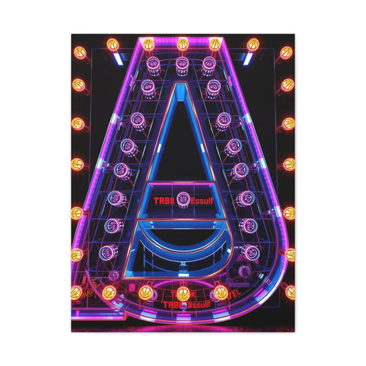
Alphabet Wall Art: Creating Enchanting Nursery Décor with Personalized Letter Designs
Transforming nursery spaces into captivating sanctuaries requires innovative decorative approaches that blend functionality with aesthetic appeal while creating nurturing environments for developing minds. Alphabet wall art represents an extraordinary design solution that combines educational elements with sophisticated visual impact, enabling parents to establish stimulating yet serene atmospheres that promote cognitive development through beautiful spatial arrangements.
The contemporary approach to nursery design emphasizes versatile decorative elements that transcend traditional gender-specific themes while maintaining enchanting visual appeal. Alphabet wall art installations provide perfect solutions for modern parents seeking sophisticated design alternatives that remain engaging for children while complementing diverse interior design philosophies and architectural styles.
Creative letter displays offer unprecedented flexibility in spatial customization, enabling designers to adapt installations to various room configurations, ceiling heights, and wall dimensions while maintaining cohesive aesthetic integrity. These adaptable decorative elements can be reconfigured as children grow, providing long-term value while accommodating evolving spatial requirements and design preferences.
The educational benefits inherent in alphabet wall art extend beyond mere decoration to encompass early literacy development, visual recognition skills, and cognitive stimulation that supports healthy child development. These thoughtfully designed installations create immersive learning environments where children naturally absorb foundational educational concepts through daily exposure to beautifully crafted letter forms.
Professional interior designers increasingly recognize alphabet wall art as sophisticated design elements that elevate nursery aesthetics while providing practical educational benefits. These installations demonstrate how functional design can seamlessly integrate with luxury aesthetics, creating spaces that satisfy both parental aspirations and child development requirements through innovative decorative approaches.
Creating Inclusive and Timeless Nursery Spaces Through Versatile Alphabet Displays
In recent years, the design landscape for nurseries has evolved significantly, with an increasing focus on creating inclusive, gender-neutral environments that foster creativity and development while maintaining aesthetic elegance. One of the most compelling and versatile elements of modern nursery design is the use of alphabet wall art. This design choice accommodates various developmental stages while contributing to the room’s visual appeal, making it an ideal feature for those seeking a space that evolves with the child.
In the past, nursery designs often leaned heavily into traditional gendered colors and themes. However, today's trends emphasize inclusivity, creating spaces that cater to all genders, personalities, and needs. Gender-neutral alphabet displays are part of this movement, offering a timeless and sophisticated design choice that resonates with parents looking for a flexible yet refined approach to nursery decor. These displays are not only functional but can serve as an educational tool as children grow, all while enhancing the aesthetic charm of the nursery.
The Role of Gender-Neutral Color Schemes in Alphabet Wall Displays
When designing a nursery, selecting the right color palette is crucial. It helps set the tone of the room and can have a profound impact on the child's mood and development. Gender-neutral colors offer a wonderful opportunity to create an inclusive environment while maintaining visual appeal. Soft hues such as pale yellows, muted greens, warm grays, and creamy whites make the perfect backdrops for alphabet displays, ensuring the room feels calm and peaceful. These colors are easy on the eyes, providing a soothing environment that fosters relaxation and sleep, two vital aspects of early childhood development.
Choosing a color palette that complements alphabet wall art enhances its impact without overwhelming the space. When paired with neutral shades, the colorful letters can stand out as playful and engaging elements, yet remain balanced and not overly stimulating. For parents looking to create a nursery that grows with their child, gender-neutral color schemes are a smart choice. They allow the space to evolve from a calming retreat for newborns to a lively, educational environment for toddlers.
Strategic Placement and Design Considerations for Alphabet Displays
Designing a nursery is about balancing form with function, and this holds true for alphabet wall art as well. The strategic placement of alphabet displays is critical to maximizing their visual impact while ensuring the overall layout of the room remains practical. Professional designers suggest considering the room’s proportions, the placement of furniture, and natural lighting when positioning these displays.
One of the most important factors in positioning alphabet installations is ensuring they are visible at the right height for both adults and children. For babies, the display can be higher up on the wall, where parents can enjoy it while interacting with their child or while caring for them. As the child grows and starts engaging with their environment, the alphabet display can become more interactive, allowing the child to touch, point, and eventually learn the letters.
For optimal impact, designers recommend that the displays should be placed at eye level for toddlers and older children. This ensures the letters are engaging and accessible, promoting active learning as the child begins to recognize the alphabet and other educational elements.
Utilizing Vertical Space with Dramatic Alphabet Installations
In rooms with high ceilings, designers have an exciting opportunity to create dramatic, vertical alphabet displays that can serve as the focal point of the room. These expansive installations can take full advantage of the available space, creating a striking visual statement that enhances the room’s design. Full alphabet sequences, carefully arranged words, or even meaningful phrases like family names can be featured in these high-reaching installations, adding a personalized touch to the nursery.
Such displays can be bold and whimsical, or they can be designed with clean lines and a minimalist aesthetic, depending on the overall theme of the room. Whether the goal is to fill a large wall space or to create an artistic centerpiece, high ceilings offer a fantastic opportunity for creative expression through alphabet displays.
Vertical installations are not only visually appealing but they also provide an innovative way to make use of unused space in the room. By positioning alphabet displays along the upper portions of walls, parents can retain more floor space for other essential nursery furniture, ensuring that the room remains functional and comfortable for both parent and child.
The Flexibility of Modular Alphabet Systems
A key feature that makes alphabet displays so appealing is their flexibility. With modular systems, parents can easily rearrange, update, or expand their alphabet displays as their child grows. This flexibility ensures the design remains relevant and engaging throughout different developmental stages. Starting with simple letter formations or a single, beautiful word, parents can modify the display to add more letters or introduce new educational elements as the child’s literacy skills evolve.
The versatility of modular alphabet systems also allows for personalized design choices. For example, as the child grows, parents might choose to switch from generic alphabet displays to the child’s name, or even incorporate educational words like “mom,” “dad,” or “love” into the display. The ability to adapt and customize the design allows the nursery to evolve along with the child, offering a level of personalization that makes the space feel more intimate and unique.
For those with more space or a greater interest in interactive, hands-on learning, these modular systems can be expanded into large-scale word walls. Such installations not only contribute to the room’s aesthetic appeal but also support early childhood education by introducing children to vocabulary in an engaging, interactive manner.
Cohesive Design Elements and the Role of Complementary Decor
While alphabet wall art is the centerpiece of a modern, gender-neutral nursery, it’s important to ensure that it doesn’t compete with other design elements in the room. Instead, it should work in harmony with complementary decor items, such as coordinating artwork, themed accessories, or soft furnishings. The idea is to create a balanced and cohesive design narrative that enhances the overall atmosphere without overwhelming the space.
For instance, the colors in the alphabet display can be mirrored in the room’s textiles, such as the crib bedding, curtains, or rugs. Subtle patterns, textures, and accents can tie everything together and create a unified look. However, it’s important that these complementary elements do not overshadow the alphabet display itself, as the letters should remain the room’s focal point.
Incorporating subtle textures and unique accessories can also add layers of visual interest to the room without detracting from the main design elements. Soft, tactile materials such as plush pillows, knitted throws, or wooden toys can complement the simplicity of the alphabet art, offering depth and warmth to the nursery while supporting the overall theme of inclusivity and versatility.
Long-Term Value and Adaptability of Alphabet Displays
Alphabet displays offer long-term value for parents who want to create a nursery that grows with their child. As children mature and their cognitive abilities develop, alphabet wall art can evolve into a learning tool. Early exposure to letters and words plays a significant role in supporting language acquisition, and the inclusion of an alphabet display in the nursery provides children with consistent visual cues that encourage recognition and learning.
In addition, because the display is not tied to any specific age or stage, it can be reconfigured as the child’s interests evolve. A simple set of letters can gradually transform into a more complex display of words, phrases, or sentences. As children grow older, they can become more involved in personalizing their space, helping to rearrange the letters or select new words that resonate with them. This ongoing interaction with the alphabet display can provide endless opportunities for learning, creativity, and self-expression.
Furthermore, the neutrality of the design ensures that it can adapt to future changes. When children grow into their teenage years and start to move away from playful designs, the alphabet display can easily be reinterpreted into a more mature, minimalist style. Whether transformed into inspirational quotes or a sleek, modern installation, the foundation laid by these displays remains valuable, making them a timeless addition to any home.
Mastering the Art of Alphabet Wall Art in Nursery Design
Creating visually captivating and functional nursery spaces requires a blend of creativity, strategy, and a solid understanding of spatial design principles. Alphabet wall art has emerged as a popular and versatile design element that can transform a nursery into a space that is not only visually stimulating but also conducive to the child’s cognitive development. However, for alphabet installations to be truly effective, a deeper understanding of advanced spatial design techniques is required. These techniques help ensure that the alphabet display enhances the overall aesthetic while maintaining functionality and supporting the developmental needs of the child.
A professional nursery designer must consider numerous factors, including the architecture of the room, furniture placement, color schemes, lighting, and the spatial relationships between various design elements. The ability to balance all of these factors while creating a visually cohesive and impactful display is essential for ensuring the installation not only enhances the nursery’s aesthetic appeal but also provides a stimulating and educational environment for the child.
The Power of Three-Dimensional Design in Alphabet Displays
One of the most compelling ways to create depth and visual interest in alphabet installations is by adopting three-dimensional design techniques. Three-dimensional elements not only make the letters stand out but also add a sophisticated architectural layer to the space. This approach goes beyond flat, two-dimensional wall art, incorporating elements such as raised lettering, shadowing, or intricate molding.
For example, using thin wooden strips or molding around the alphabet letters can create subtle shadow lines that enhance their visibility and add dimensionality. These elements can be used strategically to create a sense of depth, making the letters appear to "pop" off the wall. This 3D effect makes the display visually engaging and can give the nursery a more polished, high-end look, providing an elegant and refined atmosphere.
Architectural mounting solutions also play a crucial role in creating depth. Letters can be mounted with varying levels of distance from the wall, giving the installation a more sculptural and dynamic appearance. This technique works particularly well in larger rooms or spaces with higher ceilings, where the effect of depth and shadow can be maximized. The 3D design strategy not only improves visual impact but also encourages a more interactive experience for the child as they grow, fostering their curiosity and engagement with their environment.
Color Coordination for Harmonious and Impactful Design
Color plays a pivotal role in the effectiveness of alphabet wall art. The right color choices can elevate the visual impact of the display while ensuring the room maintains its harmonious, cohesive feel. For nursery spaces, it’s essential to select color schemes that complement the overall design without overwhelming the space. The key is to create contrast and balance between the alphabet letters and the rest of the room’s décor.
To achieve visual harmony, designers often employ sophisticated color coordination techniques such as analogous schemes, complementary contrasts, or monochromatic variations. Analogous color schemes use colors that are adjacent to each other on the color wheel, creating a gentle, soothing aesthetic that works particularly well in nurseries. For example, shades of soft yellows, light greens, and pale oranges can create a serene, calming environment, which is essential for promoting rest and relaxation in a nursery.
Complementary contrasts, on the other hand, involve using colors that are opposite each other on the color wheel, such as blue and orange or green and red. These color pairings create a high level of contrast that can make the alphabet letters stand out while maintaining a dynamic, visually interesting design. Complementary colors can be used sparingly to create focal points, drawing attention to specific words or letters that parents may want to highlight.
Monochromatic color schemes, which use variations of the same color, can also create a sophisticated and cohesive look. A monochromatic palette consisting of various shades of blue or gray can complement the neutral tones often found in modern nursery designs. These color schemes create a peaceful atmosphere while allowing the alphabet display to remain visually striking but not overwhelming.
Scaling the Alphabet Display for Visual Balance
The scale of the alphabet display is a fundamental aspect of spatial design. Whether the nursery is large or small, it is essential that the size of the alphabet letters aligns with the room’s dimensions and the existing furniture layout. Large, oversized letters can command attention and become the focal point of the room in spacious environments, while smaller, more delicate installations work well in compact nurseries, adding a touch of charm without overwhelming the available space.
In smaller rooms, oversized alphabet letters could compete with the furniture or other design elements, creating a cluttered or crowded atmosphere. Instead, smaller letters should be used in a way that complements the room’s proportions. A small nursery with carefully scaled letters provides an intimate and cozy feeling, where the design remains clean, uncluttered, and visually balanced.
Conversely, larger rooms with higher ceilings or expansive wall space provide an excellent opportunity for oversized alphabet displays. These large-scale installations can fill up the empty space, making the room feel more cohesive and dynamic. Such displays also allow for creative design options, such as incorporating full alphabet sequences or words that reflect personal or educational themes.
Finding the right balance of scale ensures that the alphabet installation serves its intended purpose—creating visual interest and educational value—without overwhelming the nursery space. By adjusting the size of the letters according to room proportions, designers can create a seamless integration of the alphabet display into the room’s overall design.
The Role of Lighting in Enhancing Alphabet Wall Art
Lighting is a powerful tool that can significantly enhance the effectiveness of an alphabet display. The right lighting can highlight the letters, create ambiance, and ensure that the display remains visually appealing in various lighting conditions. Integrating lighting elements into alphabet wall art installations requires careful planning and consideration of natural light, artificial lighting, and accent lighting.
Natural light should be taken into account when designing the layout of the alphabet display. Positioning the display near windows or other natural light sources can enhance the visibility of the letters and create a warm, inviting atmosphere. However, direct sunlight can cause glare or fading, so it’s essential to consider the direction and intensity of natural light during the design process.
Artificial lighting, such as wall-mounted sconces or spotlights, can be strategically positioned to illuminate the alphabet display and draw attention to specific sections of the installation. Accent lighting, such as LED strips or hidden backlighting, can add a touch of drama and make the letters appear to glow, providing an enchanting effect that captures attention, especially in the evening hours.
The careful integration of lighting ensures that the alphabet display remains a standout feature of the nursery, regardless of the time of day. It can also help create a peaceful, ambient atmosphere that encourages relaxation and comfort for both parents and children.
Visual Flow and the Importance of Letter Placement
Creating a visually harmonious nursery design involves considering the flow of the space and how the eye naturally moves through the room. Visual flow is particularly important when placing alphabet wall art, as it dictates how the viewer interacts with the display. The goal is to create a pleasing eye movement pattern that enhances the overall design cohesion and supports natural reading sequences.
Professional designers use visual flow principles to guide letter placement, ensuring that the display doesn’t create visual clutter or confusion. One common approach is to align the letters along the horizontal axis or in a way that follows the natural reading pattern from left to right. In larger installations, letters may be grouped according to themes, such as words or phrases, to create a cohesive and engaging design that facilitates learning.
The room’s architecture and furniture placement also play a role in guiding visual flow. For instance, the display should complement the architectural lines of the room, such as doorways, windows, and other focal points, to ensure that the alphabet installation fits naturally within the space. Careful consideration of furniture arrangements is also essential to prevent the display from feeling disconnected or out of place. Letter placement that supports visual flow enhances the overall design and allows the alphabet display to become an integrated part of the nursery’s aesthetic.
Comprehensive Material Selection and Preparation Strategies
Successful alphabet wall art projects require careful material selection that balances aesthetic appeal, durability requirements, and safety considerations while maintaining cost-effectiveness and project feasibility. Understanding various material options enables creators to make informed decisions that optimize project outcomes while meeting specific design objectives.
High-quality spray adhesives provide essential bonding capabilities for paper applications while ensuring permanent attachment that withstands normal handling and environmental conditions. Professional-grade adhesive products offer superior performance characteristics compared to consumer alternatives, justifying investment in quality materials for long-lasting installations.
Decorative paper selections encompass diverse options including specialty scrapbook papers, gift wrapping materials, vintage dictionary pages, and custom-printed designs that enable unlimited creative possibilities. Understanding paper weight, texture, and adhesive compatibility ensures successful application while achieving desired aesthetic effects.
Color coordination involves selecting paint colors that harmonize with chosen papers while providing necessary contrast for clear letter definition. Quality acrylic paints offer excellent coverage, durability, and color retention properties essential for long-term aesthetic appeal and maintenance requirements.
Embellishment options including ribbons, burlap materials, decorative trims, and textural elements provide opportunities for creative customization while adding dimensional interest to letter surfaces. Understanding compatibility between different materials ensures successful integration while maintaining overall design cohesion.
Tool requirements encompass precision cutting implements, application tools, measuring devices, and safety equipment necessary for professional-quality results. Investing in quality tools significantly impacts project efficiency and outcome quality while ensuring safe working conditions throughout fabrication processes.
Surface preparation techniques ensure optimal adhesion and professional appearance through proper cleaning, priming when necessary, and texture assessment. Understanding substrate characteristics enables appropriate preparation approaches that maximize material bonding and long-term durability.
Professional Application Techniques for Paper-Covered Letters
Achieving professional-quality paper-covered alphabet letters requires mastery of precise application techniques that ensure smooth finishes, clean edges, and durable bonding while minimizing visible seams and material waste. These advanced methods distinguish amateur projects from professional installations through attention to detail and technical execution.
Pattern creation involves accurate tracing techniques that account for letter dimensions while providing appropriate material allowances for proper edge wrapping. Understanding how to compensate for letter thickness and contour variations ensures adequate material coverage while minimizing excess waste and visible seams.
Edge preparation techniques including strategic clipping patterns accommodate various letter shapes and curves while ensuring smooth material application without bunching or gaps. Understanding where to place cuts and how to modify edge treatments for different letter configurations enables professional-quality results across diverse alphabet characters.
Curved surface applications require specialized techniques that address material stretching, gathering, and compression issues inherent in wrapping flexible materials around three-dimensional letter forms. Mastering these advanced techniques ensures seamless coverage while maintaining consistent material tension and appearance.
Corner treatments demand particular attention to material management and cutting strategies that eliminate excess bulk while maintaining clean, finished appearances. Professional techniques for inside and outside corners ensure neat installations while preventing lifting or separation over time.
Adhesive application strategies optimize bonding strength while minimizing visible residue or surface irregularities. Understanding proper adhesive quantities, application patterns, and working time constraints enables efficient installation while ensuring permanent attachment and professional appearance.
Quality control measures throughout application processes identify potential issues before they become permanent problems. Regular inspection and adjustment techniques ensure consistent quality while enabling corrections that maintain professional standards throughout project completion.
Advanced Decorative Techniques for Enhanced Visual Appeal
Sophisticated alphabet installations benefit from advanced decorative techniques that add visual interest, textural variety, and personalized character while maintaining overall design cohesion. These professional approaches distinguish exceptional installations from basic letter applications through creative material usage and innovative design solutions.
Multi-material combinations create rich textural contrasts that enhance visual appeal while adding sophisticated design elements. Understanding how to effectively combine papers, fabrics, paints, and decorative elements enables complex installations that maintain balanced compositions while showcasing creative expertise.
Stencil applications provide precise decorative patterns that add professional detailing to letter surfaces while maintaining consistent design themes. Mastering stencil techniques including registration, paint application, and edge management ensures crisp, clean results that enhance rather than detract from overall letter designs.
Texture integration through materials such as burlap, canvas, or specialty papers adds dimensional interest while creating tactile appeal that engages multiple senses. Understanding how to incorporate textural elements while maintaining readability and visual clarity requires careful balance and design sensitivity.
Color layering techniques create depth and visual complexity through strategic application of multiple hues that build sophisticated color relationships. Understanding how colors interact and layer enables advanced effects that distinguish professional installations from basic applications.
Pattern mixing approaches combine different decorative elements while maintaining visual harmony through careful attention to scale relationships, color coordination, and design balance. Professional pattern mixing requires understanding of design principles that prevent visual chaos while creating interesting complexity.
Custom embellishment creation enables unique decorative elements that perfectly complement specific design themes while adding personalized character. Understanding various crafting techniques and material properties enables creation of original decorative elements that enhance overall installation impact.
Dimensional Enhancement Strategies for Thick Letter Applications
Working with substantial letter forms requires specialized techniques that address increased material requirements, mounting considerations, and finishing challenges while maintaining professional appearance and structural integrity. These advanced approaches ensure successful installations regardless of letter thickness or complexity.
Edge treatment solutions for thick letters encompass various approaches including ribbon applications, fabric wrapping, and paint treatments that create finished appearances while addressing material limitations. Understanding which techniques work best for different thickness levels ensures appropriate method selection for optimal results.
Material calculation adjustments account for increased surface area requirements while optimizing material usage and minimizing waste. Understanding how letter thickness impacts material needs enables accurate project planning while ensuring adequate supplies for completion without excessive purchasing.
Mounting strategies for heavier installations require enhanced support systems that ensure safe, secure attachment while maintaining desired positioning and alignment. Professional mounting approaches consider weight distribution, wall surface characteristics, and long-term stability requirements.
Seam management techniques for thick applications address increased complexity in achieving smooth material transitions while maintaining clean, finished appearances. Advanced seam placement and finishing strategies ensure professional results despite challenging dimensional requirements.
Quality control measures for substantial letters encompass additional inspection points and finishing techniques that address unique challenges associated with increased dimensionality. Understanding potential problem areas enables proactive solutions that maintain installation quality.
Finishing techniques for thick letter applications include edge sealing, protective treatments, and maintenance considerations that ensure long-term durability while preserving aesthetic appeal. Professional finishing approaches contribute to installation longevity and continued visual impact.
Creative Customization Options and Personalization Strategies
Exceptional alphabet installations benefit from thoughtful customization that reflects individual preferences, family characteristics, and specific design themes while maintaining professional quality and visual appeal. These personalization approaches transform standard letter installations into unique artistic expressions that resonate with families.
Theme development strategies incorporate personal interests, cultural backgrounds, or meaningful symbols that add emotional significance while enhancing visual appeal. Understanding how to integrate personal elements while maintaining design coherence requires careful planning and creative sensitivity.
Color personalization enables installations that perfectly complement existing nursery schemes while reflecting individual preferences and design philosophies. Advanced color selection considers not only immediate aesthetic appeal but also long-term adaptability and psychological impacts on developing children.
Texture selection strategies incorporate materials that provide tactile interest while supporting sensory development and visual appeal. Understanding various texture options and their appropriate applications enables installations that engage multiple senses while maintaining safety and durability.
Size customization approaches accommodate various spatial requirements while maintaining proportional relationships and visual impact. Professional size selection considers room dimensions, viewing distances, and furniture arrangements to optimize installation effectiveness.
Layout personalization enables unique arrangements that complement architectural features while creating distinctive visual presentations. Understanding spatial design principles enables creative layout solutions that maximize impact while maintaining functional considerations.
Artistic integration opportunities incorporate additional creative elements such as coordinating artwork, decorative accents, or themed accessories that enhance alphabet installations while creating cohesive design narratives that reflect personal style and preferences.
Procurement Strategies and Source Selection Guidelines
Successful alphabet wall art projects depend on securing quality materials from reliable sources that offer appropriate selection, competitive pricing, and consistent availability. Understanding procurement options enables informed purchasing decisions that optimize project budgets while ensuring material quality and design satisfaction.
Craft retail establishments provide extensive selections of letter forms in various materials, sizes, and styles that accommodate diverse project requirements. Understanding different retailer specializations enables targeted shopping approaches that maximize selection while optimizing value propositions.
Online procurement options expand available selections while enabling price comparisons and access to specialized materials not available through local retailers. Understanding online purchasing considerations including shipping costs, return policies, and quality guarantees ensures successful procurement experiences.
Quality assessment criteria guide material selection decisions by establishing standards for durability, appearance, and performance characteristics essential for successful installations. Understanding quality indicators enables informed purchasing decisions that prevent disappointment and project delays.
Cost optimization strategies balance material quality requirements with budget constraints while maximizing value through strategic purchasing and material selection decisions. Professional procurement approaches consider total project costs including tools, adhesives, and finishing materials.
Supplier relationship development enables access to specialized materials, volume discounts, and expert advice that enhance project outcomes while building resources for future creative endeavors. Understanding how to establish productive supplier relationships contributes to long-term crafting success.
Alternative source exploration including salvage materials, repurposed items, and creative substitutions enables unique design solutions while managing costs and environmental impact. Understanding how to identify and adapt alternative materials requires creativity and technical knowledge.
Installation Planning and Project Management Excellence
Professional alphabet wall art installations require comprehensive planning approaches that address design development, material procurement, fabrication scheduling, and installation logistics while ensuring quality outcomes and stakeholder satisfaction. Effective project management distinguishes successful installations from problematic experiences.
Design development processes encompass concept creation, layout planning, material selection, and technical specification development that establish clear project parameters while enabling effective execution. Understanding design development stages ensures thorough preparation that prevents costly mistakes and installation delays.
Timeline establishment considers material procurement lead times, fabrication requirements, installation scheduling, and room preparation needs while accommodating family schedules and nursery completion deadlines. Realistic scheduling prevents rushed work that compromises quality while ensuring timely project completion.
Budget planning encompasses all project costs including materials, tools, labor if applicable, and contingency allowances for unexpected requirements or changes. Comprehensive budgeting enables informed decision-making while preventing cost overruns that could compromise project completion.
Quality assurance protocols establish inspection points, acceptance criteria, and correction procedures that ensure professional results while identifying potential issues before they become permanent problems. Professional quality management contributes to installation success and client satisfaction.
Risk management strategies identify potential problems and establish contingency plans that minimize project disruption while ensuring successful outcomes despite unexpected challenges. Understanding potential risks enables proactive planning that prevents delays and quality issues.
Documentation requirements encompass progress tracking, material specifications, installation procedures, and maintenance guidelines that support project success while enabling future modifications or repairs. Professional documentation contributes to long-term installation success and value preservation.
Maintenance and Longevity Considerations for Sustained Beauty
Preserving alphabet wall art installations requires understanding maintenance requirements, durability characteristics, and preservation strategies that ensure long-term aesthetic appeal while protecting investment value. Professional maintenance approaches extend installation life while maintaining visual impact throughout extended use periods.
Cleaning protocols encompass appropriate techniques, cleaning agents, and frequency recommendations that preserve material integrity while maintaining appearance standards. Understanding proper cleaning methods prevents damage while ensuring installations remain attractive throughout their intended lifespan.
Environmental protection strategies address temperature fluctuations, humidity variations, and light exposure that could impact material stability and color retention. Professional environmental management preserves installation quality while preventing premature deterioration.
Damage prevention measures encompass child safety considerations, furniture placement strategies, and activity planning that minimize installation exposure to potential harm while maintaining accessibility for educational interaction. Understanding prevention strategies protects investments while ensuring family safety.
Repair techniques for common issues including edge lifting, material separation, or surface damage enable prompt correction that prevents minor problems from becoming major installation failures. Professional repair approaches maintain appearance standards while preserving structural integrity.
Modification strategies enable installation updates that accommodate changing preferences, room renovations, or family growth while preserving existing investments and maintaining design cohesion. Understanding modification possibilities extends installation value while enabling continued satisfaction.
Long-term preservation planning considers installation lifecycle, replacement scheduling, and upgrade opportunities that maintain nursery appeal while adapting to evolving family needs and design preferences. Professional planning maximizes investment value while ensuring continued satisfaction.
This comprehensive guide provides the strategic insights and technical expertise necessary for creating exceptional alphabet wall art installations that combine educational value with sophisticated aesthetic appeal. Through careful planning, quality material selection, and professional execution techniques, these installations become treasured nursery elements that support child development while enhancing family living spaces.
Final Thoughts
Alphabet wall art transcends the role of simple decoration to become an essential part of modern nursery design, blending visual beauty with functional, developmental value. What might initially appear as charming decorative letters on a wall carries far deeper implications for both the child’s environment and the family’s lived experience within the space. By carefully curating and installing personalized alphabet displays, parents are not only beautifying a room—they are actively shaping a nurturing, stimulating, and enduring environment that supports growth, learning, and emotional well-being.
One of the greatest strengths of alphabet wall art lies in its versatility. Unlike many nursery themes that may feel age-specific or temporary, alphabet installations provide timeless relevance. For newborns, they function as visually captivating elements that bring warmth and identity to the space. As children grow, these same displays evolve into interactive educational tools, helping toddlers and preschoolers recognize letters, build early literacy skills, and make connections between symbols and sounds. The adaptability of modular alphabet systems, customizable arrangements, and scalable designs ensures that what begins as nursery décor can remain meaningful throughout early childhood and even beyond.
Equally important is the role alphabet wall art plays in reinforcing inclusivity and modern design philosophies. By stepping away from outdated gender-specific themes, today’s nursery designs embrace gender-neutral color palettes, minimalist aesthetics, and multifunctional décor elements. Alphabet displays seamlessly align with this ethos, offering endless design options that harmonize with diverse architectural styles and personal tastes. Whether executed in soft, muted hues for a serene atmosphere or bold, colorful tones to energize the room, alphabet wall art adapts effortlessly while remaining impactful.
From a developmental perspective, the benefits are profound. Children thrive in environments that provide gentle, consistent stimulation, and alphabet displays do exactly that. Daily exposure to letter forms reinforces recognition patterns, while creative arrangements inspire curiosity. As children begin to point, trace, and eventually read the letters, the wall art shifts from passive decoration to an active learning tool. This dual role—decorative and developmental—sets alphabet wall art apart as one of the most effective long-term investments parents can make in their nursery design.
The emotional and psychological dimensions of these displays cannot be overlooked. A personalized alphabet design, perhaps featuring a child’s initials, name, or meaningful words like “love” or “dream,” serves as a daily reminder of identity, care, and familial connection. These subtle design choices instill a sense of belonging and stability, making the nursery not only beautiful but emotionally resonant. Moreover, the ability for parents and children to interact with and even rearrange modular displays fosters shared experiences, creativity, and bonding within the family.
On a practical level, alphabet wall art offers lasting value through its adaptability. As a child matures, the same display can be reimagined to align with their evolving personality and interests. Letters can form inspirational quotes for school-aged children, meaningful words for teenagers, or even minimalist art statements in later years. This longevity ensures that the effort and resources invested in the initial installation continue to pay dividends far beyond infancy.
Additionally, these displays contribute to a broader design narrative, tying together complementary décor elements and establishing a cohesive aesthetic. Thoughtful integration with textiles, furniture, lighting, and architectural features ensures that the alphabet installation feels like a natural centerpiece of the room rather than an isolated accent. With careful planning, the display not only enhances visual appeal but also harmonizes the entire space, creating an atmosphere that is both enchanting and purposeful.
Finally, alphabet wall art exemplifies how design can balance beauty, function, and meaning. It reflects a holistic approach to nursery decoration—one that values aesthetics, supports cognitive development, embraces inclusivity, and adapts gracefully over time. By combining thoughtful material selection, strategic placement, and creative personalization, parents can create installations that elevate the nursery into a sanctuary of learning, love, and imagination.
In essence, alphabet wall art is more than just décor. It is a foundational element of an environment that nurtures growth, fosters creativity, and celebrates the unique journey of childhood. With its timeless appeal and profound impact, it transforms nursery spaces into places where beauty and learning coexist seamlessly. For parents seeking to design not only a room but an experience—one that evolves with their child and continues to inspire for years to come—alphabet wall art stands as an enduring and enchanting solution.

