-
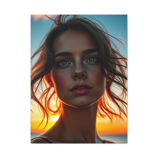
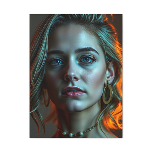
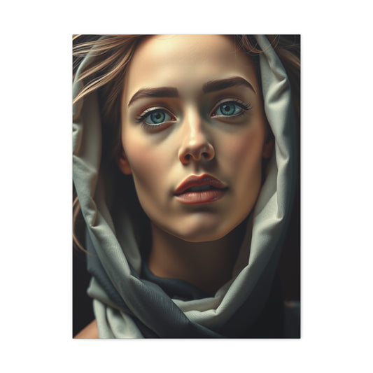
Elite Olivia Herrick Art Vision Wall Art & Canvas Print
Regular price From $141.23 USDRegular priceUnit price per -
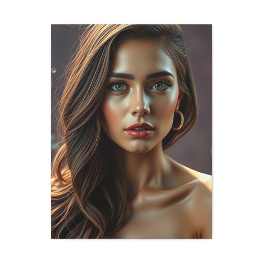
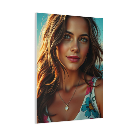
Olivia Herrick Art Refined Canvas Wall Art & Canvas Print
Regular price From $141.23 USDRegular priceUnit price per -
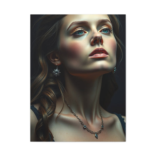
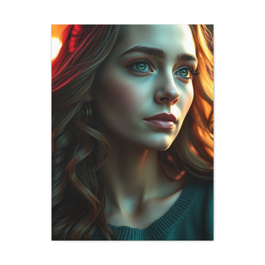
Olivia Herrick Art Supreme Canvas Wall Art & Canvas Print
Regular price From $141.23 USDRegular priceUnit price per -
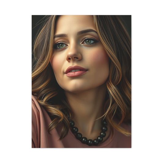
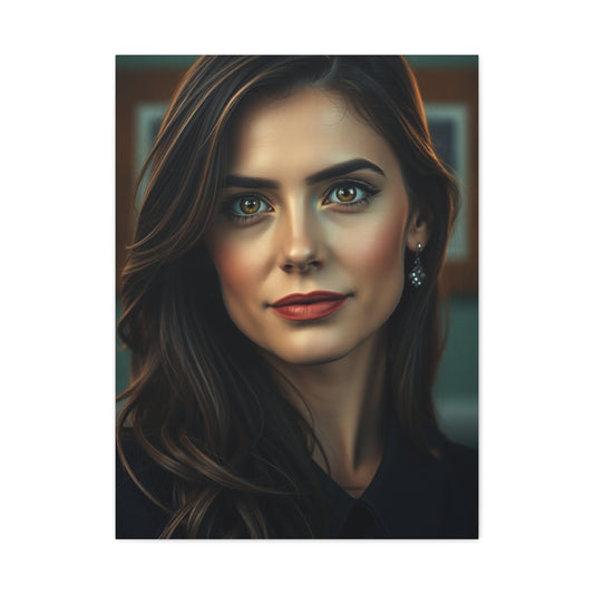
Collection Olivia Herrick Art Art Wall Art & Canvas Print
Regular price From $141.23 USDRegular priceUnit price per -
Olivia Herrick Art Supreme Gallery Wall Art & Canvas Print
Regular price From $141.23 USDRegular priceUnit price per -
Vision Olivia Herrick Art Art Wall Art & Canvas Print
Regular price From $141.23 USDRegular priceUnit price per -
Olivia Herrick Art Luxury Canvas Wall Art & Canvas Print
Regular price From $141.23 USDRegular priceUnit price per -
Supreme Olivia Herrick Art Collection Wall Art & Canvas Print
Regular price From $141.23 USDRegular priceUnit price per -
Masterpiece Olivia Herrick Art Vision Wall Art & Canvas Print
Regular price From $141.23 USDRegular priceUnit price per
Exploring Olivia Herrick Wall Art: Modern Design for Inspired Living Spaces
Creating meaningful spaces within our homes and workplaces requires careful consideration of visual elements that inspire, motivate, and reflect personal values. Olivia herrick wall art represents a distinctive approach to interior decoration that combines contemporary aesthetics with purposeful messaging, offering individuals an opportunity to transform their environments through thoughtfully curated visual statements.
The realm of decorative wall pieces has evolved significantly, moving beyond traditional paintings and photographs to embrace bold typographic expressions, motivational messaging, and vibrant color combinations. This transformation reflects broader cultural shifts toward personalized living spaces that serve as extensions of individual identity and aspirations.
Contemporary Wall Decoration
Modern interior design emphasizes the importance of creating environments that support both aesthetic pleasure and emotional well-being. Wall decorations play a crucial role in establishing atmosphere, conveying personality, and providing daily inspiration. The contemporary approach to wall art prioritizes accessibility, meaningful content, and visual impact over traditional notions of fine art exclusivity.
Today's homeowners and office dwellers seek decorative solutions that offer immediate emotional connection while maintaining professional appearance standards. This demand has fostered the emergence of specialized design approaches that blend artistic merit with practical functionality, creating pieces suitable for diverse settings from corporate environments to personal sanctuaries.
The shift toward personalized interior spaces reflects deeper cultural movements emphasizing individual expression and environmental psychology. Research demonstrates that surrounding ourselves with positive visual stimuli can significantly impact mood, productivity, and overall life satisfaction. Wall art serves as a constant source of environmental influence, making selection decisions particularly important for long-term well-being.
Exploring Bold Typographic Print Collections
Typography-based wall art represents one of the most impactful forms of contemporary interior decoration. Bold typographic prints combine the power of written language with visual design principles, creating pieces that communicate directly while serving as sophisticated decorative elements. These designs range from single powerful words to complete inspirational phrases, each carefully crafted to maximize both readability and aesthetic appeal.
The effectiveness of typographic wall art lies in its ability to function simultaneously as literature and visual design. Unlike traditional artwork that requires interpretation, typography-based pieces deliver clear, immediate messages while contributing to overall room aesthetics. This dual functionality makes them particularly valuable for spaces where both inspiration and visual interest are desired.
Contemporary typographic design draws from diverse influences, including vintage advertising, modern minimalism, and digital graphics culture. Designers working in this medium must balance legibility with artistic expression, ensuring that messages remain clear while contributing to sophisticated interior environments. The best typographic wall art achieves this balance through careful font selection, strategic color usage, and thoughtful composition.
Font choice plays a crucial role in typographic wall art effectiveness. Sans-serif fonts often provide clean, modern appearances suitable for contemporary settings, while serif fonts can add elegance and traditional appeal. Script and decorative fonts offer opportunities for more expressive designs but require careful handling to maintain readability at viewing distances typical in interior spaces.
Color selection in typographic wall art extends beyond aesthetic considerations to encompass psychological impact and environmental harmony. Bold contrasts can create dramatic focal points, while subtle tonal variations offer sophisticated integration with existing decor. Successful typographic designs often employ limited color palettes to maximize impact while maintaining visual coherence.
Motivational Quote Poster Design Principles
Motivational quote posters serve as daily reminders of personal values and aspirations, transforming ordinary wall spaces into sources of continuous inspiration. These pieces combine carefully selected quotations with complementary visual design elements, creating artwork that speaks to both intellectual and emotional sensibilities.
The selection process for motivational quotes requires consideration of multiple factors, including personal relevance, universal appeal, and visual presentation potential. The most effective motivational quote posters feature messages that resonate across diverse audiences while maintaining personal significance for individual viewers. This balance ensures that pieces remain meaningful over time rather than becoming mere decorative elements.
Design approaches for motivational quote posters vary widely, from minimalist text presentations to elaborate illustrated compositions. Simple designs often prove most effective, allowing quote content to take precedence while providing sufficient visual interest to justify wall space allocation. Complex designs risk overwhelming textual content, potentially diminishing motivational impact.
Typography selection for motivational quote posters requires particular attention to emotional tone and readability. Fonts must convey appropriate feelings while ensuring easy reading from typical viewing distances. Sans-serif fonts often work well for contemporary motivational pieces, while script fonts can add personality but may sacrifice some readability depending on implementation.
Color psychology plays a significant role in motivational quote poster effectiveness. Warm colors like oranges and yellows can promote energy and optimism, while cool colors like blues and greens may encourage calm reflection. Neutral color schemes offer versatility and longevity, adapting well to changing interior design preferences over time.
The positioning and sizing of motivational quote posters within interior spaces affects their impact significantly. Pieces placed at eye level in frequently visited areas maximize exposure and influence, while oversized installations can serve as dramatic focal points that anchor entire room designs. Smaller pieces work well in intimate spaces or as components of larger gallery wall arrangements.
Color-Block Wall Art Movement
Color-block wall art represents a contemporary design movement that emphasizes pure color relationships over representational imagery. These pieces utilize geometric shapes and bold color combinations to create visually striking compositions that complement modern interior design aesthetics while providing opportunities for personal expression through color preference.
The appeal of color-block art lies in its versatility and immediate visual impact. Unlike representational artwork that may require specific contextual understanding, color-block pieces communicate through direct sensory experience, making them accessible to diverse audiences while offering sophisticated design solutions for contemporary spaces.
Color theory principles guide effective color-block wall art creation, with designers considering relationships between hues, saturation levels, and tonal contrasts. Complementary color schemes create dynamic tension and visual excitement, while analogous color relationships promote harmony and calm. Monochromatic approaches offer sophisticated subtlety through tonal variation within single color families.
The geometric nature of color-block art allows for precise alignment with architectural elements and furniture arrangements. Rectangular compositions can echo window shapes or furniture proportions, while square formats offer stability and balance. Circular and organic shapes introduce softer elements that can counterbalance more rigid interior features.
Scale considerations play crucial roles in color-block wall art selection and placement. Large pieces can serve as room-defining elements that establish color schemes for entire spaces, while smaller pieces work well as accent elements or components of grouped arrangements. The relationship between artwork size and room proportions affects visual balance and overall design success.
Color-block wall art offers particular advantages for individuals seeking to introduce bold color elements without committing to permanent changes like paint or wallpaper. These pieces can be easily relocated or replaced as taste preferences evolve, providing flexibility that permanent color changes cannot offer.
Design Philosophy in Wall Art
Minimalist design principles have profoundly influenced contemporary wall art, emphasizing simplicity, clarity, and intentionality over complexity and ornamentation. Minimalist wall art pieces achieve maximum impact through careful reduction of elements to essential components, creating sophisticated visual statements that complement rather than compete with interior environments.
The philosophy underlying minimalist design extends beyond mere aesthetic choices to encompass broader lifestyle considerations. Minimalist wall art reflects values of intentionality, quality over quantity, and appreciation for subtle beauty. These pieces often serve as meditative focal points that encourage contemplation and calm rather than demanding immediate attention.
Successful minimalist wall art achieves complexity through simplicity, employing subtle variations in texture, tone, or composition to create visual interest without overwhelming viewers. This approach requires exceptional skill in editing and refinement, as every element must justify its inclusion and contribute meaningfully to overall effect.
Color usage in minimalist wall art typically emphasizes neutral palettes, monochromatic schemes, or carefully selected accent colors. The restrained color approach allows form, texture, and composition to take precedence while creating pieces that integrate seamlessly with diverse interior design styles. Bold color accents, when employed, carry increased significance due to overall restraint.
Material considerations play enhanced roles in minimalist wall art, as texture and surface quality become primary sources of visual interest. Paper quality, printing methods, and mounting choices significantly impact final appearance and longevity. Premium materials often justify their cost through superior visual results and extended durability.
The positioning of minimalist wall art requires particular attention to spatial relationships and negative space utilization. These pieces often benefit from generous surrounding space that allows their subtle qualities to be appreciated without distraction. Grouping multiple minimalist pieces requires careful consideration of spacing and alignment to maintain visual harmony.
Retro-Style Print Collections and Vintage Aesthetics
Retro-style wall art draws inspiration from past design eras while adapting vintage aesthetics for contemporary interiors. These pieces combine nostalgic appeal with modern production methods, creating decorative elements that bridge temporal divides while serving current aesthetic and functional requirements.
The appeal of retro-style prints extends beyond mere nostalgia to encompass appreciation for design periods characterized by distinctive visual languages and cultural optimism. Mid-century modern graphics, Art Deco influences, and vintage advertising aesthetics offer rich sources of inspiration for contemporary wall art creation.
Color palettes in retro-style wall art often reflect the technological limitations and cultural preferences of their inspirational periods. Vintage color schemes may appear muted or saturated compared to contemporary standards, requiring careful adaptation to ensure compatibility with modern interior environments while maintaining authentic period character.
Typography in retro-style pieces frequently employs fonts that reference specific historical periods, from Art Deco letterforms to mid-century sans-serif designs. These typographic choices contribute significantly to period authenticity while requiring careful handling to ensure contemporary relevance and readability standards.
The production of retro-style wall art must balance historical accuracy with modern quality expectations. While vintage pieces may exhibit imperfections that add character, contemporary reproductions benefit from modern printing methods that ensure color accuracy, durability, and consistency while maintaining vintage aesthetic appeal.
Retro-style wall art works particularly well in environments that embrace eclectic design approaches or seek to establish specific temporal atmospheres. These pieces can serve as starting points for broader interior design themes or as accent elements that add personality to otherwise neutral spaces.
Daily Affirmation Art for Personal Motivation
Daily affirmation wall art transforms personal development practices into permanent environmental elements, surrounding individuals with positive messages that support mental well-being and goal achievement. These pieces serve as constant reminders of personal values and aspirations, integrating self-improvement practices into daily living environments.
The effectiveness of daily affirmation art depends largely on message selection and personal resonance. The most impactful pieces feature affirmations that align closely with individual goals and values while maintaining universal applicability. This balance ensures long-term relevance while accommodating evolving personal circumstances and priorities.
Design approaches for daily affirmation art range from simple text presentations to elaborate illustrated compositions. The most effective designs prioritize message clarity while providing sufficient visual interest to justify prominent placement. Overly complex designs risk diluting affirmation impact, while overly simple presentations may fail to capture attention consistently.
The psychological impact of daily affirmation art extends beyond immediate message content to encompass environmental conditioning effects. Regular exposure to positive messages can influence subconscious thought patterns and behavioral responses, making placement decisions particularly important for maximizing beneficial effects.
Typography selection for daily affirmation art must balance readability with emotional resonance. Fonts should convey appropriate feelings while ensuring easy comprehension from typical viewing distances. The emotional tone conveyed by typographic choices can significantly enhance or diminish affirmation effectiveness.
Color psychology plays important roles in daily affirmation art design, with different colors promoting various emotional states and responses. Warm colors can encourage energy and motivation, while cool colors may promote calm reflection and self-acceptance. Personal color preferences should be considered alongside psychological effects to ensure maximum positive impact.
Graphic Positivity Poster Collections
Graphic positivity posters combine uplifting messages with bold visual design elements, creating wall art that actively promotes optimistic outlooks and emotional well-being. These pieces employ contemporary graphic design principles to maximize both aesthetic appeal and psychological impact, serving dual functions as decorative elements and mood enhancement tools.
The development of graphic positivity posters requires careful balance between visual impact and message clarity. Successful designs integrate text and graphic elements seamlessly, ensuring that positive messages remain easily readable while benefiting from enhanced visual presentation. This integration process demands skilled design execution and thoughtful composition planning.
Color usage in graphic positivity posters often emphasizes bright, energetic palettes that promote feelings of joy, optimism, and vitality. These color choices support the positive messaging while creating visually striking pieces that command attention and contribute to overall room energy. However, color selection must also consider long-term viewing comfort and interior design compatibility.
Graphic elements in positivity posters range from abstract shapes and patterns to representational imagery that supports textual messages. The most effective graphic elements enhance rather than compete with text content, providing visual interest while maintaining message primacy. This balance requires careful consideration of scale, positioning, and visual hierarchy.
The target audience for graphic positivity posters often includes individuals seeking to create supportive environments for personal growth, stress management, or general mood enhancement. Understanding these motivations helps guide design decisions toward maximum effectiveness and user satisfaction.
Contemporary graphic design trends significantly influence positivity poster aesthetics, with current styles emphasizing clean lines, bold typography, and strategic color usage. Staying current with design trends ensures that positivity posters maintain contemporary appeal while serving their primary function of mood enhancement.
Playful Font Artwork and Typography Exploration
Playful font artwork celebrates the expressive potential of typography while creating wall art that brings joy and personality to interior spaces. These pieces explore the boundaries between text and image, using letterforms as primary design elements while maintaining communication functions typical of text-based artwork.
The creation of playful font artwork requires deep understanding of typographic principles combined with willingness to experiment with unconventional approaches. Designers working in this medium must balance playfulness with legibility, ensuring that experimental typography remains functional while achieving desired artistic effects.
Font selection for playful artwork often involves custom letterform creation or significant modification of existing typefaces. This process allows for unique visual results that cannot be achieved through standard font usage, creating distinctive pieces that stand out in crowded visual environments.
Color application in playful font artwork can range from subtle tonal variations to bold multi-color schemes that emphasize individual letterforms or words. The most effective color approaches support overall design concepts while maintaining sufficient contrast for readability. Gradient effects, texture overlays, and pattern fills offer additional creative possibilities.
The appeal of playful font artwork extends beyond pure aesthetics to encompass emotional responses and personality expression. These pieces often serve as conversation starters while reflecting the tastes and attitudes of their owners. This personal connection enhances their value as decorative elements and long-term satisfaction factors.
Placement considerations for playful font artwork often emphasize casual, creative environments where experimental design approaches are welcomed and appreciated. These pieces work particularly well in creative studios, informal office spaces, and residential areas where personality expression is prioritized over formal presentation.
Vibrant Color Combination Strategies
Vibrant color combinations in wall art can transform neutral spaces into dynamic, energetic environments that promote creativity and positive emotional states. Understanding how to effectively combine bold colors requires knowledge of color theory principles combined with sensitivity to spatial relationships and viewing comfort considerations.
The psychology of vibrant colors extends beyond immediate visual impact to encompass physiological and emotional responses that can significantly influence mood and behavior. Warm vibrant colors like reds, oranges, and yellows typically promote energy and excitement, while vibrant cool colors like electric blues and vivid greens can create stimulating yet calming effects.
Color harmony principles guide effective vibrant color combination creation, with complementary schemes offering maximum contrast and visual excitement. However, pure complementary relationships can create visual tension that may be overwhelming in residential or work environments, requiring careful modulation through tonal adjustments or neutral accent colors.
Analogous vibrant color schemes, utilizing colors adjacent on the color wheel, offer opportunities for bold visual impact with reduced visual stress. These combinations maintain energetic qualities while providing greater harmony and viewing comfort over extended periods. The key lies in selecting appropriate saturation levels and proportional relationships.
Triadic color schemes, employing three colors equally spaced on the color wheel, can create vibrant combinations with balanced visual weight distribution. These schemes often work well for larger wall art installations where multiple color areas can be distributed across significant visual space.
The physical properties of color pigments and printing processes affect vibrant color reproduction, with some combinations more challenging to achieve than others. Understanding these limitations helps in creating realistic expectations and making appropriate design adjustments during the production process.
Clean Geometric Print Design Elements
Clean geometric prints represent a sophisticated approach to wall art that emphasizes mathematical precision and visual clarity. These designs draw inspiration from geometric principles while creating decorative elements that complement contemporary interior design aesthetics through their emphasis on order, balance, and refined simplicity.
The appeal of geometric prints lies in their ability to provide visual interest through pure form relationships rather than representational content. This approach creates artwork that remains fresh over time, as geometric relationships possess inherent stability that transcends changing stylistic preferences or cultural trends.
Mathematical principles underlying geometric design include concepts such as proportion, symmetry, and pattern repetition. Understanding these principles allows for creation of prints that possess inherent visual harmony and appeal, as they align with fundamental human preferences for order and mathematical relationships found throughout nature.
Color application in geometric prints often emphasizes either monochromatic approaches that focus attention on form relationships, or carefully selected multi-color schemes that enhance geometric structure without overwhelming it. The most effective color choices support geometric clarity while providing sufficient visual interest to justify wall placement.
Scale considerations play crucial roles in geometric print effectiveness, with larger installations capable of serving as room-defining elements while smaller pieces work well as accent elements or components of larger arrangements. The relationship between geometric elements and surrounding architectural features can either create harmony through alignment or provide contrast through variation.
Contemporary geometric print design often incorporates digital design tools that allow for precise execution of complex geometric relationships. These tools enable creation of intricate patterns and perfect geometric forms that would be difficult or impossible to achieve through traditional manual methods.
Office Inspiration Art for Professional Environments
Office inspiration art serves the dual purpose of enhancing workplace aesthetics while promoting productivity, motivation, and positive workplace culture. These pieces must balance professional appearance standards with meaningful content that supports career goals and organizational values.
The selection of office inspiration art requires consideration of diverse factors including corporate culture, industry standards, and individual motivation needs. Pieces appropriate for creative industries may differ significantly from those suitable for traditional corporate environments, requiring careful assessment of contextual appropriateness.
Professional color palettes for office inspiration art typically emphasize sophisticated neutrals with strategic accent colors that promote focus and energy without creating distraction. Colors should complement existing office design elements while providing sufficient visual interest to serve motivational functions effectively.
Typography in office inspiration art must maintain professional appearance while conveying appropriate motivational messages. Font choices should reflect organizational personality while ensuring readability across diverse viewing distances and lighting conditions typical in workplace environments.
The psychological impact of office inspiration art extends beyond immediate visual effects to encompass long-term influences on workplace satisfaction, productivity, and goal achievement. Regular exposure to positive messages and attractive visual elements can contribute to improved workplace experience and career satisfaction.
Size and placement considerations for office inspiration art must account for workspace limitations, professional appearance requirements, and individual privacy needs. Pieces should enhance rather than dominate workspace environments while remaining visible enough to serve their inspirational functions effectively.
Modern Nursery Wall Print Collections
Modern nursery wall prints combine child-appropriate imagery with contemporary design aesthetics, creating decorative elements that appeal to adult sensibilities while providing appropriate visual stimulation for developing minds. These pieces must balance multiple requirements including safety, aesthetic appeal, and developmental appropriateness.
Color selection for nursery wall prints often emphasizes gentle palettes that promote calm while providing sufficient visual interest for developing vision systems. Research suggests that infants respond well to high contrast patterns and primary colors, while older children benefit from more complex color relationships and subtle variations.
Design themes for modern nursery prints frequently draw from nature, simple geometric patterns, or stylized animal imagery that maintains contemporary aesthetic appeal while remaining age-appropriate. The most successful designs avoid overly complex or potentially frightening imagery while providing enough visual interest to engage developing minds.
Safety considerations for nursery wall prints extend beyond frame selection to encompass ink and material choices that ensure non-toxic composition. Parents increasingly prioritize environmental safety and sustainable production methods when selecting items for children's environments.
The longevity of nursery wall prints often depends on their ability to remain appropriate as children grow and develop. Designs that can transition from infant appropriateness to toddler and beyond provide better long-term value while reducing the need for frequent redecoration.
Educational content integration in modern nursery prints can support early learning while maintaining aesthetic appeal. Alphabet letters, numbers, and simple word presentations can serve both decorative and preparatory purposes, supporting later formal learning processes.
Uplifting Message Decor for Emotional Well-being
Uplifting message decor serves as environmental therapy, surrounding individuals with positive affirmations and encouraging statements that support mental health and emotional resilience. These pieces function as constant sources of encouragement while contributing to overall interior design schemes.
The selection of uplifting messages requires sensitivity to diverse emotional needs and personal circumstances. The most effective pieces feature messages that offer hope and encouragement without appearing dismissive of genuine challenges or difficulties. This balance ensures long-term relevance and emotional authenticity.
Design approaches for uplifting message decor range from subtle presentations that integrate quietly into environments to bold statements that serve as focal points and conversation starters. The choice between approaches depends on individual preferences and intended usage contexts.
Typography selection for uplifting message decor must convey appropriate emotional tones while maintaining readability and aesthetic appeal. Script fonts can add warmth and personality, while sans-serif fonts provide clarity and contemporary appeal. The emotional resonance of font choices significantly affects message impact.
Color psychology plays important roles in uplifting message decor effectiveness, with different colors promoting various emotional states and responses. Warm colors typically promote feelings of comfort and optimism, while cool colors may encourage calm reflection and peace. Personal associations with specific colors should also be considered.
The placement of uplifting message decor within living spaces affects its psychological impact significantly. Pieces positioned in frequently viewed areas provide regular exposure and reinforcement, while those in private spaces offer personal sanctuary and reflection opportunities.
Pastel Color Themes and Soft Aesthetics
Pastel color themes in wall art create gentle, soothing environments that promote relaxation and calm contemplation. These soft color palettes work particularly well in bedrooms, meditation spaces, and other areas where tranquility is prioritized over high energy or dramatic visual impact.
The psychology of pastel colors often associates these gentle hues with feelings of safety, comfort, and emotional peace. Research suggests that pastel environments can reduce stress levels and promote better sleep quality, making them particularly appropriate for rest and recovery spaces.
Color harmony in pastel themes typically emphasizes subtle relationships and gentle transitions between hues. Monochromatic pastel schemes create sophisticated unity, while analogous pastel combinations offer slightly more visual variety while maintaining overall harmony. Complementary pastel relationships provide gentle contrast without harsh visual tension.
Design elements in pastel-themed wall art often emphasize soft shapes, gentle textures, and flowing lines that complement the peaceful color palette. Hard geometric edges and sharp contrasts may conflict with pastel aesthetics, though carefully implemented they can provide interesting focal points.
The seasonal associations of pastel colors often connect them with spring themes of renewal, growth, and fresh beginnings. These associations can enhance the emotional impact of pastel wall art while providing opportunities for seasonal decoration strategies.
Lighting considerations play crucial roles in pastel color presentation, as these subtle hues can appear washed out or muddy under inappropriate lighting conditions. Natural lighting typically flatters pastel colors best, while artificial lighting should be selected to maintain color accuracy and appeal.
Simple Word Art and Minimalist Text Design
Simple word art reduces communication to essential elements, creating powerful visual statements through careful selection of individual words or short phrases. This minimalist approach to text-based wall art achieves maximum impact through reduction rather than addition, requiring exceptional skill in word choice and presentation.
The power of single-word presentations lies in their ability to convey complex concepts through simple, direct communication. Words like "breathe," "create," or "believe" can serve as daily reminders and inspiration sources while maintaining sophisticated visual appeal appropriate for diverse interior environments.
Typography selection for simple word art carries enhanced importance, as font choice becomes a primary design element rather than merely a vehicle for communication. The personality and emotional resonance of selected fonts must align closely with word meaning while providing sufficient visual interest to justify wall placement.
Color choices in simple word art often emphasize either bold contrasts that ensure immediate readability or subtle tonal relationships that create sophisticated, integrated presentations. The decision between approaches depends on intended emotional impact and environmental integration requirements.
Scale considerations for simple word art affect both visual impact and practical functionality. Large-scale presentations can serve as dramatic focal points and room-defining elements, while smaller pieces work well as accent elements or components of larger gallery arrangements.
The positioning of simple word art within interior spaces should consider both visual impact and functional accessibility. Words intended as daily reminders benefit from prominent placement in frequently viewed areas, while decorative word art can be positioned for optimal aesthetic integration with existing design elements.
Framed Minimalist Quote Collections
Framed minimalist quote collections combine the inspirational power of meaningful text with the refined aesthetics of minimalist design principles. These curated sets create cohesive visual presentations while offering multiple sources of daily inspiration and motivation.
The curation process for minimalist quote collections requires careful consideration of thematic relationships, visual compatibility, and individual quote impact. The most effective collections balance variety with unity, offering diverse perspectives on related themes while maintaining overall aesthetic coherence.
Frame selection for minimalist quote collections significantly affects overall presentation and integration with interior environments. Simple, clean frame styles typically complement minimalist aesthetics best, while frame color and material choices should support rather than compete with quote content and design elements.
Typography consistency across quote collections helps create visual unity while allowing for subtle variations that maintain individual quote distinctiveness. Font families that offer multiple weights and styles provide flexibility while ensuring overall coherence across collection elements.
Color coordination in minimalist quote collections often emphasizes monochromatic or analogous schemes that create sophisticated unity. Limited color palettes ensure that attention remains focused on quote content while providing sufficient visual interest to justify gallery-style presentation.
Spacing and arrangement considerations for framed quote collections affect both individual piece visibility and overall collection impact. Grid arrangements provide formal structure, while organic groupings can create more casual, approachable presentations. The choice depends on intended aesthetic effect and available wall space.
Small Space Wall Art Solutions
Small space wall art must maximize visual impact while respecting spatial limitations and avoiding overwhelming compact environments. These specialized design considerations require careful attention to scale, color, and compositional relationships that enhance rather than diminish perceived space.
Vertical emphasis in small space wall art can help create illusions of increased ceiling height, while horizontal arrangements may suggest greater width. Understanding these spatial psychology principles allows for strategic wall art selection that supports desired spatial perceptions.
Light color palettes in small space wall art typically help maintain feelings of openness and airiness, while dark colors may create intimate but potentially cramped sensations. However, strategic use of darker accent colors can add depth and sophistication without overwhelming small spaces.
Multi-functional wall art solutions for small spaces may combine decorative appeal with practical functions such as organization, lighting, or storage. These hybrid approaches maximize value while minimizing space requirements, making them particularly suitable for studio apartments or compact offices.
Scale relationships in small space wall art require particular attention to proportional harmony. Oversized pieces may overwhelm compact rooms, while undersized pieces may appear insignificant. Finding appropriate scale balance ensures that wall art enhances rather than detracts from small space aesthetics.
Gallery wall approaches can work effectively in small spaces when carefully planned to maintain visual coherence without creating chaotic impressions. Limiting color palettes, maintaining consistent spacing, and using unified frame styles help ensure successful small space gallery presentations.
Art for Creative Studios and Workspaces
Creative studio wall art serves dual functions of inspiration and professional presentation, creating environments that stimulate creativity while maintaining appropriate standards for client interactions and collaborative work sessions. These pieces must balance artistic expression with practical functionality.
The inspirational value of creative studio wall art extends beyond mere decoration to encompass mood enhancement, creative stimulation, and professional identity expression. Pieces should reflect the creative process while supporting the specific type of creative work performed in the space.
Color psychology in creative studio environments often emphasizes energizing palettes that promote creative thinking and sustained focus. However, color choices must also support comfortable extended working sessions without creating visual fatigue or distraction from creative tasks.
The flexibility of creative studio wall art arrangements allows for periodic updates and rotations that maintain fresh inspiration and reflect evolving creative interests. Modular hanging systems and interchangeable pieces support this flexibility while minimizing wall damage and installation effort.
Professional presentation considerations for creative studios may require balancing personal artistic expression with client-appropriate aesthetics. Wall art selections should reflect creative capabilities while maintaining professional standards suitable for business interactions.
Storage and organization integration with creative studio wall art can maximize functionality while maintaining aesthetic appeal. Pieces that incorporate display areas for works in progress or creative tools combine practical utility with decorative function.
Giftable Design Print Collections
Giftable design prints require universal appeal combined with personal significance, creating wall art that communicates thoughtfulness while serving long-term decorative functions. These pieces must balance broad accessibility with sufficient uniqueness to feel special and personalized.
The versatility of giftable design prints often emphasizes neutral aesthetic approaches that complement diverse interior design styles and personal preferences. This flexibility ensures that recipients can integrate gifts successfully into existing environments regardless of their specific decorative preferences.
Meaningful message selection for giftable design prints requires consideration of universal themes such as friendship, success, happiness, and personal growth. These topics maintain relevance across diverse recipient circumstances while avoiding potentially inappropriate or overly personal content.
Packaging and presentation considerations for giftable design prints affect perceived value and gift-giving success. High-quality materials and attractive presentation enhance the gifting experience while protecting prints during transportation and storage.
Size considerations for giftable design prints often emphasize moderate dimensions that work well in diverse spatial contexts without requiring specific placement requirements. This flexibility increases the likelihood of successful integration into recipient environments.
Price point considerations for giftable design prints must balance quality expectations with gift-giving budget realities. Offering multiple price tiers allows for appropriate gift selection across diverse relationships and occasions.
Custom Poster Design and Personalization
Custom poster design services allow for complete personalization of wall art content, creating unique pieces that reflect individual preferences, experiences, and aesthetic requirements. These specialized services bridge the gap between mass-produced prints and original artwork commissioning.
The consultation process for custom poster design typically involves discussion of personal preferences, interior design requirements, and intended message or aesthetic goals. This collaborative approach ensures that final products meet specific needs while benefiting from professional design expertise.
Design development for custom posters often involves multiple iteration rounds that refine concepts based on client feedback and practical considerations. This iterative process ensures satisfaction while allowing for creative exploration and problem-solving.
Typography customization in poster design allows for perfect alignment between message content and visual presentation. Custom lettering and font modifications can create unique aesthetic signatures while ensuring optimal readability and emotional impact.
Color customization ensures perfect coordination with existing interior elements while supporting intended emotional and aesthetic goals. Custom color development can match specific requirements or create unique palette combinations not available in standard offerings.
Production considerations for custom posters include material selection, size optimization, and quality control measures that ensure final products meet professional standards. These technical aspects significantly affect long-term satisfaction and durability.
Thematic Wall Art Rotation
Seasonal wall art rotation strategies allow for dynamic interior environments that reflect changing seasons, holidays, and personal interests while maximizing investment value through repeated use of diverse pieces. This approach requires planning and organization but offers significant flexibility and visual variety.
Storage solutions for rotating wall art collections must balance accessibility with protection, ensuring that unused pieces remain in good condition while remaining easily accessible for seasonal changes. Proper storage prevents damage while supporting efficient rotation schedules.
Color coordination across seasonal collections helps maintain overall interior design coherence while allowing for seasonal variation and interest. Establishing base color schemes that work across seasons simplifies coordination while supporting successful rotation strategies.
Theme development for seasonal collections can encompass traditional holiday approaches, natural seasonal changes, or personal milestone celebrations. The choice depends on individual preferences and lifestyle patterns that support consistent rotation maintenance.
Planning and scheduling seasonal rotations helps ensure timely changes while preventing storage and organization challenges. Calendar-based reminder systems support consistent rotation while minimizing effort and decision-making requirements.
Investment considerations for seasonal collections often favor smaller initial purchases that can be expanded over time rather than large upfront commitments. This approach allows for experimentation and preference development while managing financial commitments.
Print Quality and Material Selection Guide
Print quality factors significantly affect both immediate visual impact and long-term durability of wall art pieces. Understanding quality indicators helps ensure satisfactory purchases while avoiding common quality-related disappointments.
Paper quality considerations include weight, texture, acid-free composition, and archival characteristics that affect both appearance and longevity. Higher quality papers typically provide better color reproduction and resist deterioration over time.
Ink quality affects color accuracy, fade resistance, and overall print longevity. Pigment-based inks generally offer superior fade resistance compared to dye-based alternatives, making them preferable for pieces intended for long-term display.
Resolution requirements for wall art prints depend on intended viewing distances and print sizes. Higher resolution files support larger print sizes without quality degradation, while lower resolution files may show pixelation or softness when enlarged significantly.
Color management considerations ensure that final prints match intended colors and maintain consistency across different production batches. Professional color management systems provide better results than basic printing approaches.
Mounting and finishing options affect both presentation quality and installation convenience. Professional mounting services often provide superior results compared to DIY approaches, particularly for larger or more valuable pieces.
Conclusion:
Olivia Herrick’s wall art stands as a testament to the power of design that merges simplicity, positivity, and purpose. In a world where interiors often serve as reflections of personal identity, her work offers individuals a chance to surround themselves with meaningful messages, vibrant colors, and a touch of playfulness. Unlike generic décor, her creations feel alive, engaging both the eye and the mind with an authenticity that resonates across generations and design preferences.
What makes Herrick’s wall art truly distinctive is its ability to adapt. A single print can feel at home in a minimalist apartment, a lively family home, a creative studio, or even a professional office. This versatility stems from her unique balance of clean typography, thoughtful color blocking, and uplifting affirmations. Her art is not just decorative—it is functional, serving as a source of motivation, reassurance, or inspiration for those who encounter it daily. This practical emotional connection is what transforms her work from being simply “nice to look at” into something that actively enhances people’s lives.
Equally important is how her wall art complements broader interior design trends. From the growing popularity of gallery walls to the renewed appreciation for retro-inspired palettes, her pieces embody both timeless charm and modern relevance. For homeowners and decorators, this makes them an invaluable tool for curating spaces that feel fresh and meaningful, yet deeply personal. Whether arranged as standalone focal points or integrated into larger design schemes, Herrick’s works leave a lasting impression.
On a deeper level, her art underscores the significance of living intentionally. The affirmations and messages she incorporates invite reflection, reminding individuals to prioritize positivity, gratitude, and creativity in their daily routines. In an age where stress and digital noise can easily overwhelm, such visual reminders of optimism and balance carry immense value. They encourage mindfulness, offering viewers a moment of calm and clarity amid busy lives.
Ultimately, Olivia Herrick wall art exemplifies how thoughtful design can enrich both aesthetic and emotional dimensions of a home. Her ability to blend visual beauty with meaningful expression ensures that her work continues to captivate and inspire. For those seeking décor that is more than surface-level—art that truly speaks and uplifts—Herrick’s creations provide the perfect solution. By integrating her prints into everyday environments, individuals are not only enhancing their interiors but also cultivating spaces that nurture well-being, creativity, and joy.

