


Decorating Tips: Using Abstract Wall Art to Elevate Your Living Room
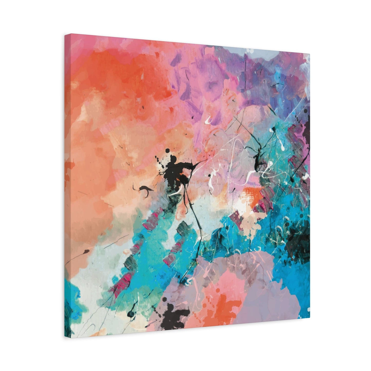
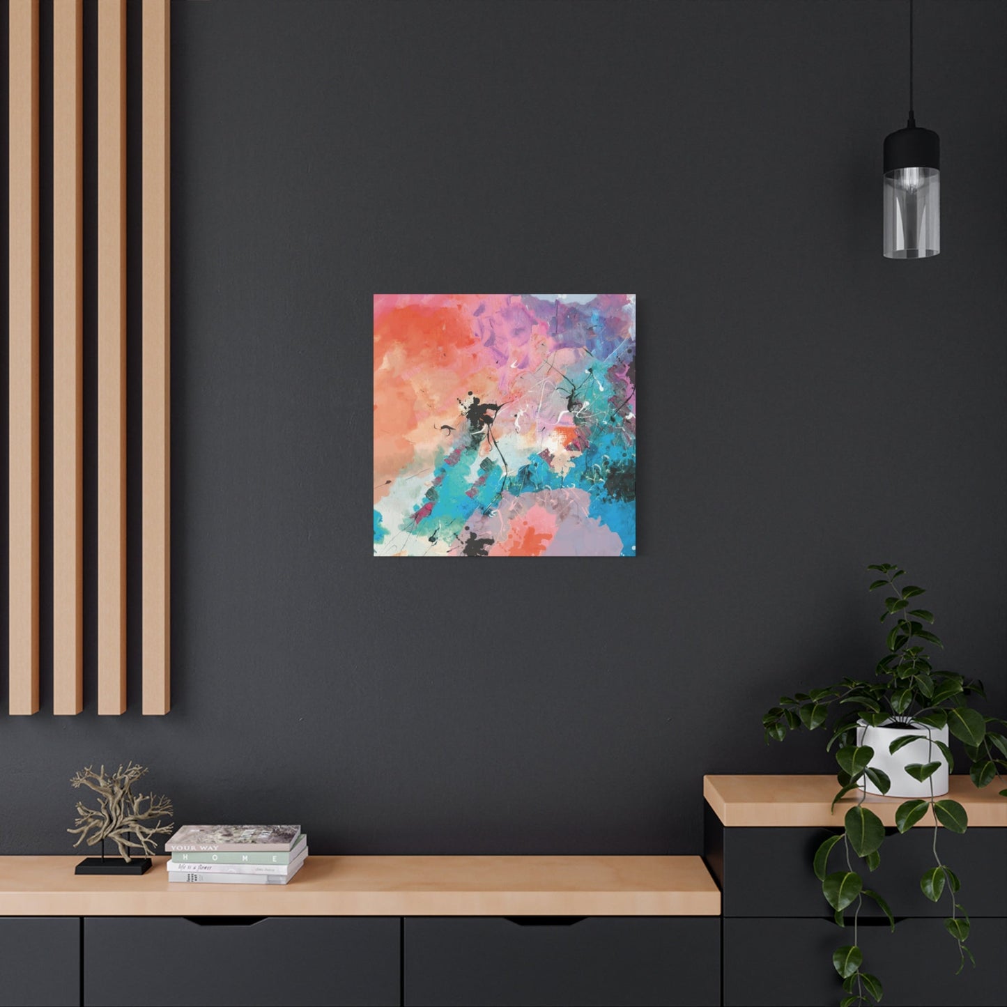
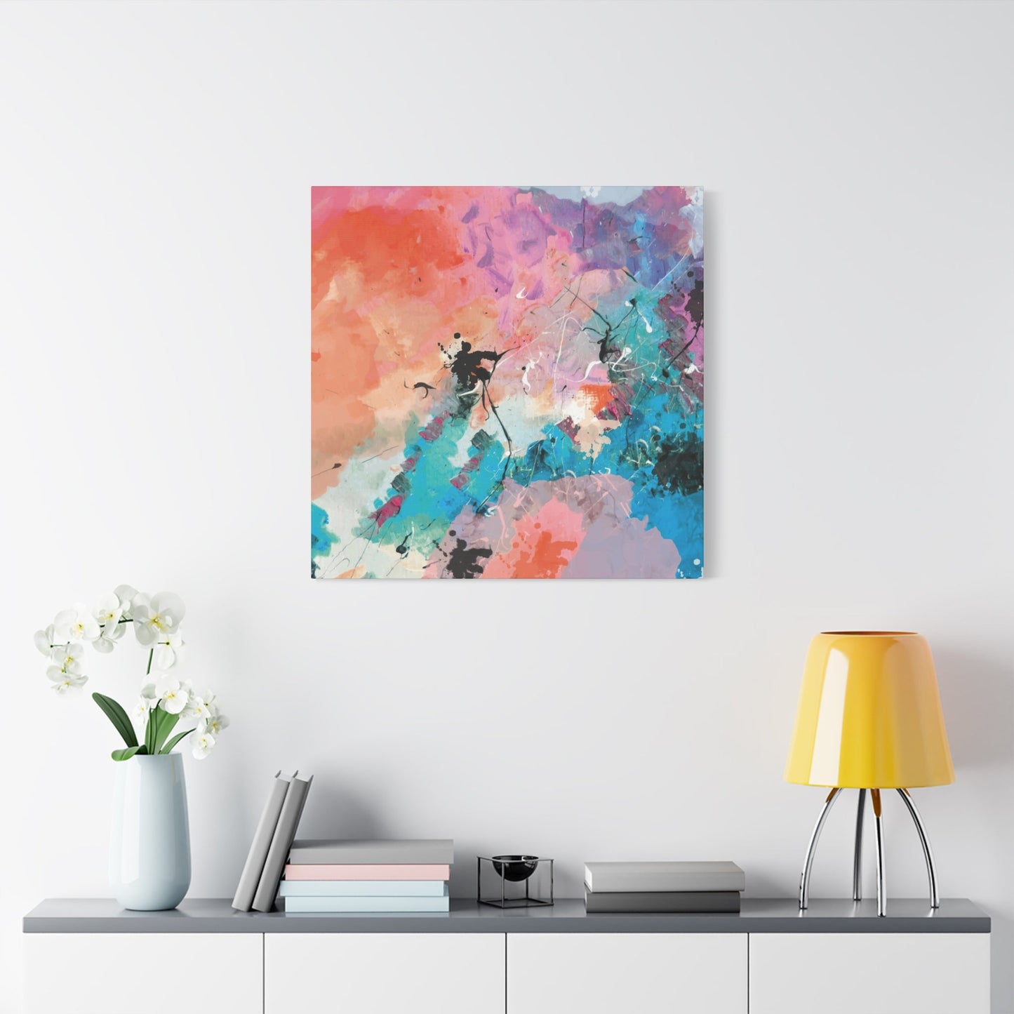
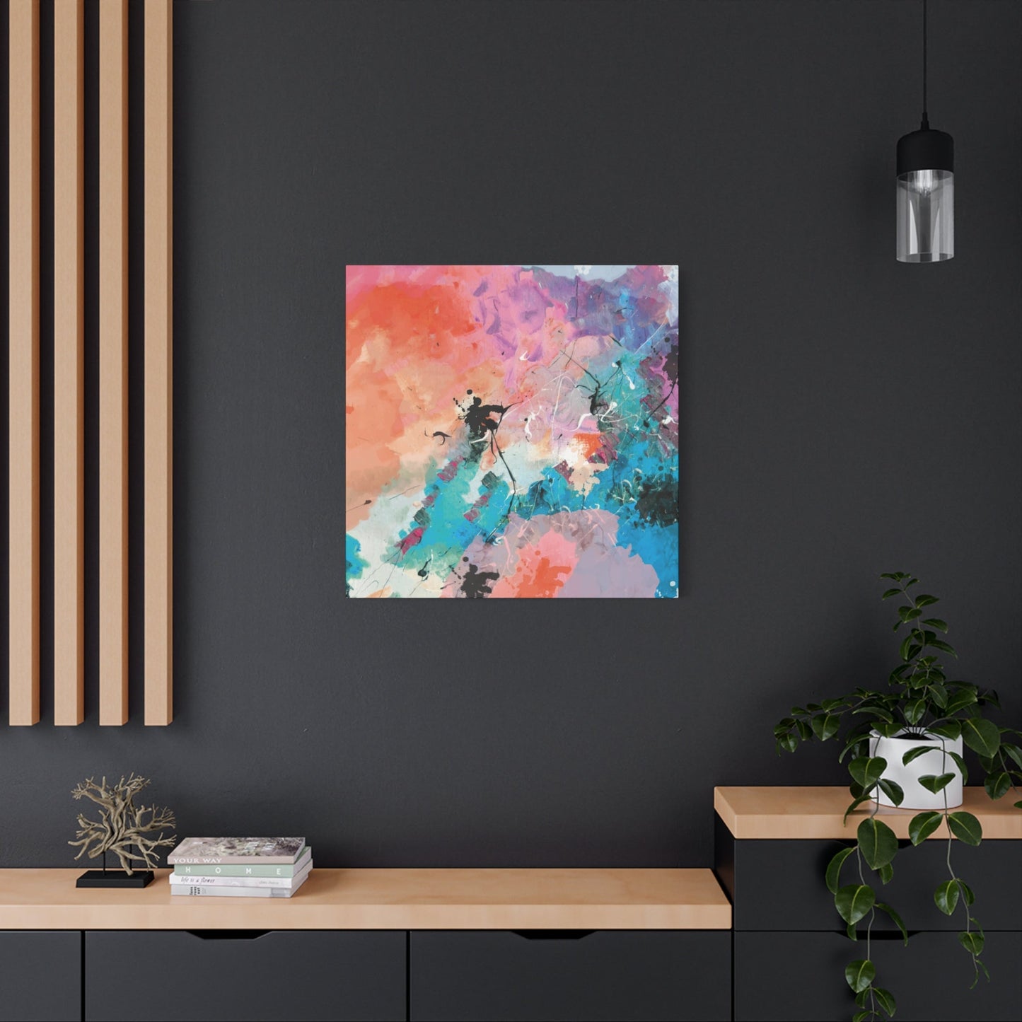
Abstract wall art possesses an extraordinary ability to transform any living space from ordinary to extraordinary. When you introduce abstract pieces into your room, you're not simply adding decoration – you're infusing your environment with energy, personality, and visual interest that can completely alter the atmosphere. The beauty of abstract art lies in its versatility and the way it interacts with natural and artificial light sources throughout the day.
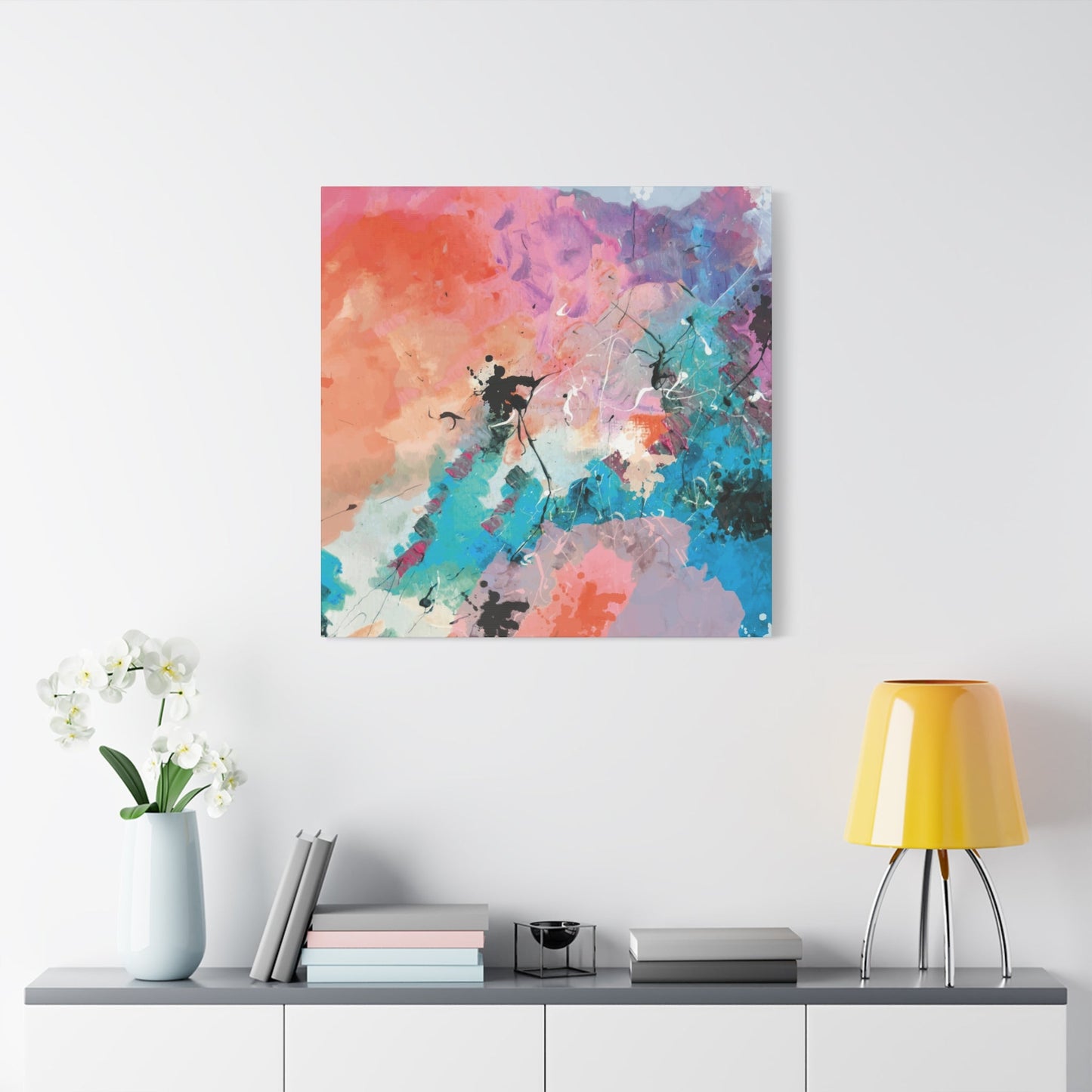
The process of brightening your room begins with understanding how abstract art functions as more than mere decoration. These pieces serve as focal points that draw the eye and create conversation starters while simultaneously reflecting and amplifying available light. When strategically placed near windows or under well-positioned lighting fixtures, abstract canvases can bounce light around the room, creating an illusion of increased space and luminosity.
Color selection plays a crucial role in achieving the brightening effect you desire. Lighter hues such as soft yellows, warm whites, gentle pinks, and pale blues naturally reflect more light than darker tones. However, this doesn't mean you should avoid darker colors entirely. Instead, consider how contrast works within your space. A predominantly light abstract piece with subtle darker accents can create depth while maintaining the room's brightness.
The size and placement of your abstract art significantly impact its brightening capabilities. Larger pieces tend to have more visual impact and can make a room feel more expansive, while smaller pieces work well in intimate spaces or as part of a gallery wall arrangement. Consider placing abstract art opposite windows to maximize natural light reflection, or use them to brighten darker corners that might otherwise feel neglected.
Abstract art's non-representational nature means it doesn't compete with other elements in your room for attention. Instead, it complements existing furniture, textiles, and architectural features while adding its own unique character. This harmonious integration allows the art to enhance your room's brightness without overwhelming the space or creating visual chaos.
The emotional impact of abstract art contributes significantly to the overall brightening effect. When you choose pieces that resonate with you personally, they contribute to a positive atmosphere that makes the entire space feel more welcoming and energetic. This psychological brightening effect works hand in hand with the physical light-reflecting properties to create a comprehensive transformation of your environment.
Trending Abstract Canvas Prints
The world of abstract canvas prints continues to evolve, with contemporary artists and designers pushing boundaries to create pieces that resonate with modern homeowners. Current trends reflect a sophisticated understanding of how art interacts with contemporary interior design while honoring the timeless appeal of abstract expression. Understanding these trends helps you make informed decisions that will keep your space feeling current and stylish for years to come.
Geometric abstraction remains at the forefront of trending styles, with clean lines, precise shapes, and mathematical precision appealing to those who appreciate order within creativity. These pieces often feature bold contrasts between geometric forms and organic elements, creating dynamic tension that captivates viewers. The popularity of geometric abstracts stems from their ability to complement both minimalist and maximalist interior design approaches.
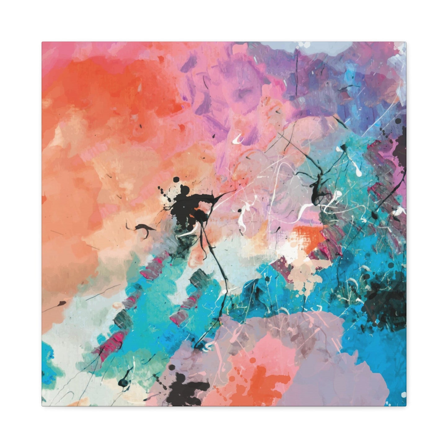
Fluid art represents another significant trend, characterized by flowing, organic forms that seem to move across the canvas. These pieces often incorporate multiple colors that blend seamlessly into one another, creating dreamlike landscapes that evoke feelings of calm and wonder. The creation process itself, involving the manipulation of paint flow and gravity, results in unique patterns that cannot be exactly replicated, making each piece truly one-of-a-kind.
Textural abstracts have gained tremendous popularity as homeowners seek art that engages multiple senses. These pieces incorporate raised elements, mixed media, and varied surface treatments that create tactile interest alongside visual appeal. The interplay between smooth and rough textures adds depth and sophistication to any room, making the art feel more substantial and engaging.
Monochromatic abstracts continue to trend, particularly in grayscale and single-color palettes that rely on tonal variation and texture for impact. These pieces work exceptionally well in spaces where color coordination is challenging or where the homeowner prefers a more subtle artistic presence. The sophistication of monochromatic abstracts lies in their restraint and the skill required to create visual interest without relying on color contrast.
Digital abstracts represent the intersection of traditional artistic principles with contemporary creation methods. These pieces often feature perfect gradients, impossible geometries, and color combinations that push beyond what's achievable with traditional media. The precision possible with digital creation appeals to those who appreciate technical perfection alongside artistic expression.
Nature-inspired abstracts translate organic forms into simplified, stylized representations that maintain connection to the natural world while embracing abstract principles. These pieces might suggest landscapes, weather patterns, or botanical forms without explicitly depicting them, allowing viewers to make their own interpretations and connections.
Choosing Colors for Wall Art
The selection of colors for your abstract wall art represents one of the most critical decisions in creating a cohesive and visually appealing interior space. Color choice affects not only the aesthetic appeal of your room but also influences mood, perceived space, and the overall energy of the environment. Understanding color theory and its practical applications will empower you to make selections that enhance your living space in meaningful ways.
Primary colors – red, blue, and yellow – serve as the foundation for all other hues and can create bold, energetic statements when used in abstract art. Red brings warmth, passion, and energy to a space, making it ideal for areas where you want to encourage conversation and activity. Blue offers calm, tranquility, and a sense of spaciousness, working particularly well in bedrooms and study areas. Yellow introduces sunshine, optimism, and intellectual stimulation, perfect for kitchens, home offices, and creative spaces.
Secondary colors – green, orange, and purple – provide more nuanced options that can bridge different elements within your room. Green promotes balance and harmony while connecting interior spaces to the natural world outside. Orange combines the energy of red with the cheerfulness of yellow, creating warmth without overwhelming intensity. Purple adds sophistication and luxury, working beautifully in formal spaces or areas where you want to create a sense of elegance.
The temperature of colors significantly impacts how they function within your space. Warm colors including reds, oranges, and yellows tend to advance visually, making walls appear closer and creating intimate, cozy atmospheres. Cool colors such as blues, greens, and purples recede visually, making spaces appear larger and more open. This understanding allows you to use color strategically to achieve specific spatial effects.
Neutral colors provide stability and sophistication while allowing other elements in your room to take center stage. Grays, beiges, browns, and off-whites create calm backdrops that work with virtually any decorating style. However, neutrals don't have to be boring – abstract art can incorporate multiple neutral tones with varying textures and finishes to create subtle but engaging visual interest.
The intensity or saturation of colors affects their impact and longevity in your space. Highly saturated colors create dramatic focal points but can become overwhelming over time, while muted or desaturated colors offer more lasting appeal and easier integration with changing decor. Consider your lifestyle and how often you prefer to update your surroundings when choosing color intensity.
Color harmony principles guide the creation of pleasing color combinations that feel balanced and intentional. Monochromatic schemes use various shades and tints of a single color, creating sophisticated unity. Analogous schemes combine colors adjacent on the color wheel for harmonious blending. Complementary schemes pair opposite colors for dynamic contrast and energy.
Minimalist Spaces and Abstract Art
The integration of abstract art into minimalist spaces requires careful consideration of balance, proportion, and intentionality. Minimalism emphasizes the beauty of simplicity, clean lines, and the elimination of excess, making the selection and placement of abstract art particularly significant. In these environments, each piece must justify its presence through meaningful contribution to the overall aesthetic and emotional impact of the space.
Minimalist design principles align naturally with certain types of abstract art, particularly pieces that embrace simplicity and restraint. Monochromatic abstracts work exceptionally well in minimalist settings, providing visual interest without introducing color complexity that might disrupt the calm, unified atmosphere. These pieces rely on texture, form, and subtle tonal variations to create impact, demonstrating that powerful artistic statements don't require elaborate complexity.
The concept of negative space becomes crucial when incorporating abstract art into minimalist environments. Negative space – the empty areas around and within the artwork – contributes as much to the overall composition as the painted or textured areas. This principle extends to the placement of art within the room, where surrounding empty wall space enhances the impact of the chosen piece and maintains the uncluttered aesthetic that defines minimalist design.
Scale and proportion take on heightened importance in minimalist spaces where every element receives focused attention. A single, well-chosen abstract piece can serve as the room's primary focal point, eliminating the need for multiple decorative elements. The size relationship between the artwork and the surrounding space must feel intentional and balanced, neither overwhelming the room nor disappearing into insignificance.
Material considerations become more prominent in minimalist settings where texture and surface quality receive increased scrutiny. Canvas prints with subtle textures, clean edges, and quality mounting systems align with minimalist values of craftsmanship and attention to detail. The physical presence of the artwork should feel substantial and purposeful rather than temporary or casual.
Color palettes in minimalist spaces typically embrace restraint, making the color choices in abstract art particularly impactful. Limited color schemes that echo or complement the existing neutral palette work most effectively, though a single accent color can provide striking contrast when used judiciously. The key lies in maintaining harmony while introducing enough visual interest to prevent the space from feeling sterile or unwelcoming.
The emotional impact of abstract art in minimalist spaces often centers on creating moments of contemplation and calm. Pieces that invite quiet reflection and personal interpretation align with the minimalist philosophy of mindful living and intentional choices. The art should enhance the sense of serenity that minimalist spaces strive to achieve while providing subtle stimulation for the mind and spirit.
Mixing Abstract Prints at Home
The art of combining multiple abstract prints within a single living space requires understanding of visual relationships, color coordination, and spatial dynamics. When executed successfully, mixed abstract prints can create rich, layered environments that reflect personality and sophistication while maintaining visual harmony. The key lies in finding balance between variety and unity, allowing each piece to contribute to the overall composition without competing for attention.
Establishing a unifying element provides the foundation for successfully mixing abstract prints. This unifying factor might be a consistent color palette that appears in each piece, a shared texture or finish, similar frame styles, or a common artistic approach. Having this connecting thread allows you to introduce variety in other aspects while maintaining cohesion throughout the space.
Scale variation adds visual interest and prevents the monotony that can result from using similarly sized pieces. Combine large statement pieces with smaller supporting works to create hierarchy and flow within your arrangement. The largest piece typically serves as the anchor, with smaller pieces arranged to complement and enhance its impact rather than compete with it.
Consider the rhythm and movement created by your arrangement of multiple abstract prints. The eye should flow naturally from one piece to another, creating a visual journey through the space. This flow can be achieved through strategic placement, color relationships, or thematic connections between pieces. Avoid creating visual dead ends where the eye gets trapped without clear direction to continue exploring the arrangement.
Spacing and alignment play crucial roles in creating professional-looking arrangements of multiple abstract prints. Consistent spacing between pieces creates order and intention, while varied spacing can introduce dynamic energy. Alignment along invisible horizontal or vertical lines helps create stability even when mixing different sizes and orientations.
The relationship between abstract prints and other room elements becomes more complex when multiple pieces are involved. Consider how the combined impact of several pieces affects the balance with furniture, architectural features, and other decorative elements. The goal is integration rather than domination, where the art enhances the overall environment without overwhelming other important design elements.
Lighting considerations multiply when dealing with multiple abstract prints, as each piece may have different requirements for optimal display. Natural light patterns, artificial lighting placement, and potential glare issues all become more complex. Plan your lighting scheme to accommodate all pieces effectively, possibly incorporating adjustable fixtures that can highlight different works at different times.
Color Psychology in Wall Art
The psychological impact of color in abstract wall art extends far beyond mere aesthetic appeal, influencing mood, behavior, and overall well-being in profound ways. Understanding these psychological effects empowers you to make informed choices that support your desired emotional environment and lifestyle goals. The colors you choose for your abstract art become part of your daily visual diet, subtly but consistently affecting your mental state and energy levels.
Red stimulates energy, passion, and action, making it an excellent choice for spaces where you want to encourage activity and engagement. In abstract art, red can range from bold, aggressive statements to gentle, warm embraces depending on its shade, saturation, and surrounding colors. Deep burgundies offer sophistication and comfort, while bright crimsons energize and excite. However, extensive use of red can become overwhelming, so consider its placement and the amount of exposure you'll have to it daily.
Blue provides calm, stability, and mental clarity, making it ideal for spaces dedicated to rest, study, or reflection. Different blues offer varying psychological effects: light blues promote peace and tranquility, medium blues enhance focus and productivity, while dark blues add depth and introspection. Blue's natural association with sky and water creates instinctive feelings of openness and freedom that can make spaces feel more expansive and serene.
Yellow brings optimism, creativity, and intellectual stimulation to any environment. Its association with sunlight creates instant warmth and positivity, making spaces feel more welcoming and energetic. Soft yellows promote gentle happiness and comfort, while brighter yellows stimulate mental activity and creativity. However, overly intense yellows can become agitating, so balance is key to harnessing yellow's positive effects.
Green offers balance, harmony, and connection to nature, providing psychological restoration and reducing eye strain. Its position in the center of the visible spectrum makes it naturally restful and easy to live with. Green abstract art can bring the calming influence of nature indoors while promoting feelings of growth, renewal, and stability. Different greens evoke different responses: sage greens feel sophisticated and calm, while brighter greens energize and refresh.
Purple combines the stability of blue with the energy of red, creating colors associated with luxury, creativity, and spiritual contemplation. In abstract art, purple can add sophistication and mystery while encouraging imaginative thinking. Lighter purples like lavender promote relaxation and feminine energy, while deeper purples suggest luxury and introspection.
Color combinations multiply these psychological effects, creating complex emotional responses that can be tailored to specific needs and preferences. Complementary colors create energy and excitement, analogous colors promote harmony and peace, while monochromatic schemes offer sophistication and calm. Understanding these relationships allows you to orchestrate specific emotional responses through your color choices.
Affordable Canvas Wall Decor
Creating stunning wall displays with abstract canvas prints doesn't require substantial financial investment when you understand how to make strategic choices and maximize impact through thoughtful selection and placement. Affordable options exist across all styles and sizes, allowing you to achieve professional-looking results while maintaining budget consciousness. The key lies in focusing on impact rather than price point, seeking pieces that deliver maximum visual interest for your investment.
Online marketplaces have revolutionized access to affordable abstract canvas prints, connecting buyers directly with artists and print-on-demand services that eliminate traditional retail markups. These platforms offer vast selections at various price points, often with customer reviews and detailed product information that help ensure quality purchases. Many sites offer frequent sales, promotional codes, and bulk discounts that can significantly reduce costs for multiple pieces.
Print-on-demand services allow you to access original designs at affordable prices by eliminating inventory costs and reducing production waste. These services often feature work by emerging artists who offer unique designs at accessible prices while building their customer base. The quality of print-on-demand canvases has improved dramatically, with many options rivaling traditional retail offerings in terms of color accuracy and durability.
Local art fairs, student exhibitions, and community art shows provide opportunities to discover affordable original and print works while supporting emerging artists. Student work often offers exceptional value, combining fresh perspectives with accessible pricing. Community exhibitions frequently feature local artists who understand regional preferences and offer competitive pricing to build local customer relationships.
DIY framing can significantly reduce the overall cost of canvas wall decor while allowing for customization that perfectly matches your space and preferences. Many affordable canvas prints come unframed, providing opportunities to select frames that complement your existing decor. Learning basic framing skills or working with local framing shops during sales periods can achieve professional results at budget-friendly prices.
Seasonal shopping strategies can yield significant savings on abstract canvas wall decor. End-of-season sales, holiday promotions, and new collection launches often coincide with substantial discounts on existing inventory. Planning purchases around these cycles allows you to acquire higher-quality pieces at lower prices while building your collection gradually over time.
Creating gallery walls with smaller, affordable pieces can achieve greater impact than single large expensive works. This approach allows for creative arrangements, easy updating as tastes change, and the flexibility to rearrange pieces as needed. Multiple small pieces often cost less than single large ones while offering more decorating versatility and visual interest.
Bold Abstract Art Ideas
Bold abstract art makes powerful statements that can transform ordinary spaces into extraordinary environments filled with energy, personality, and visual excitement. The key to successfully incorporating bold pieces lies in understanding how to balance their dramatic impact with existing decor elements while ensuring they enhance rather than overwhelm your living space. Bold choices require confidence and careful planning, but the results can create truly memorable and inspiring environments.
Oversized canvases create immediate visual impact and can serve as room-defining focal points that establish the entire decorating scheme. Large-scale abstract pieces demand attention and respect, requiring adequate wall space and complementary furnishings that can hold their own without competing. The scale itself becomes part of the artistic statement, demonstrating commitment to artistic expression and design sophistication.
High-contrast color schemes generate energy and excitement through dramatic juxtapositions that capture attention and create dynamic visual tension. Black and white combinations offer timeless sophistication with maximum impact, while complementary color pairs like blue and orange or red and green create vibrating effects that energize any space. These bold color choices work particularly well in modern or contemporary settings that can accommodate their intensity.
Textural boldness can create impact through surface variation rather than color alone, offering dramatic statements suitable for spaces where color restraint is preferred. Heavily textured abstract pieces create sculptural presence that changes appearance throughout the day as lighting conditions shift. Mixed media approaches that incorporate unexpected materials add surprise and conversation value to bold abstract statements.
Geometric boldness employs strong shapes, clean lines, and mathematical precision to create striking visual impact through form rather than color or texture. Sharp angles, perfect circles, and intersecting lines create dynamic compositions that appeal to viewers who appreciate order within creativity. These pieces often work well in architectural settings with strong structural elements that echo the artwork's geometric emphasis.
Multiple bold pieces can work together when carefully orchestrated around unifying elements such as color relationships, scale harmony, or thematic connections. Creating bold gallery walls requires sophisticated understanding of visual balance and rhythm to prevent chaos while maintaining the energetic impact that bold choices provide. The key lies in finding unity within diversity, allowing each piece to contribute to an overall statement rather than competing individually.
Bold abstract art placement requires careful consideration of viewing distances, lighting conditions, and interaction with architectural features. These pieces often work best with adequate breathing room and lighting that showcases their dramatic qualities without creating glare or washing out important details. Consider the daily interaction patterns with bold pieces, as their impact can affect mood and energy levels throughout the day.
Abstract Art for Offices
The incorporation of abstract art into office environments serves multiple functions beyond mere decoration, contributing to productivity, creativity, and professional image while creating more engaging and inspiring work spaces. The selection and placement of abstract pieces in office settings requires consideration of professional appropriateness, employee well-being, and brand representation, all while maintaining the creative and energizing benefits that quality art provides.
Abstract art in reception areas creates first impressions that communicate company values, aesthetic sensibilities, and attention to quality. These pieces should reflect professionalism while providing visual interest that makes waiting more pleasant for visitors. The scale and subject matter should be appropriate for the space and clientele, creating welcoming atmospheres without being distracting or controversial.
Conference room art can influence meeting dynamics and creative thinking processes. Abstract pieces that suggest movement, growth, or collaboration can subconsciously encourage productive discussions and innovative problem-solving. Color choices should promote alertness without causing distraction, with blues and greens often working well to maintain calm professionalism while encouraging clear thinking.
Individual office spaces allow for more personal expression while maintaining professional standards. Abstract art can reflect occupant personality and preferences while creating inspiring environments that reduce stress and promote creativity. The scale should be appropriate for the space size, and color choices should coordinate with existing office furniture and decor.
Open office environments present unique challenges for abstract art placement, requiring pieces that can be appreciated from multiple angles and distances while avoiding distraction from work tasks. Modular abstract pieces that can be reconfigured as office layouts change offer flexibility and ongoing visual interest. Sound-absorbing canvas prints can provide dual functions of artistic beauty and acoustic improvement.
Color psychology becomes particularly important in office settings where art can influence energy levels, stress responses, and collaborative behaviors. Blues promote focus and calm decision-making, greens reduce eye strain and promote balance, while warmer colors can energize and encourage social interaction in appropriate areas. Avoiding overly stimulating colors in areas requiring concentration while using energizing colors in collaborative spaces optimizes art's psychological impact.
The maintenance and longevity of office abstract art require consideration of high-traffic conditions, cleaning requirements, and potential damage from daily activities. Quality canvas prints with protective finishes can withstand office environments while maintaining their appearance over time. Professional installation ensures secure mounting that meets safety requirements while showcasing pieces effectively.
Textures in Canvas Prints
The textural qualities of abstract canvas prints add dimensional depth and tactile interest that engages viewers beyond pure visual appreciation. Understanding how different textures function within abstract compositions and interior spaces allows you to select pieces that provide rich, multi-sensory experiences while complementing your existing decor elements. Texture in abstract art can create focal points, add sophistication, and provide visual weight that balances other room elements.
Canvas texture itself provides the foundation for all other textural elements in canvas prints. Traditional stretched canvas offers subtle weave patterns that add organic texture even to smooth paint applications. The weight and weave of the canvas affects how paint sits on the surface and how light interacts with the piece throughout the day. Heavier canvas weights typically provide more substantial texture and better longevity for abstract pieces.
Paint application methods create varying textural effects that dramatically impact the final appearance and feel of abstract pieces. Impasto techniques that leave thick paint applications create sculptural surfaces that cast shadows and catch light dynamically. Smooth, even paint applications provide serene surfaces that emphasize color and form over texture. Mixed approaches within single pieces create interesting contrasts that add complexity and visual interest.
Digital printing technologies now allow for the reproduction of textural effects that simulate traditional painting techniques. Advanced printing methods can reproduce the dimensionality of brush strokes, palette knife applications, and mixed media elements with remarkable accuracy. These reproductions make textural abstract art more accessible while maintaining much of the visual and tactile interest of original works.
Layering techniques in abstract canvas prints create depth through multiple textural elements that interact with each other and with viewing conditions. Transparent and opaque layers create varying degrees of visual depth, while contrasting textures within single pieces provide focal points and areas of rest for the eye. These layering effects become more apparent as viewing distance changes, providing different experiences from various positions.
Mixed media approaches incorporate non-paint materials into canvas prints to create unique textural experiences. Sand, fabric, paper, and other materials can be integrated into abstract compositions to create surprising tactile qualities and visual interest. These mixed media elements often create stronger connections between the artwork and architectural or furnishing elements within the room.
The interaction between texture and lighting becomes crucial in canvas prints where surface variation affects how light reflects and absorbs across the piece. Highly textured areas create dynamic shadow patterns that change throughout the day, while smooth areas provide stable color presentation. Understanding these interactions allows for strategic placement that maximizes the textural impact of your chosen pieces.
Abstract Art in Neutral Rooms
Neutral rooms provide sophisticated backdrops that allow abstract art to take center stage while maintaining calm, versatile environments that work with changing preferences and seasonal updates. The challenge lies in selecting abstract pieces that add interest and personality without disrupting the serene sophistication that neutral palettes provide. Successfully incorporating abstract art into neutral spaces requires understanding how to create impact through subtle means while maintaining overall harmony.
Neutral color palettes ranging from warm beiges and soft grays to cool whites and gentle off-whites create stable foundations that showcase abstract art effectively. These backdrop colors don't compete with artwork for attention, allowing the pieces to establish mood and provide personality within the space. The subtlety of neutral environments makes color choices in abstract art particularly impactful, as even muted colors gain prominence against neutral backgrounds.
Texture becomes increasingly important in neutral rooms where color variation is limited. Abstract pieces with interesting surface textures, mixed media elements, or varied paint applications add essential visual and tactile interest that prevents neutral spaces from feeling flat or boring. The interplay between smooth and textured surfaces creates sophisticated layering that adds depth without requiring color complexity.
Scale considerations take on heightened importance in neutral environments where large pieces can dominate through size alone. Oversized abstract works often function beautifully in neutral rooms, providing necessary focal points without color conflicts. Alternatively, collections of smaller pieces can create gallery walls that add personality and visual movement while maintaining neutral harmony.
Monochromatic abstract pieces work exceptionally well in neutral environments, using tonal variations within single color families to create sophisticated statements. These pieces provide visual interest through form, texture, and subtle color shifts rather than bold contrast, aligning with the restrained aesthetic that neutral rooms embody.
Black and white abstract pieces offer timeless sophistication that works with any neutral palette while providing stronger contrast than purely tonal approaches. These high-contrast pieces can serve as dramatic focal points that anchor neutral rooms while maintaining color neutrality that won't conflict with future decorating changes.
The flexibility of neutral rooms allows for seasonal or mood-based artwork rotation without requiring major decorating changes. Abstract pieces in different color families can be swapped to reflect seasonal preferences or personal mood changes while maintaining the room's fundamental neutral character. This adaptability makes neutral rooms ideal for art enthusiasts who enjoy changing their displays regularly.
Traditional vs. Abstract Art
The relationship between traditional and abstract art within interior design contexts involves understanding fundamental differences in approach, impact, and integration with various decorating styles. While traditional art focuses on recognizable subjects and realistic representation, abstract art emphasizes color, form, and emotional expression without literal interpretation. Both approaches offer distinct advantages and challenges when incorporated into living spaces.
Traditional art provides immediate recognition and often tells stories or depicts familiar subjects that viewers can easily understand and relate to. Landscapes, portraits, still lifes, and historical scenes offer conversation starters and cultural connections that many find comforting and accessible. These pieces often work well in formal settings or rooms with classical decorating approaches where representational art supports the overall aesthetic theme.
Abstract art challenges viewers to engage more actively with color, form, and personal interpretation rather than relying on subject recognition. This engagement can create more personal relationships with artwork as individual viewers bring their own experiences and emotions to the interpretation process. The open-ended nature of abstract pieces allows them to work with changing moods and perspectives over time.
Decorating flexibility differs significantly between traditional and abstract approaches. Traditional pieces often dictate or limit color schemes and decorating styles through their representational content and historical associations. Abstract pieces offer greater adaptability, working with multiple decorating styles and color schemes while allowing for personal interpretation that can evolve with changing preferences.
Investment considerations vary between traditional and abstract art approaches. Traditional pieces may hold value through historical significance, artist reputation, or cultural importance, while abstract pieces often derive value from contemporary relevance, artistic innovation, and personal connection. Both approaches can provide lasting enjoyment and potential value appreciation when selected thoughtfully.
Room compatibility shows distinct patterns between traditional and abstract approaches. Traditional art often works best in spaces with established decorating themes that complement the artwork's subject matter and style. Abstract pieces demonstrate greater versatility, adapting to minimalist modern spaces, eclectic environments, and transitional designs with equal effectiveness.
Personal connection development differs between viewing traditional and abstract art over extended periods. Traditional pieces may become familiar through subject recognition but can lose impact through over-familiarity. Abstract pieces often reveal new details, interpretations, and emotional responses as viewing conditions, personal circumstances, and perspectives change over time.
Cultural considerations influence the appropriateness of traditional versus abstract art in various settings. Traditional pieces may carry specific cultural, religious, or historical associations that affect their suitability for diverse environments. Abstract art's non-representational nature often makes it more universally acceptable while still allowing for cultural expression through color, form, and style choices.
The learning curve associated with appreciating traditional versus abstract art affects how quickly viewers develop relationships with pieces. Traditional art often provides immediate accessibility through recognizable subjects, while abstract art may require more time and exposure for full appreciation. This difference affects both initial selection processes and long-term satisfaction with chosen pieces.
Abstract Art as Gifts
Abstract art makes thoughtful, memorable gifts that demonstrate consideration for the recipient's taste while offering lasting beauty and personal meaning. The gift-giving potential of abstract pieces lies in their ability to work with various decorating styles while allowing recipients to develop personal interpretations and emotional connections. Selecting abstract art as gifts requires understanding recipient preferences, living situations, and the symbolic meanings that different pieces might convey.
Recipient lifestyle analysis helps ensure gift appropriateness and long-term enjoyment. Consider whether the recipient frequently moves, prefers minimalist or maximalist decorating approaches, and has established color preferences or restrictions. Understanding their living space characteristics including wall availability, lighting conditions, and existing decor helps guide size and style selections that will integrate successfully into their environment.
Occasion appropriateness varies among different types of abstract pieces, with certain styles and themes working better for specific gift-giving situations. Housewarming gifts might emphasize pieces that create welcoming atmospheres and work with unknown future decorating plans. Wedding gifts could focus on pieces that suggest harmony, growth, or shared journeys through complementary forms and unified compositions.
Personal meaning creation becomes particularly important when gifting abstract art, as the non-representational nature allows for symbolic interpretation that connects to relationships and shared experiences. Colors that hold special significance, forms that suggest meaningful concepts, or compositions that reflect shared memories can transform abstract pieces into deeply personal gifts that carry emotional weight beyond their aesthetic value.
Budget considerations for abstract art gifts span wide ranges, from affordable prints that provide artistic beauty to original pieces that represent significant investments. Understanding the relationship context and occasion appropriateness helps determine suitable budget levels while ensuring that the gift feels substantial and thoughtful regardless of price point.
Presentation and packaging contribute significantly to the gift-giving experience with abstract art. Professional framing, quality protective packaging, and thoughtful presentation enhance the perceived value and demonstrate care in selection and preparation. Including information about the artist, creation process, or suggested placement can help recipients appreciate and integrate their gifts successfully.
Gift recipient education might be necessary for those unfamiliar with abstract art appreciation. Including gentle guidance about placement options, lighting considerations, or interpretation approaches can help ensure successful integration and ongoing enjoyment. This educational component should feel supportive rather than prescriptive, allowing recipients to develop their own relationships with the pieces.
Return and exchange policies become particularly important for abstract art gifts given their subjective nature and integration requirements. Understanding merchant policies and selecting retailers with flexible return options provides peace of mind for both givers and recipients, ensuring that gifts can be exchanged if they don't work well in intended spaces.
Kids' Rooms with Abstract Prints
Incorporating abstract prints into children's spaces requires balancing artistic education, visual stimulation, and age-appropriate content while creating environments that support development, creativity, and personal expression. Abstract art in kids' rooms offers opportunities to introduce artistic concepts, encourage imaginative thinking, and create visually rich environments that evolve with growing children's changing needs and preferences.
Age appropriateness guides selection of abstract pieces for different developmental stages. Younger children respond well to pieces with clear, simple forms and bright, cheerful colors that stimulate visual development without overwhelming sensitive systems. Older children can appreciate more complex compositions and subtle color relationships while developing personal preferences and artistic understanding.
Safety considerations become paramount when selecting and installing abstract art in children's rooms. Secure mounting systems prevent accidents, while non-toxic materials and protected surfaces ensure health safety. Frame selection should prioritize child-safe materials and construction, avoiding sharp edges or small parts that could pose hazards during active play.
Educational value emerges naturally from exposure to abstract art, introducing concepts of color, shape, pattern, and artistic expression that support cognitive development. Children learn to interpret non-literal visual information, develop personal preferences, and express opinions about artistic choices. These skills transfer to other areas of learning and creative expression.
Interactive possibilities expand when abstract art becomes part of children's daily environments. Pieces can inspire storytelling, color identification games, shape recognition activities, and imaginative play scenarios. The open-ended nature of abstract art encourages creative thinking and personal interpretation that supports intellectual development.
Growth accommodation becomes important when selecting abstract pieces for children's spaces, as both the children and their rooms evolve rapidly. Choosing pieces with lasting appeal that can transition from nursery to teenager requires considering timeless design elements and avoiding overly juvenile themes that might become quickly outdated.
Color psychology applications in children's rooms focus on supporting healthy development, adequate sleep, and appropriate energy levels throughout the day. Calming blues and greens promote rest and concentration, while energizing yellows and oranges encourage creativity and play. Understanding these effects helps create balanced environments that support children's various needs.
Personal expression opportunities allow children to participate in art selection processes, developing taste and decision-making skills while creating personal investment in their environments. Age-appropriate involvement in choosing between pre-selected options or contributing to arrangement decisions helps children develop ownership and pride in their spaces.
Theme integration allows abstract pieces to work within broader decorating themes while providing artistic sophistication that grows with children. Abstract interpretations of favorite colors, animals, or interests can satisfy theme requirements while providing more lasting artistic value than literal representations that might quickly become outdated.
Conclusion
Abstract wall art represents far more than mere decoration – it serves as a powerful tool for personal expression, environmental transformation, and emotional enhancement that can profoundly impact daily life quality and well-being. Throughout this comprehensive exploration, we have discovered how thoughtfully selected and strategically placed abstract pieces can brighten spaces, reflect personality, support lifestyle goals, and create meaningful connections between inhabitants and their environments.
The journey through various aspects of abstract art integration reveals the remarkable versatility and adaptability of this art form. From brightening neutral rooms with carefully chosen color palettes to creating bold statements that energize office environments, abstract art demonstrates its capacity to work within virtually any setting while maintaining its essential character of non-representational beauty and emotional resonance. This adaptability makes abstract art particularly valuable in our increasingly dynamic living situations where flexibility and personalization become essential.
The practical considerations covered throughout this guide emphasize that successful abstract art integration requires more than aesthetic appreciation. Understanding scale relationships, lighting interactions, color psychology, and spatial dynamics ensures that chosen pieces will function effectively within their intended environments while providing lasting satisfaction and visual interest. These technical aspects, when properly addressed, allow the emotional and aesthetic benefits of abstract art to flourish without compromise.
Budget consciousness need not limit access to quality abstract art, as demonstrated through various affordable options and strategic selection approaches. The democratization of art through online platforms, print-on-demand services, and DIY opportunities means that beautiful, meaningful abstract pieces are accessible regardless of financial constraints. This accessibility allows more people to experience the transformative power of living with art while building collections that reflect personal growth and changing preferences over time.
The seasonal and trend awareness discussed throughout this guide provides frameworks for maintaining fresh, current environments without requiring complete redecoration or substantial ongoing investment. Understanding how abstract art trends evolve and how pieces can be rotated or updated seasonally allows for dynamic living spaces that remain engaging and inspiring throughout changing life circumstances and developing aesthetic preferences.
Personal connection emerges as perhaps the most important factor in successful abstract art selection, transcending technical considerations and trend awareness. The pieces that provide lasting satisfaction are those that speak to individual personalities, support lifestyle goals, and maintain their appeal through changing circumstances and evolving taste. This personal resonance transforms abstract art from decoration into meaningful environmental elements that contribute to overall life quality and well-being.
The educational aspects of living with abstract art extend beyond aesthetic appreciation to include development of visual literacy, cultural awareness, and personal taste refinement. Regular exposure to quality abstract pieces develops abilities to interpret non-literal visual information, appreciate artistic skill and innovation, and articulate personal preferences with increasing sophistication. These skills transfer to other areas of life, enhancing overall cultural engagement and personal development.
As we conclude this comprehensive exploration of abstract wall art, it becomes clear that these pieces offer unique opportunities for environmental enhancement that combine aesthetic beauty with practical function, personal expression with universal appeal, and immediate impact with lasting value. The investment in quality abstract art – whether financial, emotional, or intellectual – provides returns that extend far beyond simple decoration to encompass improved daily
