


Abstract Fresh Wall Art: A Complete Guide to Transforming Your Living Spaces
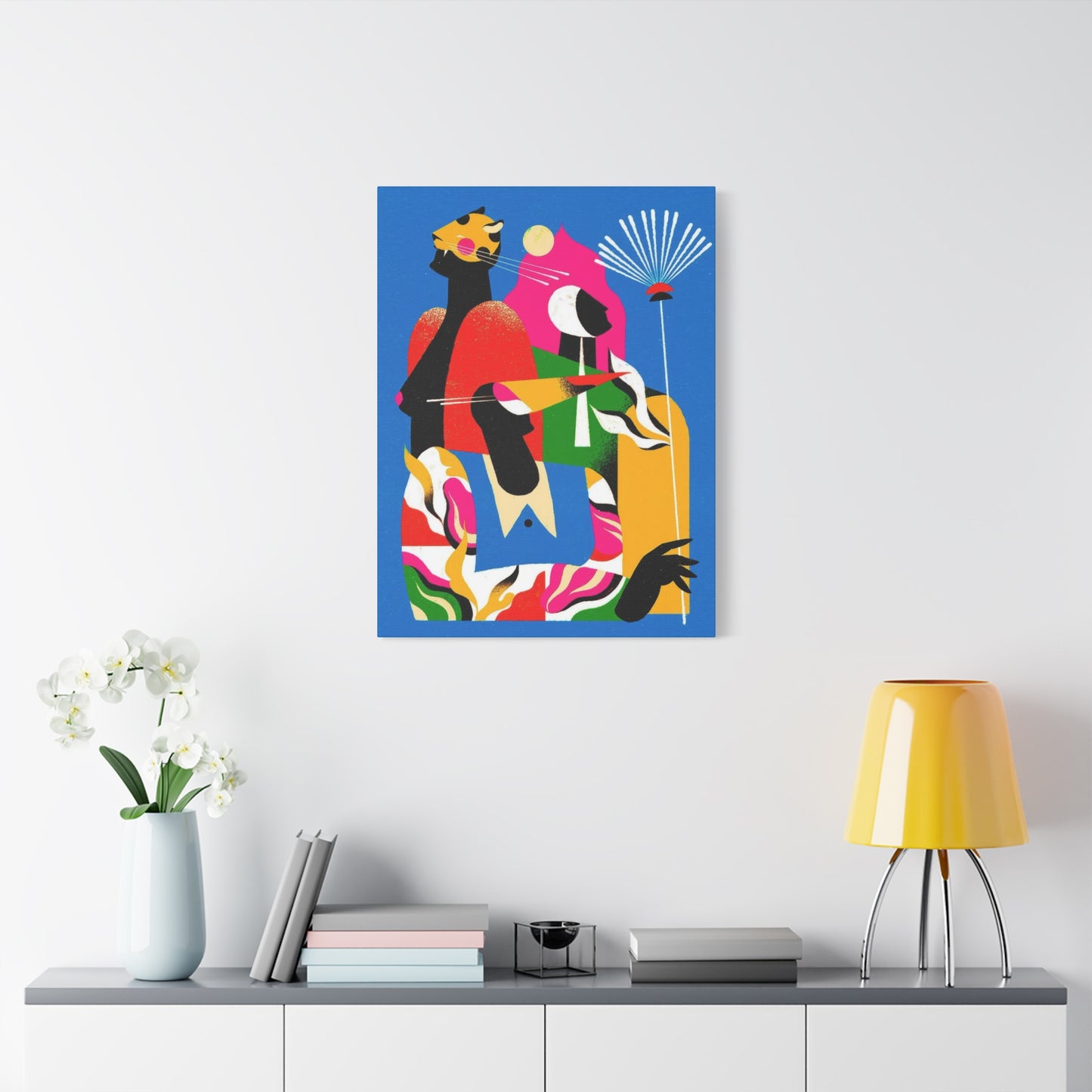
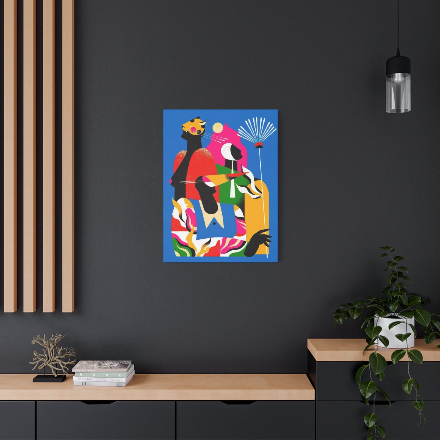
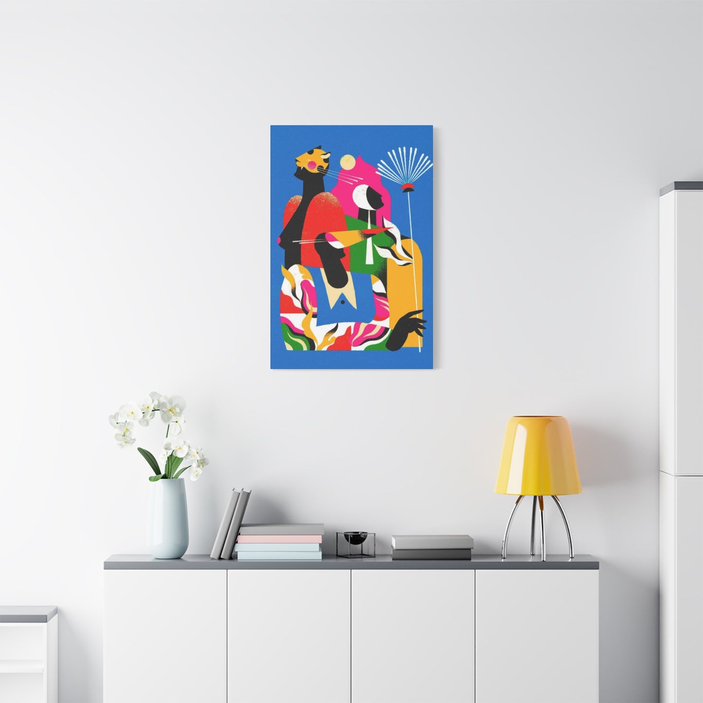
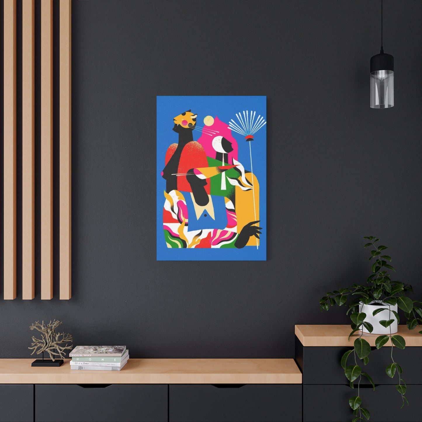
The world of interior design has witnessed a remarkable transformation in recent years, with abstract fresh wall art canvas prints emerging as one of the most sought-after elements for creating visually stunning and emotionally engaging living spaces. These artistic pieces have revolutionized the way people approach home decoration, offering an accessible yet sophisticated means of expressing personal style and enhancing the ambiance of any room. The beauty of abstract canvas prints lies in their versatility, ability to complement various design schemes, and power to transform ordinary walls into captivating focal points that reflect individual taste and contemporary aesthetic sensibilities.
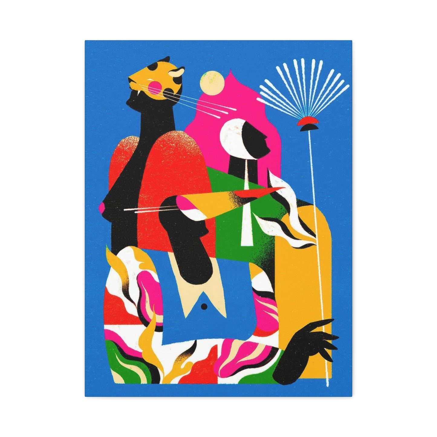
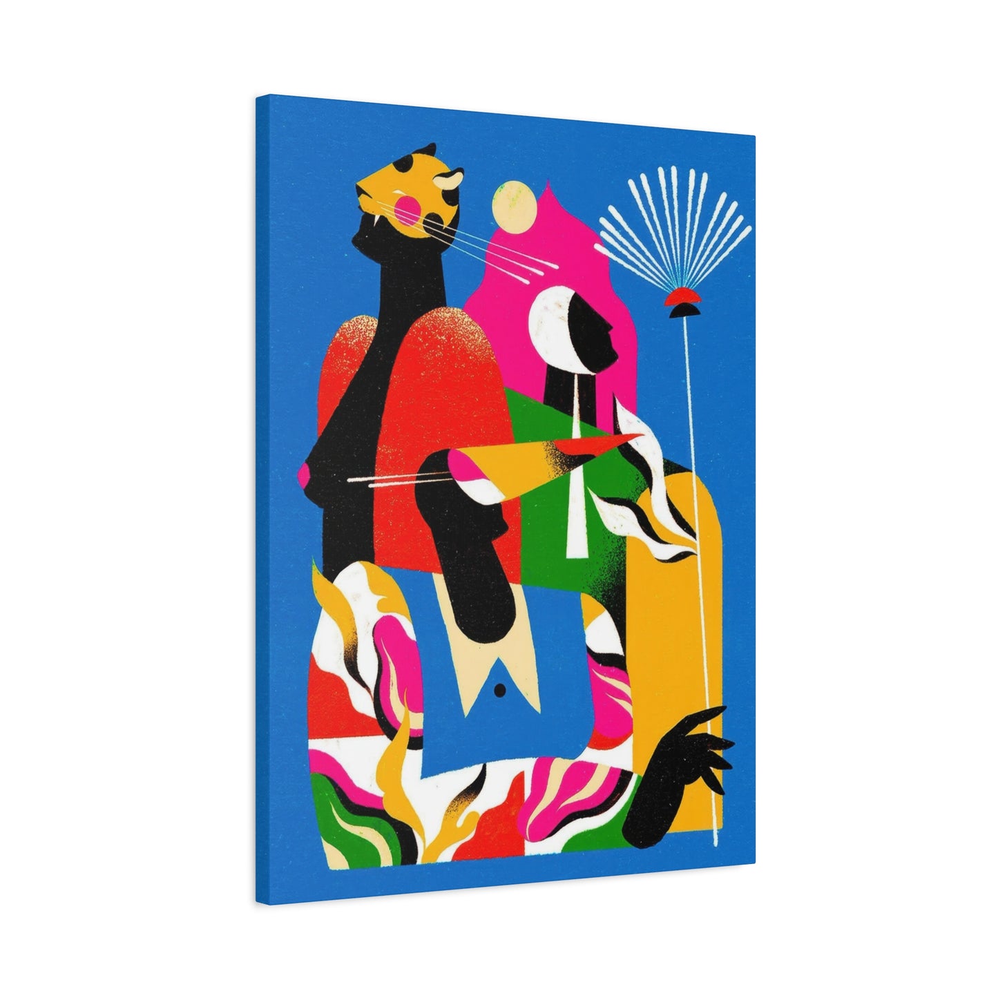
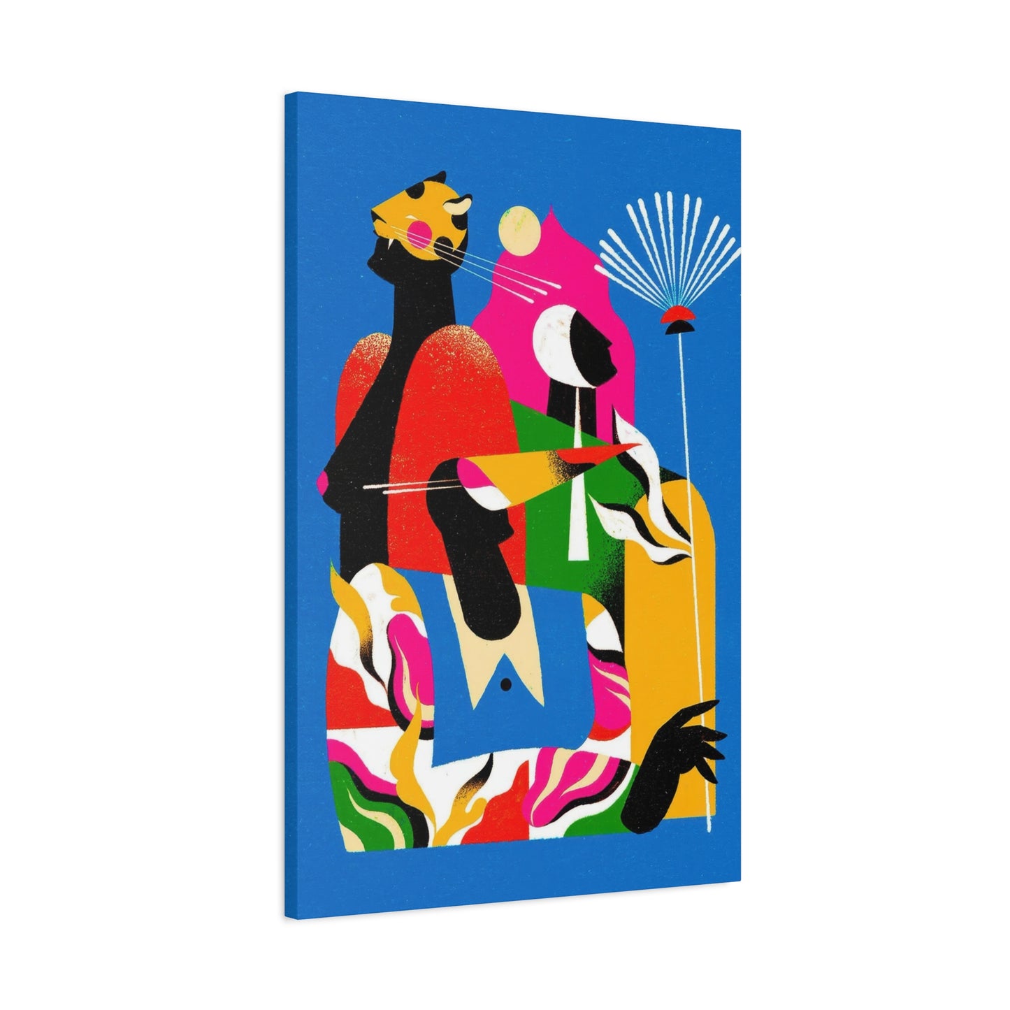
Abstract art in canvas print form represents a perfect marriage between artistic expression and practical home decoration. Unlike traditional paintings that may require significant investment and careful maintenance, canvas prints offer durability, affordability, and ease of installation while maintaining the visual impact of original artwork. The fresh perspective that abstract designs bring to interior spaces cannot be overstated, as they introduce elements of color, texture, and visual interest that can completely alter the perception and feel of a room. Whether you are furnishing a new home, refreshing an existing space, or seeking to create a specific mood or atmosphere, abstract fresh wall art canvas prints provide endless possibilities for creative expression and personalized decoration.
The appeal of abstract canvas prints extends far beyond their aesthetic qualities. These pieces serve multiple functions within a living space, acting as conversation starters, mood enhancers, and reflections of personal identity. The abstract nature of these artworks allows viewers to form their own interpretations and emotional connections, making each piece uniquely meaningful to different individuals. This subjective quality is precisely what makes abstract art so universally appealing yet personally significant. As we delve deeper into the world of abstract fresh wall art canvas prints, we will explore the various aspects that make these pieces essential elements of contemporary interior design, from understanding different styles and selecting appropriate pieces to installation techniques and maintenance considerations.
Essence of Abstract Art in Modern Interior Design
Abstract art represents a departure from realistic representation, focusing instead on colors, shapes, forms, and gestural marks to achieve its effect. This artistic approach emerged in the early twentieth century as artists began exploring ways to express emotions, concepts, and experiences that could not be captured through traditional representational methods. When translated into canvas prints for home decoration, abstract art brings this rich artistic heritage into everyday living spaces, making sophisticated visual expression accessible to everyone regardless of their budget or expertise in art collection.
The fundamental appeal of abstract art in modern interior design stems from its ability to work harmoniously with various decorative styles while maintaining its distinctive character. Unlike representational art that depicts specific subjects or scenes, abstract pieces offer visual interest without imposing a particular narrative or theme on a space. This quality makes them incredibly versatile, allowing them to complement minimalist, contemporary, traditional, eclectic, and transitional design schemes with equal effectiveness. The colors, patterns, and compositional elements in abstract canvas prints can be selected to either harmonize with existing décor or provide striking contrast that energizes a room.
Understanding abstract art begins with recognizing its various forms and expressions. Geometric abstraction employs precise shapes, lines, and mathematical relationships to create visually balanced compositions that convey order and structure. This style works particularly well in contemporary and modern settings where clean lines and organized spaces predominate. Conversely, gestural or expressive abstraction focuses on spontaneous brushwork, fluid forms, and emotional intensity, creating pieces that feel more organic and dynamic. These works often feature bold color combinations, dramatic contrasts, and energetic compositions that inject vitality into any space they occupy.
Color field abstraction represents another significant approach within the abstract art movement, characterized by large areas of solid or subtly varied color that create immersive visual experiences. These pieces work exceptionally well in creating calm, contemplative atmospheres or serving as sophisticated backdrops that allow other design elements to shine. The psychological impact of color in abstract art cannot be overlooked, as different hues evoke distinct emotional responses and can significantly influence the mood of a room. Warm colors like reds, oranges, and yellows create energy and warmth, while cool tones such as blues, greens, and purples promote tranquility and relaxation.
Selecting the Perfect Abstract Canvas Prints for Your Space
Choosing the right abstract canvas prints for your home involves careful consideration of multiple factors, from the physical characteristics of the space to the emotional atmosphere you wish to create. The selection process should begin with a thorough assessment of the room where the artwork will be displayed, taking into account dimensions, lighting conditions, existing color schemes, and the overall design aesthetic. Understanding these foundational elements will guide your choices and help ensure that your selected pieces integrate seamlessly into your environment while achieving the desired visual impact.
Room size plays a crucial role in determining appropriate canvas print dimensions. Large walls in spacious rooms can accommodate oversized pieces or multi-panel arrangements that create dramatic focal points without overwhelming the space. A common guideline suggests that artwork should occupy approximately sixty to seventy-five percent of the available wall space to achieve proper visual balance. Smaller rooms benefit from appropriately scaled pieces that provide interest without dominating the limited space. However, rules in design are meant to be flexible, and sometimes unexpected scale choices can create surprisingly effective results that challenge conventional thinking.
Color selection represents perhaps the most critical decision when choosing abstract canvas prints. The colors in your artwork should relate to the existing palette in your room, either by harmonizing with current hues or introducing complementary or contrasting tones that add visual interest. A monochromatic room can be dramatically enhanced by a canvas print featuring bold, vibrant colors that inject energy and personality into the space. Conversely, a room with diverse colors might benefit from artwork that pulls together existing tones, creating cohesion and visual unity. Consider also the undertones in your furnishings and wall colors, as these subtle hues should be reflected or complemented in your canvas print selections.
The emotional tone of abstract artwork should align with the function and desired atmosphere of the room. Bedrooms typically benefit from calming, serene pieces featuring soft colors and gentle compositions that promote relaxation and restful sleep. Living rooms and common areas can accommodate more energetic, vibrant pieces that stimulate conversation and create inviting environments for social interaction. Home offices require artwork that inspires focus and creativity without becoming distracting, often making subtle, sophisticated abstract pieces ideal choices. Dining rooms present opportunities for bold, conversation-starting pieces that contribute to the overall dining experience and create memorable impressions on guests.
Lighting conditions significantly affect how abstract canvas prints appear in a space. Natural light changes throughout the day, altering the appearance of colors and creating different visual effects at various times. Rooms with abundant natural light can accommodate a wider range of colors and values, while spaces with limited natural light may require careful color selection to prevent artwork from appearing dull or lifeless. Artificial lighting should also be considered, as different types of bulbs produce various color temperatures that affect color perception. Warm-toned lighting enhances reds, oranges, and yellows while potentially dulling cool colors, whereas cool-toned lighting has the opposite effect.
Exploring Color Psychology in Abstract Wall Art Selection
Color psychology plays a fundamental role in how abstract wall art affects the mood, atmosphere, and emotional resonance of interior spaces. Understanding the psychological and physiological effects of different colors enables more intentional selection of canvas prints that achieve specific desired outcomes in various rooms throughout your home. This knowledge transforms the art selection process from purely aesthetic consideration to strategic design decision-making that enhances daily living experiences and promotes wellbeing through thoughtful environmental design.
Red occupies a powerful position in the color spectrum, evoking intense emotional responses ranging from passion and excitement to energy and urgency. Abstract canvas prints prominently featuring red tones inject vitality into spaces, stimulating conversation and activity. These pieces work exceptionally well in social areas like dining rooms and entertainment spaces where energetic atmospheres enhance the function of the room. However, excessive red can create feelings of agitation or aggression, making balance and restraint important considerations. Combining red with neutralizing tones or limiting its presence to accent areas within the composition creates visual impact without overwhelming sensory experience.
Blue represents the opposite end of the emotional spectrum, promoting calmness, tranquility, and contemplation. Abstract artwork dominated by blue tones creates peaceful environments ideal for bedrooms, bathrooms, and meditation spaces where relaxation and stress reduction are priorities. Lighter blues evoke sky and water associations, bringing airiness and openness to spaces, while deeper navy and indigo tones add sophistication and depth. Blue also enhances focus and productivity, making it an excellent choice for home offices and study areas where concentration is essential. The cooling effect of blue can make rooms feel slightly larger and more spacious, offering visual benefits beyond emotional impact.
Yellow radiates optimism, happiness, and mental stimulation, bringing sunshine-like warmth to any space it occupies. Abstract canvas prints featuring yellow tones create cheerful, uplifting environments that combat depression and promote positive thinking. This color works beautifully in kitchens, breakfast nooks, and other spaces associated with morning activities or family gatherings. However, bright yellow can be visually overwhelming in large quantities, potentially causing anxiety or visual fatigue. Muted golden yellows or yellow combined with balancing colors create more sustainable visual environments while maintaining the color's beneficial psychological effects.
Green connects viewers to nature, promoting balance, harmony, and renewal. As the color most abundant in the natural world, green creates inherently comfortable visual experiences that reduce stress and promote wellbeing. Abstract artwork featuring green tones works effectively in virtually any room, offering versatility that few other colors provide. Lighter greens evoke freshness and new growth, while deeper emerald and forest tones convey richness and stability. Green's neutralizing effect makes it excellent for spaces where both activity and relaxation occur, creating adaptable environments that support multiple functions without favoring one mood excessively over others.
Purple combines the stability of blue with the energy of red, creating a color associated with luxury, creativity, and spirituality. Abstract canvas prints featuring purple tones add sophistication and mystery to spaces, working particularly well in bedrooms, creative studios, and meditation areas. Lighter lavenders promote gentle relaxation with romantic or feminine associations, while deeper purples convey drama and opulence. Purple's relative rarity in everyday environments makes it particularly effective for creating distinctive, memorable spaces that express unique personal style and cultivate specific atmospheric qualities.
Orange shares red's energizing qualities while adding warmth, enthusiasm, and social connection. Abstract artwork featuring orange tones creates friendly, welcoming environments perfect for living rooms, family rooms, and social spaces. The color stimulates appetite, making it effective in dining areas and kitchens. Terracotta and burnt orange tones offer earthiness and warmth without the intensity of bright orange, creating more sustainable color experiences suitable for extended exposure. Orange's association with autumn and harvest brings organic, seasonal qualities to spaces, connecting interiors with natural cycles and traditional comfort.
Contemporary Trends in Abstract Canvas Print Design
The landscape of abstract canvas print design continues to evolve as contemporary artists explore new aesthetic territories and respond to changing cultural sensibilities. Understanding current trends provides valuable context for making selections that feel fresh and relevant while avoiding designs that may quickly appear dated. However, balancing trend awareness with timeless design principles ensures that your abstract wall art remains visually satisfying and appropriate for years to come, transcending temporary fashions to achieve enduring appeal.
Minimalist abstraction has gained significant momentum in recent years, reflecting broader cultural movements toward simplicity, intentionality, and mindful living. These pieces feature restrained compositions with limited color palettes, clean lines, and generous negative space that creates breathing room and visual calm. The minimalist approach aligns perfectly with contemporary architectural trends favoring open floor plans, natural light, and uncluttered spaces. Canvas prints in this style typically feature one to three colors, geometric or organic forms, and balanced compositions that feel complete without complexity. The sophistication of minimalist abstract art lies in its refinement and the thoughtful consideration given to each element within the composition.
Organic abstraction draws inspiration from natural forms, processes, and phenomena, creating pieces that feel inherently connected to the physical world despite their non-representational nature. This trend reflects growing interest in biophilic design and the human need for connection with nature, particularly in urban environments where natural elements may be limited. Canvas prints featuring fluid shapes, botanical suggestions, geological patterns, and natural color palettes bring the soothing qualities of nature indoors without literal representation. These pieces work beautifully in spaces embracing natural materials, earth tones, and organic textures, reinforcing the connection between interior and exterior environments.
Bold geometric abstraction represents another strong current trend, characterized by strong shapes, vibrant colors, and dynamic compositions that command attention. This style draws inspiration from mid-century modern design while incorporating contemporary sensibilities and color choices. Geometric abstractions create visual order and structure, appealing to viewers who appreciate clarity, organization, and decisive design statements. These pieces work exceptionally well in modern and contemporary settings where architecture and furnishings feature clean lines and intentional forms. The graphic quality of geometric abstraction translates beautifully to canvas print format, maintaining visual impact and clarity across various sizes and viewing distances.
Textural abstraction emphasizes surface quality, layering, and dimensional effects that create visual and tactile interest. While canvas prints cannot replicate the physical texture of original paintings, printing techniques can suggest textural qualities through careful rendering of brushstrokes, layering effects, and surface variations. This trend appeals to viewers seeking artwork with depth and complexity that rewards closer examination. Textural pieces add warmth and humanity to spaces, counterbalancing the smoothness of contemporary materials like glass, metal, and polished surfaces. The implied tactile quality invites engagement and creates more intimate relationships between viewers and artwork.
Watercolor abstraction brings fluidity, transparency, and gentle color transitions to canvas print design. This approach creates ethereal, dreamy effects that work beautifully in spaces where softness and romance are desired. The unpredictable nature of watercolor creates organic patterns and color bleeds that feel spontaneous and natural. Contemporary artists working in this style often combine traditional watercolor techniques with digital enhancement, creating pieces that maximize the medium's beautiful qualities while ensuring reproducibility in print format. Watercolor abstractions work particularly well in bedrooms, bathrooms, and other private spaces where gentle, soothing atmospheres support the room's function.
Placement Strategies for Abstract Canvas Prints in Different Rooms
Strategic placement of abstract canvas prints maximizes their visual impact while ensuring they enhance rather than compete with room function and existing design elements. Each room in a home presents unique considerations, opportunities, and challenges that influence optimal artwork placement. Understanding these room-specific factors enables thoughtful decisions that create beautifully appointed spaces where artwork and environment work synergistically to achieve desired atmospheric and functional outcomes.
Living room placement typically centers on creating a focal point above the main seating area, usually a sofa or sectional. This prominent position ensures the artwork receives attention and contributes to the overall conversational atmosphere of the space. The canvas print should be positioned so that its center point aligns with average eye level when seated, typically placing the bottom edge of the artwork eight to ten inches above the sofa back. This positioning creates visual connection between furniture and artwork while maintaining appropriate spacing that allows each element to be appreciated independently. Alternative living room placements include above a fireplace mantel, on a prominent wall opposite the main entry, or as part of a gallery wall that showcases multiple pieces.
Bedroom artwork placement focuses on creating calming, personal environments that support rest and relaxation. The wall behind the bed provides the natural focal point for bedroom artwork, with the canvas print typically positioned several inches above the headboard and centered horizontally with the bed. The artwork should relate proportionally to the bed and headboard dimensions, creating visual harmony within the sleeping area. Alternative bedroom placements include walls opposite the bed, visible when lying in bed, or on walls adjacent to the bed, creating interest for other viewing angles. Bedroom artwork should feature calming colors and compositions that promote rather than disrupt restful atmospheres.
Dining room placement emphasizes creating conversation starters and enhancing the dining experience through visual interest. Artwork positioned on walls visible from the dining table receives maximum attention during meals and gatherings, making these locations prime real estate for impressive abstract canvas prints. Pieces featuring bold colors, dynamic compositions, or sophisticated designs complement formal dining while energizing casual meals. The artwork should be positioned so that it can be appreciated from seated positions around the table, typically placing the center point slightly lower than standard eye level to accommodate seated viewing angles. Avoid placing artwork where it might be damaged by food splatter or excessive heat from nearby cooking areas.
Home office placement requires balancing visual interest with minimal distraction, selecting and positioning abstract canvas prints that inspire creativity and focus without interrupting workflow. Artwork positioned behind the desk creates an impressive background for video calls while remaining outside the direct line of sight during computer work. Pieces on walls perpendicular to the desk provide visual breaks during work sessions, offering brief mental respites that can enhance productivity and creativity. Home office artwork should feature colors and compositions that support the work being conducted, with calming tones for focus-intensive work or energizing compositions for creative endeavors.
Creating Cohesive Design Schemes with Abstract Wall Art
Integrating abstract canvas prints into cohesive design schemes requires understanding how these artistic elements relate to other components within a space, including furniture, textiles, architectural features, and decorative accessories. Successful integration creates environments where all elements work harmoniously to achieve unified aesthetic visions while allowing individual components to maintain their distinctive characteristics. This balanced approach produces spaces that feel intentionally designed rather than accidentally assembled, resulting in comfortable, beautiful environments that reflect personal style and design sophistication.
Color coordination represents the most obvious connection point between abstract canvas prints and surrounding design elements. Identifying dominant and accent colors within chosen artwork guides selection of complementary furnishings, textiles, and accessories that create visual harmony. Exact color matching typically creates overly coordinated results that feel stiff and contrived, while pulling colors from the artwork into other elements creates natural, sophisticated connections. Consider using colors from the canvas print in varying proportions throughout the space, with dominant artwork colors appearing as accents elsewhere and accent artwork colors potentially becoming more prominent in other applications.
Texture coordination creates cohesive designs through tactile and visual surface quality relationships rather than color connections. Abstract canvas prints suggesting texture through printing techniques or compositional elements relate beautifully to actual textural variation in furnishings and materials. Rough, heavily textured artwork complements natural materials like jute, raw wood, and linen, while smooth, refined pieces harmonize with polished surfaces, glass, and sleek contemporary materials. Balancing textural qualities throughout a space creates visual interest and sensory richness without relying solely on color variation for impact.
Style consistency ensures that abstract canvas prints complement rather than conflict with the overall design aesthetic of a space. Modern abstract pieces featuring geometric forms and bold colors support contemporary and modern design schemes, while organic abstractions with natural forms and earthy tones complement transitional and eclectic styles. However, intentional style mixing can create interesting, personalized spaces when executed with understanding and clear vision. A contemporary abstract piece in a traditional room provides striking contrast that energizes the space, provided other elements bridge the stylistic gap and create visual transitions that make the combination feel intentional rather than random.
Maintaining and Caring for Canvas Print Artwork
Proper maintenance and care of abstract canvas prints ensures they retain their visual appeal and structural integrity for years, protecting your investment and maintaining the aesthetic quality of your spaces. While canvas prints generally require minimal maintenance compared to original paintings or works on paper, understanding appropriate care techniques and implementing regular maintenance routines significantly extends their lifespan and preserves their appearance. Developing these conservation habits takes minimal effort but produces substantial long-term benefits that justify the small time investment required.
Dust accumulation represents the most common maintenance challenge for canvas prints, as airborne particles gradually settle on surfaces and diminish color vibrancy and visual clarity. Regular dusting prevents buildup that becomes increasingly difficult to remove as it accumulates over time. A soft, dry microfiber cloth or clean feather duster gently removes dust without applying excessive pressure that might damage the canvas surface or printed image. Dusting should occur at least monthly in typical indoor environments, with more frequent attention necessary in dusty conditions or homes with pets that contribute additional airborne particulates. Always dust gently using light, sweeping motions rather than aggressive rubbing that might damage the print surface.
Cleaning beyond dusting requires extreme caution to avoid damaging the printed image or canvas material. For most situations, dry cleaning methods using soft brushes or cloths provide sufficient cleaning without moisture-related risks. If more thorough cleaning becomes necessary due to stubborn dirt or staining, barely damp cloths wrung out until almost dry can be used with extreme care, always testing on an inconspicuous area first to ensure the cleaning method doesn't damage the print. Never use cleaning chemicals, solvents, or harsh detergents on canvas prints, as these substances may dissolve inks, damage canvas fibers, or create discoloration. For valuable pieces or significant staining, professional art conservation services provide expertise and appropriate techniques that preserve artwork while achieving necessary cleaning.
Sunlight exposure poses serious threats to canvas print longevity, as ultraviolet radiation causes fading, discoloration, and material degradation over time. Direct sunlight presents the greatest risk, potentially causing noticeable fading in months or years depending on exposure intensity and duration. Positioning canvas prints away from windows receiving direct sun prevents the most severe damage, while window treatments that filter or block UV radiation provide protection for artwork that must occupy sun-exposed locations. UV-protective glazing and coating products offer additional protection, though these treatments must be applied carefully to avoid damaging the artwork. Even artificial lighting, particularly incandescent and halogen sources, produces UV radiation that contributes to fading over extended periods, making thoughtful lighting design an important conservation consideration.
The Role of Abstract Art in Supporting Mental Wellbeing
Abstract canvas prints contribute meaningfully to mental wellbeing by creating visual environments that influence mood, reduce stress, and support emotional health. The psychological impact of our surroundings receives increasing recognition from researchers, designers, and healthcare professionals who understand that environmental factors significantly affect mental states and overall wellbeing. Thoughtfully selected and positioned abstract artwork represents one accessible yet powerful tool for creating spaces that nurture mental health and emotional resilience, making art selection a consideration that extends beyond aesthetics to encompass genuine health implications.
Color psychology provides the most direct connection between abstract canvas prints and emotional wellbeing, with different hues triggering measurable physiological and psychological responses. Blue tones activate the parasympathetic nervous system, promoting relaxation and reducing heart rate and blood pressure. These calming effects make blue-dominant abstract art particularly valuable in bedrooms, meditation spaces, and other areas where stress reduction and relaxation form primary functional goals. Green similarly promotes calmness while connecting viewers to nature, offering restorative effects that combat urban stress and technology-related mental fatigue. Incorporating green-toned abstract prints brings biophilic benefits to interior spaces without requiring live plants or views of natural landscapes.
Warm colors including reds, oranges, and yellows activate the sympathetic nervous system, increasing energy, alertness, and social engagement. While excessive exposure to these stimulating hues may increase anxiety in some individuals, strategic use in social spaces and areas requiring energy and focus provides beneficial activation. The context and individual sensitivity determine whether warm colors prove energizing or overwhelming, making self-awareness and environmental responsiveness important considerations. Abstract prints featuring warm colors in balanced compositions with neutralizing elements provide stimulation without excessive intensity, achieving energizing effects while maintaining visual comfort for extended viewing.
Visual complexity in abstract compositions affects cognitive engagement and mental stimulation, with moderately complex designs providing optimal interest without overwhelming cognitive processing. Simple, minimalist abstractions offer visual rest and promote calm mental states, benefiting individuals experiencing stress, anxiety, or cognitive overload. Highly complex abstractions engage attention and stimulate cognitive activity, potentially benefiting individuals experiencing depression or low motivation. The ideal complexity level varies among individuals and changes based on current mental states and environmental contexts, suggesting benefits to maintaining variety in abstract art throughout a home to support different mood states and functional needs.
Emotional expression through abstract art provides indirect outlets for processing feelings and experiences that may be difficult to articulate verbally. Viewing abstract pieces that resonate with internal emotional states validates those feelings and creates external representations that reduce the isolation often accompanying difficult emotions. The non-representational nature of abstract art allows projection of personal meaning and interpretation, making each piece uniquely significant to different viewers based on their experiences and emotional states. This subjective quality transforms abstract canvas prints from mere decoration into personal touchstones that support emotional processing and self-understanding.
Budget-Friendly Approaches to Building Abstract Art Collections
Developing impressive collections of abstract canvas prints need not require substantial financial investment, as numerous strategies enable art acquisition within limited budgets while building meaningful collections that enhance living spaces. Understanding available options, knowing where to find quality affordable pieces, and making strategic choices maximize aesthetic impact while minimizing cost. These budget-conscious approaches democratize art collecting, making beautiful wall art accessible regardless of financial constraints and proving that limited resources need not limit design ambitions or artistic expression.
Print-on-demand services revolutionize affordable art access by eliminating traditional middlemen and connecting consumers directly with artists and printing facilities. These platforms allow artists to upload designs that customers can order in various sizes and formats, with printing occurring only after purchase eliminates inventory costs that historically inflated art prices. Print-on-demand typically offers lower prices than traditional art retail while maintaining quality standards appropriate for residential display. Many platforms feature independent artists creating original abstract designs exclusively for these services, providing access to unique pieces not available through conventional retail channels. The vast selection available through print-on-demand enables finding pieces that perfectly match specific color schemes, styles, and size requirements without settling for close-enough alternatives.
Emerging artists and art students represent underutilized sources for affordable abstract canvas prints, as these creators typically price work accessibly to build portfolios, gain exposure, and establish collector bases. Local art schools, community colleges, and universities frequently host student exhibitions and sales where original work and prints can be purchased at fraction of established artist prices. The quality often rivals or exceeds that of more expensive pieces, as talented artists develop skills and unique visions before achieving commercial success and corresponding price increases. Supporting emerging artists provides budget-friendly art acquisition while contributing to artistic communities and potentially acquiring pieces that appreciate significantly if the artist achieves prominence.
Direct artist relationships eliminate gallery markups that typically double or triple artwork prices, making direct purchase substantially more affordable for collectors while providing higher compensation for artists. Social media platforms, particularly image-focused services, enable direct connections with abstract artists worldwide, allowing collectors to view portfolios, communicate about commissions or available pieces, and arrange purchases without intermediaries. Artists frequently appreciate direct sales and may offer pricing flexibility, particularly for multiple purchases or when building ongoing collector relationships. Email newsletters and artist websites announce new work releases, exclusive offerings, and occasional sales that provide additional opportunities for affordable acquisition.
Seasonal sales and promotional events at art retailers and online marketplaces offer opportunities to acquire quality abstract canvas prints at reduced prices. Major shopping holidays including Black Friday, Cyber Monday, and seasonal clearance periods frequently feature significant discounts on wall art. Signing up for email lists from favorite retailers ensures awareness of upcoming sales and sometimes provides exclusive early access or additional discounts. End-of-season sales clear inventory to make room for new designs, offering particularly deep discounts on pieces retailers wish to move quickly. While sale shopping requires patience and flexibility regarding specific pieces available, the significant savings justify some compromise on exact design preferences.
Creating Custom Abstract Art Through Digital Tools and Services
The digital revolution transformed abstract art creation and acquisition, enabling anyone to design custom pieces that perfectly match specific requirements through accessible software and online services. This democratization of art creation removes traditional barriers including technical artistic skill, expensive materials, and time-intensive processes that historically limited custom artwork to wealthy collectors commissioning professional artists. Understanding available digital tools and services empowers individuals to create truly unique abstract canvas prints tailored precisely to their spaces, color preferences, and aesthetic sensibilities.
Graphic design software provides powerful platforms for creating sophisticated abstract compositions without traditional artistic training. Professional applications offer extensive toolsets including shape creation, color manipulation, layering, effects, and filters that enable complex abstract designs. These programs support high-resolution output appropriate for large-format printing, ensuring custom creations translate effectively to canvas prints in any desired size. While professional software involves learning curves and subscription costs, the capabilities justify investment for individuals seriously interested in creating multiple custom pieces. Tutorial resources including videos, written guides, and online courses teach abstract composition techniques adaptable to digital creation, making skill development accessible to motivated learners.
Free and low-cost design applications make custom abstract art creation accessible without significant financial investment. Web-based design tools operate through browsers without software installation, offering simplified interfaces suitable for beginners while maintaining sufficient capabilities for impressive abstract compositions. Mobile applications bring design capabilities to smartphones and tablets, enabling creation anywhere without computer requirements. These accessible tools democratize custom art creation, proving that significant technical knowledge and expensive equipment aren't necessary prerequisites for designing attractive abstract pieces. The simplified feature sets actually benefit beginners by reducing overwhelming choice and focusing attention on fundamental design principles.
Stock image and design element libraries provide building blocks for custom abstract compositions, offering professionally created graphics that users can combine, modify, and enhance to create unique pieces. These resources include shapes, textures, patterns, and color palettes that serve as starting points for custom designs. Licensing terms typically permit use in personal projects including canvas prints for home display, making these resources legal and ethical sources for design elements. Combining multiple stock elements with personal modifications creates compositions distinct from the source materials, resulting in unique pieces despite utilizing pre-existing components. This approach provides structure and starting points that help overcome the intimidation of facing completely blank digital canvases.
Color palette generators and design tools help non-designers create harmonious color schemes for custom abstract artwork. These applications suggest color combinations based on color theory principles, ensuring pleasing relationships between hues regardless of user expertise. Uploading photographs from the space where artwork will hang allows palette generation based on existing colors, ensuring perfect coordination with furnishings and finishes. Alternative approaches generate palettes from selected inspirational images, translating appealing color combinations from any source into usable schemes for custom artwork. These tools remove guesswork from color selection, providing confidence that chosen combinations will produce professional-appearing results.
Artificial intelligence design assistants represent emerging technology that generates abstract compositions based on text descriptions, style preferences, and parameter specifications. These systems analyze vast libraries of existing artwork to understand aesthetic principles and compositional strategies, applying this knowledge to create original pieces matching user requirements. While AI-generated art raises philosophical questions about creativity and authorship, the practical reality is that these tools enable custom artwork creation without any design skills or artistic training. Experimentation with different prompts and parameters produces varied results, allowing selection of the most appealing options for printing. The rapid evolution of AI capabilities suggests increasingly sophisticated options will emerge, further democratizing custom art creation.
Exploring Different Abstract Art Styles for Various Design Aesthetics
Abstract art encompasses numerous stylistic approaches, each offering distinct visual characteristics and emotional qualities that suit different interior design aesthetics and personal preferences. Understanding these stylistic variations enables more informed selection of canvas prints that authentically complement existing décor while expressing personal artistic sensibilities. This knowledge transforms the selection process from overwhelming confusion when facing infinite options to confident decision-making guided by understanding which styles align with specific spaces and design intentions.
Geometric abstraction emphasizes precise shapes, clean lines, and mathematical relationships to create ordered, structured compositions. This style traces its roots to early twentieth-century movements that sought to reduce art to essential elements removed from natural representation. Contemporary geometric abstractions range from minimalist compositions featuring few carefully positioned shapes to complex arrangements of multiple geometric elements creating dense, active surfaces. The clarity and intentionality of geometric abstraction make it particularly suitable for modern and contemporary interiors where architecture and furnishings similarly emphasize clean lines and deliberate forms. Color palettes in geometric work range from bold primaries reminiscent of modernist paintings to sophisticated neutrals and muted tones appropriate for refined contemporary spaces.
Organic abstraction draws inspiration from natural forms, processes, and phenomena while avoiding literal representation. Flowing curves, irregular shapes, and suggestions of biological or geological patterns characterize this approach. Organic abstractions feel inherently connected to the natural world, bringing biophilic benefits indoors despite non-representational execution. Color palettes typically reference nature, featuring earth tones, botanical greens, water blues, and stone grays, though contemporary interpretations sometimes employ unexpected colors while maintaining organic forms. This style complements transitional, eclectic, and naturally-inspired interiors where curves, organic materials, and references to nature create welcoming, comfortable environments. Organic abstraction provides visual interest without the geometric rigidity that may feel cold or overly formal in relaxed, lived-in spaces.
Gestural abstraction, also called action painting or expressionist abstraction, emphasizes spontaneous brushwork, dynamic marks, and visible artistic process. These pieces convey energy, movement, and emotional intensity through the character of mark-making rather than through representational content. Drips, splatters, bold strokes, and evidence of physical gesture create compositions that feel immediate and authentic. Gestural abstractions inject vitality into spaces, working beautifully in areas where energy and dynamism enhance function, including exercise rooms, creative studios, and social spaces. The emotional directness of gestural work appeals to viewers seeking authentic expression over polished refinement, making this style particularly popular among individuals valuing rawness and honesty over perfection.
Color field abstraction features large areas of color with minimal compositional complexity, creating immersive chromatic experiences. These pieces emphasize color relationships, subtle variations, and emotional color impact rather than drawing attention to compositional structure or mark-making. Color field works create contemplative, meditative atmospheres suitable for spaces dedicated to relaxation, reflection, or focused work. The apparent simplicity of color field pieces belies sophisticated color relationships and carefully considered compositional decisions that determine their success. This style complements minimalist and contemporary interiors where restraint and refinement guide design decisions. The large-scale formats often associated with color field abstraction create powerful presence despite minimal compositional activity.
Seasonal Rotation and Refreshing Spaces with Abstract Art
Implementing seasonal rotation strategies for abstract canvas prints transforms static wall displays into dynamic elements that evolve throughout the year, maintaining visual interest and reflecting changing seasons, holidays, and personal circumstances. This approach maximizes the value of art collections while preventing visual stagnation that occurs when spaces never change. Understanding practical rotation strategies, storage considerations, and seasonal selection principles enables implementation of this design technique without excessive effort or expense.
The concept of seasonal art rotation draws inspiration from traditional practices of changing textiles, decorative objects, and sometimes entire room arrangements to reflect seasonal transitions. Extending this principle to wall art creates homes that feel responsive to natural cycles and cultural seasons rather than remaining unchanging regardless of external circumstances. This practice maintains freshness and interest in familiar spaces, providing subtle renewal that prevents boredom without requiring major redecorations. The psychological benefits of seasonal change in living environments include maintaining engagement with surroundings, marking time passage, and creating anticipation for upcoming transitions.
Spring rotation introduces fresh, light, energetic pieces that reflect renewal, growth, and reawakening after winter dormancy. Abstract prints featuring light greens, soft pinks, bright yellows, and sky blues capture spring's essence without literal floral or seasonal imagery. Compositions emphasizing upward movement, organic growth patterns, and optimistic color palettes reinforce themes of new beginnings and fresh starts. Replacing heavy, dark winter pieces with lighter spring alternatives creates immediate environmental transformation that aligns interior atmospheres with external seasonal changes. This spring transition typically occurs in March or April, depending on regional climate and personal preference for timing seasonal changes.
Summer rotation emphasizes vibrant colors, bold compositions, and energetic designs that reflect the season's warmth, activity, and outdoor focus. Abstract prints featuring hot colors including reds, oranges, and bright yellows create summer excitement, while turquoise and azure blues evoke beach and water associations. Larger-scale pieces and more complex compositions suit summer's expansive energy, replacing spring's gentle works with confident statements. Summer art selections might emphasize horizontal compositions suggesting landscape expansiveness or fluid abstractions evoking water and movement. The summer rotation usually occurs in June, creating refreshed environments for the season's social activities and outdoor-indoor lifestyle transitions.
Autumn rotation introduces warmer, richer tones and more complex compositions that reflect harvest abundance and natural transitions toward winter. Abstract prints featuring deep oranges, burgundies, golden yellows, and brown earth tones create cozy atmospheres appropriate for cooler weather and increased indoor time. This seasonal shift typically involves returning to pieces featuring more visual weight and substance after summer's lighter presence, preparing spaces for winter's approaching introspection. Autumn abstract selections might emphasize layered compositions, textural qualities, and sophisticated color relationships that reward extended contemplation during lengthening evenings. September or October timing aligns this transition with visible environmental changes and cultural autumn season markers.
Winter rotation emphasizes sophisticated, contemplative pieces that suit the season's quieter, more introspective character. Abstract prints featuring cool blues, silvers, whites, deep purples, and black create winter's atmospheric qualities without relying on snow imagery or obvious seasonal references. Geometric compositions emphasizing structure and order suit winter's crystalline quality, while minimalist pieces provide visual rest during the season's social intensity surrounding holidays. Winter selections should create warm, inviting atmospheres despite cooler color temperatures, balancing sophisticated coolness with welcoming comfort. November or December timing positions this rotation to refresh spaces for winter entertaining while establishing environments suited to winter's particular character.
Combining Abstract Canvas Prints with Other Art Forms
Integrating abstract canvas prints with other art forms including photography, representational paintings, sculptures, and decorative objects creates rich, layered environments that reflect diverse aesthetic interests while demonstrating sophisticated design sensibilities. Successful combination requires understanding principles of visual harmony, managing competing focal points, and creating intentional relationships between diverse elements. This integrated approach to art display produces more interesting, personally expressive spaces than relying exclusively on single art forms or styles.
Abstract and photographic art combinations create interesting contrasts between non-representational and realistic imagery while offering opportunities for color, subject, and compositional relationships. Black and white photography pairs particularly well with abstract prints, as the photographic neutrality allows colorful abstractions to command color attention while photography provides representational grounding. Alternatively, abstract pieces featuring colors present in color photographs create color echoes that unify disparate works despite stylistic differences. Compositional relationships including similar orientations, comparable scales, or intentional contrasts help integrate these different art forms into cohesive displays. Gallery wall arrangements provide natural frameworks for combining abstract and photographic works, with thoughtful positioning creating visual rhythms and relationships.
Representational paintings and abstract prints might seem incompatible, but thoughtful combination creates dynamic tension that makes both styles more interesting through juxtaposition. Shared color palettes provide the most straightforward connection, with abstract pieces pulling colors from representational works or vice versa. Subject matter relationships offer another integration strategy, with abstract pieces suggesting themes, moods, or elements present in representational works. Scale variation helps prevent direct competition between styles, with one form assuming dominant presence while the other provides complementary support. This combination suits eclectic interiors where stylistic diversity expresses broad aesthetic interests rather than adherence to single design philosophies.
Sculptural elements and abstract canvas prints occupy different spatial dimensions, creating natural complementarity rather than direct competition. Three-dimensional sculpture adds depth and physical presence that flat artwork cannot provide, while two-dimensional pieces offer color and composition possibilities unavailable in most sculpture. Positioning sculptures on pedestals, shelves, or tables beneath abstract wall art creates vertical relationships that distribute visual interest throughout wall height rather than concentrating it at single levels. Color and form relationships between sculptures and abstract prints create intentional connections, with sculptures perhaps echoing colors or shapes present in wall art. Material contrasts between sculpture substances and canvas create textural variety that enriches sensory experiences within spaces.
Decorative objects including vases, bowls, candlesticks, and ornamental pieces integrate with abstract canvas prints through color relationships, stylistic harmony, and compositional positioning. Grouping decorative objects on furniture surfaces beneath abstract wall art creates complete compositions that unite wall and furniture planes into coordinated displays. Color coordination represents the most obvious integration strategy, with objects pulling colors from artwork or complementing artwork color schemes. Style consistency ensures that contemporary abstract prints appear with appropriately styled objects rather than clashing with incompatible decorative elements. However, intentional style mixing can create interesting eclecticism when executed with clear vision and strong color or form relationships that bridge stylistic differences.
Final Thoughts:
Abstract fresh wall art is more than just a decorative choice; it’s an opportunity to express creativity, evoke emotion, and elevate the atmosphere of any room. By focusing on bold colors, dynamic shapes, and organic forms, abstract art brings a unique energy to your living spaces, offering a fresh and modern approach to home décor.
What makes abstract wall art truly special is its ability to reflect both personal style and universal themes. Whether you’re drawn to vibrant, eye-catching colors or prefer subtle, soothing tones, abstract art allows you to create a space that feels authentic and inspiring. It’s an art form that welcomes interpretation and invites reflection, making it an excellent way to foster a deeper connection to the spaces you inhabit.
The beauty of abstract art is also in its versatility. No matter the size of the room or the existing design elements, there’s an abstract piece that can enhance the mood and bring new life to the space. Whether it becomes a focal point or complements your current décor, abstract fresh wall art has the power to transform any room into a personalized, dynamic environment.
As you explore and choose abstract wall art for your own home, remember that it’s not just about finding something that looks good—it’s about choosing pieces that resonate with you. Art has the ability to evoke emotions, spark memories, and make a statement, so trust your instincts when selecting pieces that will reflect your personality and vision for the space.
In the end, the abstract fresh wall art you choose will not only define the aesthetic of your home but also create a lasting impression that resonates with all who enter. With its ability to both energize and soothe, abstract art will continue to be a timeless and relevant choice for home décor, offering endless opportunities for creative expression.
