


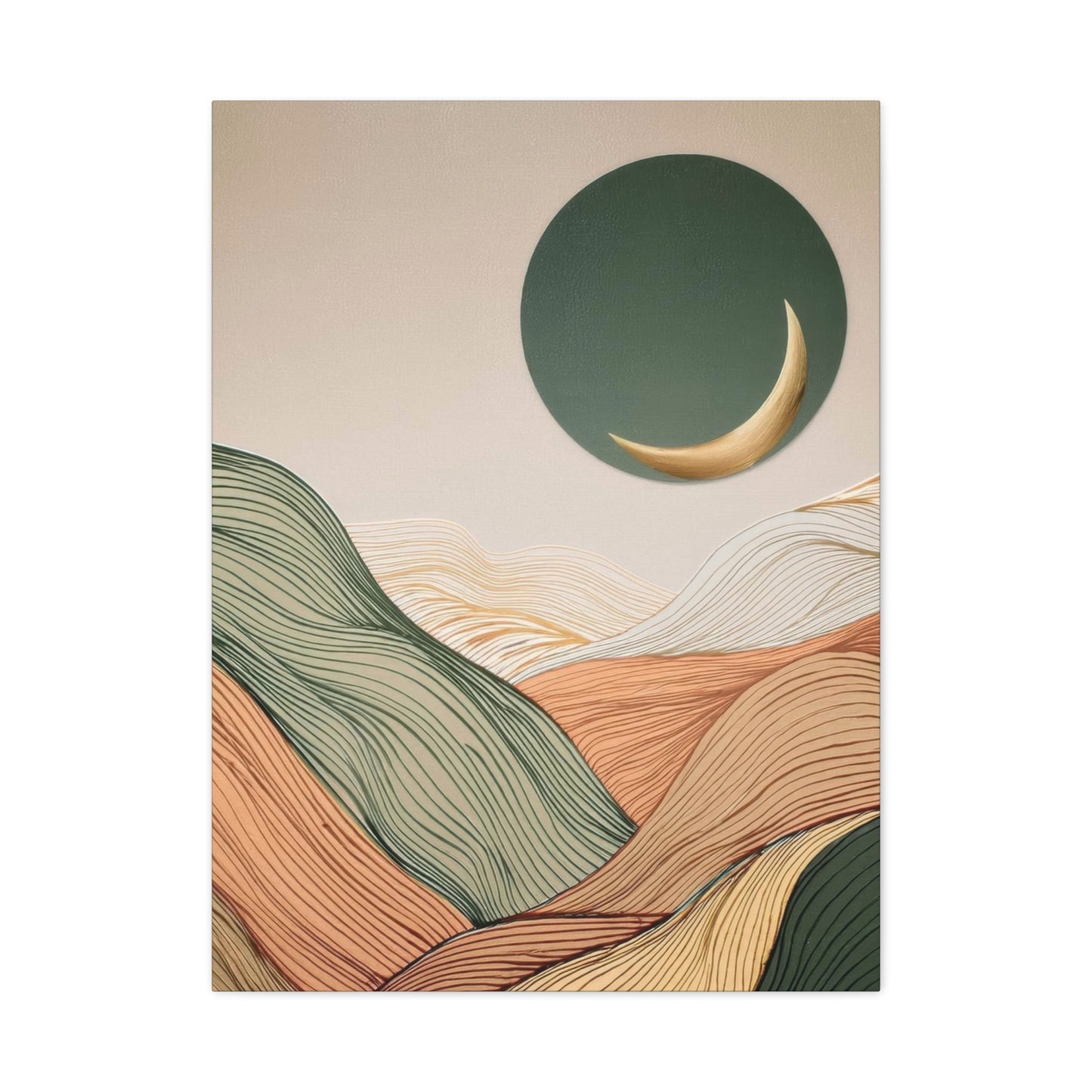
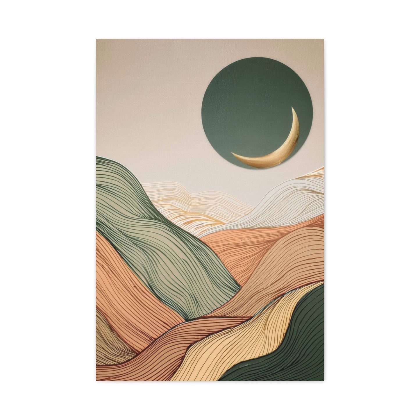
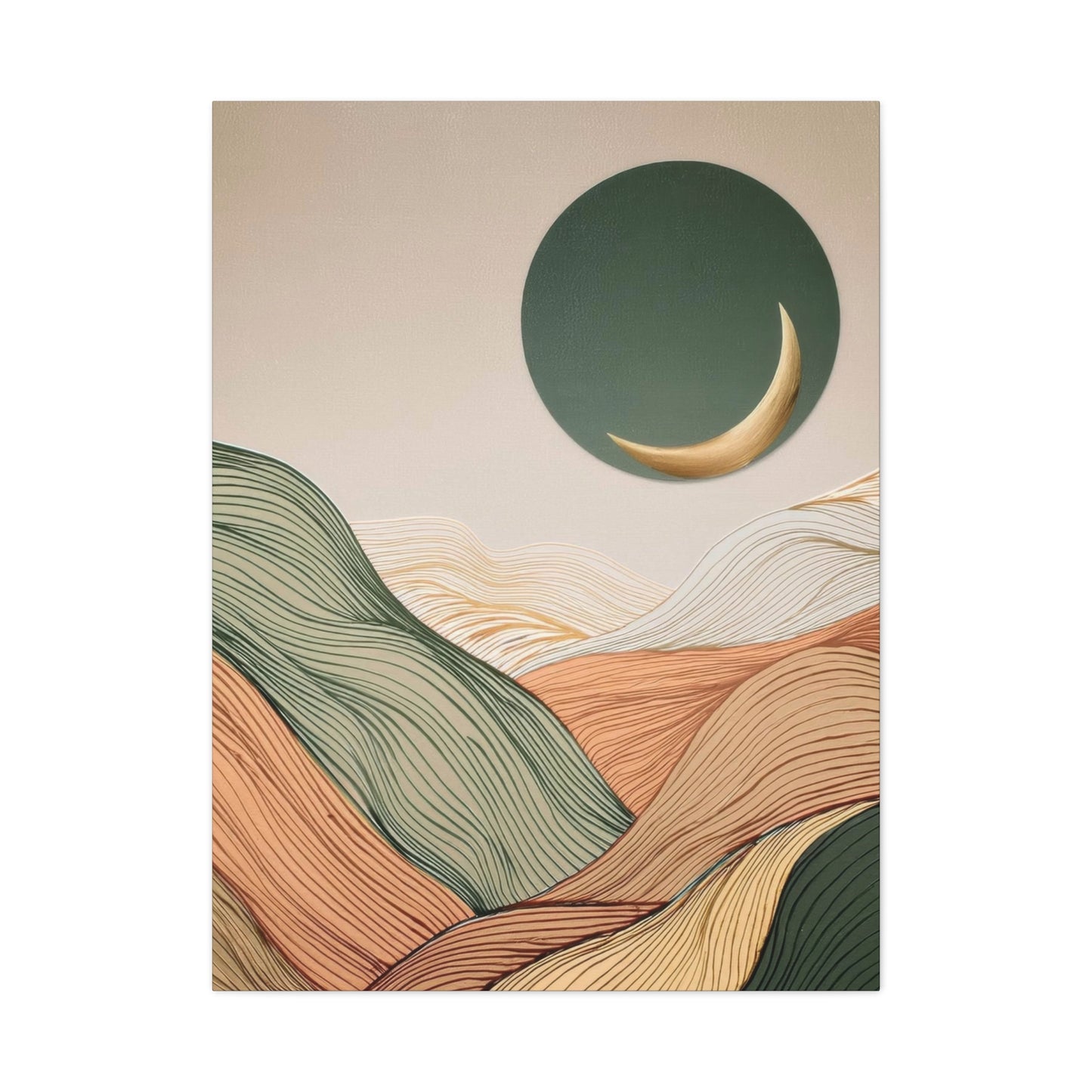

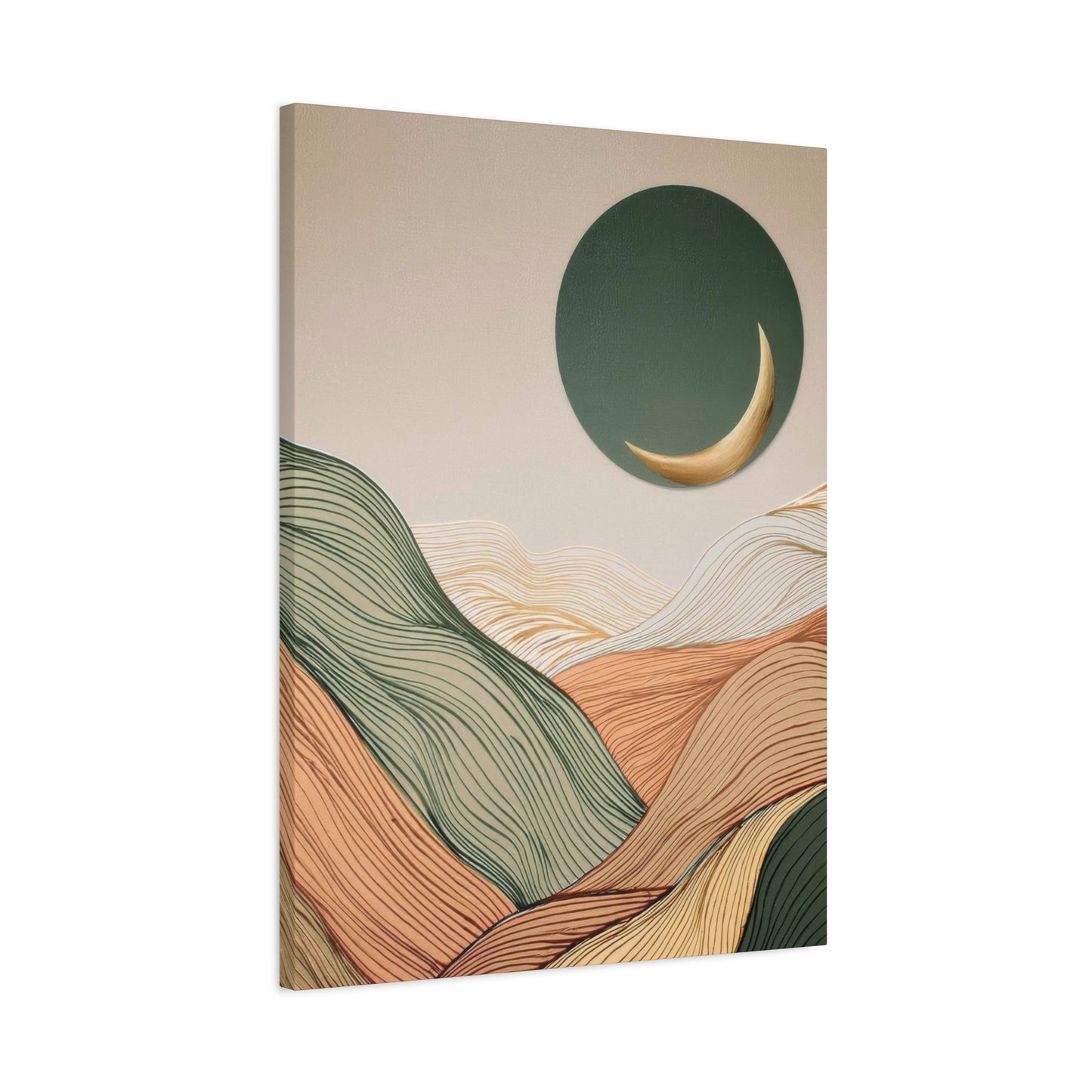
Abstract Landscape Earth Tones Wall art: A Timeless Addition to Your Contemporary Home
The world of interior design continues to evolve, bringing forward aesthetic choices that blend natural inspiration with modern artistic expression. Among the most captivating trends emerging in recent years is the incorporation of abstract landscape earth tones wall art into residential and commercial spaces. This design approach celebrates the organic beauty of our natural environment while offering a sophisticated, contemporary appeal that resonates with diverse design sensibilities.
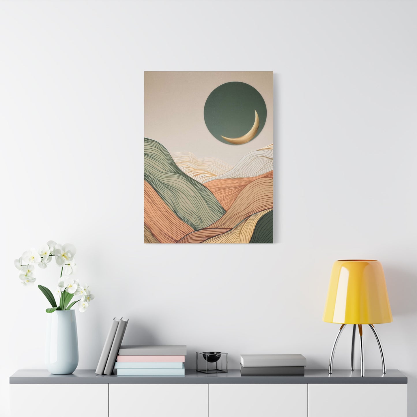
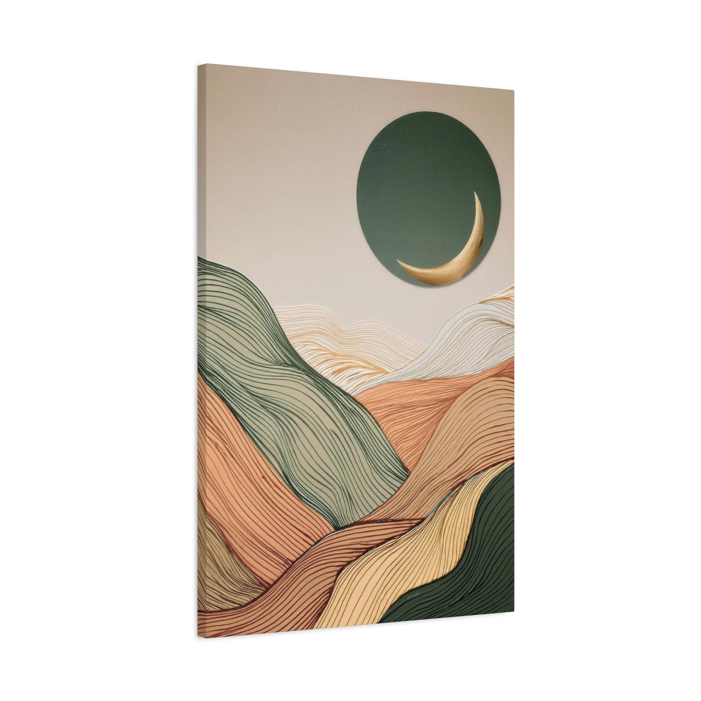
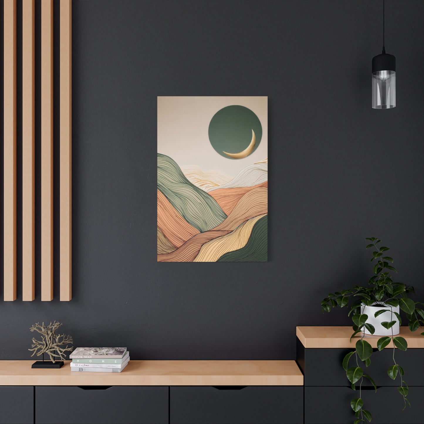
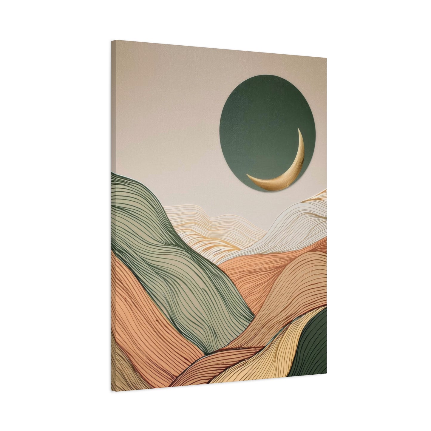
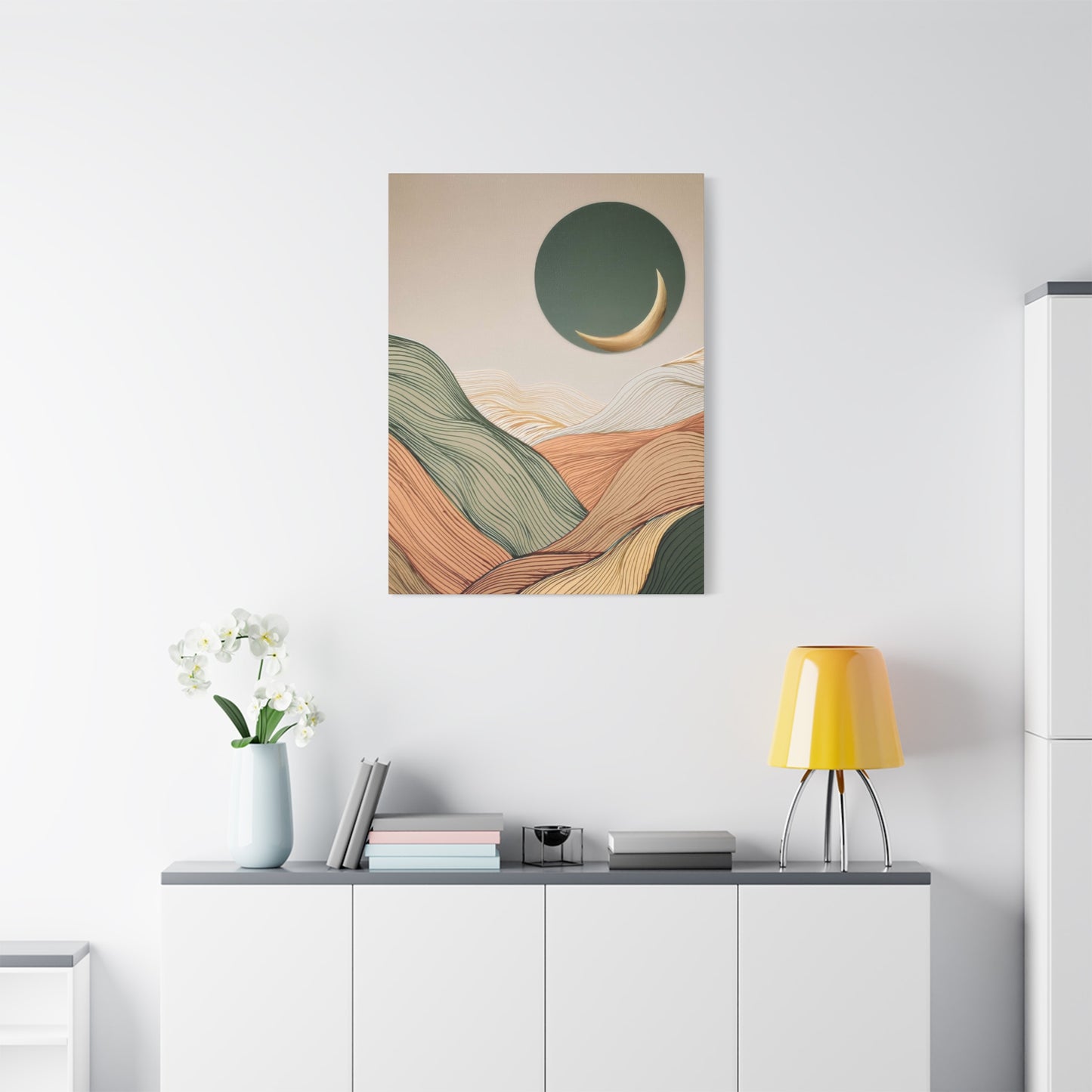
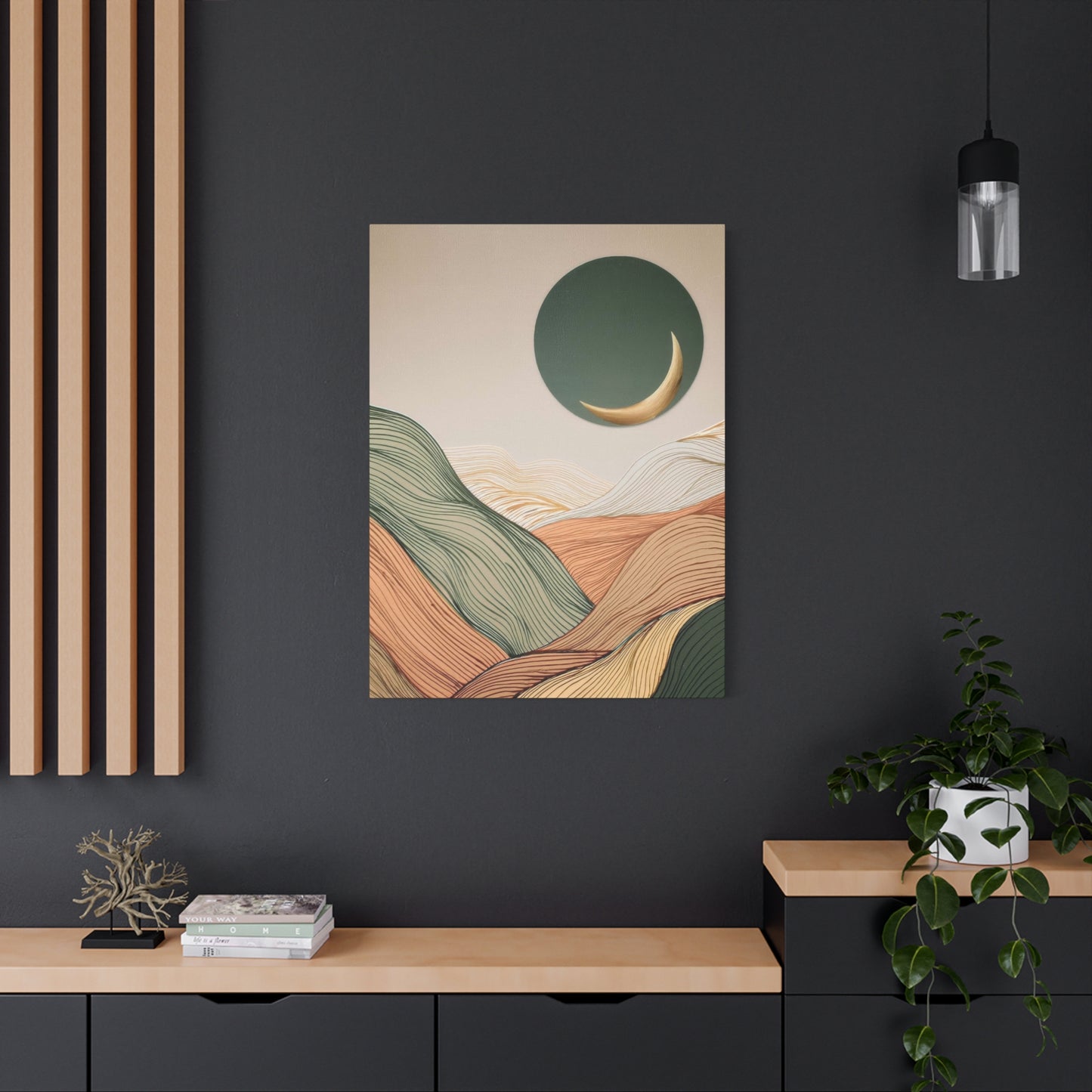
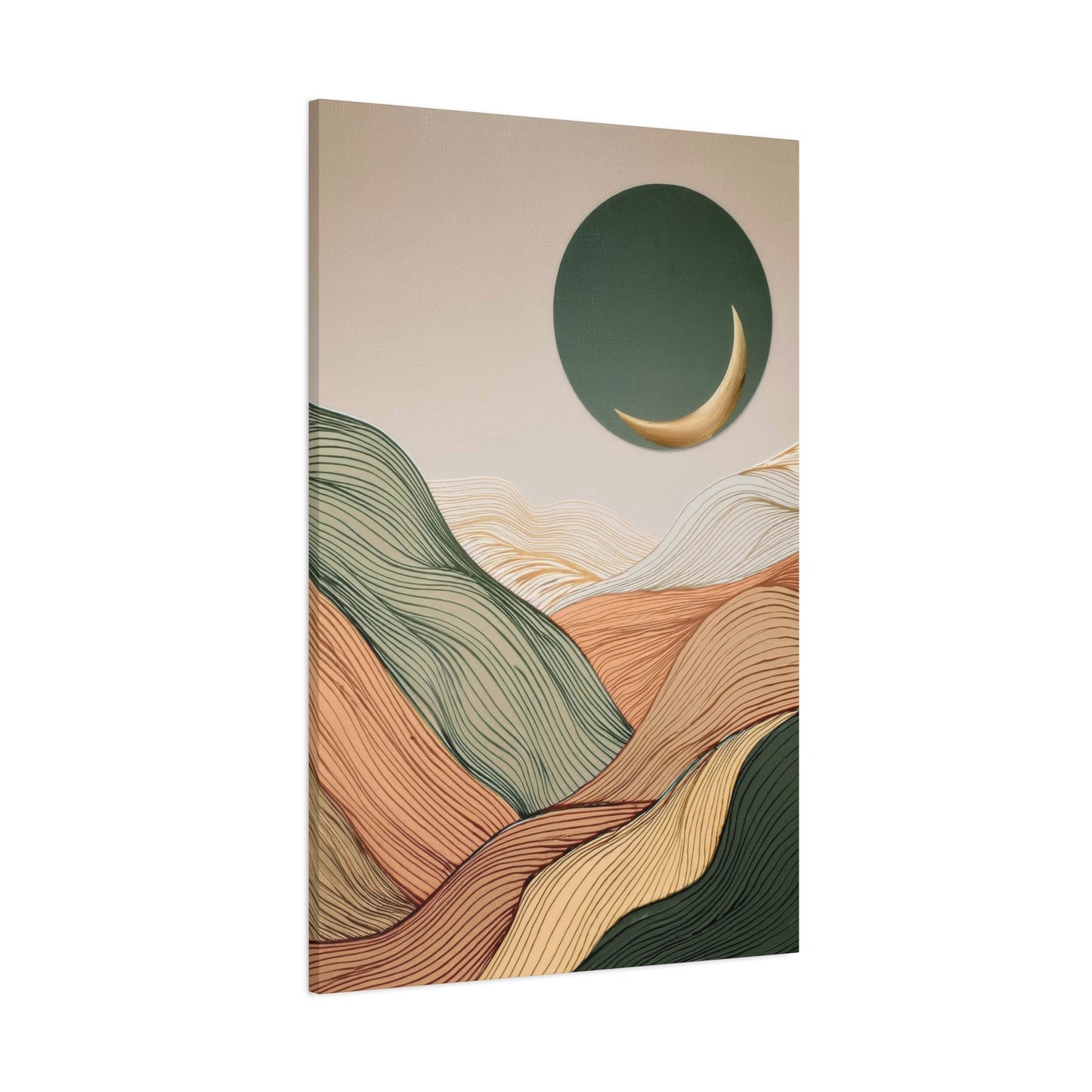
Earth tone abstract landscapes represent more than mere decorative elements; they serve as powerful visual anchors that transform ordinary spaces into sanctuaries of calm and beauty. These artistic pieces draw inspiration from the natural world, incorporating colors that mirror the earth itself—warm terracotta, soft sage, deep ochre, gentle beige, and rich umber. When rendered in abstract form, these landscapes transcend literal representation, inviting viewers to experience nature through an interpretive lens that speaks to both emotion and aesthetic preference.
The appeal of this artistic style lies in its remarkable versatility and timeless quality. Unlike trend-driven decor that quickly loses relevance, artwork featuring natural color palettes and landscape-inspired compositions maintains enduring appeal across changing design movements. Whether adorning the walls of a minimalist loft, a rustic farmhouse, or a contemporary office space, these pieces integrate seamlessly while adding depth, warmth, and visual interest.
Understanding the psychological impact of color becomes essential when exploring this artistic genre. Earth tones inherently evoke feelings of stability, comfort, and connection to nature. Research in environmental psychology suggests that spaces incorporating natural color schemes can reduce stress levels, improve concentration, and enhance overall wellbeing. When these colors appear in abstract landscape compositions, they create visual experiences that feel simultaneously grounding and imaginative.
The abstract interpretation of landscapes offers unique advantages over photographic or realistic representations. While traditional landscape art captures specific moments and places, abstract approaches distill the essence of natural environments into their most fundamental visual elements—color, form, texture, and composition. This distillation allows viewers to project their own experiences and emotions onto the artwork, creating deeply personal connections that evolve over time.
Contemporary artists working in this medium employ diverse techniques and materials to achieve their visions. Some utilize traditional painting methods with oils or acrylics, building layers of color that suggest geological formations, atmospheric conditions, or topographical features. Others incorporate mixed media elements, combining painting with collage, texture additives, or digital manipulation to create dimensional surfaces that engage multiple senses. The range of approaches ensures that collectors can find pieces perfectly suited to their individual tastes and spatial requirements.
Selecting the Perfect Abstract Landscape Piece for Your Space
Choosing artwork represents both aesthetic and practical challenge. Multiple factors influence whether specific pieces will succeed in particular spaces, from obvious considerations like size and color to subtler issues of composition, emotional tone, and artistic quality. Developing systematic approaches to selection ensures satisfactory outcomes while allowing room for intuitive responses that create genuine connections with artwork.
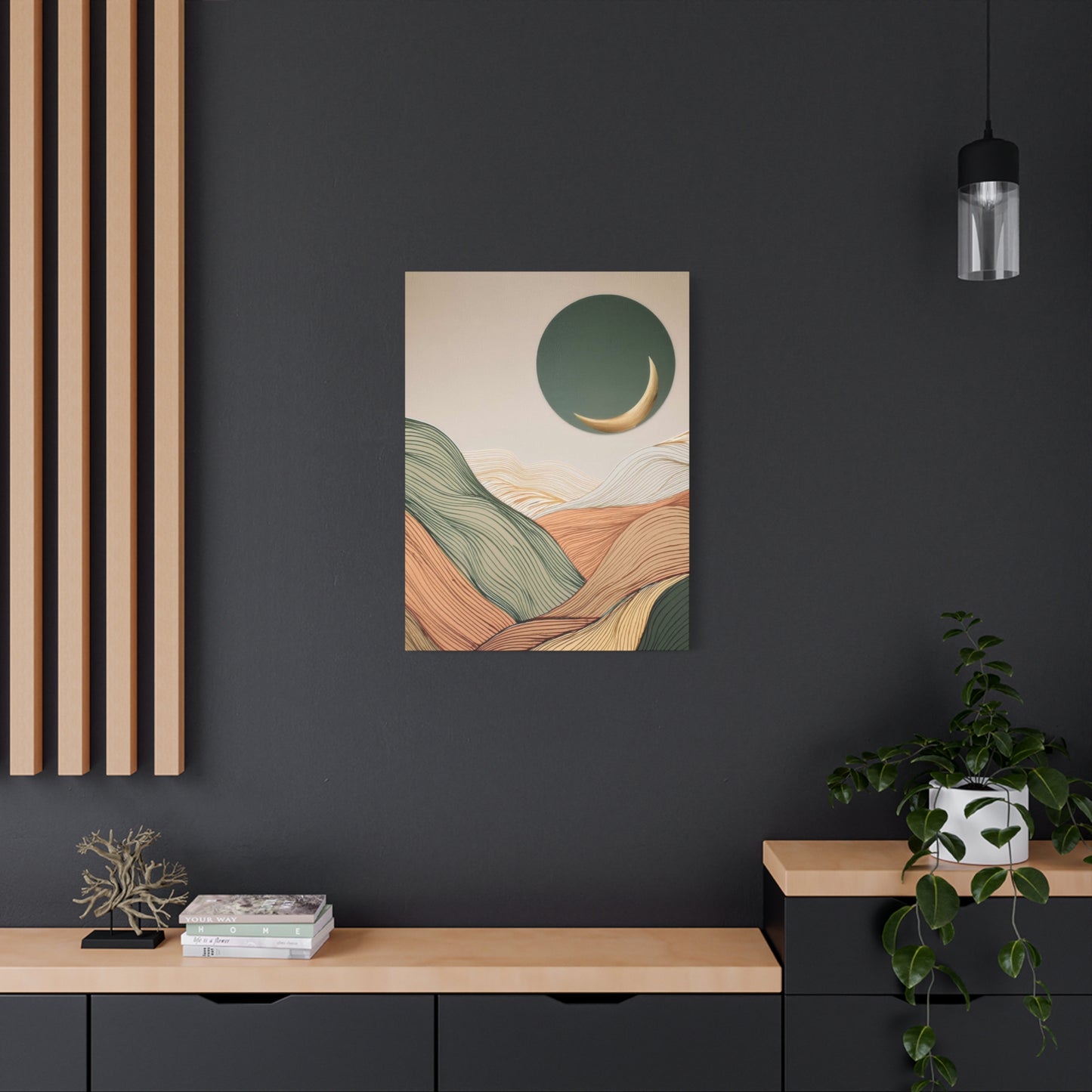
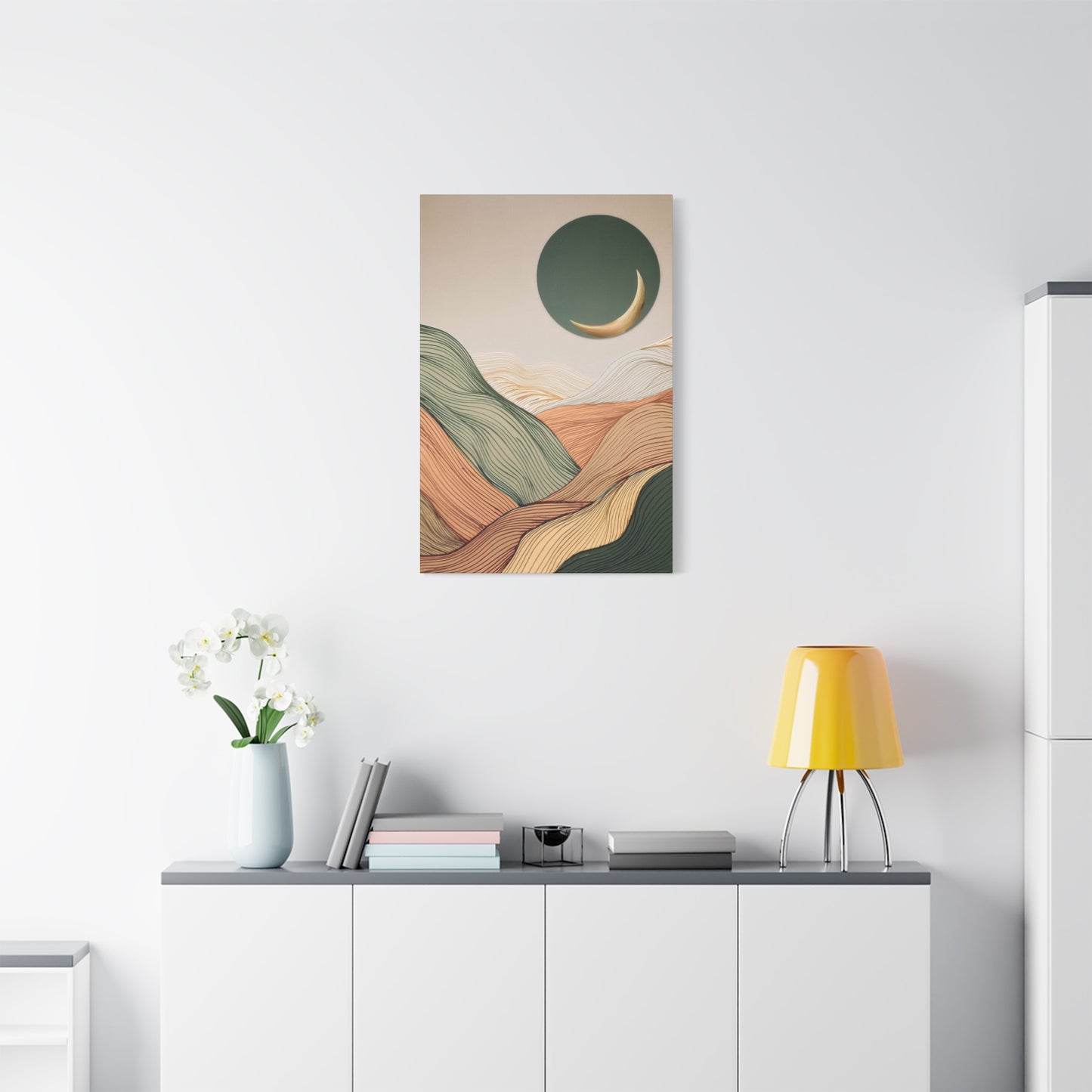
Size considerations rank among the most critical selection factors, yet many people significantly underestimate appropriate scale for their spaces. A common error involves choosing artwork too small for its intended wall, resulting in lost visual impact and awkward proportions. General guidelines suggest artwork should occupy approximately two-thirds to three-quarters of available wall width when displayed above furniture, or roughly half of wall width when floating independently on expansive walls.
Large-scale pieces create dramatic focal points and can even define the character of entire rooms. A substantial abstract landscape measuring six feet or more in width commands attention and anchors surrounding design elements. These major works require sufficient viewing distance for optimal appreciation, making them ideal for living rooms, dining areas, or large entryways. The investment in significant pieces pays dividends through their transformative impact and enduring appeal.
Medium-sized works offer flexibility and accessibility, fitting comfortably in most residential spaces. Pieces ranging from three to five feet in width suit bedrooms, home offices, medium-sized dining areas, and secondary living spaces. These dimensions provide sufficient visual presence to function as focal points while remaining manageable for installation and future relocation if design changes occur.
Small-scale artwork serves specific purposes including gallery wall components, intimate spaces like powder rooms, or clustered arrangements. Multiple smaller abstract landscape pieces can be grouped to create impact equal to single large works while offering compositional flexibility. This approach works particularly well when displaying series or thematically related pieces that dialogue with each other.
Color relationships between artwork and surrounding environment demand careful evaluation. While exact matching proves unnecessary and often undesirable, successful color interaction creates harmony that ties spaces together. Analyzing existing color schemes helps identify whether artwork should complement with analogous colors, provide contrast through complementary relationships, or introduce accent colors that enrich overall palettes.
Rooms dominated by neutral colors accommodate virtually any earth tone palette, offering maximum flexibility. These spaces allow artwork to introduce color without competing with existing elements. Conversely, spaces already featuring significant color require either artwork that shares color families or possesses sufficient visual strength to hold its own against existing hues. Understanding color theory helps predict how specific artworks will interact with particular environments.
Lighting conditions significantly affect artwork appearance and should influence selection decisions. Natural light quality varies with orientation—northern light appears cool and consistent, southern light warm and strong, eastern light bright in mornings, western light golden in afternoons. Evaluating how earth tone palettes appear under specific lighting conditions prevents surprises after installation. Many galleries and artists allow home trials precisely because lighting so dramatically affects artwork appearance.
Emotional tone deserves consideration alongside purely aesthetic factors. Abstract landscapes can evoke vastly different moods from peaceful and meditative to energetic and stimulating. Matching artwork's emotional character to room function enhances spatial effectiveness. Bedrooms typically benefit from calmer compositions emphasizing cool earth tones, while living rooms might accommodate more dynamic pieces with stronger contrasts and warmer colors.
Compositional style influences how artwork interacts with surrounding architecture and furnishings. Horizontal compositions emphasize width and calm, complementing low furniture and wide spaces. Vertical pieces draw eyes upward, emphasizing ceiling height and creating dynamic energy. Balanced, centered compositions suggest formality and stability, while asymmetrical arrangements feel more casual and contemporary. Considering existing spatial characteristics helps identify compatible compositional approaches.
Artistic quality separates lasting purchases from regrettable impulses. Quality markers include technical proficiency, compositional sophistication, color mastery, and individual artistic voice. Original artworks and limited edition prints from serious artists maintain value and provide satisfaction far beyond mass-produced decorative items. Investing in fewer, higher-quality pieces proves more rewarding than filling walls with mediocre work.
The Creative Process Behind Abstract Landscape Artwork
Understanding artistic process deepens appreciation for finished works while illuminating the skill and intentionality required to create effective abstract landscapes. Artists working in this genre employ diverse methodologies reflecting personal working styles, conceptual approaches, and technical preferences. Despite variations, common patterns emerge that characterize the transformation of landscape inspiration into abstract visual expression.
Initial inspiration often begins with direct landscape observation. Many artists maintain sketch and photography practices documenting natural environments that captivate their attention. These observational records serve not as models for literal reproduction but as reference material capturing specific qualities—light conditions, color relationships, atmospheric effects, or compositional arrangements—that might inform future work. The abstraction process distills complex observed reality into essential visual elements.
Some artists work primarily from memory and imagination rather than direct reference. This approach emphasizes internal vision over external observation, allowing freer interpretation unencumbered by representational accuracy demands. Memory naturally abstracts experience, retaining emotional essences while forgetting literal details. Artists mining remembered landscapes tap into these already-abstracted mental images, translating them into visual form through intuitive mark-making and color choices.
Preparatory work varies widely among artists. Some begin with careful planning including color studies, compositional sketches, and technical experimentation. This methodical approach reduces uncertainty during execution, allowing artists to work confidently toward predetermined goals. Others prefer minimal planning, allowing works to develop organically through responsive interaction with materials and emerging compositions. Many artists combine approaches, planning certain aspects while leaving others open to improvisation.
Color selection for earth tone palettes requires both technical knowledge and intuitive sensitivity. Artists consider color temperature relationships, ensuring balanced distributions of warm and cool tones unless deliberately creating temperature-dominant compositions. They evaluate value structures, confirming sufficient contrast to create visual interest while maintaining harmony. Saturation levels receive attention, with most earth tone work emphasizing muted or moderately saturated colors that avoid garishness while providing adequate color presence.
Ground preparation establishes foundations for subsequent layers. Many artists working in earth tone palettes begin with toned grounds rather than stark white, immediately establishing color relationships and eliminating the intimidation of blank surfaces. Ground colors might complement final palettes or provide contrasts that will peek through subsequent layers, adding depth and complexity. Some artists apply textured grounds incorporating sand, pumice, or modeling paste to create dimensional surfaces.
Initial layers typically establish broad compositional structures and major color areas. Artists block in general arrangements of light and dark, warm and cool, active and quiet regions. These foundational decisions create organizational frameworks that guide subsequent development. At this stage, specific details matter less than overall spatial division and color distribution.
Middle stages involve refining relationships, developing complexity, and introducing variation. Artists adjust color relationships, modify compositional structures, and begin suggesting forms that might evoke landscape elements without depicting them literally. This phase often involves considerable experimentation as artists respond to emerging compositions, following productive directions while abandoning less successful approaches.
Display Strategies and Installation Considerations
Proper artwork installation maximizes visual impact while protecting valuable pieces from damage. Professional presentation elevates artwork from mere objects to meaningful spatial elements that enhance entire environments. Understanding installation principles ensures that carefully selected pieces achieve their full potential.
Height placement fundamentally affects viewing experience. Standard recommendations suggest hanging artwork with center points at approximately sixty inches from floor level, a height that aligns with average human eye level. This guideline proves particularly relevant for primary viewing pieces in living areas where people typically stand while viewing. Adjustments may be necessary based on ceiling heights, furniture configurations, and viewer demographics.
Artwork displayed above furniture requires different height calculations. When hanging pieces over sofas, consoles, or beds, maintaining six to twelve inches between furniture tops and artwork bottoms creates visual connection while preserving separation. This spacing prevents artwork from appearing to rest precariously on furniture while ensuring sufficient proximity to create unified furniture-and-art arrangements.
Lighting dramatically influences artwork appearance and requires thoughtful attention. Natural daylight provides ideal illumination but poses conservation challenges including fading and heat damage. UV-filtering glazing protects against ultraviolet damage while allowing visible light transmission. For spaces receiving intense direct sunlight, considering alternative locations or implementing window treatments protects valuable artwork from deterioration.
Artificial lighting offers control absent in natural illumination. Picture lights mounted directly on frames provide focused illumination that highlights artwork while creating dramatic effects in dimmed ambient conditions. Track or recessed lighting allows flexible positioning and can illuminate multiple pieces from single fixtures. LED technology provides excellent color rendering while generating minimal heat that could damage artwork. Positioning lights at approximately thirty-degree angles from wall surfaces minimizes glare while providing even illumination.
Gallery walls assemble multiple artworks into unified compositions that become significant design elements. Successful gallery walls balance variety with cohesion, combining pieces that share common characteristics while offering sufficient diversity to create visual interest. When incorporating abstract landscape pieces into gallery walls, shared earth tone palettes provide unifying elements that allow mixing of sizes, orientations, and specific compositions.
Planning gallery walls before installation prevents errors and nail hole proliferation. Creating full-scale paper templates matching artwork dimensions allows experimenting with arrangements before committing to permanent installation. Templates can be taped to walls, moved repeatedly, and evaluated under various lighting conditions to determine optimal configurations. This planning stage ensures final arrangements achieve desired balance and spacing.
Symmetrical gallery walls create formal, orderly presentations suitable for traditional spaces or situations requiring visual calm. These arrangements typically center around focal pieces with surrounding works arranged in balanced configurations. Asymmetrical arrangements feel more casual and contemporary, offering dynamic visual movement through varied placement. Both approaches can succeed, with choice depending on spatial context and design preferences.
Maintaining and Preserving Abstract Landscape Artwork
Quality artwork represents significant investments of financial resources and emotional connection. Proper care ensures these investments maintain their beauty and value throughout decades of ownership. While art conservation can address damage, preventive maintenance proves far more effective and economical than remedial treatments.
Environmental conditions dramatically affect artwork longevity. Temperature and humidity fluctuations cause expansion and contraction that stress canvas supports, crack paint layers, and encourage mold growth. Ideal conditions maintain temperatures between sixty-five and seventy-five degrees Fahrenheit with relative humidity between forty and fifty-five percent. While achieving museum-standard environmental control proves impractical for most residential settings, minimizing extreme fluctuations prevents most environmental damage.
Direct sunlight poses severe threats to artwork through ultraviolet radiation that degrades pigments and supports. Even brief daily sunlight exposure accumulates damage over months and years, causing irreversible fading and material breakdown. Positioning artwork away from direct sunlight provides primary protection, while UV-filtering glazing or window films offer additional security. Even indirect natural light contains UV radiation, though at lower levels than direct exposure.
Artificial lighting also affects artwork, though less severely than sunlight. Incandescent bulbs generate significant heat that can damage artwork over time, particularly when picture lights mount directly to frames. LED technology provides cool, efficient illumination that minimizes heat damage while offering excellent color rendering. Limiting lighting duration when spaces are unoccupied further reduces cumulative exposure.
Cleaning requires gentle approaches that remove surface dirt without damaging artwork. Dusting with soft, clean brushes removes loose particles from textured surfaces. For unglazed paintings, extremely gentle contact prevents pigment removal or surface abrasion. Glazed works tolerate slightly more aggressive cleaning, though care remains essential to avoid scratching protective surfaces. Professional conservation cleaning is recommended for valuable pieces or when significant soiling occurs.
Handling artwork properly prevents physical damage during moving or cleaning. Always hold frames rather than artwork surfaces, as oils and acids from skin can leave permanent marks. When moving larger unframed pieces, two people should support artwork from opposite edges, maintaining level orientation to prevent flexing that could crack paint layers. Protective gloves eliminate direct skin contact with artwork surfaces or frames.
Varnishing provides protective layers for painted artwork while offering aesthetic benefits including UV protection, dirt resistance, and unified surface sheen. Many contemporary artists apply final varnish layers before sale, though varnishes can be applied or replaced by conservators years later. Varnish removal and replacement represents standard conservation practice that refreshes artwork appearance while replacing deteriorated protective layers with fresh applications.
Framing and glazing provide physical protection against contact, dust, and environmental factors. For valuable or delicate works, conservation-grade materials including acid-free mats, UV-filtering glazing, and proper backing boards prevent chemical damage from acidic materials or atmospheric pollutants. While museum glazing appears expensive initially, the protection it provides justifies costs for significant artwork.
Documenting collections serves multiple purposes including insurance claims, estate planning, and sales or donations. Documentation should include high-quality photographs, detailed condition reports noting any existing damage, provenance information tracing ownership history, and purchase documentation including receipts and certificates of authenticity. Digital documentation systems allow organizing information while ensuring preservation through backups.
Contemporary Artists Working in Earth Tone Abstract Landscapes
The current art world includes numerous talented artists creating sophisticated work in earth tone abstract landscape traditions. While comprehensive listings exceed this scope, highlighting representative practitioners illustrates the diversity and quality available to interested collectors. These artists demonstrate varied approaches to translating landscape inspiration into abstract visual language using natural color palettes.
Contemporary artists often blend traditional painting techniques with innovative materials and conceptual frameworks. Some work primarily in oils, valuing the medium's rich color possibilities and extended working times that allow subtle blending and layering. Others prefer acrylics for their quick-drying properties and versatility in both thin washes and thick impasto applications. Many artists incorporate mixed media elements including collage, texture additives, or unconventional materials that expand expressive possibilities.
Regional landscape character influences many artists working in this genre. Painters working in desert environments naturally gravitate toward warm earth tones reflecting surrounding terrain—terracotta, burnt sienna, ochre, and dusty rose. Those in forested regions might emphasize cooler earth tones including moss green, charcoal gray, and deep brown. Coastal artists often work with sand tones, weathered wood grays, and muted blue-greens. This regional influence grounds abstract work in specific places while allowing universal resonance.
Some artists maintain relatively consistent aesthetic approaches throughout their careers, developing signature styles that become immediately recognizable. This consistency reflects deep exploration of specific formal and conceptual territories, with each new work representing incremental development rather than dramatic departure. Collectors appreciating particular artistic voices can acquire multiple works confident in stylistic cohesion.
Other artists embrace evolution and experimentation, pursuing varied directions over time. Their explorations might investigate different color palettes, compositional structures, or technical approaches while maintaining underlying commitments to landscape inspiration and abstraction. Collections spanning artists' careers document their developmental trajectories, illustrating how artistic vision matures and transforms over decades.
Emerging artists bring fresh energy and perspectives to established traditions. Without extensive art historical knowledge or market pressures to maintain consistent styles, these artists often experiment freely, creating innovative work that challenges conventions. Following emerging artists through their early career development can provide both collecting satisfaction and potential financial benefits if their reputations grow substantially.
Artist statements and conceptual frameworks illuminate the thinking behind visual work. Many contemporary artists articulate sophisticated ideas about landscape representation, environmental concerns, perceptual experience, and artistic process. Understanding these conceptual foundations deepens appreciation while revealing dimensions not immediately visible in finished works. Gallery exhibitions typically provide artist statements, and many artists maintain websites or social media presences where they discuss their practice.
Educational backgrounds vary significantly among contemporary artists. Some possess formal art education through university programs culminating in Bachelor of Fine Arts or Master of Fine Arts degrees. Others developed their skills through workshop attendance, independent study, or apprenticeships. Educational paths affect but don't determine artistic quality, with self-taught artists sometimes producing work rivaling or exceeding that of formally trained practitioners.
Exhibition histories indicate professional recognition and market positioning. Artists showing regularly at respected galleries, participating in juried exhibitions, or receiving awards demonstrate professional success and peer recognition. However, exhibition opportunities remain limited, and many talented artists struggle to secure consistent gallery representation. Direct artist relationships sometimes reveal exceptional talent that hasn't yet achieved proportionate professional recognition.
The Role of Earth Tone Abstract Landscapes in Commercial Spaces
Beyond residential applications, abstract landscape artwork in earth tone palettes serves important functions in commercial and institutional environments. These spaces face unique requirements including durability concerns, larger scales, corporate identity considerations, and diverse viewer audiences. Understanding commercial applications reveals additional dimensions of this artistic genre's versatility and cultural relevance.
Corporate office environments increasingly recognize artwork's importance in creating productive, attractive workspaces that support employee wellbeing and reinforce organizational values. Abstract landscape pieces in earth tones provide sophisticated decoration that avoids controversial content while introducing warmth and visual interest to potentially sterile office settings. The natural color palettes and landscape references support biophilic design principles that enhance workplace satisfaction and productivity.
Healthcare facilities face particular design challenges including creating calm environments that reduce patient anxiety while supporting staff working in demanding conditions. Research demonstrates that nature imagery and natural color palettes reduce stress and may improve patient outcomes. Abstract landscape art provides appropriate decoration that feels peaceful without becoming dated, helps wayfinding through distinctive landmark pieces, and creates more humane environments that benefit everyone using the facilities.
Hospitality venues including hotels, restaurants, and resorts use art to establish ambiance and reinforce branding. Earth tone abstract landscapes suit diverse hospitality concepts from urban boutique hotels to resort destinations. The sophisticated aesthetic appeals to design-conscious travelers while the timeless quality prevents rapid obsolescence. Large-scale pieces in public areas create memorable impressions while smaller works in guest rooms provide subtle enhancement without dominating limited spaces.
Retail environments employ art to create distinctive shopping experiences that differentiate brands and enhance perceived value. Abstract landscape pieces positioned strategically throughout stores provide visual interest during shopping journeys while supporting brand aesthetics. Earth tone palettes work particularly well for retailers emphasizing natural products, sustainability, or sophisticated lifestyle positioning.
Educational institutions from elementary schools through universities incorporate art to create enriching environments that support learning and campus identity. Abstract landscapes provide accessible art experiences that engage students while avoiding content that might prove distracting or controversial in educational settings. The interpretive nature of abstract work can support educational discussions about art, perception, and personal response.
Religious and spiritual spaces increasingly incorporate contemporary art that supports contemplative atmospheres without literal religious imagery. Abstract landscapes suggesting natural environments align with many spiritual traditions honoring creation and natural world. The meditative quality of carefully composed earth tone abstractions supports prayer, meditation, and spiritual reflection.
Creating Gallery Walls with Abstract Landscape Themes
Gallery wall arrangements transform multiple individual artworks into unified compositions that become significant design statements. When working with earth tone abstract landscapes, these installations can create immersive experiences that celebrate natural inspiration while demonstrating sophisticated aesthetic sensibilities. Successful gallery walls balance careful planning with creative flexibility.
Conceptual frameworks guide collection and arrangement decisions for thematic gallery walls. Within abstract landscape themes, possible organizing principles include focusing on specific landscape types like coastal, desert, or mountain subjects rendered abstractly, emphasizing particular color palette ranges within earth tone spectrum, or combining works by multiple artists working in related styles. Clear conceptual direction ensures cohesion while allowing sufficient variety to prevent monotony.
Color coordination represents primary challenge and opportunity in gallery wall creation. Earth tone palettes naturally harmonize, providing solid foundations for combining multiple pieces. However, successful walls typically show color variation within overall harmony, perhaps ranging from warm terracotta and ochre pieces through neutral tans to cooler sage and gray works. This color journey creates visual movement while maintaining thematic unity.
Scale variation adds visual interest while creating dynamic relationships between pieces. Combining one or two larger anchor pieces with several smaller supporting works establishes hierarchy and prevents visual confusion. The larger pieces draw initial attention and establish dominant themes while smaller works provide supporting details and variation. Varying sizes also allows fitting gallery walls into available spaces more flexibly than uniform sizing permits.
Orientation diversity through combining horizontal, vertical, and square formats creates visual rhythm and prevents rigid grid appearances. Horizontal landscape-oriented pieces naturally suit landscape subjects while vertical works add dynamic contrast. Square formats provide stability and can bridge between horizontal and vertical elements. The combination creates more interesting visual experiences than uniform orientations allow.
Frame consistency versus variety represents important stylistic choice. Uniform framing creates cohesive, formal presentations that emphasize connections between pieces. This approach works particularly well for series by single artists or when pieces share strong visual similarities. Varied framing including different styles, colors, or materials creates more casual, collected-over-time appearances that feel personal and eclectic. Both approaches succeed when executed thoughtfully.
Matting decisions affect how individual images appear and interact with neighbors. White or off-white mats create breathing room around images while allowing maximum flexibility in combining diverse pieces. Colored mats can pull specific tones from artworks, creating sophisticated color relationships, though this approach requires careful coordination to prevent discord. Contemporary practice often eliminates mats entirely, allowing direct image relationships that feel current and immediate.
Spacing between pieces fundamentally affects whether arrangements read as unified compositions or collections of individual works. Tight spacing of two to three inches emphasizes unity, suggesting pieces belong together as ensemble. Moderate spacing of four to six inches maintains connection while giving pieces individual presence. Wide spacing of eight inches or more separates pieces into more independent statements that share wall space rather than functioning as unified composition.
Template planning prevents installation errors while allowing experimentation. Creating paper templates matching exact artwork dimensions allows arranging and rearranging without committing to permanent hanging hardware. Templates can be taped temporarily to walls, providing accurate preview of final appearance while facilitating precise measurement for hanging hardware placement. This planning phase enables trying multiple arrangements before identifying optimal configurations.
The Intersection of Abstract Landscape Art and Sustainable Design
Contemporary design increasingly prioritizes sustainability alongside aesthetics, seeking to minimize environmental impact while creating beautiful, functional spaces. Abstract landscape artwork aligns naturally with sustainable design principles through materials, themes, production methods, and philosophical orientations that celebrate rather than exploit natural world.
Materials sourcing affects artwork's environmental footprint. Traditional art materials including oil paints contain petroleum-derived compounds and heavy metal pigments presenting environmental and health concerns. Many contemporary artists prioritize sustainable alternatives including natural earth pigments derived from mineral and plant sources, water-based acrylic formulations, and supports manufactured from responsibly harvested or recycled materials. These choices reduce environmental impact while often producing distinctive aesthetic qualities.
Local sourcing of materials and finished artwork reduces transportation carbon footprints. Collectors supporting regional artists minimize shipping distances while strengthening local creative economies. This locavore approach to art collecting mirrors sustainable food movement principles, recognizing that geographic proximity benefits both environmental goals and community vitality.
Handcrafted original artwork embodies sustainability through rejecting mass production and planned obsolescence. Each hand-created piece represents significant invested time and skill, creating objects meant to provide lasting value rather than temporary diversion. This opposition to disposable consumer culture aligns with sustainability's emphasis on durability, quality, and enduring relevance.
Thematic content connecting viewers with natural world supports environmental consciousness. Abstract landscape artwork keeps nature visible and valued in built environments, potentially strengthening environmental commitment. While artwork alone won't solve environmental challenges, maintaining visible nature connections in daily life supports broader cultural shifts toward sustainability.
Biophilic design principles recognize human needs for nature connection and incorporate natural elements into built environments. Research demonstrates that biophilic design improves health, productivity, and psychological wellbeing. Abstract landscape artwork functions as biophilic design element, particularly in urban settings where direct nature access remains limited. These pieces provide nature surrogates that partially fulfill innate biophilic needs.
Timeless design resists trend-driven cycles encouraging frequent replacement of functionally adequate items. Earth tone abstract landscapes possess enduring aesthetic appeal that transcends momentary fashions. This longevity makes them inherently more sustainable than trendy items requiring replacement as tastes shift. Investing in quality, timeless artwork reduces long-term consumption while providing ongoing satisfaction.
Artwork longevity through proper conservation represents another sustainability dimension. Well-made artwork using quality materials and proper techniques can survive centuries with appropriate care. This extreme durability contrasts sharply with consumer goods designed for replacement within years or decades. Properly caring for artwork maximizes its lifespan, avoiding waste and preserving cultural value.
Supporting living artists creates sustainable creative economies allowing cultural workers to maintain their practices. Direct artist purchases or fair gallery partnerships ensure artists receive appropriate compensation supporting continued creation. This economic sustainability enables artistic professions to persist despite challenging market conditions and limited public support for arts.
Artwork donation and estate disposition extends useful life beyond original ownership. Rather than discarding unwanted artwork, donors can place pieces with new collectors, nonprofit organizations, or educational institutions where they continue providing value. Thoughtful estate planning ensures collections find appropriate future homes rather than entering waste streams.
Natural Color Palettes in Living Spaces
The colors surrounding us in daily life exert powerful though often unconscious influences on mood, stress levels, cognitive function, and overall psychological wellbeing. Earth tone abstract landscapes bring carefully orchestrated natural color palettes into interior environments, potentially providing measurable benefits alongside their aesthetic contributions.
Color psychology research demonstrates that different hues trigger distinct physiological and psychological responses. Warm colors generally activate sympathetic nervous systems, increasing alertness and energy. Cool colors typically promote parasympathetic activation, reducing arousal and promoting calm. Earth tones, combining warm and cool elements in moderate saturation, provide balanced stimulation that enlivens without agitating and calms without sedating.
Natural color preferences appear innate and cross-cultural, suggesting evolutionary origins. Research indicates universal human preferences for savanna-like landscapes featuring green vegetation, blue water, and earth-toned land—precisely the color palette that would have supported survival in evolutionary environments. These preferences persist despite modern urban living, influencing color choices in both art and interior design.
Stress reduction represents crucial psychological benefit of earth tone environments. Studies measuring cortisol levels, blood pressure, and self-reported stress show significant reductions when participants view natural landscapes or natural color palettes compared to urban scenes or artificial colors. While abstract rather than representational, earth tone landscape artwork may produce similar stress reduction through color associations with natural environments.
Attention restoration theory explains how nature exposure replenishes depleted cognitive resources. Modern life demands sustained directed attention to tasks often lacking inherent interest, gradually exhausting attention capacity and impairing cognitive function. Natural environments engage involuntary attention through fascinating stimuli that require no effort to notice, allowing directed attention systems to rest and recover. Abstract landscape artwork may provide similar restorative benefits by engaging involuntary attention while referencing natural environments.
Mood enhancement represents another documented benefit of nature exposure and natural color palettes. Multiple studies show improved mood and reduced symptoms of depression and anxiety following nature experiences. Interior environments incorporating earth tone artwork may provide ongoing mild mood support, though direct nature access produces stronger effects. The cumulative impact of daily exposure to nature-inspired color in living spaces may substantially affect overall emotional wellbeing.
Creativity and problem-solving appear to benefit from nature exposure and may extend to nature-inspired artwork. Research shows that time in natural environments improves creative thinking and problem-solving performance. The proposed mechanism involves attention restoration allowing more flexible, divergent thinking. Home offices or creative spaces incorporating earth tone abstract landscapes might support cognitive performance while providing aesthetic enrichment.
Sleep quality potentially benefits from bedroom color choices, with cooler, more muted tones generally promoting better sleep than bright, stimulating colors. Earth tone abstract landscapes emphasizing cooler greens, grays, and blues provide bedroom artwork that supports sleep while maintaining visual interest. The calming color palette helps establish environments conducive to relaxation and healthy sleep patterns.
Biophilic design applications in healthcare settings demonstrate measurable health outcomes from nature integration. Patients in rooms with nature views require less pain medication, experience fewer complications, and discharge sooner than comparable patients in rooms without nature views. While abstract landscape artwork represents indirect nature connection, healthcare facilities increasingly incorporate such work specifically for potential health benefits alongside aesthetic improvement.
Workplace productivity and satisfaction improve in biophilically designed offices incorporating natural elements including plants, natural lighting, and nature-inspired artwork. Employees report higher satisfaction, demonstrate improved cognitive performance, and show reduced absenteeism in such environments. Commercial spaces incorporating earth tone abstract landscapes may reap these benefits while achieving sophisticated design aesthetic.
Meditation and mindfulness practices often employ nature focus or nature imagery to support present-moment awareness. Abstract landscape artwork can serve as meditation focal points, with their non-literal quality preventing mind from engaging analytical description mode. The calming color palettes and open interpretive possibilities support the relaxed awareness meditation cultivates.
Commissioning Custom Abstract Landscape Artwork
Commissioning original artwork creates opportunities for precisely tailored pieces that respond to specific spatial conditions, color requirements, and personal preferences. While commissioned work involves more complex processes and typically higher costs than purchasing existing pieces, the resulting perfect integration with spaces and personal vision justifies these investments for significant projects.
Initial consultations establish whether commissions suit specific situations. Artists need adequate information about intended spaces, desired aesthetics, functional requirements, and budget realities to propose appropriate projects. Collectors should communicate clearly about expectations while remaining open to artists' creative input. Successful commissions balance client vision with artist expertise, allowing collaborative development of concepts neither party might achieve independently.
Space assessment determines practical parameters including dimensions, orientation, architectural features, lighting conditions, and design context. Artists often request photographs, floor plans, or even site visits for major commissions to understand fully where work will appear. This information influences scale, color, composition, and technical choices ensuring finished pieces integrate optimally into intended settings.
Color development represents crucial commission phase, particularly for earth tone abstract work intended to coordinate with existing interior palettes. Clients should provide paint chips, fabric samples, or other material examples representing key colors. However, exact color matching often proves less desirable than harmonious relationships allowing artwork sufficient distinctiveness to command attention. Artists typically prepare color studies showing proposed palettes for client approval before beginning final work.
Compositional concepts establish overall design approaches including format orientation, spatial organization, and aesthetic character. Artists might prepare thumbnail sketches or digital mockups illustrating proposed directions. These preliminary studies allow discussion and refinement before investing in final execution. Clients should expect some variation between studies and finished work, as paintings develop organically during creation. Maintaining flexibility while establishing general parameters produces better outcomes than demanding rigid adherence to preliminary concepts.
Timeline expectations require realistic assessment of artistic process. Commissioned paintings typically require weeks to months for completion depending on size, complexity, and artist's existing commitments. This timeline includes concept development, materials procurement, execution, drying time, and finishing. Rush projects may be possible but often involve premium fees and potentially compromised quality. Planning commissions well ahead of deadlines ensures adequate time for thoughtful development.
Pricing structures for commissioned work vary across artists and project types. Some artists charge by square inch or square foot, establishing predictable pricing based on size. Others assess projects individually considering complexity, materials, and time requirements. Commissioned work typically costs more than purchasing existing pieces of comparable size, reflecting the customization and client collaboration involved. Obtaining written estimates prevents misunderstandings and facilitates budget planning.
Contract terms should be documented in writing protecting both parties. Agreements typically specify dimensions, general aesthetic approach, timeline, payment schedule, intellectual property rights, and procedures for installation and approval. Clear contracts prevent disputes while ensuring mutual understanding of expectations and obligations. Legal counsel may be advisable for major commissions involving substantial sums.
Payment schedules commonly include deposits covering initial materials and securing artist commitment, progress payments during execution, and final payments upon completion and approval. This staged approach manages financial risk for both parties while funding project development. Deposit amounts typically range from twenty-five to fifty percent of total fees, with exact structures varying by artist policies and project scale.
Abstract Landscape Art in Digital and Print Media
While original paintings represent traditional fine art formats, contemporary technologies enable creating and distributing abstract landscape imagery through digital and print media. These alternative formats provide accessibility and functionality that originals cannot match while raising questions about authenticity, value, and aesthetic legitimacy.
Digital art creation employs computers, tablets, and specialized software as artistic tools. Digital artists working in abstract landscape modes use programs including Adobe Photoshop, Corel Painter, or Procreate to create works entirely within digital environments. These tools offer enormous flexibility including infinite undo options, non-destructive editing, and effects impossible in physical media. Digital creation enables experimentation without material costs while producing works optimized for digital display or translation to prints.
Fine art printing technologies translate original paintings or digital files into physical prints rivaling original artwork in visual quality. Giclée printing uses archival inks and papers to produce museum-quality reproductions with excellent color accuracy and longevity. When properly executed using quality materials, giclée prints can last over a century without significant fading. These prints provide affordable access to imagery by artists whose originals exceed most budgets.
Limited edition prints balance accessibility with exclusivity by restricting production numbers. Artists or publishers commit to printing predetermined quantities—often numbering from fifty to several hundred—then destroying printing plates or permanently archiving files to prevent additional production. Each print is numbered indicating its position in total edition size. This artificial scarcity creates value exceeding unlimited reproductions while maintaining affordability compared to originals.
Artist proofs represent prints retained by artists outside numbered editions. Traditionally, artists kept small numbers of prints for personal archives or sales. These proofs may carry premiums over edition prints due to their association with artists themselves. The exact number of artist proofs typically ranges from ten to twenty percent of edition sizes.
Print authentication including signatures, certificates, and embossing provides assurance regarding edition legitimacy. Artists typically sign and number prints by hand, with signatures adding both value and authenticity verification. Certificates of authenticity provide provenance documentation while embossed seals prevent unauthorized reproduction. Reputable publishers implement these protections ensuring collector confidence.
Canvas wrapping extends print applications beyond traditional framing. Modern printing technologies can print directly on canvas, with finished prints then stretched on wooden frames in the manner of paintings. These canvas prints cost less than traditional framing while providing substantial physical presence. The painterly surface quality suits abstract landscape imagery, though canvas prints lack the textural complexity of actual painted surfaces.
Print-on-demand services democratize art publishing while raising quality concerns. Online platforms allow artists to upload images made available for printing as customers order them. This model eliminates inventory costs and risks while providing artists passive income from digital files. However, quality varies dramatically across platforms, and unlimited availability eliminates scarcity that creates value in traditional print markets.
Digital display technologies offer alternatives to physical prints for some applications. High-quality monitors or digital art frames can display artwork at essentially zero marginal cost per image. Digital display allows changing artwork frequently, providing variety impossible with physical pieces. However, screen display limitations including resolution constraints, color accuracy issues, and glowing rather than reflected light create aesthetic differences from physical artwork.
NFTs (non-fungible tokens) represent emerging digital art market using blockchain technology to create verifiable scarcity and ownership of digital files. NFT sales have generated enormous publicity and some spectacular prices, though market sustainability remains uncertain. For abstract landscape artists working digitally, NFTs provide new distribution and monetization channels while raising questions about environmental impact and long-term value retention.
Earth Tone Abstract Landscapes in Cultural and Historical Context
Contemporary earth tone abstract landscapes emerge from rich cultural histories spanning global artistic traditions. Understanding these contextual foundations enriches appreciation while revealing how current practices build upon, respond to, and depart from historical precedents across diverse cultures.
Indigenous artistic traditions worldwide have long celebrated relationships between humans and natural environments through various aesthetic means. Native American, Aboriginal Australian, African, and other indigenous cultures created artworks connecting communities to specific landscapes through symbolic representation, spiritual expression, and practical documentation. While typically more symbolic than naturalistic, these traditions established landscape art as vehicle for communicating profound relationships with place.
East Asian landscape painting traditions including Chinese shan shui (mountain-water) painting and Japanese sumi-e developed sophisticated approaches to landscape representation that influenced later abstract developments. These traditions emphasized spiritual dimensions of nature experience rather than visual replication, using minimal means to suggest vast spaces and eternal principles. The philosophical underpinnings recognizing landscape as manifestation of cosmic forces anticipated Western abstraction by centuries.
Chinese landscape painting from Song Dynasty through Ming periods achieved extraordinary refinement, with artists developing conventional forms representing specific landscape features while maintaining overall aesthetic rather than descriptive orientation. Mountains, water, mist, and trees appeared in compositions organized for visual harmony rather than topographical accuracy. The emphasis on brush technique, empty space, and suggestive rather than descriptive rendering parallels contemporary abstract landscape approaches.
Japanese aesthetics including concepts like wabi-sabi (beauty in imperfection and impermanence) and ma (negative space) inform contemporary abstract landscape sensibilities. These principles value subtlety, natural materials, and unpredictable organic qualities over perfection, synthetic materials, and control. Contemporary earth tone abstract landscapes often embody these values through earthy materials, irregular compositions, and appreciation for natural variation.
Islamic artistic traditions prohibited representational imagery in religious contexts, leading to sophisticated abstract decorative traditions employing geometry, calligraphy, and pattern. While not specifically landscape-oriented, these traditions demonstrated abstract visual language's power to communicate spiritual content and create aesthetic experiences without representation. This precedent established abstraction as legitimate artistic approach centuries before Western modernism.
European landscape traditions from Renaissance through Impressionism gradually elevated landscape from background element to primary subject while developing increasingly sophisticated approaches to light, atmosphere, and color. Each stylistic movement contributed insights that informed eventual abstract developments. Impressionism's broken color and emphasis on optical sensation particularly presaged abstraction's emergence.
American landscape traditions including Hudson River School, Luminism, and Regionalism celebrated specifically American terrain while developing distinctive approaches to light and space. The vast scale of American landscapes encouraged paintings emphasizing horizontal expanses and dramatic light effects. These traditions inform contemporary American artists working in abstract landscape modes, with regional terrain continuing to influence color and compositional choices.
Conclusion
In conclusion, Abstract Landscape Earth Tones Wall Art is more than just an artistic statement—it’s a lasting, transformative element that brings natural beauty and tranquility into your home. Its seamless blend of earthy hues, soft gradients, and abstract forms creates a timeless visual experience that complements modern interiors with elegance and simplicity. Whether your home is a minimalist sanctuary, a cozy urban apartment, or a spacious contemporary living room, this artwork offers a perfect balance of serenity, style, and sophistication.
The use of earth tones in abstract landscape art is key to its universal appeal. Earthy shades like warm browns, deep greens, terracotta, and soft ochres bring a grounded and organic energy to any room. These colors, reminiscent of the earth itself, evoke a sense of peace, stability, and connection to the natural world. They create an inviting, soothing atmosphere, perfect for spaces that serve as retreats from the hustle and bustle of everyday life. When combined with the fluid, open-ended nature of abstract landscapes, the art becomes a reflection of nature's beauty in its purest, most elemental form.
What makes Abstract Landscape Earth Tones Wall Art especially compelling is its ability to transcend trends. While contemporary home design often emphasizes clean lines and modern aesthetics, this type of artwork complements the minimalist ethos by adding a touch of organic warmth and depth. The simplicity of the abstract landscape—whether it's a subtle, muted mountain range, a serene body of water, or an undulating desert horizon—blends effortlessly into contemporary spaces without overwhelming them. Its neutral, earthy palette works well with a wide range of styles, from mid-century modern and Scandinavian to industrial and bohemian.
The timeless nature of Abstract Landscape Earth Tones Wall Art ensures that it remains relevant for years to come. Unlike many design trends that can quickly feel dated, this art remains versatile and enduring, making it an investment in your home's long-term aesthetic appeal. Its ability to evoke emotion—whether it's a sense of awe at nature's vastness or a feeling of quiet introspection—adds another layer of value. It’s not just a decorative piece, but an experience that invites the viewer to pause and reflect, offering a moment of peace and connection with the natural world.
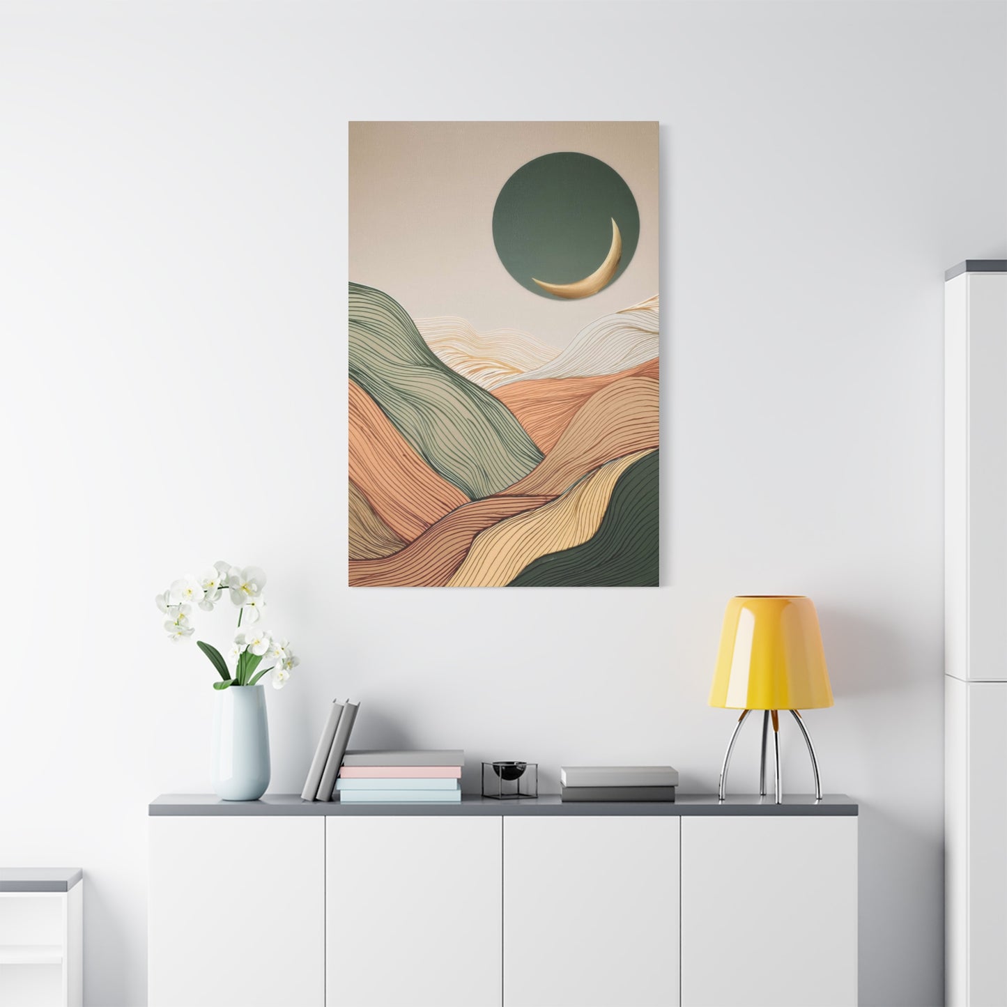
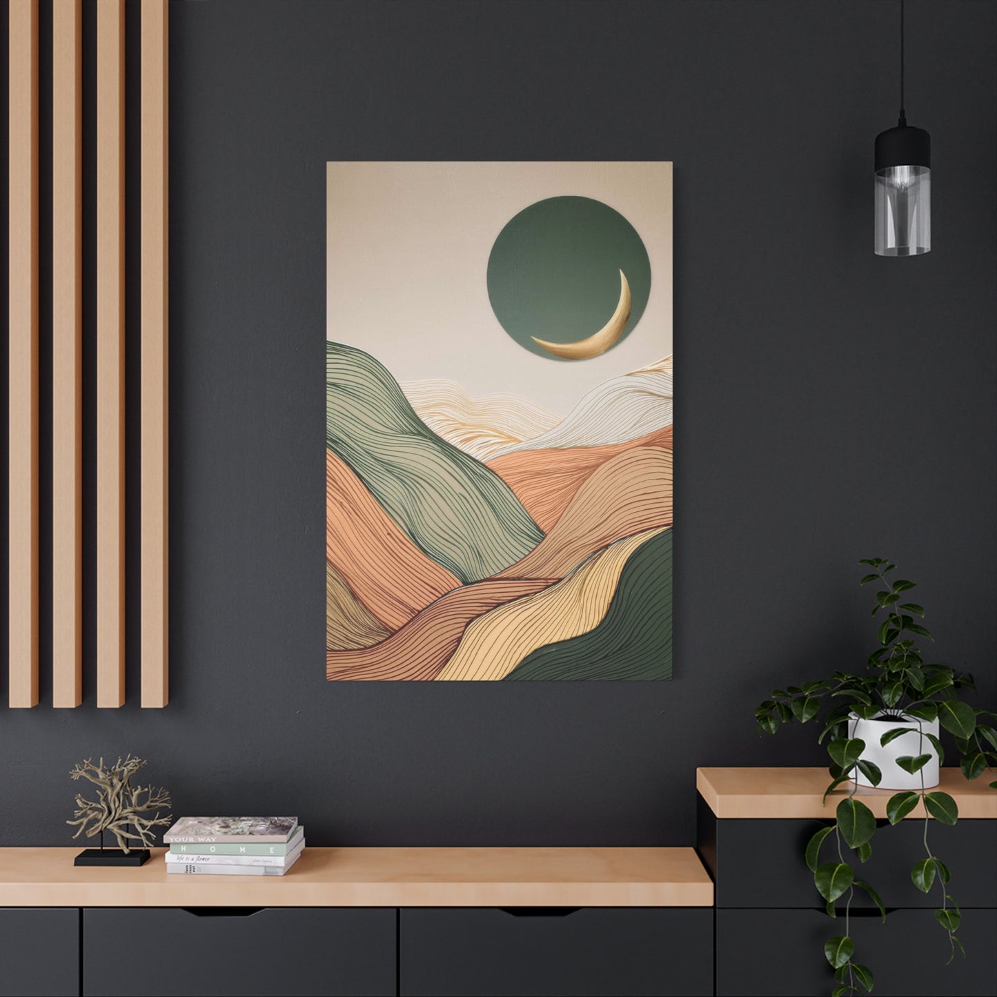
From a design perspective, this artwork can easily serve as the centerpiece of a room or act as a complementary element in a larger gallery wall. Its neutral color palette means it can effortlessly tie together different design elements, from furniture and textiles to flooring and lighting. Whether hung above a sofa, placed in an entryway, or framed in a hallway, it brings a sense of cohesion and sophistication to the space. The abstract forms allow for personal interpretation, encouraging viewers to project their own memories or dreams onto the landscape. As such, Abstract Landscape Earth Tones Wall Art doesn’t just decorate a space—it enhances it, bringing depth, warmth, and a touch of nature into the heart of the home.
Moreover, this type of art is incredibly versatile when it comes to pairing with other design elements. Its natural color scheme works well with wood finishes, stone textures, and natural fabrics like linen or cotton, making it easy to integrate into spaces that prioritize organic materials. It also pairs beautifully with metallic accents, such as gold or brushed nickel, creating a sophisticated contrast that enhances the contemporary appeal of the piece.
Looking ahead, as more people seek to embrace biophilic design and create homes that reflect a deeper connection to nature, Abstract Landscape Earth Tones Wall Art will remain a staple in interior design. The desire for spaces that promote calm, balance, and well-being aligns perfectly with the tranquil qualities of this artwork, making it a timeless addition to any home.
In conclusion, Abstract Landscape Earth Tones Wall Art is a perfect blend of contemporary design and natural elegance. Its harmonious combination of earthy colors and abstract forms creates a peaceful yet stylish atmosphere, elevating the mood of any room. Whether you’re designing a new space or refreshing an existing one, this artwork offers a sophisticated, timeless way to bring warmth, depth, and nature-inspired beauty into your home for years to come.
