


The Beauty of Balance: How Abstract Shapes Earth Tones Wall Art Creates Harmony in Your Space
The connection between natural palettes and artistic expression has captivated creators and admirers for centuries. When we examine the relationship between organic color schemes and contemporary visual design, we discover a profound harmony that resonates with our innate connection to the environment. This comprehensive exploration delves into how natural hues influence creative work, transforming spaces and evoking emotions through carefully crafted compositions that blend form, color, and meaning.
The power of nature-inspired palettes lies in their ability to create environments that feel simultaneously grounded and sophisticated. These color schemes draw from the world around us, incorporating shades found in soil, stone, clay, sand, and organic materials. From the warm embrace of terracotta to the cool sophistication of slate gray, from the richness of chocolate brown to the gentle whisper of cream, these hues create visual experiences that feel authentically connected to our surroundings. When combined with non-representational forms and geometric elements, they produce artwork that speaks to both our aesthetic sensibilities and our psychological need for connection with the natural world.
Artists and designers who work with these palettes understand that color selection extends far beyond mere decoration. Each shade carries its own weight, its own story, its own emotional resonance. The careful selection and combination of these hues can transform ordinary spaces into sanctuaries, create focal points that draw the eye without overwhelming the senses, and establish atmospheres that range from energizing to meditative. This comprehensive guide explores every facet of creating and appreciating work that combines organic color palettes with contemporary compositional techniques, offering insights for creators, collectors, and anyone seeking to understand this timeless artistic approach.
Nature's Palette in Contemporary Visual Expression
The influence of the natural world on creative expression represents one of the most enduring themes in artistic history. When we observe the environment around us, we encounter an endless array of hues that have evolved over millions of years to create the visual landscape we inhabit. These colors are not arbitrary but rather the result of geological processes, biological adaptations, and atmospheric conditions that have shaped our planet. The rich browns of fertile soil, the warm ochres of desert landscapes, the cool grays of weathered stone, and the soft beiges of sandy beaches all contribute to a palette that feels inherently familiar and comforting.
Contemporary creators who draw inspiration from these natural color schemes tap into something fundamental in human psychology. Research in environmental psychology suggests that exposure to natural elements and colors derived from nature can reduce stress, improve concentration, and enhance overall wellbeing. When these hues are incorporated into visual compositions, they carry with them these same psychological benefits, creating artwork that not only pleases the eye but also nourishes the spirit. The connection between viewer and artwork becomes more than aesthetic; it becomes almost primal, touching something deep within our evolutionary memory.
The process of translating natural color palettes into non-representational compositions requires both technical skill and intuitive understanding. Artists must consider not only individual colors but also how they interact, how light affects them, and how they relate to the forms and shapes within the composition. A successful piece balances warm and cool tones, creates visual interest through subtle variations in hue and saturation, and maintains cohesion through thoughtful color relationships. The result is artwork that feels both contemporary and timeless, speaking to current design trends while remaining rooted in the eternal beauty of the natural world.
Throughout history, artists have been drawn to pigments derived from natural sources. Ancient cave painters used ochre and charcoal to create their masterpieces, while Renaissance artists ground minerals and earth to produce their colors. Although modern pigments are often synthetic, the appeal of these natural hues remains undiminished. Contemporary creators working with these palettes honor this historical connection while bringing fresh perspectives and innovative techniques to their work. They understand that these colors carry within them the weight of artistic tradition while remaining perfectly suited to modern aesthetic sensibilities.
The versatility of natural palettes allows them to work across various artistic styles and movements. Whether incorporated into minimalist compositions with clean lines and simple forms, or into more complex arrangements featuring layered textures and intricate patterns, these colors adapt and enhance. They serve as excellent backgrounds that allow other elements to shine, while also having the strength to stand as primary focal points. This flexibility makes them invaluable tools in the contemporary creator's palette, capable of expressing a wide range of moods, concepts, and aesthetic visions.
Harmonizing Forms with Organic Hues
The relationship between shape and color represents one of the fundamental considerations in creating successful visual compositions. When geometric or organic forms interact with natural color palettes, the possibilities for expression multiply exponentially. Each shape carries its own associations and emotional valence, while each color brings its own character and mood. The art lies in finding combinations that enhance rather than compete, that create resonance rather than dissonance, that speak with a unified voice while maintaining complexity and interest.
Geometric shapes offer clarity, precision, and a sense of order that pairs beautifully with the softer, more organic qualities of natural color schemes. A composition featuring clean circles rendered in warm terracotta tones conveys both structure and warmth, combining intellectual appeal with emotional resonance. Rectangular forms in cool gray-browns suggest stability and reliability while maintaining visual interest through their interaction with space and surrounding elements. Triangular shapes in sandy beiges introduce dynamic energy without creating the visual tension that might result from more saturated, vibrant colors. These combinations demonstrate how form and color work together to create meanings and feelings that neither could achieve alone.
Organic shapes, with their irregular contours and flowing lines, connect even more directly to natural themes when rendered in palette inspired by the environment. These forms echo the shapes we encounter in nature: the curve of a river, the outline of a distant hill, the pattern of erosion in stone. When colored with hues drawn from these same sources, the connection becomes explicit and powerful. Yet even with these natural associations, the compositions remain abstract, avoiding literal representation while maintaining clear references to the organic world. This balance between abstraction and recognition creates artwork that engages viewers on multiple levels, rewarding both immediate emotional response and deeper contemplation.
The interplay between positive and negative space takes on particular importance when working with natural palettes and abstract forms. The areas between and around shapes are not merely empty spaces but active elements of the composition, contributing to the overall balance and meaning. When background tones are carefully selected from the same family of natural hues as the primary forms, but perhaps shifted slightly in value or saturation, the result is a composition that breathes, where eye movement is guided naturally from one element to the next. This sophisticated approach to spatial relationships elevates work beyond simple arrangement of shapes into the realm of carefully orchestrated visual experience.
Layering techniques add depth and complexity to the relationship between forms and colors. When shapes overlap, creating areas where colors blend or one hue shows through another, the composition gains dimensional quality that flat arrangements lack. These layered areas become sites of visual interest, drawing the eye and inviting closer examination. The colors in these overlapping regions often create unexpected combinations, as the transparent or semi-transparent layers interact to produce new hues not explicitly present in the base palette. This emergent quality adds richness and sophistication, making the work more engaging through repeated viewings.
The size relationships between different forms within a composition affect how the colors are perceived and experienced. Large shapes in quiet, neutral tones can serve as anchoring elements, providing stability against which smaller, more active forms play. Conversely, a single small form in a vibrant accent color might stand out dramatically against a field of larger, more subdued shapes. These relationships of scale and color work together to create hierarchy within the composition, guiding viewer attention and creating pathways for the eye to follow. Understanding these principles allows creators to craft compositions that communicate effectively while maintaining visual harmony and balance.
Creating Warmth Through Natural Color Selection
The quality of warmth in visual compositions relates directly to our physiological and psychological responses to color. While temperature is an objective physical property, our perception of warmth in visual terms is highly subjective, based on learned associations and innate responses that have developed over human evolution. The natural palette offers abundant options for creating warm visual experiences, drawing from colors associated with fire, sun, earth, and other elements that have sustained human life throughout our history.
Warm hues dominate certain times of day and certain seasons, creating associations that extend into our emotional responses. The golden light of sunrise and sunset, the rich colors of autumn leaves, the warm tones of sun-baked earth all contribute to a vocabulary of warmth that artists can draw upon. When these colors appear in compositions, they carry with them these accumulated associations, instantly communicating feelings of comfort, energy, and vitality. A piece dominated by warm ochres and russet browns might evoke memories of autumn afternoons, creating feelings of nostalgia and contentment, while one featuring golden yellows and amber tones might suggest the optimism and energy of sunrise.
The technical aspects of creating warmth involve understanding color theory and the relationships between hues on the color wheel. Warm colors are generally considered to be those in the red, orange, and yellow families, but within the context of natural palettes, warmth can be found even in colors that might typically be classified as cool. A brown with red undertones reads as warmer than one with blue undertones, even though both are essentially neutral. This subtlety allows for sophisticated play with temperature within compositions, creating works that feel warm overall while incorporating cooler elements that provide contrast and visual interest.
Saturation levels significantly impact the perceived warmth of colors. Highly saturated warm hues can feel energetic to the point of being agitating, while more muted versions of the same colors convey warmth without overwhelming the viewer. The natural palette tends toward these more subdued saturations, offering colors that are rich and full without being strident. This quality makes them particularly suitable for creating warm environments that remain comfortable for extended periods, unlike spaces dominated by highly saturated warm colors that might initially excite but eventually exhaust.
The Sophisticated Restraint of Organic Palettes
In an era often characterized by visual excess and sensory overload, the quiet elegance of carefully restrained color palettes offers a compelling alternative. The term elegance, when applied to visual compositions, suggests a quality of refinement, sophistication, and thoughtful editing that results in work where every element serves a purpose and nothing extraneous remains. Natural color schemes lend themselves beautifully to this aesthetic, offering richness without ostentation, complexity without confusion, and impact without aggression.
The subtlety inherent in these palettes requires both creator and viewer to engage more deeply with the work. Unlike compositions featuring high contrast or vibrant colors that announce themselves immediately, pieces rendered in nuanced natural tones reveal themselves gradually. Initial impressions give way to deeper appreciation as the eye adjusts and begins to distinguish the subtle variations in hue, the delicate shifts in value, the carefully considered relationships between elements. This quality of revelation rewards sustained attention, making these works particularly suitable for spaces where people spend significant time and where superficial decoration would eventually become tiresome.
Restraint in color selection paradoxically allows for greater expressiveness in other aspects of the composition. When the palette is limited and harmonious, variations in texture, form, and composition become more apparent and carry more weight. A slight variation in brushstroke quality becomes significant when it is not competing with dramatic color contrasts. The precise placement of forms takes on greater importance when color relationships are subtle. This focusing effect allows creators to explore nuances that might be lost in more visually complex works, developing sophisticated visual languages that speak through whisper rather than shout.
The elegant use of natural palettes demonstrates an understanding of the principle that limitations can foster creativity rather than constrain it. When working within a defined color range, artists must find inventiveness in other dimensions: composition, texture, scale, and form. This constraint can lead to innovation and originality, as creators develop unique approaches within the parameters they have established. The resulting work often possesses a coherence and intentionality that more expansive palettes might lack, as every decision is made within a clearly defined aesthetic framework.
Historical precedents for elegant restraint can be found throughout artistic tradition. Japanese aesthetics, particularly the concepts of wabi-sabi and ma, emphasize the beauty of simplicity, imperfection, and negative space. Scandinavian design principles prioritize functionality, clean lines, and neutral palettes. These traditions, while arising from different cultural contexts, share an appreciation for restraint and subtlety that resonates with contemporary audiences seeking alternatives to visual complexity. Modern creators drawing on these traditions while working with natural palettes create work that feels simultaneously fresh and timeless, speaking to current sensibilities while honoring enduring principles of aesthetic excellence.
The commercial and critical success of work featuring elegant restraint in natural palettes reflects broader cultural shifts toward mindfulness, sustainability, and intentional living. Consumers and collectors increasingly seek pieces that align with values of simplicity and authenticity, rejecting the conspicuous consumption and visual excess that characterized earlier periods. Artwork featuring sophisticated use of natural color schemes speaks to these values, offering visual experiences that enhance rather than dominate their environments, that age gracefully rather than date quickly, and that provide lasting satisfaction through their quiet elegance and careful craftsmanship.
Organic Color Schemes in Simplified Environments
The aesthetic movement toward simplified, uncluttered interiors has created ideal conditions for artwork featuring natural palettes and clean forms. These environments, characterized by carefully edited possessions, neutral backgrounds, and emphasis on quality over quantity, provide the perfect canvas for pieces that emphasize subtlety and refinement. The relationship between minimalist spaces and art rendered in organic hues is symbiotic: each enhances the other, creating environments that feel both sophisticated and serene.
In minimalist interiors, every element carries increased visual weight because fewer items compete for attention. A single well-chosen piece becomes a focal point that anchors the entire space, making selection crucial. Work featuring natural color palettes excels in this role because it provides visual interest without creating discord with the neutral surroundings typical of minimalist design. The colors complement rather than clash with common materials like concrete, wood, and stone, creating a cohesive aesthetic that feels intentional and refined. The organic quality of the palette prevents the space from feeling cold or sterile, adding warmth and humanity to what might otherwise seem austere.
The clean lines and geometric precision often found in minimalist architecture and furnishings create beautiful contrast with the more organic qualities of natural color palettes. This juxtaposition between the hard and soft, the precise and the fluid, adds visual interest and prevents monotony. A composition featuring irregular shapes in warm terracotta tones might hang on a stark white wall beside a sleek modern sofa, the contrast highlighting the unique qualities of each element. This dialogue between different design languages creates spaces that feel layered and considered rather than merely empty.
Functionality represents a core principle of minimalist design, and artwork in these spaces must justify its presence through both aesthetic and emotional contributions. Pieces featuring natural palettes serve multiple functions: they add color and warmth without overwhelming, they provide focal points that organize the space visually, and they contribute to the overall atmosphere of calm and order that minimalist environments seek to achieve. Far from being mere decoration, these works become integral to the success of the space, as essential as any piece of furniture or architectural element.
Designing Peaceful Environments with Organic Hues
The creation of spaces that support relaxation and mental restoration represents an important goal in contemporary interior design and wellness practices. Our homes and workplaces should offer refuge from the stress and stimulation of modern life, providing environments where we can decompress, reflect, and recharge. Artwork featuring natural color palettes plays a significant role in achieving these peaceful environments, contributing to atmospheres that promote calm without inducing boredom, that soothe without dulling the senses.
Color psychology research has established clear connections between specific hues and emotional states. Colors drawn from nature, particularly in the middle range of the value scale, have been shown to reduce physiological markers of stress and promote feelings of tranquility. When incorporated into artwork for relaxing spaces, these colors work on both conscious and subconscious levels, sending signals to the brain that support the desired emotional state. A bedroom featuring pieces in soft beiges and warm grays, for instance, provides visual cues that support the transition from waking activity to restful sleep, while a meditation room adorned with works in cooler earth tones might facilitate the mental stillness sought in contemplative practices.
The absence of jarring contrasts or highly stimulating elements in natural palette artwork makes these pieces particularly suitable for spaces designated for relaxation. Unlike more dynamic works that demand attention and provoke strong responses, pieces rendered in harmonious earth tones allow the mind to rest while remaining engaged at a gentle level. This quality of calm engagement represents an ideal state for spaces like bedrooms, bathrooms, reading nooks, and other areas where we seek respite from more active parts of our lives. The artwork provides something for the eyes and mind to rest upon without generating the kind of stimulation that would interfere with relaxation.
Natural lighting conditions in relaxing spaces often differ from those in more public or active areas of the home, tending toward softer, more diffused light that changes gradually throughout the day. Artwork featuring natural palettes responds beautifully to these lighting conditions, revealing different aspects as the light shifts without ever appearing harsh or inappropriate. The same piece might appear warm and enveloping in morning light, neutral and balanced at midday, and cool and settling in evening. This chameleon quality ensures that the artwork remains in harmony with the space and its purpose regardless of the time of day.
The integration of natural palette artwork with other elements commonly found in relaxing spaces creates cohesive environments that feel intentionally designed. Natural materials like wood, stone, linen, and wool share color affinities with these palettes, creating visual connections throughout the space. Plants, increasingly recognized for their contributions to both air quality and mental wellbeing, echo the organic origins of the color palette. Soft furnishings in complementary neutral tones complete the picture, creating environments where every element works together to support the space's peaceful purpose.
Personal meaning and connection significantly enhance the effectiveness of artwork in creating relaxing environments. A piece that simply looks appropriate is less effective than one that resonates with the individual on a deeper level, perhaps reminding them of a peaceful place they have visited, or evoking feelings associated with positive memories. Collectors seeking work for relaxing spaces benefit from taking time to identify pieces that speak to them personally, that create emotional responses aligned with the feelings they wish to cultivate in the space. This personal connection transforms artwork from decoration into a meaningful element of a therapeutic environment.
Gentle Transitions in Organic Compositions
The play of light and shadow, the gradual shift from one hue to another, the subtle modulation of saturation across a surface—these gentle transitions characterize some of the most compelling work in the tradition of natural palette compositions. Unlike approaches that favor hard edges and stark contrasts, this aesthetic celebrates the beauty of gradation, the elegance of smooth transitions, and the sophistication of nuanced relationships. The result is artwork that invites the eye to travel across its surface, discovering new subtleties with each viewing.
Soft transitions between colors mimic effects commonly observed in natural settings: the gradual change in sky color as the sun sets, the subtle shift in soil color from dry surface to moist depth, the gentle blending where different geological strata meet. These natural phenomena have aesthetic appeal rooted in our evolutionary history and continuing environmental experience. When artists incorporate similar transitions into their work, they tap into this deep well of positive associations, creating pieces that feel fundamentally right even to viewers who cannot articulate exactly why they are moved.
The technical execution of smooth color transitions requires skill and patience, whether working in traditional media like oil paint, which naturally lends itself to blending, or in more challenging media like watercolor or acrylic. Digital creation offers its own set of tools and challenges for achieving convincing gradations. Regardless of medium, the goal remains the same: to create transitions that feel organic and uncontrived, that guide the eye without forcing it, that create unity while maintaining interest. Successful execution of these techniques separates amateur work from professional quality, marking pieces that will provide lasting satisfaction from those that reveal their limitations upon repeated viewing.
The emotional impact of soft transitions differs significantly from that of hard-edged compositions. Where sharp boundaries between colors can create energy, tension, or dynamism, gradual transitions tend to produce feelings of calm, flow, and continuity. This quality makes them particularly appropriate for certain applications and spaces, while perhaps less suitable for others. Understanding these effects allows collectors and designers to select pieces appropriate to their specific needs and goals, matching the emotional qualities of the artwork to the desired atmosphere of the space.
Dimensional Qualities in Organic Compositions
The creation of visual depth in two-dimensional surfaces represents one of the fundamental challenges and opportunities in artistic practice. While traditional approaches might employ perspective, modeling, or other techniques derived from representational art, abstract compositions must find other means of suggesting space and dimension. Natural palette work often achieves remarkable depth through layering, subtle value shifts, textural variation, and careful attention to the relationships between forms and their surrounding spaces.
Layering techniques create literal depth when working with certain media, as successive applications of paint or other materials build up physical texture on the surface. Even in perfectly flat digital creations, the visual impression of layering can be achieved through careful manipulation of transparency, overlap, and color relationships. When executed with natural palette colors, these layers suggest geological strata, weathered surfaces, or the accumulated effects of time and natural processes. The visual richness achieved through layering rewards close viewing, revealing complexity that might not be immediately apparent from a distance.
The strategic use of contrast in value and saturation guides the eye through space, creating pathways that suggest depth even in the absence of traditional perspective cues. Lighter, warmer colors tend to advance toward the viewer, while darker, cooler tones recede, creating spatial relationships that the brain interprets as depth. Artists manipulating these effects within natural palettes create compositions that seem to extend beyond the picture plane, inviting the viewer into spaces that exist only in visual perception. This illusionistic quality adds another dimension to the viewing experience, making static compositions feel dynamic and alive.
Textural variation across the surface of a work creates visual interest and suggests tactile qualities that contribute to the perception of depth. Smooth areas contrast with rough ones, matte surfaces with glossy, creating a landscape of varying qualities that the eye interprets as dimensional. In natural palette work, these textural variations might reference natural materials and surfaces: the roughness of stone, the smoothness of worn wood, the granularity of sand. Even when the actual surface is uniform, visual suggestions of texture through technique and color application create the impression of dimensional variety.
The relationship between figure and ground, or form and background, takes on particular importance in creating depth within compositions. When these elements are clearly differentiated, with forms appearing to sit upon or float above the ground, the composition gains spatial quality. However, more sophisticated approaches might deliberately ambiguate this relationship, creating situations where forms and backgrounds merge and separate in different areas, where what appears as figure in one section becomes ground in another. This spatial ambiguity creates visual interest and invites multiple readings of the composition, enriching the viewer experience through complexity and nuance.
Enhancing Environments with Organic Visual Elements
The transformation of ordinary spaces into environments that inspire, comfort, and energize represents one of the most valuable contributions that thoughtful artwork can make to daily life. When we consider how to elevate spaces—making them more than merely functional, infusing them with personality and meaning—artwork featuring natural palettes emerges as a powerful tool. These pieces bring the calming influence of nature indoors, create focal points that organize visual experience, and contribute to atmospheres that support our best selves.
The selection process for artwork intended to elevate a space begins with honest assessment of the space's current qualities and desired outcomes. What purposes does the space serve, and what emotional atmosphere would best support those purposes? What are the existing color schemes, materials, and lighting conditions? What is the scale of available wall space, and what is the viewing distance? Answers to these questions guide selection toward pieces that will genuinely enhance the environment rather than simply occupying wall space. A thoughtful match between artwork and environment creates synergy where each element strengthens the other.
Installation considerations extend beyond simply hanging pieces at standard heights. The relationship between artwork and surrounding elements—furniture, architectural features, windows—affects both the artwork's impact and the overall harmony of the space. A piece positioned to catch natural light at certain times of day gains a dynamic quality as shifting illumination reveals different aspects. Work placed in relationship to seating areas creates opportunities for contemplation and appreciation during moments of rest. Groupings of multiple pieces can define zones within larger spaces or create visual narratives that unfold as one moves through the environment.
The psychological impact of elevated environments should not be underestimated. Spaces that feel considered and intentional, where each element contributes to a coherent whole, support mental clarity and emotional wellbeing in ways that chaotic or generic spaces cannot. Artwork featuring natural palettes contributes to this quality of intentionality, signaling that the space has been designed with care and attention. This attention to environment affects not only the inhabitants but also visitors, communicating values and aesthetic sensibilities through visual means. The investment in quality artwork represents an investment in the quality of daily life itself.
The economic dimension of elevating spaces with quality artwork deserves consideration. While well-executed pieces require financial investment, they provide value that transcends mere decoration. Quality artwork retains or appreciates in value, represents lasting rather than disposable goods, and provides aesthetic satisfaction that endures long after trends have passed. When viewed as long-term investments in living environments and personal wellbeing rather than short-term decorative purchases, the cost calculus shifts significantly. The cost per day of ownership over years of enjoyment makes even significant initial investments more reasonable than they might initially appear.
Returning to Natural Origins Through Color
The deliberate reference to natural palettes in contemporary visual work represents more than aesthetic choice; it embodies a philosophical stance about the relationship between human creativity and the natural world. In an era of increasing urbanization and digital mediation of experience, artwork that draws directly from nature's color schemes offers a form of reconnection, a visual reminder of origins and ongoing dependencies. This nodding acknowledgment of nature through color selection carries meaning beyond the purely formal, touching on themes of sustainability, authenticity, and ecological consciousness.
Natural pigments historically came directly from earth, plants, and minerals, creating a direct material connection between artwork and environment. While contemporary creators typically work with synthetic pigments and digital processes, the choice to work within palettes derived from nature maintains a conceptual connection to this tradition. Each color becomes not just a formal element but a gesture toward the natural world, an acknowledgment of beauty found in unmanufactured reality. This gesture resonates with audiences increasingly concerned with environmental issues and seeking ways to maintain connection with nature in their daily lives.
The specificity of natural color palettes varies dramatically across different geographical regions and ecosystems. Desert landscapes offer different color vocabularies than forests, coastal areas differ from mountains, temperate zones contrast with tropical or arctic regions. Artists drawing from these varied natural palettes bring regional character into their work, even when the compositions themselves remain abstract. This geographical specificity adds another layer of meaning, potentially connecting viewers with particular places or types of landscapes that hold personal or cultural significance. The universality of natural color combined with regional variation allows for work that communicates across boundaries while retaining distinctive character.
Seasonal changes in natural environments provide another dimension of variation within natural palettes. Spring greens differ from summer greens, autumn introduces warm colors largely absent from other seasons, winter strips landscapes to their essential structural elements and muted tones. Artists attuned to these seasonal shifts might create bodies of work that reflect different times of year, capturing not specific landscapes but the color essence of seasons. Collections that incorporate this seasonal awareness bring the rhythm of natural cycles into interior spaces, creating subtle connections to the larger patterns of the living world.
The symbolic and metaphorical dimensions of natural color palettes extend beyond direct visual reference. Green suggests growth and renewal, brown implies stability and groundedness, ochre and gold connect to sun and warmth, gray relates to stone and permanence. These associations, while culturally inflected and individually experienced, provide a vocabulary of meaning that enriches purely formal relationships. Compositions can draw on these symbolic dimensions without becoming explicitly narrative, allowing viewers to bring their own interpretations while working within frameworks of shared meaning rooted in common human experience of the natural world.
Achieving Visual Equilibrium with Organic Hues
The concept of balance in visual composition encompasses both obvious symmetry and more subtle forms of equilibrium achieved through careful distribution of visual weight. Natural palette compositions often exemplify this more sophisticated approach to balance, where harmony emerges not from mirroring but from thoughtful relationships between elements of different sizes, shapes, and colors. This dynamic balance feels more alive than static symmetry, more interesting while remaining fundamentally stable and resolved.
Visual weight in composition relates to several factors: size, color intensity, complexity, and position within the frame. A small area of relatively saturated color might balance a larger area of neutral tone, while a complex textured region might counterbalance a simpler but larger form. Artists working with natural palettes become skilled at evaluating these various factors, making intuitive judgments about balance that viewers experience as rightness even when they cannot articulate the specific relationships creating that feeling. This skilled balancing act represents years of practice and refined aesthetic sensibility.
Asymmetrical balance particularly suits natural palette work because it mirrors the way balance occurs in natural settings. A large tree might be balanced by a group of smaller plants, a prominent rock formation by an expanse of sky, a dark forest by a bright meadow. These natural balances feel organic rather than designed, even though they result from complex interactions of geological, biological, and physical forces. Artists creating compositions that echo these natural balances tap into deeply rooted aesthetic preferences shaped by millions of years of human evolution in natural environments.
The role of negative space in creating balance deserves special attention. Empty or minimally articulated areas are not merely backgrounds but active participants in compositional balance. The weight and character of these spaces must be considered as carefully as the more obviously active areas of the composition. In natural palette work, where dramatic color contrasts might be absent, the subtle character of negative spaces becomes especially important. A warm neutral background creates a different balance than a cool one, even when both are functionally neutral and provide similar visual contrast to the primary forms.
Horizontal and vertical elements within compositions create different types of balance and convey different feelings. Horizontal elements suggest stability, rest, and groundedness, aligning with our experience of the horizon and the earth beneath our feet. Vertical elements imply growth, aspiration, and upward movement, echoing trees, mountains, and our own upright posture. Diagonal lines introduce energy and movement, suggesting forces in action or transitions in progress. The balance between these directional forces affects the overall character of the composition, with natural palette work often favoring horizontal and vertical elements that reinforce feelings of stability and calm.
Creating Intimate Atmospheres with Warm Natural Tones
The challenge of making spaces feel welcoming and comfortable, particularly larger rooms that might otherwise seem cold or impersonal, finds elegant solution in the strategic use of warm natural tones. These colors have the remarkable ability to visually contract space, creating sensations of enclosure and intimacy without physical modification of room dimensions. Artwork featuring these warm palettes becomes a tool for environmental manipulation, allowing occupants to adjust the felt character of spaces to better serve their needs and preferences.
Warm colors from the natural palette range from the deep richness of chocolate brown through the vitality of terracotta to the gentle glow of cream and beige with golden undertones. Each of these hues contributes differently to creating cozy atmospheres. Deeper tones add weight and richness, making spaces feel more enclosed and protected. Mid-range warmths provide energy and vitality without overwhelming. Lighter warm tones maintain airiness while still contributing the comforting quality of warmth. Skilled combination of these various warm hues within artwork creates pieces that deliver maximum coziness while maintaining visual sophistication.
The size and placement of warm-toned artwork significantly affects its impact on room atmosphere. Large pieces create dominant warm presences that substantially influence the overall character of spaces. They work particularly well in rooms where occupants spend significant time seated, as the artwork remains within comfortable viewing range and contributes continuously to the environmental experience. Smaller works might be grouped to create warm zones within larger spaces, defining intimate areas within more expansive settings. Strategic placement near seating areas, above fireplaces, or in other locations associated with comfort and gathering amplifies the cozy effect.
Contemporary Aesthetic Movements and Organic Color Traditions
The tension and dialogue between tradition and innovation characterizes all living artistic practices. Natural palette compositions occupy an interesting position within this dynamic, drawing on color traditions that extend deep into artistic history while remaining thoroughly contemporary in form, technique, and sensibility. This combination of old and new creates work that feels both familiar and fresh, grounded in tradition while speaking directly to current aesthetic concerns and cultural moments.
Modernist movements of the twentieth century explored abstraction and emphasized essential forms, often employing limited palettes that share affinities with contemporary natural palette work. The influence of these movements continues to shape how artists and audiences approach non-representational composition. However, contemporary practice differs in important ways, incorporating digital techniques, drawing on global rather than primarily Western traditions, and responding to current cultural contexts including environmental consciousness and technology-saturated daily life. The result is work that honors modernist achievements while moving beyond them into new territory.
Postmodern sensibilities have influenced natural palette work by introducing playfulness, self-awareness, and mixing of references that pure modernism would have rejected. Contemporary pieces might combine geometric precision with organic irregularity, reference multiple artistic traditions simultaneously, or incorporate subtle humor alongside serious formal concerns. This expanded vocabulary allows for greater expressiveness while maintaining the fundamental appeal of natural colors and abstract forms. The seriousness of high modernism gives way to approaches that remain sophisticated while acknowledging multiple possibilities and perspectives.
Global artistic traditions increasingly influence contemporary practice as information and inspiration flow more freely across cultural boundaries. Japanese aesthetic principles, African textiles and patterns, Islamic geometric traditions, Indigenous American earth-based art, and countless other non-Western traditions contribute to the vocabulary available to contemporary creators. Natural palette work benefits from this global exchange, incorporating diverse approaches to color, form, and meaning while finding common ground in the universal human relationship with earth, stone, clay, and other natural materials from which these palettes derive.
Creating Serene Environments Through Natural Palette Selection
The contribution of carefully selected artwork to creating peaceful atmospheres represents one of the most valued functions of natural palette compositions. In a world characterized by constant stimulation and frequent overstimulation, spaces that offer visual and psychological calm become increasingly precious. Artwork featuring harmonious natural colors creates these calm environments, providing visual experiences that soothe rather than agitate, that invite relaxation rather than demanding attention, that support mental rest and emotional equilibrium.
Color psychology research consistently demonstrates connections between specific hues and emotional states. Colors derived from nature, particularly those in the middle range of intensity and value, promote feelings of calm and stability. When these colors dominate a visual field, whether in a room's overall design or in artwork displayed within that space, they influence the emotional state of occupants. This influence operates largely below conscious awareness, affecting mood and stress levels without requiring active attention. The cumulative effect of spending time in spaces dominated by calming natural palettes can be significant, contributing to reduced stress and improved wellbeing.
The absence of jarring contrasts in natural palette work contributes to its calming effect. While contrast creates visual interest and energy, excessive contrast can be stimulating to the point of being stressful. Natural palette compositions typically employ subtler contrasts that provide sufficient visual interest without creating tension. This balanced approach allows for engagement without overstimulation, creating the ideal conditions for spaces meant for rest, reflection, or focused work. The eye can move comfortably through the composition without encountering disturbing elements that break the peaceful mood.
Compositional balance and harmony reinforce the calming qualities of color in natural palette work. Balanced compositions feel resolved and complete, generating feelings of satisfaction and ease in viewers. Harmonious color relationships create sensations of rightness and appropriateness that translate into psychological comfort. When form and color work together to create these qualities, the resulting artwork becomes a powerful tool for environmental design, capable of significantly influencing the character and emotional tone of spaces. This functional dimension adds value beyond purely aesthetic considerations.
Understanding the Appeal of Organic Forms in Modern Visual Culture
The enduring fascination with non-representational forms rendered in natural palettes reflects deep currents in contemporary culture and ongoing questions about the relationship between abstraction and meaning. While representational art continues to thrive, abstract approaches offer different possibilities for expression and engagement, allowing for ambiguity, personal interpretation, and focus on formal qualities rather than narrative content. When combined with natural palettes, these abstract forms create work that feels connected to lived experience despite avoiding literal depiction.
The psychological appeal of abstract forms relates partly to the freedom they offer viewers to project their own meanings and emotions onto the work. Without prescribed narratives or specific representational content, abstract compositions become screens for personal interpretation. Different viewers find different things in the same piece, bringing their own experiences, associations, and emotional states to the viewing experience. This openness creates active rather than passive engagement, asking viewers to participate in meaning-making rather than simply receiving predetermined messages. The resulting experience feels more personal and involving than engagement with more explicitly directed content.
Pattern recognition represents a fundamental human cognitive process, and abstract forms engage this capacity in particular ways. The brain constantly seeks patterns, connections, and meanings in sensory input. Abstract compositions provide material for this pattern-seeking without offering obvious resolution, creating ongoing engagement as the mind works to organize and understand what it perceives. Natural palette work often employs subtle patterns and relationships that reward this cognitive activity without frustrating it through complete inscrutability. The balance between coherence and mystery keeps viewers engaged without causing the frustration that might arise from total incomprehensibility.
Achieving Visual Impact Through Restrained Color Choices
The paradox that limitation can enable rather than prevent strong visual impact finds clear demonstration in successful natural palette work. While vibrant colors and strong contrasts represent obvious routes to visual impact, more subtle approaches can prove equally or more effective when executed with skill and intention. Natural palette compositions achieve their impact through harmony, sophistication, and the cumulative effect of many subtle decisions rather than through immediate, obvious means. This approach creates work that may initially appear quiet but reveals its power over time.
The concept of visual impact encompasses several dimensions: the ability to attract and hold attention, the capacity to create emotional responses, and the power to transform or define spaces. Natural palette work achieves these goals through different means than more obviously dramatic approaches. Rather than shouting for attention, these pieces speak in modulated tones that reward listening. Rather than hitting single emotional notes with force, they create complex emotional environments through nuance. Rather than dominating spaces, they enhance and define them through complementary relationships with architecture and furnishings.
Scale plays a crucial role in achieving impact with subtle palettes. Large-scale natural palette work can create powerful presence through sheer size, even when color relationships remain subtle. The expansive field of harmonious natural colors becomes an environmental element that significantly affects the character of spaces. In commercial or institutional settings, large natural palette installations create memorable impressions while maintaining sophistication that more aggressive approaches might lack. The combination of substantial scale with refined palette creates impact that feels weighty and serious rather than merely attention-seeking.
Placement and context significantly affect the impact of natural palette work. A piece that might seem understated in isolation can become powerful focal point when thoughtfully positioned within an environment. Careful consideration of sight lines, lighting, and relationships to surrounding elements maximizes impact. Natural palette work particularly benefits from considered installation because its subtlety requires viewers to engage with it rather than being hit over the head. Placement that facilitates this engagement—at appropriate viewing distances, with suitable lighting, in relationship to functional spaces—ensures that the work fulfills its potential impact.
Conclusion
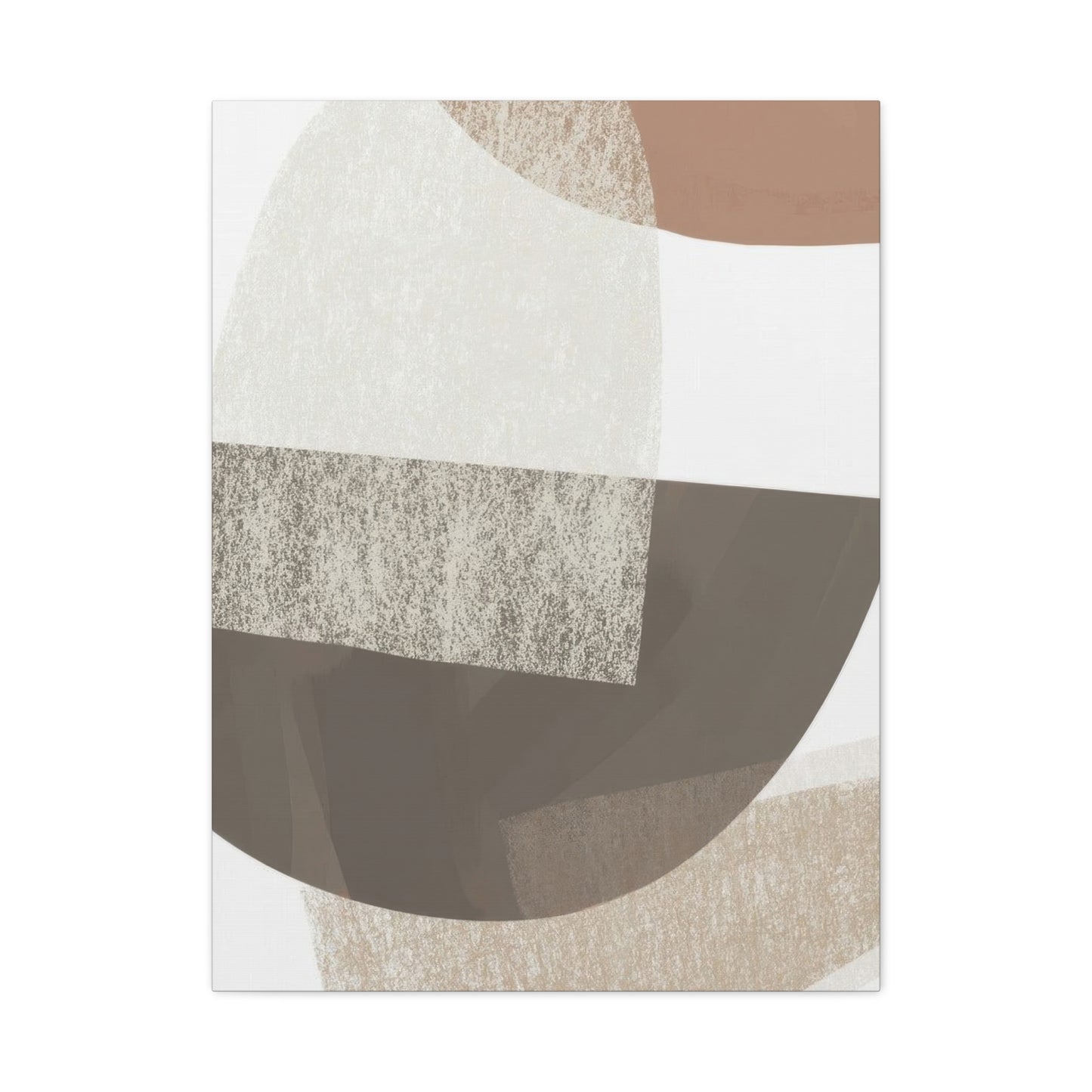
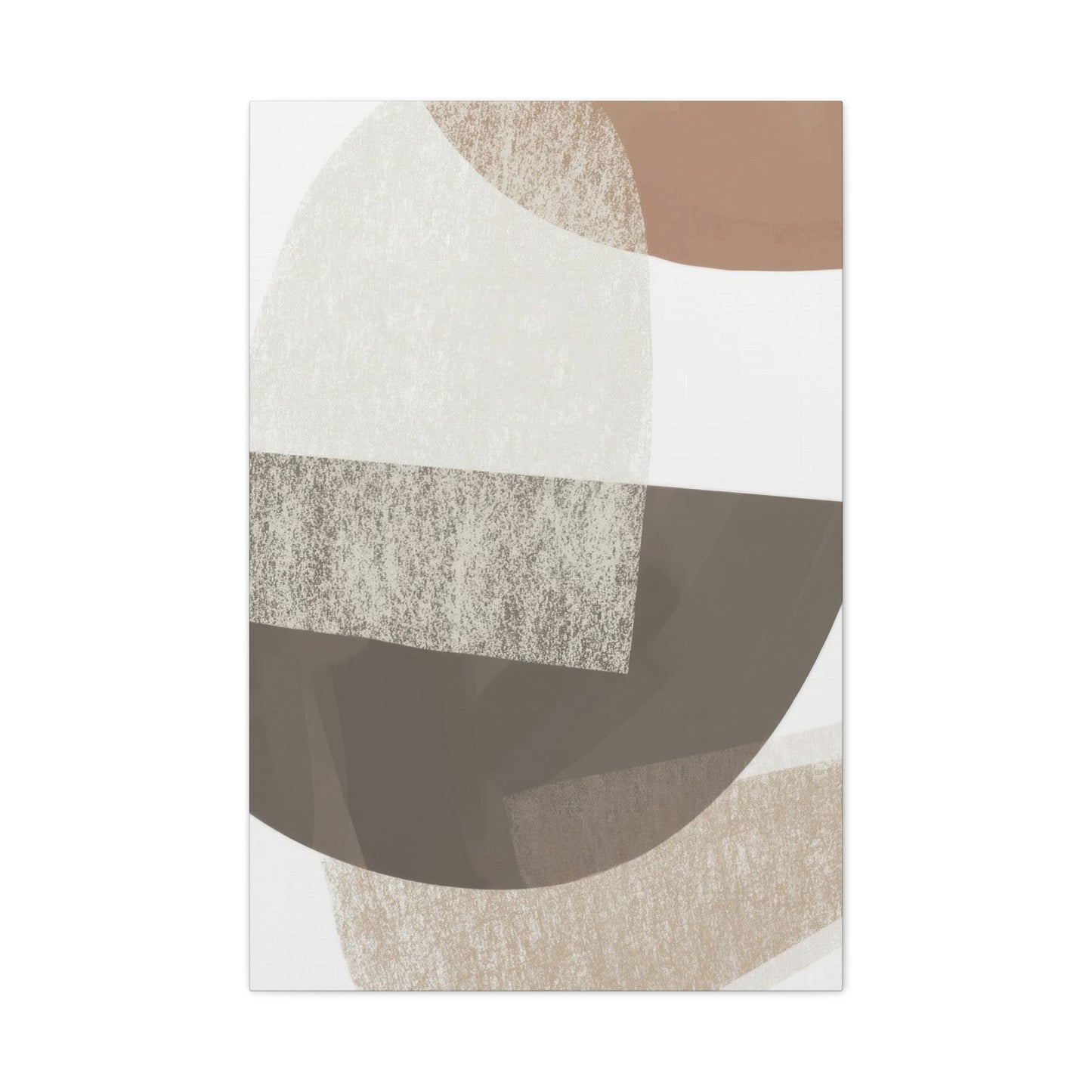
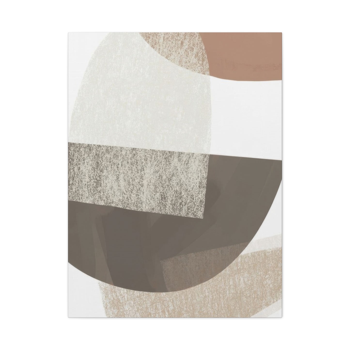
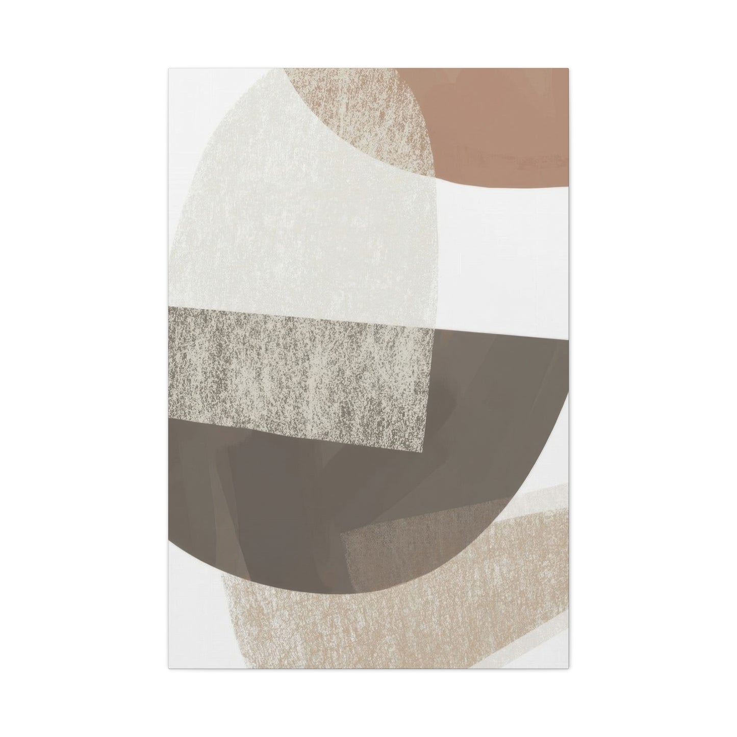
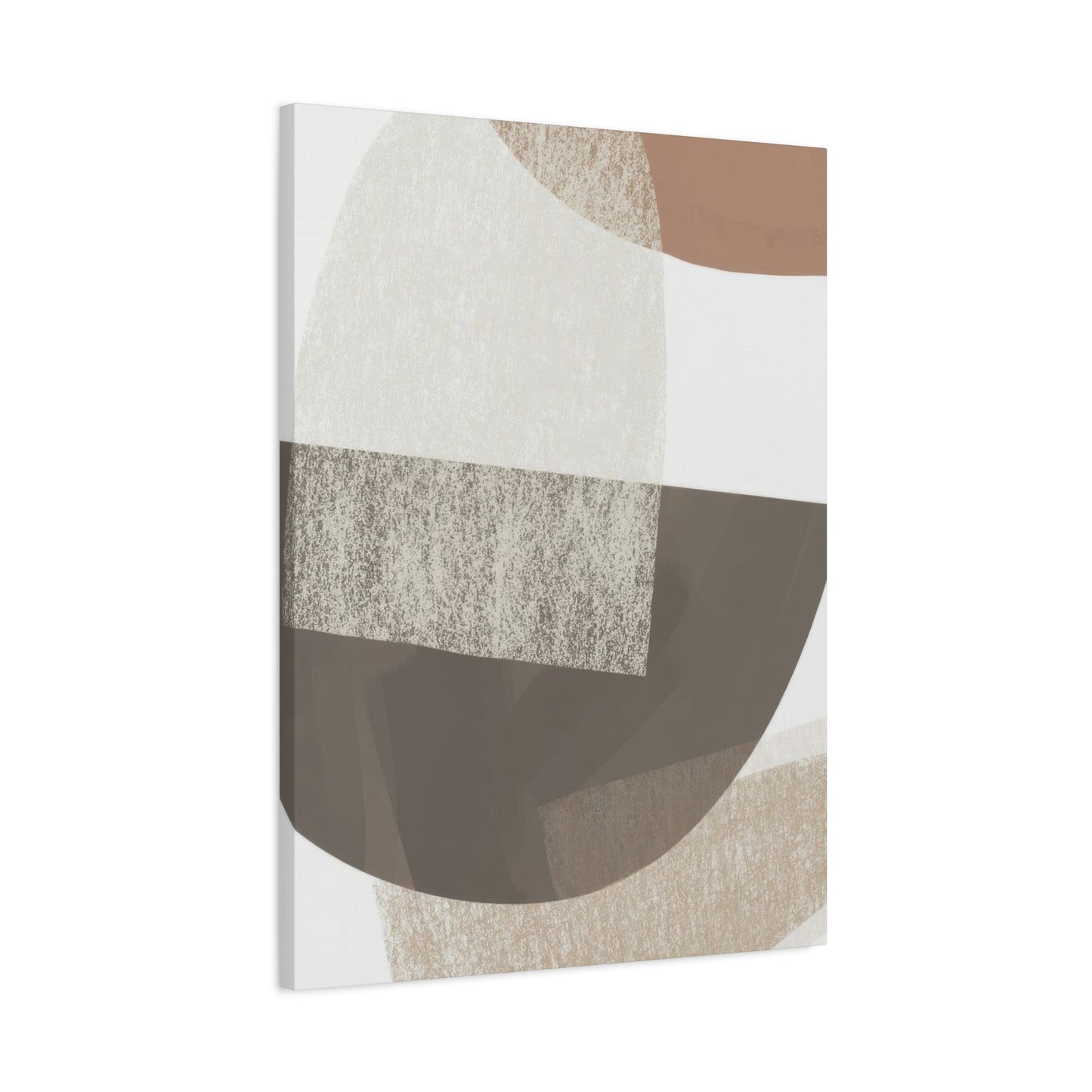
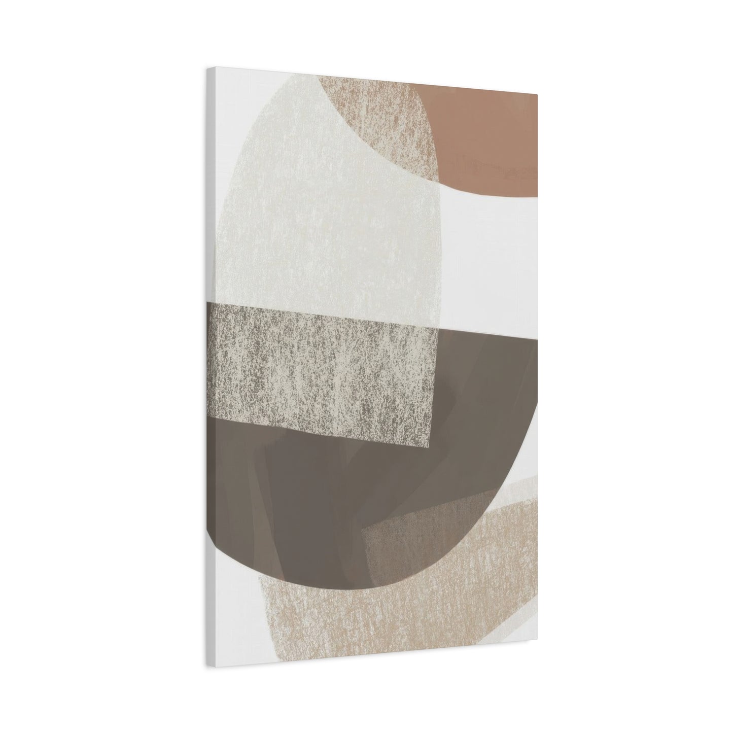
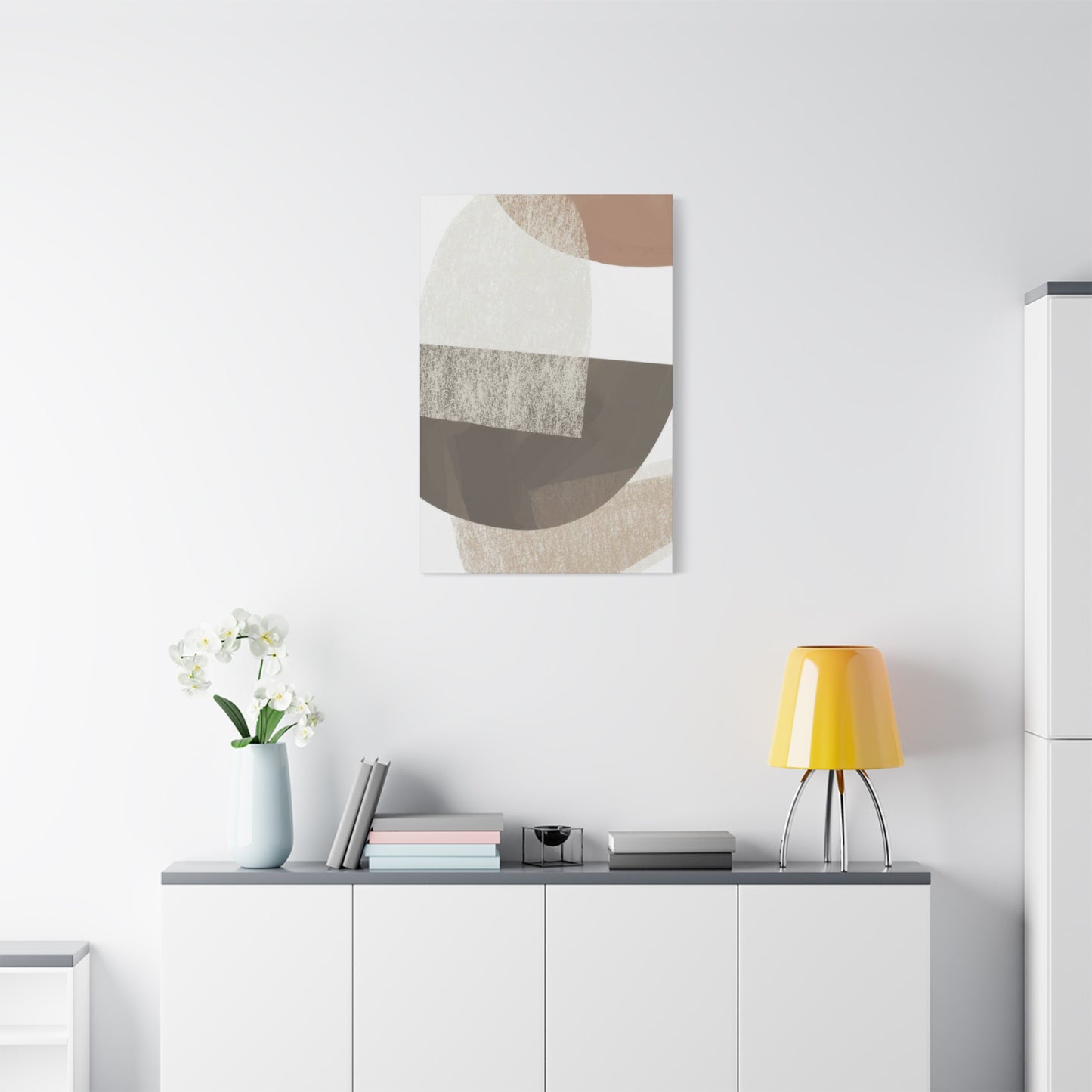
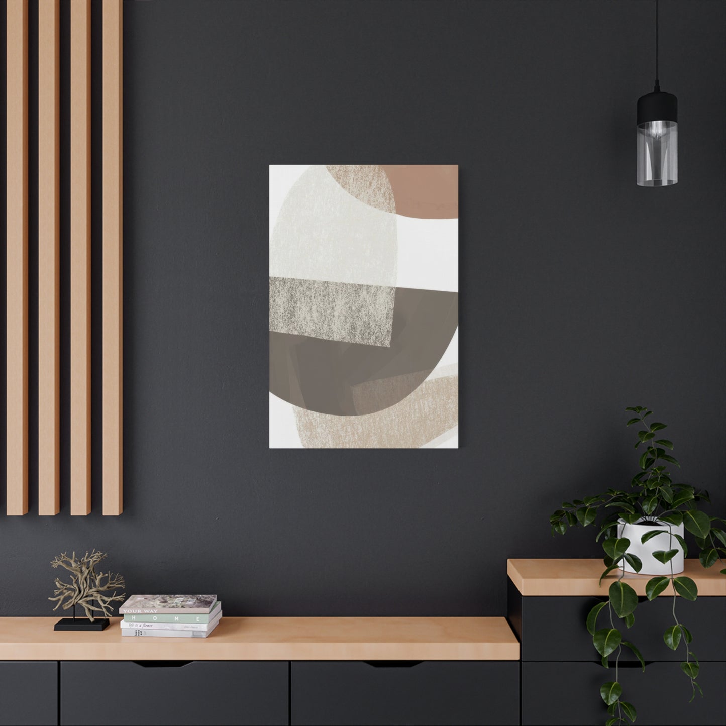
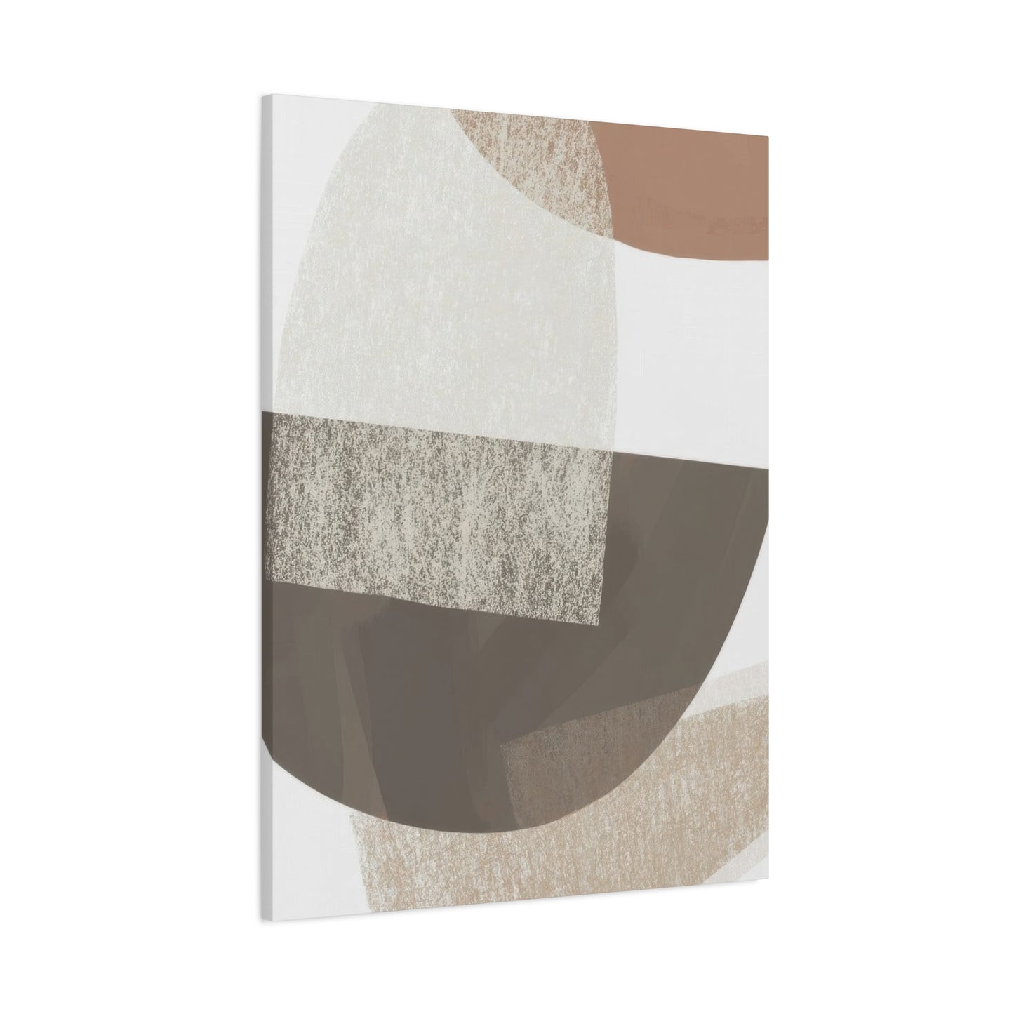
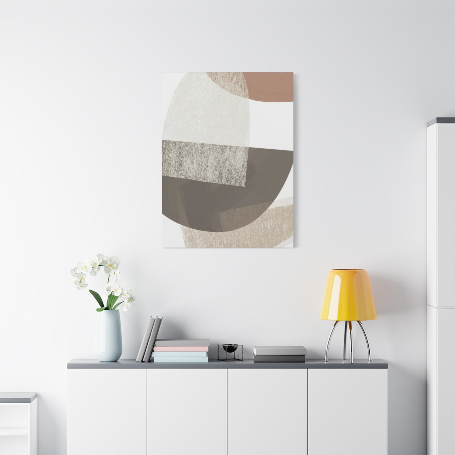
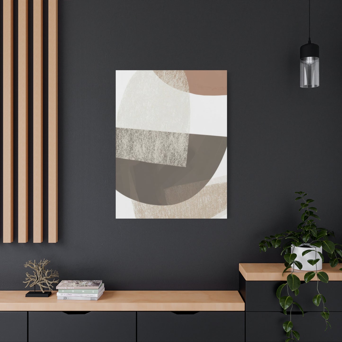
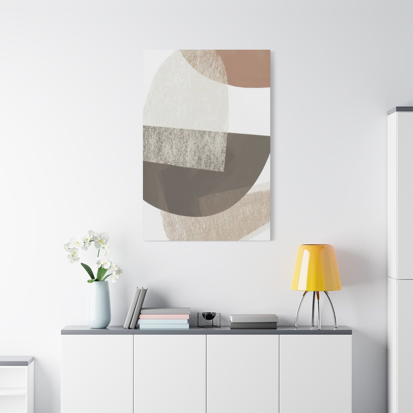
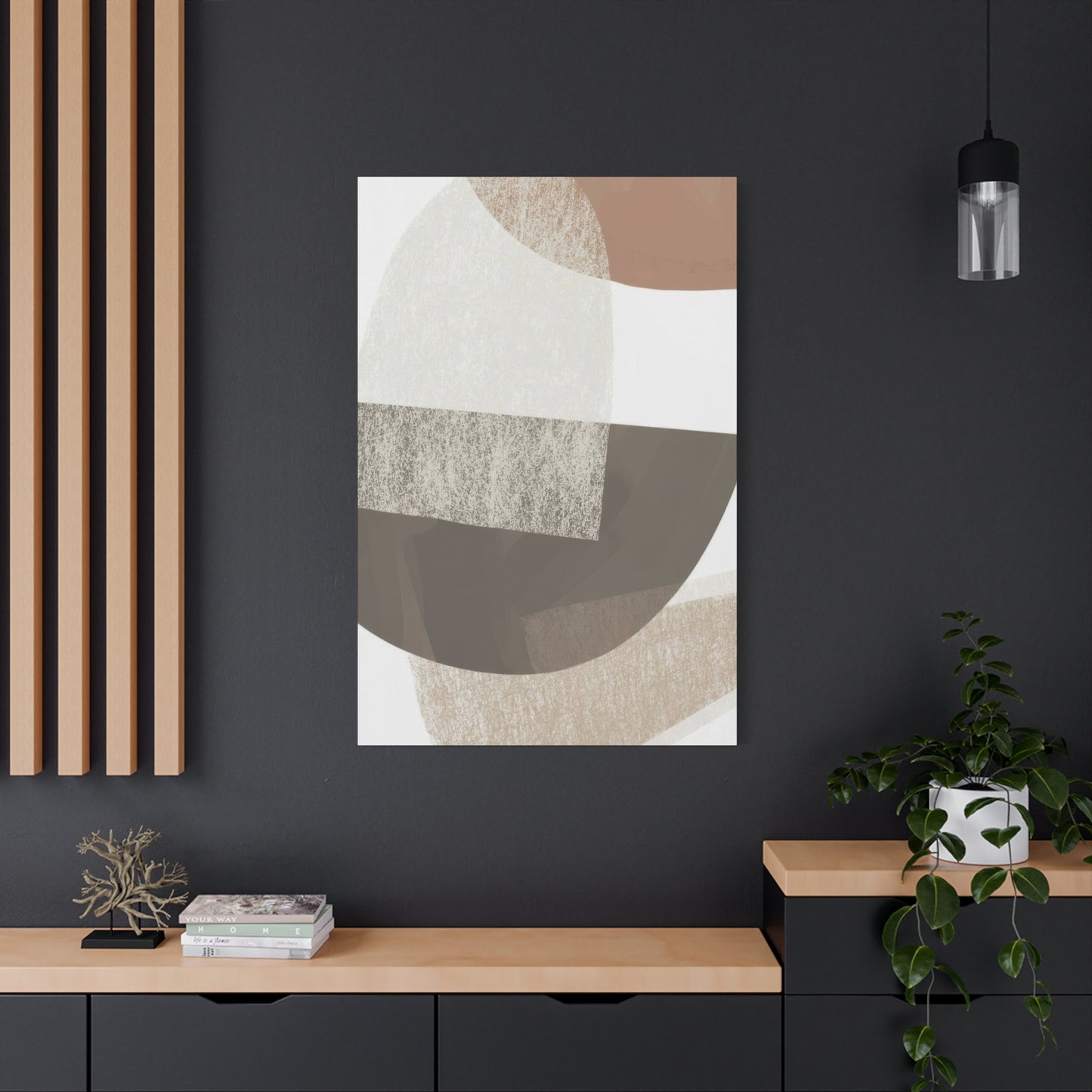
In conclusion, The Beauty of Balance: How Abstract Shapes Earth Tones Wall Art Creates Harmony in Your Space demonstrates that the right combination of color, form, and composition can significantly influence the mood and energy of a room. By blending abstract shapes with a rich palette of earth tones, this style of wall art creates a calming yet dynamic visual experience that enhances the ambiance of any space. Its ability to evoke balance, tranquility, and warmth makes it an ideal addition to your home, bringing a sense of natural harmony that resonates with both the environment and your personal aesthetic.
At the heart of Abstract Shapes Earth Tones Wall Art is the concept of balance. The earthy colors—soft browns, muted greens, warm beiges, and deep terracotta—are inherently grounding, evoking the natural elements of soil, stone, and foliage. These tones create a foundation of stability and warmth within a space, providing a sense of calm and relaxation. Combined with abstract shapes—whether geometric or organic—the artwork introduces a perfect juxtaposition between structure and fluidity. The abstract forms encourage the viewer’s imagination to wander, while the earth tones root the composition in a natural rhythm, offering a sense of peace and order.
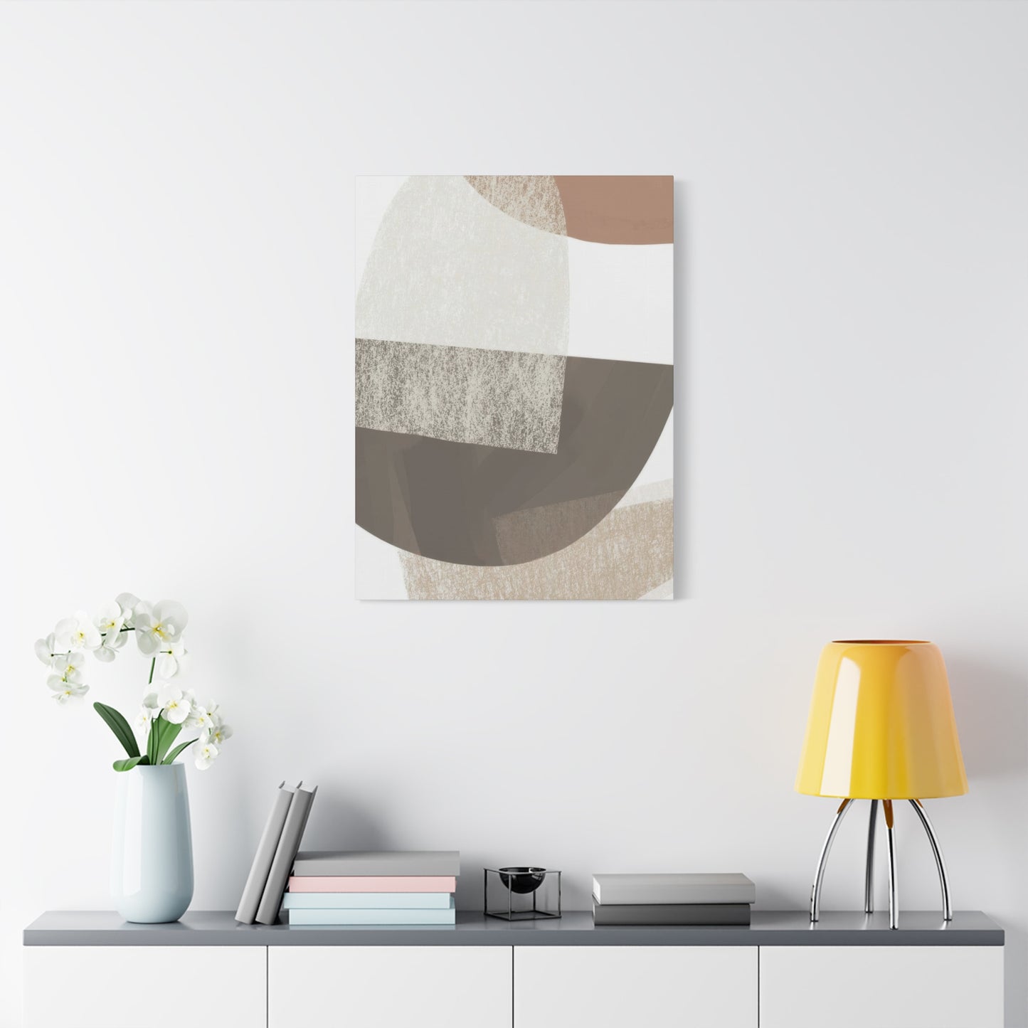
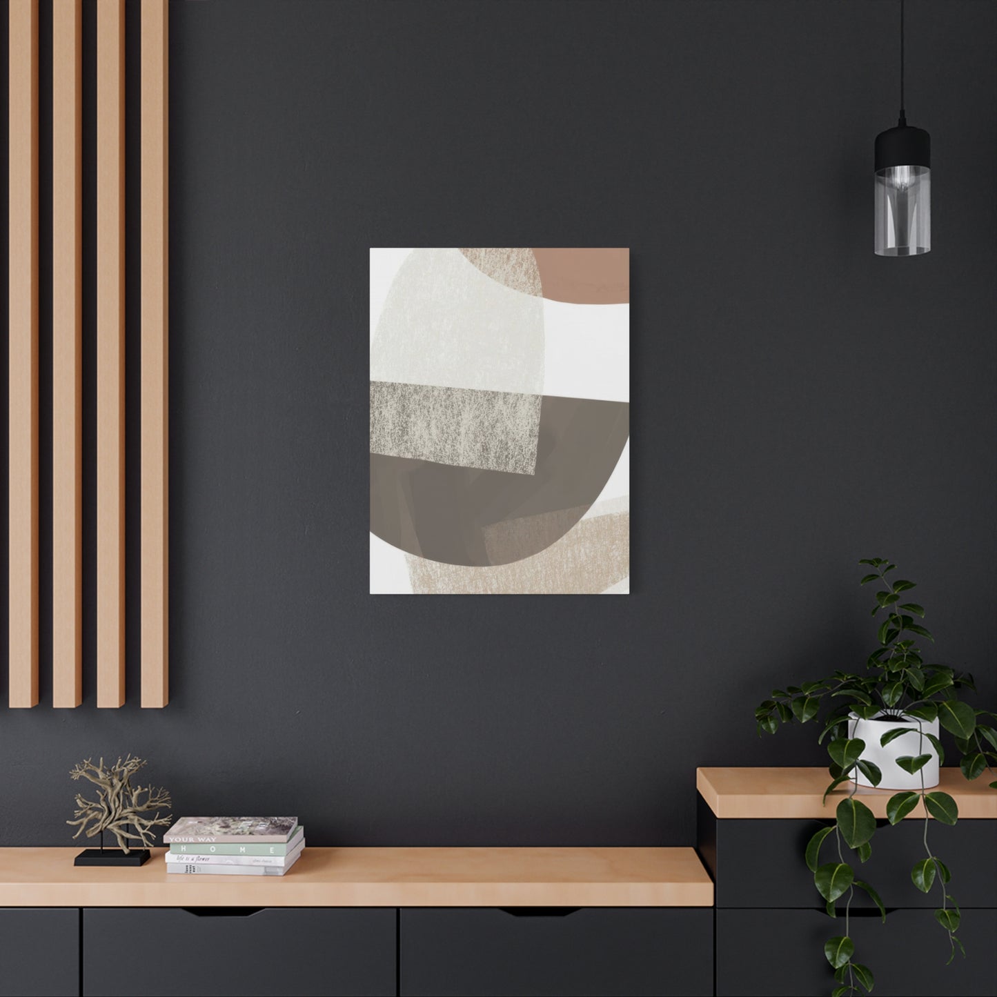
One of the greatest strengths of Abstract Shapes Earth Tones Wall Art is its versatility in creating harmony within a room. The simplicity of the earth-tone palette allows it to effortlessly complement various interior styles, from modern and minimalist to bohemian and rustic. Whether you choose a large canvas to serve as the focal point of a living room or a series of smaller pieces to create a cohesive gallery wall, this type of art can seamlessly integrate into your existing décor. Its neutral yet warm color scheme pairs beautifully with natural textures like wood, stone, and linen, while also adding depth and dimension to spaces with more vibrant or eclectic styles.
This wall art also brings a sense of unity to a room, helping to tie together disparate elements of a space. Abstract shapes, whether angular, curved, or asymmetrical, often create visual flow by guiding the eye through the piece and around the room. When placed strategically, these shapes can help balance the proportions and layout of your space, bringing cohesion to a variety of design elements. The subtle elegance of earth tones enhances this effect, allowing the artwork to serve as both a focal point and a unifying feature within the room. It creates a calming, harmonious atmosphere that invites relaxation and reflection.
Beyond aesthetics, Abstract Shapes Earth Tones Wall Art also fosters an emotional connection with nature. Earth tones have long been associated with feelings of stability, comfort, and rootedness. They recall the colors of the earth, the sky, and the changing seasons, invoking a sense of connection to the natural world. The abstract shapes within the artwork, free from representational constraints, allow the viewer to engage with the piece on a more personal level, creating an emotional and sensory experience that resonates beyond mere decoration. As you gaze upon the art, the soothing blend of colors and shapes encourages mindfulness, making it an ideal piece for spaces dedicated to relaxation or creativity.
