


Arctic Grace Wall Art: Elevate Your Interior Design with Stunning Canvas Prints
The concept of Arctic Grace wall art has emerged as a powerful design element that brings sophistication, tranquility, and visual interest to contemporary living spaces. This distinctive style captures the ethereal beauty of polar landscapes through carefully curated canvas prints that feature cool color palettes, minimalist compositions, and serene imagery. Whether you're redesigning a single room or creating a cohesive aesthetic throughout your entire home, Arctic Grace wall art offers versatile solutions that complement various interior design styles while maintaining a sense of peaceful elegance.
The appeal of Arctic-inspired artwork lies in its ability to create atmospheric environments that promote relaxation and mental clarity. The natural color schemes found in these pieces typically include soft whites, deep blues, gentle grays, and occasional hints of silvery accents that mirror the pristine beauty of frozen landscapes. These hues work harmoniously with modern furniture selections and architectural elements, making them ideal choices for homeowners seeking artwork that enhances rather than overwhelms their existing décor.
Contemporary interior designers have increasingly turned to Arctic Grace canvas prints as strategic design tools that solve common decorating challenges. These artworks effectively fill empty wall spaces, establish focal points within rooms, and create visual continuity between different areas of the home. The minimalist nature of Arctic-inspired designs makes them particularly suitable for spaces where calm and focus are priorities, such as home offices, meditation areas, and bedrooms.
The versatility of Arctic Grace wall art extends beyond aesthetic considerations to encompass emotional and psychological benefits. Studies in environmental psychology have demonstrated that exposure to nature-inspired imagery, particularly scenes featuring cool tones and expansive landscapes, can reduce stress levels and improve overall well-being. By incorporating these elements into your interior design, you create environments that support both visual beauty and mental health.
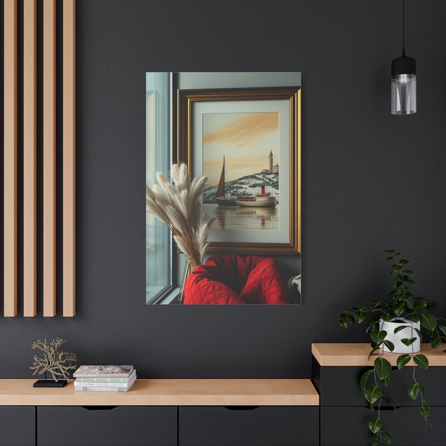
When selecting Arctic Grace wall art for your space, consider the interplay between the artwork and surrounding architectural features. The scale of the canvas, the intensity of colors within the print, and the framing style all contribute to how the piece integrates with your existing design elements. Large-scale Arctic Grace canvas prints can anchor spacious rooms and create dramatic statements, while smaller pieces work beautifully in intimate settings or as components of gallery wall arrangements.
Arctic Grace Wall Art Designs for Modern Interiors
Modern interior design emphasizes clean lines, functional spaces, and thoughtful aesthetic choices that create cohesive living environments. Arctic Grace wall art aligns perfectly with these principles by offering visual interest without unnecessary complexity. The streamlined compositions typical of Arctic-inspired artwork complement contemporary furniture pieces, architectural details, and color schemes commonly found in modern homes.
The relationship between Arctic Grace canvas prints and modern interiors stems from shared design philosophies that prioritize simplicity, quality, and intentional aesthetic decisions. Modern design movements from mid-century modernism to today's Scandinavian-inspired trends have consistently embraced natural elements and minimalist approaches to decoration. Arctic-themed artwork fits naturally within this design continuum, offering connections to the natural world while maintaining the sophistication that modern interiors demand.
One of the defining characteristics of successful modern interior design is the strategic use of negative space. Arctic Grace wall art enhances this principle by providing visual anchors that don't crowd or clutter rooms. The expansive compositions often featured in these prints mirror the open floor plans and uncluttered surfaces typical of modern homes. This synergy between artwork and architectural space creates harmonious environments where each element enhances the others.
Color coordination between Arctic Grace canvas prints and modern interior palettes requires thoughtful consideration of undertones and saturations. Modern spaces often feature neutral base colors with carefully selected accent hues. Arctic-inspired artwork naturally provides cool-toned accents that can either blend seamlessly with existing neutrals or provide deliberate contrast against warmer elements. This flexibility makes Arctic Grace wall art adaptable to various modern design schemes.
The texture and finish of Arctic Grace canvas prints contribute significantly to their effectiveness in modern interiors. High-quality canvas materials with appropriate finishes preserve the integrity of the printed image while adding tactile interest to wall surfaces. Matte finishes typically work best in modern settings, avoiding unwanted reflections that could interfere with the clean aesthetic these spaces require. The physical presence of canvas on the wall adds dimensional depth that flat paper prints cannot achieve.
Lighting considerations play a crucial role in displaying Arctic Grace wall art within modern interiors. Contemporary lighting design often includes adjustable systems that allow homeowners to modify ambient and accent lighting according to different needs and times of day. Proper illumination of Arctic-themed canvas prints enhances their visual impact by revealing subtle gradations in color and detail that might otherwise go unnoticed. Consider installing picture lights or positioning track lighting to highlight these artworks effectively.
Serene Canvas Prints with Arctic Grace Themes
Serenity in visual art refers to the quality of peacefulness and calm that artwork can evoke in viewers. Arctic Grace canvas prints excel at creating this emotional response through careful composition, color selection, and subject matter that draws inspiration from the tranquil nature of polar environments. These prints offer visual respite from the overstimulation that characterizes much of modern life, providing spaces where the mind can rest and reset.
The psychological impact of serene Arctic-inspired artwork connects to fundamental human responses to natural landscapes. Research in neuroaesthetics suggests that viewing expansive natural scenes activates specific neural pathways associated with relaxation and stress reduction. Arctic Grace canvas prints harness these innate responses by presenting compositions that mirror the vastness and stillness of frozen landscapes. The resulting emotional experience contributes to the overall atmosphere of the spaces where these artworks are displayed.
Creating serenity through Arctic Grace wall art involves more than simply depicting cold landscapes. The most effective prints balance elements of interest with areas of visual calm, preventing monotony while avoiding overstimulation. Subtle variations in tone and texture within predominantly cool color schemes maintain viewer engagement without disrupting the peaceful quality of the composition. This delicate balance requires skilled artistic execution and thoughtful printing processes that preserve nuanced details.
The horizontal orientation common in Arctic Grace canvas prints contributes to their serene quality by echoing natural horizon lines and creating visual stability. Horizontal compositions tend to feel more restful than vertical ones, as they mirror the natural scanning pattern of human vision and suggest expansiveness rather than ascension. When positioning these prints in your space, maintaining level hanging ensures that the calming horizontal emphasis remains effective.
Layering multiple shades of similar hues creates depth within serene Arctic Grace prints without introducing jarring contrasts. This monochromatic or analogous color approach maintains the peaceful atmosphere while preventing the artwork from appearing flat or uninteresting. The subtle transitions between different values of blue, gray, and white guide the viewer's eye through the composition in a gentle, unhurried manner that reinforces the serene quality of the piece.
The absence of human figures or obvious human intervention in most Arctic Grace canvas prints contributes to their serene nature by removing narrative complexity. Viewers can project their own experiences and emotions onto these relatively abstract landscapes without being directed toward specific stories or interpretations. This openness allows the artwork to function as a meditative focus rather than a demanding narrative that requires active engagement.
Minimalist Wall Art Ideas with Arctic Grace
Minimalism as a design philosophy emphasizes essential elements while eliminating unnecessary decoration, creating spaces that feel open, organized, and intentional. Arctic Grace wall art naturally aligns with minimalist principles through its streamlined compositions, limited color palettes, and focus on fundamental forms rather than decorative details. These characteristics make Arctic-inspired canvas prints ideal choices for anyone pursuing minimalist interior design.
The intersection of minimalist design and Arctic Grace artwork occurs at the point where maximum visual impact meets restrained expression. Successful minimalist wall art doesn't simply remove elements until nothing remains; instead, it carefully selects and presents the most essential components that communicate meaning and create aesthetic interest. Arctic Grace prints achieve this balance by distilling vast, complex polar landscapes into their most compelling visual elements.
Implementing minimalist Arctic Grace wall art requires consideration of the surrounding space and how the artwork interacts with architectural features. In minimalist interiors, each element carries increased visual weight because fewer items compete for attention. An Arctic Grace canvas print in a minimalist room becomes a significant design statement even when the artwork itself features subtle imagery. This amplification effect means that careful selection and placement become even more critical in minimalist settings.
Color restraint distinguishes minimalist Arctic Grace wall art from more decorative approaches. Limiting the palette to two or three closely related hues maintains the simplified aesthetic that minimalism demands while still allowing for visual interest through value and saturation variations. Many successful minimalist Arctic prints feature predominantly white or light gray compositions with minimal darker accents that provide just enough contrast to define forms and create depth.
The negative space within minimalist Arctic Grace canvas prints functions as an active design element rather than empty background. In minimalist compositions, the areas without obvious subject matter contribute equally to the overall impact as the areas with defined imagery. This philosophy mirrors traditional Asian artistic approaches where empty space represents possibility, breath, and balance within the composition. Understanding this principle helps viewers appreciate the completeness of seemingly simple Arctic Grace prints.
Framing decisions significantly affect how minimalist Arctic Grace wall art integrates with surrounding spaces. Many minimalist applications favor frameless gallery-wrapped canvases where the printed image extends around the edges of the stretcher bars. This approach eliminates visual boundaries between artwork and wall, creating a seamless integration that supports minimalist design goals. When frames are used, simple profiles in neutral colors maintain the restrained aesthetic without introducing decorative distraction.
Elegant Arctic Grace Designs for Living Rooms
Living rooms function as the social and aesthetic centerpieces of most homes, making them ideal locations for impactful Arctic Grace wall art that reflects personal style while creating welcoming atmospheres for family and guests. The elegant qualities inherent in Arctic-inspired canvas prints elevate living room designs by introducing sophisticated visual elements that command attention without overwhelming the space or competing with functional furniture arrangements.
Elegance in interior design refers to refined beauty achieved through careful selection of high-quality materials, thoughtful composition, and restrained ornamentation. Arctic Grace wall art embodies these principles through its focus on natural beauty, subtle color progressions, and compositions that suggest rather than explicitly depict every detail. This approach to visual representation aligns with traditional concepts of elegance that value understatement and quality over obvious display.
The focal wall concept works particularly well in living rooms, where a single prominent Arctic Grace canvas print can anchor the entire design scheme. Positioning a large-scale Arctic-inspired artwork above a sofa, fireplace, or credenza creates a visual destination that draws the eye and establishes the room's aesthetic direction. This strategic placement transforms the artwork from mere decoration into an integral architectural element that influences all other design decisions in the space.
Color relationships between Arctic Grace wall art and living room furnishings require careful orchestration to achieve elegant results. The cool tones typical of Arctic-inspired prints can either harmonize with similar cool colors in upholstery and accents or provide intentional contrast against warmer elements in the room. Both approaches can create elegant outcomes when executed with attention to balance and proportion. Consider pulling one or two accent colors from the artwork to repeat in throw pillows, blankets, or decorative objects throughout the space.
Lighting design dramatically affects how Arctic Grace canvas prints appear in living room settings and influences the elegant atmosphere these pieces can create. Natural light streaming through windows interacts with the cool tones of Arctic-inspired artwork throughout the day, creating dynamic visual experiences as shadows and highlights shift. Supplementing natural light with carefully positioned accent lighting ensures that the artwork remains impactful during evening hours when artificial illumination dominates the space.
The height at which Arctic Grace wall art hangs influences both its visual impact and the elegant quality of the presentation. Standard gallery hanging height places the center of the artwork at approximately eye level, typically between 57 and 60 inches from the floor. This positioning ensures comfortable viewing and creates professional-looking displays that enhance the elegant atmosphere. Adjustments may be necessary when hanging artwork above furniture, maintaining appropriate proportional relationships between the canvas and underlying pieces.
Creating Statement Walls with Arctic Grace Prints
Statement walls serve as bold design declarations that immediately capture attention upon entering a room, establishing the aesthetic direction for the entire space. Arctic Grace canvas prints excel in statement wall applications by providing visually striking imagery that commands presence while maintaining sophisticated restraint. The key to successful statement walls lies in balancing impact with integration, ensuring the featured artwork enhances rather than alienates from the overall design scheme.
Scale represents the most obvious factor in creating statement walls with Arctic Grace wall art. Oversized canvas prints ranging from 40 inches to 60 inches or larger create immediate visual impact that transforms ordinary walls into architectural features. These substantial artworks work best on uninterrupted wall surfaces where they can achieve their full effect without competing with windows, doors, or built-in features that might fragment the visual experience.
Alternative approaches to statement walls involve multiple Arctic Grace canvas prints arranged in intentional configurations. Diptychs and triptychs split single compositions across two or three separate canvases, creating dynamic presentations that add dimension and interest to the wall surface. These multi-panel arrangements introduce rhythm and movement while maintaining cohesive imagery that reads as a unified statement. Proper spacing between panels ensures that the individual pieces relate to each other while allowing each canvas to maintain its own presence.
Color intensity within Arctic Grace prints influences their effectiveness as statement wall features. While subtle, monochromatic compositions create sophisticated statements through restraint, prints featuring stronger contrast or bolder color variations make more immediate impacts. Neither approach is inherently superior; the choice depends on the existing room design, desired atmosphere, and personal aesthetic preferences. Bolder statements work well in spaces that can accommodate their energy, while subtler approaches suit rooms requiring calmer atmospheres.
The wall color surrounding Arctic Grace canvas prints significantly affects their statement-making potential. Light, neutral wall colors provide clean backdrops that allow artwork to stand forward visually, creating clear separation between the print and its environment. Darker wall colors can create dramatic presentations where Arctic Grace prints appear to glow against their backgrounds, though this approach requires careful lighting design to prevent the artwork from being visually absorbed by surrounding surfaces.
Cool and Calm Décor with Arctic Wall Art
The psychological impact of cool colors in interior environments has been extensively documented, with blue and gray tones consistently associated with feelings of calm, stability, and mental clarity. Arctic Grace wall art leverages these inherent color associations to create décor schemes that promote relaxation and emotional balance. Understanding how cool-toned artwork influences spatial atmosphere allows for intentional design decisions that support specific lifestyle goals and personal well-being.
Cool color palettes derived from Arctic environments offer natural harmonies that feel inherently balanced and restful. The blues, whites, grays, and occasional silver tones found in Arctic Grace canvas prints work together seamlessly, creating cohesive color stories that require minimal adjustment or coordination with surrounding elements. This built-in harmony simplifies the design process while ensuring successful aesthetic outcomes that feel professionally composed.
Temperature perception within interior spaces connects directly to color choices, with cool-toned environments literally feeling cooler than spaces dominated by warm colors. Arctic Grace wall art can help balance rooms that receive abundant warm natural light or spaces with warm-toned finishes that might otherwise feel too stimulating. This temperature-balancing effect provides both psychological comfort and perceived physical relief, particularly in climates where cooling effects are desirable year-round or during warmer seasons.
The calm atmosphere created by Arctic Grace décor extends beyond color considerations to encompass compositional qualities within the artwork itself. Horizontal lines, gradual transitions, and expansive open spaces within Arctic-inspired prints reinforce the peaceful qualities that cool colors provide. These compositional elements work synergistically with the color palette to create comprehensive calm that engages multiple aspects of visual perception simultaneously.
Combining Arctic Grace wall art with appropriate furniture and textile selections amplifies the cool, calm atmosphere throughout the space. Light-colored upholstery, glass or metal furniture elements, and textiles in complementary cool tones create cohesive environments where every element supports the intended atmosphere. Natural materials like light woods, stone, and linen add textural warmth that prevents cool color schemes from feeling sterile or unwelcoming.
Contrast management maintains visual interest within cool, calm décor schemes featuring Arctic Grace canvas prints. While the overall palette emphasizes cool tones, introducing carefully selected warm accents prevents monotony and adds necessary visual energy. Small doses of warm wood tones, brass or copper metallic elements, or subtle warm accent colors in accessories provide relief that makes the predominant cool scheme more livable and engaging.
Arctic Grace Canvas Selections for Bedrooms
Bedrooms function as personal sanctuaries where rest, relaxation, and rejuvenation take priority over social interaction or visual impact. Arctic Grace canvas prints align perfectly with bedroom design goals by creating atmospheres conducive to sleep and peaceful contemplation. The serene qualities inherent in Arctic-inspired artwork support the bedroom's fundamental purpose while adding aesthetic interest that makes the space more enjoyable during waking hours.
Color psychology particularly relevant to sleep environments emphasizes the importance of cool, muted tones that promote melatonin production and signal the body to prepare for rest. Arctic Grace wall art naturally provides these beneficial color qualities through its blue-gray-white palette derived from polar landscapes. Positioning these prints as focal points in bedroom design leverages their inherent calming properties to create environments that actively support healthy sleep patterns.
The view from bed represents a crucial consideration when positioning Arctic Grace canvas prints in bedrooms. Many people spend considerable time in bed awake, reading, relaxing, or simply contemplating before sleep or upon waking. Placing Arctic-inspired artwork where it's easily visible from the bed provides a pleasant visual focus during these moments, offering the mind something beautiful and calming to contemplate. This strategic placement maximizes the artwork's impact and utility within the space.
Scale considerations in bedroom applications differ somewhat from those in more public spaces. While living rooms might accommodate and even benefit from oversized statement pieces, bedrooms often function better with moderately sized Arctic Grace prints that provide visual interest without overwhelming the intimate atmosphere. Artwork ranging from 24 to 40 inches typically works well in standard bedrooms, creating presence without dominating the space or interfering with the room's primary restful function.
Symmetrical arrangements of Arctic Grace canvas prints can reinforce the sense of order and calm that bedrooms require. Positioning matching prints on either side of the bed or creating balanced compositions that mirror along a central axis creates visual harmony that feels inherently restful. This approach works particularly well in traditional or transitional bedroom designs where symmetry already plays an important role in furniture arrangement and architectural details.
Gallery-Worthy Arctic Grace Wall Art Presentations
Gallery presentation techniques elevate home artwork displays from casual decoration to sophisticated art exhibitions that command respect and attention. Arctic Grace canvas prints respond beautifully to gallery-style treatments, which emphasize the artwork itself while creating professional presentations that enhance perceived value and aesthetic impact. Understanding fundamental gallery principles allows homeowners to apply these techniques in residential settings with impressive results.
Proper spacing represents the cornerstone of gallery-worthy presentations, whether displaying a single Arctic Grace print or multiple pieces in arrangement. Professional galleries typically allow generous space around artworks, preventing crowding and giving each piece room to breathe visually. In home applications, this might mean resisting the urge to fill every available wall surface, instead focusing on strategic placement that allows Arctic Grace prints to receive full attention and appreciation.
Lighting quality dramatically influences how artwork appears and determines whether presentations feel amateurish or professional. Gallery-standard lighting provides even illumination across the entire artwork surface while avoiding glare, hot spots, or shadows that distract from the image. Dedicated picture lights, track lighting systems with adjustable heads, or carefully positioned spotlights can achieve gallery-quality illumination in home settings. The investment in proper lighting significantly enhances the presentation and perceived quality of Arctic Grace canvas prints.
Wall color selection affects how gallery-worthy presentations appear, with neutral tones typically providing the most professional backdrops. White, light gray, and soft beige walls allow Arctic Grace prints to stand forward visually without competing with strong background colors. Professional galleries overwhelmingly favor white walls for their neutrality and ability to showcase artwork across various styles and color palettes. Adopting this approach in home settings immediately elevates the gallery quality of wall art presentations.
Mat-free, frame-free presentations using gallery-wrapped canvases create clean, contemporary looks that align with professional exhibition standards. Gallery wrapping extends the printed image around the canvas edges, eliminating the need for framing while creating finished presentations ready for hanging. This approach works particularly well with Arctic Grace prints, where the minimalist aesthetic of the artwork complements the simplified presentation method. The resulting displays feel modern and sophisticated while highlighting the artwork itself.
Grouping strategies for multiple Arctic Grace prints require attention to visual weight, color balance, and compositional flow. Gallery walls featuring several pieces benefit from planning that considers how individual artworks relate to each other and to the overall arrangement. Creating templates from paper or cardboard allows for experimentation with different configurations before committing to wall mounting. Maintaining consistent spacing between pieces, typically 2 to 4 inches, creates cohesive presentations that read as intentional compositions rather than random collections.
Arctic-Inspired Décor Ideas for Wall Displays
Drawing inspiration from Arctic environments opens numerous creative possibilities for wall décor that extends beyond simple canvas prints to encompass comprehensive design approaches. Arctic-inspired décor ideas incorporate the colors, textures, forms, and emotional qualities of polar regions into cohesive visual presentations that transform ordinary walls into compelling design features. Exploring these varied approaches provides options for personalizing Arctic themes according to individual tastes and spatial requirements.
Textural contrast represents an often-overlooked aspect of Arctic-inspired wall décor that can add significant visual interest and depth. Combining smooth canvas surfaces with rougher textures like natural wood frames, woven wall hangings, or three-dimensional sculptural elements creates tactile variety that engages multiple senses. This layering of textures mirrors the complex surfaces found in actual Arctic environments where smooth ice coexists with rough rock formations and crystalline snow structures.
Metallic accents in silver, chrome, or brushed nickel complement Arctic Grace canvas prints beautifully by referencing the reflective qualities of ice and snow under various lighting conditions. Incorporating metallic frames, wall-mounted sculptural pieces, or decorative mirrors near Arctic-inspired artwork creates visual connections that enhance the overall theme. These reflective elements also interact with light in ways that add movement and dynamism to what might otherwise be static wall presentations.
Dimensional layering creates visual interest by positioning elements at various depths from the wall surface rather than mounting everything flush. Hanging Arctic Grace canvas prints as the primary layer, then adding floating shelves or shadow boxes at different depths in front of or beside the artwork creates complex presentations that reward sustained viewing. This approach works particularly well in spaces where visitors frequently linger, as the dimensional variety provides ongoing visual discovery.
Seasonal rotation strategies allow Arctic-inspired wall décor to evolve throughout the year while maintaining thematic consistency. During warmer months, emphasizing the cooling, refreshing qualities of Arctic Grace prints through minimal additional decoration celebrates their ability to psychologically reduce heat perception. In colder seasons, layering additional textural elements like faux fur textiles or warm metallic accents creates coziness while maintaining the Arctic theme through thoughtful coordination.
Lighting as décor represents an innovative approach where illumination itself becomes an artistic element rather than simply revealing other decorative components. LED strip lights positioned behind floating Arctic Grace canvas prints create dramatic glow effects, while fiber optic installations can mimic starlight or aurora phenomena associated with polar regions. These lighting-as-art approaches work particularly well in contemporary or modern interiors where innovative design expressions are valued.
Elegant Canvas Art Exploring Arctic Grace Themes
Elegance in art transcends simple prettiness to achieve refined beauty through sophisticated composition, quality execution, and thoughtful presentation. Arctic Grace canvas art embodies these elegant qualities through its restrained approach to subject matter, careful attention to color relationships, and professional production values that distinguish fine art from mere decoration. Understanding what makes Arctic-inspired canvas truly elegant enables informed selection that elevates interior spaces through genuine artistic merit.
Compositional sophistication distinguishes elegant Arctic Grace canvas art from simpler interpretations of polar themes. Elegant compositions balance areas of interest with expanses of negative space, create subtle directional flow that guides viewer attention, and establish harmonious relationships between various elements within the frame. These sophisticated compositional strategies require artistic skill and intentionality that separate fine art from casual decorative pieces.
Color harmony achieved through careful palette selection and value control represents another hallmark of elegant Arctic Grace canvas art. Rather than using colors arbitrarily or prioritizing impact over cohesion, elegant Arctic-inspired pieces demonstrate masterful understanding of color theory through analogous schemes, monochromatic variations, or carefully controlled complementary accents. This color sophistication creates visual satisfaction that viewers might not consciously recognize but definitely experience emotionally.
Print quality dramatically affects whether Arctic Grace canvas art appears elegant or amateurish regardless of the underlying image quality. Professional printing using archival pigment inks on premium canvas substrates preserves subtle color gradations and fine details that define elegant artwork. Lower-quality printing processes might reproduce the same image but lose the nuanced qualities that distinguish elegant pieces, resulting in flat, lifeless reproductions that fail to achieve the desired aesthetic impact.
Canvas texture selection influences how elegant Arctic Grace art appears and feels within spaces. Fine-weave canvases with subtle textures complement detailed Arctic imagery without competing for attention, while coarser weaves might suit more impressionistic or abstract interpretations where visible texture becomes part of the artistic expression. Matching canvas texture to image style ensures that the physical substrate supports rather than undermines the artistic content.
Statement Corners Transformed with Arctic Grace Wall Art
Corner spaces within rooms often present decorating challenges due to their awkward geometries and limited visibility from primary viewing angles. Arctic Grace wall art offers innovative solutions for transforming these underutilized areas into statement features that contribute meaningfully to overall room designs. Strategic corner treatments using Arctic-inspired canvas prints maximize spatial efficiency while creating visual interest in areas that might otherwise remain neglected or wasted.
Two-wall corner installations create immersive experiences by wrapping Arctic Grace imagery across adjacent wall surfaces. This approach might use complementary prints that create visual dialogue between the two walls or a single panoramic image split across both surfaces for dramatic effect. The resulting corner becomes an environmental installation rather than simple wall decoration, transforming the entire area into an artistic destination within the room.
Vertical emphasis in corner placements draws eyes upward and increases perceived ceiling height, making rooms feel more spacious and grand. Tall, narrow Arctic Grace canvas prints or vertical arrangements of smaller pieces create ascending visual movement that exploits the full height potential of corner spaces. This approach works particularly well in rooms with lower ceilings where horizontal emphasis might reinforce the restricted vertical dimension.
Lighting strategies specific to corner installations ensure that these often-shadowy areas receive adequate illumination to showcase featured Arctic Grace wall art effectively. Corner-mounted accent lights, ceiling-directed uplights that create ambient glow, or even floor lamps positioned to illuminate corner artwork transform dark corners into highlighted features. Proper lighting converts potential problem areas into design opportunities that actively contribute to room atmospheres.
Furniture coordination with corner Arctic Grace displays creates cohesive vignettes that feel purposefully composed rather than arbitrarily placed. Positioning an accent chair, small table, or decorative plant near corner artwork establishes the area as an intentional design feature. This combination of artwork and furnishings transforms otherwise empty corners into functional, beautiful spaces that increase the room's usable area while adding visual interest.
Scale considerations for corner installations differ from those for center-wall placements because corner viewing angles and distances affect how artwork appears. Pieces that might overwhelm center-wall positions can work perfectly in corners where viewing typically occurs from greater distances or oblique angles. Conversely, very large pieces might feel cramped in corners where they can't be properly appreciated from appropriate distances.
Serene Arctic Masterpieces Suitable for Any Room
Versatility represents one of Arctic Grace wall art's greatest strengths, with high-quality Arctic-inspired pieces adapting successfully to virtually any room in the home. This universal applicability stems from the broad appeal of nature imagery, the psychological benefits of cool color palettes, and the sophisticated minimalism that characterizes well-executed Arctic-themed artwork. Understanding how to adapt Arctic Grace prints to different room functions and design contexts maximizes their utility and value within residential spaces.
Living room applications of Arctic Grace masterpieces emphasize their role as conversation pieces and aesthetic anchors that set the tone for social interactions. The serene quality of Arctic-inspired artwork creates welcoming atmospheres that put guests at ease while the sophisticated imagery demonstrates the homeowner's refined taste and attention to design detail. Positioning Arctic Grace prints prominently in living areas ensures they receive the appreciation they deserve while influencing the overall character of these important social spaces.
Bedroom implementations leverage Arctic Grace artwork's calming properties to support rest and relaxation essential to sleep spaces. The cool color palettes and peaceful compositions characteristic of Arctic-inspired pieces create bedtime environments conducive to mental quieting and physical relaxation. Unlike stimulating artwork that might interfere with sleep preparation, serene Arctic masterpieces actively support the bedroom's primary function while adding beauty that enhances waking hours spent in the space.
Kitchen and dining areas benefit from Arctic Grace wall art that provides visual interest without introducing food-related imagery that might feel too literal or prescriptive. The abstract or landscape-based nature of Arctic-inspired prints offers sophisticated decoration that complements rather than dictates the culinary functions of these spaces. Cool color palettes in Arctic Grace pieces can also create psychological cooling effects that make kitchens feel more comfortable despite heat-generating appliances.
Bathroom applications of Arctic Grace artwork create spa-like atmospheres that transform utilitarian spaces into relaxation retreats. The water associations inherent in many Arctic scenes connect naturally with bathroom functions while the serene qualities support the self-care activities these spaces accommodate. Selecting Arctic Grace prints with appropriate moisture-resistant treatments ensures longevity in humid bathroom environments while maintaining the artwork's visual appeal.
Arctic Grace Wall Art for Meditation Spaces
Meditation and mindfulness practices require environmental support that minimizes distraction while providing gentle focal points for attention when needed. Arctic Grace wall art serves meditation spaces exceptionally well through its inherently calming visual qualities, connection to natural beauty, and ability to support various meditation techniques from focused concentration to open awareness. Creating dedicated meditation areas enhanced by Arctic-inspired artwork supports regular practice while beautifying the home.
Visual anchors for meditation practice provide objects upon which attention can rest during techniques requiring external focus. Arctic Grace canvas prints function perfectly as meditation anchors through their serene imagery that holds attention without becoming mentally stimulating or emotionally provocative. The gentle color progressions and minimalist compositions allow practitioners to maintain soft focus on the artwork without their minds becoming caught in narrative or analytical processes that would interfere with meditative states.
Color psychology specific to meditation emphasizes cool, muted tones that promote mental calm and emotional equilibrium. Arctic Grace wall art naturally provides these psychologically beneficial hues through its polar-inspired palette of blues, grays, and whites. Exposure to these colors during meditation practice may enhance the relaxation response and support deeper meditative states by creating environmental conditions that signal the nervous system to release tension and anxiety.
Spatial arrangement in meditation areas should position Arctic Grace artwork at appropriate heights and distances for comfortable viewing during various meditation postures. Whether practitioners sit on cushions at floor level, use benches, or prefer chairs, the artwork should be easily visible without requiring uncomfortable neck positions or visual strain. This ergonomic consideration ensures that the Arctic-inspired prints support rather than complicate meditation practice.
Lighting control in meditation spaces allows practitioners to adjust illumination according to practice needs and time of day. Arctic Grace canvas prints benefit from adjustable lighting that can highlight the artwork during active practice sessions or dim to near invisibility during practices requiring darkness or minimal visual input. Installing dimmer switches or using adjustable lamps provides this flexibility while ensuring the artwork remains visible and beautiful when the meditation space serves other purposes.
Symbolic associations between Arctic environments and spiritual concepts enhance the appropriateness of Arctic Grace wall art in meditation spaces. The purity suggested by pristine snow, the vastness reflected in expansive ice fields, and the stillness embodied in frozen landscapes all connect to meditation goals of mental clarity, expanded awareness, and inner peace. These symbolic resonances work on subconscious levels to reinforce meditation intentions and deepen practice experiences.
Acoustic considerations in meditation spaces complement visual elements like Arctic Grace prints to create holistically supportive environments. The visual silence of minimalist Arctic-inspired artwork pairs beautifully with actual acoustic quietness or gentle ambient sounds used during meditation. This multi-sensory coordination creates immersive environments where all elements work together to support meditative states rather than competing for attention or introducing conflicting sensory information.
Cool Tones and Elegant Arctic Canvas Presentations
The inherent coolness of Arctic-inspired color palettes provides both aesthetic and psychological benefits that distinguish this artwork category from warmer-toned alternatives. Understanding how cool tones function within interior spaces and affect human perception enables strategic use of Arctic Grace canvas prints to achieve specific design and atmospheric goals. The elegant presentation of these cool-toned artworks requires attention to factors including framing, positioning, lighting, and coordination with surrounding elements.
Color temperature theory explains the psychological and perceptual differences between cool and warm hues, with cool colors generally associated with calm, clarity, and spaciousness. Arctic Grace canvas presentations leverage these associations through deliberate emphasis on blues, grays, whites, and silvers that define cool color categories. The resulting visual experiences feel fundamentally different from those created by warm-toned artwork, offering design options that support specific functional and emotional objectives within interior spaces.
Spatial perception shifts when cool-toned Arctic Grace art dominates visual fields, with cool colors typically making spaces feel larger and more open than warm colors do. This perceptual effect occurs because cool colors appear to recede visually, creating illusory depth that pushes walls outward. Strategic placement of cool-toned Arctic-inspired prints in small rooms can help counteract cramped feelings, making these artworks particularly valuable in apartments, compact homes, or any spaces where maximizing perceived size matters.
Seasonal appropriateness of cool-toned Arctic Grace canvas presentations deserves consideration in climates with distinct seasons and varying comfort needs. In hot climates or during summer months, the psychological cooling effect of cool-toned artwork provides welcome relief from heat. However, in very cold climates during winter, extensively cool color schemes might feel uncomfortably cold, potentially requiring seasonal modifications through warm-toned accessories or adjusted lighting that adds warmth to the overall environment.
Elegant presentation techniques elevate cool-toned Arctic Grace prints from simple decoration to sophisticated design elements. Professional framing with slim, understated profiles in metallic finishes complements the cool palette without competing for attention. Alternatively, frameless gallery wrapping maintains clean, contemporary appearances that allow the artwork itself to star. Both approaches can achieve elegant results when executed with attention to quality and proportional relationships between artwork and mounting treatment.
Lighting temperature significantly affects how cool-toned Arctic Grace canvas presents within spaces, with warm light creating different effects than cool light. Warm-toned lighting can soften and balance extremely cool artwork, preventing spaces from feeling sterile or unwelcoming. Cool-toned lighting enhances and emphasizes the inherent coolness of Arctic-inspired prints, creating cohesive presentations where lighting and artwork work together. Neither approach is universally correct; the choice depends on desired atmospheres and how the space will be used.
Arctic Grace Wall Art Enhancing Hallways
Hallways present unique opportunities and challenges for artwork display, functioning as transitional spaces that connect distinct areas of the home while often lacking natural light and architectural interest. Arctic Grace wall art transforms utilitarian hallways into gallery experiences that add beauty and value to spaces frequently dismissed as mere passages. Strategic selection and placement of Arctic-inspired canvas prints maximizes the impact of these often-narrow spaces while addressing their specific functional and aesthetic requirements.
Scale considerations in hallway applications differ from those in larger rooms because viewing distances and angles change as people move through the space. Rather than being viewed primarily from fixed positions, hallway artwork gets observed from various distances and perspectives as people walk past. This dynamic viewing situation favors artwork with strong compositional structures that read clearly from multiple vantage points while also containing details that reward closer inspection during slower passage.
Linear arrangements of multiple Arctic Grace prints create rhythm and visual flow that complement hallway geometry. Spacing prints at regular intervals along hallway walls establishes predictable patterns that guide movement through the space while preventing monotony through variations in the artwork itself. This serial installation approach transforms ordinary corridors into curated galleries that make the journey between rooms an aesthetic experience rather than merely functional transition.
Lighting challenges in hallways often include limited natural light and awkward ceiling fixture positions that may not adequately illuminate wall artwork. Arctic Grace canvas prints in hallways benefit from supplementary lighting solutions including wall-mounted picture lights, strategically placed accent lighting, or even LED strips integrated into crown molding. These lighting additions not only ensure proper artwork visibility but also increase hallway safety by improving overall illumination in spaces that might otherwise feel dim or gloomy.
Sight lines from adjacent rooms influence how hallway Arctic Grace displays appear and function within the broader home context. Artwork visible from living areas, bedrooms, or other spaces through open doorways becomes part of those rooms' visual experiences, requiring coordination with the adjoining spaces' design schemes. This interconnected visibility can work to advantage by creating visual connections between areas or might require careful selection to ensure hallway art doesn't clash with visible elements in adjacent rooms.
Modern Home Décor Enhanced by Arctic Grace Prints
Modern home décor encompasses a broad range of styles unified by emphasis on clean lines, functional design, and contemporary aesthetics that reflect current lifestyles and values. Arctic Grace prints contribute to modern décor through their minimalist sensibilities, sophisticated color palettes, and ability to bridge natural inspiration with contemporary artistic expression. Understanding how Arctic-inspired artwork functions within various modern design contexts enables effective integration that enhances homes while supporting modern living patterns.
Open-concept living spaces characteristic of modern homes require thoughtful artwork placement that creates visual connections between different functional areas without fragmenting the overall design. Arctic Grace prints can unify open-plan spaces through repeated color themes or artistic styles that appear in multiple areas, establishing cohesion across zones dedicated to different activities. This unifying function makes Arctic-inspired artwork particularly valuable in contemporary homes where traditional room divisions have been eliminated in favor of flowing, multipurpose spaces.
Technology integration distinguishes modern homes from earlier domestic environments, with smart systems controlling lighting, climate, entertainment, and security. Arctic Grace wall art provides valuable analog counterpoints to digital dominance, offering purely visual experiences that require no interaction, emit no light, and demand no updates or connectivity. This balance between cutting-edge technology and traditional art appreciation characterizes successful modern homes that support both contemporary convenience and timeless human needs for beauty and contemplation.
Sustainable design priorities in modern home décor align well with Arctic Grace artwork's connections to natural environments and implicit conservation messages. Arctic regions face significant threats from climate change, making Arctic-inspired artwork subtle reminders of environmental fragility and the importance of preservation efforts. This symbolic dimension adds depth to decorative choices while reflecting modern values around sustainability and environmental responsibility that increasingly influence design decisions.
Conclusion
Arctic Grace Wall Art embodies a unique artistic philosophy — one that unites minimalism, sophistication, and the natural poetry of the Arctic into an evocative visual statement. Its purpose extends far beyond decoration; it serves as a medium through which serenity, refinement, and modern elegance are expressed in interior spaces. Through its tonal restraint, compositional clarity, and delicate beauty, this artwork transforms ordinary environments into sanctuaries of calm sophistication. It captures the quiet majesty of ice, light, and horizon, turning them into visual metaphors for purity and balance in contemporary design.
The defining characteristic of Arctic Grace Wall Art lies in its ability to merge emotional stillness with visual complexity. Its soft gradients of white, gray, silver, and frost-blue create an atmosphere of ethereal calm, inviting introspection and peace. Every brushstroke, print texture, or compositional element speaks to an aesthetic of restraint — a design language where elegance is achieved through understatement rather than embellishment. This is what makes it perfectly suited to modern interiors: it complements architectural clarity while introducing a whisper of natural beauty that softens structured environments.
In today’s design world, where minimalism and mindfulness converge, the Arctic Grace collection resonates deeply with homeowners and designers alike. These canvas prints introduce tranquility into dynamic spaces, balancing the energy of modern life with the serenity of frozen landscapes. Their clean lines and neutral palettes harmonize beautifully with contemporary materials like marble, glass, and brushed metal, allowing the artwork to act as both a focal point and a unifying element within a room. Whether in a sleek apartment, an office space, or a luxury home, these pieces bring an atmosphere of quiet grace that uplifts the entire aesthetic experience.
Lighting plays a pivotal role in amplifying the beauty of Arctic Grace Wall Art. Soft, directional light highlights the artwork’s subtle tonal transitions and textures, while natural light transforms its hues throughout the day — evoking the fleeting luminosity of Arctic dawns and dusks. This dynamic quality ensures that the artwork never feels static; it evolves with time and mood, giving each space a living, breathing connection to art. By thoughtfully integrating this element into interior design, homeowners can create an environment that feels both serene and alive.
The deeper significance of Arctic Grace Wall Art lies in the emotional and philosophical dimension it conveys. It reflects humanity’s ongoing search for stillness amid motion, for simplicity amid complexity. The Arctic landscape — vast, silent, and eternal — becomes a metaphor for composure and resilience. Translating that natural grandeur into visual form reminds us that beauty often resides in quietude and that design can inspire introspection as much as admiration. In this way, these canvas prints bridge the worlds of art and mindfulness, offering not just aesthetic pleasure but also emotional balance.
From a design perspective, Arctic Grace complements an extraordinary range of interior styles. In minimalist settings, it reinforces purity and openness; in luxury spaces, it adds refinement and textural depth. Even in rustic or eclectic interiors, its subdued cool tones introduce contrast and balance. This adaptability underscores its timeless nature — art that is not bound to a single trend but instead aligned with enduring principles of harmony and proportion.
Collectors and art enthusiasts are drawn to the subtle mastery of these pieces — the way they blend the vastness of nature with the intimacy of human perception. Each print feels intentional, meditative, and complete, demonstrating that true artistic sophistication arises not from excess but from precision. This philosophy aligns perfectly with modern design sensibilities that favor clarity over clutter and emotional resonance over ornamentation.
Ultimately, Arctic Grace Wall Art redefines the concept of interior beauty. It proves that elegance is not loud or extravagant but serene, balanced, and deeply evocative. By capturing the Arctic’s delicate equilibrium of light, shadow, and silence, it allows viewers to bring a piece of that majesty into their personal environments. The artwork becomes more than a decorative accent — it becomes an emotional landscape, a window to tranquility, and a symbol of contemporary refinement.
Incorporating Arctic Grace into your interior design is an invitation to slow down, to appreciate the subtleties of texture and tone, and to rediscover the profound connection between art and atmosphere. It exemplifies how thoughtful art can elevate everyday spaces into meaningful experiences — transforming walls into canvases of reflection, beauty, and grace. Through its pristine aesthetic and timeless composure, Arctic Grace Wall Art stands as an enduring testament to the power of visual stillness in a world that rarely pauses to breathe.
