


Cozy Up Your Space: Autumn bloom Wall Art Ideas to Embrace the Season
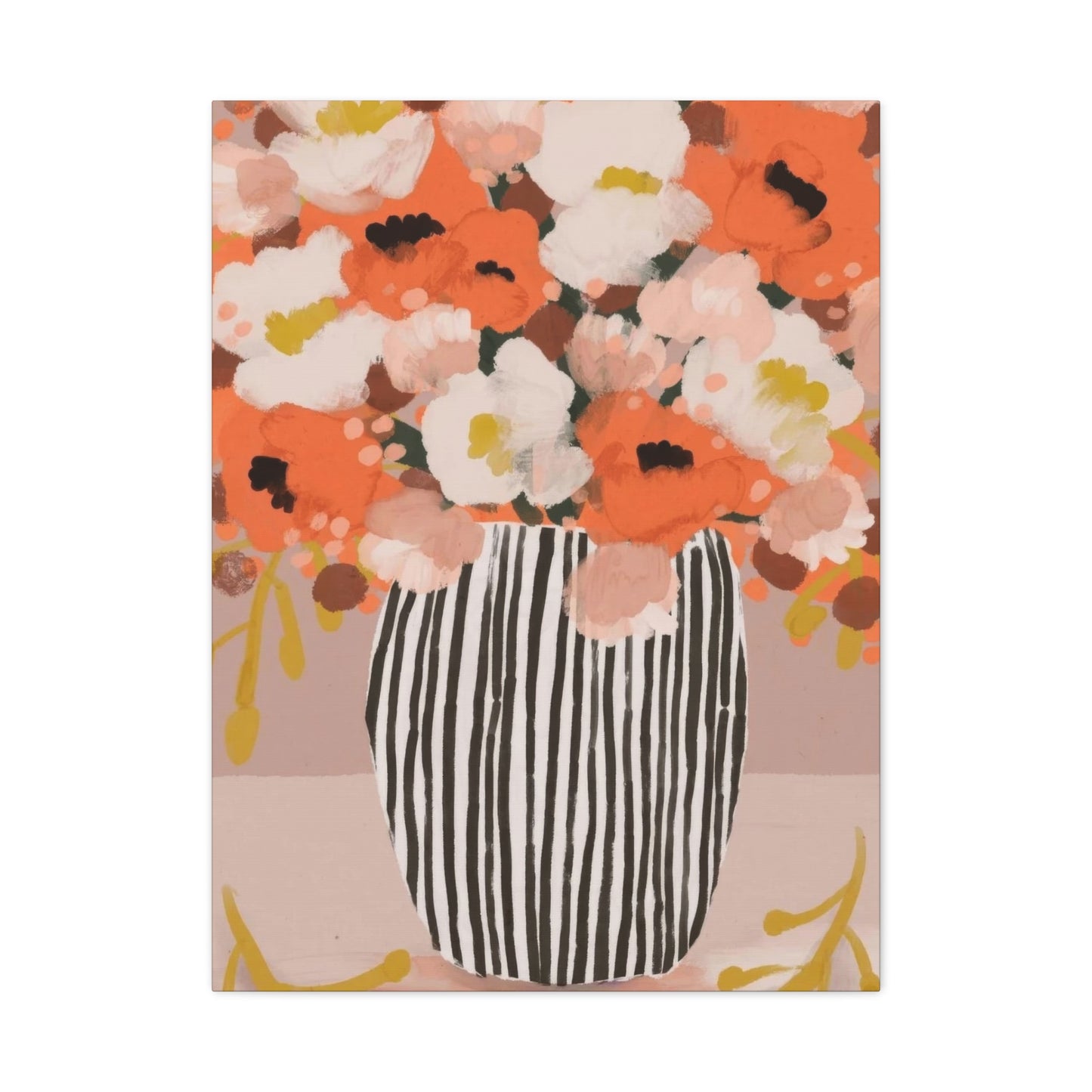
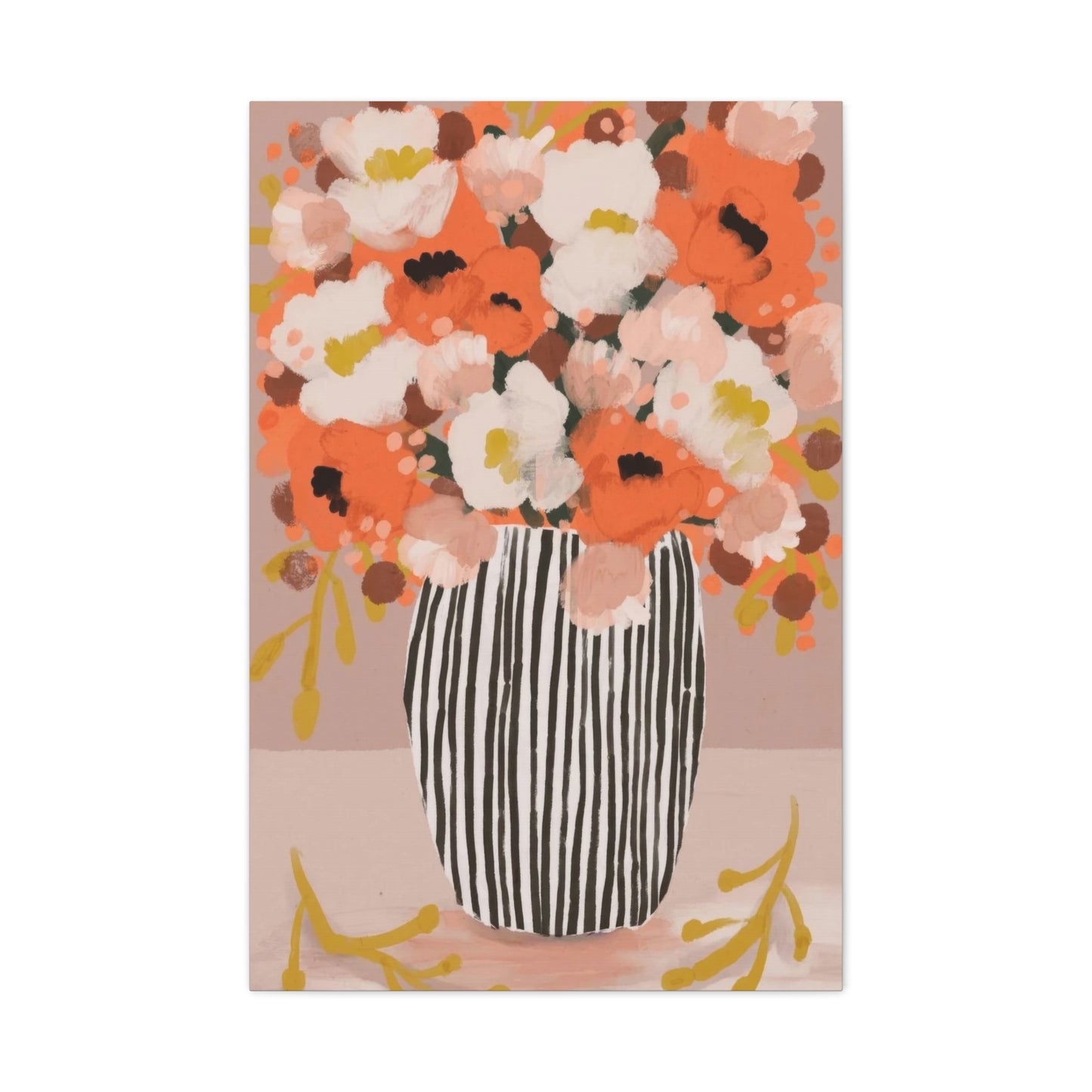
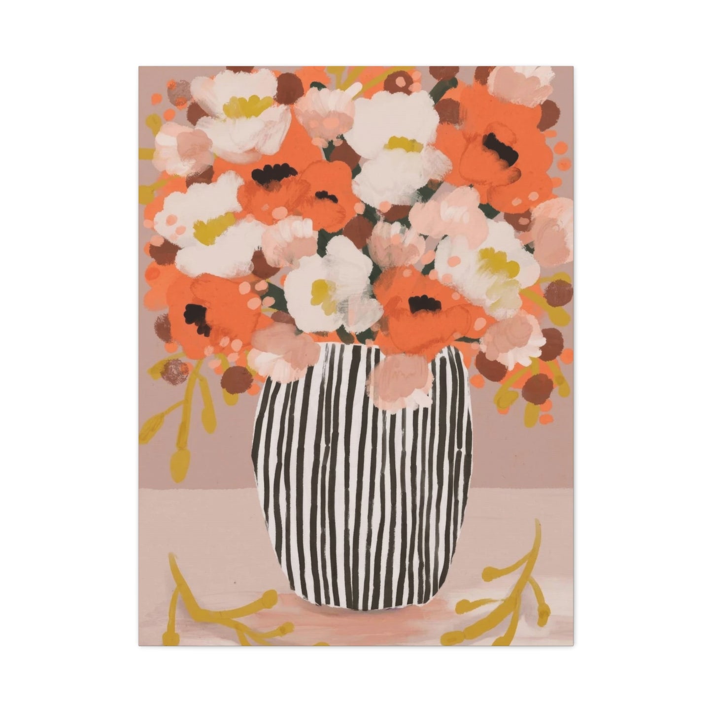
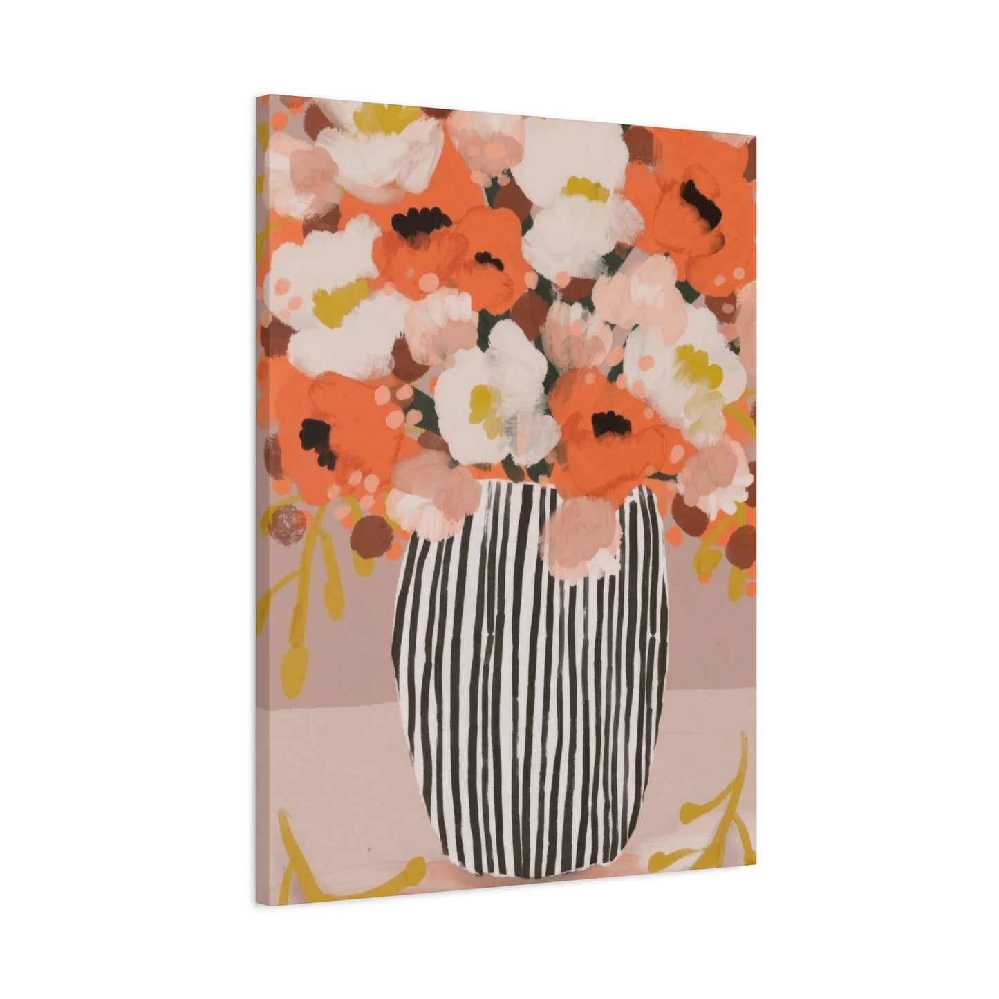
Transforming your living spaces with the captivating beauty of autumn blooms captured on canvas offers an exceptional way to bring warmth and character into your home. The rich palette of fall flowers, with their deep oranges, burgundies, golden yellows, and rustic browns, creates an atmosphere that resonates with comfort and natural elegance. When these seasonal treasures are immortalized through artistic canvas prints, they become more than mere decorations; they evolve into statement pieces that reflect the changing seasons and your personal style preferences.
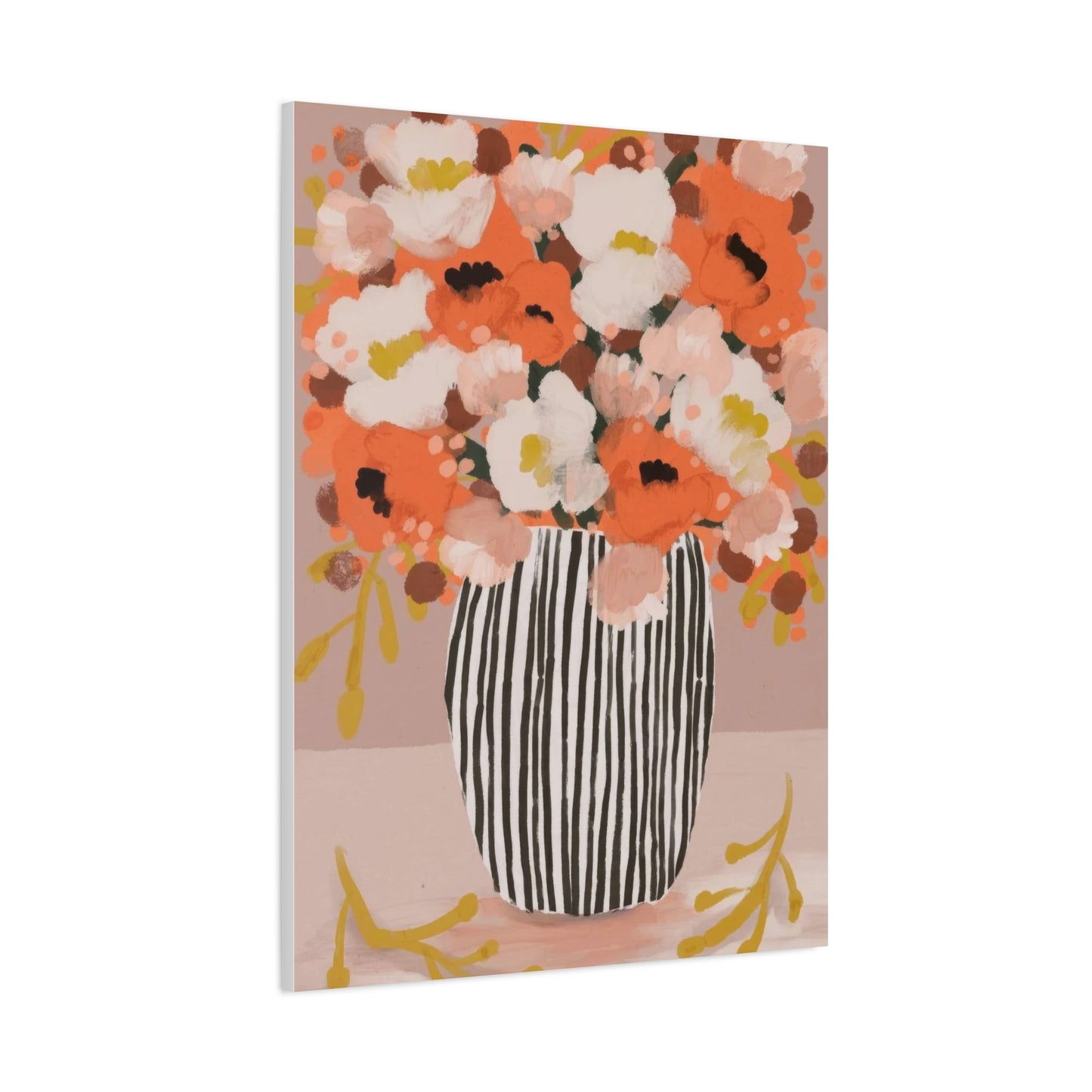
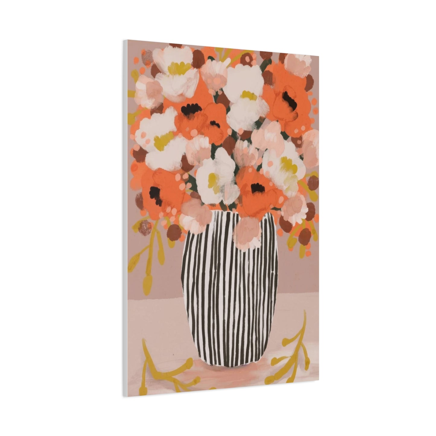
Canvas art featuring autumn blooms has experienced a remarkable surge in popularity among interior designers and homeowners alike. This trend stems from the versatile nature of fall floral imagery, which complements various design aesthetics from traditional farmhouse charm to contemporary minimalist spaces. The textured quality of canvas material adds depth and dimension to floral compositions, creating visual interest that flat prints simply cannot match. Additionally, the durability and longevity of canvas prints make them a worthwhile investment for those seeking to enhance their home environments with lasting beauty.
The emotional connection people feel toward autumn blooms runs deep, rooted in memories of harvest celebrations, cozy gatherings, and the natural transition between seasons. Incorporating these elements into your wall decor allows you to maintain that connection throughout the year, not just during the brief autumn months. Whether you prefer realistic botanical representations or abstract interpretations of fall flowers, canvas art provides countless opportunities to express your aesthetic vision while celebrating nature's most colorful season.
Capturing Nature's Transition Through Canvas Art
The essence of autumn lies in its transformative beauty, where nature puts on one final spectacular show before winter's arrival. Canvas prints that capture this transition offer viewers a window into moments of breathtaking natural splendor. Artists who specialize in autumn floral compositions understand how to harness the unique lighting conditions of fall, where golden hour seems to extend throughout the day, casting everything in warm, honeyed tones that make colors appear more vibrant and saturated.
Professional photographers and painters who focus on autumn blooms often venture into fields, gardens, and wild meadows during peak season to capture flowers at their most magnificent state. These artists pay careful attention to composition, ensuring that each bloom is positioned to showcase its unique characteristics while contributing to the overall harmony of the piece. The process of transferring these images to canvas involves sophisticated printing techniques that preserve color accuracy and tonal range, resulting in artwork that faithfully represents the original scene's emotional impact.
Canvas material itself plays a crucial role in how autumn floral art is perceived. The slight texture of canvas weave adds a painterly quality to photographic prints, blurring the line between photography and traditional painting. This characteristic makes canvas particularly suitable for floral subjects, as it enhances the organic nature of the imagery while providing a tactile element that invites closer inspection. When properly stretched and mounted, canvas prints develop a three-dimensional quality that creates subtle shadows along the edges, further enhancing their visual appeal and making them appear more like original paintings than reproductions.
The color retention capabilities of modern canvas printing technology ensure that the vibrant hues of autumn flowers remain true for years to come. Advanced archival inks resist fading from sunlight exposure and maintain their brilliance through various environmental conditions. This longevity is particularly important for autumn-themed artwork, as the colors themselves are integral to the emotional response these pieces evoke. The deep reds of autumn dahlias, the bright yellows of chrysanthemums, and the burnt oranges of marigolds all retain their intensity, allowing your canvas art to remain as impactful as the day you first hung it on your wall.
Designing Spaces with Fall Floral Compositions
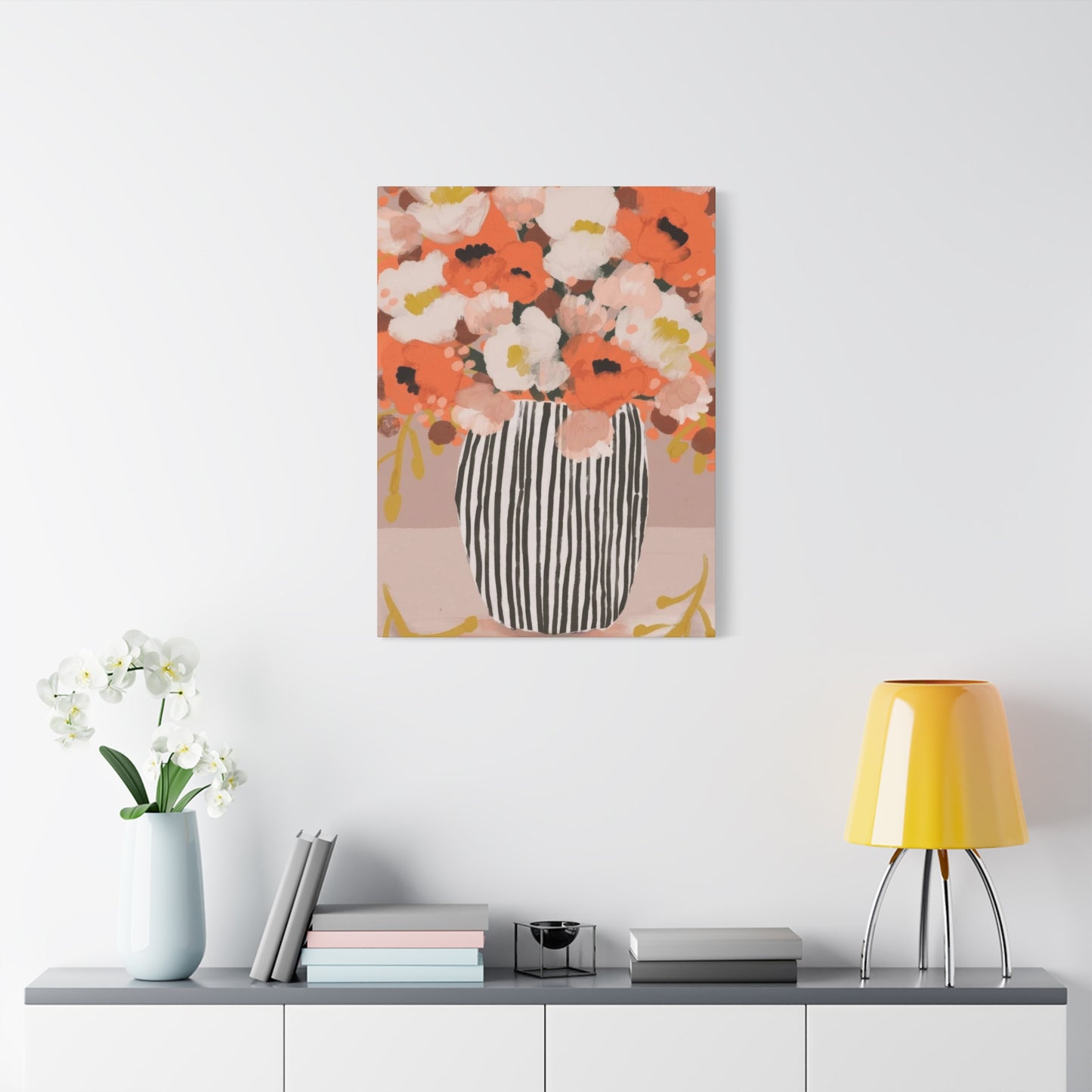
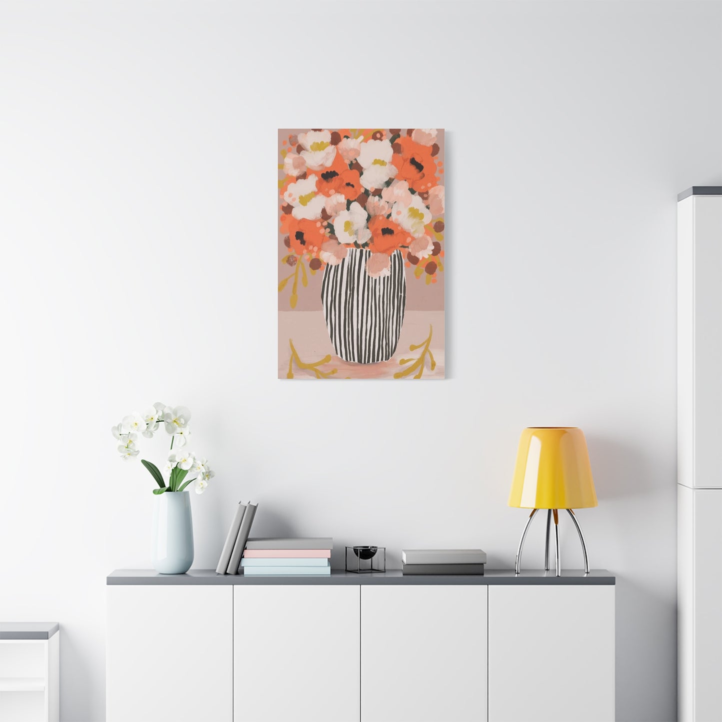
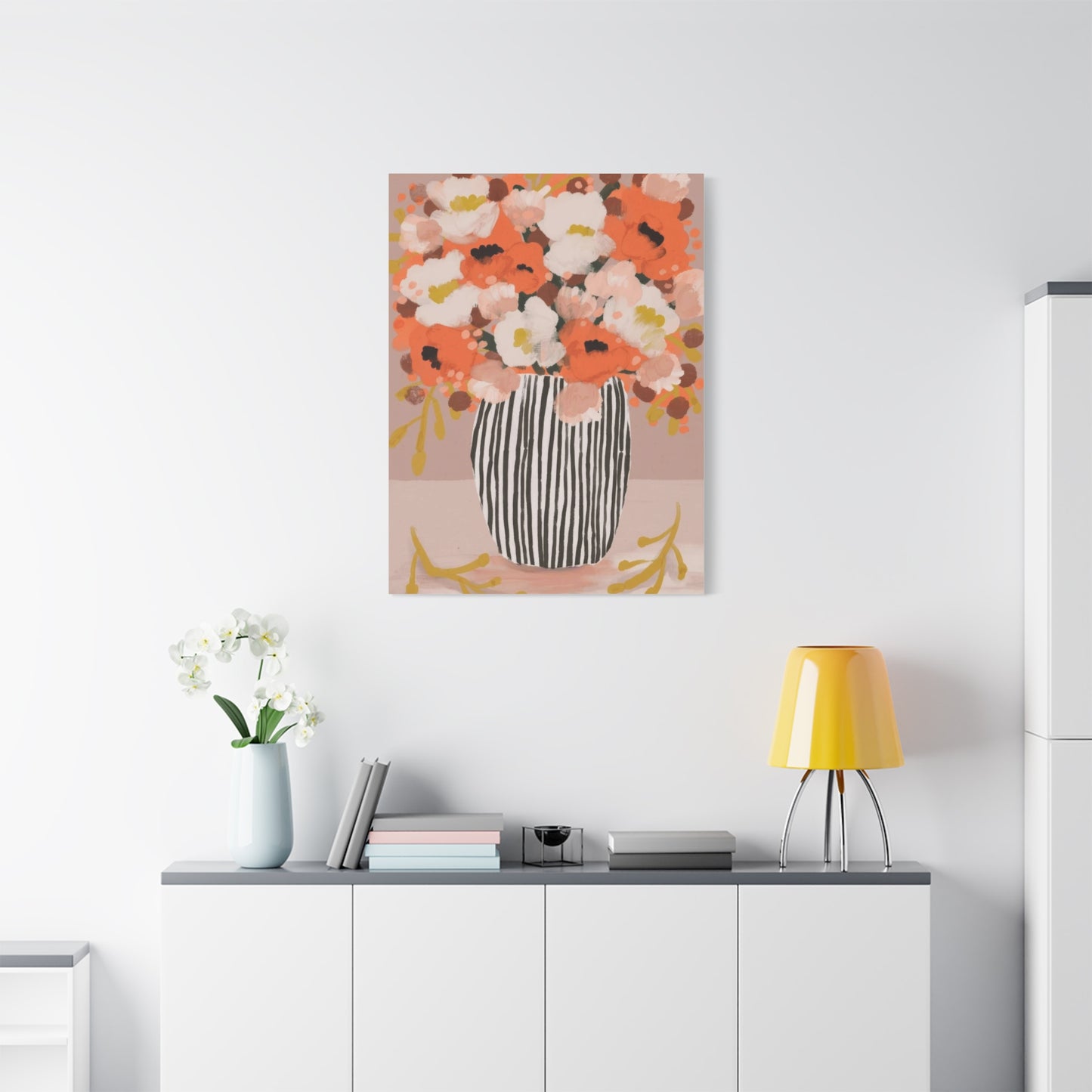
Integrating fall floral canvas art into your interior spaces requires thoughtful consideration of existing design elements, color schemes, and the atmosphere you wish to create. The versatility of autumn bloom imagery means it can adapt to various room functions and design styles, but strategic placement and selection ensure maximum impact. Living rooms, often serving as the heart of the home, provide ideal settings for larger canvas prints featuring expansive autumn floral scenes that become focal points for conversation and contemplation.
When selecting canvas art for living areas, consider the scale of your space and existing furniture arrangements. A substantial canvas print depicting a field of autumn wildflowers can anchor a seating area, drawing the eye upward and creating a sense of expanded space. The warm color palette typical of fall florals naturally complements neutral furnishings in beiges, taupes, and soft grays, while also harmonizing beautifully with deeper jewel tones like emerald, sapphire, and amethyst that are popular in contemporary interiors.
Bedrooms benefit immensely from the calming influence of autumn floral canvas art. The organic forms and warm colors associated with fall flowers create a restful atmosphere conducive to relaxation and sleep. Positioning a canvas print above the headboard establishes a clear focal point while maintaining the serene ambiance necessary for restful spaces. Smaller complementary pieces on adjacent walls can create a curated gallery effect without overwhelming the room's peaceful character. Consider selecting canvas prints with softer color palettes featuring muted golds, gentle rusts, and cream tones for bedroom applications, as these hues promote tranquility while still capturing autumn's essence.
Dining areas present unique opportunities for displaying autumn bloom canvas art, as these spaces are inherently connected to harvest themes and seasonal abundance. A canvas print featuring arrangements of fall flowers mixed with seasonal elements like pumpkins, gourds, or wheat stalks reinforces the connection between food, nature, and gathering. The warm tones of autumn florals enhance appetite and create an inviting atmosphere for meals and entertaining. Consider how lighting in your dining area will interact with your canvas art; pendant lights or chandeliers positioned to cast gentle illumination on the artwork will enhance its colors and create dynamic visual interest as natural light changes throughout the day.
Home offices and studies can be energized by the inclusion of autumn floral canvas art, which provides visual relief from screen time while maintaining a professional aesthetic. The natural subject matter offers moments of mental respite during work hours, while the sophisticated color palettes associated with fall florals convey maturity and refinement. Positioning canvas prints within your line of sight but not directly behind monitors ensures you can appreciate the artwork during breaks without creating distracting reflections on screens. Select pieces with balanced compositions and moderate color saturation to maintain focus while still benefiting from the mood-enhancing properties of natural imagery.
Selecting Colors That Transform Interior Atmospheres
The color psychology behind autumn floral canvas art plays a significant role in how these pieces affect our emotional states and perception of space. The characteristic warm palette of fall flowers triggers associations with comfort, security, and natural abundance. Understanding how specific colors within autumn bloom compositions influence mood and spatial perception allows for more intentional selection of canvas art that serves both aesthetic and psychological purposes within your home.
Rich burgundy and deep red tones found in autumn dahlias, late-blooming roses, and ornamental grasses create feelings of warmth and intimacy. These colors are particularly effective in spaces where you want to encourage close conversation and connection, such as reading nooks, intimate dining areas, or master bedrooms. Canvas prints dominated by these deeper hues have a grounding effect, making rooms feel more enclosed and protected, which can be especially desirable during colder months when we naturally seek coziness and refuge indoors.
Golden yellows and bright oranges, reminiscent of chrysanthemums, sunflowers, and marigolds, infuse spaces with energy and optimism. These vibrant tones are excellent choices for areas where you want to promote activity, creativity, and social interaction. Kitchen spaces, breakfast nooks, and family rooms all benefit from the uplifting qualities of these sunlit shades. Canvas prints featuring predominantly yellow and orange autumn florals can also help counteract the diminishing natural light that occurs as fall progresses into winter, maintaining a sense of brightness and vitality even on overcast days.
Earthy browns, taupes, and bronzes that appear in dried grasses, seed pods, and the stems of autumn flowers provide neutral foundation tones that anchor more vibrant colors. These understated hues are incredibly versatile, working seamlessly with both bold and subtle color schemes. Canvas art that emphasizes these earthy tones offers sophistication and restraint, making it appropriate for professional spaces like home offices or formal sitting rooms. The natural quality of these colors also ensures they remain relevant across changing design trends, making them wise choices for those seeking lasting appeal in their wall art selections.
Touches of green that persist in autumn floral compositions, whether in leaves that haven't fully turned or in evergreen foliage that provides contrast to blooms, offer important visual balance. These green elements prevent autumn-themed canvas art from feeling too monochromatic and provide visual rest points within busy floral compositions. The particular shades of green found in fall imagery tend toward olive, sage, and forest tones rather than the bright lime or kelly greens of spring, maintaining cohesion with the overall autumn palette while providing essential color diversity.
Creating Gallery Walls with Seasonal Themes
Gallery walls featuring multiple canvas prints of autumn blooms allow for creative expression while providing flexibility in how you present seasonal themes. This approach enables you to combine various sizes, orientations, and specific floral subjects to create a cohesive yet dynamic display. The key to successful gallery walls lies in establishing visual connections between individual pieces through consistent color palettes, complementary framing choices, or thematic continuity while maintaining enough variety to keep the arrangement interesting.
Planning your gallery wall layout before making any holes in your walls is essential for achieving professional results. Begin by laying out your canvas prints on the floor in various configurations, experimenting with spacing, arrangement patterns, and which pieces occupy central versus peripheral positions. Photograph different arrangements from above to compare options and share with others for feedback. Consider creating paper templates in the exact sizes of your canvas prints that you can temporarily affix to the wall with removable tape, allowing you to visualize the final arrangement in its intended location before committing to permanent installation.
Symmetrical gallery wall arrangements featuring autumn floral canvas prints create formal, orderly presentations that work well in traditional or transitional interiors. These layouts often feature a central anchor piece surrounded by smaller prints in matching proportions, creating a structured grid or geometric pattern. The predictability of symmetrical arrangements can be particularly effective when the individual canvas prints themselves feature busy floral compositions; the orderly layout provides visual structure that prevents the overall display from feeling chaotic despite the organic complexity of the subject matter.
Asymmetrical gallery walls offer more contemporary, eclectic presentations that can accommodate canvas prints of varying sizes and proportions. These layouts require careful attention to visual weight and balance, ensuring that larger or more colorful pieces don't create lopsided compositions. When working with autumn floral themes, consider how the color density and subject prominence in each canvas print affects its visual weight; a smaller print featuring intensely colored blooms against a dark background may carry as much visual presence as a larger print with softer tones and more negative space. Successful asymmetrical arrangements feel intentional rather than random, with clear relationships between adjacent pieces that guide the viewer's eye through the entire display.
Themed gallery walls that tell a specific story about autumn's progression offer engaging narratives through sequential imagery. You might arrange canvas prints chronologically, beginning with late summer blooms and progressing through fall's peak color to late-season dried flowers and seed heads. Alternatively, organize your gallery wall around a specific color journey, starting with warmer tones on one side and gradually transitioning to cooler autumn hues. These narrative approaches transform your wall into an educational and aesthetic experience, inviting viewers to engage more deeply with the seasonal themes presented.
Understanding Canvas Quality and Printing Methods
The technical aspects of canvas printing significantly impact the final appearance, longevity, and value of autumn floral wall art. Understanding these elements helps you make informed purchasing decisions and ensures your investment in canvas art delivers lasting satisfaction. Modern canvas printing encompasses various techniques, materials, and finishing options, each with distinct characteristics that affect how autumn bloom imagery is rendered and preserved over time.
Giclée printing represents the gold standard in canvas reproduction, utilizing archival-quality pigment-based inks and high-resolution printers to create museum-grade reproductions. This method excels at rendering the subtle color gradations and tonal nuances found in autumn floral photography and paintings. The term giclée itself derives from the French word for spray, referring to the fine mist of ink particles that build up color gradually through multiple passes. For autumn bloom canvas art, giclée printing captures the delicate transitions between light and shadow on petals, the subtle variations in foliage color, and the complex textures of flower centers with remarkable fidelity.
Canvas material composition affects both the visual characteristics and durability of the final product. Cotton canvas offers a traditional artist-quality substrate with a distinctive textured weave that enhances the handcrafted appearance of prints. This material readily accepts inks and provides excellent color vibrancy, making it ideal for autumn floral subjects where color intensity is paramount. Polyester canvas, while less traditional, offers superior resistance to moisture and environmental fluctuations, making it suitable for locations with higher humidity or temperature variations. Some premium canvas products blend cotton and polyester fibers, combining the aesthetic qualities of natural materials with enhanced durability.
Canvas weight and thickness, measured in ounces per square yard, influence how the material stretches, how it ages, and the final appearance of the print. Heavier canvas weights, typically ranging from eight to twelve ounces, provide more substantial feel and resist sagging over time. These weightier materials are particularly important for larger canvas prints of autumn florals, where significant unsupported spans need to maintain tension and flatness. The increased thickness also provides better ink absorption, resulting in colors that appear richer and more saturated, which enhances the warm, vibrant tones characteristic of fall floral imagery.
Stretching and mounting methods determine the final presentation of canvas prints and affect their long-term stability. Gallery wrapping, where the image extends around the edges of the stretcher frame, creates a contemporary borderless appearance that works particularly well with autumn floral subjects that don't have critical compositional elements that might be lost around the corners. Traditional wrapping, which folds white canvas edges around the frame, provides a cleaner look that may be preferable when canvas prints will be displayed in ornate frames. The depth of stretcher frames also varies, with deeper frames creating more pronounced three-dimensional effects that cast dramatic shadows and enhance the sculptural quality of canvas art.
Styling Techniques for Modern Living Areas
Contemporary interior design embraces clean lines, uncluttered spaces, and thoughtful object placement, principles that apply equally to displaying autumn floral canvas art in modern settings. The key lies in selecting pieces that complement rather than compete with the minimalist aesthetic while still providing the warmth and organic connection that makes autumn bloom imagery so appealing. Strategic styling ensures your canvas art enhances the modern character of your space rather than introducing visual discord.
Minimalist approach to autumn floral canvas art often involves selecting single large-scale pieces rather than multiple smaller prints. A substantial canvas featuring a close-up perspective of a single autumn bloom or a simplified composition of a few flowers creates dramatic impact without overwhelming the clean aesthetic of modern interiors. The scale of the piece commands attention while the focused subject matter maintains the uncluttered visual environment characteristic of contemporary design. Position these statement pieces with generous surrounding space, allowing the artwork to breathe and viewers to appreciate the simplicity of the composition without distraction.
Color coordination between your autumn floral canvas art and existing interior elements requires careful attention in modern spaces where color palettes tend toward restraint. Rather than matching colors exactly, which can feel forced and overly coordinated, seek complementary relationships that create subtle harmonies. If your modern living room features cool gray upholstery, canvas prints showcasing autumn blooms with lavender and silvery tones provide connection while maintaining the sophisticated coolness of the palette. Introduce small accent pieces in warmer autumn tones through throw pillows or decorative objects to bridge the gap between the coolness of the primary palette and the warmth of the floral art.
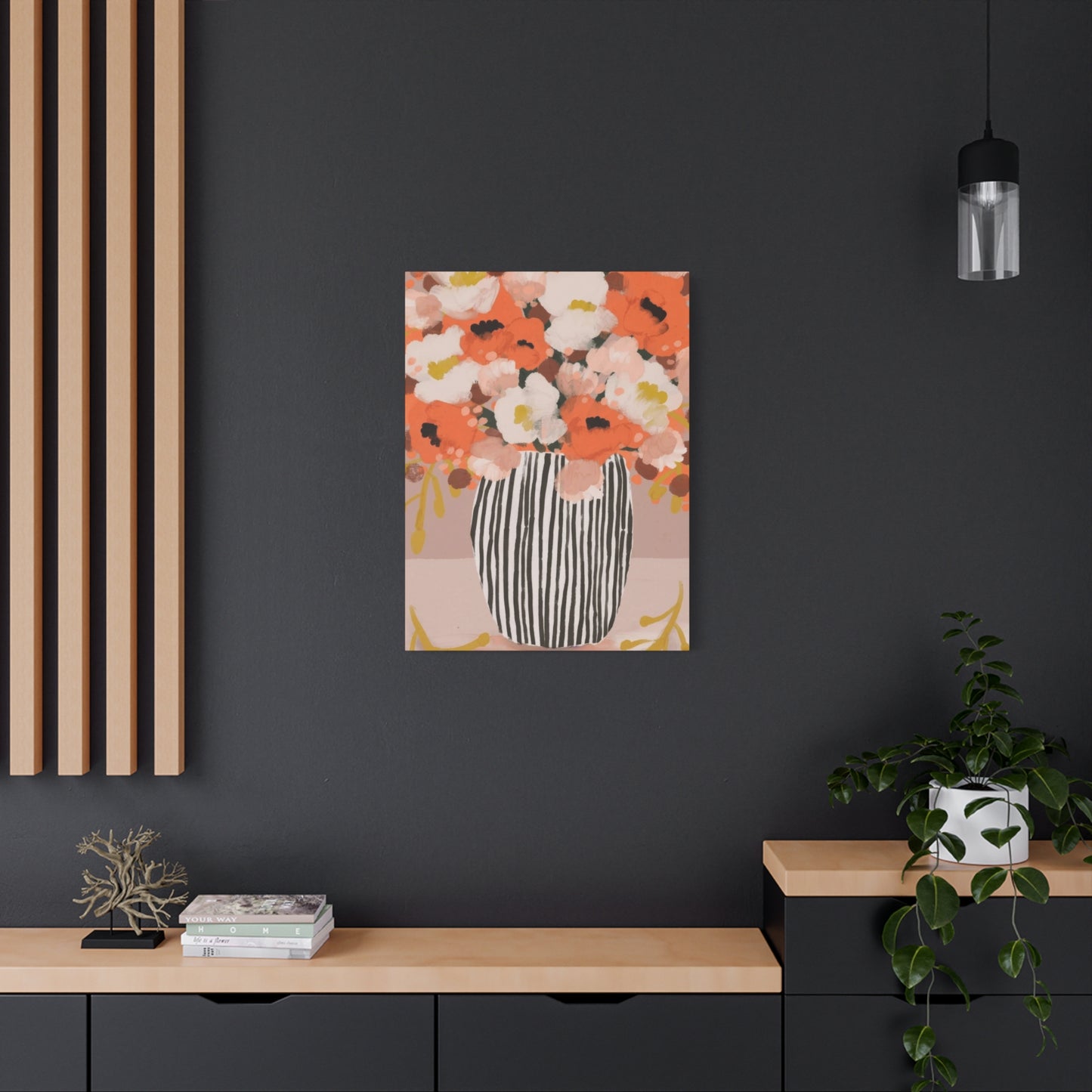
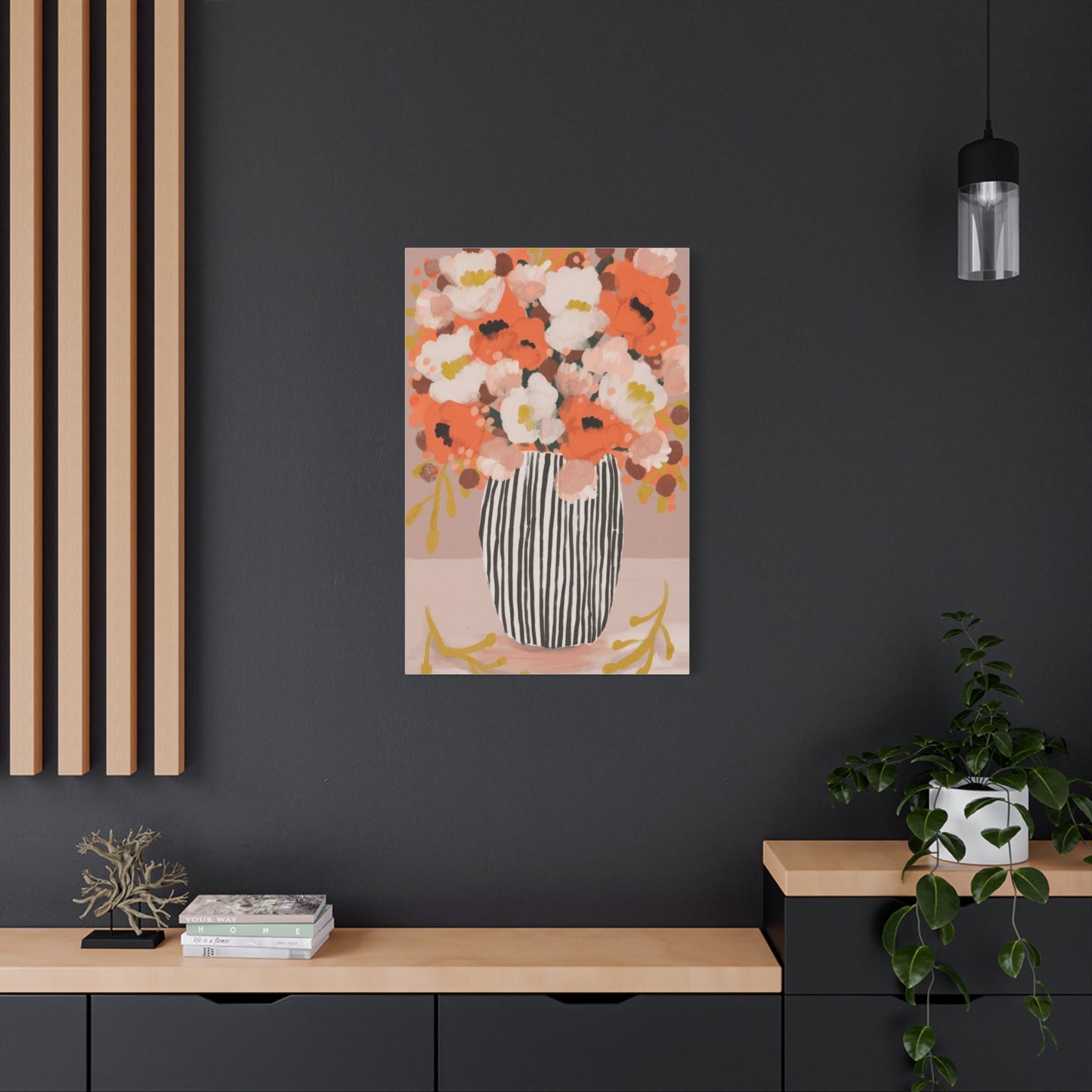
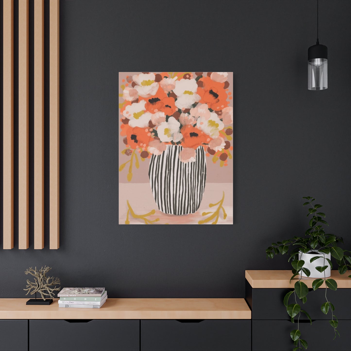
Contrast strategies can make autumn floral canvas art particularly striking in modern settings. Mounting a canvas with warm, highly saturated autumn colors against an expanse of crisp white wall creates dramatic tension that draws the eye and celebrates the artwork's subject matter. This approach works especially well in open-concept spaces where walls are sparse and each decorative element needs to justify its presence through significant visual contribution. The organic, complex forms of autumn flowers provide compelling counterpoint to the geometric precision of modern furniture and architectural elements, creating balance through juxtaposition rather than similarity.
Lighting plays a crucial role in how autumn floral canvas art performs within modern interiors. Track lighting, picture lights, or strategically positioned LED strips can dramatically enhance the depth and color vibrancy of canvas prints. In modern spaces where ambient lighting often comes from recessed fixtures or minimal pendant lights, adding dedicated art lighting ensures your autumn bloom canvas receives the illumination necessary to showcase its colors and details. Warm-toned LED lights complement the natural warmth of autumn florals, while cooler lights can create interesting tension by emphasizing the contrasts inherent in the imagery.
Incorporating Vintage Aesthetics with Floral Canvas
The enduring appeal of vintage-inspired interiors finds perfect expression through autumn floral canvas art that references historical botanical illustration traditions, romantic painting styles, and nostalgic representations of country gardens. These approaches to fall bloom imagery resonate with those who appreciate the stories embedded in older aesthetic sensibilities and the craftsmanship evident in traditional artistic methods. Selecting and styling vintage-character autumn canvas art requires understanding the visual language of historical periods and how to integrate these elements authentically into contemporary living spaces.
Victorian-influenced autumn floral canvas prints typically feature abundant, densely arranged blooms with rich, saturated colors and dramatic contrasts between light and dark. These compositions often include symbolic elements like ribbons, vases, or accompanying fruits that reference the Victorian language of flowers and the era's love of elaborate ornamentation. When incorporating Victorian-style autumn canvas art, consider pairing it with furniture featuring turned legs, tufted upholstery, and curved forms that echo the ornate character of the artwork. Richly patterned textiles in complementary autumn tones can create cohesive environments where the canvas art feels like an integral part of a carefully curated historical aesthetic.
Botanical illustration style canvas prints offer a more scientific yet equally vintage approach to autumn floral subjects. These pieces typically feature precise representations of individual flowers, often shown with stems, leaves, roots, and even cross-sections revealing internal structures. The refined quality of botanical illustrations, often set against aged or parchment-toned backgrounds, brings sophistication and educational interest to autumn canvas displays. Group several botanical-style prints featuring different fall flowers to create a studied, collector's arrangement that suggests both aesthetic appreciation and intellectual curiosity about the natural world.
Shabby chic interpretations of autumn florals on canvas embrace weathered, romantic aesthetics through soft color palettes, loose brushwork, and deliberately aged appearances. These pieces often feature autumn blooms in gentle rusts, faded golds, and dusty roses that suggest the passage of time and memories of gardens past. The canvas material itself may include intentional distressing or irregular edges that enhance the vintage character. When styling shabby chic autumn canvas art, incorporate distressed wood furniture, lace textiles, and accessories with patina to reinforce the nostalgic atmosphere. The key is achieving a collected-over-time appearance rather than overly matched coordination.
Farmhouse vintage style applies rustic simplicity to autumn floral canvas art, often featuring wildflowers, harvest arrangements in metal buckets or ceramic crocks, and compositions that emphasize the connection between flowers and agricultural traditions. These pieces typically employ more muted, natural color palettes that reflect organic pigments and sun-bleached tones. Canvas prints with this aesthetic work beautifully when integrated with reclaimed wood elements, industrial metal accents, and simple, functional furniture pieces. The unaffected charm of farmhouse autumn florals creates welcoming, approachable environments that celebrate seasonal beauty without pretension.
Seasonal Rotation Strategies for Wall Displays
While autumn bloom canvas art offers timeless appeal that justifies year-round display, some homeowners enjoy rotating their wall art seasonally to maintain fresh perspectives and celebrate the unique character of each time of year. This approach treats canvas art as part of an evolving decorative scheme that responds to changing light, outdoor landscapes, and personal mood preferences throughout the calendar. Developing a seasonal rotation system requires planning, appropriate storage solutions, and a collection of canvas prints that work together despite being displayed at different times.
Building a rotational canvas collection begins with establishing a core selection for each season while maintaining visual connections between pieces that will occupy the same spaces at different times. Your autumn floral canvas prints might emphasize warm oranges and deep reds, while spring alternatives feature pastels and fresh greens, summer pieces showcase bright, saturated hues, and winter selections incorporate cool blues and silver tones. Despite these seasonal color shifts, maintain consistent sizing and general compositional styles to ensure smooth transitions that don't require complete room reorganizations with each change.
Storage considerations become essential when implementing seasonal canvas rotation. Proper storage protects your investment in artwork while keeping pieces ready for their next display period. Canvas prints should never be stored in environments with extreme temperatures, high humidity, or significant temperature fluctuations, as these conditions can cause canvas to expand and contract, potentially leading to cracking of the printed surface or deterioration of stretcher frames. Dedicate a climate-controlled closet, unused bedroom, or other appropriate space for storing off-season canvas pieces. Wrap each canvas in acid-free tissue paper or clean cotton sheets to prevent dust accumulation while allowing the material to breathe.
Installation and removal procedures should minimize wall damage and simplify the rotation process. Consider using picture hanging systems with adjustable hooks that allow you to swap canvas prints without creating new wall holes each season. These systems typically involve a mounted rail from which adjustable cables or cords descend, providing flexibility in positioning while maintaining secure support. For those preferring traditional hanging methods, maintain careful records with photographs showing exact placement of hanging hardware, measurements from corners or ceiling lines, and any special leveling considerations. These records eliminate guesswork when rehang seasonal pieces and ensure consistent presentation each year.
Transitional timing deserves thoughtful consideration when implementing seasonal canvas rotation. Rather than making all changes based strictly on calendar dates, respond to actual environmental conditions and your personal readiness for seasonal transitions. You might display autumn floral canvas art from late August through November, capturing the full span of fall's progression rather than limiting display to the official astronomical season. Similarly, don't feel obligated to change all pieces simultaneously; gradual transitions where you swap one or two canvas prints at a time can feel more organic and less disruptive to your living environment.
Complementary Decor Elements for Cohesive Rooms
Creating truly cohesive interiors requires considering how autumn floral canvas art interacts with all other decorative elements within a space. While the canvas print serves as a focal point, supporting accessories, textiles, and furnishings either reinforce or undermine its impact. Thoughtful selection of complementary decor creates unified environments where autumn bloom imagery feels purposeful rather than arbitrary, contributing to an overall aesthetic vision that extends beyond the artwork itself.
Textile selections offer immediate opportunities to echo colors and themes from your autumn floral canvas art. Throw pillows in fabrics that pick up accent colors from the artwork create visual connections without requiring exact matches. If your canvas features autumn dahlias with burgundy petals and golden centers, pillows in mustard yellow, burnt orange, or deep wine tones distributed throughout the seating area will create color echoes that tie the space together. Consider varying textures within your coordinating color palette; velvet pillows in rich jewel tones complement the visual depth of canvas art, while linen or cotton textiles in autumn hues maintain the organic, natural character of floral subjects.
Window treatments provide significant opportunities to either complement or clash with autumn canvas art, given their substantial visual presence and impact on room lighting. Curtains in neutral tones allow floral canvas art to remain the star attraction while still influencing the room's overall warmth through fabric texture and weight. Alternatively, window treatments in colors drawn from your autumn canvas prints can create dramatic, enveloping environments where walls and windows work together to immerse occupants in a particular color story. Consider how natural light filtering through curtains affects the appearance of your canvas art throughout the day; sheer panels in warm cream or honey tones will cast golden light that enhances autumn floral colors, while heavier drapes control harsh midday sun that might cause glare or fading.
Furniture finishes and upholstery fabrics establish the foundational palette against which autumn floral canvas art will be perceived. Wood tones ranging from honey oak to deep walnut naturally complement the warm color palette of fall florals, creating harmonious relationships rooted in natural material connections. Upholstered furniture offers more flexibility for coordination; neutral upholstery in beige, gray, or taupe allows autumn canvas art to introduce color drama, while upholstery in complementary autumn tones creates more saturated, cocooning environments. Consider the formality level of both your furniture and artwork; formal, symmetrical furniture arrangements pair well with more composed, traditional autumn floral compositions, while relaxed, asymmetrical furniture layouts complement loosely arranged, organic floral subjects.
Decorative accessories provide finishing touches that can either enhance or overwhelm the presentation of autumn canvas art. Restraint often yields better results than abundance; a few carefully selected objects in materials and colors that complement your floral artwork will be more effective than numerous competing decorative items. Consider natural materials like wood, stone, ceramic, and metal that reinforce the organic quality of autumn blooms. A substantial ceramic vase in a glaze color pulled from your canvas art, positioned on a console table beneath the artwork, creates intentional connection. Metallic accents in warm golds, coppers, and bronzes add subtle shimmer that complements the natural gleam of canvas material while echoing the precious quality of peak autumn color.
Framing Options to Enhance Canvas Presentations
While canvas prints are often displayed without frames, allowing the gallery-wrapped edges to remain visible, framing can elevate autumn floral artwork and provide additional protection while connecting canvas pieces to other framed elements within your interior. Understanding various framing approaches and their aesthetic implications helps you decide when to frame canvas prints and which frame styles best serve your autumn bloom imagery and overall design vision.
Floating frames create contemporary presentations where canvas prints appear to hover within the frame boundaries, suspended with a small gap between the canvas edges and the frame's inner dimension. This approach provides the structure and finish of framing while maintaining the modern, borderless aesthetic of stretched canvas. For autumn floral subjects, floating frames in natural wood finishes complement the organic subject matter and warm color palette, while black or metal frames provide sophisticated contrast that makes the colors appear more vibrant. The depth of floating frames adds dimensional interest and casts subtle shadows that enhance the three-dimensional quality of canvas prints.
Traditional picture frames with deep rabbets can accommodate canvas prints, particularly when you want to create visual connections between canvas pieces and other framed artwork in the same space. This approach works especially well when mixing media types in gallery wall arrangements; framing both photographic prints and canvas paintings in coordinating frames unifies the display despite the different substrates. When selecting traditional frames for autumn floral canvas, consider how frame ornament levels interact with the visual complexity of the subject matter. Heavily carved, gilded frames can enhance romantic, vintage-style floral compositions but may overwhelm contemporary interpretations of autumn blooms. Simple frames with clean profiles often serve autumn canvas art better, providing definition without competing for attention.
Natural wood frames in various finishes offer versatile options for autumn floral canvas that reinforce connections to the natural world. Light woods like maple or ash provide contrast with the typically warm palette of fall flowers while maintaining organic material compatibility. Medium tones such as cherry or alder create harmonious relationships with autumn oranges and golds, nearly blending with the artwork's color scheme. Dark walnut or espresso frames provide dramatic enclosure that makes lighter elements within autumn floral compositions appear more luminous through contrast. Consider how prominent wood grain is in frames; highly figured woods add visual texture that can either complement or compete with busy floral compositions.
Metal frames present opportunities for both industrial-modern and traditional-formal presentations depending on the finish and profile selected. Matte black metal frames have become contemporary staples that provide crisp, clean boundaries for canvas art while receding visually to let the artwork dominate attention. These frames work particularly well with autumn floral subjects that include significant negative space or lighter backgrounds, as the dark frame creates strong edge definition. Metallic finishes in gold, copper, or bronze can mirror the warm metallics often present in autumn light and color palettes, creating luxurious presentations appropriate for more formal spaces. The narrow profiles typical of metal frames make them especially suitable for smaller canvas prints where thicker wood frames might overwhelm the image area.
Placement Guidelines for Maximum Visual Impact
Strategic placement of autumn floral canvas art significantly influences its effectiveness within your interior spaces. Understanding principles of sight lines, focal points, and spatial relationships helps you position artwork where it will receive appropriate attention while contributing to balanced, harmonious room compositions. These placement considerations apply whether you're hanging a single statement piece or arranging multiple canvas prints in more complex configurations.
Eye-level positioning represents the fundamental guideline for hanging canvas art, with the vertical center of the artwork typically placed between fifty-seven and sixty inches from the floor. This height range corresponds to average adult eye level and ensures comfortable viewing without requiring viewers to crane their necks upward or bend down to appreciate the artwork. For autumn floral canvas prints hung in areas where people will primarily view them while seated, such as dining rooms or bedrooms with prominent seating areas, adjust hanging height downward by several inches to account for the lowered sight line. Conversely, artwork in hallways or galleries where viewers remain standing can adhere to or even slightly exceed standard eye-level recommendations.
Relationship to furniture requires careful consideration when positioning autumn canvas art above sofas, beds, consoles, or other substantial pieces. The general principle suggests artwork width should span between two-thirds and three-quarters of the furniture piece width below it, creating visual balance without the art appearing overwhelmed by or dwarfing the furniture. Maintain a gap of approximately six to twelve inches between the furniture top and the canvas bottom, providing separation while maintaining clear association between the pieces. This spacing prevents the artwork from appearing to rest on the furniture while keeping the elements visually connected as a unit.
Architectural feature integration considers how autumn floral canvas relates to windows, doorways, fireplaces, and built-in elements within your space. Positioning canvas art to align with these architectural features creates organized, intentional appearances. For example, centering a canvas print over a fireplace mantel creates symmetrical formality, while positioning artwork to align its edge with window trim suggests more relaxed, collected arrangements. Consider how the colors and lighting from windows will interact with your autumn canvas art; direct sunlight can cause glare and color fading, so position artwork perpendicular to windows rather than directly opposite them when possible.
Negative space around canvas art is equally important as the artwork itself in creating balanced, sophisticated presentations. Resist the temptation to fill every wall surface with art or accessories; generous empty space surrounding your autumn floral canvas allows the piece to breathe and gives viewers' eyes rest points. This principle is especially important with smaller canvas prints, which can appear lost or cluttered when surrounded by too many competing elements. Create clear visual separation between your autumn artwork and other wall-mounted items, using either physical distance or intervening furniture to establish distinct zones that prevent visual confusion.
Color Temperature Balance in Room Design
The inherently warm color temperature of autumn floral canvas art influences how spaces feel and how they relate to other temperature-based color schemes within your home. Understanding color temperature theory and how to create intentional temperature relationships allows you to harness the psychological effects of autumn bloom imagery while maintaining visual interest through contrast or creating enveloping warmth through harmony.
Warm color dominance characterizes most autumn floral canvas art, with reds, oranges, yellows, and browns creating cozy, energizing, or appetite-stimulating effects depending on their specific hues and saturation levels. When building upon this inherent warmth, select supporting colors from the warm side of the color wheel, including additional variations of red, orange, yellow, and warm-toned neutrals like camel, terracotta, and golden beige. This approach creates immersive environments where temperature consistency produces strong emotional effects; rooms designed around warm autumn palettes feel inviting, comfortable, and protective. The potential challenge with exclusively warm palettes is their potential to feel overwhelming or claustrophobic in smaller spaces or in regions with hot climates where psychological coolness is desirable.
Cool contrast strategies introduce color temperature opposition to create dynamic, visually engaging spaces that prevent autumn floral warmth from becoming monotonous. Pairing autumn bloom canvas art with cool gray walls, icy blue textiles, or silvery metallic accessories generates temperature tension that makes both warm and cool elements appear more vibrant through contrast. This approach is particularly effective in modern or contemporary interiors where intentional tension and juxtaposition are valued aesthetic principles. The warm organic forms of autumn flowers gain additional impact when surrounded by cool, crisp environments, while the cool elements prevent the space from feeling too saturated with warmth.
Neutral temperature balance employs true neutral colors that contain equal amounts of warm and cool undertones, creating environments where autumn floral canvas art provides the primary temperature direction without overwhelming commitment to warmth. Greiges (gray-beige hybrids), perfect taupes, and balanced creams serve as diplomatic backgrounds that allow autumn artwork to shine while maintaining flexibility for seasonal decoration changes or evolving style preferences. This approach offers practical advantages for those who rotate artwork seasonally, as neutral foundations accommodate winter's cool palettes and spring's mixed temperatures equally well as autumn's warmth.
Lighting temperature considerations extend color temperature principles beyond pigment into illumination. The light sources in your space significantly affect how autumn floral canvas art appears and how it influences the room's overall temperature feel. Warm LED bulbs with color temperatures around twenty-seven hundred Kelvin enhance the cozy character of autumn florals, making oranges more vibrant and creating cohesive warmth throughout the space. Cool daylight bulbs around five thousand Kelvin create contrast that can either enliven or clash with autumn imagery depending on your intentions and the specific colors in your canvas art. Consider installing dimmer switches that allow you to adjust light intensity and, if using smart bulbs, even temperature throughout the day to optimize how your autumn canvas appears under different conditions.
Size Selection for Different Wall Configurations
Choosing appropriately sized canvas prints for your specific wall dimensions and spatial contexts ensures autumn floral artwork makes intended impacts without appearing dwarfed by expansive walls or overwhelming smaller spaces. Understanding how size relates to viewing distance, room scale, and desired prominence helps you select canvas dimensions that feel purposeful and proportionate within your particular interior environments.
Large-scale canvas prints, typically measuring forty by sixty inches or larger, command attention and work best in spacious rooms with substantial wall areas and furniture of corresponding scale. These significant pieces bring autumn floral subjects to life-size or larger-than-life proportions, allowing viewers to appreciate intricate details while also creating dramatic focal points visible from across rooms. In open-concept living areas, oversized autumn canvas art helps define zones and provides visual anchoring for furniture groupings. The considerable cost and commitment involved with large canvas pieces necessitates careful consideration of long-term appeal; select timeless autumn compositions that transcend temporary trends and that you'll continue appreciating for years.
Medium-sized canvas prints, generally ranging from twenty by thirty inches to thirty by forty inches, offer versatility suitable for most residential applications. These proportions work effectively above sofas, beds, and console tables while remaining manageable for rearrangement if furniture layouts change. Medium canvas prints of autumn florals provide sufficient scale to appreciate compositional elements and color relationships without requiring the substantial wall space or investment that large pieces demand. Consider using multiple medium-sized canvases in coordinated arrangements to achieve the impact of larger pieces while maintaining flexibility and distributing visual weight across wall areas.
Small canvas prints, typically smaller than twenty by thirty inches, excel in creating intimate vignettes, filling narrow wall spaces, and building complex gallery arrangements. Individual small pieces featuring close-up perspectives of autumn blooms can be incredibly impactful when viewed from appropriate distances, revealing details that larger compositions might miss. Multiple small canvas prints arranged in grids or organic clusters create significant visual presence while allowing for creative expression through varied arrangements. The affordable nature of smaller canvas pieces enables experimentation with different autumn floral subjects, artistic styles, and arrangement configurations without substantial financial risk.
Conclusion
As the leaves turn golden and the air takes on that unmistakable crispness, embracing the spirit of autumn through wall art offers a wonderful way to transform any space into a warm and inviting sanctuary. Autumn bloom wall art serves as a beautiful bridge between the changing season outside and the comfort within our homes. Through thoughtful selection of colors, textures, and motifs, it is possible to infuse interiors with the cozy, vibrant energy that autumn uniquely brings. This art not only decorates walls but also creates an atmosphere of warmth, nostalgia, and connection to nature’s seasonal rhythms.
One of the most compelling reasons to incorporate autumn bloom-themed wall art is its ability to evoke the senses and emotions tied to fall. Rich hues like burnt orange, deep reds, amber, and golden yellows mirror the tapestry of autumn foliage, instantly creating a cozy ambiance. These colors, when paired with natural elements such as leaves, flowers, and branches, help to soften any space and invite feelings of comfort and relaxation. The right artwork can remind us of crisp walks through wooded trails, the scent of spiced pumpkin, or the gentle crackling of a fireplace, making the home a haven during shorter, cooler days.
Beyond color and imagery, autumn bloom wall art offers incredible versatility and creativity in design. Whether it’s a delicate watercolor painting of chrysanthemums and marigolds, a bold abstract piece inspired by falling leaves, or a rustic photographic print capturing the beauty of late-season blooms, there is something to suit every style and taste. This flexibility allows homeowners to personalize their décor while staying true to the season’s essence. Layering these pieces with complementary textures like woven throws, wooden frames, or linen curtains further enhances the feeling of warmth and depth.
Another key aspect of cozying up with autumn bloom wall art lies in its capacity to foster mindfulness and intentional living. As autumn symbolizes a time of harvest, reflection, and preparation, decorating with art that celebrates these themes encourages a slower, more deliberate approach to life. This intentionality helps transform homes from mere living spaces into mindful retreats where moments are savored and the changing seasons are honored. When wall art resonates with these seasonal rituals, it adds meaning beyond aesthetics, deepening the emotional connection to the environment.
Moreover, choosing autumn bloom art supports local artists and sustainable practices. Many creators draw inspiration from their surroundings and craft pieces using eco-friendly materials, emphasizing the importance of preserving the natural world. Supporting such work not only enriches a home’s atmosphere but also aligns with values of environmental stewardship. Incorporating handcrafted or limited-edition pieces adds uniqueness and authenticity, making your seasonal décor feel special and heartfelt.
In addition, the strategic placement of autumn-inspired art can dramatically impact the overall mood and flow of a room. Well-placed artwork acts as a focal point that anchors other design elements like cushions, rugs, and lighting, creating a cohesive and inviting environment. By thoughtfully arranging autumn bloom pieces, you can guide the eye and inspire comfort in both small apartments and spacious living rooms. The balance between art, furniture, and natural light contributes to a harmonious space that invites relaxation and social connection.
It’s also worth noting that autumn bloom wall art invites a playful interaction with the cycles of nature. As leaves fall and flowers fade, the art serves as a reminder of the beauty in transition and impermanence. This appreciation helps cultivate gratitude and resilience, essential qualities for thriving throughout the seasons of life. By welcoming autumn into the home through art, you embrace change and find comfort in the natural flow of time.
Ultimately, cozying up your space with autumn bloom wall art is a joyful celebration of the season’s unique charm and a way to enhance everyday living. Whether you choose vibrant floral prints, subtle earth-toned abstracts, or vintage-inspired botanical illustrations, the result is a home imbued with warmth, personality, and seasonal spirit. This approach not only beautifies your walls but also invites emotional warmth, making your space a true reflection of the cozy, abundant feeling that autumn inspires.
By thoughtfully embracing autumn through wall art, you cultivate a living environment that nurtures well-being, fosters connection to nature, and honors the rhythms of the year. It is a reminder that décor is not just about aesthetics but also about the emotions and stories a space can hold. As the season unfolds, let your walls tell a story of change, warmth, and beauty—inviting you and your loved ones to cozy up and savor every moment.
