


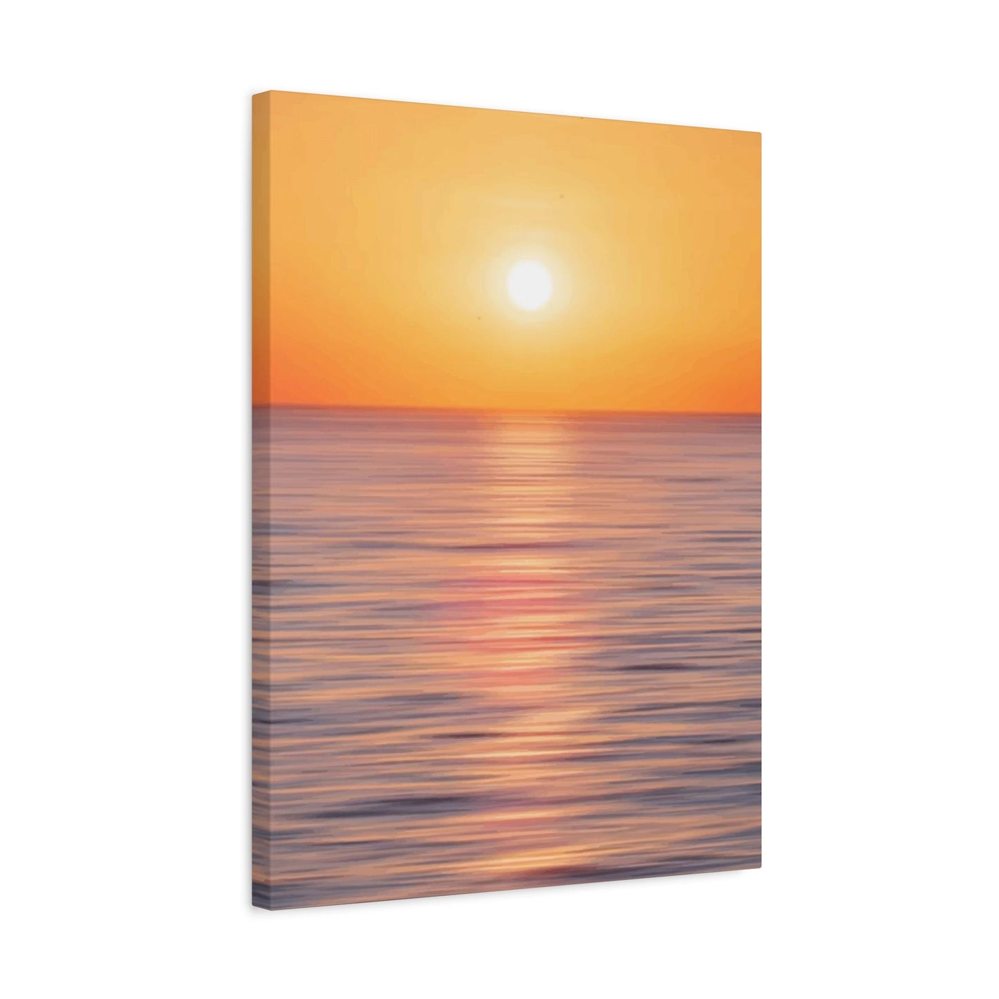

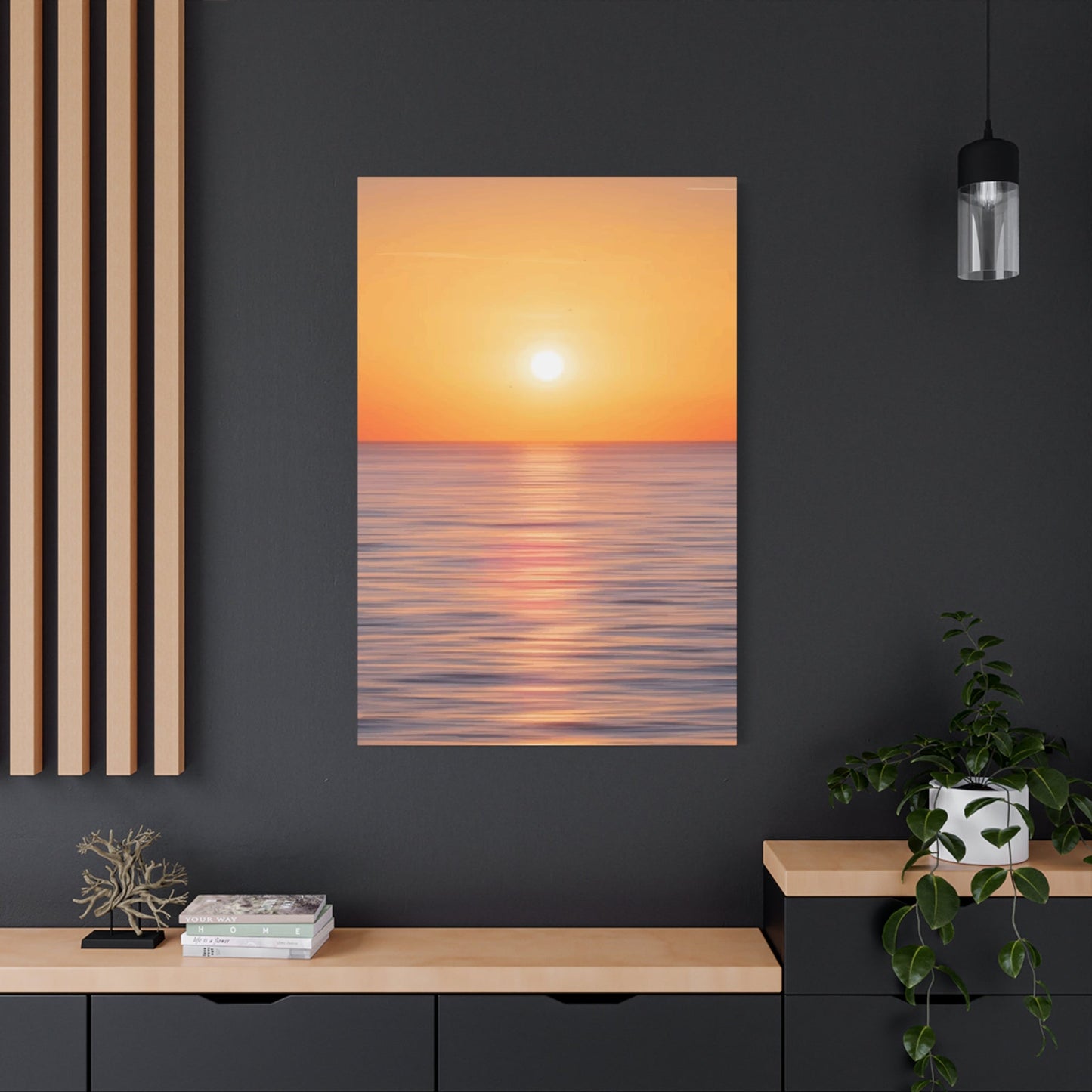
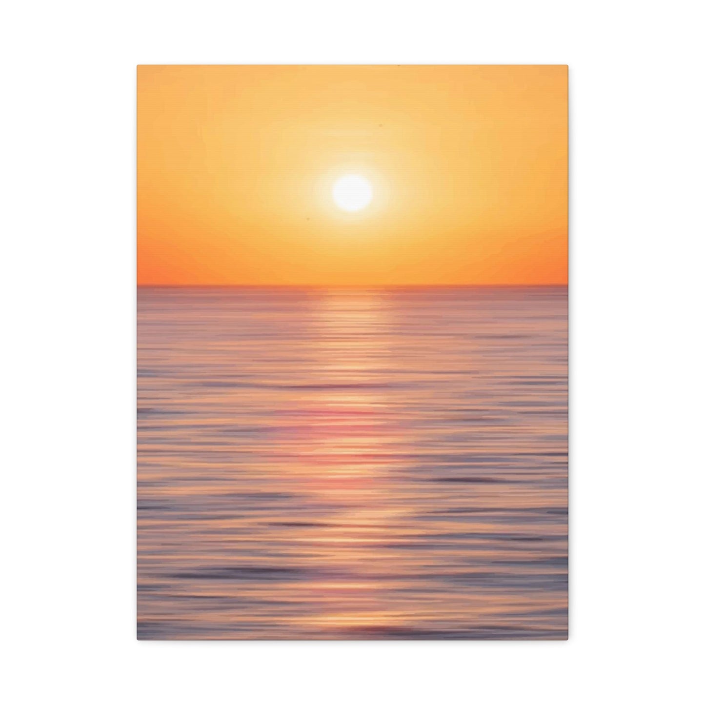
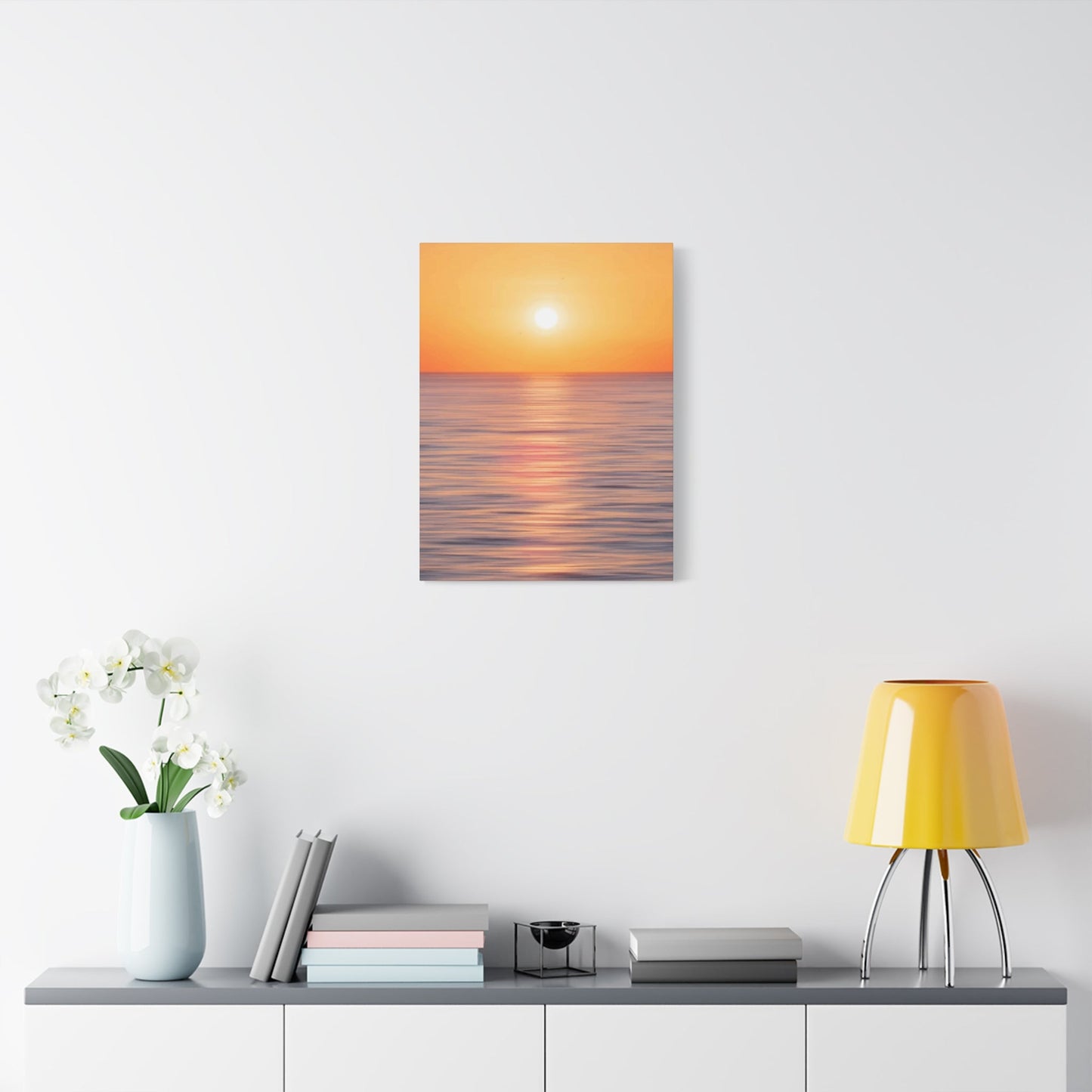
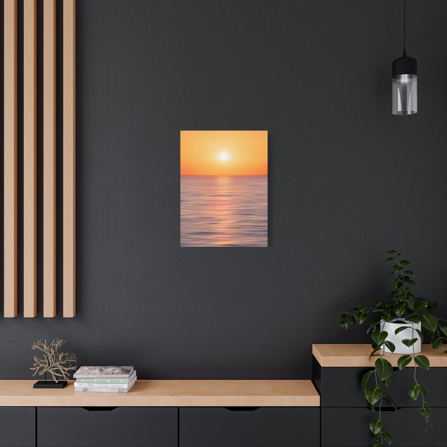
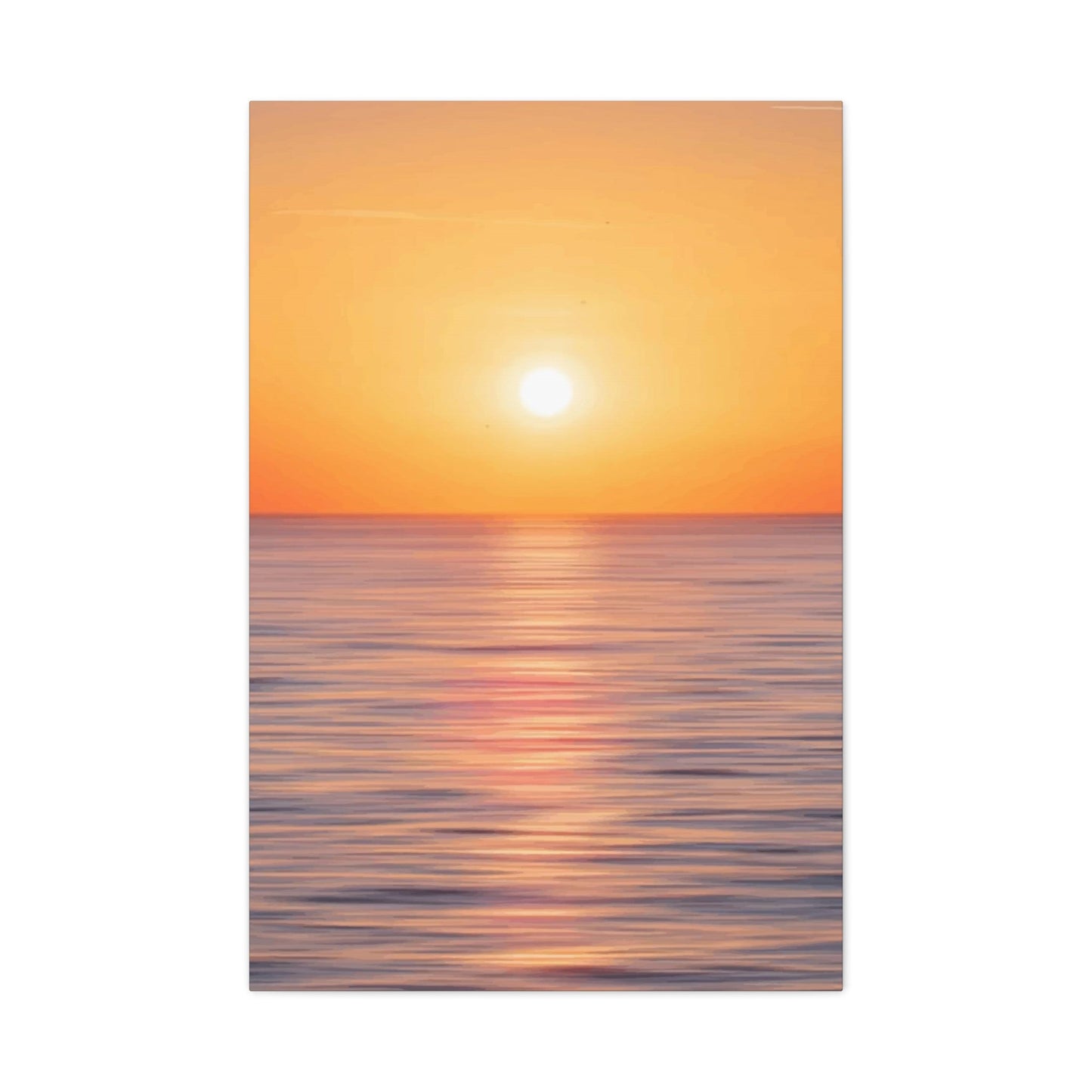
Masterpiece Coastal Art: Beach at Dawn Mixed Media Wall Decor
The creation of significant artwork often emerges from unexpected encounters with extraordinary human achievement. This particular artistic endeavor began while immersing myself in captivating climbing documentaries that showcased one of America's most formidable rock formations. The initial spark ignited when observing skilled climbers navigating the treacherous vertical terrain of El Capitan's legendary Dawn Wall section, a route that has challenged countless adventurers over decades.
The sheer magnitude of this granite monolith presented itself through various climbing narratives, each revealing different aspects of its character and complexity. These visual chronicles demonstrated not merely the physical demands of ascending such precipitous heights, but also the profound spiritual connection between climber and stone. The interplay of light across the massive rock face throughout different times of day created an ever-changing canvas that demanded artistic interpretation.
What particularly captivated my imagination was witnessing the remarkable Alex Honnold's free solo ascent of the entire formation. This extraordinary feat of human courage and skill transcended mere athletic accomplishment, becoming a meditation on the relationship between humanity and nature's most imposing structures. The visceral reaction of perspiration and heightened awareness while viewing his ascent underscored the profound impact such achievements have on observers, creating an emotional resonance that would later influence the artistic process.
Discovering Inspiration Through Climbing Chronicles
The cinematography captured during these climbing expeditions revealed the rock face's intricate textures, shadow play, and the subtle color variations that occur as sunlight moves across its surface throughout the day. These visual elements would prove instrumental in understanding the subject matter's complexity and beauty. The way morning light illuminated specific sections while leaving others shrouded in deep shadow created a natural drama that begged for artistic interpretation through traditional media.
The emotional intensity generated by these viewing experiences created an urgent need for creative expression. The combination of awe, fear, admiration, and wonder demanded outlet through artistic creation. This confluence of emotions and visual stimulation provided the foundational motivation for embarking on what would become an extensive artistic journey spanning multiple iterations and refinements.
The climbing videos also revealed the scale and proportion of the rock face in relation to human figures, providing crucial reference points for understanding the monumental nature of the subject. This sense of scale would become essential in translating the overwhelming presence of El Capitan into a manageable yet impactful artistic composition. The challenge lay in capturing both the grandeur and the intimate details that make this geological formation so compelling.
The repeated viewing of these climbing narratives allowed for deeper appreciation of the rock's character, from its weathered surfaces scarred by millennia of natural forces to the precise crack systems that provide purchase for determined climbers. Each viewing session revealed new details and perspectives that would later inform the artistic interpretation and technical approach to rendering this magnificent subject.
Japanese Woodblock Print Revelations
The artistic trajectory took an unexpected turn through discovery of historical Japanese woodblock prints, specifically the breathtaking work of renowned printmaker Hiroshi Yoshida from 1925. His interpretation of El Capitan demonstrated how Eastern artistic sensibilities could capture the essence of Western landscapes through traditional techniques and aesthetic principles. This cross-cultural artistic bridge provided profound inspiration for approaching the subject matter from a fresh perspective.
Yoshida's masterful treatment of the rock formation revealed possibilities for combining realistic representation with stylized interpretation. His use of color gradations, simplified forms, and emphasis on atmospheric effects showed how artistic license could enhance rather than diminish the subject's impact. The print's composition demonstrated sophisticated understanding of how to balance detailed rendering with selective simplification to create maximum visual impact.
The Japanese master's approach to depicting light and shadow through woodblock techniques offered insights into alternative methods for representing the complex interplay of illumination across El Capitan's surface. His strategic use of color temperature variations and value contrasts created depth and dimensionality that transcended the limitations of the printmaking medium. These observations would later influence decisions regarding color palette and tonal relationships in the painting.
The aesthetic philosophy underlying traditional Japanese printmaking emphasized harmony between artistic interpretation and natural observation. This balance between faithful representation and creative interpretation provided a framework for approaching the Dawn Wall subject matter. The principle of capturing the essence rather than merely copying surface appearances became a guiding philosophy throughout the artistic process.
Yoshida's treatment of atmospheric perspective, particularly his rendering of distant mountain ranges and sky conditions, demonstrated sophisticated understanding of how environmental factors affect visual perception of landscape elements. His ability to suggest vast distances and monumental scale through subtle gradations and color relationships provided technical insights that would prove invaluable in tackling similar challenges in the painting process.
The woodblock print's compositional strength lay in its bold simplification of complex forms while maintaining essential character and recognizability. This approach to distilling complex visual information into manageable artistic elements offered a methodology for approaching the overwhelming detail present in photographic references of El Capitan. The challenge would be determining which details to emphasize, simplify, or eliminate entirely.
The historical context of Yoshida's work, created during a period when Japanese artists were increasingly engaging with Western subjects while maintaining traditional techniques, provided inspiration for a similar cross-cultural artistic approach. The idea of applying contemporary mixed media techniques to interpret this iconic American landscape through artistic sensibilities influenced by both Eastern and Western traditions became an underlying theme in the project's development.
Initial Sketching and Compositional Planning
The transition from inspiration to actual artistic creation began with careful observational sketching using photographic references. This preliminary phase involved studying multiple images of El Capitan from various angles, lighting conditions, and seasonal variations to understand the subject's visual characteristics thoroughly. The sketching process served both as skill-building exercise and compositional exploration, allowing experimentation with different approaches to representing the massive rock formation.
Early sketches focused on capturing the overall gesture and character of the rock face rather than obsessing over minute details. This approach prevented becoming overwhelmed by the subject's complexity while establishing the fundamental compositional structure that would support more detailed development. The emphasis remained on understanding the major planes, primary light sources, and essential shadow patterns that define the formation's three-dimensional form.
The sketching phase revealed the importance of establishing a clear focal point within the composition to guide viewer attention through the complex arrangement of geological features. Various compositional approaches were explored, including different viewpoints, cropping decisions, and emphasis on specific sections of the rock face. These experiments helped identify the most compelling way to present the subject within the confines of the intended format.
Particular attention was paid to the relationship between positive and negative space within the composition. The interplay between the solid rock mass and the surrounding sky created dynamic tension that would become crucial to the painting's overall impact. Sketching allowed exploration of how much sky to include, where to position the horizon line, and how to balance the visual weight of different compositional elements.
The preliminary drawings also served as problem-solving exercises for technical challenges that would arise during the painting process. Issues such as how to render complex texture variations, manage transitions between light and shadow, and maintain color harmony across diverse surface materials were identified and partially resolved through sketching. This preparatory work proved invaluable for streamlining the actual painting process.
Multiple iterations of the basic composition were developed, each emphasizing different aspects of the subject matter. Some versions focused on the dramatic vertical thrust of the rock face, while others emphasized the horizontal stratification and geological layering. These variations helped identify the most compelling presentation that would best serve the artistic goals of the project.
The sketching process also involved experimenting with different mark-making techniques and drawing media to identify approaches that would translate effectively to the final painting medium. Understanding how different drawing tools behaved on paper provided insights into how brushwork and paint application might be approached to achieve similar effects in the larger format work.
Scaling and Transfer Methodology
Converting the successful sketch into a larger format suitable for detailed painting required careful planning and technical execution. The decision to work at A3 size demanded significant enlargement from the original sketch dimensions, necessitating a systematic approach to maintain proportional accuracy while scaling up the composition. The transfer process became an opportunity to refine and improve upon the original sketch's strengths while addressing any compositional weaknesses.
The scanning and digital enlargement process introduced considerations about image quality and detail preservation during scale transition. Achieving 141% enlargement required strategic planning to maintain line quality and compositional integrity while accommodating the physical limitations of standard printing equipment. The necessity of printing in multiple sections and reassembling them created additional challenges that required creative problem-solving.
The graphite transfer technique provided an efficient method for translating the enlarged composition onto watercolor paper without damaging the surface or introducing unwanted artifacts. This traditional transfer method maintained the sketch's essential character while allowing for adjustments and refinements during the transfer process. The light graphite lines served as guidelines rather than rigid constraints, preserving flexibility for spontaneous improvements during painting.
Preparation of the watercolor paper surface was crucial for ensuring optimal paint adhesion and preventing technical problems during the painting process. The choice of Arches paper reflected considerations of surface texture, absorbency, and dimensional stability under varying moisture conditions. These technical factors would prove essential for supporting the mixed media approach planned for the final artwork.
The transfer process also provided an opportunity to reconsider compositional elements and make final adjustments before committing to paint application. This intermediate step allowed for evaluation of how the composition would work at the larger scale and whether any modifications might improve the overall visual impact. The ability to make changes during transfer prevented potential problems that might have been difficult to correct once painting commenced.
Maintaining registration and proportional accuracy during the multi-section transfer required careful attention to alignment and consistent pressure application. The technique demanded patience and precision to ensure that all compositional elements would align properly in the final artwork. This methodical approach prevented distortions that could have compromised the overall composition's effectiveness.
The light nature of the transferred guidelines preserved maximum flexibility for artistic interpretation during the painting process. Rather than creating restrictive outlines that might inhibit spontaneous mark-making, the transfer provided just enough guidance to maintain compositional integrity while encouraging creative freedom in execution. This balance between structure and spontaneity would prove essential for achieving the desired artistic result.
Watercolor Foundation and Atmospheric Development
The painting process commenced with establishing the atmospheric foundation through traditional watercolor techniques applied to the sky area. This initial phase was crucial for setting the overall mood and tonal relationships that would inform all subsequent color decisions throughout the artwork. The transparent nature of watercolor made it ideal for creating the subtle gradations and atmospheric effects that would contrast effectively with the more opaque rock rendering to follow.
The sky treatment required careful consideration of color temperature relationships and value progression to create convincing atmospheric depth. Multiple washes were applied to build up the desired color intensity while maintaining the luminous quality that watercolor uniquely provides. The wet-on-wet technique allowed for soft edge transitions that effectively suggested the ethereal quality of atmospheric conditions around the massive rock formation.
Weather conditions and time of day implications were embedded within the sky treatment through strategic color choices and value patterns. The goal was creating an atmospheric environment that would complement and enhance the drama of the rock face rather than competing for attention. This required restraint in color intensity and careful management of contrast levels to ensure proper visual hierarchy within the composition.
The watercolor sky also served as a testing ground for understanding how the paper surface would respond to paint application and moisture variations. This preliminary work provided valuable information about absorption rates, pigment behavior, and surface texture interactions that would inform techniques used in subsequent painting phases. The lessons learned during sky development proved essential for planning the more complex rock rendering to follow.
Gradation techniques were refined during the sky painting process, developing smooth transitions between different color areas while avoiding unwanted texture or inconsistency. The ability to achieve seamless color progression would prove crucial when rendering the subtle tonal variations present across the rock face's surface. These fundamental watercolor skills provided the technical foundation for more complex mixed media applications.
The atmospheric perspective established through the sky treatment created spatial depth that would enhance the three-dimensional illusion of the rock formation. The careful management of color temperature and value relationships in the sky provided a reference point for maintaining consistent spatial relationships throughout the entire composition. This systematic approach to atmospheric development ensured visual coherence across all elements of the artwork.
Edge quality management during the sky painting process established techniques that would be applied throughout the artwork to create appropriate transitions between different surface materials and lighting conditions. The ability to control edge sharpness and softness would prove essential for distinguishing between areas of sharp focus and atmospheric softening that occurs in natural landscape conditions.
Rock Face Underpainting and Structural Foundation
The transition from atmospheric watercolor work to rock face development required shifting to a more structured approach that would support the complex tonal relationships and surface variations inherent in the subject matter. The initial blocking-in phase focused on establishing major light and shadow patterns without becoming distracted by surface details that would be developed in subsequent layers. This disciplined approach prevented premature detail development that might compromise overall compositional unity.
The underpainting served multiple functions beyond basic color and value establishment. It provided a foundation for understanding the rock's three-dimensional form through careful observation of how light interacts with the complex geological surfaces. The major planes were identified and blocked in with appropriate base colors that would support more nuanced color development in subsequent painting phases.
Value relationships were given priority over color accuracy during this foundational phase, ensuring that the underlying tonal structure would support whatever color variations might be developed later. The importance of establishing correct value patterns cannot be overstated, as these relationships determine the artwork's ability to create convincing three-dimensional illusions and spatial depth. Color adjustments are relatively easy to make, but correcting fundamental value errors becomes increasingly difficult as painting layers accumulate.
The rock face's complex surface required careful analysis to identify the primary geological features that would need emphasis to maintain subject recognition while avoiding overwhelming detail that might compromise overall visual impact. Strategic simplification became necessary to distill the essential character of the rock formation while eliminating extraneous elements that might create visual confusion or detract from the composition's primary focus.
Surface texture considerations were introduced during the underpainting phase through deliberate brush handling and paint application techniques. The goal was establishing a foundation that would support more detailed texture development while maintaining overall surface unity. Different areas of the rock face would require varying approaches to texture rendering, and the underpainting provided opportunity to test and refine these techniques.
Color temperature relationships were carefully managed during the underpainting process to ensure proper spatial separation between different planes of the rock face. Warmer colors were generally reserved for areas receiving direct illumination, while cooler colors were used in shadow areas and more distant surfaces. This systematic approach to color temperature helped establish the spatial depth necessary for convincing three-dimensional representation.
The underpainting also revealed areas where the original composition might benefit from adjustment or refinement. Working with actual paint on paper provided insights that were not apparent during the sketching phase, allowing for strategic modifications that would improve the overall composition. This flexibility to make improvements during the painting process prevented rigid adherence to preliminary decisions that might not serve the final artwork's best interests.
Gouache Application and Mixed Media Integration
The decision to introduce gouache over the watercolor foundation created unique opportunities for combining the advantages of both media while addressing their individual limitations. Gouache's opacity and covering power provided the ability to develop precise details and sharp edges that would have been difficult to achieve with watercolor alone. The combination of transparent watercolor sky and opaque gouache rock rendering created deliberate contrast that enhanced the perceived hardness and solidity of the stone formation.
The transition between media required careful consideration of how different paint consistencies and application techniques would interact with the established watercolor foundation. Gouache's heavier body and different drying characteristics demanded adjustments in brushwork and paint application to achieve smooth integration with the underlying watercolor work. The learning curve associated with mixed media application became part of the artistic process, contributing to the artwork's unique character.
Color mixing principles required modification when working with gouache compared to traditional watercolor approaches. The opacity of gouache allowed for different color development strategies, including the ability to work from dark to light in certain areas while maintaining the capacity for transparent glazing techniques where appropriate. This flexibility in approach provided expanded options for color development and surface treatment throughout the rock face rendering.
Texture development became a primary focus during the gouache application phase, with different brush techniques and paint consistencies being employed to suggest the varied surface characteristics present across the rock formation. Some areas required smooth, precisely rendered surfaces to suggest polished stone, while other sections needed rough, broken textures to convey weathered and fractured rock surfaces. The gouache medium proved ideal for achieving this range of textural effects.
The covering power of gouache enabled corrections and adjustments that would have been impossible with watercolor alone. This forgiving quality allowed for experimentation and refinement during the painting process without fear of creating irreversible mistakes. The ability to make changes and improvements contributed significantly to the final artwork's quality and the artist's confidence during the creative process.
Edge quality control became more precise with gouache application, allowing for the sharp, definitive edges that would suggest the hard, crystalline nature of the rock surfaces. The contrast between soft atmospheric edges in the sky and sharp geological edges in the rock face enhanced the perceived material differences between these compositional elements. This edge quality variation became a crucial factor in the artwork's overall visual impact.
The layering capabilities of gouache enabled gradual development of complex color relationships and subtle tonal variations that would have been difficult to achieve in a single application. Multiple thin layers built up richness and depth while maintaining control over color intensity and value relationships. This methodical layering approach proved essential for achieving the sophisticated color development visible in the final artwork.
Surface Texture Mastery Through Strategic Mark-Making
The development of convincing surface textures represents one of the most demanding aspects of realistic landscape representation. Rock formations, in particular, present complex challenges due to their varied geological compositions and weathering patterns. Each stone type exhibits distinctive characteristics that must be carefully observed and faithfully translated through appropriate mark-making strategies.
Sedimentary rock formations display layered striations that reflect their gradual formation over geological time periods. These horizontal banding patterns require subtle color variations and carefully controlled brushwork to suggest the compressed layers without creating overly mechanical appearances. The artist must balance geological accuracy with artistic interpretation, ensuring that scientific correctness serves the broader aesthetic purpose rather than dominating it.
Igneous rock surfaces present entirely different textural challenges, typically exhibiting crystalline structures and irregular fracture patterns. The representation of these formations demands understanding of how light interacts with various crystal orientations and surface irregularities. Successful execution requires building up multiple transparent glazes that simulate the complex light penetration and reflection characteristic of these geological specimens.
Metamorphic rock varieties introduce additional complexity through their transformed crystal structures and folded formations. These geological features often display flowing, organic patterns that contrast dramatically with the angular fractures of sedimentary and igneous counterparts. The artistic challenge lies in capturing these fluid characteristics while maintaining the fundamental solidity expected from stone representations.
Weather-induced surface modifications add another layer of complexity to rock texture development. Lichen colonization creates unique color variations and surface treatments that must be carefully integrated without overwhelming the underlying geological characteristics. These biological elements often provide crucial color accents that enhance overall compositional vitality when properly executed.
Erosional patterns carved by wind and water create distinctive groove and channel formations that require specialized brushwork techniques. These features often follow predictable directional patterns that can be exploited to enhance overall compositional movement and visual flow. Understanding these natural processes enables artists to create more convincing and dynamically engaging surface treatments.
The interplay between large-scale geological formations and microscopic surface details demands careful hierarchical planning throughout the painting process. Major structural elements must be established first, with progressively smaller details added in subsequent layers. This systematic approach prevents detail conflicts and ensures that each textural element supports the overall compositional structure.
Color Harmony Refinement and Atmospheric Perspective
The achievement of sophisticated color relationships requires systematic analysis of temperature variations, value progressions, and chromatic intensity distributions throughout the composition. During final refinement stages, minute adjustments in these color properties can produce dramatic improvements in overall visual coherence and professional appearance quality.
Temperature modulations within individual color areas create subtle vibrational effects that enhance surface believability and visual interest. Cool undertones within predominantly warm passages suggest reflected light from sky sources, while warm notes within cool shadow areas indicate bounced light from illuminated surfaces. These temperature variations must be carefully calibrated to maintain overall color unity while providing sufficient contrast to prevent monotonous uniformity.
Atmospheric perspective principles become increasingly critical as compositions approach completion. Distant elements require systematic desaturation and value compression to suggest intervening atmospheric layers. This aerial perspective effect relies on subtle color temperature shifts toward cooler hues in background elements, creating convincing spatial depth illusions that enhance three-dimensional believability.
Local color modifications based on lighting conditions represent another crucial aspect of sophisticated color development. The inherent colors of objects undergo systematic transformations under varying illumination circumstances. Direct sunlight intensifies warm local colors while simultaneously cooling shadow areas through sky reflection influences. These modifications must be consistently applied throughout the composition to maintain lighting logic credibility.
Chromatic intensity variations create visual hierarchy and focal emphasis without relying solely on value contrasts. Strategic placement of highly saturated color notes draws attention to designated focal areas, while surrounding regions maintain more subdued chromatic intensities. This selective saturation approach prevents overwhelming color competition while ensuring adequate visual excitement within key compositional zones.
Color echo effects strengthen overall unity by repeating similar hues in various locations throughout the composition. These repetitions should vary in intensity and temperature to avoid monotonous duplication while maintaining harmonic relationships. Successful color echoing creates subtle visual pathways that guide viewer attention through predetermined compositional routes.
The integration of complementary color relationships adds vibrational energy and visual sophistication to otherwise straightforward color schemes. These oppositions should be carefully modulated to enhance rather than overwhelm the primary color narrative. Successful complementary integration creates dynamic tension that energizes the overall visual experience without sacrificing compositional stability.
Illumination Logic and Shadow Pattern Consistency
The establishment and maintenance of consistent lighting logic throughout complex compositions requires systematic analysis of light source characteristics and their resulting effects on all visible surfaces. Single light source scenarios demand particular attention to shadow casting relationships and reflected light behaviors that must remain internally consistent regardless of compositional complexity.
Direct illumination effects create the primary value structure upon which all other lighting phenomena depend. The angle, intensity, and color temperature of the primary light source determine the fundamental shadow patterns and highlight distributions that define form modeling throughout the composition. These primary lighting effects must be established early and maintained consistently through all subsequent development phases.
Secondary illumination sources, including sky light and reflected light from illuminated surfaces, create the subtle gradations that transform flat shadow areas into believable three-dimensional forms. These secondary effects require careful observation and systematic application to maintain consistent spatial logic. Inconsistent secondary lighting effects immediately betray amateur handling and undermine otherwise competent technical execution.
Cast shadow behaviors provide crucial spatial information that enhances compositional depth and form relationships. These shadows must follow predictable geometric projection rules based on established light source positions and directions. The shapes, edges, and intensities of cast shadows offer powerful tools for creating spatial illusions and emphasizing form relationships within complex compositions.
Atmospheric influences on illumination create distance-dependent modifications in light quality and color temperature. Intervening atmospheric layers systematically reduce contrast and modify color temperature in predictable patterns. Understanding these atmospheric effects enables artists to create convincing depth illusions through systematic light quality modifications rather than relying solely on linear perspective techniques.
Surface texture influences on light behavior create the subtle variations that distinguish between different material types and surface treatments. Smooth surfaces produce sharp reflections and well-defined highlight patterns, while rough textures scatter light in complex ways that require careful observation and interpretation. These material-specific lighting responses must be consistently applied to maintain believable surface character representations.
Time-of-day lighting considerations introduce additional complexity through systematic color temperature and angle modifications. Morning light exhibits different characteristics from midday or evening illumination, requiring corresponding adjustments in color relationships and shadow patterns. Maintaining temporal consistency throughout extended compositions prevents confusing mixed-message lighting that undermines compositional credibility.
Mixed Media Integration Strategies and Technical Transitions
The successful combination of multiple artistic mediums within single compositions requires sophisticated understanding of each material's unique properties and limitations. Watercolor transparency characteristics interact differently with underlying surfaces than gouache opacity, creating transition challenges that must be carefully managed to maintain seamless visual continuity.
Watercolor medium properties include rapid drying characteristics, transparent color layering capabilities, and unpredictable flow behaviors that can create both opportunities and challenges during mixed media applications. These properties must be thoroughly understood and systematically exploited to achieve desired visual effects while avoiding common technical pitfalls that plague inexperienced practitioners.
Gouache medium characteristics provide opaque coverage capabilities and reworkable surface properties that complement watercolor transparency in mixed media applications. The combination of these contrasting properties enables artists to achieve both transparent atmospheric effects and solid structural elements within unified compositions. Successful integration requires careful planning regarding medium application sequences and surface preparation considerations.
Surface preparation requirements differ significantly between various mixed media applications. Watercolor techniques demand absorbent surfaces that encourage controlled pigment penetration, while gouache applications benefit from slightly less absorbent grounds that prevent excessive paint absorption. Achieving optimal surface characteristics for mixed media work often requires multiple preparation layers and careful attention to drying conditions.
Color mixing compatibility between different mediums requires systematic testing and evaluation to prevent unwanted chemical reactions or visual inconsistencies. Certain pigment combinations exhibit different behaviors when mixed within watercolor mediums versus gouache formulations. Understanding these compatibility issues prevents disappointing results and enables confident mixed media manipulation throughout development phases.
Brushwork transition techniques enable seamless movement between different medium applications without creating obvious technical boundaries. These techniques often involve careful brush selection, loading methods, and application pressures that accommodate the varying viscosity and flow characteristics of different mediums. Mastering these transition techniques elevates mixed media work from amateur experimentation to professional sophistication.
Drying time considerations become increasingly complex in mixed media applications where different materials require varying curing periods before subsequent layers can be safely applied. Premature overworking can disturb underlying applications and create muddy, overworked appearances that compromise overall visual quality. Systematic timing awareness prevents these technical difficulties while enabling efficient workflow management.
Compositional Flow Enhancement Through Strategic Adjustments
The refinement of visual movement patterns throughout complex compositions requires systematic analysis of directional forces and rhythmic relationships that guide viewer attention through predetermined pathways. These compositional currents must be carefully orchestrated to support primary focal hierarchies while maintaining engaging visual journeys that reward extended examination.
Directional emphasis techniques include strategic placement of linear elements, value progressions, and color transitions that create invisible pathways connecting different compositional areas. These directional forces should work cooperatively rather than competitively to prevent confusing visual conflicts that fragment viewer attention. Successful directional orchestration creates flowing, musical rhythms that enhance overall aesthetic sophistication.
Rhythmic repetition patterns strengthen compositional unity through systematic element repetitions that create predictable visual beats throughout the work. These rhythms might involve repeated color notes, similar shape relationships, or parallel directional forces that establish underlying structural frameworks. Effective rhythmic development prevents monotonous repetition while providing sufficient consistency to maintain compositional coherence.
Visual weight distribution requires careful balance between contrasting elements to prevent compositional instability or overwhelming focal dominance. Heavy visual elements must be strategically positioned and counterbalanced by appropriate opposing forces to maintain comfortable equilibrium. This balance consideration extends beyond simple symmetrical arrangements to include more sophisticated asymmetrical relationships that create dynamic stability.
Edge treatment variations provide crucial tools for controlling attention focus and creating convincing spatial relationships. Sharp, high-contrast edges advance toward viewers and demand immediate attention, while soft, low-contrast transitions recede and encourage visual rest. Strategic edge control enables artists to manipulate viewer attention pathways without relying on obvious focal pointing devices.
Negative space activation transforms seemingly empty areas into active compositional participants that contribute meaningfully to overall visual success. Well-designed negative spaces provide visual breathing room and create interesting shapes that complement positive elements rather than merely surrounding them. This negative space consciousness elevates compositions beyond simple object arrangements toward sophisticated spatial orchestrations.
Scale relationship variations create visual interest and spatial depth through strategic size contrasts between compositional elements. These scale modifications should follow logical perspective principles while providing adequate variety to prevent boring uniformity. Successful scale orchestration creates believable spatial environments that invite viewer exploration and extended engagement.
Critical Evaluation Methodologies for Artistic Assessment
The transition from active creation to objective evaluation requires systematic assessment procedures that enable accurate quality determination and identification of potential improvement areas. This evaluative process demands temporary suspension of emotional attachment to enable honest appraisal of technical achievement and aesthetic success relative to initial artistic objectives.
Distance viewing techniques provide essential perspective shifts that reveal compositional strengths and weaknesses invisible during close working distances. Stepping back several feet from completed work enables assessment of overall visual impact, compositional balance, and focal hierarchy effectiveness. These distance evaluations often reveal surprising discoveries about work previously considered complete.
Value squinting methods eliminate color distractions to enable pure assessment of underlying value relationships and structural effectiveness. Half-closed eyes naturally filter out color information while preserving value patterns that form compositional foundations. This evaluation technique quickly reveals value problems that might otherwise remain hidden beneath attractive surface color treatments.
Seeing Anew Through Mirror Image Reflection Assessment
When an artist views a composition through mirror reversal or digital flipping, familiar relationships between elements often shift in surprising ways. What once seemed balanced may reveal asymmetries. Directional emphases—the way lines, curves, or shapes lead the eye—can invert gravity. For example, a subject facing right may carry more visual momentum than when mirrored to face left, depending on how human gaze and cultural viewing habits orient left‑to‑right or right‑to‑left. Mirror reflection forces the eye to relearn the piece, to see its contour relationships, negative space, edge weight differently. Hidden weaknesses emerge: maybe one side of the picture feels heavier; perhaps one element that felt subordinate becomes too prominent; maybe focal anchors drift off‑balance.
This practice is especially useful when the creator has spent many hours with the piece and no longer notices imbalances because perception has accommodated them. By observing the flipped version, the brain’s habitual patterns are disrupted and flaws become visible again. Artists working in composition—painting, drawing, graphic work, photography—can benefit greatly from this technique. It allows objective evaluation of scale, spacing, asymmetry, directional dominance, rhythm between forms. Even small adjustments—nudging an object slightly, redistributing negative space—after seeing through mirror reflection can transform the harmony of the whole piece.
Documenting Artwork Under Variable Conditions
Photographic documentation is more than archiving; it is a powerful tool for reflective assessment. By photographing a piece under diverse lighting—warm, cool, diffused, directional—and from multiple perspectives (straight‑on, oblique angles, close detail shots), the artist sees how shifts in light and viewpoint affect color, texture, shadow, edge clarity. Some hues may shift under warm light; some textures lose detail under glare; edges may sharpen or soften.
Similarly, comparing finished work to sketches, color studies, or compositional mockups helps judge fidelity to initial vision. Did the proportions drift? Did the color palette darken in execution? Did background value weight alter contrast? These documented comparisons can be archived (digital files, printed contact sheets) and revisited after rest, giving fresh eyes for revision. They serve also as pedagogic record: showing what choices were made, what worked, what yielded unintended outcomes.
In addition, photographing with consistent condition ladders or color cards helps. Including a neutral reference (grey patch, white card) in one shot provides anchor for color correction. Close‑ups expose texture, brush technique, transitions; wide shots show whole composition, spatial relationships. The richness of this process gives detailed feedback for both technical execution and conceptual coherence.
Structured Critique: From Intention to Final Form
A robust critique procedure begins with clearly restating original intent. What was the concept? What emotions, ideas, or symbolic resonances was the artist aiming to communicate? What compositional devices (color contrast, spatial tension, asymmetry or symmetry) were meant to support those ideas? With those in view, one can evaluate technical execution: how well are form, line, value, color, texture handled; are surfaces clean, are transitions smooth, are edges resolved; does perspective hold; is scale coherent.
Next, compositional effectiveness: is the focal point strong? Do supporting elements guide the eye without distraction? How balanced is the layout? Are key forms weighted well? Is negative space used appropriately? Are directional vectors (lines, implied shapes) pulling the viewer through in a pleasing or intentional way? Are proportions pleasing, or do some areas feel cramped or sparse?
Then conceptual success: does the visual outcome match the initial idea? Are metaphors clear or subtle; is ambiguity handled intentionally or accidentally; does the viewer see what the artist hoped to evoke (or does something unexpected emerge)? Does the piece withstand emotional or intellectual proximity—does it offer layers of meaning?
This structured evaluation avoids superficial praise (“nice colors,” “good job”) and yields specific feedback. Artists can maintain folders of critiques, noting issues flagged by mirror view, documentation, and structured critique. Over time, patterns emerge—repeated trouble zones or successful strategies—which inform future work.
Presentation Matters: Framing, Lighting, and Viewing Distance
Even the most successful composition can feel diminished if poorly presented. Framing choices—molding, matting, border width, material finish—modulate how the artwork is perceived. A heavy dark frame may anchor a vibrant piece but risk sucking energy out; a thin frame may let the work breathe but risk lack of separation from surrounding wall. Matting (border around the art) both protects materials and gives “visual breathing room,” isolating artwork from wall color or other visual clutter.
Lighting is essential. Directional lighting that produces glare or hot spots can distort color, wash out shadows, flatten texture. Even illumination from neutral color temperature bulbs with high color‑rendering characteristics helps preserve subtle color relations. Light angle, distance, whether filtered or diffused, all influence how textures, brush strokes, and material surfaces are read. Avoid placing artwork in direct sun or unfiltered bright lights that shift over day, which can fade pigments or warp materials.
Viewing distance and sightline height matter. A small piece viewed from too far loses detail; a large work hung too low or high strains the neck or misaligns focal impact. For wall hanging, center of the artwork often placed near eye height (~57‑60 inches in many galleries) ensures comfortable viewing. For large works, allowing viewers space to step back so the entire composition can be seen helps; in tight spaces, viewing angle may limit perception. Also consider how lighting interacts at different distances: textures may reveal at close‑in vantage but appear too sharp or harsh from afar.
Conclusion
Several practical tests can reveal compositional weakness. Mirror or digital flip reveals asymmetries, directional pull, horizon tilts, edge weight that may not be consciously noticed. Distance test: stepping back to view work from far away (or photographing it from some distance) allows seeing overall shapes, silhouette, massing, light/dark patterns. Very close inspection reveals detail but may obscure overall structure. Also viewing under different lighting times of day (morning vs evening; artificial vs daylight) shows how shadows fall, color shifts, glare or reflections.
Another helpful tactic: viewing under restricted vision, e.g., squinting or defocusing eyes, or seeing in grayscale (turning color work to black & white) to judge value contrasts independent of hue. If the value (light vs dark) relationships hold up in grayscale, composition likely strong in balancing tonal contrast. Blind contour or quick thumbnail sketches help the artist see what is essential.
Self‑critique is necessary but limited by closeness; external feedback offers fresh perception. Sharing work with peers, mentors, or critics, illustrated with documentation and mirror‑flipped versions, can show what translates and what does not. Observing how people react—what draws their gaze, what distracts them—provides valuable data. Recording viewer comments, noting recurring observations (e.g., many people are drawn to left corner, or feel uneasy about top‑right balance) helps refine clarity.
Also useful: exhibiting the work in informal spaces, seeing it alongside other works, seeing how lighting and framing in different settings affect it. The artist can learn what works in gallery, home, online reproduction. External feedback often reveals presentation issues: frame glare, inadequate lighting, uneven wall color, flooring reflections, background distractions—all of which can diminish the impact even if composition is strong.
Finally, assessment and presentation processes contribute to longer artistic legacy when the artist treats each work not as final but as node in ongoing conversation. Over time, revisiting past works using these methods (mirror flips, comparison, external critique) can yield new insights. Perhaps what was once a minor compositional imbalance becomes central theme in later pieces. The artist evolves a sense of what kinds of framing, light, viewing contexts best honor their vision; they refine standards of self‑presentation.
Also, audience expectations adapt: when works are presented with care—good framing, lighting, exhibition layout—even viewers perceive higher value, or deeper resonance. Cultural institutions, galleries, collectors likewise respond more positively to works that survive scrutiny in both concept and presentation. Thus attention to these assessment and presentation practices is not merely aesthetic discipline; it builds trust, reputation, durability of work’s presence in the cultural field.
