


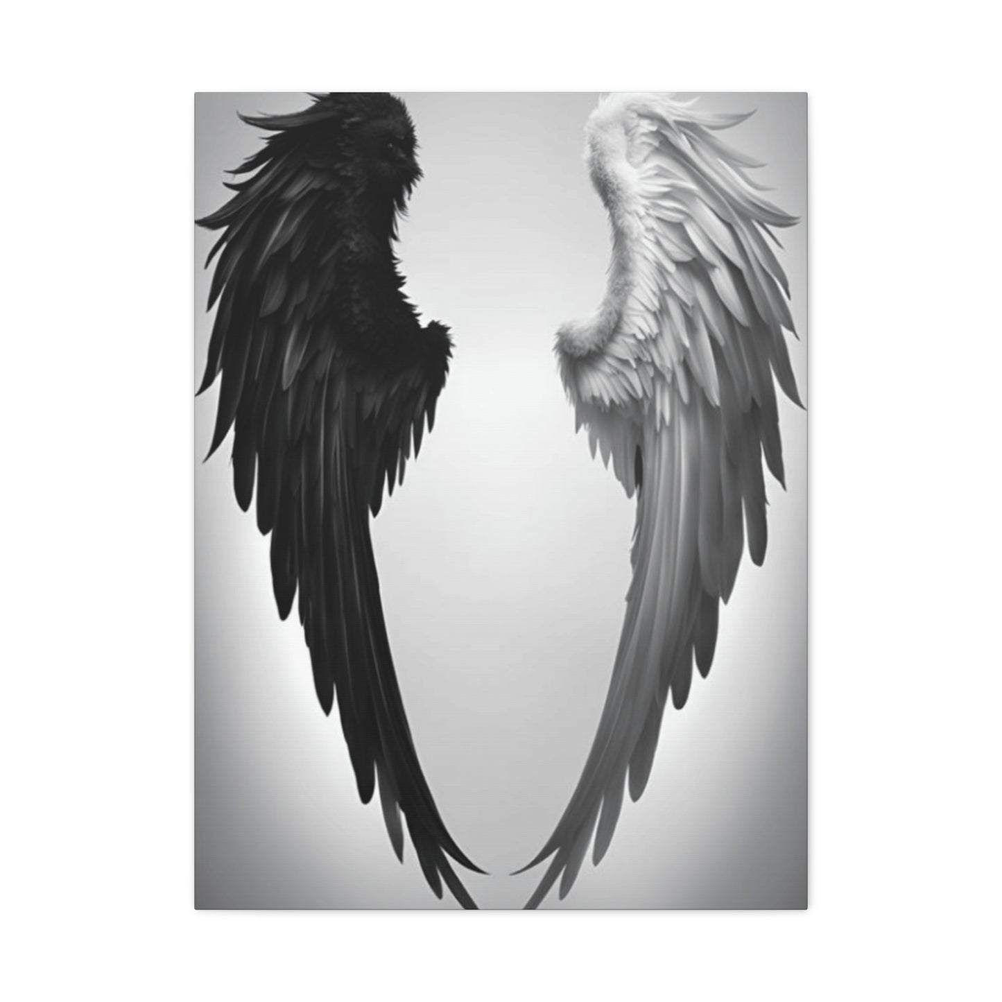
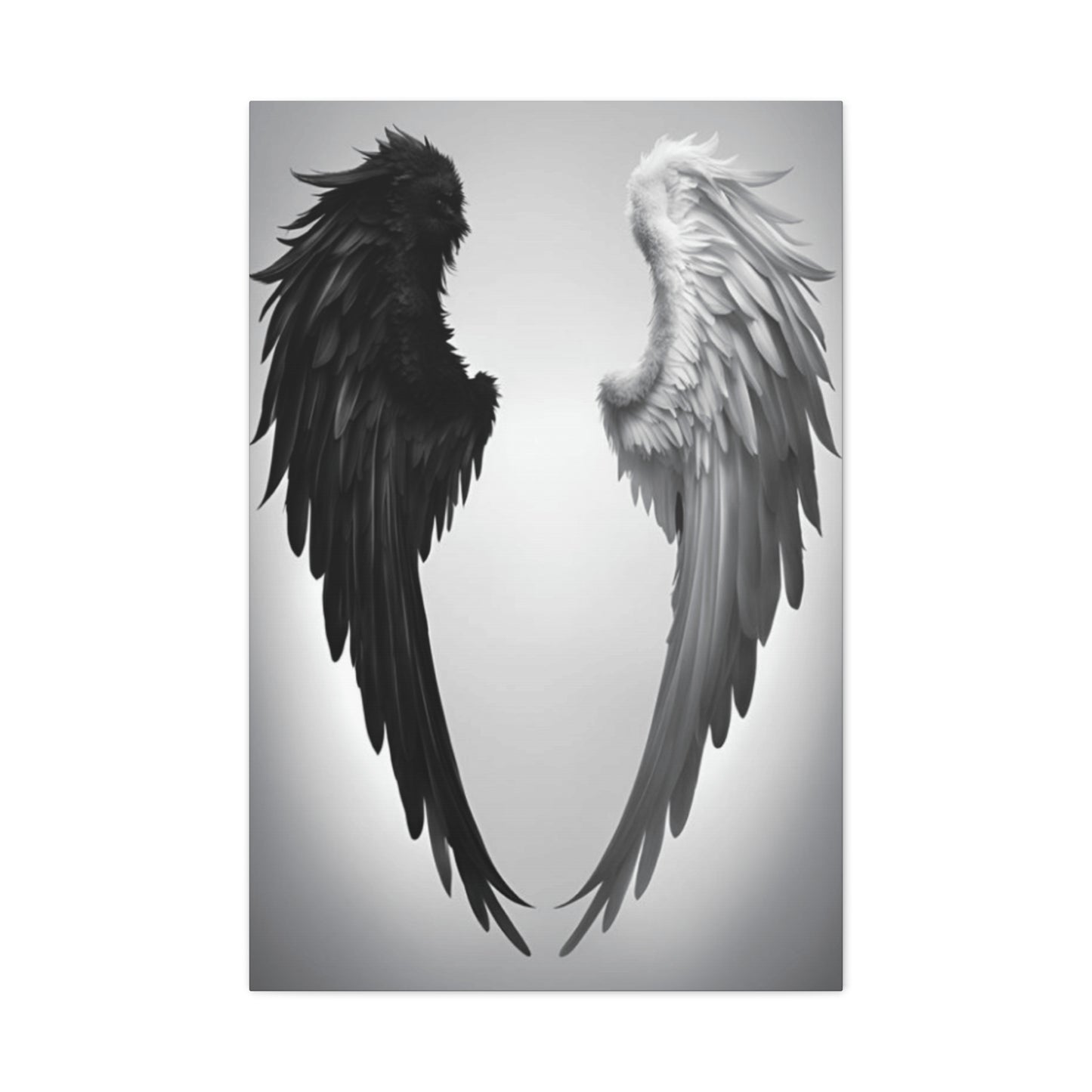
Exploring the Symbolism Behind Angel Wings: What Black and White Wall Art Represents
The allure of celestial imagery in interior design has captivated homeowners and decorators for generations. Among the most sought-after elements in contemporary home styling, monochromatic celestial artwork stands as a timeless choice that bridges the gap between spiritual symbolism and modern aesthetic appeal. The powerful visual impact of feathered celestial appendages rendered in stark contrasting tones creates an atmosphere of serenity, protection, and ethereal beauty within any living space.
These striking pieces of wall decor have transcended their religious origins to become versatile design elements suitable for various interior styles, from minimalist modern apartments to rustic farmhouse dwellings. The simplicity of the two-tone palette allows these artworks to complement virtually any color scheme while making a bold statement that draws the eye and sparks conversation. Whether displayed in bedrooms, living rooms, nurseries, or meditation spaces, these artistic representations of divine guardianship bring a sense of peace and spiritual connection to the home environment.
The growing popularity of this particular decorating trend reflects a broader cultural movement toward mindfulness, spiritual awareness, and the creation of sanctuary-like spaces within our homes. As people seek refuge from the chaos of modern life, incorporating symbols of protection and transcendence into their personal spaces has become increasingly important. The visual representation of celestial protectors serves as a daily reminder of hope, faith, and the possibility of something greater than ourselves.
The Timeless Appeal of Monochromatic Celestial Artwork in Modern Interior Design
The enduring fascination with monochromatic representations of heavenly appendages stems from their remarkable ability to transcend temporal design trends while maintaining relevance across decades of evolving aesthetic preferences. Unlike colorful artwork that may clash with changing decor schemes or fall out of fashion as color trends shift, pieces rendered in pure grayscale possess an inherent versatility that allows them to remain stylistically appropriate regardless of surrounding design elements. This timelessness makes them an investment piece rather than a temporary decorative addition.
The psychological impact of these images cannot be understated. Research in environmental psychology suggests that spaces adorned with symbols of protection and transcendence create feelings of safety and emotional security among inhabitants. The visual representation of guardian figures provides subconscious reassurance, particularly valuable in bedrooms where restful sleep is paramount or in children's spaces where feelings of security are essential for healthy development. The monochromatic treatment of these subjects adds a layer of sophistication that prevents the imagery from becoming overly sentimental or religiously specific, allowing individuals of various beliefs to appreciate the artwork on multiple levels.
From an artistic perspective, the restriction to two tones challenges creators to convey depth, texture, and dimensionality through careful attention to shading, contrast, and composition rather than relying on color to create visual interest. This constraint often results in more thoughtful, technically skilled artwork where every line and shadow serves a deliberate purpose. The feathered details of celestial appendages become studies in texture and light, with each individual plume carefully rendered to create a sense of movement and delicacy despite the absence of color variation.
The minimalist nature of this color scheme also aligns perfectly with contemporary design philosophies that emphasize restraint, intentionality, and the creation of calm, uncluttered spaces. In an era where visual overstimulation is commonplace, the simplicity of stark tonal contrast provides visual respite while still maintaining artistic interest. The lack of color allows viewers to focus on form, composition, and symbolic meaning rather than being distracted by chromatic elements, resulting in a more meditative, contemplative viewing experience.
Understanding the Spiritual Symbolism Behind Heavenly Appendage Imagery
Throughout human history, the concept of celestial beings with magnificent feathered appendages has appeared in religious traditions, mythologies, and spiritual belief systems across virtually every culture worldwide. These symbols represent far more than decorative motifs; they embody profound concepts of divine protection, spiritual ascension, moral guidance, and the connection between earthly existence and higher planes of consciousness. Understanding the rich symbolic heritage of these images enhances appreciation for their presence in domestic spaces.
In Western religious traditions, guardian figures equipped with feathered appendages serve as divine messengers, protectors of the faithful, and intermediaries between the mortal realm and the celestial kingdom. Their presence in artwork serves as a reminder of constant divine watchfulness and protection, offering comfort during difficult times and reinforcing faith during moments of doubt. The specific positioning of the appendages in artwork carries meaning as well, with outstretched forms suggesting embrace and protection, while folded positions indicate reverence and peaceful repose.
Eastern philosophical and spiritual traditions also incorporate similar imagery, though sometimes with different cultural interpretations. The concept of enlightened beings who transcend earthly limitations and serve as guides for those still on the path appears in various forms across Buddhist, Hindu, and Taoist traditions. The feathered appendages represent the ability to rise above mundane concerns, achieve spiritual elevation, and access higher states of consciousness. Their inclusion in living spaces serves as inspiration for personal spiritual development and mindfulness practice.
Beyond specifically religious contexts, these symbols have entered secular cultural consciousness as representations of purity, innocence, goodness, and moral integrity. The stark contrast of monochromatic rendering emphasizes the duality inherent in existence, the balance between light and shadow, and the eternal struggle between higher and lower impulses within human nature. This universal symbolism allows individuals from diverse backgrounds to find personal meaning in the imagery regardless of their specific belief systems.
The therapeutic and psychological benefits of displaying such symbolism should not be overlooked. Mental health professionals have noted that surrounding oneself with images representing protection, hope, and transcendence can have measurable positive effects on mood, anxiety levels, and overall emotional wellbeing. The visual reminder that we are watched over and protected, whether by divine forces or our own higher selves, provides psychological comfort that manifests in reduced stress responses and improved emotional regulation.
Exploring Various Artistic Styles and Interpretations of Feathered Celestial Forms
The world of monochromatic celestial artwork encompasses a remarkably diverse range of artistic approaches, each offering unique aesthetic qualities and emotional resonance. From photorealistic renderings that capture every minute detail of individual feathers to abstract interpretations that suggest form through bold gestural marks, the variety available ensures that every decorator can find pieces aligned with their personal taste and the overall design philosophy of their space.
Photorealistic styles employ meticulous attention to anatomical accuracy and textural detail, creating images so lifelike that viewers can almost sense the softness of downy underlayers and the structural strength of primary flight feathers. These works often feature dramatic lighting that emphasizes dimensional depth, with highlights catching on the curved surfaces of individual barbs and shadows pooling in the spaces between layers. The technical skill required for such renderings commands respect and creates focal points that demand prolonged contemplation, rewarding viewers with new details discovered upon each examination.
Contemporary minimalist interpretations strip the subject to its essential elements, using clean lines, simplified shapes, and strategic negative space to suggest rather than explicitly depict the celestial forms. These approaches align beautifully with modern and Scandinavian design aesthetics that prioritize simplicity, functionality, and the elimination of visual excess. The power of these pieces lies in their restraint, proving that sometimes the most impactful art is that which shows less rather than more, engaging the viewer's imagination to complete the image.
Abstract expressionist treatments transform the subject into dynamic studies of movement, energy, and emotion rather than literal representations. Bold brushstrokes, splattered textures, and gestural marks convey the essence of flight, transcendence, and spiritual power without being constrained by realistic depiction. These works tend to be more emotionally charged and energetically active, making them excellent choices for spaces where inspiration and motivation are desired outcomes.
Vintage and antique-inspired styles reference classical artistic traditions, incorporating elements reminiscent of Renaissance religious artwork, Victorian engravings, or baroque theatrical compositions. These approaches often feature ornate decorative elements, such as scrollwork, halos, or architectural details that contextualize the celestial figures within traditional iconographic frameworks. The aged, weathered appearance often applied to such pieces adds layers of historical depth and romantic nostalgia that particularly complement shabby chic, vintage, and eclectic decorating schemes.
Geometric and modern line-art approaches reduce the subject to its fundamental structural elements, representing feathered forms through interconnected lines, polygons, or mathematically derived patterns. These interpretations appeal to those with appreciation for technical design, architectural aesthetics, and the intersection of art with mathematical precision. The clean, organized nature of geometric representations creates a sense of order and intentionality that resonates with personalities drawn to structure and clarity.
Selecting the Perfect Size and Scale for Maximum Visual Impact
The dimensional aspects of artwork play a crucial role in determining its effectiveness within a given space, yet size selection remains one of the most commonly mishandled aspects of art placement. Understanding principles of scale, proportion, and visual weight ensures that your celestial artwork makes the intended impact rather than appearing awkwardly small and insignificant or overwhelmingly large and dominating.
For spaces above furniture such as sofas, beds, or console tables, design professionals typically recommend that artwork span approximately two-thirds to three-quarters of the furniture width. This proportion creates visual harmony between the pieces while ensuring the art commands appropriate attention without overwhelming the furniture below. A standard sofa measuring seven feet in length would ideally be paired with artwork spanning four to five feet across, creating balanced visual weight distribution that appears intentional and professionally executed.
Vertical spaces such as narrow wall sections between windows or alongside doorways benefit from portrait-oriented pieces or vertically arranged gallery groupings that emphasize the height of the space rather than fighting against it. Conversely, horizontal expanses above low-profile furniture like media consoles or bedroom benches call for landscape-oriented pieces or horizontal arrangements that reinforce the lateral dimension of the space. Matching the orientation of artwork to the proportions of the wall space creates visual cohesion that makes rooms feel more harmonious and thoughtfully designed.
Statement pieces intended to serve as room focal points should be sized generously enough to command attention from the primary seating or entrance area. In living rooms, this often means selecting pieces measuring four to six feet in their longest dimension, depending on overall room size and ceiling height. The goal is creating immediate visual impact that draws the eye and establishes a clear design hierarchy within the space. Undersized artwork in these applications appears tentative and fails to fulfill its intended purpose as an anchoring element.
Conversely, intimate spaces such as powder rooms, reading nooks, or gallery wall arrangements benefit from smaller-scale pieces that invite closer inspection and create cozy, personalized environments. In these applications, pieces measuring twelve to thirty inches allow for comfortable viewing from typical proximity distances while maintaining appropriate proportions relative to the confined space. Multiple smaller pieces arranged in intentional groupings can create visual impact equivalent to a single large work while offering greater flexibility for customization and personal expression.
Ceiling height significantly influences appropriate artwork scale, with higher ceilings accommodating and often requiring larger pieces to prevent artwork from appearing diminished and insignificant. Rooms with eight-foot ceilings can successfully display pieces up to sixty inches in height, while spaces with ten-foot or higher ceilings may require even larger works or multiple pieces arranged vertically to properly fill the available wall space. The vertical dimension of artwork should generally not exceed two-thirds of the wall height from floor to ceiling, ensuring adequate visual breathing room above and below the piece.
Material Considerations and Print Quality Factors That Define Excellence
The physical materials and production methods employed in creating printed artwork dramatically affect both the immediate visual appeal and long-term durability of these decorative investments. Understanding the distinctions between various substrates, printing technologies, and finishing treatments empowers consumers to make informed decisions that balance aesthetic preferences, budgetary constraints, and practical considerations.
Traditional stretched textile printing remains the most popular format for artwork of this nature, offering several compelling advantages that explain its enduring market dominance. Premium-grade textiles provide a slight surface texture that enhances the perceived depth and dimensionality of images while effectively eliminating glare that can plague glass-covered prints. The wrapped edges of stretched textile pieces create a finished, three-dimensional object that requires no additional framing, reducing overall cost and installation complexity while providing a contemporary, gallery-quality presentation.
The weight and weave characteristics of the printing substrate significantly influence the final appearance and longevity of the artwork. Professional-grade textiles typically feature weights between eight and twelve ounces, providing sufficient thickness to resist warping, sagging, or showing through from reverse-side stretcher bars. Tighter weaves with higher thread counts yield smoother printing surfaces that capture finer details with greater accuracy, particularly important for photorealistic styles where minute textural elements contribute substantially to the overall effect.
Wood panel substrates offer an alternative presentation format that provides exceptional rigidity, dimensional stability, and a unique aesthetic quality that particularly complements rustic, industrial, and modern farmhouse design schemes. The natural grain of the wood surface visible through the printed image adds an organic element that softens the starkness of monochromatic imagery while creating visual interest through the interplay between printed content and physical substrate. These formats work especially well in casual spaces where the relaxed, natural aesthetic aligns with overall design intentions.
Metal printing represents a premium option that produces extraordinarily vivid images with intense color saturation and dramatic contrast, though in monochromatic applications, the benefits manifest primarily through enhanced tonal range and exceptional detail resolution. The inherently reflective surface of metal substrates creates a luminous quality where light appears to emanate from within the image rather than merely reflecting off its surface. This otherworldly luminescence perfectly suits celestial subject matter, enhancing the sense of transcendence and divine radiance.
Acrylic and plexiglass presentations create ultra-modern, high-end displays where images appear to float within layers of clear material, creating remarkable depth and dimensionality. Light passes through the transparent substrate before reflecting off the printed image layer, resulting in exceptional color vibrancy and a sense of three-dimensional space that traditional flat prints cannot achieve. These presentations command premium prices but deliver unmatched visual impact in contemporary spaces where cutting-edge aesthetics justify the investment.
Print resolution and color management represent critical quality factors that separate professional-grade products from inferior alternatives. Legitimate fine art prints should employ a minimum resolution of three hundred dots per inch at the final output size, ensuring smooth gradations, crisp details, and the absence of visible pixelation even upon close inspection. Professional color calibration throughout the production workflow ensures accurate tonal reproduction where subtle gradations between light and dark remain distinct rather than muddying into indistinct gray masses.
Strategic Placement Guidelines for Optimal Visual Harmony and Feng Shui Balance
The location where artwork is displayed within a room affects not only its visual effectiveness but also, according to various design philosophies and traditional practices, the energy flow and emotional atmosphere of the space. Thoughtful consideration of placement principles derived from both Western design theory and Eastern spatial arrangement traditions ensures that your celestial artwork contributes maximally to the overall environment.
The primary focal wall in any room represents the most impactful location for significant artwork, typically identified as the wall first visible upon entering the space or the wall opposite primary seating areas. In living rooms, this often corresponds to the wall above the sofa or fireplace mantel. Placing your most impressive celestial artwork in this prime position establishes it as a central design element around which other decorative choices revolve, creating clear visual hierarchy and intentional design flow.
Bedroom placement carries particular significance given the restorative and protective symbolism associated with heavenly guardians. Positioning such artwork on the wall visible from the bed, particularly above the headboard, creates a sense of watchful protection that many find comforting and conducive to restful sleep. Alternative placement on the wall opposite the bed places the imagery in the direct line of sight upon waking, establishing a positive, spiritually centered tone for beginning each day. Traditional practices sometimes caution against hanging heavy objects directly above sleeping areas; wall-adjacent placement offers compromise solutions that honor both protective symbolism and practical safety considerations.
Entryway and foyer placements establish the energetic tone for the entire home, creating first impressions for guests while setting intentions for residents each time they cross the threshold. Celestial imagery in these transitional spaces symbolically invokes protection for the home and all who dwell within, creating a blessed space separated from the outside world. The visual impact of dramatic monochromatic artwork in entryways creates immediate design credibility, signaling to visitors that they have entered a thoughtfully curated environment.
Spaces dedicated to contemplation, meditation, or prayer benefit profoundly from the presence of spiritually meaningful imagery positioned at eye level relative to seated positions. Whether in dedicated meditation rooms, reading nooks, or quiet corners designated for reflection, celestial artwork serves as a focal point for centering practices and visual anchor during mindfulness exercises. The monochromatic treatment supports mental quieting rather than providing excessive visual stimulation that could distract from contemplative states.
Children's rooms and nurseries represent particularly meaningful applications for protective guardian imagery, where the symbolic significance combines with aesthetic appeal to create nurturing environments. Placement above cribs or beds positions the protective symbolism optimally while creating visual interest in spaces that benefit from engaging but not overstimulating decor. The monochromatic palette avoids potential sleep disruption from overly bright or stimulating colors while providing sufficient visual interest for developing visual systems.
Hallways and transitional spaces often present challenging design opportunities given their narrow proportions and functional rather than destination-oriented nature. Vertical arrangements of celestial imagery transform these neglected areas into gallery experiences that elevate the entire home's design sophistication. The movement implied by feathered forms aligns metaphorically with the transitional nature of these spaces, creating subconscious harmony between form and function.
According to traditional Eastern spatial arrangement practices, the areas within rooms associated with spiritual development, helpful people, and protection correspond to specific sectors relative to the entry point. Consulting these directional associations when placing celestial artwork adds an additional layer of intentionality to design decisions, though Western practitioners should feel free to prioritize aesthetic and practical considerations over strict adherence to traditional systems they may not fully understand or personally embrace.
Creating Stunning Gallery Wall Arrangements with Multiple Celestial Pieces
The arrangement of multiple artworks into cohesive gallery displays represents an advanced design technique that, when executed skillfully, creates visual impact far exceeding the sum of individual pieces. Successfully composing gallery walls requires understanding principles of visual balance, spacing relationships, and compositional flow that guide the eye through the arrangement in intentional ways.
Symmetrical grid arrangements offer the most structured, orderly approach to gallery wall composition, establishing a sense of stability, formality, and intentional organization. This layout style works particularly well with identically sized pieces featuring consistent framing and matting, creating a museum-like presentation that conveys sophistication and design confidence. The strict geometry of grid layouts complements modern and contemporary spaces while providing a restful visual quality that prevents the complexity of multiple images from becoming visually chaotic.
Asymmetrical organic arrangements embrace a more relaxed, collected-over-time aesthetic that suggests personal curation rather than coordinated purchase. This approach permits mixing various sizes, orientations, and frame styles while maintaining overall visual balance through careful attention to visual weight distribution. The informal nature of organic arrangements suits eclectic, bohemian, and traditional spaces where evidence of personality and lived experience enhances rather than detracts from design appeal.
Linear horizontal arrangements create the effect of a single extended artwork while maintaining the flexibility and interest of multiple pieces. This approach works especially well along hallways, above sofas, or in any space where horizontal emphasis serves the overall design composition. Maintaining consistent vertical alignment along either the top edges or centers of pieces creates sufficient structure to prevent the arrangement from appearing haphazard while allowing variation in individual piece sizes and proportions.
Vertical stacked arrangements emphasize height in spaces with significant vertical dimensions such as stairwells, beside tall windows, or on narrow wall sections. These compositions draw the eye upward, creating the perception of enhanced ceiling height while effectively utilizing wall space that might otherwise remain empty due to its awkward proportions. Varied piece sizes within vertical arrangements create visual rhythm and prevent monotony while maintaining the overall columnar structure.
Salon-style arrangements embrace maximum density, covering substantial wall areas with numerous pieces arranged in apparently organic but actually carefully planned compositions. This traditional European approach creates immersive visual experiences that reward extended examination, with new details and relationships revealed through continued viewing. The ambitious nature of salon walls makes them ideal statement features in living rooms, studies, or any space where architectural interest is lacking and dramatic design intervention is desired.
Central anchor arrangements build outward from a single significant piece, surrounding it with smaller complementary works that enhance without competing with the central focus. This approach provides clear visual hierarchy while achieving the complexity and interest of multi-piece displays. The central work should possess sufficient visual weight to justify its featured position, with surrounding pieces sized at roughly half to two-thirds the dimensions of the anchor piece to maintain appropriate subordination.
Complementary Color Schemes That Enhance Monochromatic Celestial Artwork
The surrounding color environment profoundly influences how monochromatic artwork is perceived and the overall effectiveness of its contribution to space aesthetics. While the absence of color in the artwork itself provides tremendous flexibility for integration into various color schemes, certain palette choices create particularly harmonious or dramatically contrasting effects worthy of consideration during the design planning process.
Pure white walls provide the cleanest, most gallery-like presentation that allows artwork to command complete visual attention without competition from surrounding color. This approach particularly suits modern and Scandinavian aesthetics while creating the perception of increased space and enhanced natural light. The stark contrast between pure white surroundings and the deep blacks within monochromatic imagery maximizes the dramatic impact of tonal variation, making every subtle gradation and textural detail visible and significant.
Soft neutral tones including warm beiges, gentle grays, and creamy off-whites create sophisticated backdrops that provide subtle definition and warmth while maintaining the restful, uncluttered quality of neutral palettes. These middle-value neutrals prevent the potential sterility of pure white while avoiding the dramatic intensity of dark walls, creating comfortable, livable spaces that feel collected and refined rather than austere or overly designed. The slight color variation adds depth and visual interest that pure white lacks while remaining compatible with virtually any furnishing and accessory palette.
Deep charcoal and navy walls create dramatic, cocoon-like environments where lighter elements within monochromatic artwork seem to glow luminously against the dark surround. This bold approach suits confident designers comfortable with unconventional choices and particularly enhances spaces intended for relaxation, intimacy, or dramatic entertaining. The inverted contrast relationship, where artwork contains significant light areas against dark walls rather than the conventional dark artwork on light walls, creates unexpected visual dynamics that distinguish spaces from conventional design formulas.
Accent walls in muted jewel tones such as dusty sage, muted mauve, or soft slate blue introduce subtle color interest while maintaining the sophisticated, restful quality appropriate for spaces featuring monochromatic artwork. These complex, desaturated hues provide sufficient visual interest to prevent blandness while avoiding the aggressive presence of fully saturated colors that would compete with artwork for visual attention. The slight color presence humanizes spaces and provides warmth without overwhelming the contemplative quality that celestial imagery encourages.
Monochromatic room schemes employing various shades of a single hue create sophisticated, cohesive environments where variation in value and saturation provides visual interest without chromatic complexity. All-gray schemes ranging from palest silver to deep charcoal exemplify this approach, creating modern, masculine spaces where monochromatic celestial artwork integrates seamlessly into the overall palette while maintaining sufficient contrast to remain visually distinct. The unified color strategy creates a sense of intentional design sophistication that elevates even modest spaces.
Contrasting color schemes that pair monochromatic artwork with vibrant furnishings and accessories create energetic, contemporary spaces where the restful quality of the artwork provides visual respite from surrounding chromatic intensity. This approach allows enjoyment of current color trends in easily changeable elements like pillows, throws, and small accessories while maintaining timeless neutrality in permanent or expensive elements like large artwork. The stable neutrality of the celestial pieces grounds the space regardless of how accessory colors shift with evolving preferences or trending palettes.
Natural material palettes incorporating warm wood tones, woven textures, and organic fibers create earthy, grounded environments where monochromatic celestial artwork introduces spiritual elevation without losing connection to physical comfort and natural beauty. The combination of transcendent symbolism with materially rich textures creates balanced spaces that honor both spiritual and physical aspects of human experience, preventing either excessive ethereality or overly mundane materialism from dominating the environment.
Framing Options and Presentation Styles for Enhanced Visual Appeal
While many contemporary textile prints require no additional framing due to their gallery-wrapped presentation, understanding available framing options expands creative possibilities and allows customization that aligns artwork more precisely with specific interior design aesthetics. The selection between unframed, simply framed, or elaborately framed presentations significantly impacts both the visual effect of the artwork and its compatibility with various decorating styles.
Gallery-wrapped presentation without additional framing represents the most modern, minimalist approach where the printed image continues around the edges of the stretched substrate, creating a three-dimensional object with finished sides that requires no further treatment. This clean, contemporary presentation eliminates visual barriers between viewer and image while reducing both cost and installation complexity. The absence of frames creates seamless integration with modern and transitional interiors while allowing the artwork itself to remain the exclusive focus of attention.
Floating frame presentations suspend artwork within a shallow frame profile that creates visible space between the image edges and frame interior, generating an illusion that the artwork hovers within its frame rather than being confined by it. This sophisticated presentation technique adds dimensionality and visual interest while maintaining the clean, uncluttered aesthetic of modern design. The shadow gap created by the floating mount enhances the perception of depth and craftsmanship, signaling higher-end design sensibility and attention to detail.
Traditional wood frame moldings in simple profiles with black, white, or natural wood finishes complement monochromatic imagery while providing transitional compatibility that bridges contemporary artwork with more traditional architectural elements. These straightforward framing choices add definition and formality without introducing visual complexity that would compete with image content. Wood grain variations in natural finishes add organic warmth that softens the potentially stark quality of pure monochromatic imagery, creating a more approachable, livable presentation.
Ornate frames in antique gold, silver, or dark bronze finishes create dramatic contrast with monochromatic imagery while referencing classical artistic traditions and museum presentations. These elaborate framing treatments suit traditional, classical, and eclectic interiors where evidence of historical reference and romantic nostalgia enhances overall design narratives. The juxtaposition of ornate frames with modern monochromatic imagery creates interesting dialogue between historical and contemporary aesthetics, resulting in layered, sophisticated presentations that reward contemplation.
Industrial metal frames in raw steel, aged iron, or matte black finishes align perfectly with urban loft aesthetics, industrial design schemes, and masculine spaces where material honesty and structural clarity are valued. The substantial presence and utilitarian appearance of metal framing provides grounding weight that balances the ethereal quality of celestial subject matter, creating interesting tension between transcendent imagery and earthy material presence. The durability and low maintenance requirements of metal frames offer practical advantages alongside their aesthetic contributions.
Shadow box framing creates significant depth between glazing and artwork surface, generating dramatic three-dimensionality enhanced by directional lighting that casts shadows within the frame interior. This museum-quality presentation technique signals serious artistic intent and design sophistication while providing superior physical protection for valuable pieces. The additional depth allows for creative layering effects where multiple elements at different distances from the backing create complex visual compositions that change appearance based on viewing angle.
Lighting Techniques That Maximize Drama and Visual Impact
Proper illumination represents a frequently overlooked aspect of artwork display that dramatically affects both the immediate visual impact and long-term preservation of printed pieces. Understanding lighting principles specific to monochromatic imagery ensures that your celestial artwork appears at its best while protecting against premature fading or degradation from inappropriate light exposure.
Natural daylight provides the most accurate color rendering and creates dynamic presentations that change throughout the day as light quality shifts from warm morning tones through neutral midday illumination to golden evening light. However, direct sunlight poses significant conservation risks, with ultraviolet radiation causing gradual fading of pigments and degradation of substrate materials. Strategic placement that receives abundant ambient natural light while avoiding direct sun exposure provides ideal conditions, or window treatments that filter harmful UV rays while maintaining visible light transmission offer protective solutions.
Picture lights mounted directly above or below artwork provide focused illumination that ensures consistent visibility regardless of ambient lighting conditions while creating dramatic shadow effects that enhance dimensionality. These dedicated fixtures allow precise control over the quantity and direction of light reaching artwork surfaces, creating professional gallery presentation quality in residential settings. LED picture lights offer particular advantages through their cool operation temperature that prevents heat damage, minimal UV emission that protects against fading, and exceptional energy efficiency that makes continuous operation practical.
Track lighting and adjustable spotlights provide flexible illumination solutions that can be precisely aimed and adjusted to accommodate artwork changes or repositioning. The ability to control beam spread, intensity, and angle allows customization of lighting effects from dramatic spotlighting that isolates artwork in pools of light to broader wash effects that evenly illuminate entire walls. Dimming capabilities enable adjustment of lighting intensity appropriate to various activities and times of day, from bright task lighting during active hours to subtle accent lighting for ambiance during entertaining.
Wall-washing techniques employ fixtures positioned to cast even illumination across entire wall surfaces, minimizing shadows and creating uniform brightness that showcases multiple artworks equally without creating dramatic focal points. This approach suits gallery wall arrangements where maintaining equal visual weight among numerous pieces prevents hierarchical relationships that would privilege certain works over others. The even lighting creates calm, restful spaces appropriate for bedrooms and meditation areas where excessive drama would conflict with functional requirements.
Backlighting techniques position light sources behind translucent or semi-transparent artwork or around artwork perimeters, creating luminous halos and dramatic silhouette effects that enhance the ethereal quality of celestial subject matter. These advanced lighting approaches require specific artwork construction or custom mounting solutions but produce extraordinary visual effects that transform artwork into light features rather than merely illuminated objects. The otherworldly quality of backlit presentation particularly suits celestial imagery by reinforcing associations with divine radiance and transcendent illumination.
Color temperature selection significantly affects the perceived warmth or coolness of monochromatic artwork, with warmer color temperatures around 2700-3000K creating inviting, intimate atmospheres while cooler temperatures near 4000-5000K produce alert, energizing environments. Most residential applications benefit from warmer temperatures that create comfortable, livable spaces, though personal preference and specific room functions should guide final selections. Consistent color temperature throughout connected spaces prevents jarring transitions that disrupt visual flow and spatial continuity.
Maintenance and Preservation Practices for Long-Term Beauty
Proper care and maintenance protect the investment represented by quality artwork while ensuring that pieces maintain their aesthetic appeal for years or decades of display. Understanding appropriate cleaning methods, environmental protection strategies, and handling practices prevents common forms of damage that can diminish or destroy artwork value and appearance.
Regular dusting using soft, clean microfiber cloths prevents the accumulation of airborne particles that can work into textile weaves or scratch smooth surfaces over time. The gentle touch required for artwork cleaning necessitates patience and attention, avoiding vigorous rubbing that could abrade surfaces or displace printed pigments. For textile surfaces, feather dusters or soft brush attachments on vacuum cleaners maintained at minimal suction provide effective dust removal without physical contact that could cause damage.
Spot cleaning of minor soiling should employ only methods appropriate to the specific substrate and printing technology involved, with plain water or very mild soap solutions applied sparingly to small areas using soft cloths. Testing any cleaning solution in an inconspicuous area before addressing visible soiling prevents disastrous reactions that could worsen rather than improve the situation. For significant staining or extensive soiling, professional art conservation services provide expertise and specialized materials unavailable to consumers, making their higher cost worthwhile for protecting valuable pieces.
Environmental control prevents many common deterioration mechanisms through management of temperature, humidity, and light exposure. Maintaining stable temperatures between 65-75 degrees Fahrenheit and relative humidity levels between 45-55 percent prevents expansion and contraction cycles that stress substrates and cause warping or cracking. Avoiding placement near heat sources, air conditioning vents, or areas subject to extreme temperature fluctuations protects against thermally induced damage.
Ultraviolet light protection represents critical preservation practice given the known degrading effects of UV radiation on virtually all printing pigments and substrate materials. Window films, UV-filtering glazing in framed pieces, and careful placement away from direct sunlight provide layered protection against this pervasive threat. Even artificial lighting should employ low-UV bulb technologies such as LED sources rather than halogen or incandescent bulbs that emit significant ultraviolet radiation.
Physical protection from impact damage, especially in high-traffic areas or homes with children or pets, may require strategic placement decisions or physical barriers that prevent contact with artwork surfaces. Corner guards for framed pieces, sufficient clearance from door swings, and elevation above areas where furniture, cleaning equipment, or play activities might cause impact prevent most accidental damage scenarios. For particularly vulnerable locations, protective glazing provides a sacrificial barrier that can be replaced if damaged while preserving underlying artwork.
Periodic inspection for signs of deterioration such as fading, yellowing, surface cracking, substrate warping, or pest activity allows early intervention before minor issues progress to major damage. Familiarity with the appearance of artwork when new provides the baseline against which changes can be detected, though gradual degradation occurring over years may escape notice without conscious attention. Digital photography of newly acquired artwork creates permanent records useful for detecting subtle changes that might otherwise remain unnoticed.
Professional reframing, mounting, or restoration services should be employed when problems exceed homeowner capabilities or when artwork value justifies the expense of expert intervention. Attempting amateur repairs on valuable pieces risks causing additional damage that reduces rather than restores value, making professional consultation worthwhile despite higher initial costs. Reputable framers, conservators, and restoration specialists possess training, experience, and specialized materials that enable them to address problems beyond the scope of typical homeowner resources.
Budget-Friendly Approaches to Achieving High-End Visual Results
Achieving sophisticated, designer-quality results need not require unlimited budgets or professional decorator assistance. Strategic decision-making regarding where to allocate limited resources, combined with creative problem-solving and willingness to invest personal time and effort, enables even modest budgets to produce impressive outcomes.
Prioritizing investment in fewer, larger, higher-quality pieces rather than numerous smaller, lower-quality items creates greater visual impact while potentially costing less overall. A single substantial, well-executed work commands more attention and makes a stronger design statement than multiple mediocre pieces that fragment attention and dilute impact. This quality-over-quantity approach aligns with contemporary design philosophies emphasizing intentionality and restraint while providing better long-term value through enhanced durability and timeless appeal.
Purchasing directly from artists or through online marketplaces that connect consumers with creators often yields better value than retail gallery purchases where significant markups compensate for overhead and margin requirements. The proliferation of platforms enabling direct artist-consumer transactions has democratized art collection, making professional-quality work accessible at price points previously unimaginable. The personal connection with creators and ability to request customizations adds intangible value beyond mere cost savings.
Awaiting seasonal sales events and promotional periods offered by major retailers and online vendors allows acquisition of desired pieces at significantly reduced prices for those with sufficient patience and advance planning. End-of-season clearances, holiday promotions, and platform-wide sale events frequently offer discounts of twenty to fifty percent off regular retail pricing. Monitoring prices over time and striking when favorable pricing appears requires patience but generates substantial savings that can be redirected toward additional pieces or higher-quality alternatives.
Print-on-demand services that manufacture custom artwork from provided digital files or stock image selections offer unprecedented customization at accessible price points. These services have revolutionized affordable art access by eliminating inventory costs, enabling single-unit production, and providing virtually unlimited design options. The ability to specify exact dimensions, substrate materials, and finishing treatments ensures perfect alignment with specific design requirements impossible through selection from limited retail inventory.
Framing costs frequently equal or exceed artwork expenses, making them prime targets for economization. Purchasing unframed pieces and sourcing frames separately through discount retailers, second-hand sources, or direct-from-manufacturer purchases significantly reduces total cost. For those comfortable with basic tools, assembling frame kits or even constructing simple frames from dimension lumber provides maximum savings while enabling complete customization of profiles, finishes, and dimensions.
Strategic DIY applications including hanging, lighting installation, and gallery wall planning save professional labor costs while providing valuable skills applicable to future projects. Online tutorials, digital planning tools, and widespread availability of information democratize knowledge previously available only through professional training or expensive consultancy. The personal satisfaction and creative engagement of hands-on participation adds intangible value beyond monetary savings.
Conclusion
The symbolism behind angel wings in black and white wall art is deeply rich and layered, evoking themes of spirituality, freedom, protection, and transformation. These minimalist yet powerful designs transcend mere decoration, serving as a visual representation of the profound and often mysterious forces that shape our lives. By using the stark contrast of black and white, this art style creates a sense of balance, highlighting the dualities of existence—light and dark, good and bad, the earthly and the divine. When angel wings are portrayed in these colors, they act as a powerful symbol of guidance, offering both a comforting presence and a reminder of the complexities of life.
Angel wings have long been associated with protection and divine intervention. Across many cultures, angels are viewed as messengers between the physical and spiritual realms, offering comfort, support, and safety. In art, angel wings symbolize not only this protective force but also the idea of transcendence—of rising above life's struggles or finding peace amidst chaos. The black and white contrast amplifies this sense of duality, suggesting that while there may be darkness and hardship in life, there is always the potential for redemption, light, and grace. This theme of duality is especially evident in black-and-white angel wings art, which embodies the idea that light cannot exist without darkness, and vice versa.
On a deeper level, black and white angel wings art can represent the process of personal growth and transformation. The wings, often depicted in a poised, ready-to-fly state, symbolize freedom and the potential for change. The starkness of black and white may reflect a moment of choice or transition, emphasizing the contrast between where one has been and where one is going. The wings, then, are not just symbols of protection but also of liberation—signifying the ability to rise above limitations, to shed old identities, and to embrace new possibilities. In this way, angel wings can serve as a visual reminder that, even in the face of adversity, we have the power to transcend and evolve.
Moreover, the choice of black and white as a medium for angel wings art offers a unique aesthetic that lends itself well to a variety of interior design styles. The simplicity and boldness of the two contrasting colors make this type of art both timeless and versatile. In modern or minimalist spaces, black and white angel wings wall art acts as a striking focal point, providing depth and drama without overwhelming the room’s design. In more traditional or eclectic homes, the art serves as a symbol of timeless spirituality and personal transformation, blending effortlessly with vintage or nature-inspired elements. The monochromatic palette of black and white also allows for an intriguing sense of balance—anchoring the room in a visual harmony that mirrors the balance of light and shadow in life itself.
Angel wings in black and white art can also evoke a sense of serenity and contemplation. Their calm, majestic form invites the viewer to pause and reflect on their own spiritual journey or personal growth. Whether hung in a bedroom, living room, or meditation space, these artworks foster an environment of introspection and peace, offering a quiet space for connection to something greater than oneself. Their gentle, expansive shape suggests the presence of something higher, a comforting force that transcends the limits of everyday life.
In conclusion, black and white angel wings wall art is a powerful and meaningful addition to any home, blending beauty, symbolism, and simplicity. It serves as both a visual anchor and a spiritual symbol, reminding us of the potential for personal transformation, the ever-present support of divine forces, and the balance between light and dark in our lives. By embracing angel wings as a focal point in your décor, you invite a sense of protection, freedom, and introspection into your living space—transforming not just your walls, but your entire environment into a sanctuary of calm, peace, and elevated consciousness.
