


Elevating Your Décor with Blue Cool Gradient Wall Art: The Power of Color Transitions in Interior Design
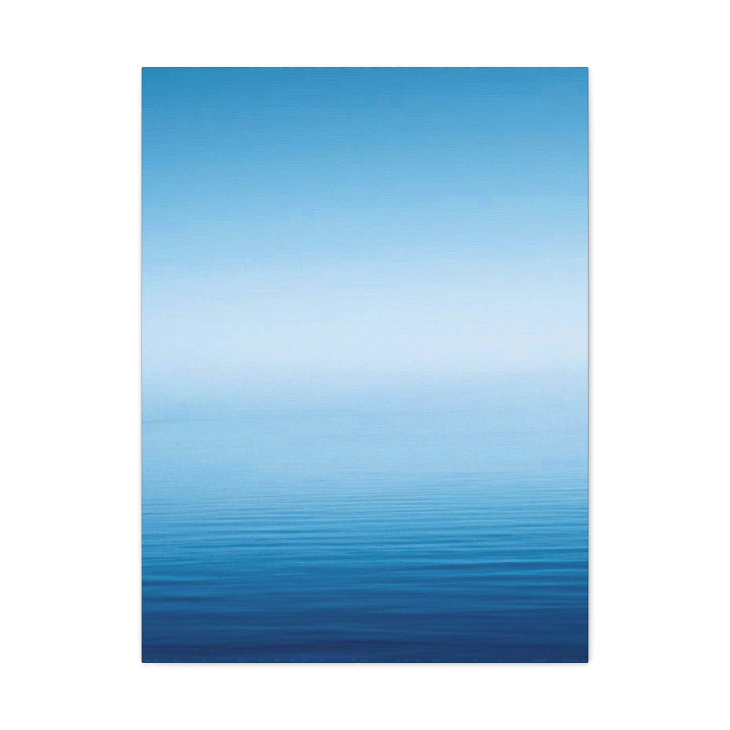
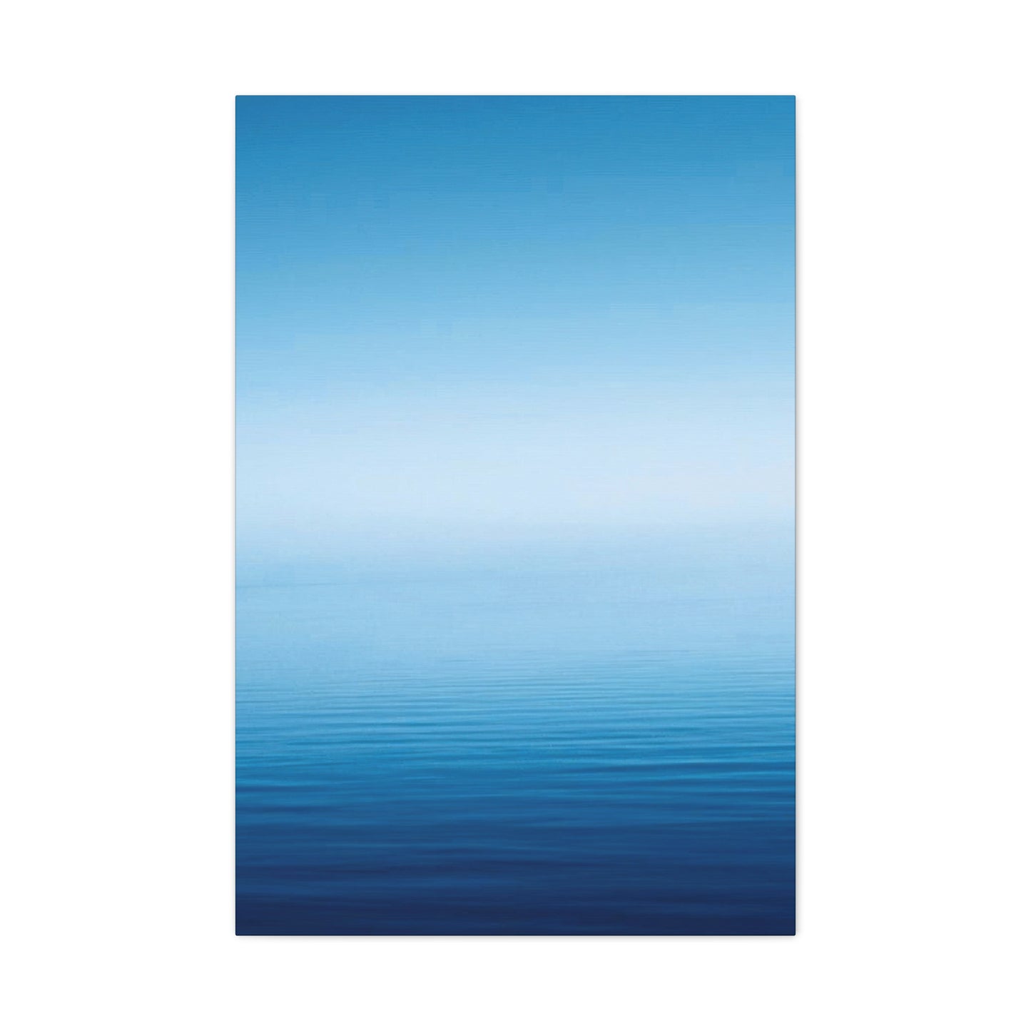
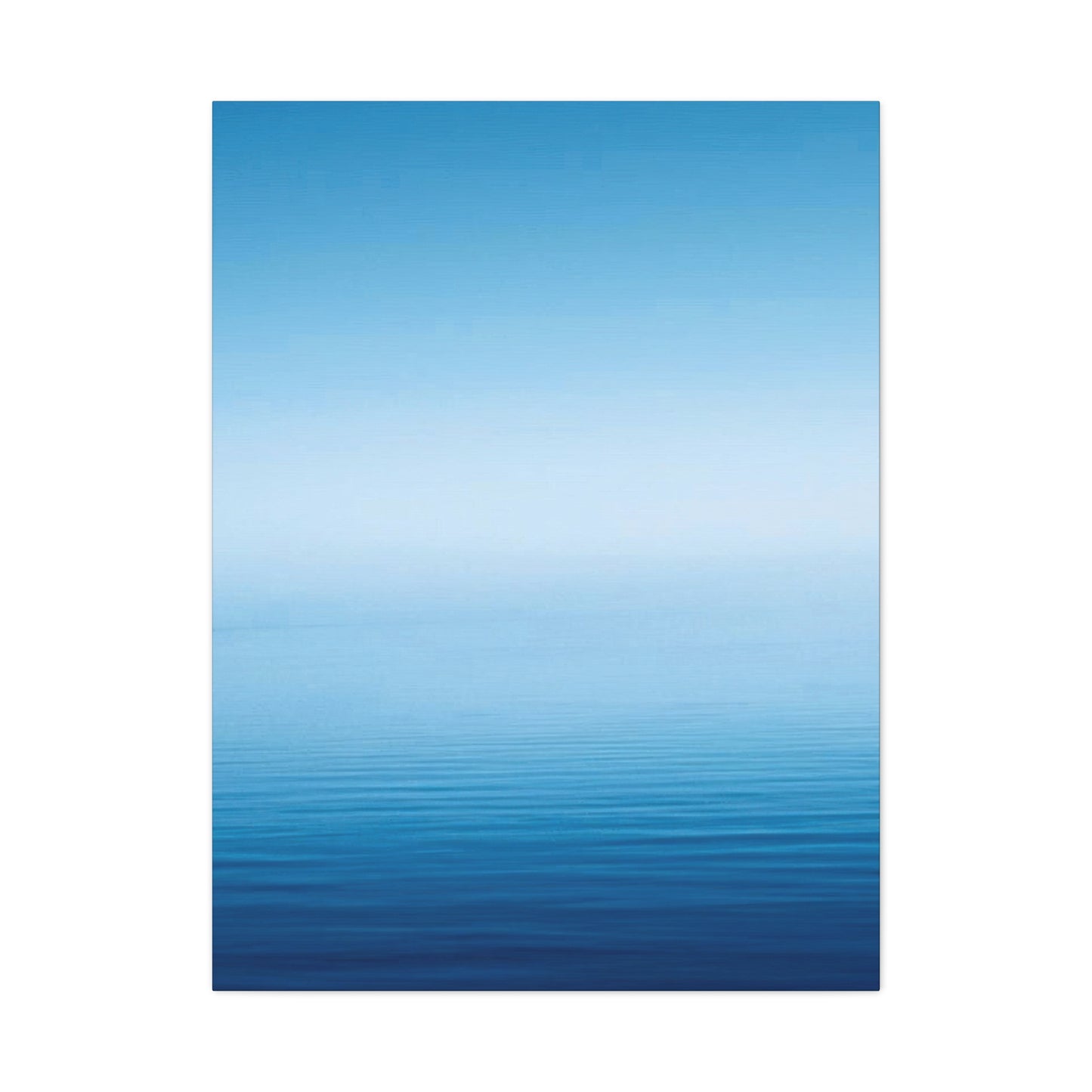
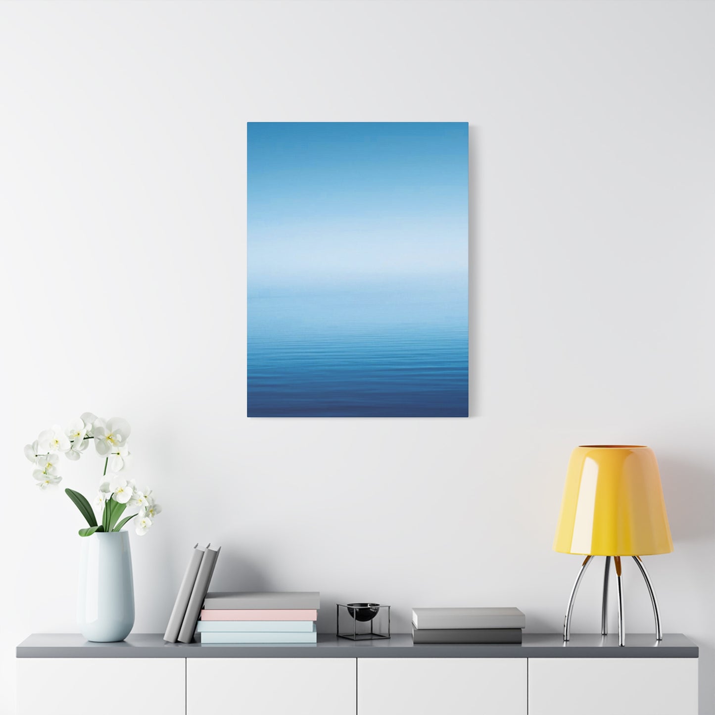
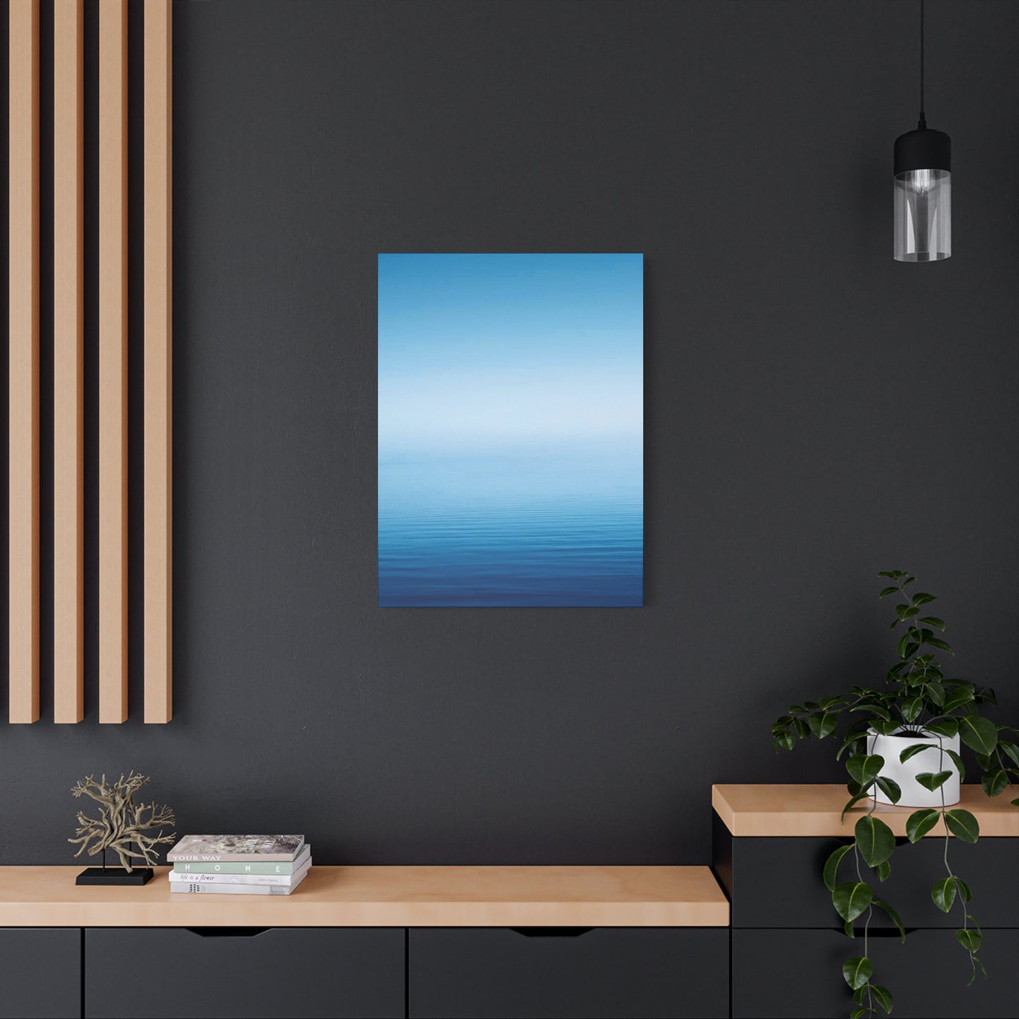
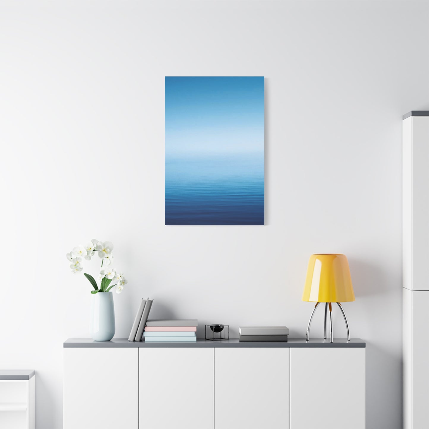
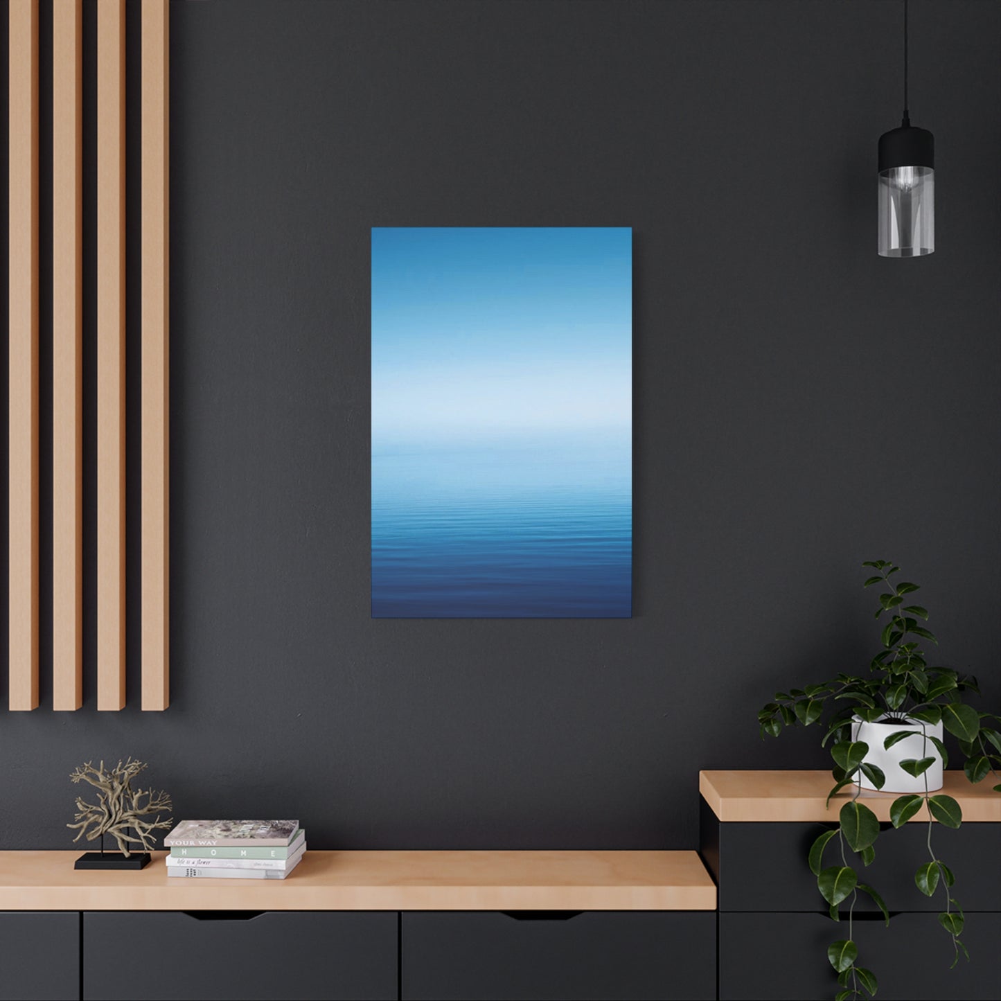
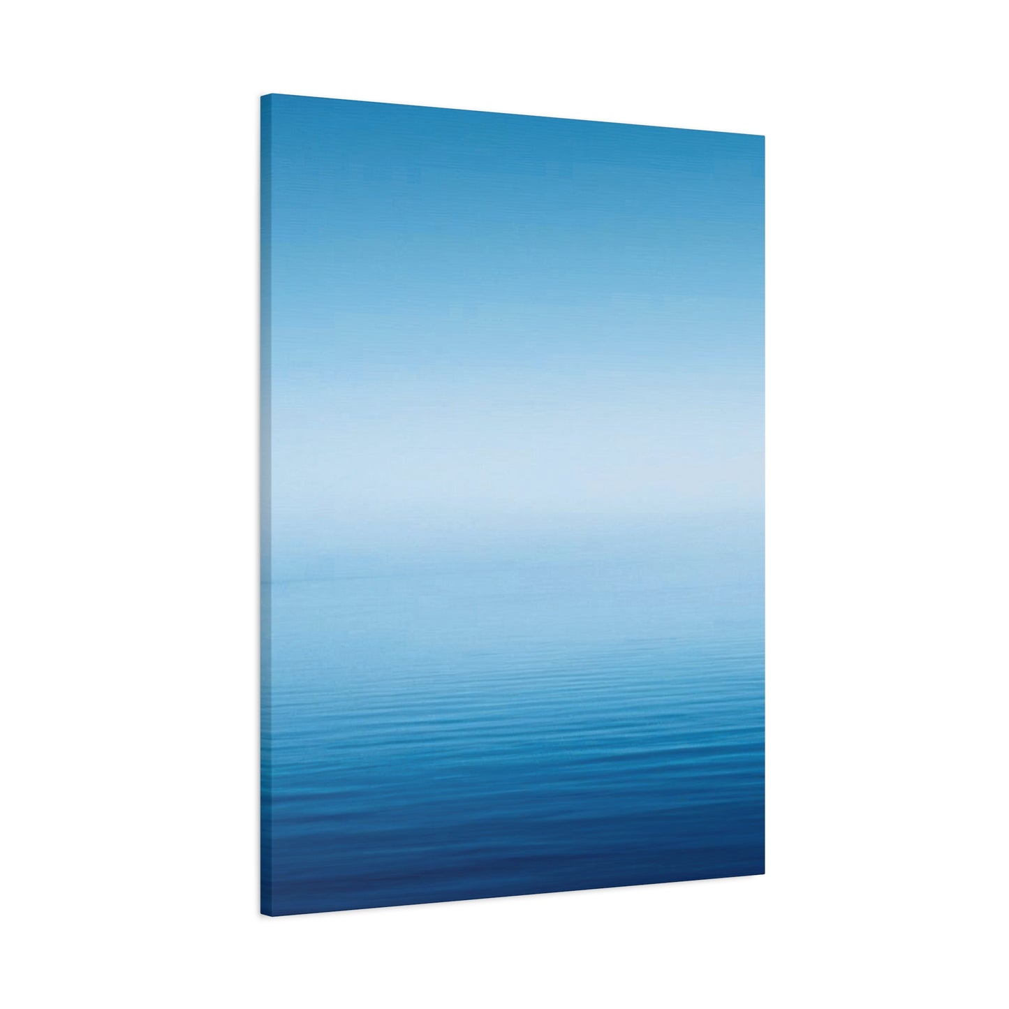
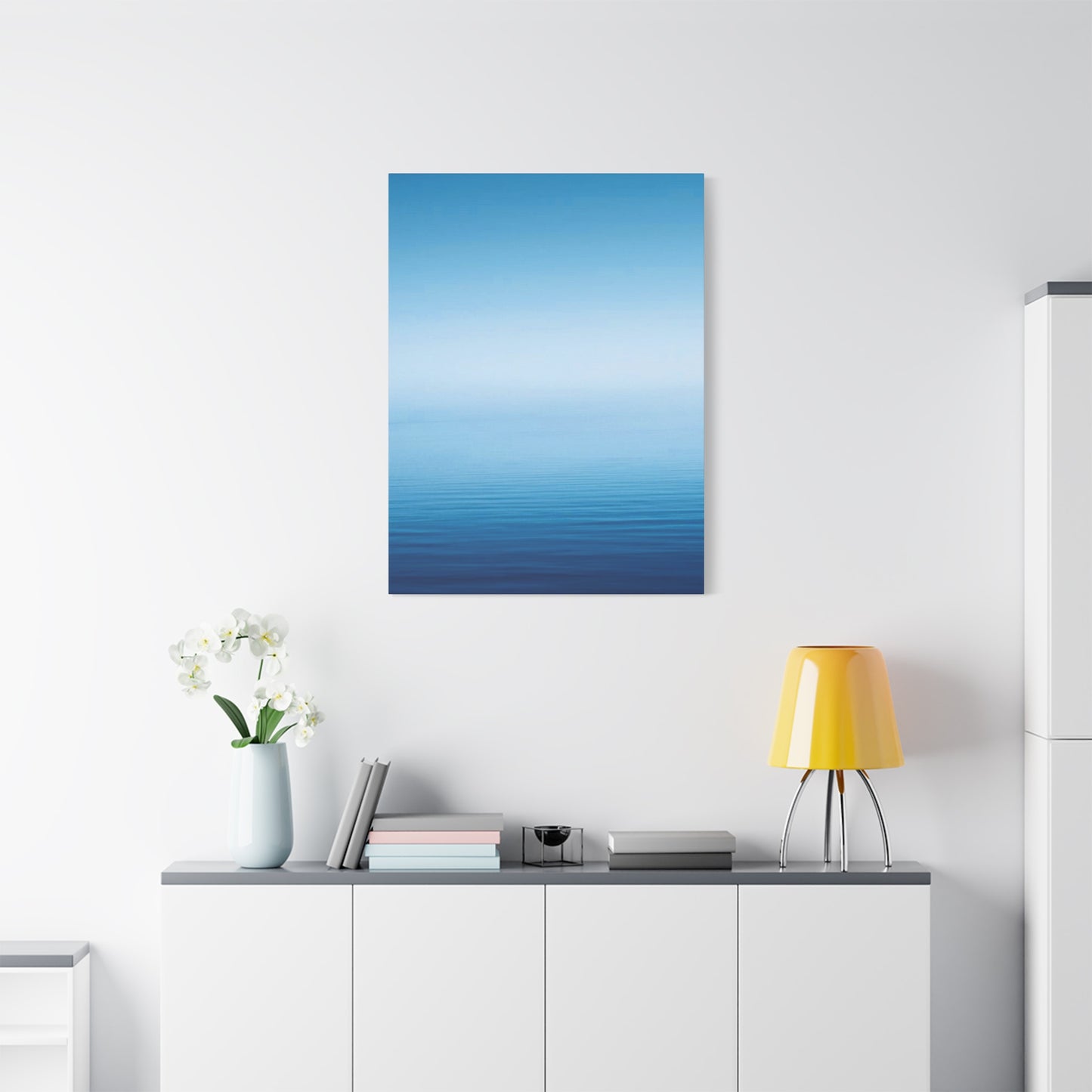
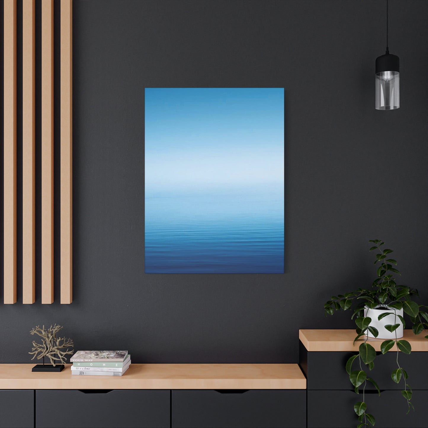
Blue cool gradient wall art canvas prints have emerged as one of the most sought-after decorative elements in contemporary interior design. These stunning pieces combine the calming essence of blue tones with the dynamic visual appeal of gradient transitions, creating artwork that captivates viewers while maintaining a sophisticated aesthetic. The popularity of these canvas prints stems from their remarkable versatility and ability to complement various design styles, from minimalist Scandinavian interiors to bold modern spaces. Homeowners and interior designers alike appreciate how blue gradient artwork can transform a plain wall into a focal point that draws the eye and sparks conversation.
The appeal of blue cool gradient wall art lies in its psychological impact on living spaces. Blue has long been recognized as a color that promotes tranquility, reduces stress, and encourages mental clarity. When combined with gradient techniques that seamlessly blend different shades, these canvas prints create a sense of depth and movement that static solid-color artwork cannot achieve. The cool tones particularly resonate with individuals seeking to create peaceful environments in their bedrooms, meditation spaces, or home offices where concentration and calmness are essential.
Contemporary homeowners are increasingly drawn to abstract and minimalist art forms, and blue gradient canvas prints perfectly align with this trend. Unlike traditional paintings that require specific themes or subjects, gradient artwork offers a more flexible interpretation that allows viewers to project their own emotions and meanings onto the piece. This subjective quality makes these prints universally appealing across different age groups and cultural backgrounds. The smooth transitions between shades of blue, cyan, teal, and azure create a mesmerizing effect that never becomes tiresome, ensuring that these pieces remain relevant and engaging for years to come.
The technical quality of modern canvas printing technology has also contributed significantly to the popularity of blue cool gradient wall art. Advanced printing methods now capture subtle color variations with exceptional precision, reproducing gradients that rival hand-painted artwork. High-resolution printing ensures that even large-format pieces maintain clarity and color accuracy, while UV-resistant inks protect the artwork from fading over time. This combination of artistic beauty and practical durability makes canvas prints an excellent investment for those looking to enhance their living spaces with art that maintains its visual impact through years of display.
Behind Blue Tones in Interior Decoration and Wall Art
The selection of blue cool gradient wall art canvas prints for interior spaces is deeply rooted in color psychology and its profound effects on human emotions and behavior. Blue occupies a unique position in the color spectrum as one of the most universally loved hues across cultures worldwide. Scientific research has consistently demonstrated that exposure to blue tones can lower blood pressure, reduce heart rate, and decrease feelings of anxiety. When incorporated into wall art, particularly through gradient designs, these psychological benefits become an integral part of the daily living environment, subtly influencing mood and mental state throughout the day.
Different shades within the blue spectrum evoke distinct emotional responses, and gradient artwork skillfully leverages these variations to create layered psychological impacts. Lighter blue tones, such as sky blue and powder blue, tend to evoke feelings of openness, freedom, and serenity reminiscent of clear summer skies. These shades work exceptionally well in spaces where relaxation is prioritized, such as bedrooms and bathrooms. Medium blue tones like cerulean and cobalt convey stability, confidence, and trust, making them ideal for home offices and study areas where focus and productivity matter. Deeper blue shades including navy and midnight blue project sophistication, depth, and contemplation, perfect for formal living rooms or dining areas where a more refined atmosphere is desired.
The gradient effect in blue wall art amplifies these psychological benefits by creating visual movement that mimics natural phenomena. The human brain is hardwired to find patterns in nature comforting and engaging, and gradients that resemble ocean depths, twilight skies, or morning horizons tap into these primal connections. This naturalistic quality makes blue gradient canvas prints particularly effective at reducing stress and promoting mental wellbeing. Studies in environmental psychology have shown that viewing artwork with natural color progressions can trigger the same relaxation response as spending time outdoors, offering a practical solution for urban dwellers with limited access to natural environments.
The cool temperature associated with blue tones creates a perceived expansion of space, making rooms feel larger and more open than they actually are. This optical illusion proves particularly valuable in smaller apartments or rooms with limited square footage. When blue cool gradient wall art is strategically placed, it can visually push walls outward, creating breathing room and preventing spaces from feeling cramped or claustrophobic. Interior designers frequently exploit this property when working with challenging architectural constraints, using gradient artwork as a tool to manipulate spatial perception and enhance overall comfort.
Blue's association with water elements in various cultural traditions adds another layer of meaning to gradient wall art. In feng shui philosophy, blue represents the water element, which symbolizes wisdom, fluidity, and abundance. Placing blue gradient artwork in specific areas of the home according to feng shui principles can supposedly enhance various aspects of life, from career success to emotional balance. Whether or not one subscribes to these traditional beliefs, the cultural resonance of blue as a meaningful and powerful color enriches the experience of living with blue gradient canvas prints, adding depth beyond mere aesthetic appreciation.
Exploring Different Styles of Blue Cool Gradient Wall Art Canvas Prints
The world of blue cool gradient wall art canvas prints encompasses a remarkable diversity of artistic styles, each offering unique visual characteristics and emotional resonances. Horizontal gradient designs represent perhaps the most popular category, featuring smooth color transitions that move from left to right or right to left across the canvas. These pieces create a sense of horizon and stability, mimicking sunrises, sunsets, or ocean vistas. The horizontal orientation naturally draws the eye across the width of the wall, making these prints ideal for placement above sofas, beds, or console tables where they can anchor the space and provide visual balance.
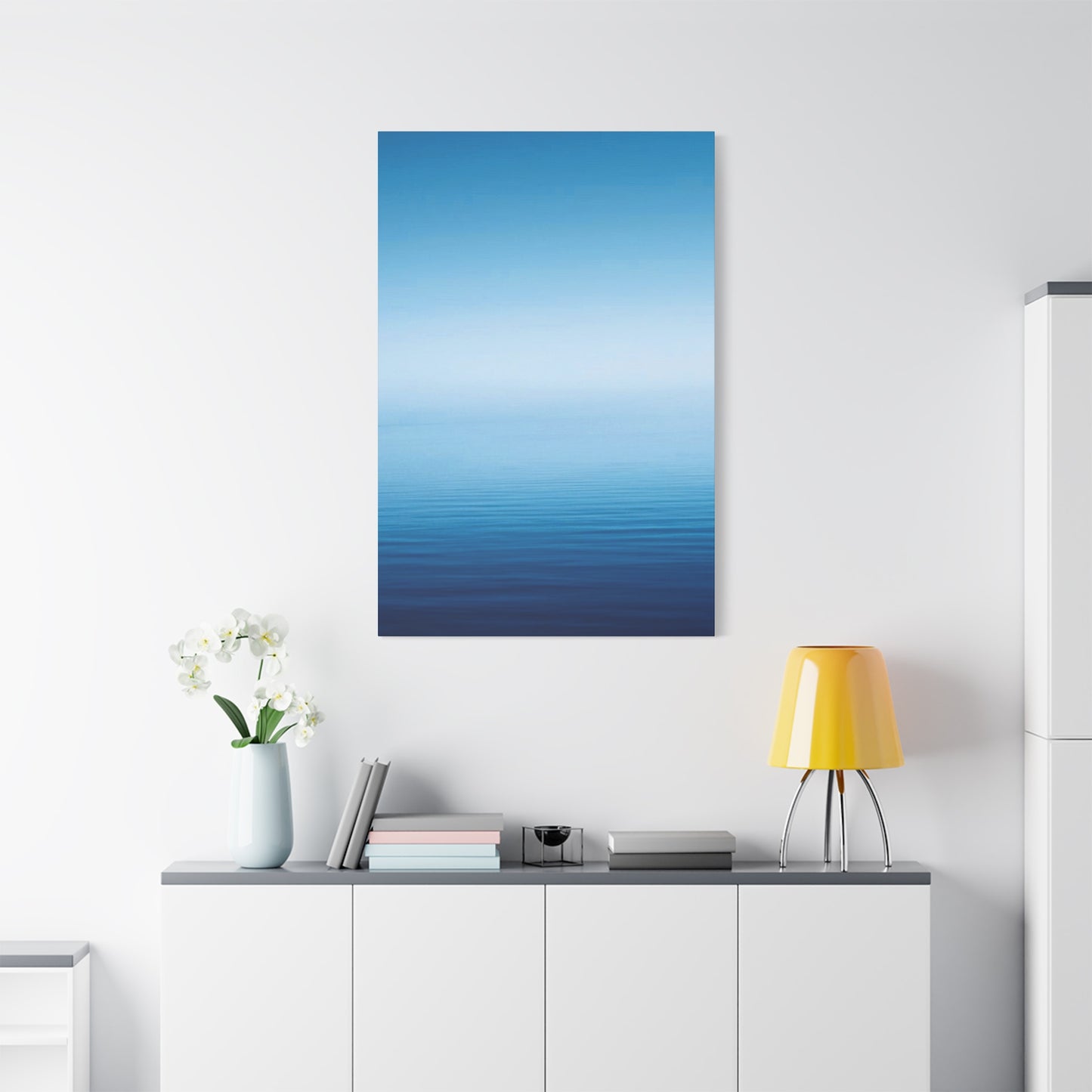
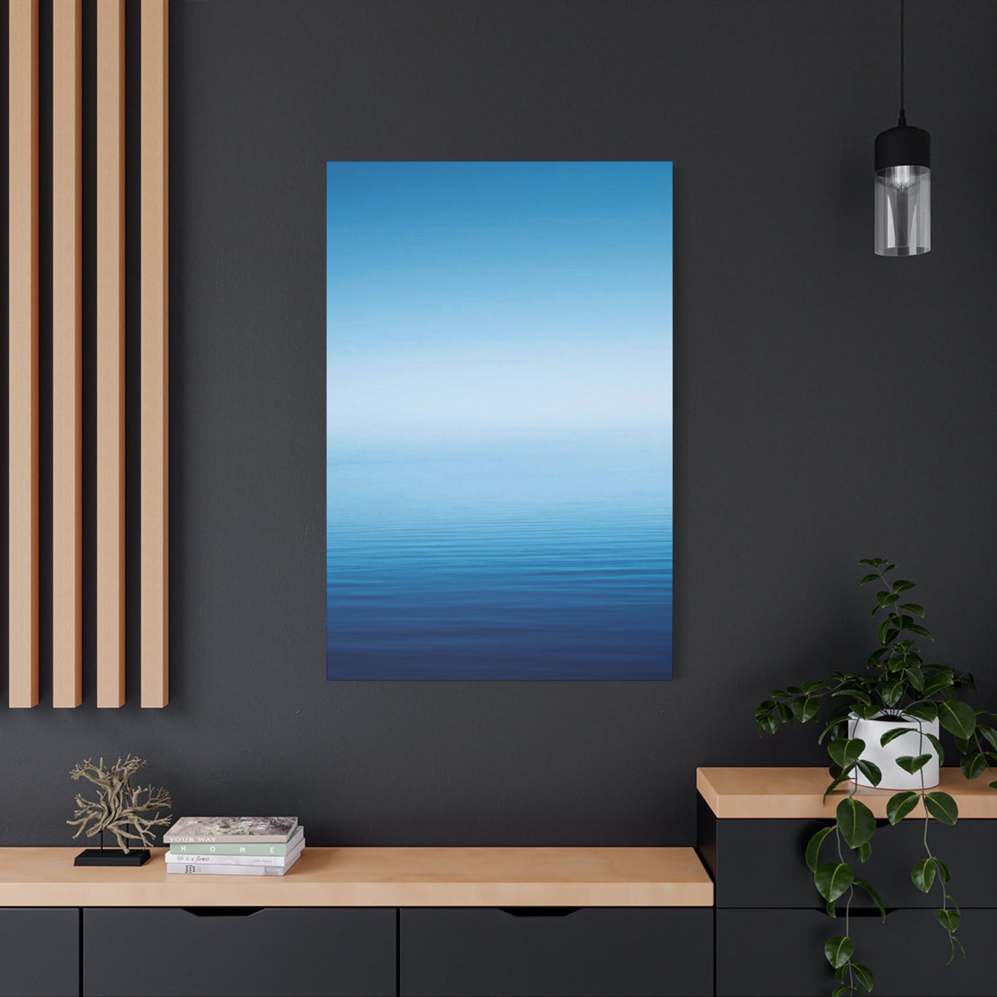
Vertical gradient styles flip this orientation, with color transitions flowing from top to bottom. These designs create a sense of elevation and aspiration, as the eye naturally travels upward when viewing the piece. Vertical gradients work particularly well in rooms with high ceilings, where they can emphasize architectural height and create dramatic impact. The downward flow of color can also evoke waterfalls or rain, adding a dynamic quality to static wall space. Many collectors choose vertical gradient pieces for narrow wall sections, hallways, or spaces between windows where horizontal artwork might feel cramped or disproportionate.
Radial gradient designs introduce circular or spiral color progressions, with blue tones radiating outward from a central point or converging inward toward a focal area. These compositions create powerful visual magnetism, drawing viewers toward the center of the artwork and creating a sense of energy and movement. Radial gradients in cool blue tones can resemble everything from distant galaxies and celestial phenomena to ripples on water surfaces. The concentric nature of these designs makes them excellent conversation starters and natural focal points for feature walls in living rooms, entryways, or creative workspaces.
Multi-directional gradient styles combine various gradient directions within a single composition, creating complex visual landscapes that reward prolonged viewing. These sophisticated pieces might feature diagonal flows, intersecting gradients, or layered transparent effects that produce depth and dimension. The complexity of multi-directional gradients makes them suitable for larger wall spaces where simpler designs might appear underwhelming. These prints work exceptionally well in open-concept living areas, where their intricate details can be appreciated from various viewing distances and angles throughout the space.
Geometric gradient styles incorporate distinct shapes and patterns into the gradient progression, merging the organic flow of color transitions with the structure of geometric design. These pieces might feature triangular sections with different gradient directions, hexagonal patterns with varied blue intensities, or circular shapes arranged in artistic configurations. The combination of mathematical precision and fluid color change creates visual tension that engages the analytical and creative aspects of perception simultaneously. Geometric gradient prints appeal particularly to those with modern or contemporary design sensibilities, complementing spaces with clean lines and architectural interest.
Abstract expressionist approaches to blue gradient wall art embrace irregularity and spontaneity, with color transitions that appear more organic and less predictable than traditional smooth gradients. These pieces might incorporate brushstroke textures, splatter effects, or intentional color bleeding that gives the artwork a more hand-crafted appearance. While still maintaining the overall gradient concept, these expressive styles add personality and uniqueness that mass-produced smooth gradients cannot replicate. Collectors seeking one-of-a-kind aesthetic character often gravitate toward these more artistic interpretations of the gradient concept.
Ombre-style gradients represent a specific subcategory characterized by the gradual lightening or darkening of a single blue hue rather than transitions between different colors. These monochromatic progressions create subtle sophistication and work exceptionally well in minimalist design schemes where color variety might feel excessive. Ombre blue prints can range from nearly white at one extreme to deep indigo at the other, providing tonal variation without introducing additional colors that might clash with existing decor elements. The restraint of ombre designs makes them versatile choices for spaces with bold accent colors or patterned furnishings.
How to Select the Perfect Size of Blue Cool Gradient Wall Art Canvas Prints for Your Space
Choosing the appropriate size for blue cool gradient wall art canvas prints represents a critical decision that dramatically impacts the visual effectiveness of the artwork and its relationship to the surrounding space. The fundamental principle guiding size selection involves proportion and scale relative to both the wall dimensions and the furniture below or around the artwork. As a general guideline, artwork should occupy approximately two-thirds to three-quarters of the available wall space above furniture pieces, creating visual balance without overwhelming the area or appearing disproportionately small.
For walls above sofas, which represent one of the most common placement locations for canvas prints, the artwork width should measure between half and three-quarters of the sofa's length. A standard three-seater sofa measuring roughly seven to eight feet in length pairs well with canvas prints ranging from forty to sixty inches wide. This proportion ensures the artwork feels substantial and anchored rather than appearing as an afterthought floating above the furniture. When opting for multi-panel sets rather than single large prints, the combined width of all panels should follow this same proportional guideline.
Bedroom walls above headboards require similar proportional consideration but with slightly different parameters. The canvas print width should not exceed the headboard width and ideally measures about ten to twenty inches narrower, leaving visual breathing room on either side. For a queen-size bed with a sixty-inch headboard, a canvas print measuring forty to fifty inches wide creates pleasing balance. The height of bedroom artwork should be considered carefully as well, avoiding pieces so tall they create visual weight that feels oppressive in a space meant for relaxation and sleep.
Dining room walls present unique sizing challenges because the artwork needs to relate proportionally to both the dining table and the wall itself. A canvas print above a dining table should be wide enough to visually anchor the eating area without extending beyond the table's length. For a six-foot dining table, artwork measuring four to five feet wide provides appropriate scale. Height becomes less restrictive in dining areas, as these spaces typically tolerate larger statement pieces that command attention during social gatherings.
Small wall sections, such as those flanking windows or in hallways, benefit from carefully measured vertical canvas prints that fill the available space without crowding adjacent architectural features. In these applications, measuring the exact wall dimensions and subtracting six to twelve inches from both height and width provides appropriate sizing that allows the artwork to breathe while maximizing visual impact. Narrow hallways particularly benefit from vertical gradient prints that draw the eye upward and create the illusion of greater height.
Large open walls in living rooms, above fireplaces, or in entryways can accommodate oversized canvas prints that make bold statements. In these applications, going larger than initial instincts suggest often produces better results, as undersized artwork in vast spaces appears lost and fails to anchor the area effectively. Canvas prints measuring six feet wide or larger work well on expansive walls, creating the dramatic impact these prominent locations demand. Consider the viewing distance as well, as artwork in large rooms will be viewed from farther away and needs sufficient size to maintain visual presence across the space.
Multi-panel canvas sets offer flexibility in size customization, allowing the overall dimensions to be adjusted by spacing panels closer together or farther apart. A three-panel blue gradient set might measure twenty inches per panel, creating a combined width of sixty inches when hung with appropriate gaps. These sets work particularly well for very wide walls where a single canvas might appear awkwardly stretched or disproportionate. The individual panels can be arranged horizontally for wide spaces or stacked vertically for tall narrow walls, providing versatile sizing solutions.
Scale considerations extend beyond simple measurements to include the visual weight of the artwork itself. Blue cool gradient prints with darker tones and more dramatic contrast carry more visual weight than lighter, subtle gradients. A dark navy-to-black gradient will dominate a space more than a light sky-blue-to-white gradient of the same physical dimensions. When working with bold, dark gradient designs, slightly smaller sizes may be appropriate to prevent the artwork from overwhelming the space. Conversely, lighter gradient prints can often go larger without creating visual heaviness.
The Best Rooms and Placement Strategies for Blue Cool Gradient Wall Art Canvas Prints
The bedroom represents perhaps the ideal environment for blue cool gradient wall art canvas prints, given the color's scientifically proven sleep-promoting properties. Positioning a gradient print above the headboard creates an immediate focal point that establishes the room's aesthetic tone. The calming progression of cool blue tones helps signal to the brain that the space is meant for rest and relaxation. For optimal effect, choose gradient designs that transition from darker blues near the bottom to lighter shades at the top, mimicking the natural darkening of the sky as night approaches. This downward visual flow subconsciously reinforces restfulness and can contribute to better sleep quality.
Living rooms benefit enormously from the versatile aesthetic of blue gradient canvas prints, particularly when placed above seating areas or on feature walls opposite the main entrance. In open-concept living spaces, a large gradient print can serve as a unifying visual element that ties together different functional zones within the larger area. The cool tones provide a neutral backdrop that allows other design elements to shine while still maintaining presence and interest. For living rooms with abundant natural light, positioning the artwork on walls perpendicular to windows prevents direct sunlight exposure that could fade the print over time while ensuring the piece receives enough illumination to display its color nuances effectively.
Home offices and study areas gain significant functional benefits from blue gradient wall art, as the color promotes concentration, mental clarity, and productive thinking. Placing the artwork on the wall directly in front of the desk provides a visual focal point during brief mental breaks, allowing the eyes to rest on something calming rather than staring at blank walls or cluttered spaces. The gradient's gentle movement offers just enough visual interest to prevent boredom without becoming distracting during work sessions. For those who conduct video calls from home offices, positioning gradient artwork in the background creates a professional yet personalized backdrop that appears polished on camera.
Bathroom spaces, though often overlooked for artwork placement, provide excellent opportunities for blue gradient canvas prints, particularly when using properly sealed canvases designed to withstand humidity. The natural association between blue tones and water makes these prints feel inherently appropriate in bathroom settings. Placing a gradient print above the bathtub creates a spa-like atmosphere that enhances the relaxation experience during baths. Smaller gradient pieces work well above toilet areas or on walls adjacent to vanities, adding visual interest to spaces that might otherwise feel purely functional.
Meditation rooms, yoga spaces, and other wellness-focused areas benefit immensely from the tranquil energy of blue cool gradient wall art. The absence of representational imagery in gradient designs prevents mental distraction during mindfulness practices, while the color's calming properties support the meditative state. Positioning the artwork at eye level when seated on the floor ensures it's visible during meditation sessions without requiring neck strain. For yoga spaces, placing gradient prints on walls facing the typical yoga mat orientation allows practitioners to focus on the calming colors during certain poses and relaxation periods.
Dining rooms present excellent opportunities for more dramatic blue gradient pieces, as these social spaces benefit from artwork that stimulates conversation and creates atmosphere. A large gradient canvas on the main dining room wall serves as both a conversation piece and a sophisticated backdrop for dinner parties and family meals. The cool tones of blue gradients provide an elegant counterpoint to the warm tones often present in wood dining furniture and table settings. For formal dining rooms, consider deeper gradient transitions that include navy or midnight blue for added sophistication and drama.
Entryways and foyers benefit from the immediate impact of blue gradient artwork, which sets the tone for the entire home from the moment guests arrive. A striking gradient print on the first visible wall creates a memorable first impression and establishes the home's aesthetic sensibility. The cool, welcoming nature of blue makes visitors feel comfortable while demonstrating the homeowner's design awareness. In narrow entry halls, vertical gradient prints can make the space feel taller and less confined, improving the perceived proportions of challenging architectural areas.
Children's rooms and nurseries can incorporate lighter, gentler blue gradients that provide visual interest without overstimulation. Soft transitions from pale blue to white or from light aqua to cream create soothing environments conducive to both play and rest. Position these prints where they're visible from the crib or bed but not directly overhead, as artwork above sleeping areas can sometimes feel imposing. For older children's rooms, more vibrant gradient designs with broader tonal ranges can reflect energetic personalities while maintaining the calming undercurrent that blue naturally provides.
Combining Blue Cool Gradient Wall Art Canvas Prints with Various Interior Design Styles
Modern minimalist design philosophy pairs exceptionally well with blue cool gradient wall art canvas prints, as both emphasize clean lines, uncluttered spaces, and intentional aesthetic choices. In minimalist interiors, where every element must justify its presence, a gradient canvas print serves multiple functions simultaneously: it provides color, creates visual interest, and establishes focal points without introducing pattern complexity or decorative excess. The smooth transitions of gradient designs align perfectly with minimalism's appreciation for simplicity and restraint. When integrating gradient prints into minimalist spaces, select pieces with subtle color progressions and avoid ornate frames, opting instead for simple floating frames or frameless gallery wrapping that maintains the clean aesthetic.
Scandinavian design schemes embrace cool color palettes, natural materials, and cozy functionality, making blue gradient canvas prints natural companions for this popular style. The Nordic approach to design values light, airy spaces with touches of color used strategically rather than overwhelmingly. A blue gradient print in a Scandinavian-style room might feature transitions from pale ice blue to crisp white, echoing the winter landscapes that inspire this design tradition. Pair these prints with natural wood furniture, white or light gray walls, and textural elements like wool throws and linen curtains to create the characteristic hygge atmosphere that defines Scandinavian interiors.
Contemporary design, characterized by current trends and a less rigid aesthetic than strict modernism, accommodates blue gradient wall art with ease. Contemporary spaces often mix materials, textures, and periods, creating eclectic yet cohesive environments where gradient artwork can serve as either a subtle background element or a bold statement piece. In contemporary settings, experiment with larger gradient prints that incorporate multiple shades of blue or transition into related colors like teal or turquoise. The flexibility of contemporary design allows for creative hanging arrangements, such as asymmetrical groupings of multiple gradient panels or unconventional placement that breaks traditional rules.
Industrial design aesthetics, featuring exposed brick, metal fixtures, and urban loft sensibilities, benefit from the softening influence of blue gradient canvas prints. The hardness of industrial materials and the rawness of exposed structural elements create a masculine energy that can feel cold or unwelcoming without balancing elements. Blue gradient artwork introduces organic fluidity and color warmth that humanizes industrial spaces without contradicting their fundamental character. Choose gradient prints with deeper, more saturated blue tones that can hold their own against the visual weight of industrial elements, and consider metal frames that echo other metallic finishes in the space.
Coastal and nautical design themes find obvious synergy with blue cool gradient wall art, given the color's direct associations with ocean and sky. In beach-inspired interiors, gradient prints can literally represent the meeting of sea and sky, creating artwork that reinforces the room's thematic focus. Pair these prints with white or sand-colored walls, natural fiber rugs, and driftwood accessories to build a cohesive coastal narrative. For more sophisticated coastal designs that avoid kitsch, choose gradient prints with complex color progressions that suggest ocean depths rather than simple light-blue beach themes, and balance them with organic textures and refined furnishings.
Mid-century modern design, experiencing ongoing revival popularity, combines clean lines with organic forms and bold color choices. Blue gradient prints complement mid-century aesthetics when paired with the era's characteristic furniture pieces like teak sideboards, molded plastic chairs, and geometric patterned textiles. The gradient's organic color flow echoes mid-century design's appreciation for biomorphic shapes while maintaining the period's commitment to clean, uncluttered visual presentations. Select gradient prints with color intensities that match the boldness of mid-century accent colors, and consider wooden frames in warm tones that reference the era's love of quality woodcraft.
Transitional design, which bridges traditional and contemporary aesthetics, requires careful selection of blue gradient artwork that works with both design languages. In transitional spaces, choose gradient prints with medium color intensities that neither skew too bold and modern nor too pale and traditional. The artwork should feel substantial enough to coexist with traditional furniture pieces while maintaining the clean simplicity that connects to contemporary elements. Framing choices become particularly important in transitional designs, with simple but substantial frames in classic finishes like gold, silver, or dark wood helping the contemporary gradient artwork feel at home alongside more traditional pieces.
Bohemian and eclectic design styles, characterized by layered patterns, mixed cultural influences, and collected-over-time aesthetics, can incorporate blue gradient prints as grounding elements amid visual complexity. In boho spaces rich with pattern and color, a gradient print's smooth transitions provide visual rest areas where the eye can relax between more stimulating decorative elements. The key to successful integration lies in ensuring the blue tones in the gradient artwork appear elsewhere in the room's color scheme, creating cohesive threads that tie disparate elements together. Position gradient prints where they can serve as bridges between different design influences rather than as competing focal points.
Understanding Canvas Print Quality and Materials for Blue Cool Gradient Wall Art
The foundation of any high-quality blue cool gradient wall art canvas print begins with the canvas material itself, which comes in several distinct types, each with specific characteristics affecting appearance and longevity. Cotton canvas represents the traditional choice, prized for its natural texture and excellent ink absorption properties. High-grade cotton canvases create slight texture variation that adds depth to gradient prints, catching light differently across the surface and creating subtle visual interest. The fabric's natural fiber construction allows it to breathe, preventing moisture accumulation that could damage the print over time, making cotton an excellent choice for artwork displayed in bathrooms or humid climates.
Polyester canvas offers modern advantages including exceptional durability, resistance to stretching and sagging, and superior color vibrancy. The synthetic fibers create a smoother surface than cotton, which some viewers prefer for gradient artwork as it allows uninterrupted color transitions without textural interference. Polyester's inherent water resistance provides additional protection against humidity and accidental splashes, though this same quality can sometimes prevent ink from penetrating as deeply as with natural fiber options. Many premium canvas prints use cotton-polyester blends that attempt to capture the best qualities of both materials, combining cotton's natural appeal with polyester's practical advantages.
The weight and thickness of canvas material significantly impact the perceived quality and durability of gradient wall art. Canvas weight is measured in ounces per square yard, with professional-grade canvases typically ranging from eight to fifteen ounces. Lighter canvases around eight ounces work adequately for smaller prints and budget-conscious applications but may show warping over time, particularly in larger formats. Medium-weight canvases between ten and twelve ounces offer the best balance of quality and affordability for most applications, providing sufficient structure to resist sagging while remaining cost-effective. Heavy-weight canvases above twelve ounces deliver museum-quality results with exceptional flatness retention but come at premium prices appropriate mainly for large investment pieces.
The printing technology employed for creating blue gradient wall art dramatically affects color accuracy, longevity, and overall visual impact. Inkjet printing dominates the canvas print market due to its ability to produce smooth color gradations essential for gradient artwork. Within inkjet technology, different ink formulations create varying results. Dye-based inks produce vibrant, saturated colors with smooth transitions ideal for gradient effects but offer limited fade resistance without protective coatings. Pigment-based inks trade slight color intensity for dramatically superior lightfastness, ensuring gradient prints maintain their appearance for decades even in rooms with significant natural light exposure.
Resolution specifications determine the sharpness and detail clarity of canvas prints, measured in dots per inch or DPI. For gradient artwork without fine details or text, lower resolutions may suffice, but higher specifications still improve overall quality by enabling smoother color transitions. Professional canvas printing typically operates at 300 DPI or higher, ensuring even close examination reveals no visible pixelation or banding in gradient progressions. When commissioning custom gradient prints, verify that the source file resolution supports the final print dimensions at appropriate DPI to avoid disappointing results with visible color bands or quality degradation.
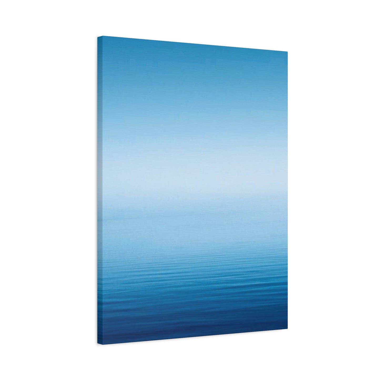
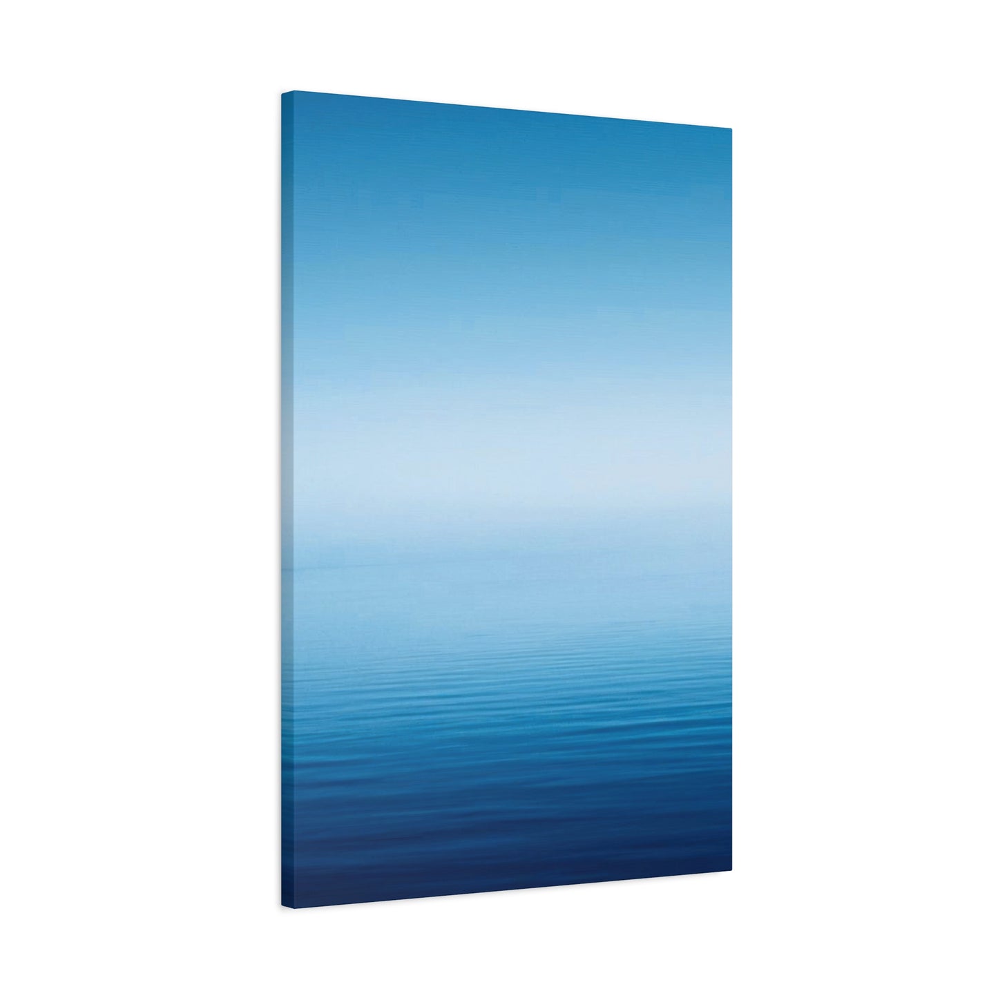
Stretcher bars, the wooden frames over which canvas wraps, contribute substantially to the finished print's appearance and structural integrity. Standard stretcher bar depths measure three-quarters to one inch, creating relatively flat profiles suitable for traditional framing or spaces where protruding artwork might be problematic. Gallery-wrapped canvases use thicker stretcher bars, typically one-and-a-half to two inches deep, creating substantial three-dimensional presence that eliminates framing requirements. The gradient design continues around the canvas edges in gallery wrapping, producing finished sides that look intentional and complete from any viewing angle. Premium stretcher bars feature cross-bracing and corner reinforcements that prevent warping in larger prints.
Coating and finishing treatments protect gradient canvas prints while affecting their visual appearance and texture. Gloss coatings enhance color vibrancy and saturation, making blue tones appear more intense and transitions more dramatic. The reflective surface creates dynamic viewing experiences as lighting conditions change throughout the day, though it may also produce unwanted glare in certain room positions. Matte finishes eliminate glare and reflection, creating consistent appearance regardless of lighting while producing sophisticated, gallery-quality aesthetics. Satin finishes offer compromise positions with slight sheen that enhances colors without excessive reflection. UV-protective coatings, regardless of finish type, provide essential protection against fading and should be considered mandatory for artwork in rooms with significant sun exposure.
Edge finishing options affect the completed look of gallery-wrapped canvas prints significantly. Mirror-wrapped edges reflect the nearest edge imagery, creating continuity but sometimes producing awkward color jumps at corners in gradient designs. Color-wrapped edges extend the nearest gradient color around the sides, creating solid-color borders that work well when the gradient reaches pure colors at canvas edges. Image-wrapped edges continue the gradient design around the sides, though this requires careful planning to ensure color progressions flow naturally around three-dimensional corners. Black or white wrapped edges provide neutral borders that work with any gradient design but create distinct visual breaks between front face and sides.
The Art of Creating Harmonious Color Schemes Around Blue Cool Gradient Wall Art Canvas Prints
Developing a cohesive color scheme around blue cool gradient wall art canvas prints begins with understanding the specific blue tones present in the artwork and how they interact with surrounding colors. Analyze your gradient print carefully to identify the lightest and darkest blue shades, any undertones of purple, green, or gray, and the overall temperature of the color progression. This analysis provides a foundation for making coordinated color decisions throughout the space. Extract three to five key colors from the gradient artwork to serve as your color palette foundation, ensuring at least one light shade, one medium tone, and one darker accent color for creating visual depth and interest.
Monochromatic color schemes built entirely around different values of blue create sophisticated, cohesive environments where the gradient artwork feels perfectly integrated. In monochromatic approaches, vary the intensity and lightness of blue throughout the room rather than using a single flat blue everywhere. Walls might feature a pale sky blue several shades lighter than the gradient's lightest tones, while upholstery incorporates medium blues that appear within the gradient progression, and accent pieces introduce darker navy tones from the gradient's deeper ranges. This layered approach prevents monotony while maintaining harmonious unity that allows the gradient artwork to shine as the space's colorful centerpiece.
Analogous color schemes incorporate colors adjacent to blue on the color wheel, typically including greens and purples that create naturally harmonious combinations. For blue gradient artwork with cool undertones, introduce accessories and textiles in shades of teal, turquoise, seafoam green, and aqua that extend the artwork's color family throughout the space. When the gradient includes purple undertones, incorporate lavender, periwinkle, and soft violet accents that complement rather than compete with the artwork. Analogous schemes create serene, flowing environments where colors blend seamlessly, ideal for bedrooms and relaxation spaces where visual calm supports the room's function.
Complementary color schemes pair blue with its opposite on the color wheel: orange. While this might initially seem counterintuitive for maintaining a cool, calming atmosphere, thoughtful application of warm orange accents creates vibrant energy and visual excitement that prevents blue-heavy spaces from feeling cold or sterile. Rather than introducing bright traffic-cone orange, select muted warm tones like terracotta, rust, amber, and copper that provide complementary contrast without overwhelming the cool blue gradient foundation. Use these warm accents sparingly in throw pillows, artwork frames, small decorative objects, or single furniture pieces that punctuate the space without dominating it.
Neutral color schemes allow blue gradient artwork to serve as the primary color source in spaces dominated by whites, grays, beiges, and blacks. This approach proves particularly effective when the gradient print features bold, saturated blues that provide sufficient color impact without additional chromatic support. In neutral environments, the gradient becomes an even more powerful focal point as it stands alone against subdued backgrounds. Layering different neutral tones prevents blandness; combine warm off-whites with cool grays, natural beige with charcoal, and various wood tones to create depth and interest that supports rather than competes with the blue gradient centerpiece.
Metallic accents introduce reflective elements that enhance blue gradient artwork through light interaction and luxurious aesthetic elevation. Silver and chrome metallics complement cool blue tones naturally, creating cohesive modern or contemporary aesthetics. Gold and brass metallics provide warm contrast that prevents blue-dominant spaces from feeling cold while adding sophisticated glamour. Copper metallics offer middle-ground options with rosy warmth that complements blue without the formality of gold. Distribute metallic elements through light fixtures, picture frames, decorative accessories, and furniture hardware to create subtle continuity that catches light and draws attention to the gradient artwork.
Natural material palettes featuring wood, stone, natural fibers, and plants create organic foundations that ground blue gradient artwork in physical reality and prevent spaces from feeling too abstract or sterile. Light woods like oak, maple, and birch maintain bright, airy feelings that complement lighter gradient prints, while darker woods including walnut and mahogany provide grounding weight appropriate for deeper gradient designs. Natural stone in gray, white, or beige tones offers textural interest and color neutrality that supports blue artwork. Living plants introduce organic shapes and additional green tones that harmonize with blue through analogous color relationships while improving air quality and bringing life to the space.
Pattern integration requires careful consideration to avoid visual competition with gradient artwork while maintaining decorative interest. Geometric patterns in coordinating blue tones create contemporary cohesion, particularly when pattern scales differ sufficiently from the gradient's smooth transitions. Small-scale geometric patterns in textiles or rugs provide visual texture without overwhelming, while larger geometric patterns should be used sparingly on single accent pieces. Organic patterns inspired by natural forms like florals, leaves, or water ripples complement gradient artwork's flowing qualities. Ensure any patterned elements incorporate colors pulled directly from the gradient print to maintain harmonious coordination.
Different Framing Options and Presentation Styles for Blue Cool Gradient Wall Art Canvas Prints
Floating frames represent one of the most popular presentation styles for blue gradient canvas prints, creating sophisticated three-dimensional effects that add depth and presence to the artwork. These frames feature a small gap between the canvas edge and frame interior, making the artwork appear to hover within the frame rather than pressed against it. The shadow gap, typically ranging from one-quarter to one-half inch, adds visual interest and contemporary styling that complements the modern aesthetic of gradient artwork. Floating frames come in various materials and finishes, with natural wood options providing warmth, metallic frames offering sleek modernity, and black or white frames delivering timeless versatility.
Gallery wrapping without additional framing creates clean, minimalist presentations where the gradient design continues around the canvas edges, eliminating the need for separate frames entirely. This approach maximizes the artwork's visible surface area and creates seamless integration with walls, particularly effective in modern and contemporary interiors. Gallery-wrapped canvases require sufficient stretcher bar depth, typically one-and-a-half inches or more, to create substantial three-dimensional presence that justifies the frameless presentation. The edge treatment becomes crucial in gallery wrapping; ensure the gradient design flows naturally around corners or select solid edge colors that complement the primary face design.
Traditional framing with matting introduces classical elegance to gradient canvas prints, though this approach appears less common for contemporary gradient designs. When matting gradient artwork, select mat colors that appear within the gradient itself, typically choosing lighter shades that don't compete with the artwork's color impact. Mat width should be proportional to the artwork size, with two to four inches working well for most prints. Frame moldings can range from simple profiles that let the artwork dominate to more ornate designs appropriate for traditional interiors. Ensure matting uses acid-free materials to prevent color degradation over time.
Shadow box framing creates dramatic three-dimensional presentations where the canvas floats within a deeper frame structure, separated from the backing by one to three inches. This presentation style casts actual shadows around the artwork, creating dynamic visual effects that change with lighting conditions throughout the day. Shadow boxes work particularly well for thicker gallery-wrapped canvases and create museum-quality presentations suitable for valuable or significant pieces. The depth allows for creative backlighting installations that can illuminate the canvas from behind, creating ethereal glowing effects particularly stunning with lighter gradient designs.
Minimalist strip framing uses thin metal or wood strips along canvas edges rather than full frames, providing structure and protection while maintaining clean, contemporary aesthetics. These strips can be as narrow as half an inch, creating barely-there framing that adds definition without visual weight. Strip frames prove particularly effective when displaying multiple gradient panels as sets, as the minimal framing allows the individual pieces to read as cohesive unified installations rather than separate framed artworks. This approach works best with high-quality gallery-wrapped canvases that don't require framing to hide edge imperfections.
Acrylic or plexiglass face mounting creates ultra-modern presentations where the canvas print is permanently bonded to the back of a clear acrylic panel. The acrylic face intensifies colors, adds glossy depth, and provides substantial protection against environmental damage and UV exposure. This presentation style works exceptionally well for gradient artwork, as the smooth acrylic surface enhances color transitions and creates luminous effects impossible with standard canvas presentations. Face-mounted prints require no additional framing and can be hung directly on walls using hidden mounting hardware, creating sleek floating appearances particularly suited to contemporary and minimalist spaces.
Multiple panel installations without frames create dramatic contemporary presentations where several gradient canvases combine to form larger unified artworks. These installations might feature triptychs with three panels, diptychs with two panels, or more complex arrangements with five or more pieces. The spacing between panels becomes a critical design element, typically ranging from one to four inches depending on overall scale and desired effect. Consistent alignment ensures the gradient flows naturally across panel breaks, or intentional misalignment can create interesting visual disruption effects. Unframed multi-panel installations maximize color impact and create striking focal walls.
Conclusion
In conclusion, Blue Cool Gradient Wall Art is an exceptional way to elevate your interior décor by harnessing the transformative power of color transitions. Color has an undeniable influence on the mood and energy of a space, and the gradual, soothing shift from one shade of blue to another can create a calming, harmonious atmosphere in any room. Whether you're designing a minimalist sanctuary, a modern living room, or a peaceful bedroom retreat, gradient art offers a visually stunning yet subtle way to enhance your home’s aesthetic.
The power of color transitions in interior design is not just about beauty; it’s about the emotions they evoke. Blue is traditionally known for its calming and tranquil qualities, often associated with the sky, water, and openness. The fluid gradient of cool blues can evoke a sense of serenity, making it an ideal choice for spaces designed for relaxation and reflection. The soft, gradual shift in tone creates a gentle flow of energy, promoting a feeling of peace without overwhelming the senses. This makes Blue Cool Gradient Wall Art the perfect addition to spaces like bedrooms, home offices, or living areas where you want to foster a sense of calm and balance.
Moreover, the gradual transition in gradient art is visually captivating. The blending of hues not only adds depth and dimension to the artwork, but it also draws the viewer’s eye in a subtle, almost hypnotic way. This natural flow mimics the soothing rhythms found in nature, making the piece feel alive and dynamic, yet tranquil. The blend of lighter and darker shades of blue can also serve to ground a space or highlight key areas of the room. For example, in a minimalist setting, the gradient can act as both a focal point and a complementary element to the surrounding décor, adding interest without cluttering the space.
Gradient art also plays a vital role in creating a sense of movement and transformation within a room. The smooth transition from one color to another can represent change, growth, and fluidity, which are powerful concepts in interior design. This type of artwork can be used to evoke the feeling of openness or to direct attention to certain parts of a space. It offers a dynamic contrast to solid, static colors while maintaining a sense of unity and flow. In this way, the art does more than simply occupy wall space — it guides the room’s energy and atmosphere.
Incorporating Blue Cool Gradient Wall Art into your home also gives you the opportunity to explore the psychological effects of color in design. Blue tones, known for their associations with peace and reliability, can make a room feel more expansive, grounded, and serene. As a cool color, blue can also help regulate temperature perception, making it perfect for warmer climates or rooms where you want to create a cool, refreshing ambiance. Additionally, because blue is such a versatile color, it pairs effortlessly with a wide range of other hues. Whether you opt for a piece that includes subtle hints of greens, grays, or purples, the gradient effect seamlessly integrates into a variety of design schemes.
Lastly, the timeless appeal of gradient art ensures its place as a lasting trend in interior design. Unlike specific color trends that may fade with time, the beauty of a gradient — especially in the versatile, soothing tones of blue — will always have a place in modern and contemporary homes. As your space evolves, your Blue Cool Gradient Wall Art will continue to serve as both a visual anchor and a calming presence, adapting seamlessly to changing décor and furniture styles.
In closing, Blue Cool Gradient Wall Art is more than just a decorative choice; it’s a tool for enhancing the mood, flow, and overall energy of a room. By introducing this dynamic yet soothing artwork into your space, you can create an environment that feels peaceful, balanced, and visually captivating. Whether you’re looking to refresh an existing room or add a touch of elegance to a new space, the power of color transitions through gradient art offers a simple yet profound way to elevate your home’s décor and overall ambiance.
