


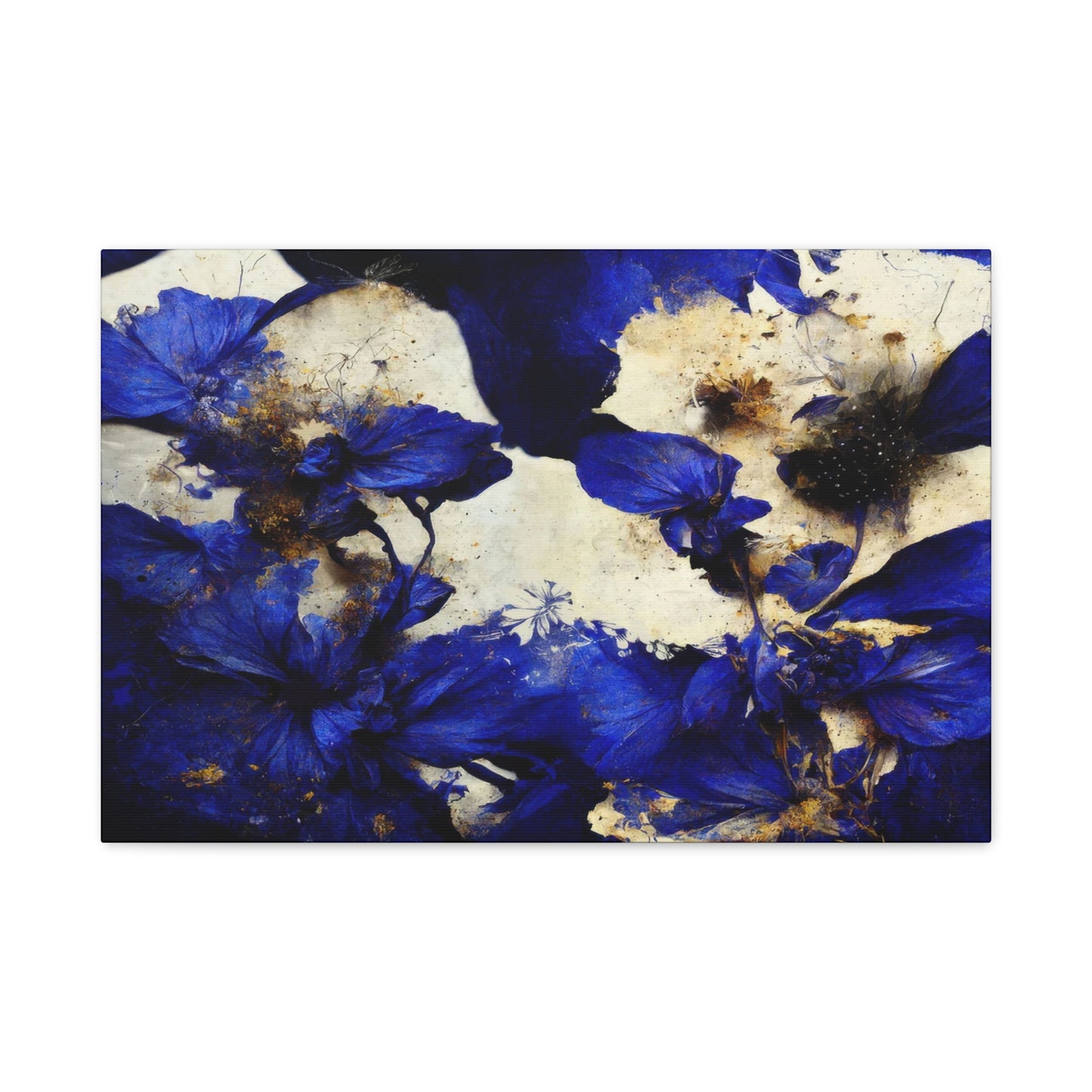
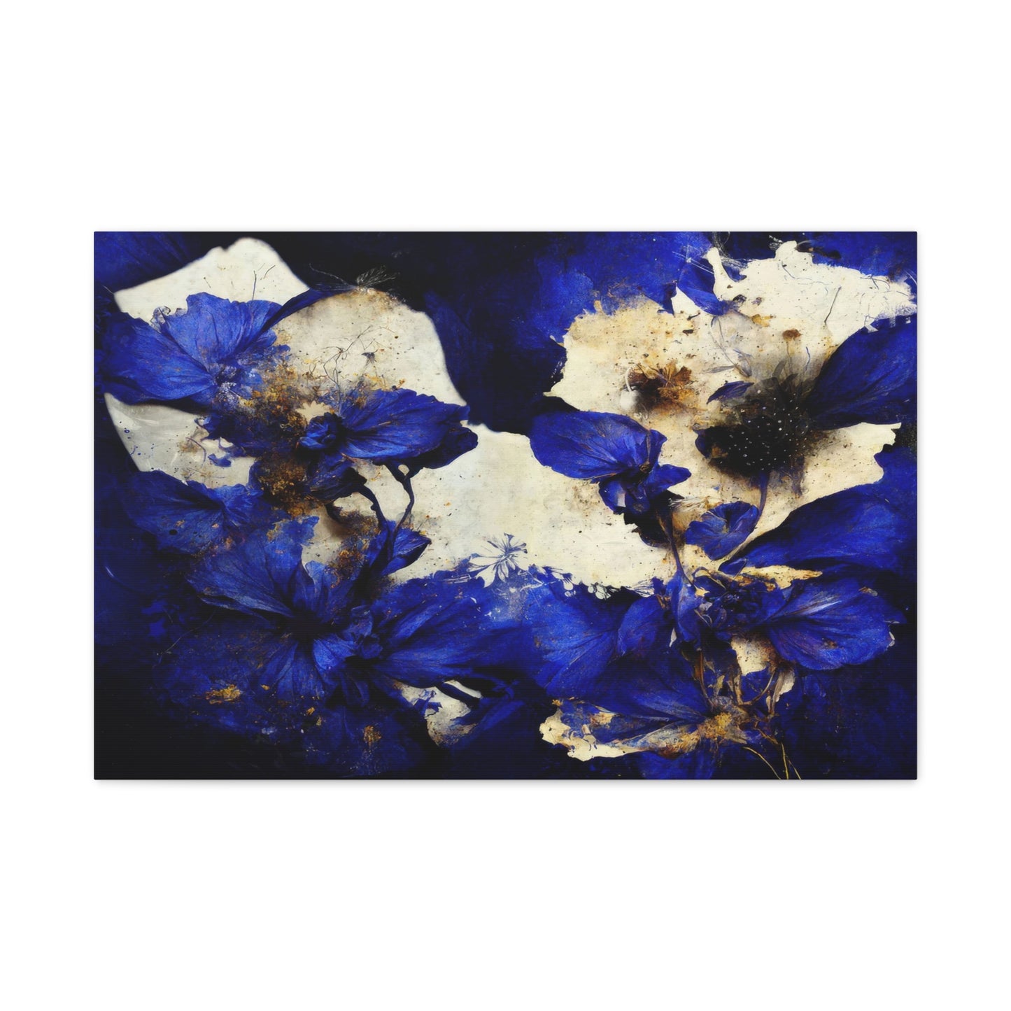

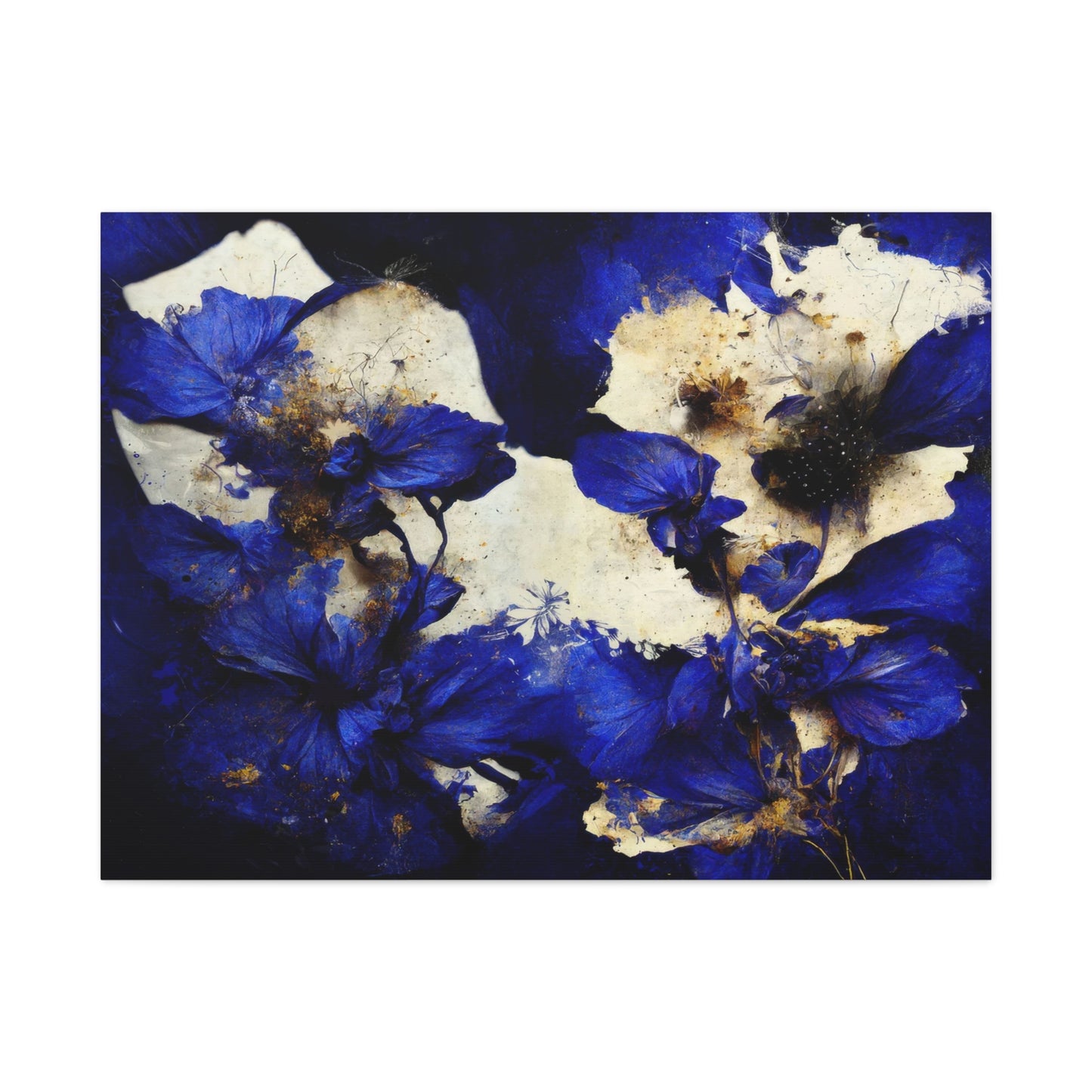
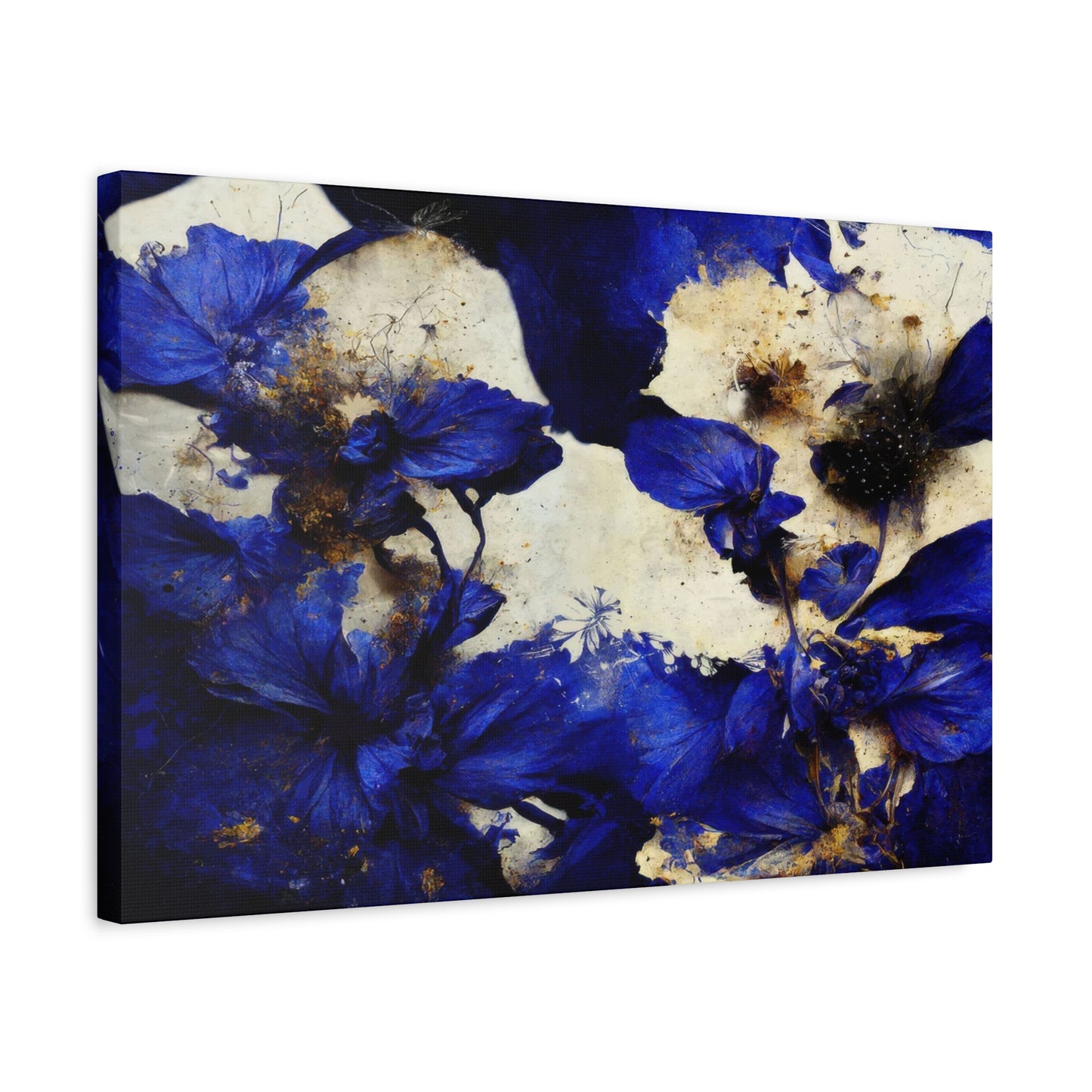

Blue Petals Wall Art in Bohemian and Eclectic Spaces: A Touch of Nature Meets Artistic Flair
The world of interior design has witnessed a remarkable transformation in recent years, with nature-inspired artwork taking center stage in modern home decoration. Among the most captivating trends that have emerged, floral canvas prints featuring delicate blue petals have become increasingly popular among homeowners, interior designers, and art enthusiasts alike. These stunning pieces of wall art bring a sense of tranquility, sophistication, and natural beauty into any living space, creating an atmosphere that is both calming and visually striking.
The appeal of botanical artwork extends far beyond simple decoration. These pieces serve as powerful focal points that can completely transform the ambiance of a room, influencing mood, perception, and overall aesthetic appeal. When we think about incorporating nature into our homes, few elements are as universally beloved as flowers, and when these blooms are rendered in serene shades of blue, they create an especially mesmerizing effect that captures the imagination and soothes the soul.
Canvas prints have revolutionized the way we approach wall decoration, offering high-quality reproductions of artistic designs that are both affordable and accessible. Unlike traditional paintings, these modern alternatives provide durability, versatility, and ease of installation, making them an ideal choice for anyone looking to enhance their interior spaces without the commitment or expense of original artwork. The technology behind contemporary canvas printing has advanced to such a degree that the final products often rival the visual impact of hand-painted pieces, with vivid colors, intricate details, and textures that add depth and dimension to any wall.
In this comprehensive exploration, we will delve deep into the world of floral canvas art, examining everything from the psychological impact of color choices to practical installation techniques. Whether you are a seasoned decorator looking to refresh your space or a first-time homeowner seeking to personalize your new environment, understanding the nuances of this art form will empower you to make informed decisions that reflect your personal style and enhance your daily living experience.
Understanding the Allure of Floral Artwork in Modern Interior Design
The human connection to flowers transcends cultural boundaries and historical periods, representing one of the most enduring relationships between humanity and the natural world. Throughout history, floral motifs have appeared in art, architecture, textiles, and decorative objects, serving as symbols of beauty, life cycles, emotions, and spiritual concepts. In contemporary interior design, this ancient fascination with botanical subjects has evolved into a sophisticated design element that bridges the gap between traditional aesthetics and modern sensibilities.
Floral artwork serves multiple functions within a living space. On the most fundamental level, these pieces introduce organic shapes and natural imagery into environments that might otherwise feel sterile or overly geometric. The curved lines of petals, the delicate structures of stems, and the intricate patterns found in flower centers provide visual interest that softens hard edges and creates balance within a room. This is particularly important in modern and minimalist interiors, where the predominance of clean lines and simple forms can sometimes feel cold or impersonal without the warmth that natural elements provide.
Beyond their aesthetic contribution, botanical prints carry significant psychological benefits. Research in environmental psychology has consistently demonstrated that exposure to nature, even in representational forms like photographs and artwork, can reduce stress levels, lower blood pressure, and improve overall mood. When we surround ourselves with images of flowers and plants, we create subtle connections to the outdoor world, satisfying an innate human need for natural environments that evolved over millennia. This phenomenon, sometimes referred to as biophilic design, recognizes that our well-being is intrinsically linked to our relationship with nature, and incorporating natural imagery into our homes is one way to nurture this connection.
The versatility of floral artwork is another factor contributing to its enduring popularity. Unlike highly specific subjects or abstract compositions that might appeal to narrow taste preferences, flower imagery tends to have broad appeal across demographic groups, design styles, and cultural contexts. This universal appreciation makes botanical prints an excellent choice for various spaces, from private bedrooms and living rooms to public areas like offices, hospitality environments, and healthcare facilities where creating a welcoming atmosphere is paramount.
In the realm of contemporary design, there has been a notable shift toward incorporating larger-scale artwork that makes bold statements rather than relying on collections of smaller pieces. Oversized canvas prints featuring dramatic floral compositions have become particularly fashionable, serving as striking focal points that anchor entire room designs. These substantial pieces command attention without overwhelming spaces, especially when the color palette is carefully chosen to complement existing decor elements.
The Significance of Blue in Artistic Expression and Home Decoration
Color psychology plays a crucial role in how we experience and interact with our environments, and blue holds a particularly special place in the spectrum of human color perception and cultural associations. As one of the most universally favored colors across cultures and demographics, blue carries a wealth of meanings and triggers various emotional and physiological responses that make it an exceptional choice for home decoration.
Blue is intrinsically associated with natural phenomena that have shaped human experience throughout our evolutionary history. The color of the sky on a clear day, the vast expanse of ocean waters, and certain rare flowers all share this distinctive hue that simultaneously conveys both tranquility and depth. These associations contribute to the calming effect that blue environments tend to produce, making spaces feel more relaxing and conducive to rest and contemplation. Studies in color psychology have shown that blue can actually lower heart rate and blood pressure, creating a physiological relaxation response that complements its aesthetic appeal.
In interior design contexts, blue offers remarkable versatility that spans from the palest ice tones to the deepest navy shades. Light blue hues can make rooms feel more spacious and airy, reflecting light and creating an atmosphere of openness and freshness. These lighter shades work particularly well in smaller spaces or rooms with limited natural light, where they can help counteract feelings of confinement. Medium blue tones bring sophistication and stability to spaces, creating visual interest without overwhelming other design elements. Deeper blue shades add drama and richness, providing depth and a sense of luxury that works beautifully in formal settings or as accent colors in more casual environments.
When blue is applied specifically to floral imagery, something magical occurs. Flowers in nature rarely display pure blue pigmentation, making blue blooms relatively uncommon and therefore more precious and intriguing when they do appear. This rarity translates into artwork that feels special and distinctive, offering something beyond the ordinary yellows, pinks, and reds that dominate most floral representations. The combination of familiar floral forms rendered in unexpected blue tones creates visual tension that captures attention while maintaining the inherent beauty and grace associated with botanical subjects.
The cool temperature of blue also makes it an excellent choice for creating specific atmospheric effects within rooms. In spaces that receive abundant natural light or are oriented toward southern exposures that bring warm sunlight, blue artwork can provide a cooling counterbalance that prevents the environment from feeling too warm or intense. Conversely, in north-facing rooms that might naturally feel cooler, the right shade of blue can enhance the serene, contemplative quality of the space rather than fighting against it.
Exploring Different Styles of Petal-Focused Canvas Art
The world of floral canvas art encompasses an extraordinary range of artistic styles, each offering unique visual characteristics and emotional impacts. Understanding these different approaches helps in selecting pieces that align with personal preferences and complement specific interior design schemes. The variety available ensures that regardless of your aesthetic inclinations, there exists floral artwork that will resonate with your sensibilities and enhance your living environment.
Photographic realism represents one popular approach to floral canvas art, featuring highly detailed representations that capture flowers with exceptional clarity and precision. These pieces often showcase individual blooms in extreme close-up, revealing intricate details of petal textures, subtle color gradations, and delicate structural elements that might go unnoticed in casual observation. The hyperrealistic quality of these images creates immediate visual impact, drawing viewers into intimate encounters with botanical subjects that feel almost tangible. This style works particularly well in contemporary and modern interiors where clean lines and minimalist aesthetics benefit from the organic complexity that detailed floral imagery provides.
Watercolor-inspired designs offer a softer, more ethereal interpretation of floral subjects. These pieces typically feature gentle color washes, soft edges, and a dreamy quality that evokes the fluidity and transparency characteristic of watercolor painting techniques. The delicate nature of this style makes it particularly suited to bedrooms, nurseries, and other spaces where creating a soothing, gentle atmosphere is desired. Watercolor-style prints often incorporate white or light-colored backgrounds that enhance their airy quality, making rooms feel more spacious and serene.
Abstract floral compositions take a more interpretive approach, distilling flower forms into their essential elements of shape, color, and movement. These pieces might feature stylized petals arranged in geometric patterns, fragmented botanical elements recombined in unexpected ways, or impressionistic renderings that suggest rather than explicitly depict floral subjects. Abstract approaches offer versatility that can bridge different design styles, working equally well in traditional settings where they provide a modern update or in contemporary spaces where they reinforce artistic sophistication.
Minimalist botanical art strips away extraneous detail to focus on the elegant simplicity of flower forms. These pieces often feature single blooms or small clusters rendered with clean lines and limited color palettes, creating images that feel refined and intentional. The restraint characteristic of minimalist design allows the essential beauty of the subject to shine without distraction, making these pieces ideal for spaces where subtlety and sophistication are valued over dramatic impact. This style coordinates particularly well with Scandinavian design aesthetics, Japanese-inspired interiors, and modern minimalist approaches.
Vintage and botanical illustration styles draw inspiration from historical scientific illustrations and antique botanical prints. These pieces often feature precise line work, careful attention to botanical accuracy, and compositional approaches reminiscent of nineteenth-century naturalist drawings. Some variations incorporate aged or textured backgrounds that enhance the historical character, while others present the illustrations on clean white backgrounds for a more contemporary interpretation. This style appeals to those who appreciate the intersection of art and science, bringing intellectual interest alongside aesthetic beauty.
Aspects of Canvas Printing and Quality Considerations
Understanding the technical processes and quality factors involved in canvas printing empowers consumers to make informed decisions when selecting artwork for their homes. The quality of canvas prints can vary dramatically based on materials, printing techniques, and finishing processes, and recognizing these differences helps ensure satisfaction with purchases and longevity of the artwork.
The foundation of any canvas print is the canvas material itself, which typically consists of cotton, polyester, or a blend of both fibers. Cotton canvas is generally considered the premium option, offering superior texture, excellent color absorption, and a more traditional artistic feel. High-quality cotton canvas has a tight, even weave that provides a smooth printing surface while maintaining enough texture to add depth and interest to the image. Polyester canvas, while less traditional, offers advantages in terms of durability and moisture resistance, making it suitable for environments where humidity might be a concern. Blended canvases attempt to capture the best characteristics of both materials, balancing artistic quality with practical durability.
The weight and thickness of canvas material significantly impact the final quality of the print. Canvas weight is typically measured in ounces per square yard, with heavier canvases generally offering better stability and durability. Premium canvas prints usually utilize material weighing between eight and twelve ounces, providing substantial feel without excessive stiffness. Thicker canvases are less prone to sagging over time and better maintain their taut appearance on the stretcher frame.
Printing technology represents another crucial quality factor. Most contemporary canvas prints utilize either inkjet or giclée printing techniques. Giclée printing, which uses archival-quality inks and high-resolution printers, produces exceptionally detailed images with accurate color reproduction and superior longevity. The term giclée, derived from French meaning to spray or squirt, refers to the fine mist of ink droplets that create the image. These prints can last for decades without significant fading when properly cared for, making them worthwhile investments for quality-conscious consumers.
The type of ink used in printing has profound implications for color vibrancy, accuracy, and fade resistance. Pigment-based inks are generally superior to dye-based alternatives, offering better resistance to fading from light exposure and environmental factors. UV-resistant inks provide additional protection, extending the lifespan of prints displayed in areas that receive natural light. The number of ink colors used in the printing process also affects quality, with more colors allowing for subtler gradations and more accurate reproduction of complex hues.
Resolution and image quality of the source file determine how much detail and clarity the final print can display. High-resolution digital files contain more information, allowing for sharper details, smoother color transitions, and the ability to print at larger sizes without pixelation or blurriness. When selecting canvas prints, especially larger pieces, ensuring that the image has been created or scanned at sufficient resolution prevents disappointment with final results.
Selecting the Perfect Size and Scale for Your Space
The physical dimensions of artwork significantly influence its impact within a room, and selecting appropriate sizes requires consideration of multiple factors including wall space, viewing distance, furniture placement, and overall design intentions. Understanding principles of scale and proportion helps ensure that artwork enhances rather than overwhelms or disappears within its environment.
As a general guideline, artwork should occupy approximately sixty to seventy-five percent of the available wall space above furniture pieces. This proportion creates visual balance, ensuring that the art feels substantial enough to make an impact without appearing cramped or oversized. When hanging artwork above a sofa, console table, or bed, measuring the furniture width and selecting art that spans roughly two-thirds to three-quarters of that dimension typically produces pleasing results.
Viewing distance plays a crucial role in determining optimal artwork size. In larger rooms where viewers will primarily experience the art from across the space, larger pieces ensure visibility and impact. Conversely, in smaller, more intimate settings where art will be viewed from closer proximity, moderately sized pieces allow appreciation of details without requiring viewers to step back to take in the full composition. A practical approach involves standing at the typical viewing distance and considering whether the artwork feels appropriately sized for comfortable viewing without straining to see details or feeling overwhelmed by scale.
Ceiling height influences artwork selection in ways that extend beyond simple proportional relationships. In rooms with standard eight-foot ceilings, very tall artwork might make spaces feel cramped or emphasize the limited vertical dimension. However, in rooms with higher ceilings, taller artwork or vertically oriented pieces help fill the additional wall space and draw the eye upward, making the most of the architectural volume. Horizontal orientations often work well for standard ceiling heights, emphasizing the room's width and creating the perception of expanded space.
The concept of negative space, the empty area surrounding artwork, deserves consideration when determining size and placement. Adequate negative space allows artwork to breathe, preventing walls from feeling cluttered and ensuring that individual pieces receive appropriate visual emphasis. While there are no absolute rules, leaving at least several inches of space on all sides of artwork generally produces balanced compositions, with specific distances adjusted based on room size and the amount of available wall space.
Creating gallery walls or collections of multiple pieces introduces additional complexity to size considerations. When grouping several canvases, the combined visual weight of all pieces should be considered rather than evaluating each individually. Collections can include various sizes arranged in asymmetrical layouts that create dynamic visual interest or uniform sizes in grid patterns for more formal, organized appearances. The total footprint of the collection should follow similar proportional guidelines as single large pieces, occupying appropriate percentages of the available wall space.
Single oversized statement pieces have become increasingly popular in contemporary design, offering dramatic impact with minimal effort. These substantial canvases, sometimes measuring several feet in width or height, serve as focal points that anchor entire room designs. When selecting oversized art, ensure that the space can accommodate the piece without feeling overwhelmed, and consider how the artwork will interact with other design elements in the room. Bold, oversized florals work particularly well in modern and transitional interiors where they provide organic contrast to geometric furniture and architectural elements.
Color Coordination and Creating Cohesive Design Schemes
Successfully integrating canvas art into existing decor requires thoughtful consideration of color relationships, ensuring that new additions enhance rather than clash with established design elements. Understanding color theory principles and practical coordination strategies empowers homeowners to select artwork that creates cohesive, visually pleasing environments.
The color wheel serves as a fundamental tool for understanding color relationships and predicting how different hues will interact. Complementary colors, those positioned opposite each other on the wheel, create vibrant, high-contrast combinations that energize spaces. For artwork featuring blue petals, complementary orange and coral tones in other decor elements can create dynamic tension that makes both colors appear more vivid. However, this high-contrast approach works best when used judiciously, as extensive use of complementary pairs can feel overwhelming in residential settings.
Analogous color schemes utilize colors adjacent to each other on the wheel, creating harmonious combinations that feel naturally cohesive. For spaces featuring floral artwork in blue tones, incorporating neighboring colors like blue-green, turquoise, or blue-violet in furnishings, textiles, and accessories creates smooth visual transitions that feel comfortable and unified. This approach is generally easier to execute successfully than complementary schemes and tends to create more relaxing environments suitable for living spaces and bedrooms.
Monochromatic schemes explore variations in value and saturation within a single color family, creating sophisticated, elegant effects. When building a room around such canvas art, incorporating various tones from pale sky through deep navy creates depth and interest without introducing competing color information. This approach works particularly well in modern and minimalist interiors where restraint and refinement are valued.
Neutral backdrops provide versatile foundations that allow artwork to shine as the primary source of color in a space. White, gray, beige, and taupe walls create clean canvases that don't compete with artwork for attention. When rooms feature predominantly neutral color schemes, colorful canvas prints become focal points that inject personality and visual interest. This strategy offers flexibility, as changing artwork can dramatically shift the room's character without requiring extensive redecorating.
The undertone of neutral colors deserves attention when coordinating with blue-toned artwork. Cool-toned neutrals with blue or gray undertones naturally harmonize with such pieces, creating cohesive color stories. Warm neutrals with yellow or red undertones can still work effectively but require careful balancing to ensure that the temperature contrast feels intentional rather than discordant. Testing paint samples and fabric swatches near the intended artwork location helps predict actual color interactions under specific lighting conditions.
Metallic accents provide opportunities to add luxury and visual interest while maintaining color harmony. Silver, chrome, and pewter metallics echo the cool tones of blue florals, creating connections through temperature rather than hue. Gold, brass, and copper metallics create appealing warm-cool contrasts that add sophistication and prevent schemes from feeling too monotonous. Mixed metal approaches have become increasingly acceptable in contemporary design, allowing for layered, collected looks that feel personalized rather than overly coordinated.
Pattern mixing represents an advanced coordination technique that adds depth and personality to spaces. When incorporating patterned textiles, wallpapers, or accessories into rooms featuring floral canvas art, ensuring that patterns vary in scale prevents visual competition. Pairing large-scale floral artwork with smaller geometric patterns, subtle textures, or different floral scales creates variety while maintaining cohesion. Repeating colors from the artwork in patterned elements helps tie disparate components together.
Installation Techniques for Professional-Looking Results
Proper installation of canvas art ensures both aesthetic success and preservation of the artwork, transforming carefully selected pieces into impressive focal points that enhance living spaces. While hanging artwork might seem straightforward, attention to technical details separates amateur attempts from professional-quality installations.
Determining the correct hanging height represents the first critical decision in the installation process. The widely accepted standard places the center of the artwork at eye level, typically between fifty-seven and sixty inches from the floor. This guideline evolved from museum and gallery practices where optimizing viewing for average adult height creates comfortable engagement with art. However, this rule should be adapted based on specific circumstances including viewer height, furniture placement, and architectural features.
When hanging artwork above furniture, the relationship between the two elements requires special consideration. Generally, the bottom edge of the canvas should sit six to twelve inches above the furniture surface, creating visual connection without the pieces touching. This spacing allows the artwork to relate to the furniture as part of a unified composition while maintaining enough separation to prevent the wall from feeling cluttered. For beds and sofas where viewers will often be seated or reclining, centering artwork on the wall section above the furniture rather than at standing eye level often produces better visual relationships.
Locating wall studs provides the most secure mounting points for heavier artwork. Electronic stud finders or traditional tapping methods help identify these structural supports hidden behind wall surfaces. Hanging substantial canvas pieces from studs distributes weight safely and prevents failures that could damage both walls and artwork. When studs are not positioned conveniently for desired artwork placement, various wall anchor systems provide alternatives that secure artwork to drywall or plaster surfaces.
Selecting appropriate hanging hardware depends on artwork weight, wall type, and desired adjustability. Wire and hook systems remain popular for traditional hanging approaches, with wire attached to D-rings or eye screws on the back of the frame. This method allows for minor adjustments but can create challenges in achieving perfectly level installations. French cleat systems provide superior stability and easier leveling, utilizing interlocking pieces mounted to both wall and artwork that simply hook together. For very heavy pieces or valuable artwork, professional-grade hanging systems with dedicated rails and adjustable hooks offer maximum security and flexibility.
Leveling artwork correctly is essential for professional appearance, as even slight deviations from true horizontal catch the eye and create subtle visual discomfort. Using a quality level during installation prevents this common problem. For maximum precision, measuring and marking the desired placement before inserting hardware reduces trial and error. Laser levels project perfectly straight lines across walls, simplifying the process of aligning multiple pieces or ensuring that artwork relates correctly to architectural features.
Gallery walls present unique installation challenges requiring planning and precision to achieve cohesive, attractive arrangements. Creating templates using paper cutouts or painter's tape allows experimentation with layouts before committing to holes in the wall. Photographing potential arrangements helps visualize how the completed wall will appear. When installing collections, working from the center outward or establishing a focal piece first and building around it typically produces more balanced results than starting from one edge.
Creating Different Moods Through Artistic Choices
The specific characteristics of floral canvas art, including composition, color intensity, style, and subject matter, significantly influence the emotional atmosphere created within a space. Understanding how these variables affect mood empowers intentional design decisions that align environments with desired feelings and functions.
Serene and calming environments benefit from artwork featuring soft color palettes, gentle compositions, and peaceful subject matter. Canvas prints depicting delicate petals in pale or medium-toned blues create tranquil atmospheres ideal for bedrooms, meditation spaces, and bathrooms where relaxation and stress reduction are priorities. Watercolor-style treatments with soft edges and subtle color transitions enhance this calming effect, as do minimalist compositions with ample negative space that allow the mind to rest rather than actively processing complex visual information.
Energizing and uplifting spaces benefit from brighter, more saturated colors and dynamic compositions. While deeper or more vibrant blue tones maintain the inherent sophistication of the color, they inject more personality and presence into rooms. Artwork featuring multiple blooms, diagonal compositions that create visual movement, or contrasting color combinations stimulates mental engagement and creates livelier atmospheres suitable for kitchens, home offices, and social areas where activity and interaction occur.
Sophisticated and elegant environments often feature carefully curated artwork that demonstrates restraint and refinement. Single spectacular blooms rendered in detail against neutral backgrounds create focal points without overwhelming spaces. Classic compositions with traditional proportions and balanced arrangements convey timelessness and good taste. Incorporating such artwork into rooms with quality furnishings, refined color palettes, and thoughtful accessories creates cohesive upscale aesthetics.
Romantic and dreamy atmospheres emerge from artwork that emphasizes beauty, delicacy, and softness. Petals captured in close-up with selective focus create intimate, sensual qualities. Layered compositions with overlapping blooms and complex color interactions suggest depth and mystery. When combined with soft lighting, luxurious textiles, and feminine design elements, such artwork contributes to environments that feel indulgent and emotionally rich.
Contemporary and artistic spaces benefit from bold, unconventional approaches to floral subjects. Abstract interpretations, unexpected color combinations, dramatic crops and angles, or stylized treatments that push beyond realistic representation create conversations and demonstrate design confidence. These pieces work effectively in modern interiors where innovation and creativity are valued, providing artistic credibility while maintaining the accessible appeal of floral imagery.
Natural and organic environments embrace artwork that emphasizes the botanical nature of subjects and connections to the living world. Detailed realistic representations, compositions that include stems and leaves alongside blooms, or collections showing flowers in various stages of development reinforce nature themes. Pairing such artwork with natural materials, earth-toned palettes, and actual plants creates holistic environments that celebrate nature in multiple forms.
Minimalist and zen-inspired spaces require artwork that embodies simplicity and intentionality. Single stems with few blooms, stark compositions with dramatic negative space, or monochromatic treatments that focus on form rather than color align with minimalist principles. These pieces contribute to environments that feel uncluttered, peaceful, and meditative, supporting practices like yoga, meditation, or simply creating havens from busy modern life.
Complementary Decor Elements That Enhance Floral Artwork
Successfully showcasing canvas art involves more than simply hanging pieces on walls. Thoughtfully selected complementary decor elements create cohesive environments where artwork integrates seamlessly with other design components, resulting in polished, intentional spaces that feel greater than the sum of their parts.
Throw pillows and cushions provide opportunities to echo colors, patterns, and themes established by wall art. Selecting pillows that incorporate similar blue tones creates obvious connections that tie spaces together visually. However, exact color matching isn't necessary and can sometimes feel overly coordinated. Instead, choosing pillows in complementary tones or with patterns that include blue alongside other colors creates more sophisticated, layered effects. Mixing solid colored pillows with patterned options adds depth, with patterns potentially including small-scale florals that reinforce the botanical theme without directly copying the artwork.
Area rugs anchor furniture groupings and define spaces while offering substantial opportunities to reinforce color schemes. Rugs featuring blue elements, whether as dominant colors or accent tones within larger patterns, create grounding relationships with artwork displayed above. The substantial size of rugs means they significantly impact overall color balance in rooms, making them powerful tools for either emphasizing or tempering the presence of wall art colors. Texture choices in rugs also contribute to overall aesthetic, with plush options adding luxury and flat-weave alternatives supporting casual or contemporary styles.
Window treatments frame views and control light while contributing to color schemes and overall design character. Curtains, drapes, or blinds in coordinating colors extend artwork influence across entire rooms. For spaces with floral art, options range from solid colored treatments that provide clean backgrounds allowing art to dominate, to patterned fabrics that introduce additional visual interest while coordinating with established color palettes. The weight and texture of window treatments also affect room ambiance, with heavy draped fabrics creating formal elegance and light, flowing materials supporting casual, airy aesthetics.
Decorative accessories including vases, sculptures, picture frames, and decorative objects add personality and finish to spaces. Items in metals, glass, or ceramics featuring blue glazes or finishes create direct color links to artwork. However, accessories need not be identical in color to coordinate effectively. Varied items in complementary tones, contrasting colors, or neutral finishes that allow artwork to remain the primary color focus all represent valid approaches. The key lies in ensuring that accessories feel intentionally selected and appropriately scaled for their locations rather than appearing random or cluttered.
Incorporating Floral Art in Various Room Settings
Different rooms within homes serve distinct functions and create varied design challenges and opportunities. Understanding how to adapt floral canvas art to specific spaces ensures that artwork enhances each environment appropriately, supporting the activities and atmospheres associated with different areas.
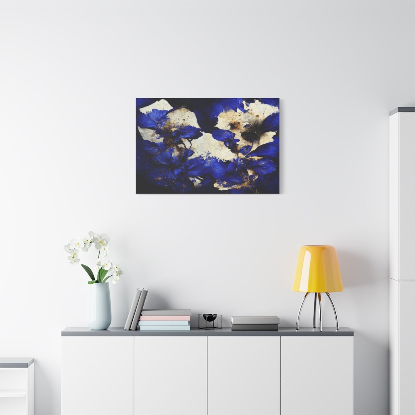
Living rooms and family rooms function as social hubs where households gather and guests are entertained, making them ideal locations for substantial statement pieces that reflect personal style and create conversation. Large-scale canvas prints featuring dramatic floral compositions work beautifully in these spaces, commanding attention without overwhelming. The living room placement often positions artwork as the focal point around which furniture arrangements organize, giving it prominence in the home hierarchy. Because these spaces typically see significant use and host visitors, artwork quality and presentation merit particular attention, as pieces displayed here communicate taste, values, and identity to both residents and guests.
Dining areas benefit from artwork that enhances the pleasure of meals and social gatherings without creating distraction or visual competition with food and table settings. Floral canvas in sophisticated color palettes adds refinement and elegance appropriate to dining, while the organic subject matter connects to themes of abundance, harvest, and natural beauty that resonate with eating and nourishment. Scale considerations are particularly important in dining spaces, where artwork should feel substantial enough to anchor the area but not so large or intense that it dominates the experience of sharing meals.
Bedrooms demand artwork that supports rest, relaxation, and intimacy, making them ideal locations for softer, more serene floral pieces. The bedroom serves as personal sanctuary away from household activity and outside demands, and artwork selections can reflect individual preferences without needing to appeal to broader household tastes or visitor approval. Canvas featuring gentle compositions, calming color palettes, and peaceful subjects contributes to environments conducive to quality sleep and emotional restoration. Placement considerations include ensuring that artwork is positioned to be appreciated from the bed, creating pleasant views during rest and first moments of waking.
Home offices and workspaces benefit from artwork that balances professionalism with personality, creating environments that feel appropriate for focused work while remaining personally meaningful and motivating. Floral canvas adds organic elements that soften potentially stark office equipment and furniture, creating more humane workspaces that support sustained productivity. Research suggests that access to nature views and imagery improves cognitive performance and reduces mental fatigue, making nature-inspired artwork particularly functional in work environments beyond its aesthetic contributions.
Bathrooms, often overlooked in decorating considerations, become more spa-like and luxurious with the addition of appropriate artwork. The inherently calming nature of floral imagery in serene colors aligns perfectly with bathroom functions of cleansing, grooming, and personal care. Practical considerations include ensuring that canvas is protected from excessive moisture through appropriate placement away from direct water exposure and potentially using additional protective coatings. Small bathrooms benefit particularly from artwork, as these spaces are often visually bland and adding visual interest significantly enhances the experience of these frequently used rooms.
Entryways and hallways represent transitional spaces that benefit from artwork that creates positive first impressions and guides movement through homes. These areas often lack natural light and can feel cramped, making them challenging to decorate effectively. Floral canvas in lighter tones helps counteract darkness while adding visual interest to spaces that might otherwise feel purely functional. Scale becomes important in these often narrow spaces, with vertically oriented pieces sometimes working better than horizontal orientations that might feel cramped.
Budget-Friendly Approaches to Acquiring Quality Art
Creating beautifully decorated homes featuring impressive artwork need not require enormous budgets or luxury price points. Understanding various acquisition strategies and quality considerations empowers consumers to obtain attractive, well-made canvas prints without overspending, making artistic living accessible across income levels.
Online retailers have revolutionized art acquisition, offering enormous selections at prices that traditional galleries rarely match. The elimination of physical gallery overhead, combined with direct-from-manufacturer models, allows online sources to provide canvas prints at fraction of conventional costs. Major online marketplaces host multiple sellers offering similar products at varying price points, enabling comparison shopping that helps identify best values. Reading customer reviews provides insight into actual quality and seller reliability, helping avoid disappointments and ensuring satisfactory purchases.
Print-on-demand services represent another avenue for obtaining custom canvas art affordably. These platforms allow customers to upload personal photographs or select from vast design libraries, then order canvas prints produced specifically for each order. While this model eliminates inventory costs that traditional retailers must build into pricing, it requires careful attention to image quality and resolution to ensure satisfactory results. Print-on-demand works particularly well for creating personalized art from personal photographs or for obtaining designs from independent artists who sell through these platforms.
Sales, promotions, and seasonal discounts provide opportunities to acquire artwork at reduced prices. Many retailers offer significant discounts during major shopping holidays, end-of-season clearances, and special promotional events. Subscribing to retailer email lists or following social media accounts provides advance notice of sales, allowing strategic timing of purchases. Patience in waiting for promotions rather than buying at full price can yield substantial savings, particularly for multiple pieces or larger canvases that represent more significant investments.
Outlet stores and discount retailers increasingly offer home decor including canvas art at reduced prices. While selections may be more limited than specialty retailers and quality can vary, careful shopping at these venues can uncover excellent values. Inspecting pieces carefully before purchase ensures quality meets expectations, checking for proper stretching, clean printing, and secure construction. The hands-on evaluation possible in physical stores provides advantages over online shopping for quality-conscious budget shoppers.
Purchasing smaller pieces or opting for standard sizes rather than custom dimensions reduces costs while still providing attractive artwork. Many retailers price products based partly on size, with smaller pieces naturally costing less than large-scale canvases. For those willing to work within available sizes rather than insisting on specific dimensions, standard options provide ready availability and lower prices. Multiple smaller pieces can be grouped to fill wall spaces that might otherwise demand single large pieces, creating interesting gallery wall arrangements while managing costs.
DIY approaches for the particularly ambitious offer maximum cost savings at the expense of time and effort. Printing services can output digital images on paper at relatively low cost, which can then be mounted to canvas panels or stretched frames using techniques learned through online tutorials. While this approach requires some skill and produces results that may not match professional printing quality, it allows for extremely customized artwork at minimal expense. For temporary decorating or experimental designs, DIY methods provide flexibility to change artwork frequently without significant financial commitment.
Thrift stores, estate sales, and secondhand marketplaces occasionally offer artwork including canvas prints at nominal prices. While finding specific styles or subjects requires patience and luck, the treasure-hunt aspect appeals to some shoppers, and remarkable discoveries occasionally surface. Even if found artwork requires cleaning or minor frame repair, the combination of low acquisition cost and personal effort can yield satisfying results and unique pieces unlikely to appear in other homes.
Quality compromises that minimize cost impact provide middle ground between luxury and budget extremes. For example, selecting pieces with thinner gallery wrap depths rather than deep frames reduces material costs without necessarily compromising visual appeal, particularly if the piece will be viewed primarily from the front rather than at angles where depth is visible. Choosing prints without additional protective coatings or enhanced finishing treatments reduces costs while still providing perfectly attractive artwork, though potentially with somewhat shorter lifespan.
Commissioning Custom Art for Personalized Spaces
While pre-made canvas prints offer convenience and affordability, commissioning custom artwork provides opportunities for personalized pieces perfectly tailored to specific spaces, color schemes, and individual preferences. Understanding the custom art process empowers consumers to navigate commissions successfully, resulting in unique pieces that reflect personal vision and enhance spaces precisely as intended.
Finding appropriate artists represents the first challenge in commissioning work. Online platforms connecting artists with clients have simplified this process dramatically, allowing searches by medium, style, subject matter, and price range. Many artists maintain portfolios showcasing previous work, providing insight into their capabilities, aesthetic sensibilities, and quality standards. Social media platforms, particularly those emphasizing visual content, host thriving artist communities where work can be discovered and artists contacted directly. Local art fairs, galleries, and community centers also provide venues for discovering regional artists who might welcome commission opportunities.
Evaluating artist suitability involves assessing whether their existing work aligns with desired aesthetics and whether they demonstrate the technical skills necessary to execute the vision. Review multiple examples of previous work rather than judging based on single pieces, looking for consistency in quality and style. Consider whether the artist has experience with the specific subject matter, medium, and scale envisioned for the commission. References from previous clients provide valuable insight into working relationships, reliability, and satisfaction with completed work.
Communicating vision effectively represents a critical factor in commission success. Providing clear descriptions of desired subjects, styles, color palettes, and overall effects helps artists understand expectations. Sharing reference images, even if they depict different subjects or styles, helps convey aesthetic preferences and specific elements to include or avoid. Discussing where artwork will display and how it relates to existing decor helps artists understand context and make informed creative decisions. However, achieving balance between providing direction and allowing artistic interpretation is important, as overly prescriptive instructions can stifle creativity and prevent artists from applying their expertise.
Understanding pricing for commissioned work prevents misunderstandings and ensures realistic budget expectations. Factors influencing cost include artist experience and reputation, artwork size, complexity of composition, level of detail required, and time investment needed. Established artists with proven track records command higher fees than emerging artists building portfolios. Larger pieces require more materials and time, justifying higher prices. Complex compositions with numerous elements or photo-realistic detail demand more work than simpler designs. Discussing budget constraints upfront helps determine whether particular artists can work within available resources or whether adjustments to scope or scale are necessary.
Contracts and agreements protect both artists and clients, establishing clear expectations regarding deliverables, timelines, payment terms, and usage rights. Formal written agreements should specify artwork dimensions, subject matter, medium, deadline for completion, total cost, payment schedule, and what happens if either party becomes dissatisfied with the arrangement. Understanding copyright and usage rights is particularly important, as artists typically retain copyright to created works even when physical pieces are sold. Clarifying whether clients can reproduce artwork for personal uses, and whether artists may use images of completed work in portfolios or promotional materials, prevents later conflicts.
Conclusion:
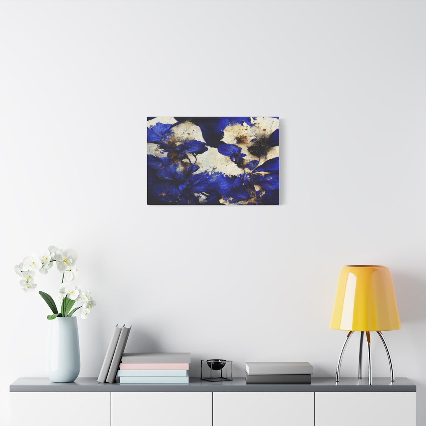
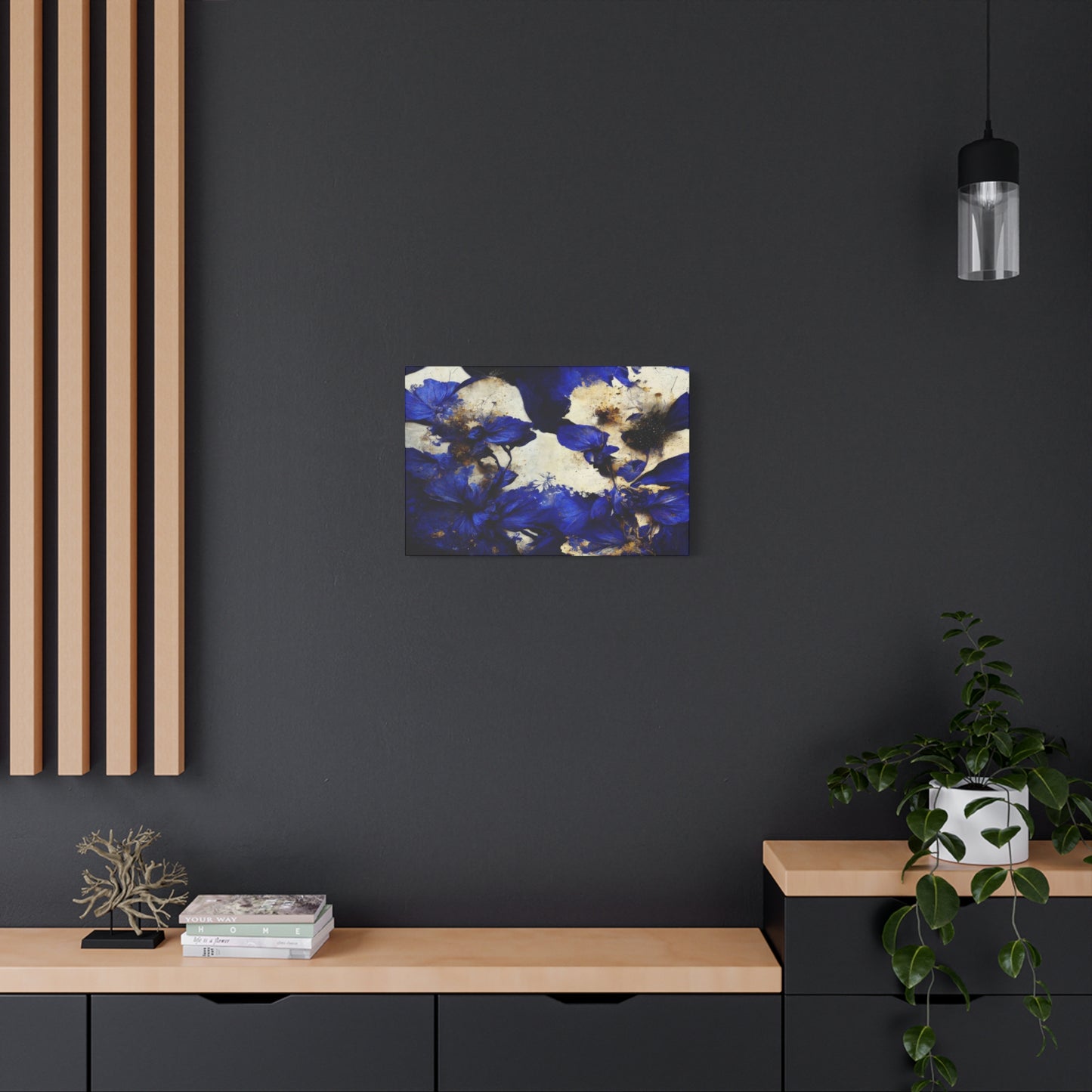
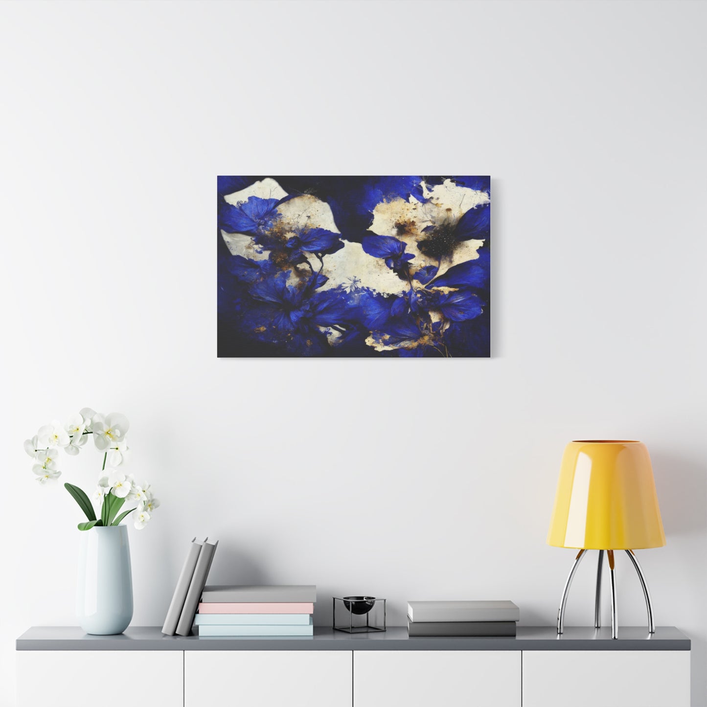
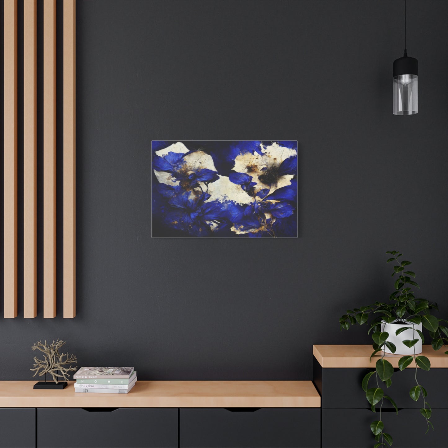
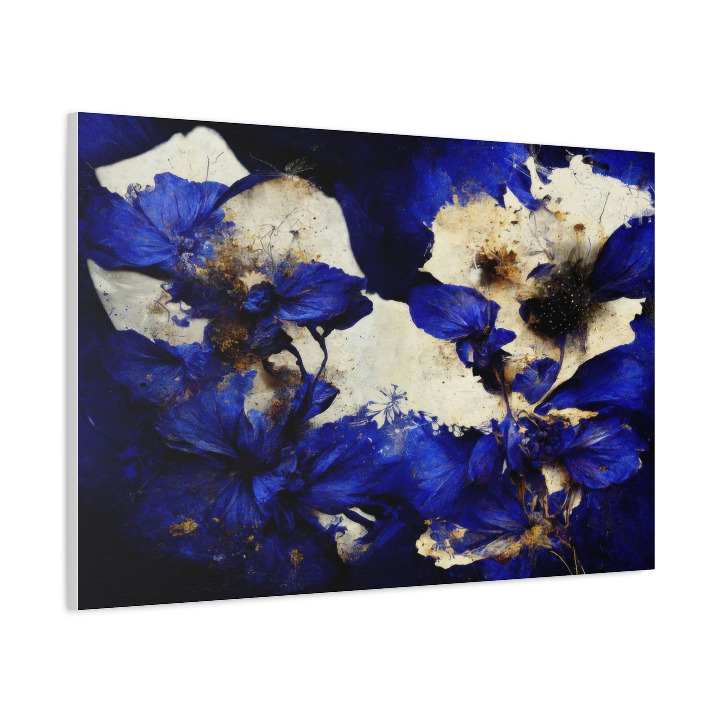
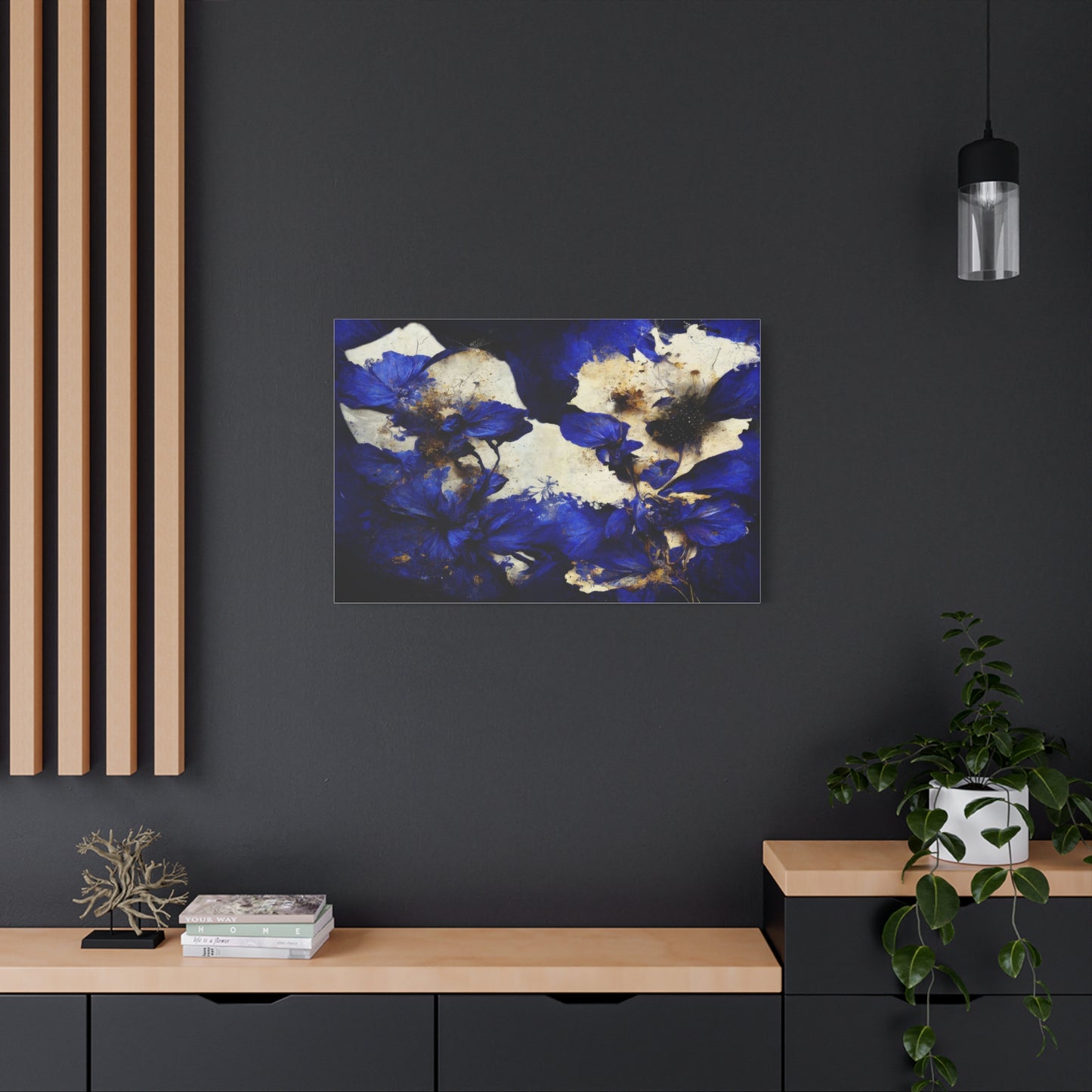
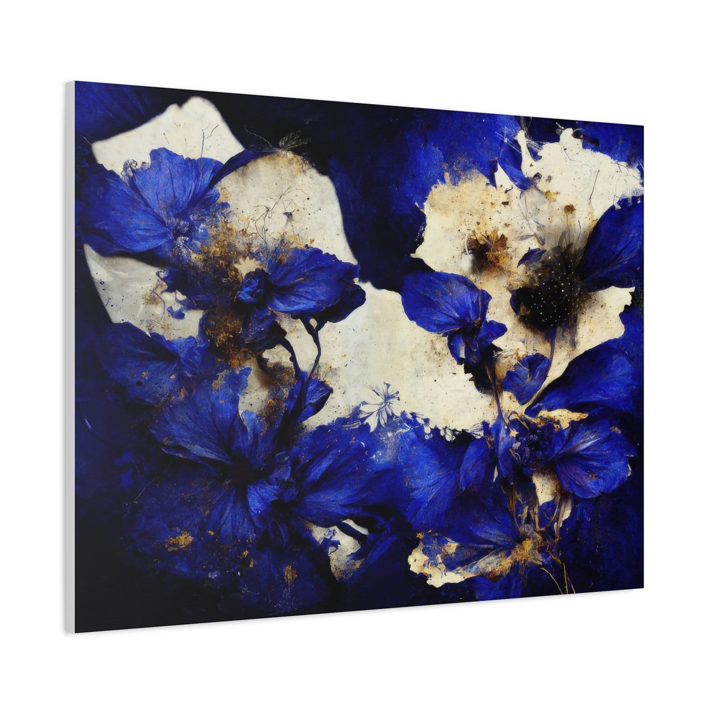
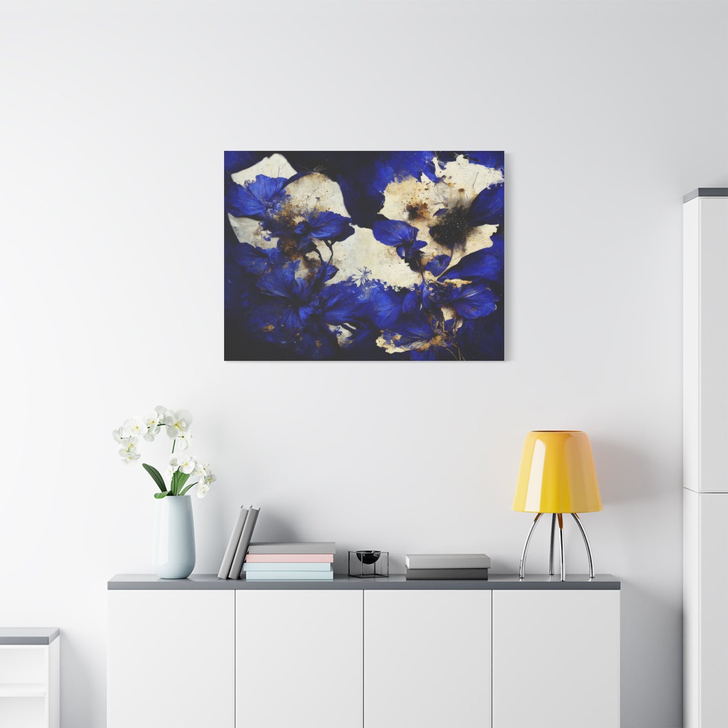
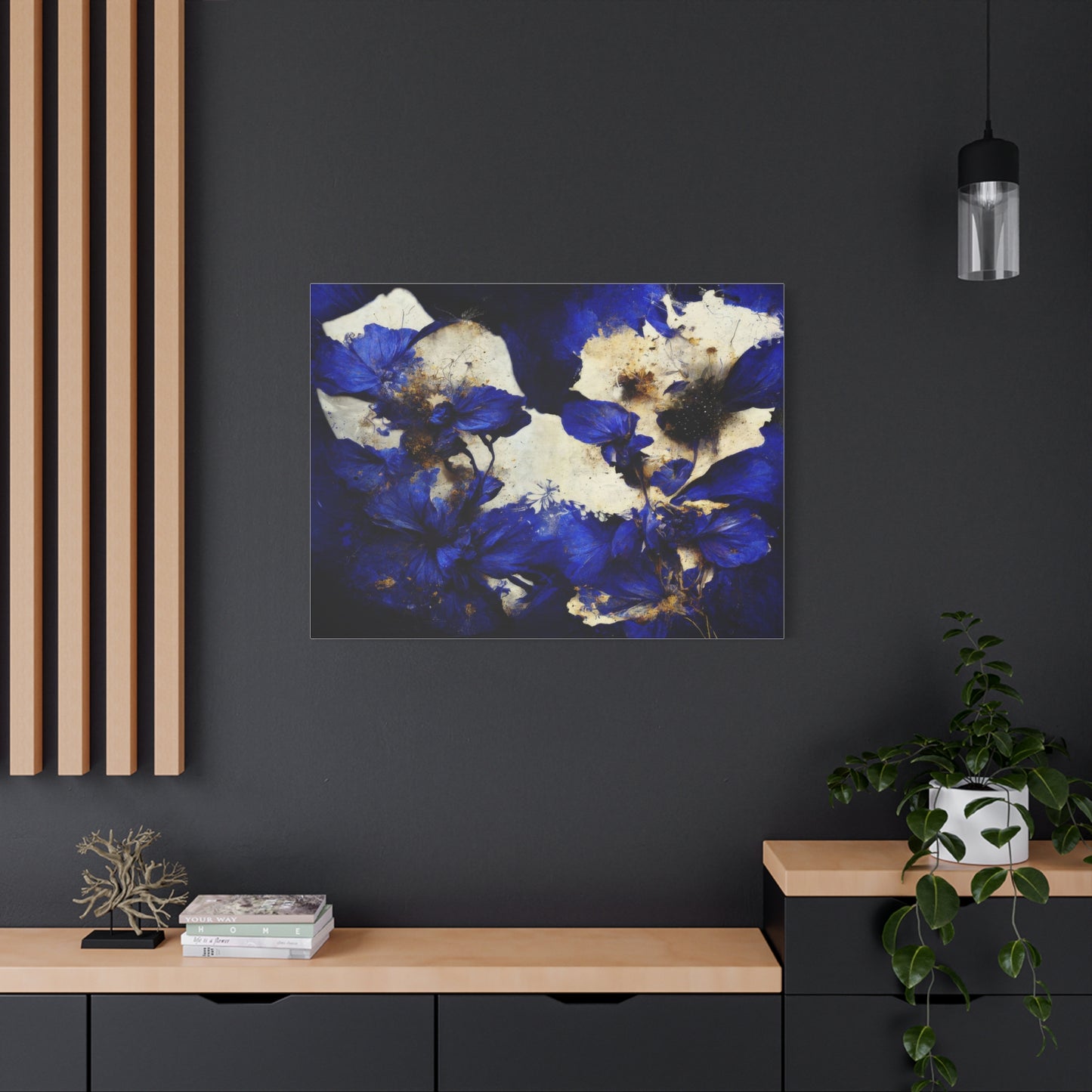
In conclusion, Blue Petals Wall Art is the perfect addition to any Bohemian or Eclectic space, blending the raw beauty of nature with the artistic expression that defines these design styles. The vibrant yet calming shades of blue in the artwork capture the essence of nature's elegance while adding a pop of color that can energize and transform a room. In Bohemian and Eclectic interiors, where creativity and personal expression reign, Blue Petals Wall Art serves as both a statement piece and a harmonious element that ties together the diverse elements of the space.
The appeal of Blue Petals Wall Art lies in its ability to seamlessly blend nature with artistic flair. Bohemian and Eclectic spaces are known for their mix of textures, patterns, and colors, and Blue Petals art adds an organic yet visually captivating layer to the mix. The beauty of floral designs is universal—flowers symbolize growth, beauty, and serenity—but the use of blue petals introduces an unexpected twist. Blue, often associated with calmness and tranquility, provides a serene backdrop that complements the more eclectic or bohemian elements in a room. Whether it's a calming sky blue or a deep, rich indigo, the color of the petals draws the eye and enhances the artistic, laid-back vibe of these interior styles.
In Bohemian and Eclectic design, which often features a variety of colors, textures, and cultures, Blue Petals Wall Art can serve as a grounding element while still adding a pop of visual intrigue. The artwork can act as a focal point, balancing out bolder patterns, vibrant colors, and eclectic décor items like tapestries, rugs, and mismatched furniture. The use of flowers in these settings reflects the Bohemian love of nature and the free-spirited embrace of beauty in its many forms, while the rich blue tones bring in a layer of sophistication that keeps the space grounded and cohesive.
One of the greatest strengths of Blue Petals Wall Art in Bohemian and Eclectic spaces is its ability to create visual harmony. With these styles often embracing a mix-and-match philosophy, the artwork serves as a unifying force, helping to tie together the varied elements within the room. Whether your furniture is vintage, mid-century modern, or industrial, Blue Petals art provides a balance that ties together the different textures and tones in the room. It can act as a backdrop to your eclectic gallery wall, a focal point above your couch, or even as a piece that complements the other natural elements like plants or wooden furniture that often appear in these spaces.
Furthermore, Blue Petals Wall Art adds a sense of depth and dynamism to your walls. Floral designs naturally draw the eye, and when paired with the depth and complexity of blue tones, the art takes on a layered, multi-dimensional feel. In a Bohemian or Eclectic living space, this layered depth complements the often cozy, lived-in atmosphere, creating an environment that feels rich in texture, history, and visual interest. The organic forms of the petals bring a soft, natural aesthetic that contrasts beautifully with the bold patterns and textures commonly found in these interiors.
The beauty of Blue Petals Wall Art also lies in its versatility. No matter the size or shape of the canvas, it can be adapted to a variety of different settings within a Bohemian or Eclectic home. Whether hung on a large, central wall or placed in a more intimate corner, the artwork works seamlessly in different formats, from oversized canvas pieces to smaller, more delicate prints. It’s a versatile element that can fit perfectly above a bed, in a reading nook, or as part of a larger gallery wall filled with personal treasures and eclectic finds.
Moreover, the timeless nature of flowers ensures that Blue Petals Wall Art remains relevant and beautiful in any room. The design can evolve with your changing décor, and its natural elegance means it pairs well with everything from contemporary minimalist furniture to the more vintage, boho-inspired pieces that often define Bohemian spaces. No matter how your style evolves, Blue Petals Wall Art will continue to provide a touch of nature that enhances the room’s aesthetic.
Ultimately, Blue Petals Wall Art is more than just a piece of décor; it’s an invitation to bring the beauty of nature into your home in a way that feels both artistic and organic. It embodies the spirit of Bohemian and Eclectic design—free-spirited, creative, and full of life—while also providing a calming and visually cohesive element that helps to ground the space. Whether you're drawn to its serene blues, its dynamic floral shapes, or its ability to connect nature with artistic expression, Blue Petals Wall Art is the perfect way to infuse your living space with beauty, creativity, and a touch of natural elegance.
