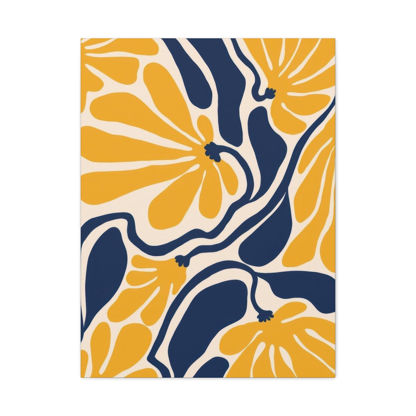
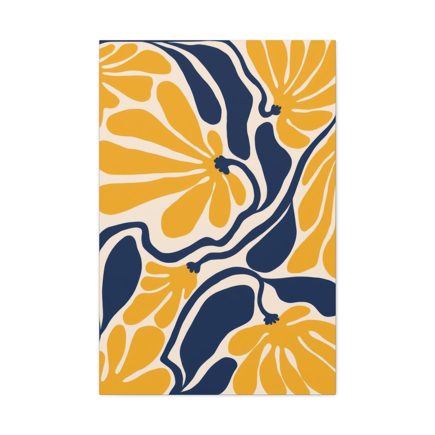
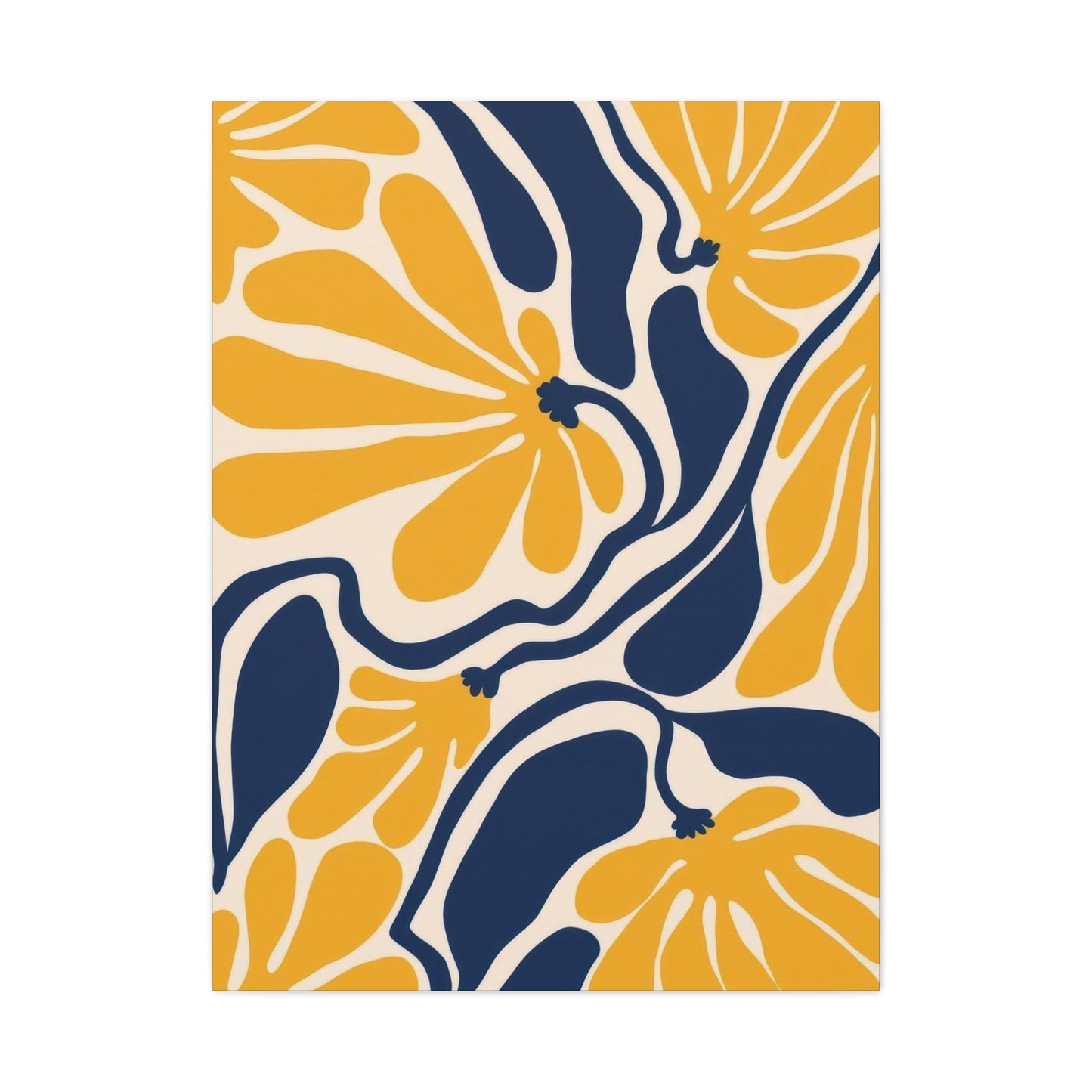
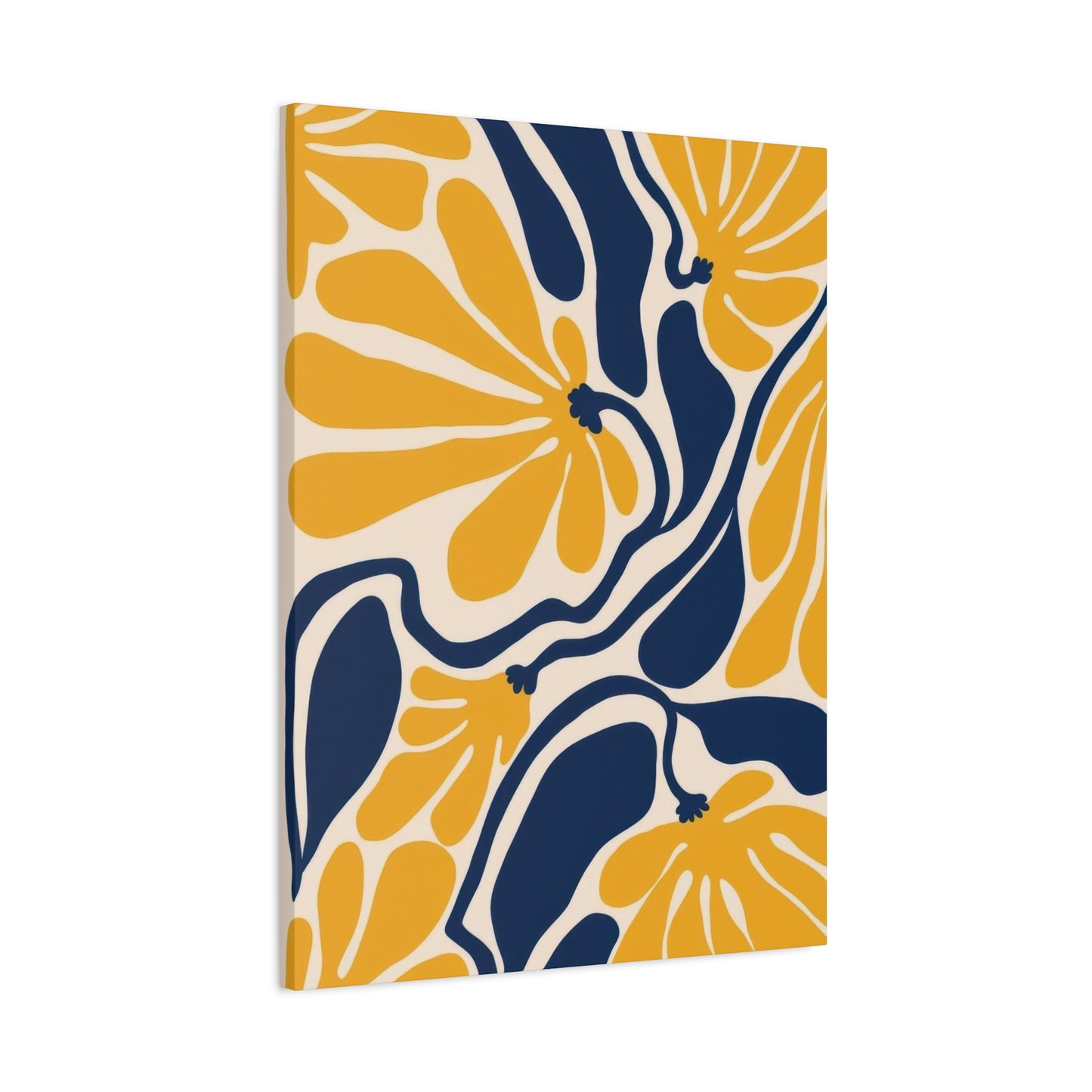
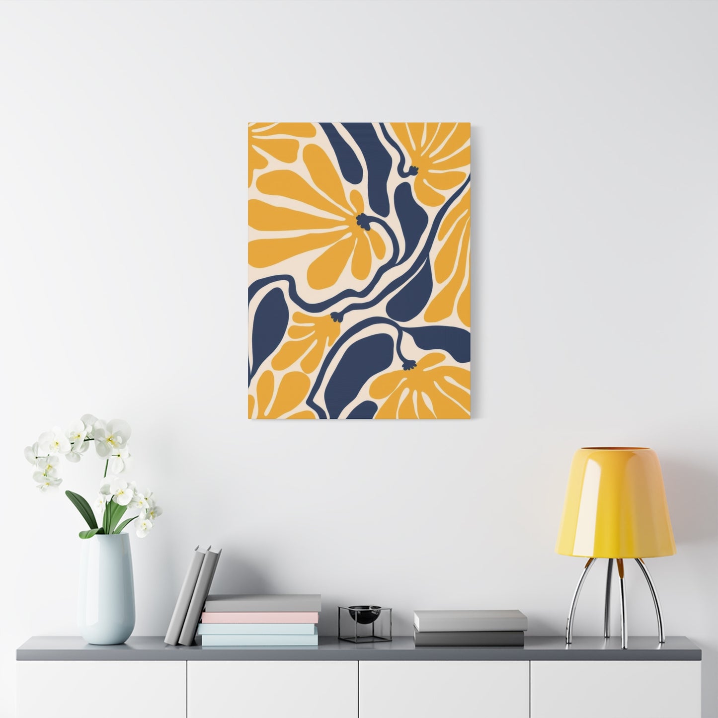
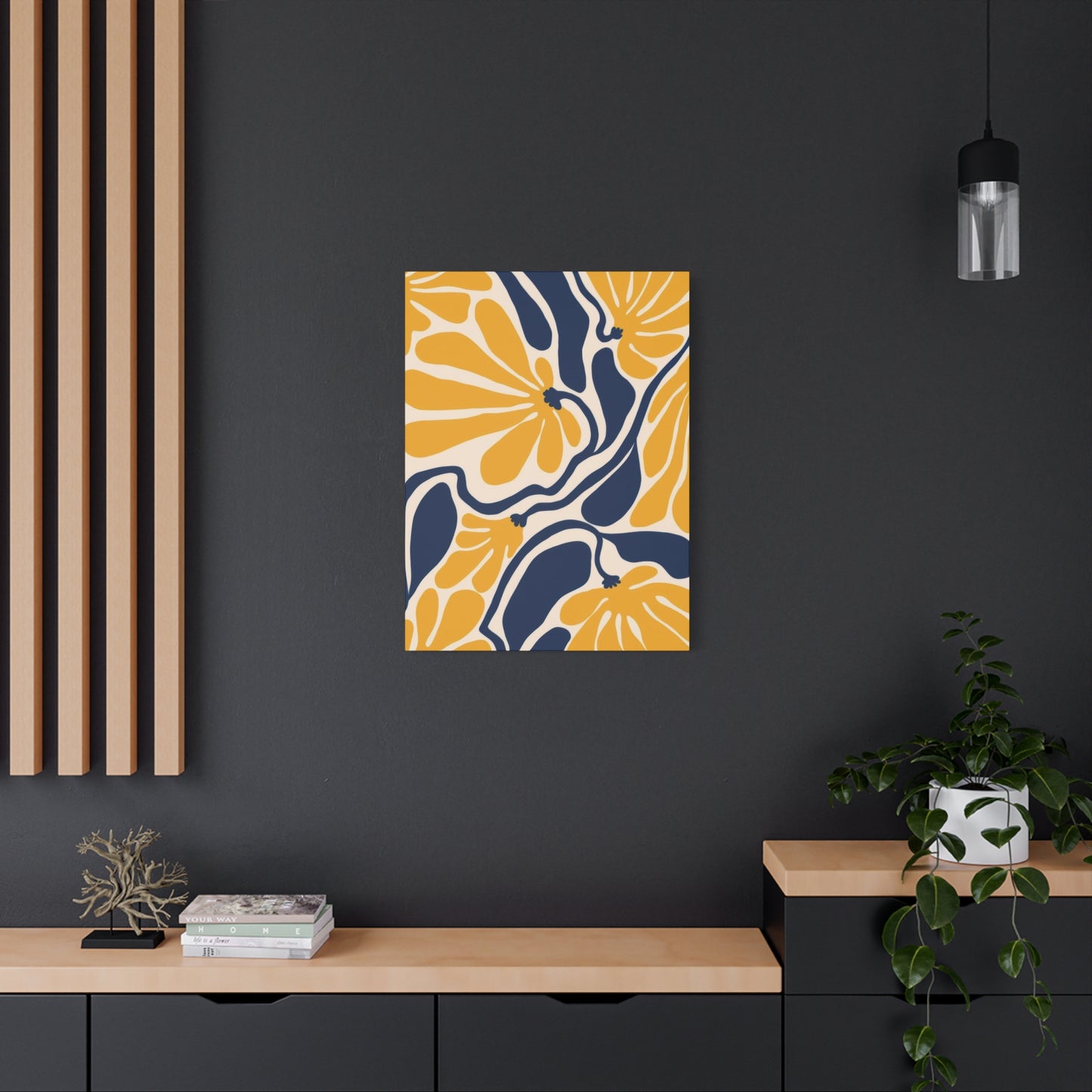
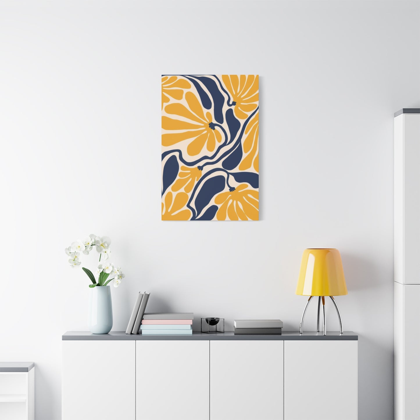
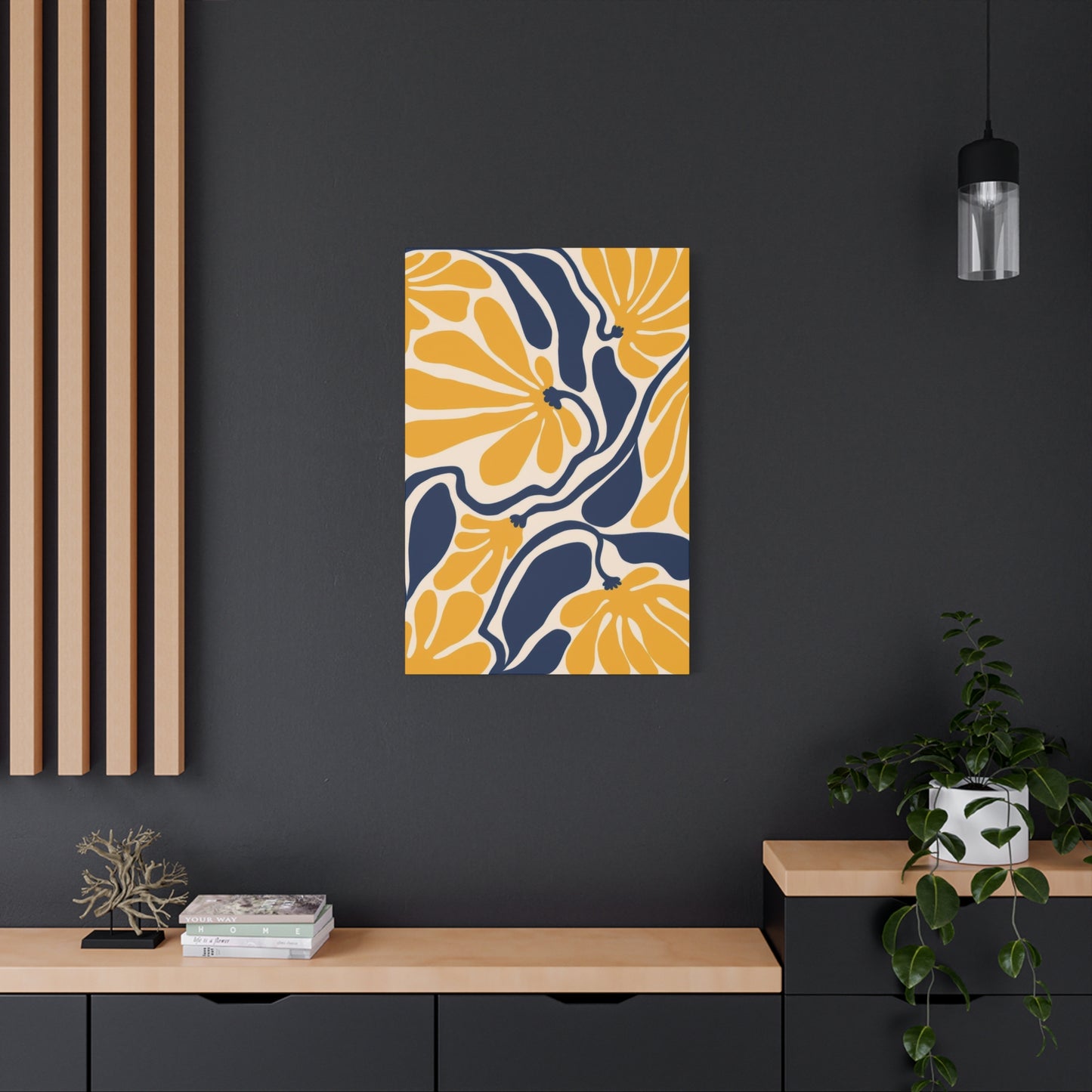
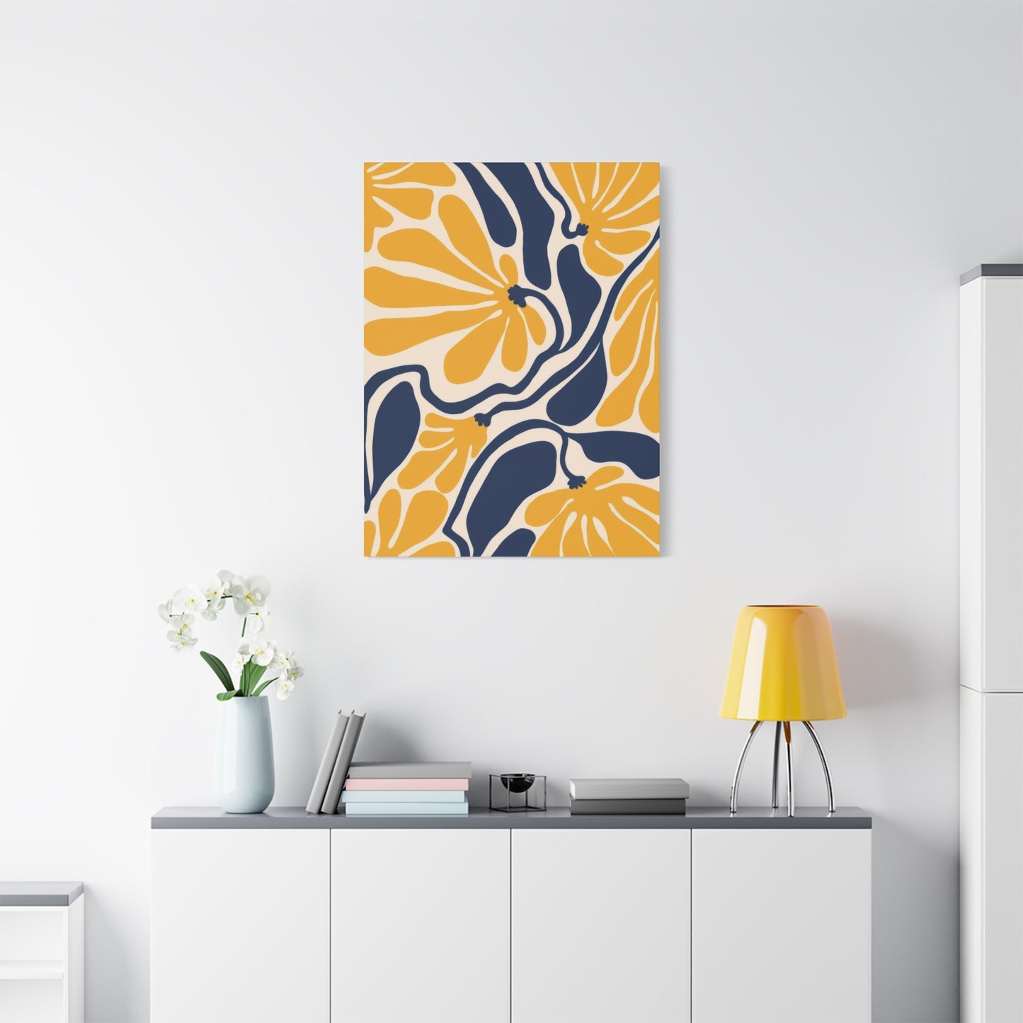
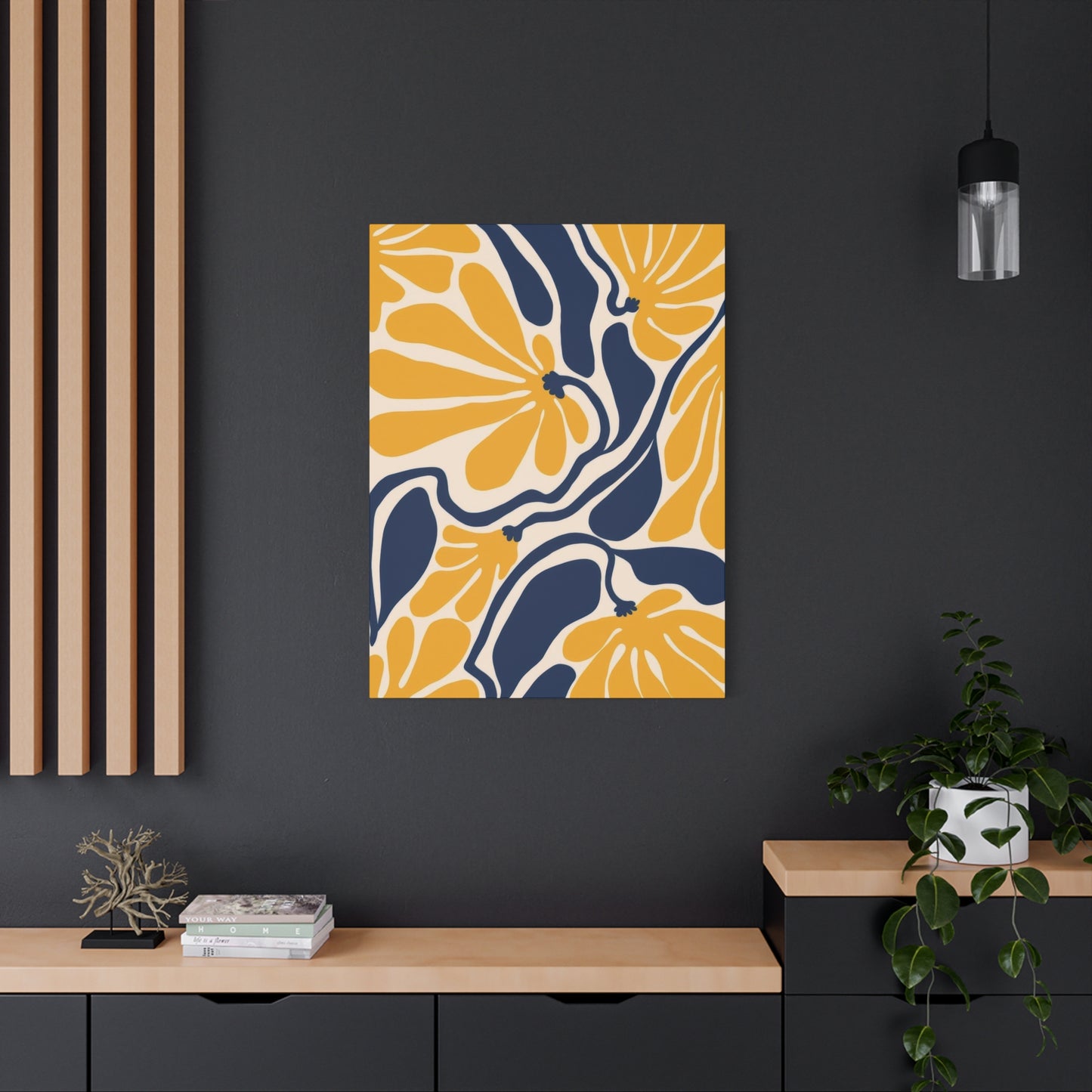
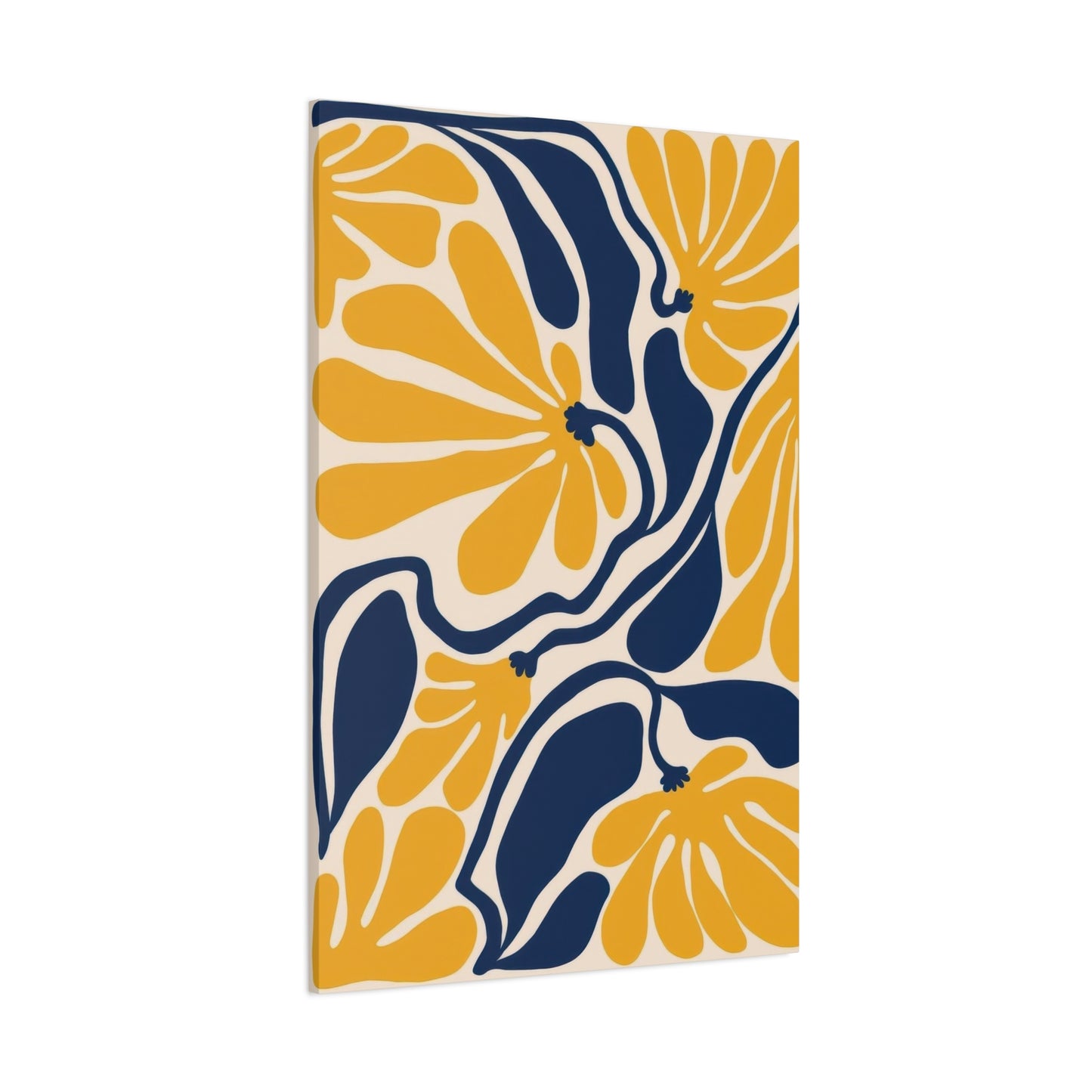
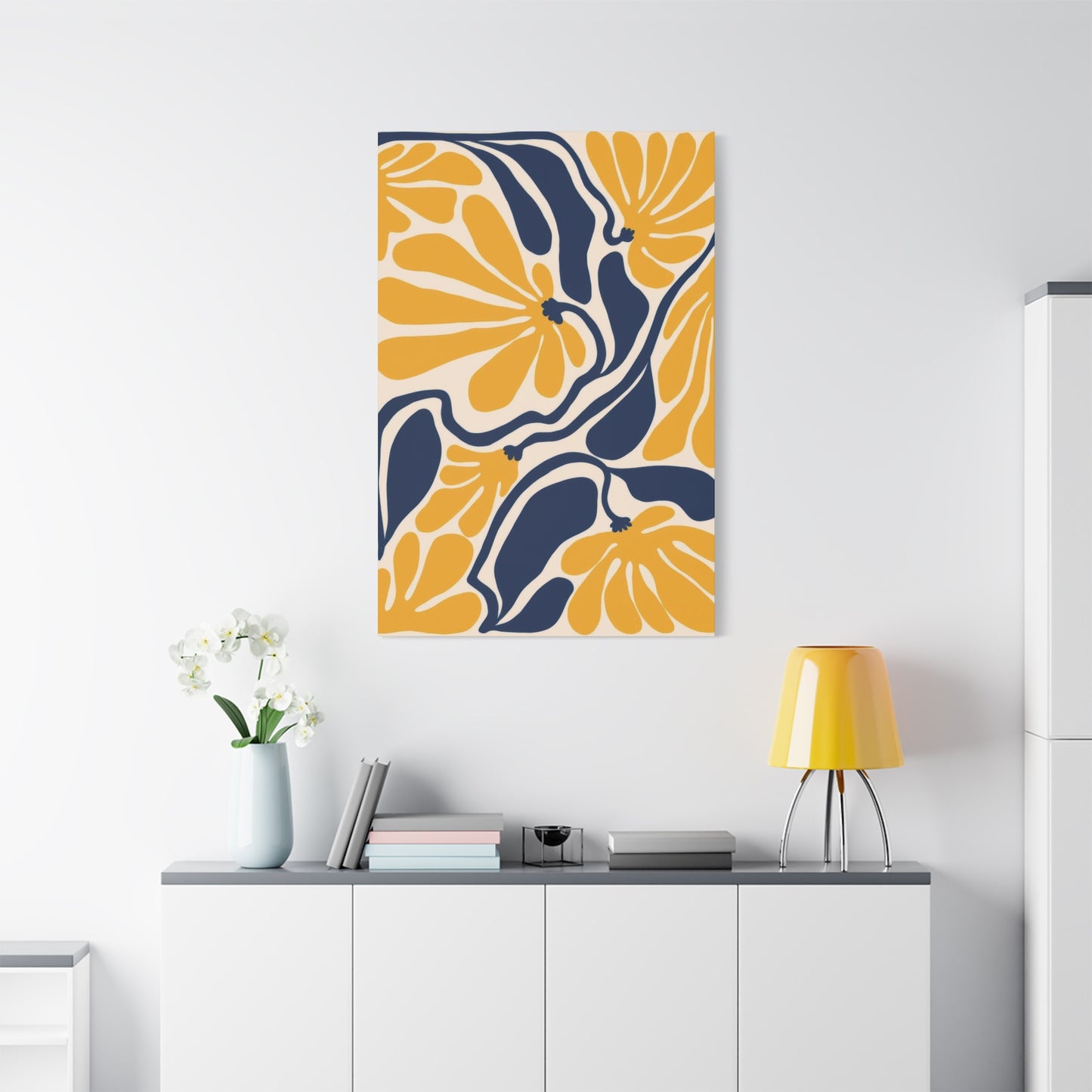
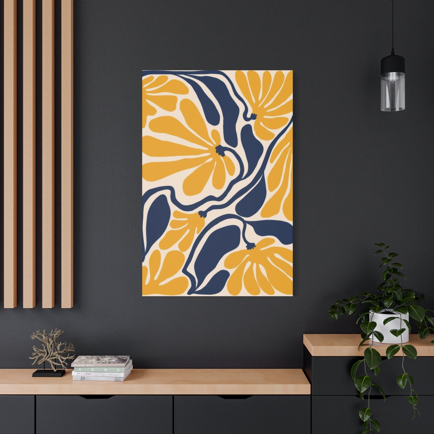
The Artistic Beauty of Blue Yellow Flower Abstract Wall Art for Contemporary Home Décor
The world of interior design has witnessed a remarkable resurgence in artistic expression through abstract floral canvas prints. Among the most captivating combinations available today is the stunning pairing of blue and yellow tones in flower artwork. This comprehensive guide explores every aspect of incorporating these vibrant pieces into your living spaces, offering insights into their aesthetic appeal, psychological impact, and practical applications across various room settings.
The Captivating Appeal of Blue-Yellow Abstract Floral Canvas Prints
The magnetic attraction of blue and yellow abstract floral canvas prints stems from their ability to merge natural beauty with contemporary artistic expression. These pieces represent more than mere decorations; they embody a sophisticated approach to bringing the outdoors inside while maintaining a modern aesthetic sensibility. The combination of cool blue tones with warm yellow hues creates a visual harmony that appeals to diverse design preferences and personality types.
When examining the popularity of these artistic pieces, several factors contribute to their widespread acceptance in modern homes. The abstract nature of the florals allows for interpretation and personal connection, making each piece unique to the viewer's perspective. Unlike photographic representations, abstract interpretations of flowers provide freedom in design, enabling artists to emphasize color, form, and emotion rather than botanical accuracy.
The canvas medium itself adds significant value to these artworks. Canvas prints offer texture, depth, and durability that paper prints cannot match. The fabric surface creates subtle variations in how light interacts with the colors, making blue and yellow tones appear dynamic throughout different times of day. This living quality ensures that the artwork never becomes static or boring, continuously offering fresh visual interest.
Contemporary homeowners increasingly seek artwork that bridges the gap between traditional subject matter and modern presentation. Blue-yellow floral abstracts perfectly fulfill this need by taking the timeless appeal of flowers and reimagining them through contemporary color palettes and compositional techniques. This fusion creates pieces that feel both familiar and refreshingly innovative.
Why Blue and Yellow Flowers Create Visual Impact in Modern Art
The striking visual impact of blue and yellow flowers in modern art derives from fundamental principles of color theory and human perception. This color combination exploits complementary relationships on the color wheel, creating maximum contrast and visual interest. When artists position these hues alongside each other, they generate optical vibration that captures attention and maintains viewer engagement.
From a scientific perspective, blue and yellow wavelengths stimulate different receptors in the human eye. This neurological response creates heightened awareness and emotional stimulation when viewing these colors together. Artists throughout history have recognized this powerful dynamic, from Van Gogh's starry nights to Monet's water lilies, proving the timeless effectiveness of this pairing.
In modern artistic contexts, the blue-yellow combination offers versatility unmatched by other color schemes. These hues can be rendered in countless shades and saturations, from pale pastels to deep, saturated jewel tones. This flexibility allows artists to create works ranging from subtle and sophisticated to bold and dramatic, all while maintaining the fundamental appeal of the color relationship.
The abstract treatment of floral subjects amplifies the impact of blue and yellow combinations. By reducing flowers to their essential forms and emphasizing color over detail, artists create compositions that communicate through pure visual language. This approach allows the colors themselves to become the primary subject, with floral shapes serving as vehicles for color expression rather than botanical studies.
Contemporary design trends favor artwork that makes statements without overwhelming spaces. Blue-yellow abstract florals achieve this delicate balance by offering visual interest and color impact while maintaining accessibility and appeal. The organic forms of flowers soften the boldness of contrasting colors, creating pieces that feel both dynamic and harmonious within diverse interior settings.
Adding Natural Elements with Abstract Flower Wall Art
Incorporating abstract flower wall art into interior spaces represents one of the most effective methods for introducing natural elements without literal representation. This approach satisfies the human psychological need for connection with nature while maintaining the clean lines and sophisticated aesthetics demanded by contemporary design philosophies.
Biophilic design principles emphasize the importance of natural connections in built environments. Research consistently demonstrates that exposure to nature, even through artistic representation, reduces stress, improves cognitive function, and enhances overall wellbeing. Abstract floral artwork fulfills these biophilic needs by suggesting natural forms without the visual complexity of photographic nature scenes.
The abstraction of floral subjects offers particular advantages in modern interiors. Unlike realistic botanical prints, abstract interpretations complement rather than compete with other design elements. The simplified forms and emphasized colors of abstract florals integrate seamlessly with minimalist furniture, geometric patterns, and contemporary architectural features that characterize modern spaces.
Blue and yellow abstract flower art specifically excels at bringing nature indoors because these colors naturally occur in garden settings. Blue appears in delphiniums, hydrangeas, irises, and forget-me-nots, while yellow blooms in sunflowers, daffodils, roses, and countless other species. This natural association triggers subconscious recognition and positive emotional responses, even when the artwork takes considerable artistic license with form.
How Blue-Yellow Floral Prints Can Transform and Brighten Your Home
The transformative power of blue-yellow floral prints extends far beyond simple decoration, fundamentally altering the atmosphere, perceived dimensions, and emotional character of interior spaces. Understanding how these artworks achieve such dramatic effects enables homeowners to strategically deploy them for maximum impact throughout their residences.
Light interaction represents one of the primary mechanisms through which these prints brighten homes. Yellow pigments naturally reflect more light than most other colors, increasing overall luminosity in rooms where they appear. When combined with blue tones, which provide visual depth and prevent yellow from becoming overwhelming, the result is artwork that genuinely enhances ambient lighting conditions.
The psychological impact of color on perceived brightness cannot be ignored. Yellow activates neural pathways associated with sunshine and daylight, causing viewers to perceive spaces as brighter regardless of actual light levels. This perceptual phenomenon makes blue-yellow floral prints particularly valuable in rooms with limited natural light, where they compensate for physical darkness through psychological brightness.
Spatial perception also changes dramatically with the introduction of properly chosen artwork. Large canvas prints create focal points that organize visual space, making rooms feel more intentional and well-designed. The combination of expansive blue backgrounds with yellow floral elements creates depth illusions, causing walls to recede and rooms to feel more spacious than their actual dimensions.
The energy level within spaces shifts noticeably with blue-yellow artwork presence. Yellow's inherent vibrancy and blue's calming influence combine to create environments that feel both energized and comfortable. This balanced energy makes rooms more inviting and suitable for diverse activities, from relaxation to social gathering to focused work.
Color psychology research confirms that blue-yellow combinations particularly excel at mood elevation. The warm tones stimulate positive emotional responses while cool tones prevent overstimulation, creating ideal conditions for contentment and wellbeing. Homes featuring these color combinations consistently score higher in occupant satisfaction surveys, demonstrating their real impact on daily life quality.
Choosing the Perfect Blue-Yellow Canvas for Your Living Room
Selecting the ideal blue-yellow canvas for living room spaces requires careful consideration of multiple factors including size, composition, color intensity, and relationship to existing decor elements. The living room serves as the primary gathering space in most homes, making artwork choices particularly significant for overall aesthetic success and family satisfaction.
Size considerations must balance impact with proportion. Living rooms typically accommodate larger artwork than other spaces, with many designers recommending pieces spanning two-thirds to three-quarters of furniture width for proper visual balance. For standard sofas measuring seventy to eighty inches wide, canvas prints between forty-eight and sixty inches create harmonious proportions without overwhelming the space.
Composition style significantly affects how blue-yellow floral canvases function within living environments. Some pieces feature bold, large-scale flowers with minimal background, creating dramatic focal points suitable for minimalist rooms with limited competing visual elements. Others present scattered, smaller blooms across expansive backgrounds, offering subtler integration appropriate for busier, more eclectic design schemes.
Color intensity selection depends heavily on existing room palettes and desired atmospheric effects. Rooms with neutral walls and furnishings can accommodate saturated, vibrant blue and yellow tones that become primary color sources. Conversely, spaces already featuring strong colors benefit from softer, more muted interpretations that complement rather than compete with existing hues.
The relationship between artwork and furniture deserves careful attention during selection. Canvas prints should dialogue with major furniture pieces, particularly sofas and accent chairs visible from primary viewing angles. Pulling specific blue or yellow shades from upholstery, throw pillows, or rugs creates cohesive design schemes that feel professionally curated rather than randomly assembled.
Lighting conditions dramatically affect how blue-yellow artwork appears and performs. Natural daylight renders colors most accurately, making north-facing rooms ideal for true color appreciation. Artificial lighting can shift color perception significantly, with warm bulbs enhancing yellows while potentially muddying blues, and cool bulbs performing the opposite effect. Testing artwork under actual room lighting before final commitment prevents disappointing surprises.
Frame and mounting choices impact final presentation substantially. Gallery-wrapped canvases, where artwork continues around edges, offer contemporary, frameless aesthetics that emphasize the painting itself. Traditional framing provides additional protection and can introduce complementary colors or textures, though frames must be chosen carefully to enhance rather than distract from the blue-yellow floral subject.
Abstract Flower Art as a Bold Addition to Any Wall
Abstract flower art introduces boldness to interior walls through its fundamental departure from representational accuracy, emphasizing instead the expressive potential of color, form, and composition. This artistic approach transforms familiar floral subjects into vehicles for emotional communication and visual experimentation, creating wall decorations that command attention and provoke contemplation.
The boldness of abstract floral artwork stems partly from its interpretive freedom. Viewers accustomed to realistic representations must engage more actively with abstract pieces, investing mental energy in understanding and appreciating the artist's vision. This cognitive engagement creates stronger emotional connections and more memorable impressions than passive viewing of conventional artwork provides.
Color application in abstract florals often embraces intensity and contrast that realistic botanical art avoids. Artists feel liberated to push saturation levels, juxtapose unexpected hues, and employ color for emotional effect rather than descriptive accuracy. This freedom results in artworks with visual impact unachievable through realistic representation, particularly when featuring the naturally striking combination of blue and yellow.
Compositional structures in abstract flower art frequently challenge conventional expectations. Rather than centering single blooms or creating balanced botanical arrangements, abstract artists might fragment flowers across canvases, overlap forms until they become nearly unrecognizable, or reduce blooms to essential geometric shapes. These unconventional approaches create visual tension and interest that keeps viewers returning for repeated examination.
The scale manipulation common in abstract florals contributes significantly to their boldness. Artists might enlarge individual petals to monumental proportions, reduce entire bouquets to thumbnail sketches, or combine multiple scales within single compositions. This playing with size relationships creates dynamic visual experiences that feel contemporary and fresh compared to traditional floral art.
Color Combinations: Blue and Yellow in Flower Art
The sophisticated interplay of blue and yellow in flower art represents one of design's most enduring and versatile color partnerships. Understanding the theoretical foundations, psychological effects, and practical applications of this combination enables informed artistic choices and successful interior design implementations across diverse settings and style preferences.
Color wheel positioning explains much of the blue-yellow relationship's effectiveness. These hues sit approximately opposite each other on traditional color wheels, creating complementary contrast that maximizes visual impact. Complementary colors contain no shared pigments, making each appear more vibrant and saturated when positioned adjacently, a phenomenon artists have exploited for centuries.
Temperature contrast contributes significantly to this combination's appeal. Blue reads as cool, evoking water, sky, and shadow, while yellow registers as warm, suggesting sunlight, fire, and energy. This temperature difference creates dynamic visual tension that prevents either color from dominating, instead achieving equilibrium where both tones enhance each other's distinctive qualities.
Psychological associations with blue and yellow individually and combined inform their use in flower art. Blue's connections to trust, stability, and tranquility complement yellow's associations with happiness, optimism, and creativity. Together, they create emotional environments that feel both energizing and calming, productive and restful, making spaces suitable for diverse activities and moods.
Saturation variations within blue-yellow combinations offer extensive creative possibilities. Pairing pale, pastel versions creates soft, romantic impressions suitable for bedrooms and quiet spaces. Combining deeply saturated, jewel-toned versions produces dramatic, energetic effects ideal for entertainment areas. Mixing saturations, such as vibrant yellow with muted blue, creates sophisticated contrasts that feel intentional and refined.
Proportion considerations affect how blue-yellow combinations function in flower art. Compositions with equal color distribution create balanced, harmonious impressions. Featuring one color prominently with smaller accent amounts of the other creates hierarchy and focal points. Artists manipulate these proportions deliberately to control viewer attention and emotional responses.
Historical precedents demonstrate the timeless appeal of blue-yellow combinations in art. Impressionist masters frequently employed these colors to capture light's effects on landscapes and gardens. Post-impressionists pushed the combination toward greater emotional expression. Contemporary abstract artists continue exploring this relationship, finding endless variations within its fundamental structure.
Cultural meanings associated with blue and yellow vary globally, affecting how flower art incorporating these colors is received. Western traditions often link blue with masculinity and yellow with cheerfulness, while Eastern cultures may assign different symbolic values. Understanding these cultural dimensions helps in creating or selecting artwork appropriate for specific audiences and contexts.
Elevate Your Decor with Abstract Blue-Yellow Flowers
Elevating interior decor through abstract blue-yellow flower artwork involves strategic placement, thoughtful coordination with existing design elements, and understanding how these pieces can anchor and enhance overall aesthetic schemes. The transformative potential of well-chosen floral abstracts extends throughout entire rooms, affecting perception, atmosphere, and daily experience.
Establishing visual hierarchy represents a fundamental principle in decor elevation. Abstract blue-yellow flower canvases naturally draw attention through color contrast and organic forms, making them ideal focal points around which other design elements organize. Positioning these artworks at eye level on primary walls ensures they fulfill their role as visual anchors effectively.
Color coordination between artwork and surrounding decor amplifies cohesive design impact. Pulling blue tones from canvas prints into throw pillows, area rugs, or curtain panels creates intentional color relationships that feel professionally designed. Similarly, echoing yellow accents throughout the space through accessories, lighting fixtures, or furniture upholstery unifies the entire room around the artwork's palette.
Contrast management balances visual interest against harmony. While blue-yellow artwork provides inherent contrast, surrounding elements should vary in their approach. Pairing bold artwork with relatively neutral furnishings prevents visual overwhelming, allowing the canvas to shine. Conversely, rooms with already colorful decor might benefit from more subdued blue-yellow pieces that contribute without dominating.
Texture layering adds sophistication and depth to rooms featuring abstract floral canvases. The organic quality of flower subjects pairs beautifully with natural materials like wood, stone, linen, and wool. Incorporating these textures through furniture, flooring, and accessories creates rich, multi-dimensional environments where artwork feels integrated rather than applied as afterthought.
Lighting design dramatically affects how abstract blue-yellow florals perform decoratively. Accent lighting directed at canvas prints creates gallery-like presentation, elevating artwork from mere decoration to featured exhibit. Ambient lighting choices influence color perception, with adjustable systems allowing homeowners to modify atmospheric effects throughout day and evening.
Scale relationships between artwork and furniture determine visual success. Undersized pieces appear tentative and fail to make intended impacts, while oversized works can overwhelm spaces and furniture. Following professional design ratios ensures appropriate proportions that elevate rather than unbalance room aesthetics.
Seasonal rotation strategies maintain fresh, dynamic interiors. While abstract blue-yellow florals work year-round, alternating between different pieces or complementing them with seasonal accessories prevents visual stagnation. Spring might emphasize lighter, pastel versions, while autumn calls for deeper, more saturated interpretations, keeping decor feeling current and intentional.
The Role of Blue and Yellow in Creating Calm Spaces
The strategic deployment of blue and yellow in creating calm, peaceful interior environments relies on understanding color psychology, careful balance between opposing qualities, and thoughtful integration with other design elements. These colors, when properly employed, transform potentially stressful environments into sanctuaries that support relaxation, reflection, and emotional restoration.
Blue's well-documented calming properties stem from physiological responses to color wavelengths. Studies demonstrate that blue exposure can lower heart rate, reduce blood pressure, and decrease cortisol levels associated with stress. These biological responses occur subconsciously, making blue incorporation in living spaces an effective passive stress management strategy.
Yellow's contribution to calmness initially seems counterintuitive given its energizing qualities, but proper application reveals its value. Soft, warm yellows evoke gentle sunlight, creating comfortable, welcoming atmospheres without stimulating anxiety. The key lies in saturation control; muted, buttery yellows support calmness while bright, lemony tones might prove too stimulating for relaxation-focused spaces.
The combination of blue and yellow achieves emotional balance unattainable by either color alone. Blue provides the foundational calmness and stability, while yellow prevents the space from feeling cold, depressing, or emotionally flat. This balance creates environments that feel simultaneously peaceful and positive, calm and gently uplifting.
Color proportion directly influences calmness levels in blue-yellow spaces. Calm environments typically benefit from blue dominance with yellow accents rather than equal distribution. Abstract floral canvases featuring expansive blue backgrounds with delicate yellow blooms exemplify this principle, providing strong calming foundation while preventing monotony through carefully placed warm accents.
Saturation levels must be carefully controlled in calm-focused spaces. Highly saturated colors, regardless of hue, stimulate neural activity and can prevent relaxation. Abstract florals intended for peaceful rooms should feature softer, more muted versions of blue and yellow, perhaps with significant white or neutral admixture that reduces intensity while maintaining color character.
Fresh Ideas for Styling Blue-Yellow Abstract Art
Innovative styling approaches for blue-yellow abstract art extend beyond traditional hanging methods, embracing creative placement strategies, unexpected combinations, and multi-functional applications that maximize visual impact while serving practical purposes. These fresh perspectives transform standard decoration into dynamic design elements that enhance spaces in surprising, delightful ways.
Gallery wall integration offers contemporary alternatives to single large-scale pieces. Combining multiple smaller blue-yellow abstract florals in varied sizes creates visual interest through compositional complexity. This approach allows for artistic evolution over time, with pieces added or rearranged as tastes change or new artworks are discovered, maintaining design freshness indefinitely.
Unexpected placement locations challenge conventional artwork positioning. Rather than defaulting to living room walls, consider featuring blue-yellow florals in entryways for impactful first impressions, bathrooms for spa-like atmospheres, or home offices for creativity stimulation. These non-traditional placements demonstrate design confidence and maximize artwork's atmospheric effects throughout entire homes.
Layering techniques add dimensional interest to flat walls. Leaning smaller blue-yellow canvases on mantels, shelves, or console tables creates casual, collected aesthetics that feel more personally curated than formally hung pieces. Layering multiple artworks of varying sizes against walls adds depth and allows for easy seasonal rotation without wall damage.
Furniture coordination elevates both artwork and furnishings simultaneously. Positioning blue-yellow abstract florals above sofas or beds creates intentional design relationships, but taking coordination further through color-matched pillows, throws, or upholstery transforms good design into exceptional presentation. This holistic approach demonstrates sophisticated design understanding.
Lighting integration treats artwork as architectural features deserving dedicated illumination. Installing picture lights, track lighting, or recessed spots that highlight blue-yellow pieces creates museum-quality presentation in residential settings. Adjustable systems enable atmospheric changes throughout day and evening, maximizing artwork's versatility and impact.
Room divider applications provide creative solutions for open-plan spaces requiring subtle separation. Large blue-yellow abstract canvases mounted on freestanding frames or suspended from ceilings can define areas without solid barriers, maintaining open feelings while providing visual privacy and acoustic benefits.
Seasonal styling refreshes spaces without requiring artwork changes. Surrounding permanent blue-yellow pieces with seasonal accessories, plants, or complementary smaller artworks creates dynamic environments that evolve throughout the year. Spring might introduce fresh flowers echoing canvas blooms, while winter could add cozy textures that contrast with artwork's vibrancy.
The Rising Trend of Blue-Yellow Flower Wall Art
The contemporary surge in blue-yellow flower wall art popularity reflects broader cultural shifts in design preferences, lifestyle priorities, and relationships with natural environments. Understanding the forces driving this trend provides insight into its likely longevity and helps identify authentic expressions versus temporary fads.
Biophilic design movement growth significantly contributes to increased floral art demand. As urbanization intensifies and screen time dominates daily life, people increasingly crave nature connections within built environments. Floral artwork satisfies this craving accessibly, bringing garden beauty indoors without maintenance demands of living plants.
Color psychology awareness has expanded dramatically through social media and design programming. Homeowners now understand how blue promotes calmness and yellow enhances happiness, leading to intentional color selections based on desired emotional effects. This informed approach to color drives demand for specific combinations like blue-yellow that deliver proven psychological benefits.
Abstract art appreciation has broadened beyond traditional art collector circles. Contemporary audiences value artwork's emotional and aesthetic contributions over technical realism or investment potential. This democratization of art appreciation creates markets for abstract interpretations that earlier generations might have dismissed, expanding opportunities for both artists and consumers.
Customization trends favor unique, individual expressions over mass-market conformity. Blue-yellow abstract florals offer sufficient variety that homeowners can find pieces feeling personally meaningful rather than generically decorative. This personalization possibility appeals strongly to consumers seeking distinctive environments that reflect individual identities.
Online marketplace expansion has revolutionized art accessibility and affordability. Consumers can now browse thousands of blue-yellow floral options from global artists, compare prices, read reviews, and purchase directly without gallery intermediaries. This access democratizes art ownership and exposes buyers to diverse styles previously unavailable through local outlets.
Why Floral Canvas Prints Are Ideal for Modern Interiors
The inherent suitability of floral canvas prints for modern interior environments stems from their unique ability to bridge natural organic forms with contemporary aesthetic sensibilities. This compatibility makes them versatile, adaptable solutions that enhance rather than conflict with modern design principles while providing necessary warmth and life.
Minimalist philosophy compatibility positions floral canvases as ideal modern accompaniments. While minimalism emphasizes reduction and simplicity, it does not demand sterility. Carefully selected abstract floral pieces provide visual interest and organic softness that prevent minimalist spaces from feeling cold or unwelcoming, fulfilling minimalism's quality-over-quantity principle through singular impactful artworks.
Color discipline in modern interiors creates opportunities for floral canvas integration. Contemporary design often employs limited palettes of neutrals with one or two accent colors. Blue-yellow abstract florals can provide these accent colors efficiently, delivering maximum impact through concentrated applications that align perfectly with modern color distribution preferences.
Clean line aesthetics characterizing modern design benefit from organic floral counterbalance. Spaces dominated by geometric furniture, angular architecture, and linear patterns risk feeling harsh or mechanical. Curved, flowing floral forms introduce necessary organic elements that soften hard edges without compromising contemporary character.
Open-plan living demands artwork that works across multiple functional zones simultaneously. Large-scale floral canvases serve as visual anchors that unify open spaces while remaining appropriate for diverse activities occurring within sight lines. This versatility makes them practical solutions for contemporary spatial configurations.
Natural material emphasis in modern design creates harmonious contexts for floral subjects. Contemporary interiors frequently feature wood, stone, leather, and other organic materials that complement rather than conflict with nature-inspired artwork. Blue-yellow florals feel cohesive within these material palettes, strengthening overall design unity.
How to Incorporate Bold Colors in Floral Art
Successfully incorporating bold colors in floral art requires understanding intensity management, context consideration, and strategic placement that maximizes impact while maintaining livability. Bold color deployment differs fundamentally from subtle approaches, demanding confidence and careful planning to achieve striking results without overwhelming occupants or creating visual chaos.
Color confidence begins with commitment to statement-making. Bold floral art demands prominent placement where impact registers fully. Half-hearted positioning in secondary locations wastes potential and creates ambiguous design messages. Committing to primary wall locations, generous sizing, and unobstructed viewing angles ensures bold colors deliver intended effects.
Surrounding neutrality provides essential counterbalance to bold floral colors. Intensely colored artwork requires visual breathing room to shine without creating overwhelming sensory experiences. Neutral walls, floors, and major furniture pieces create calm frameworks within which bold blue-yellow florals become exciting focal points rather than contributors to visual cacophony.
Color repetition through accessories extends artwork impact throughout spaces. Pulling bold blues and yellows from canvas prints into smaller decor elements like throw pillows, vases, or books creates intentional color stories that unify rooms. This repetition demonstrates design sophistication and prevents artwork from appearing randomly selected or contextually disconnected.
Scale appropriateness ensures bold colors enhance rather than dominate. Large rooms with high ceilings can accommodate monumental canvases featuring intense colors that would overwhelm small spaces. Conversely, compact rooms benefit from smaller bold pieces or multiple medium works that provide color impact without spatial intimidation.
Lighting management controls perceived color intensity. Bright, direct lighting intensifies bold colors, potentially pushing them toward uncomfortable extremes. Diffused, moderate lighting maintains visual impact while preventing overwhelming sensations. Adjustable lighting systems provide flexibility to modify intensity based on time, mood, or activity.
Blue-Yellow Abstract Flowers: A Perfect Match for Bright Interiors
The exceptional compatibility between blue-yellow abstract flowers and bright interior environments stems from complementary light interactions, color reinforcement effects, and psychological harmonies that create unified, energized spaces. Understanding these relationships enables strategic artwork selection and placement that maximizes synergies between natural brightness and artistic enhancement.
Light amplification occurs when yellow pigments in artwork reflect ambient illumination back into spaces. Bright rooms naturally contain abundant light that yellow surfaces intensify through reflection, creating multiplying effects that increase overall luminosity beyond original light levels. This amplification makes already bright spaces feel even more radiant and energized.
Color saturation enhancement results from bright lighting conditions. Artificial and natural light increase perceived color intensity, making blues appear deeper and yellows more vibrant. In dim environments, these colors might appear muted or flat, but bright interiors activate their full chromatic potential, justifying selection of pieces with more saturated, intense color applications.
Visual temperature balance prevents bright spaces from feeling harsh or uncomfortable. While abundant light creates energetic, active environments, excessive brightness without visual relief can cause strain or agitation. Blue components in abstract florals provide cooling visual counterweights that prevent overwhelming sensations while maintaining bright, cheerful overall character.
Seasonal alignment makes blue-yellow florals particularly successful in naturally bright spaces. Rooms with significant windows often experience dramatic seasonal light variations, appearing brilliant in summer and dimmer in winter. The consistent color impact of abstract floral canvases stabilizes atmospheric qualities across seasons, maintaining visual brightness even when natural light decreases.
Decorating Tips for Blue and Yellow Flower Canvas Prints
Expert decorating with blue and yellow flower canvas prints involves mastering proportional relationships, color coordination techniques, placement strategies, and contextual considerations that transform good intentions into exceptional executions. These practical tips bridge the gap between artistic appreciation and successful real-world implementation.
Height positioning critically affects artwork impact and viewer experience. Standard practice places artwork centers at fifty-seven to sixty inches above floor level, approximating average eye height. This positioning ensures comfortable viewing without neck strain while creating professional gallery presentation. Adjustments may be necessary for unusually tall or short occupants or furniture relationships requiring different heights.
Furniture clearance maintains visual separation between canvas prints and objects below. Leaving six to twelve inches between artwork bottom edges and furniture tops prevents pieces from appearing to rest on furniture while maintaining clear visual relationships. This spacing creates intentional designs rather than accidental proximities.
Color matching precision determines coordination success. Rather than accepting approximate matches, bringing fabric swatches, paint chips, or photographs of existing decor when selecting artwork ensures accurate color relationships. Many online retailers offer sample programs allowing at-home evaluation before commitment, reducing matching errors.
Pattern mixing requires careful attention to scale and intensity variations. Combining blue-yellow floral canvases with patterned textiles works beautifully when patterns differ significantly in scale. Pairing large, bold floral paintings with small-scale geometric fabrics creates pleasing contrasts, while competing similar-scale patterns create visual confusion.
Negative space preservation prevents visual crowding. Artwork requires surrounding empty wall space to register properly. Cramming canvases too closely to room corners, architectural features, or other decorations diminishes impact and creates cluttered impressions. Generous negative space communicates design sophistication and allows artwork to breathe visually.
Symmetry versus asymmetry choices depend on room character and personal preferences. Formal spaces often benefit from symmetrical artwork arrangements that reinforce order and tradition. Casual, contemporary environments typically succeed with asymmetrical placements that feel relaxed and spontaneous. Understanding stylistic implications guides appropriate approach selection.
The Impact of Floral Abstract Art on Room Ambiance
The profound influence of floral abstract art on room ambiance extends beyond superficial decoration, fundamentally shaping atmospheric qualities, emotional responses, and experiential dimensions of interior spaces. Understanding these impacts enables intentional atmosphere creation that supports desired activities, moods, and lifestyle expressions through strategic artistic deployment.
Emotional resonance represents the primary mechanism through which floral abstracts shape ambiance. Blue and yellow combinations trigger specific psychological responses grounded in evolutionary associations and cultural conditioning. These automatic responses occur below conscious awareness, creating ambient emotional environments that influence occupants continuously without demanding active attention or engagement.
Sensory complexity increases dramatically with abstract floral presence. Bare walls offer minimal visual interest, creating sensory monotony that can feel unstimulating or depressing. Introducing organic forms, varied colors, and compositional complexity through floral artwork engages visual processing systems, creating mentally stimulating environments that prevent boredom while avoiding overwhelming chaos.
Memory activation through floral imagery affects ambiance subtly but significantly. Most people possess positive memories associated with flowers, gardens, and natural beauty. Abstract floral art triggers these memory networks, importing associated positive emotions into present environments. This memory-emotion connection operates continuously, contributing to sustained positive ambient feelings.
Social atmosphere modification occurs through artwork's communicative functions. Floral abstracts signal warmth, creativity, and personal investment in environmental quality. These signals affect how guests perceive hosts and how comfortable they feel within spaces. The resulting social atmosphere becomes more relaxed, friendly, and conducive to meaningful interaction than austere, undecorated alternatives provide.
Temporal rhythm establishment helps structure daily experiences through atmospheric variation. Different lighting conditions throughout the day alter how blue-yellow artwork appears, creating subtle atmospheric shifts that mark time's passage. Morning light might emphasize yellow's energizing qualities, while evening illumination could strengthen blue's calming effects, supporting natural circadian patterns.
Blue-Yellow Floral Art: A Timeless Decor Choice
The enduring appeal of blue-yellow floral art across changing design trends reflects its foundation in unchanging human psychological responses, natural associations, and fundamental aesthetic principles. Understanding the sources of this timelessness helps distinguish genuine classic choices from temporary fads, ensuring decorating investments maintain relevance and beauty across decades.
Color theory foundations guarantee continued relevance regardless of trend cycles. The complementary relationship between blue and yellow operates independently of fashion, rooted in physics and human vision. This fundamental basis means the combination will never become outdated in the way specific pattern trends or style movements inevitably do.
Natural world connections provide timeless appeal immune to cultural shifts. Humans evolved in environments containing blue skies and yellow sunlight, creating deep biological associations with these colors. Floral subjects similarly tap into universal human appreciation for natural beauty that transcends cultural boundaries and historical periods.
Emotional universality ensures cross-generational appeal. The calming effects of blue and energizing qualities of yellow produce consistent responses across ages, cultures, and personal preferences. This psychological consistency prevents blue-yellow floral art from feeling dated or generationally specific, making it appropriate for households containing multiple age groups.
Stylistic versatility allows adaptation to evolving personal tastes. Abstract floral art ranges from barely recognizable suggestions of flowers to clearly botanical forms rendered in non-realistic colors. This spectrum means individuals can select pieces matching current preferences while remaining within the timeless blue-yellow floral category, enabling evolution without complete reinvention.
Quality craftsmanship trumps trendy gimmicks in lasting appeal. Well-executed abstract florals on quality canvas materials maintain physical and aesthetic integrity for decades. This durability contrasts with trend-chasing decor items that appear dated quickly and deteriorate physically, making timeless choices more sustainable and economical long-term.
Historical precedent demonstrates proven longevity. Blue-yellow color combinations appear throughout art history, from ancient decorative arts through Impressionist paintings to contemporary abstracts. This continuous presence across centuries confirms genuine timelessness rather than mere current popularity waiting to fade.
Investment value, both financial and emotional, accrues to timeless pieces. Quality abstract floral art appreciates or maintains value more reliably than trendy alternatives. Additionally, the emotional investment in living with beloved artwork for years creates sentimental value that transcends monetary considerations, enriching daily life immeasurably.
The Beauty of Abstract Flower Art in Home Offices
The specific advantages of abstract flower art in home office environments address the unique challenges of creating spaces that support productivity, creativity, and wellbeing while maintaining professional atmosphere suitable for virtual meetings and focused work. Blue-yellow floral abstracts particularly excel in these demanding, multi-functional spaces.
Creativity stimulation occurs through organic forms and color interplay that activate different neural networks than typical office environments engage. Abstract florals introduce visual complexity and beauty that exercises right-brain functions often neglected during analytical work tasks. This cognitive diversification prevents mental fatigue and supports creative problem-solving.
Stress reduction becomes critical in home offices where work-life boundaries blur dangerously. Blue's physiologically calming effects help counteract workplace stress, while yellow prevents the space from feeling depressing or oppressive during long work hours. This emotional balance maintains mental health during demanding work periods.
Video conference backgrounds benefit enormously from thoughtful artwork placement. Abstract floral canvases positioned behind workspace seating create professional yet personable backgrounds that communicate taste and attention to detail. Blue-yellow combinations specifically appear well in most lighting conditions and camera systems, presenting favorably to remote colleagues and clients.
Focus maintenance requires visual interest that engages without distracting. Abstract florals provide sufficient complexity for brief mental breaks during intense concentration, allowing eyes and minds to rest momentarily before returning to work tasks. This subtle distraction prevents burnout more effectively than completely austere environments or obviously distracting decorations.
Natural element introduction addresses biophilic needs often unmet in home offices, particularly those in basements or interior rooms without windows. Floral artwork provides psychological nature connection that improves mood, reduces stress, and enhances cognitive function, compensating partially for absent direct nature access.
Why Abstract Art Works for Every Room in Your Home
The universal applicability of abstract art across diverse room types and functions stems from its interpretive flexibility, emotional adaptability, and aesthetic versatility. Understanding why abstraction succeeds so broadly enables confident deployment throughout homes, creating visual continuity while respecting individual space requirements and characteristics.
Subjective interpretation allows abstract art to mean different things in different contexts. The same blue-yellow floral piece might evoke energetic creativity in a studio, peaceful rest in a bedroom, or social warmth in a living room. This meaning flexibility permits single artwork styles to function appropriately across functionally distinct spaces.
Style neutrality prevents abstract art from clashing with varied decor approaches throughout homes. Unlike representational art or specific style-driven pieces, abstracts complement traditional, contemporary, eclectic, and minimalist interiors equally well. This versatility proves invaluable in homes where different rooms express different aesthetic personalities.
Color coordination simplifies when working with abstract pieces across multiple rooms. Selecting abstract florals in consistent blue-yellow palettes but varied compositions creates visual threads connecting spaces while maintaining individual room character. This approach produces cohesive whole-house design without monotonous repetition.
Emotional range within abstraction accommodates different room purposes. Abstract florals can be rendered boldly for energetic spaces or subtly for calm areas, dramatically for entertainment zones or minimally for work environments. This emotional flexibility within single subject-color categories enables appropriate atmospheric creation everywhere.
Scale adaptability permits abstract art to fit various architectural proportions. Small pieces work in powder rooms and hallways, medium works suit bedrooms and offices, large canvases command living and dining areas. The abstract format translates successfully across these scale variations more readily than many representational subjects.
Conversation starting without controversy makes abstract art socially safe for public home areas. Unlike political, religious, or provocative representational works, abstract florals generate positive discussion without risk of offending guests. This social neutrality proves particularly valuable in homes with diverse visitors.
Bring Spring Indoors with Blue-Yellow Flower Canvas Prints
The capacity of blue-yellow flower canvas prints to evoke spring's renewal, freshness, and optimism transcends seasonal boundaries, allowing year-round enjoyment of spring's psychological benefits. Understanding how these artworks capture seasonal essence enables strategic use for mood elevation, particularly during darker months when spring's actual presence lies distant.
Seasonal association with blue and yellow colors runs deep in human psychology. Yellow immediately evokes spring's returning sunshine after winter's darkness, while blue suggests clear spring skies and emerging blue flowers like hyacinths and forget-me-nots. These automatic associations trigger springtime feelings regardless of actual seasons.
Renewal symbolism inherent in floral subjects amplifies spring connections. Flowers represent life returning, growth recommencing, and natural cycles continuing. Abstract interpretations of these themes communicate renewal concepts without literal representation, allowing sophisticated, mature expressions of optimism appropriate for adult environments.
Light quality improvement creates perceived seasonal shifts. The brightness yellow brings to spaces mimics spring's increasing daylight, psychologically signaling seasonal change even when actual daylight remains winter-short. This perceptual shift combats seasonal affective disorder and winter blues effectively.
Color therapy principles support using spring-evoking artwork for mood management. Chromotherapy research indicates that yellow exposure increases serotonin production, improving mood and energy. Blue provides emotional stability and reduces anxiety. Together, they recreate spring's psychological benefits biochemically.
Indoor gardening alternatives appeal to those unable or unwilling to maintain living plants. Canvas florals provide permanent, maintenance-free spring presence that never wilts, requires no watering, and triggers no allergies. This practicality makes spring's beauty accessible to more people more reliably.
Holiday preparation benefits from spring artwork establishing fresh foundations. Rotating seasonal accessories around permanent spring-themed canvases creates evolving displays that feel current while maintaining design continuity. Blue-yellow florals serve as neutral bases that complement rather than compete with holiday-specific decorations.
Psychological preparation for actual spring begins months earlier through environmental cues. Featuring spring-themed artwork during winter months creates anticipatory excitement and hopeful forward-looking that improves winter experience. This psychological time-travel function makes difficult seasons more bearable.
The Versatility of Blue and Yellow in Home Art Decor
The remarkable versatility of blue and yellow in home art decor derives from their individual color characteristics, their powerful combination effects, and their compatibility with diverse materials, styles, and design philosophies. Exploring this versatility reveals why these colors dominate successful interior art across varied aesthetic approaches and lifestyle contexts.
Shade range within blue and yellow categories provides extensive variation possibilities. Blues span from pale sky tints to deep navy, encompassing aqua, turquoise, cobalt, and countless other variations. Yellows range from subtle cream through bright lemon to deep gold. This diversity within single color names permits unlimited unique combinations.
Intensity modulation creates different design impacts from identical color combinations. Soft, pastel blue-yellows create gentle, romantic effects suitable for traditional or cottage styles. Saturated, vivid versions produce bold, contemporary impressions appropriate for modern spaces. Medium intensities offer versatile middle grounds suiting transitional designs.
Temperature balance enables season-appropriate applications. Cool-leaning blue-yellows with more blue emphasis feel appropriate for summer and warm climates, while warm-leaning combinations with stronger yellow presence suit autumn, winter, and cool climates. This temperature flexibility allows year-round appropriateness through subtle emphasis shifts.
Style translation proves remarkably successful across aesthetic categories. Blue-yellow florals execute beautifully in impressionistic, expressionistic, minimalist, maximalist, and geometric abstraction styles. This cross-style capability means diverse household members can find blue-yellow pieces matching personal aesthetic preferences.
Material compatibility extends blue-yellow success beyond canvas. These colors translate excellently to ceramics, textiles, glass, metal, and wood, enabling comprehensive design schemes where artwork coordinates with varied decorative objects. This material versatility facilitates cohesive multi-element displays.
Styling Fundamentals for Blue-Yellow Abstract Floral Displays
Mastering styling fundamentals for blue-yellow abstract floral displays requires understanding compositional principles, spatial relationships, and aesthetic balance that distinguish professional-quality presentations from amateur attempts. These foundational skills enable confident decoration that maximizes artwork impact while creating cohesive, beautiful spaces.
Visual weight distribution affects perceived balance in room compositions. Large, dark, or intensely colored elements possess greater visual weight than small, light, or pale alternatives. Balancing blue-yellow florals with appropriately weighted furniture and accessories creates stable compositions that feel neither top-heavy nor unanchored.
Color echo technique reinforces artwork importance through repetition. Selecting three to five colors from canvas prints and repeating them in varying proportions throughout rooms creates intentional, professional color schemes. This technique demonstrates design sophistication while ensuring artwork feels integrated rather than arbitrarily placed.
Layering depth creates dimensional interest in flat wall displays. Positioning artwork as background, furniture as middle ground, and accessories as foreground generates spatial depth that makes rooms feel larger and more dynamic. Understanding these layers helps position blue-yellow florals optimally within overall compositions.
Contrast variation prevents visual monotony while avoiding chaos. Rooms need both high-contrast elements for interest and low-contrast areas for rest. Blue-yellow artwork provides high contrast, so surrounding areas should offer lower-contrast relief that allows eyes and minds to relax between engagement periods.
Proportion mathematics guide size relationships between artwork and surrounding elements. Classical golden ratio principles suggest pleasing proportions, but practical interior design typically employs simpler rules: artwork spanning two-thirds of furniture width, heights proportional to wall dimensions, and spacing equal to approximately one-fifth artwork dimensions.
Focal hierarchy establishes primary and secondary visual destinations. Every room needs clear focal points organizing visual attention. Blue-yellow florals excel as primary focal points but can also function as secondary interest areas supporting architectural features or furniture groupings as primary focuses.
Material palette coordination extends beyond colors to textures and finishes. Matte canvas surfaces pair beautifully with similar matte wood, stone, or fabric textures but create interesting contrasts with glossy glass, metal, or lacquered surfaces. Considering textural relationships alongside color produces sophisticated, multi-dimensional designs.
Creating Mood and Atmosphere Through Floral Canvas Selection
Strategic floral canvas selection based on desired mood and atmospheric qualities enables precise environmental control that supports specific activities, emotional states, and lifestyle needs. Understanding how different abstract floral characteristics affect ambient qualities empowers intentional choices that create genuinely functional, beautiful spaces.
Color temperature manipulation directly influences emotional atmosphere. Cool-temperature blues with minimal yellow create calm, contemplative environments ideal for bedrooms and meditation spaces. Warm-temperature yellows with accent blues generate energetic, social atmospheres perfect for kitchens and gathering areas. Balanced combinations suit multipurpose spaces requiring atmospheric flexibility.
Compositional density affects energy perception in spaces. Densely packed floral compositions with many blooms and little background space create busy, energetic impressions suitable for active areas. Sparse compositions with significant negative space produce calm, spacious feelings appropriate for rest and concentration. Selecting appropriate density levels ensures atmospheric alignment with room purposes.
Brush stroke character communicates different emotional qualities. Smooth, blended applications create serene, controlled atmospheres, while visible, energetic brush strokes suggest dynamism and spontaneity. Texture levels in paint application similarly affect perceived energy, with heavily textured surfaces reading as more active than flat applications.
Scale relationships between flowers and canvas dimensions alter impact and feeling. Oversized blooms filling entire canvases create bold, confident, contemporary atmospheres. Smaller flowers scattered across larger backgrounds produce delicate, traditional feelings. Understanding these scale-atmosphere connections guides appropriate selections for desired effects.
Color saturation levels dramatically affect ambient energy. Highly saturated, intense colors create stimulating environments that energize and activate. Desaturated, muted tones produce contemplative, sophisticated atmospheres that encourage thought and calm. Matching saturation to room function optimizes environmental appropriateness.
Conclusion:
The comprehensive exploration of blue-yellow abstract floral canvas prints reveals their remarkable capacity to transform residential environments across aesthetic, psychological, and functional dimensions. These artworks represent far more than simple wall decorations, functioning instead as powerful tools for environmental enhancement, emotional support, and personal expression that enrich daily life in countless subtle and profound ways.
The enduring appeal of blue and yellow color combinations stems from fundamental aspects of human perception, evolutionary psychology, and universal natural associations that transcend temporary design trends. This timeless foundation ensures that investments in quality blue-yellow floral artwork remain relevant and beautiful across decades, providing reliable value that fast-fashion decor alternatives cannot match. The complementary color relationship creates visual dynamism that captures attention while maintaining harmony, achieving the delicate balance between interest and overwhelming that characterizes truly successful interior design.
Abstract interpretation of floral subjects offers particular advantages in contemporary living spaces where diverse aesthetic preferences, architectural styles, and functional requirements demand versatile decoration solutions. The flexibility inherent in abstraction allows individual viewers to find personal meaning and connection while maintaining broad accessibility and appeal. This interpretive openness makes blue-yellow abstract florals appropriate for virtually any room type, design style, or household composition, demonstrating versatility unmatched by more specific artistic approaches.
The psychological benefits documented throughout this exploration deserve special emphasis as they contribute substantially to overall quality of life. Blue's calming influences and yellow's energizing properties combine to create emotionally balanced environments supporting diverse activities and moods. These effects occur automatically and continuously, providing passive environmental support for mental health and emotional wellbeing that operates regardless of conscious awareness. In an era of increasing stress and mental health challenges, creating home environments that actively support emotional equilibrium represents genuine preventive health care.
Practical considerations around selection, placement, lighting, and integration demonstrate that successful artwork incorporation requires thoughtful planning rather than impulsive purchasing. Understanding how canvas size relates to furniture proportions, how lighting affects color perception, and how new pieces interact with existing decor elements separates amateur decoration from professional-quality results. The information provided throughout this guide empowers confident decision-making that produces genuinely satisfying outcomes rather than disappointing mismatches requiring expensive corrections.
The rising popularity of blue-yellow abstract florals reflects not temporary trend-following but rather authentic alignment with contemporary lifestyle needs and values. Increased home-centeredness following global pandemic experiences, growing environmental consciousness, wellness movement priorities, and desire for meaningful, lasting possessions all converge to make these artworks particularly appropriate for current circumstances. This cultural alignment suggests continued relevance rather than pending obsolescence, confirming the wisdom of current investments.
The versatility demonstrated across varied applications from bright living rooms to calm bedrooms, from professional home offices to welcoming entryways proves that properly selected blue-yellow abstract florals genuinely work everywhere. This universal applicability simplifies whole-house design coordination while maintaining individual room character, creating visual continuity without monotonous repetition. The ability to achieve both unity and variety through single artistic category represents significant practical value for homeowners seeking cohesive yet interesting interior schemes.
Investment considerations extending beyond initial purchase prices to encompass aesthetic dividends, psychological benefits, durability, and legacy potential reframe artwork acquisition as genuinely valuable resource allocation rather than frivolous spending. When calculated across years of daily enjoyment, environmental enhancement, and emotional support, quality canvas prints prove remarkably cost-effective compared to many routine expenditures providing far less sustained value. This economic perspective justifies prioritizing artwork in household budgets and encourages selecting quality pieces offering maximum long-term returns.


