


Abstract Expression: What Bright Brush Wall Art Says About Your Style
The world of painting transforms dramatically when artists embrace the power of vibrant brush strokes and bold artistic expressions. These dynamic techniques have revolutionized how we perceive and create visual art, offering endless possibilities for emotional communication and aesthetic innovation. Through careful study and practice, painters can harness these powerful methods to create compelling works that captivate viewers and convey profound artistic messages.
Vivid brush strokes serve as the foundation for expressive painting, allowing artists to communicate energy, emotion, and movement through their chosen medium. The mastery of these techniques requires understanding both the technical aspects of brush handling and the artistic principles that govern effective composition and color theory. Whether working with traditional oils, acrylics, or modern digital mediums, the principles of dynamic brushwork remain consistent across all platforms.
The significance of bright brush techniques extends beyond mere aesthetic appeal, touching the very core of artistic expression and visual communication. These methods enable painters to create works that pulse with life and energy, drawing viewers into immersive experiences that transcend the boundaries of traditional representation. Through strategic application of vibrant colors and confident brush movements, artists can evoke specific emotions, guide visual attention, and establish powerful focal points within their compositions.
Contemporary art movements have consistently embraced bold brushwork as a means of breaking free from conventional artistic constraints. From the explosive energy of abstract expressionism to the refined subtlety of modern minimalism, vivid brush strokes have played pivotal roles in defining artistic epochs and pushing creative boundaries. This rich historical context provides contemporary artists with a wealth of inspiration and technical knowledge to draw from in developing their own unique styles.
Selecting Optimal Bright Color Palettes for Dynamic Brushwork
The selection of appropriate bright colors forms the cornerstone of effective bold stroke painting, requiring careful consideration of color theory principles, emotional impact, and compositional harmony. Artists must develop a sophisticated understanding of how different hues interact with one another, creating either harmonious relationships or dynamic tensions that serve the overall artistic vision.
Primary bright colors such as cadmium red, ultramarine blue, and cadmium yellow provide the foundation for most vibrant painting palettes. These fundamental hues possess inherent energy and intensity that makes them ideal for bold stroke applications. When selecting these colors, artists should consider factors such as pigment quality, lightfastness, and mixing capabilities to ensure optimal results in their finished works.
Secondary and tertiary bright colors offer expanded possibilities for creating sophisticated color relationships within bold stroke paintings. Orange, violet, and green combinations can create striking visual effects when applied with confident brush movements. The key lies in understanding how these colors complement or contrast with one another, creating visual tensions that enhance the overall impact of the artwork.
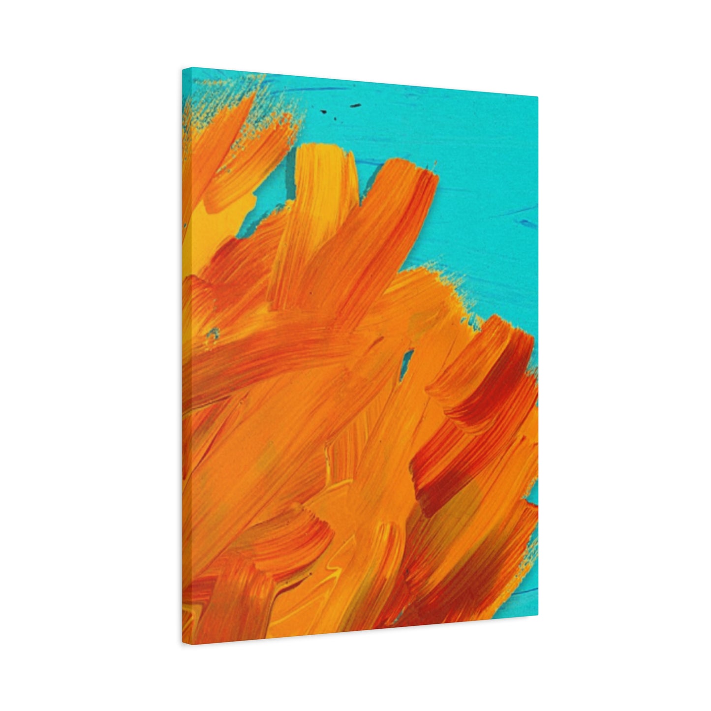
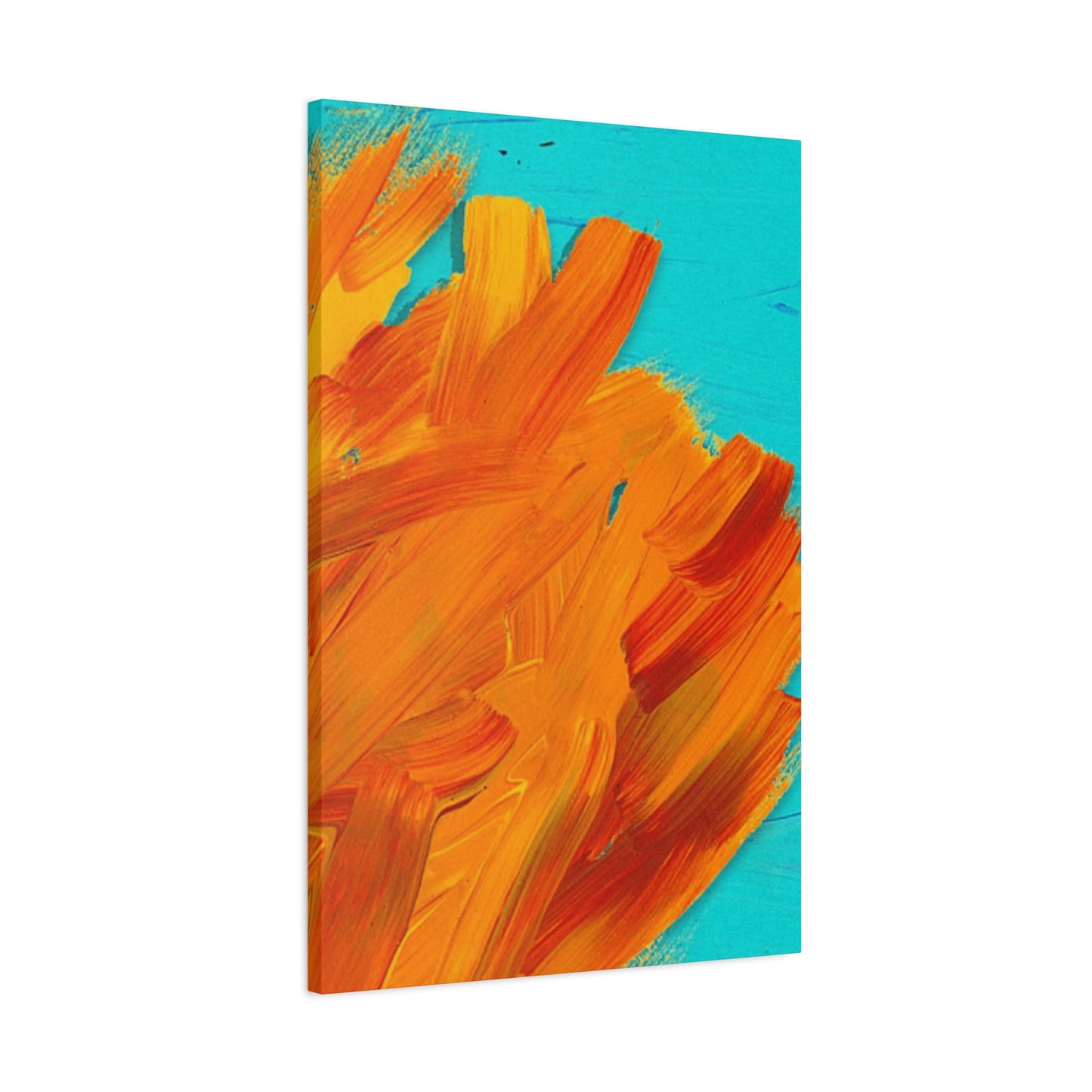
Temperature considerations play a crucial role in bright color selection for dynamic brushwork. Warm colors such as reds, oranges, and yellows naturally advance toward the viewer, making them excellent choices for creating focal points and areas of emphasis. Cool colors like blues, greens, and violets tend to recede, providing opportunities for creating depth and atmospheric effects within bold stroke compositions.
Saturation levels must be carefully balanced when working with bright colors in bold brushwork applications. Highly saturated colors create maximum impact but can quickly become overwhelming if not properly controlled. Artists often employ varying degrees of saturation to create visual hierarchies and guide viewer attention through their compositions effectively.
The psychological impact of bright color choices cannot be overlooked when developing dynamic brush stroke techniques. Different colors evoke specific emotional responses in viewers, and skilled artists leverage these psychological associations to enhance the communicative power of their work. Red suggests passion and energy, blue conveys calm and stability, while yellow radiates joy and optimism.
Practical considerations for bright color selection include factors such as drying time, consistency, and compatibility with different painting surfaces. Some pigments work better for fast, gestural applications, while others are more suitable for controlled, deliberate brush movements. Understanding these technical characteristics allows artists to make informed decisions that support their creative objectives.
Cultural and historical contexts also influence bright color selection in bold brushwork. Different artistic traditions have developed distinct approaches to color usage, and contemporary artists can draw inspiration from these rich cultural legacies while developing their own unique aesthetic voices.
Mastering Brush Pressure Control for Expressive Line Quality
Developing precise control over brush pressure represents one of the most critical skills in creating dynamic and expressive brush strokes. This fundamental technique allows artists to vary line quality, create textural interest, and establish rhythmic patterns that bring paintings to life with energy and movement.
Light pressure applications create delicate, subtle marks that can suggest atmospheric effects, soft textures, and gentle transitions between colors. These gentle touches require steady hand control and often benefit from longer brush handles that provide greater leverage and sensitivity. Artists practicing light pressure techniques should focus on maintaining consistent contact between brush and surface while avoiding unnecessary tension in their grip.
Medium pressure applications form the backbone of most bold stroke techniques, providing the optimal balance between control and expressiveness. This pressure level allows for confident mark-making while maintaining precision and intentionality in brush movements. Developing consistency at medium pressure levels requires extensive practice and conscious attention to hand and arm positioning.
Heavy pressure applications create bold, assertive marks that command attention and establish strong focal points within compositions. These powerful strokes require confidence and commitment, as they are difficult to modify once applied. Artists working with heavy pressure must develop strong foundational skills to ensure their bold statements enhance rather than detract from their overall artistic vision.
Gradual pressure variations within individual brush strokes create dynamic lines that pulse with energy and movement. These techniques require coordination between hand movement and pressure application, often involving the entire arm rather than just wrist motion. Practicing pressure gradations helps artists develop the muscle memory necessary for fluid, expressive mark-making.
Brush angle relationships significantly impact how pressure translates into visible marks on the painting surface. Holding brushes at different angles while applying varying pressure levels creates diverse textural effects and line qualities. Understanding these relationships allows artists to expand their expressive vocabulary and create more sophisticated visual effects.
Surface texture interactions play important roles in how brush pressure manifests in finished paintings. Rough surfaces tend to grab paint differently than smooth ones, requiring pressure adjustments to achieve desired effects. Artists must develop sensitivity to these surface characteristics and adjust their techniques accordingly.
Tool selection impacts pressure control capabilities significantly. Different brush types, sizes, and materials respond uniquely to pressure variations. Natural hair brushes often provide more sensitive pressure response than synthetic alternatives, while brush size affects the scale and character of pressure-sensitive marks.
Practice exercises for developing pressure control include gradient studies, line variation exercises, and textural exploration projects. Regular practice with these focused exercises builds the motor skills and sensitivity necessary for confident pressure control in more complex artistic applications.
Directing Visual Attention Through Strategic Bright Stroke Placement
The strategic placement of vivid brush strokes serves as a powerful tool for guiding viewer attention and creating compelling visual narratives within paintings. This sophisticated technique requires understanding of compositional principles, visual psychology, and the inherent properties of different colors and mark-making approaches.
Eye movement patterns in visual perception follow predictable pathways that artists can leverage when placing bright strokes strategically. Western viewers typically scan images from left to right and top to bottom, creating opportunities for artists to position key visual elements along these natural viewing paths. Strategic placement of vivid strokes at crucial intersection points can effectively capture and direct attention.
Focal point establishment through bright stroke placement requires careful consideration of compositional balance and visual hierarchy. Primary focal points benefit from the highest concentration of vibrant marks, while secondary areas of interest can be enhanced with more subdued but still noticeable bright accents. This hierarchical approach prevents visual confusion while maintaining viewer engagement throughout the composition.
Directional flow creation through stroke placement helps establish movement and rhythm within static paintings. Arranging bright strokes along curved or angular paths creates implied motion that guides viewers through the composition in predetermined sequences. This technique proves particularly effective in narrative paintings where specific viewing sequences enhance storytelling effectiveness.
Contrast relationships between bright strokes and surrounding areas determine the effectiveness of attention-directing techniques. High contrast placements create dramatic focal points that immediately capture attention, while more subtle contrast relationships provide gentler guidance that maintains viewer interest without creating visual shock.
Scale variations in bright stroke placement add dimensional interest to attention-directing strategies. Large, bold strokes naturally attract attention first, while smaller accent strokes provide supporting visual interest and help maintain engagement after initial viewing. Balancing these scale relationships creates sophisticated viewing experiences that reward extended observation.
Color temperature interactions influence how bright stroke placements function within overall compositions. Warm bright strokes placed against cool backgrounds create advancing focal points, while cool bright strokes against warm backgrounds can create atmospheric depth effects. Understanding these temperature relationships enhances the effectiveness of strategic placement decisions.
Rhythm and repetition in bright stroke placement create visual music that enhances viewer engagement and comprehension. Regular intervals of bright accents establish predictable rhythms, while irregular placements create syncopated effects that maintain visual interest. Skilled artists often combine regular and irregular patterns to create sophisticated rhythmic compositions.
Negative space relationships significantly impact how strategically placed bright strokes function within compositions. Generous negative space around bright strokes emphasizes their importance and prevents visual overcrowding. Conversely, dense arrangements of bright strokes can create energetic areas that contrast effectively with calmer compositional zones.
Harmonizing Dynamic Strokes with Refined Background Elements
The successful integration of bold, vibrant brush strokes with subtle background elements requires sophisticated understanding of compositional balance, visual hierarchy, and color relationships. This delicate balance determines whether dynamic foreground elements enhance or compete with supporting background areas.
Tonal value relationships between foreground strokes and background elements establish the foundational structure for successful integration. Light backgrounds allow dark bright strokes to achieve maximum contrast and impact, while darker backgrounds can make light bright strokes appear luminous and ethereal. Understanding these tonal relationships guides effective compositional decision-making.
Color harmony principles govern how bright foreground strokes interact with background color schemes. Analogous color relationships create peaceful, unified effects that allow bold strokes to integrate smoothly with their surroundings. Complementary color relationships generate dynamic tensions that can enhance the impact of bright strokes when carefully controlled.
Textural contrasts between dynamic strokes and background areas create visual interest while maintaining compositional unity. Smooth, subtle backgrounds provide excellent contrast for rough, energetic brushwork, while textured backgrounds can complement bold strokes when their textures operate at different scales or orientations.
Atmospheric perspective techniques help integrate bold foreground strokes with receding background elements. Progressively cooler colors, reduced contrast, and softer edges in background areas create depth illusions that allow bright foreground strokes to advance naturally toward viewers without appearing disconnected from their compositional context.
Edge quality variations between foreground and background elements contribute significantly to successful integration. Sharp, defined edges in bright stroke areas contrast effectively with soft, blended background transitions. This edge contrast helps establish clear visual hierarchies while maintaining overall compositional harmony.
Scale relationships between bold strokes and background elements must be carefully considered to avoid overwhelming or underwhelming effects. Large-scale bright strokes require proportionally substantial background areas to maintain balance, while smaller accent strokes can function effectively against more detailed backgrounds.
Layering strategies enable artists to build complex relationships between dynamic strokes and background elements gradually. Initial background layers provide foundational color and value structures, while subsequent bright stroke applications can be adjusted to achieve optimal integration and visual impact.
Glazing techniques offer sophisticated methods for harmonizing bright strokes with background elements. Transparent color layers applied over completed sections can unify disparate elements while maintaining the distinctive character of individual components. This approach allows for fine-tuning integration after primary painting phases are complete.
Vivid Brushwork in Contemporary Artistic Movements
Contemporary artistic movements have embraced vivid brushwork as a means of expressing modern sensibilities and addressing current cultural themes. These movements demonstrate how traditional brush techniques can be adapted and reimagined to serve contemporary artistic objectives and communicate with modern audiences.
Neo-expressionist movements have particularly championed bold brushwork as a reaction against minimalist and conceptual art trends. Artists in this movement employ aggressive, gestural strokes to convey emotional intensity and psychological complexity. Their work demonstrates how vivid brushwork can serve as a vehicle for personal and political expression in contemporary contexts.
Street art and graffiti influences have introduced new approaches to bold brushwork in gallery settings. Artists working in this tradition often combine traditional brush techniques with spray paint effects and urban aesthetic sensibilities. This fusion creates dynamic works that bridge high art traditions with popular culture expressions.
Digital art integration has expanded possibilities for bright brushwork through hybrid analog-digital techniques. Contemporary artists increasingly combine traditional painting methods with digital manipulation, creating works that maintain the physical presence of brushwork while incorporating digital enhancement and modification capabilities.
Environmental art movements utilize bright brushwork in outdoor installations and temporary works that interact with natural settings. These applications require consideration of weather resistance, scale relationships with landscape elements, and environmental impact factors while maintaining the expressive power of vivid brush techniques.
Performance art integration has transformed bright brushwork from static creation to dynamic process documentation. Artists working in this mode emphasize the physical act of painting as much as the finished result, creating time-based works that capture the energy and movement of brush application.
Mixed media approaches combine bright brushwork with alternative materials and techniques, creating textural richness and conceptual complexity. Contemporary artists frequently incorporate found objects, digital prints, and unconventional surfaces to expand the expressive possibilities of traditional brush techniques.
Conceptual frameworks in contemporary art movements often employ bright brushwork as metaphor or symbol rather than purely aesthetic element. These approaches demonstrate how technical skills can serve broader artistic concepts and cultural commentary while maintaining visual impact and emotional resonance.
Global perspectives have enriched contemporary bright brushwork through cross-cultural exchanges and international artistic collaborations. Artists draw inspiration from diverse cultural traditions while adapting techniques to address universal human experiences and contemporary global challenges.
Generating Dynamic Motion Through Sweeping Gestural Techniques
The creation of visual movement through sweeping brush gestures represents one of the most powerful aspects of dynamic painting techniques. These movements can transform static surfaces into energetic compositions that pulse with life and capture viewers' attention through implied motion and rhythmic flow.
Large-scale gestural movements require full-body engagement rather than relying solely on hand and wrist motions. Artists developing these techniques must learn to coordinate shoulder, elbow, and wrist movements to create fluid, confident strokes that maintain energy and direction throughout their execution. This physical approach to painting creates marks that cannot be replicated through smaller, more controlled movements.
Directional flow in sweeping gestures establishes the primary movement patterns within compositions. Horizontal sweeps suggest calm and stability, vertical movements imply growth and aspiration, while diagonal gestures create dynamic tensions and implied motion. Curved sweeping movements generate organic, flowing sensations that can suggest natural forms and processes.
Speed variations within individual gestures create complex rhythmic effects that enhance the sense of movement and energy. Beginning gestures slowly and accelerating through their execution creates powerful visual crescendos, while decelerating movements suggest settling or resolution. Maintaining consistent speeds throughout gestures creates steady, predictable rhythms.
Brush loading techniques significantly impact the visual character of sweeping gestures. Heavily loaded brushes create rich, saturated marks that maintain intensity throughout long movements, while lightly loaded brushes produce varying opacity effects that suggest atmospheric conditions or fading energy. Understanding these loading relationships allows for sophisticated gestural expression.
Overlap patterns in multiple sweeping gestures build complex movement systems that create sophisticated visual experiences. Parallel gestures reinforce directional flow, while crossing movements create intersection points that can serve as focal areas or transition zones. Random overlapping patterns generate energetic, chaotic effects suitable for expressing intense emotions or natural turbulence.
Surface preparation affects how sweeping gestures manifest in finished paintings. Smooth surfaces allow for fluid, uninterrupted movements, while textured surfaces create drag and resistance that can add character and visual interest to gestural marks. Artists must consider these surface characteristics when planning gestural approaches.
Color transitions within sweeping movements add dimensional complexity to simple directional gestures. Blending multiple colors along the length of single strokes creates gradual transitions that suggest atmospheric effects or chromatic progression. These techniques require careful color preparation and confident execution to avoid muddy or confused results.
Scale relationships between sweeping gestures and overall compositions determine their effectiveness and visual impact. Large gestures in small compositions create dramatic, overwhelming effects, while small gestures in large works may appear insignificant. Balancing gestural scale with compositional dimensions ensures optimal visual communication.
Psychological Dimensions of Color in Dynamic Brushwork
The psychological impact of color choices in bold brushwork extends far beyond aesthetic considerations, tapping into fundamental human responses that influence emotion, perception, and cognitive processing. Understanding these psychological dimensions enables artists to create works that communicate on deeper levels and establish stronger connections with viewers.
Red applications in dynamic brushwork trigger immediate psychological responses associated with passion, energy, danger, and excitement. These powerful associations make red an excellent choice for creating focal points and areas of maximum visual impact. However, excessive red usage can create overwhelming sensations that may alienate rather than engage viewers.
Blue psychological associations include calm, stability, trust, and melancholy, making blue brushwork effective for creating atmospheric effects and areas of visual rest. Cool blue strokes can provide balance against warmer colors while suggesting depth, distance, and tranquility. The specific shade of blue significantly influences its psychological impact, with lighter blues suggesting serenity and darker blues implying sophistication or sadness.
Yellow psychological responses involve joy, optimism, energy, and attention-grabbing qualities that make yellow brushwork highly effective for creating luminous focal points. Yellow's high visibility makes it naturally advance toward viewers, creating opportunities for establishing primary visual elements. However, yellow can become aggressive or overwhelming in large quantities.
Green color psychology encompasses growth, nature, harmony, and renewal associations that make green brushwork suitable for suggesting organic elements and creating balanced compositions. Green's position between warm and cool on the color spectrum allows it to function as either advancing or receding color depending on its specific hue and surrounding color relationships.
Orange psychological impacts combine the energy of red with the cheerfulness of yellow, creating associations with enthusiasm, creativity, and warmth. Orange brushwork can create inviting, energetic areas while maintaining accessibility and positive emotional associations. This color works particularly well for suggesting sunset effects and autumn themes.
Purple psychological associations include luxury, spirituality, mystery, and creativity, making purple brushwork effective for creating sophisticated, contemplative areas within compositions. Purple's relative rarity in nature gives it exotic qualities that can enhance the uniqueness and memorability of artworks.
Color combination psychology becomes particularly important in bold brushwork applications where multiple colors interact within close proximity. Complementary color combinations create maximum contrast and energy, while analogous combinations produce harmony and unity. Understanding these interaction effects allows for more sophisticated color planning.
Cultural color psychology varies significantly across different societies and historical periods, influencing how color choices in bold brushwork are interpreted by diverse audiences. Artists working for international audiences must consider these cultural variations to ensure their color messages are appropriately received and understood.
Establishing Powerful Focal Points with Strategic Bright Accents
The establishment of compelling focal points through strategic bright accent placement represents a fundamental skill in dynamic painting composition. These carefully positioned elements serve as visual anchors that organize viewer attention and create hierarchical structures within complex compositions.
Primary focal point development requires concentration of the brightest, most saturated colors and the boldest brush movements. These areas should receive the highest level of detail and visual complexity while maintaining clear, readable forms. Primary focal points function as the main subjects or themes of paintings and deserve the most careful consideration during compositional planning.
Secondary focal point creation provides supporting visual interest that enhances rather than competes with primary elements. These areas benefit from bright accents that are slightly less intense or smaller in scale than primary focal points. Proper balance between primary and secondary focal elements creates viewing experiences that reward both quick observation and extended study.
Transitional accent placement guides viewer movement between focal areas while maintaining overall compositional unity. These connecting elements help create visual pathways that lead viewers through paintings in purposeful sequences. Transitional accents should be noticeable enough to provide guidance but subtle enough to avoid creating competing focal points.
Contrast manipulation around focal points enhances their effectiveness by creating clear separations from surrounding areas. High value contrasts make bright accents appear more luminous, while color temperature contrasts can make warm accents appear to advance or cool accents to recede. Understanding these contrast relationships enables more sophisticated focal point development.
Scale relationships between focal point accents and surrounding elements determine their visual impact and effectiveness. Larger accents naturally attract more attention but must be balanced carefully to avoid overwhelming compositions. Smaller accents can be highly effective when properly contrasted against their surroundings.
Edge quality considerations affect how focal point accents integrate with their compositional contexts. Sharp, defined edges create maximum separation and attention-grabbing effects, while softer edges allow for more subtle integration. Varying edge qualities within individual compositions adds visual interest and prevents monotonous effects.
Color temperature strategies for focal point development leverage the natural advancing and receding properties of warm and cool colors. Warm bright accents naturally advance toward viewers, making them excellent choices for primary focal points, while cool accents can effectively create secondary interest areas that provide visual depth.
Repetition and rhythm in accent placement create sophisticated viewing experiences that maintain interest through multiple observation sessions. Strategic repetition of bright accent colors throughout compositions creates unity, while varying their intensities and scales prevents monotony and maintains visual excitement.
Achieving Compositional Balance with Strategic Negative Space Usage
The effective use of negative space in compositions featuring bold bright strokes requires sophisticated understanding of visual balance, proportion, and spatial relationships. These empty areas serve as crucial breathing room that prevents visual overcrowding while enhancing the impact of positive elements.
Proportion relationships between positive and negative space significantly influence overall compositional effectiveness. Generally, compositions benefit from unequal divisions that create visual tension and interest. The golden ratio and rule of thirds provide useful guidelines for establishing pleasing proportion relationships, though artistic judgment should ultimately guide these decisions.
Visual weight distribution between positive brush stroke elements and negative space areas must be carefully balanced to prevent compositions from appearing top-heavy, bottom-heavy, or otherwise unstable. Dark, bright, or textured areas carry more visual weight than light, dull, or smooth areas, requiring conscious planning to achieve overall balance.
Shape quality in negative spaces contributes significantly to overall compositional success. Interesting negative space shapes enhance overall visual appeal, while boring or repetitive negative shapes can detract from even the most skillful positive elements. Artists should design negative spaces with the same care and attention given to positive elements.
Active versus passive negative space usage affects how effectively these areas support overall compositions. Active negative spaces participate in compositional dynamics through interesting shapes and clear relationships with positive elements, while passive negative spaces simply provide breathing room without adding visual interest.
Edge relationships between positive strokes and negative spaces create opportunities for sophisticated visual effects. Hard edges create clear separations that emphasize the distinct character of each area, while soft edges allow for more integrated relationships that can suggest atmospheric or transitional effects.
Scale variations in negative space areas prevent monotony and create visual rhythm throughout compositions. Alternating large and small negative spaces creates dynamic patterns that enhance overall visual interest while maintaining clarity and readability in positive elements.
Directional implications of negative space shapes can reinforce or counteract movement patterns established by positive brush strokes. Negative spaces that echo positive directional flows enhance overall movement, while contradictory negative space directions can create interesting visual tensions.
Color considerations in negative space treatment, even when these areas appear empty, significantly impact overall compositional effectiveness. Subtle color variations in apparently empty areas add richness and depth, while maintaining sufficient contrast with positive elements to ensure clear visual separation and hierarchy.
Exploring Diverse Brush Shapes for Distinctive Visual Effects
The selection and manipulation of diverse brush shapes opens vast possibilities for creating unique textural effects and expressive marks in bright stroke painting applications. Different brush configurations produce characteristically different marks, enabling artists to expand their visual vocabulary and develop distinctive artistic voices.
Flat brush applications create broad, confident strokes that cover substantial areas efficiently while maintaining clean, geometric edges. These brushes excel at establishing large color areas, creating architectural elements, and producing marks with strong directional emphasis. Varying the angle at which flat brushes contact painting surfaces creates different edge qualities and stroke characteristics.
Round brush techniques produce organic, flowing marks that suggest natural forms and curved movements. These versatile tools can create both fine detail work and broader gestural strokes depending on pressure application and brush loading. Round brushes naturally produce varied line weights that add visual interest and expressive quality to mark-making.
Filbert brush effects combine characteristics of both flat and round brushes, creating marks with soft, rounded edges that appear more organic than flat brush strokes but more controlled than round brush applications. These brushes prove particularly effective for portrait work and organic subject matter where subtle transitions are desired.
Fan brush textures create distinctive linear effects that suggest hair, grass, foliage, and other fibrous textures. These specialized tools require different handling techniques than conventional brushes but can produce effects that would be extremely time-consuming to achieve through other methods. Fan brushes work particularly well for creating atmospheric effects and suggesting complex textural surfaces.
Detail brush precision enables fine linear work and small accent placement that can enhance larger bold stroke compositions. These small brushes require steady hand control and different pressure sensitivity than larger tools. Strategic detail placement can significantly enhance the overall impact of bold stroke paintings.
Palette knife effects, while technically not brush-based, create distinctive textural qualities that complement traditional brush work effectively. Palette knives can apply paint in thick impasto applications, create sharp linear edges, and produce scraping effects that add textural variety to brush-dominated compositions.
Foam brush characteristics produce soft, atmospheric effects that differ significantly from traditional hair or synthetic brushes. These tools excel at creating graduated washes, soft color transitions, and textural effects that suggest clouds, mist, or other atmospheric phenomena.
Custom brush modifications enable artists to create tools specifically designed for their individual artistic needs. Cutting, shaping, or combining different brush types can produce unique marking capabilities that distinguish individual artistic approaches and expand expressive possibilities beyond commercially available options.
Adapting Bold Stroke Techniques Across Various Painting Surfaces
The successful application of dynamic bright stroke techniques requires careful consideration of different painting surfaces and their unique characteristics. Each surface type presents distinct opportunities and challenges that influence how brush strokes appear and behave during application and after drying.
Canvas surface characteristics significantly impact bright stroke appearance and handling properties. Rough canvas textures grab paint differently than smooth surfaces, creating distinctive textural effects that can enhance bold brushwork. Canvas weave patterns become visible through paint applications, adding subtle textural complexity to finished works.
Paper surface variations create different opportunities for bright stroke applications. Hot-pressed papers provide smooth surfaces that allow for clean, precise strokes, while cold-pressed papers offer textural interest that can enhance gestural applications. Paper weight and sizing affect paint absorption and behavior during application.
Wood panel preparations offer extremely smooth surfaces that enable fluid brush movement and precise control over stroke quality. Properly prepared wood panels provide excellent dimensional stability and can support heavy impasto applications without warping or buckling. The smooth surface allows for subtle color transitions and blending effects.
Metal surface applications require special preparation and paint selection to ensure proper adhesion and longevity. Aluminum and copper surfaces can create unique visual effects through their natural colors showing through paint applications. Metal surfaces also offer interesting possibilities for scraping and scratching techniques.
Glass surface painting creates unique optical effects through transparency and light transmission properties. Bright strokes on glass can create luminous effects when backlit, adding dimensional qualities not available on opaque surfaces. Glass requires special paint formulations for proper adhesion.
Textured surface applications can dramatically alter the appearance of bright strokes through mechanical texture interactions. Heavily textured surfaces break up smooth color applications, creating pointillistic effects that can enhance color mixing and visual complexity. Artists must adjust their techniques to work effectively with textured surfaces.
Flexible surface considerations affect how brush strokes appear and age over time. Canvas and fabric surfaces may shift or expand with environmental changes, potentially affecting the appearance of finished works. Proper preparation and paint selection help minimize these effects.
Absorbent surface behaviors influence paint flow and drying characteristics during bright stroke applications. Highly absorbent surfaces may pull moisture from paint applications, affecting color intensity and blending possibilities. Understanding these absorption characteristics enables better technique adaptation.
Advanced Color Blending in Dynamic Brush Applications
The mastery of color blending within dynamic brush applications represents one of the most sophisticated aspects of bright stroke painting techniques. These skills enable artists to create seamless transitions, atmospheric effects, and complex color relationships that enhance overall compositional impact.
Wet-on-wet blending techniques allow for smooth color transitions that occur during paint application. This approach requires working quickly while paint remains workable, enabling colors to flow together naturally. The timing of wet-on-wet applications significantly affects the quality and character of resulting blends.
Wet-on-dry blending approaches provide greater control over color mixing and allow for building complex color relationships through multiple applications. This method enables more precise color placement but requires skill in edge management to avoid harsh transitions between color areas.
Optical mixing through broken color techniques creates vibrant color effects that rely on viewer perception rather than physical paint mixing. Placing small strokes of pure color adjacent to each other allows viewers' eyes to blend colors optically, often resulting in more luminous effects than physical mixing.
Gradation techniques enable smooth transitions between colors or values across substantial areas. These applications require consistent brush movement and careful color preparation to achieve seamless results. Gradations can suggest atmospheric conditions, three-dimensional form, or abstract color progressions.
Scumbling applications create broken color effects through light, irregular brush movements over existing color areas. This technique allows underlying colors to show through, creating complex color relationships and textural interest. Scumbling works particularly well for suggesting atmospheric effects and aged surfaces.
Glazing techniques enable transparent color layers that modify underlying colors without completely covering them. These applications can unify color schemes, adjust color temperature, or create luminous color effects. Glazing requires proper paint consistency and careful application to avoid disturbing underlying layers.
Impasto blending combines thick paint applications with color mixing, creating dimensional surface effects that catch and reflect light in complex ways. These techniques require substantial paint quantities and confident brush handling to achieve successful results.
Color temperature blending leverages the psychological and visual effects of warm and cool color relationships. Transitioning between warm and cool colors can suggest atmospheric depth, time changes, or emotional progressions within compositions.
Layered Approaches in Mixed Media Bright Stroke Compositions
The integration of bright stroke techniques with mixed media approaches opens expansive creative possibilities that transcend traditional painting limitations. These combinations enable artists to create works with enhanced textural richness, conceptual complexity, and visual impact.
Underpainting strategies provide foundational structures that support subsequent bright stroke applications. These initial layers can establish value patterns, color temperatures, or textural foundations that enhance final bright stroke layers. Proper underpainting planning significantly affects final results.
Collage integration combines bright brush strokes with paper or fabric elements to create multi-dimensional visual experiences. The contrast between painted and applied elements can enhance the impact of both approaches while adding conceptual layers to artistic communication.
Digital print combinations merge traditional painting techniques with contemporary digital imagery. Bright strokes can be applied over printed photographs or digital compositions, creating hybrid works that bridge traditional and contemporary artistic approaches.
Textural medium applications enable raised surface effects that interact dramatically with bright stroke techniques. These dimensional additions catch light differently than flat surfaces, creating shadow patterns and textural complexity that enhance overall visual interest.
Metal leaf integration creates luminous effects that complement bright stroke applications. Gold, silver, or colored metal leafs can be applied in specific areas to create focal points or accent elements that enhance overall compositional impact.
Found object incorporation adds three-dimensional elements that create interesting relationships with two-dimensional brush stroke areas. These combinations require careful balance between dimensional and flat elements to maintain overall compositional unity.
Photographic element integration enables realistic detail areas that contrast effectively with gestural bright stroke sections. These combinations can create powerful juxtapositions between representational and abstract elements within single compositions.
Alternative medium combinations explore unconventional material uses that expand expressive possibilities. Sand, sawdust, coffee grounds, or other materials can be mixed with paint to create unique textural effects that enhance bright stroke applications.
Creating Rich Surface Textures Through Thick Paint Applications
The development of rich surface textures through impasto and thick paint applications adds dimensional qualities to bright stroke paintings that enhance their visual impact and tactile appeal. These techniques create surface variations that interact dynamically with light, casting shadows and creating highlight patterns that change with viewing angles.
Loading techniques for thick applications require understanding of paint consistency, brush capacity, and application methods that enable successful impasto effects. Properly loaded brushes can deposit substantial paint quantities while maintaining control over placement and form. Paint consistency must be adjusted to support thick applications without running or slumping.
Palette knife applications enable the creation of sharp ridges, smooth planes, and complex textural patterns that complement brush-applied elements. Palette knives can move substantial paint quantities efficiently while creating distinctive mark characteristics that differ significantly from brush-made marks.
Layering strategies for thick applications must consider drying times, paint compatibility, and structural stability. Building thick textures through multiple applications allows for complex surface developments while maintaining proper paint adhesion and stability. Each layer must be properly cured before subsequent applications.
Directional texture patterns created through thick paint applications can reinforce compositional movement and enhance overall visual flow. Consistent directional patterns create unity, while varied directions add visual complexity and textural interest.
Color mixing within thick applications creates unique color effects that cannot be achieved through thin paint layers. Colors can be partially mixed on painting surfaces, creating color variations within individual strokes that add complexity and visual interest.
Light interaction with textured surfaces significantly affects how colors appear and how compositions are perceived. Raised paint areas catch light differently than recessed areas, creating highlight and shadow patterns that add dimensional qualities to flat surfaces.
Tool variety for texture creation includes brushes, palette knives, combs, sponges, and other implements that create distinctive textural patterns. Each tool produces characteristic marks that can be combined to create complex surface treatments.
Maintenance considerations for thick paint applications include proper support preparation, appropriate paint selection, and environmental factors that affect drying and stability. Thick applications require stronger supports and may benefit from consolidation treatments to ensure long-term stability.
Problem-Solving Techniques for Bold Stroke Corrections
The inevitable challenges that arise during bold stroke painting require sophisticated problem-solving approaches that can address issues without compromising overall compositional integrity. Developing effective correction techniques enables artists to work more confidently and recover from mistakes or unexpected developments.
Immediate correction techniques work best when applied while paint remains wet and workable. Quick removal with clean brushes or palette knives can eliminate unwanted marks before they set. Having appropriate tools ready for immediate corrections improves success rates significantly.
Blending corrections can integrate problematic marks into surrounding areas through careful color matching and edge softening. This approach requires understanding of color theory and blending techniques to achieve seamless results that don't call attention to correction areas.
Overpainting strategies enable covering problematic areas with new paint applications once underlying layers have dried sufficiently. These approaches require proper paint opacity and color selection to ensure complete coverage while maintaining color accuracy.
Scraping techniques can remove or modify dried paint applications through careful use of palette knives or other scraping tools. These methods work best on smooth surfaces and require practice to avoid damage to underlying layers or painting supports.
Incorporation strategies transform mistakes into compositional elements rather than simply correcting them. This creative approach can lead to unexpected solutions and enhance overall compositional interest while solving technical problems.
Color matching for corrections requires understanding of color theory and careful observation of surrounding color areas. Proper color matching ensures corrections integrate seamlessly with existing work rather than appearing as obvious patches or modifications.
Texture matching in correction areas requires attention to brush handling, paint consistency, and application techniques that replicate surrounding surface characteristics. Inconsistent textures can make corrections obvious even when colors match perfectly.
Prevention strategies reduce the likelihood of requiring corrections through proper planning, technique development, and working methods. Understanding common problem areas and developing preventive approaches improves overall success rates and reduces correction needs.
Conclusion:
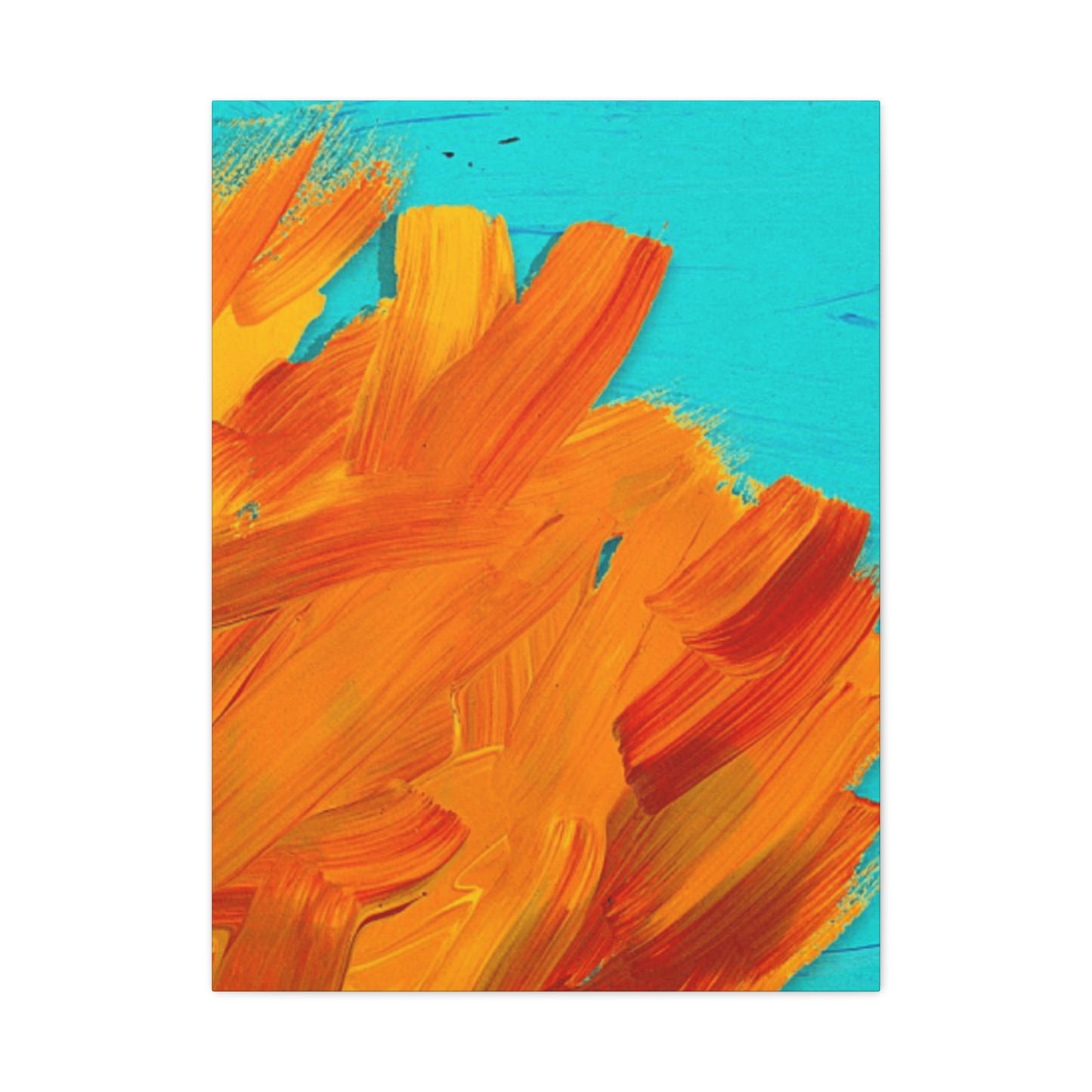
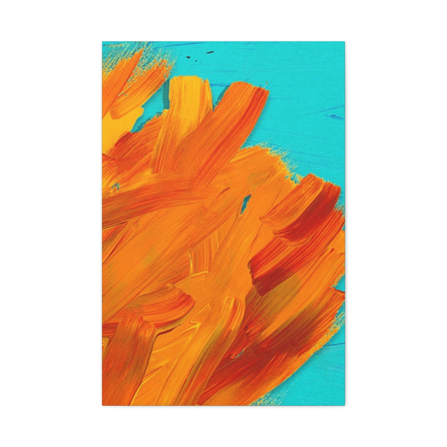
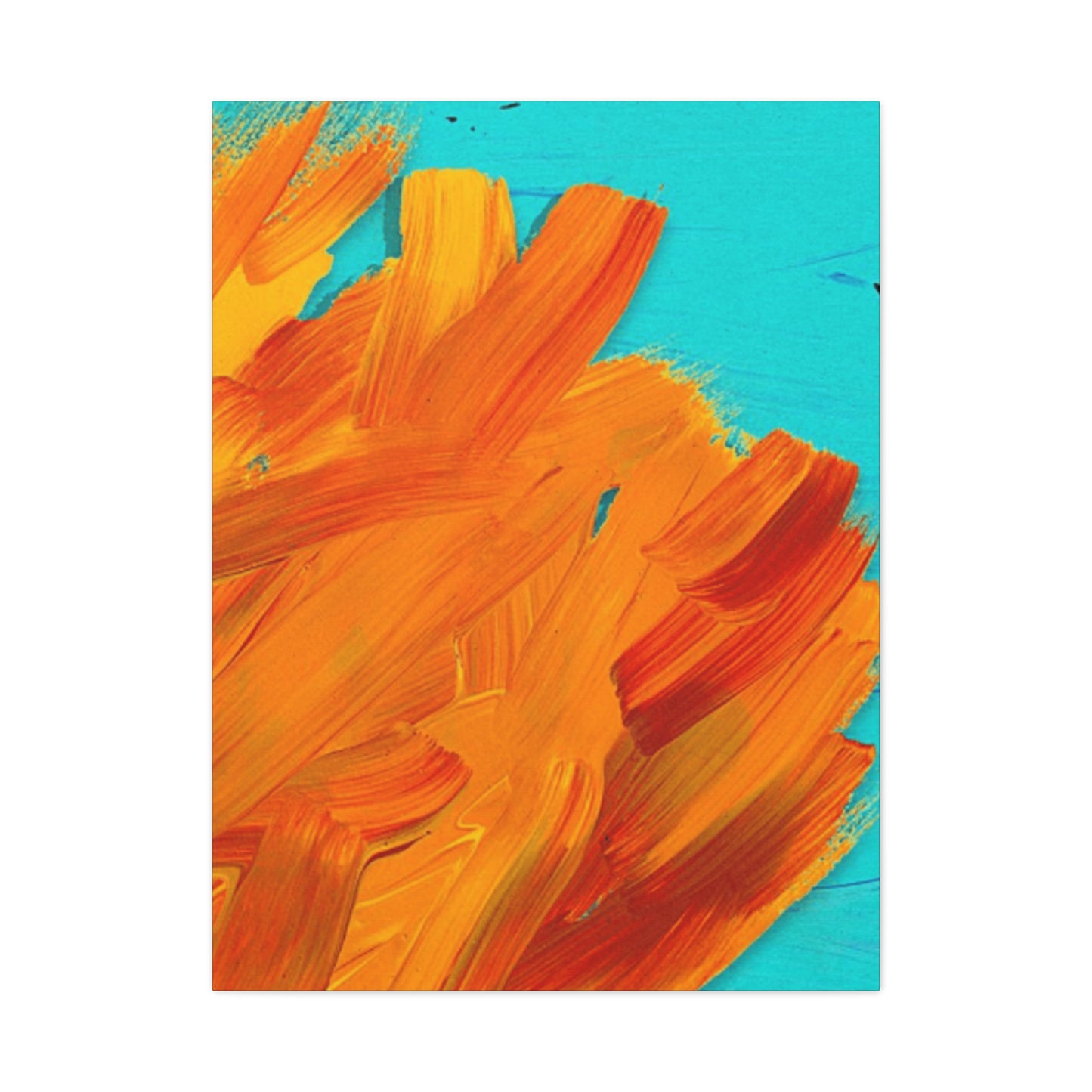
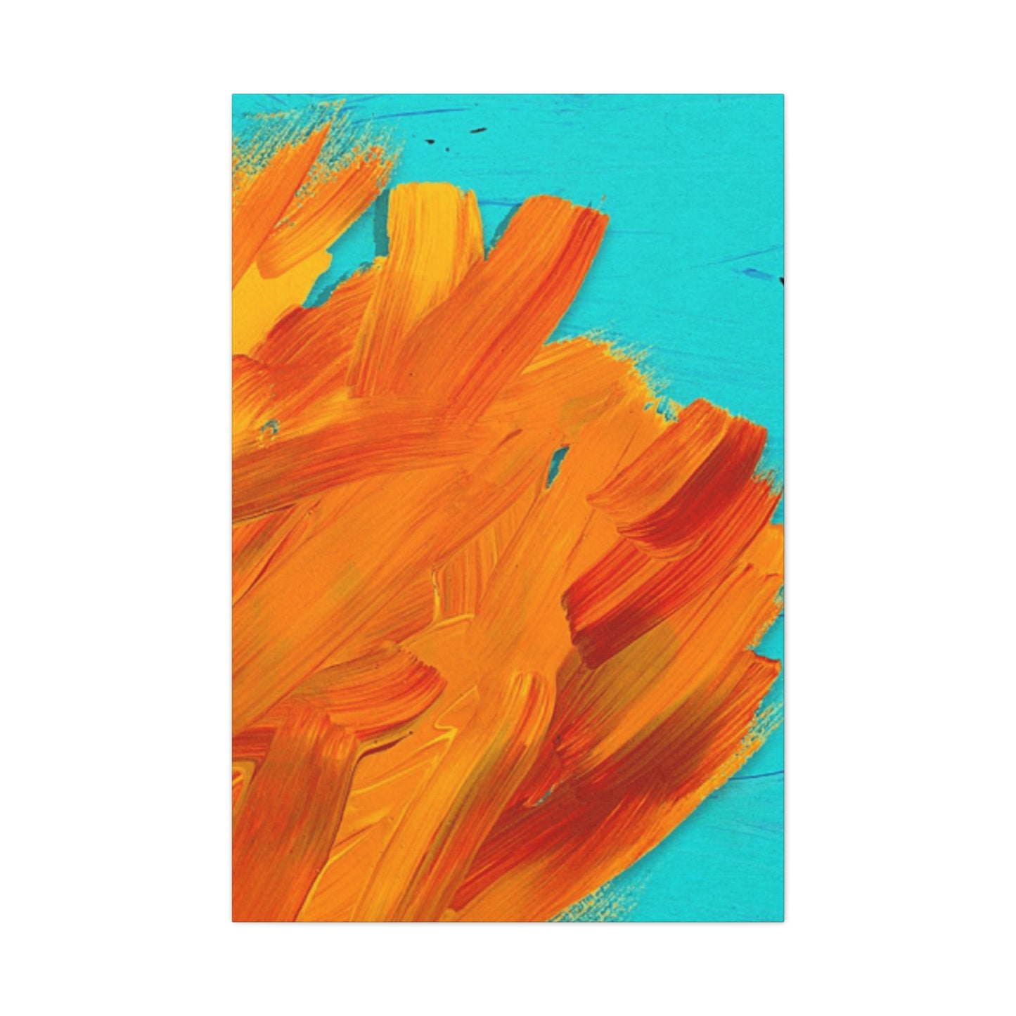
Bright brush wall art is more than just a splash of color on your walls—it’s a vivid reflection of your personality and artistic sensibility. This style of abstract expression showcases bold, energetic strokes and vibrant hues that communicate confidence, creativity, and a willingness to embrace the unexpected. Choosing bright brush artwork signals a love for spontaneity and emotional depth, turning your space into a lively canvas of self-expression.
Such pieces often break away from traditional forms and invite viewers to engage with emotion rather than narrative, making them perfect for those who value individuality and artistic freedom. Bright brush wall art complements contemporary, eclectic, and modern interiors, adding dynamic movement and visual interest that can energize any room.
By incorporating this art style into your home or workspace, you create an environment that celebrates creativity and positivity. It speaks to a mindset that welcomes bold ideas and fresh perspectives, inspiring both residents and guests alike.
In essence, bright brush wall art is a powerful style statement. It reveals your appreciation for color, motion, and emotional honesty, while elevating your space with an unmistakable vibrancy that’s uniquely yours.
