


Celestial Tides Canvas wall art & canvas print
Celestial Tides Canvas wall art & canvas print
Couldn't load pickup availability


Celestial Tides Canvas Wall Art: Transform Your Space with Oceanic Cosmic Beauty
The intersection of celestial wonder and oceanic majesty creates a mesmerizing visual experience that has captivated artists and interior design enthusiasts for generations. When we explore the realm of decorative artwork that captures both the mystery of the cosmos and the rhythmic beauty of ocean waves, we discover a unique category of home decor that speaks to our deepest connections with nature and the universe. This form of artistic expression combines the ethereal qualities of starlit skies with the powerful, ever-changing nature of tidal movements, resulting in pieces that transform ordinary living spaces into sanctuaries of contemplation and beauty.
The concept of bringing together cosmic elements with oceanic imagery represents more than just an aesthetic choice. It reflects our human desire to connect with forces larger than ourselves, to find harmony in the natural cycles that govern both the heavens above and the waters below. Throughout history, civilizations have looked to both the stars and the seas for guidance, inspiration, and understanding of their place in the universe. Today, this ancient fascination finds new expression in contemporary wall decorations that allow us to bring these powerful natural elements into our daily environments.
Understanding the Artistic Vision Behind Ocean and Space Imagery
The marriage of celestial and maritime themes in artistic compositions creates a unique visual language that resonates with viewers on multiple levels. This artistic approach draws inspiration from the actual physical connection between lunar cycles and ocean tides, translating scientific reality into aesthetic beauty. Artists who work in this genre understand that the moon's gravitational pull creates the rhythmic rise and fall of ocean waters, and they use this knowledge to create compositions that feel both scientifically grounded and emotionally evocative.
When examining pieces that combine these elements, we often find layers of meaning woven into the composition. The vastness of space mirrors the depths of the ocean, both representing realms that remain largely mysterious and unexplored. The movement of waves parallels the movement of celestial bodies across the night sky, creating visual rhythms that our eyes naturally follow. Colors blend and transition in ways that remind us of both sunset horizons and nebular clouds, creating atmospheric effects that seem to exist in a liminal space between water and sky.
The technical execution of these artistic visions requires careful consideration of color theory, composition, and visual balance. Artists must capture the luminosity of celestial bodies while also conveying the fluidity and power of ocean waves. This often involves working with gradients that transition from deep, rich blues and purples to lighter, more ethereal tones. Metallic accents or highlights can suggest starlight reflecting on water surfaces, while swirling patterns evoke both galactic formations and wave movements.
The Psychological Impact of Nature-Inspired Artwork in Interior Spaces
Research in environmental psychology has consistently demonstrated that incorporating natural elements into interior environments has profound effects on human wellbeing. When we surround ourselves with imagery that evokes the natural world, we experience reduced stress levels, improved mood, and enhanced cognitive function. This phenomenon, sometimes referred to as biophilic design, suggests that humans have an innate need to connect with nature, even when spending time indoors.
Artwork featuring oceanic and celestial themes taps into this psychological need in particularly powerful ways. The ocean has long been associated with feelings of calm, vastness, and renewal. The rhythmic nature of waves creates a visual metaphor for breathing and meditation, encouraging viewers to slow down and find their own internal rhythm. Similarly, celestial imagery connects us to something larger than our immediate concerns, providing perspective and encouraging contemplation of deeper questions about existence and our place in the universe.
The color palettes typically associated with this style of artwork also contribute to their psychological impact. Deep blues and purples are known to have calming effects, reducing anxiety and promoting relaxation. These colors are often associated with twilight hours, a time when our bodies naturally begin to wind down for rest. Lighter blues and teals can energize while still maintaining a sense of tranquility, making them versatile choices for various room functions. When touches of warmer tones like gold, coral, or amber are incorporated, they add vitality and prevent the overall composition from feeling too cool or distant.
Selecting the Perfect Dimensions for Your Wall Space
One of the most crucial aspects of choosing decorative wall pieces involves understanding the relationship between artwork size and the space it will occupy. A piece that is too small for a given wall will appear lost and fail to make the intended impact, while an oversized piece can overwhelm a space and make it feel cramped. The art of proper sizing requires both measurement and visual judgment, taking into account not just the wall dimensions but also the furniture arrangement, ceiling height, and overall room proportions.
For large, open walls such as those above sofas, beds, or dining tables, substantial pieces create the most dramatic effect. A general guideline suggests that artwork should cover approximately two-thirds to three-quarters of the furniture width below it. This creates a visual connection between the furniture and the art, anchoring both elements in the space. In rooms with high ceilings, vertical orientation can draw the eye upward and emphasize the room's height, while horizontal pieces can make a room feel wider and more expansive.
When working with smaller walls or spaces like hallways, entryways, or bathroom areas, more modest dimensions become appropriate. However, even in these spaces, it is often better to err on the side of slightly larger rather than too small. A piece with presence can transform even a compact area into a focal point, while a tiny piece may simply fade into the background. Consider the viewing distance as well. Artwork that will be viewed primarily from across a room can be larger and more bold, while pieces in close-quarter spaces might benefit from more intricate details that reward closer inspection.
Material Quality and Canvas Construction Techniques
The foundation of any high-quality printed artwork lies in the materials used for its construction. Traditional printing typically employs cotton or polyester materials, with cotton generally considered superior for its texture, archival properties, and ability to hold color. High-grade cotton provides a slightly textured surface that mimics the appearance of hand-painted works, adding depth and authenticity to the final piece. The weight and thickness of the material also matter significantly, with heavier options providing better durability and a more substantial feel.
The printing process itself has evolved dramatically with technological advances. Modern printing methods can reproduce intricate details, subtle color gradations, and rich, vibrant hues that remain stable over time. The best printing processes use archival-quality materials that resist fading when exposed to indirect sunlight and normal indoor lighting conditions. This longevity is essential for maintaining the investment value of decorative artwork and ensuring that the piece continues to enhance your space for years to come.
Stretching and mounting techniques significantly impact the final appearance and durability of printed pieces. Gallery wrapping, where the image continues around the edges of the frame, creates a finished look that does not require additional framing. This technique is particularly popular for contemporary designs as it emphasizes the artwork itself without the visual interruption of a border or frame. The stretching process must be done carefully to ensure the material is taut without being overstretched, which could cause warping or damage over time.
Color Psychology and Scheme Coordination in Room Design
The colors present in your wall decorations interact with the other hues in your space to create an overall color scheme that profoundly affects the room's atmosphere. Understanding basic color theory helps in making selections that either complement or strategically contrast with existing decor elements. Analogous color schemes, which use colors adjacent to each other on the color wheel, create harmonious, soothing environments. For instance, a piece featuring blues, teals, and greens would work beautifully in a space with similar cool tones.
Complementary color schemes offer more dramatic visual interest by pairing colors opposite each other on the color wheel. A piece with deep blue ocean tones could be balanced by warm amber or coral accents in furniture, textiles, or accessories. This approach creates dynamic tension that energizes a space while maintaining balance. The key is ensuring that one color dominates while others serve as accents, preventing the space from feeling too busy or visually chaotic.
Monochromatic schemes, using various shades and tones of a single color, create sophisticated, cohesive environments. A room decorated in varying shades of blue, from pale sky tones to deep navy, could be anchored by artwork that incorporates this entire range. This approach works particularly well in minimalist or contemporary settings where simplicity and refinement are priorities. Adding metallic accents through the artwork or accessories introduces visual interest without disrupting the monochromatic harmony.
The emotional associations of colors should also inform your choices. Cool colors like blues and purples typically promote relaxation and are ideal for bedrooms and bathrooms. Warmer additions like golds and coppers introduce energy and optimism, making them excellent for living areas and creative spaces. Understanding these psychological effects allows you to curate environments that support their intended functions while reflecting your personal aesthetic preferences.
Installation Methods and Wall Preparation Strategies
Proper installation ensures that your decorative pieces remain securely mounted while preserving both the artwork and your walls. The first consideration involves understanding your wall type. Standard drywall, plaster, concrete, and brick all require different mounting approaches. Drywall, the most common interior wall material, typically needs either wall anchors or mounting into wall studs for heavier pieces. Locating studs with a stud finder provides the most secure mounting points, capable of supporting significant weight.
For pieces weighing less than a certain threshold, adhesive strips designed specifically for hanging artwork offer a damage-free alternative to nails or screws. These strips have become increasingly sophisticated, with some varieties capable of supporting substantial weight while allowing for clean removal without damaging paint or leaving residue. However, for larger or heavier pieces, traditional hanging hardware remains the most reliable option. Using appropriate weight-rated hangers ensures safety and prevents accidents.
The positioning of your artwork requires thoughtful consideration of sight lines and spatial balance. The standard guideline suggests hanging artwork so that its center point sits at eye level, typically around fifty-seven to sixty inches from the floor. However, this rule should be adjusted based on the room's function and the heights of the people who will most frequently occupy the space. In dining areas, artwork should be positioned relative to seated eye level, while in hallways, standard standing eye level applies.
Creating a balanced arrangement involves considering the relationship between the artwork and surrounding architectural features. Centering a piece over furniture creates symmetry and order, while off-center placement can introduce dynamic energy to a space. When hanging multiple pieces as a gallery wall, laying out the arrangement on the floor first allows you to experiment with spacing and composition before making holes in your walls. Maintaining consistent spacing between pieces, typically two to three inches, creates cohesion in multi-piece installations.
Caring for and Maintaining Your Decorative Wall Pieces
Proper maintenance extends the life and appearance of your wall decorations significantly. Dust accumulation is the primary concern for most indoor artwork, as particles can dull colors and create a dingy appearance over time. Regular gentle dusting with a soft, dry microfiber cloth keeps surfaces clean without risking damage. The dusting motion should always be gentle and follow the same direction to avoid creating scratches or disturbing the surface texture.
Environmental factors play crucial roles in artwork preservation. Direct sunlight is particularly damaging, causing colors to fade and materials to deteriorate prematurely. Even pieces specifically treated to resist fading should not be placed in direct sun for extended periods. If a sunny wall is your only option, consider window treatments that filter ultraviolet light or strategically position the artwork to minimize direct exposure during peak sun hours.
Humidity levels also affect artwork longevity, particularly in bathrooms or other moisture-prone areas. Excessive humidity can cause materials to warp, promote mold growth, or damage adhesives used in construction. Using bathroom exhaust fans during and after showers helps control moisture levels. Dehumidifiers can help maintain appropriate humidity levels in naturally damp spaces. Conversely, extremely dry conditions can cause materials to become brittle, so maintaining moderate humidity levels year-round is ideal.
Temperature fluctuations present another environmental consideration. Artwork should not be positioned near heating vents, radiators, or air conditioning units where dramatic temperature changes occur regularly. These fluctuations can cause expansion and contraction that leads to warping or separation of layers. Maintaining relatively consistent temperatures helps preserve structural integrity and appearance over time.
Exploring Different Artistic Styles and Visual Interpretations
The realm of cosmic ocean imagery encompasses a diverse range of artistic styles, each offering unique visual characteristics and emotional resonances. Realistic interpretations aim to capture the actual appearance of night skies over ocean waters, often featuring photographically accurate depictions of celestial bodies, accurate wave formations, and naturalistic color palettes. These pieces appeal to those who appreciate scientific accuracy and the authentic beauty of natural phenomena.
Abstract interpretations take creative liberties with form, color, and composition to evoke the essence of celestial and oceanic themes rather than literally depicting them. Swirling forms might suggest both wave motion and galactic spirals, while color gradients blur the boundary between water and sky. These pieces often feel more emotional and interpretive, allowing viewers to project their own meanings and associations onto the work. The ambiguity inherent in abstraction makes these pieces versatile, as they can adapt to various decor styles and personal interpretations.
Minimalist approaches distill these themes to their essential elements, using simple compositions, limited color palettes, and clean lines to suggest rather than explicitly show oceanic and celestial elements. A single crescent moon over a suggested horizon line, rendered in just two or three colors, can be remarkably evocative while maintaining the simplicity that defines minimalist aesthetics. These pieces work particularly well in contemporary or Scandinavian-inspired interiors where restraint and negative space are valued.
Surrealist and fantastical interpretations push beyond physical reality to create dreamlike scenes that combine oceanic and celestial elements in impossible or magical ways. Moons might appear submerged beneath waves, or constellations might take the form of sea creatures. These imaginative pieces appeal to those who embrace whimsy and appreciate artwork that invites them into alternate realities. They work beautifully in creative spaces, children's rooms, or any environment where imagination and wonder are encouraged.
The Role of Texture and Visual Depth in Artistic Composition
Texture, whether actual or implied, adds another dimension to two-dimensional artwork, creating visual interest and inviting closer inspection. In printed pieces, texture can be suggested through various techniques including layered imagery, varied brushstroke effects in the original digital or physical painting, and printing methods that create subtle surface variations. These textural elements help distinguish quality pieces from flat, lifeless prints, adding the richness that makes artwork feel valuable and engaging.
Visual depth is created through various compositional techniques that guide the viewer's eye through different planes within the image. Foreground elements like waves or coastal features establish the front of the visual space, while celestial bodies and distant horizons create background layers. Middle ground elements bridge these extremes, creating a sense of three-dimensional space within the two-dimensional surface. This layering makes images feel more immersive and engaging, drawing viewers into the scene rather than leaving them as passive observers.
The use of atmospheric perspective, where distant elements appear hazier and less distinct than foreground features, enhances the sense of depth and space. This technique mimics how human vision actually works, making the composition feel natural and believable. Colors also contribute to depth perception, with warm colors appearing to advance toward the viewer while cool colors recede. Artists use these principles to create compositions that feel spatially complex despite their flat surfaces.
Lighting effects dramatically impact both texture and depth perception. The way light interacts with waves, reflects off water surfaces, or illuminates celestial bodies creates visual information that our brains interpret as three-dimensional form. Highlights and shadows define surfaces and create volume, while gradual transitions suggest curvature and distance. Quality artwork leverages these lighting principles to create convincing illusions of depth and substance.
Integrating Artwork into Various Room Functions and Purposes
Different rooms serve distinct functions and therefore benefit from artwork choices that support those purposes. Bedrooms, as spaces dedicated to rest and rejuvenation, are ideal locations for calming oceanic and celestial imagery. The serene quality of these themes promotes relaxation and can even support better sleep quality by creating a peaceful visual environment that helps the mind unwind. Cooler color palettes work particularly well in these spaces, though warmer accent tones can prevent the room from feeling cold or unwelcoming.
Living areas, where social interaction and family gathering occur, benefit from artwork that serves as conversation pieces while maintaining broad appeal. Larger-scale pieces make bold statements in these spaces, often becoming focal points around which furniture arrangement and decor decisions revolve. The versatility of ocean and space themes makes them excellent choices for living rooms, as they generally appeal to diverse tastes while adding sophistication and visual interest.
Home offices and creative workspaces can benefit from inspiring imagery that stimulates imagination while maintaining focus. The contemplative quality of celestial themes combined with the dynamic energy of ocean imagery creates an interesting balance between calm concentration and creative energy. Positioning artwork where you can see it from your work position, but not directly in your primary line of sight, allows you to benefit from its presence without it becoming a distraction.
Dining areas offer opportunities for artwork that enhances the dining experience without overwhelming it. Since meals are social occasions where conversation and connection are priorities, artwork in these spaces should be engaging without being so dramatic that it competes for attention. The sophisticated quality of well-executed cosmic ocean pieces adds elegance to dining spaces while maintaining the relaxed atmosphere that makes meals enjoyable.
Understanding Scale and Proportion in Visual Design
The principles of scale and proportion extend beyond simply choosing appropriately sized artwork to encompass the relationship between all visual elements in a space. The human eye naturally seeks balance and harmony, and when elements are properly scaled relative to each other, spaces feel comfortable and well-designed. Artwork that is properly proportioned to its wall and surrounding furniture contributes to this sense of balance, while poorly scaled pieces create visual discord that makes spaces feel uncomfortable even when we cannot explicitly identify the problem.
The concept of visual weight also influences how we perceive scale and proportion. Dark colors, busy patterns, and bold imagery all carry more visual weight than light colors, simple patterns, and subtle imagery. A smaller piece with significant visual weight might balance a larger but lighter piece on an opposite wall. Understanding these principles allows for more sophisticated design choices that create interest and balance without requiring strict symmetry.
Negative space, the empty area surrounding artwork and other design elements, is as important as the elements themselves. Allowing adequate breathing room around wall decorations prevents spaces from feeling cluttered and gives each piece room to make its intended impact. The amount of appropriate negative space varies with design style; minimalist aesthetics embrace generous empty space, while maximalist approaches reduce it significantly. Regardless of style, some negative space is essential for visual clarity.
Repeating proportional relationships throughout a space creates cohesion and rhythm. If your primary artwork uses a particular width-to-height ratio, echoing that ratio in other elements like mirrors, windows, or furniture creates subtle visual harmony. These repeated proportions create a sense that the space was thoughtfully designed rather than randomly assembled, elevating the overall aesthetic quality of the environment.
The Evolution of Oceanic and Celestial Art Through History
Human fascination with both oceans and celestial bodies stretches back to our earliest ancestors, who relied on both for navigation, timekeeping, and understanding their world. Ancient cultures created artwork depicting these elements, from Polynesian navigation charts showing star positions over ocean routes to cave paintings showing celestial events. These early artistic efforts were often functional as well as aesthetic, serving as teaching tools and records of important knowledge.
During the Age of Exploration, maritime art flourished as ships ventured into previously unknown waters. Artists documented these voyages, creating paintings that captured both the beauty and terror of the open ocean. The Romantic period saw artists like J.M.W. Turner creating dramatic seascapes that emphasized the sublime power of nature and humanity's small place within it. These works often featured turbulent seas under dramatic skies, themes that continue to resonate in contemporary interpretations.
The development of astronomy as a science influenced how artists depicted celestial themes. As telescopes revealed the true nature of planets, stars, and galaxies, artists incorporated this new knowledge into their work. The discovery that the moon influences tides created new conceptual connections between oceanic and celestial themes. Scientific illustration emerged as a distinct art form, creating detailed and accurate depictions of celestial bodies that were both educational and beautiful.
Contemporary artists working with these themes benefit from both this rich historical tradition and modern technology that allows for new forms of expression. Digital tools enable the creation of imagery that would be impossible or extremely difficult with traditional media. Photography, including long-exposure night sky photography over ocean scenes, has created new aesthetic possibilities. The increasing accessibility of space imagery from telescopes and spacecraft provides inspiring source material that previous generations could only imagine.
Color Symbolism and Cultural Associations in Design
Colors carry symbolic meanings that vary across cultures and contexts, and understanding these associations helps in making artwork choices that align with your intended atmosphere and message. Blue, the color most strongly associated with both oceans and night skies, generally symbolizes tranquility, stability, and depth. In many cultures, blue represents trust and reliability, making it a universally appealing choice for home environments. However, in some contexts, blue can also suggest sadness or coldness, which is why many oceanic pieces include warmer accent colors to balance these potential associations.
Purple, often present in twilight skies and deep ocean imagery, has historically been associated with royalty, luxury, and spirituality. This connection stems partly from the historical rarity and expense of purple dyes. In contemporary design, purple adds sophistication and mystery, working particularly well in spaces where you want to create a sense of special occasion or contemplative atmosphere. The color bridges warm and cool tones, making it versatile for various color schemes.
Metallic tones like gold, silver, and copper frequently appear in celestial-themed artwork, representing stars, moonlight, and the reflective quality of water. Gold carries associations with warmth, prosperity, and divinity across many cultures. Silver suggests modernity, elegance, and lunar light. Copper, warmer than silver but cooler than gold, adds a unique quality that works particularly well in contemporary and industrial design contexts. These metallic elements add visual richness and can tie artwork to metallic accents elsewhere in the room.
Black and deep charcoal tones provide depth and drama, representing the darkness of space or ocean depths. Rather than being depressing or oppressive, when used skillfully in artwork, these dark tones create contrast that makes lighter elements more luminous and impactful. They provide visual anchoring and can make colors appear more vibrant through contrast. The key is balancing darkness with sufficient light and color to prevent the overall effect from becoming too heavy or somber.
Creating Cohesive Design Themes Throughout Your Home
While each room can have its own character, creating threads of consistency that run throughout your home results in a more polished, intentional overall design. One approach involves selecting artwork that shares common elements while varying in specific execution. For instance, you might choose pieces that all incorporate celestial ocean themes but express them in different color palettes or styles appropriate to each room's function and existing decor.
Color serves as one of the most effective tools for creating cohesion. Selecting a primary color palette that appears throughout your home, even as accent tones in some spaces and dominant tones in others, creates visual flow as you move from room to room. If blues and teals dominate your main living area artwork, echoing these tones in adjacent spaces creates a sense of connection. This does not mean every room should look identical, but rather that they should feel like parts of a unified whole.
Stylistic consistency also contributes to cohesive design. If you favor abstract interpretations in your primary living spaces, maintaining this stylistic approach in other rooms creates continuity. Alternatively, you might use style to differentiate public spaces from private ones, choosing more universally appealing realistic pieces for shared areas while reserving more personal, abstract or unconventional choices for private rooms. This approach respects both the need for cohesion and the desire for personal expression.
The concept of visual rhythm involves creating patterns of repetition and variation throughout your space. This might mean placing artwork at consistent heights throughout your home, repeating certain compositional elements like horizontal orientations in specific types of spaces, or echoing frames or mounting styles. These repeated elements create subconscious expectations that make spaces feel ordered and intentional, even when individual pieces vary significantly.
Lighting Considerations for Optimal Artwork Display
Lighting dramatically affects how artwork appears and how effectively it fulfills its role in your space. Natural light varies throughout the day and across seasons, meaning artwork may look quite different at various times. Morning light tends to be cooler and softer, while afternoon light becomes warmer and more intense. Understanding these variations helps in positioning artwork and choosing pieces whose colors will appear attractive under the specific lighting conditions of their intended location.
Artificial lighting offers more control and consistency but requires thoughtful selection and positioning. General ambient lighting provides overall illumination but may not adequately highlight artwork. Accent lighting, through track lights, picture lights, or strategically placed lamps, can dramatically enhance artwork visibility and impact. When using accent lighting, position the light source at approximately a thirty-degree angle from the wall to minimize glare and create appealing shadows that add dimension to textured surfaces.
The color temperature of your light bulbs significantly impacts how artwork colors appear. Warmer light bulbs, with color temperatures around twenty-seven hundred to three thousand Kelvin, create cozy, inviting atmospheres and enhance warm tones in artwork while potentially dulling cooler colors. Cooler light bulbs, around four thousand to five thousand Kelvin, create more energizing environments and show cool colors more vibrantly. For the most accurate color representation, bulbs in the middle range around three thousand five hundred Kelvin offer a neutral baseline that neither emphasizes nor diminishes particular color families.
Dimming capabilities add versatility to your lighting design, allowing you to adjust brightness to suit different times of day, activities, or moods. Artwork that looks dramatic and engaging under bright lighting might feel overwhelming in evening hours when lower lighting is more comfortable. Being able to adjust lighting levels means your artwork can remain appropriate and appealing throughout the day. Smart lighting systems take this further, allowing you to create preset scenes optimized for different purposes.
The Psychology of Ocean Imagery in Personal Spaces
The ocean holds profound psychological significance for humans, even for those who live far from coastal areas. The sight and sound of waves have measurably calming effects, lowering blood pressure and heart rate while promoting a meditative state sometimes called "blue mind." This term describes the mildly meditative state that water proximity induces, characterized by calm, peacefulness, and a sense of general happiness and satisfaction with life in the moment.
Bringing ocean imagery into your home allows you to access some of these psychological benefits regardless of your geographic location. While viewing artwork cannot fully replicate the experience of being at the ocean, research suggests that even representations of natural elements provide measurable wellness benefits. The repetitive, rhythmic quality of wave patterns in artwork can serve as visual focal points for meditation or stress reduction practices, providing something peaceful to focus on during difficult moments.
The ocean also symbolizes vastness, mystery, and the unknown. These associations can be either calming or slightly unsettling depending on individual psychology and experiences. For most people, this sense of vastness provides perspective on daily concerns, helping them recognize that their immediate problems are small relative to the grand scale of nature. This perspective can be remarkably therapeutic, reducing anxiety and helping maintain emotional equilibrium during stressful periods.
Water also carries symbolic associations with emotions, fluidity, and change. The ocean's constant motion reminds us that change is natural and inevitable. This can provide comfort during transitional life periods, serving as a visual reminder that uncertainty is a natural part of existence. The ocean's ability to be calm or turbulent while remaining essentially itself offers a metaphor for emotional resilience, suggesting that we too can remain fundamentally ourselves through various emotional states.
Celestial Symbolism and Its Impact on Interior Atmospheres
Celestial bodies have served as navigation aids, timekeeping tools, and subjects of spiritual contemplation throughout human history. The sun, moon, stars, and planets have been assigned meanings and importance by every culture, creating a rich symbolic vocabulary that contemporary artwork can draw upon. Incorporating celestial imagery into your home connects you to this ancient tradition of looking upward for guidance, inspiration, and wonder.
The moon, with its clear influence on tides and its visible phases, has particularly rich symbolic associations. It represents cycles, change, and renewal, as it moves through its phases from new to full and back again. The moon is often associated with feminine energy, intuition, and the subconscious mind in various cultural traditions. Artwork featuring prominent moons can suggest these qualities, creating spaces that feel introspective and connected to natural rhythms.
Stars symbolize guidance, hope, and constancy in many traditions. The phrase "reach for the stars" embodies their association with aspiration and achievement. Starlit skies suggest infinite possibilities and the vast unknown, which can be both humbling and inspiring. In home environments, star imagery contributes to feelings of wonder and can encourage contemplation of larger life questions and purposes beyond daily concerns.
The night sky as a whole represents mystery, the unknown, and the vastness of existence. Unlike the specific symbolism of individual celestial bodies, the overall impression of a night sky scene evokes feelings of awe and our small place within the cosmos. This can be surprisingly comforting rather than diminishing, as it provides perspective and reminds us that we are part of something incomprehensibly vast and ancient.
Matching Artwork to Architectural Features and Room Characteristics
The architectural features of your space should inform your artwork choices to create harmony between permanent structural elements and changeable decorative ones. High ceilings offer opportunities for large-scale or vertically oriented pieces that would overwhelm rooms with standard ceiling heights. These dramatic pieces can make the most of vertical space while drawing the eye upward to emphasize the room's impressive proportions.
Crown molding, wainscoting, or other decorative millwork creates visual lines and divisions that artwork should respect and complement. Hanging artwork that aligns with these architectural features creates visual order, while ignoring them can make spaces feel chaotic or poorly planned. For example, in a room with a chair rail, you might position artwork's bottom edge near this horizontal line, creating a relationship between the decorative elements.
Windows are significant architectural features that influence artwork placement. Positioning pieces adjacent to windows can create interesting dialogues between the natural world visible outside and the artistic interpretation within. However, care must be taken to avoid direct sunlight exposure that could damage artwork. In rooms with limited wall space due to numerous windows, choosing larger pieces for the available wall areas prevents the space from feeling fragmented or cluttered with small items.
Fireplaces often serve as natural focal points, and artwork positioned above mantels should acknowledge this importance. The piece should be substantial enough to hold its own against the visual weight of the fireplace but not so large that it overwhelms the architectural feature. The style of the fireplace, whether traditional or contemporary, should also inform the artwork choice to create either a harmonious or intentionally contrasting effect depending on your design goals.
The Impact of Framing Choices and Presentation Styles
While many contemporary pieces use frameless presentation methods, framing remains an important consideration that dramatically affects the final appearance. Traditional frames create clear boundaries between artwork and surroundings, which can be desirable for certain aesthetic approaches. Wood frames add warmth and can bridge contemporary artwork with traditional architectural features, while metal frames emphasize modern aesthetics and clean lines.
The frame width relative to the artwork size influences the overall impression. Narrow frames provide subtle definition without drawing attention away from the image itself, while substantial frames make stronger statements and add visual weight. The frame color should be chosen thoughtfully, either picking up tones from within the artwork to create cohesion or providing deliberate contrast. Black frames offer timeless versatility and work with virtually any color scheme, while white or natural wood frames create lighter, airier impressions.
Gallery wrapping, where printed material extends around the edges of the support, creates a more contemporary presentation that emphasizes the artwork itself. This approach works particularly well with abstract or modern pieces where the lack of traditional framing aligns with the artwork's aesthetic. The depth of the support becomes important in this presentation style, with deeper supports creating more substantial shadow lines that add visual interest and dimension.
Floating frames, which suspend artwork slightly away from the wall with visible space between the frame and the image, create distinctive modern appearances. This presentation style adds literal depth and creates interesting shadow effects that change with viewing angle and lighting conditions. The floating presentation draws particular attention to the artwork and is best reserved for pieces you want to emphasize as primary focal points.
Seasonal Considerations and Rotating Artwork Collections
While permanent artwork installations have their place, developing a collection that can be rotated seasonally adds versatility to your spaces and keeps your environment feeling fresh and responsive to the changing year. Ocean and celestial themes lend themselves well to seasonal interpretation, with different aspects of these themes feeling particularly appropriate at different times.
Summer might call for lighter, brighter pieces that emphasize the joy and energy of warm weather. Images featuring turquoise waters, bright sun reflections, and vibrant skies capture the season's vitality. These pieces can make rooms feel cooler visually, a welcome effect during warm months. Horizontal compositions might feel particularly appropriate, suggesting expansive summer horizons and long, lazy days.
Autumn welcomes richer, warmer tones that reflect changing leaves and golden hour light. Ocean scenes with warm sunset colors or celestial pieces featuring amber moons and copper-toned stars align with autumn's distinctive palette. As days shorten and we spend more time indoors, these pieces can help maintain connection to the natural seasonal changes occurring outside.
Winter calls for artwork that either embraces the season's stark beauty or provides comforting warmth during cold months. Deep blues and purples can celebrate winter's cool elegance, while warmer tones offer visual coziness. Celestial themes feel particularly appropriate during winter's long nights, when we are more aware of the night sky and its beauty. Stormy ocean scenes can reflect winter's dramatic weather while we appreciate them from our warm interiors.
Spring renewal is captured in pieces featuring clearer, fresher colors and compositions suggesting new beginnings. Lighter blues and greens reflect spring's characteristic tones, while compositions emphasizing sky over sea suggest the lifting of winter's heaviness. This is an excellent time for more ethereal, delicate pieces that capture spring's gentle beauty and promise.
Investment Value and Collecting Considerations
While decorative artwork is primarily purchased for aesthetic enjoyment, understanding factors that contribute to long-term value helps make informed decisions. The quality of materials and construction directly impacts durability and, therefore, lasting value. Pieces created with archival materials and professional-grade processes maintain their appearance and integrity far longer than cheaper alternatives, making them better long-term investments despite higher initial costs.
Artist reputation, while perhaps less relevant for purely decorative pieces than for fine art, still matters. Established artists or companies with strong reputations for quality tend to maintain value better than unknown sources. This reputation serves as a form of quality assurance, suggesting that the piece was created with care and professional standards. Researching creator backgrounds before making purchases helps ensure you are investing in quality work.
Limited editions can carry additional value compared to unlimited reproductions, though this is more relevant for collectors than casual buyers. The exclusivity of limited runs appeals to some buyers and can theoretically maintain value better over time. However, the primary consideration should always be whether you love the piece and it serves your needs, not speculation about future value appreciation.
Versatility contributes to practical value, as pieces that work in multiple locations or with different design schemes offer more flexibility as your needs and tastes evolve. Classic rather than trendy choices tend to have longer aesthetic lifespans, remaining attractive even as design trends shift. This does not mean avoiding contemporary styles, but rather choosing pieces with qualities that transcend momentary fashion.
Cultural Diversity in Oceanic and Celestial Artistic Traditions
Different cultures have developed unique artistic traditions around oceanic and celestial themes, offering rich variety for those interested in culturally specific interpretations. Japanese art features distinctive wave and moon imagery, most famously in Hokusai's "Great Wave" but also in countless other works throughout Japanese art history. These pieces often emphasize graceful lines, dramatic compositions, and a particular aesthetic philosophy that values simplicity and suggestion over explicit detail.
Polynesian and Pacific Islander cultures have extensive artistic traditions centered on ocean themes, reflecting their deep cultural connections to the sea. Traditional navigation practices that relied on reading stars and ocean patterns resulted in symbolic artistic representations of these elements. Contemporary artists from these cultures often blend traditional motifs with modern styles, creating works that honor heritage while speaking to current audiences.
Conclusion:
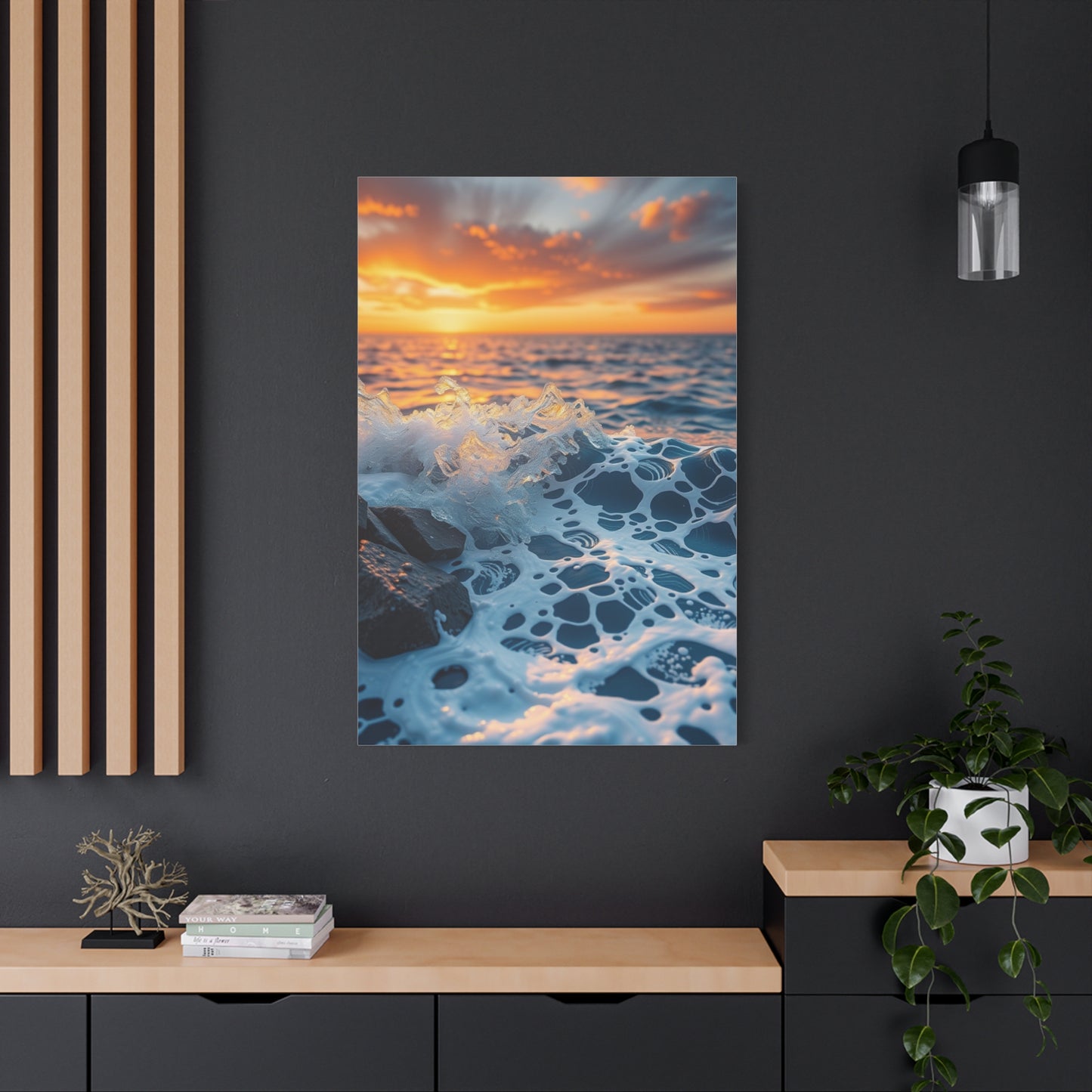
The captivating beauty of Celestial Tide Symphony wall art prints lies in their masterful depiction of the timeless connection between the moon and the sea—two natural forces eternally intertwined in rhythm, reflection, and balance. These artworks celebrate the poetic harmony between celestial light and earthly movement, presenting the ebb and flow of tides as both a visual and emotional experience. Through the interplay of luminous lunar imagery and fluid marine forms, Celestial Tide Symphony art evokes serenity, wonder, and spiritual reflection, transforming interiors into tranquil sanctuaries where the viewer can sense the universe’s quiet pulse and the sea’s eternal song.
At its essence, Celestial Tide Symphony art captures the delicate dialogue between stability and motion. The moon represents constancy and guidance, while the sea symbolizes depth, emotion, and transformation. Together, they embody balance—an elegant choreography of pull and release, light and darkness, stillness and movement. Artists often interpret this connection through abstract and surreal compositions, where silver moons hover above rippling waves, or through minimalist renderings that distill the concept into forms of light, shadow, and rhythm. This duality between the cosmic and the earthly invites viewers to pause, reflect, and find meaning within the artwork’s tranquil symmetry.
From an interior design perspective, Celestial Tide Symphony wall art offers exceptional versatility. Large-scale prints can serve as breathtaking focal points, anchoring living rooms, bedrooms, or meditation areas with a sense of depth and calm. Smaller pieces, or curated sets, can be displayed in hallways, reading corners, or creative spaces to enhance serenity and visual flow. The artwork’s color palettes—featuring deep oceanic blues, pearlescent silvers, soft whites, and muted grays—harmonize beautifully with a range of interior styles, from coastal and modern minimalist to bohemian or even contemporary luxury designs. The reflective and soothing tones help create a balanced atmosphere that blends tranquility with sophistication.
Beyond aesthetics, Celestial Tide Symphony wall art resonates on a deeper, symbolic level. The moon and sea have long represented the cycles of life, emotion, and renewal. Their rhythmic interplay mirrors the balance between human experience and the greater forces of nature. Displaying such artwork in a living space evokes not only beauty but also mindfulness, reminding viewers of the importance of harmony, patience, and flow in their own lives. The artwork becomes more than a decorative element—it acts as a meditative focal point, grounding the observer while uplifting the spirit.
The craftsmanship behind Celestial Tide Symphony art reflects a deep appreciation for both nature and artistic innovation. Artists employ a wide range of techniques—from digital illustration and watercolor to acrylic painting and mixed-media layering—to capture the nuances of light, reflection, and movement. Some artworks focus on realism, showcasing the moon’s soft glow over glistening waters, while others embrace abstraction, using texture, geometry, and motion to represent the essence of celestial harmony. This diversity allows collectors and homeowners to find pieces that align with their aesthetic sensibilities, whether they seek a minimalist composition or a richly detailed portrayal of lunar and marine unity.
Moreover, the visual and emotional depth of moon-and-sea-inspired art enhances a room’s ambiance. When paired with soft, ambient lighting, metallic frames, or reflective décor, the artwork creates an immersive visual experience, inviting the viewer to feel as though they are gazing across a moonlit horizon. Textural accents such as linen, driftwood, or glass can further reinforce the theme of nature’s harmony, while gentle lighting accentuates the artwork’s luminous tones, making it glow softly within the space. The result is an interior that feels balanced, ethereal, and deeply connected to the rhythms of the natural world.
In conclusion, Celestial Tide Symphony wall art embodies the perfect union of cosmic wonder and oceanic grace. It transforms ordinary interiors into reflective sanctuaries of calm, beauty, and spiritual depth, where art becomes a bridge between heaven and earth.
Ultimately, embracing moon-and-sea-inspired art allows homeowners and collectors to cultivate spaces that exude tranquility, balance, and timeless sophistication. By incorporating these prints into home décor, walls transcend their decorative function—they become poetic expressions of the universe’s rhythm, celebrating the eternal harmony between celestial light and the flowing tides of life itself.
