


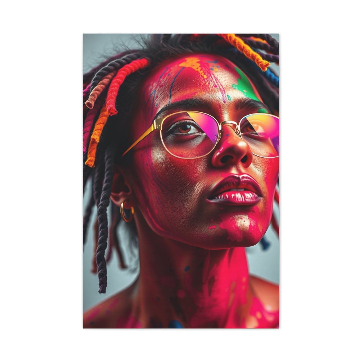


Transforming Spaces with Colorful Musical Art: A Journey Through Chromatic Symphony wall art
The intersection of color and music has fascinated artists, designers, and homeowners for generations. When vibrant hues meet rhythmic patterns on canvas, they create visual masterpieces that resonate with our deepest emotions. This exploration into chromatic artistic expression reveals how carefully selected wall decorations can transform ordinary spaces into extraordinary galleries that speak to the soul. Whether you're designing a contemporary living room, a creative studio, or a serene bedroom, incorporating these dynamic visual elements offers endless possibilities for personal expression and aesthetic enhancement.
The marriage of musical themes with explosive color palettes creates artwork that doesn't just hang on walls but actively participates in the atmosphere of a room. These pieces serve as focal points that draw the eye, spark conversation, and inspire creativity. From subtle gradients that whisper tranquility to bold contrasts that shout vitality, the range of possibilities ensures every personality and preference finds its perfect match.
Chromatic Symphony Wall Art Ideas
Exploring artistic concepts that blend color theory with musical inspiration opens doors to remarkable decorating possibilities. The essence of chromatic symphony lies in how different shades interact, overlap, and complement each other to create visual harmony reminiscent of orchestral arrangements. Each color represents a different instrument, and together they perform a silent concert for your eyes.When selecting pieces for your space, consider how various hues affect mood and perception. Warm tones like reds, oranges, and yellows inject energy and passion into environments, making them ideal for social spaces where activity and interaction flourish. These colors stimulate conversation and creativity, perfect for dining rooms, kitchens, or entertainment areas where people gather to share experiences and create memories.
Cool tones such as blues, greens, and purples bring calmness and sophistication to interiors. These shades work beautifully in bedrooms, home offices, or meditation spaces where tranquility and focus are priorities. The psychological impact of color cannot be overstated, as research consistently demonstrates how environmental hues influence our emotional states, productivity levels, and even physical wellbeing.Layering multiple chromatic elements creates depth and visual interest that evolves throughout the day as natural light shifts and changes. Morning sunlight might emphasize certain pigments, while evening illumination brings forward different aspects of the artwork. This dynamic quality ensures your space never feels static or boring, instead offering fresh perspectives with each viewing.
The scale of chromatic pieces matters tremendously in achieving desired effects. Large-format installations command attention and establish themselves as the room's centerpiece, dictating the overall aesthetic direction. Smaller works arranged in galleries or clusters offer flexibility and allow for personal curation that can evolve over time as tastes change or collections grow.Texture adds another dimension to chromatic expression, with options ranging from smooth, glossy finishes that reflect light dramatically to matte surfaces that absorb illumination for subtler effects. Raised elements, mixed media applications, and three-dimensional components introduce tactile qualities that enhance visual appeal and create shadows that add complexity to the overall composition.
Placement strategies significantly impact how chromatic artwork influences a space. Eye-level positioning ensures immediate engagement, while higher installations draw gazes upward, making rooms feel more spacious. Corner placements soften harsh angles, and hallway displays transform transitional spaces into curated galleries that maintain interest throughout the home.Considering the existing color palette of your interior is crucial for successful integration. Chromatic pieces can either complement current schemes by incorporating similar hues or provide striking contrast that energizes neutral spaces. Both approaches offer merit, depending on whether you seek cohesion or dramatic impact.
Color Symphony Canvas Prints
Canvas prints offering symphonic color arrangements bring museum-quality art into residential and commercial spaces without the prohibitive costs associated with original paintings. Modern printing technology reproduces colors with stunning accuracy, capturing subtle gradations and intense saturations that remain vibrant for years when properly cared for and displayed away from direct harsh sunlight.The canvas medium itself contributes significantly to the artistic experience. The woven texture of canvas adds depth and authenticity that paper prints cannot replicate, creating surfaces that interact with light in complex ways. This texture becomes part of the artwork itself, visible up close and contributing to the overall tactile and visual appeal that distinguishes quality pieces from mass-produced alternatives.
Wrapped canvas construction, where the image extends around the frame edges, eliminates the need for additional framing and creates a contemporary, gallery-ready appearance straight out of the packaging. This presentation style works exceptionally well in modern and minimalist interiors where clean lines and uncluttered aesthetics reign supreme.Size options for canvas prints range from intimate pieces perfect for personal spaces to massive installations that transform entire walls into artistic statements. Multi-panel designs, also called triptychs or polyptychs when divided into three or more sections, allow for impressive scale while remaining manageable for installation and transportation. These segmented arrangements also introduce visual breaks that add rhythm and movement to the composition.
The durability of canvas prints makes them practical choices for various environments, including high-traffic areas where paper-based artwork might suffer damage. Quality canvas resists fading, moisture, and minor impacts better than many alternatives, though proper care still extends longevity and maintains appearance over decades of display.Customization possibilities mean you can adjust dimensions, color intensities, and even specific elements of designs to perfectly match your vision and space requirements. Many providers offer personalization services that transform generic prints into tailored pieces that feel commissioned specifically for your home or office.Affordable pricing compared to original artwork democratizes interior design, allowing everyone to enjoy sophisticated aesthetic enhancement regardless of budget constraints. This accessibility has revolutionized how people approach decorating, shifting from viewing art as luxury to recognizing it as essential for creating truly livable, inspiring spaces.
Abstract Chromatic Wall Decor
Abstract expressions that prioritize color relationships over representational imagery invite personal interpretation and emotional response. Without recognizable subjects to anchor meaning, viewers engage with pure visual elements, allowing their own experiences, memories, and feelings to shape their understanding and appreciation of each piece.The freedom inherent in abstraction appeals to diverse tastes and philosophies. Some find liberation in artwork that doesn't insist on singular meanings or narratives, preferring visual experiences that evolve with their moods and circumstances. This flexibility makes abstract chromatic pieces particularly suitable for spaces occupied by multiple people with different preferences.
Geometric abstractions featuring clean lines, precise shapes, and calculated color placement create order and structure that appeals to analytical minds and complements architectural elements. These designs work brilliantly in professional environments, modern homes, and any setting where organization and clarity are valued attributes.Fluid abstractions with organic shapes, flowing lines, and spontaneous color applications evoke natural phenomena like water, clouds, or plant growth. These softer approaches introduce warmth and humanity into spaces that might otherwise feel sterile or overly controlled, balancing technological surroundings with organic visual elements.
The scale of abstract chromatic works dramatically affects their impact. Oversized pieces create immersive experiences that surround viewers with color and form, while smaller works offer contemplative focal points that reward close observation. Consider the viewing distance and room proportions when selecting appropriate sizes for optimal effect.Color temperature in abstract pieces influences ambiance profoundly. Warm-dominated palettes radiate energy and approachability, making spaces feel welcoming and active. Cool-dominated schemes project sophistication and calm, ideal for environments designed for concentration, relaxation, or refined entertaining.Contrast levels determine visual drama and accessibility. High-contrast compositions with sharply defined color boundaries create excitement and bold statements, while low-contrast blended gradients offer subtlety and elegance that reveal complexity gradually. Both approaches serve different purposes and appeal to different sensibilities.
Vibrant Symphony Wall Art
Vibrancy in artistic expression speaks to celebration, joy, and the exuberant embrace of life's colorful possibilities. These intensely saturated works refuse to fade into backgrounds, instead demanding attention and radiating positive energy that transforms environments from mundane to magnificent with their sheer presence and unapologetic boldness.The psychological impact of vibrant coloration extends beyond mere aesthetics. Studies demonstrate that exposure to bright, saturated hues can elevate mood, increase energy levels, and even enhance cognitive performance in appropriate contexts. Workspaces incorporating vibrant visual elements often report improved creativity and problem-solving among occupants.
Balancing vibrancy with other design elements prevents overwhelming spaces or creating visual fatigue. Strategic placement ensures vibrant pieces enhance rather than dominate, allowing them to energize without exhausting. Surrounding neutral areas give eyes places to rest, creating rhythm between stimulation and calm that keeps environments comfortable for extended periods.Musical themes in vibrant artwork create natural connections between visual and auditory experiences. Representations of instruments, sound waves, musical notation, or abstract interpretations of rhythm and melody speak to music lovers and add thematic depth that pure color alone might not achieve.
Layering techniques in vibrant pieces create dimensional effects that shift with viewing angles and lighting conditions. Translucent overlays, gradient transitions, and color interactions produce depth that draws viewers into the composition, discovering new details and relationships with each examination.The versatility of vibrant symphonic themes allows integration into diverse design styles. While naturally suited to eclectic, bohemian, or contemporary spaces, these pieces can also provide striking focal points in traditional settings, creating dynamic tension between classical architecture and modern artistic sensibilities.Seasonal considerations might influence vibrant artwork selections. Warm-hued pieces feel particularly welcoming during cooler months, while cooler vibrant palettes refresh spaces during warmer seasons. Rotating displays according to seasonal preferences keeps interiors feeling current and responsive to changing conditions and moods.
Modern Chromatic Canvas Design
Contemporary design principles emphasize clean execution, intentional composition, and sophisticated color application that distinguishes modern chromatic pieces from historical approaches. These works reflect current aesthetic movements while incorporating timeless elements that ensure lasting appeal beyond fleeting trends.Minimalist influences in modern chromatic design often manifest through restrained color palettes and simplified forms. Rather than overwhelming with complexity, these pieces achieve impact through careful selection and precise placement of limited elements, demonstrating that powerful statements need not be complicated or busy.
Digital creation tools have revolutionized modern chromatic canvas production, enabling precision and effects impossible with traditional media alone. Artists combine hand techniques with technological capabilities, producing hybrid works that honor artistic heritage while embracing contemporary possibilities.Metallic accents incorporated into modern chromatic designs add luxury and visual interest through reflective properties that change dramatically with viewing angles and light sources. Gold, silver, copper, and bronze elements catch and redirect light, creating dynamic surfaces that seem to move and breathe within static compositions.
The role of negative space in modern design cannot be overstated. Strategic areas of minimal color or activity provide visual breathing room that makes active areas more impactful by contrast. This balance between action and rest demonstrates sophisticated design thinking and prevents compositions from feeling cramped or chaotic.Material innovations expand possibilities for modern chromatic canvas work. Specialty surfaces, unique textures, and alternative substrates offer artists new ways to express color relationships and create distinctive pieces that push beyond traditional canvas limitations.Installation methods for modern chromatic pieces often embrace unconventional approaches. Floating mounts that create shadows between wall and artwork, asymmetric groupings that challenge traditional gallery arrangements, and integrated lighting that becomes part of the artistic experience all reflect contemporary thinking about how art inhabits and transforms space.
Colorful Symphony Prints for Homes
Residential spaces benefit enormously from carefully selected symphonic color prints that reflect occupant personalities while enhancing livability and aesthetic appeal. Homes should nurture and inspire, and the right artwork contributes significantly to creating environments where people thrive emotionally and psychologically.Living room selections often prioritize pieces that facilitate conversation and reflect shared household values. Large-scale symphonic prints above sofas or fireplaces establish focal points around which furniture arrangements naturally organize. These pieces should be substantial enough to anchor spaces without overwhelming or making rooms feel cluttered.
Bedroom artwork requires different considerations, as these private retreats serve rest and rejuvenation. Calming color symphonies in softer hues promote relaxation and sleep quality, while placement ensures comfortable viewing from the bed without creating visual disturbance that might interfere with winding down at day's end.Kitchen and dining areas accommodate more energetic symphonic prints that stimulate appetite and encourage social interaction. These spaces naturally lend themselves to bolder choices that energize without overwhelming, creating backgrounds for meals and gatherings that feel celebratory and welcoming.
Home office environments benefit from chromatic prints that inspire focus and creativity without becoming distracting. Carefully selected pieces provide visual interest during breaks while maintaining professional atmospheres appropriate for video calls and client meetings conducted from home settings.Hallways and transitional spaces often get overlooked in decorating plans, yet these areas offer excellent opportunities for creating curated galleries of smaller symphonic prints. These displays transform functional passages into engaging experiences that maintain visual interest throughout the home.Children's spaces welcome playful chromatic symphonies that stimulate imagination and development. Age-appropriate pieces that grow with children prevent the need for frequent replacements while supporting evolving tastes and maturity levels.
Abstract Symphony Wall Murals
Large-scale mural applications transform entire walls into immersive artistic environments that redefine spatial perception and create truly unique interiors. Unlike smaller pieces that decorate spaces, murals become architectural elements that fundamentally alter how rooms feel and function, offering unparalleled impact and presence.The planning process for symphonic wall murals requires careful consideration of room dimensions, lighting conditions, existing design elements, and intended atmospheric effects. Professional consultations often prove worthwhile for such significant installations, ensuring technical execution matches creative vision and integrating seamlessly with other interior components.
Custom mural design allows for perfect alignment between artistic expression and spatial requirements. Working with designers or artists to create bespoke murals ensures colors, proportions, and themes perfectly suit your specific environment and preferences, resulting in truly one-of-a-kind installations impossible to duplicate elsewhere.Installation techniques vary from traditional painting methods to modern adhesive applications that simplify the process and reduce permanence. Removable mural options appeal to renters or those who prefer flexibility to change designs without wall damage or extensive renovation projects.
Durability considerations for wall murals include surface preparation, material selection, and protective treatments that ensure longevity despite exposure to daily wear, humidity, temperature fluctuations, and cleaning requirements. Quality installations properly executed can last decades with minimal maintenance.Lighting design becomes crucial with large-scale murals, as illumination dramatically affects how colors appear and interact. Natural light patterns throughout the day create evolving appearances, while strategic artificial lighting can emphasize certain areas or create dramatic effects after dark.The psychological impact of enveloping chromatic environments differs significantly from viewing discrete artworks. Murals create atmospheres that affect mood and behavior more profoundly, making careful color selection particularly important to ensure desired emotional and psychological outcomes align with space functions and occupant needs.
Bold Chromatic Canvas Art
Boldness in artistic expression reflects confidence, individuality, and willingness to make strong statements rather than playing safe with neutral or universally appealing choices. Bold chromatic pieces become defining features that communicate personality and establish unmistakable aesthetic directions for entire spaces.High-saturation colors form the foundation of bold chromatic artwork, pushing intensity to maximum levels that command immediate attention. These pieces refuse to blend into backgrounds, instead announcing their presence and influencing everything around them through sheer chromatic force.
Contrast ratios in bold work often reach extremes, pairing complementary colors that vibrate against each other or juxtaposing light and dark values for maximum visual impact. These dramatic relationships create energy and movement that enliven spaces and prevent visual stagnation.Scale amplifies boldness, with large formats naturally creating stronger impressions than smaller works. However, even modest-sized pieces achieve bold status through intense coloration and strong compositional choices that overcome physical limitations through visual assertiveness.
The risk-reward balance of bold chromatic selections requires honest self-assessment about long-term commitment and decorating confidence. While these pieces create spectacular results for those who love them, they can feel overwhelming or tiresome to others, making careful consideration essential before substantial investments.Contextualizing bold chromatic art within broader design schemes prevents chaos while maintaining impact. Surrounding neutral elements allow bold pieces to shine without competing for attention, while coordinated accent colors in textiles, accessories, or furniture create cohesion rather than conflict.Evolution and adaptation become important considerations with bold artistic choices. As tastes change or living situations evolve, intensely bold pieces might require relocation to different spaces or eventual replacement, making flexibility in mounting and display methods valuable for practical reasons.
Musical Symphony Wall Decor
The relationship between music and visual art has inspired creators across cultures and centuries. Pieces explicitly referencing musical themes create multisensory connections that appeal particularly to musicians, music lovers, and anyone who responds strongly to sonic experiences translated into visual language.Instrumental representations ranging from realistic depictions to abstract interpretations bring musical presence into spaces without sound. These visual references to guitars, pianos, drums, horns, and orchestral instruments celebrate musical passion and create thematic coherence in studios, practice rooms, or entertainment spaces dedicated to musical pursuits.
Musical notation elements incorporated into designs add intellectual and aesthetic interest. Staff lines, clefs, notes, and rhythmic patterns become graphic elements that musicians immediately recognize while remaining visually appealing to those without musical training who appreciate them purely as abstract design components.Sound wave visualizations translate audio frequencies into graphic forms, creating bridges between heard and seen experiences. These scientifically grounded yet artistically rendered patterns embody the physical reality of music while creating striking visual compositions that work as standalone art regardless of viewers' scientific understanding.
Genre-specific themes allow musical wall decor to reflect particular tastes and affiliations. Jazz-inspired pieces might emphasize improvisation and spontaneity through loose, expressive forms. Classical music themes often feature more structured, formal compositions. Rock and contemporary genres embrace bold, rebellious aesthetics that match their sonic personalities.Performance scenes capturing musicians in action inject dynamic energy into spaces. Whether realistic or stylized, these depictions of human engagement with musical creation add narrative elements and emotional resonance that pure abstractions might not achieve.The acoustic properties of spaces housing musical wall decor sometimes factor into selection decisions. Certain materials and surface treatments affect sound reflection and absorption, matters of practical concern in actual performance or listening rooms where both visual and sonic qualities contribute to overall experiences.
Color Explosion Wall Prints
Explosive color treatments create visual fireworks that celebrate chromatic abundance without restraint or apology. These exuberant pieces embrace maximalist philosophies where more truly becomes more, rejecting minimalist restraint in favor of joyful, unrestrained chromatic celebration that transforms walls into festivals of hue and saturation.Splatter and drip techniques characteristic of action painting movements create organic, spontaneous patterns that feel immediate and energetic. These mark-making approaches produce unique variations even when reproducing original works, as each print captures specific moments of creative activity frozen in time.
Radial burst patterns emanating from central points create focal emphasis and directional energy that draws eyes inward or outward depending on compositional choices. These explosive arrangements naturally create movement and dynamism that prevent static, lifeless wall presentations.Layered transparency effects in color explosion prints create depth through overlapping translucent hues that blend optically while maintaining individual identity. These complex interactions produce colors that couldn't exist through simple mixing, creating sophisticated palettes that reward close examination while remaining impactful from distance.
The celebratory nature of color explosion artwork makes these pieces particularly appropriate for spaces dedicated to joy, creativity, and social connection. Playrooms, creative studios, entertainment areas, and casual gathering spaces all benefit from the positive, energetic atmospheres these works naturally generate.Digital manipulation techniques expand possibilities for color explosion effects, enabling controlled chaos where apparent randomness actually follows careful design principles. This balance between spontaneity and structure creates visually exciting results that maintain coherence despite apparent wildness.Printing technology capable of reproducing intense saturations and subtle gradations ensures color explosion prints maintain their impact across viewing distances.
Chromatic Harmony Wall Designs
Harmony in chromatic design refers to color relationships that create pleasing, balanced compositions where elements support rather than fight each other. These designs demonstrate sophisticated color theory application, producing results that feel naturally right even to viewers without formal artistic training.Analogous color schemes using adjacent hues on the color wheel create gentle, cohesive harmonies that feel unified and peaceful. These arrangements work beautifully for creating serene, contemplative environments where jarring contrasts would disturb desired tranquility and interfere with intended atmospheric qualities.
Complementary color relationships pairing opposites on the color wheel generate vibrant contrasts while maintaining harmonic balance. These dynamic combinations create visual excitement without chaos, as the natural relationship between complementary hues ensures they enhance rather than clash despite their differences.Triadic harmonies employing three equally spaced colors create balanced complexity suitable for spaces requiring visual interest without overwhelming intensity. These arrangements offer more variety than analogous schemes while maintaining greater coherence than random color selections might achieve.
Temperature balance between warm and cool hues prevents compositions from feeling too energizing or too calm, instead achieving equilibrium appropriate for multifunctional spaces that serve varying needs at different times. This balance ensures artwork remains appropriate regardless of activity or mood.Value relationships between light and dark elements create depth and dimension even in relatively simple color harmonies. Careful attention to tonal ranges ensures sufficient contrast for visual clarity while maintaining overall harmonic unity that ties compositions together.The mathematical and musical theories underlying color harmony reflect universal principles of proportion and relationship found throughout nature and human perception. These deep connections explain why certain combinations feel intrinsically right, resonating with cognitive and emotional processing systems developed over evolutionary timescales.
Bright Symphony Canvas Ideas
Brightness in chromatic artwork brings illumination and optimism to interiors, reflecting and amplifying natural and artificial light to create spaces that feel open, airy, and welcoming. These lighter-value compositions work particularly well in spaces with limited natural light or smaller rooms where darker pieces might create oppressive feelings.Pastel symphonies featuring soft, light-saturated colors create gentle, approachable environments suitable for bedrooms, nurseries, and any spaces designed for calm and comfort. These pieces maintain chromatic interest while avoiding intensity that might overwhelm or overstimulate in contexts requiring relaxation.
High-key compositions keeping most values in the lighter range create ethereal, almost glowing effects that seem to emit rather than reflect light. These pieces work particularly beautifully in contemporary, minimalist settings where their luminous quality enhances clean, uncluttered aesthetics.White and cream backgrounds allow bright colors to pop against neutral fields, creating clarity and definition that darker backgrounds might obscure. This approach works well for displaying complex color relationships where each hue needs space and separation to maintain individual identity within the larger composition.
Reflective properties of bright canvases make them valuable tools for amplifying existing light sources. Strategically placed bright symphonic pieces can make rooms feel larger and better lit by bouncing available light throughout spaces, reducing the need for additional artificial illumination.Seasonal appropriateness gives bright chromatic pieces particular appeal during darker months when bringing additional luminosity indoors counteracts winter gloom. Rotating between brighter pieces in winter and potentially richer, deeper works during summer maintains visual freshness throughout the year.The psychological lift provided by bright environments has been extensively documented in research on seasonal affective disorder and general mood regulation.
Abstract Music Art for Walls
Abstract interpretations of musical concepts allow artistic freedom to explore how sound might look if visible, creating fascinating translations between sensory experiences. These pieces appeal to those who appreciate both music and visual art, creating bridges between disciplines and offering intellectually engaging decorative options.Rhythm visualizations translate musical timing and beat patterns into graphic forms using repeated elements, varied spacing, and dynamic arrangements that create visual tempo. These designs embody musicality through purely visual means, allowing eyes to read patterns the way ears parse rhythmic sequences.
Melodic representations might use flowing lines suggesting pitch changes, with rising and falling contours creating visual equivalents of musical phrases. Color shifts along these paths could indicate harmonic changes or emotional qualities, building complex metaphorical systems that reward contemplation.Harmonic structures expressed through color relationships create visual chords where combinations work together to produce effects greater than individual components. These pieces demonstrate color theory parallels to musical harmony, celebrating the mathematical and emotional connections between these artistic forms.
Dynamic range, referring to volume variations in music, finds visual equivalents in contrast ratios, size differences, and saturation levels within compositions. Quiet passages might translate to subtle, low-contrast areas while forte sections explode with intense colors and bold forms.Tempo and pace manifest through compositional density and element spacing. Faster musical passages might inspire busier, more crowded visual areas while slower sections open into spacious, breathing rooms where elements have space to exist independently.Genre characteristics influence abstract musical interpretations significantly. Classical music might inspire more formal, structured compositions while jazz encourages improvisation and asymmetry.
Color Symphony Posters
Poster formats offer affordable entry points into chromatic symphonic artwork, making sophisticated design accessible regardless of budget constraints. While sometimes dismissed as less serious than canvas or framed prints, quality posters on premium papers with professional printing can deliver impressive visual results suitable for any environment.Paper selection dramatically affects poster appearance and longevity. Heavyweight art papers with appropriate coatings resist fading and wear while providing surfaces that reproduce colors faithfully and display them beautifully. The tooth and finish of paper contribute to overall aesthetic, with options ranging from smooth, glossy surfaces to textured, matte presentations.
Framing transforms posters from temporary decorations into permanent installations worthy of serious interior design consideration. Quality frames with proper matting and protective glazing elevate posters to gallery-worthy status while providing physical protection that extends lifespan indefinitely.The temporary nature of unframed posters appeals to those who enjoy frequently changing their environments or who rent spaces where permanent installations aren't practical. Rotating poster displays keep spaces feeling fresh and allow experimentation with different styles and colors without significant financial commitment.
Vintage and retro symphonic poster designs celebrate historical design movements and nostalgic aesthetics. These pieces work particularly well in eclectic interiors mixing old and new, creating conversational focal points that reference cultural and artistic history.Oversized poster formats approach the impact of canvas prints while maintaining cost advantages. Large-scale posters make bold statements appropriate for substantial walls in open-plan spaces, studios, or commercial environments where visual impact matters but budgets remain constrained.Custom poster printing services enable creation of unique pieces from original designs, photographs, or digital art. This personalization transforms generic wall covering into meaningful expressions of individual creativity and vision, resulting in truly one-of-a-kind installations.
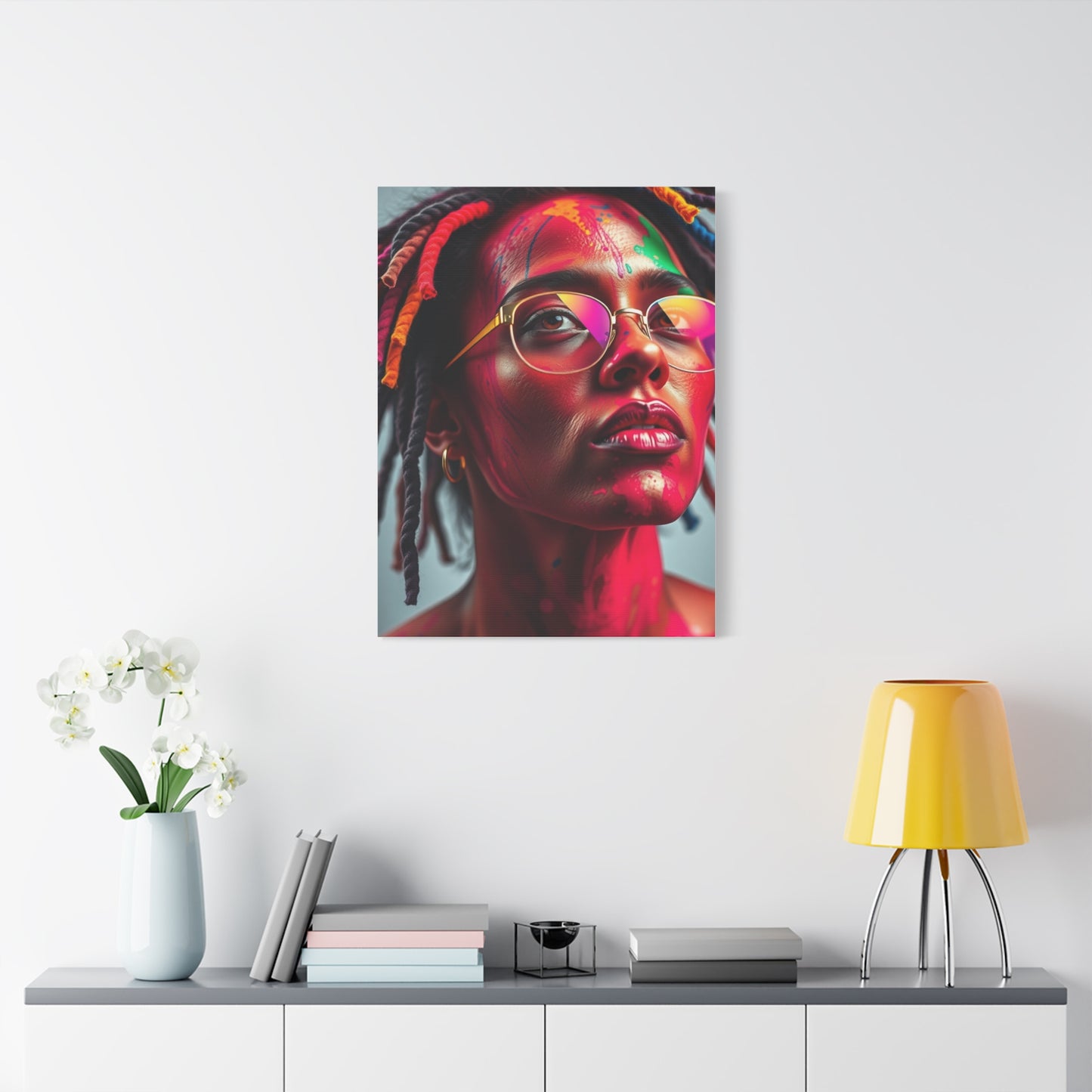
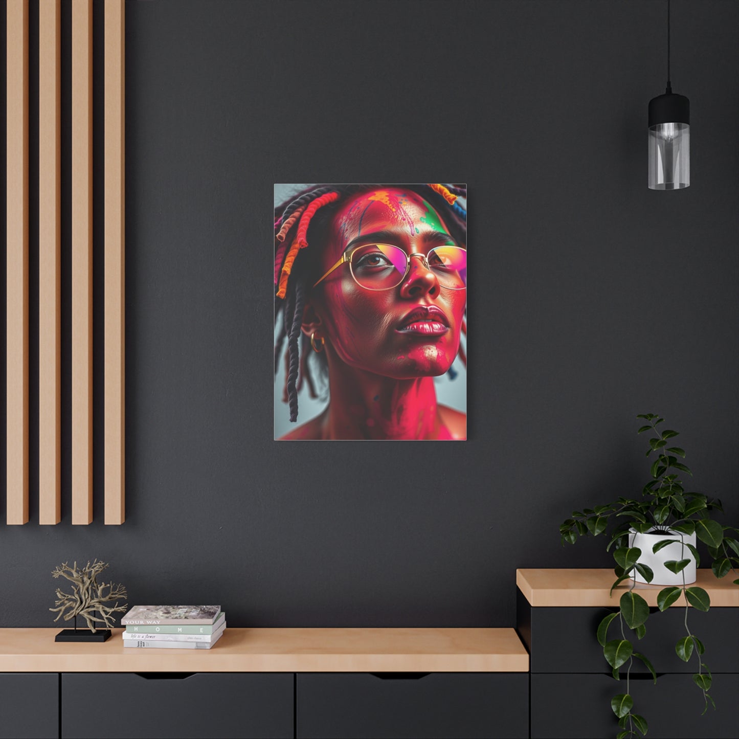
Vivid Canvas Prints for Living Rooms
Living rooms serve as the heart of homes, welcoming family and guests while accommodating diverse activities from entertainment to relaxation. Vivid canvas prints in these central spaces make strong statements about household style and priorities while creating inviting atmospheres that encourage gathering and connection.Above-sofa placement remains the classic location for substantial canvas pieces, creating natural focal points that anchor seating arrangements. The scale relationship between furniture and artwork matters greatly, with pieces ideally spanning two-thirds to three-quarters of sofa width for balanced proportions that feel neither overwhelming nor insignificant.
Fireplace surrounds offer alternative focal opportunities where vivid canvases compete with or complement architectural features. Mantels provide natural shelving for coordinating accessories that can pick up colors from artwork, creating cohesive vignettes that tie together multiple decorative elements.Gallery walls incorporating multiple vivid canvases of varying sizes create dynamic, collected looks that reflect personality and interests. Successful gallery arrangements balance symmetry and asymmetry, maintaining overall harmony while allowing individual pieces to shine. Planning layouts on floors before hanging prevents costly mistakes and ensures satisfying final arrangements.
Color coordination between vivid canvases and existing living room palettes requires consideration of whether artwork should blend harmoniously or provide contrasting excitement. Both approaches work depending on desired effects and overall design philosophies guiding the space.Lighting design for living room canvases includes both natural daylight considerations and artificial illumination planning. Track lighting, picture lights, or strategically placed lamps can highlight artwork while creating ambient lighting that serves broader room functions.Scale variations create visual interest when displaying multiple canvases in living areas. Mixing large statement pieces with smaller supporting works prevents monotony while allowing for collection growth and evolution as tastes develop and opportunities arise.
Modern Abstract Wall Murals
Contemporary mural approaches transform walls into architectural art that fundamentally redefines spatial experiences. Modern abstract murals reject representational imagery in favor of pure formal elements, color relationships, and compositional structures that create environments rather than simply decorating them.Floor-to-ceiling installations maximize impact by eliminating boundaries between artwork and architecture. These complete wall treatments create immersive environments where viewers feel surrounded by color and form rather than simply observing from outside.
Geometric modern murals featuring precise shapes and calculated arrangements appeal to minimalist sensibilities and complement contemporary architecture. These clean, structured designs create order and sophistication appropriate for professional environments and modern residential spaces valuing clarity and intentionality.Organic abstract murals with flowing, natural forms soften architectural edges and introduce warmth into potentially stark modern interiors. These designs reference nature without literally depicting it, creating biophilic connections that research shows support wellbeing and cognitive function.
Multi-wall installations extend murals beyond single surfaces to create cohesive environments where artwork flows continuously through spaces. These ambitious projects require careful planning and professional execution but deliver unmatched impact and architectural integration.Gradient murals transition smoothly between colors, creating atmospheric effects reminiscent of skies, sunsets, or abstract color fields. These subtle approaches provide chromatic impact without busy patterns that might compete with furniture and other interior elements.Textured modern murals incorporate dimensional elements that create shadows and surface variations adding tactile interest to visual appeal.
Chromatic Rhythm Wall Art
Rhythm in visual art creates movement and flow through repetition, variation, and pattern. Chromatic rhythm pieces use color as the primary vehicle for establishing these temporal qualities, creating visual music that plays across wall surfaces in silent performance.Regular repetition establishes predictable rhythms that feel orderly and calming, similar to consistent musical beats. These steady patterns create reliability and structure that works well in spaces requiring focus and concentration like home offices or study areas.
Syncopated rhythms introduce unexpected variations that create visual interest and prevent monotony. Like jazz syncopation that plays against the beat, these compositions keep viewers engaged through pleasant surprises and calculated disruptions of expected patterns.Progressive rhythms that gradually accelerate or decelerate create directional energy and narrative quality. These pieces might begin with widely spaced elements that gradually compress, building visual tension, or reverse this pattern to create release and resolution.
Alternating rhythms establish back-and-forth patterns similar to call-and-response in music. Color shifts between complementary hues, value contrasts, or shape variations create dialogue within compositions, giving pieces conversational qualities that engage viewers.Polyrhythmic compositions layer multiple simultaneous patterns at different scales or intervals, creating complexity reminiscent of African drumming traditions or contemporary electronic music. These sophisticated arrangements reward extended viewing as eyes discover various embedded patterns and their interactions.
Art Symphony Prints for Studios
Creative studios and workspaces benefit tremendously from inspiring chromatic prints that stimulate imagination while maintaining functional environments conducive to actual production. The right artwork in creative spaces becomes more than decoration, serving as muse and motivation that influences the work produced within these environments.Artist studios accommodating visual art creation might display chromatic symphonies that demonstrate color theory principles, serve as inspiration for palette development, or simply provide beauty during long creative sessions. These pieces should inspire without overwhelming, supporting rather than dominating the creative process.
Music studios and practice rooms naturally pair with symphonic chromatic prints that celebrate the art form practiced within. Visual representations of musical concepts create thematic coherence while acoustic treatments that might include artwork can serve dual aesthetic and functional purposes.Writing studios and author workspaces use chromatic symphonic prints to stimulate creativity and provide visual breaks during intensive mental work. The right pieces can influence mood and energy levels, helping writers access desired emotional states for different projects or overcome creative blocks.
Photography studios might select chromatic prints demonstrating sophisticated color work or complementary to the photographic style practiced within. These pieces educate clients about chromatic possibilities while showcasing the studio's aesthetic sensibilities and artistic sophistication.Design studios working in graphic design, interior design, or other creative disciplines use chromatic prints to demonstrate commitment to visual excellence and keep current with aesthetic trends. These pieces become conversation starters with clients and inspiration sources for project development.Multi-purpose creative spaces accommodating various artistic pursuits benefit from versatile chromatic prints that inspire broadly without favoring specific disciplines.
Colorful Abstract Canvas Style
Style in abstract chromatic work encompasses countless approaches, each offering unique aesthetic experiences and emotional qualities. Understanding various stylistic options helps in selecting pieces that resonate personally while serving intended functional and decorative purposes within specific spaces and design contexts.Expressionist styles prioritize emotional communication over formal precision, using bold colors and energetic mark-making to convey feelings and states of mind. These passionate pieces create intense atmospheres appropriate for spaces embracing drama and emotional authenticity over restraint.
Geometric abstraction featuring clean lines, precise shapes, and calculated color placement creates orderly, rational compositions that appeal to analytical sensibilities. These intellectually rigorous pieces complement modern architecture and minimalist interiors while providing chromatic interest.Lyrical abstraction combines color and form in fluid, poetic arrangements that feel musical and spontaneous. These softer approaches create gentle, contemplative environments suitable for meditation spaces, bedrooms, or any areas designed for introspection and peace.Hard-edge abstraction features sharply defined color areas meeting in crisp boundaries without blending or gradation. This style creates bold, graphic impact suitable for contemporary settings and spaces requiring strong visual statements.
Color field painting emphasizes large areas of flat color creating immersive chromatic environments. These expansive approaches work particularly well at large scales where viewers can become surrounded by color and experience its psychological and perceptual effects fully.Mixed-media approaches combine traditional painting with collage, texture, or dimensional elements, creating rich surfaces that reward close examination. These complex pieces work well in intimate settings where viewers can appreciate detailed craftsmanship and layered construction.Digital styles embrace technology in creation, producing precise, often mathematical patterns and effects impossible through traditional means alone. These contemporary approaches reflect current moment cultural and technological contexts while expanding possibilities for chromatic expression.
Chromatic Melody Wall Decor
Melodic qualities in visual art translate the flowing, connected nature of musical lines into graphic forms that create movement and narrative across surfaces. These pieces guide eyes through compositions the way melodies guide ears through musical passages, creating visual journeys with beginnings, developments, and conclusions.Linear elements establishing paths through compositions create directional flow similar to melodic contours. These lines might be explicit or implied through element arrangement, but they function to guide viewer attention and create temporal experiences within static media.
Color progressions moving through spectrums or shifting through related hues create chromatic melodies that change gradually across compositions. These transitions feel organic and natural, creating flow that prevents jarring shifts while maintaining continuous visual interest throughout pieces.Rising and falling arrangements where elements ascend and descend spatially create visual equivalents of melodic pitch changes. These compositions have innate dynamism that creates energy and movement, preventing static, lifeless presentations.
Repetition with variation, fundamental to memorable melodies, appears in chromatic wall decor through repeated motifs that shift slightly in color, scale, or position. These variations maintain coherence while preventing boring predictability, balancing unity and variety.Phrasing in visual compositions creates natural breaks and breathing space similar to musical phrases separated by rests or cadences. These pauses give eyes recovery time and create rhythm that makes complex compositions easier to parse and appreciate.The emotional arc of pieces, moving from tension to release or building gradually toward climaxes, creates narrative quality that engages viewers beyond simple aesthetic appreciation. These dramatic structures give artwork storytelling capabilities that create memorable experiences.
Bold Color Symphony Wall Art
Boldness in symphonic wall art reflects confidence and commitment to strong aesthetic positions. These unapologetic pieces demand attention and establish clear design directions, working best in spaces where inhabitants embrace distinctive styleThe psychology of bold color choices reveals much about personality and values. Those drawn to intense chromatic expressions often value authenticity, creativity, and individual expression over conformity. These pieces become extensions of personal identity, broadcasting tastes and attitudes to visitors while creating environments that genuinely reflect occupant characters rather than generic design formulas.
Commitment required for bold symphonic installations shouldn't be underestimated. Unlike neutral choices that fade into backgrounds, bold pieces remain constantly present and influential. This permanence makes careful selection crucial, ensuring chosen works inspire rather than irritate over years of daily exposure. The right bold piece energizes and delights indefinitely, while mismatched selections become sources of regret.
Context amplification occurs when bold symphonic art contrasts dramatically with surroundings. A vivid explosion of color gains even greater impact when surrounded by neutral walls, minimal furniture, and restrained accessories. This strategic contrast prevents visual chaos while allowing bold pieces to achieve maximum effect through isolation and emphasis.The cultural dimensions of color boldness vary significantly across traditions and regions. Western modernism often embraces bold primary colors and high contrast, while Eastern aesthetics might find boldness in subtle variations within narrow ranges. Understanding these cultural contexts enriches appreciation and selection processes.
Installation confidence matters tremendously with bold symphonic pieces. Tentative placement at inappropriate scales or in awkward locations undermines inherent power. These works demand prominent positioning at generous scales where their boldness feels intentional and celebrated rather than apologetic or uncertain.Evolution strategies for living with bold art include seasonal rotations that prevent familiarity from breeding contempt, strategic lighting changes that transform appearance throughout day and night, and periodic rearrangement of surrounding elements to refresh relationships and maintain visual interest.
Abstract Color Canvas Trend
Contemporary trends in abstract chromatic canvas work reflect broader cultural movements, technological capabilities, and evolving aesthetic sensibilities. Understanding current directions helps in making selections that feel fresh and relevant while avoiding dated approaches that might quickly appear tired or passé.Minimalist color blocking featuring limited palettes and simple geometric divisions continues dominating modern design conversations. These restrained approaches appeal to contemporary tastes for clarity and intentionality, rejecting unnecessary complexity in favor of essential elements executed with precision and confidence.
Organic shapes and biomorphic forms represent reactions against excessive geometry and digital perfection. These nature-inspired approaches introduce warmth and humanity into spaces potentially dominated by technology and hard surfaces, creating balance between natural and artificial environments.Maximalist reactions against minimalism have gained momentum, celebrating abundance, pattern, and complexity after years of reductive simplification. These exuberant pieces embrace more-is-more philosophies, layering colors, patterns, and textures into rich compositions that reward extended viewing.
Nostalgic revivals drawing from mid-century modern, art deco, or other historical movements reinterpret classic approaches for contemporary contexts. These pieces reference design history while updating for current sensibilities, creating bridges between past and present.Experimental techniques combining traditional and digital methods produce hybrid works that feel innovative and contemporary. These pieces demonstrate how technology expands rather than replaces traditional artistry, creating new possibilities while honoring established practices.
Sustainable and ethical production considerations increasingly influence trend directions as consumers prioritize environmental responsibility and fair labor practices. Artwork created with eco-friendly materials and ethical production methods gains appeal among conscientious buyers.Customization and personalization trends reflect desires for unique expressions rather than mass-produced uniformity. Technology enabling affordable custom production has democratized bespoke art, allowing everyone to commission or create pieces perfectly suited to their specific spaces and visions.
Creating Cohesive Color Stories Throughout Spaces
Successful chromatic art integration extends beyond individual pieces to encompass entire environments. Creating cohesive color narratives that flow throughout spaces produces sophisticated, intentional results that feel professionally designed rather than accidentally assembled.Anchor pieces establish dominant color directions that subsequent selections support and enhance. These primary artworks set palettes that inform choices for accent pieces, accessories, textiles, and even paint colors, creating unity that ties diverse elements into harmonious wholes.
Color progression between rooms creates visual journeys through homes or facilities. Thoughtful transitions from warm to cool spaces, light to dark areas, or calm to energetic zones guide experiences and create variety within overall coherence.Repetition of key colors in different contexts throughout spaces creates rhythm and connection. A particular blue appearing in living room artwork, kitchen textiles, and bedroom accents weaves color stories that unite separate areas while allowing individual room personalities.
Proportional balance ensures no single color dominates excessively unless intentionally creating signature color schemes. The classic 60-30-10 rule suggesting dominant, secondary, and accent color proportions provides a useful framework for balanced distribution throughout spaces.Layering depths from walls to furniture to accessories to artwork creates dimensional color experiences more interesting than flat, single-layer applications. This depth prevents spaces from feeling flat or lifeless, instead building complexity that engages eyes and minds.
Seasonal flexibility built into color schemes through changeable elements like throw pillows, smaller artworks, and accessories allows refreshing spaces without complete redesign. This adaptability keeps environments feeling current and responsive to changing moods and preferences.Testing and sampling before committing to permanent installations prevents expensive mistakes. Many providers offer sample programs or return policies allowing evaluation of pieces in actual spaces under real lighting conditions before final decisions.
Conclusion
The journey through chromatic symphonic wall art reveals a rich landscape of possibilities for transforming living and working environments through strategic color application and artistic vision. From bold expressionist explosions to subtle harmonic gradations, from traditional canvas prints to cutting-edge digital displays, the options available today enable unprecedented personalization and aesthetic sophistication regardless of budget or space constraints.
Successfully integrating chromatic artwork into interiors requires balancing multiple considerations including aesthetic preferences, practical requirements, psychological impacts, cultural contexts, and even financial implications. The most satisfying results emerge when selections reflect genuine personal resonance rather than following prescribed formulas or chasing trendy aesthetics that may quickly feel dated or alienating.
Understanding color theory fundamentals empowers more confident decision-making, revealing why certain combinations feel harmonious while others create jarring discord. This knowledge transforms artwork selection from intimidating mystery to accessible process where informed choices replace anxious guesswork. Even basic familiarity with complementary relationships, temperature balance, and value contrast dramatically improves outcomes.
The emotional and psychological dimensions of chromatic environments deserve serious consideration beyond surface aesthetics. Colors profoundly influence mood, energy, productivity, and wellbeing in ways research continues revealing and quantifying. Treating artwork selection as environmental design supporting specific outcomes rather than mere decoration acknowledges these powerful effects and leverages them intentionally.
Quality and craftsmanship matter tremendously for long-term satisfaction and value retention. While budget constraints legitimately influence purchasing decisions, prioritizing fewer high-quality pieces over multiple inferior alternatives typically delivers better results aesthetically, psychologically, and financially. Investment in enduring quality proves wise economy compared to repeatedly replacing disappointing cheap alternatives.
The care and maintenance required for preserving chromatic artwork investments need not be burdensome or complex. Basic environmental awareness, gentle regular cleaning, and prompt professional attention for serious issues protect collections while maintaining their beauty and value across decades. Establishing simple routines prevents most problems while minimizing ongoing effort and expense.
Cultural literacy regarding color meanings, artistic movements, and historical contexts enriches appreciation and enables more sophisticated selections that carry deeper significance than pure visual appeal alone. This knowledge connects individual pieces to larger conversations spanning centuries and cultures, adding intellectual dimension to aesthetic pleasure.
