


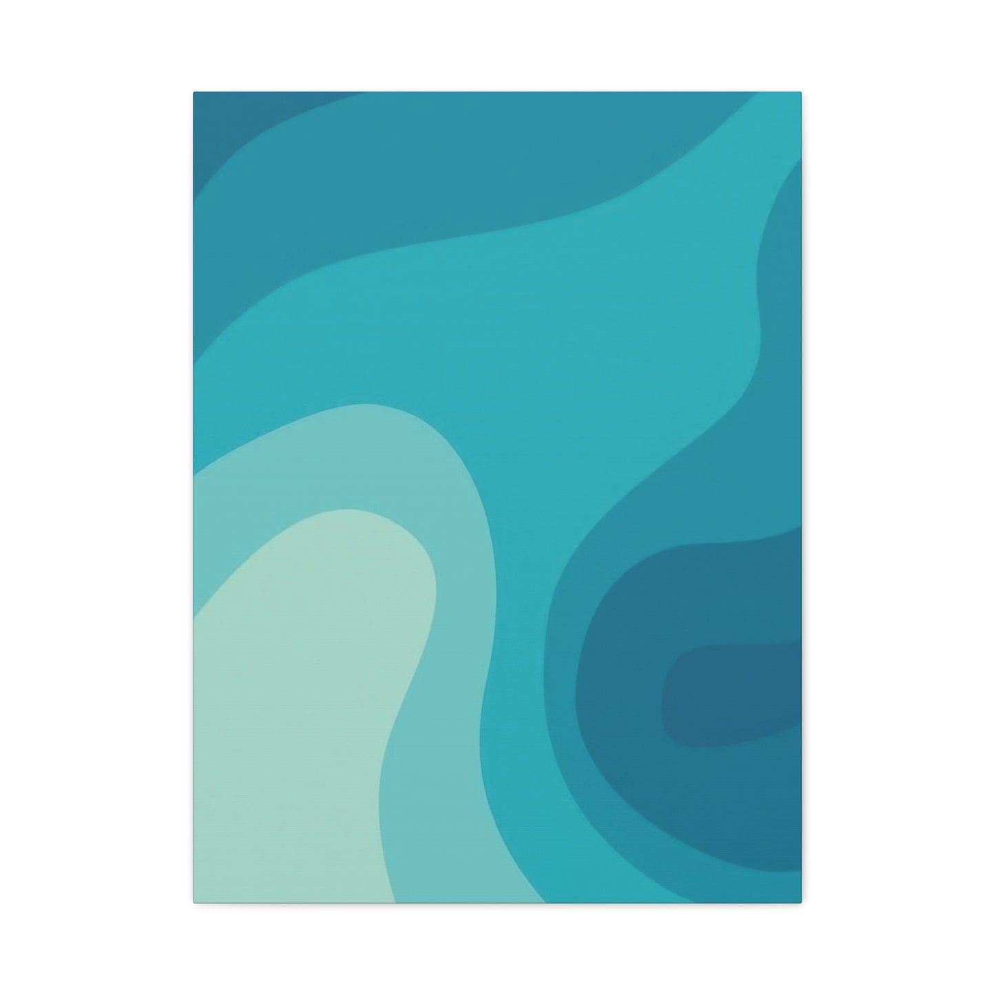

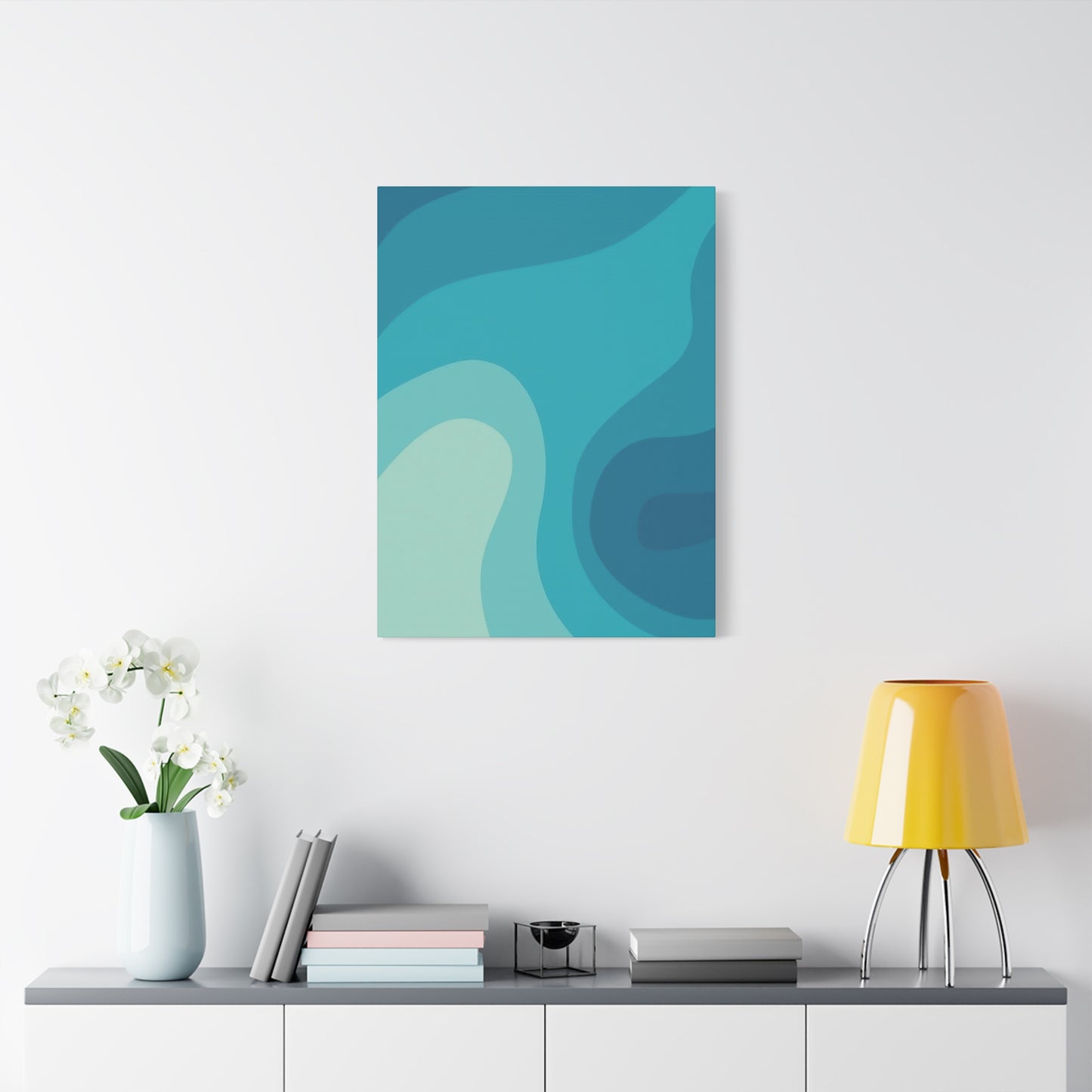
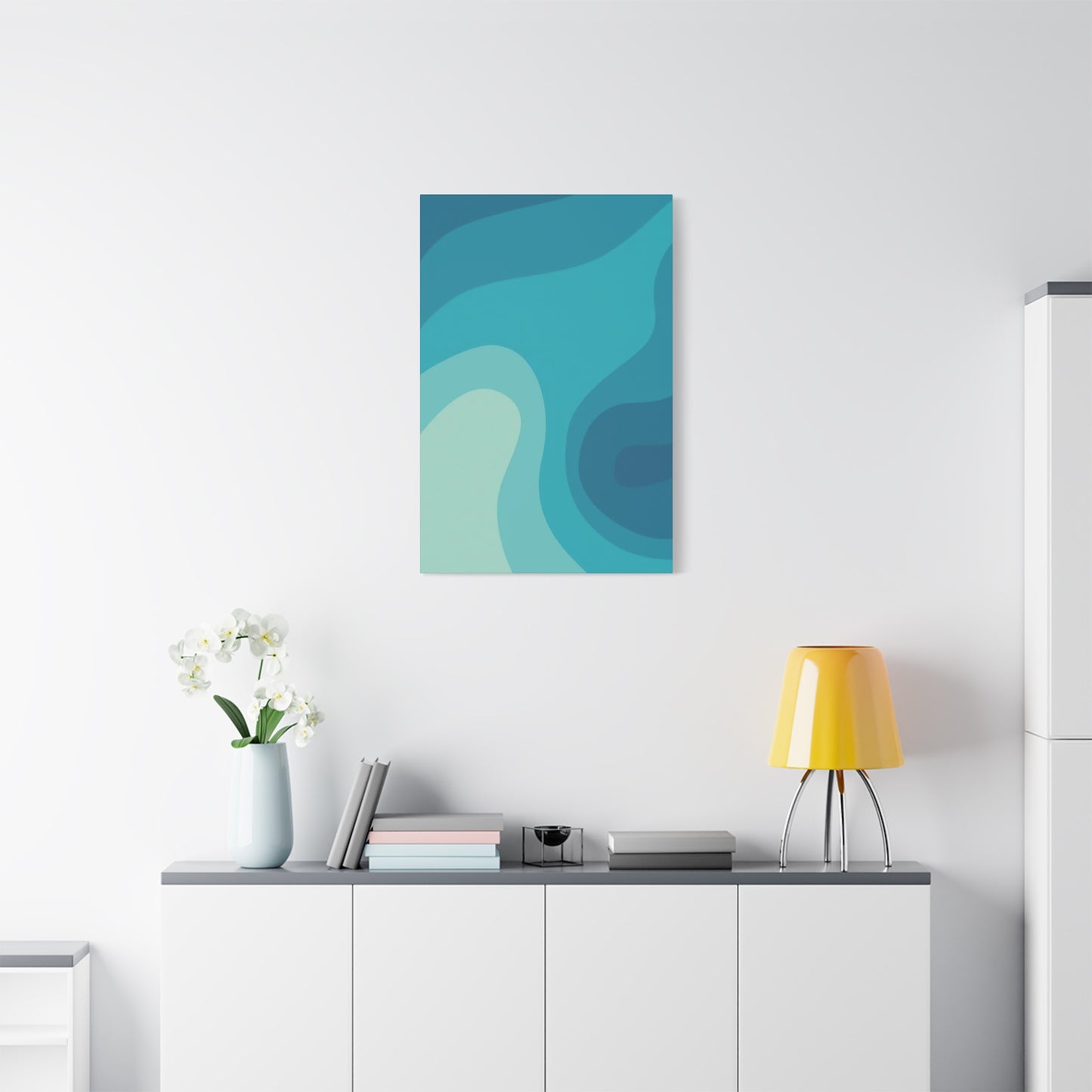
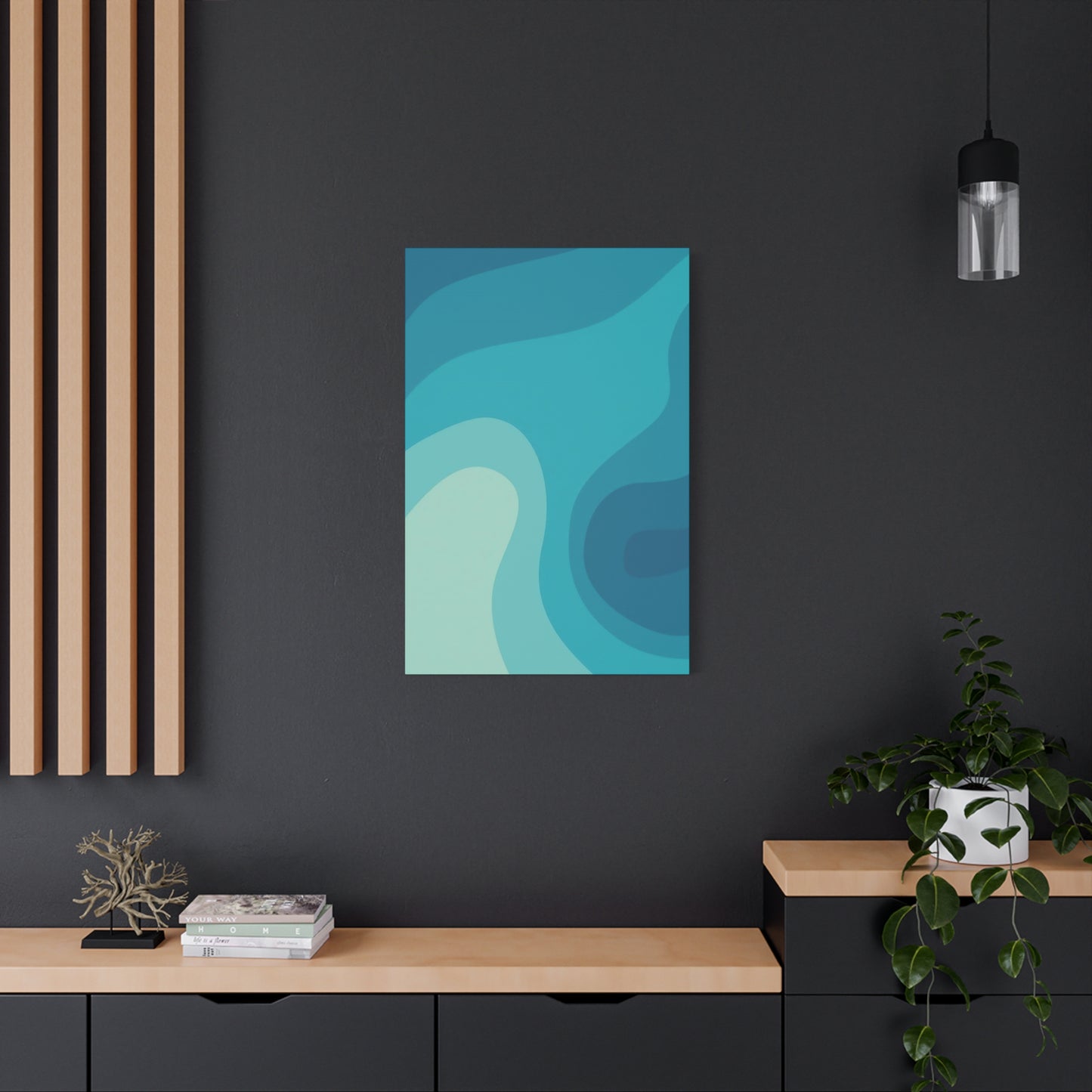
Cool Blue Waves Wall Art: Infusing Homes with Oceanic Calm and Contemporary Style
The incorporation of ocean-inspired elements into contemporary interior design has revolutionized the way we perceive and experience our living spaces. The natural beauty of water, particularly the mesmerizing movement of waves, brings an unparalleled sense of tranquility and sophistication to any environment. When we talk about introducing oceanic aesthetics into modern homes, we are discussing more than simple decoration; we are creating atmospheric sanctuaries that promote mental wellness and aesthetic pleasure.
The appeal of aquatic visuals in residential and commercial spaces stems from their inherent connection to nature and the psychological benefits they provide. Studies in environmental psychology consistently demonstrate that exposure to natural elements, even through artistic representations, can significantly reduce stress levels and improve overall mood. The flowing forms of water captured in artistic expressions serve as visual meditations, offering viewers a momentary escape from the demands of daily life.
Contemporary design philosophy embraces the concept of biophilic design, which integrates natural elements into built environments. Ocean-themed artwork perfectly embodies this principle, bringing the healing qualities of coastal environments into urban and suburban settings. The gentle undulation of waves, rendered in various shades of azure and turquoise, creates visual rhythm that naturally draws the eye and calms the mind. This rhythmic quality mirrors the breathing patterns associated with relaxation and meditation, making such artwork particularly effective in spaces designated for rest and rejuvenation.
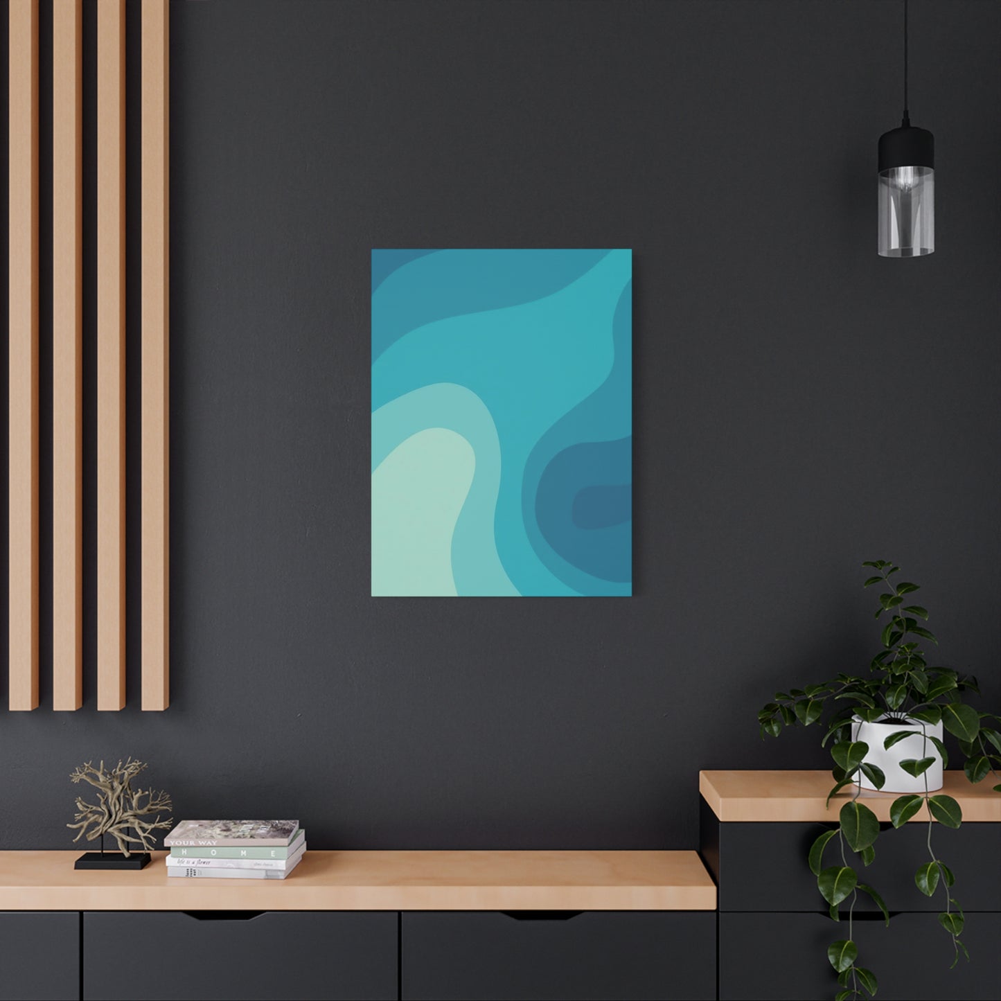
The versatility of marine-inspired wall decorations allows them to complement various design styles, from ultra-modern minimalist interiors to more traditional coastal themes. The key lies in selecting pieces that harmonize with existing color palettes while introducing dynamic visual interest. Cool tonal variations found in ocean imagery provide designers and homeowners with endless possibilities for creating cohesive, visually appealing spaces that feel both fresh and timeless.
Modern interpretations of aquatic art range from photorealistic representations to abstract interpretations that capture the essence rather than the literal appearance of water. This diversity ensures that regardless of personal taste or existing décor, there exists a perfect piece to enhance any space. The movement within these artworks creates a living quality, preventing spaces from feeling static or stagnant, which is crucial in maintaining visual interest over time.
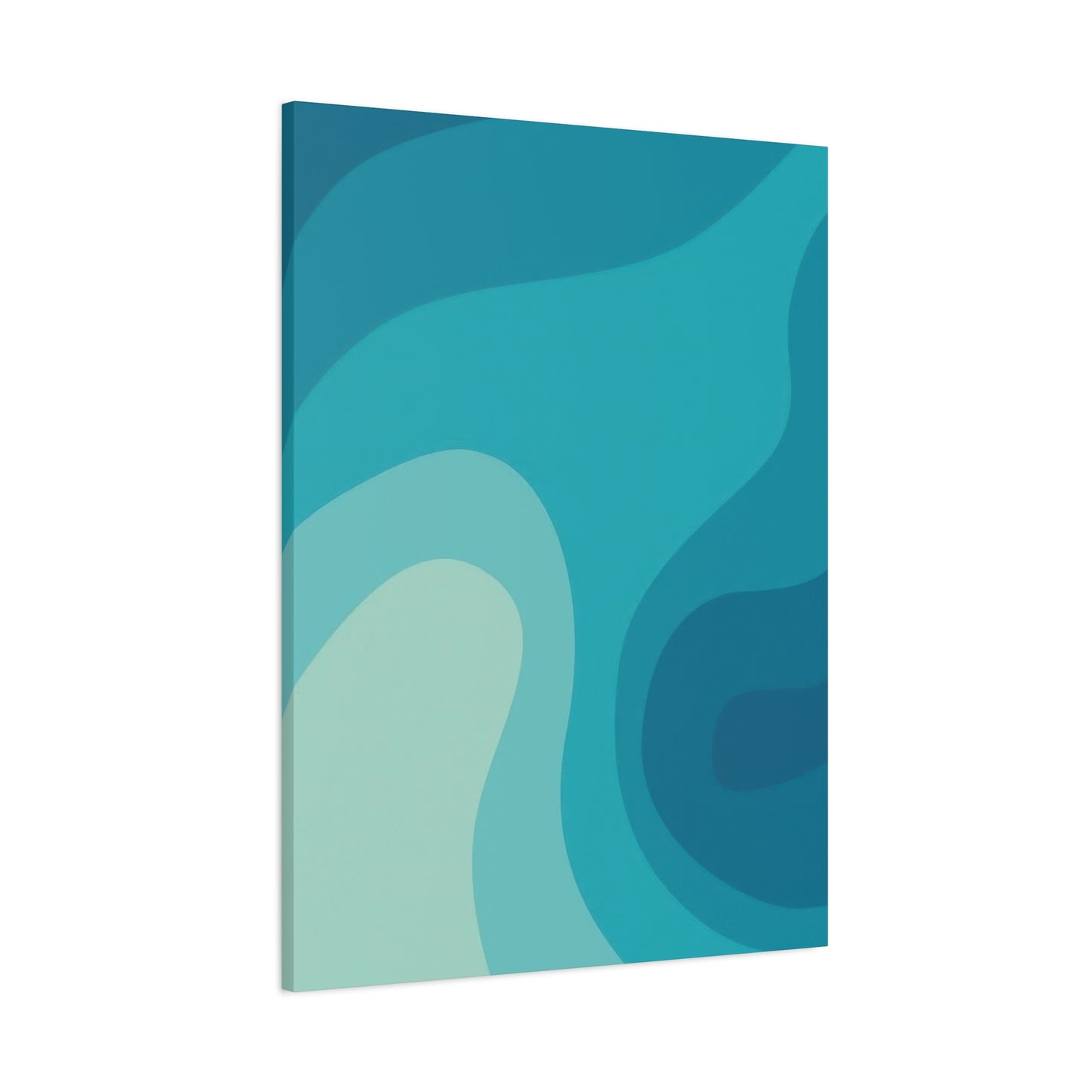
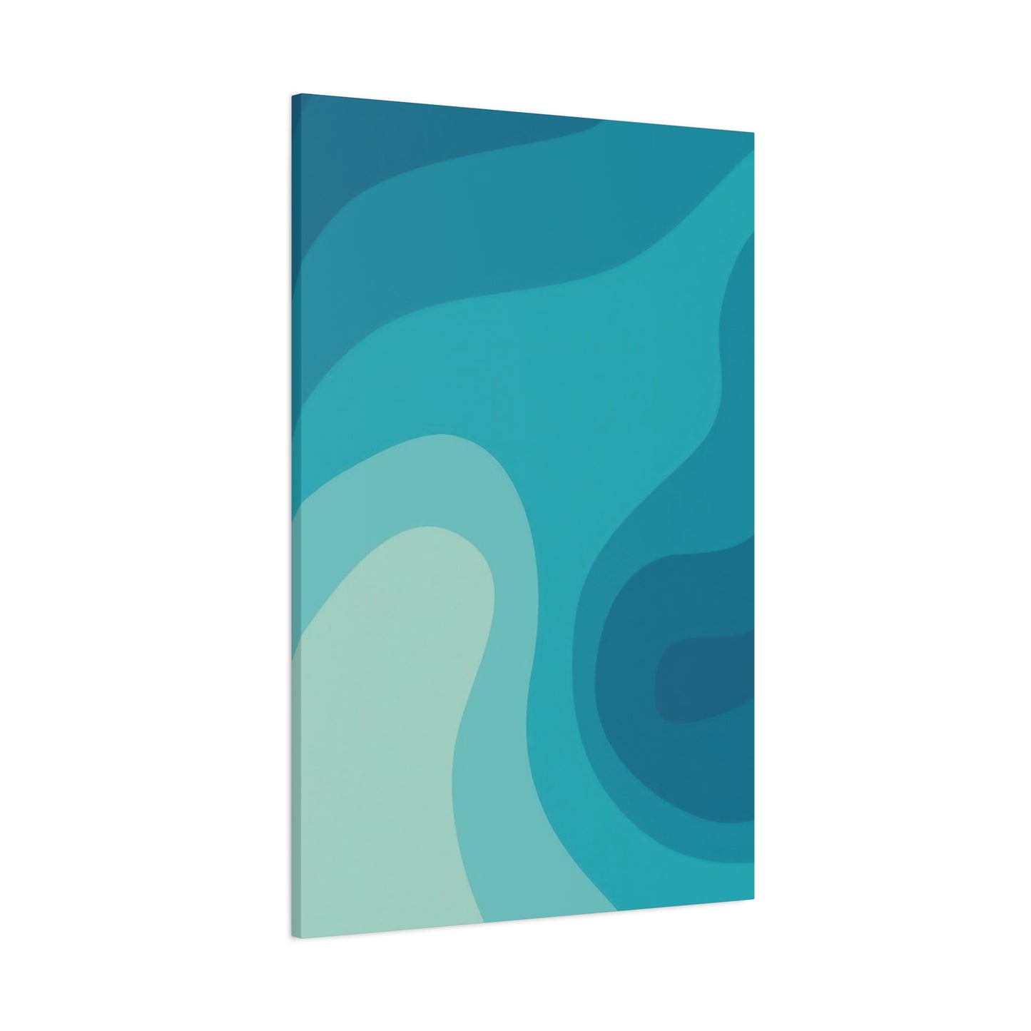
Abstract Ocean Motion: Blue Wave Canvas Ideas
Abstract representations of oceanic movement offer unique opportunities for personal interpretation and emotional connection. Unlike representational art, abstract expressions of water dynamics invite viewers to project their own experiences and emotions onto the canvas, creating deeply personal relationships with the artwork. This subjective quality makes abstract marine art particularly valuable in creating spaces that feel intimately connected to their inhabitants.
The technique of abstracting water forms involves distilling the essence of wave motion into fundamental shapes, colors, and textures. Artists working in this genre focus on capturing the energy and emotion of the ocean rather than its photographic accuracy. Through bold brushstrokes, layered textures, and strategic color placement, these creators communicate the power, grace, and mystery of aquatic environments. The resulting pieces often feature sweeping curves, dynamic diagonals, and organic shapes that suggest movement without explicitly depicting it.
Color selection in abstract ocean artwork plays a crucial role in determining the emotional impact of the piece. Cooler shades evoke calmness and introspection, while deeper navy tones can suggest mystery and depth. Artists often incorporate subtle variations within the blue spectrum, adding touches of seafoam green, pearl white, or soft gray to create dimensional complexity. These nuanced color relationships prevent the artwork from feeling flat or monotonous, maintaining visual engagement over extended viewing periods.
Texture adds another dimension to abstract aquatic art, providing tactile interest that enhances the viewing experience. Many contemporary artists employ mixed media techniques, combining acrylic paints with gels, resins, or other materials to create surface variations that catch light differently throughout the day. This changing quality ensures that the artwork appears slightly different depending on lighting conditions and viewing angles, maintaining freshness and preventing visual fatigue.
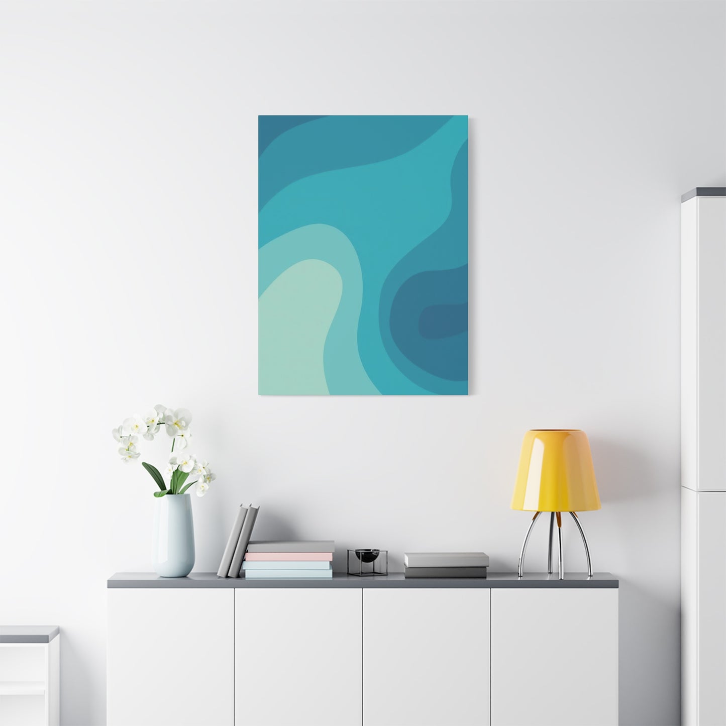
Cool Tones, Calm Spaces: Blue Wave Wall Prints
The psychological impact of color in interior environments has been extensively documented by researchers and designers alike. Cool color temperatures, particularly those found in aquatic settings, possess unique properties that influence mood, perception, and even physiological responses. When we surround ourselves with these cooling hues, we create environments that naturally encourage relaxation, clear thinking, and emotional balance.
The spectrum of blue found in ocean environments ranges from pale sky tints to deep midnight shades, each variation carrying its own psychological associations and design implications. Lighter aquatic tones create feelings of openness and airiness, making spaces feel larger and more breathable. These softer shades work exceptionally well in smaller rooms or areas with limited natural light, as they reflect available illumination and prevent spaces from feeling cramped or oppressive.
Medium-range oceanic hues strike a balance between tranquility and presence, providing enough visual weight to anchor a space without overwhelming it. These mid-tone blues work beautifully as transitional elements, bridging lighter and darker design features within a room. Their versatility makes them ideal for spaces that serve multiple functions, as they provide visual interest without dominating the environment or limiting future design flexibility.
Deeper aquatic shades introduce drama and sophistication to interiors, creating focal points that command attention while maintaining the calming qualities associated with water imagery. These richer tones work particularly well in larger spaces with abundant natural light, where they can be fully appreciated without making rooms feel smaller or darker. When incorporating deeper oceanic colors through wall art, consider the proportional relationship between the artwork size and the room dimensions to ensure visual harmony.
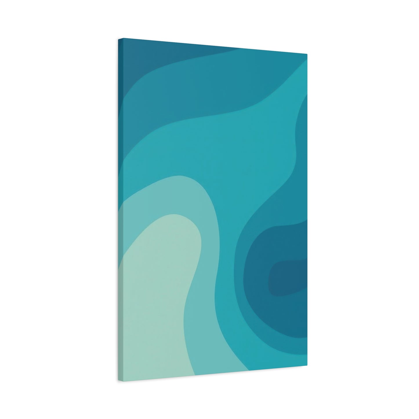
The finish quality of wall prints significantly affects their visual impact and longevity. High-quality printing techniques preserve the subtle gradations and tonal variations that give aquatic imagery its depth and realism. Modern printing technologies, including giclée printing on archival papers or canvas, ensure color accuracy and fade resistance, protecting your investment and maintaining the artwork's beauty for years. When selecting prints, examine the reproduction quality closely, looking for smooth color transitions, sharp details, and rich, saturated hues that accurately represent the original artwork.
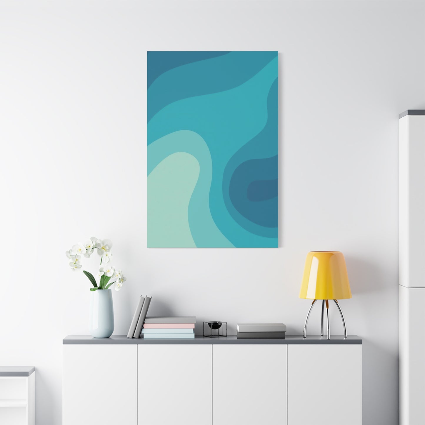
Modern Coastal Aesthetics with Blue Waves Art
Contemporary coastal design has evolved significantly from traditional nautical themes, embracing sophisticated minimalism while maintaining connections to seaside environments. This modern interpretation focuses on essential elements, clean lines, and carefully curated pieces that evoke maritime atmospheres without resorting to obvious beach motifs. Ocean wave artwork serves as the perfect centerpiece for this design approach, providing the necessary connection to coastal environments while maintaining the refined simplicity that characterizes modern aesthetics.
The color palette in modern coastal design extends beyond traditional navy and white combinations, incorporating a broader range of aquatic hues and natural tones. Soft grays reminiscent of weathered driftwood, warm sandy beiges, and various shades of blue and green found in coastal waters create layered, sophisticated color stories. Wave art introduces these colors organically, serving as both inspiration and anchor for the overall design scheme. By pulling accent colors from the artwork, designers create cohesive environments that feel intentionally composed yet effortlessly natural.
Textural contrast plays a vital role in modern coastal interiors, preventing spaces from feeling too smooth or sterile. While the overall aesthetic remains clean and uncluttered, the introduction of varied textures through natural materials, woven elements, and carefully selected artwork adds depth and sensory interest. Ocean wave art contributes to this textural layering through canvas weaves, print substrates, and, in some cases, three-dimensional elements that create actual surface relief. This dimensional quality engages multiple senses, enhancing the overall experience of the space.
Furniture selection in modern coastal rooms favors clean-lined pieces in natural materials or neutral upholstery, creating calm foundations that showcase featured artwork without competition. Low-profile sofas, streamlined dining tables, and minimal case goods provide functionality without visual clutter, directing attention to carefully chosen decorative elements like wave art. The relationship between furniture and artwork should feel balanced, with each element contributing to the overall composition without overwhelming the others.
Soothing Interiors with Cool Blue Wall Art
Creating genuinely soothing interior environments requires thoughtful consideration of multiple design elements working in harmony. Color selection serves as the foundation for mood-setting, with cool aquatic tones proving particularly effective at promoting relaxation and mental clarity. When ocean-inspired wall art introduces these calming colors into a space, it serves as both a visual anchor and a mood regulator, subtly influencing the emotional state of those who occupy the environment.
The neurological response to blue wavelengths has been studied extensively, with research indicating that exposure to blue tones can actually lower heart rate, reduce blood pressure, and decrease anxiety levels. These physiological responses translate into psychological feelings of calmness and security. By incorporating ocean artwork featuring prominent blue tones, we leverage these natural responses to create environments that actively support wellbeing. This represents design functioning not merely aesthetically but therapeutically, with spaces contributing positively to occupants' health.
The visual weight of artwork affects how grounded and stable a space feels. Ocean pieces with substantial presence provide visual anchors that help organize and structure rooms psychologically. This anchoring effect proves particularly valuable in open-concept spaces or rooms with challenging architectural features. A substantial piece of wave art can define seating areas, draw attention away from awkward angles, or provide focal points in otherwise featureless walls, contributing to both aesthetic appeal and functional clarity.
Layering in soothing interiors involves building visual depth through multiple elements at varying distances from walls. Ocean wall art serves as the background layer in this compositional strategy, with furniture, accessories, and textiles adding progressive layers of interest. This dimensional approach prevents spaces from feeling flat or uninspiring while maintaining the overall sense of calm that characterizes truly relaxing environments. Each layer should relate harmoniously to the others, with the wall art establishing the color palette and mood that subsequent layers reinforce.
The Rhythm of the Sea Captured in Canvas
Rhythm in visual art refers to the repetition and variation of elements that create a sense of movement and unity throughout a composition. Ocean waves naturally embody rhythmic qualities through their repetitive yet varied formation, making them ideal subjects for artists interested in exploring rhythm visually. When successfully translated to canvas, this natural rhythm creates artwork that feels alive and dynamic, maintaining viewer interest through implied motion and temporal progression.
The cyclical nature of waves provides artists with inherent rhythmic structure to explore and interpret. From the gradual swell of open ocean waves to the dramatic crash of surf against shorelines, water exhibits patterns that repeat while never duplicating exactly. This combination of pattern and variation creates visual interest that doesn't become predictable or boring. Artists working with wave subjects can emphasize either the repetitive qualities for meditative effect or the variations for dramatic impact, depending on their artistic intentions and the desired emotional response.
Compositional techniques for conveying rhythm include strategic placement of repeated elements, graduated sizing, and directional emphasis. In wave art, these might manifest as multiple wave forms at different distances, creating depth while establishing rhythmic repetition. The spacing between these repeated elements affects the perceived tempo of the piece; closer spacing creates faster, more energetic rhythms, while wider spacing produces slower, more contemplative pacing. Understanding these relationships allows both artists and collectors to select pieces whose inherent rhythm matches the intended function of the space.
Color rhythm operates independently from compositional rhythm but contributes equally to the overall sense of movement in artwork. The alternation between lighter and darker tones, warm and cool colors, or saturated and muted hues creates visual tempo that guides viewers through the composition. In ocean artwork, color rhythm might manifest as the transition from deep water blues to pale foam whites, repeating across multiple waves to establish pattern while allowing for natural variation. This color-based rhythm can be subtle or pronounced depending on artistic approach and intended impact.
Tranquil Blues: Creating Peace with Ocean Wall Art
Peace in interior environments results from multiple contributing factors working synergistically. Visual calm derives from harmonious color relationships, uncluttered presentations, and connections to calming imagery. Ocean wall art contributes to all these factors simultaneously, making it one of the most effective single elements for creating peaceful spaces. The natural associations humans have with water, combined with the inherently calming qualities of blue color wavelengths, create powerful tools for environmental mood-setting.
The psychology of blue extends beyond simple color preference to deeply rooted associations with sky, water, and open space. These elements represent fundamental human needs for freedom, safety, and connection to nature. When we surround ourselves with blue-toned imagery, particularly representations of water, we subconsciously access these positive associations, creating emotional responses that promote peace and contentment. This psychological dimension transforms ocean artwork from mere decoration into a functional element that actively supports mental wellbeing.
Light interaction with ocean artwork affects both its appearance and its contribution to room ambiance. Natural light brings out the full range of tones and details in wave imagery, creating dynamic presentations that change throughout the day. Morning light might emphasize cooler tones, while afternoon sun brings warmth and depth. This changing quality keeps artwork feeling fresh and prevents visual stagnation. When placing ocean art, consider how natural light will interact with it at different times, potentially using this variation as a design feature rather than trying to eliminate it.
The size relationship between artwork and viewing distance impacts emotional effect. Large pieces viewed from standard seating distances create immersive experiences, allowing viewers to feel surrounded by the calming imagery. Smaller pieces require closer viewing, creating more intimate interactions that might suit private spaces like bedrooms or reading nooks better than public areas. Understanding these relationships allows for strategic placement that maximizes the peaceful impact of ocean artwork throughout a home.
Abstract Waterforms: Cool Blue Waves for Modern Spaces
Abstract interpretation of water allows artists to move beyond literal representation toward emotional and conceptual expression. This artistic freedom produces diverse works that capture water's essential qualities while leaving room for personal interpretation and emotional projection. For modern spaces that prize individuality and artistic sophistication, abstract waterform art offers opportunities to introduce aquatic elements without resorting to obvious or expected imagery.
The process of abstracting water forms requires identifying and emphasizing specific qualities while minimizing or eliminating realistic details. An artist might focus on color relationships, emphasizing the transitions between light and dark tones found in water while abandoning recognizable wave shapes. Alternatively, they might prioritize movement and energy, using dynamic brushwork and compositional strategies that convey water's motion without depicting actual waves. These varied approaches produce distinctly different results, all valid expressions of water's essential nature.
Geometric abstraction offers one approach to representing water, breaking fluid forms into angular shapes and structured compositions. This intellectual approach appeals to viewers who appreciate order and intentional design, even when depicting something as organic as water. Geometric water abstractions might use triangular forms to suggest wave peaks, rectangular color blocks to indicate depth variations, or circular elements to reference water's cyclical nature. The contrast between water's fluidity and geometric rigidity creates visual tension that engages viewers and provokes contemplation.
Gestural abstraction takes the opposite approach, emphasizing spontaneity, emotion, and physical expression in paint application. Artists working gesturally might apply paint in sweeping motions that mirror wave movement, creating energetic surfaces that record the physical act of creation. This approach produces work that feels alive and immediate, capturing water's dynamic energy more than its appearance. Gestural abstract waterforms suit modern spaces that embrace energy and movement, complementing active lifestyles and dynamic personalities.
Refreshing Décor Ideas Using Blue Ocean Art
Refreshing existing spaces without complete renovation requires strategic introduction of new elements that shift the overall feeling without requiring wholesale changes. Ocean-themed wall art serves this purpose exceptionally well, bringing new color, energy, and visual interest to tired spaces. The psychological association between water and renewal makes ocean art particularly effective for refresh projects, as it naturally suggests freshness, cleanliness, and new beginnings.
The focal point strategy involves introducing a substantial piece of ocean artwork as the primary visual anchor for a space, then adjusting surrounding elements to complement it. This approach allows for significant impact without extensive changes, as the new artwork draws attention and establishes fresh aesthetic direction. Smaller modifications to accessories, textiles, or lighting complete the transformation, creating spaces that feel renewed without the time and expense of major remodeling.
Color extraction from ocean artwork guides coordinated updates throughout a space. By identifying accent colors within a new wave piece, you can select throw pillows, decorative objects, or textile elements that harmonize with the art while introducing the new color palette throughout the room. This color-threading technique creates cohesion between the artwork and its environment, making the addition feel intentional and integrated rather than arbitrarily placed.
Seasonal rotation of artwork offers opportunities for ongoing refreshment without permanent commitment. A collection of ocean pieces in varying styles or color intensities can be rotated based on season, mood, or changing preferences. Lighter, airier wave art might suit spring and summer months, while deeper, more dramatic ocean pieces could transition spaces into fall and winter. This rotating approach keeps spaces feeling fresh and prevents the visual fatigue that can result from unchanging environments.
Gallery wall creation around a central ocean piece builds visual interest and allows for personal expression through curated arrangements. Starting with a substantial wave canvas as the anchor, surrounding it with complementary smaller pieces, personal photographs, or three-dimensional objects creates dynamic wall compositions that tell stories and reflect individual personalities. This collected approach suits eclectic and transitional design styles while maintaining the refreshing coastal influence introduced by the primary ocean artwork.
The Art of Motion: Dynamic Blue Waves on Canvas
Capturing motion in static media presents fundamental artistic challenges that have occupied painters for centuries. Water's constant movement makes it particularly challenging and rewarding subject matter, requiring artists to suggest change, energy, and temporal progression within frozen moments. Successful wave art doesn't simply show what water looks like but conveys how it moves, creating illusions of motion that engage viewers and bring artwork to life.
Photographic reference for wave paintings captures specific instants in water's movement, but artists must carefully select which moments to depict. The peak of wave formation, just before breaking, often provides the most dynamic and visually interesting compositions. This moment captures maximum energy and tension, with the wave's structure most clearly defined while its potential for dramatic change remains evident. Artists might also choose the moment of breaking, with spray and foam creating explosive visual impact, or the aftermath, with collapsing water creating complex, chaotic patterns.
Directional emphasis guides viewers' eyes through wave compositions, creating visual paths that mirror actual water movement. Diagonal lines suggest action and change more effectively than horizontal or vertical orientations, making them valuable tools for conveying motion. Artists employ these diagonal elements through wave angles, horizon placement, and compositional structure, creating energetic presentations even within rectangular formats. The direction of implied movement also affects emotional response; waves moving toward viewers feel engaging and immediate, while those moving across the picture plane create calmer, more observational experiences.
Color temperature shifts enhance the perception of depth and movement in wave art. Water approaching viewers might be rendered in warmer, more saturated tones, while distant water appears cooler and less intense. This atmospheric perspective creates three-dimensional illusion while also suggesting temporal progression, as viewers perceive near water as present and distant water as past or future. These subtle color manipulations add sophistication to wave art, creating layered viewing experiences that reward extended attention.
Surface texture in paint application contributes significantly to perceived motion in wave artwork. Smooth, fluid brushwork suggests gentle, continuous movement, while impasto techniques with visible texture convey rougher, more turbulent water. Some artists employ palette knife application for crisp, angular edges that suggest the sharp geometry of breaking waves, while others use soft blending for ethereal, dreamlike water renditions. These textural choices affect not just visual appearance but emotional impact, with smooth surfaces feeling calming and rough textures creating excitement or tension.
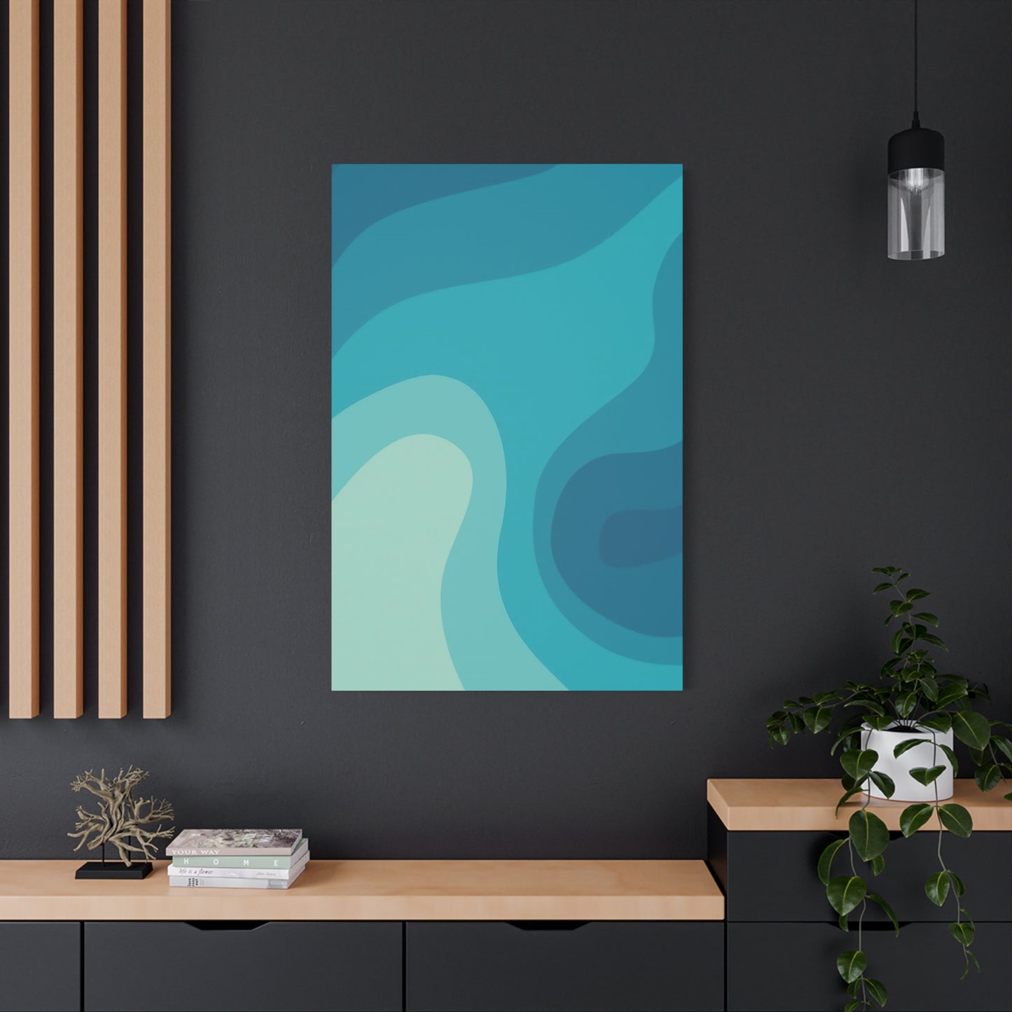
Deep Sea Hues: Wall Art for Coastal Interiors
The color spectrum found in deep ocean waters differs significantly from the brighter, clearer tones of shallow coastal areas. These darker, more saturated blues and blue-greens carry distinct emotional qualities and design implications. While lighter aquatic tones suggest airiness and calm, deeper sea hues introduce mystery, drama, and sophisticated depth to interiors. Coastal design incorporating these richer colors achieves elegance and maturity that lighter palettes sometimes lack.
The psychological impact of deeper ocean colors includes associations with depth, mystery, and introspection. These tones encourage contemplation and create sophisticated, adult atmospheres distinct from the breezy casualness of traditional beach décor. Rooms featuring deep sea artwork take on gallery-quality seriousness while maintaining the calming, natural qualities that make ocean imagery universally appealing. This balance between sophistication and accessibility makes deep sea hues particularly valuable in formal living spaces, studies, or master bedrooms where mature aesthetics are desired.
Lighting consideration becomes crucial when incorporating darker ocean artwork, as insufficient illumination can make rich blues appear muddy or allow them to recede visually into walls. Proper lighting reveals the complexity and beauty of deep sea hues, showcasing the subtle variations and dimensional qualities that make them interesting. Natural light sources should be maximized when possible, with strategic placement near windows allowing daylight to bring out the full range of tones. Supplemental artificial lighting, including picture lights or track systems, ensures that artwork remains visible and impactful during evening hours.
Contrast management in rooms featuring deep sea artwork requires balancing the dark, saturated tones with lighter elements that prevent spaces from feeling heavy or oppressive. Crisp white trim, light-toned flooring, or neutral furniture upholstery provides visual relief and allows the artwork's rich colors to stand out rather than blend into dark walls. This high-contrast approach creates dynamic, visually interesting spaces where deep ocean artwork serves as a bold focal point against lighter surroundings.
Fluid Harmony: Blue Wave Art for Calm Environments
Harmony in design refers to the pleasing arrangement of elements that feel unified and balanced. Achieving harmony requires careful consideration of relationships between colors, shapes, textures, and proportions. Ocean wave artwork contributes to harmonious environments through its inherent balance, organic forms, and naturally coordinated color palettes. When properly integrated into design schemes, wave art enhances overall harmony rather than disrupting it, supporting the creation of balanced, peaceful spaces.
The organic nature of wave forms provides visual contrast to the predominantly geometric shapes found in architecture and furniture. This contrast between organic and geometric creates visual interest while maintaining balance, preventing spaces from feeling either too rigid or chaotically informal. The curves and flowing lines in wave art soften hard angles and straight edges, creating more welcoming, comfortable environments. This softening effect is particularly valuable in modern interiors with strong architectural geometry that might otherwise feel cold or uninviting.
Color harmony in ocean artwork results from the limited, naturally related palette found in water scenes. Blues, greens, and neutral tones occur together in nature, creating inherently harmonious combinations that translate beautifully to art and design. When ocean wave artwork introduces these naturally coordinated colors into a space, achieving color harmony in the surrounding design becomes simpler and more intuitive. Pulling accent colors from the artwork ensures coordination, as these colors already harmonize within the piece itself.
Proportional harmony between artwork and furniture prevents spaces from feeling imbalanced or awkward. The visual weight of ocean art should relate appropriately to nearby furnishings, with neither overwhelming the other. Large-scale wave canvases pair well with substantial furniture pieces, while smaller artworks suit more delicate or minimal furnishings. When proportions align correctly, spaces feel intentionally composed and visually restful, supporting the calm atmosphere that harmonious design creates.
Repetition with variation creates rhythm and unity while preventing monotony. In spaces featuring ocean wave art, this principle might manifest through repeating the blue color family in various intensities throughout the room, or echoing the curved forms of waves in furniture silhouettes or architectural details. These subtle repetitions tie design elements together, creating cohesive environments where everything feels related and purposeful. The variation aspect prevents this repetition from becoming boring, ensuring that while elements relate to each other, they maintain individual interest and character.
Ocean Whisper: Cool Blue Waves That Inspire Peace
The gentle, constant sound of ocean waves has long been recognized for its calming properties, often incorporated into meditation practices and sleep aids. Visual representations of peaceful waves can evoke similar responses, creating what might be termed visual whispers that quietly promote tranquility without demanding attention. This subtle quality makes gentle wave art particularly valuable in spaces where peace and relaxation are primary goals, such as bedrooms, meditation areas, or quiet reading nooks.
The concept of visual whispering involves artwork that communicates softly rather than shouting for attention. Gentle wave art achieves this through subtle color transitions, soft edges, and compositions that suggest rather than assert. These pieces don't dominate spaces but instead create gentle presences that support rather than direct attention. This understated quality allows them to function effectively in intimate spaces where aggressive or dramatic artwork might feel intrusive or overwhelming.
Color saturation levels significantly affect whether artwork reads as assertive or gentle. Highly saturated colors demand attention and create energetic impact, while softer, less saturated tones communicate quietly and create calm atmospheres. Wave art rendered in muted, desaturated blues and greens achieves the whisper quality that promotes peace, never jarring or startling viewers but instead offering consistent, gentle visual comfort. These softer palettes work particularly well in spaces used during evening hours, when eyes are tired and prefer gentle visual experiences.
Compositional simplicity enhances the peaceful quality of gentle wave art. Complex, busy compositions require mental effort to process and understand, creating subtle cognitive demands that interfere with relaxation. Simple compositions with clear focal points and uncluttered arrangements allow minds to rest, requiring minimal processing while still providing visual interest. The most peaceful wave art often features single waves or simple arrangements of a few wave forms, rendered with enough detail to satisfy visual curiosity but not so much complexity as to create mental work.
Abstract Aquatic Beauty in Blue Wave Wall Prints
Abstract aquatic art distills the essence of water into pure visual poetry, transcending literal representation to capture emotional truths about oceanic environments. This artistic approach values feeling over accuracy, allowing artists to communicate their emotional responses to water rather than documenting its appearance. The resulting works often carry powerful emotional impact precisely because they bypass intellectual analysis and speak directly to viewers' emotions and subconscious associations.
The freedom inherent in abstraction allows for highly personal artistic expressions that nonetheless communicate universally. While an abstract wave piece might not resemble any specific body of water, it can still successfully convey the feeling of being near the ocean, the power of waves, or the peace of gentle waters. This paradox of personal expression achieving universal communication makes abstract aquatic art particularly valuable, as it allows for individual artistic vision while maintaining broad appeal and accessibility.
Experimentation with media and technique in abstract aquatic work produces diverse results that expand the possibilities of ocean-inspired art. Some artists employ unconventional materials like sand, shells, or crushed glass, incorporating actual ocean elements into abstract compositions. Others use traditional media in innovative ways, perhaps pouring and manipulating fluid acrylics to create chance effects that mirror water's unpredictability. These experimental approaches keep abstract aquatic art fresh and exciting, preventing the genre from becoming predictable or stale.
The tension between control and chaos in abstract water art mirrors the dual nature of ocean environments themselves. Water can appear both utterly chaotic in stormy conditions and perfectly ordered in calm states. Abstract artists working with aquatic themes often explore this tension, incorporating both controlled, intentional elements and unpredictable, chance-driven aspects. This combination creates visual complexity and maintains viewer interest, as eyes discover both planned compositions and happy accidents that occurred during creation.
Serenity in Motion: The Allure of Blue Waves
The apparent paradox of serenity and motion coexisting in wave art reflects water's dual nature as both calming presence and dynamic force. This combination proves particularly alluring, offering simultaneous reassurance and excitement, peace and energy. Wave art that successfully captures both qualities achieves a rare balance that appeals broadly while avoiding the extremes of either static boredom or chaotic overstimulation.
The visual rhythm established by wave formations creates predictable patterns that comfort while allowing for variations that intrigue. This balance between pattern and variation characterizes many naturally occurring phenomena that humans find appealing, from the changing yet cyclical seasons to the individual uniqueness of snowflakes within overall pattern consistency. Wave art taps into this fundamental human attraction to ordered variation, creating visual experiences that feel both familiar and fresh simultaneously.
Color temperature modulation within wave art contributes significantly to the serene-yet-dynamic quality. Cool blues dominate, establishing overall calmness, while strategic introduction of warmer tones in foam, spray, or reflected light creates energy and movement. This temperature variation prevents monotony while maintaining the predominantly calming effect that makes wave art suitable for relaxation spaces. The interplay between cool and warm creates visual vibration that suggests energy without overwhelming the overall peaceful quality.
The transparency and opacity variations in water create visual complexity that engages attention without demanding it. Deep water appears opaque and solid, while cresting waves reveal translucent qualities as light passes through thin water sheets. Artists who capture these optical variations create depth and interest in their work, inviting extended viewing as eyes explore the interplay of solid and transparent areas. This optical complexity contributes to the allure of wave art, providing visual rewards for sustained attention.
The temporal quality suggested by captured motion adds narrative interest to wave art. Viewers naturally imagine the progression of the depicted wave, mentally completing the motion suggested by the frozen instant. This imaginative engagement creates active rather than passive viewing experiences, with minds participating in completing the story that eyes begin. The allure of this interactive quality keeps wave art interesting over time, as repeated viewings can prompt different imaginative completions of the suggested motion.
Coastal Cool: Modern Wall Art Inspired by the Sea
Contemporary interpretations of coastal themes have evolved significantly beyond traditional nautical aesthetics, embracing sophisticated minimalism and artistic innovation. Modern coastal art draws inspiration from ocean environments while avoiding clichéd references to anchors, ships, or lighthouses. This refined approach captures the essence of coastal living through color, form, and atmosphere rather than obvious symbolism, resulting in artwork that feels fresh, sophisticated, and timeless.
The color palette of modern coastal art extends beyond navy and white to encompass the full spectrum of seaside hues. Soft grays reminiscent of foggy mornings, warm sandy tones, seafoam greens, and various blue intensities from pale sky to deep water all contribute to contemporary coastal palettes. This expanded color range allows for nuanced, sophisticated color stories that feel connected to coastal environments without resorting to predictable combinations. Modern wave art often incorporates multiple subtle tones within the blue-green family, creating depth and interest through color variation rather than dramatic contrast.
Material innovation in modern coastal art includes exploration of non-traditional substrates and presentation methods. Beyond conventional canvas prints, contemporary artists and designers employ materials like acrylic, metal, wood panels, or even textured papers that add dimensional interest to wave imagery. These material choices affect not just the appearance of artwork but also how it interacts with light and space, creating varying effects throughout the day as lighting conditions change. The materiality of modern coastal art contributes significantly to its overall impact and integration within contemporary interiors.
The graphic quality of much modern coastal art distinguishes it from traditional realistic seascapes. Clean lines, simplified forms, and bold color blocking create striking visual impact while maintaining recognizable connections to ocean imagery. This graphic approach aligns with contemporary design preferences for clarity and impact, creating artwork that reads clearly even from a distance while revealing additional interest upon closer inspection. The balance between immediate impact and sustained interest characterizes successful modern coastal art.
Minimalist Ocean Art for Tranquil Living Spaces
Minimalism applied to ocean imagery strips away extraneous details to reveal essential forms and colors. This reductive process creates artwork that communicates powerfully through simplicity, relying on composition, color, and fundamental shapes rather than elaborate details or complexity. The result feels zen-like and meditative, perfectly suited to tranquil living spaces where visual rest and mental calm are priorities.
The editing process in creating minimalist ocean art involves ruthless elimination of non-essential elements. Artists working in this mode must identify what absolutely must be retained to communicate oceanic essence, discarding everything else. This might mean reducing a complex seascape to a simple horizon line and graduated color field, or distilling wave forms to their most basic geometric components. The discipline required for this reduction results in powerful, focused images that don't waste visual energy on superfluous details.
Negative space plays a crucial role in minimalist ocean compositions, often occupying more of the canvas than positive imagery. This generous use of emptiness creates breathing room for both eyes and minds, preventing visual overwhelm and supporting the tranquil quality these pieces seek to achieve. In wave art, negative space might represent sky or calm water, providing simple, restful areas that balance more active wave forms. The relationship between positive and negative space creates composition, with negative areas contributing as actively as depicted elements.
Monochromatic or near-monochromatic color schemes characterize much minimalist ocean art, with subtle variations within a single color family creating all necessary interest and depth. These limited palettes create unified, cohesive images that feel calm and considered rather than busy or chaotic. A minimalist wave piece might employ only various tones of blue-gray, using lightness and darkness rather than different hues to suggest form and space. This color restraint results in sophisticated, mature artwork that doesn't rely on contrast or variety for impact.
Capturing the Flow: Blue Wave Art for Modern Homes
The challenge of depicting water's constant motion has inspired artists throughout history, with modern interpretations bringing contemporary perspectives to this timeless subject. Capturing flow involves more than documenting appearance; it requires translating kinetic energy and temporal progression into static visual form. Modern wave art approaches this challenge through various techniques and perspectives, producing diverse results that share the common goal of conveying water's essential fluidity.
Photography-based wave art captures genuine moments of water motion, freezing instants that reveal forms and patterns invisible to real-time observation. High-speed photography can show precise details of splash and spray formations, while longer exposures create blur effects that suggest motion through time. These photographic approaches offer authenticity that painted interpretations cannot match, documenting actual water behavior rather than artistic interpretation. The best photographic wave art transcends mere documentation, however, achieving artistic vision through framing, timing, and post-processing decisions.
Painted wave art allows for interpretive freedom impossible in photography, with artists able to emphasize, minimize, or completely reimagine water's appearance to achieve desired effects. Some painters work toward photorealism, using observation and skill to recreate water's appearance with remarkable accuracy. Others embrace painting's interpretive possibilities, using color, texture, and composition expressively to communicate emotional responses to water rather than literal appearance. Both approaches offer value, with selection depending on individual preference and design context.
Digital art techniques enable effects impossible through traditional media, with software allowing manipulation of images and creation of entirely synthetic water renderings. Digital artists can combine multiple exposures, adjust colors beyond natural ranges, or create completely imagined aquatic scenes. The flexibility of digital tools supports experimentation and revision difficult or impossible with physical media. As digital art gains acceptance in fine art contexts, expect increasing prominence of digitally created wave imagery in modern homes seeking cutting-edge aesthetics.
Water-Inspired Art That Brings Coolness Indoors
The psychological association between water and coolness extends beyond temperature to emotional qualities, with aquatic imagery naturally suggesting freshness, clarity, and rejuvenation. This cooling effect makes water-inspired art particularly valuable in spaces where refreshment and energy are desired, from home offices needing mental clarity to living areas seeking revitalization. The cooling influence operates both literally, through color temperature effects, and metaphorically, through symbolic associations with water's refreshing properties.
Color temperature fundamentals explain how blue-dominant artwork creates perceptual cooling effects. Cool colors recede visually and feel less advancing than warm tones, creating spacious, open sensations. In psychological terms, cool colors reduce arousal and promote calm, contributing to the refreshing quality they project. Water art's predominantly cool palette naturally delivers these effects, making spaces feel literally cooler even when actual temperature remains unchanged. This perceptual cooling can increase comfort and reduce perceived need for climate control.
The symbolic cleanliness associated with water translates into feelings of freshness and renewal when water imagery appears in interior spaces. Water cleanses and purifies, associations we carry from practical experience into symbolic understanding. Spaces featuring water art subconsciously benefit from these purity associations, feeling cleaner and fresher than identical spaces without aquatic imagery. This psychological effect, though subtle, contributes meaningfully to overall spatial experience and occupant satisfaction.
Seasonal considerations make water art particularly valuable during warmer months when cooling effects are most appreciated. Some designers maintain collections allowing seasonal rotation, with water pieces displayed prominently during spring and summer and potentially replaced with warmer-toned work during fall and winter. This seasonal approach keeps interiors feeling aligned with outdoor conditions and prevents the potential winter chill that abundant cool tones might create during cold months. However, year-round display works equally well in climates where cooling effects are perpetually welcomed.
The energizing aspect of water imagery balances its calming qualities, creating refreshing effects that invigorate rather than sedate. While blue tones promote calm, the dynamic movement often present in wave art introduces energy and vitality that prevent spaces from feeling too subdued. This balance between calm and energy characterizes genuinely refreshing environments, which both restore and invigorate simultaneously. Water art achieves this balance naturally, making it ideal for spaces requiring both concentration and relaxation.
The Tranquil Power of Cool Blue Ocean Art
The seemingly contradictory combination of tranquility and power in ocean imagery reflects water's dual nature as both gentle and forceful. This paradox creates compelling artwork that appeals to multiple desires simultaneously, offering both the peace we seek in our homes and the inspiration that comes from witnessing natural power. Ocean art successfully embodying both qualities achieves rare balance that remains interesting and emotionally satisfying over extended time.
The scale of ocean forces humbles and inspires simultaneously, reminding viewers of nature's magnitude while offering connection to something larger than individual concerns. This perspective shift can be psychologically valuable, temporarily lifting attention from minor stresses to contemplate broader contexts. Ocean art depicting powerful waves provides this perspective without requiring actual ocean access, bringing philosophical and emotional benefits of coastal living to inland locations.
The controlled expression of power in artistic wave renderings makes natural force accessible and non-threatening. While actual storms and large waves can be dangerous, artistic representations allow safe contemplation of these forces. We can appreciate ocean power aesthetically without risk, gaining inspiration from strength and beauty without exposure to actual danger. This safe access to natural power makes ocean art particularly appealing, offering connection to something greater without vulnerability.
The meditative quality of watching actual waves translates surprisingly well to static imagery through artistic skill and viewer engagement. While artwork cannot literally move, successful wave pieces suggest motion and change sufficiently to trigger similar meditative responses as actual wave watching. The repetitive yet varied forms, the flowing compositions, and the inherent rhythm all contribute to this meditative quality. Viewers can experience some of the stress-reducing benefits of beach time through regular engagement with quality ocean art.
The timeless quality of ocean subjects ensures lasting relevance and appeal. Water has moved humans aesthetically and emotionally throughout history and will continue doing so indefinitely. Unlike trendy subjects or styles that date quickly, ocean imagery maintains perpetual relevance. This timelessness makes ocean art wise long-term investment, as pieces maintain emotional impact and aesthetic appeal regardless of changing design trends or personal life circumstances.
Elegant Simplicity: Blue Wave Wall Décor Ideas
Elegance through simplicity represents sophisticated design philosophy that values restraint and refinement over elaboration. In wave wall décor, this manifests as carefully selected pieces that communicate clearly without excessive detail or complexity. The discipline required to achieve elegant simplicity results in timeless presentations that avoid dating and maintain appeal across changing trends and personal evolution.
Single statement pieces create focal points that organize entire rooms without requiring supporting elements. A substantial wave canvas in a simple frame needs nothing more, commanding attention and establishing design direction through presence alone. This confident approach to display demonstrates design maturity and aesthetic self-assurance, resisting the temptation to over-decorate or fill every surface. The breathing room around a single important piece allows it to be fully appreciated without competition or distraction.
Symmetrical presentation of paired wave pieces creates formal, balanced displays suited to traditional or transitional interiors. Two identical or complementary wave canvases flanking a focal point like a fireplace or headboard establish order and intentionality. This classical approach to arrangement feels timeless and sophisticated, avoiding the potential chaos of asymmetrical groupings while maintaining visual interest through the pairing. Symmetry creates instant elegance through its implied order and deliberation.
Monochromatic framing allows artwork to dominate by minimizing frame visibility and impact. Simple white, black, or natural wood frames in slim profiles frame without competing, directing all attention to the artwork itself. This self-effacing approach to framing demonstrates confidence in the artwork's ability to carry the display without elaborate support. The clean, simple lines of minimal framing align with contemporary aesthetics while remaining compatible with traditional settings through their non-intrusive presence.
Strategic lighting elevates simple wave displays from decoration to art installation, demonstrating serious attention to presentation. Picture lights, track lighting, or recessed fixtures that illuminate artwork create gallery-quality presentations that signal the importance and value placed on the pieces. This lighting investment transforms how artwork appears and how viewers perceive it, lending legitimacy and significance that encourages serious appreciation rather than casual glancing.
Modern Marine Vibes with Blue Wave Canvases
Contemporary interpretations of marine themes embrace current design sensibilities while maintaining connections to ocean environments. Modern marine aesthetics avoid literal nautical references in favor of abstracted, sophisticated approaches that feel current and relevant. Blue wave canvases serve as perfect vehicles for modern marine vibes, offering clear ocean connections without resorting to anchors, ropes, or other obvious maritime symbols.
The industrial-meets-natural aesthetic characterizes much modern marine design, combining raw materials like concrete, metal, and wood with organic forms and natural colors. Wave canvases bridge these seemingly opposite sensibilities, bringing nature's forms into industrial contexts without creating discord. The juxtaposition of organic wave imagery against industrial materials creates visual tension that defines contemporary design, demonstrating how opposites can complement rather than contradict.
The global influence on modern marine aesthetics incorporates design principles and references from various coastal cultures. Rather than defaulting to American or European beach house traditions, modern marine design draws inspiration from Mediterranean, Asian, Caribbean, and other coastal traditions. This global perspective creates richer, more diverse aesthetic possibilities. Wave art reflecting this global awareness might incorporate color palettes, compositional approaches, or artistic techniques from various cultural traditions, creating fusion aesthetics that feel both familiar and novel.
The sustainability consideration increasingly important in modern design extends to art selection and display. Environmentally conscious consumers seek artwork created and presented with minimal environmental impact. This might mean selecting prints on recycled or sustainable materials, choosing local artists to reduce shipping impacts, or ensuring that ocean-themed art doesn't contribute to ocean harm. The irony of ocean art produced through environmentally damaging processes isn't lost on thoughtful consumers, who increasingly align purchasing with values.
Conclusion
The incorporation of cool blue wave art into contemporary living spaces represents far more than simple decoration; it embodies a profound connection between human psychology, natural beauty, and thoughtful design. Throughout this comprehensive exploration, we have examined how ocean-inspired artwork serves multiple functions simultaneously, acting as aesthetic enhancement, psychological support, and meaningful connection to the natural world. The versatility and universal appeal of wave imagery ensure its continued relevance across changing design trends and evolving personal circumstances.
The psychological benefits of surrounding ourselves with aquatic imagery cannot be overstated. The calming effects of blue color wavelengths, combined with the meditative qualities of flowing water forms, create environments that actively support mental health and emotional wellbeing. In our increasingly stressful, technology-saturated world, these visual sanctuaries provide necessary respite and restoration. The accessibility of these benefits through simple artwork placement makes cool blue wave art one of the most cost-effective wellness investments available to contemporary homeowners.
The design versatility of ocean wave art allows seamless integration into virtually any aesthetic approach, from ultra-modern minimalism to traditional coastal themes. This adaptability ensures that regardless of existing décor or future design evolution, appropriate wave artwork exists to enhance and complement. The range of available interpretations, from photorealistic documentation to abstract expression, provides options for every taste and sensibility. This diversity within the ocean art category prevents aesthetic limitation while maintaining thematic coherence.
