


Underwater Harmony: Styling Coral Symphony Wall Art for a Serene and Vibrant Interior
The world of interior design continuously evolves, bringing fresh perspectives and innovative approaches to transforming living spaces into personal sanctuaries. Among the most captivating trends emerging in contemporary home décor is the incorporation of ocean-inspired artwork that captures the essence of coastal beauty while maintaining sophisticated aesthetic appeal. This comprehensive exploration delves into the magnificent realm of coral-toned wall art, examining how these stunning pieces can revolutionize your interior spaces while creating an atmosphere of warmth, elegance, and tranquility.
A Celebration of Color and Harmony in Coastal Design
The marriage of vibrant coral shades with harmonious design elements creates an extraordinary visual experience that transcends traditional wall decoration. When considering artwork that celebrates the interplay between color and composition, the coral palette offers an unparalleled opportunity to infuse spaces with both energy and serenity. This unique combination stems from the natural world, where ocean depths reveal breathtaking displays of color that have captivated humanity for centuries.
The celebration of these hues goes beyond simple decoration, representing a deeper connection to nature and the calming influence of coastal environments. Interior designers and homeowners alike have discovered that incorporating these warm, inviting tones can dramatically alter the emotional atmosphere of any room. The psychological impact of coral shades has been extensively studied, revealing their ability to promote feelings of comfort, creativity, and social connection while simultaneously providing a sense of grounding and stability.
When artwork celebrates the harmony between multiple coral tones, the result is a sophisticated visual symphony that engages viewers on multiple levels. The layering of different intensities and saturations creates depth and movement, drawing the eye across the canvas in a natural, flowing pattern that mirrors the organic movements found in ocean currents. This artistic approach transforms static wall hangings into dynamic focal points that seem to shift and evolve with changing light conditions throughout the day.
The celebration aspect also extends to how these pieces interact with surrounding décor elements. The versatility of coral tones allows them to complement a wide range of interior styles, from minimalist contemporary spaces to more traditional settings. This adaptability makes artwork featuring these colors an excellent investment for homeowners who appreciate flexibility in their design choices, as the pieces can transition seamlessly through various decorating phases and style evolutions.
Furthermore, the harmonious qualities of well-executed coral artwork contribute to creating balanced, cohesive interiors where every element works together to support the overall design vision. Rather than competing with other decorative elements, these pieces enhance and elevate the entire space, serving as both anchor and accent depending on the specific needs of the room.
Ocean Elegance and the Beauty of Marine-Inspired Artwork
The ocean has eternally served as a muse for artists, offering endless inspiration through its constantly changing moods, colors, and textures. Translating this natural elegance into wall art requires a delicate balance between capturing the raw power of the sea and presenting it in a manner that enhances residential spaces. The beauty of ocean-inspired pieces lies in their ability to evoke the majesty of coastal environments while maintaining the sophistication necessary for refined interior settings.
Marine-inspired artwork featuring coral elements brings a unique form of elegance that distinguishes itself from other nature-themed décor. Unlike the cool blues and greens typically associated with water themes, coral tones introduce warmth that makes spaces feel more inviting and personally connected. This warmth transforms the potentially distant concept of the ocean into something intimate and accessible, allowing homeowners to experience the restorative qualities of coastal environments without the literal presence of water.
The elegance inherent in these pieces stems from their ability to suggest rather than explicitly depict. Abstract interpretations of ocean themes offer viewers the opportunity to engage their imagination, seeing different elements and meanings with each viewing. This interpretive quality ensures that the artwork remains engaging over time, never becoming static or overly familiar. The subtle variations in tone and texture invite closer examination, revealing new details and appreciating nuances that might not be immediately apparent.
Creating ocean elegance through art also involves understanding the interplay between positive and negative space. Skilled artists manipulate empty areas within compositions to enhance the impact of colored sections, using restraint as effectively as bold strokes. This approach mirrors the way natural ocean scenes present themselves, with vast expanses of water punctuated by vibrant coral formations or the interplay between deep waters and breaking waves.
The beauty of these artistic interpretations extends to their technical execution as well. High-quality reproductions on premium materials ensure that the artwork maintains its visual impact and color integrity over years of display. The texture of the canvas, the saturation of pigments, and the overall finish all contribute to creating pieces that command attention while remaining tasteful and appropriate for residential settings.
Coastal Warmth in Contemporary Living Spaces
Introducing coastal warmth into modern interiors represents a thoughtful approach to creating environments that feel both current and comforting. The challenge many homeowners face is achieving a contemporary aesthetic without sacrificing the welcoming atmosphere that makes a house feel like a home. Coral-toned artwork provides an elegant solution to this design dilemma, offering sophisticated visual appeal while infusing spaces with genuine warmth.
The concept of coastal warmth differs significantly from tropical or beach-themed décor, which can sometimes feel overly casual or vacation-oriented. Instead, this approach distills the essence of coastal living into its most refined form, capturing the emotional qualities of seaside environments while maintaining the clean lines and sophisticated palette expected in modern interiors. The result is a space that feels both timeless and contemporary, familiar yet fresh.
Implementing this warmth through wall art requires careful consideration of color balance and composition. The most effective pieces feature coral tones as dominant elements while incorporating complementary shades that enhance rather than compete. Neutral backgrounds allow the warm colors to shine without overwhelming the space, creating visual breathing room that prevents the artwork from feeling too intense or demanding.
The warmth these pieces provide goes beyond simple temperature associations. Psychologically, warm colors are known to stimulate conversation, creativity, and social interaction, making them ideal choices for common areas where families gather or guests are entertained. At the same time, when used in more private spaces like bedrooms or personal offices, these same hues can create a cocooning effect that promotes relaxation and introspection.
Modern interiors benefit particularly from the introduction of organic warmth because contemporary design can sometimes feel cold or impersonal when executed without careful attention to emotional impact. The addition of coral-toned artwork serves as a humanizing element, softening hard edges and introducing a sense of natural flow into spaces dominated by geometric forms and industrial materials. This balance between contemporary structure and natural warmth creates interiors that feel complete and thoughtfully designed.
Abstract Harmony and the Masterpiece Concept
Understanding what elevates artwork from merely decorative to genuinely masterful requires examining the relationship between abstract elements and harmonious composition. When discussing pieces that achieve this elevated status, we must consider how various components interact to create a unified whole that exceeds the sum of its individual parts. The masterpiece concept in abstract art centered on coral themes involves multiple layers of visual and emotional engagement.
Abstract harmony begins with the artist's ability to balance competing elements within a single composition. Color relationships must be carefully calibrated to create interest without chaos, while forms and shapes need to relate to each other in ways that feel intentional yet organic. The challenge of abstract work lies in communicating without relying on recognizable imagery, forcing the artist to manipulate pure visual elements in ways that resonate with viewers on an intuitive level.
The explanation of what makes these pieces successful involves understanding principles of visual weight, movement, and focal point creation. Even in abstract compositions, the eye needs guidance through the artwork, following pathways created by color transitions, textural changes, or directional elements. Masterful pieces provide this guidance subtly, allowing viewers to explore the canvas while maintaining an overall sense of cohesion and purpose.
Coral-inspired abstracts achieve harmony through their connection to natural patterns and organic forms. Even when not literally depicting ocean scenes, these works reference the flowing movements, layered textures, and color gradations found in marine environments. This connection to nature provides an underlying structure that feels familiar and comfortable, even when the specific imagery remains abstract and open to interpretation.
The masterpiece quality also derives from technical excellence in execution. The application of paint, the blending of colors, and the creation of texture all require skill and intentional decision-making. High-quality abstract work shows evidence of artistic mastery while maintaining an effortless quality that allows the viewer to focus on the overall impact rather than individual brushstrokes or technical details.
The Art of Balance in Ocean-Inspired Wall Décor
Achieving balance in wall décor requires understanding multiple dimensions of visual harmony, from color relationships to spatial proportions. When working with ocean-inspired pieces featuring coral tones, this balance becomes both easier and more complex simultaneously. The natural associations with water and marine life provide an intuitive framework, while the need to integrate these elements into residential spaces requires thoughtful consideration of scale, placement, and complementary design elements.
The art of balance begins with selecting pieces whose proportions suit the intended display location. Oversized artwork can overwhelm smaller rooms or compete with architectural features, while undersized pieces may appear insignificant or afterthought when hung on expansive walls. The ideal balance considers not just the wall itself but also the furniture, windows, and other elements that define the space. Coral-toned artwork should command attention without dominating, serving as a focal point that anchors the room's design scheme.
Color balance represents another crucial consideration in creating harmonious interiors with ocean-inspired décor. The warmth of coral tones needs counterbalancing with cooler elements or neutral zones that prevent spaces from feeling too energetically charged. This might involve pairing coral artwork with furnishings in cream, sand, or soft gray tones, or incorporating touches of blue or green that reference water without competing with the dominant coral palette.
Visual weight distribution also factors into achieving balance. The perceived heaviness of dark or intensely saturated colors differs from lighter, more translucent hues, affecting how the eye moves through a space. Strategic placement of coral artwork can help balance rooms where weight feels unevenly distributed, drawing attention to underutilized areas or counterbalancing substantial furniture pieces on opposite walls.
The balance concept extends to emotional qualities as well. Ocean-inspired décor should evoke the restorative, calming aspects of coastal environments while maintaining enough visual interest to prevent spaces from feeling flat or boring. The most successful implementations achieve this through layering textures, varying intensities of color, and incorporating elements that suggest movement or change, much like the ocean itself constantly shifts and evolves.
Radiant Hues as Statement Pieces
Incorporating radiant coral hues into interior spaces through carefully selected statement pieces represents a bold design choice that can transform entire rooms. The concept of statement art differs from background decoration in its intentional prominence and visual impact. These pieces are meant to draw immediate attention, serving as conversation starters and primary focal points around which other design elements orbit.
The radiance of coral tones makes them particularly effective as statement elements because they naturally catch and reflect light in ways that create visual interest throughout the day. Morning light might emphasize the warmer, more orange-leaning aspects of coral, while afternoon sun could bring out cooler undertones or create interesting shadow patterns. This dynamic quality ensures that statement pieces remain engaging rather than static, offering new visual experiences depending on time and lighting conditions.
Selecting artwork as a statement piece requires considering the room's overall purpose and desired atmosphere. In living spaces designed for social interaction, bold coral artwork can energize the environment and encourage lively conversation. The warmth and vibrancy of these hues create an inviting backdrop for gatherings while demonstrating the homeowner's design confidence and artistic appreciation.
The statement aspect also involves scale and presence. While smaller works can certainly feature coral tones, true statement pieces typically command significant wall space, creating an undeniable visual impact. This substantial presence allows the artwork to establish the room's color palette and emotional tone, with other design elements selected to complement and enhance rather than compete with the primary piece.
Creating successful statements with radiant hues requires understanding the difference between boldness and overwhelm. The most effective pieces balance their visual intensity with elements of restraint, perhaps through careful color placement, incorporation of neutral areas, or sophisticated compositional structures that organize the vibrancy into pleasing patterns. This balance allows the artwork to make a strong impression without becoming tiresome or visually exhausting over time.
Modern Serenity Through Peaceful Wall Art
The pursuit of serenity in modern living spaces has become increasingly important as daily life grows more hectic and demanding. Creating peaceful environments through thoughtful design choices helps residents recharge and find moments of calm within their own homes. Wall art featuring coral tones can contribute significantly to this goal when selected and displayed with intention, offering visual tranquility that supports mental and emotional wellbeing.
Modern serenity differs from traditional notions of peaceful décor by embracing clean lines, uncluttered compositions, and sophisticated color applications rather than relying on overtly calming imagery or predictable design formulas. The contemporary approach to peaceful spaces recognizes that minimalism and simplicity can coexist with color and visual interest, creating environments that feel both restful and engaging.
Coral-toned artwork supports this modern serenity through its unique position on the color spectrum. Unlike more aggressive reds or overly stimulating bright oranges, coral occupies a middle ground that provides warmth and presence without overwhelming the senses. The hue has been shown to promote feelings of comfort and security while maintaining enough vibrancy to prevent spaces from feeling dull or lifeless.
The peaceful qualities of these pieces also derive from their connection to natural environments. Ocean-inspired artwork taps into the human affinity for water and coastal settings, environments that have been shown to reduce stress and promote relaxation. Even abstract interpretations that don't literally depict ocean scenes can evoke these positive associations through color choice and compositional flow, bringing the restorative qualities of coastal environments into inland or urban homes.
Creating spaces that embody modern serenity requires considering the entire sensory experience, not just visual elements. While artwork serves as a focal point, it should integrate seamlessly with other design choices including lighting, furniture arrangement, and material selections. The goal is creating a cohesive environment where every element contributes to the overall sense of peace and tranquility.
Blending Warmth and Energy in Artistic Compositions
The successful blending of seemingly contradictory qualities represents one of the highest achievements in both art and interior design. When discussing pieces that combine warmth with energy, we explore the delicate balance between creating inviting, comfortable spaces and maintaining visual excitement that keeps environments feeling alive and dynamic. Coral-inspired artwork excels in this area, naturally embodying both qualities in ways that feel organic rather than forced.
Warmth in artistic compositions manifests through color temperature, with coral's orange and pink undertones creating immediate associations with comfort, friendliness, and approachability. This warmth makes spaces feel welcoming and inhabited, counteracting the sterile or impersonal qualities that can afflict modern interiors when executed without sufficient attention to emotional impact. The psychological effect of warm colors has been extensively documented, with studies showing their ability to promote social interaction and create perceptions of physical warmth even in climate-controlled environments.
Energy, conversely, derives from visual movement, color vibrancy, and compositional dynamics that keep the eye engaged and the mind stimulated. Artwork that successfully incorporates energy avoids static, predictable arrangements in favor of flowing forms, interesting juxtapositions, and unexpected color relationships. This energetic quality prevents spaces from feeling too sedate or lifeless, maintaining a sense of vitality that makes homes feel current and lived-in rather than museum-like or overly precious.
The blending of these two qualities in coral artwork happens through careful manipulation of color intensity, value contrasts, and compositional structure. Artists might use bold, saturated coral in strategic locations while allowing other areas to recede through lighter application or complementary neutral tones. This variation creates rhythm and movement while preventing the overall composition from becoming visually overwhelming or exhausting.
The successful integration of warmth and energy also requires understanding how these pieces interact with their surroundings. The artwork should draw energy from and contribute to the overall design scheme, neither disappearing into the background nor dominating to the point of throwing the space out of balance. This relationship between art and environment represents a collaborative rather than competitive dynamic, with each element enhancing the other.
The Allure of Nature's Palette in Canvas Form
Nature has always provided artists and designers with an inexhaustible source of color inspiration, offering combinations and gradations that human imagination alone might never conceive. The translation of natural palettes into canvas art requires both technical skill and aesthetic sensitivity, capturing the essence of organic color relationships while adapting them for residential display. The allure of these nature-derived palettes lies in their inherent harmony and their ability to create emotionally resonant environments.
Coral reefs represent some of nature's most spectacular color displays, with their vibrant hues resulting from complex biological processes and intricate ecosystems. Translating these colors into wall art involves distilling the overwhelming complexity of natural coral formations into compositions that capture their essence while remaining suitable for everyday living spaces. This distillation process requires artistic judgment about which elements to emphasize, which to minimize, and how to organize colors in ways that feel both natural and intentionally designed.
The allure of bringing nature's palette into homes extends beyond simple aesthetic appreciation. Biophilic design principles recognize the human need for connection to natural environments, demonstrating that incorporating natural elements into built spaces can improve mental health, reduce stress, and enhance overall quality of life. Canvas art featuring nature-inspired color palettes provides an accessible way to introduce these beneficial elements without requiring significant architectural changes or the maintenance demands of live plants and water features.
Canvas as a medium offers particular advantages for displaying nature-inspired color work. The texture of canvas provides visual interest that complements organic subject matter, while the material's ability to hold color richly and deeply ensures that coral tones appear vibrant and true. Quality canvas prints can reproduce the subtle color variations and textural elements of original paintings, making sophisticated artwork accessible to broader audiences while maintaining high standards of visual impact.
The form in which nature's palette appears matters significantly to the overall effect. Abstract interpretations allow viewers to project their own experiences and emotions onto the work, creating personal connections that might not develop with literal representations. This abstract approach to natural color can feel more sophisticated and design-forward than obvious depictions, making the artwork more versatile and suitable for contemporary interiors.
Where Art Meets Coastal Luxury Design
The intersection of artistic excellence and luxury coastal design represents a refined approach to creating exceptional living spaces that honor both aesthetic sophistication and connection to natural beauty. This meeting point requires understanding how fine art principles can enhance and elevate coastal themes, transforming potentially casual beach-house aesthetics into something more substantial and enduring. The result is environments that feel both relaxed and refined, comfortable yet unmistakably luxurious.
Coastal luxury distinguishes itself from standard beach décor through its emphasis on quality materials, sophisticated color applications, and restrained elegance rather than obvious thematic elements. Rather than relying on shells, anchors, or literal representations of marine life, this approach captures the essence of coastal living through more subtle means. Wall art featuring coral tones contributes to this aesthetic by providing color and emotional resonance without resorting to predictable imagery or heavy-handed coastal references.
The artistic aspect of this equation involves selecting pieces that demonstrate genuine artistic merit rather than merely decorative appeal. This means considering composition, color theory application, and technical execution when evaluating potential artwork. Luxury environments demand art that can withstand close inspection and prolonged viewing, revealing depth and sophistication that might not be immediately apparent but becomes more evident over time.
Meeting the standards of both artistic excellence and coastal luxury requires careful curation and placement. The artwork should integrate seamlessly with high-end finishes, quality furniture, and thoughtful architectural details, contributing to a cohesive whole where every element appears intentionally selected and perfectly positioned. This level of integration requires patience and often professional guidance, as the wrong piece or improper placement can undermine even the most carefully planned design scheme.
The luxury coastal aesthetic also involves understanding proportion and scale in ways that maximize impact while maintaining elegance. Oversized pieces can create dramatic focal points in spaces with adequate dimensions, while smaller works might be grouped or displayed in series to create visual interest without overwhelming. The key lies in matching the artwork's presence to the room's architecture and purpose, ensuring that the art enhances rather than competes with the space itself.
Abstract Ocean Tones as Artistic Statements
Abstract interpretations of ocean themes offer artists and homeowners unique opportunities to engage with coastal beauty in ways that transcend literal representation. The artistic statement made through abstract ocean-toned work differs significantly from traditional seascape paintings, offering more conceptual and emotional engagement while maintaining connection to marine environments. This approach allows for greater flexibility in interior design applications while potentially achieving deeper resonance with viewers who appreciate interpretive rather than descriptive art.
Ocean tones in abstract work encompass a range beyond typical blues and greens, incorporating the coral, pink, and warm orange hues found in sunrise reflections, tropical waters, and coral reef environments. These warmer ocean colors provide opportunities for creating artwork that maintains marine associations while introducing warmth typically absent from cooler water-themed pieces. The abstract treatment of these tones allows artists to manipulate and combine colors in ways that nature might not present directly, creating intensified or idealized versions of coastal palettes.
The statement aspect of abstract ocean art derives from its departure from expected representations. Rather than providing comfortable, recognizable imagery, abstract work challenges viewers to engage more actively, interpreting forms and finding personal meaning within compositions. This active engagement creates deeper connections between viewer and artwork, as each person brings their unique experiences and perceptions to the interpretation process.
Creating effective abstract statements with ocean tones requires understanding the language of abstraction and how visual elements communicate without relying on recognizable subjects. Color relationships, textural variations, compositional balance, and spatial dynamics all become primary communication tools. The most successful pieces manipulate these elements with confidence and skill, creating work that feels intentional and considered rather than random or accidentally abstract.
The artistic statement also extends to the work's position within contemporary art and design trends. Abstract ocean-toned pieces can reference art historical movements while remaining current and relevant to modern audiences. This connection to broader artistic conversations adds intellectual depth to the work, elevating it beyond simple decoration into something more culturally and aesthetically significant.
Contemporary Elegance with Canvas Print Collections
The development of contemporary elegance in residential spaces involves careful selection of elements that balance current design trends with timeless aesthetic principles. Canvas print collections featuring coral tones and ocean-inspired themes offer accessible ways to achieve this elegance without requiring extensive budgets or access to original artwork. The key lies in understanding what distinguishes truly contemporary elegant pieces from those that merely follow passing trends or rely on superficial design gestures.
Contemporary elegance emphasizes clean lines, sophisticated color applications, and compositions that feel both fresh and enduring. Rather than chasing the latest design fads, this approach identifies lasting principles of good design and applies them in ways that feel current without being trendy. Canvas prints that embody these qualities demonstrate restrained complexity, where layers of color and form create interest without chaos, and where every element serves a clear purpose within the overall composition.
The advantage of working with canvas print collections lies in their ability to create cohesive visual narratives across multiple pieces. Rather than selecting individual works in isolation, collection-based approaches allow for the creation of more complex statements through the relationship between pieces. This might involve varying sizes arranged in intentional configurations, or multiple canvases that share color palettes or thematic elements while maintaining individual distinction.
Contemporary elegance with canvas prints also requires attention to presentation quality. The printing process, canvas material, stretching methods, and finishing details all contribute to the final product's perceived quality and appropriateness for elegant interiors. High-resolution printing on premium materials ensures that colors appear vibrant and true, while gallery-quality stretching and mounting create professional presentation worthy of sophisticated spaces.
The selection process for contemporary elegant canvas prints should consider both immediate impact and long-term satisfaction. While trendy pieces might provide short-term excitement, truly elegant work maintains its appeal over years of display. This enduring quality comes from artistic fundamentals rather than fashionable details, ensuring that the investment in quality artwork pays dividends in sustained enjoyment and continued relevance to evolving design schemes.
The Emotional Power of Interior Art
Understanding the emotional impact of wall art represents crucial knowledge for anyone seeking to create meaningful, supportive living environments. The power of interior art extends far beyond simple decoration, actively shaping the emotional atmosphere of spaces and influencing the moods and experiences of those who inhabit them. When considering pieces featuring coral tones and ocean-inspired themes, this emotional dimension becomes particularly significant due to the inherent associations these elements carry.
The emotional power begins with color psychology, a field that has documented the various ways different hues affect human mood, perception, and behavior. Coral tones, with their blend of energizing orange and calming pink elements, create complex emotional effects that can simultaneously stimulate and soothe. This balanced emotional impact makes coral-toned artwork particularly versatile, suitable for spaces ranging from energetic social areas to more contemplative private rooms.
Beyond color alone, the compositional qualities of artwork contribute significantly to its emotional impact. Flowing, organic forms tend to create calming, meditative responses, while angular, geometric elements might generate more energetic, alert states. Ocean-inspired pieces often incorporate flowing movements and organic forms that naturally promote relaxation and mental ease, tapping into deep human associations between water and emotional restoration.
The emotional power of interior art also manifests through personal associations and memories. Individuals who have positive experiences with coastal environments often find that ocean-inspired artwork evokes those pleasant memories, bringing associated feelings of relaxation, joy, or wonder into everyday life. Even those without direct ocean experience can respond to these pieces through cultural associations and innate human connections to water as a life-sustaining element.
Creating spaces with strong positive emotional character requires intentional selection and placement of artwork that supports desired feelings and experiences. For spaces intended to promote relaxation and stress reduction, coral-toned pieces with gentle color gradations and flowing compositions provide ideal choices. For areas meant to energize and inspire, more vibrant applications of coral tones with dynamic compositions can help achieve the desired emotional atmosphere.
Bold Yet Calming Aesthetic Approaches
The apparent contradiction between boldness and calm represents one of the most intriguing challenges in interior design and art selection. Creating aesthetic approaches that embody both qualities requires sophisticated understanding of how visual elements interact and how perception varies based on context and individual viewer characteristics. Coral-inspired artwork naturally lends itself to this dual quality, offering vibrant color presence while maintaining inherent associations with natural beauty and oceanic tranquility.
Boldness in aesthetic terms involves making strong visual statements that command attention and demonstrate design confidence. This might manifest through saturated colors, large-scale compositions, or dramatic contrasts that create immediate visual impact. The bold element prevents spaces from feeling timid or apologetic, instead projecting personality and intentional design thinking. However, boldness without temperance can become overwhelming, creating environments that feel aggressive or exhausting rather than exciting and engaging.
Calming aesthetics, conversely, prioritize visual rest, psychological comfort, and the reduction of stress-inducing stimulation. Calming approaches typically involve softer color applications, balanced compositions, and the avoidance of jarring contrasts or chaotic arrangements. The challenge lies in achieving these calming qualities without sacrificing interest or allowing spaces to become so subdued they feel boring or lifeless.
The fusion of bold and calming elements in coral-themed artwork succeeds through careful calibration of multiple visual factors. The inherent warmth and visibility of coral tones provides boldness, while their connection to natural, organic sources and their position on the warmer but not aggressive end of the color spectrum maintains calming qualities. Artists enhance this natural balance through compositional choices that create movement and interest while avoiding chaos or visual confusion.
Implementing this bold yet calming aesthetic in residential spaces requires considering the cumulative effect of multiple design elements. The artwork should work in concert with furniture, lighting, architectural features, and other decorative elements to create an overall environment that feels both stimulating and restful. This might involve pairing bold coral artwork with more neutral furnishings, or using the artwork as a colorful anchor in otherwise minimalist spaces.
Artistic Flow Through Color and Metal Accents
The concept of artistic flow encompasses the visual movement created within and around artwork, guiding the viewer's eye through compositional elements in ways that feel natural and satisfying. When considering pieces that combine coral tones with metallic accents, particularly gold, the flow takes on additional complexity and visual interest. The interplay between warm organic colors and reflective metallic elements creates dynamic relationships that change based on lighting conditions and viewing angles.
Flow in artistic composition derives from careful arrangement of visual elements to create pathways through the work. This might involve color gradations that transition smoothly from one hue to another, or the placement of forms that suggest directional movement. In abstract work, flow becomes particularly important as it provides structure and guidance in the absence of recognizable imagery or narrative content. Viewers rely on these compositional flows to navigate the artwork and extract meaning or emotional response.
The harmony aspect of combining coral and gold involves more than simple color compatibility, though these warm tones do naturally complement each other. True harmony emerges from the relationship between different material qualities and visual weights. The solid, saturated presence of coral pigment contrasts beautifully with the reflective, changeable nature of metallic gold, creating visual interest through material diversity while maintaining color family unity.
Coral and gold combinations also carry cultural and psychological associations that enhance their impact. Gold has long symbolized luxury, achievement, and value across numerous cultures, lending artwork that incorporates it a sense of preciousness and significance. When paired with the natural, organic qualities of coral tones, this luxury becomes accessible and warm rather than cold or distant. The combination suggests both refinement and approachability, making it suitable for elegant yet comfortable residential spaces.
The practical implementation of coral and gold artwork requires considering how metallic elements will interact with room lighting. Natural light brings out different qualities in gold accents than artificial lighting does, and the direction and intensity of light sources can dramatically affect the artwork's appearance throughout the day. This variability adds to the piece's interest but also requires thoughtful placement to ensure it appears at its best during the times the room receives most use.
Modern Homes Adorned with Ocean-Inspired Masterpieces
The modern home represents a departure from traditional residential design in numerous ways, embracing open floor plans, clean architectural lines, and the integration of indoor and outdoor spaces. Adorning these contemporary environments with ocean-inspired masterpieces requires understanding how to maintain the aesthetic coherence of modern design while introducing the organic, nature-derived elements that prevent spaces from feeling cold or sterile. The successful integration of these seemingly different design approaches creates homes that feel both current and warmly habitable.
Modern homes typically feature neutral color palettes that provide flexible backdrops for introducing accent colors through artwork and decorative elements. This neutrality makes coral-toned pieces particularly effective as they provide necessary warmth and color without fighting against existing design schemes. The artwork can serve as the primary color source in minimalist spaces, establishing the room's emotional tone and providing visual anchors around which other design elements can be arranged.
Ocean-inspired masterpieces in modern settings work best when they embrace contemporary artistic approaches rather than traditional representational styles. Abstract interpretations of marine themes feel more at home in modern interiors than literal seascapes, maintaining stylistic consistency while still evoking coastal beauty and natural inspiration. This alignment between artistic style and architectural context ensures that the artwork feels intentional and integrated rather than incongruous or mismatched.
The placement of masterpiece-quality artwork in modern homes demands careful consideration of sightlines, lighting, and spatial flow. Open floor plans mean that artwork may be visible from multiple vantage points, requiring pieces that maintain interest from various distances and angles. Large-scale works often suit modern spaces better than collections of smaller pieces, creating bold focal points that can anchor expansive walls without appearing insignificant against generous ceiling heights and open volumes.
Adorning modern homes with ocean-inspired pieces also involves understanding contemporary approaches to art display and presentation. Traditional heavy frames may feel out of place in modern settings, while frameless gallery-wrapped canvases or minimalist floating frames better complement contemporary architecture. The presentation method should allow the artwork to shine while maintaining the clean, uncluttered aesthetic that defines modern design sensibilities.
Vibrant Sophistication in Wall Décor Selection
Achieving vibrant sophistication in wall décor requires a delicate balance between energetic color presence and refined artistic execution. The combination of these qualities prevents spaces from feeling either overly subdued or chaotically overwhelming, instead creating environments that feel both alive and thoughtfully designed. Understanding how to select pieces that embody this balanced quality involves developing discernment about color application, compositional sophistication, and overall artistic merit.
Vibrancy in décor terms refers to the intensity and presence of color, the artwork's ability to command attention and energize its surroundings. Vibrant pieces typically feature saturated hues applied with confidence, creating immediate visual impact that draws the eye and establishes focal points within rooms. However, vibrancy alone can become tiresome or feel unsophisticated if not balanced with other artistic qualities that provide depth and staying power.
Sophistication emerges from multiple factors including compositional balance, color theory application, and technical execution quality. Sophisticated artwork demonstrates understanding of design principles, with elements arranged in ways that feel intentional rather than accidental. The color relationships should show knowledge of complementary and analogous color schemes, while the overall composition maintains balance between complexity and clarity. Technical execution should appear skilled without being overly precious or labored, allowing the viewer to focus on the overall impact rather than individual brushstrokes or application techniques.
The selection process for vibrant sophisticated wall décor involves evaluating pieces against multiple criteria simultaneously. The artwork should create immediate positive emotional response through its color and composition while also revealing deeper qualities upon closer examination. This layered quality ensures long-term satisfaction, as the piece continues to offer new discoveries and appreciations even after extended display.
Context also plays a crucial role in determining whether artwork successfully achieves vibrant sophistication within specific spaces. A piece that appears perfectly balanced in one setting might seem overwhelming or insufficient in another due to differences in room size, lighting, surrounding colors, or architectural features. The most successful selections consider the artwork not in isolation but as it will appear within its intended environment, ensuring proper scale, appropriate color relationships, and suitable stylistic alignment.
Nature-Inspired Warmth in Contemporary Artwork
The incorporation of nature-inspired elements into contemporary artwork represents a bridge between timeless natural beauty and modern aesthetic sensibilities. This fusion allows artwork to feel both grounded in organic reality and aligned with current design trends, creating pieces that can enhance contemporary interiors without appearing out of place or stylistically inconsistent. The warmth that nature-inspired elements provide proves particularly valuable in contemporary spaces that might otherwise feel cool or impersonal.
Nature inspiration in artwork extends beyond literal representation to include color palettes, organic forms, and compositional approaches that reference natural patterns and phenomena. Coral-toned pieces draw from the spectacular color displays found in reef environments, translating these natural hues into artistic compositions suitable for residential display. This connection to nature provides psychological comfort and emotional resonance, tapping into deep human affinity for natural environments and living systems.
The warmth aspect comes both from color temperature and from the emotional associations nature-inspired work carries. Warm colors like coral naturally create perceptions of physical and emotional warmth, while the connection to living natural systems provides feelings of vitality and life force. Together, these qualities counteract the potential coldness of contemporary materials like glass, steel, and concrete that often feature prominently in modern architecture.
Contemporary artwork distinguishes itself from traditional nature-themed pieces through its approach to subject matter and execution. Rather than attempting photorealistic depictions or romantic idealizations of natural scenes, contemporary approaches tend toward abstraction, stylization, or conceptual interpretation. This modern handling of natural themes ensures that the work feels current and sophisticated rather than dated or overly sentimental.
Incorporating nature-inspired warmth through contemporary artwork requires selecting pieces that maintain artistic integrity while serving design functions. The artwork should stand as art first, capable of being appreciated for its aesthetic qualities independent of its decorative role. This artistic legitimacy ensures that the piece commands appropriate respect within the space and continues to provide satisfaction beyond its initial decorative impact.
Conclusion:
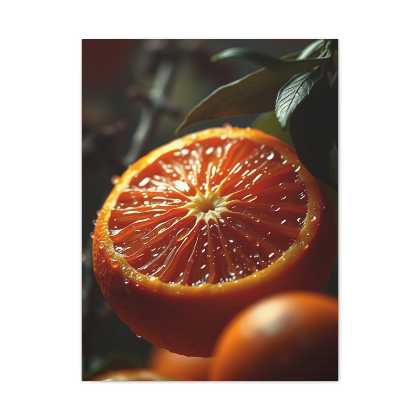
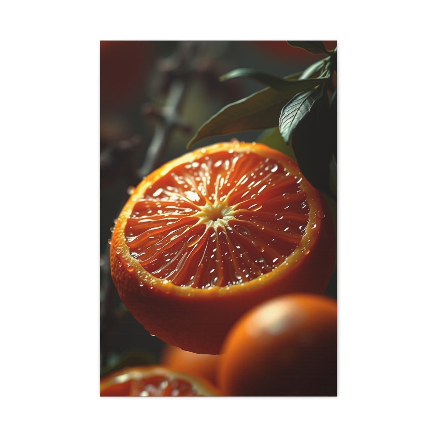
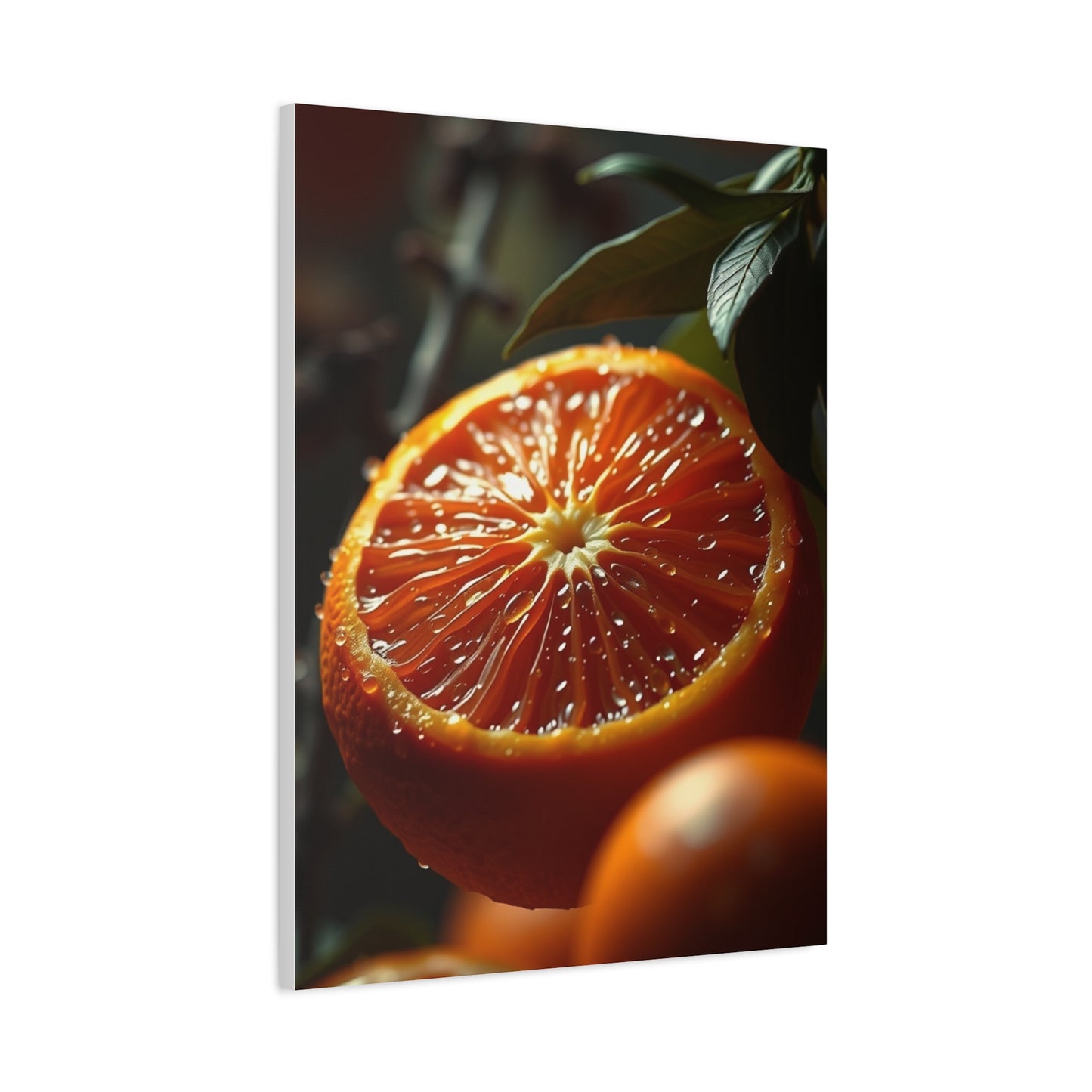
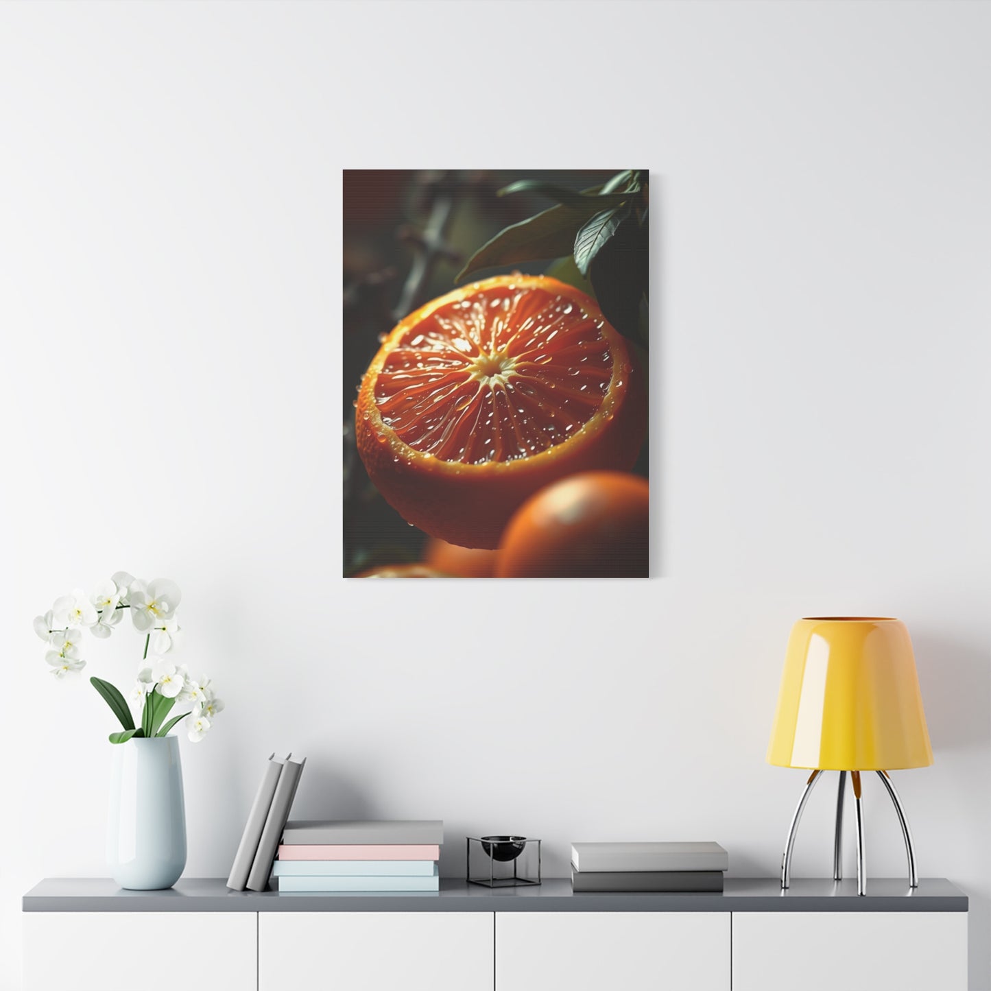
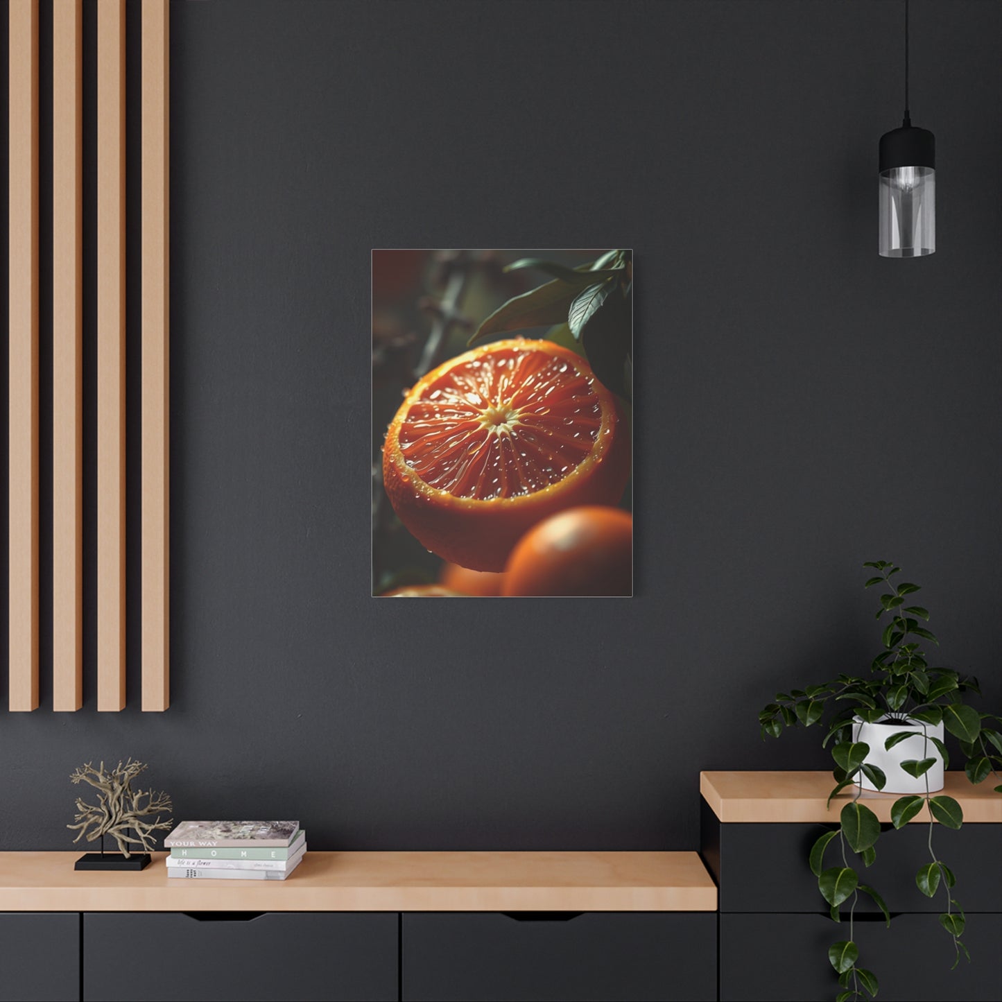
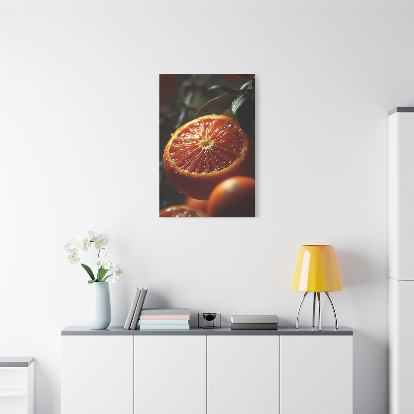
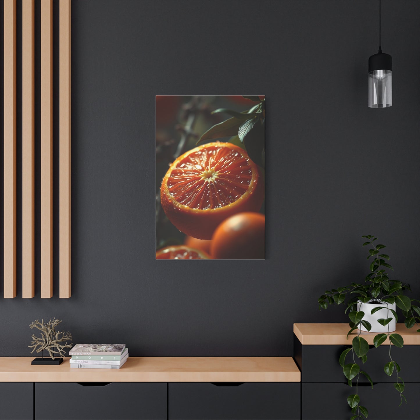
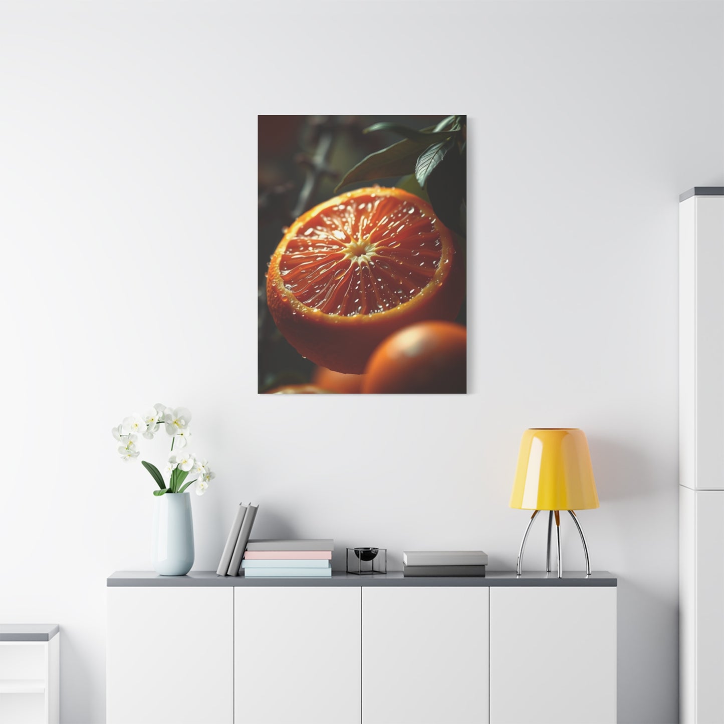
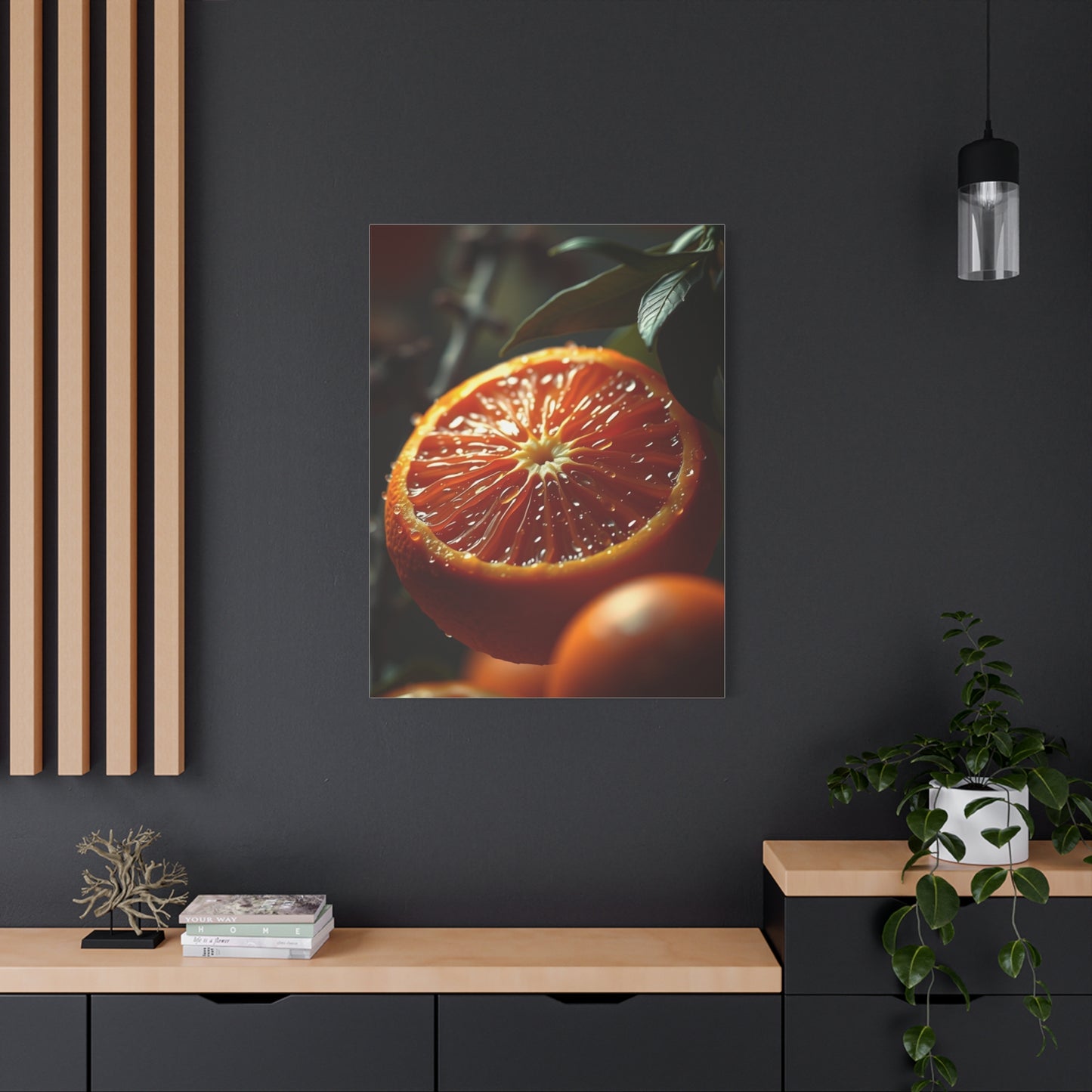
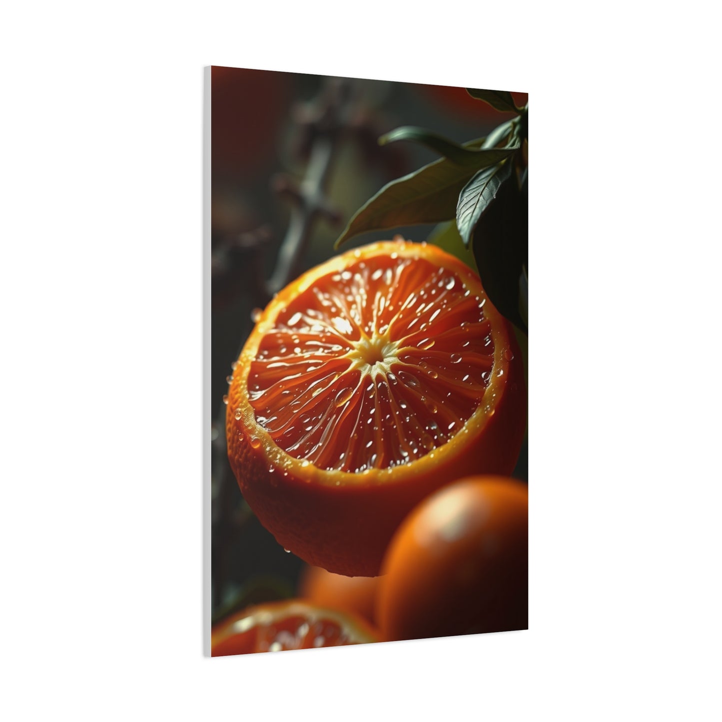
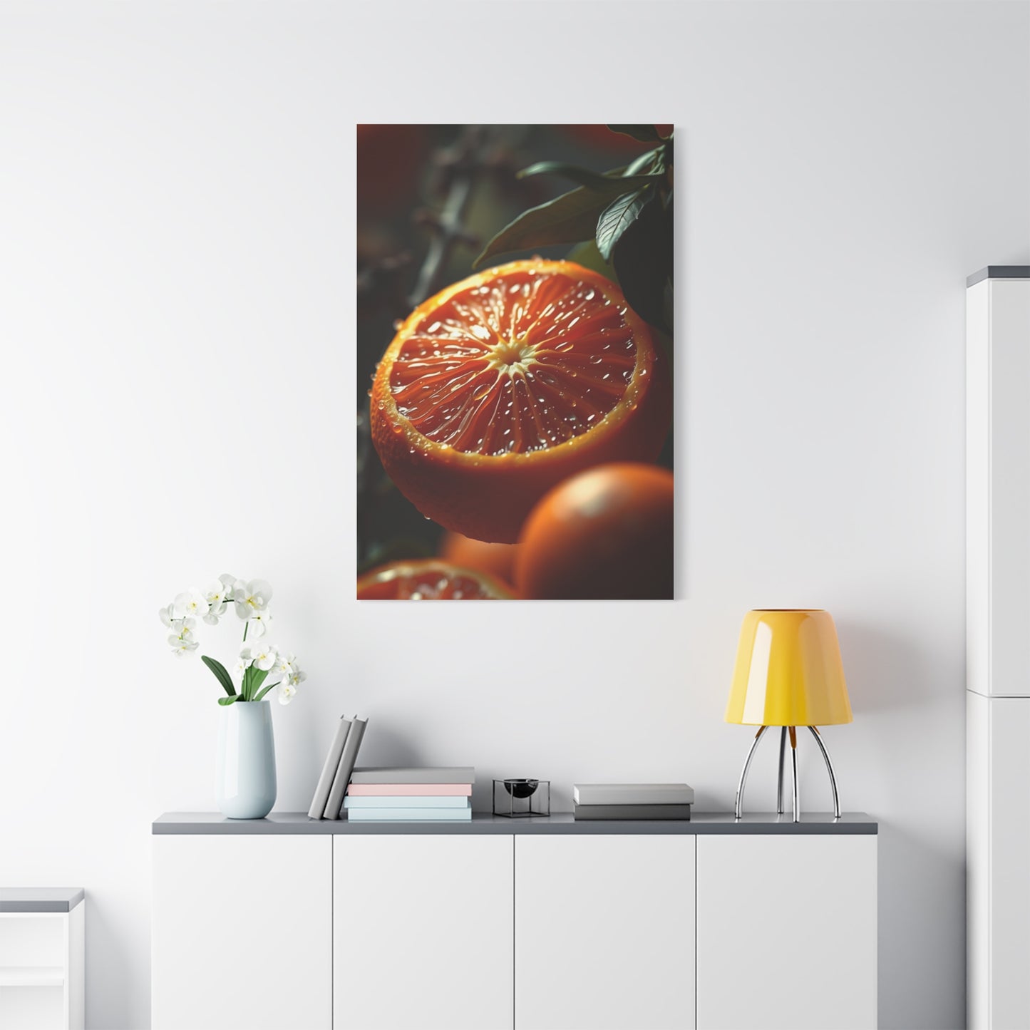
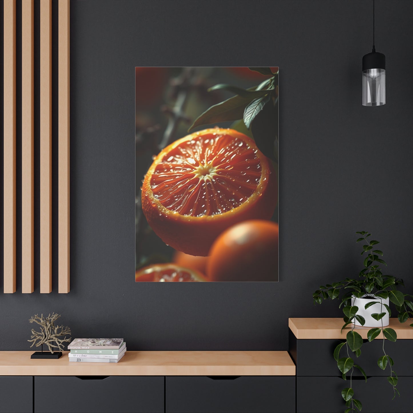
Underwater Harmony: Styling Coral Symphony Wall Art for a Serene and Vibrant Interior explores the transformative potential of marine-inspired artwork in interior design. Coral symphony wall art, with its intricate forms, vibrant hues, and rhythmic patterns, captures the dynamic beauty of underwater ecosystems, bringing both serenity and energy into living spaces. These works are more than decorative pieces; they function as focal points that infuse interiors with color, movement, and emotional resonance, creating environments that feel alive, balanced, and visually stimulating. By thoughtfully styling coral-inspired canvases, homeowners can achieve a seamless blend of tranquility and vibrancy that enhances both aesthetic appeal and emotional well-being.
At the heart of coral symphony artwork is its ability to convey harmony through form, texture, and color. The branching patterns of coral, the soft undulations of underwater flora, and the subtle interplay of light and shadow mimic the natural rhythms of the sea. Artists often employ rich palettes—corals, teals, aquamarines, and muted neutrals—to evoke the depth and luminosity of marine environments. These tones can energize a room without overwhelming it, offering a sophisticated balance between visual stimulation and soothing calm. The inherent fluidity and movement in coral designs allow them to complement both minimalist and eclectic interiors, creating spaces that feel cohesive and dynamic.
From an interior design perspective, coral symphony wall art is highly versatile. Large-scale canvases serve as statement pieces above sofas, beds, or dining areas, anchoring the room’s color palette and setting a serene aquatic tone. Smaller panels or multi-piece arrangements allow for creative layering, introducing rhythm, repetition, and thematic continuity throughout the space. By integrating coral artwork with complementary furnishings, such as textured throws, aquatic-toned cushions, or natural wooden accents, homeowners can amplify both color and tactile richness, ensuring a holistic design experience. The juxtaposition of coral patterns against neutral or muted backgrounds enhances visual impact while maintaining a sense of balance and calm.
Lighting plays a crucial role in highlighting the nuances of underwater-inspired wall art. Natural light accentuates the subtle gradients, delicate textures, and reflective qualities of coral forms, while strategically placed accent lighting—spotlights, wall-mounted fixtures, or soft ambient lamps—adds depth and dimension. Proper illumination ensures that the artwork’s intricate details, flowing lines, and vibrant colors interact dynamically with the space, creating an immersive experience reminiscent of sunlight filtering through water. This interplay between light, texture, and color reinforces the feeling of being enveloped in a serene underwater environment.
Beyond aesthetic appeal, coral symphony wall art carries emotional and symbolic significance. Coral, as a natural element, represents growth, resilience, and the interconnectedness of life. Integrating such artwork into a home fosters mindfulness, tranquility, and a sense of wonder. It encourages viewers to pause and reflect, transforming interiors into spaces that support both relaxation and inspiration. By pairing the artwork with complementary textures—woven rugs, linen fabrics, and natural wooden accents—homeowners can further evoke the sensory richness of the ocean, creating a multisensory environment that engages sight, touch, and emotion.
Artists employ diverse techniques to bring coral symphony to life. Watercolor and acrylic renderings capture fluidity and luminosity, while textured mixed-media approaches introduce depth and dimensionality. Some compositions focus on realistic depictions of coral reefs, emphasizing intricate details and vibrant ecosystems, while others embrace abstraction, highlighting color, rhythm, and movement. This range of techniques allows homeowners to select pieces that resonate with personal taste, spatial needs, and desired emotional impact, ensuring that coral wall art complements both the aesthetic and functional aspects of their interiors.
