


The Ultimate Guide to French Countryside French Wall Art: Transform Your Living Space with Rustic Elegance
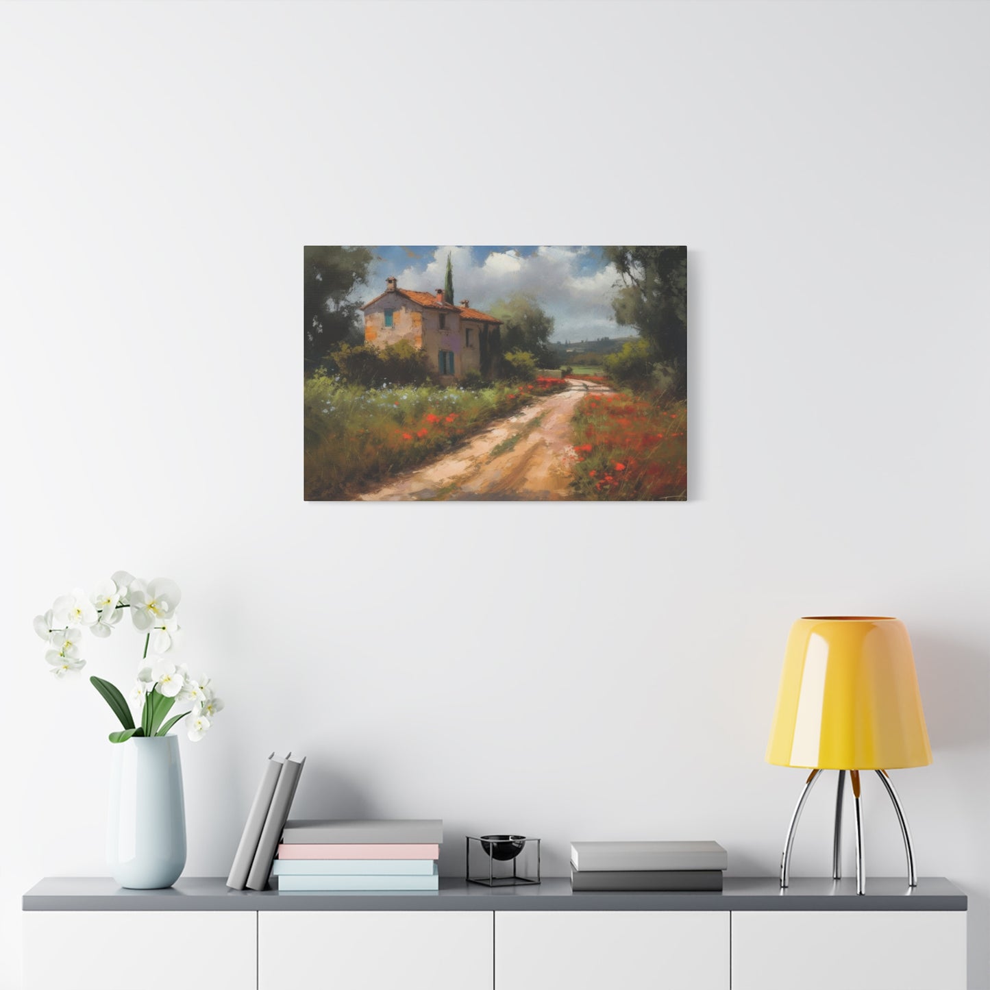
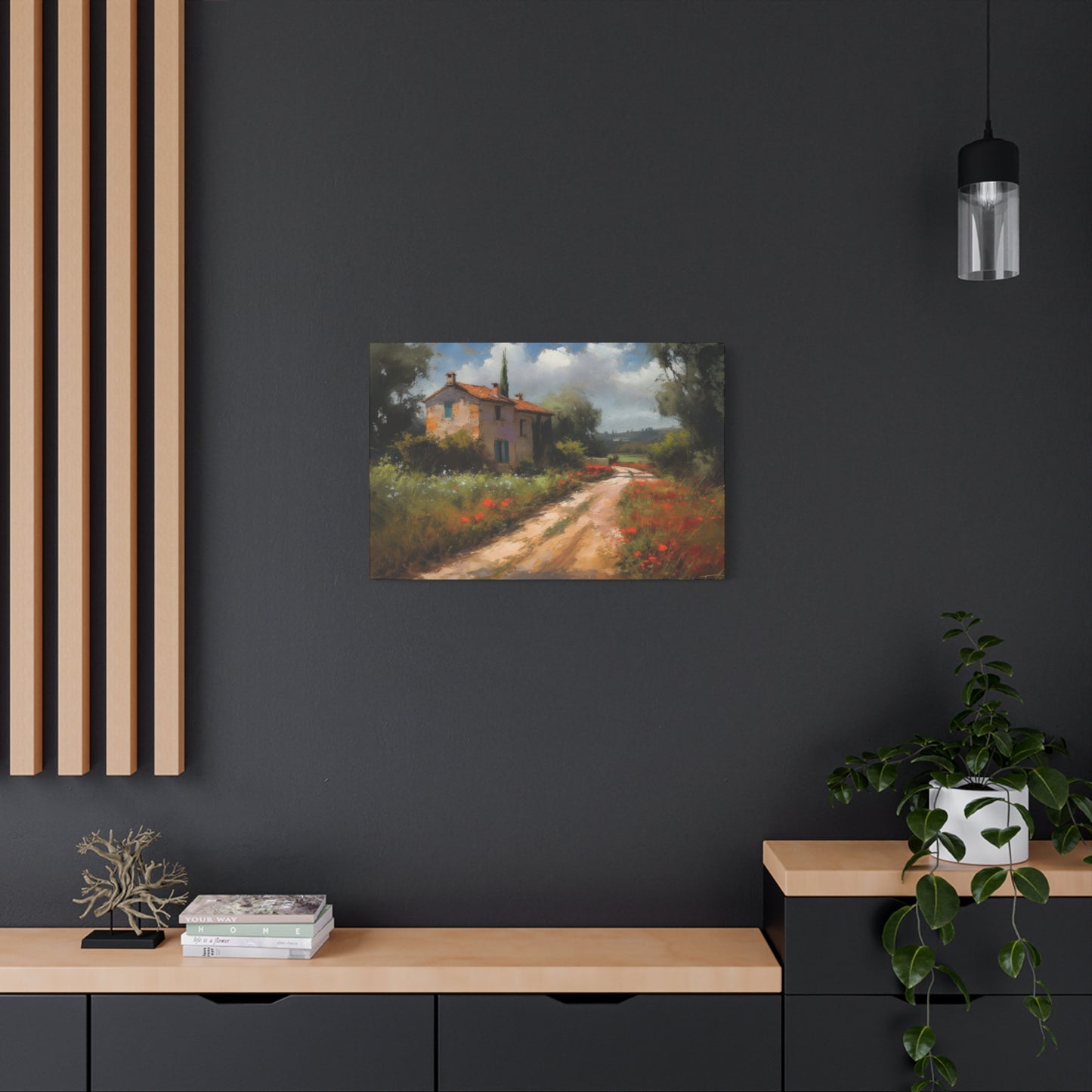
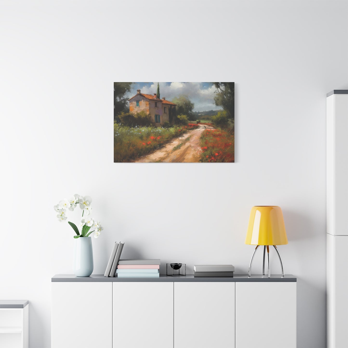
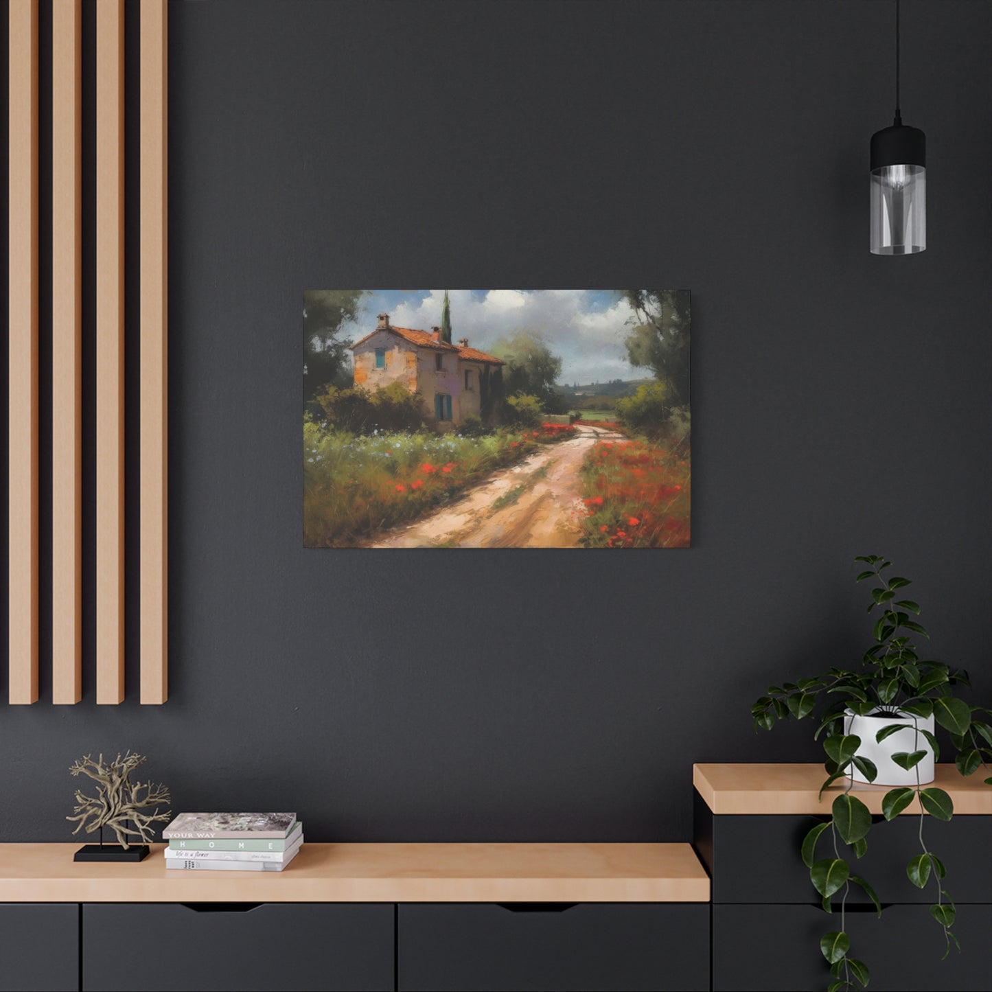
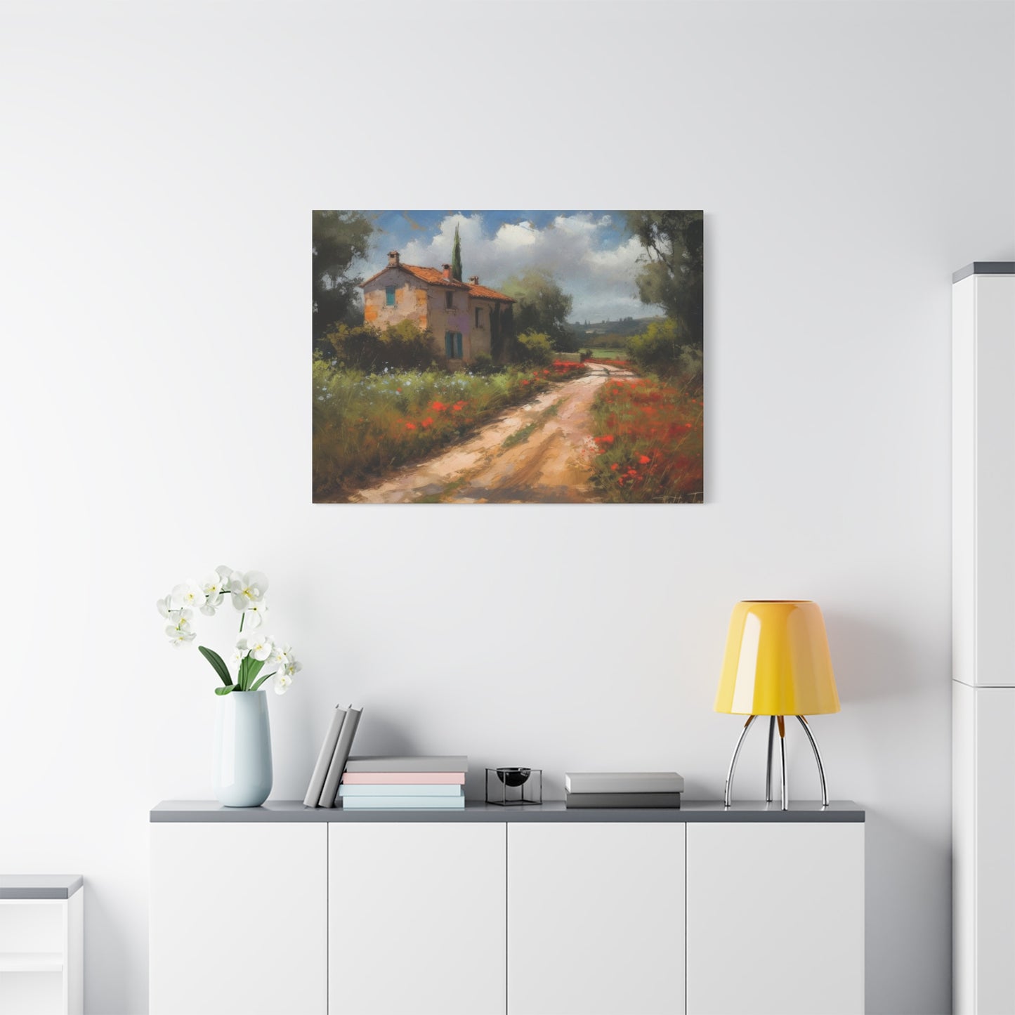
The allure of French countryside aesthetics has captivated interior design enthusiasts for generations. There's something inherently calming about pastoral landscapes, winding village pathways, and the gentle beauty of rural life captured on canvas. These artistic representations bring the tranquility of provincial France directly into your home, creating spaces that feel both sophisticated and welcoming. Whether you're redesigning your living room, bedroom, or office space, incorporating canvas artwork depicting serene village routes and rustic landscapes can dramatically transform the ambiance of any interior.
Canvas art featuring pastoral scenes offers more than mere decoration. These pieces serve as windows to simpler times, inviting viewers to mentally escape the chaos of modern life and find solace in the peaceful imagery of countryside living. The textured quality of canvas adds depth and authenticity to these reproductions, making them feel like genuine artistic treasures rather than simple prints. When you invest in quality countryside pathway artwork, you're not just purchasing wall décor; you're acquiring a conversation piece that reflects your appreciation for timeless beauty and refined taste.
Understanding the Appeal of Rural Landscape Canvas Artwork
The magnetic pull of rural landscape imagery runs deeper than surface-level aesthetics. Throughout history, artists have been drawn to the countryside as subject matter, recognizing that these scenes resonate with fundamental human desires for peace, connection to nature, and escape from urban pressures. Provincial landscapes remind us of slower rhythms, seasonal cycles, and the enduring beauty of natural environments shaped gently by human habitation over centuries.
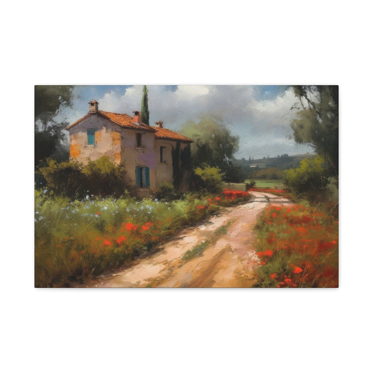
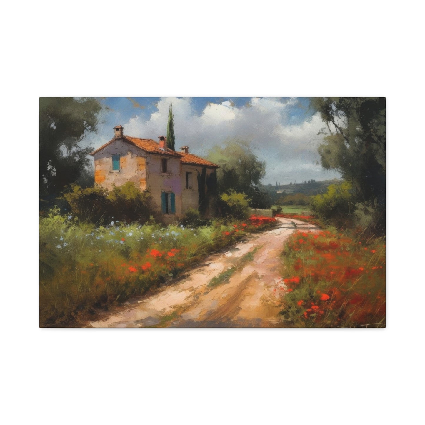
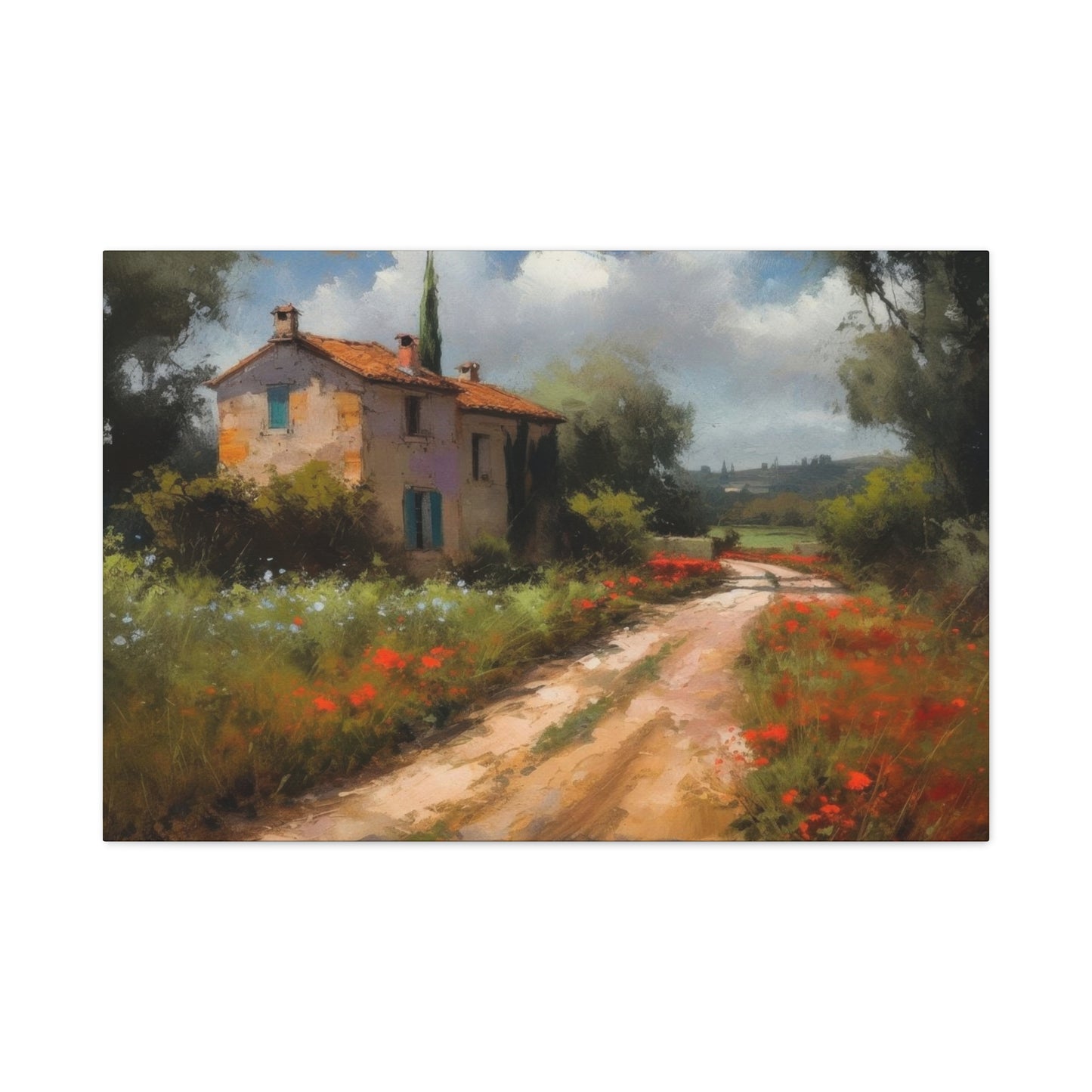
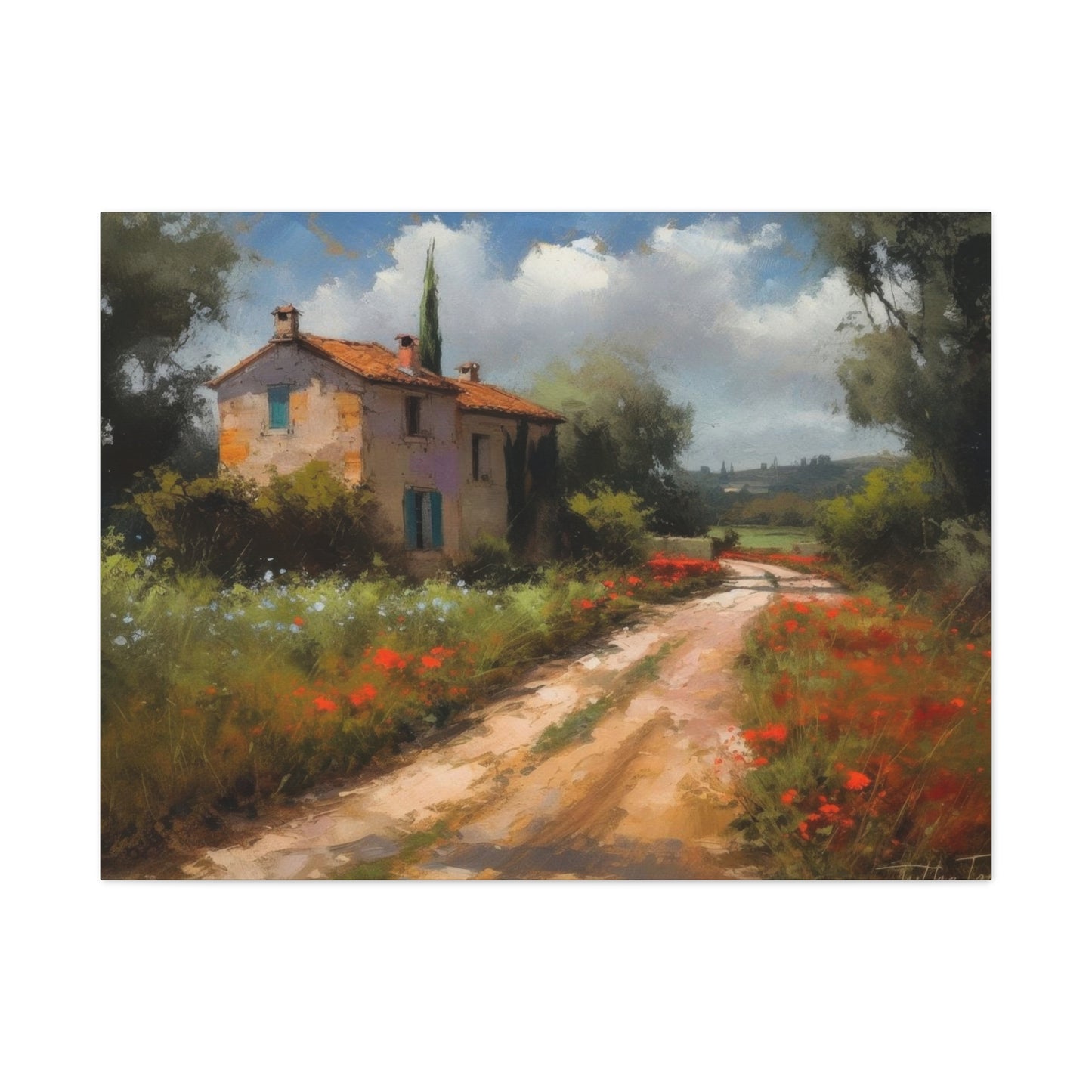
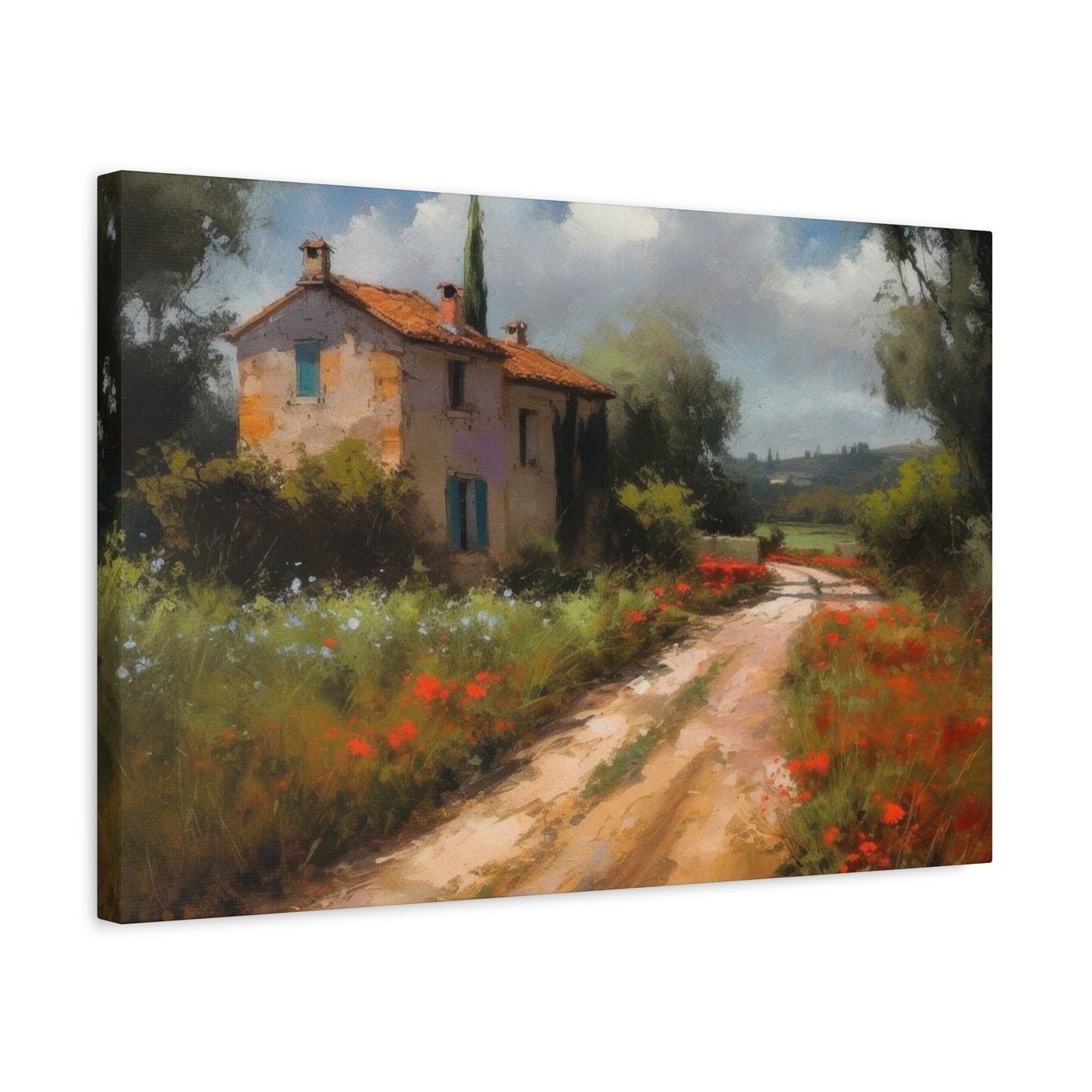
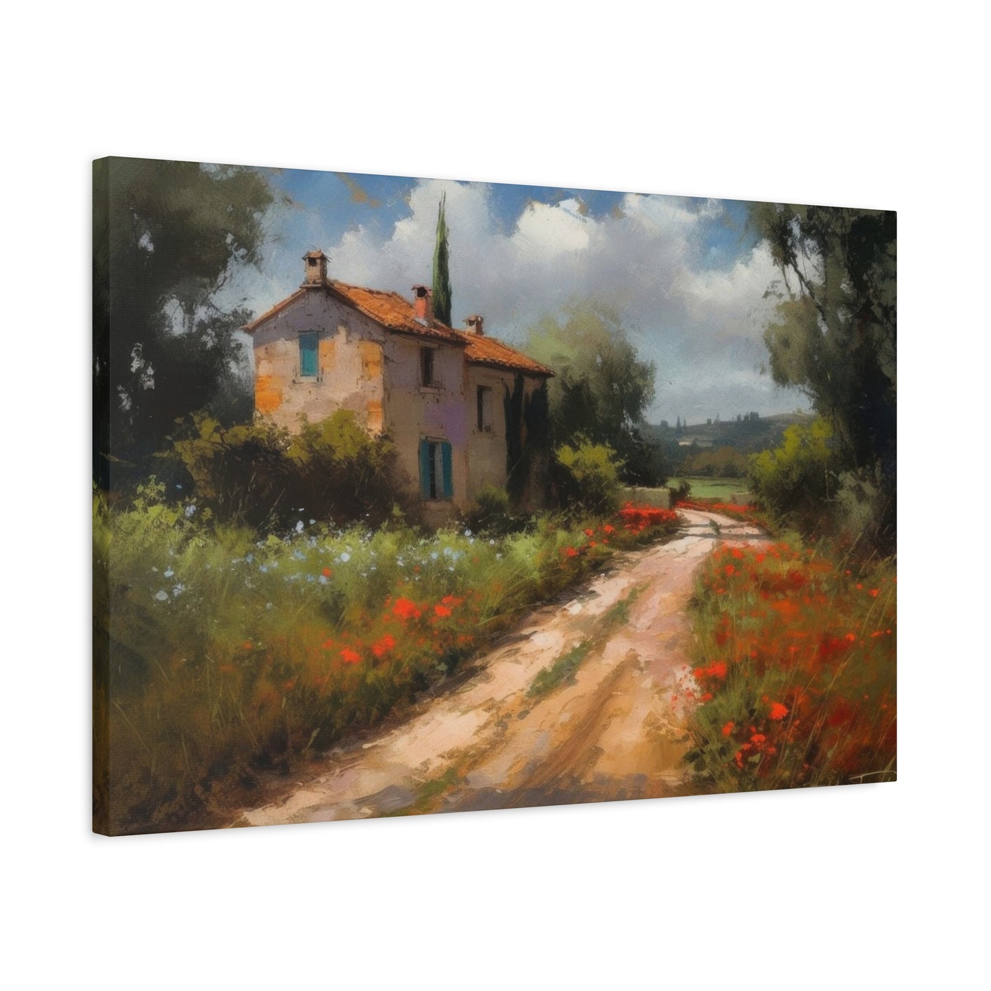
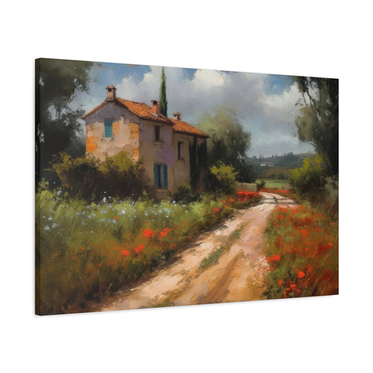
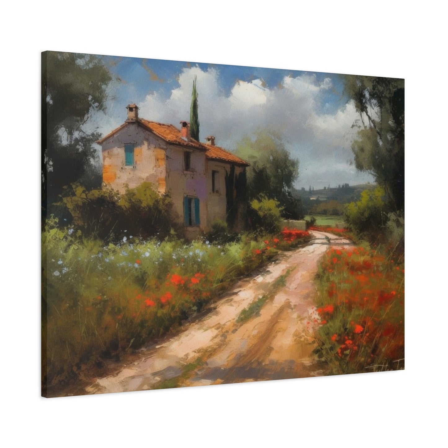
Canvas reproductions of countryside pathways capture specific moments in time while simultaneously feeling eternal. A dirt road winding through lavender fields, stone cottages lining a village lane, or trees creating natural archways over cobblestone paths all evoke nostalgia even for places we've never visited. This universal appeal makes rural artwork suitable for diverse decorating styles and personal preferences. The imagery transcends cultural boundaries, speaking to anyone who appreciates natural beauty and artistic craftsmanship.
The psychological benefits of surrounding yourself with nature-inspired artwork have been documented in numerous studies. Even when we cannot physically be in natural settings, viewing representations of such environments can lower stress levels, improve mood, and create feelings of tranquility. Pastoral pathway scenes specifically encourage the eye to travel along the depicted route, creating a meditative effect as viewers mentally follow the journey suggested by the composition. This visual movement provides gentle stimulation without overwhelming the senses, making these pieces ideal for spaces intended for relaxation or contemplation.
Exploring Different Styles of Provincial Pathway Canvas Creations
Provincial pathway canvas artwork encompasses a remarkable range of artistic styles, each offering distinct visual qualities and emotional impacts. Traditional representational approaches aim for photorealistic detail, capturing every stone, leaf, and shadow with precision that makes viewers feel they could step directly into the scene. These detailed works appeal to those who appreciate technical mastery and want artwork that serves as convincing portals to other places.
Impressionistic interpretations take a different approach, using visible brushstrokes and color blending to suggest rather than precisely define elements within the composition. This style captures the feeling and atmosphere of countryside pathways rather than photographic accuracy. The softened edges and luminous quality characteristic of impressionistic work create dreamy, romantic ambiances particularly well-suited to bedrooms and personal spaces where you want to cultivate peaceful, introspective moods.
Contemporary minimalist approaches strip countryside pathway imagery to essential elements, using simplified forms, limited color palettes, and clean compositions. These modern interpretations maintain the subject matter's inherent tranquility while fitting seamlessly into contemporary interior designs. The restrained aesthetic prevents visual clutter while still providing the psychological benefits associated with nature imagery. Such pieces work beautifully in modern and transitional spaces where elaborate traditional artwork might feel out of place.
Abstract variations on countryside themes take inspiration from rural landscapes without attempting literal representation. These pieces might use color palettes drawn from provincial settings or suggest pathway compositions through line and form without depicting recognizable scenes. Abstract countryside artwork offers the advantage of complementing virtually any décor style while still conveying the peaceful essence of rural environments. These pieces encourage personal interpretation, allowing each viewer to project their own experiences and emotions onto the artwork.
Selecting the Perfect Canvas Dimensions for Your Space
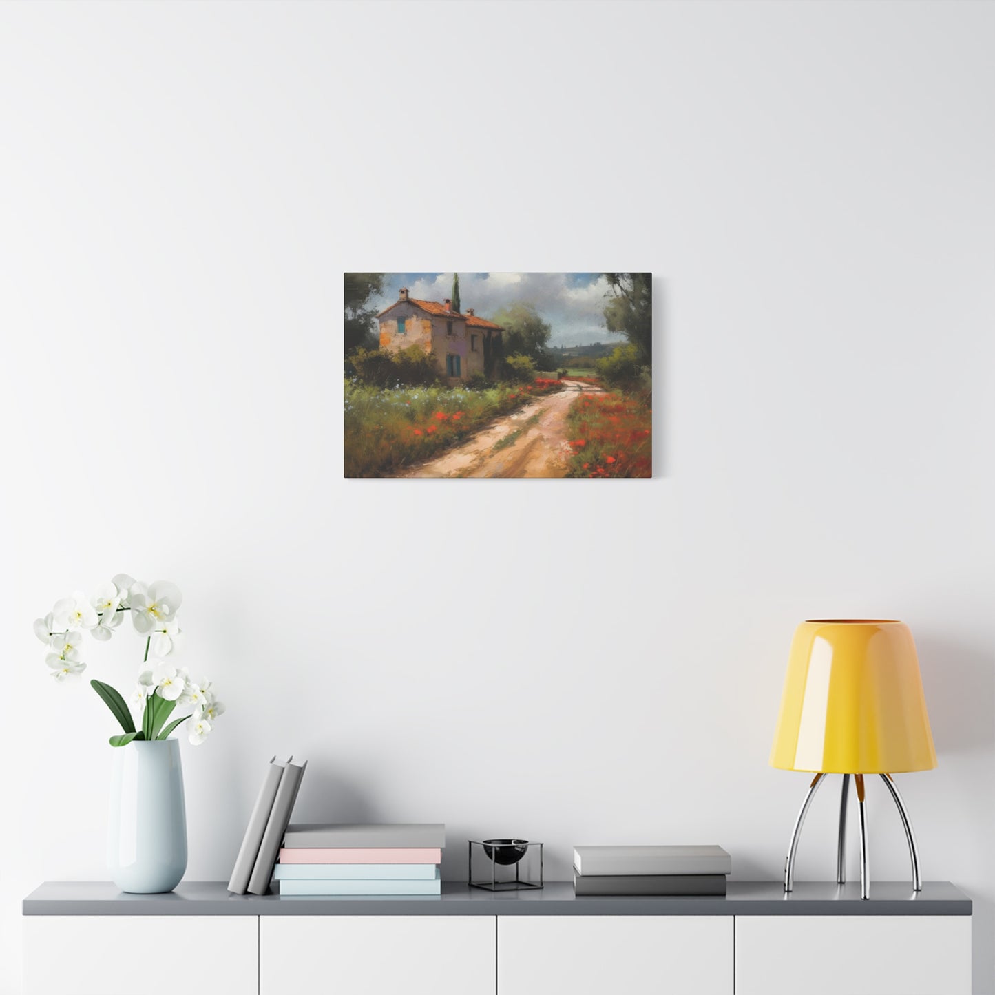
Choosing appropriate canvas dimensions requires careful consideration of both the wall space available and the visual impact you wish to achieve. Oversized statement pieces measuring five feet or larger in width create dramatic focal points that anchor entire rooms. These substantial canvases work best on expansive wall surfaces where they can be viewed from appropriate distances. Large-scale countryside pathway artwork makes bold declarations about your design priorities and can make smaller rooms feel more significant by drawing the eye to impressive visual elements.
Medium-sized canvases ranging from two to four feet in width offer versatility for various applications. These proportions work well above furniture pieces like sofas, beds, and console tables, providing visual interest without overwhelming other design elements. Medium formats allow for appreciable detail in pathway scenes while remaining approachable and comfortable in standard residential spaces. This size category represents the sweet spot for many homeowners, offering impact without requiring massive wall expanses or exceptionally high ceilings.
Smaller canvas pieces measuring under two feet work beautifully in gallery wall arrangements, intimate spaces, or as complementary elements in larger decorating schemes. Collections of small countryside pathway canvases can tell visual stories when arranged thoughtfully, perhaps depicting different seasons along the same route or various perspectives of village life. Smaller formats also provide budget-friendly options for those wanting to introduce canvas artwork without major financial investment. These pieces work particularly well in hallways, bathrooms, home offices, and other spaces where larger artwork might feel cramped or excessive.
Vertical orientations suit tall, narrow wall spaces and can draw the eye upward, making rooms with standard ceiling heights feel more spacious. Pathway compositions with strong vertical elements like tall trees lining routes or ascending village streets work particularly well in portrait formats. Horizontal orientations create calming, restful effects and work beautifully above horizontal furniture arrangements. Wide panoramic formats capture sweeping countryside vistas and work spectacularly in rooms with significant horizontal wall space. Square formats offer balanced, centered compositions that work in both traditional and contemporary settings, providing flexible options for various architectural contexts.
Color Palette Considerations for Countryside Canvas Art
The color palette of your chosen canvas artwork significantly impacts both the piece's individual character and its relationship with surrounding décor. Earthy, muted tones including soft browns, warm grays, gentle greens, and subdued golds create naturally harmonious atmospheres that complement a wide range of interior color schemes. These understated palettes rarely clash with existing décor, making them safe choices for those uncertain about color coordination. The subtlety of muted countryside artwork allows these pieces to enhance spaces without dominating them, creating sophisticated backdrops for living.
Vibrant, saturated color approaches bring energy and personality to countryside pathway depictions. Bold blues in skies, rich purples in lavender fields, or intense greens in foliage create more dramatic statements that serve as genuine focal points. These livelier interpretations work beautifully in spaces that might otherwise feel neutral or understated, injecting character and visual interest. Saturated colors can energize rooms while still maintaining the peaceful essence of countryside subjects. However, bold palettes require more careful coordination with existing color schemes to avoid visual discord.
Monochromatic and near-monochromatic approaches using variations of single colors create cohesive, sophisticated effects. Sepia-toned pathway scenes evoke vintage photography and historical atmospheres, while blue-toned pieces might suggest twilight or moonlit walks through villages. These limited palettes offer elegance and restraint while maintaining visual interest through value contrasts and textural variations. Monochromatic countryside artwork particularly suits minimalist interiors where color restraint maintains clean, uncluttered aesthetics.
Seasonal color palettes capture specific times of year, allowing you to select artwork that resonates with your personal preferences or creates desired atmospheric effects. Spring palettes featuring fresh greens, delicate pinks, and soft yellows convey renewal and optimism. Summer interpretations burst with vibrant greens, bright blues, and warm golden tones suggesting sunshine and abundance. Autumn scenes glow with rich oranges, deep reds, and warm browns that create cozy, intimate feelings. Winter depictions using whites, cool grays, and muted blues evoke quiet contemplation and peaceful solitude. Choosing seasonal palettes allows your artwork to reflect either your favorite time of year or the mood you wish to cultivate regardless of actual seasons.
Incorporating Canvas Art into Living Room Designs
Living rooms serve as primary gathering spaces where families relax, entertain guests, and spend significant portions of their time. The artwork you display in these central spaces makes important statements about your aesthetic preferences and creates the foundational atmosphere for daily living. Countryside pathway canvas art brings elements of nature indoors, softening the often hard-edged quality of modern furniture and architectural features while adding layers of visual interest and sophistication.
Positioning canvas artwork above seating arrangements creates natural focal points that anchor furniture groupings and provide something visually engaging for seated guests. A substantial canvas depicting a serene village route positioned above a sofa becomes the room's centerpiece, drawing the eye and establishing the space's aesthetic tone. The horizontal format of most sofas pairs beautifully with horizontal or square canvas orientations, creating balanced, pleasing proportions. Maintaining appropriate scale ensures the artwork neither disappears into the background nor overwhelms the seating area below.
Gallery wall arrangements offer opportunities to display multiple countryside pathway pieces together, creating visual narratives and adding complexity to living room designs. Mixing different sizes while maintaining cohesive subject matter and color palettes produces dynamic, curated appearances that suggest thoughtful collecting rather than mass-produced coordination. Asymmetrical arrangements feel more organic and interesting than rigid geometric patterns, though both approaches have merits depending on overall design styles. Including subtle variations in frame colors and styles adds additional visual texture while maintaining overall coherence.
Balancing canvas artwork with other living room elements prevents any single component from dominating the space. Consider how your chosen countryside pathway piece relates to existing colors in upholstery, draperies, and rugs. The artwork doesn't need to match exactly but should harmonize with the overall palette. Similarly, consider the visual weight of furniture pieces in relation to artwork scale. Delicate, minimalist furniture pairs beautifully with substantial canvas art, while heavier, more ornate furnishings might be better balanced by simpler artistic compositions. Creating these balanced relationships ensures living rooms feel cohesive and intentionally designed rather than haphazardly decorated.
Creating Tranquil Bedroom Environments with Pathway Paintings
Bedrooms serve as personal retreats where we begin and end each day, making the atmosphere of these spaces particularly important for overall wellbeing. Countryside pathway canvas art naturally supports the tranquil, restorative qualities bedrooms should possess. The peaceful subject matter encourages mental relaxation, helping to quiet racing thoughts and ease the transition from waking activities to restful sleep. Choosing artwork for bedrooms differs from selecting pieces for public spaces because these selections need only please the room's occupants rather than appealing to diverse tastes.
Positioning canvas art above bed headboards creates traditional, symmetrical arrangements that feel organized and intentional. This placement makes the artwork one of the first things you see upon waking and the last thing visible before sleep, bookending days with peaceful imagery. The width of your canvas should generally span two-thirds to three-quarters of the headboard width to maintain pleasing proportions. Pathway compositions with strong central focus points work particularly well in this position, creating balanced focal points that anchor the entire bedroom design.
Color temperature considerations become especially important in bedroom artwork selections. Cooler tones including soft blues, gentle purples, and silvery greens promote relaxation and support sleep readiness. Warmer tones like soft oranges, gentle yellows, and peachy pinks create cozy, nurturing feelings that some people find more comforting. Consider your personal responses to different colors when making selections. If certain hues energize rather than calm you, avoid them in bedroom artwork regardless of how beautiful the pieces might be objectively.
Lighting interactions with canvas artwork affect bedroom atmospheres significantly. Natural daylight reveals colors and details differently than artificial evening illumination. Consider how your chosen pathway canvas appears under both conditions, ensuring it maintains its peaceful qualities regardless of lighting. Avoid placing canvas art where direct sunlight strikes it for extended periods, as ultraviolet exposure gradually fades colors and damages canvas materials. Positioning artwork on walls perpendicular to windows provides visibility without direct sun exposure.
Enhancing Dining Spaces with Rural Landscape Imagery
Dining areas benefit tremendously from artwork that creates pleasant atmospheres for shared meals and conversations. Countryside pathway canvas art brings natural elements into dining spaces, creating connections to agricultural traditions and the land that produces our food. These thematic links feel particularly appropriate in rooms dedicated to nourishment and gathering. The peaceful quality of rural imagery prevents visual distraction during meals while providing pleasant focal points during conversation lulls.
Scale considerations for dining room artwork depend largely on wall dimensions and furniture proportions. Long, narrow dining rooms often benefit from horizontal canvas orientations that emphasize the room's length rather than fighting against it. Wider dining spaces can accommodate larger square or vertical formats. The artwork should feel substantial enough to hold its own against dining tables and chairs, which typically feature significant visual weight, but shouldn't overwhelm the space or make diners feel crowded.
Color coordination between canvas artwork and dining décor creates cohesive, well-planned appearances. Consider how pathway scene colors relate to table linens, chair upholstery, and dishware you regularly use. While exact matching feels overly coordinated and contrived, complementary relationships between artwork and functional dining elements produce sophisticated results. If your dining style features frequently changing linens and seasonal décor, selecting canvas art with neutral, versatile palettes ensures long-term compatibility regardless of temporary decorating shifts.
Conversation-starting qualities make particular artwork selections especially suitable for dining spaces where guests gather. Countryside pathway scenes with interesting details, unusual perspectives, or particularly beautiful light effects give guests something to discuss and appreciate. Artwork that tells subtle visual stories or includes intriguing elements rewards repeated viewing, preventing the pieces from becoming invisible background elements that fade from conscious notice over time. Selecting canvas art with genuine artistic merit elevates dining experiences beyond mere functional necessity into more memorable, aesthetically rich occasions.
Transforming Home Offices with Inspirational Countryside Views
Home offices present unique decorating challenges because these spaces must support productivity while remaining comfortable for extended periods. Countryside pathway canvas art offers ideal solutions for work environments, providing visual breaks that rest the eyes and mind without creating distracting movement or busy details. Brief moments of gazing at peaceful rural imagery can reset focus and reduce stress during demanding work sessions, making these artistic choices both beautiful and functional.
Positioning considerations for office artwork should account for typical sightlines from primary work positions. Artwork placed directly behind computer monitors remains invisible during work, while pieces positioned where you naturally glance during brief breaks provide maximum benefit. Many people find artwork positioned perpendicular to their primary work orientation most useful, allowing easy shifts of visual attention without requiring significant body movement. This placement invites momentary mental escapes without encouraging extended daydreaming that undermines productivity.
Subject matter selection for office artwork should energize rather than sedate, maintaining the peaceful qualities of countryside imagery while incorporating elements that inspire forward movement. Pathway compositions with clear directional flow subtly encourage progress and journey, metaphorically supporting work advancement. Scenes depicting roads leading toward distant horizons or pathways emerging from shadowy woods into bright clearings carry optimistic symbolism that can positively influence mindset during challenging work periods.
Color psychology plays important roles in office productivity. Blues enhance focus and mental clarity, making them excellent choices for analytical work environments. Greens reduce eye strain and promote balanced, sustainable energy levels. Yellows and warm tones stimulate creativity and optimistic thinking. Consider your work's nature when selecting canvas artwork colors, choosing palettes that support rather than hinder your specific professional activities. Multiple pieces featuring different color emphases can address varied work modes, with your attention naturally drawn to whichever piece best supports current tasks.
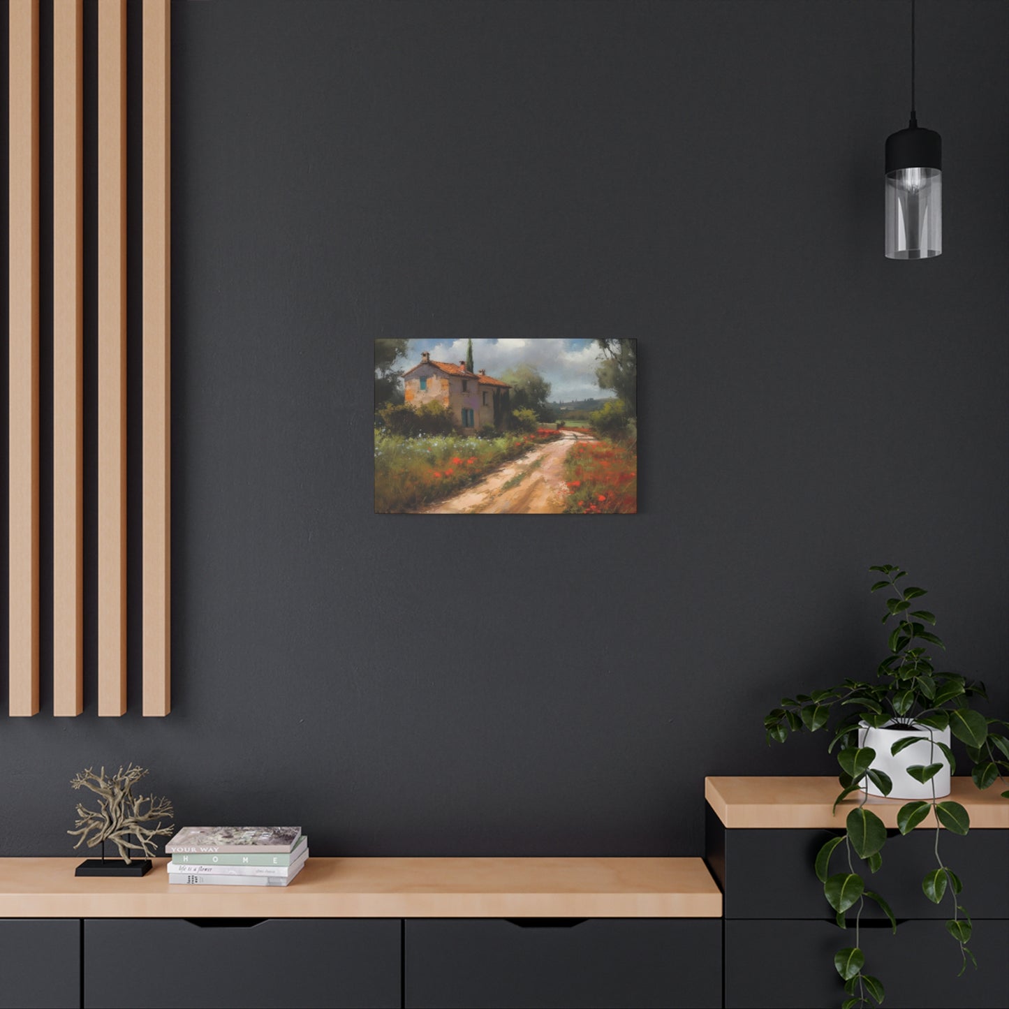
Complementing Modern Interior Design with Rural Canvas Art
The apparent contradiction between contemporary design aesthetics and traditional countryside subject matter creates interesting decorating opportunities. Modern interiors characterized by clean lines, minimal ornamentation, and neutral palettes actually provide perfect backdrops for rustic pathway canvas art. The contrast between sleek contemporary furnishings and organic natural imagery creates visual tension that makes both elements more interesting. This unexpected pairing demonstrates sophisticated design thinking that moves beyond matchy-matchy coordination toward more complex, layered approaches.
Selecting countryside pathway artwork for modern spaces requires attention to composition and treatment rather than subject matter alone. Simplified, graphic interpretations of rural scenes work particularly well in contemporary contexts, maintaining recognizable imagery while eliminating fussy details that might clash with minimalist sensibilities. Bold, simplified color palettes rather than complex, naturalistic hues help bridge traditional subjects with modern surroundings. Clean, simple framing or frameless gallery-wrapped canvas presentations further integrate rural artwork into contemporary design schemes.
Balancing warm and cool elements prevents modern spaces from feeling cold or unwelcoming. Contemporary design often emphasizes cool materials including metal, glass, and stone that can create austere atmospheres without adequate warming elements. Countryside pathway canvas art introduces natural warmth through subject matter and typically earthy color palettes, softening modern edges while maintaining clean aesthetic lines. The canvas texture itself adds subtle organic quality that contrasts pleasantly with smooth contemporary surfaces.
Scale and proportion take on heightened importance in modern settings where fewer decorative elements compete for attention. Substantial canvas pieces make confident statements in minimalist rooms, commanding attention and justifying their presence through impressive scale and quality. Smaller pieces risk appearing insignificant against expansive modern wall surfaces unless grouped strategically or positioned in smaller spatial zones. Modern design principles favor decisive choices over tentative half-measures, suggesting that bold artwork selections typically succeed better than safe, understated options in contemporary contexts.
Traditional Interiors Enhanced by Provincial Landscape Canvas
Traditional interior design and countryside pathway canvas art form natural partnerships rooted in shared appreciation for classical beauty, historical continuity, and refined craftsmanship. Traditional spaces typically feature rich wood tones, ornate architectural details, and layered decorative approaches that create warm, established atmospheres. Rural landscape artwork fits seamlessly into these contexts, reinforcing rather than challenging the overall aesthetic direction.
Ornate, substantial frames elevate countryside pathway canvas art in traditional settings, adding architectural presence and historical gravitas. Gilded frames with classical molding profiles particularly suit formal traditional rooms, creating museum-quality presentations that honor both the artwork and surrounding décor. Wood frames in rich stains complement traditional furniture pieces and millwork, creating cohesive relationships between all room elements. Frame selection represents an opportunity to reinforce period-appropriate aesthetics or introduce subtle contemporary updates that prevent traditional spaces from feeling dated or stuffy.
Color relationships between artwork and traditional decorating elements require careful attention to achieve harmonious results. Traditional interiors often feature complex color schemes with multiple hues appearing in wallpapers, upholstery, draperies, and rugs. Countryside pathway canvas art should complement these existing colors without competing for attention or introducing jarring contrasts. Selecting pieces that pull together multiple existing room colors creates unified, cohesive effects that make spaces feel intentionally designed. Artwork becomes the visual glue binding disparate elements into coherent wholes.
Layering artwork with other traditional decorative elements creates rich, collected appearances characteristic of classic design approaches. Positioning countryside pathway canvas pieces among other traditional elements including decorative plates, wall sconces, and mirrors produces curated gallery effects. Maintaining consistent themes and quality levels across all decorative layers prevents these complex arrangements from appearing cluttered or chaotic. Traditional design celebrates abundance and layering, but successful execution requires curatorial restraint and consistent aesthetic standards that separate thoughtful collecting from mere accumulation.
Rustic and Farmhouse Style Integration
Rustic and farmhouse design styles celebrate simplified country living with emphasis on natural materials, functional beauty, and unpretentious comfort. Countryside pathway canvas art aligns perfectly with these aesthetics, depicting the rural landscapes and village scenes that inspire farmhouse design principles. The connection between subject matter and overall design philosophy creates particularly authentic, cohesive results that feel genuine rather than styled or affected.
Distressed and reclaimed wood frames enhance rustic presentations of countryside pathway artwork, adding textural interest and historical character. These weathered frames suggest age and use, implying that artwork pieces have been cherished through generations rather than recently purchased. The imperfect qualities of distressed frames complement rustic design's celebration of natural aging and authentic wear patterns. Selecting frames constructed from actual reclaimed barn wood or other architectural salvage creates genuine rather than manufactured vintage character.
Color palettes in rustic farmhouse settings typically emphasize natural, unsaturated tones that canvas artwork should complement. Creamy whites, soft grays, warm tans, and muted greens dominate successful farmhouse color schemes, creating peaceful, nature-inspired atmospheres. Countryside pathway artwork featuring similar gentle palettes reinforces these color stories, while pieces with slightly more saturated tones can provide accent interest without disrupting overall harmony. Avoiding bright, artificial colors maintains the authentic, nature-connected feeling central to farmhouse aesthetics.
Grouping multiple countryside pathway canvases creates gallery wall effects particularly suited to farmhouse interiors. Asymmetrical arrangements with varied frame styles and sizes appear collected over time rather than purchased as matched sets. Including pieces with different artistic treatments, such as mixing photorealistic and impressionistic styles, adds visual variety while maintaining thematic consistency. These curated collections demonstrate personal connection to countryside imagery rather than merely following decorating trends, increasing authenticity and emotional resonance.
Scandinavian Design Principles and Rural Canvas Art
Scandinavian design emphasizes simplicity, functionality, and strong connections to nature, creating natural affinity with countryside pathway canvas artwork. The Nordic aesthetic values light, both natural and depicted in artwork, making luminous rural scenes particularly appropriate. Scandinavian interiors typically feature predominantly white or very light neutral backgrounds, providing perfect canvases for artwork to create visual interest without competing with busy patterns or multiple colors.
Minimalist composition becomes paramount when selecting countryside pathway artwork for Scandinavian settings. Simplified scenes with clean lines, uncluttered foregrounds, and emphasis on essential elements work better than busy, detail-heavy interpretations. The artwork should feel calm and contemplative, supporting the meditative qualities characteristic of Nordic design. Negative space within compositions gains importance in Scandinavian contexts, with breathing room around focal elements contributing to overall serenity rather than indicating incomplete execution.
Limited color palettes align with Scandinavian restraint while still providing necessary warmth and interest. Countryside pathway artwork featuring predominantly white, gray, and soft blue tones with touches of natural wood browns or gentle greens maintains Nordic color discipline. These restrained palettes prevent artwork from overwhelming carefully balanced Scandinavian color schemes while still providing visual focal points and nature connections. Completely monochromatic interpretations work beautifully, though small color accents can introduce welcome warmth without violating minimalist principles.
Natural wood frames or simple white frames suit Scandinavian presentations of countryside pathway canvas art. The frame should disappear into the background, directing attention to the artwork itself rather than competing for notice. Light wood tones including birch, ash, or light oak complement Scandinavian furniture and flooring while adding subtle warmth. Alternatively, simple white frames create seamless integration with white walls, allowing artwork colors and compositions to command full attention. Avoiding ornate or heavily decorative frames maintains the clean simplicity central to Scandinavian aesthetics.
Coastal and Nautical Spaces Incorporating Countryside Elements
Coastal design doesn't restrict artwork choices to maritime subjects exclusively. Countryside pathway canvas art can successfully integrate into beach-inspired interiors, particularly when pieces feature appropriate color palettes or suggest connections between coastal and rural environments. French countryside scenes especially complement coastal aesthetics given the Mediterranean connections and shared emphasis on natural beauty, relaxed living, and outdoor orientation.
Color coordination becomes the primary factor when incorporating countryside artwork into coastal settings. Selecting pathway scenes featuring blues, aquas, soft greens, sandy beiges, and warm whites creates color relationships with typical coastal palettes. Artwork depicting lavender fields introduces purple-blue tones that bridge countryside and coastal color stories. Scenes with prominent skies establish atmospheric connections with beach environments while maintaining their rural character. These strategic color selections allow countryside pathway canvas art to feel at home in coastal contexts without requiring maritime subject matter.
Thematic bridges between countryside and coastal elements create conceptual coherence justifying diverse artwork in unified spaces. Both environments celebrate natural beauty, outdoor living, and escape from urban intensity. Both inspire relaxation and connection with fundamental natural rhythms. Emphasizing these shared qualities rather than surface differences allows countryside pathway artwork to function successfully in coastal-themed rooms. Many successful interiors blend multiple inspirations rather than adhering rigidly to single themes, creating personalized, layered results that reflect complex interests and experiences.
Frame selections for countryside artwork in coastal settings should maintain light, airy qualities characteristic of beach-inspired design. White-washed or light natural wood frames work beautifully, adding subtle texture without introducing visual weight. Avoiding heavy, dark frames prevents countryside artwork from feeling out of place against light coastal backgrounds. Simple, clean frame profiles maintain breezy, uncomplicated feelings while still providing finished presentations. In particularly casual coastal settings, frameless gallery-wrapped canvas presentations create appropriately relaxed, unpretentious effects.
Industrial Loft Spaces Softened with Rural Imagery
Industrial design aesthetics featuring exposed brick, visible ductwork, concrete floors, and steel structural elements create dramatic, urban spaces that can sometimes feel cold or harsh without appropriate softening elements. Countryside pathway canvas art provides perfect counterbalance to industrial hardness, introducing natural subject matter and organic forms that warm these spaces while maintaining their edgy, unconventional character. The contrast between rough industrial elements and peaceful rural imagery creates unexpected tensions that make both components more interesting.
Oversized canvas pieces match the dramatic scale typical of industrial loft spaces with their high ceilings and expansive wall surfaces. Substantial countryside pathway artwork holds its own against industrial architecture's powerful presence, creating visual anchors in otherwise minimal spaces. Bold scale prevents artwork from appearing insignificant or tentative against industrial backdrops. Large canvas pieces demonstrate the confident aesthetic decisions that successful industrial design requires, showing commitment to design visions rather than hesitant half-measures.
Raw, industrial-style frames or frameless presentations suit countryside pathway canvas in loft settings. Simple metal frames echo structural steel elements found throughout industrial spaces, creating material consistency while still setting artwork apart as distinct decorative elements. Alternatively, rough wood frames suggesting reclaimed industrial materials bridge natural and industrial aesthetics. Frameless gallery-wrapped presentations can work beautifully, allowing canvas texture to interact directly with surrounding industrial materials without intervening frame barriers.
Lighting considerations gain particular importance in industrial spaces where abundant natural light from large windows interacts with typically sparse artificial lighting. Positioning countryside pathway artwork where it receives adequate illumination ensures visibility while avoiding direct sunlight damage. Industrial-style track lighting or minimalist picture lights can highlight canvas pieces, creating gallery effects that elevate artwork significance within sparse surroundings. Dramatic lighting can transform countryside pathway scenes into statement pieces worthy of industrial spaces' theatrical qualities.
Bohemian Eclecticism and Countryside Canvas Combinations
Bohemian design celebrates personal expression, global influences, and layered collections of meaningful objects accumulated over time through travel and experience. Countryside pathway canvas art integrates beautifully into bohemian interiors, adding nature-inspired elements to typically complex, richly decorated spaces. The peaceful subject matter provides visual rest areas within otherwise stimulating environments, creating balance between energetic pattern and color and contemplative calm.
Mixing countryside pathway canvas with diverse artistic styles characterizes successful bohemian approaches. Combining rural French scenes with Moroccan textiles, Indian block prints, and contemporary abstract pieces creates eclectic collections that reflect wide-ranging interests and influences. The key to successful bohemian mixing involves maintaining some consistent elements throughout collections, whether color relationships, frame styles, or subtle thematic connections. These threads of continuity prevent eclectic collections from dissolving into chaotic randomness.
Color serves as primary unifying element in bohemian spaces where multiple patterns and styles coexist. Countryside pathway artwork should either complement existing color schemes or introduce new hues that enhance overall richness without creating jarring contrasts. Bohemian palettes typically embrace jewel tones, warm earthy colors, and touches of metallics, providing ample opportunities for countryside artwork integration. Selecting pieces with sunset lighting effects, autumn foliage, or lavender fields can echo bohemian color preferences while maintaining rural subject matter.
Layering countryside pathway canvas with other decorative elements creates bohemian depth and richness. Positioning canvas art behind or among collections of objects including plants, textiles, and smaller artworks produces the collected, lived-in appearance characteristic of successful bohemian design. Vintage or globally-inspired frames enhance bohemian presentations, particularly when frames themselves represent interesting finds with their own stories. Bohemian design celebrates the personal narratives behind decorative choices, making selection processes as important as final results.
Creating Focal Points with Statement Countryside Canvas Pieces
Statement artwork commands attention and anchors design schemes around its presence, making bold declarations about aesthetic priorities and design confidence. Countryside pathway canvas art can certainly serve this purpose when selected and positioned strategically. The key involves choosing pieces with sufficient visual impact to justify focal point status while ensuring the subject matter and treatment warrant the attention they'll receive.
Size represents the most obvious factor in creating statement artwork impact. Substantial canvases measuring four feet or larger in any dimension naturally command attention through sheer physical presence. These impressive pieces require adequate wall space to display properly, with surrounding breathing room emphasizing their significance. Positioning statement countryside pathway canvas pieces on prominent walls visible from room entries ensures they create intended first impressions. These substantial artworks establish rooms' entire aesthetic directions, making their selection critical to overall design success.
Dramatic color or unique composition can create statement impact even in moderately sized canvases. Countryside pathway artwork featuring unusual perspectives, particularly striking light effects, or bold color treatments draws attention through distinctive character rather than merely physical size. These pieces offer statement presence without requiring massive wall expanses, making them suitable for smaller rooms where oversized artwork might feel overwhelming. Seeking artwork with genuine artistic merit and individual character rather than generic mass-produced designs increases chances of creating true statement pieces.
Lighting enhances statement artwork impact by literally spotlighting pieces for emphasis. Picture lights mounted directly to frames or directed track lighting can dramatically increase canvas visibility and importance, especially in rooms with otherwise ambient lighting. Lighting creates gallery effects that elevate artwork from mere decoration to genuine artistic presentation. Dimmers allow adjustment of lighting intensity for different occasions and times of day, providing flexibility while maintaining artistic emphasis. Investment in appropriate lighting demonstrates commitment to artwork as significant design elements rather than casual afterthoughts.
Arranging Multiple Canvas Pieces in Gallery Walls
Gallery walls transform ordinary wall space into curated exhibitions, demonstrating sophisticated design sensibilities and creating complex visual interest. Countryside pathway canvas art works beautifully in gallery arrangements, particularly when pieces share thematic consistency while offering variations in size, color emphasis, or artistic treatment. Successful gallery walls require careful planning regarding spacing, arrangement patterns, and overall composition to avoid chaotic results.
Planning gallery wall layouts before hanging anything prevents costly mistakes and unnecessary wall damage. Creating paper templates matching canvas dimensions allows experimental arrangement on floors or walls using temporary adhesive, enabling adjustment until achieving satisfying results. Common arrangement approaches include symmetrical grids creating organized, formal effects, asymmetrical organic arrangements feeling more casual and collected, and centered arrangements radiating from single dominant pieces. Consider which approach best suits your countryside pathway canvas collection and overall room character.
Spacing consistency maintains visual cohesion across gallery walls even when canvas sizes vary significantly. Maintaining uniform spacing between all pieces creates invisible grid structures that organize diverse elements into unified wholes. Standard spacing of two to three inches between canvas pieces works well for most applications, providing sufficient separation without creating gaps that fragment collections. Consistent spacing demonstrates intentionality and design sophistication, preventing gallery walls from appearing haphazardly assembled.
Color distribution across gallery walls affects overall impact and cohesion. Scattering similar colors throughout arrangements rather than clustering them creates balanced, integrated effects. If your countryside pathway canvas collection includes pieces with various color emphases, distributing blues, greens, and warmer tones throughout the arrangement prevents one section from visually dominating while others fade into backgrounds. Alternatively, creating deliberate color progressions from one side to another can produce sophisticated gradients that add another layer of visual interest.
Seasonal Rotation Strategies for Canvas Art Collections
Building canvas art collections over time provides opportunities for seasonal rotation, refreshing home appearances without requiring complete redecorating efforts. Countryside pathway artwork particularly suits seasonal approaches given how rural landscapes transform throughout the year. Rotating pieces seasonally maintains visual freshness and prevents artwork from becoming invisible through excessive familiarity.
Spring-themed countryside pathway canvas featuring blooming trees, fresh green foliage, and renewed vegetation brings optimistic energy after winter months. These pieces typically emphasize lighter colors including soft greens, delicate pinks, gentle yellows, and clear blues suggesting longer daylight and warmer temperatures. Spring artwork creates hopeful, forward-looking atmospheres that complement the season's natural renewal themes. Displaying these pieces from March through May aligns artwork with outdoor seasonal changes, creating harmony between interior and exterior environments.
Summer interpretations emphasizing vibrant greens, bright sunshine, and lush vegetation capture warm season abundance. These pieces often feature more saturated colors and full foliage creating sense of plenty and growth. Summer countryside pathway artwork displayed from June through August reflects peak growing seasons and outdoor living emphasis. The vitality and richness of summer pieces energize spaces during months when activity levels typically increase and indoor time decreases.
Autumn-focused countryside pathway canvas celebrates harvest seasons with warm oranges, rich reds, golden yellows, and deep browns suggesting cooling temperatures and changing leaves. These pieces create cozy, introspective atmospheres appropriate for months when outdoor time decreases and indoor gathering increases. Displaying autumn artwork from September through November prepares homes for approaching holidays and colder weather. The warm, welcoming character of autumn pieces enhances comfort during transitional seasons.
Winter scenes featuring bare trees, snow-covered paths, or low winter light create contemplative, quiet atmospheres. These pieces typically emphasize cooler color palettes with whites, grays, blues, and muted earth tones. Winter countryside pathway artwork displayed from December through February acknowledges seasonal realities while finding beauty in dormant landscapes. The peaceful quality of winter pieces supports introspection and rest during traditionally quiet months.
Maintaining and Caring for Canvas Artwork
Proper maintenance extends canvas artwork lifespan and preserves appearance quality for decades. Understanding basic care requirements protects your investment in countryside pathway pieces while ensuring they remain beautiful focal points throughout their display lives. Most canvas care involves prevention rather than active maintenance, making protective measures during initial installation paramount.
Avoiding direct sunlight represents the single most important protective measure for canvas artwork. Ultraviolet radiation gradually fades colors and weakens canvas fibers, causing irreversible damage over time. Position countryside pathway canvas pieces on walls where direct sunlight never strikes them, even briefly. East and west-facing walls receive direct sun during portions of the day, making them risky positions despite appearing safe at installation time. North-facing walls in northern hemisphere locations receive no direct sun, making them ideal for valuable artwork. Southern exposures receive maximum sunlight, making them worst positions for canvas art requiring color preservation.
Temperature and humidity fluctuations stress canvas materials, causing expansion and contraction that eventually weakens fibers and damages artwork. Maintaining stable interior climates protects canvas pieces alongside occupant comfort. Avoid hanging countryside pathway artwork in locations experiencing extreme temperature variations including above fireplaces, near heating vents, or in unheated seasonal spaces. Similarly, avoiding high-humidity locations like bathrooms protects canvas from moisture damage. Climate-controlled living spaces provide ideal environments for canvas artwork, requiring no special accommodations beyond normal comfortable living conditions.
Dusting canvas surfaces occasionally prevents particle accumulation that dulls appearance over time. Using soft, clean, dry brushes specifically designed for artwork cleaning prevents damage while removing surface dust. Very gentle strokes in single directions rather than scrubbing motions prevent disturbing paint layers or canvas surfaces. Never use liquid cleaners, even water, on canvas artwork as moisture causes immediate and often irreversible damage. Professional conservation services exist for canvas pieces requiring more extensive cleaning or restoration beyond simple dusting.
Frame inspection identifies potential problems before they damage artwork. Checking that canvases remain secure within frames prevents shifting that could cause corner damage. Ensuring hanging hardware remains secure prevents falls that could tear canvas or damage frames. Making these simple inspections during regular dusting catches problems early when solutions remain simple and inexpensive. Prevention through awareness protects canvas artwork investments far more effectively than repairs after damage occurs.
Conclusion:
French countryside wall art offers a timeless and evocative way to infuse your living space with rustic elegance, natural charm, and a sense of serenity. Over the years, the allure of the French countryside has inspired artists, interior designers, and homeowners alike to recreate its picturesque landscapes, charming villages, and pastoral beauty within the walls of their homes. By understanding the unique characteristics, themes, and styles of French countryside art, anyone can transform a simple room into an inviting, warm, and aesthetically cohesive environment. This guide has explored not only the visual appeal of such art but also the deeper emotional and cultural resonance that these pieces bring to a home.
At its core, French countryside wall art captures the essence of rural life in France—the gentle rolling hills of Provence, the sun-drenched lavender fields, the quaint stone cottages with flowering window boxes, and the meandering cobblestone streets of historic villages. Each painting, print, or canvas is more than just decoration; it is a window into a slower, more contemplative way of life. By incorporating these pieces into your living spaces, you invite a sense of calm and a connection to nature, even in the midst of a busy modern lifestyle. The subtle color palettes, often dominated by soft pastels, earthy tones, and natural greens, create a soothing backdrop that encourages relaxation and mindfulness.
One of the key advantages of French countryside wall art is its versatility. Whether your home décor leans toward traditional, modern, or eclectic, these artworks complement a wide range of interior design styles. A vintage-inspired farmhouse can benefit from paintings of rustic barns, orchards, and farm animals, while a modern minimalist space can incorporate black-and-white or muted-toned countryside prints for a sophisticated, understated elegance. Moreover, wall art can be used strategically to define spaces, create focal points, and enhance the ambiance of a room. For example, a large canvas depicting a sunlit vineyard can bring a dining area to life, while smaller framed prints of lavender fields or wheat meadows can add charm to hallways, bedrooms, or reading nooks.
Beyond aesthetics, French countryside wall art also offers a means of personal expression. Selecting pieces that resonate with your own experiences, travels, or memories can transform your home into a reflection of your personality and taste. Whether it’s a painting of a village you once visited in Burgundy or a reproduction of a famous landscape from Provence, each piece has the power to evoke nostalgia, inspiration, and joy. The tactile and visual qualities of these artworks—the brushstrokes, textures, and color depth—engage the senses in ways that digital images or mass-produced decorations cannot replicate, creating a more intimate and meaningful experience.
In addition to enhancing interior beauty, French countryside wall art can also serve practical design purposes. By carefully choosing art that complements existing color schemes, textures, and furnishings, you can create visual cohesion and harmony throughout your space. Light, airy landscapes can make smaller rooms feel more expansive, while richer, earthy-toned pieces can add warmth and coziness to larger areas. Grouping multiple smaller pieces in a gallery wall can generate a curated and dynamic effect, while one large statement piece can anchor a room and draw immediate attention. These strategies underscore the importance of thoughtful placement, framing, and scale when incorporating French countryside art into your home décor.
Finally, embracing French countryside wall art is not just about aesthetics; it’s about cultivating an atmosphere of tranquility, romance, and timeless beauty. These works remind us of the simple pleasures of rural life—the golden light of a late afternoon, the gentle sway of wildflowers in the breeze, the charm of rustic architecture—and allow us to bring those feelings into our everyday environment. In a world that often feels fast-paced and impersonal, the serene landscapes and idyllic scenes of the French countryside offer a welcome respite, encouraging mindfulness and appreciation for natural and cultural beauty.
In conclusion, incorporating French countryside wall art into your home is a transformative design choice that combines elegance, warmth, and personal expression. By carefully selecting pieces that resonate with your style and sensibilities, you can create a living space that is not only visually appealing but also emotionally enriching. These artworks serve as bridges between your home and the enchanting landscapes of rural France, inviting a sense of harmony, nostalgia, and rustic sophistication. Whether used as focal points, accents, or part of a curated collection, French countryside wall art allows every room to tell a story—one of beauty, tradition, and timeless charm. Ultimately, investing in these pieces is an investment in atmosphere, character, and the joy of living surrounded by art that evokes both nature and culture, offering a daily reminder that elegance can be found in simplicity, and serenity can be cultivated in every corner of your home.
