


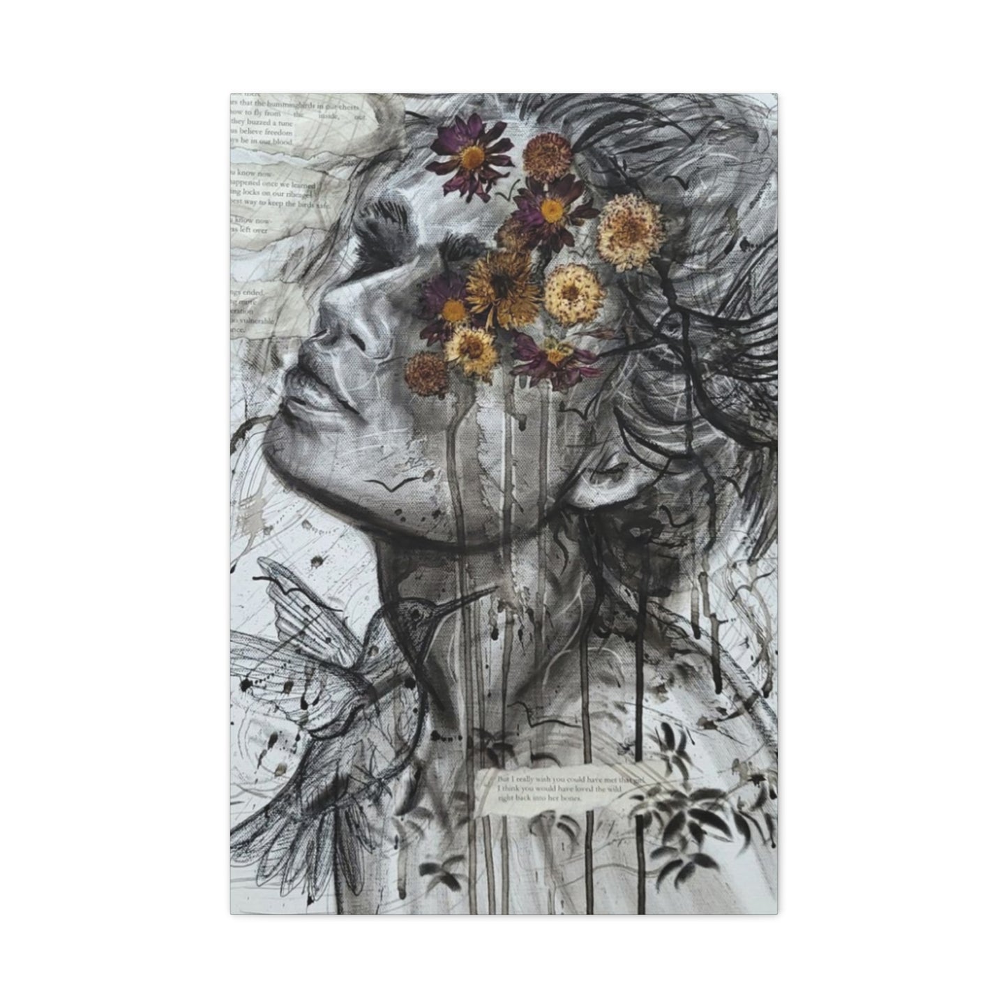
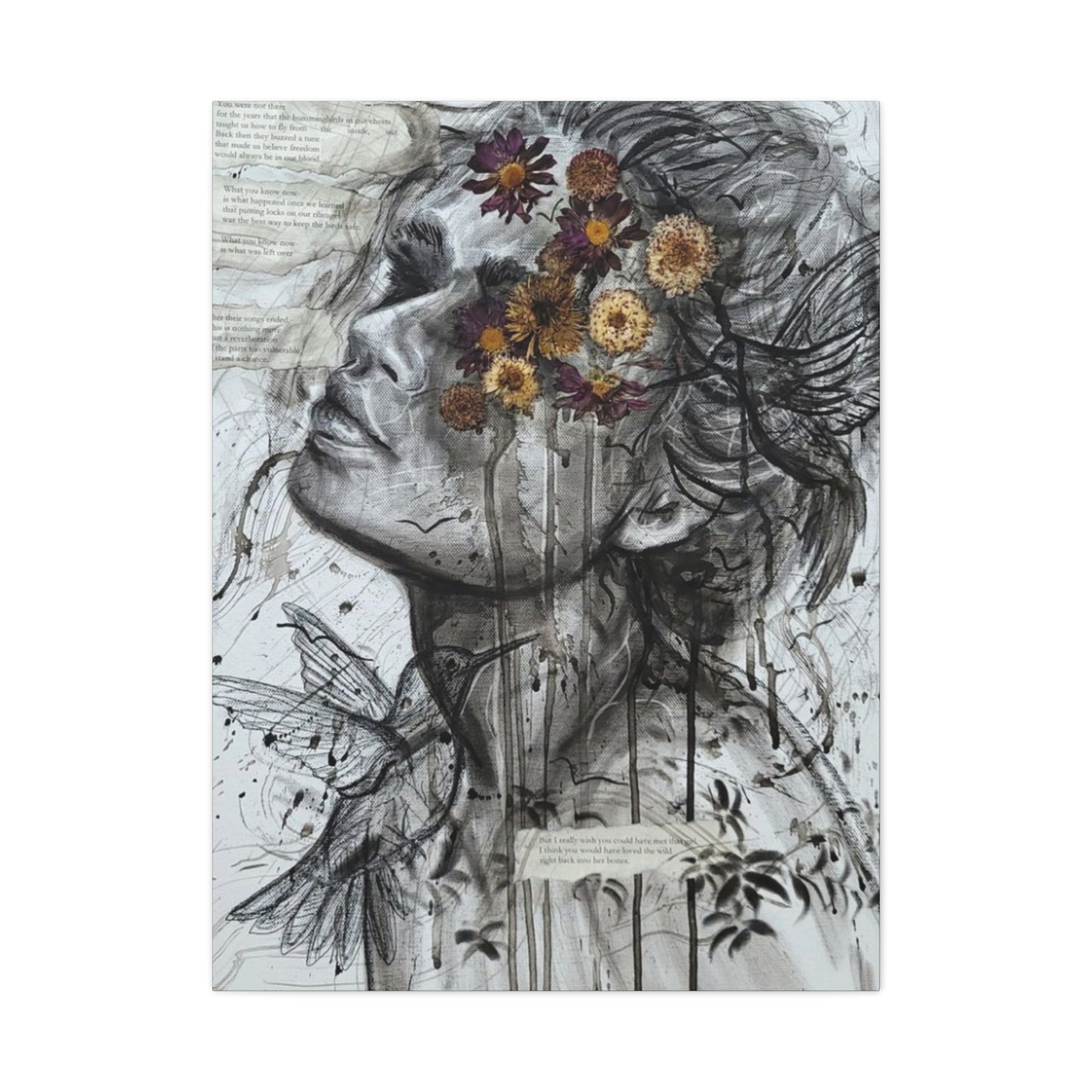
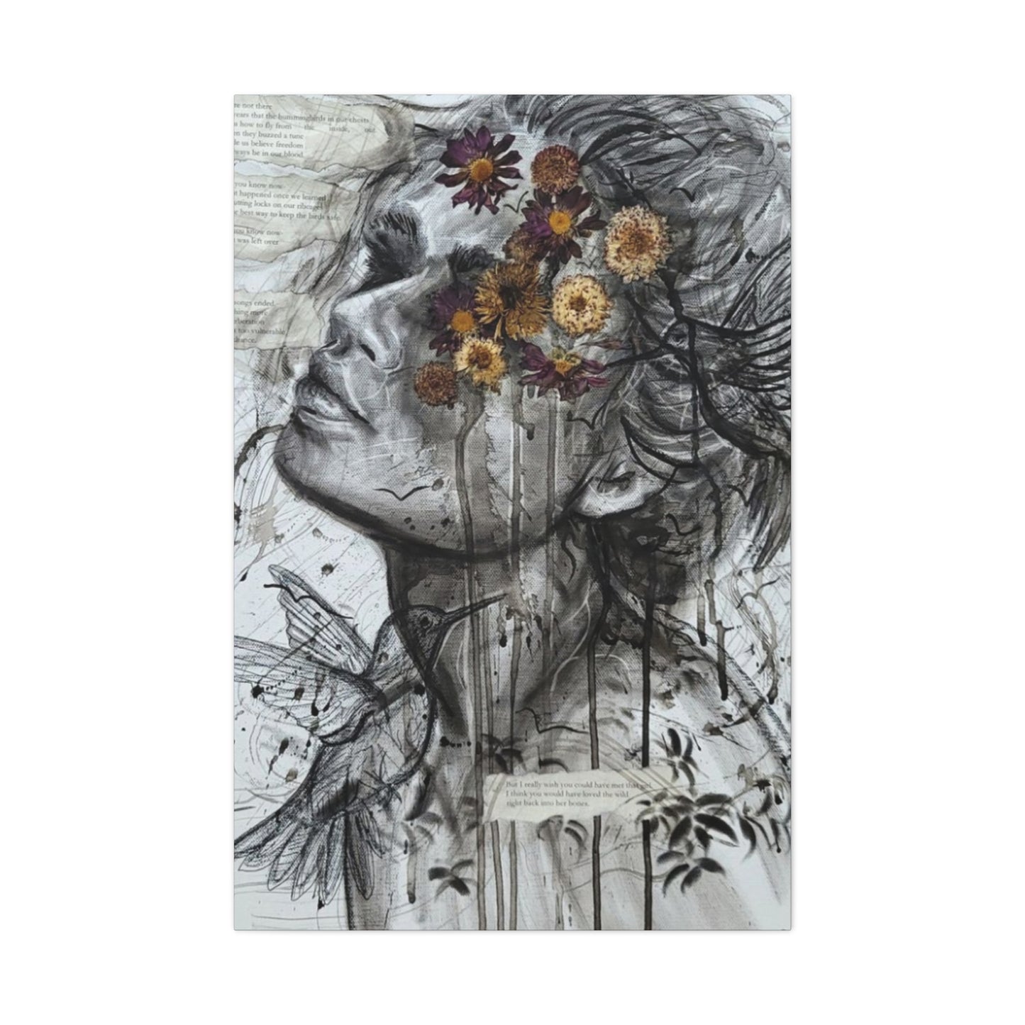

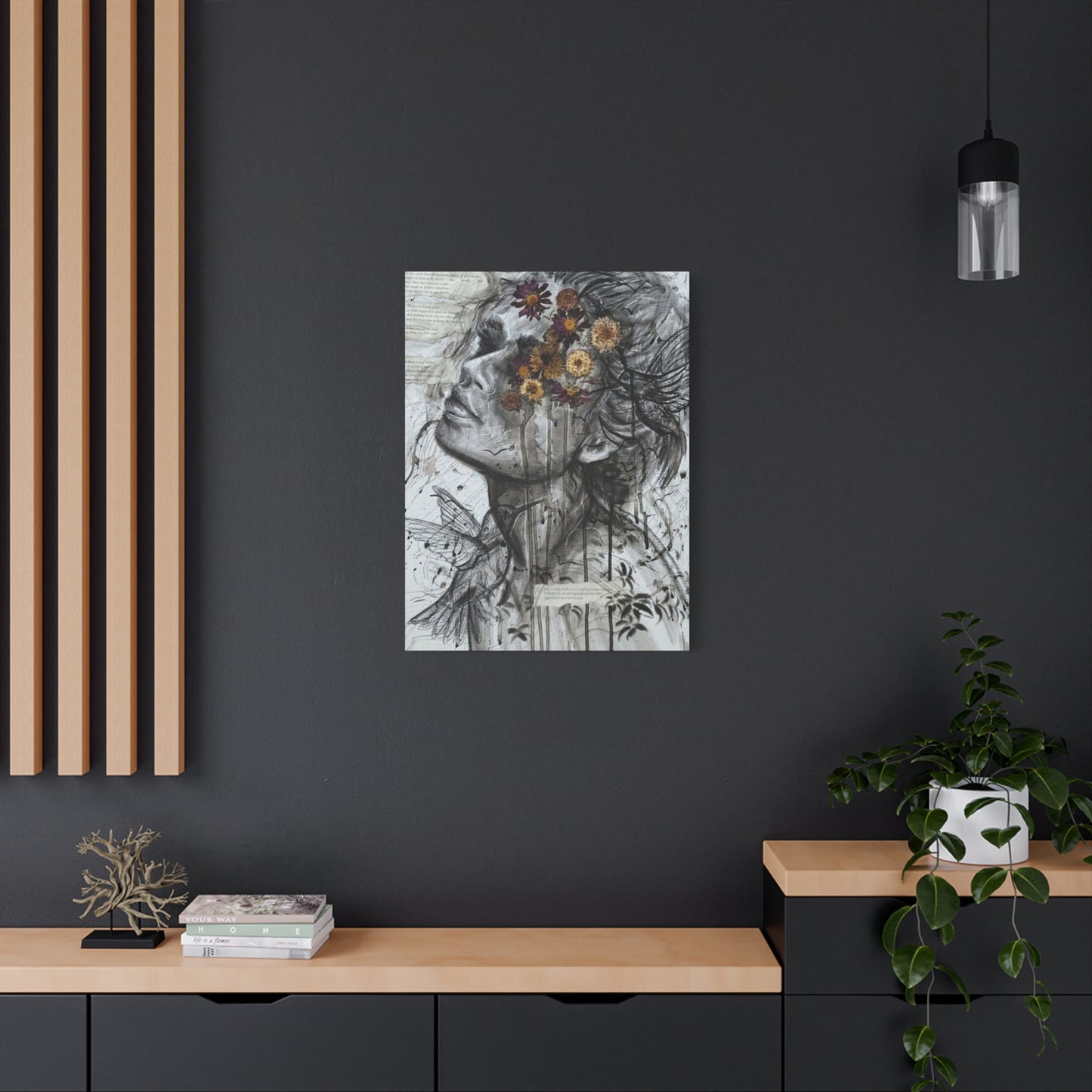
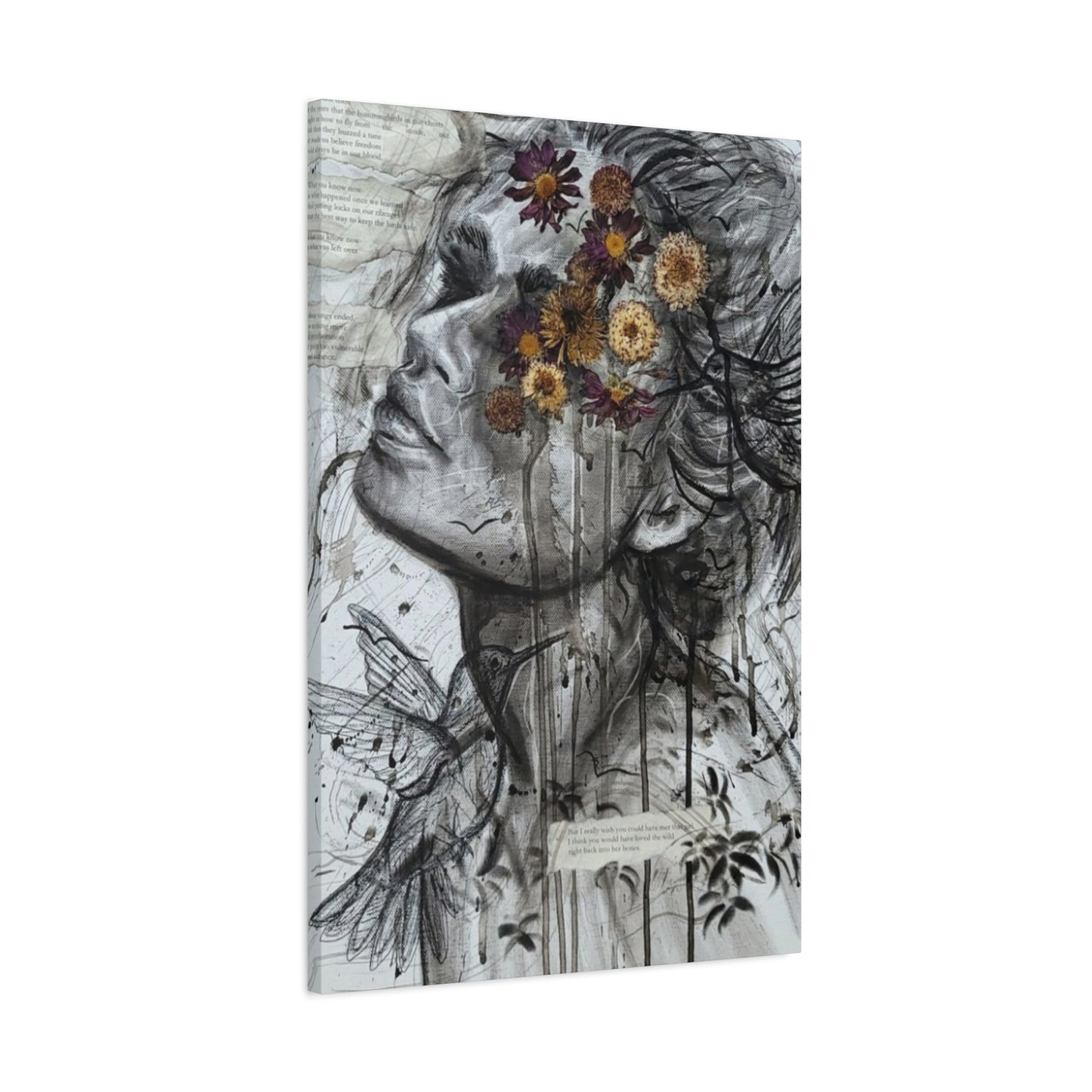
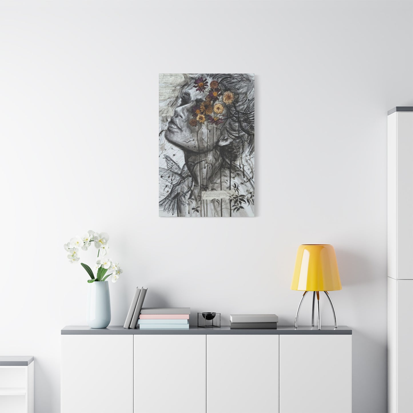
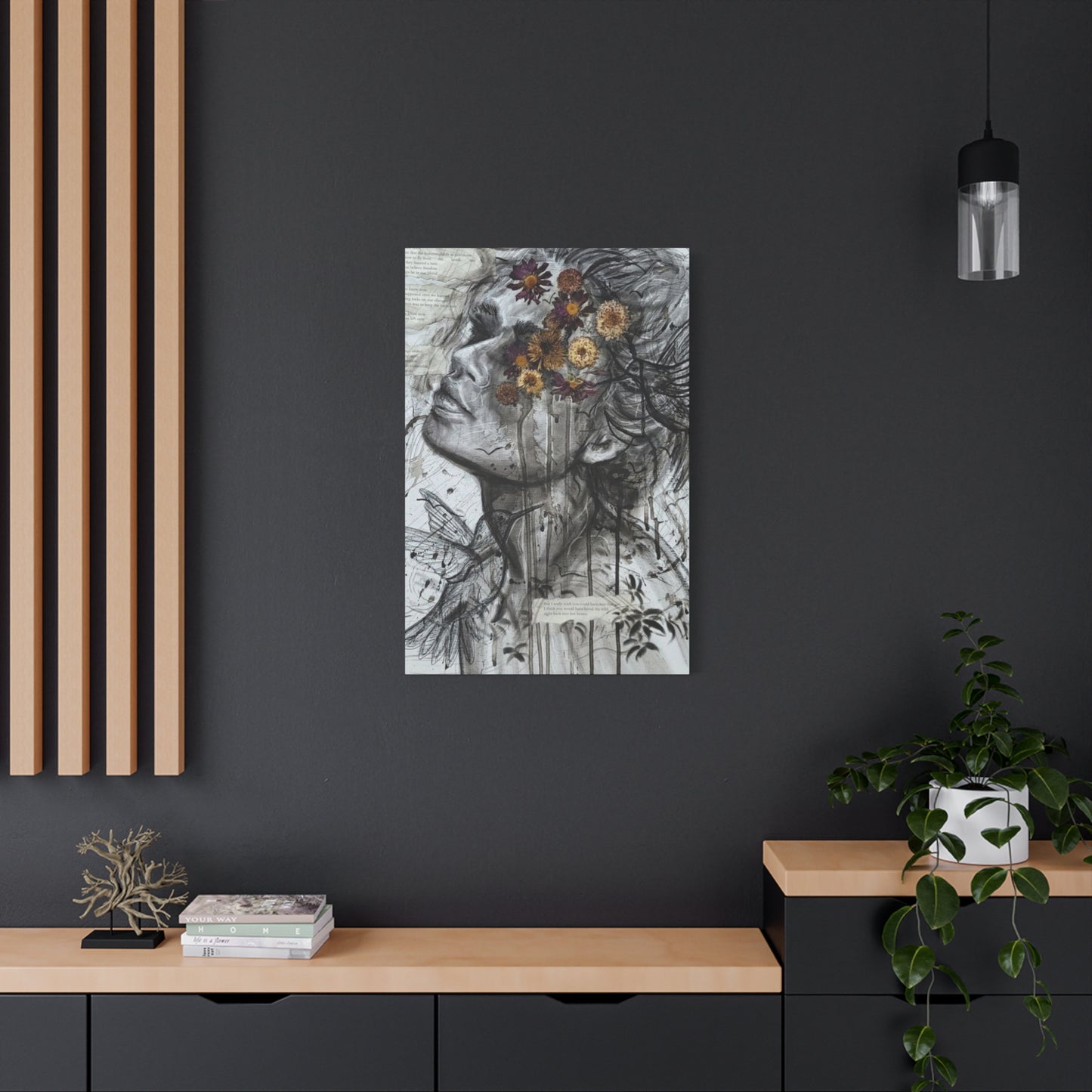
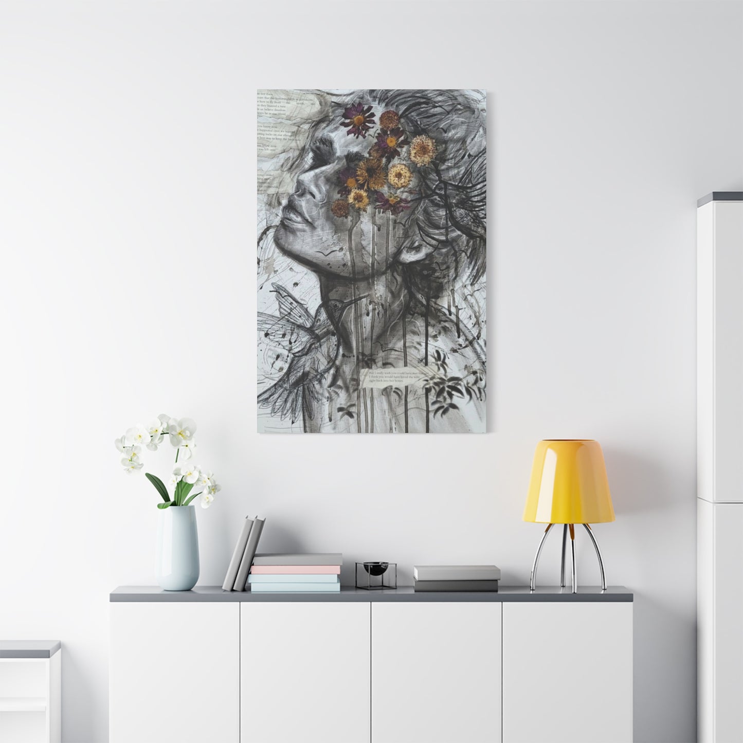
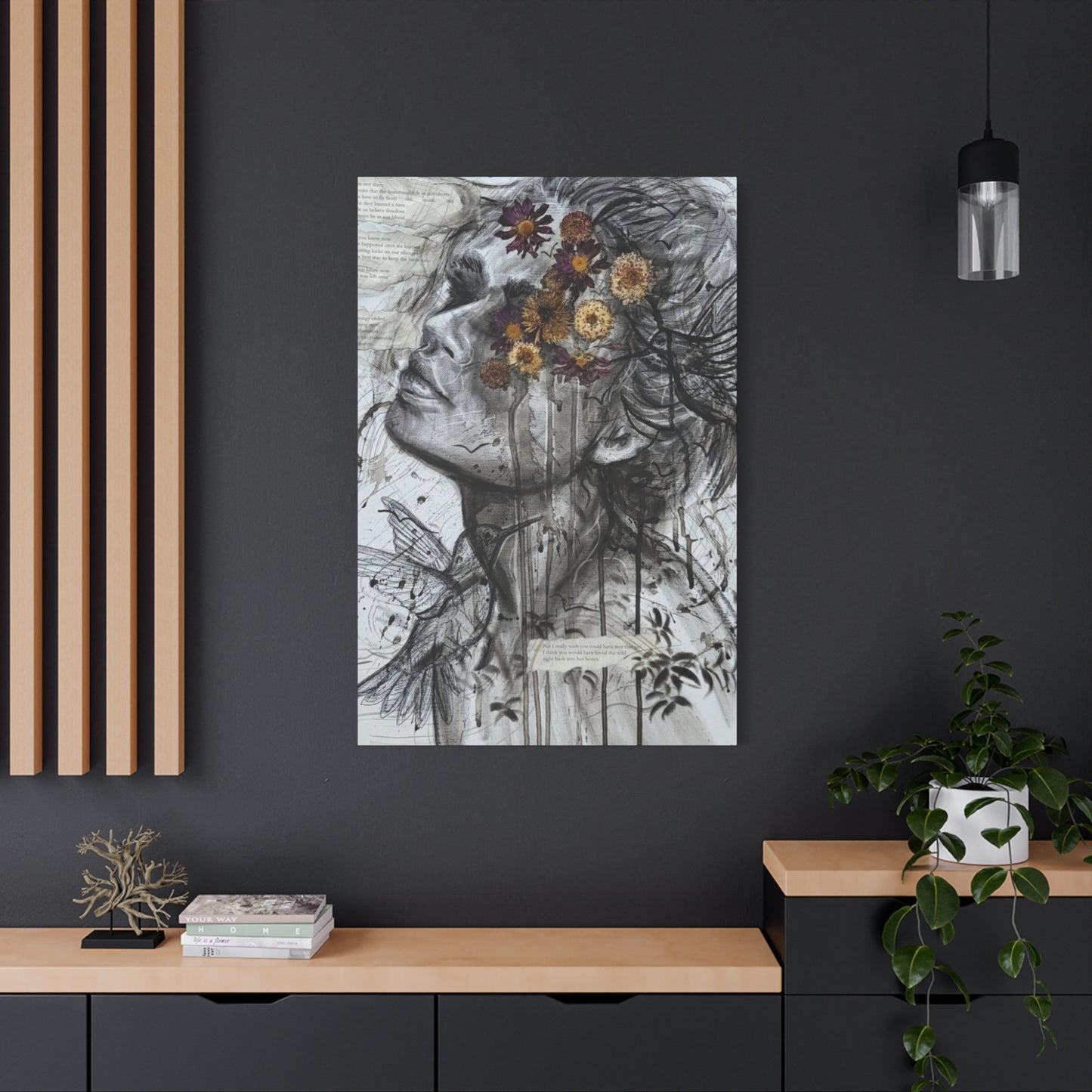
The Intersection of Nature and Portraiture: Girl and Flower Mixed Media Wall Art
The world of contemporary home decoration has evolved dramatically, with abstract mixed media wall art featuring feminine figures and floral elements becoming increasingly popular among homeowners and art enthusiasts alike. These captivating pieces combine traditional artistic techniques with modern sensibilities, creating visual narratives that speak to the soul while enhancing any living environment. Canvas prints of girl and flower abstract compositions offer an accessible way to bring museum-quality artistry into personal environments, transforming ordinary rooms into extraordinary galleries of self-expression.
The Artistic Evolution of Feminine Floral Abstract Compositions
The representation of women alongside floral motifs has deep historical roots in artistic traditions across cultures. Ancient civilizations often depicted goddesses surrounded by blooming plants, symbolizing fertility, beauty, and the cyclical nature of life. These early artistic expressions laid the foundation for what would eventually evolve into contemporary abstract mixed media interpretations that continue to captivate viewers today.
Modern artists have reimagined these classical themes through innovative techniques and unconventional materials, creating layered compositions that invite multiple interpretations. The abstract approach allows artists to explore emotional depths and psychological nuances that realistic portrayals might not achieve. By incorporating various media such as acrylic paints, watercolors, collage elements, and digital enhancements, contemporary creators produce works that are both visually striking and emotionally resonant.
The evolution from traditional portraiture to abstract representation reflects broader cultural shifts in how we perceive identity, beauty, and artistic expression. Contemporary artists embrace ambiguity and suggestion rather than literal representation, allowing viewers to project their own experiences and emotions onto the artwork. This approach creates a more personal and intimate relationship between the observer and the artistic piece.
Mixed media techniques have revolutionized how artists approach feminine and floral themes. By combining different materials and methods, creators can achieve textures, depths, and visual effects that would be impossible with traditional single-medium approaches. Layering transparent washes over collage elements, incorporating found objects, and using unconventional tools all contribute to the unique aesthetic that defines contemporary abstract wall art.
The democratization of art through digital reproduction and canvas printing has made these sophisticated artistic expressions accessible to a broader audience. High-quality canvas prints can now capture the subtle nuances of mixed media works, preserving the integrity of the original while making it available for home decoration at various price points.
Understanding Mixed Media Techniques in Contemporary Art Creation
Mixed media artistry represents a revolutionary approach to creative expression that has transformed how artists conceptualize and execute their visions. This technique involves combining multiple artistic materials and methods within a single composition, creating layered works that possess depth, texture, and visual complexity impossible to achieve through traditional single-medium approaches. The integration of various elements allows artists to tell more nuanced stories and evoke stronger emotional responses from viewers.
The foundation of successful mixed media work lies in understanding how different materials interact with one another. Acrylic paints provide vibrant colors and quick-drying properties, while watercolors offer translucent washes that can create atmospheric effects. Oil pastels add richness and texture, while collage elements introduce unexpected visual elements that can serve as focal points or subtle background details.
Paper selection becomes crucial in mixed media compositions, as different surfaces respond differently to various materials. Heavy watercolor paper can withstand multiple layers of wet media, while canvas provides tooth that grips dry media effectively. Some artists prefer working on wood panels or even unconventional surfaces like fabric or metal, each bringing unique characteristics to the finished piece.
The layering process in mixed media work requires careful planning and intuitive decision-making. Artists must consider the transparency and opacity of different materials, understanding that certain elements will show through subsequent layers while others will completely obscure what lies beneath. This knowledge allows for strategic placement of colors, textures, and details that will contribute to the overall visual impact of the piece.
Texture creation represents one of the most exciting aspects of mixed media work. Artists can achieve three-dimensional effects through the application of modeling paste, the incorporation of fabric or paper elements, or the use of unconventional tools for mark-making. These textural variations catch light differently, creating visual interest that changes as viewing angles shift.
Color harmony in mixed media pieces requires careful consideration of how different materials and techniques affect chromatic relationships. A color that appears vibrant when applied with acrylic paint may look completely different when overlaid with translucent watercolor washes. Artists must develop an understanding of these interactions through experimentation and practice.
The unpredictability inherent in mixed media work can be both challenging and inspiring. Unlike traditional media where results are more predictable, mixed media compositions often evolve in unexpected directions as materials interact in unforeseen ways. This element of surprise can lead to discoveries that enhance the artistic vision or require adaptation of the original concept.
Documentation becomes important in mixed media work, as the complex layering process can make it difficult to recreate specific effects. Many artists maintain detailed notes about materials used, application techniques, and timing of different layers to facilitate future work or to assist in creating series of related pieces.
The Psychology Behind Feminine Imagery in Abstract Art
The incorporation of feminine figures in abstract art taps into deep psychological and cultural associations that resonate across diverse audiences. These representations often transcend literal portraiture to become symbols of universal themes such as nurturing, creativity, resilience, and transformation. The abstract treatment of feminine imagery allows viewers to connect with these themes on an emotional level without being constrained by specific cultural or ethnic identifications.
Psychologically, the human brain is naturally drawn to facial features and human forms, a phenomenon known as pareidolia. Even when presented in highly abstracted forms, viewers tend to recognize and respond to human-like elements in artwork. This innate tendency makes abstract feminine figures particularly engaging, as they trigger recognition responses while maintaining enough ambiguity to allow for personal interpretation.
The color choices commonly associated with feminine imagery in abstract art often reflect both traditional associations and contemporary reinterpretations. Soft pinks, purples, and earth tones might evoke gentleness and nurturing, while bold reds, oranges, and vibrant blues can suggest strength, passion, and independence. Contemporary artists frequently subvert traditional color expectations, using unexpected palettes to challenge preconceived notions about femininity.
Emotional projection plays a significant role in how viewers respond to abstract feminine imagery. The lack of specific details allows individuals to see reflections of their own experiences, relationships, and aspirations within the artwork. A abstract female figure might represent a mother, sister, friend, or idealized self, depending on the viewer's personal history and current emotional state.
The incorporation of floral elements alongside feminine figures creates additional layers of psychological meaning. Flowers have long been associated with growth, beauty, fragility, and renewal across cultures. When combined with feminine imagery, these botanical elements can suggest themes of personal growth, natural cycles, and the interconnectedness of human experience with the natural world.
Cultural conditioning influences how viewers interpret abstract feminine imagery, with responses varying significantly across different backgrounds and experiences. What might appear empowering to one viewer could seem decorative or limiting to another, highlighting the subjective nature of artistic interpretation and the importance of diverse perspectives in art appreciation.
The therapeutic potential of viewing and creating feminine abstract art has been recognized by art therapists and psychologists. The process of connecting with these images can facilitate emotional processing, self-reflection, and healing. Many individuals find comfort and inspiration in artwork that reflects their own experiences or aspirations related to identity, relationships, and personal growth.
Memory and association play crucial roles in how abstract feminine imagery affects viewers. Personal experiences with important women in one's life, cultural messages about femininity, and exposure to artistic traditions all contribute to the emotional response triggered by these artistic representations. This complex web of associations makes each viewing experience unique and personally meaningful.
Floral Symbolism Throughout Art History and Modern Interpretations
The language of flowers has communicated complex emotions and ideas throughout human history, with different blooms carrying specific meanings that transcended spoken language. This rich symbolic tradition provides contemporary artists with a vast vocabulary of visual metaphors that can enhance the emotional impact and interpretive depth of their work. From ancient Egyptian tomb paintings to Victorian flower dictionaries, botanical imagery has served as a powerful tool for artistic expression.
In classical art traditions, roses symbolized love and passion, while lilies represented purity and rebirth. Lotus flowers carried spiritual significance in Eastern traditions, representing enlightenment and spiritual awakening. These established meanings continue to influence contemporary interpretations, though modern artists often play with or subvert traditional associations to create new layers of meaning.
The fragility and temporary nature of flowers make them powerful metaphors for the human condition. Their beauty, brief lifespan, and cyclical renewal speak to themes of mortality, hope, and regeneration that resonate deeply with viewers. Abstract treatments of floral imagery can emphasize these emotional qualities while allowing for more personal and varied interpretations.
Contemporary artists working with floral abstractions often focus on capturing the essence or emotional quality of flowers rather than their literal appearance. This approach might involve emphasizing color relationships that evoke the feeling of a garden in bloom, or creating gestural marks that suggest the movement of petals in wind. The abstraction process distills the most emotionally resonant aspects of floral imagery.
Color psychology plays a significant role in how abstract floral elements communicate meaning. Warm colors like reds, oranges, and yellows might suggest energy, passion, and joy, while cooler blues and purples could evoke tranquility, mystery, or melancholy. The interaction between these color choices and abstract forms creates emotional landscapes that speak to viewers on a subconscious level.
The seasonal associations of different flowers add temporal dimensions to abstract floral artwork. Spring blossoms might suggest new beginnings and hope, while autumn flowers could evoke reflection and acceptance of change. Artists can layer these seasonal references to create works that speak to different emotional states and life experiences.
Cultural variations in floral symbolism provide rich material for contemporary artistic exploration. Cherry blossoms hold special significance in Japanese culture, representing the ephemeral nature of life, while marigolds play important roles in Mexican Day of the Dead celebrations. Artists working with abstract floral themes can draw upon these diverse traditions to create works with global resonance.
The integration of floral symbolism with feminine imagery creates particularly potent artistic statements. Traditional associations between women and flowers have sometimes been criticized as limiting, but contemporary artists often reclaim and reinterpret these connections to explore themes of growth, strength, and natural power. The abstract treatment allows for more complex and nuanced explorations of these relationships.
Environmental consciousness has brought new dimensions to contemporary floral symbolism, with flowers sometimes representing fragility of ecosystems, beauty under threat, or resilience in the face of change. Artists working with abstract floral themes can address these contemporary concerns while maintaining the timeless emotional appeal of botanical imagery.
Canvas Printing Technology and Artistic Reproduction
The revolution in digital printing technology has democratized access to high-quality artistic reproductions, making museum-caliber artwork available for home decoration at unprecedented scales. Modern canvas printing processes can capture minute details, subtle color gradations, and textural nuances that preserve the integrity of original mixed media works while making them accessible to broader audiences.
Advanced inkjet printing systems utilize pigment-based inks that offer superior color accuracy, longevity, and resistance to fading compared to earlier dye-based alternatives. These archival-quality inks can reproduce the full spectrum of colors found in mixed media originals, from subtle pastel washes to vibrant accent colors. The color gamut achievable with professional printing equipment often exceeds what traditional reproduction methods could accomplish.
Canvas substrate selection significantly impacts the final quality of printed reproductions. High-quality cotton or cotton-blend canvases provide the texture and durability necessary to support fine art reproductions. The weave structure of the canvas affects how ink is absorbed and how the finished piece will display under different lighting conditions. Finer weaves capture more detail, while more pronounced textures can add visual interest to abstract compositions.
Pre-treatment processes prepare canvas surfaces to receive inks optimally, ensuring proper adhesion and preventing bleeding or color shifts. These treatments also contribute to the longevity of the finished print, protecting against environmental factors that could degrade the image over time. Quality control during this phase determines the professional appearance and durability of the final product.
Color management throughout the printing process ensures that what appears on screen matches what emerges from the printer. Professional workflows utilize calibrated monitors, standardized lighting conditions, and ICC color profiles to maintain accuracy from digital file to finished canvas. This technical precision is crucial when reproducing the subtle color relationships found in mixed media artwork.
Resolution requirements for canvas printing differ from those needed for paper prints due to viewing distances and canvas texture. While extremely high resolutions might seem desirable, optimal results often come from understanding how resolution interacts with canvas weave and intended viewing distances. Proper file preparation can enhance the final result significantly.
Finishing processes like protective coatings and gallery wrapping contribute to the professional appearance and longevity of canvas prints. UV-resistant coatings protect against light damage while maintaining the visual characteristics of the printed surface. Gallery wrapping, where the image extends around the stretcher bars, creates a finished appearance that eliminates the need for traditional framing.
Quality control measures throughout the printing process ensure consistent results and identify potential issues before they affect finished products. This includes monitoring ink density, checking color accuracy, and inspecting canvas tension and stretching quality. Professional printing services maintain detailed records and protocols to ensure reproducible results.
Color Theory in Abstract Feminine and Floral Compositions
Color relationships form the foundation of emotional communication in abstract art, with the interaction between different hues creating psychological responses that can be more powerful than representational imagery. In compositions featuring feminine figures and floral elements, color choices carry additional layers of cultural and symbolic meaning that enhance the overall impact of the artwork.
Warm color palettes dominated by reds, oranges, and yellows tend to create energetic, passionate, and optimistic feelings in viewers. When applied to abstract feminine and floral themes, these colors might suggest vitality, creativity, and life force. The interaction between warm colors and organic forms can evoke sensations of growth, blooming, and natural energy that resonate with themes of femininity and botanical beauty.
Cool color schemes built around blues, greens, and purples often produce calming, contemplative, or mysterious effects. In the context of feminine and floral abstractions, these colors might suggest introspection, wisdom, or spiritual connection. The combination of cool colors with flowing, organic forms can create meditative qualities that invite quiet contemplation and emotional reflection.
Analogous color schemes, which utilize colors adjacent to each other on the color wheel, create harmonious and unified compositions that feel naturally balanced. These palettes work particularly well in abstract floral pieces where the goal is to suggest the gentle transitions found in natural color progressions, such as the gradual shift from pink to purple in sunset-lit petals.
Complementary color relationships, involving colors opposite each other on the color wheel, create dynamic tension and visual excitement. When used thoughtfully in abstract compositions, complementary pairs can suggest the dualities often explored in feminine themes: strength and gentleness, growth and rest, passion and tranquility. The vibration created by complementary colors can energize abstract forms and create focal points within compositions.
Color temperature plays a crucial role in creating depth and atmospheric effects in abstract artwork. Warm colors tend to advance toward the viewer, while cool colors recede, allowing artists to create spatial relationships and hierarchies within flat compositions. This principle becomes particularly useful when layering abstract feminine figures against floral backgrounds or integrating multiple elements within a single composition.
Saturation levels affect the emotional intensity and sophistication of color relationships. Highly saturated colors create bold, energetic effects that command attention, while desaturated or muted colors produce subtle, sophisticated moods that invite closer inspection. The balance between saturated and muted colors can control the overall energy level of a composition and guide viewer attention to specific areas.
Value relationships, referring to the lightness or darkness of colors, create structure and visual organization within abstract compositions. Strong value contrasts can define forms and create dramatic effects, while subtle value transitions can suggest ethereal or dreamlike qualities appropriate for abstract interpretations of feminine and floral themes.
The psychological associations of specific colors vary across cultures and individual experiences, adding personal dimensions to color interpretation. While red might universally suggest passion or energy, its specific emotional impact depends on cultural context and personal associations. Artists working with abstract themes can layer multiple color meanings to create rich, interpretively complex works.
Color harmony principles guide the creation of pleasing and emotionally resonant compositions. Triadic color schemes, split-complementary relationships, and tetradic combinations each offer different approaches to balancing visual interest with overall unity. These systematic approaches provide frameworks for color decision-making while leaving room for intuitive adjustments and creative expression.
Composition Techniques for Mixed Media Wall Art
Effective composition in mixed media wall art requires balancing multiple visual elements while maintaining overall unity and emotional impact. The integration of feminine figures, floral elements, abstract forms, and various media creates complex compositional challenges that demand both technical skill and intuitive understanding of visual dynamics.
The rule of thirds provides a fundamental framework for organizing compositional elements in ways that feel natural and balanced to viewers. By dividing the canvas into nine equal sections with two horizontal and two vertical lines, artists can position key elements at intersection points or along lines to create more dynamic and engaging compositions than centering would achieve.
Golden ratio proportions, found throughout nature and classical art, can create compositions that feel inherently harmonious and pleasing. This mathematical relationship, approximately 1.618:1, can guide decisions about size relationships between different elements, placement of focal points, and overall compositional divisions. Many artists apply these proportions intuitively rather than calculating them precisely.
Visual flow directs viewer attention through the composition in ways that support the artistic intent and emotional message. Leading lines, whether literal or implied, can guide the eye from one area to another, creating movement and maintaining engagement. In abstract feminine and floral compositions, these flow lines might follow the curve of a figure's form or the organic growth patterns suggested by botanical elements.
Focal hierarchy establishes the relative importance of different elements within the composition, ensuring that viewers understand where to look first and how to navigate through the piece. Primary focal points command initial attention, while secondary elements support and enhance the overall visual narrative. The strategic use of contrast, color intensity, and detail density can control this hierarchical relationship.
Balance in mixed media compositions can be symmetrical, asymmetrical, or radial, each creating different emotional effects and visual dynamics. Symmetrical balance tends to create formal, stable feelings, while asymmetrical balance produces more dynamic, energetic sensations. Radial balance, emanating from a central point, can create focus and unity while maintaining visual interest throughout the composition.
Negative area, the portions of the composition not occupied by obvious subject matter, plays crucial roles in determining overall visual impact and emotional tone. Well-designed negative areas provide rest for the eye, enhance the prominence of positive elements, and can suggest additional layers of meaning through their shapes and relationships to other compositional elements.
Layering strategies in mixed media work must consider both physical and visual layers. Physical layers involve the actual application of different materials at different stages of the creative process, while visual layers refer to the perceptual organization of elements in terms of foreground, middle ground, and background relationships. Successful integration of these layering approaches creates depth and visual richness.
Scale relationships between different elements within the composition affect both visual impact and emotional response. Unexpected scale relationships can create surreal or dreamlike effects appropriate for abstract interpretations, while more naturalistic scale relationships might ground fantastical elements in familiar visual experiences.
Repetition and variation of visual elements create rhythm and unity while maintaining interest. Repeated colors, shapes, textures, or motifs establish visual themes that unify diverse elements, while variations prevent monotony and maintain viewer engagement. This principle becomes particularly important when integrating multiple media and techniques within a single composition.
Lighting Considerations for Displaying Canvas Art
Proper lighting transforms the viewing experience of canvas art, revealing colors, textures, and details while protecting the artwork from damage. Mixed media pieces with their complex surfaces and varied materials require particularly thoughtful lighting approaches that enhance their visual impact while preserving their longevity.
Natural light offers the most complete spectrum for color rendering but presents challenges for artwork preservation. The ultraviolet radiation in sunlight can cause fading and deterioration over time, while the constantly changing quality and direction of natural light make it unreliable for consistent viewing experiences. Strategic placement near north-facing windows can provide gentle, consistent natural illumination without direct sun exposure.
LED lighting systems have revolutionized art display with their energy efficiency, longevity, and controllable characteristics. Modern LED fixtures offer full spectrum lighting that can accurately render colors while producing minimal heat and UV radiation. The ability to adjust color temperature and intensity allows for customization based on specific artwork requirements and viewing preferences.
Track lighting provides flexible solutions for illuminating multiple pieces or large compositions. Adjustable fixtures can be positioned to eliminate glare while providing even illumination across the entire surface of the artwork. The directional nature of track lighting allows for precise control over which areas receive emphasis and can accommodate different sizes and orientations of artwork.
Picture lighting, including traditional picture lights and modern LED strip systems, offers dedicated illumination designed specifically for artwork display. These systems can be integrated into frames or mounting systems to provide consistent, even lighting that travels with the artwork if repositioning becomes necessary.
Color temperature selection significantly affects how artwork appears under artificial lighting. Warmer color temperatures (2700K-3000K) tend to enhance reds, oranges, and earth tones while making blues appear more muted. Cooler temperatures (4000K-5000K) provide more accurate color rendering across the spectrum but may appear harsh in residential settings.
Beam angles and light distribution patterns must be matched to artwork dimensions and viewing distances. Narrow beam angles concentrate light on smaller areas, creating dramatic effects but potentially causing uneven illumination on larger pieces. Wider beam angles provide more even coverage but may lack the intensity needed to properly illuminate detailed work.
Glare prevention requires careful attention to fixture placement and beam direction. Light sources should be positioned at angles that prevent direct reflection into viewers' eyes while providing adequate illumination of the artwork surface. Anti-glare accessories and diffusion materials can further reduce problematic reflections.
Dimming capabilities allow for adjustment of lighting levels based on ambient conditions, time of day, and viewing preferences. Programmable dimming systems can automatically adjust lighting throughout the day to maintain optimal viewing conditions while conserving energy and reducing wear on both fixtures and artwork.
Conservation considerations must balance optimal viewing conditions with long-term preservation requirements. Even LED lighting produces some heat and potential UV radiation that can accumulate over time. Timer systems and motion sensors can reduce unnecessary exposure while ensuring adequate illumination when artwork is being viewed.
Creating Emotional Connections Through Abstract Art
Abstract art's power lies in its ability to bypass literal interpretation and speak directly to viewers' emotions and subconscious responses. Mixed media compositions featuring feminine and floral themes tap into universal human experiences while allowing for deeply personal interpretations that create lasting emotional connections.
The ambiguity inherent in abstract representation allows viewers to project their own experiences, memories, and emotions onto the artwork. A flowing form might suggest movement, dance, or growth to one viewer while evoking water, wind, or music to another. This interpretive flexibility makes abstract art personally meaningful in ways that more literal representations might not achieve.
Emotional triggers in abstract art often operate below the conscious level, using color relationships, gestural marks, and compositional dynamics to evoke feelings before rational interpretation begins. The immediate emotional response to an abstract piece can be more powerful and authentic than reactions to artwork that requires intellectual analysis or cultural knowledge to appreciate fully.
Memory activation through abstract imagery can create profound connections between viewers and artwork. Subtle color combinations might evoke memories of specific places, seasons, or relationships, while gestural marks could suggest movement patterns or emotional states from personal experience. These unconscious connections contribute to the lasting appeal of abstract compositions.
Psychological projection allows individuals to see reflections of their inner lives within abstract forms. The suggestion of feminine figures might activate thoughts about important women in one's life, personal identity issues, or aspirations related to strength, creativity, or nurturing. Floral elements might trigger associations with growth, beauty, fragility, or natural cycles.
Therapeutic benefits of engaging with abstract art have been documented by art therapists and psychologists. The process of viewing and interpreting abstract imagery can facilitate emotional processing, stress reduction, and creative thinking. Many individuals find that abstract art helps them access and express feelings that might be difficult to articulate through words alone.
Cultural resonance in abstract feminine and floral themes connects individual experiences to broader human narratives about growth, beauty, relationships, and natural cycles. These universal themes transcend specific cultural contexts while remaining open to personal interpretation and cultural variation.
Contemplative qualities in abstract art invite extended viewing and reflection that can deepen emotional connections over time. Unlike artwork that reveals all its secrets immediately, abstract compositions often reward repeated viewing with new discoveries and evolving interpretations. This ongoing dialogue between viewer and artwork creates lasting relationships that enrich daily life.
Mood enhancement through carefully chosen abstract art can positively influence the emotional atmosphere of living environments. Colors, forms, and compositional energies that resonate with desired emotional states can subtly influence daily experiences and contribute to overall well-being and life satisfaction.
Historical Context of Women in Art and Modern Reinterpretations
The representation of women in artistic traditions has evolved dramatically from symbolic and idealized portrayals to complex, multifaceted explorations of feminine experience. Contemporary abstract interpretations of feminine themes build upon this rich historical foundation while challenging traditional limitations and expanding possibilities for artistic expression.
Ancient artistic traditions often portrayed women as goddesses, symbols of fertility, or representations of natural forces. These early depictions established visual vocabularies and symbolic associations that continue to influence contemporary interpretations. However, modern artists often subvert or recontextualize these historical references to create new meanings and challenge traditional limitations.
Renaissance and Baroque periods saw increasingly sophisticated portrayals of women, though often still constrained by cultural expectations and male artistic perspectives. The technical achievements of these periods in representing human form, emotion, and psychological depth provide foundations that contemporary abstract artists can reference while departing from literal representation.
The emergence of women artists in the 19th and 20th centuries brought new perspectives and approaches to feminine representation in art. Artists like Mary Cassatt, Georgia O'Keeffe, and Frida Kahlo offered intimate and authentic portrayals of women's experiences that challenged conventional artistic traditions and opened new possibilities for artistic expression.
Feminist art movements of the 1960s and 1970s revolutionized how women's experiences were represented and interpreted in artistic contexts. These movements emphasized the importance of female perspectives, challenged traditional artistic hierarchies, and created new frameworks for understanding gender in artistic representation.
Contemporary abstract approaches to feminine themes benefit from this expanded historical context while offering new possibilities for interpretation and expression. The freedom from literal representation allows modern artists to explore aspects of feminine experience that might be difficult to address through traditional portraiture or narrative painting.
Postmodern sensibilities have introduced additional layers of complexity to contemporary interpretations of feminine themes in art. Questions of identity, representation, cultural construction of gender, and individual agency all influence how contemporary artists approach these subjects and how audiences interpret the resulting works.
Global perspectives on feminine representation have enriched contemporary artistic discourse by introducing diverse cultural approaches to these themes. Artists working with abstract feminine imagery can draw upon multiple cultural traditions while creating works that speak to universal human experiences.
The democratization of artistic production and distribution through digital technologies has allowed for more diverse voices and perspectives in contemporary art. This diversity has enriched the field of abstract feminine art with new approaches, techniques, and interpretations that reflect the complexity of modern feminine experience.
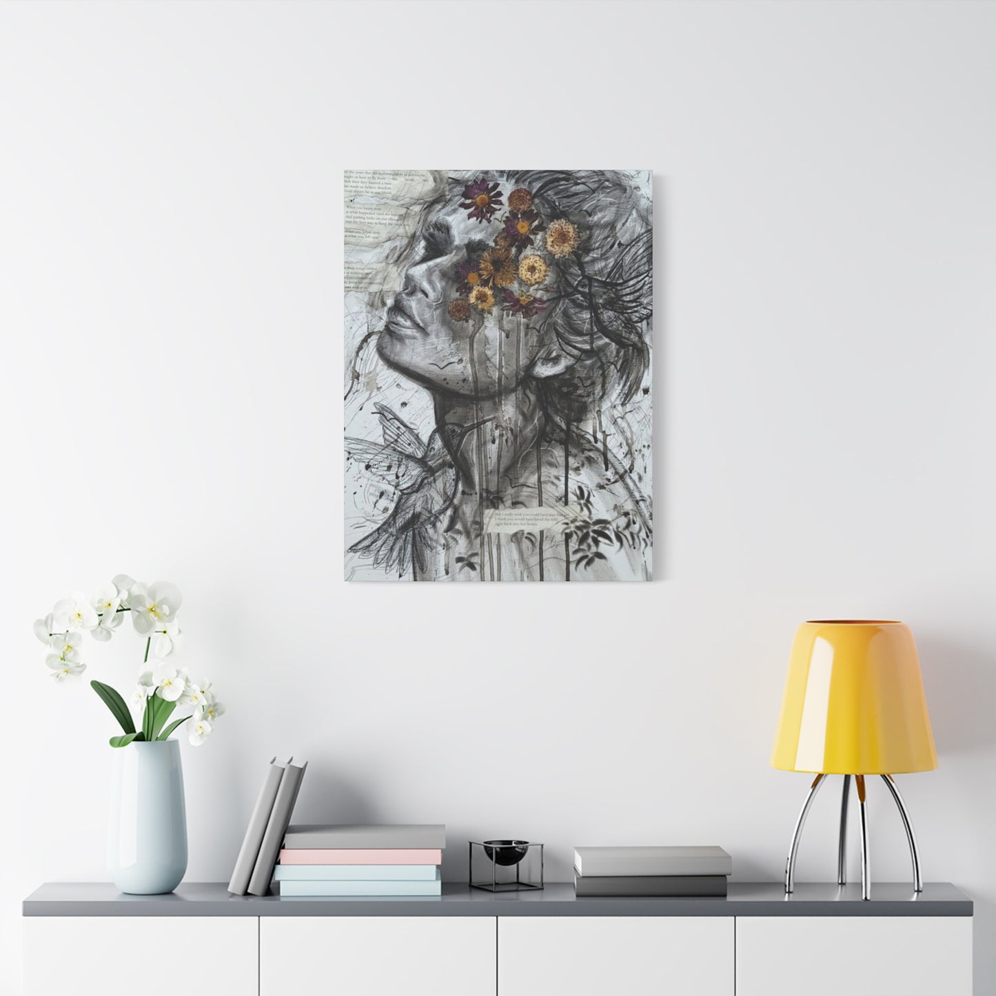
Selecting the Perfect Size and Placement for Canvas Prints
The selection of appropriate size and placement for canvas prints significantly impacts their visual effectiveness and integration into living environments. Mixed media abstract compositions featuring feminine and floral themes require careful consideration of viewing distances, room proportions, and intended emotional effects.
Viewing distance calculations help determine optimal sizes for canvas prints in specific locations. Artwork that will be viewed primarily from conversation seating distances requires different size considerations than pieces intended for hallway display or close inspection. The complexity and detail level of mixed media compositions also influences ideal viewing distances.
Wall proportion relationships affect how artwork integrates with architectural elements and furniture arrangements. Pieces that are too small for their wall locations may appear insignificant and fail to create intended visual impact, while oversized pieces can overwhelm environments and compete with other design elements.
Furniture scale coordination ensures that canvas prints complement rather than compete with surrounding furnishings. The relationship between artwork size and nearby furniture pieces affects overall visual balance and can influence how comfortable and harmonious an environment feels to occupants and visitors.
Multiple piece arrangements allow for creative approaches to displaying abstract compositions that might work well as series or complementary groupings. Triptych arrangements, gallery walls, and symmetrical or asymmetrical groupings each offer different advantages for specific artworks and room configurations.
Ceiling height considerations influence both the maximum practical size for artwork and the optimal placement height. Standard placement guidelines suggest hanging artwork with centers at eye level, but room proportions, furniture arrangements, and intended viewing positions may require adjustments to these general principles.
Lighting integration must be considered during placement planning to ensure that adequate illumination can be provided without creating problematic glare or shadows. The relationship between natural light sources, artificial lighting fixtures, and artwork placement affects both aesthetic results and long-term preservation concerns.
Room function and traffic patterns influence both placement options and size requirements. Artwork in frequently traveled areas might benefit from different size and placement approaches than pieces in quiet contemplation areas. The intended use of each room affects how artwork can best contribute to the overall environmental experience.
Color coordination with existing décor elements requires consideration of both the artwork's color palette and the surrounding environment's color scheme. While artwork can serve as either harmonizing or contrasting elements within a room's color story, the relationship must be intentional and supportive of the overall design goals.
Understanding Different Canvas Materials and Their Characteristics
Canvas material selection significantly influences both the appearance and longevity of printed artwork reproductions. Different fiber compositions, weave structures, and preparation treatments each contribute unique characteristics that affect how inks are absorbed, how colors appear, and how well the finished piece will maintain its quality over time.
Cotton canvas represents the most traditional choice for fine art reproduction, offering excellent color absorption, archival stability, and pleasant texture characteristics. The natural fibers provide tooth that helps inks adhere properly while creating subtle texture that enhances the visual appeal of printed reproductions. Cotton's proven longevity in artistic applications makes it a reliable choice for high-quality reproductions.
Cotton-polyester blend canvases combine the natural characteristics of cotton with the stability and consistency of synthetic fibers. These blends often offer enhanced dimensional stability, reduced susceptibility to environmental changes, and consistent texture characteristics. The synthetic component can also improve ink absorption and color vibrancy in some applications.
Polyester canvas materials provide maximum stability and resistance to environmental factors that can affect natural fiber canvases. These synthetic materials maintain consistent dimensions and texture characteristics regardless of humidity changes and offer excellent color reproduction capabilities. However, they may lack some of the natural aesthetic qualities that many prefer in fine art applications.
Weave structure affects both the visual appearance and functional characteristics of canvas substrates. Fine weaves capture more detail and produce smoother color transitions, making them ideal for detailed mixed media reproductions. Coarser weaves provide more pronounced texture that can enhance the tactile quality of abstract compositions but may obscure fine details.
Weight classifications indicate the density and durability of canvas materials, with heavier weights generally providing better stability and longevity. Gallery-wrap applications particularly benefit from heavier canvas weights that can maintain proper tension around stretcher bars without sagging or developing wrinkles over time.
Priming and preparation treatments prepare canvas surfaces to receive inks optimally while providing protection against environmental factors. Proper priming prevents ink bleeding, ensures color accuracy, and contributes to the overall archival quality of the finished reproduction. Different priming formulations are optimized for specific ink types and printing processes.
Texture options range from ultra-smooth surfaces that maximize detail reproduction to heavily textured materials that emphasize the handmade quality of original artwork. The choice depends on the characteristics of the original piece and the desired aesthetic effect in the reproduction.
Archival quality standards ensure that canvas materials will maintain their appearance and structural integrity over extended periods. Acid-free materials, lightfast treatments, and appropriate chemical compositions all contribute to archival quality that protects the investment in high-quality art reproductions.
Environmental resistance characteristics vary among different canvas materials and treatments. Factors such as humidity tolerance, UV resistance, and resistance to airborne pollutants all affect how well canvas prints will maintain their appearance in different display environments.
Color Matching and Calibration for Accurate Reproductions
Achieving accurate color reproduction in canvas prints requires sophisticated color management throughout the entire production process. From initial digital capture or creation through final printing, each step must be carefully controlled and calibrated to ensure that the finished reproduction accurately represents the original artwork's color relationships and emotional impact.
Monitor calibration establishes the foundation for accurate color work by ensuring that what appears on screen matches standardized color values. Professional color management systems use hardware calibration devices to create custom ICC profiles that account for individual monitor characteristics and environmental lighting conditions.
Color profile management coordinates color interpretation throughout the production workflow, from image creation through final printing. ICC profiles describe how different devices interpret color values, allowing for accurate translation between different color gamuts and ensuring consistency across various stages of the reproduction process.
Gamut mapping addresses the differences between color ranges that can be captured, displayed, and printed. While original artwork might contain colors that exceed the capabilities of printing systems, sophisticated gamut mapping algorithms can maintain color relationships and emotional impact while staying within printable ranges.
Proofing procedures provide opportunities to evaluate and adjust color accuracy before committing to final production. Soft proofing on calibrated monitors allows for preliminary assessment, while hard proofing with actual ink and substrate combinations provides the most accurate preview of final results.
Ambient lighting control during color evaluation ensures consistent and accurate assessment of color relationships. Standardized viewing booths with controlled lighting eliminate variables that could affect color perception and decision-making throughout the production process.
Ink density monitoring maintains consistent color output throughout print runs and over time as printing equipment ages or environmental conditions change. Sophisticated printing systems automatically monitor and adjust ink density to maintain color accuracy and consistency.
Color temperature considerations affect how colors appear under different lighting conditions and must be factored into both the reproduction process and the intended display environment. Colors that appear accurate under one lighting condition might look significantly different under another type of illumination.
Metamerism awareness addresses the phenomenon where colors that match under one lighting condition appear different under another type of light. This consideration becomes particularly important for artwork that will be viewed under various lighting conditions throughout its display life.
Quality control procedures throughout the production process identify and correct color accuracy issues before they affect finished products. These procedures include regular equipment calibration, color target monitoring, and systematic evaluation of finished prints against established standards.
Conclusion
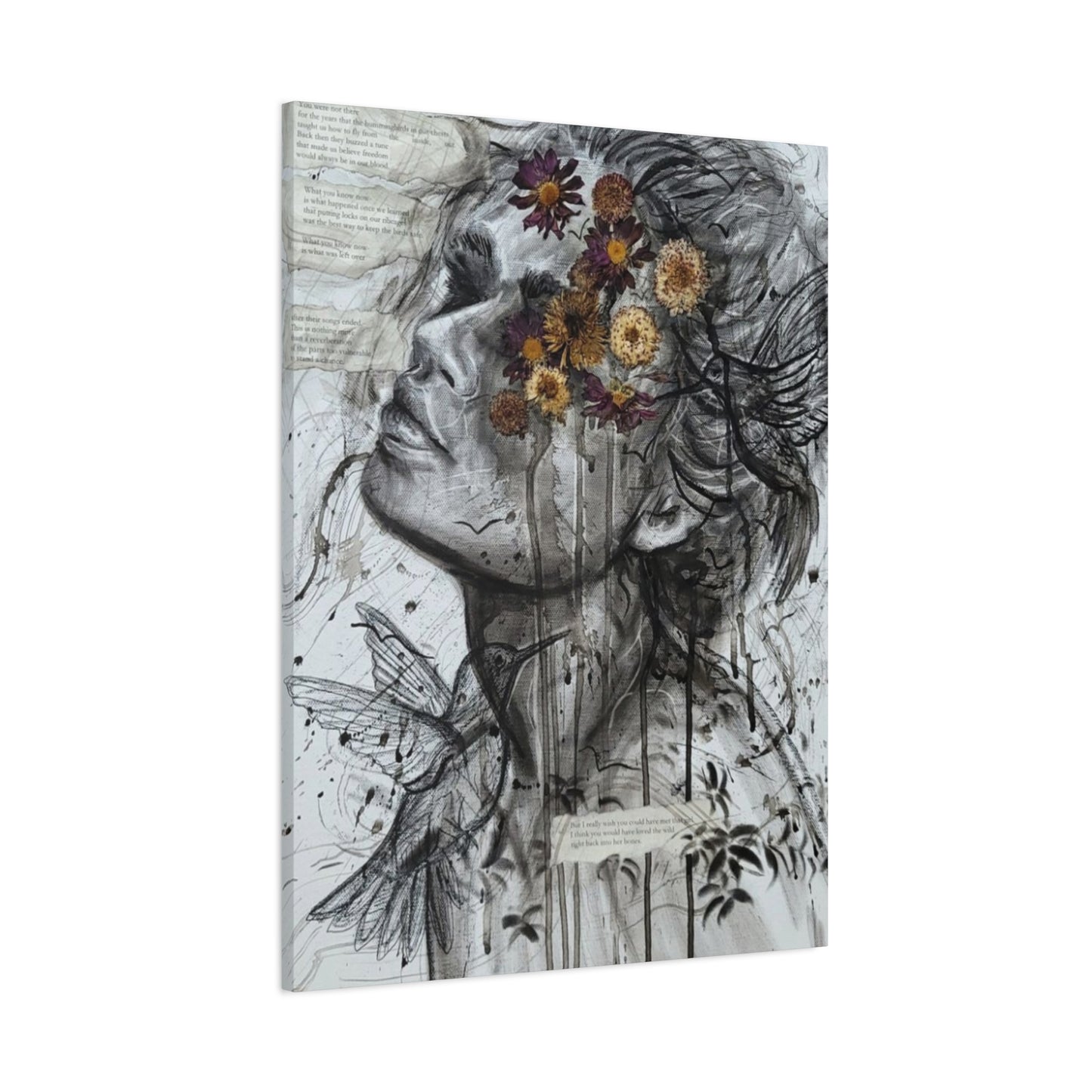
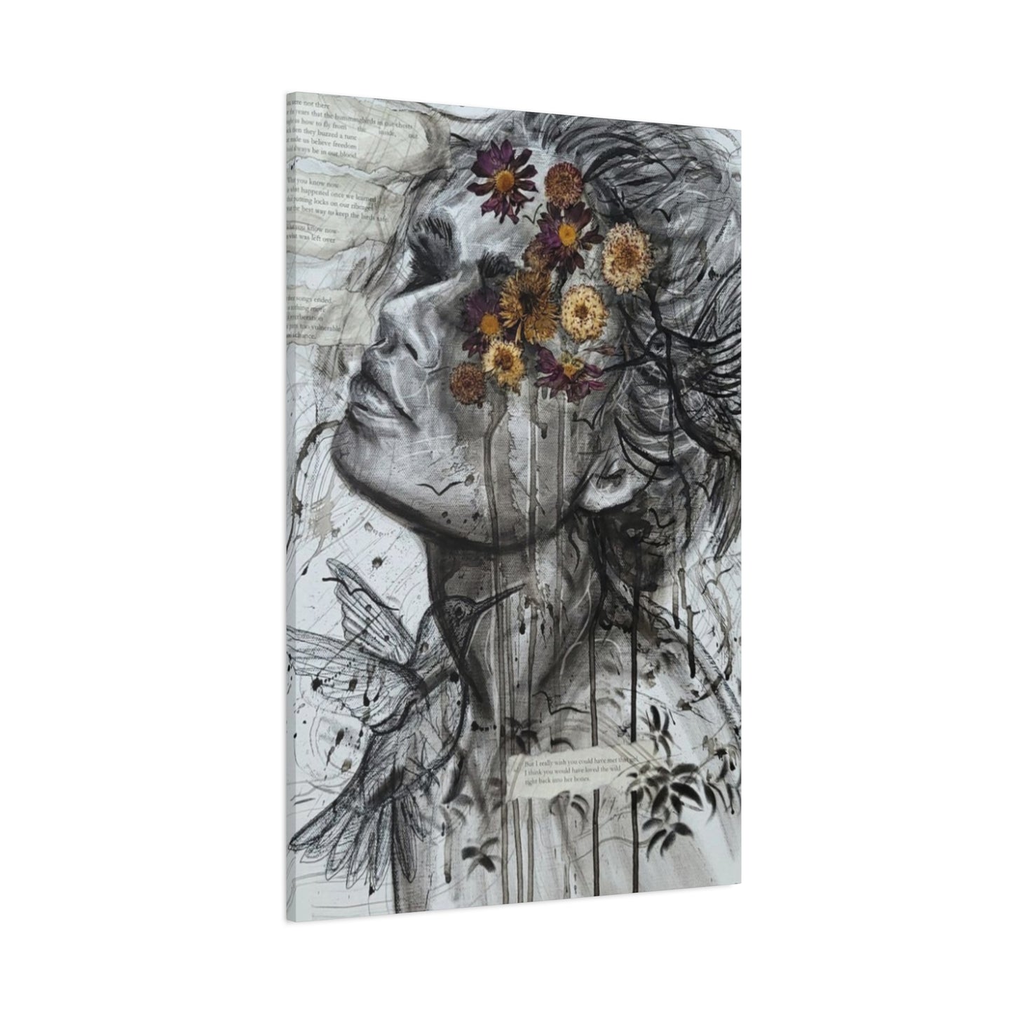
The intersection of nature and portraiture, as expressed in girl and flower mixed media wall art, offers a compelling fusion of human emotion and organic beauty that resonates deeply with viewers. This art form seamlessly blends delicate floral elements with intimate human features, creating evocative compositions that celebrate both individuality and the natural world. By combining portraiture’s emotional depth with nature’s vibrant symbolism, these mixed media pieces invite us to explore themes of growth, transformation, and interconnectedness in a visually stunning way.
At its core, girl and flower mixed media wall art captures the timeless relationship between humans and nature. Flowers symbolize beauty, fragility, and renewal, while the human portrait conveys identity, emotion, and personality. Together, they form a harmonious dialogue that reflects the complex interplay between inner life and the environment. This artistic intersection encourages viewers to consider how we are shaped by and, in turn, shape the natural world around us, reminding us of our shared vulnerability and resilience.
The mixed media technique adds another layer of richness to this art style. By combining paint, collage, photography, and other materials, artists create textured, multidimensional works that engage the senses and invite closer inspection. This tactile quality enhances the emotional impact of the pieces, making the portraits feel alive and the flowers almost tangible. The layered effects also mirror the layers of human experience, suggesting that identity and nature are both complex and multifaceted.
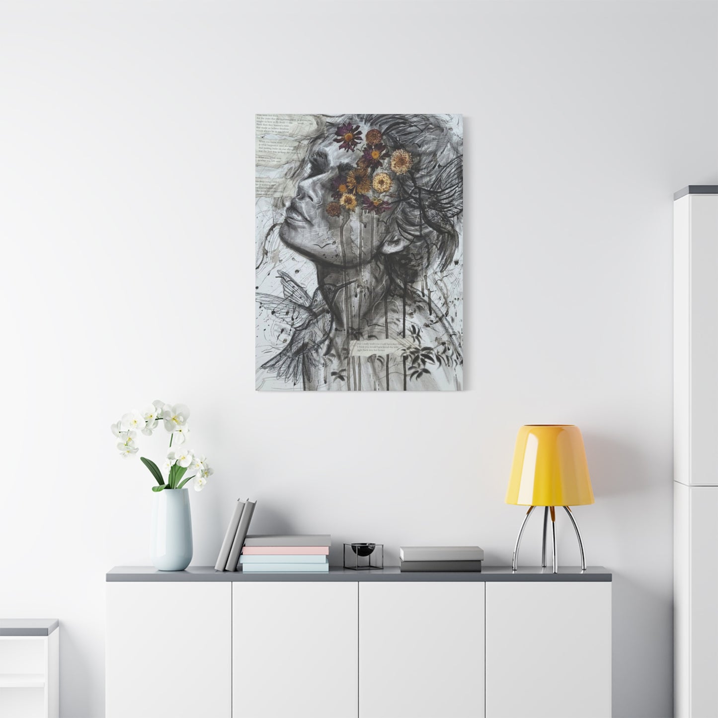
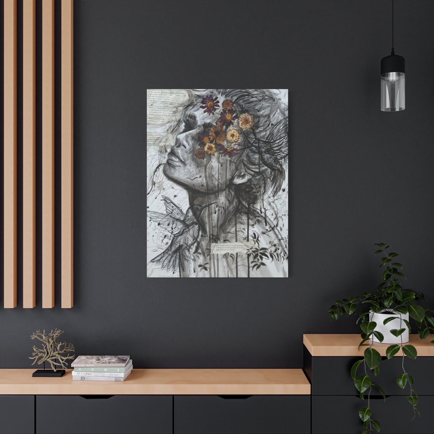
From a design perspective, girl and flower mixed media wall art offers versatility and sophistication for contemporary interiors. These artworks work beautifully as focal points in living rooms, bedrooms, or creative spaces, adding a unique blend of softness and strength. The combination of natural motifs and human expression can complement diverse décor styles, from bohemian and eclectic to modern and minimalist, creating spaces that feel both personal and inspiring.
In conclusion, the intersection of nature and portraiture in girl and flower mixed media wall art provides a meaningful and visually captivating way to explore themes of beauty, identity, and connection. By merging floral symbolism with human emotion, these pieces transcend traditional portraiture and botanical art, offering something fresh and profound. Incorporating this art into your living environment invites reflection on the harmony between self and nature, enriching your space with depth, texture, and poetic beauty. It’s a celebration of life’s delicate balance, captured through the creative synergy of two timeless subjects.
