


Nature’s Touch: How Green Scenery Colorful Wall Art Redefines Modern Wall Décor
The incorporation of verdant hues into interior wall decorations has emerged as one of the most influential design movements in contemporary home styling. This color, deeply rooted in our connection to the natural world, brings an unparalleled sense of tranquility and rejuvenation to living spaces. When strategically integrated into wall art, these earthy tones create environments that promote mental clarity, emotional balance, and physical wellbeing. The psychological impact of incorporating nature-inspired palettes into our daily surroundings cannot be overstated, as these shades trigger our innate biophilic responses, creating sanctuaries within our homes that serve as respites from the demands of modern life.
The selection of wall decorations featuring natural landscapes and botanical elements represents more than mere aesthetic preference; it reflects a fundamental human need to maintain connection with the organic world. As urbanization continues to distance us from natural environments, the deliberate integration of forest-inspired artwork and botanical imagery serves as a vital bridge between indoor living and the wilderness beyond our walls. This design philosophy acknowledges that our wellbeing is intrinsically linked to our environment, and by thoughtfully curating our interior spaces with representations of thriving ecosystems, we create atmospheres that nurture both body and mind.
Contemporary interior design increasingly recognizes the therapeutic potential of color psychology, particularly regarding the calming influence of verdant shades. These hues, ranging from deep emerald to soft sage, from vibrant lime to muted olive, each carry distinct emotional resonances that can dramatically alter the energy of a space. The strategic placement of artwork featuring these tones can transform stark, sterile environments into warm, welcoming sanctuaries that encourage relaxation and creative thinking. Understanding how to harness this transformative power requires knowledge of color theory, spatial dynamics, and the subtle interplay between light, texture, and pigment.
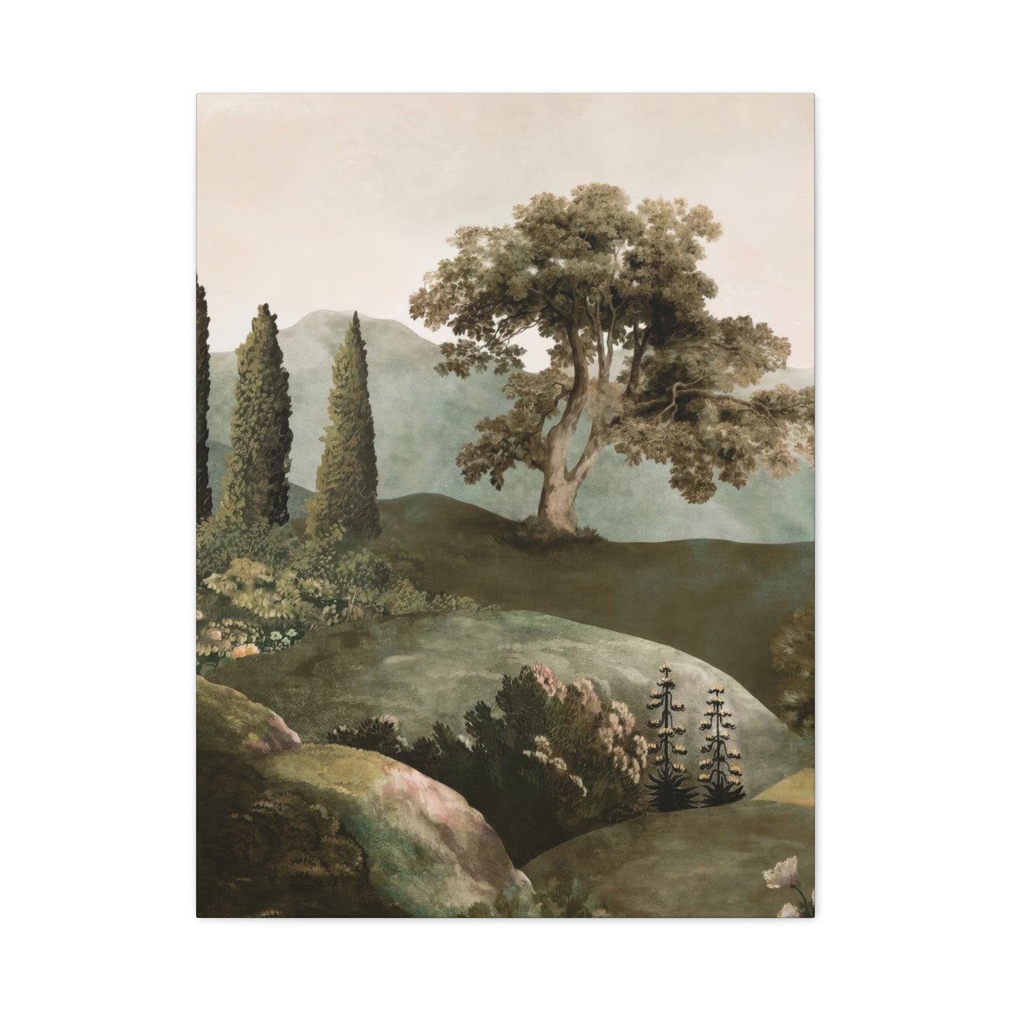
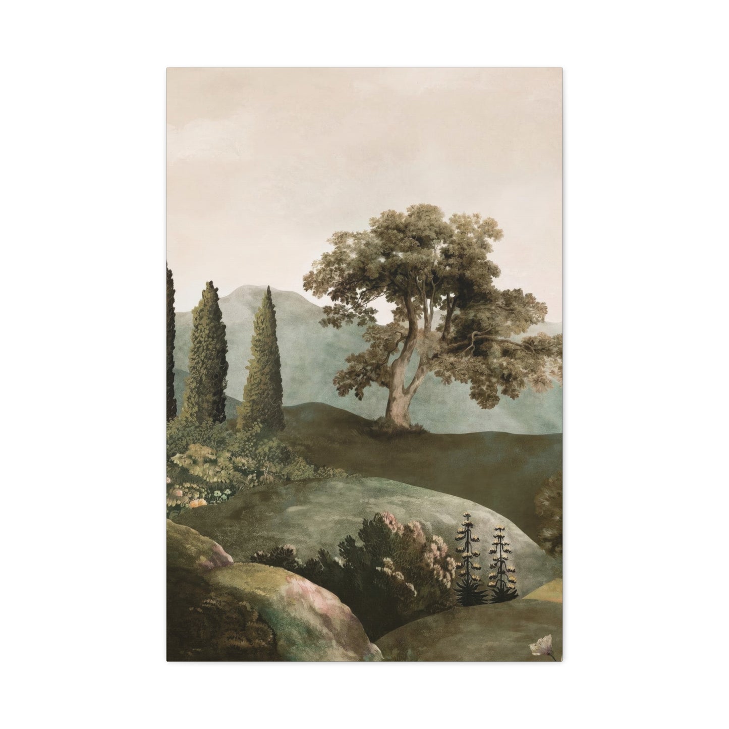
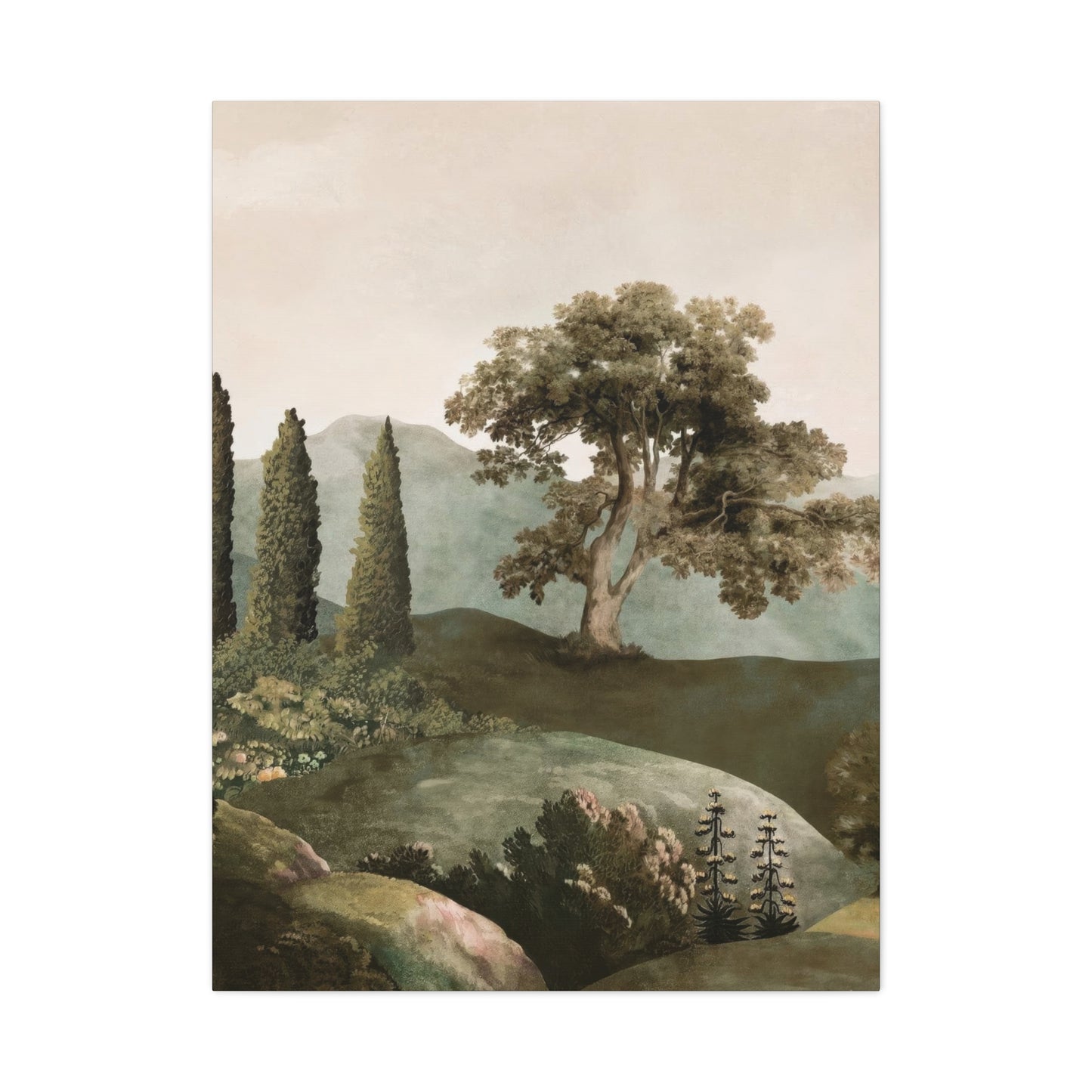
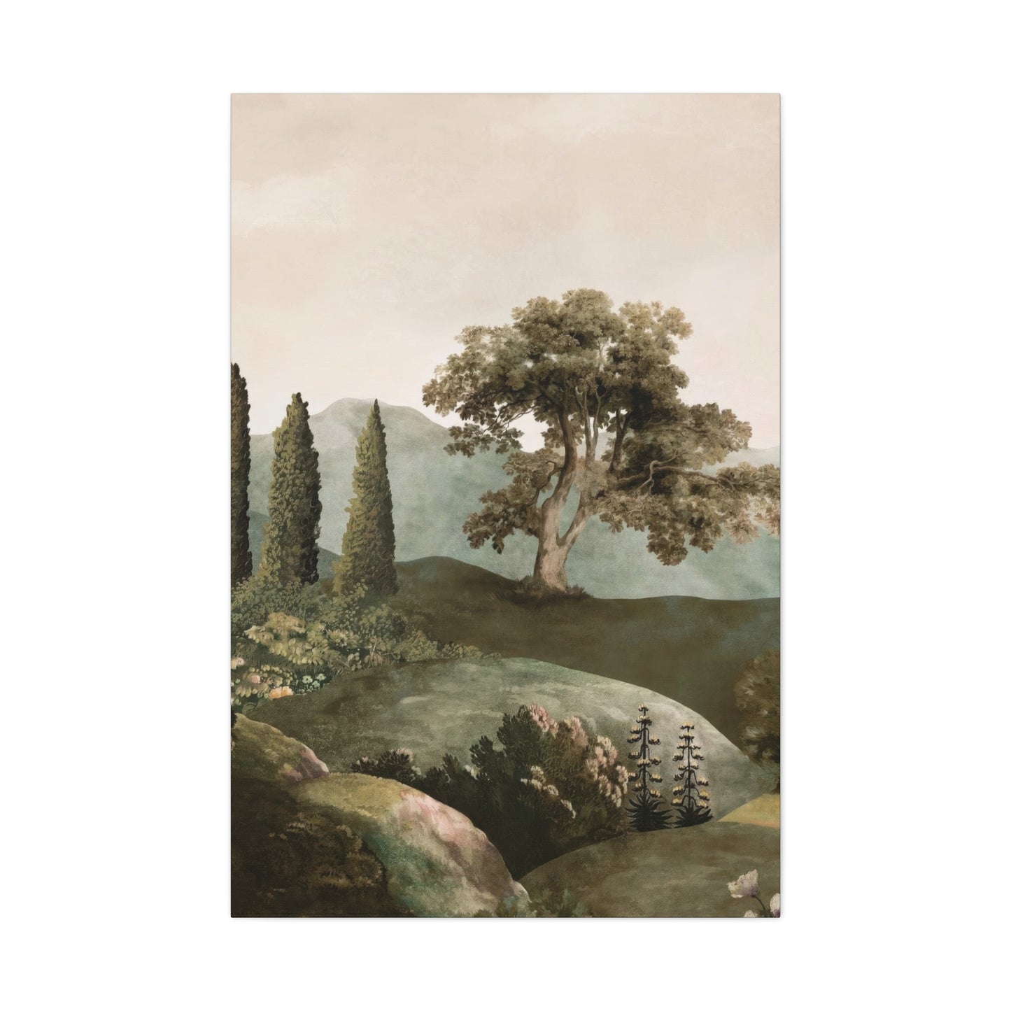
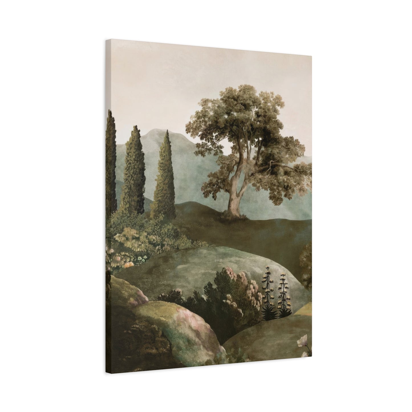
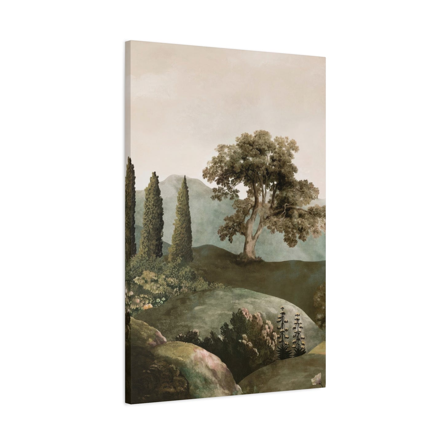
The evolution of wall art has witnessed a remarkable shift toward nature-centric themes, with artists and designers alike exploring innovative ways to capture the essence of the natural world on canvas. This movement extends beyond simple landscape reproduction, encompassing abstract interpretations, stylized botanical studies, and imaginative compositions that blend realistic representation with artistic innovation. The result is a diverse marketplace of options that cater to various aesthetic preferences while maintaining the core principle of bringing the outdoors inside. Whether through photorealistic depictions of forest scenes, impressionistic renderings of meadows, or minimalist line drawings of foliage, the options for incorporating natural elements into wall decor are virtually limitless.
The Calming Effect of Green in Wall Decor
The profound psychological impact of verdant tones in interior design stems from millions of years of human evolution in natural environments. Our ancestors spent their entire lives surrounded by foliage, grasslands, and forests, developing deep neurological associations between these shades and feelings of safety, abundance, and tranquility. Modern neuroscience has confirmed what our instincts have always known: exposure to these colors triggers measurable reductions in stress hormones, lowers blood pressure, and promotes mental clarity. When we integrate artwork featuring these natural palettes into our living spaces, we tap into these ancient associations, creating environments that fundamentally support human wellbeing.
The specific wavelengths of light reflected by verdant pigments fall within a range that human eyes process with minimal strain, making these hues inherently restful to perceive. Unlike more stimulating colors that demand attention and can create visual fatigue, natural earth tones allow the eyes to relax, reducing the cognitive load required for visual processing. This physiological response translates into a subjective experience of calmness and ease, making spaces decorated with forest-inspired artwork ideal for areas dedicated to rest, contemplation, or creative work. The gentle visual stimulation provided by these shades creates a backdrop that supports focused activity without overwhelming the senses.
Incorporating wall decorations dominated by botanical hues into bedroom environments can significantly improve sleep quality and promote deeper relaxation. The absence of jarring, high-energy colors allows the mind to disengage from the day's stimulation more easily, facilitating the transition into restful states. Many sleep researchers recommend that bedroom color schemes emphasize cooler, nature-derived tones precisely because they support the physiological processes associated with healthy sleep patterns. Artwork featuring tranquil forest scenes, misty mountain landscapes, or gentle meadow vistas reinforces this calming atmosphere, transforming the bedroom into a true sanctuary for restoration.
Living areas also benefit tremendously from the integration of nature-inspired wall art, particularly in homes where residents experience high levels of daily stress. The presence of verdant artwork in frequently occupied spaces provides continuous subtle cues that encourage mental decompression and emotional regulation. This is particularly valuable in modern homes where distinct work and leisure boundaries have become increasingly blurred. A thoughtfully chosen piece depicting a serene woodland scene or a lush botanical garden can serve as a visual anchor, reminding occupants to pause, breathe, and reconnect with the natural rhythms that urban living often obscures.
The therapeutic applications of color psychology extend into professional healthcare settings, where the strategic use of nature-inspired artwork has become a standard component of healing-oriented design. Hospitals, clinics, and wellness centers increasingly incorporate wall decorations featuring peaceful landscapes and botanical imagery to reduce patient anxiety, support faster recovery times, and create more humane care environments. Research consistently demonstrates that patients in rooms featuring natural scenery require less pain medication, report lower stress levels, and experience shorter hospital stays compared to those in environments lacking such visual elements. These findings underscore the profound physiological impact that our visual environment exerts on health outcomes.
The calming influence of verdant wall art extends beyond individual psychological responses to affect interpersonal dynamics within shared spaces. Families gathering in living rooms adorned with peaceful nature scenes often report improved communication, reduced conflict, and enhanced feelings of connection. The subtle influence of the surrounding visual environment shapes emotional states in ways that participants may not consciously recognize, yet these effects accumulate over time to create distinct atmospheric qualities. A home decorated with thoughtfully chosen botanical artwork cultivates an ambiance of harmony and balance that permeates all interactions occurring within its walls.
Commercial spaces increasingly recognize the value of incorporating calming nature-inspired artwork to enhance customer experience and employee wellbeing. Offices featuring forest landscapes report higher employee satisfaction, improved productivity, and reduced absenteeism. Retail environments using botanical wall decorations create more pleasant shopping experiences, encouraging customers to linger longer and return more frequently. Restaurants and cafes adorned with verdant artwork foster relaxed dining atmospheres that enhance patron satisfaction and encourage positive reviews. The commercial applications of strategic color use demonstrate that the psychological impacts of environmental design translate directly into measurable business outcomes.
Understanding the specific emotional associations connected to different shades within the natural spectrum allows for more nuanced interior design choices. Deep forest tones convey stability, grounding, and sophistication, making them ideal for spaces where serious work or contemplation occurs. Brighter, more vibrant verdant hues suggest energy, growth, and optimism, working well in creative studios or children's areas. Soft, muted sage and celadon tones evoke tranquility and refinement, perfect for meditation spaces or formal living areas. By matching the specific character of the color palette to the intended function of each room, designers create environments that intuitively support their intended purposes.
The interaction between natural light and verdant wall art creates dynamic visual experiences that change throughout the day. Morning sunlight illuminating a forest landscape piece may emphasize golden undertones, creating an energizing atmosphere perfect for starting the day. Afternoon light might deepen shadows and enrich the saturation of foliage, producing a more contemplative mood. Evening illumination can transform the same artwork yet again, perhaps emphasizing cooler undertones that support relaxation as day transitions to night. This natural variation ensures that artwork remains visually engaging rather than becoming mere background decoration, maintaining its psychological efficacy over extended periods.
Blending Nature and Color in Canvas Art
The artistic fusion of naturalistic representation with bold chromatic choices represents one of the most exciting developments in contemporary wall art. Traditional landscape painting often prioritized realistic color reproduction, striving to capture scenes exactly as they appeared to the eye. Modern artists, however, increasingly embrace interpretive approaches that heighten emotional impact through intentional color manipulation. A forest scene might incorporate unexpected purples in shadowed areas, or a meadow could feature electric blues alongside traditional verdant tones. These creative color choices don't diminish the artwork's connection to nature but rather intensify the emotional resonance, creating pieces that speak to both our rational appreciation of natural beauty and our instinctive emotional responses to color.
The psychological impact of combining realistic natural elements with unexpected color palettes creates cognitive interest that maintains viewer engagement over time. When we encounter a landscape rendered in colors that slightly diverge from strict realism, our brains engage in a subtle process of recognition and surprise. We identify the scene as naturalistic while simultaneously appreciating the artistic interpretation, creating a richer, more layered viewing experience. This dynamic prevents the visual fatigue that can occur with purely representational artwork, ensuring that pieces remain interesting and emotionally engaging even after years of daily viewing.
Contemporary canvas art frequently employs layering techniques that build visual depth through the strategic application of multiple color values. An artist might begin with deep, rich base tones representing shadows and depth, then progressively add lighter layers to suggest foliage, atmospheric perspective, and points of illumination. This approach creates artwork with remarkable visual complexity that reveals new details upon repeated viewing. The interplay of warm and cool tones within natural scenes adds dimension and movement, preventing flat, lifeless representations. When backlit or viewed under changing light conditions, these layered compositions seem to shift and evolve, maintaining visual interest throughout different times of day and seasonal light variations.
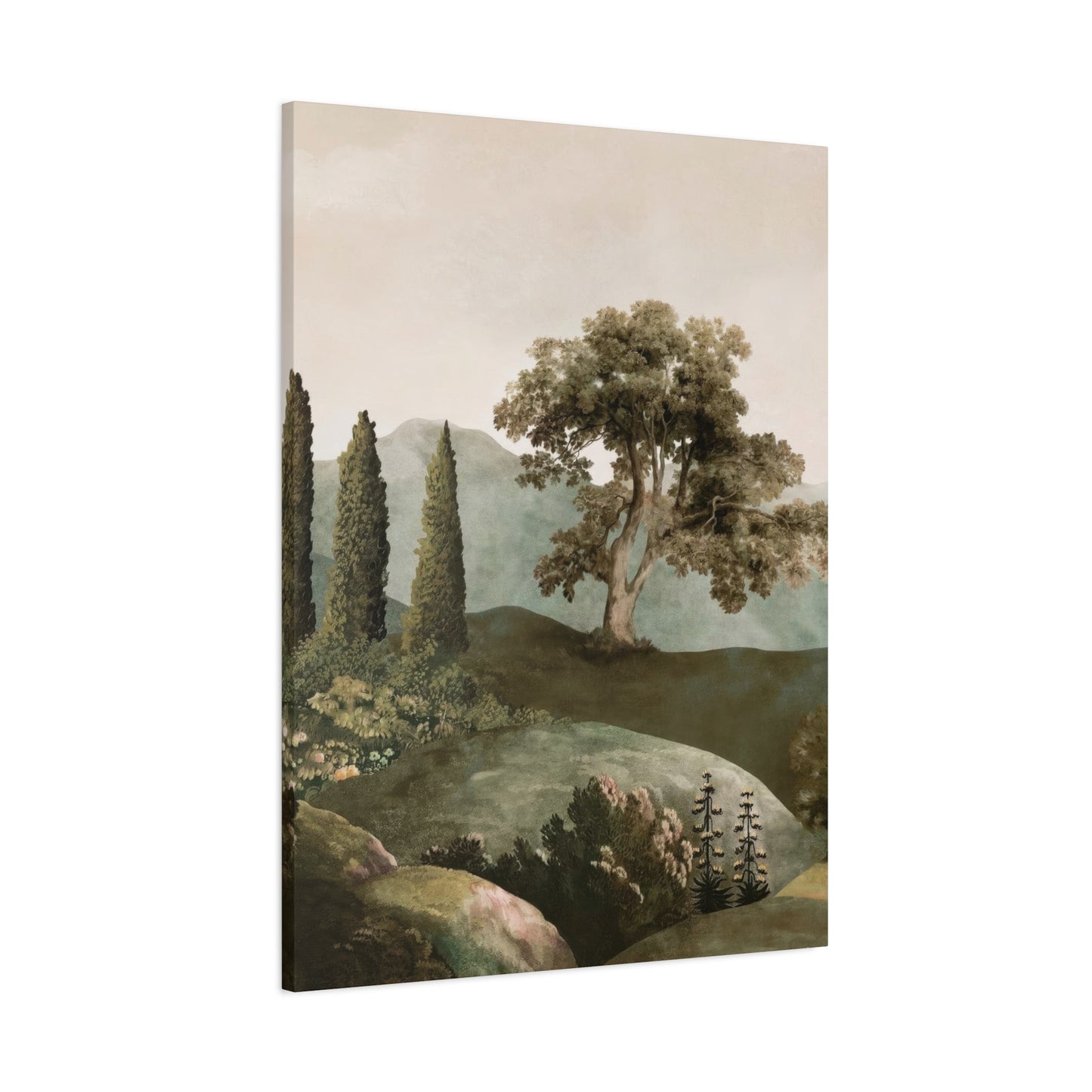
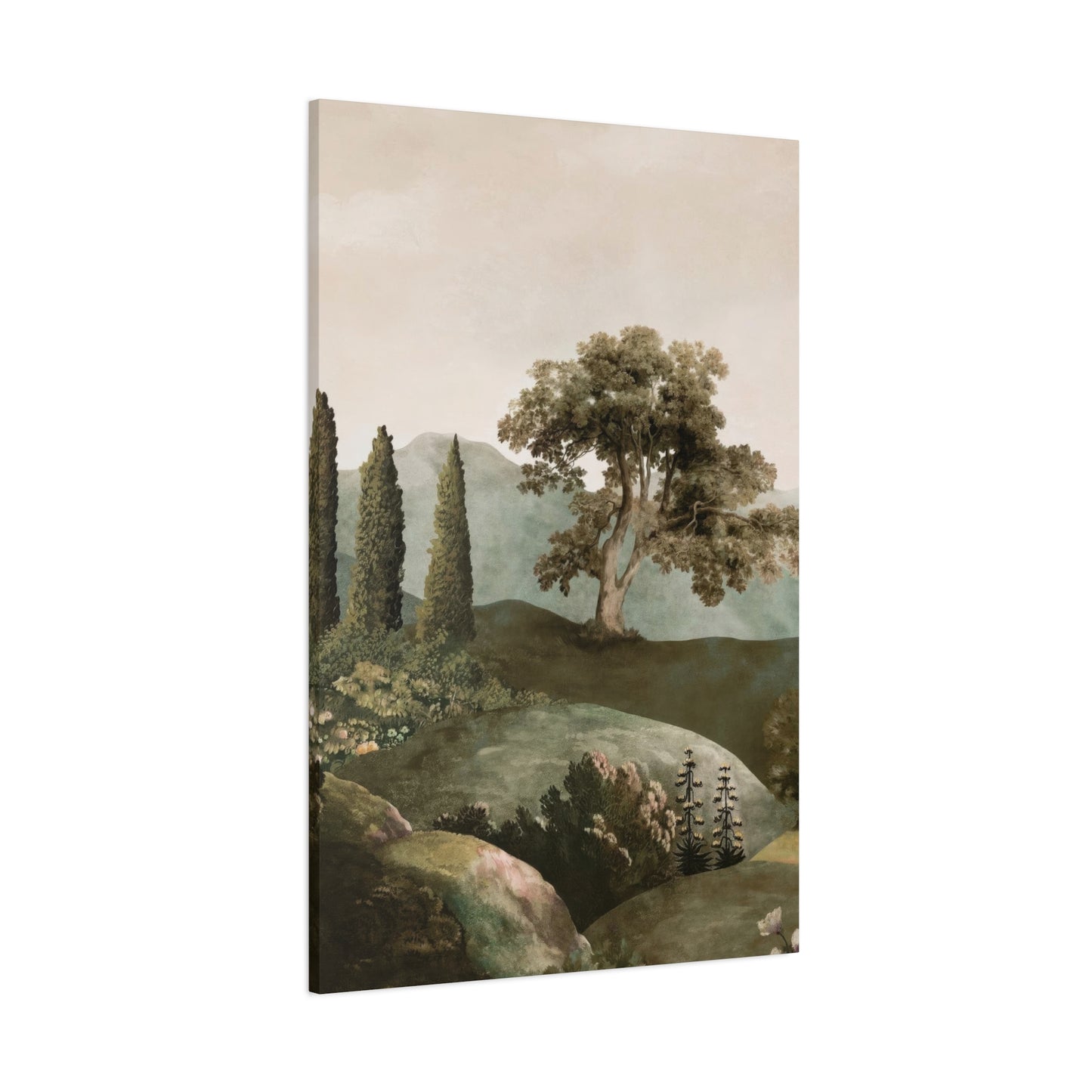
The selection of canvas as a medium for nature-inspired artwork offers specific advantages for interior design applications. The texture of canvas adds subtle dimensionality that enhances the organic quality of botanical and landscape subjects. Unlike smooth, glossy prints, canvas artwork interacts with light in ways that emphasize the handcrafted quality of the piece, adding warmth and authenticity to interior spaces. The slight texture also reduces glare, making artwork more comfortable to view under various lighting conditions. For collectors seeking pieces that feel substantial and valuable, canvas presentations offer a sense of permanence and quality that elevates the entire room's aesthetic.
Color harmony in nature-inspired canvas art requires careful consideration of both the artwork itself and its relationship to the surrounding interior design elements. Successful integration involves selecting pieces whose color palette complements or thoughtfully contrasts with existing room colors, furniture finishes, and textile selections. A room dominated by neutral tones might benefit from artwork featuring more saturated natural hues to serve as a visual focal point, while spaces already rich in color might call for more restrained landscape pieces that provide visual relief. The goal is creating a cohesive design narrative where the artwork feels integral to the space rather than arbitrarily added.
Abstract interpretations of natural landscapes offer particular versatility for modern interior design schemes. By distilling natural scenes to their essential color and form elements, abstract nature art bridges the gap between representational tradition and contemporary aesthetic preferences. These pieces maintain the calming psychological associations of natural imagery while offering the visual sophistication and artistic credibility that contemporary design sensibilities demand. A semi-abstract forest scene might suggest tree forms through vertical color bands, or a meadow could be rendered as horizontal layers of color that evoke the experience of a landscape without literal representation. This approach satisfies both the human need for natural connection and the desire for artistically innovative home decor.
The rise of mixed-media approaches in canvas art has expanded the possibilities for creating visually compelling nature-inspired pieces. Artists now frequently combine traditional painting techniques with collage elements, metallic accents, textural additives, and even embedded natural materials. A forest scene might incorporate actual pressed leaves or bark fragments, creating literal connections to the natural world while adding tactile interest. Metallic gold or copper leaf might highlight certain areas, suggesting sunlight filtering through foliage or the shimmer of water. These multimedia approaches create artwork that engages multiple senses and offers visual complexity that rewards extended contemplation.
Understanding color temperature's role in nature-inspired canvas art enables more strategic selection for specific interior applications. Cool-toned landscapes featuring blues, purples, and blue-based verdant hues create refreshing, spacious feelings particularly valuable in warmer climates or rooms receiving significant southern light exposure. Warm-toned nature scenes emphasizing golden yellows, oranges, and yellow-based natural shades generate cozy, welcoming atmospheres ideal for social spaces or cooler environments. Many successful nature compositions skillfully balance both warm and cool elements, creating dynamic visual tension that prevents monotony while maintaining overall harmony. This balanced approach works well in transitional spaces or rooms used for multiple purposes.
The scale relationship between canvas artwork and room dimensions significantly impacts the psychological effect of nature-inspired pieces. Large-format canvases featuring expansive landscapes can transform entire walls into windows onto natural vistas, dramatically altering the perceived boundaries of interior spaces. These monumental pieces work particularly well in contemporary homes with open floor plans and generous wall space. Conversely, smaller nature studies grouped in thoughtful arrangements create gallery-like presentations that add sophistication while maintaining connection to natural themes. The arrangement of multiple smaller pieces allows for creative compositions that guide eye movement and create visual narratives across wall surfaces.
Vibrant Landscapes for Modern Interiors
The integration of energized, color-saturated landscape artwork into contemporary interior design represents a bold departure from traditional neutral color schemes. Modern architectural trends toward minimalist surfaces and streamlined forms create perfect canvases for vibrant art that serves as a room's emotional and visual centerpiece. A brilliantly colored mountain vista or a jewel-toned forest scene provides the personality and warmth that starkly modern spaces sometimes lack, bridging the gap between cutting-edge design aesthetics and human needs for visual stimulation and connection to the natural world. This approach transforms potentially sterile contemporary environments into dynamic living spaces that feel both current and warmly inviting.
The selection of highly saturated landscape artwork for modern interiors requires confidence and understanding of color theory principles. These bold pieces demand attention and set the tone for the entire space, making their selection one of the most important design decisions in room planning. The color palette of the chosen artwork should inform subsequent decisions regarding furniture, textiles, and accessories, creating a cohesive design narrative rather than a chaotic assemblage of competing elements. When properly integrated, a vibrant landscape piece becomes the cornerstone around which the entire room's aesthetic revolves, providing both inspiration and constraint that guide all other design choices.
Contemporary landscape artists working in vibrant palettes often draw inspiration from Fauvist and Expressionist traditions that prioritize emotional impact over realistic representation. These approaches liberate color from its descriptive function, allowing artists to use hue, saturation, and value to convey feeling rather than simply record appearance. A sky might blaze with magentas and oranges that never occur in nature but perfectly capture the emotional intensity of a spectacular sunset. Water might shimmer with impossible turquoises and violets that evoke the crystalline quality of pristine lakes more effectively than literal color matching. These interpretive choices create artwork that resonates on deep emotional levels while maintaining recognizable connections to natural landscapes.
The psychological impact of vibrant landscape artwork differs significantly from more subdued nature-inspired pieces. Where muted earth tones promote contemplation and calm, saturated colors stimulate energy, creativity, and emotional engagement. This makes brightly colored nature art particularly appropriate for social spaces, creative studios, and areas dedicated to active pursuits. A living room anchored by a brilliant sunset landscape becomes an energizing environment that stimulates conversation and engagement. A home office featuring a vivid mountain scene might inspire ambition and bold thinking. Understanding these psychological dynamics allows for strategic artwork placement that supports each space's intended function.
Modern printing technologies have democratized access to vibrant landscape artwork, enabling reproduction of original paintings with remarkable color fidelity at accessible price points. High-quality giclée printing on canvas preserves the richness and depth of original artwork while making pieces available to broader audiences. This technological advancement has coincided with growing consumer interest in bold, personality-driven interior design, creating a thriving market for vibrant nature-inspired wall art. However, quality varies significantly across manufacturers, making it essential to evaluate print quality, color accuracy, and material durability before purchasing. Investment in higher-quality reproductions yields better long-term results in terms of color stability and visual impact.
The interaction between vibrant landscape artwork and interior lighting deserves careful consideration during design planning. Artificial lighting can dramatically alter color appearance, potentially muting the very vibrancy that makes a piece appealing. LED lighting with high Color Rendering Index ratings preserves color accuracy, ensuring artwork appears as intended. Strategic accent lighting can enhance specific artwork, using directional fixtures to highlight particular elements while creating dramatic visual impact. Natural lighting considerations are equally important; rooms with limited daylight may benefit from artwork with inherently brighter palettes to compensate for lower ambient light levels, while sun-flooded spaces can successfully showcase more nuanced color variations.
Balancing vibrant landscape artwork within overall room design prevents visual chaos while maintaining dynamic energy. The principle of allowing one element to dominate while others support applies perfectly to rooms featuring bold nature-inspired pieces. If the artwork provides intense color saturation, surrounding elements should exercise restraint, featuring more neutral tones that allow the artwork to command attention without competition. This doesn't require stark minimalism; rich textures in neutral palettes, varied material finishes, and subtle pattern work can all coexist successfully with vibrant artwork when color intensity remains controlled in non-art elements.
Seasonal rotation of landscape artwork offers an intriguing approach for those who appreciate variety while maintaining connection to natural themes. Summer months might feature lush, verdant forest scenes bursting with life and color. Autumn could bring landscapes rich in amber, scarlet, and gold tones that celebrate the season's transformation. Winter artwork might emphasize cooler palettes with crystalline qualities and stark natural beauty. Spring selections could showcase delicate blossoms and fresh, bright shades of renewal. This approach keeps interior spaces feeling fresh and aligned with natural cycles while allowing experimentation with different artistic styles and color palettes throughout the year.
The cultural dimensions of color in landscape art add layers of meaning beyond pure aesthetic considerations. Different cultural traditions associate specific colors with particular symbolic meanings, and awareness of these associations can enrich the selection process. Eastern artistic traditions often emphasize the spiritual qualities of natural landscapes, using color symbolism to convey philosophical concepts. Western traditions may prioritize different associations, with particular colors carrying distinct historical and cultural baggage. Global contemporary art increasingly blends these traditions, creating hybrid aesthetics that draw from multiple cultural sources. Understanding these dimensions adds depth to the appreciation and selection of landscape artwork for personal spaces.
How to Style Green Wall Art in Any Room
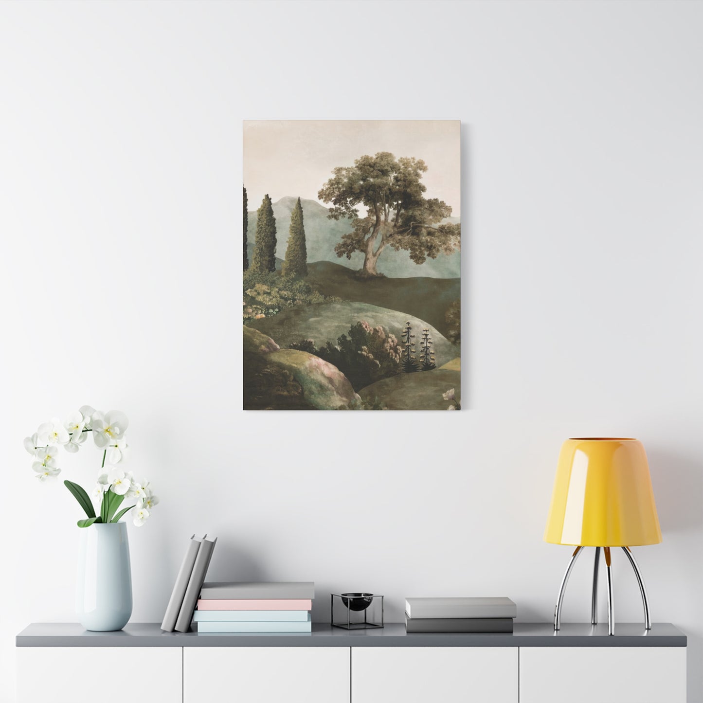
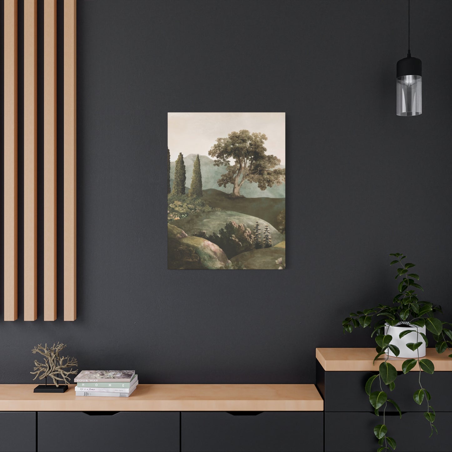
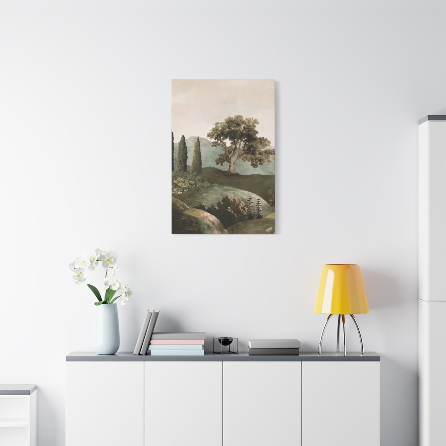
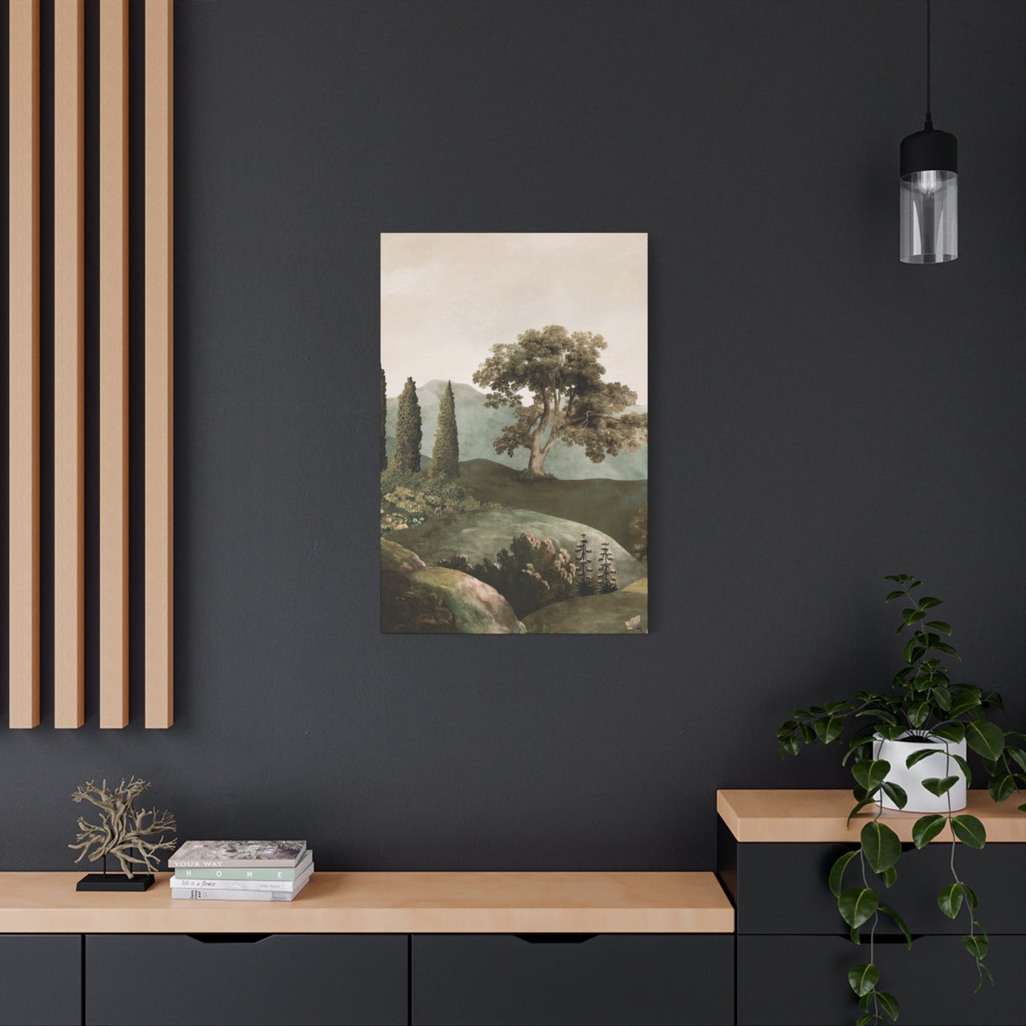
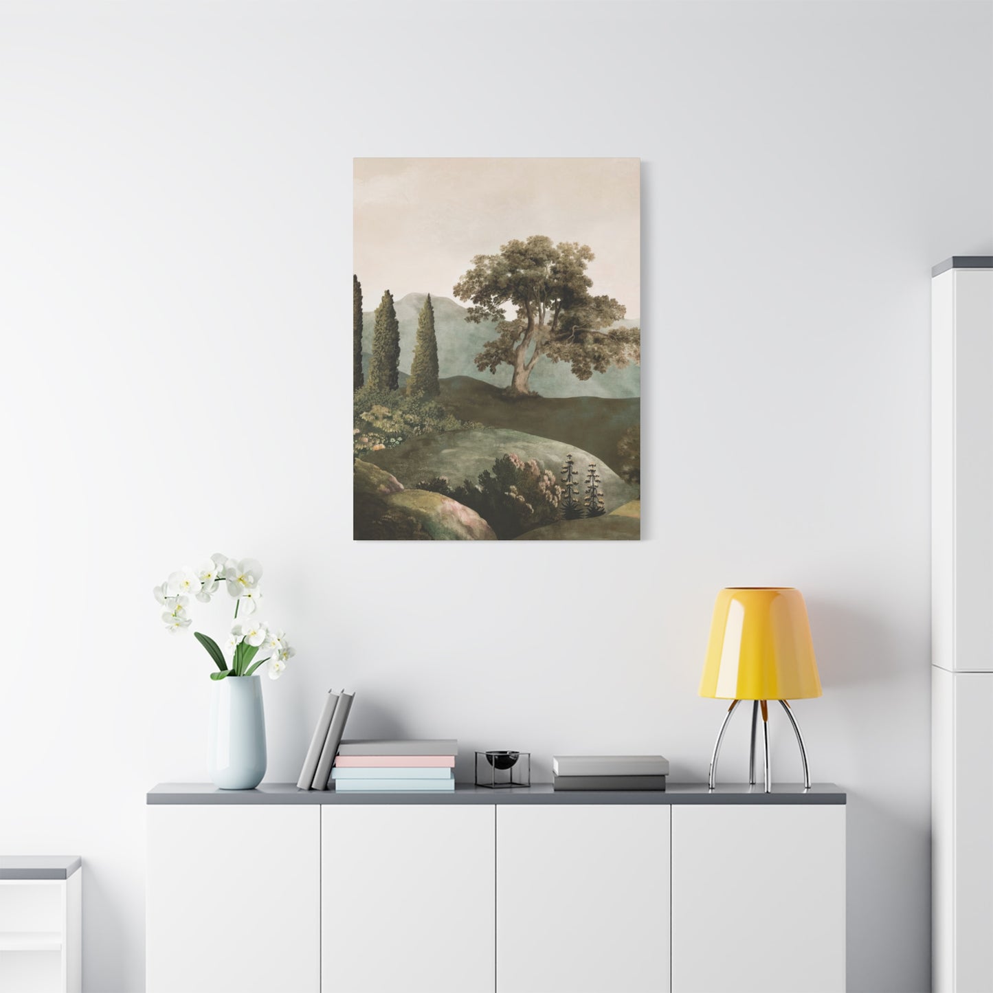
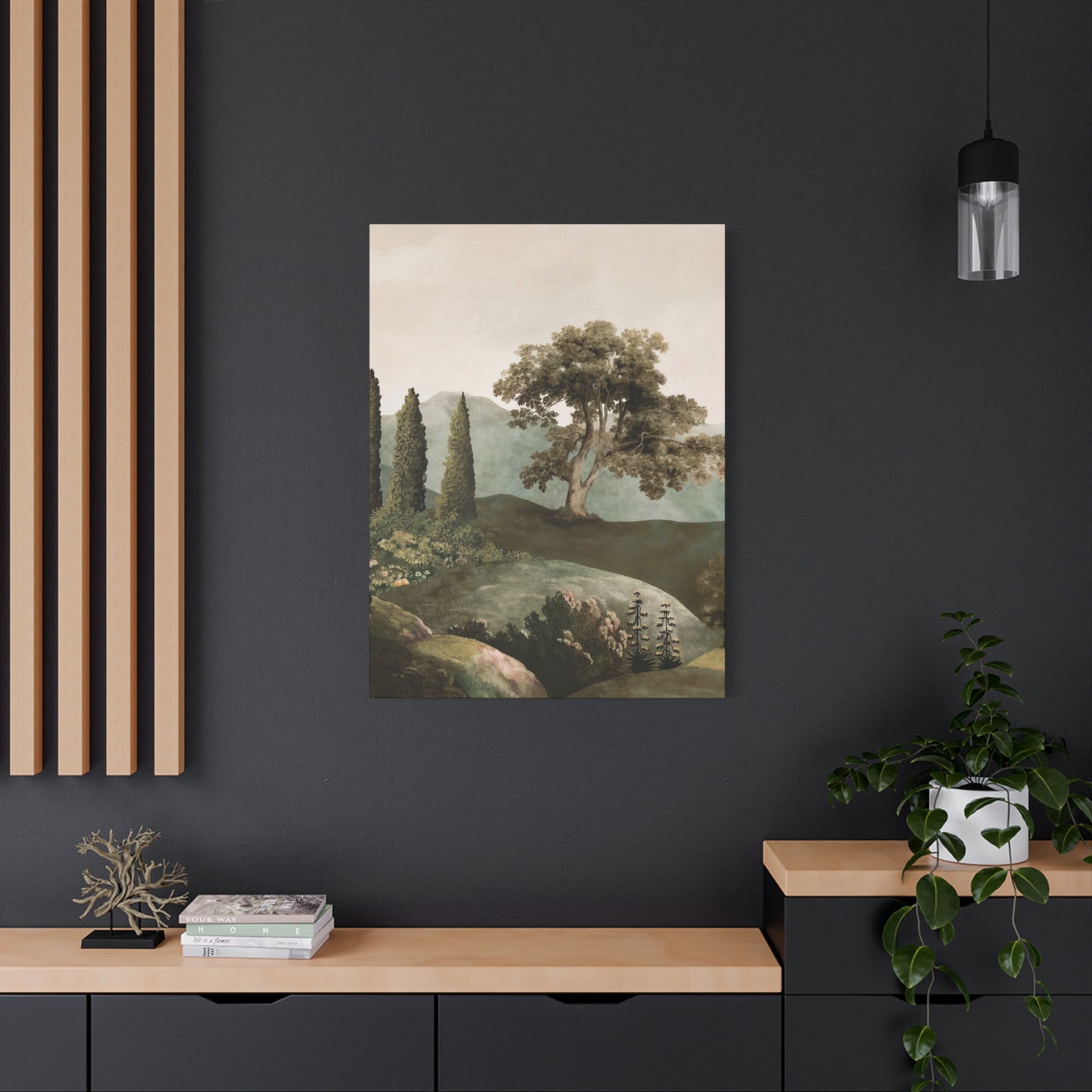
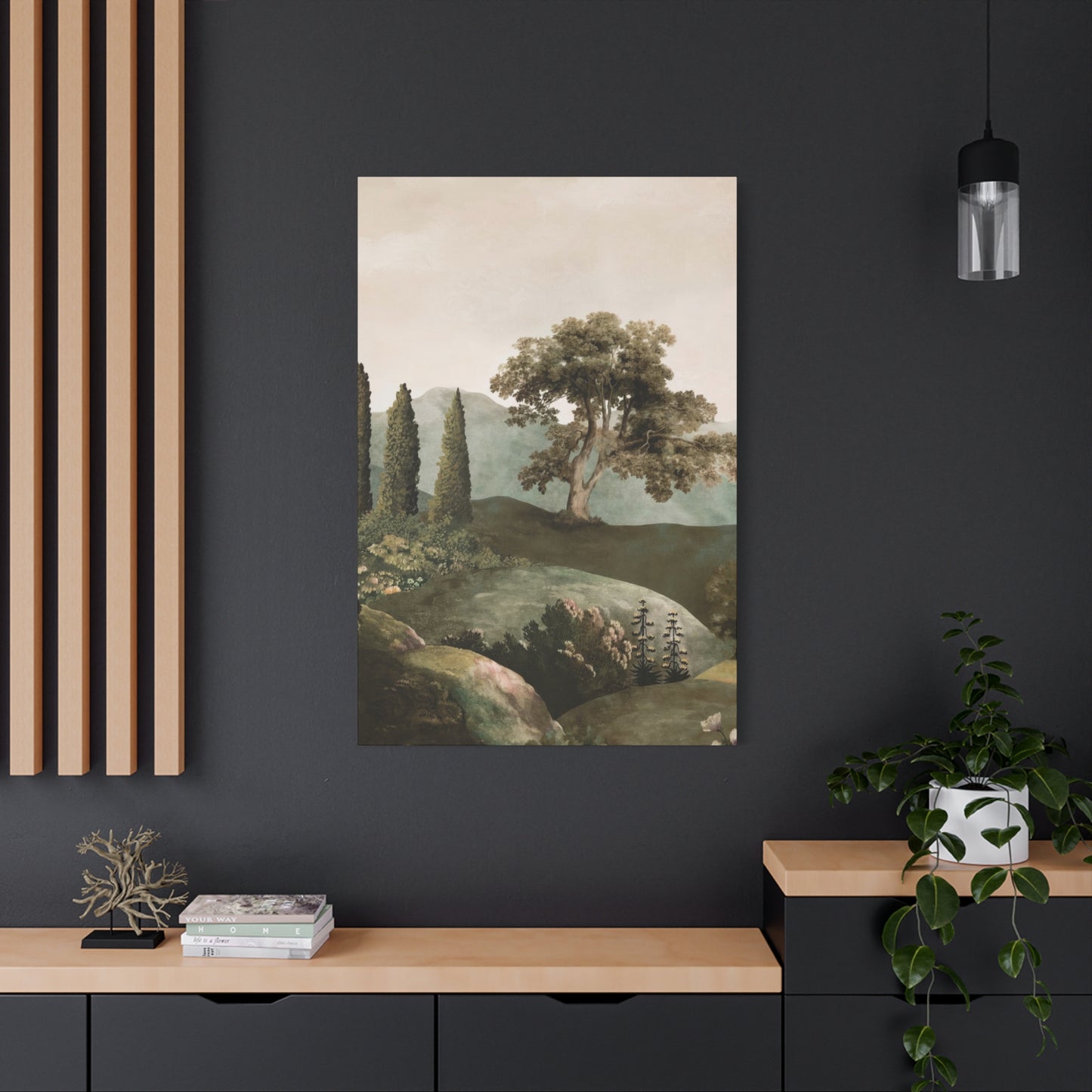
The strategic integration of nature-inspired artwork into diverse interior spaces requires understanding both universal design principles and the specific functional requirements of different rooms. Living rooms, serving as primary gathering spaces for families and guests, benefit from larger-scale pieces that command attention without overwhelming conversation. The artwork should be positioned at appropriate viewing height, typically with the center of the piece at eye level for the average viewer, ensuring comfortable viewing from primary seating areas. The relationship between the artwork and furniture arrangement deserves careful consideration; a sofa or console table beneath the piece can visually anchor the composition, creating cohesive groupings that feel intentional rather than arbitrary.
Bedroom styling with verdant wall art demands particular attention to the psychological impacts of color and imagery. Since bedrooms serve as personal sanctuaries dedicated to rest and intimacy, artwork selections should prioritize calming, restorative qualities over stimulation. Peaceful forest scenes, gentle meadow vistas, or serene water landscapes featuring soft color palettes support relaxation and sleep quality. Placement relative to the bed is important; artwork positioned opposite the bed becomes the first thing seen upon waking, making it ideal for inspiring, uplifting imagery. Pieces placed above the headboard should be securely mounted and appropriately scaled to avoid overwhelming the sleeping area.
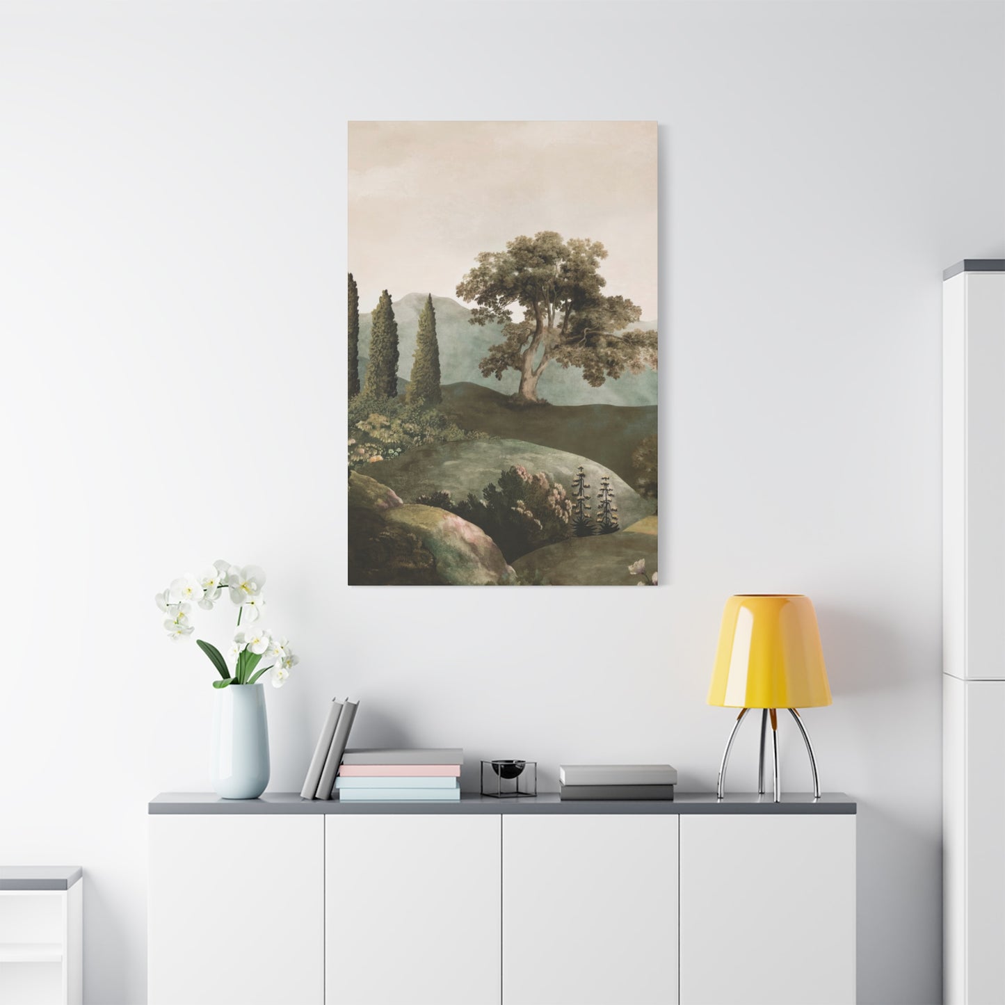
Kitchen and dining spaces present unique opportunities for incorporating botanical and nature-inspired artwork. These areas associated with nourishment and gathering benefit from artwork that conveys abundance, freshness, and vitality. Botanical studies featuring herbs, vegetables, or fruits create thematic connections to food and cooking while adding visual interest to functional spaces. The practical considerations of kitchen environments require attention to artwork protection; pieces should be positioned away from direct exposure to cooking heat, steam, and grease. Dining rooms can accommodate more formal landscape presentations, with artwork scaled to complement dining furniture and positioned to enhance the dining experience without distracting from table conversations.
Home office styling with nature-inspired wall art balances professional aesthetics with personal wellbeing considerations. The growing prevalence of remote work and video conferencing makes background appearance increasingly important, creating opportunities for thoughtfully selected artwork to project professionalism while maintaining personal character. Nature scenes provide universally appealing backgrounds that avoid controversial statements while demonstrating taste and consideration. The psychological benefits of natural imagery support focus and reduce stress during intensive work periods, making verdant artwork functional as well as decorative. Placement should consider both personal viewing angles during work and how the space appears on camera during virtual meetings.
Bathroom environments, often overlooked in artwork planning, offer unexpected opportunities for nature-inspired decoration. The association between water, cleansing, and natural environments makes botanical and aquatic landscape themes particularly appropriate for these spaces. However, high humidity levels require careful consideration of materials and mounting methods. Canvas artwork should be professionally sealed or framed under glass to prevent moisture damage. Alternatively, high-quality waterproof prints designed specifically for bathroom environments provide worry-free solutions. The intimate scale of most bathrooms suits smaller artwork or collections of related pieces that create gallery walls without overwhelming limited space.
Entryways and hallways present transitional spaces where nature-inspired artwork can create welcoming first impressions and guide movement through homes. These areas typically receive brief viewing durations, making them ideal for more complex, detailed pieces that reward quick glances while offering deeper interest upon extended study. Long hallways benefit from gallery wall arrangements featuring related nature themes, creating visual interest along otherwise blank expanses while guiding visitors through the space. Entryway artwork sets the tone for the entire home, making statement pieces featuring bold natural imagery effective choices that immediately communicate the homeowner's aesthetic sensibilities.
Children's rooms and play areas benefit tremendously from nature-inspired artwork tailored to young sensibilities. Whimsical forest scenes featuring friendly wildlife, colorful garden illustrations, or imaginative landscape interpretations stimulate creativity while maintaining calming natural connections. The educational potential of botanical and wildlife artwork shouldn't be overlooked; pieces can spark curiosity about the natural world while decorating spaces. Durability and safety considerations are paramount in children's areas; securely mounted, shatterproof presentations ensure artwork remains both beautiful and safe. As children mature, their tastes evolve, making it worthwhile to select pieces sophisticated enough to transition through various developmental stages.
Multi-functional spaces present unique styling challenges that nature-inspired artwork can help address. Open-plan living areas that combine cooking, dining, and relaxation functions benefit from artwork that unifies the space thematically while remaining appropriate for all activities. Large-scale landscape pieces visible from multiple zones can serve as visual anchors that create coherence across the open area. Alternatively, different nature-inspired artworks in coordinated color palettes can define distinct functional zones while maintaining overall design harmony. The key is creating visual connection without rigid matching, allowing each area to maintain its identity while contributing to a cohesive whole.
The Symbolism of Green in Art
Throughout human history, verdant hues have carried profound symbolic significance across diverse cultures and artistic traditions. Ancient Egyptian artists associated these tones with fertility, rebirth, and the life-giving power of the Nile's annual flooding. The pigment itself was precious, requiring complex preparation processes that made its use in artwork a significant investment reflecting the depicted subject's importance. Medieval European artists employed natural shades to symbolize both earthly paradise and spiritual renewal, with specific associations varying between sacred and secular contexts. Understanding this rich symbolic heritage adds depth to contemporary appreciation of nature-inspired artwork, connecting modern pieces to millennia of human meaning-making through color.
The psychological associations connected to forest and botanical colors extend beyond conscious symbolism into deep evolutionary programming. Human survival throughout prehistory depended on recognizing natural environments, with verdant hues signaling water availability, edible plants, and habitable territories. These ancient associations persist in modern brains, creating instinctive positive responses to natural palettes even among urban dwellers with limited direct nature exposure. Contemporary artists and designers harness these subconscious associations, using color to evoke feelings and states of mind that bypass rational analysis to speak directly to our embodied, evolutionary selves. This explains why nature-inspired artwork can profoundly affect mood and wellbeing even when viewers are unaware of the specific mechanisms at work.
Religious and spiritual traditions worldwide have invested natural imagery and colors with sacred significance. Islamic art tradition, which generally avoids figurative representation, developed extraordinary sophistication in geometric patterns and color use to suggest paradise gardens where the faithful would dwell eternally. The emphasis on natural shades alongside water imagery created powerful symbols of divine reward and spiritual aspiration. Buddhist traditions associate specific colors with various aspects of spiritual development, with certain natural hues representing balance, harmony, and connection to the living world. Hindu traditions employ natural imagery extensively in both religious art and domestic decoration, seeing the natural world as a manifestation of divine creative energy. These spiritual associations enrich the experience of nature-inspired artwork for those aware of these traditions while adding layers of meaning accessible to attentive viewers.
Political symbolism has also appropriated natural colors throughout history, though these associations shift across time and geography. Environmental movements worldwide have claimed natural imagery and colors as symbols of ecological awareness and commitment to planetary stewardship. This association lends contemporary nature-inspired artwork additional dimensions of meaning, particularly for viewers who identify with environmental values. Displaying verdant landscape art can become a subtle statement of personal values and concerns about humanity's relationship with the natural world. However, these associations remain fluid and context-dependent, with meanings shifting across cultural boundaries and temporal periods.
The symbolism of particular shades within the natural spectrum carries nuanced significance that sophisticated artists exploit for expressive purposes. Deep forest tones might suggest mystery, depth, or the unknown aspects of nature that inspire both fascination and apprehension. Bright, cheerful lime shades convey freshness, youth, and vital energy associated with spring growth and renewal. Muted sage and olive tones suggest maturity, wisdom, and the subtle beauty of landscapes weathered by time. By deliberately selecting particular shades and combinations, artists guide viewer emotional responses and create symbolic resonances that operate beneath conscious awareness. Attentive selection of artwork with symbolic alignment to intended room functions and personal values creates environments with deeper coherence and meaning.
Seasonal symbolism provides another layer of significance in nature-inspired artwork. Spring imagery bursting with fresh natural growth symbolizes renewal, hope, and new beginnings, making such pieces appropriate for spaces dedicated to fresh starts or reinvention. Summer landscapes at peak lushness represent abundance, achievement, and the fullness of life, creating inspiring environments for productive work or creative endeavors. Autumn scenes featuring mature foliage in transformation symbolize change, transition, and the wisdom that comes with experience. Winter landscapes, though less verdant, represent rest, contemplation, and the necessary dormant periods that precede new growth cycles. Selecting seasonal symbolism aligned with personal life phases or room functions adds meaningful resonance to design choices.
The interplay between natural symbolism and personal associations creates unique meanings for individual viewers. A forest scene might evoke childhood memories of family camping trips, infusing the artwork with private significance beyond its universal symbolic content. A meadow vista could remind someone of a meaningful place, investing the image with emotional weight specific to that viewer's experience. These personal associations, layered atop cultural and universal symbolism, create the rich, complex responses that make certain artworks feel particularly significant to individual collectors. The most successful art selections balance universal appeal with openness to personal interpretation, allowing viewers to invest pieces with their own meanings while maintaining broader aesthetic and emotional accessibility.
Contemporary artists increasingly play with traditional natural symbolism, subverting expectations to create thought-provoking pieces that challenge viewer assumptions. A forest rendered in unexpected colors might question our assumptions about nature's permanence or comment on environmental degradation. Abstract interpretations that reduce landscapes to pure color and form ask viewers to reconsider what constitutes nature and how we represent our relationship to the living world. These conceptual approaches add intellectual dimension to nature-inspired art, appealing to viewers who appreciate both aesthetic beauty and conceptual sophistication. The most compelling contemporary landscape work often operates on multiple levels simultaneously, offering immediate visual appeal alongside deeper meanings that emerge through sustained contemplation.
Using Bold Hues to Enhance Nature Scenes
The strategic incorporation of intensified chromatic choices into landscape compositions creates artwork that captures attention while maintaining organic authenticity. Contemporary artists working in natural subjects increasingly embrace expressive color approaches that heighten emotional impact without sacrificing essential connection to recognizable landscapes. This approach draws from Post-Impressionist traditions established by artists who prioritized subjective color responses over objective documentation, creating precedents for expressive manipulation of natural palettes. Modern technology enables reproduction of these intense colors with remarkable fidelity, bringing gallery-quality color experiences into residential spaces at accessible price points.
The relationship between saturated colors and viewer emotional responses operates through both cultural conditioning and innate neurological processing. Highly saturated hues stimulate greater neural activity in visual processing centers, creating stronger emotional engagement than muted alternatives. This physiological response translates into subjective experiences of energy, excitement, and emotional intensity. When applied to nature scenes, bold color choices can transform peaceful landscapes into dynamic compositions that energize spaces and stimulate creativity. The key to successful application lies in maintaining compositional balance, ensuring that color intensity serves the artwork's overall impact rather than overwhelming other aesthetic considerations.
Complementary color relationships provide powerful tools for creating visual drama in nature-inspired compositions. The natural world frequently offers complementary pairings; sunset skies feature oranges against blues, autumn foliage presents reds and yellows against evergreen backgrounds, and wildflower meadows display purples alongside yellow-greens. Artists can emphasize these natural relationships through selective saturation, intensifying complementary elements to create vibrating optical effects that capture and hold viewer attention. These dynamic color relationships prevent visual monotony while maintaining organic authenticity, creating artwork that feels both artistically sophisticated and naturally grounded.
Analogous color schemes featuring closely related hues create harmonious compositions that allow for bold saturation without visual chaos. A landscape rendered in variations of blue, teal, and aqua, or one featuring progressions from yellow through orange to red maintains color unity while offering sufficient variation for visual interest. These harmonious approaches work particularly well in spaces where multiple competing visual elements exist, allowing artwork to make strong color statements without clashing with surrounding design elements. The subtle variations within analogous schemes create depth and dimension, preventing the flatness that can plague monochromatic approaches while maintaining overall color harmony.
The concept of color temperature takes on particular significance in bold nature compositions. Warm-toned landscapes featuring reds, oranges, yellows, and warm-based natural shades create advancing visual effects that make artwork feel closer and more immediate. These compositions generate energy and excitement, making them ideal for social spaces and creative environments. Cool-toned pieces emphasizing blues, purples, and blue-based verdant hues create receding effects that suggest depth and spaciousness while promoting calm contemplation. Many successful bold landscape compositions skillfully balance both temperatures, creating dynamic tension between advancing warm areas and receding cool zones that add dimension and movement to two-dimensional surfaces.
Gradation and transition of saturated colors within compositions prevent harsh, cartoonish effects while maintaining bold impact. Skilled artists create smooth progressions between intense hues, using intermediate values and transitional colors to bridge between dominant elements. A sunset sky might progress from deep magenta through coral and peach to golden yellow, with each transition carefully modulated to maintain unity. These sophisticated color progressions create visual sophistication that elevates bold color work beyond simple illustration toward fine art territory. The smooth blending demonstrates technical mastery while serving compositional goals of directing viewer attention and creating spatial depth.
The role of neutral elements in bold color compositions deserves recognition and strategic deployment. Even the most intensely colored successful landscapes typically include areas of relative neutrality that provide visual rest and prevent overwhelming saturation. These might appear as shadowed areas rendered in deep browns or grays, or as atmospheric effects that reduce saturation in distant landscape elements. Strategic placement of neutral zones guides eye movement through compositions, creates focal hierarchies, and prevents the visual fatigue that unrelieved color intensity can produce. Understanding when to exercise restraint is as important as knowing when to apply bold color, with the interplay between intensity and neutrality creating dynamic compositions that maintain viewer engagement over time.
Technical considerations in reproducing bold color artwork affect final results significantly. Different printing technologies, substrates, and ink formulations yield varying color accuracy and saturation capabilities. Premium giclée printing using archival pigment-based inks on quality canvas substrates preserves color intensity while ensuring longevity. Lower-quality reproduction methods may mute colors, shift hues, or produce inconsistent results that fail to capture the intended impact. For collectors serious about bold color artwork, investing in quality reproduction pays dividends in terms of visual impact and piece longevity. Additionally, UV-protective glazing or coatings prevent premature fading, maintaining color intensity throughout years of display.
Abstract Green Landscapes That Pop
Abstract interpretation of natural landscapes represents one of contemporary art's most dynamic and versatile movements. By reducing naturalistic scenes to essential elements of color, form, and composition, abstract artists create works that maintain emotional connections to the natural world while offering sophisticated visual experiences aligned with modern design sensibilities. These pieces bridge the gap between traditional representational landscape art and purely non-objective abstraction, occupying a fertile middle ground that appeals to diverse aesthetic preferences. The suggestion of landscape rather than literal depiction allows viewer imagination to complete the composition, creating participatory viewing experiences where each observer brings personal associations and interpretations.
The freedom from representational accuracy liberates abstract landscape artists to pursue pure color relationships and compositional dynamics without constraint from observable reality. A horizon line need not sit at optically correct positions; instead, it can divide the canvas according to aesthetic principles of balance and proportion. Color selections can prioritize emotional impact and visual harmony over accurate environmental representation. Forms can be simplified, exaggerated, or distorted to serve compositional goals. This liberty enables creation of artwork that captures the essence and feeling of natural places while offering visual sophistication that purely representational work sometimes lacks. The result is artwork that satisfies both our need for natural connection and our appreciation for aesthetic innovation.
Minimalist approaches to abstract landscape work reduce compositions to the bare essentials required to suggest natural environments. A horizontal band of deep forest color above a lighter earth tone might sufficiently evoke a simple landscape, leaving vast areas of negative space that create contemplative, meditative pieces. These sparse compositions work particularly well in contemporary interiors where visual simplicity aligns with overall design philosophy. The restraint demonstrated in minimalist landscape abstraction conveys sophistication and confidence, suggesting rather than declaring, inviting rather than demanding viewer engagement. For spaces where calm and clarity are paramount, minimalist abstract nature pieces provide ideal solutions.
Conversely, maximalist abstract landscapes embrace complexity, layering multiple elements to create visually dense compositions that reward sustained attention. These pieces might combine gestural marks suggesting foliage with hard-edged geometric forms representing structural elements, all unified through consistent color palettes drawn from nature. The resulting complexity creates artwork that reveals new details upon each viewing, preventing the visual exhaustion that simpler compositions might eventually produce. Maximalist approaches suit spaces where visual richness is desired, particularly in areas where people spend extended periods and benefit from artwork that maintains interest over time. The density of information in these pieces makes them ideal conversation starters and focal points in social spaces.
Texture plays a crucial role in successful abstract landscape work, with dimensional surface quality adding tactile interest that enhances visual appeal. Heavy impasto application creates three-dimensional surfaces that catch light differently throughout the day, causing artwork to appear subtly different under varying illumination conditions. This changing quality keeps pieces feeling alive and dynamic rather than static. Alternative textural approaches might incorporate collage elements, mixed media additions, or innovative application techniques that create distinctive surface characteristics. The tactile dimension adds richness that purely flat color application cannot achieve, creating artwork that engages multiple senses and offers sophisticated visual experiences.
Color field approaches to abstract landscape work emphasize large areas of unmodulated color that suggest atmospheric qualities or simplified landscape elements. These compositions prioritize color relationships and subtle variations within seemingly uniform areas. Upon close inspection, what appears as solid color often reveals subtle gradations, texture variations, and layering that add depth and complexity. Color field landscape abstractions create contemplative, immersive viewing experiences that encourage meditation and quiet reflection. The apparent simplicity masks sophisticated color theory knowledge and technical execution skill, rewarding attentive viewers with subtle pleasures that emerge through sustained contemplation.
Geometric abstraction applied to landscape subjects creates structured compositions that organize natural forms according to mathematical or systematic principles. Trees might become vertical rectangular forms, mountains transform into triangular shapes, and water surfaces resolve into horizontal bands. This approach creates visual order from natural complexity, appealing to viewers who appreciate both natural beauty and formal structure. Geometric landscape abstractions work particularly well in modern and contemporary interiors where clean lines and systematic organization dominate architectural and furnishing choices. The marriage of natural subject matter with geometric structure satisfies multiple aesthetic priorities simultaneously, creating bridges between organic and manufactured design philosophies.
Conclusion
Nature’s touch through green scenery colorful wall art offers a refreshing and transformative influence on modern wall décor. In an era where urban living often distances us from the natural world, bringing vibrant greens and lush landscapes into our interiors serves as a vital reconnection with the environment. This form of art not only enhances aesthetic appeal but also fosters wellbeing, calmness, and inspiration—qualities that have become essential in contemporary living spaces.
Green scenery wall art is uniquely positioned to redefine how we think about interior design. The dynamic use of color, from deep emerald forests to soft mossy hues, brings life and energy to otherwise neutral or minimalist rooms. These works create a bridge between indoors and outdoors, inviting the freshness and tranquility of nature into the heart of our homes and offices. As a result, spaces feel more vibrant, welcoming, and balanced, counteracting the often sterile and impersonal aspects of modern architecture.
Beyond visual appeal, green scenery art carries symbolic meaning that resonates deeply with many. Green is universally associated with growth, renewal, and harmony. It has a calming effect that reduces stress and increases productivity, making it ideal for environments where focus and relaxation are equally valued. The presence of natural imagery can also spark creativity and evoke cherished memories of outdoor experiences, enhancing emotional well-being.
Furthermore, green scenery colorful wall art offers remarkable versatility in design. Whether it is a sprawling forest landscape, a close-up of dew-kissed leaves, or an abstract interpretation of plant life, such artwork can complement various décor styles—from rustic and bohemian to sleek and modern. It can serve as a dramatic centerpiece or a subtle accent, adaptable to different room sizes and lighting conditions.
The trend toward sustainability and eco-conscious living further amplifies the appeal of nature-inspired art. Many artists and producers emphasize environmentally friendly materials and ethical practices in creating these pieces, aligning the artwork’s message with contemporary values. Choosing green scenery art is thus both an aesthetic and a conscientious decision, reflecting a commitment to the planet.
