


Complete Guide to Green Vase Wall Art and Botanical Home Decor
Interior design continues to evolve, bringing fresh perspectives on how we incorporate artistic elements into our living spaces. Among the most captivating trends emerging in contemporary home styling is the thoughtful integration of botanical imagery, particularly artwork featuring vessels in verdant hues combined with linear patterns. This comprehensive exploration delves into the multifaceted world of decorative wall pieces that celebrate the marriage of natural elements with modern design sensibilities, offering insights into how these artistic choices transform ordinary rooms into extraordinary sanctuaries.
The Symbolic Significance of Verdant Hues in Residential Artwork
Color psychology plays a profound role in shaping the atmosphere of our living environments, and few shades possess the transformative power found in the spectrum of botanical tones. When incorporated into residential artwork, these natural pigments create immediate connections to the outdoors, fostering a sense of tranquility that permeates throughout the space. The presence of these earthy colors in artistic representations of containers and vessels draws upon centuries of cultural associations with growth, renewal, and vitality.
Throughout history, societies across the globe have attributed special meaning to these natural shades. In many Eastern philosophies, such tones represent harmony and balance, serving as visual reminders of our connection to the natural world. Western traditions similarly embrace these hues as symbols of hope, freshness, and new beginnings. When we introduce artwork featuring these colors into our homes, we unconsciously tap into these deep-rooted associations, creating environments that feel inherently welcoming and restorative.
The psychological impact extends beyond mere symbolism. Scientific research has demonstrated that exposure to natural color palettes can actually reduce stress levels, lower blood pressure, and improve overall mental wellbeing. Artwork depicting vessels in these shades acts as a constant, gentle reminder of nature's calming influence, even in urban environments far removed from forests and meadows. This makes such pieces particularly valuable for individuals seeking to create peaceful retreats within their homes.
The versatility of these botanical tones allows them to function effectively across various design contexts. Whether displayed in high-energy spaces like kitchens or in restful environments such as bedrooms, these colors adapt to complement the room's purpose. Their natural quality prevents them from feeling overly stimulating, while their vibrancy ensures they remain engaging focal points rather than fading into the background.
Furthermore, the specific shade selection within this color family can dramatically influence the mood conveyed. Deeper, forest-inspired tones evoke sophistication and grounding stability, making them ideal for formal spaces or areas where concentration is required. Lighter, more spring-like variations bring feelings of airiness and optimism, perfect for brightening darker rooms or creating cheerful atmospheres in social gathering spaces.
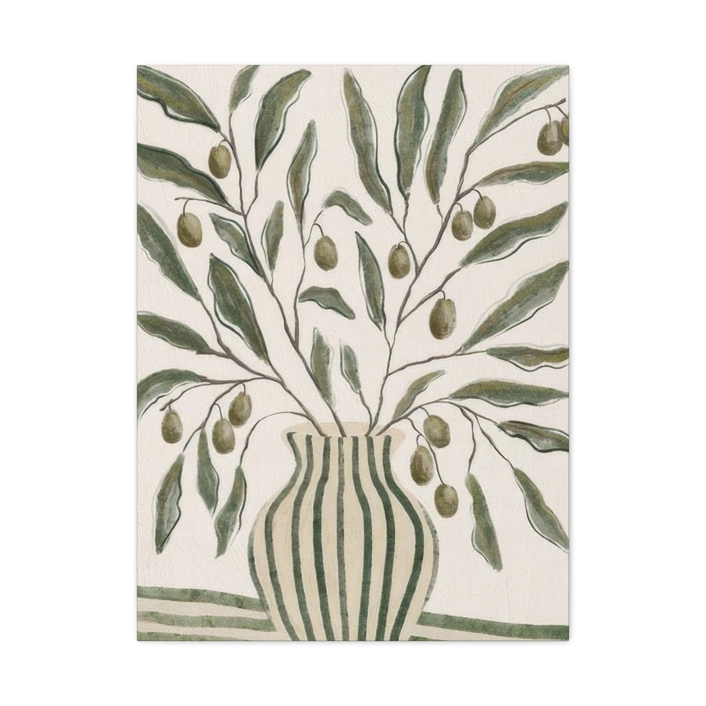
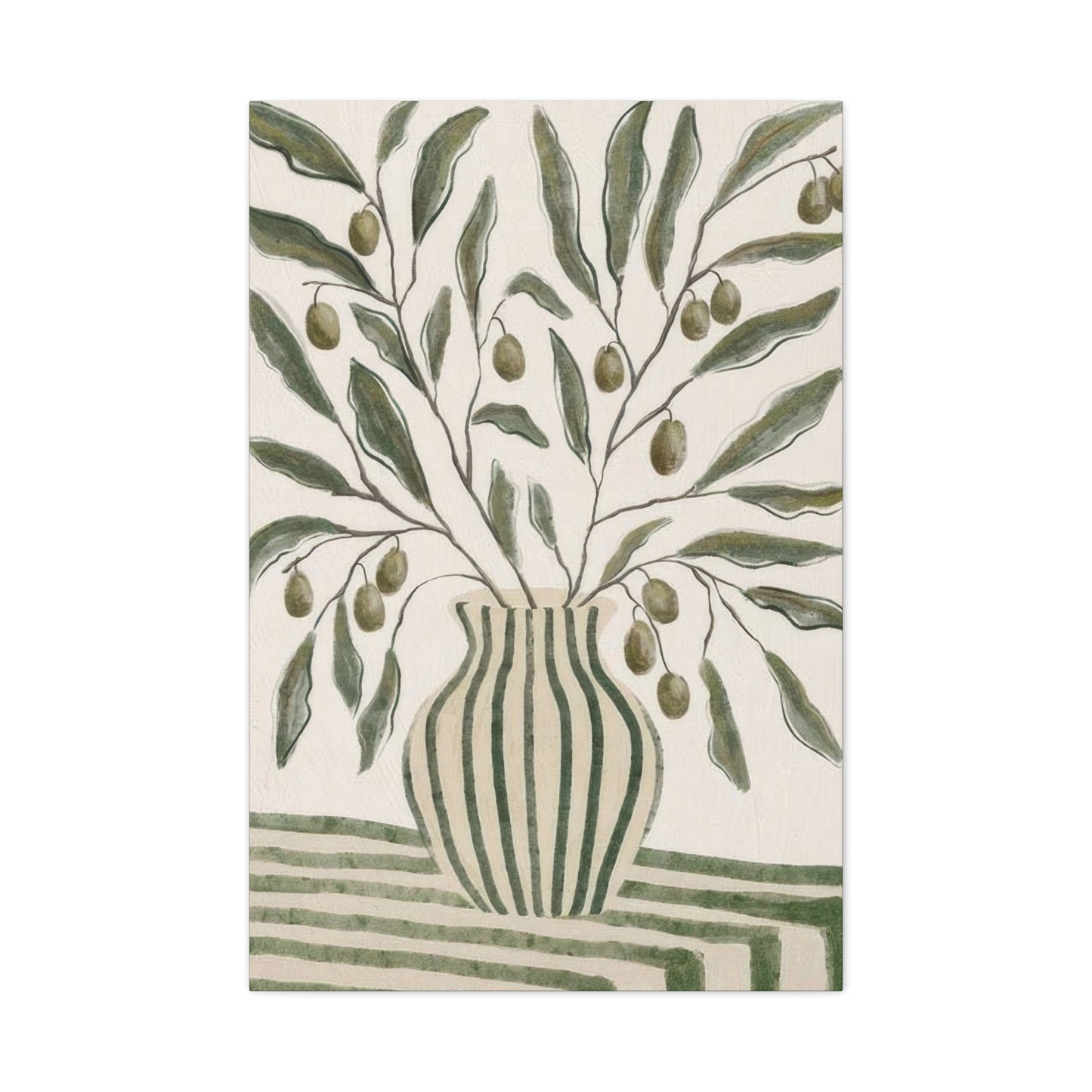
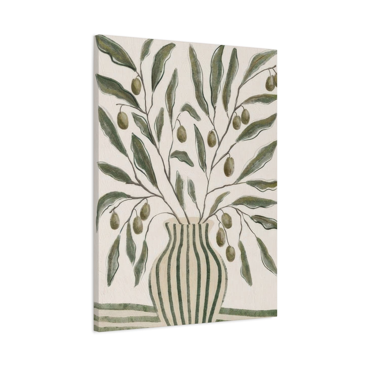
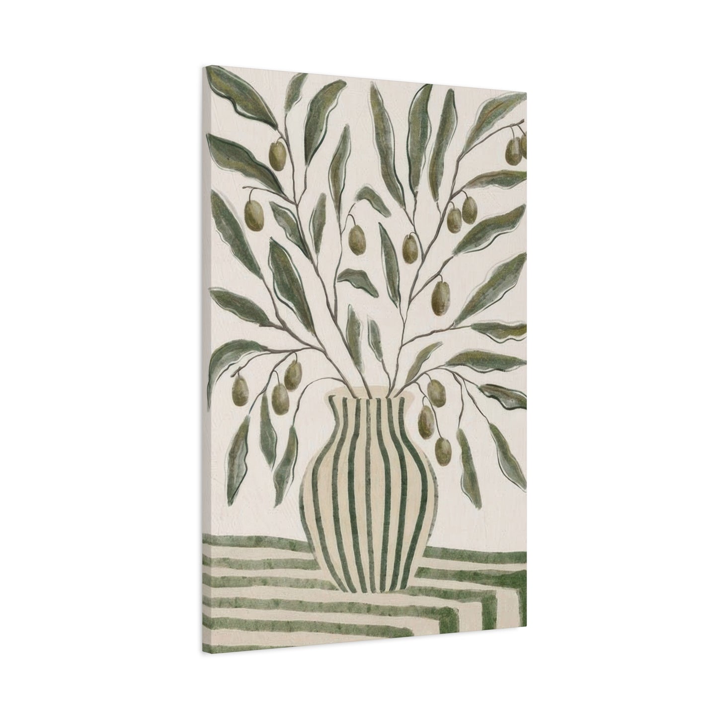
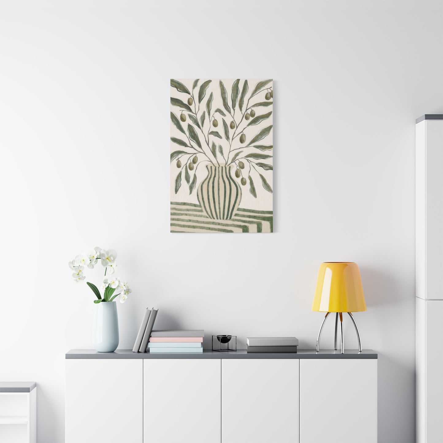
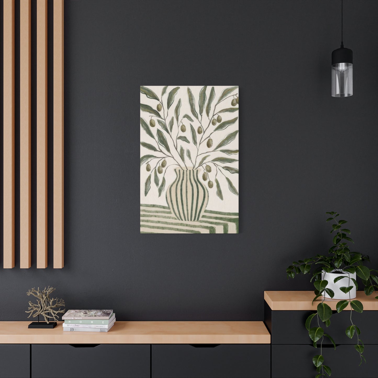
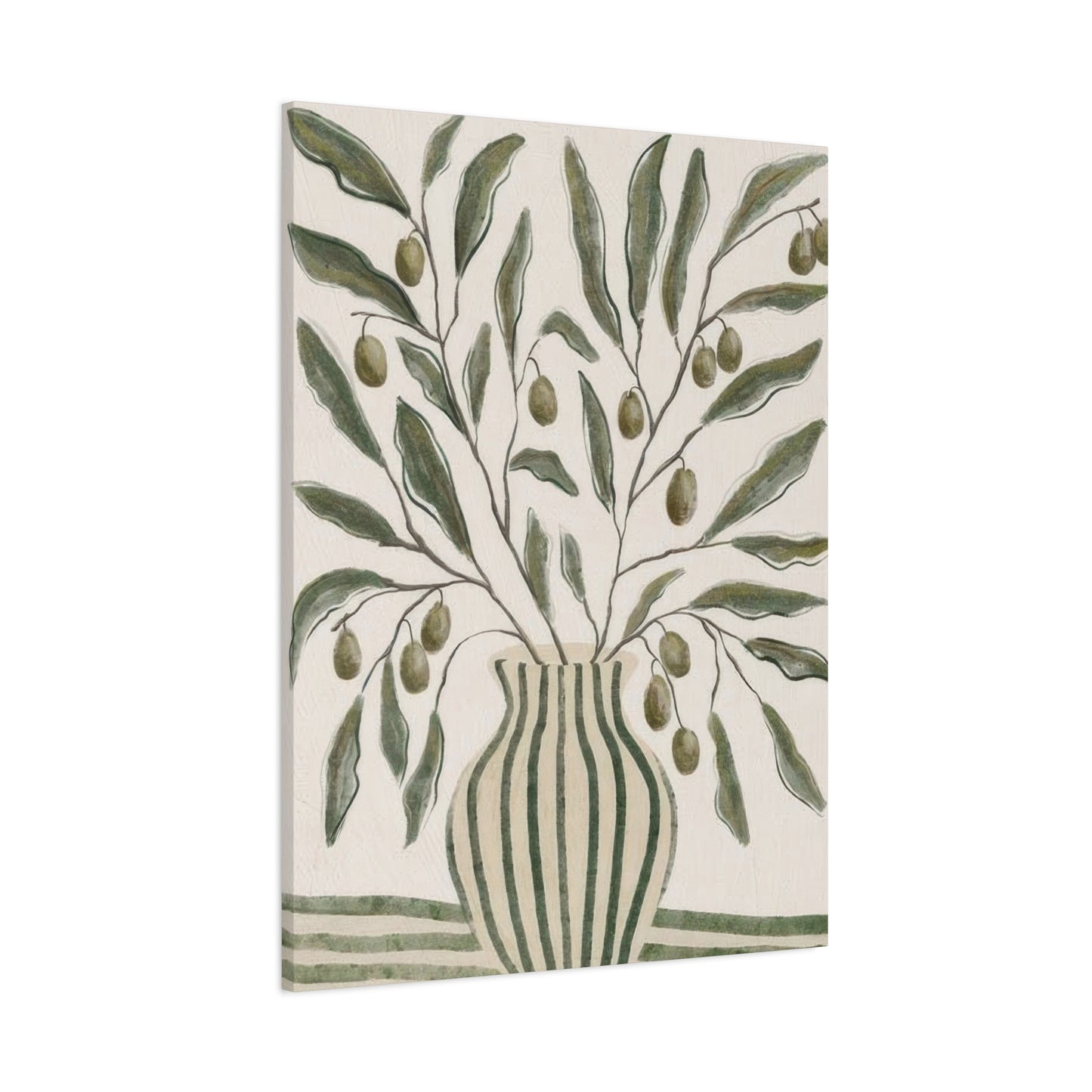
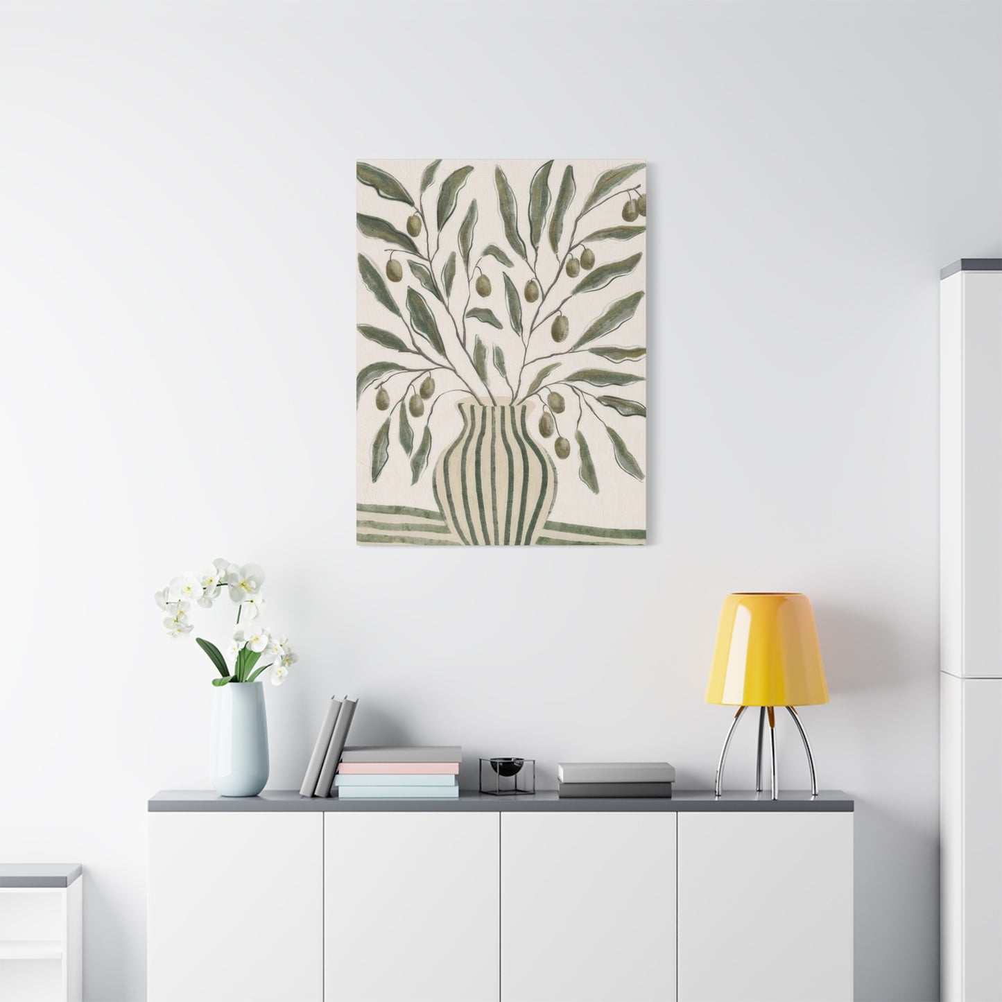
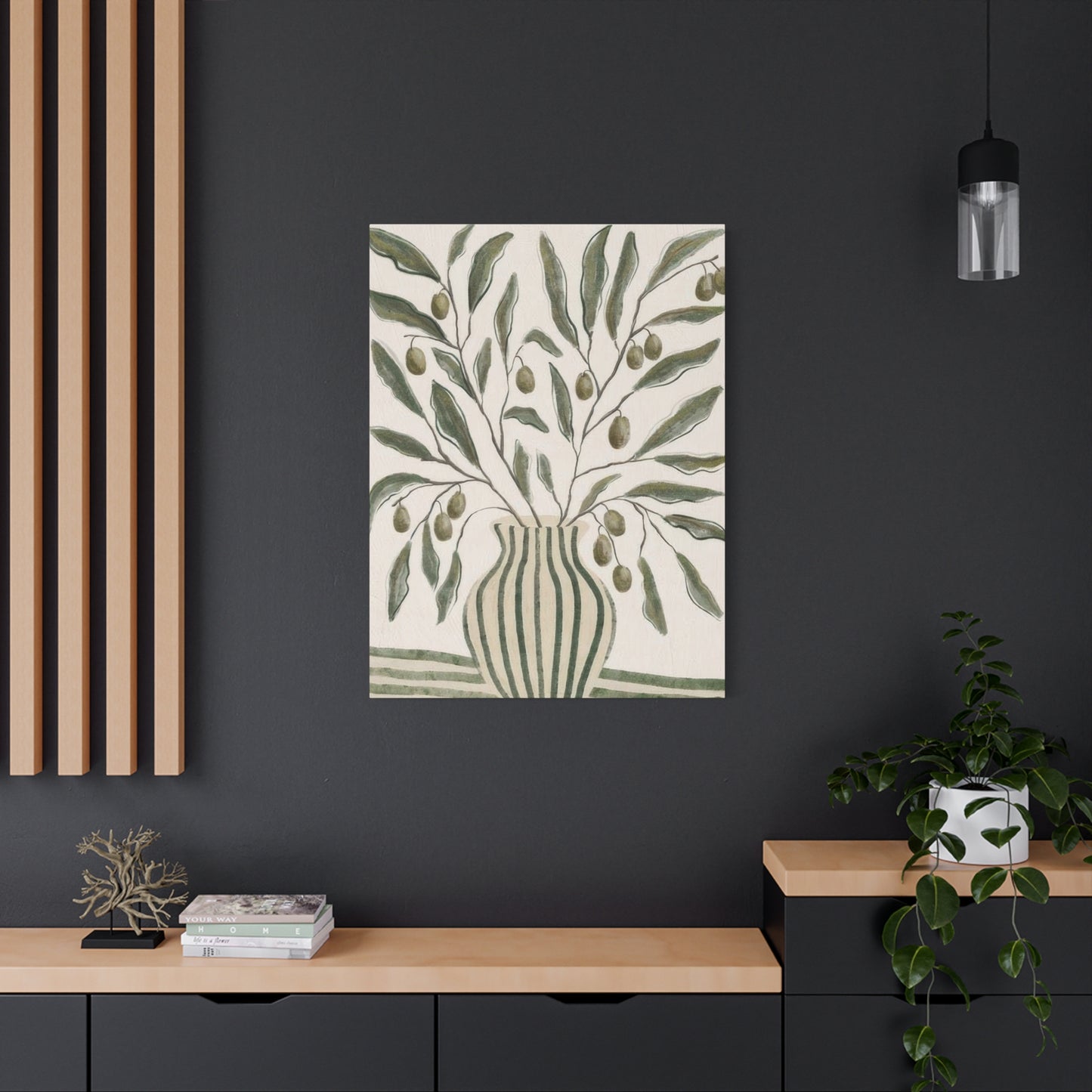
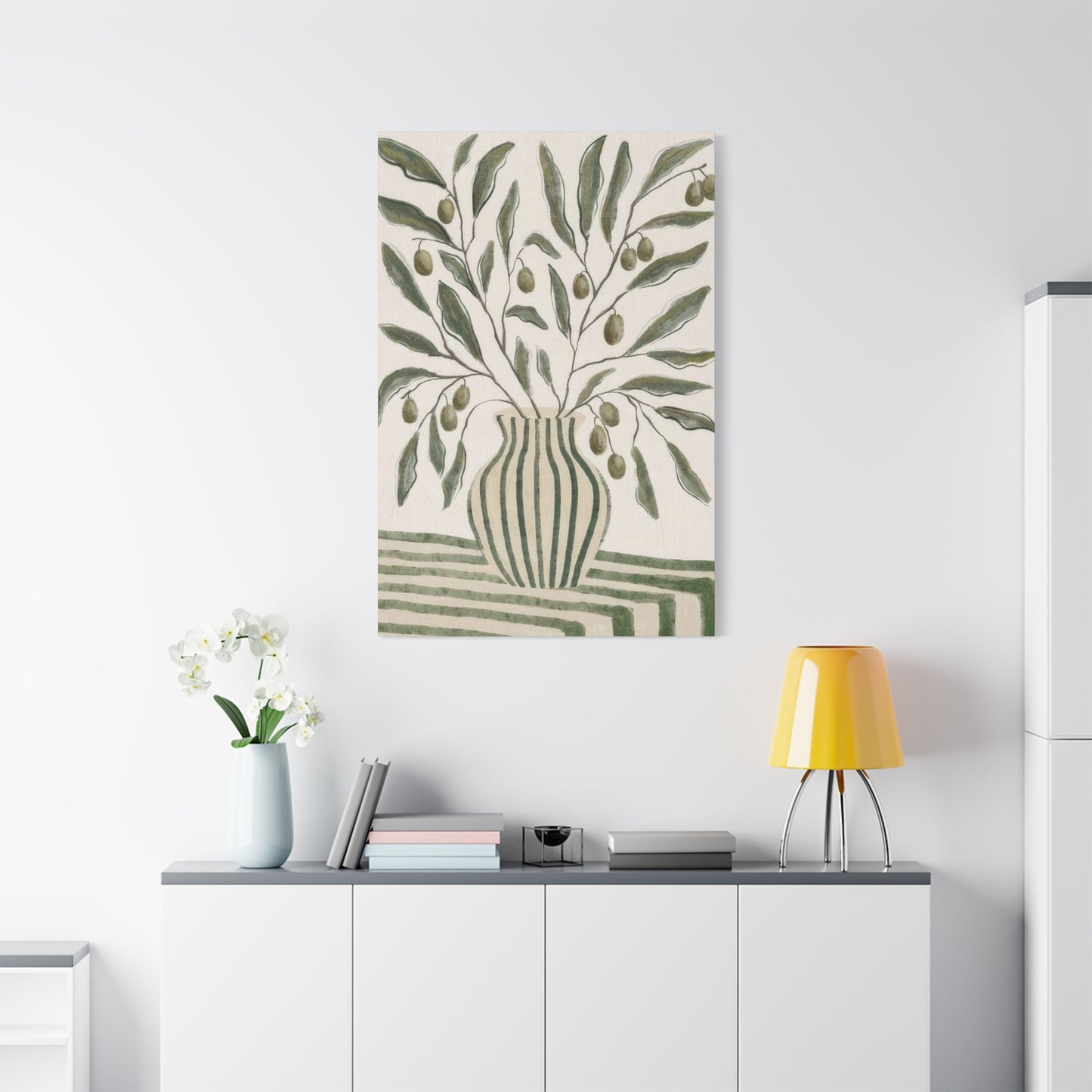
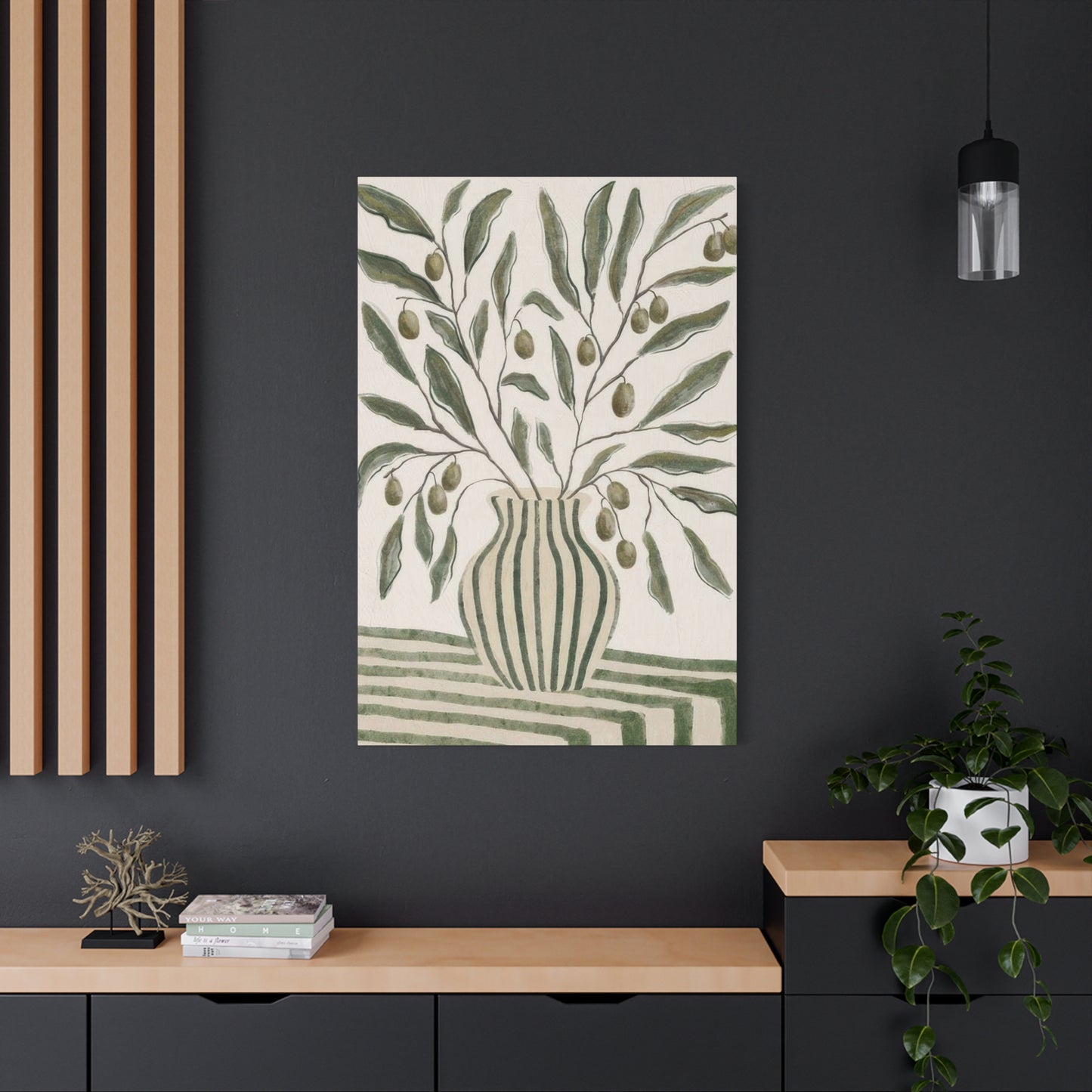
The representation of containers and vessels in these natural hues adds another layer of meaning to the artwork. Vessels have long symbolized abundance, hospitality, and the human capacity to hold and nurture. When rendered in colors associated with growth and life, these everyday objects become powerful metaphors for the home itself as a container for our lives, relationships, and memories.
Linear Patterns and Streamlined Design: Contemporary Visual Appeal
Modern interior design increasingly embraces the philosophy that simplicity need not equate to starkness or coldness. The incorporation of linear patterns into artwork featuring botanical vessels represents a perfect synthesis of minimalist principles with visual interest. These rhythmic arrangements of parallel bands create movement and energy while maintaining an overall sense of order and intentionality that defines contemporary aesthetics.
The appeal of these geometric elements lies in their ability to provide structure without rigidity. Unlike complex, ornate patterns that can overwhelm a space, simple linear arrangements offer just enough visual texture to prevent monotony while remaining sufficiently restrained to avoid causing visual fatigue. This balance makes them particularly suitable for environments where people spend extended periods, such as living rooms, home offices, or bedrooms.
Linear patterns also possess remarkable versatility in how they interact with other design elements. Horizontal arrangements can make walls appear wider, creating the illusion of expanded space in smaller rooms. Vertical arrangements draw the eye upward, emphasizing ceiling height and adding a sense of grandeur to the environment. Diagonal orientations introduce dynamic energy, suggesting movement and preventing spaces from feeling too static or predictable.
The thickness and spacing of these linear elements significantly impact the overall impression created by the artwork. Thin, closely spaced bands convey delicacy and sophistication, working beautifully in refined, elegant interiors. Wider intervals between broader bands feel more relaxed and casual, suiting laid-back, comfortable living spaces. This flexibility allows homeowners to select pieces that genuinely resonate with their personal style preferences and the specific character they wish to cultivate in each room.
When combined with representations of vessels in natural tones, these geometric patterns create fascinating juxtapositions. The organic, curved forms of containers contrast beautifully with the straight, measured quality of linear elements, generating visual tension that keeps the eye engaged. This interplay between natural and constructed forms mirrors the broader relationship between human creativity and the natural world, making such artwork intellectually satisfying as well as aesthetically pleasing.
The contemporary appeal of this design approach also reflects broader cultural movements toward intentional living and thoughtful consumption. By choosing artwork that features clean lines and purposeful composition, homeowners signal their appreciation for quality over quantity, for thoughtful design over passing trends. These pieces communicate an understanding that true style emerges from careful curation rather than excessive accumulation.
Moreover, the timeless quality of well-executed linear patterns ensures that such artwork remains relevant even as specific decorating trends come and go. While particular color combinations or styling approaches may shift with fashion, the fundamental appeal of balanced geometric composition endures. This longevity makes these pieces wise investments for those building collections they hope to enjoy for years to come.
Container Imagery as Central Elements in Visual Compositions
The strategic use of vessel representations as primary subjects in wall art taps into deep artistic traditions while offering distinctly modern interpretations. Throughout art history, painters and illustrators have returned repeatedly to the motif of containers and receptacles, drawn by their elegant forms and symbolic richness. Contemporary interpretations of this classic subject matter breathe new life into the tradition, presenting familiar objects through fresh perspectives that resonate with current design sensibilities.
Positioning these container images as central focal points within compositions creates immediate visual hierarchy, guiding viewers to understand where to direct their attention. This clarity of purpose prevents artwork from feeling chaotic or confusing, instead offering a clear entry point for visual engagement. The eye naturally gravitates toward these centrally placed forms, beginning its exploration of the piece from a position of stability before moving outward to discover additional details and nuances.
The choice to feature vessels prominently also carries practical advantages for home decorators. Unlike complex scenes with multiple competing elements, artwork centered on a single primary subject integrates easily into various room configurations. The clear silhouette of a container form reads clearly even from a distance, making these pieces effective in larger rooms or when viewed from across open-concept living areas. Simultaneously, they reward closer inspection with subtle details in texture, pattern, and coloration that reveal themselves upon nearer examination.
The symbolic weight carried by container imagery adds depth to these seemingly simple compositions. Vessels represent potential and possibility, empty spaces waiting to be filled with beauty, nourishment, or meaning. In domestic contexts, this symbolism resonates powerfully, reflecting the home's role as a container for daily life and the relationships that give it meaning. Artwork featuring these forms subtly reinforces positive associations with domestic space, enhancing feelings of comfort and belonging.
Different vessel shapes convey distinct aesthetic and emotional qualities. Tall, slender forms suggest elegance and refinement, their vertical orientation adding grace and sophistication to interiors. Wider, more rounded shapes feel abundant and welcoming, their generous proportions implying hospitality and warmth. Angular, geometric vessels bring modern edge and architectural interest, while organic, hand-formed shapes introduce artisanal character and authenticity.
The interplay between the vessel form and its surrounding negative space constitutes another crucial aspect of these compositions. Skilled artists manipulate the relationship between object and background to create breathing room that prevents the image from feeling cramped or claustrophobic. This attention to spatial relationships ensures that the artwork maintains visual balance, feeling neither too sparse nor too crowded regardless of the room's other design elements.
Surface treatments applied to these container forms further enhance their effectiveness as focal points. Smooth, unadorned surfaces emphasize pure form and shape, celebrating the essential beauty of simple objects. Decorated surfaces incorporating patterns or textural variations add layers of visual interest without compromising the clarity of the overall composition. The choice between these approaches depends on the desired level of visual complexity and how the piece will interact with surrounding furnishings and architectural features.
Combining Multiple Patterns Within Curated Wall Displays
The art of assembling collections of wall pieces requires careful consideration of how individual works relate to one another, creating cohesive groupings that feel intentional rather than random. When working with pieces that feature different patterns, the challenge intensifies, demanding thoughtful attention to balance, rhythm, and overall visual harmony. Successfully mixing patterned works elevates wall displays from simple decoration to sophisticated artistic statements that demonstrate refined aesthetic judgment.
The key to successful pattern mixing lies in identifying common threads that unite disparate pieces while allowing each to maintain its individual character. Shared color palettes provide the most obvious connection, allowing pieces featuring different patterns to coexist harmoniously through their related hues. When multiple works incorporate similar botanical tones, for example, they read as a cohesive family despite variations in their linear or geometric elements.
Scale variation represents another crucial consideration when combining patterned pieces. Groupings that feature patterns at different scales create visual hierarchy and prevent the display from feeling too uniform or repetitive. A large piece with bold, widely spaced elements might anchor the collection, while smaller works with finer, more delicate patterns provide supporting interest without competing for dominance. This layering of scales mimics the complexity found in natural environments, where elements of different sizes coexist in balanced ecosystems.
The spacing and arrangement of multiple pieces on the wall significantly impacts how their patterns interact. Tight groupings create the impression of a single, unified composition, with the patterns from individual pieces blending into an overall texture. More generous spacing allows each work to breathe independently, emphasizing the distinct character of each pattern while still maintaining connection through proximity and alignment.
Mixing representational and abstract patterns adds another dimension to wall collections. Pieces depicting recognizable vessel forms with clear patterns can anchor more abstract geometric works, providing reference points that help viewers navigate the collection. This combination of concrete and conceptual elements creates intellectual interest alongside visual appeal, inviting contemplation about the relationships between different artistic approaches.
The inclusion of varying orientations within pattern-mixed groupings prevents monotony and adds dynamic energy to wall displays. While some pieces may feature horizontal linear elements, others might incorporate vertical arrangements or even diagonal compositions. This variety of directional movement keeps the eye traveling across the collection, discovering new relationships and interactions with each viewing.
Symmetry versus asymmetry constitutes another important decision when arranging multiple patterned pieces. Symmetrical arrangements convey formality and traditional elegance, their balanced compositions feeling stable and authoritative. Asymmetrical groupings feel more contemporary and relaxed, their unexpected arrangements suggesting spontaneity and creative freedom. The choice between these approaches should reflect both the room's overall design character and the specific mood the homeowner wishes to cultivate.
Frame selection plays a surprisingly significant role in successful pattern mixing. Consistent framing helps unify diverse pieces, their matching borders creating visual continuity that allows varied patterns to coexist more easily. Alternatively, varied frames can become part of the overall pattern play, adding another layer of visual interest for those seeking maximum creativity and complexity in their wall displays.
Harmonizing Structure and Utility in Container-Inspired Artwork
The most satisfying decorative pieces manage to be both visually compelling and conceptually meaningful, transcending mere prettiness to offer substance alongside style. Artwork featuring vessels naturally embodies this duality, representing objects designed specifically to serve functional purposes while simultaneously celebrating aesthetic qualities. This marriage of utility and beauty resonates deeply with contemporary design philosophies that reject artificial divisions between art and life.
Historical precedents for this integration abound across cultures and eras. Traditional crafts people understood intuitively that objects used daily deserved thoughtful design and decorative embellishment. A container meant to hold water or grain received the same artistic attention as items created purely for display, reflecting the belief that functionality and beauty naturally complement rather than contradict each other. Modern artwork depicting these utilitarian forms continues this tradition, honoring the idea that everyday objects possess inherent artistic worth.
The visual representation of vessels in wall art serves as a reminder of this philosophical stance. By elevating humble containers to subjects worthy of artistic attention, these pieces challenge viewers to reconsider their relationships with ordinary objects. This shift in perspective can transform how we experience our entire domestic environment, encouraging greater appreciation for the tools and items we interact with daily. Suddenly, the simple act of arranging flowers in a vessel becomes a conscious aesthetic choice rather than a purely practical task.
From a design standpoint, the clear structure provided by vessel forms makes them excellent subjects for artwork intended to anchor interior spaces. Their defined silhouettes create strong visual statements without requiring excessive detail or complexity. This structural clarity allows such pieces to function effectively in both minimalist environments, where their simple forms complement sparse surroundings, and in more layered, eclectic spaces, where their straightforward shapes provide grounding amidst visual abundance.
The functional associations carried by container imagery also contribute to their effectiveness in specific rooms. In kitchens and dining areas, artwork depicting vessels reinforces the room's purpose as a space for nourishment and gathering. In entryways, such pieces symbolically welcome guests, their container forms suggesting receptiveness and hospitality. Even in private spaces like bedrooms, these images can represent the self as a vessel containing thoughts, dreams, and identity.
Contemporary artists working with these themes often explore the tension between representation and abstraction, depicting vessels that hover between recognizable forms and geometric compositions. This ambiguity invites viewer participation, as each person brings their own interpretations and associations to the work. The resulting engagement transforms passive viewing into active experience, making the artwork feel more personally meaningful.
The materials and techniques used to create these pieces also reflect considerations of form and function. Print production methods allow for crisp, clean reproductions that maintain the clarity of the original design, ensuring that the artwork's structural elements read clearly on the wall. Quality materials and proper finishing techniques ensure longevity, allowing these pieces to function effectively as long-term components of the home environment rather than temporary decorative gestures.
Coordinating Container Artwork With Living Botanical Displays
One of the most visually satisfying design strategies involves creating deliberate relationships between two-dimensional representations and three-dimensional reality. Pairing artwork depicting vessels with actual living specimens in physical containers creates delightful echoes and resonances that blur the boundaries between art and life. This layering of representational and actual elements adds dimensional depth to interior spaces while reinforcing connections to the natural world.
The most successful pairings consider both visual and conceptual relationships between the artwork and the living specimens. Matching the color palette provides the most obvious connection, selecting plants whose foliage echoes the botanical tones featured in the wall pieces. This color repetition creates visual rhythm that carries across the room, linking horizontal surfaces with vertical wall space in a unified composition. The effect suggests intentionality and care, qualities that elevate the entire space.
Shape relationships offer another avenue for creating harmonious pairings. Artwork featuring tall, slender vessels might be complemented by similarly vertical plant forms such as snake plants or tall dracaenas. Conversely, pieces depicting rounded, generous containers could be echoed by fuller, bushier plant specimens like ferns or pothos. These shape echoes feel naturally pleasing, creating a sense that all elements in the room belong together as parts of a considered whole.
Contrast can be equally effective as harmony in these pairings. A minimalist artwork featuring clean lines and simplified vessel forms might be dramatically offset by the organic complexity of a large, architectural plant specimen. This juxtaposition highlights the unique qualities of each element, the artwork's restraint making the plant's natural exuberance appear even more vital and alive. Such contrasts create dynamic tension that keeps spaces feeling fresh and engaging.
The physical positioning of plants relative to the artwork requires careful consideration. Placing living specimens directly below or adjacent to related wall pieces creates obvious, intentional connections. More subtle placements across the room from the artwork create visual conversations that reward attentive viewers, their discovery adding an element of surprise and delight. Both approaches have merit depending on the room's layout and the desired level of obvious coordination.
Scale relationships between the artwork and actual plants significantly impact the overall effect. Oversized artwork paired with modest plant specimens emphasizes the artistic representation, suggesting that the wall piece serves as the primary element with the living plant offering supporting interest. Conversely, substantial plant displays accompanied by smaller-scale artwork create the impression that nature takes precedence, with the wall piece serving to enhance and celebrate the living specimens.
The containers holding actual plants present additional opportunities for coordination with wall art. Selecting vessels whose colors, materials, or forms echo elements in the artwork strengthens the visual relationship between dimensions. A piece depicting terracotta-toned containers might be beautifully complemented by actual ceramic planters in similar warm earth tones. This attention to detail throughout the space demonstrates design sophistication and creates deeply satisfying cohesion.
Seasonal variations in living plant displays offer opportunities to refresh the relationship between actual specimens and permanent artwork. As plants grow, flower, or change with the seasons, their interaction with static wall pieces evolves, keeping the space feeling dynamic despite unchanged core elements. This natural variation prevents the pairing from becoming stale or too predictable over time.
Understated Container Compositions With Botanical Accent Colors
The current movement toward simplified aesthetics has brought increased appreciation for artwork that does most of its work through restraint rather than abundance. Pieces featuring spare, uncluttered compositions with carefully chosen accent colors embody this philosophy perfectly, proving that visual impact need not depend on complexity or busy-ness. These works demonstrate that sometimes the most powerful statements emerge from knowing precisely what to include and, equally importantly, what to leave out.
The foundation of effective minimalist artwork lies in strong, confident composition. With fewer elements competing for attention, each component must justify its presence through either formal strength or symbolic significance. Container forms serve this purpose admirably, their simple silhouettes providing immediate visual interest while leaving ample negative space that allows the eye to rest. This breathing room prevents viewer fatigue, making minimalist pieces particularly suitable for spaces where calm and clarity are priorities.
The introduction of botanical accent colors into these spare compositions creates crucial focal points that prevent the work from feeling too austere or cold. A single shade of natural tone applied strategically within an otherwise neutral or monochromatic piece immediately draws the eye, creating hierarchy and direction within the composition. This selective use of color feels more impactful than if the entire piece were rendered in multiple hues, demonstrating the power of restraint and purposeful choice.
The specific placement of these color accents significantly affects the piece's overall character. Concentrating color in the central vessel form emphasizes the container as the primary subject, making it the clear star of the composition. Alternatively, placing colored elements in the background or surrounding areas can create the impression that the vessel exists within a larger, suggested environment, inviting viewers to imagine the complete scene beyond the frame's edges.
Tonal variation within the minimalist palette adds subtle sophistication without compromising the overall simplicity. Using several values of the same botanical hue creates depth and dimension while maintaining color harmony. This approach allows for shadow, highlight, and mid-tone differentiation that gives form and solidity to depicted objects without requiring the introduction of additional colors that might complicate the composition.
The relationship between positive and negative space becomes particularly crucial in minimalist container artwork. Generous amounts of empty space surrounding the primary forms prevent the composition from feeling cramped while emphasizing the importance of the depicted elements. This negative space functions as an active component of the design rather than mere background, its careful shaping contributing significantly to the overall aesthetic impact.
Line quality in minimalist pieces deserves special attention, as every mark becomes more visible and meaningful when the composition includes fewer elements overall. Clean, confident lines convey assurance and intentionality, while more organic, hand-drawn qualities introduce warmth and human presence. The choice between these approaches should reflect the desired character of the space where the artwork will be displayed.
Texture can provide valuable interest in minimalist compositions without adding visual clutter. Subtle variations in surface quality, whether achieved through printing techniques, paper selection, or digital manipulation, create tactile appeal that rewards close viewing. This attention to material qualities elevates minimalist pieces beyond simple graphics to objects worth experiencing in person rather than merely viewing in reproduction.
Transitioning Functional Objects Into Decorative Statements
The conceptual journey from practical household item to wall-worthy artistic subject represents a fascinating aspect of contemporary design thinking. This transformation reflects broader cultural shifts in how we value and perceive everyday objects, recognizing that the things we use daily possess aesthetic qualities worth celebrating and preserving. Artwork depicting containers specifically honors this elevation, taking humble utilitarian forms and presenting them as subjects deserving focused artistic and viewer attention.
Historical parallels for this artistic approach appear throughout art movements of the past century. Still life painters have long understood that ordinary objects, when observed closely and rendered with care, reveal unexpected beauty and significance. The Dutch masters depicted simple kitchen vessels with the same attention they brought to portraits of wealthy patrons, recognizing that truth and beauty exist in all aspects of daily life rather than only in the grand or exotic.
Contemporary interpretations of this tradition benefit from modern production and distribution methods that make high-quality artistic reproductions accessible to wider audiences. What previous generations might have commissioned as custom paintings or acquired as expensive original works can now be obtained as excellent prints that maintain the integrity of the artistic vision while fitting within modest budgets. This democratization of art allows more people to participate in the cultural conversation about beauty, value, and domestic aesthetics.
The specific choice to feature container forms in these transitional pieces carries particular resonance in domestic contexts. Unlike abstract subjects that may feel disconnected from daily experience, vessel imagery immediately relates to familiar objects found in every home. This recognition creates instant connection between viewer and artwork, making even highly stylized or abstracted representations feel personally relevant rather than distantly conceptual.
Different artistic approaches to depicting these functional objects produce dramatically varied effects. Hyper-realistic renderings celebrate the container's physical presence and material qualities, inviting viewers to appreciate texture, weight, and substance. More stylized treatments emphasize essential form over specific detail, presenting idealized versions that capture the archetypal qualities of vessel-ness rather than reproducing any particular example. Abstract interpretations move further still from literal representation, using container forms as starting points for explorations of shape, color, and composition that transcend specific objects.
The background treatment in these pieces significantly impacts how viewers perceive the relationship between the functional object and artistic statement. Neutral, undefined backgrounds allow the vessel form to float in ambiguous space, emphasizing its sculptural qualities independent of any particular context. Defined settings or environmental suggestions place the container within recognizable spaces, connecting the artistic representation more directly to the viewer's own domestic experience.
Scale manipulation offers another tool for transforming everyday objects into artistic statements. Depicting containers at sizes far larger or smaller than their actual dimensions forces viewers to see them anew, freed from the familiarity that can breed inattention. An oversized representation commands attention and respect, while miniaturized versions invite close scrutiny and contemplation of details easily overlooked when encountering the actual objects.
Geometric Linear Elements Within Nature-Inspired Compositions
The intersection of geometric precision and organic subject matter creates fascinating visual tension that engages viewers on multiple levels. Artwork that combines natural motifs with mathematical arrangements challenges conventional boundaries between natural and constructed worlds, suggesting that these categories may be less opposed than commonly assumed. Linear patterns integrated into botanical themes specifically highlight this relationship, revealing the hidden geometries present in natural forms while imposing human order on wild, growing things.
The parallel between plant growth patterns and geometric arrangements runs deeper than surface aesthetics. Natural structures frequently display mathematical relationships, from the spiral arrangements of seeds in flower heads to the branching patterns of tree limbs. Artists who incorporate linear geometric elements into botanical compositions tap into these underlying natural geometries, making explicit what nature often leaves implicit. The resulting works feel simultaneously ordered and organic, bridging seemingly opposite aesthetic impulses.
The visual contrast between rigid geometric structures and fluid natural forms creates dynamic compositions that hold viewer attention. The eye moves between these different types of elements, first attracted to the bold geometry, then softened by organic curves, continuously circulating through the composition without finding a permanent resting place. This movement prevents boredom and invites extended viewing, as new relationships between elements reveal themselves over time.
Different geometric approaches yield distinct aesthetic results when combined with botanical subjects. Strictly rectilinear grids impose strong order that can either complement or dramatically contrast with curved vessel forms. Radial arrangements echo natural patterns like flower petals or sun rays, creating harmony between geometric structure and organic subject. Diagonal arrangements introduce dynamism and energy, suggesting movement and growth rather than static stability.
The thickness and prominence of geometric elements relative to botanical forms significantly affects the balance between these competing visual languages. Bold, heavy geometric patterns can dominate compositions, reducing natural elements to supporting roles within larger abstract structures. Conversely, delicate, subtle geometric elements might appear as gentle suggestions or light embellishments, allowing organic forms to maintain primary importance while gaining additional visual interest from the geometric overlay.
Color relationships between geometric and organic elements offer another dimension for exploration. Unifying both types of elements within a consistent color palette creates harmony despite their formal differences. Alternatively, assigning different colors to geometric versus organic components clearly differentiates these aspects, making their interaction more explicit and intellectually engaging. Both approaches have merit depending on the desired overall effect and the character of the space where the work will be displayed.
The implied depth relationships between geometric and natural elements can be manipulated to create various spatial effects. Geometric patterns appearing to recede behind vessel forms suggest that human structures support or frame natural elements. Conversely, geometric overlays that appear to sit atop organic forms imply human intervention or interpretation of nature. These spatial relationships, though existing only as illusions in two-dimensional artwork, powerfully shape how viewers understand the piece's meaning.
Contemporary digital tools have expanded possibilities for combining geometric and organic elements with unprecedented precision and flexibility. Artists can experiment with countless variations of pattern scale, orientation, and color before committing to final compositions. This technological advancement has contributed to the proliferation of work exploring these intersections, as creators can pursue complex hybrid aesthetics more efficiently than traditional methods would allow.
Artistic Methods for Creating Container Wall Pieces
Understanding the techniques behind artwork production deepens appreciation for finished pieces while informing selection decisions for those building home collections. Different creative approaches yield distinct visual qualities and characteristics that may better suit particular spaces, design schemes, or personal preferences. Knowledge of these methods allows collectors to make more informed choices, selecting pieces whose production aligns with their aesthetic values and practical requirements.
Traditional painting techniques remain relevant even in an age of digital reproduction. Hand-painted originals possess unique qualities impossible to fully capture in reproductions, with visible brushwork, paint texture, and subtle color variations that give each piece individual character. For those who value the marks of human hand and eye, original painted works or limited edition prints that preserve evidence of the painting process may hold special appeal despite typically higher costs.
Watercolor techniques bring particular qualities to container-themed artwork, their transparent layering and fluid edges lending softness and subtlety to vessel depictions. The medium's natural variation and slight unpredictability introduce organic qualities that complement botanical subjects beautifully. Watercolor's traditional association with botanical illustration creates historical resonance that adds depth to contemporary interpretations of these classic themes.
Acrylic painting offers different possibilities, with its opaque coverage and crisp edges allowing for bold, graphic treatments. The medium's versatility permits both precise geometric elements and loose, expressive gestures within the same composition. Acrylics' relatively quick drying time and stable archival qualities make them practical choices for artists producing multiple works, while their vibrant color potential suits contemporary aesthetic preferences for saturated hues.
Digital illustration has become increasingly prominent in contemporary decorative art production, offering unparalleled precision and editability. Artists working digitally can achieve perfectly clean lines, mathematically exact geometric patterns, and meticulously controlled color relationships. The resulting works often possess a distinctly modern, crisp quality that appeals to those favoring contemporary minimalist aesthetics. Digital files also permit production at multiple sizes without quality loss, offering practical advantages for both artists and collectors.
Mixed media approaches combine multiple techniques within single pieces, creating rich surfaces and complex visual effects. An artist might begin with painted elements, add drawn or printed components, and finish with digital manipulation or enhancement. These hybrid methods can produce uniquely compelling results that showcase the strengths of different approaches while minimizing individual limitations. The resulting aesthetic complexity rewards close examination and extended viewing.
Print-making techniques like screen printing or linocut introduce distinctive textural qualities and slight variations between prints that mechanical reproduction cannot replicate. While each print in an edition appears essentially identical, closer inspection reveals tiny differences that give each piece individual character. For collectors who value the intersection of artistic craft and accessible pricing, limited edition prints created through these traditional methods offer appealing middle ground between unique originals and mass-produced reproductions.
The choice of substrate significantly impacts the final appearance and longevity of printed artwork. High-quality archival papers maintain color fidelity and resist degradation far better than cheaper alternatives, justifying their higher cost for pieces intended as long-term home components. Canvas printing offers different aesthetic qualities, with texture that references traditional painting while providing durability suitable for high-traffic areas. Alternative substrates like metal or wood panels introduce contemporary edge that suits modern interiors.
Historical Container Forms Interpreted Through Contemporary Perspectives
The dialogue between historical forms and modern sensibilities creates some of the most intellectually satisfying artwork in contemporary decorative collections. Pieces that reference traditional vessel types while employing current aesthetic approaches honor artistic heritage while remaining firmly grounded in present-day visual culture. This temporal layering adds conceptual depth that elevates straightforward decoration into more meaningful artistic statements that reward contemplation as well as casual viewing.
Vintage container forms carry associations with specific eras, cultures, and domestic practices that provide rich material for artistic exploration. Ancient amphoras suggest classical Mediterranean civilizations, their graceful curves and utilitarian origins connecting contemporary viewers to daily life thousands of years past. Medieval earthenware references pre-industrial domesticity, when handcrafted vessels represented significant household investments that families treasured and maintained across generations. Victorian decorative pieces evoke specific historical moments when ornate design and elaborate decoration reflected particular social values and economic conditions.
Modern reinterpretations of these historical forms employ various strategies to bridge temporal distance. Some artists render vintage vessel types in simplified, abstracted styles that reduce complex forms to essential geometric elements. This approach honors the original shapes while translating them into visual languages that resonate with contemporary minimalist sensibilities. The resulting works feel simultaneously timeless and current, belonging fully to neither past nor present but existing in productive conversation between eras.
Other contemporary treatments embrace historical complexity, faithfully representing ornate details and decorative elements while integrating them into modern color palettes or compositional frameworks. This approach creates deliberate anachronism that highlights historical quotation, making clear that the piece intentionally references the past rather than merely reproducing it. The resulting works invite reflection on how aesthetic values shift across time while certain fundamental forms retain appeal across centuries.
Color choices particularly signal modern interpretation of historical subjects. While ancient ceramics often featured earth tones derived from available mineral pigments, contemporary artwork can deploy any color imaginable. Rendering a classical vessel form in vibrant botanical hues immediately marks it as a present-day interpretation, creating productive tension between ancient shape and modern palette. This color-based temporal layering allows works to function simultaneously as historical reference and contemporary decoration.
The backgrounds and contexts in which vintage vessel forms appear within modern compositions also signal interpretive approaches. Placing historical container forms against flat, minimalist backgrounds removes them from any specific time or place, emphasizing pure form divorced from historical context. Alternatively, surrounding vintage vessels with geometric modern patterns or contemporary decorative elements creates explicit dialogue between past and present, acknowledging temporal distance while forging visual connections across it.
Technical execution marks another distinction between historical pieces and modern interpretations. While actual vintage vessels bear marks of handcraft including slight irregularities and variations, contemporary depictions might emphasize or erase these qualities depending on artistic intent. Perfectly smooth, uniform renderings suggest idealized types rather than specific objects, while deliberately included imperfections honor the hand-made origins of historical examples.
The cultural exchange inherent in global contemporary culture allows modern artists to reference vessel traditions from diverse world cultures, creating cross-cultural dialogues impossible in previous eras. An artist might combine form elements from Asian ceramics with color palettes inspired by African textiles and compositional approaches derived from Scandinavian design. These hybrid works reflect contemporary multiculturalism while celebrating the rich global heritage of ceramic vessel traditions.
Creating Welcoming Entry Spaces With Container-Themed Artwork
First impressions powerfully shape how visitors experience homes, making entrance areas particularly important design opportunities. The artwork displayed in these threshold spaces sets immediate tone and communicates the aesthetic values maintained throughout the dwelling. Container-themed pieces offer especially appropriate choices for these transitional zones, their imagery of vessels symbolically related to themes of welcome, hospitality, and the home as receptacle for human activity and connection.
The practical constraints of entryway spaces often influence artwork selection. These areas tend to be relatively small, with limited wall space competing with functional elements like coat hooks, mirrors, and console tables. Artwork for entries therefore benefits from clear, straightforward composition that reads easily at a glance rather than requiring extended study to appreciate. Container forms serve this purpose well, their simple silhouettes and strong shapes communicating effectively even in brief encounters as people come and go.
Scale considerations take on particular importance in entry spaces where viewers typically stand closer to walls than in more spacious rooms. Oversized pieces can feel overwhelming when viewed from intimate distances, while very small works risk getting lost among the visual clutter of everyday objects that accumulate in entryways. Medium-scale pieces featuring prominent vessel forms often strike the most effective balance, commanding appropriate attention without dominating these modest spaces.
Color selection for entry artwork requires thought about how these spaces function as transitions between exterior and interior realms. Botanical tones serve this bridging role beautifully, their natural associations easing the shift from outdoor environments into domestic interiors. These hues feel neither jarringly bright nor depressingly dark, instead offering balanced, welcoming color that suits the entry's transitional character.
The symbolic associations of container imagery resonate particularly well in entrance contexts. Vessels represent receptivity and welcome, their empty spaces waiting to be filled suggesting openness to guests and new experiences. This metaphorical dimension adds conceptual appropriateness to the visual appeal, making container-themed artwork feel naturally suited to these threshold locations rather than arbitrarily placed.
Lighting conditions in entry spaces often present challenges, as these areas may lack substantial natural light while needing to function during evening hours when artificial lighting predominates. Artwork for entries should maintain visibility and appeal under various lighting conditions. Pieces with strong value contrast and clear compositions remain legible even in subdued light, while overly subtle or low-contrast works may fade into invisibility when illumination is less than ideal.
The relationship between entry artwork and nearby functional elements deserves coordination. A console table below the artwork presents opportunities for three-dimensional arrangements that echo the wall piece's themes. Actual vessels holding keys, mail, or seasonal flowers can mirror the containers depicted above, creating pleasing visual rhymes. These thoughtful connections between two and three-dimensional elements demonstrate design sophistication that elevates the entire entry experience.
Seasonal flexibility allows entry spaces to feel fresh and current throughout the year. While the primary artwork might remain constant, small adjustments to surrounding elements can shift the space's character. Changing which physical vessels appear on the console table, varying their contents between seasons, or adjusting supplementary decorative items keeps the entry feeling dynamic despite the unchanging wall piece.
Container-Inspired Artwork for Culinary and Dining Spaces
Kitchens and dining rooms hold a unique place within the home, embodying both the practical and the profound. These spaces are not only centers of nourishment and sustenance but also sites of gathering, connection, and the daily rituals that structure family and social life. When selecting artwork for these rooms, it’s essential to consider how the pieces will harmonize with the spaces’ dual roles—functional hubs and emotional heartbeats of the home. Container-themed artwork, with its evocative depictions of vessels, bowls, jars, and other receptacles, offers an especially fitting choice. These works visually echo the rooms’ fundamental purpose: to hold, serve, and share.
The imagery of containers resonates on multiple levels. Practically, vessels symbolize the tools through which food is transformed and presented, making them natural companions to culinary spaces. Symbolically, they suggest themes of hospitality, abundance, and care—qualities intrinsic to the act of preparing and sharing meals. This dual significance helps container-inspired artwork deepen the ambiance of kitchens and dining rooms, inviting viewers to appreciate not just the aesthetic but also the ritualistic and communal aspects of food.
Beyond thematic alignment, the practical realities of kitchens and dining rooms also shape artwork selection. These spaces are prone to higher humidity from cooking steam, frequent temperature changes, and exposure to smoke, grease, and food particles. Such conditions demand artworks that are durable and easy to maintain. Container-themed pieces printed on canvas with protective glazing or framed under glass offer resilience against environmental challenges, ensuring longevity without compromising visual impact.
Moreover, the choice of materials and finishes can further enhance both aesthetic appeal and practicality. Glossy or semi-gloss finishes help resist stains and facilitate cleaning, while UV-resistant coatings prevent fading caused by natural or artificial light. Artists and designers who incorporate these considerations create works that withstand the kitchen’s lively atmosphere while preserving their beauty and detail.
Conclusion
Green vase wall art and botanical home décor have emerged as timeless and versatile trends that effortlessly blend nature’s serenity with modern interior aesthetics. This fusion of art and natural motifs not only brings freshness and vitality into living spaces but also cultivates an atmosphere of tranquility and well-being. As more people seek to create homes that feel both inviting and rejuvenating, incorporating green vase wall art and botanical themes has become an essential design strategy.
At the heart of green vase wall art is a celebration of nature’s simplicity and elegance. The vase—a symbol of nurturing and containment—paired with lush greenery and botanical elements, represents growth, life, and harmony. These artworks range from minimalist line drawings of leaves gracefully curling within a vase to vivid, textured canvases bursting with foliage. This diversity allows homeowners to choose pieces that align perfectly with their personal style, whether they favor understated subtlety or bold natural statements.
Botanical home décor extends beyond art to encompass a lifestyle choice that values the calming influence of plants and organic forms. Incorporating greenery, whether real or represented through artwork and accessories, fosters a connection with the outdoors that has proven psychological benefits. Numerous studies highlight how exposure to plant life can reduce stress, improve mood, and enhance concentration—effects that are particularly valuable in today’s often hectic and digitally saturated environments.
Green vase wall art, in particular, offers a unique aesthetic that is both modern and timeless. The combination of elegant vase shapes with natural botanical elements creates a balanced visual harmony that complements a variety of interior styles—from Scandinavian minimalism and mid-century modern to rustic farmhouse and eclectic bohemian. The color green, with its myriad shades, introduces freshness and a sense of renewal, while the vase motif grounds the composition, adding structure and sophistication.
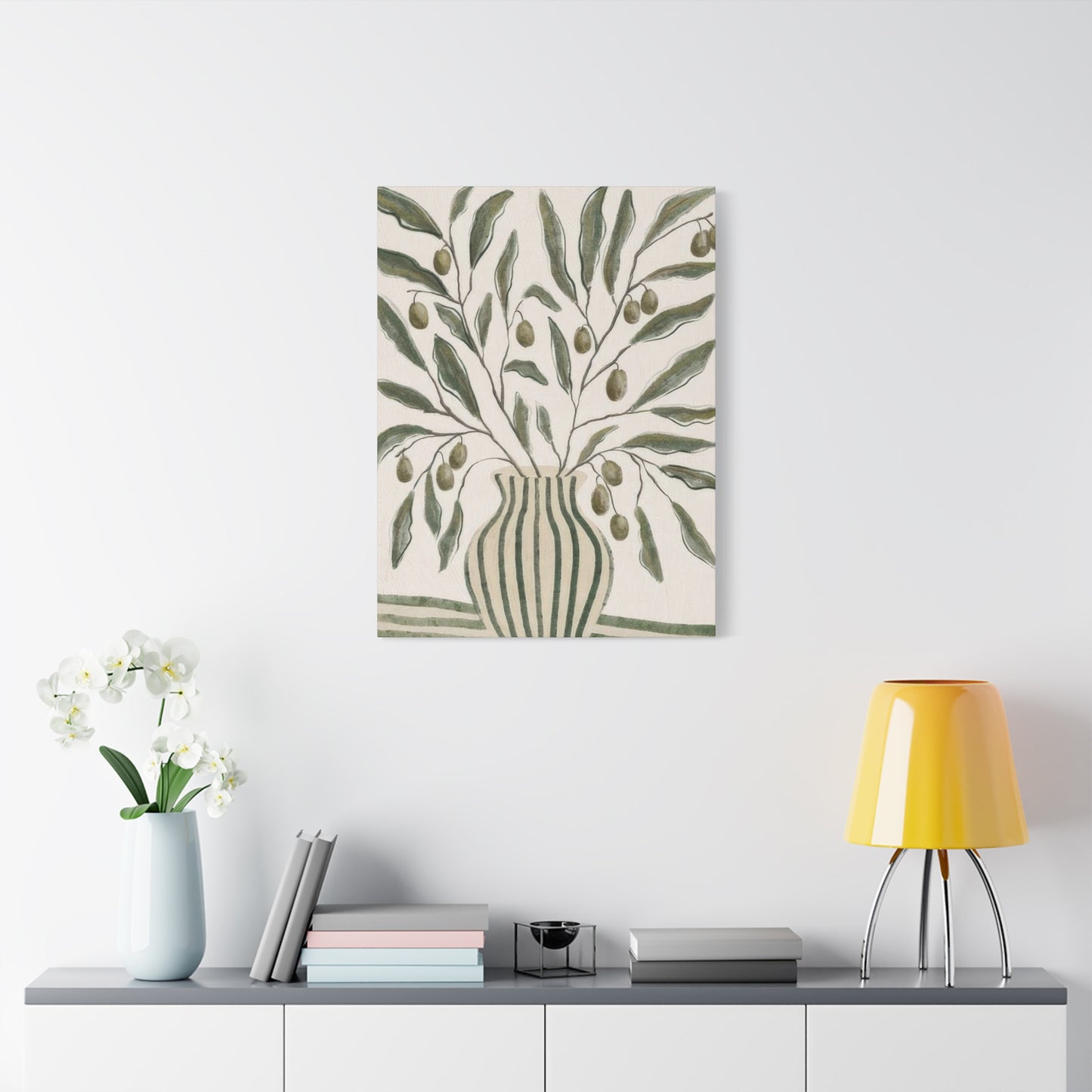
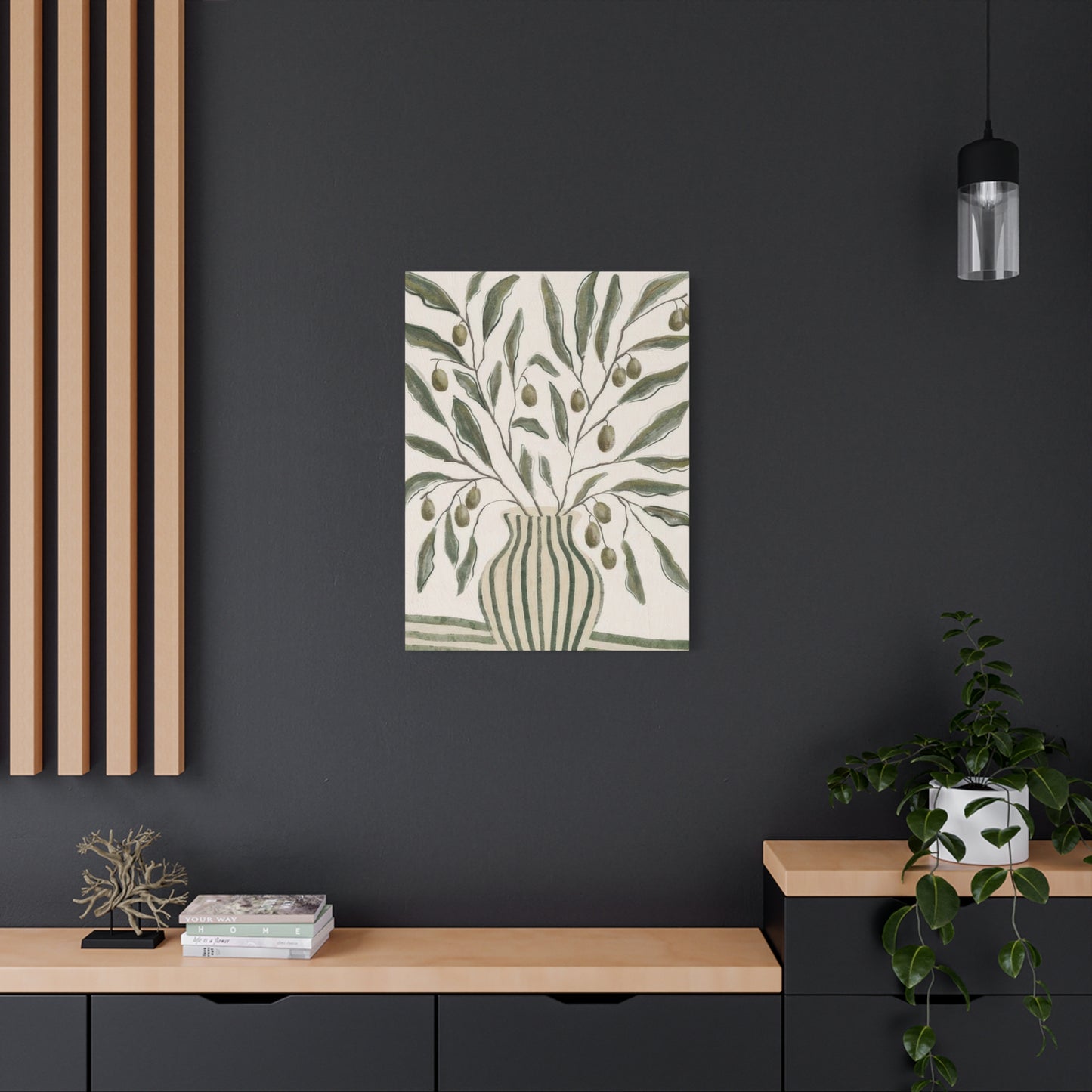
From a design perspective, these artworks are remarkably versatile. They can serve as focal points in living rooms, bedrooms, or dining areas, or act as subtle accents in smaller spaces such as bathrooms or hallways. Their calming presence makes them ideal for workspaces, where a touch of nature can boost productivity and creativity. Additionally, pairing green vase wall art with real plants and natural textures like wood, stone, or woven fabrics can amplify the botanical theme, creating cohesive and immersive environments.
Another key advantage of green vase and botanical art is its accessibility. Artworks in this category come in a wide range of price points, materials, and formats—from high-quality canvas prints and framed illustrations to affordable posters and decals. This variety makes it easy for individuals to introduce botanical beauty into their homes regardless of budget or space constraints.
Moreover, botanical art aligns with growing sustainability and wellness trends. Many artists and brands prioritize eco-friendly materials and ethical production methods, reflecting a broader cultural shift toward mindful consumption and environmental responsibility. By choosing green vase wall art and botanical décor crafted with care, consumers contribute to a more sustainable art market while enhancing their living spaces.
In conclusion, green vase wall art and botanical home décor represent a harmonious blend of natural beauty and artistic expression. They offer a pathway to enrich interiors with color, texture, and meaning, transforming everyday spaces into sanctuaries of calm and inspiration. Whether you are redecorating a single room or curating an entire home aesthetic, incorporating botanical themes is a powerful way to celebrate life’s simple pleasures and reconnect with the natural world.
