


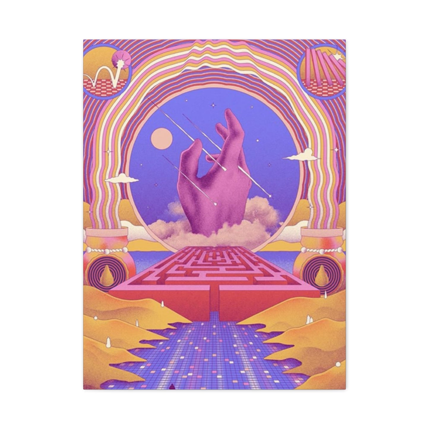

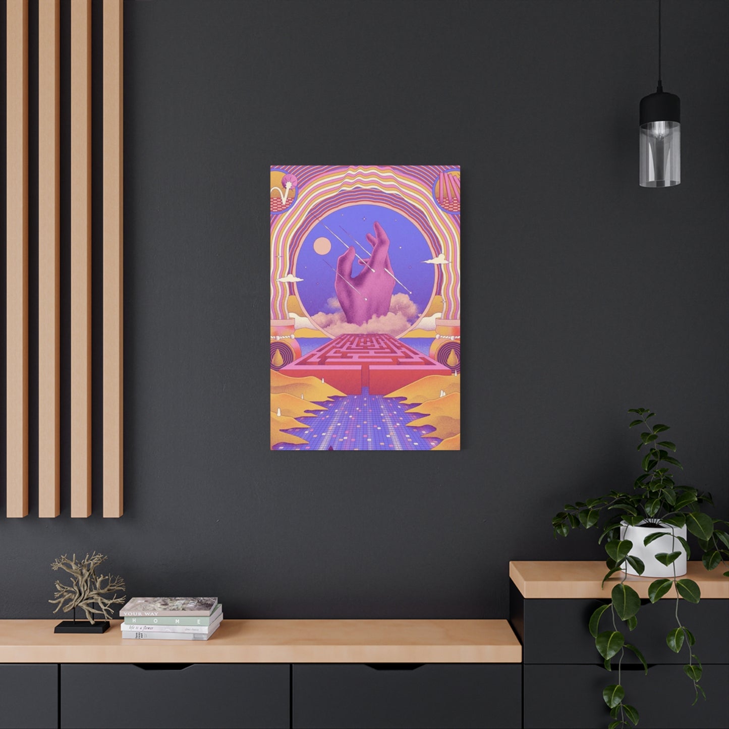
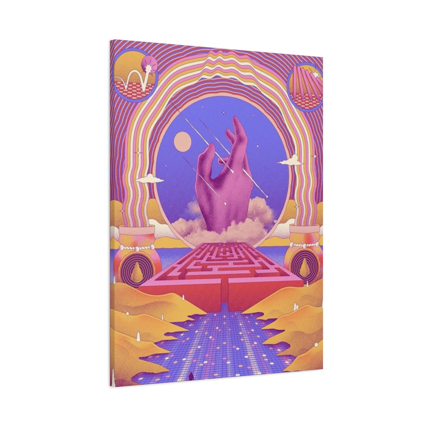
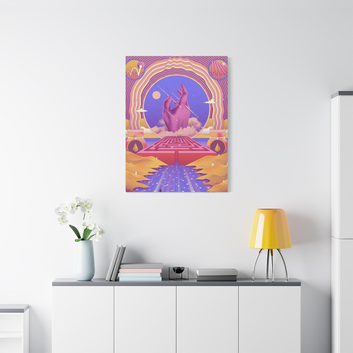
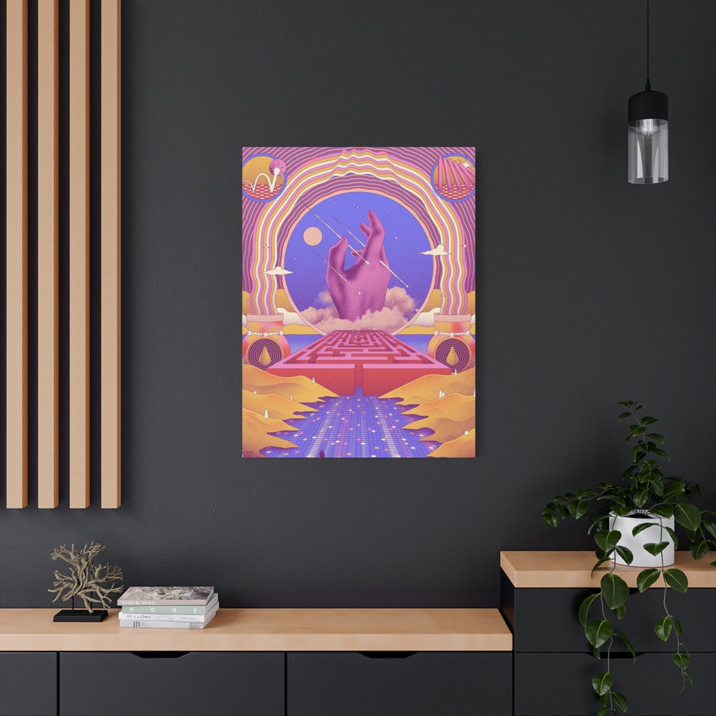
Hand-Colored Wall Art: Creative Expression Through Vibrant Artistic Displays
Hand-colored artwork represents one of the most accessible and rewarding forms of artistic expression available to homeowners and art enthusiasts. Creating your own hand-colored pieces allows for complete creative control while developing a deeper connection to the artwork that will grace your walls. The process begins with selecting appropriate base materials, which can range from high-quality watercolor paper to canvas boards specifically designed for mixed media applications.
The foundation of successful DIY hand-colored projects lies in understanding the relationship between different mediums and how they interact with various surfaces. Watercolor pencils offer exceptional control for beginners, allowing artists to create detailed line work that can later be activated with water to achieve soft, flowing color transitions. Colored pencils provide precision and the ability to build layers gradually, while markers offer bold, saturated coverage that works particularly well for contemporary designs.
When embarking on your first hand-colored project, consider starting with simple botanical illustrations or geometric patterns. These subjects provide excellent practice opportunities for color blending techniques while producing visually striking results. Botanical subjects allow for experimentation with natural color palettes, from the subtle greens of leaves to the vibrant hues of flowers and fruits. Geometric patterns, on the other hand, offer opportunities to explore color theory principles such as complementary combinations and gradient effects.
The paper selection process requires careful consideration of the intended final result. Hot-pressed watercolor paper provides a smooth surface ideal for detailed work, while cold-pressed paper offers texture that can enhance the organic feel of hand-colored pieces. Mixed media papers combine the best qualities of both, accommodating various coloring mediums while maintaining structural integrity throughout the creative process.
Developing a personal color palette becomes an essential skill in creating cohesive hand-colored artwork. Many successful artists limit themselves to a specific range of colors for each piece, creating harmony through repetition while maintaining visual interest through value and intensity variations. This approach not only simplifies decision-making during the creative process but also ensures that finished pieces will coordinate well with existing home decor elements.
Advanced DIY techniques include layering different mediums to achieve unique textural effects. Combining watercolor washes with colored pencil details creates depth and visual complexity that single-medium approaches cannot match. Adding white gel pen accents over dried color applications introduces highlights and fine details that bring hand-colored artwork to life.
Adding Dynamic Vibrancy to Walls Through Hand-Colored Artistic Methods
The transformative power of hand-colored artwork extends far beyond simple decoration, offering homeowners the opportunity to infuse their living environments with personal energy and emotional resonance. Vibrancy in hand-colored art emerges not merely from bright colors but from the thoughtful application of color theory principles that create visual movement and emotional impact within any room setting.
Understanding color temperature plays a crucial role in achieving desired vibrancy levels. Warm colors including reds, oranges, and yellows naturally advance toward viewers, creating an sense of energy and intimacy within rooms. These hues work particularly well in areas where social interaction occurs, such as dining areas or family gathering spots. Cool colors like blues, greens, and purples tend to recede visually, creating calming effects while making rooms appear more spacious.
The strategic use of complementary color combinations amplifies vibrancy through natural contrast effects. Pairing warm oranges with cool blues creates visual tension that draws attention and maintains viewer interest. Similarly, combining warm reds with cool greens produces dynamic effects that energize rooms without overwhelming occupants. These relationships occur naturally in many subjects, from sunset landscapes to botanical illustrations featuring flowers against green foliage.
Saturation levels directly impact the vibrancy achieved in hand-colored pieces. Highly saturated colors create bold, energetic effects that work well as focal points within room designs. Medium saturation levels provide visual interest while maintaining versatility across various decorating styles. Low saturation colors, often called muted or dusty tones, offer sophistication while contributing to calming atmospheric effects.
Value contrast represents another essential element in creating vibrant hand-colored artwork. The relationship between light and dark areas within compositions creates visual hierarchy and guides viewer attention throughout pieces. High contrast combinations produce dramatic, eye-catching effects suitable for contemporary settings, while subtle value relationships create gentle, sophisticated presentations appropriate for traditional environments.
Layering techniques contribute significantly to achieving vibrancy in hand-colored works. Building colors gradually through multiple applications creates depth and richness that single applications cannot match. This approach allows artists to develop complex color relationships while maintaining control over final intensity levels. Transparent layers create luminous effects, while opaque applications provide solid color foundations.
The psychological impact of vibrant hand-colored artwork extends throughout living environments, influencing mood and energy levels of occupants. Warm, vibrant pieces can counteract the effects of insufficient natural light during winter months, while cool, vibrant combinations provide refreshing contrast during hot summer periods. Understanding these relationships allows homeowners to select hand-colored pieces that support their desired lifestyle experiences.
Advanced Techniques Behind Professional Hand-Colored Artwork Creation
Professional-quality hand-colored artwork results from mastering specific techniques that elevate amateur efforts into gallery-worthy pieces. These methods require patience, practice, and understanding of how different materials interact to produce desired visual effects. The foundation of professional technique lies in proper preparation, from surface selection to color mixing preparation.
Surface preparation significantly impacts final results in hand-colored artwork. Professional artists often begin with paper stretching techniques that prevent warping when water-based mediums are applied. This process involves soaking paper briefly, mounting it to boards with tape, and allowing controlled drying that creates perfectly flat working surfaces. Properly prepared surfaces accept color applications evenly while maintaining dimensional stability throughout the creative process.
Color mixing mastery distinguishes professional work from amateur attempts. Understanding pigment properties allows artists to predict how colors will interact when layered or blended. Some pigments are naturally transparent, making them ideal for glazing techniques, while others provide opaque coverage suitable for solid color applications. Staining pigments permanently bond with paper fibers, while non-staining colors can be lifted or modified after application.
Wet-on-wet techniques create organic, flowing effects impossible to achieve through other methods. This approach involves applying wet color to damp or wet surfaces, allowing pigments to blend naturally while maintaining some directional control. Mastering wet-on-wet applications requires understanding timing, as colors behave differently depending on surface moisture levels. Too much water creates uncontrolled bleeding, while insufficient moisture prevents proper color flow.
Dry brush techniques produce textural effects that add visual interest and depth to hand-colored pieces. This method involves using brushes with minimal water content to apply color, creating broken, irregular coverage that suggests textures like tree bark, fabric, or weathered surfaces. Controlling dry brush applications requires practice in brush pressure and color consistency.
Glazing represents one of the most sophisticated techniques in hand-colored artwork creation. This process involves applying transparent color layers over dried base applications, creating depth and color complexity through optical mixing rather than physical pigment mixing. Successful glazing requires understanding which colors maintain transparency when diluted and how different combinations affect underlying layers.
Negative painting techniques create dramatic effects by painting around subjects rather than painting subjects directly. This approach requires careful planning and value control but produces results with exceptional depth and atmospheric quality. Professional artists often combine negative painting with traditional approaches to achieve complex compositions that engage viewers on multiple levels.
Texture creation through various tools and techniques adds tactile quality to hand-colored artwork. Sponges, salt, plastic wrap, and other unconventional tools can create unique surface effects that enhance visual interest. Understanding when and how to incorporate these techniques prevents overuse while maximizing their impact within compositions.
Seamlessly Mixing Hand-Colored Artwork with Contemporary Modern Decor
Contemporary modern decor emphasizes clean lines, minimal clutter, and carefully curated artistic elements, making hand-colored artwork an ideal complement to these design principles. The organic nature of hand-colored pieces provides warmth and personality that balances the sometimes stark aesthetic of modern furnishings while maintaining the sophisticated atmosphere that contemporary design requires.
Scale relationships become crucial when incorporating hand-colored artwork into modern settings. Contemporary rooms often feature large, uninterrupted wall surfaces that can accommodate substantial artwork pieces or carefully arranged groupings. Hand-colored pieces work particularly well when sized appropriately for their intended locations, with larger works serving as focal points and smaller pieces contributing to layered visual arrangements.
Color coordination between hand-colored artwork and modern decor requires understanding both the existing color palette and the emotional impact desired within rooms. Modern color schemes often rely on neutral backgrounds with selective color introductions through accessories and artwork. Hand-colored pieces can either harmonize with existing color schemes or provide controlled contrast that energizes rooms without disrupting overall design coherence.
The material contrast between hand-colored artwork and modern furnishings creates visual interest through textural variety. Modern furniture often features smooth, industrial materials like metal, glass, and leather, while hand-colored artwork introduces organic texture and visual warmth. This contrast prevents rooms from feeling cold or impersonal while maintaining the clean aesthetic that defines contemporary design.
Framing choices significantly impact how hand-colored artwork integrates with modern decor. Simple, clean-lined frames in materials like brushed metal, white-painted wood, or black lacquer complement contemporary aesthetics while allowing artwork to remain the primary focus. Avoiding ornate or traditional frame styles ensures that hand-colored pieces enhance rather than compete with modern furnishings.
Lighting considerations become particularly important when displaying hand-colored artwork in modern settings. Contemporary rooms often feature dramatic lighting schemes with directed spotlights or track systems that can be adjusted to highlight artwork effectively. Understanding how different lighting affects hand-colored pieces ensures optimal presentation while preventing color distortion or fading over time.
The strategic placement of hand-colored artwork within modern rooms requires consideration of sight lines and furniture arrangements. Contemporary design often emphasizes open floor plans and flowing room connections, making artwork placement decisions important for overall visual coherence. Hand-colored pieces can serve as connection points that tie different areas together through color relationships and thematic consistency.
Grouping strategies for multiple hand-colored pieces follow contemporary design principles of asymmetrical balance and varying scales. Rather than traditional symmetrical arrangements, modern approaches often feature off-center groupings that create dynamic visual movement while maintaining overall balance through careful attention to visual weight distribution.
Maximizing Hand-Colored Artwork Impact in Compact Living Areas
Compact living areas present unique opportunities and challenges for displaying hand-colored artwork effectively. The limited wall area requires strategic selection and placement decisions that maximize visual impact while avoiding overwhelming smaller room proportions. Understanding how to leverage hand-colored pieces in compact settings can significantly enhance the perceived size and visual appeal of any room.
Vertical emphasis through tall, narrow hand-colored pieces can create the illusion of increased ceiling height in compact rooms. These pieces draw the eye upward, making rooms feel more spacious while providing opportunities for dramatic color statements that wouldn't overwhelm larger areas. Portrait-oriented botanical illustrations or abstract vertical compositions work particularly well for this purpose.
Color psychology becomes especially important in compact areas where residents spend significant amounts of time in close proximity to artwork. Light, cool colors can make small rooms feel more open and airy, while warm colors create cozy, intimate atmospheres. The key lies in balancing color intensity with room proportions to achieve desired emotional effects without creating claustrophobic feelings.
Multi-functional artwork approaches maximize the value of each piece in compact settings. Hand-colored artwork can incorporate practical elements like calendars, inspirational quotes, or educational content that serves dual purposes while maintaining aesthetic appeal. These approaches ensure that every decorative element contributes meaningfully to daily life within limited living areas.
Mirror integration with hand-colored artwork can dramatically expand perceived room size while creating unique visual effects. Placing mirrors adjacent to or opposite hand-colored pieces reflects colors throughout rooms, creating depth and movement that makes compact areas feel significantly larger. This technique requires careful planning to ensure reflected images enhance rather than distract from original compositions.
Corner utilization through specially proportioned hand-colored pieces makes use of often-neglected areas in compact rooms. Corner-specific artwork can transform awkward angles into focal points while maximizing available wall area. These pieces often work best when designed specifically for corner placement rather than adapted from traditional rectangular formats.
Layered hanging systems allow for artwork rotation in compact areas where storage might be limited. Using multiple hanging points or adjustable systems enables residents to change displayed pieces seasonally or according to mood preferences without requiring additional storage solutions. This approach keeps visual environments fresh while working within physical limitations.
The relationship between hand-colored artwork and furniture placement becomes critical in compact settings where every element must contribute to overall functionality. Artwork placement should consider furniture arrangements, ensuring pieces remain visible and impactful rather than hidden behind necessary furnishings. Strategic placement can also help define different functional areas within multi-purpose rooms.
Implementing Bold Color Strategies in Hand-Colored Artistic Displays
Bold color implementation in hand-colored artwork requires confidence and understanding of color theory principles that guide successful combinations. These vibrant approaches can transform ordinary rooms into dynamic, energetic environments that reflect personal style while creating memorable visual experiences for residents and guests alike.
Primary color utilization provides the foundation for many bold hand-colored approaches. Pure reds, blues, and yellows create immediate visual impact while offering endless combination possibilities. Understanding how to balance these intense hues prevents overwhelming effects while maintaining the energy that makes bold color approaches so appealing. Strategic use of neutral elements helps control intensity levels while preserving color vibrancy.
Analogous color schemes featuring bold intensities create harmonious yet exciting visual effects in hand-colored artwork. Combining intense yellows with vibrant oranges and passionate reds produces sunset-inspired palettes that energize rooms naturally. Similarly, bold blue-green-purple combinations evoke ocean and sky imagery while maintaining sophisticated color relationships.
Complementary contrast strategies amplify boldness through opposing color relationships. Pairing intense oranges with vivid blues creates maximum visual tension while maintaining color harmony through natural relationships. These combinations work particularly well in hand-colored abstract pieces where color interaction becomes the primary artistic focus rather than representational accuracy.
Monochromatic bold approaches explore intensity variations within single color families. Using multiple values and saturations of bold blues, for example, creates sophisticated color studies that maintain visual coherence while providing sufficient variety for sustained interest. These approaches work well in rooms where color coordination with existing elements is important.
Cultural color symbolism adds meaning layers to bold hand-colored artwork implementations. Understanding how different cultures perceive color relationships can enhance the emotional impact of bold artistic choices while avoiding unintended associations. This knowledge becomes particularly valuable when creating artwork for diverse households or public environments.
Seasonal adaptation of bold colors allows for year-round enjoyment of vibrant hand-colored artwork. Summer palettes featuring bright yellows, oranges, and tropical greens can be balanced with winter combinations featuring deep reds, rich purples, and forest greens. This approach maintains bold impact while providing appropriate atmospheric support throughout changing seasons.
The psychological impact of bold colors in hand-colored artwork extends beyond mere decoration to influence mood and energy levels significantly. Understanding these effects helps determine appropriate placement within homes, with energizing colors working well in active areas while more calming bold combinations suit relaxation zones.
Creative Texture Integration Ideas for Hand-Colored Artistic Works
Texture integration elevates hand-colored artwork from two-dimensional displays to engaging sensory experiences that invite closer examination and tactile interaction. These techniques add depth and visual complexity while creating artwork that changes appearance under different lighting conditions and viewing angles.
Paper texture manipulation provides the foundation for many textural effects in hand-colored artwork. Embossing techniques create raised areas that catch light differently than surrounding regions, adding dimensional quality to finished pieces. These effects work particularly well with botanical subjects where natural texture variation enhances realism and visual interest.
Mixed media integration introduces contrasting textures that create visual dialogue within hand-colored compositions. Combining smooth watercolor washes with rough charcoal applications, or delicate colored pencil details with bold marker strokes creates tactile variety that maintains viewer engagement. Understanding how different media interact ensures successful combinations rather than conflicting applications.
Collage elements incorporated into hand-colored artwork add unexpected textural dimensions while providing opportunities for personal expression. Fabric scraps, specialty papers, or natural materials like pressed leaves can be integrated seamlessly with traditional coloring media to create unique artistic statements that reflect individual interests and experiences.
Salt technique applications create organic textural effects in water-based hand-colored artwork. Sprinkling salt onto wet paint applications causes irregular absorption patterns that resemble natural phenomena like snow, stars, or mineral formations. Timing becomes critical with salt techniques, as surface moisture levels determine final effect intensity and character.
Scratching and scraping techniques, known as sgraffito, create linear textural elements by removing color applications to reveal underlying layers or paper surfaces. These techniques work particularly well for suggesting hair, grass, or other fine linear elements while adding tactile quality to finished pieces.
Stamping and printing methods introduce repeating textural patterns that can serve as backgrounds or focal elements within hand-colored compositions. Natural objects like leaves, shells, or flowers can serve as stamps, while carved erasers or potatoes provide custom printing elements for geometric or abstract patterns.
Three-dimensional element integration pushes hand-colored artwork beyond traditional flat presentations. Strategic use of layered paper elements, fabric applications, or small sculptural additions creates shadow patterns and depth variations that change throughout the day as natural light shifts across artwork surfaces.
Professional Framing Approaches for Hand-Colored Artistic Pieces
Professional framing significantly impacts how hand-colored artwork is perceived and preserved, transforming individual pieces into polished presentations worthy of prominent display locations. Understanding framing principles ensures that hand-colored work receives appropriate presentation while protecting against environmental damage over time.
Mat selection provides crucial breathing room around hand-colored artwork while offering opportunities for color coordination with room decor. Neutral mats in cream, white, or light gray allow artwork colors to dominate visual attention, while colored mats can either harmonize with or contrast against artwork palettes for different effects. Multiple mat layers add sophisticated depth to presentations.
Frame material choices significantly impact both aesthetic presentation and longevity of hand-colored artwork. Wood frames offer warmth and traditional appeal while accommodating various finish options from natural stains to painted surfaces. Metal frames provide contemporary clean lines and excellent durability, while composite materials offer budget-friendly alternatives with extensive style options.
Glass selection protects hand-colored artwork while affecting visual presentation quality. Regular glass provides basic protection but can create reflections that interfere with artwork viewing. Museum-quality glass reduces reflections while filtering harmful ultraviolet light that causes color fading over time. Acrylic alternatives offer lightweight solutions with similar protective benefits.
Mounting methods ensure that hand-colored artwork remains flat and properly positioned within frames without causing damage to paper surfaces. Acid-free materials prevent chemical interactions that could discolor artwork over time, while hinge mounting allows for natural paper expansion and contraction with humidity changes.
Conservation framing techniques maximize longevity for valuable hand-colored pieces through specialized materials and methods. These approaches use archival-quality materials throughout framing assemblies while ensuring reversibility of mounting methods for future conservation needs. Investment in conservation framing protects artwork value over decades.
Custom framing solutions address unique sizing or presentation requirements that standard frame sizes cannot accommodate. Hand-colored artwork often features non-standard dimensions or unusual proportions that require custom frame construction for optimal presentation. Professional framers can create solutions that enhance rather than compromise artistic vision.
DIY framing approaches provide budget-friendly alternatives while maintaining quality presentation standards. Understanding basic framing principles allows art enthusiasts to create professional-looking presentations using readily available materials and tools. These approaches work particularly well for artwork collections where uniform presentation is desired.
Current Hand-Colored Artwork Trends Shaping 2025 Aesthetic Preferences
The 2025 aesthetic landscape for hand-colored artwork reflects broader cultural shifts toward sustainability, authenticity, and personal expression within home environments. These trends emphasize organic processes and individual creativity while incorporating contemporary color palettes and subject matter that resonates with modern lifestyles.
Botanical maximalism represents a significant trend featuring abundant plant life rendered in vibrant, saturated colors that celebrate natural abundance. These pieces often incorporate multiple species within single compositions, creating lush visual gardens that bring outdoor energy into interior environments. The trend reflects growing environmental awareness while providing escapist elements for urban dwellers.
Digital-analog hybrid approaches combine traditional hand-coloring techniques with digital enhancement or preparation methods. Artists create initial compositions digitally before printing on specialty papers for hand-coloring completion, merging technological precision with organic artistic expression. These approaches offer expanded creative possibilities while maintaining the authentic appeal of hand-worked surfaces.
Sustainable material emphasis drives interest in eco-friendly papers, natural pigments, and non-toxic coloring media that align with environmental consciousness. These materials often produce unique color qualities that synthetic alternatives cannot match while supporting responsible artistic practices. The trend extends to framing materials and display methods that minimize environmental impact.
Abstract emotional expression moves away from representational accuracy toward color and form combinations that convey feelings and experiences directly. These pieces often feature flowing, organic shapes rendered in colors that reflect emotional states or seasonal moods. The approach allows for highly personal artistic expression while creating artwork that adapts to various room settings.
Cultural fusion elements incorporate artistic traditions from multiple cultural backgrounds within single hand-colored compositions. These pieces might combine European watercolor techniques with Asian brush painting approaches, or African pattern traditions with contemporary abstract elements. The trend celebrates global artistic heritage while creating unique contemporary expressions.
Minimalist color palettes focus on limited color ranges with emphasis on subtle variations and sophisticated relationships rather than bold contrasts. These approaches often feature two or three colors in various intensities and values, creating sophisticated presentations that complement contemporary design trends while maintaining visual interest through skillful color manipulation.
Interactive element integration includes QR codes, augmented reality triggers, or other technological interfaces that expand hand-colored artwork beyond static displays. These innovations create layered experiences that engage viewers through multiple sensory channels while maintaining the fundamental appeal of hand-created artistic elements.
Harmonizing Hand-Colored Artwork with Minimalist Design Principles
Minimalist design principles emphasize simplicity, functionality, and careful curation, creating opportunities for hand-colored artwork to serve as focal points within deliberately sparse environments. Successfully integrating hand-colored pieces into minimalist settings requires understanding how organic artistic elements can enhance rather than complicate clean aesthetic approaches.
Color restraint becomes essential when selecting hand-colored artwork for minimalist environments. Monochromatic or limited palette pieces align naturally with minimalist color schemes while providing sufficient visual interest to justify their presence within carefully edited room compositions. These pieces often feature subtle color variations that reward close examination without overwhelming simplified surrounding elements.
Scale proportions require careful consideration in minimalist settings where each element carries increased visual weight due to reduced overall complexity. Hand-colored pieces should be sized appropriately for their intended impact levels, with larger works serving as primary focal points and smaller pieces providing supporting visual elements within overall compositional strategies.
Subject matter simplification favors clean, uncluttered compositions that complement minimalist furniture and architectural elements. Botanical subjects featuring single stems or flowers work particularly well, as do abstract geometric compositions that echo the clean lines found throughout minimalist room designs. Avoiding busy or complex subject matter ensures harmony with minimalist principles.
Negative area utilization in hand-colored artwork mirrors minimalist design emphasis on empty regions that provide visual breathing room. Compositions featuring significant white or neutral areas create harmony with minimalist architecture while allowing colored elements to achieve maximum impact through contrast with surrounding simplicity.
Quality over quantity principles guide minimalist artwork selection, favoring fewer, higher-quality hand-colored pieces rather than numerous decorative elements. This approach ensures that each artwork selection contributes meaningfully to overall room aesthetic while avoiding visual clutter that contradicts minimalist goals.
Material authenticity aligns with minimalist values emphasizing genuine materials and honest construction methods. Hand-colored artwork provides authentic artistic expression that complements minimalist furniture crafted from natural materials like wood, stone, and metal. This relationship creates cohesive environments that celebrate material honesty throughout.
Flexible display systems accommodate minimalist preferences for adaptable room configurations that can evolve with changing needs. Simple hanging systems allow for artwork repositioning or rotation while maintaining clean wall presentations that support minimalist aesthetic goals.
Designing Engaging Hand-Colored Artwork for Children's Living Areas
Children's living areas provide unique opportunities for hand-colored artwork that combines educational value with visual appeal, creating environments that stimulate imagination while supporting developmental needs. These artistic displays should balance engaging content with age-appropriate presentation methods that encourage exploration and learning.
Educational integration transforms hand-colored artwork into learning tools that support various developmental objectives. Alphabet illustrations featuring animals or objects beginning with each letter combine artistic beauty with literacy support, while number sequences rendered in engaging colors help develop mathematical awareness. These approaches ensure that decorative elements contribute actively to child development rather than serving purely aesthetic functions.
Interactive elements encourage children to engage directly with hand-colored artwork through touch, manipulation, or participation activities. Pieces designed with moveable components, hidden elements, or areas designed for child additions create dynamic displays that evolve over time. These approaches maintain long-term interest while supporting creative expression development.
Safety considerations guide material selection and presentation methods for children's hand-colored artwork. Non-toxic materials throughout creation processes ensure child safety during any direct contact, while secure mounting methods prevent accidental damage or injury. Understanding child behavior patterns helps predict potential interaction scenarios and plan accordingly.
Growth adaptation allows hand-colored artwork to remain relevant as children mature through different developmental stages. Sophisticated artistic techniques can present age-appropriate content that reveals additional layers of meaning as comprehension develops. This approach maximizes artwork investment while supporting continued engagement over extended periods.
Collaborative creation opportunities involve children in hand-colored artwork development, creating personal connections that enhance emotional value. Family art projects where children contribute coloring elements to adult-designed compositions create shared creative experiences while developing artistic skills progressively.
Cultural representation in children's hand-colored artwork exposes young viewers to diverse artistic traditions and global perspectives. Incorporating artistic elements from various cultural backgrounds supports inclusive worldview development while introducing aesthetic traditions that broaden artistic appreciation throughout life.
Seasonal rotation systems keep children's environments fresh while supporting temporal awareness development. Hand-colored artwork featuring seasonal themes can be rotated throughout the year, reinforcing natural cycle understanding while maintaining visual interest through regular environmental changes.
Abstract Expression Styles in Hand-Colored Artistic Compositions
Abstract expression in hand-colored artwork liberates artists from representational constraints while creating opportunities for pure color and form exploration that can evoke powerful emotional responses. These approaches emphasize personal interpretation and creative freedom while maintaining aesthetic coherence through understanding of design principles and color relationships.
Gestural expression techniques emphasize spontaneous mark-making that captures emotional energy and movement within hand-colored compositions. These approaches often feature flowing brushwork, dynamic color applications, and organic shapes that suggest natural phenomena without literal representation. The resulting pieces convey feelings and atmospheres rather than specific subject matter.
Color field approaches create contemplative experiences through large areas of subtly modulated color that invite extended viewing and meditation. These hand-colored pieces often feature gentle gradations and atmospheric effects that suggest infinite depth while maintaining surface integrity. The technique works particularly well for creating calming environments that support reflection and relaxation.
Geometric abstraction combines mathematical precision with organic color relationships to create structured compositions that maintain visual harmony through repetitive elements and systematic color progressions. These pieces often feature triangles, circles, and rectangular shapes arranged according to underlying grid systems or golden ratio proportions.
Layered transparency techniques build complex color relationships through multiple transparent applications that create optical mixing effects impossible to achieve through single color applications. These approaches require understanding of pigment properties and drying times to achieve controlled results that maintain luminosity while building intensity gradually.
Texture contrast methods juxtapose smooth color applications with rough, broken textures to create visual tension and tactile appeal within abstract hand-colored compositions. These techniques might combine flowing watercolor areas with dry-brush applications, or smooth pencil work with rough paper textures that add dimensional quality.
Emotional color mapping translates feelings and experiences into color combinations and compositional arrangements that communicate non-verbally with viewers. Understanding color psychology helps artists select palettes that support intended emotional communications while maintaining aesthetic appeal through harmonious relationships.
Process documentation approaches treat the creation process as equally important to finished results, often incorporating evidence of artistic decisions and techniques within final presentations. These pieces might include preliminary sketches, color samples, or process notes that provide insight into creative development while enhancing viewer engagement.
Botanical Hand-Colored Artwork Concepts for Natural Home Environments
Botanical hand-colored artwork brings natural beauty indoors while celebrating the diversity and complexity of plant life through artistic interpretation. These pieces can range from scientifically accurate botanical illustrations to stylized interpretations that emphasize decorative qualities while maintaining connection to natural inspiration.
Species accuracy in botanical hand-colored artwork appeals to viewers interested in natural history while providing educational value that extends beyond purely decorative functions. These pieces often require careful research and observation to achieve believable representations that honor botanical subjects while demonstrating artistic skill through accurate color matching and form rendering.
Seasonal progression themes capture the changing character of plant life throughout annual cycles, creating artwork series that reflect natural temporal rhythms. These collections might follow single species through seasonal changes or explore how different plants respond to changing environmental conditions, providing year-round visual interest through rotation or permanent display strategies.
Habitat representation approaches present plant communities within their natural environmental contexts, creating comprehensive botanical portraits that include background elements, companion species, and environmental conditions. These pieces often feature complex compositions that reward extended examination while providing insight into natural ecological relationships.
Magnification studies focus on detailed plant structures that are often overlooked in casual observation, such as flower centers, leaf textures, or seed formations. These hand-colored pieces celebrate the intricate beauty found within natural forms while demonstrating the artistic potential of close observation and careful rendering techniques.
Stylized interpretation methods transform botanical subjects through artistic filters that emphasize decorative qualities while maintaining recognizable plant characteristics. These approaches might feature simplified forms, enhanced colors, or pattern emphasis that creates artwork suitable for various room settings while preserving botanical inspiration.
Garden planning integration uses hand-colored botanical artwork to support actual gardening projects through visual planning tools that help envision proposed plant combinations and seasonal progressions. These pieces serve dual purposes as decorative elements and practical references for outdoor gardening activities.
Preservation documentation captures botanical specimens that might be endangered or locally rare, creating artistic records that celebrate natural heritage while raising awareness of conservation issues. These pieces combine artistic beauty with environmental advocacy through careful documentation of threatened plant species.
Sourcing Quality Hand-Colored Artwork Through Various Acquisition Methods
Acquiring quality hand-colored artwork requires understanding various sources and evaluation criteria that ensure satisfaction with purchase decisions while supporting artists and maintaining collection value over time. Different acquisition methods offer unique advantages depending on budget considerations, quality requirements, and personal preferences for artist relationships.
Gallery relationships provide access to established artists with proven track records while ensuring artwork authenticity through professional curation and documentation. Galleries often offer detailed provenance information, artist background materials, and sometimes provide consultation services that help match artwork selections with specific room requirements or collection goals.
Artist studio visits create opportunities for direct relationships with creators while accessing artwork before public availability. These interactions often provide insight into artistic processes and inspiration sources while supporting artists through direct purchases that eliminate gallery commissions. Studio visits also offer possibilities for custom commission discussions.
Online marketplace evaluation requires careful attention to seller reputation, artwork condition descriptions, and return policies that protect buyer interests. Quality online sources provide detailed photographs, accurate dimensions, and comprehensive condition reports that support informed purchasing decisions. Understanding platform protection policies helps minimize transaction risks.
Art fair participation exposes collectors to diverse artists and styles while providing opportunities for price comparisons across similar works. These events often feature emerging artists alongside established professionals, creating possibilities for discovery of new talent while building collection diversity through varied acquisition sources.
Commission processes allow for completely customized hand-colored artwork that addresses specific size, color, or subject matter requirements while supporting artist careers through direct patronage. Successful commission relationships require clear communication of expectations, timeline agreements, and payment structures that protect both parties throughout creation processes.
Estate sale opportunities sometimes yield quality hand-colored artwork at favorable prices while providing acquisition of pieces with interesting histories. These sources require careful condition evaluation and authenticity verification but can provide unique additions to collections while preserving artistic heritage.
Auction participation offers access to investment-quality hand-colored artwork while providing market validation through competitive bidding processes. Understanding auction procedures, including condition reports, preview opportunities, and buyer premiums ensures informed participation while managing acquisition costs effectively.
Developing Personal Hand-Colored Artwork Through Skill Building Programs
Creating personal hand-colored artwork provides deeply satisfying creative outlets while developing artistic skills that enhance appreciation for professional works. Systematic skill development through structured learning approaches ensures steady progress while maintaining enthusiasm throughout the learning process.
Foundation skill development begins with understanding basic drawing principles that support successful hand-coloring applications. Proportion observation, line quality control, and composition planning provide essential groundwork for color applications while ensuring structural integrity throughout creative processes. These skills transfer across various artistic media and subject matters.
Color theory mastery enables confident color selection and combination decisions that elevate amateur efforts toward professional quality results. Understanding primary, secondary, and tertiary relationships provides logical frameworks for palette development while knowledge of warm/cool relationships, complementary contrasts, and analogous harmonies guides specific application decisions.
Medium experimentation exposes developing artists to various coloring materials and their unique characteristics, helping identify personal preferences while expanding technical capabilities. Watercolors, colored pencils, markers, and mixed media approaches each offer distinct advantages for different artistic goals and stylistic preferences.
Subject matter exploration helps artists discover personal interests and strengths while building diverse skill sets through varied practice opportunities. Botanical subjects develop observation skills and natural color understanding, while abstract approaches encourage creative expression and color experimentation. Landscape studies build atmospheric rendering capabilities.
Technique progression follows logical sequences that build complexity gradually while maintaining achievable challenge levels. Beginning with simple color washes and flat applications, artists can progress through gradient development, texture creation, and advanced layering methods that produce professional-quality results through practice and patience.
Critique integration through class participation, online communities, or peer review groups provides objective feedback that accelerates skill development while building artistic community connections. Constructive criticism helps identify improvement areas while positive reinforcement maintains motivation throughout challenging learning phases.
Portfolio development documents artistic progress while creating bodies of work suitable for exhibition or sale opportunities. Systematic documentation through photography and organization helps artists track development while building presentation materials for future artistic endeavors.
Enhancing Professional Office Environments with Hand-Colored Artistic Elements
Professional office environments benefit significantly from hand-colored artwork that humanizes workspaces while maintaining appropriate business atmosphere standards. These artistic additions can improve employee satisfaction, client impressions, and overall workplace culture through thoughtful selection and placement strategies.
Productivity enhancement through appropriate hand-colored artwork selection creates visual environments that support focus while reducing stress levels associated with sterile office atmospheres. Research indicates that natural subjects and calming color palettes contribute to improved concentration and reduced eye strain during extended work periods.
Brand alignment ensures that hand-colored artwork selections support company culture and professional image goals while avoiding conflicts with business messaging or client expectations. Artwork themes and color palettes should complement brand identity elements while adding personality that distinguishes office environments from competitors.
Client impression management considers how hand-colored artwork affects visitor perceptions while supporting business relationship development. Sophisticated artistic selections demonstrate cultural awareness and attention to environmental quality while avoiding controversial or distracting subject matter that might interfere with business discussions.
Employee morale improvements result from workplace environments that demonstrate management investment in quality surroundings rather than purely functional considerations. Hand-colored artwork selections that reflect diverse interests and cultural backgrounds support inclusive workplace cultures while providing visual relief from task-focused activities.
Traffic flow considerations guide artwork placement decisions that maximize visibility while avoiding interference with daily operational requirements. Corridor displays, reception areas, and meeting rooms provide opportunities for prominent artwork presentation while maintaining clear circulation patterns throughout office layouts.
Maintenance planning ensures that hand-colored artwork selections remain presentable throughout extended display periods while minimizing ongoing care requirements. Understanding fade resistance, cleaning requirements, and environmental sensitivity helps maintain professional appearance standards without excessive maintenance investments.
Rotation strategies maintain visual freshness while accommodating seasonal preferences or business cycle changes that might benefit from environmental modifications. Systematic artwork rotation can support company events, seasonal celebrations, or campaign launches through coordinated visual environmental changes.
Final Thoughts
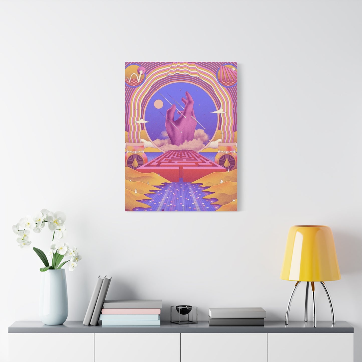
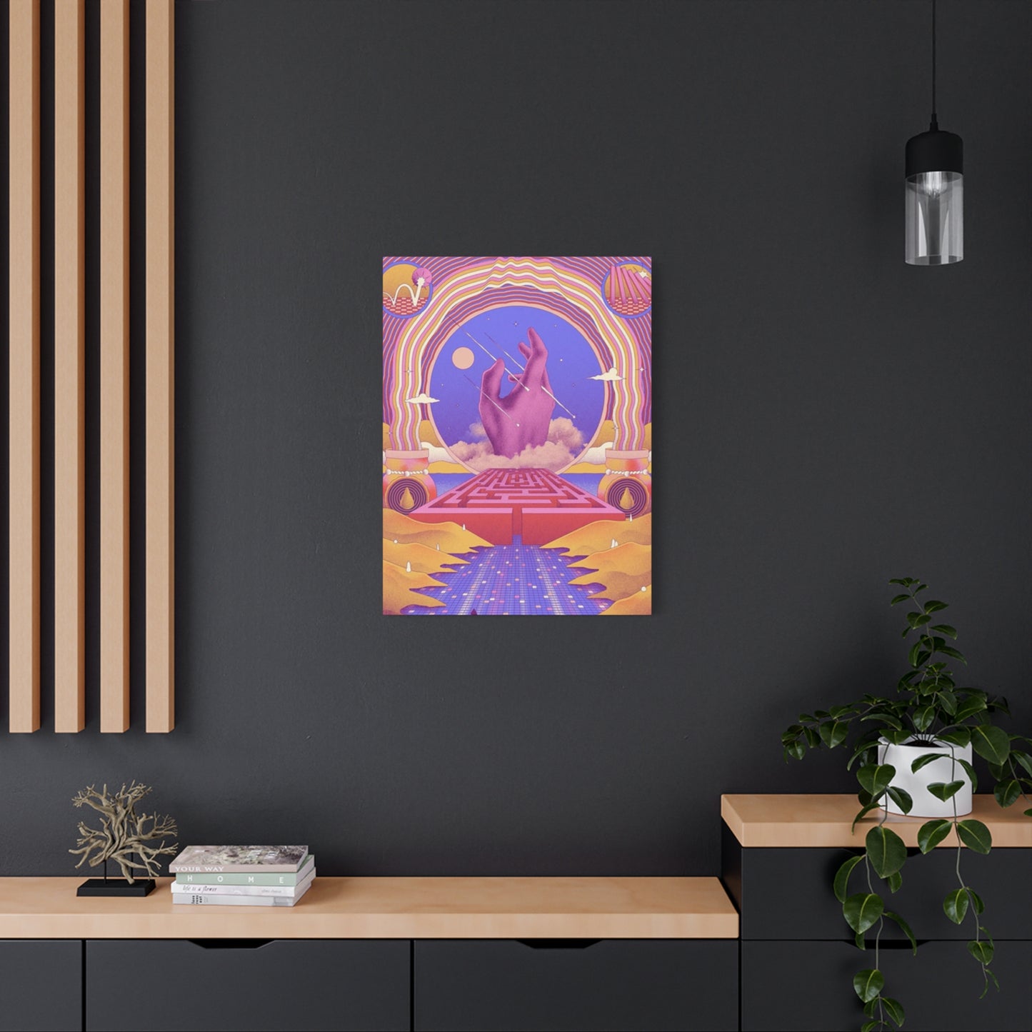
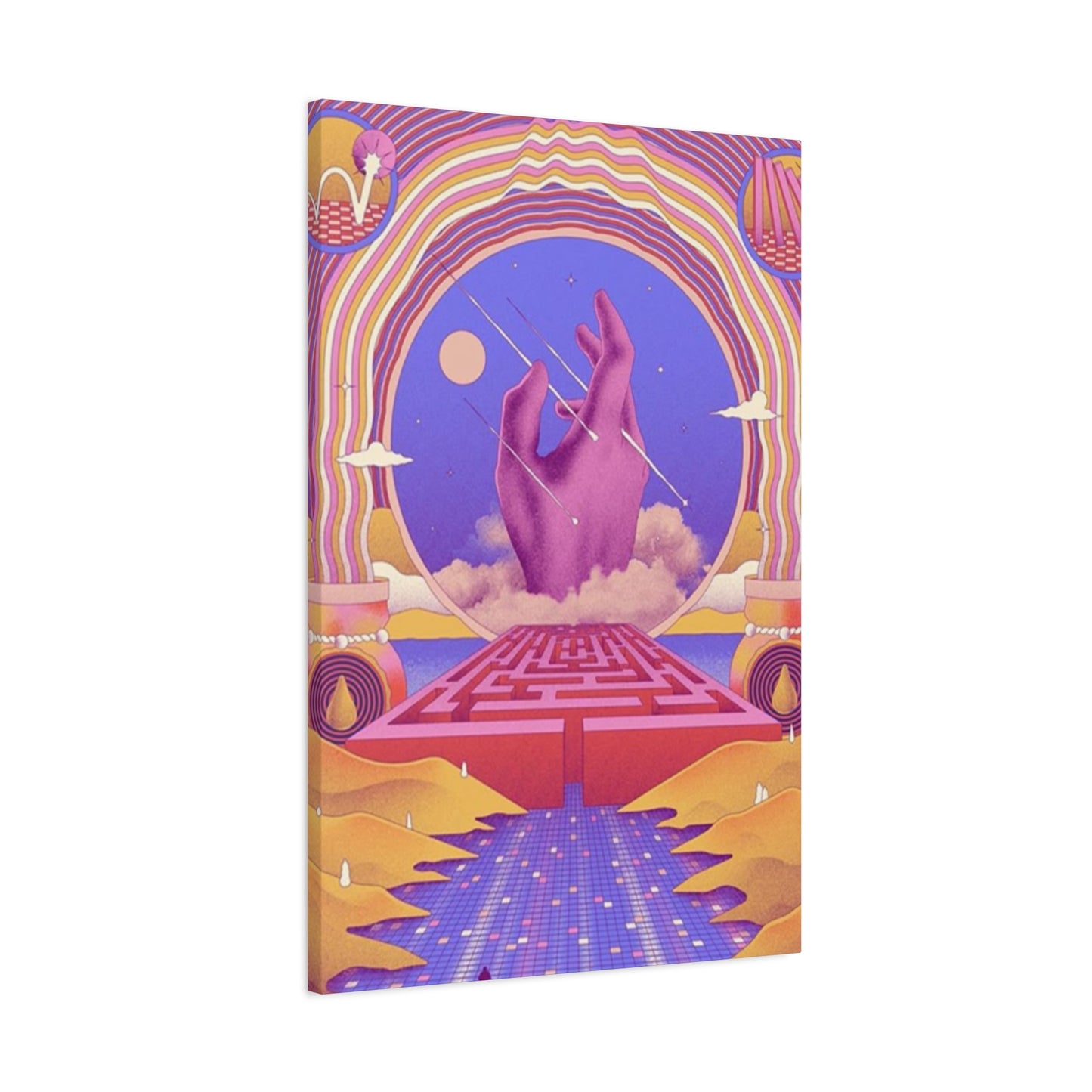
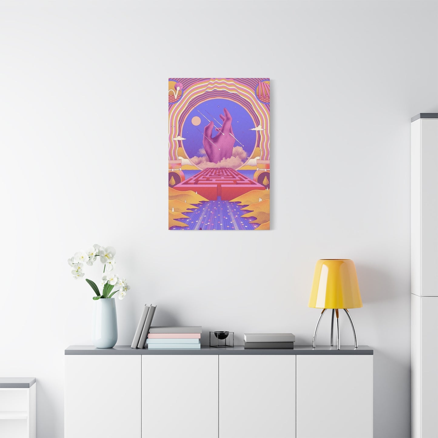
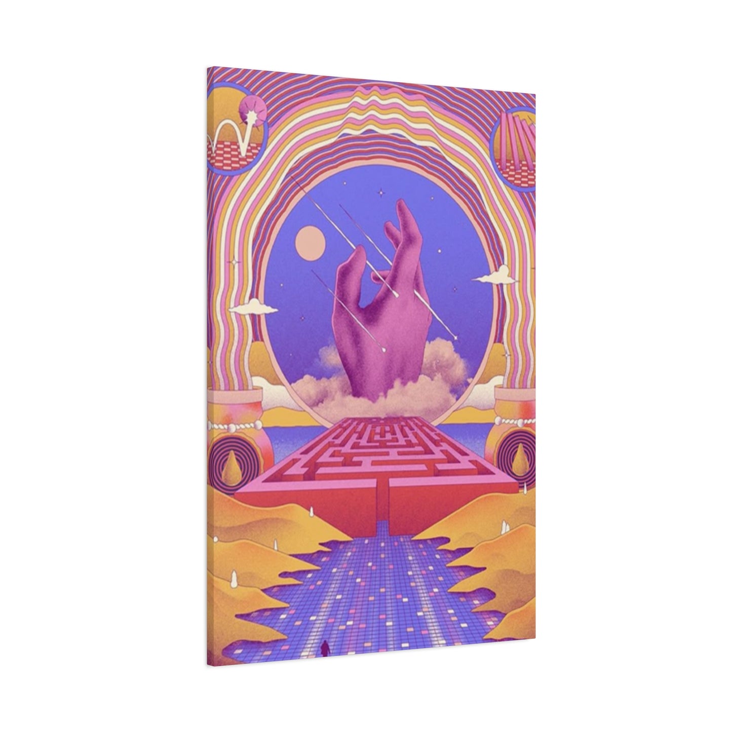
Hand-colored wall art is a bold celebration of creativity, craftsmanship, and individuality. Unlike mass-produced prints, each piece bears the artist’s unique touch—layering vivid pigments, brushstrokes, or ink by hand to transform black-and-white or monochrome foundations into rich, expressive works of art. These vibrant displays breathe life into your walls, making your space feel more personal, more thoughtful, and more alive.
What sets hand-colored art apart is its raw authenticity. The process blends the precision of traditional printmaking or photography with the spontaneity of painting, resulting in pieces that are both structured and fluid—where no two versions are exactly alike. This handcrafted nature not only enhances the visual depth of the artwork but also adds an emotional and tactile layer that digital prints often lack.
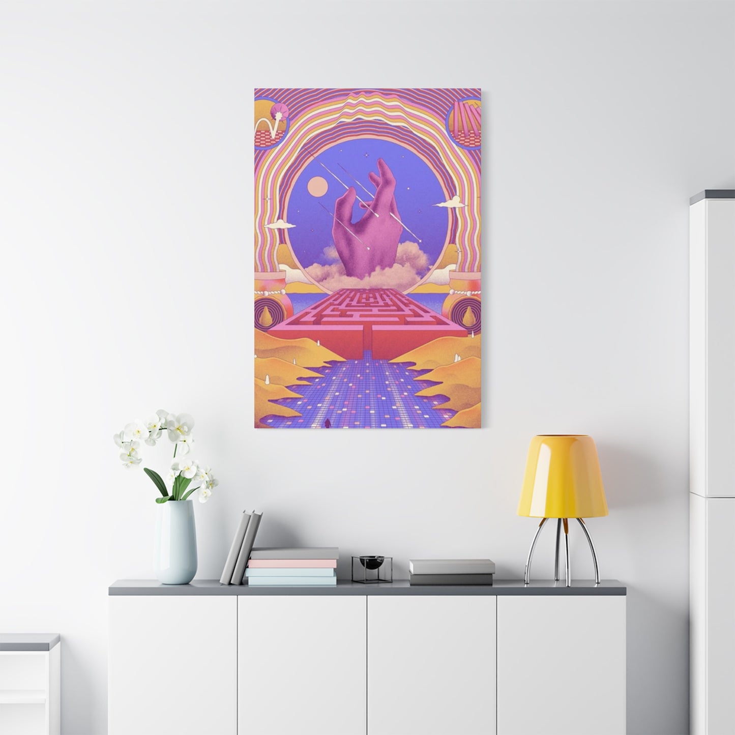
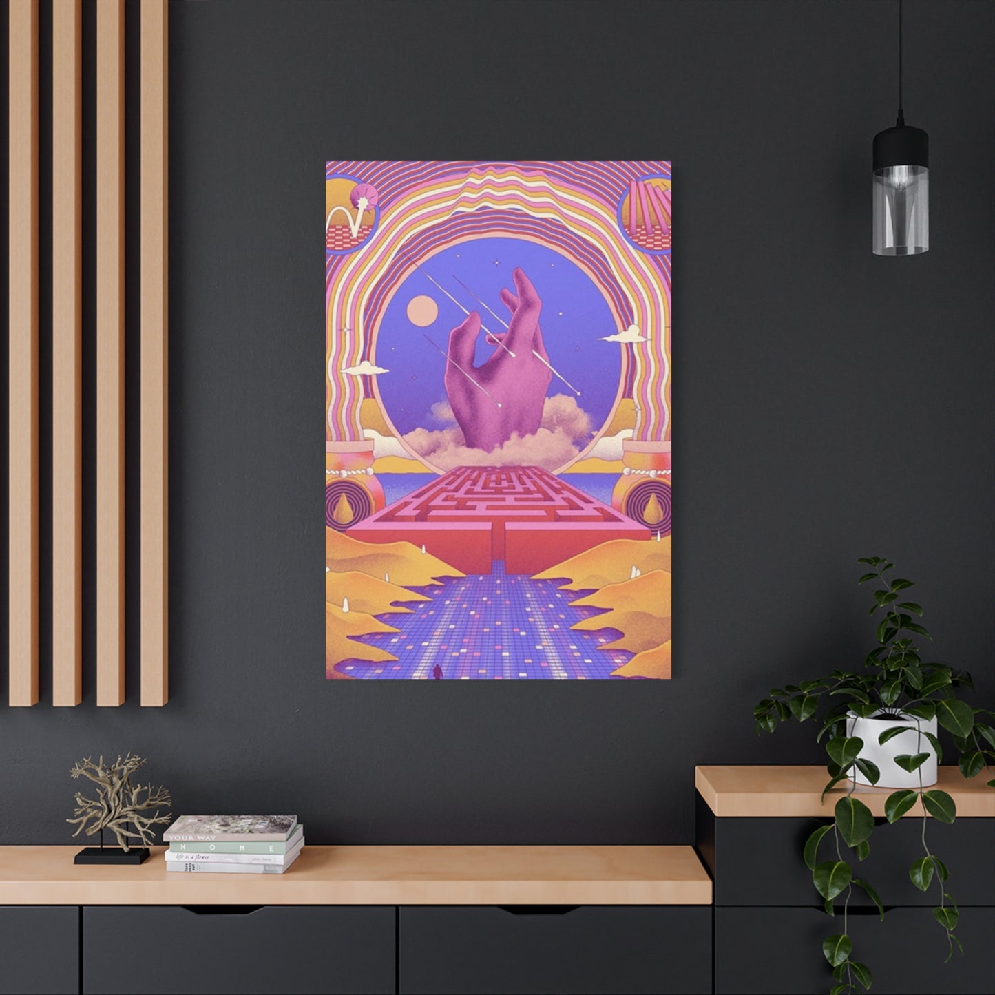
In interior design, hand-colored wall art serves as a dynamic focal point. Whether it's a surreal landscape, a reimagined portrait, or an abstract form bursting with color, these works bring energy, warmth, and sophistication to contemporary, eclectic, and even minimalist spaces. Their vibrant hues can anchor a room’s color palette or provide an unexpected pop that breaks up neutral tones with creative flair.
Beyond aesthetics, hand-colored art invites a deeper appreciation for artistic process and intention. It reminds us that behind every piece is a human hand, an inspired eye, and a moment of artistic decision. For art lovers and collectors alike, it’s a chance to own something truly unique—where even within a limited series, your piece is one of a kind.
Ultimately, hand-colored wall art is more than decoration; it's a personal expression of creativity, color, and character. It speaks to those who value originality, detail, and the joy of owning something crafted with care. If you're looking to elevate your home with artwork that tells a story and stands out, hand-colored pieces are a radiant and rewarding choice.
