


Transform Your Space: How Window Curtain Wall Art Adds Style and Personality
The intersection of textile design and wall art has given birth to a fascinating trend that merges the tactile beauty of draped fabrics with the permanence of canvas prints. This innovative approach to interior decoration celebrates the organic movement of curtains, the depth of olive-green hues, and the sophisticated simplicity that comes from bringing window treatments into the realm of wall art. For homeowners, interior designers, and art enthusiasts seeking fresh ways to introduce texture, color, and dimension into living spaces, this emerging style offers unlimited creative possibilities while maintaining an air of understated elegance.
The concept draws inspiration from the natural folds and cascades of fabric as it hangs in windows, capturing those fleeting moments when light filters through material, creating shadows and highlights that change throughout the day. By translating these ephemeral qualities onto canvas, artists and designers have created a category of wall art that feels both familiar and refreshingly original. The olive-green color palette adds another layer of sophistication, connecting these pieces to nature while maintaining versatility that works across various design aesthetics from contemporary minimalism to rustic farmhouse styles.
This comprehensive exploration examines the multifaceted world of curtain-inspired canvas art in olive tones, investigating how this distinctive approach to wall decoration transforms ordinary spaces into visually compelling environments. We will delve into the psychological impact of these colors and textures, practical applications across different room types, styling techniques that maximize visual impact, and the broader cultural shift toward bringing textile elements into permanent decorative features. Whether you are renovating a single room or reimagining your entire home's aesthetic, understanding the nuances of this design trend will empower you to make informed decisions that elevate your interior spaces.
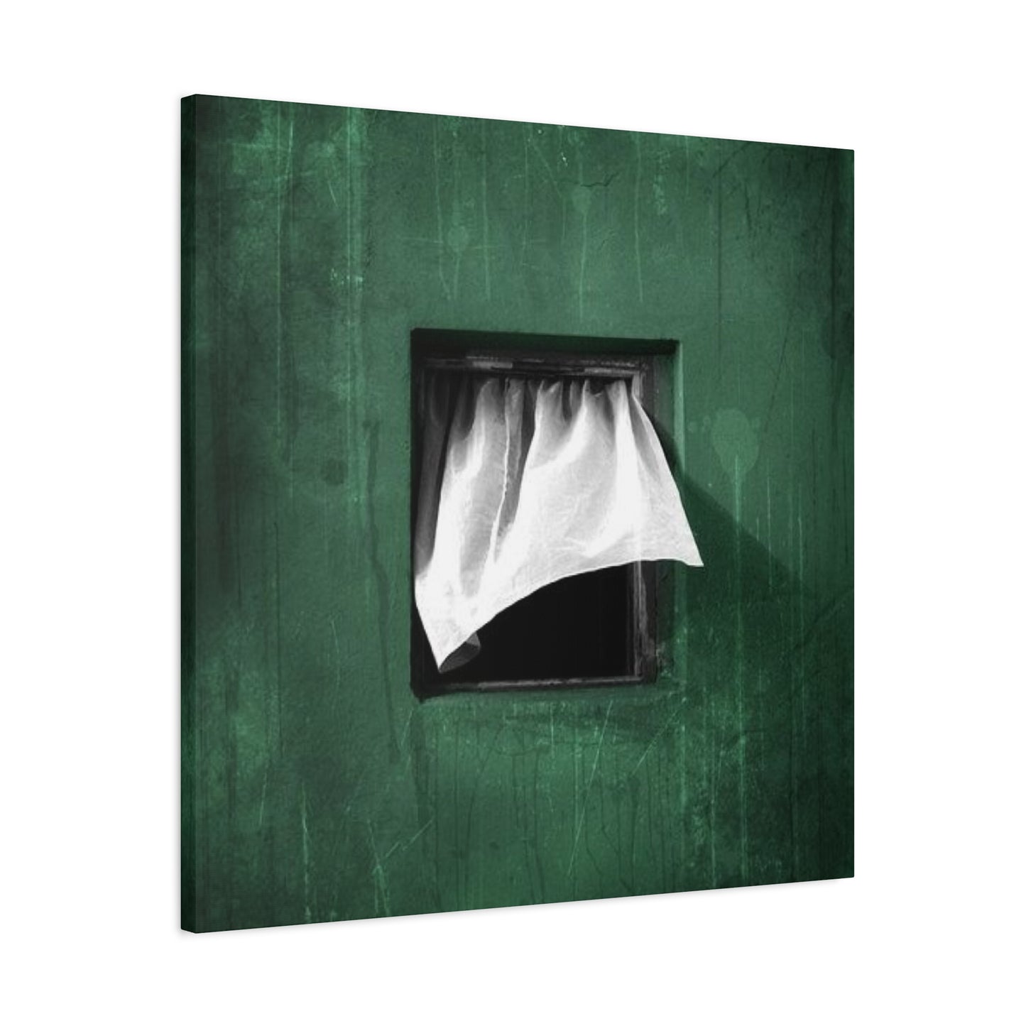
Draped in Green Wall Art
The concept of wall art that mimics draped fabric represents a significant evolution in how we think about decoration and spatial design. Traditional wall art typically presents static images, whether photographs, paintings, or prints, but draped green wall art introduces an element of implied movement and three-dimensionality that engages viewers on multiple sensory levels. The visual suggestion of fabric in motion creates a dynamic quality that prevents spaces from feeling stagnant or overly formal.
When artists and designers create draped green wall art, they are essentially freezing a moment in time when fabric hangs in perfect, natural folds. This requires careful attention to how light interacts with textile surfaces, creating gradations from deep forest greens in shadowed recesses to lighter, almost luminous olive tones where imagined light sources would hit the material. The result is artwork that possesses depth and dimension despite being presented on a flat canvas surface.
The color choice of green, particularly in olive and sage variations, connects these pieces to the natural world in ways that resonate with contemporary design trends emphasizing biophilic elements. Green has long been associated with renewal, growth, and tranquility, making it an ideal choice for spaces intended for relaxation and rejuvenation. When presented through the lens of draped fabric, these greens take on additional softness and approachability that pure color blocks might lack.
Creating effective draped green wall art requires understanding textile behavior and how different fabrics interact with gravity and air movement. Heavy materials like velvet create deep, structured folds with pronounced shadows, while lighter linens produce gentler, more flowing drapes with subtler tonal variations. Artists working in this medium must decide which textile qualities they want to evoke, as this choice significantly impacts the emotional tone of the finished piece.
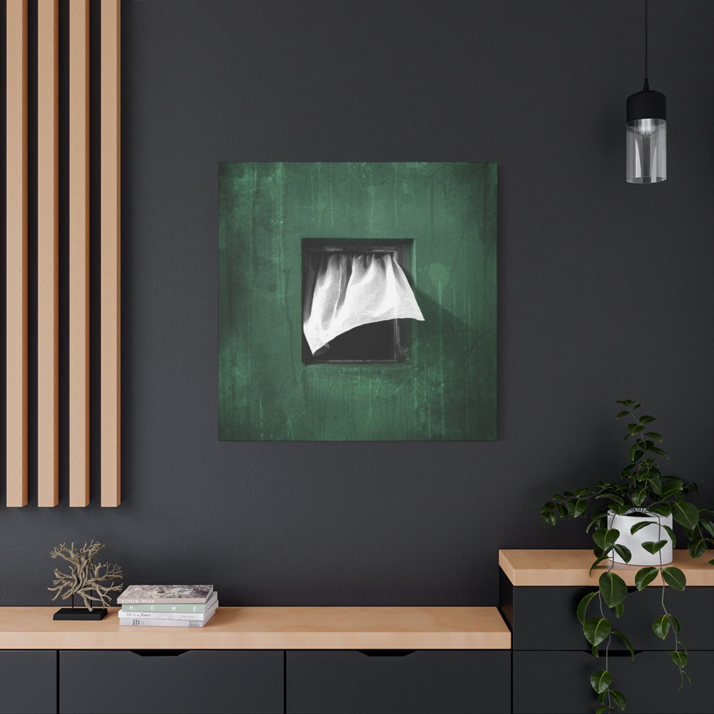
The installation and placement of draped green wall art also deserves careful consideration. These pieces work exceptionally well in spaces where actual curtains or window treatments are present, creating visual harmony between functional textiles and decorative art. However, they can also serve as striking focal points in rooms without windows, bringing the suggestion of natural light and outdoor views to interior spaces that might otherwise feel enclosed or confined.
Scale plays a crucial role in the effectiveness of draped green wall art. Oversized pieces that span significant portions of a wall create immersive experiences that can make viewers feel as though they are standing behind actual curtains, while smaller pieces function more as decorative accents that hint at textile beauty without overwhelming the space. The decision between these approaches should align with the room's overall design goals and the emotional atmosphere you wish to create.
Canvas Prints with Curtain Flair
Canvas prints that capture the essence of curtains represent a unique category within the broader wall art market, combining the accessibility and affordability of printed reproductions with subject matter that elevates everyday objects to artistic status. This democratization of art allows homeowners with various budgets to incorporate sophisticated visual elements into their spaces without investing in original paintings or expensive commissioned works.
The technical process of creating canvas prints with curtain flair begins with either photography or digital illustration that captures the movement, texture, and tonal qualities of draped fabric. Photographers working in this genre must have exceptional understanding of lighting techniques, using both natural and artificial light sources to emphasize the dimensional qualities of fabric folds. The interplay between highlight and shadow becomes the primary subject of the work, with the curtain itself serving as the vehicle for exploring these light dynamics.
Digital artists approaching this subject have different advantages and challenges. They can manipulate colors, textures, and compositions with greater freedom than photographers working with actual fabrics, but must be careful to maintain realistic qualities that prevent the work from appearing overly artificial or computerized. The most successful digital curtain prints achieve a balance where the medium is not immediately apparent, allowing viewers to focus on the artistic qualities rather than the creation method.
The printing process itself significantly impacts the final quality of canvas prints with curtain flair. High-resolution printing technologies that can reproduce subtle tonal gradations are essential for capturing the nuanced color shifts that make these pieces visually compelling. Inferior printing methods may flatten the dimensional qualities that make the original image interesting, reducing what should be a rich, textured appearance to a muddy or unclear representation.
Canvas as a substrate brings its own textural qualities to these prints, adding an additional layer of interest that complements the curtain imagery. The woven texture of canvas provides a subtle tactile quality that enhances the textile theme of the subject matter. Some manufacturers even use specialized canvas weaves that more closely mimic actual curtain fabrics, creating even stronger connections between medium and message.
Finishing techniques for canvas prints with curtain flair can vary from simple gallery wraps where the image extends around the edges of the stretcher frame to more elaborate presentations with decorative frames that either complement or contrast with the curtain imagery. The finishing choice should consider the overall design context where the print will be displayed, with more minimalist spaces often benefiting from frameless presentations while traditional interiors might call for framed options.
The versatility of canvas prints with curtain flair makes them suitable for nearly any interior space. In commercial settings like hotels, offices, and restaurants, these prints provide visual interest without being overly provocative or controversial. The universal familiarity with curtains as everyday objects makes these images immediately accessible to diverse audiences while still offering enough artistic merit to withstand repeated viewing.
Olive Green Window Vibes
Creating olive green window vibes through wall art taps into powerful associations between windows, natural light, and the outdoors. Windows serve as transitional spaces between interior and exterior environments, and artwork that evokes window elements brings some of that liminal quality into rooms regardless of their actual window access. This becomes particularly valuable in spaces with limited natural light or views, where art can suggest openness and connection to nature.
The specific choice of olive green for window-inspired art carries multiple layers of meaning and practical benefits. Olive tones exist in that perfect middle ground between warm and cool colors, making them remarkably versatile in coordinating with various color schemes. Unlike brighter greens that can feel too energetic or dark forest greens that might seem heavy, olive provides a sophisticated neutrality that works as either a dominant color or a supporting accent.
Window vibes in art can be achieved through various visual strategies beyond simply depicting windows. The suggestion of filtered light, the presence of fabric that might hang near windows, or abstract representations of the view one might see through windows all contribute to this atmospheric quality. Artists might include subtle architectural elements like window frames or sills, or they might focus entirely on the quality of light and color that characterizes window areas.
The psychological impact of olive green window vibes should not be underestimated. Humans are inherently drawn to windows and the promise of outlook they provide, even in representational form. Artwork that taps into this instinct can make spaces feel more expansive and less confined. The addition of olive green tones connects to our biological affinity for natural environments, creating a sense of calm and groundedness that enhances wellbeing.
Seasonal considerations influence how olive green window vibes are perceived and utilized. In spring and summer, these tones harmonize with the lush greenery visible through actual windows, creating continuity between indoor art and outdoor landscapes. During fall and winter months, olive green window art provides comforting reminders of growth and renewal during dormant seasons, maintaining visual connections to nature even when outdoor environments have shifted to browns and grays.
Curtain Texture on Canvas
The translation of curtain texture onto canvas represents a fascinating challenge for artists and photographers, requiring them to capture the tactile qualities of fabric through purely visual means. Successful execution depends on understanding how texture is perceived by the human eye and which visual cues most effectively communicate different fabric characteristics. This involves careful attention to surface irregularities, reflective properties, and the way light interacts with woven or knitted materials.
Different curtain fabrics present distinct textural challenges and opportunities. Linen curtains feature visible weave patterns with slight irregularities that give them character and authenticity. Cotton fabrics might display smoother surfaces with softer light reflection. Silk curtains create dramatic highlights with their lustrous surfaces, while heavier materials like velvet absorb light, creating deep shadows that emphasize fold depth. Artists must decide which textile qualities they want to emphasize and how to translate those characteristics into two-dimensional representations.
The photography techniques used to capture curtain texture require specialized knowledge and equipment. Macro photography can reveal intricate weave patterns and surface details that might not be visible to the casual observer, elevating ordinary textiles to abstract compositions of line, pattern, and texture. Lighting becomes paramount, with side lighting often most effective for emphasizing texture through the creation of small shadows that define surface irregularities.
Digital enhancement plays a legitimate role in creating curtain texture canvas art, allowing artists to emphasize textural elements that might be subdued in straight photography. Techniques like contrast adjustment, sharpening specific frequency ranges, and selective color enhancement can make textures more visually prominent without creating obviously artificial results. The goal is enhancement rather than fabrication, maintaining the authentic character of the original fabric while making it more visually compelling in print form.
The canvas substrate itself contributes additional textural dimension to these works. The woven texture of canvas creates a pleasing resonance with curtain imagery, where the physical texture of the artwork surface relates to the depicted texture of the fabric. Some artists deliberately choose canvas weaves that echo the scale and pattern of the curtain fabric being depicted, creating sophisticated relationships between form and content.
Elegant Drape-Inspired Art
Elegance in drape-inspired art emerges from the artist's ability to capture the graceful, effortless quality of fabric as it responds to gravity. Unlike forced or artificial arrangements, truly elegant drapery possesses an organic, unposed quality that reflects the natural behavior of textiles. This requires artists to understand fabric physics and to recognize which moments of fabric movement embody that perfect balance between structure and flow.
The composition of elegant drape-inspired art typically emphasizes vertical elements that echo the natural hang of curtains. These vertical lines create a sense of height and dignity that contributes to the elegant character of the work. However, the most sophisticated examples avoid rigid verticality, instead introducing subtle curves and variations that prevent the composition from feeling stiff or overly formal. The interplay between the overall vertical movement and the gentle horizontal curves of individual folds creates visual rhythm.
Color choices significantly influence perceived elegance in drape-inspired art. Olive and sage greens possess inherent sophistication that makes them natural choices for elegant interpretations. These muted, complex colors avoid the garishness that can come with more saturated hues while still providing enough color interest to prevent the work from appearing drab or lifeless. The specific shade selection should consider the lighting conditions in the installation space, as greens can shift dramatically in appearance under different light sources.
Elegant drape-inspired art often employs a refined color palette with limited range, focusing on subtle tonal variations rather than dramatic contrasts. This approach creates a sense of cohesion and intentionality that contributes to the elegant impression. The absence of jarring color shifts allows viewers to focus on the formal qualities of the composition, appreciating the shapes, lines, and spatial relationships without distraction from competing color elements.
The framing and presentation of elegant drape-inspired art deserves thoughtful consideration. Simple, refined frames in metallic finishes or light woods can enhance elegance without competing with the artwork itself. Alternatively, frameless presentations can work beautifully when the image naturally extends to the canvas edges in ways that feel complete and intentional. The key is ensuring that presentation choices support rather than undermine the elegant qualities of the work.
Olive Green Fabric Illusion
Creating convincing fabric illusions in olive green requires artists to master the complex interplay of color, light, shadow, and texture that makes two-dimensional representations appear three-dimensional. The human brain has sophisticated pattern recognition capabilities developed through constant interaction with fabrics, making it challenging to create illusions that withstand close scrutiny. Successful fabric illusions leverage this unconscious knowledge rather than fighting against it.
The illusion of fabric depth emerges primarily from careful attention to lighting and shadow. Fabric folds create shadows that range from subtle to dramatic depending on the depth of the fold and the lighting conditions. Artists must understand how light wraps around cylindrical forms like rolled fabric edges and how it creates sharp transitions in deeply creased areas. The gradient from highlight to midtone to shadow must follow patterns that the viewer's brain recognizes as authentic based on lifelong experience with fabric.
Color theory plays a crucial role in fabric illusions. Olive green, being a complex color that contains elements of yellow, blue, and sometimes gray, shifts significantly as it moves from highlight to shadow. The shadow areas of olive fabric don't simply become darker versions of the base color; they shift in both value and hue, often taking on cooler, more bluish qualities. Artists who understand these color shifts create more convincing illusions than those who simply darken the base color for shadows.
Texture is another essential component of fabric illusion. Even when canvas prints cannot replicate actual fabric texture, visual cues like the slight irregularity of fabric weave, the way light catches on individual fibers, and the soft rather than hard edges of fabric forms all contribute to the illusion. Digital artists can simulate these qualities through various techniques including texture overlays, subtle noise addition, and edge softening that mimics the way fabric boundaries appear slightly fuzzy rather than knife-sharp.
Soft Curtain Wall Print
The concept of soft curtain wall prints emphasizes gentleness and approachability in contrast to harder-edged or more dramatic artistic approaches. Softness in this context refers to multiple qualities including color saturation, contrast levels, edge definition, and overall emotional tone. These prints create atmospheres of comfort and tranquility, making them particularly suitable for spaces intended for relaxation and restoration.
Achieving softness in curtain wall prints begins with image selection or creation. Photographers and digital artists working in this style favor diffused lighting conditions that minimize harsh shadows and bright highlights. Overcast daylight or artificially softened light sources create the gentle gradations that characterize soft curtain imagery. The resulting images possess a dreamy quality that invites contemplation rather than demanding immediate attention.
Color palettes for soft curtain wall prints typically feature desaturated or muted tones. While olive green serves as a primary color in many pieces, the most effective soft prints reduce the color intensity to levels that feel calming rather than energizing. This desaturation process requires skill to maintain enough color interest to prevent the work from appearing washed out or lifeless. The goal is achieving that perfect balance between color presence and restraint.
Edge quality significantly impacts perceived softness in these prints. Sharp, well-defined edges create graphic impact but can feel harsh or aggressive. Soft curtain wall prints favor slightly diffused edges where fabric meets background or where one fold transitions to another. This technical approach mimics how the human eye naturally perceives soft fabrics and contributes to the overall gentle character of the work.
The printing process itself can enhance or undermine softness depending on technical choices. Matte canvas prints typically appear softer than glossy alternatives, as the light-absorbing quality of matte surfaces reduces contrast and highlights. Some manufacturers offer specialized soft or satin finishes that provide the perfect middle ground, offering slight sheen without the harsh reflections that can make prints feel cold or commercial.
Window-Inspired Canvas Art
Window-inspired canvas art encompasses a broad category of works that take windows as conceptual starting points, whether through direct representation, abstraction of window elements, or evocation of the qualities we associate with windows. This approach recognizes windows as more than mere architectural features, understanding them as symbolic portals between interior and exterior worlds, sources of light and air, and frames through which we view and interpret our surroundings.
Direct representations of windows in canvas art might include architectural details like frames, mullions, or sills, depicting these elements with varying degrees of realism or abstraction. However, the most compelling window-inspired art often goes beyond literal depiction to explore the experiential qualities of windows such as the way light filters through, the suggestion of views beyond, or the presence of treatments like curtains or blinds that modify the window experience.
Abstract interpretations of windows can be particularly powerful, reducing the concept to essential elements like vertical and horizontal lines suggesting frames, blocks of color representing panes and views, or textural areas evoking materials like glass or fabric. These abstractions allow viewers to project their own window experiences and associations onto the work, creating personal connections that might be more difficult with purely representational approaches.
The color symbolism in window-inspired canvas art carries significant meaning. Olive and other green tones naturally connect to outdoor views and growing things that might be seen through windows. Blues can suggest sky views, while warm tones might evoke interior spaces and the comfort of home. Artists working in this genre carefully consider how color choices communicate specific aspects of the window experience they wish to emphasize.
Window-inspired canvas art often incorporates suggestions of transparency, translucency, or layers, reflecting the physical reality of windows as boundaries that simultaneously separate and connect. Techniques like layering, overlapping forms, or creating depth through atmospheric perspective can evoke these qualities. The challenge lies in suggesting transparency through opaque paint or print media, requiring sophisticated understanding of how transparent materials interact with light.
Olive Tones, Fabric Feel
The combination of olive tones with fabric feel in canvas art creates a multisensory experience that engages viewers on both visual and tactile levels, even though the actual tactile component remains implied rather than literal. This approach recognizes that visual perception of texture is powerful enough to trigger tactile memories and associations, allowing two-dimensional art to evoke three-dimensional, physical experiences.
Olive as a color family encompasses remarkable range from yellow-tinted khaki olives to gray-green sage variations to deeper, almost military greens. Each variation carries distinct emotional associations and works differently within various design contexts. Yellow olives feel warmer and more energetic, suitable for spaces where activity and creativity are priorities. Gray olives possess sophisticated neutrality that works in formal or professional settings. Deeper olives create drama and intimacy appropriate for cozy, enclosed spaces.
The fabric feel component of these works requires careful attention to visual texture techniques. Painted or digitally created pieces might incorporate actual textile patterns, subtle weave suggestions, or irregular surfaces that mimic fabric characteristics. Printed works benefit from canvas substrates that provide authentic textile texture, creating physical dimension that supports the visual representation of fabric. The combination of visual and physical texture creates a more complete sensory experience.
Lighting plays a crucial role in how olive tones and fabric feel are perceived. These works respond dynamically to changing light conditions, with colors shifting and texture becoming more or less apparent as light quality changes. Natural daylight brings out the green component of olive tones and emphasizes texture through shadow creation, while warm artificial light can shift colors toward khaki or tan ranges and soften textural contrast. Considering the lighting environment during selection and installation ensures optimal appearance.
Olive tones with fabric feel work particularly well in transitional design schemes that bridge traditional and contemporary aesthetics. The color provides enough richness to satisfy traditional sensibilities while maintaining the restraint appreciated in modern design. The fabric texture element adds warmth and accessibility that can soften harder-edged contemporary spaces or refresh traditional interiors that risk feeling stuffy or dated.
Textured Drapery on Canvas
Textured drapery on canvas represents one of the most technically challenging approaches to curtain-inspired art, requiring artists to convey multiple layers of texture, depth, and dimension through print or paint media. The complexity stems from the need to depict both the large-scale texture of draped folds and the fine-scale texture of fabric weave or surface, all while maintaining visual clarity and artistic impact.
Large-scale texture in drapery comes from the three-dimensional forms created by hanging fabric. Deep folds create valleys and peaks that catch light differently, producing dramatic value contrasts. Gentle undulations create subtler tonal shifts. The most effective textured drapery art captures this range, using the full value spectrum from near-white highlights to deep, rich shadows. This value range creates the visual pop that makes drapery appear to project from the canvas surface despite being physically flat.
Fine-scale texture refers to the actual surface quality of the fabric, whether that's the visible weave of linen, the smooth sheen of silk, the deep pile of velvet, or the irregular character of handwoven textiles. Capturing these surface qualities requires either macro photography that reveals actual textile structure or digital illustration techniques that convincingly simulate these characteristics. The challenge lies in making fine texture visible without allowing it to compete with or overwhelm the larger compositional elements.
The relationship between large and fine texture requires careful balancing. If fine texture is too prominent, it can flatten the overall composition by competing with the three-dimensional form. If it's too subtle, the work might lack the textural richness that makes it compelling. Successful textured drapery finds the sweet spot where both scales of texture are present and work together to create rich, layered visual experiences.
Flowing Curtain Wall Decor
Flowing curtain wall decor emphasizes movement and dynamism, capturing moments when fabric responds to air currents or gravitational forces. Unlike static drapery that hangs in fixed positions, flowing curtains suggest gentle motion that adds life and energy to interior spaces. This approach to wall decor taps into human responsiveness to movement, even when that movement is implied rather than actual.
The visual language of flowing curtains relies on specific formal elements including diagonal lines, curved forms, and asymmetrical compositions. Vertical drapery emphasizes stability and formality, while diagonal and curved elements suggest motion and change. Artists working in this style carefully arrange these elements to create clear directional flow that guides the viewer's eye through the composition, typically from top to bottom following the natural fall of fabric under gravity.
Capturing authentic flowing curtain imagery often requires working with actual fabrics in controlled conditions. Photographers might use fans or natural breezes to create movement, shooting multiple frames to capture the perfect moment when fabric forms create compelling compositions. The challenge lies in achieving movement that appears natural rather than forced, requiring patience and sometimes hundreds of attempts to capture that ideal instant.
Digital artists creating flowing curtain wall decor have different advantages and challenges. They can manipulate fabric forms with complete freedom, creating idealized compositions that might be difficult or impossible to capture photographically. However, they must have deep understanding of fabric physics to create movement that appears authentic. Flowing fabric follows specific patterns based on weight, flexibility, and environmental forces, and departures from these patterns are immediately noticeable to viewers even if they cannot articulate exactly what appears wrong.
The color transitions in flowing curtain art contribute significantly to the sense of movement. As fabric flows and folds, its orientation to light sources constantly changes, creating shifting patterns of light and shadow. Olive green flowing curtains might display warm yellow-green highlights on surfaces facing light sources, transitioning through true olive tones in perpendicular surfaces to cool, shadowed greens in areas turned away from light. These color shifts reinforce the three-dimensional quality of the forms and enhance the illusion of movement.
Flowing curtain wall decor works particularly well in spaces where actual air movement is present or desired. Rooms with ceiling fans, good ventilation, or open windows benefit from artwork that echoes and celebrates these environmental qualities. The visual suggestion of flowing fabric can even make spaces feel more comfortable by implying the presence of fresh, moving air even when actual air is relatively still.
Installation height and viewing angle significantly impact how flowing curtain art is perceived. These pieces often work best when mounted high enough that viewers can appreciate the full sweep of fabric from top to bottom. The sense of flow is most powerful when the composition includes both the origin point where fabric would be attached and the ending point where it would settle, creating a complete visual journey.
Olive Curtain Wall Accent
Using olive curtain wall art as an accent represents a strategic design approach that leverages the sophisticated color and compelling subject matter without overwhelming spaces. Accent pieces differ from dominant focal points in scale, placement, and visual weight, providing visual interest and color reinforcement without demanding to be the center of attention. This approach offers flexibility and works particularly well in spaces with multiple design elements competing for visual hierarchy.
The ideal scale for olive curtain wall accents typically ranges from small to medium sizes that provide presence without dominating entire walls. Pieces measuring between twelve inches and thirty-six inches in any dimension often work well as accents, large enough to be clearly visible and appreciated but not so large that they demand primary focus. Multiple accent pieces can be grouped to create larger visual impact when desired, offering flexibility that single large works cannot provide.
Placement strategies for accent pieces differ from those for dominant artworks. Rather than occupying prime positions like fireplace mantels or the wall behind primary seating, accents work well in secondary locations such as hallway walls, beside doorways, on smaller wall sections between windows, or above secondary furniture pieces like consoles or credenzas. These positions allow accents to contribute to overall room aesthetics without creating competing focal points.
Color coordination becomes crucial when using olive curtain art as an accent. The olive tones should connect to other green elements in the space, whether found in upholstery, accessories, plants, or other decorative items. However, the accent should not match exactly, as too-perfect matching creates a coordinated look that can feel contrived or overly designed. Instead, the olive should harmonize while introducing slight variation that adds interest and prevents monotony.
Olive curtain wall accents can serve specific functional purposes beyond pure decoration. They can balance color distribution, drawing the eye to underutilized spaces. They can create visual rhythm when repeated at intervals along walls or through connected spaces. They can provide transition between different color schemes in open floor plans, serving as bridges that help disparate areas feel connected. These functional roles make accent pieces valuable design tools rather than purely aesthetic additions.
Olive Curtain Texture Art
Olive curtain texture art places primary emphasis on the tactile qualities of fabric, celebrating surface characteristics that make textiles physically and visually engaging. This approach recognizes that much of fabric's appeal lies in its textural richness, and that successfully translating these qualities into two-dimensional art creates powerful connections with viewers whose lifelong experience with textiles informs their response to these works.
The range of textures available in curtain fabrics provides rich material for artistic exploration. Smooth, lustrous silks create one type of textural experience, while rough, heavily textured linens create entirely different effects. Velvet with its deep pile and directional nap presents yet another textural category, as do sheer fabrics that create texture through transparency rather than surface character. Artists working in texture-focused art must decide which textile qualities to emphasize.
Capturing texture in art requires different techniques depending on whether the work is photographed, painted, or digitally created. Photography of actual textiles benefits from careful lighting that emphasizes surface irregularities through shadow creation. Macro photography can reveal textile structures invisible to casual observation, transforming ordinary fabrics into abstract landscapes of fiber and weave. The technical challenge lies in maintaining enough context that the texture remains identifiable as fabric rather than becoming so abstract that connection to the subject is lost.
Digital creation of curtain texture offers different possibilities and challenges. Artists can synthesize textures that might not exist in actual fabrics, creating idealized or enhanced versions of textile surfaces. They can combine multiple textile characteristics into single compositions, or manipulate scale to show texture at unusual magnifications. However, digital texture creation requires careful attention to authenticity, as viewers with lifelong tactile experience with fabrics quickly recognize when depicted textures don't behave according to expected patterns.
Color choices significantly impact how texture is perceived in olive curtain texture art. The olive palette provides excellent foundation for textural work because these complex colors naturally show variation and depth. As texture creates small shadows and highlights across fabric surfaces, olive shifts through its color range, creating visual interest that reinforces the textural qualities. Flat, uniform colors cannot support textural emphasis as effectively as these nuanced tones.
Window Drapes Reimagined
Reimagining window drapes in art involves taking familiar elements and transforming them through creative vision into something fresh and unexpected. This approach might involve abstraction that reduces drapes to essential formal elements, unusual color choices that depart from typical curtain palettes, unexpected compositions that challenge conventional arrangements, or conceptual approaches that use drapes as metaphors for broader ideas about boundaries, transparency, or transition.
Abstraction offers powerful tools for reimagining window drapes. Rather than depicting curtains with photographic accuracy, abstract approaches might emphasize the vertical linear quality of hanging fabric through parallel lines, suggest folds through curved forms, or evoke the softness of textiles through organic, flowing shapes. The goal is capturing the essence of drapes while departing from literal representation, allowing viewers to engage with familiar subjects in new ways.
Color experimentation can dramatically reimagine window drapes. While natural fabric colors and olive tones create one effect, introducing unexpected colors like vibrant teals, deep burgundies, or even non-naturalistic colors like bright pink or electric blue transforms curtains from familiar domestic objects into vehicles for bold artistic expression. The key is ensuring that color choices feel intentional rather than arbitrary, serving clear aesthetic or conceptual purposes.
Compositional innovation reimagines how drapes are presented and arranged. Instead of standard centered presentations, drapes might be shown from unusual angles, cropped in unexpected ways, or combined with other elements that create surprising juxtapositions. Multiple drape images might be layered or fragmented and reassembled, creating complex compositions that reference curtains while moving into more experimental visual territory.
Conceptual approaches use window drapes as starting points for exploring broader themes. Drapes might represent boundaries between public and private, known and unknown, or interior and exterior worlds. They might symbolize revelation and concealment, openness and protection, or transition and transformation. These conceptual layers add depth beyond the purely visual, giving viewers multiple entry points for engaging with the work.
Reimagined window drape art appeals particularly to design-forward audiences who appreciate innovation and are comfortable with departures from conventional approaches. These works suit contemporary interiors where experimentation and individuality are valued over traditional decorative approaches. They work well in creative professional environments like design studios, advertising agencies, and tech companies where innovation is part of the organizational culture.
Canvas with Curtain Depth
Creating canvas art with convincing curtain depth requires mastery of techniques that transform flat surfaces into apparently three-dimensional spaces. Depth perception depends on multiple visual cues that artists must understand and skillfully employ to create illusions that engage viewers and create spatial complexity within two-dimensional constraints.
Linear perspective provides one tool for creating depth, though its application to curtain art differs from traditional architectural perspective. Curtains hanging in space don't necessarily recede toward vanishing points, but understanding how forms appear to diminish with distance helps artists create convincing spatial relationships. When multiple curtain layers are depicted, those behind should appear smaller and less detailed than those in front, creating clear depth progression.
Atmospheric perspective, the tendency of distant objects to appear lighter, less saturated, and less detailed than near objects, offers another depth-creation tool. In curtain art with multiple layers or complex folds, background areas might be rendered with reduced contrast and detail compared to foreground elements. This mimics how the atmosphere affects perception of distant objects, creating a sense that some curtain areas recede into space while others advance toward the viewer.
Overlap is perhaps the most powerful depth cue available to artists. When one curtain fold clearly passes in front of another, unambiguous spatial relationships are established. Skilled artists use overlapping forms strategically throughout compositions, creating clear front-to-back progressions that help viewers mentally construct the three-dimensional space depicted. The edges where overlaps occur require particular attention to ensure they read correctly.
Value contrast creates depth through the principle that high-contrast areas appear closer while low-contrast areas recede. In curtain art, this might manifest as bright highlights and deep shadows in foreground folds with more compressed value ranges in background areas. This approach leverages the way atmospheric conditions and lighting typically work in real space, creating depth cues that feel natural to viewers.
Color temperature can contribute to depth perception, with warm colors generally appearing to advance while cool colors recede. In olive curtain art, this might involve using warmer yellow-olive tones in foreground areas and cooler blue-olive tones in recesses and background regions. This approach requires subtlety to avoid appearing obvious or forced, but when skillfully applied creates powerful depth effects.
Olive Fabric Wall Statement
Using olive fabric wall art as a bold statement piece represents a design strategy that embraces confident color and subject matter choices to create focal points that anchor room designs. Statement pieces differ from subtle accents in their scale, visual impact, and role within overall design schemes, demanding attention and establishing aesthetic direction that other elements support and reinforce.
The scale of statement pieces typically ranges from large to oversized, occupying significant wall space and creating immediate visual impact upon entering a room. While exact dimensions depend on room size and architectural context, statement works generally measure at least four feet in one dimension and often considerably larger. This substantial presence ensures the piece commands attention without requiring dramatic subject matter or shocking colors.
Subject matter in olive fabric statement art should be strong enough to justify the prominent placement and scale. This might involve dramatic compositions with high contrast, unusual perspectives that create visual interest, or particularly rich textural qualities that reward viewing from various distances. The work should offer enough visual complexity to sustain interest over time, as statement pieces will be viewed repeatedly and should continue revealing new details and qualities.
Color strategy for olive fabric statement pieces must consider the entire room palette. The olive can serve as either a dominant color that sets the overall tone or as a major accent that punctuates a neutral scheme. In either case, the specific olive shade should be carefully selected to harmonize with existing colors while providing enough distinction to justify its prominent position. Test samples in the actual space under real lighting conditions before committing to large-scale purchases.
Installation location for statement pieces deserves careful planning. Traditional statement positions include walls behind sofas or beds, above mantels, and in entry halls where they create first impressions. However, unconventional placements can be equally effective when thoughtfully executed. The key is ensuring the piece has adequate space around it to breathe and that sightlines from major seating areas allow comfortable viewing.
Lighting design becomes crucial for statement pieces, as improper lighting can undermine even exceptional art. Dedicated picture lighting ensures the work is properly illuminated during evening hours, while considering natural light patterns prevents damage from direct sun exposure. The lighting should enhance the dimensional and textural qualities of the olive fabric imagery without creating glare or washing out colors.
Abstract Curtain Movement
Abstract curtain movement art distills the essence of flowing fabric into compositions that prioritize formal qualities like line, shape, color, and rhythm over literal representation. This approach allows artists to explore the dynamic qualities of moving curtains while freeing themselves from the constraints of realistic depiction, creating works that capture feeling and energy rather than specific moments in time.
The abstraction process begins with identifying which qualities of curtain movement are most essential and expressive. Is it the sweeping curves of fabric responding to air currents? The rhythm of repeated vertical folds? The play of light and shadow across moving surfaces? The tension between the stability of fixed attachment points and the freedom of flowing fabric below? Different artists emphasize different qualities, leading to varied abstract interpretations of the same basic subject.
Line quality becomes particularly important in abstract curtain movement art. Flowing, organic lines suggest gentle fabric movement, while more angular, abrupt lines might evoke heavier fabrics or stronger air currents. The thickness, consistency, and character of lines all contribute to the overall feeling of the work. Varied line weights create visual interest and can suggest depth, with heavier lines appearing closer and lighter lines receding.
Conclusion
The world of olive-toned curtain-inspired canvas art represents far more than a passing design trend or simple decorative option. It embodies a sophisticated approach to interior aesthetics that recognizes the profound impact of color, texture, movement, and implied three-dimensionality on our experience of living spaces. Throughout this exploration, we have examined how this unique category of wall art bridges the gap between functional textile elements and permanent artistic installations, creating opportunities for homeowners and designers to introduce warmth, sophistication, and natural connections into diverse interior environments.
The enduring appeal of curtain-inspired art lies in its fundamental accessibility combined with its capacity for endless variation and artistic interpretation. Curtains exist as universal elements in human dwellings across cultures and throughout history, making them immediately recognizable and comfortable subjects that require no specialized knowledge to appreciate. Yet within this familiar framework, artists find remarkable creative freedom, exploring everything from hyper-realistic representations to bold abstractions, from gentle atmospheric pieces to dramatic statement works. This range ensures that curtain-inspired art can serve nearly any design need and appeal to widely varied aesthetic preferences.
The specific choice of olive and related green tones adds another dimension of sophistication and psychological benefit to these works. Green's associations with nature, growth, renewal, and tranquility make it psychologically supportive in ways that more neutral or cooler colors might not achieve. Olive specifically occupies that perfect middle ground between warm and cool, saturated and muted, allowing it to work harmoniously across varied color schemes and design styles. Its versatility makes it as appropriate in traditional settings as in cutting-edge contemporary spaces, equally at home in residential bedrooms and commercial lobbies.
The technical evolution that has made high-quality canvas prints accessible and affordable has democratized this art form, allowing people with diverse budgets to incorporate sophisticated wall art into their spaces. No longer limited to those who can commission original paintings or afford gallery pieces, canvas prints bring artistic vision to mass markets without necessarily sacrificing quality or impact. This accessibility represents a significant shift in how we think about art in living spaces, moving from art as luxury good to art as essential component of well-designed environments.
As we have explored throughout this comprehensive examination, successful implementation of curtain-inspired canvas art requires consideration of multiple factors including scale, placement, lighting, color coordination, and relationship to surrounding design elements. The most effective installations result from thoughtful planning that considers not just the artwork in isolation, but its role within the larger context of the space it will inhabit. This holistic approach ensures that art enhances rather than conflicts with overall design goals, creating environments where all elements work together synergistically.
The psychological and emotional impacts of these works deserve emphasis as we conclude. In an increasingly digital and disconnected world, art that evokes tactile experiences and natural elements provides valuable grounding. Curtain-inspired pieces trigger memories of physical fabrics, connect to our biological affinity for natural colors, and create visual softness that counterbalances the hard surfaces and sharp edges prevalent in modern architecture and design. These qualities make such art not merely decorative but genuinely supportive of human wellbeing in built environments.
Looking forward, the continued evolution of printing technologies, artistic techniques, and design trends promises even greater possibilities for curtain-inspired canvas art. We may see increasing integration of sustainable materials and processes, responding to growing environmental consciousness. Digital art creation tools will continue advancing, enabling artists to create ever more sophisticated and convincing representations or to push further into experimental territories. The fundamental appeal of bringing textile qualities to wall art will likely remain constant even as specific manifestations evolve.
